 Magezon Blog Help Merchants Build Comprehensive eCommerce Websites

In today’s digital world, having a website and ensuring it works well are becoming more and more important, maybe more crucial than anything else. How often have you gone to a website but left because you didn’t like the design or content or because it took too long for the pages to load? If you’re making or updating your website, the best way to start is by looking at the sites of the top brands in your field. Here are 35+ best beauty websites for online makeup stores, skincare stores, self-care brands, and more to give you ideas. So, let’s get started!
Table of contents
35+ Best Beauty Websites to Get Inspiration
1. Dior
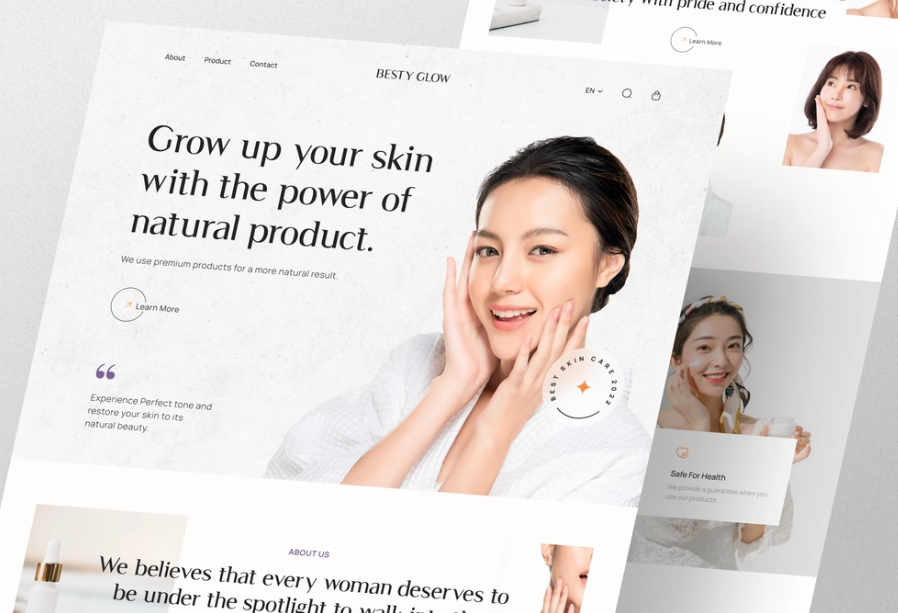
With its stunning fragrances and haute-couture clothing, Dior has established a strong reputation. But they should also be recognized for their beauty department as well. The skincare and cosmetics parts work as excellent makeup helpers. Each product has a thorough explanation that covers the formulae, offered hues, and even application advice.
The product pages aren’t spectacular, but it’s not bad. There is a lot of white space, a simple color palette, and an uncomplicated layout. And that’s advantageous since you want to draw attention to the product rather than detract from it with extraneous elements.
→ Use tools to create your website’s layout: 20 Best Wireframe Tools to Sketch Your Website (+ How to Choose)
As a beauty website, visuality is all that matters. Dior has successfully included attracting multimedia, such as high-quality videos and photographs, to keep visitors interested without distracting them from the products.
Overall, this is a simple but profoundly engaging website design. The design’s inherent simplicity is intrinsically interesting, encouraging interaction via a subtle layout, detailed product descriptions, and a fluid checkout procedure that promotes a smooth and sophisticated customer experience.
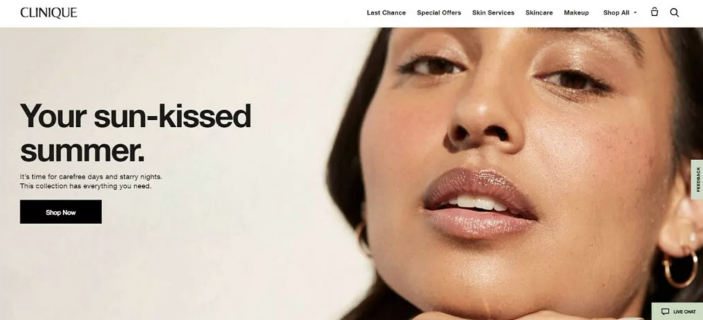
2. Clinique
Clinique’s website’s most exciting feature is its virtual skincare diagnostic and foundation applicator. The program displays over 80 data points on the face in a single scan against models created using more than a million face scans and more than 50 years of dermatological study. It provides 24/7 beauty assistance via its live chat feature.
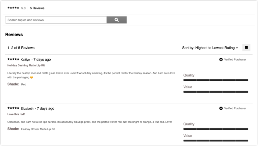
Additionally, this page has many reviews to increase the product’s reliability. These reviews appear on the homepage (when hovering over) and product page (detailed review). On the other hand, you can create a dedicated testimonial page with pictures and videos of customers talking about your products; this is an excellent method to increase your reputation and prospects’ trust.
→ Discover testimonial examples to get inspiration: 50+ Stunning Testimonial Page Examples
3. ColorPop Cosmetics
ColorPop cosmetics is just what its name implies: a splash of color! Its well-organized product pages contribute to the company’s reputation as a leader in the cosmetics market.
→ Optimize your product page with tips: Product Detail Page: 12 Practical Guidelines & Best Practices
When you click on a specific category of products, such as “eyes,” you will see its further segments, like eyeshadow palettes, lashes, mascara, and eyeliner. If your company offers more than one product type, maintain a structured layout that will not confuse your visitors and make their navigation easier.
ColorPop’s website also loads quickly, which is excellent for product pages with a lot of glitz, dynamic graphics, and high-quality design.
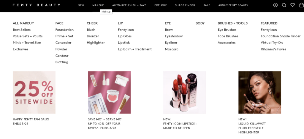
4. Fenty Beauty
Knowing what color or shade a product appears outside the bottle is a significant obstacle buyers face when purchasing cosmetic products online. Fendy Beauty handles this by showing different images when you move your cursor over a product on their product page.
In the lipstick section, the picture changes to display a swatch of what the color looks like—this is important for raising the purchase rate of your items because customers can know the exact color of the lipstick and consider whether it suits them.
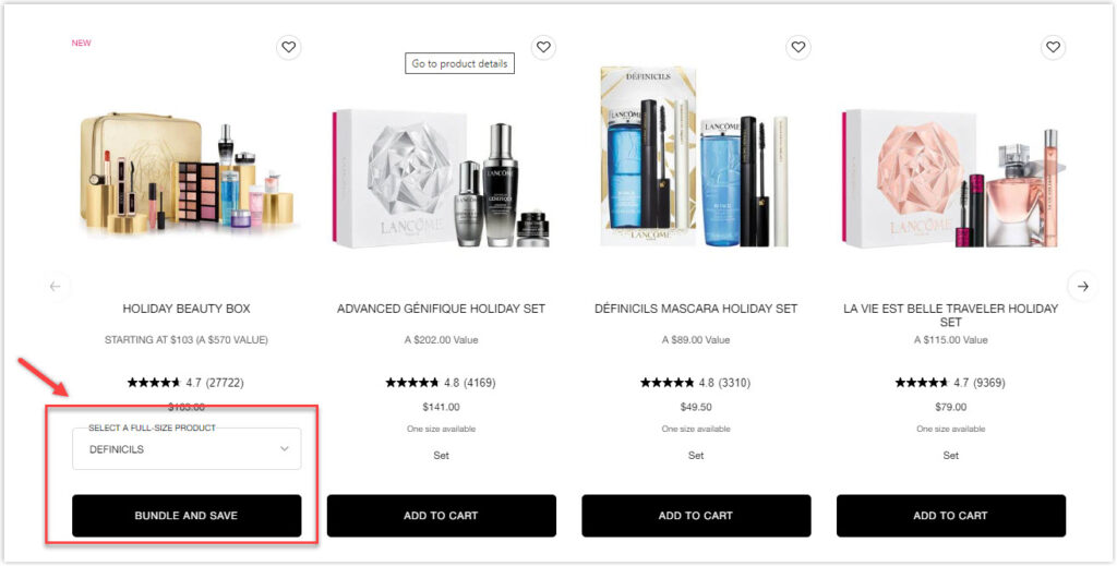
Products that have received awards and mentions also have the certification in the corner of the product picture. In addition, reviews are provided on the homepage (ratings) and the product page (ratings and detailed reviews).
Try FREE Magezon Page Builder!
Easily create your engaging Magento pages in any style whenever you want without relying on developers or designers, just by drag & drop.
5. Kylie Cosmetics
On Kylie Cosmetics’ website, new products are identified with the word “New” in the top-left corner of every image to draw attention and create a FOMO for visitors. Each product also includes a list of reviews, and given that Kylie’s items often get ratings between 4 and 5, these evaluations help establish the brand’s legitimacy.
When there is an offer, the product page includes a pop-up on the left-hand side accompanying you as you explore the product catalog rather than an elusive pop-up on your screen.
6. Vanity Planet
On the product pages of Vanity Planet’s website, there is a filtering system that is easy to use and sticky on top of the page. As a result, customers may quickly and easily filter products by price, color, and collection to discover precisely what they’re looking for. And what’s best? It goes quickly. Once you apply your filters, the page will update in less than a second.
→ Create an effective search bar with tips: 15 Search Bar Design Best Practices in Details 2022
Customers may quickly add items to their basket while browsing a specific product category. In addition, they are given clear expectations about what is now available when Vanity Planet modifies the CTA to read “sold out” or “pre-order” if an item is not currently in stock.
→ Optimize CTA buttons for more sales: 8 Must-Have Characteristics of the High-Converting CTA Buttons and Examples
7. Lancôme
Like Clinique, Lancôme allows users to “virtually try on” new products on their skin type. Seeing the effect on the skin will help customers better visualize whether the product suits them, making a purchase decision quickly. Overall, the website has a harmonized UX layout with enough white space and proper placement of all sections. Products on the homepage are made to be easily added to the cart with all the options provided, such as color, size, or weight.
→ Learn the basics of website grids: 3 Things to Remember Before Creating Website Grids
However, everything has a downside. Lancôme’s picture is blurry and broken, which diminishes the legibility of picture captions. This isn’t good for both brands’ reputations and negatively impacts the customer experience.
8. MAC Cosmetics
Another beauty site you can learn from is MAC Cosmetics. The website, known for its strong branding, does an excellent job translating the company’s concept into a colorful online presence. Its well-organized product and trend library provides a thrilling and inspirational shopping experience. By enabling customer account response, MAC can also make tailored advertising offers.
9. NARS Cosmetics
NARS is synonymous with flair, luxury, and elegance. Its gorgeous website also provides a virtual “try-out” tool powered by AR that removes potential hurdles to purchasing. When you visit its site, your eye is quickly drawn in by the striking color contrast between red, black, and white. It’s interesting to note that NARS offers both horizontal and hamburger menus to make it easier for customers to navigate while scrolling down.
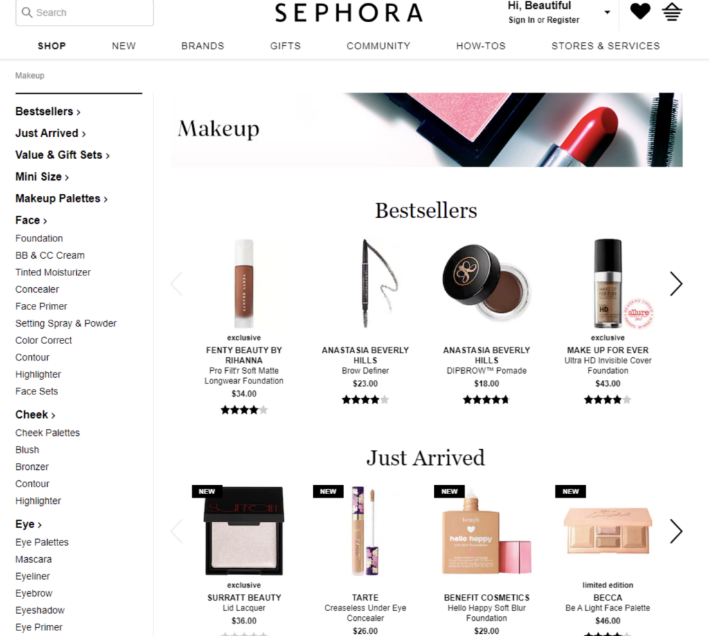
10. Sephora
Sephora is unquestionably the market leader and has one of the best beauty websites. This site adjusts to customer behavior and personalizes suggestions to facilitate purchasing. The design is simple and well-organized, and the simple navigation menu makes site research pleasurable.
There’s also a “Tips & Tricks” section and an online forum to join. But, most significantly, this cosmetics e-commerce business gives its customers access to new products before they are available in physical shops.
11. Olay
Olay is excellent if you seek high-quality, scientifically based skin care products. Unlike other websites, the menu is written in low caps and is easy to navigate with simple captions, helping visitors find their wished items quickly.
This beauty website prioritizes the beauty of nature, which takes away the superficial and corporate feel of the design as a whole and makes people feel good and excited. And all of this makes Olay becomes one of the top skincare websites.
12. Jeffree Star Cosmetics
Jeffree Star Cosmetics is an outstanding example of a business with good branding, and Jeffree’s personality shows through the website and products.
Look at the products’ names; you’ll see things like “Thirsty Palette,” “Conspiracy Palette,” and “Cremated Eyeshadow Palette.” which are named after personal events. For instance, while working with another well-known Youtuber popular with his conspiracy theories, Shane Dawson, the Conspiracy Palette was created. So each color in this palette is named after a shared love for something of Jeffree and Shane.
The product page for Jeffree Star demonstrates how crucial it is to make sure that your website’s text, design, product name, and message are all in line with your brand’s voice. Moreover, the website for brand has been updated and redesigned to fit the mood of Halloween.
→ Decorate your website this Halloween with tips: Halloween Website Ideas: 8 Tricks to Boost Your Sales (+ Marketing Tips)
13. 100% Pure
This firm encourages customers to purchase through social evidence like reviews. Because almost 90% of shoppers check internet reviews before making a purchase, featuring items with favorable feedback is an effective way to boost sales.
14. Spectrum
Spectrum is another candidate we want to mention in this list of the best beauty websites. The product page of Spectrum adheres to all recommended standards for e-commerce beauty brands: Rating and reviews are placed under each product, the design is straightforward, and the product photos are all the same style.
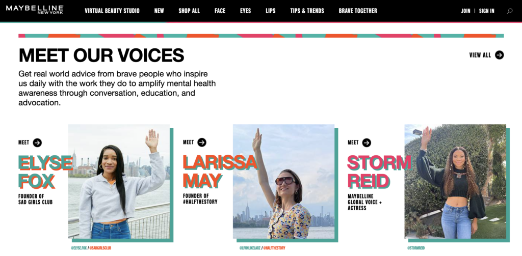
15. MAYBELLINE
This historic cosmetic brand is renowned for its timeless products, such as “Great Lash” mascara. It already has a dedicated customer base, but its hero video appeals to younger Millennials and Generation Z. Although MAYBELLINE has been around for a long time and has a wide range of beauty products, the website is modern, lively, and fun.
| Create captivating demo videos for your products: 19+ Best Product Demo Videos to Inspire You and How to Create One |
“Make Up studio” is an essential interactive part of the MAYBELLINE site. You can try four sections: Foundation Finder, Virtual Try-On, Brow Play Studio, and Match The Ink Game. Each section corresponds to a MAYBELLINE product, such as lipstick, foundation, eyebrow pencil, etc. To try this feature, you can take or upload a picture of yourself to MAYBELLINE and let them do your makeup.
16. NYX COSMETICS
The beauty website for NYX Cosmetics features an excellent product variety, powerful branding, and ideal design elements. In addition, customers can improve their beauty skills with interactive features, engaging tips, lessons, and advice from a virtual cosmetic assistant thanks to the user experience’s well-designed UX.
Try FREE Magezon Page Builder!
Easily create your engaging Magento pages in any style whenever you want without relying on developers or designers, just by drag & drop.
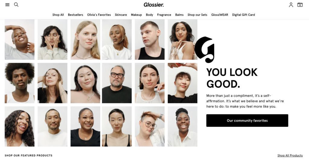
17. Glossier
Glossier has one of the best beauty websites, which is simple and conveys the company’s philosophy. The primary goal is to make the items stand out by keeping the site for their cosmetics business basic. This clean and entertaining website incorporates modern design and cosmetic trends from packaging to basic formulas.
The website’s primary focus is on the user experience. Visitors can choose any product, alter its color or number with a single click, and see it from all angles. In addition, the customer’s experience is made simple and exciting by the speedy checkout procedure, which incorporates subtle upselling, the provision of free samples, and a seamless connection with effective payment options.
18. Covergirl
Covergirl has a well-designed, customer-centric website. Its new design focuses more on authenticity, variety, and self-expression. Finally, the straightforward interface of this cosmetic company makes buying simple.
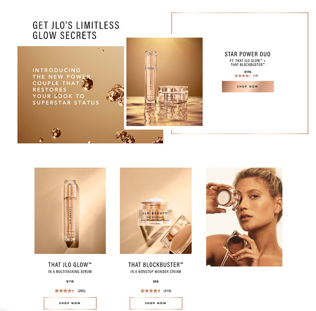
19. JLO Beauty
It’s no surprise that Jennifer Lopez completely nailed her web design, making her site lie on the top cosmetic websites. Giving the product page elements and photographs the same glowy quality was a brilliant design decision that made every single item obtain all the “JLO glow.”
The company also bundles products that work well as a routine, assisting customers in selecting products for a unique appearance. For example, customers can buy the “Star Power Duo,” designed to introduce them to JLO’s style. If you don’t want to buy both things, they’re listed below the bundle and may be purchased individually.
20. Soko Glam
Soko Glam is one of the best beauty websites regarding consistency. Their product page has a simple design with white backgrounds and photos in gentle blues, pinks, yellows, and greens. One significant distinction between Soko Glam’s product pages and other manufacturers is the option to “love” a product.
You can add a product to your wish list by clicking the heart in the top-right corner of each product picture. Then, on the right side of the navigation menu, click the heart to view everything you’ve put on your wish list. Not only can you use this to return to things you know you want later, but you can also share your wish list through email, Facebook, or Twitter.
21. Sleek Makeup
The design of this website is clear and consistent. Each product has the same background, making everything look neat and synchronized. In addition, customers can click “Notify me” for various items, and the company will collect their emails to contact them when the thing is back in stock, naturally growing the email list.
22. Green People’s Organic Lifestyle
Information and advice provided in banner images on Green People Organic Lifestyle product pages is the most beneficial feature on its website. There are three alternative banner photographs for each product page and category that offer information about the significance of the product, self-care advice, and even customer feedback. In addition, for some product categories, the banner image contains a link to an article where a consumer may read more about a particular subject, such as eczema in infants.
23. Bobbi Brown Cosmetics
Bobbi Brown is a world-renowned cosmetics brand that requires no introduction. Its website elegantly displays the most popular beauty items. In addition, the site adverts effectively promote new items, and the plethora of informative instructional is an excellent example of intelligent content marketing.
24. Urban Decay
Its website’s horizontal menu allows quick access to product pages, gift bundles, and virtual services. The minimal color palette (white, black, and purple) guarantees the items are the primary emphasis, while the purple banner at the top of the site displays current special offers.
| Use innovative tools to create your great color scheme: 15+ Best Color Palette Generators for Website 2022 (+FAQs) |
25. Materiae
The website of Materiae, which bills itself as the “best online beauty destination for immaculate brands,” certainly lives up to that claim. The streamlined menu of this supplier of high-end and custom beauty items oozes elegance, and it doesn’t take away from the nicely presented photographs.
26. Cap Beauty
Cap Beauty provides skincare items that are entirely natural and include no synthetics. In addition, the website’s cutting-edge functionality reflects the company’s openness to employing better products for people and the environment. For example, instead of merely saying “buy,” its purchase call-to-action buttons with the wording “Yes, please” express eagerness, adding a more personal touch.
| Use copies for your CTA buttons: 100 Last-Minute Call-to-Action Phrases to Double Your Conversion |
27. Muddy Body
A basic and clean design is sometimes required for a successful product page, as Muddy Body shows. Not only is the website consistent with how the items are shown, but the pages load exceptionally quickly when switching from product to product and category to category, so customers are never frustrated by a page that takes a long to load.
Muddy Body features a Facebook Messenger button on its website in the bottom right corner, which you can use to communicate with the company and ask questions or request product recommendations. The Muddy Body Messenger bot starts conversing with you by asking questions about your needs, skin type, concerns, and more. It concludes by matching you to a comprehensive skincare regimen and providing a discount code for 20% off.
By providing customers with one-on-one help in locating a skincare solution via this Facebook Messenger bot that is present on all of the product pages, Muddy Body is interacting with customers in a more customized manner.
28. Function of Beauty
Since the first step in using Function of Beauty products is a questionnaire, the company’s offerings are unlike those of other beauty firms. It seems logical that buyers aren’t given items until they establish their “hair profile” via the questionnaire. The success of Function of Beauty’s products relies on matching customers with a customized shampoo and conditioner package to fight their hair difficulties.
Customers can check reviews and study product information and ingredients before completing the quiz. Customers must have this information upfront so that they can make an informed decision about whether or not they want to spend the time to fill out their hair profile to acquire their customized product.
29. Spongelle
The interactive video is used on its website as the product page banner and becomes the page’s standout element. Moreover, a high-definition video clip of individuals using the items mentioned in that category is shown to customers before they can examine the products, helping them better understand what the products look like and how to use them.
The currency change is just another function available on Spongelle’s product pages. In addition, Spongelle can change the money as soon as you access their website, ensuring that the prices you see while you explore are accurate.
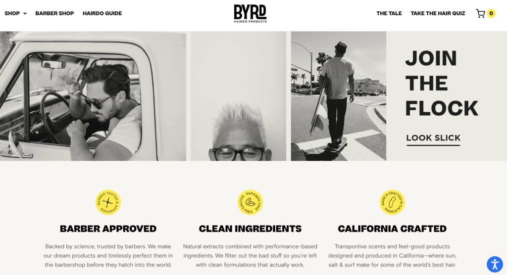
30. Byrd Hairdo
Who doesn’t want to look handsome and cool? Most essential, have a pleasant purchasing experience. We all know that most guys prefer to avoid lengthy shopping expeditions, in-person or online! That’s why Byrd Hairdo’s luxurious bath and hair products appeal to consumers who appreciate a simple, efficient, and quick online shopping experience.
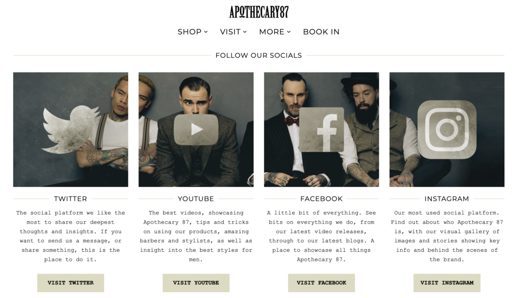
31. Apothecary 87
Apothecary 87 is a men’s grooming business with beard and skin care products that will give them vigor, volume, and an unmistakable smoothness. This rugged, rustic, and genuine nature was reflected in the company’s choice of a classic beauty website design that fully displays the objects and their personality.
This one of the best skin care websites has an intense vintage atmosphere with a monochrome backdrop and retro graphics, ensuring the most refined buyer’s experience. Both browsing the shop and analyzing its layout is enjoyable. Thanks to Instagram integration, users may look for essential items directly from their social network account server; a more conventional approach is also accessible.
32. Hudson Made
Hudson Made thinks that our inherent beauty is harmonious with the environment. Therefore, their products are 100 percent natural. The firm is concerned not only with the advantages of its products for the body and skin but also with being environmentally friendly. This creates a lasting brand image and a pleasant impression while browsing its product categories.
White space is used well on the site, between lines of text and different sections for users to navigate more simpler. In addition, the photos of the products are also simple and in sync, which makes them easier to follow.
33. INH Hair
On the top of its site devoted to ponytails, they announce proudly, “The #1 best-selling ponytail extensions in North America.” By telling customers this, they increase the credibility of their brand and product and make it easier for a customer to buy one of INH Hair’s ponytails.
INH Hair offers a Gorgias-powered live chat support widget on the bottom right of the website. You can ask questions or obtain help since the live chat function remains in the exact location from page to page, whether looking at extensions, style tools, or a particular product.
34. Yukie Natori New York
Yukie Natori New York (YNNY) demonstrates that simplicity can be exciting. Among the best beauty websites on this list, YNNY has a great site.
YNNY uses its user-interactive hero banner, which creates a water-like ripple effect when the mouse is moved over it. Rather than the standard horizontal menu, which is used by the vast majority of websites, YNNY has a hamburger menu.
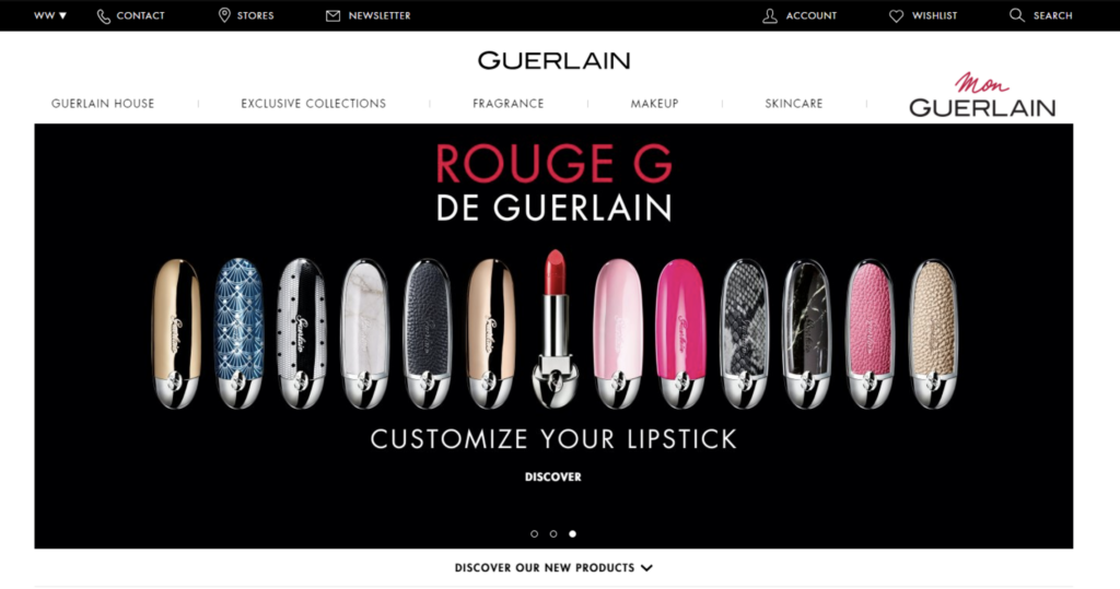
35. Guerlain
Although Guerlain is a leader in its field, its website lacks many products. The product pages have more than just good pictures and basic information; you can also find helpful videos, similar things, how to use them, and a menu for social media. Everything is made to provide a complete experience on-site.
This design has a moody feel to it because of the dark background, simple layout, and large CTAs. This adds a touch of luxury that is both grand and powerful. It makes you feel like buying cosmetics that will make you feel good, which sets the stage for a great buying experience.
Try FREE Magezon Page Builder!
Easily create your engaging Magento pages in any style whenever you want without relying on developers or designers, just by drag & drop.
9 Helpful Tips to Level Up Your Beauty Website
Visuality
Visual Hierarchy
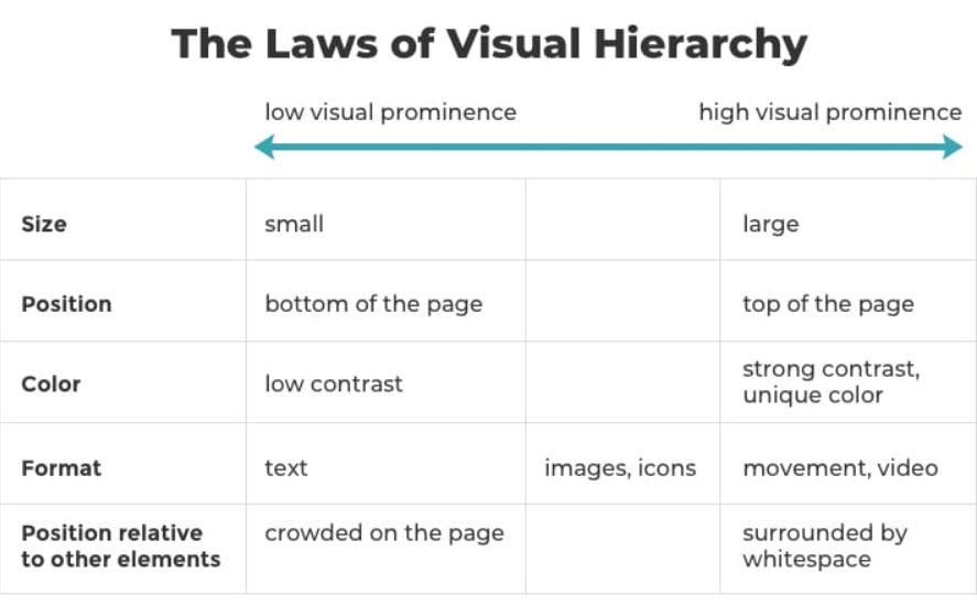
The website layout includes positioning, proportions, aesthetics, and contrast. A skilled designer uses visual hierarchy first to draw viewers’ attention to the most crucial parts or sections. When everything is combined, their influence is multiplied. A sizable video will be visible to everyone on the page’s top. Low-contrast text accompanied by graphics won’t be easy to read for many individuals.
Visual hierarchy is why your eyes follow a precise route on every website. When utilized purposefully, it draws the visitor’s attention to a call to action via a succession of messages.
Hierarchy is an important design rule that assists in clearly and effectively presenting your beauty items. If you apply hierarchy appropriately, you can focus site users’ attention on certain page pieces in order of importance, starting with the most crucial thing.
The following are the primary components of visual hierarchy:
- Size and weight: Enlarge and make your most significant assets more obvious, such as your business name and logo. Readers are naturally drawn to huge, bold headlines before going on to smaller paragraphs.
- Element positioning: Use a suitable website layout to guide your visitors’ attention appropriately. You might, for example, add an essential call-to-action button in the middle of the screen or your logo in the header.
Stripes and grid layouts are practical web design components that can assist you in creating a solid visual hierarchy.
Images
Concrete examples are more effective than vague promises.
Most beauty websites promise to make customers appear excellent. However, pictures of your work or people using your beauty products speak louder. Customers will share if you post images that showcase your brand’s particular aesthetic. As a result, you will acquire and retain more consumers.
Include photographs on your website that demonstrate your talent and flair. Show prospects that they can rely on you to make them appear fantastic.
- Make a photo album of your favorite manicures, hair color customers, or make-up jobs.
- Develop a page with a gallery of your most excellent work.
- Encourage your consumers to use a distinctive hashtag when posting images of themselves using your beauty items on Instagram if you create them. Then, on your website, incorporate a widget automatically showing those photographs.
- Let customers submit photographs in their product reviews.
Maintain Standard Layouts
A website that adheres to web design guidelines is more likely to be appreciated. The most attractive sites are those with high prototypicality and low visual complexity.
The following are examples of “standard” websites with high prototypicality:
- The logo is located in the upper left corner
- The header has a horizontal navigation bar
- Top-level search bar
- Bottom social media icons
- Design for mobile devices
User Experience
Make Sure Your Website Is Simple to Navigate
You definitely will want your users to locate the information they want quickly. Moreover, a gorgeous website with effective navigation supports search engines in indexing your information and considerably enhances the user experience.
- Link the homepage to your logo: Your visitors will anticipate this as a usual practice, so save them a few clicks.
- Observe your menu: Whatever format you use for your menu—traditional horizontal list, mascara menu, or anything else—must be straightforward to access.
- Provide vertical navigation: If your website has a lengthy scroll, like a one-page website, use an anchor menu. Then, with only one click, viewers can access any page on the website. Another option is to utilize the “Back to Top” button, which, no matter where a user is on your website, takes them back to the top of the page.
- Improve your footer: Keep all of your crucial links at the bottom of your website, as it is likely to be the final thing visitors see. This might contain any pertinent links visitors would look for, your social media icons, a condensed version of your menu, and your contact information.
Create Your Website for Quick Load Times
If a web page takes excessive time to load, it is doubtful that anybody will ever read it. When your website takes about 4 to 5 seconds to load, about 20% of visitors will have departed. In addition, the speed at which your website loads affects how well it will do in search engine optimization rankings. Therefore, the simpler it is for people to find, the better.
Maintain a Minimalist Homepage
The best cosmetics website design should immediately offer your key message and brand’s narrative. After all, we seldom read every word on a webpage. Instead, we quickly scan the page for essential words, phrases, and visuals. The less your site visitors have to read, click on, or remember, the better they will be able to consume and evaluate your content.
When studying how to build a beauty website, the following simple site design recommendations will assist you in splitting up your content and producing an attractive and welcoming homepage design:
- Make critical information prominent: Visitors should be able to quickly understand the purpose of your website without having to scroll or click anywhere.
- Give your content space: Whitespace should be used between components. Leaving certain areas empty may make the design look more airy and balanced. Also, use short and quickly understood paragraphs.
- Add images: High-quality media elements, such as beautiful images, vector art, or icons, for instance, will be an excellent replacement for text to convey your message.
- Include a call-to-action (CTA) button on the homepage to nudge site visitors toward the action you want them to perform, such as making a purchase or signing up.
Keep You Website Mobile-Friendly
Visitors should be able to experience your best beauty eCommerce sites, regardless of the device they use to browse. Consider yourself a user while evaluating your site’s mobile version; test each page, user action, and button. Consider removing or condensing certain page elements, such as the menu, to make your mobile website more streamlined and uncluttered.
Social Proof & Customer Relationship
Include Social Proof and Evidence
“Conformity bias” describes the tendency of people to follow the lead of others around them. Therefore, your business will seem more credible if you show that other people have picked you. Adding testimonials is the quickest, most straightforward method. Other forms of social evidence are included below:
- Endorsements from influential people
- Customer feedback on products
- “As seen in…” logos of publications in which your firm has been referenced.
- Social networking widgets display the size of the following Trust seals, including association memberships, security certifications, and awards.
Maintain Customer Connectivity Through Social Media
Beauty companies should interact directly with their target audience on social media platforms to convert them into consumers. Integrating social media helps you accomplish a few important goals, such as expanding the reach and visibility of your company. Additionally, it increases website traffic and allows your social media following to grow.
Moreover, both your website and your social media accounts should work together. This gets the word out about your brand and brings more people to your social media pages.
→ Top popular social media platforms: 17 Most Popular Social Media Platforms In 2021
Conclusion
Beauty website design is essential because it can either help or hurt a brand. And you don’t want your brand to suffer because the design isn’t good. Ensure your beauty website says much about your business and gives people a good time. Try to guess what your customers want and how your products can help solve their problems so they don’t have to waste time figuring it out.
If you are a Magento merchant and don’t know which extension to build your website, consider Page Builder from Magezon. As a trusted Adobe partner, we have satisfied thousands of customers with a vast collection of drag-and-drop extensions, helping you create a high-converting and unique store in minutes.
Don’t take my words for granted; see how your website can be with Magezon Page Builder and what others say about us:


