 Magezon Blog Help Merchants Build Comprehensive eCommerce Websites

Have you ever visited a website looking for something but not knowing how? Then, a search bar is what you need. At first sight, we might not put much effort into a search bar design when making a website. However, it significantly impacts user experience and is a must-have element on content-heavy websites.
This article will explain why you need a website search box and some examples you can use for your site.
Table of contents
Why Is Search Bar Important?
1. Use a Website Search Bar to Find Out What People Are Looking for From You
We all want to know what type of content appeals to our visitors so we can optimize our sites. And a search bar is what helps you with it.
For instance, when I check my Squarespace Analytics and examine the terms visitors have looked up on my website, I see:
- landing page tutorial
- restaurant, law firm website example
- CSS frameworks
In the meantime, it’s good for you to check your search result weekly to know which content should be focused on. This method will help you attract more visitors, increase their time staying on your website, and eventually the conversion rate.
2. Search Bars Make It Easier for Users to Find What They Need
If you have an effective website search bar, then you’ve achieved 2 goals:
- A satisfying user experience.
- More return customers. In other words, it’s more likely to make a customer return if they had a satisfying experience on your website, especially with the search bar, as they know they can find what they need.
3. A Search Bar Helps Keep People on Your Site Longer
Lastly, having a search bar can keep visitors on your site longer. Let’s look at two following cases:
- Situation 1: A visitor arrives at your website, and after giving it a brief check and perhaps a half-scroll, they can’t find what they need. They want an optimized search bar, but there isn’t one. They will use Google, see their desired result somewhere else, leave, and forget your website.
- Situation 2: The same process, but this time, they decide to stay after noticing your search bar. They now take time utilizing it, checking the results, and probably discovering one or two of your new pages.
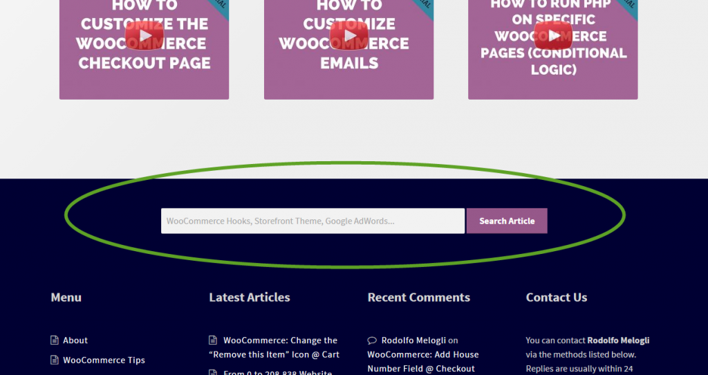
Check out the search bar design guides below to create a better user experience.
15 Search Bar Design Best Practices to Optimize Yours
1. Create a Simple Website Search Bar
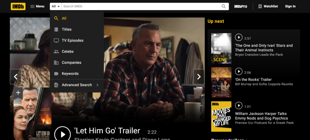
Design a user-friendly search box. Start with a simple one, then give users the ability to use filters or advanced features if necessary. You can look at the IMDb example, which offers visitors various categories of search they may need. If you provide advanced search default, use the dropdown search box to make the bar design look simple, neat, and thoughtful.
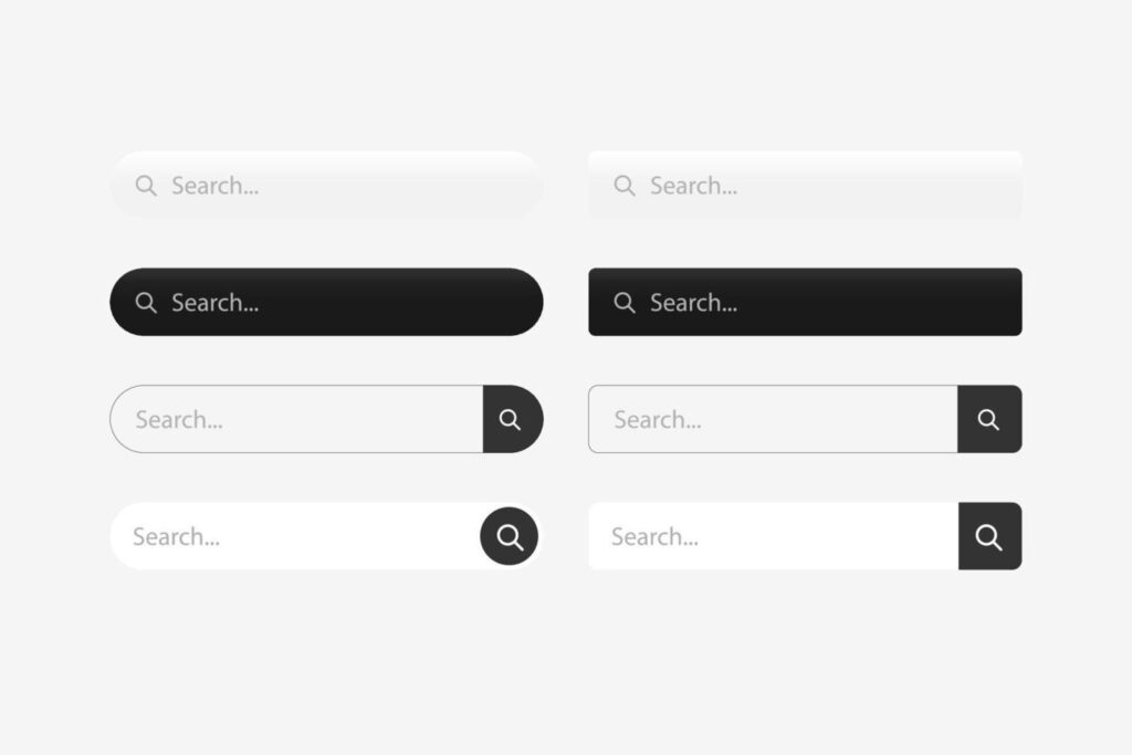
2. Add a Text Box and a Search Button
Most website search bars have two components: a text box where users enter their queries and a search button where users click to start searching. Most frequently, they are arranged on a single line, horizontally adjacent, as search bar examples below:
You might see different ones, but this look is the most common because of its simplicity and accessibility. The search box should be nothing more than a box. You can add background contrast, color, or round the edges, but to help users detect it right away, the text field should only be a length of one line.
Next, add the search button. Your users could become confused without one because it acts as a visual cue to submit an inquiry. Put this button on the right of the input field since it makes sense for those who read left to right. Create simple button text, such as “Search” or a magnifying glass icon.
Additionally, users ought to be able to start a search by either clicking the search button or by pressing “Enter,” “Return,” or “Go” when the search field is in focus (or the text cursor is active inside it).
Some websites will use the expandable search box to spare more space. You won’t see the two typical components at first, but when you click on the magnifying glass icon, the search bar can expand to either the left or right. Look at an example from Panda below.
This search bar design effectively makes the website cleaner, but you should still use it carefully. Some people might have trouble seeing it, which raises interaction costs if users have to click once more to refocus after the text box has been revealed.
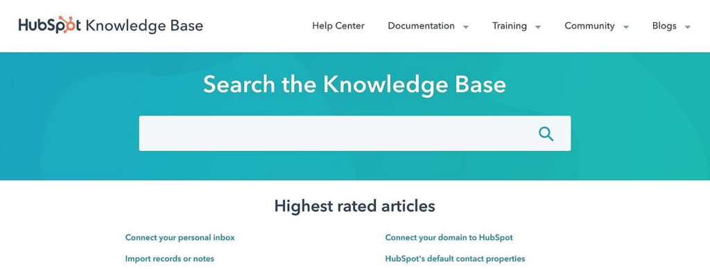
3. Place at a Predictable Location
The search box is typically located in the top-right or top-center of websites to make it noticeable and accessible. If your website displays additional menus, links, or icons in the top right corner, for example, login prompts, settings, or shopping cart icons, then move the search bar further to the left.
On the other hand, avoid placing the search bar at the bottom of the page or tucking it away in a menu. If you must add a website search box to the footer, display it clearly to ensure people do not waste much time and effort looking for it.
If a search box is the primary feature of your website, center it on the page and put it below the header for extra emphasis. As you can see, the HubSpot Knowledge Base site expects most users to arrive with precise, searchable inquiries. Therefore they choose the below search bar design.
4. Include the Search Icon
As icons take up less room and are easier to recognize, you can use them to visually represent the function of buttons and other page elements. When designing your search box, I recommend using the well-known magnifying glass icon; you can add it in various ways.
On the search button:

Inside the search box:
As we saw in the above Panda example, you might put it on a button that conceals or shows the complete search bar. Another example from Time is below:
However, one thing to remember: Many users will assume the magnifying glass outside the search box is a button, so refrain from using this icon if it isn’t clickable.
5. Choose an Appropriate Size
The importance of your website search bar and the question’s average length will determine the text box’s size. If you want your customers to focus mainly on your search bar, adjust the size to make it prominent and centered on the page load. If the bar is in the header, it should be the appropriate size for the other header elements – large enough to be noticed but not so big as to draw undue attention.
Another thing you should pay attention to is the bar’s length. On the one hand, you want your text box to be long enough to display the total questions, allowing them to see and correct typos. On the other hand, the search bar should not take up too much space in the header. In this case, guessing the typical search query’s character length is a good start. Do people only type a few words or complete questions? In the second case, you should lengthen your search box or make it click-to-expand.

Try FREE Magezon Page Builder!
Easily create your engaging Magento pages in any style whenever you want without relying on developers or designers, just by drag & drop.
6. Consider Including Autocomplete
Another approach for optimizing website search bars is the autocomplete search box. In other words, as the user types, autocomplete suggests ideas in the menu below. This feature helps users save time since they don’t have to type the entire phrase.
In addition, predictions can be adjusted to your site’s specific content, recommending users more products with the exact keywords they’re looking for. As a result, autocomplete shows what visitors are searching exactly, which can help boost the user experience for your website.
However, too many suggestions may overwhelm your users. We suggest using one to 10 proposals, depending on your website’s size and the amount of information that has been indexed. To make your interface more accessible, either let users click the suggestion or let them navigate the list by the arrow buttons and choose an option with the “Enter” or “Return” ones.
Look at an example of autocomplete on Nike’s eCommerce search bar below.
7. Tolerate and Autocorrect Typos
Spelling mistakes when searching are inevitable. Therefore, the design should be able to produce the desired results despite mistakes, correct errors where possible or necessary, and recommend alternatives.
8. Hide Advanced Choices
It’s a good idea to hide complex search options like categories, filters, and exact matching if you guess users are not technology-savvy. By doing so, the UI remains clean and accessible. If you must include advanced choices, consider putting them in a hidden menu that emerges when the search field is selected or offers a nearby link to an “Advanced search” page.
9. Mobile-Friendly Design
The increase of smartphones and tablets has also affected search bar UI design. According to W3C, there are two relevant accessibility guidelines.
- Ensure touch targets have minimum dimensions of 9 millimeters in height and width.
- Ensure a small amount of inactive area surrounds the minimal touch targets.
These rules apply to all touchscreen devices. Additionally, due to the limited space, it is more appropriate to conceal your whole search bar behind a prominent search glass icon and only expose it on click.
10. Make Use of Google’s Resources
It’s simple to allow Google Search on your website with the help of a portal called Google Custom Search. The entire integration procedure is cost-free, and you can also make money because ads will be displayed with results by default. Google enables you to customize your search bar design and supports more website content.
11. Include Options for CMS and Other Add-ons
You can modify your search settings if you use WordPress as your content management system or run your business on a hosted eCommerce platform. You may quickly seek extra plugins and add-ons that will let you add more features to your search engine.
- WordPress has a SearchWP plugin that automatically indexes your content.
- Bigcommerce has a dedicated website with options for filtering and faceting.
- Shopify offers the Searchify plugin, which adds an Autocomplete search bar design to your website.
12. Use Placeholder Text to Direct Users’ Searches
Use placeholder text such as a sample search query to assist visitors with different searches they can perform on your website. This is beneficial for users to look for the information on a page with many contents. Reduce cognitive load by keeping the length of your placeholder text to a minimum and ensuring there is enough contrast for it to be readable.
The below search bar design from the HBO website uses placeholder text to guide users on what they can search for movie titles, people, or characters.

In addition, you can also add instructions or examples of content that visitors can find inside the search text box.
13. Place Your Search Bar on Each Page
Make sure users can access your search box everywhere on your website. Consider when your visitors are on the 404 or other error pages; place it there. The search bar on every page of your site also improves the user experience as they don’t need to go back to the homepage whenever they need it.
14. Design a Sticky Search Bar
This is all about accessibility. An always-available search bar ensures users don’t have to scroll back up a page as the search is at the top. It is also an effective way to help users stay focused while navigating your website.
According to a study by Smashing Magazine, sticky bars are 22% quicker to navigate and help users save an average of 36 seconds throughout a five-minute visit.
Additionally, the study discovers that all participants like sticky navigation. Most of the time, they don’t know the difference; they just know they prefer the one with the sticky search bar.
Here’s an example of a sticky navigation bar, Bodybuilding website.
As you can see, many products are on the front page. After navigating the page, the sticky search bar is always in your eyesight if there isn’t what you’ve wanted.
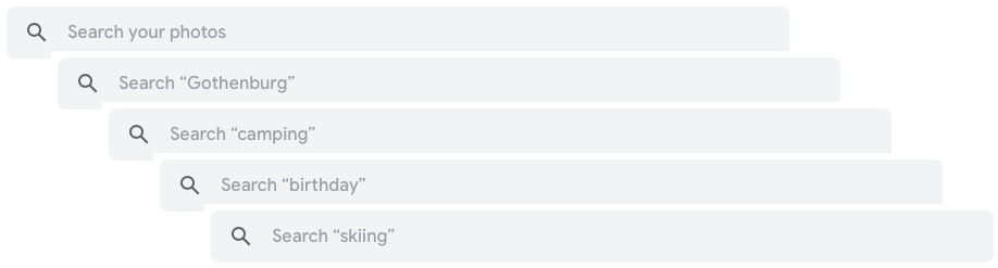
15. Keep the Most Recent Search in the Search Bar
Users can save time searching if they can immediately return to the search they made and modify it if it’s not exactly what they are looking for. Besides, it’s a way to save page load data and increase page load speed.
As you can see in the video below, pay attention to the search box when I click on it. Do you see the suggestions appear? Those are the searches I made before, and the website has memorized them.
Concluding
A simple and effective search bar is essential in building a website since it aids people in finding what they need and keeping users on your page longer. After this article, we hope you get inspiration from the examples and helpful advice from the guides. Apply those practices to optimize your search bars for websites, and leave a comment below to let us know how they help you.


