 Magezon Blog Help Merchants Build Comprehensive eCommerce Websites

A landing page is an effective tool for small/medium enterprises, startups, or website owners in their online advertising campaigns. However, many landing forms fail to generate leads, as the average conversion rate across all industries is around 2%, while a better conversion rate can be as high as 11%. This inefficient performance probably stems from the inappropriate landing page form design.
If you are stuck with it, this article can save you with 20+ valuable best practices that helps boost the conversion rate of your landing page forms.
Table of Contents
Basic Knowledge of Lead Generation Forms
Usually, a landing page form consists of the following elements:
1. Structure
A lead generation form’s structure encompasses the input fields’ order, overall appearance (including font size, text color, and white space), the form’s layout, and transitional elements (placement of CTA, sliding, pop-up, or stagnant).
2. Input Fields
Input fields are crucial for users to fill in their information or select from the provided option list in every landing page form design. Some input fields you often see are text, password, drop-down, slider, and checkbox.
3. Field Labels
Field labels let users know what information they should fill in each input field. For example, if you want to ask for customers’ emails, label the field “email.”
4. Assistance
For some landing pages, users might need explanations, guidance, or pop-up tips to assist them in filling out the form. If your landing page forms are greatly well-perform with this support, you leave a professional and helpful impression on your visitors.
→ Different types of landing pages: 19 Types of Landing Page (+ How to Choose One)
5. Validation
A validation field helps you auto-check the users’ input information to see if it is valid or not. For example, you can quickly check the validation of an email address filled out by a user by checking the email domain or format. Users can not submit their form even though it’s filled out if their email address cannot be validated.
6. Call-to-Action
Call-to-action, shortened to CTA, or an action button, is the button at the end of a form, encouraging users to submit the form.
→ Effective CTA phrases: 100 Last-Minute Call-to-Action Phrases to Double Your Conversion
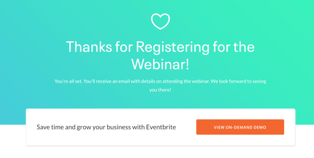
7. Thank You Message
When a user finishes inputting all the necessary information correctly and clicks the CTA, a plain-text message will automatically appear: “Thanks for completing our form.” This is a straightforward and effective way to express gratitude instead of making a whole thank you page. You can also include further instructions guiding users to complete a process, like confirming their email address to activate an account.
24 Best Practices to Create High-Converting Landing Page Forms
1. Write Clear Form Title
Website owners usually forget this form of best practice though it is helpful in many ways. A clear and simple title shows what users will get once they hit the submit button and why they should fill out their information. This is also crucial in determining whether your landing page can convert.
2. Multi-Step Forms Instead of Single-Step Forms
According to many surveys across various industries with different conversion types, multi-step has outperformed single-step forms as they look less intimidating One survey by The UK Government’s Digital Service has concluded that straightforward multi-step forms provide the best user experience and conversion rates.
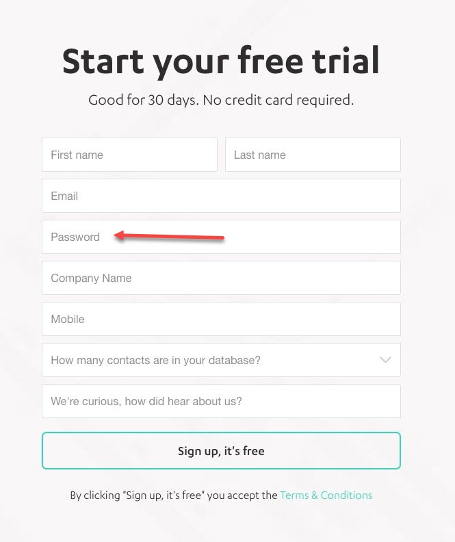
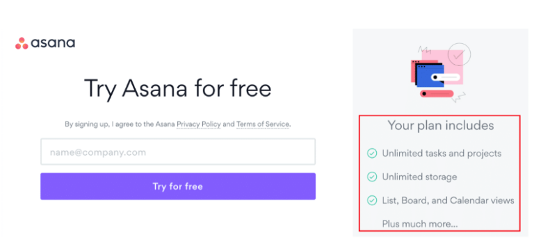
3. Shorter Forms for Secondary Conversions
Short forms are preferred for secondary conversions. Such actions as searches, email sign-ups, or general inquiries should always be ready and friendly for users. The image below illustrates a two-field form design for its free trial CTA. Users are then straight to the dashboard to get started with their free trial without interruption.

4. Limit the Number of Fields Users Need to Fill in
Simple is the best. In other words, fewer fields will help users feel less overwhelmed and annoyed. Always remember that less is more; only ask the most essential questions, such as first name, email address, or phone number (if you need to ask for this, let your users know why and what you will do with it). Don’t be greedy and include too much in the fields.
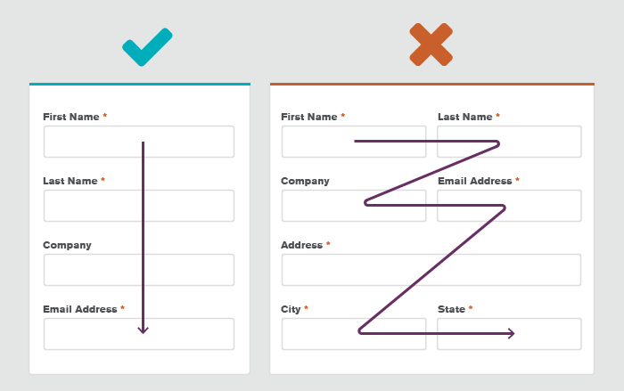
5. Organize Your Fields From Simple to Complex
When organizing your fields, always go from the easiest to the most difficult questions. Start by asking about their first and last name. If a complex question like the reason they look for your service or their business goals is placed right at the beginning, users are unlikely to fill in and continue with your opt-in landing page.
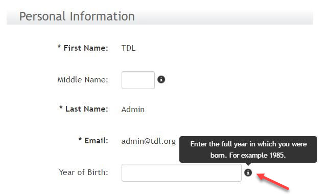
6. Make Use of the Info Boxes for Potential Questions
The info boxes are famous for landing page forms with input fields that may arouse questions. If the users don’t understand what information they need to put in or feel skeptical about it, they may skip the whole form.
7. Allow More Than One Answer in the Checkbox
Allowing multiple-choice or open fields when using checkboxes in forms makes questions with more than one answer seem easier to handle. This is especially common for survey-type forms or questions in terms of ethnicity.
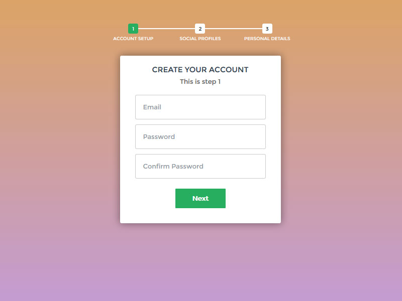
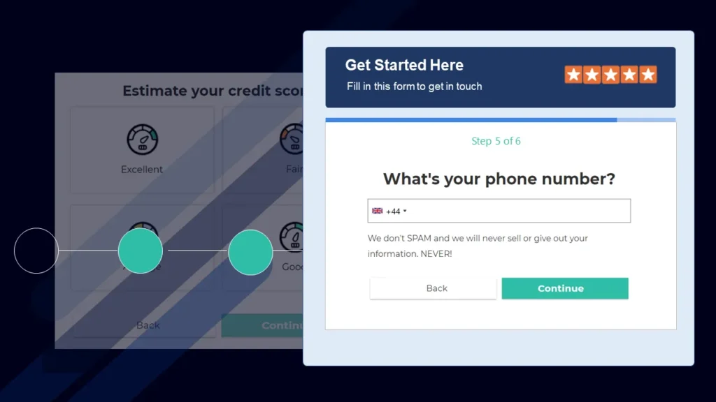
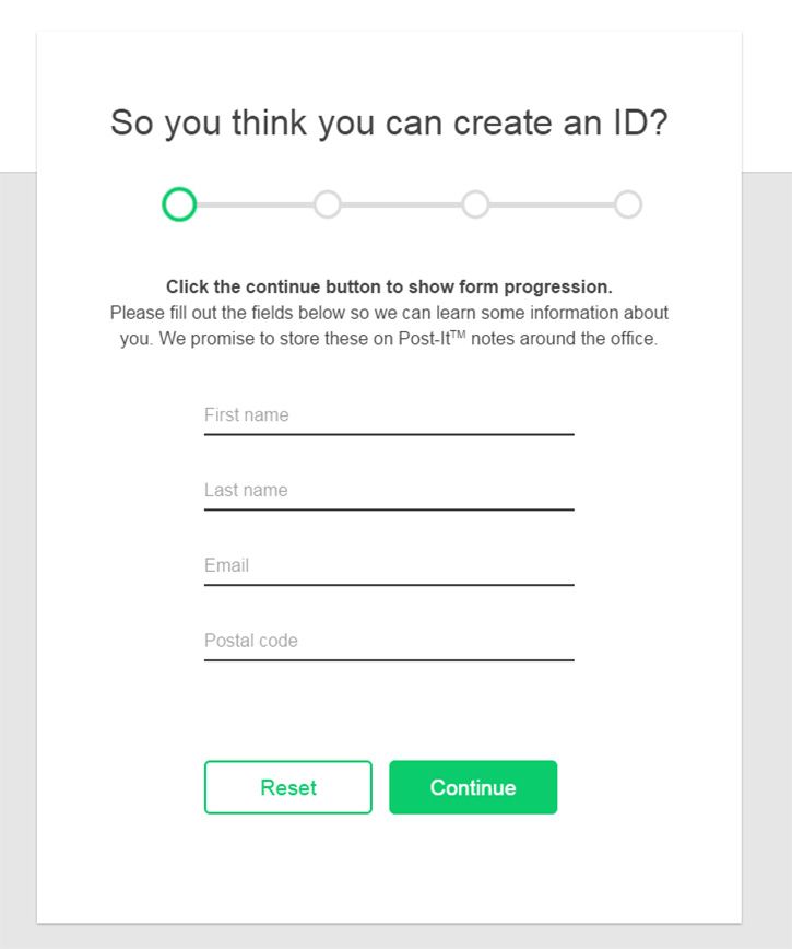
8. Display Form Filling Process by Bars
Users may feel tired, lost, and unmotivated if your form is too long and has many pages. This can also lead to a lower conversion rate and waste your design time. In this case, implementing a tool that notifies your users of their progress is necessary.
9. Reduce Typing
Another form of field best practice is less typing for users. Those who choose to fill out the form on mobile may find it more accessible with the assistance of sliders, buttons, and other touch elements. Not asking people to input the same information (like a password or email address) is essential, but if you have to do so, consider auto-filling. Eventually, your users will be much happier using your website.
10. Use Single-Column Layouts
Technically, single-column layouts are essential as it provides users with an easy-to-interpret and less intimidating look. Let’s compare the two following form designs below. Though there’s nothing so special in both of them, do you notice that the first one with one column looks more appealing to start filling out? Besides the visual factor, single-column designs are more mobile-friendly, especially in this era where smartphones are the most-used device.
11. Design for Mobile First
As I said before, smartphones are the most common device nowadays; having a responsive landing page form design is crucial. However, that’s not all. It also requires using correct HTML5 markup so that user keyboards pop up in the valid format for typing words, numbers, and other input types. Besides, other mobile features like cameras, geolocation, and touch screens should be available. For example, instead of making users type their card information, allow them to simply take a picture.
12. Make the Most out of Contrast
Landing page forms with good contrast could support users throughout the form-filling process and reduce users’ distractions from advertisements or other elements on the page, especially when your users are outside or in highly bright places where low-contrast designs are almost impossible to use.
13. Redesign Before Removing Unnecessary Fields
One of the principles for designing forms is to eliminate redundant and unnecessary fields; however, ensure you have tried redesigning your form before doing so. You can simply reword your labels or change them to a multi-step format. The shorter form with changes in input field labels outperformed the original version by almost 20% of the conversion rate.

Try FREE Magezon Page Builder!
Easily create your engaging Magento pages in any style whenever you want without relying on developers or designers, just by drag & drop.
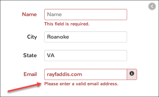
14. Go Easy on the Validation
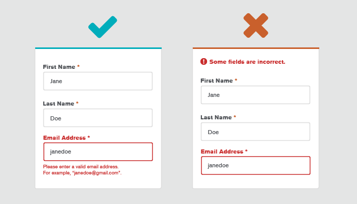
Form validation is helpful since it ensures users fill out the required information correctly and lets you know if they are humans or not. It can also help prevent your servers from being attacked and malicious code. This can be done out of users’ sight, in the background with red color, inline, and goes with feedback as they type (as in the picture above.)
Though validation is helpful and necessary, it doesn’t need to be so strict to annoy your users. For example, typing +1 instead of 0 for phone numbers is acceptable.
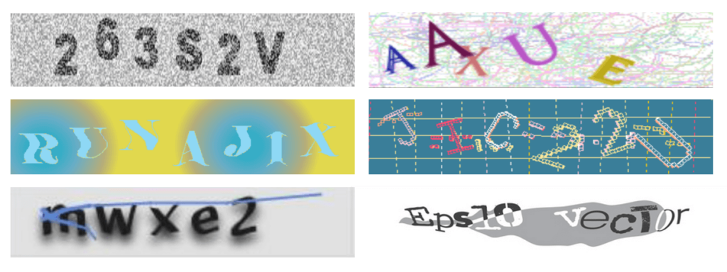
15. Replace CAPTCHAs With Other Better Approaches
CAPTCHAs are used for spam prevention; however, most users don’t like them. Hence, validation can be used behind the scenes instead of CAPTCHAs to rule out spam. One common trick for landing page form design is using hidden fields that spam bots can detect (but users cannot) and then blocking submission if the hidden area is completed.
16. Have a Perfect Call to Action (CTA)
One of the best practices to create the most appealing call to action is to make it match your users’ intentions. In other words, identify their problems and offer them a straightforward solution that is too good to ignore. On the other hand, tricks about time and promotion always work perfectly on CTA. For example, instead of “Sign up,” use “Sign up today and get 40% off” as a bigger motivation for them to complete your form. The example below shows the excellent use of an action-oriented CTA to get more email sign-ups:

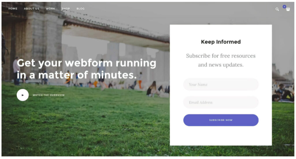
17. Use the First Person in CTA
First-person CTA is the technique when you write the CTA from the reader’s point of view. For example, you can change “your” in “book your table” to “my.” Likewise, if you wish to increase the number of email subscribers, a text like “Add me to the list” is much better than a traditional CTA “Subscribe to our newsletter.”
The following image shows a great example of using first-person CTA.
18. Hero Forms Come After a Click of CTA Buttons
Users may freak out if a form keeps popping up when they just intend to have a quick look at the website. Instead, try hiding your hero form behind an appealing CTA button.
19. Know Where to Send Users Next
At the end of your landing page form, come up with an idea of where to send your users next, depending on if you want them to confirm their account sign-up, get started with their free trial, or put them on the list for the earliest conversion. An appealing copy and CTA button will do the magic to help you gain more users’ information and uplift the conversion rate after they finish the form.
20. Show Benefits Along With Your Form
To persuade visitors to start filling out your landing page forms, put the benefits of the products or services nearby, as it can raise your users’ excitement and increase the chance they will become your actual customers.
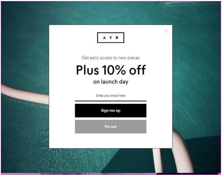
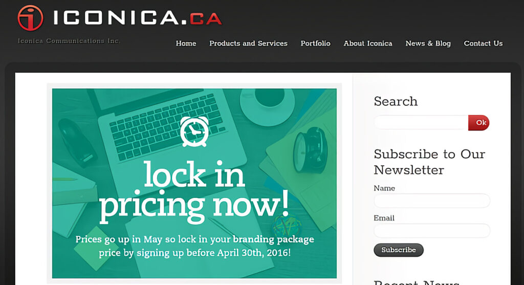
21. Use Fomo in Your Landing Page Form
FOMO, standing for “Fear of Missing out,” has the magic to persuade users to take action faster as people all hate to miss offers. Therefore, if you can use FOMO cleverly, you can increase your sales faster and better.
The example below shows the use of FOMO in a landing page contact form. By using a hard discount to ignore, “Complete your checkout now and get 60% off”, the FOMO successfully persuades many users to complete it.
22. Leverage A/B Testing
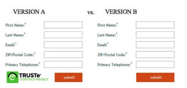
An A/B test is another best practice to see which version of your landing page gains more conversions. Accordingly, you should create two versions when running ads, test, and choose the better. By doing this, you can increase conversions without raising your ad budget. For example, a study published by Unbounce presents two different templates of a landing page form. The first form with a security seal gained 12.6% more conversion than the second one, which does not have a seal.
23. Use a Form Analytics Tool
A form analytics tool is used to see whether your form is performing well or not. Google Analytics can show how many people don’t finish your forms but not explain why, but a dedicated tool will show you which fields need improvement.
Conclusion
Remember that designing a landing page form is about making it user-friendly for users to complete without difficulties. One valuable and well-performed form should work best to elevate the conversion rate by having a beautiful layout template with progress bars, a clear title, appropriate order of questions, strict enough validation for users, etc., and most importantly, an engaging copy and CTA button.
Following form best practices will help you move closer to your marketing goal of having higher conversion rates.


