 Magezon Blog Help Merchants Build Comprehensive eCommerce Websites

As eCommerce store owners and web admins, you surely understand the importance of web forms in online interactions between you and your potential customers. Forms serve various different purposes — helping customers make contact with you, submit RMA, review your products, or subscribe to newsletters.
However, many users don’t actually complete these forms, which is mostly due to poor design. Some website forms are too long, confusing, or ask uncomfortable questions. Some have non-mobile-friendly design layouts.
So, if your forms fail to convert, this article can help. After reading it, you’ll know how to design web forms that users can complete quickly and without trouble. Although there is no one-size-fits-all solution for every situation, the following design principles could greatly impact your form, user experience, and ultimately conversions.
Table of contents
- A. Best practices to design web forms that convert
- B. Test the effectiveness of your web forms
- I. Verify all form input fields and variables
- II. Test usability and access
- III. Test automation and integrations
- IV. Assess the mobile compatibility of your form
- V. Evaluate and optimize your form for popular web browsers
- VI. Perform user testing before launching the form
- VII. Conduct A/B testing on your form post-launch
- C. Magento Blue Form Builder: Creating versatile forms with ease
- The bottom line…
A. Best practices to design web forms that convert
Designing a user-friendly web form is all about making it easy for users to understand and complete. To help you achieve this, we have gathered valuable best practices for creating forms with a great user experience and an intuitive interface. Depending on your form type and length, you can pick and choose the tips that work best for you.
I. Form layout
1. Place the form in the wide layout
When users interact with a form, it becomes the focal point. Therefore, the form’s placement within the web page should reflect its significance. For instance, even a basic signup form deserves visual prominence and a central position in the overall design. Avoid squeezing it into a corner or relegating it to the footer as an afterthought. Give your form the attention it deserves!
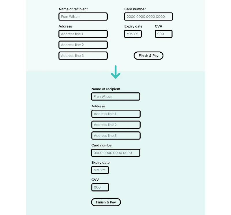
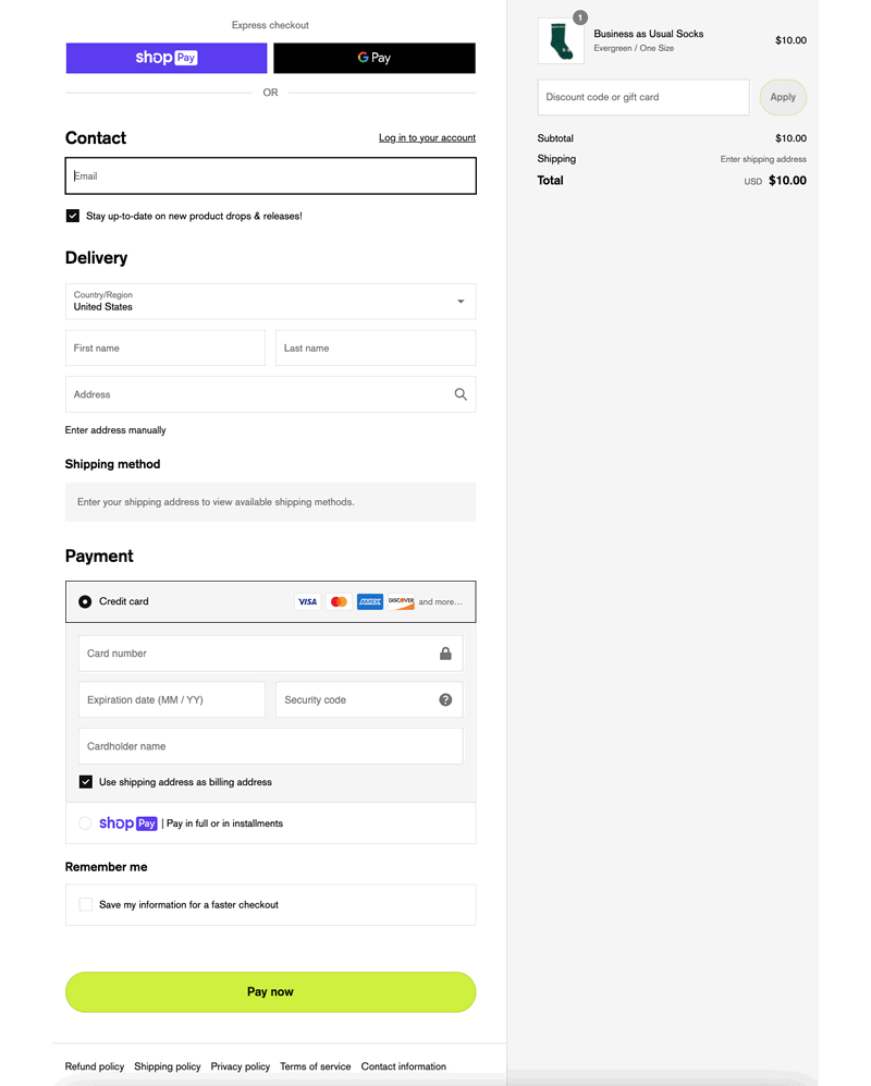
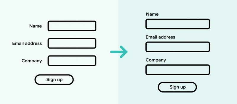
2. Stick to single-column layouts
While a one-column layout may appear less visually appealing, Baymard’s study has shown that it leads to better user comprehension, reduces errors, and increases conversion rates. The reason behind this is quite simple: in a one-column layout, users have fewer chances to overlook input fields. Their gaze can effortlessly follow a smooth vertical path rather than navigating a complex zigzag pattern.
When users miss a field, it significantly hampers completion time and increases frustration. It disrupts their sense of progress through the form, as they’re forced to backtrack and fill in previously overlooked information. Such instances often drive users to abandon the form altogether.
And if creating a single column is not feasible, you can consider grouping fields and placing them in a logical top-down order to reduce confusion.
3. Split up long forms into multiple steps
Long forms can overwhelm your visitors. Hence, you can use multi-step forms that break down the fields into smaller sections. This way, users don’t have to submit all their information at once, helping them feel more comfortable to complete.

II. Input fields
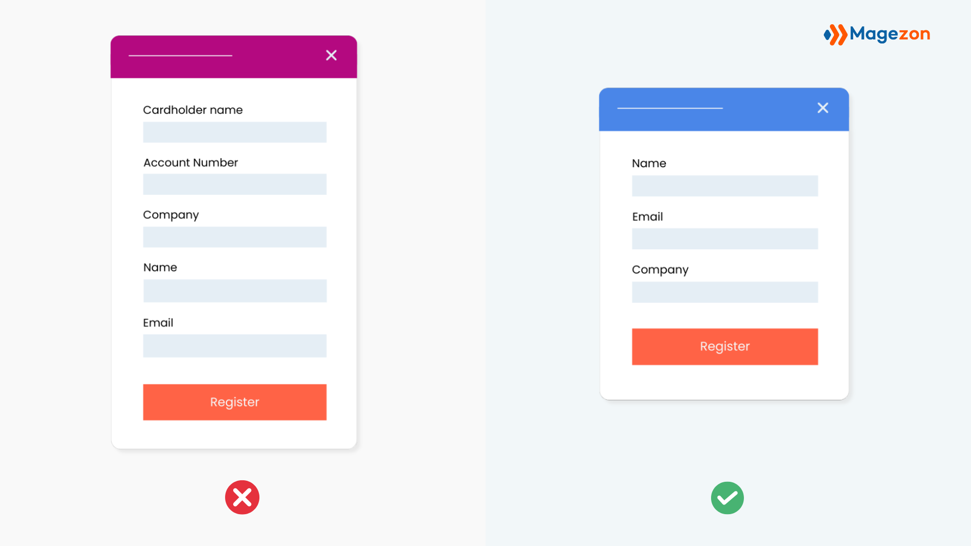
4. Group related fields together
When deciding on the order of your form fields, organizing them in a way that makes sense and follows a logical and thematic structure is essential.
For instance, if you need to collect various contact information such as email, telephone, and address, it’s best to group these fields together rather than scattering them throughout the form. To illustrate, imagine an account creation form with three sections: “Personal information,” “Payment details,” and “Marketing preferences.”
Once you have determined these logical groups of information, it’s essential to also care about their look. This can be achieved simply by inserting some space between the groups. Ideally, you may include section headings to clarify the purpose of each section.
5. Arrange form fields from easy to difficult
To create a user-friendly form, it’s best to begin with the simplest and least time-consuming questions like name and email, and these fields are usually quick and easy to fill out. By doing so, your visitors can get a sense of progress and feel more inclined to continue since they’ve already made a small commitment.
On the other hand, if the first form field presents a challenge, such as requiring credit card details that may not be readily available, it could discourage users from proceeding and potentially lead them to abandon the form.
6. Minimize the number of required fields
Next, let’s make filling out the form a breeze for users by asking only what is necessary. This way, we can minimize the number of fields and ensure quick completion of the form. Each additional field increases the chances of users opting out of filling out the form.
To illustrate this point – an interesting example is Expedia, which saved approximately $12 Million simply by deleting one field from their web form.
7. Use auto-fill browsers for convenience
Filling out form fields has become easier thanks to the autofill features available in popular browsers like Google Chrome and Bing. These features conveniently retrieve past information entered on a visitor’s device, such as their first and last name.
This way, you can save visitors’ time while ensuring that only accurate information is submitted. As a result, your visitors will appreciate not having to manually enter every piece of information.
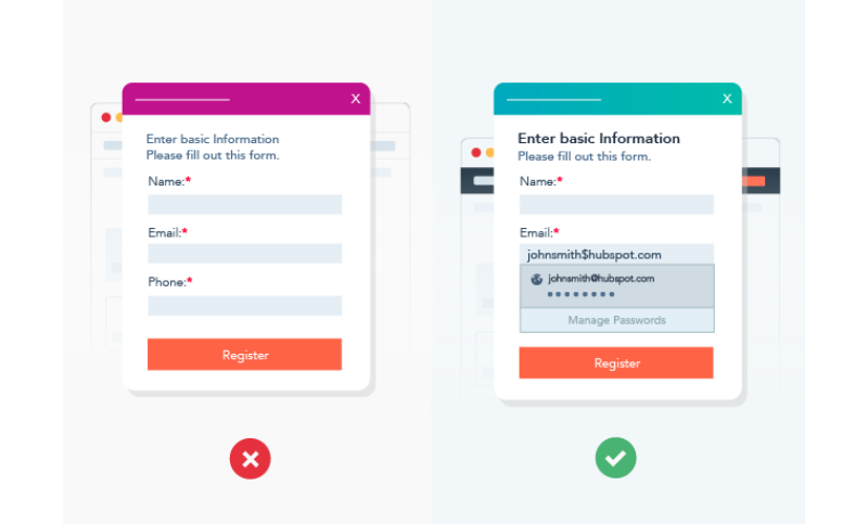
This feature is particularly useful when users fill out your forms on small device screen like mobile. Tasks like entering shipping or payment details will become easier for those who don’t have small fingers or are not proficient texters.
| You may also be interested: 15 UX Guidelines to Create Sign-up Forms That Convert 20+ Best Practices to Create High-Converting Landing Page Forms |
8. Make use of smart defaults
Using smart defaults can significantly enhance the speed and accuracy of form completion, making it a fantastic option. These defaults leverage user information, such as their current location, to automatically populate fields like city or town.
6. Arrange lists, checkboxes, and radio buttons in a column
Place lists, checkboxes, and radio buttons in a vertical layout. This helps guide the user’s eye in a straight line and creates a feeling of steady advancement. Additionally, it reduces the chances of users overlooking any options in a list.
7. Pay attention to placeholder text
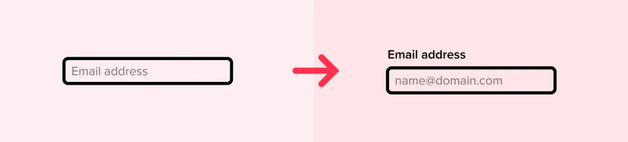
Placeholder text is the text you see inside a text entry field before interacting with it. However, there are several issues with using placeholder text as labels, including:
- Placeholder text is often displayed in a faded color, which makes it less inclusive and accessible.
- Visually impaired users rely on screen readers, but these tools typically don’t read out placeholder text, rendering your form unusable for them.
- Once you select the field and start typing, the placeholder text disappears, causing users to forget what they are supposed to enter potentially.
- Placeholder text should ideally assist with data entry format, but it cannot fulfill this purpose when used as a label.
III. Field labels
8. Put labels above form elements, not beside them
In one-column layouts, form labels are often positioned to the left of the input area. However, this can make the user’s eye follow a Z-shaped path instead of a straightforward vertical one. As a result, this could make the form appear more complex, increase fatigue, and create a sense of slowness.
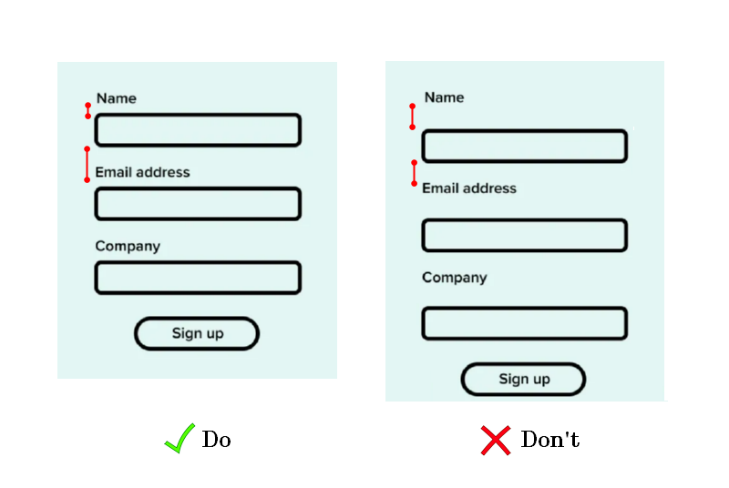
9. Group labels with their inputs
When the label and field are spaced too far apart, it can be confusing and unclear what information should be entered. Hence, bring labels and inputs closer together to help establish their connection and minimize confusion. This design principle is rooted in Gestalt psychology, which explores how our brains perceive objects as cohesive entities rather than separate parts.
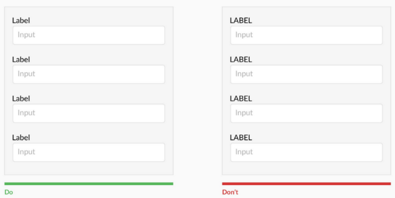
10. Avoid all caps and use clear labels
It’s a great idea to avoid using capital letters in website form designs. Such text is harder to read and takes longer for our minds to process. Reading speed decreases by 13 to 20% when text is written in all capitals. Furthermore, all-caps labels can create the impression of “shouting” at users.
11. Left-align labels for consistency
Remember to position all the text in your form on the left side, including labels. This will make reading and filling out easier and more comfortable for your visitors.
Researchers from CSS Tricks discovered that aligning the text on the left side, above the form field box, reduces the time required to complete the form. This alignment makes it easier for users to read the form since their eyes don’t have to jump around the page as much.
IV. Usability and validation
12. Confirm user progress with inline validation
Inline form validation involves reviewing visitors’ information in real time as they progress through a form. An error message will appear below or inside the form field if incorrect information is entered, like an invalid email address or credit card number. This message notifies visitors of their mistake, allowing them to correct it and proceed to the next question swiftly.
13. Validate user input in real time
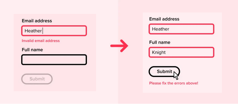
Validating the user’s data entry in real-time is preferable to waiting until they attempt to submit the form or move forward. This approach makes sense as it allows for addressing errors while the user is still focused on the information. Additionally, displaying errors upon form submission interrupts user progress and increases their chances of abandoning the process instead of rectifying the error.
Moreover, when applicable, the system should provide informative messages that assist users in pinpointing the error. Error messages like “Insufficient number of digits” are much more helpful in guiding users than the ones like “Please fix the errors.”
14. Help users fix errors with clear and positive error messages
Avoid assuming that error messages are self-explanatory. For instance, simply stating “invalid data” next to a credit card number won’t effectively assist the user in identifying the issue. Instead, use a more helpful message, such as “It seems like you missed a number,” to provide clearer guidance.
Plus, your error message should be positive and polite. When users encounter an error message, they may already feel frustrated. It’s essential to avoid blaming them. Instead, strive for a light-hearted, polite tone that helps users feel supported and understood.
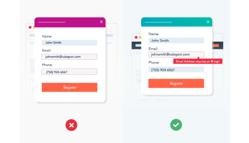
Suppose the email address they entered is incorrect. In that case, it’s better to use a helpful tone by saying something like, “Please enter a valid email address using the following format: [email protected],” rather than directly pointing out the user’s mistake with a message like, “You entered your email incorrectly.”
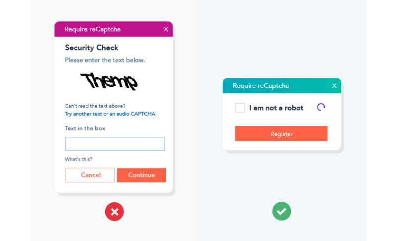
15. Use reCAPTCHAs instead of CAPTCHAs
Have you ever completed a form and seen a difficult-to-read image with a string of numbers and letters? Then you would be asked to enter those characters into a form field to prove that you are “not a robot.”
In that case, you’ve filled out a CAPTCHA, a helpful tool to identify whether an online user is a human or a bot. However, completing CAPTCHAs is sometimes tricky, making users impatient and frustrated. That’s why we recommend implementing reCAPTCHAs instead. Not only do they spot SPAM and bots, but reCAPTCHAs also enable visitors to simply check the “I’m not a robot” box before submitting the form.
16. Avoid disabling the submit button
Some web forms disable the submit button until all required fields are filled out. However, this approach has its drawbacks. It can be challenging for people with accessibility needs who lack feedback when clicking the button.
For example, when a form is auto-filled or a password is pasted, the form may mistakenly think that no inputs have been touched. Consequently, the “Login” button remains disabled until a character is manually added and removed. And this problem is common on mobile browsers.
On the other hand, keeping the button enabled allows for highlighting any errors on the form upon submission. The use of disabled buttons is acceptable only in cases where there is a single form field and no other way to proceed.

17. Confirm successful submission
After the user submits a form, don’t forget to confirm that the submission was successful. Thanks to it, they can know they’ve finished the form.

V. CTA button
The call to action (CTA) plays a major role in a website form. All the other elements on the form work together to direct visitors toward the CTA button for conversion – the ultimate goal of every web form. Hence, you can’t miss the basic principles below to design CTAs that increase your form conversions.
18. Focus on how the CTA button looks
a. CTA button size
If your CTA is too small, people might not notice it. On the other hand, if your CTA is too big, it may overwhelm the form design and gives users an impression of being quite aggressive. So, looking at the whole page before choosing the size for your CTA is essential. Ensure the button on your form is big enough to both balance the entire design and catch visitors’ eye.
Here’s an example of a CTA button size that is suitable for all eyes. It’s neither too big nor too small.
b. The shape of CTA buttons
You may have noticed that most online CTAs (call-to-action) and buttons are rectangular. While people still use circular, square, or other shapes for CTA buttons, rectangles dominate the scene. But why? Because they provide a sense of comfort, stability, and reliability, making us feel at ease.
However, it’s been scientifically proven that humans are naturally drawn to curves. Round shapes are aesthetically more pleasing to our eyes than sharp, angular ones. In addition, circles evoke feelings of tranquility, wholeness, and balance. Putting that all together, the most effective shape for CTA buttons should be a rectangle with rounded corners. This mixed shape is favored among numerous marketers and web admins.
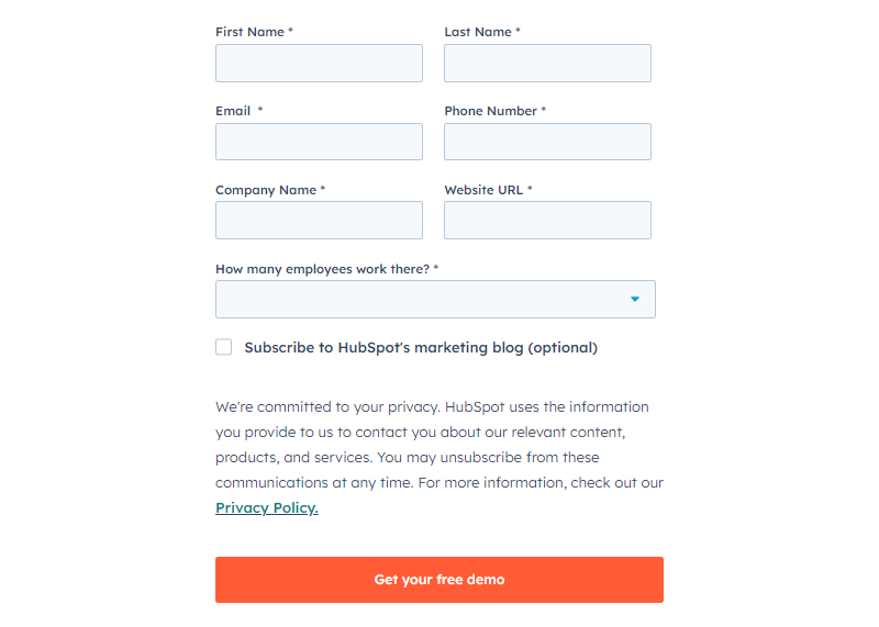
c. Button color
Before choosing the color for the CTA button, you must consider three factors:
- Branding
- Color harmony
- Color contrast
For example, HubSpot’s “Get your free demo” button demonstrates the effective use of a color that stands out from its surroundings. It balances visual appeal and stays consistent with the website’s branding elements.
d. Eye-catching effects for buttons
Consider adding effects to your CTA button to draw users’ attention to it. There are many special effects to make your CTA buttons outstanding, increasing the chances of visitors clicking them, including:
- Rounded corners
- Arrows
- Gradients
- Drop shadows
- Beveled edges

e. CTA font
In web design, font plays a significant role in impacting a visitor’s experience. The same goes for CTAs on your web forms, which directly affect conversions and sales. So, it’s better to go for an easy-to-read font that matches the color, style, and size of your CTA.
In addition, it’s a good idea to use sans-serif fonts because they have a modern appearance and are easy to read. Remember that each sans-serif font has its own unique personality. If you have font guidelines for your brand, it makes the choice easier. If not, select a font that matches your brand personality.
f. Spacing
Consider using white space around the buttons and text on your form. Doing so will make your button more noticeable than the rest of the content. As a result, users primarily focus on buttons, increasing their likelihood of clicking on them.
19. Make CTA phrases clear and action-oriented
Buttons should clearly describe the action they perform when clicked. While “Submit” and “Cancel” may be acceptable in technical applications, they can often feel bland and generic. Instead, it’s better to use short yet descriptive phrases like “Sign up,” “Send information,” or “Create an account.”
→ Related: 8 Must-Have Characteristics of the High-Converting CTA Buttons (+Examples)
VI. Others
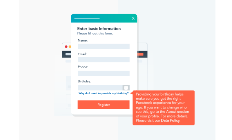
20. Share the reasons for needing specific user information
Sometimes, visitors find it uneasy to answer some questions on your form, such as their company name or phone number. To encourage them to fill out these fields, they need to understand the reason behind it. In other words, you should explain why you need it. (And if you don’t really need it, don’t ask for it!)
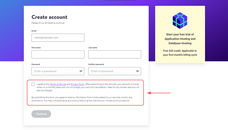
21. Care about user privacy
You should ensure the form adheres to privacy regulations like GDPR and CCPA. Include a transparent privacy policy and terms of use that outline how user data will be utilized.
Kinsta sets a good example by including a brief message at the bottom of their contact form with a link to their privacy policy. This safeguards you from legal issues and fosters trust with customers by demonstrating your commitment to transparency regarding data usage.
22. Keep it minimalist and on brand
When it comes to web form design, how they look really matters. Make sure to keep your form simple, clean and eye-pleasing.
What’s more, your form should reflect your brand. Even though it’s on a small screen, having your brand on it gives it a professional look and reminds your visitors who they’re dealing with.
→ Interested in minimalism? Read more: Beginner’s Guide to Minimalist Website Design for E-commerce.
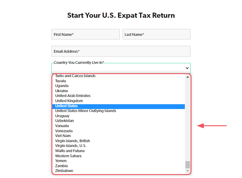
23. Use native features of mobile devices wherever possible
When dealing with data entry, it’s worth noting that both Google’s Android and Apple’s iOS offer built-in interfaces for specific types of input, like date pickers. In such cases, leverage these native elements rather than develop new ones. It’s because users tend to be more accustomed to them, resulting in a more intuitive and seamless experience.
B. Test the effectiveness of your web forms
The purpose of conducting this test is to ensure that your website forms work correctly. When your forms function properly, visitors can easily understand, complete, and submit the required information. This, in turn, helps prevent users from getting frustrated with non-working forms and leaving your website. To verify this, you should check a few key aspects:
- Identify and fix forms that are not functioning
- Correct formatting, grammar, and spelling errors
- Clarify any confusing sections of the form
- Ensure that integrations are syncing properly
- Resolve any technical bugs that may be affecting the form’s performance
I. Verify all form input fields and variables
Before launching your form on your website or app, it is crucial to conduct thorough testing. There are several areas that warrant your attention during this testing phase:
- Input field validation: Ensure that the data entered into the form reaches your intended location.
- Error messages: Test whether the error messages are displayed as expected when the form is filled out incorrectly.
- Conditional logic: If your input fields depend on conditional logic, test all possible paths and variables to ensure they function correctly.
II. Test usability and access
By conducting these tests, you ensure that the web forms are easy to use and accessible. Therefore, users can easily find, read, understand, complete, and submit the form. Even when a form loads properly, users may encounter issues if unsure of what to do. Please check the following:
- Confirm the form is placed correctly on the page.
- Check that all parts of the form are loaded correctly.
- Double-check that all required fields are included and in the right place.
- Correct formatting, grammar, and spelling errors.
- Ensure the form is the right size for the page.
- Ensure that the questions are easy to read, with a clear and adequately sized font.
- Check if users can navigate through the form using the tab key. This feature is particularly helpful for individuals who cannot use a mouse.
- etc.
III. Test automation and integrations
Once a user submits the form, you should check whether the data is formatted, stored, and sent accurately. This step involves checking all automation and integrations.
1. Error messages
Error messages help users identify and fix any mistakes during form submission. Hence, it is essential to have clear and noticeable error messages. To test this, intentionally fill out the form incorrectly and observe the following:
- Is the error message visible and easy to find?
- Does the form prevent submission when an error message is displayed? This helps to avoid receiving incomplete, unhelpful forms.
- Does the error message clearly state what needs to be fixed or filled in before submission?
2. Submission and thank you pages
Submission and thank you pages appear after form submission, confirming successful form submission or additional instructions. During testing, consider the following:
- Does the correct message/page appear after form submission?
- Does the message/page align with your expectations?
- Does the page clearly instruct visitors what to do next? For example, it may say, “Thank you, we’ll be in touch soon” or “Congratulations! Check your inbox for updates.”
3. Email
Form builders often provide the option to send email notifications after form submission. Depending on your preference, you can configure these notifications to be sent to either the user, your team, or both.
Here are the key aspects to check:
- Are the notification emails being sent as expected?
- Is the timing of the emails appropriate, neither too early nor too late?
- Do the email subject line and sender information appear correctly?
- Is the email formatted as intended?
4. Integrations
If you have additional tools linked to your web form, ensure everything works smoothly. For instance, let’s imagine you have connected MailChimp to your web form plugin. When a user fills out their contact details, it should automatically add their name and email address to your mailing list.
Besides, you can perform a test by submitting dummy information and checking if it appears correctly in MailChimp. Then, repeat this process to ensure all connections function properly and gather the required information.
IV. Assess the mobile compatibility of your form
It’s important to ensure that the form fields are user-friendly and easy to submit on smaller mobile screens. Different devices have varying limitations in terms of visuals and usability. While a form functions well as a single screen on a desktop, it may become lengthy for a single screen on a mobile device. In such cases, opt for a multi-screen layout for mobile devices.
V. Evaluate and optimize your form for popular web browsers
Web forms may encounter unexpected issues due to how different browsers interpret HTML form elements. To address this, start by testing the form on the most commonly used browsers.
VI. Perform user testing before launching the form
If you have enough time and resources, it’s ideal to perform user testing before launching a new form. This involves:
- Assigning specific tasks to participants
- Observing their responses while they fill out the form
- Collecting valuable feedback from them once they have completed the process.
VII. Conduct A/B testing on your form post-launch
The testing process doesn’t need to stop once you have launched your design. Even after your form is live, conducting ongoing experiments would be better. For instance, you can try out different input fields, labels, layouts, and copies.
The A/B testing method can be utilized to compare how well design elements perform in terms of conversion rates, user flow abandonment, completion time, and others.
C. Magento Blue Form Builder: Creating versatile forms with ease
As you can see, there are many web form design tips and best practices to help you create user-friendly forms that increase conversions. And if you’re a Magento store owner and want to create high-converting forms for your e-commerce website, check out Magento 2 Blue Form Builder. It allows you to create any kind of form on your website with just drag and drop.
With this free-code, feature-rich Magezon builder, you can easily add fields, customize the design, and set up email notifications for your web forms.
- For beginners or those who don’t have much time, 10+ ready-made form templates are the way to go. You can choose from these templates to create contact, registration, order, or forms to collect information for e-books and more.
- For anyone who wants to create stunning and effective forms for their Magento websites but knows little about coding, Magezon Blue Form Builder is the ultimate solution.
To learn more about what Magezon Blue Form Builder can do for you, click the button below to try it demo.
The bottom line…
Designing web forms that users can complete without hesitation is all about keeping things simple, clear, and user-centered. When you prioritize simplicity, provide helpful instructions, offer real-time feedback, and optimize forms for mobile devices, this means you’re creating a seamless experience that guides users effortlessly.
And that’s it. We hope after this article you can create better converting forms. If you have any questions or issue arising during your form creation, don’t hesitate to comment below. We’re pleased to help you. Moreover, we will produce more insightful webform articles that you can apply and optimize for your store. Stay tuned!


