 Magezon Blog Help Merchants Build Comprehensive eCommerce Websites

A minimalist website design is popular among brands who want to build unique websites with minimum components. However, it’s not easy to achieve this goal. You have much more to do with ‘simplicity’ than you thought to pursue minimalism for your site. Yet, we’re here to help. This article will tell you how to make a minimalist website and provide 10+ simple clean ideas to learn from.
So, don’t stay out of this trend to create a better user experience and reach the ultimate goal of conversion growth. Let’s get started!
Table of contents
What Is a Minimalist Web Design?
A modern minimalist website usually obtains a clear and straightforward design where the most important content is displayed. It has no redundant elements so users don’t need to go through distracting elements, offering a better user experience.
“Less is more” and “Simplicity is the key” are two phrases that best describe a good minimalist site.
Why Minimalist Websites?
1. Better Navigation
It’s not uncommon for users to click through websites, get stuck in text and images, and get confused when trying to find the information they need. However, a minimalist, modern website design reduces irrelevant components and guides users to more intuitive navigation.
2. Fast Loading Speed
There are too many items such as backgrounds, overloaded graphics, complex fonts, video elements, etc. make the web load longer. However, this is not the case for minimalist e-commerce websites. It loads faster, encourages people to explore your store, reduces abandonment, and benefits your SEO.
3. Impactful Focal Point
Too many competing elements on a page, especially on the landing page, will break the visual hierarchy. People will be overwhelmed by mish-mash elements and find it hard to focus since there’s no focal point. This is when clean and impactful focal content with simple and bold typography such as a slogan or logo is handy in your minimalist website design.
4. Limited Color Scheme
Too fussy color palettes can bother users’ eyes and create an unpleasant experience. The typical colors for minimalist website design are black, white, and gray as they are soothing to the eye and easier to parse. However, it does not mean a minimalist webpage should only be in those three colors. You can combine brighter ones, yet with limited numbers and good harmony.
→ Choose the appropriate color scheme: 10 Useful Tips to Choose a Color Palette for Website
5. Easier Mobile Device Optimization
Complicated pages can easily overwhelm small screens since everything is maximized. When you cut off unnecessary or extra elements, your website will be simpler and easier to optimize for mobile devices.
6. Clarified Purpose
Eliminating the cluttering and unnecessary elements allows you to focus on more important content. When visitors look at your modern and minimalist website, they will immediately understand your niche.
7. Professional Look
With a single focal point, neutral color palette, fast loading, and intuitive navigation, minimalism will help your website look more professional.
8. Long-Lasting Style of Design
Minimalist website design has become widespread since the late 20th century. Despite the changes in web design styles and trends, it’s still a preferable option for many brands and web designers.
Things to Remember Before Choosing Minimalist Design
Skill, research, and practice are needed to master the art of minimalism; otherwise, your website will look primitive or limited. You must apply principles correctly for a simple yet fully functional online store. One of the most prominent mistakes of designers is hiding the navigation bar, causing trouble for visitors when navigating. Instead, use clickable image cards provided with summarized information that can direct users and make them stay on the page longer.
On the other hand, if you’ve been thinking of when your business grows, take a deeper consideration when choosing a minimalist website. Large and complex projects may require more time to develop because simplifying them needs more thought and plans than usual.
15 Best Practices for a Minimalist Website Design
1. Use Intuitive Grids to Simplify Your Simple Webpage
One of the website design tips is to use grids to improve functionality and simplify your page. It helps organize the contents in logical groups and makes them easy to follow. The grids create the right spatial relationships and great harmony, even with a design that initially does not look minimal.
2. Keep the Essentials Only
The best minimalist websites can simplify interfaces without making users’ primary tasks more difficult. To build a genuinely minimalist interface, designers must choose what to prioritize and eliminate.
Only displaying the most essential components can encourage visitors to read your content and take desired actions. Every element should have a purpose (to make the message clear); otherwise, they don’t need to be there. Long texts, auto-plays, pop-ups, animation, advertisements, etc., should be stripped away so they will not distract users.
On the other hand, minimalist website design aims to make essential elements more transparent. Thus, remember to leave enough visible elements (such as primary navigation) to guide your visitors to desired information without confusion.
3. Use a Few Selected Colors
There is a lot of research about color and psychological functioning that proves the importance of color schemes in minimalist website design. A suitable color palette can build information and emotional connections between products and users, create visual interest, and direct attention without needing actual graphics and additional design elements.
A talented designer knows how to maximize the usage of limited colors to create an effective minimalist site. It’s also not rare to see a page with a monochrome color scheme.
4. Ensure all Elements Are in Balance and Harmony
Creating visual harmony and balance between elements is one of the vital web design tips for beginners. You should understand how all components work together to keep everything in check. For example, to make an image in harmony with other elements such as typography, you can try to make it visually appealing. Putting it near other well-combined components, such as white space, or using alignment styles and colors may help.
→ Improve your product image to convert more customers: 19 Best Tips to Improve Your Product Image for Ecommerce
5. Design Each Screen Page With Only One Concept to Focus
‘Content is king, and the visual layout salutes the king.’ It’s what minimalist philosophy is all about.
Minimalist modern website design aims to create a clear message by eliminating distractions and involving a strong focal area. That’s why having a single focal point per screen without any unnecessary elements is important to keep visitors focused.
6. Display High-Level Content at the Top of the Screen
People tend to pay attention to the page above the fold more than the below content; thus, make sure you set great expectations with the top area of the screen. You can encourage visitors to explore more by putting essential information with ample white space on top and providing more details as the scroll moves down.
7. Use Negative Space
Negative (or white) space is the most important feature of minimalism. It’s a minimalist website design tip to make the main information stand out. This space balances your design, reduces distracting components, makes a particular feature more noticeable, and concentrates users on the product or service. Though it’s called white space, you don’t always have to choose white, a one-color background can also work well.
8. Apply Contrast
High-contrast copy, or graphic elements, is a good option for a minimalist website design as it can draw visitors’ attention to the vital components and make the text more readable, thus, creating a better user experience and website efficiency.
9. Apply Flat Texture to the Minimalist Interfaces
Gradients, shadows, and other 3D or glossy textures are not preferred in minimalist interfaces. Instead of that, you should include flat textures, icons, and graphic elements.
10. Use a Decent Photo as an Explanation
A decent photo can say thousands of words about your product or service. It’s the most prominent form of artwork in minimalist design as it can set the atmosphere and connect emotions. However, not every photo can do the job well. An inappropriate image (a photograph full of distracting elements) can negatively influence the surrounding minimalist interface and ruin harmony. Therefore, a high-resolution photo with ample negative space, expansive skies, and empty white walls would be preferable.
11. Dynamize the Site With Functional Animation
A good animation in a minimalist website design should be subtle and essential. It must work well to serve the purposes of being meaningful and functional. For example, you can use animation to reveal hidden details on hover to save space and encourage users to discover.

Try FREE Magezon Page Builder!
Easily create your minimalist website without relying on developers or designers. Just by drag & drop.
12. Pay Attention to the Fonts and Typography
After removing the annoying components, your content is more visible. Yet, besides color, you must deal with the fonts and typography to present an intriguing visual. Bold typography immediately draws attention and helps convey the message. However, don’t use several fonts; keep the selected font consistent throughout the webpage. ‘Comic sans’ or ‘handwriting’ is usually recommended.
13. Get Rid of Unnecessary Words
Omitting unnecessary words is advisable for a true minimalist website design. You should communicate succinctly by including minimum words to convey your message adequately.
14. Simplify the Navigation Without Hiding It
One of the top goals of web design is easy navigation, and a minimalist site is no exception. While pursuing minimalism, you still should ensure visitors can find what they need quickly. Common options to expand menu icons make navigation items hard to find. In most cases, a visible navigation bar works better than a hidden one.
→ Create your effective navigation bar: A Complete Guide to Creating Effective Website Navigation Bar
Below are examples of hidden and simplified navigations.
15. Put the CTA Button in an Easy-to-See Place
Visitors should spot the CTAs within three seconds after clicking on your site. They will not stick around and convert when the button is ‘invisible.’ When put in the right place, these buttons will help users identify your brand easier at first glance and be willing to take desirable actions.
10+ Inspiring Minimalist eCommerce Websites
1. Dior
Dior is a well-known fashion brand that applies minimalism to its website. By using two decent images to emphasize their two categories: Fashion & Accessories and Fragrance & Beauty, Dior successfully directs visitors to find their targeted items easily. Except for the option buttons on top, users can also click directly on the images to the desired section.
2. Olive
Olive is a fashion company in the UK that specializes in clothes mixed between traditional European and modern styles. When looking at their homepage, the images do all the talking. They use two pictures of serious-looking young models wearing their typical product to show the concept of synthesis: long sleeve, old-fashion complex earth tones with contemporary material and cut.
3. True Linkswear
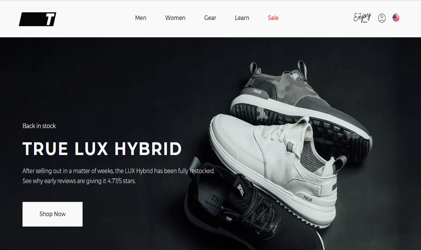
A shoe website, True LinksWear, is a good example of using contrast and making the CTA prominent. A simple contrast of black and white draws visitors’ attention to the products and information provided. The ‘Shop now’ option is also easy-to-see, encouraging users to click on it.
4. Maison Labiche

The French company Maison Labiche designs its page with a pleasant color background and a high-quality picture. They also clearly put the navigation on top, so users don’t get confused when approaching a section.
5. Mowellens
Mowellen’s homepage shows a clear navigation bar on the top, an image slider below, and a prominent CTA button on the right. The selected pictures are elegant and soothing to the eyes.
6. Eiktyrne Whisky

Another minimalist e-commerce website is Eiktyrne Whisky, where a picture of their product stays at the center of a full dark background color with a white, short text on the left to encourage visitors to discover more. If users want to know more about the brand, they just need to click ‘About Eiktyrne.’
7. Hobbe
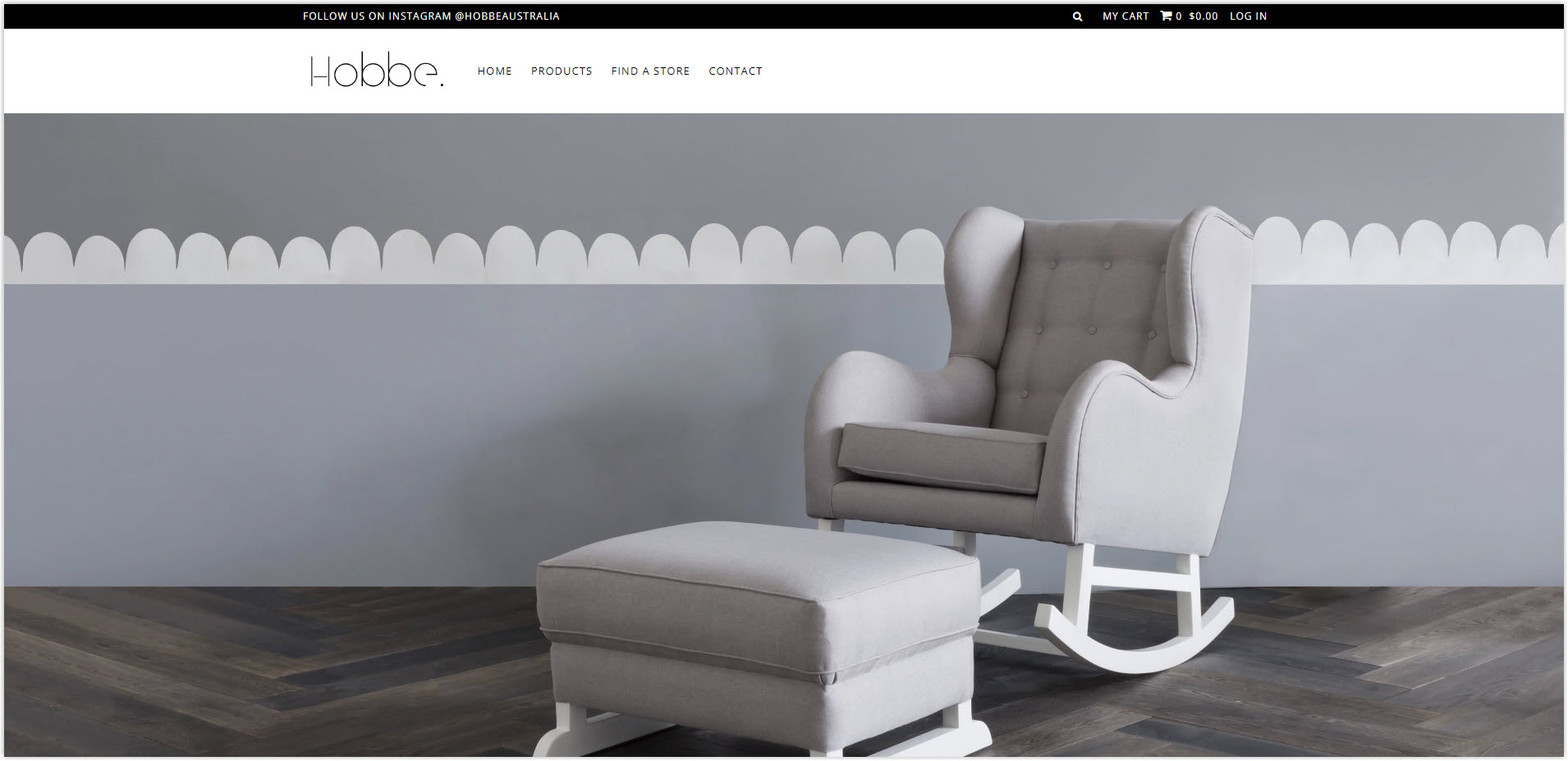
Hobbe’s website is an excellent example of monochrome. The nursery and home design concepts present the products, immediately telling visitors what the brand offers.
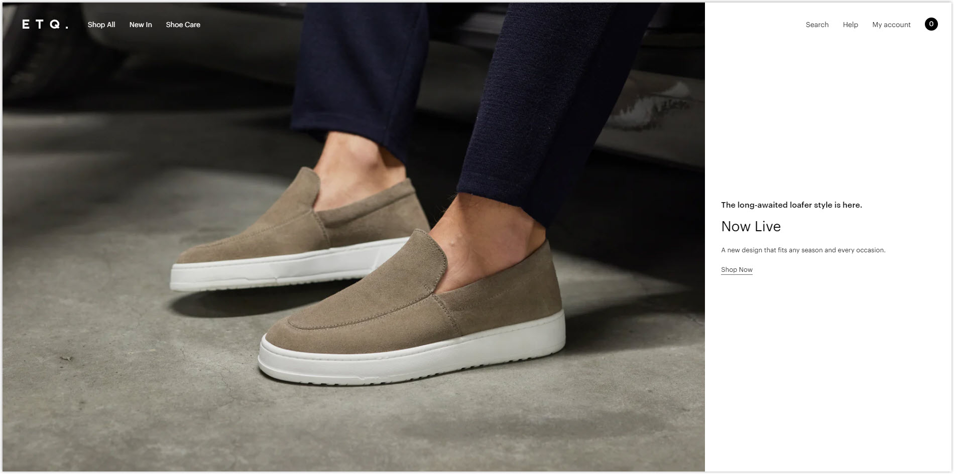
8. ETQ

ETQ separates the screen into two sections: 2/3 image and 1/3 solid color background with text and link. As you scroll, the transparent header disappears and appears again. The minimalist flow comes from header to footer, creating a better user experience.
9. MDD
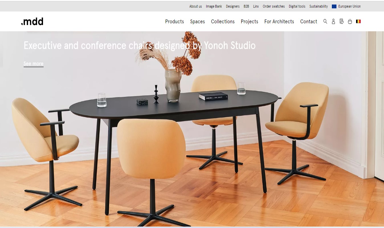
MDD pursues a fresh and clutter-free design to make its website neat. The navigation bar on top helps break things into sections and direct users.
10. Leen Heyne
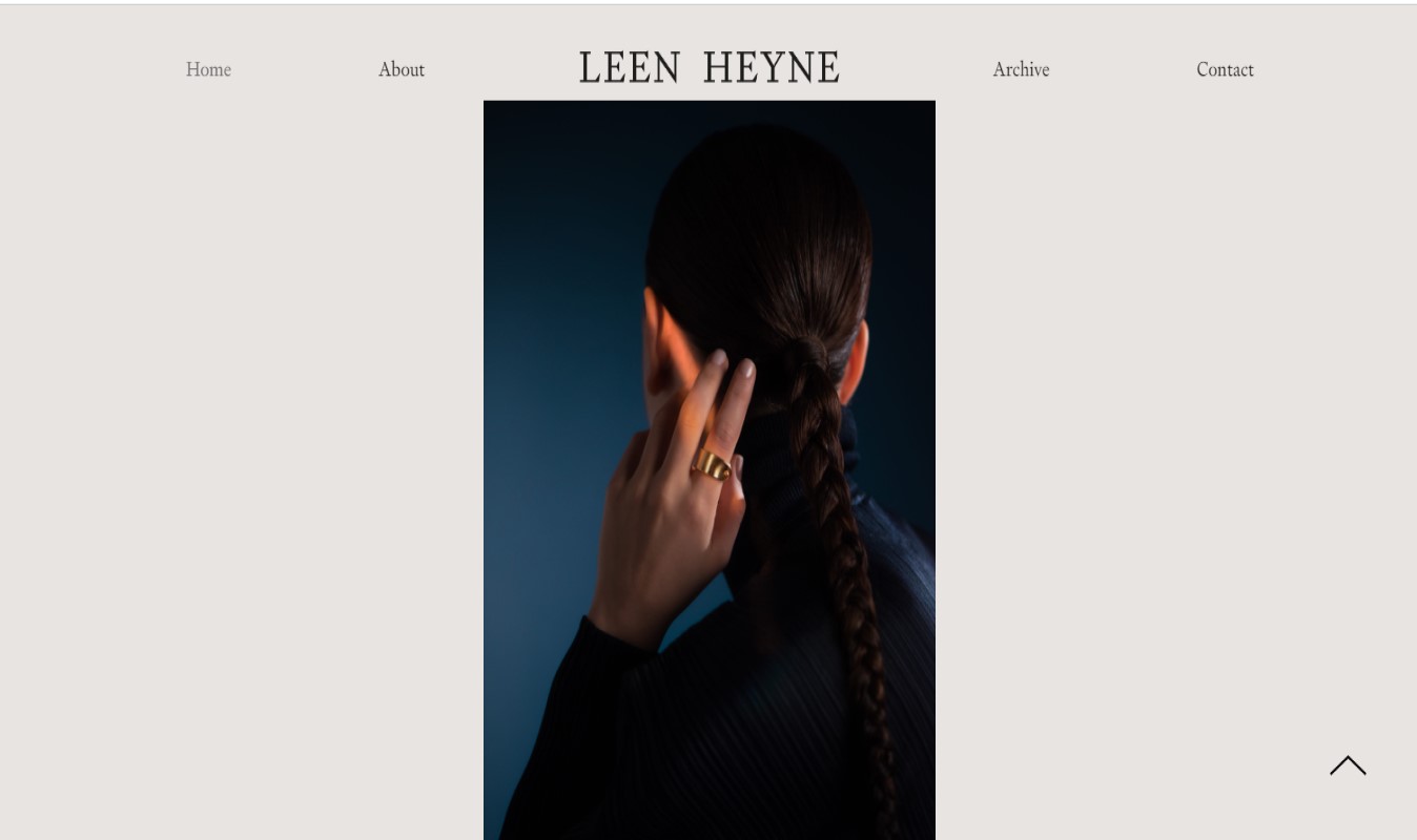
The jewelry brand Leen Heyne has an effective and aesthetic website. They eliminate all glitz and glam and only draw users’ attention to what they sell. A monochrome dull-toned background actually helps highlight the brand’s name and products.
11. Nua Bikes
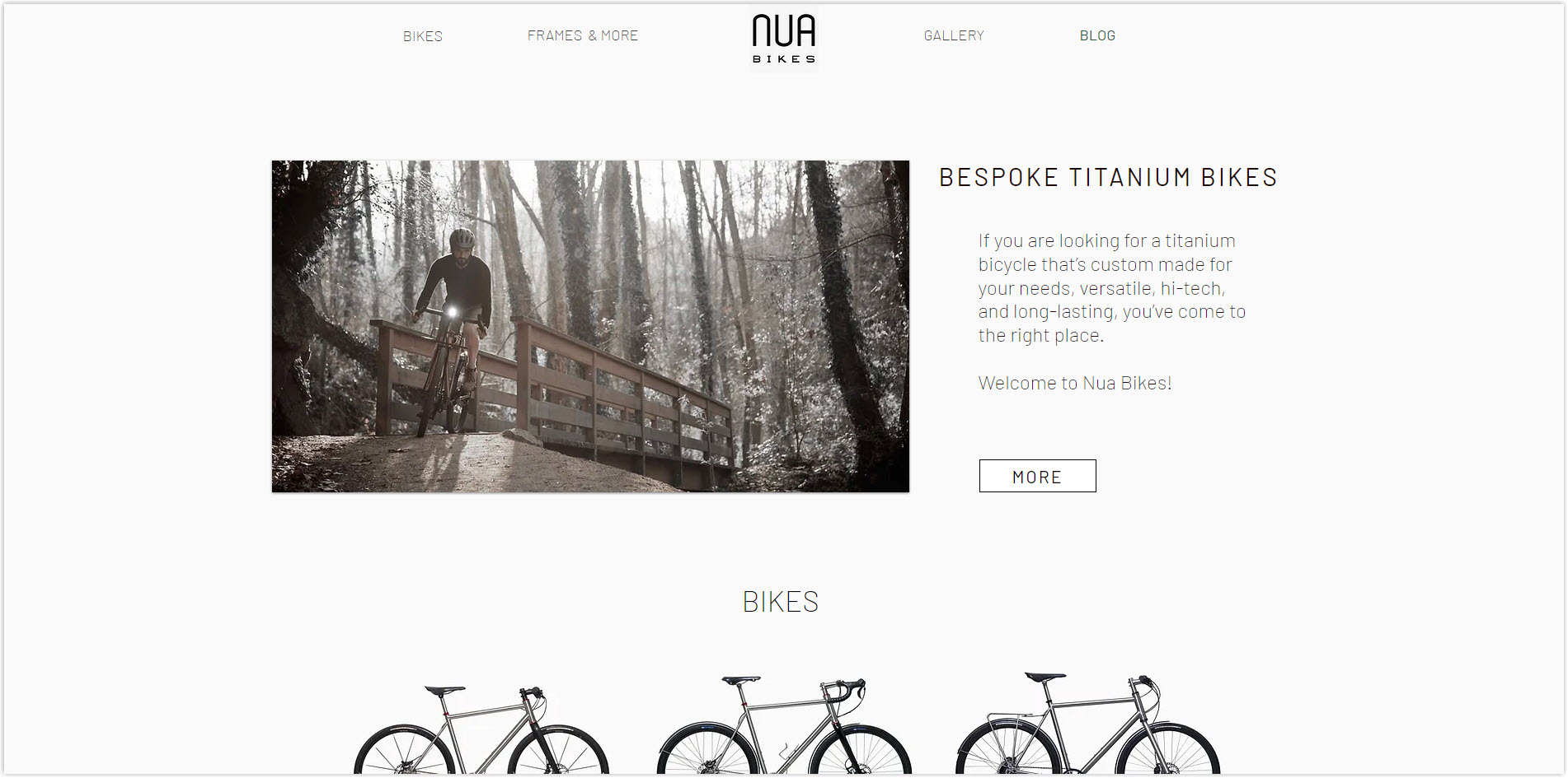
Nua Bikes applies a plain white background, a high-resolution picture on the left, and short text on the right to their homepage. It makes visitors immediately understand the brand’s niche and can click ‘More’ to explore the products.
The Bottom Lines
The basic rule of a minimalist website design is to delete unnecessary elements and leave only the essential ones. However, there are more principles and tips that you need to follow to make sure you create one of the best minimalist websites, but not the one that confuses visitors. I believe today’s article has been a great help in clearing up all your confusion when creating a modern online store.
Now, if you don’t know which Magento extension to easily build your minimalist eCommerce website and gain more sales, consider Page Builder from Magezon. As a trusted Adobe partner, we have satisfied thousands of customers with a vast collection of drag-and-drop extensions, helping you create a high-converting and unique store in minutes.
Don’t worry if you are not competent at coding, now you can confidently create any necessary page of your website in any style you want at ease.


