 Magezon Blog Help Merchants Build Comprehensive eCommerce Websites
A website navigation bar is crucial. It helps your customers to navigate for their needed information faster; without one, they will likely abandon your website before converting, and you’ll lose a number of prospects.
On the other hand, having well-managed navigation menus is an excellent way to promote your website as professional and customer-oriented. However, it’s not an easy task to make an effective menu bar if you don’t have a complete and helpful guide. In today’s article, we’ll go through each step of creating and optimizing yours.
Table of contents
Step 1: Determine What Your Website Navigation Bar Should Include
Obviously, you will want to include every page in your website menu bar cause they all seem important. However, it is not a great idea if you take SEO and user experience under consideration. Therefore, seven pages should be the most appropriate number that you can begin with.
That’s the theory we know, but how can you choose which one is worth displaying on your navigation menus? There are three methods that you can apply to figure out.
1. Card Sorting

This is the most straightforward technique to know your website visitors’ needs on your navigation menu. Trust me; you don’t need a single UX experience to run this exercise, and it should only take about 20 minutes to finish.
Here’s how you do it. First, you’ll need some people from outside your organization and prepare a stack of index cards for them to organize how they want. After seeing a trend in how they group the pages, ask them to name each category. This is the backbone of your site navigation.
2. Attribution Reports
An attribution report offers the number of newly created contacts and their reactions to your business, helping you understand which of your website’s content or features converts the most visitors into leads. With this knowledge in mind, you can more accurately decide which item should be included in your website navigation bar.
Take HubSpot’s attribution reports below as an example.
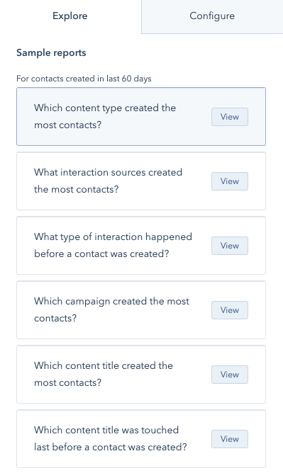
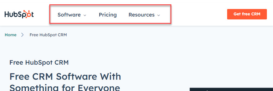
Looking closely at their navigation menus, you’ll see how they prioritize critical pages like software, pricing, and resources, as these are the pages with the highest conversion.
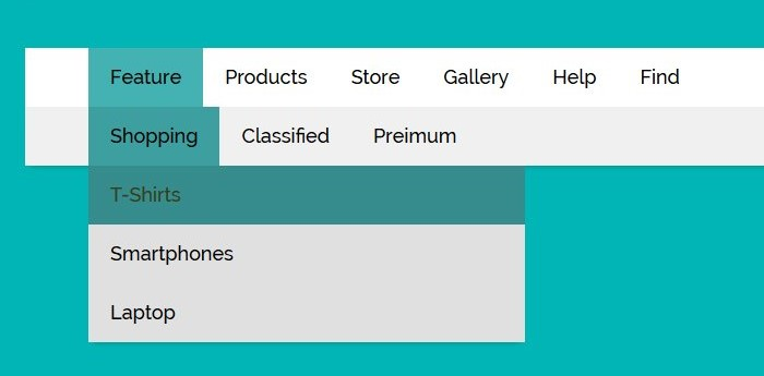
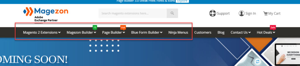
Magezon is another example of prioritizing content that converts most customers on the website navigation bar. As you can see below, we put our best sellers right in the front to capture visitors’ attention and arouse their will to click on the products.
3. Users Flow
If you don’t have an attribution report, you can always use the User Flow report in Google Analytics to decide which item should be displayed on your website navigation menu. However, this report will only provide you with data on the standard traffic, not details about when or where a prospect turns into a customer.
After applying the three methods above, you now have the data on which content should be included in the website menu bar. Next, you must choose a type of menu bar that suits your business, depending on your target audience. Below are some of the most common ones you can consider nowadays.

Try FREE Magezon Page Builder!
Easily create your engaging Magento pages in any style whenever you want without relying on developers or designers, just by drag & drop.
Step 2: Select a Type of Navigation Menus
1. Horizontal Navigation Bar
This is the most common type of website navigation bar that you can see on almost every website. You can find a horizontal menu bar on the header with the main pages standing side-by-side. Remember that all the items won’t be dropped down, so you must choose wisely which content should be displayed.
The most used items are “About,” “Products,” “Pricing,” and “Contact,” but you don’t necessarily stick with them. Every website is different; choose the most appropriate content categories that are more likely to give your visitors easy access to the pages they need and convert most.
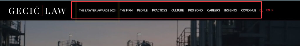
You can get inspiration from Gecić Law’s website navigation bar below to see what they include to optimize their UX interface.
2. Dropdown Navigation Menu
You should use this menu bar type if your website is rich in content and has a complex IA. Think about it; you cannot list all your pages in one menu bar side-by-side as it would be cluttered and intimidating to your visitors. Besides, arranging them reasonably horizontally without affecting the UI and UX interface is tricky.
Instead, list the most general items first and let the rest stay dropdown. While using this menu bar, allow visitors to see all content by hovering over or clicking. You can have a look at the website navigation bar of Helly Hansen to see how they arrange their menus for an optimized user experience.
3. Hamburger Navigation Menu
You may have heard of this navigation menu design while learning about responsive websites. With this approach, you usually see a whole horizontal menus bar on larger screen sizes and a hamburger button with menus collapsed behind it on smaller screen sizes. However, some websites may still use it on every screen size, as you can see from Bienert Katzman Littrell Williams LLP below.
This hamburger menu bar was invented to save space for mobile apps and websites with limited real estate. When visitors click the three-line icon, they will see a vertical drop-down or horizontal pop-out with the navigation links. To better understand, you can look at the website navbar on the mobile version of Nettle.
4. Vertical Sidebar Navigation Menu
Using this menu, you will stack items on top of each other and position them on the left sidebar. Although this website menu design is not as popular as the horizontal one, you can see several benefits it provides. A vertical menu bar helps increase findability by removing design constraints that limit the categories, adding more content in the future, offering a more scannable experience, and translating better on mobile.
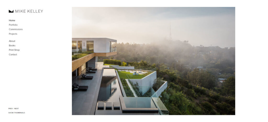
Many businesses use this navigation menu on their website, but you can see an interesting example from Mike Kelley below.
5. Footer Navigation Menu
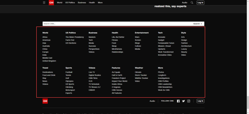
This comes in paired with the horizontal navigation menus when visitors look at the footer for further information they can’t find in the header. Below is CNN’s footer website navbar with more than 60 categories belonging to 9 primary menus. This approach offers easier access to sub-categories if your visitors can’t find them on the top menus without affecting their user experience on your website.
6. Full-Screen Navigation Menu
With the development of technology, web designers no longer have to sacrifice productivity, accessibility, and functionality to include videos, images, and complicated effects. And they now have more room to express their creative ideas; this full-screen navigation bar is one way to do it. However, to create an exciting and memorable experience with interesting effects and appealing media, it’s better to equip yourself with a strong knowledge of UX and UI.
Many websites use this technique for their navigation bar, but I’ll take one example from Impossible Bureau below to help you imagine it clearer.
Step 3: Arrange Your Navigation Items
While having the critical categories displayed on your website navigation bar is the first step, arranging them reasonably is the next thing you should do. Cognitive studies have already pointed out that links on either end of your menus will be most memorable, or as the primacy and recency effects say, the first or last words of a list will pull more heavily on the attention span of the viewers. Think carefully about what to put in these spots to convert the most customers for your website.
For further information, Andy Crestodina, web strategist, once said: “Place your most important items at the beginning and the least ones in the middle of your website navigation menu. ‘Contact’ should be the last item at the standard location, far right in the top-level horizontal navbar ”
Try FREE Magezon Page Builder!
Easily create your engaging Magento pages in any style whenever you want without relying on developers or designers, just by drag & drop.
Step 4: Phrase Your Navigation Options
Your business or organization type will help you choose between straightforward or more creative labels at this stage. However, the most important thing here is to consider the terms customers use to describe your pages, then search engine optimization. We’ll look at some criteria below.
1. Object-Based
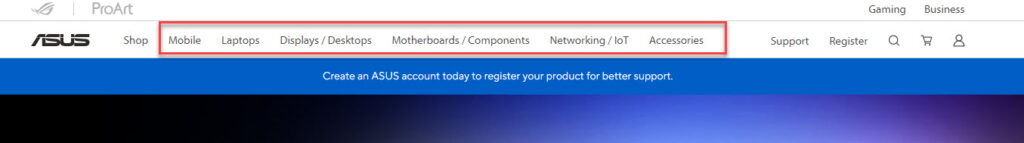
If your navigation menus’ phrases are object-based, they are groups of noun-only topics, categories, and pages. In other words, in this case, the navbar is a table of contents of your website. For a better understanding, you can see the menu bar of Asus, one of the most popular Magento-based websites. The contents within the red frame are its main products.
2. Action-Based
You’ll use this type to list specific actions you need your visitors to take on your website. For example, if you are building a site for an English center, then the navbar should include “Learning,” “Signing in,” or “Applying.”
You may wanna look at a typical example from Sigma to see clearly how they select which contents to appear.
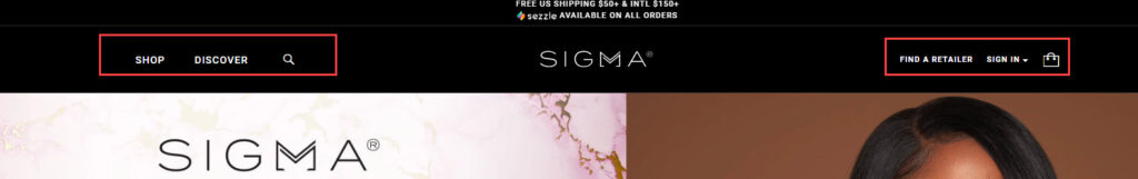
As you’ve noticed, their website navigation bar contains only 4 main categories, which are “Shop,” “Discover,” “Find a retailer,” and “Sign in” since these are the actions that they want their visitors to take the most.
3. Audience-Based
If your visitors can easily classify themselves (women, men, kids, etc.), this is the type of phrasing you’re looking for. You can use it in navigation and sub-navigation but remember to avoid confusing your visitors with unclearly identifying audiences, such as small vs. medium size companies or marketing vs. advertising agencies.
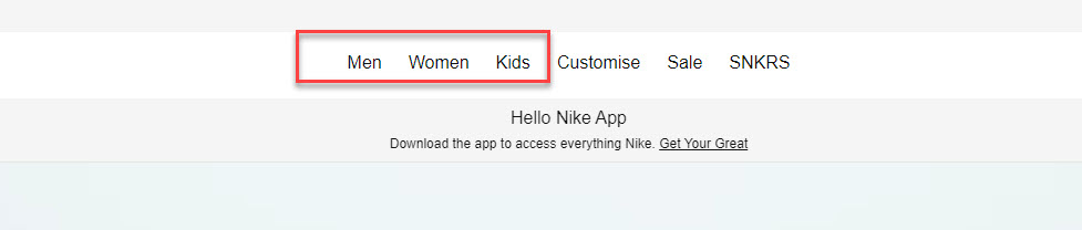
Let’s see the below example from another Magento store, Nike, to see how they phrase their categories and mix with object-based navigation to direct their visitors’ actions.
4. Search Engine Optimized
Your website navigation bar needs to be optimized for search engines besides satisfying your visitors. Kristina Kledzik, an SEO strategist, advises using Google Analytics and Google’s Keywords to see which search terms bring visitors in and identify their variations to include in your website navigation bar.
Step 5: Optimize Your Website Navigation Menu (9 Practices)
1. Simple Is the Best
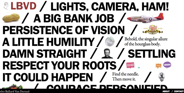
This quote is accurate when designing anything and your website navigation menu is no exception. Keep the design of your navbar as simple as possible because you don’t need to look so fancy to attract visitors. Remember that what does is your menu bar’s ability to assist them in detecting what they’re looking for. Below is an example of what you shouldn’t do with your website navigation bar.
2. Be Consistent
Consistency is not only about being consistent; it’s also about aligning with visitors’ current knowledge and expectations. That is to say, format and design your navigation interface consistently using only one navbar style for the main and sub-navigation.
For example, let’s look at the Kurt Geiger website below. All their links are black, and when you hover over them, there will be underlines that appear. Moreover, every site’ page has navigation links with the same style to ensure visitors know which one is hyperlinked.
3. Design for Every Device Screen Size
No one can deny the importance of mobile devices nowadays when they account for over half of organic search engines, and that’s why making your website navigation bar design responsive is a must.
The first step is to design on the smallest screen (thinking mobile first) by deciding which links should be included in your primary navigation and in what order. On the other hand, you’ll need to choose appropriate navigation features for mobile – like a hamburger button – and figure out how they’ll look in your desktop design. By knowing the essential pages and navigation features, shifting the design into larger screen sizes will be much easier.
4. Display Only the Most Important Information
If you’ve ever heard of the three-click rule, you must know that when someone lands on a website, its navigation structure should enable them to find whatever information they need within three clicks. However, as time went by, this rule wasn’t credited as before. A study found that users are more patient in continuing a task after 12 to 25 clicks.
Even so, following the basics is necessary. The less effort you reduce for visitors to find out what they seek, the better. Ultimately, the most important thing is to focus on creating clear pathways, increasing page loading speed, and removing any user journey’s friction points.
5. Add Breadcrumbs
This is what breadcrumb navigation looks like:

By looking at the breadcrumb, users can visualize their location on the website and retrace to higher-level pages. Don’t worry that it will obstruct the user experience cause it doesn’t take up much space. You’ll usually see this secondary navigation bar display with links that are separated by the “greater than” symbol (>) right below the header.
6. Use at Most Two Levels in the Top Navigation
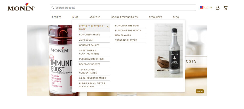
If your website has more than 7 content that needs to be displayed, you can use the dropdown menu but keep it to two menu levels. Remember that a dropdown that leads to another dropdown is not a good idea but using a “mega menu” populating a larger menu from the primary navigation will be a great choice.
As you can see from the example below, the Magento-based website Monin has 10 different product categories. Still, it keeps everything in a two-level menu bar to not overwhelm its visitors and create a better user experience.
7. Place a Call-to-Action Button in the Top Navigation
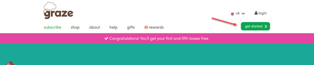
Adding a primary CTA to your main navigation is a perfect way to drive more conversions. It’s made to be eye-catching enough for visitors to click as your website menu bar is often placed in a spacious location on your page. You can look at the Graze website; its CTA is found on the right side and made extremely prominent without any elements obstructing viewers’ experience.
8. Give Sticky Website Top Navigation Bar a Try
A sticky website navigation menu, a navbar that remains at the top of a webpage even at scrolls, constantly shows visitors other options they can discover on your website other than the current page. In other words, it works as a reminder that there’s always more content to look at, and eventually, they’ll stay longer on your website. If you ever use this type of menu bar, then remember to include an appealing CTA to increase the chance of clicking.
9. Improve Your Website Navigation Bar With Analytics
You can use Google Analytics to manage your results, see which works best and make adjustments. After looking at the analytics and the heat-map tracking, you can understand how people are doing on your site to improve their experience and enhance results.
Below is something you may need to improve your website menu bar:
- If there is any item that your visitors rarely click, remove or rename it.
- There’s always a page with more views than every page else; make it easier to access.
- The menu items with the most clicks should be moved to the top or front.
Conclusion
Pay close attention to designing your website navigation menu, as it’s the main tool that visitors will use to navigate and understand your site. Before doing anything, preparation is compulsory, so equip yourself with the necessary knowledge above and apply the helpful navigation bar best practices to optimize yours. Remember, one good navbar can assist you greatly in creating a professional and thoughtful company image, increasing trustworthiness and, ultimately, your conversion rate.
If you are a Magento merchant and don’t know which extension to build your website, consider Page Builder from Magezon. As a trusted Adobe partner, we have satisfied thousands of customers with a vast collection of drag-and-drop extensions, helping you create a high-converting and unique store in minutes.
Don’t take my words for granted; see how your website can be with Magezon Page Builder and what others say about us:


