 Magezon Blog Help Merchants Build Comprehensive eCommerce Websites

CTA buttons are among the most essential features of your landing page as they convert most of your customers. This comprehensive guide will go through what a CTA button is, how it works, and how you can optimize it to make it one of the high-converting CTA buttons.
We will emphasize eight must-have characteristics of high-converting CTA buttons and provide examples from different websites to help you understand how to apply them to your pages. You can also get inspired by more landing page examples we have collected.
In some situations, besides researching these high-converting CTA buttons, we’ve even interviewed the site owners and administrators to learn more about their strategy and how it has affected their businesses.
Hesitate no more; let’s start our article right away!
Table of contents
What Is a CTA Button in Marketing?
High-converting CTA buttons are important to marketers because they motivate people to act on a marketing campaign. The ultimate objective of any marketing campaign is to guide your audience through the buyer’s journey until they make a purchase.
Because there are various strategies you may use to direct your audience on their journey, each marketing campaign may have a different action for them to take.
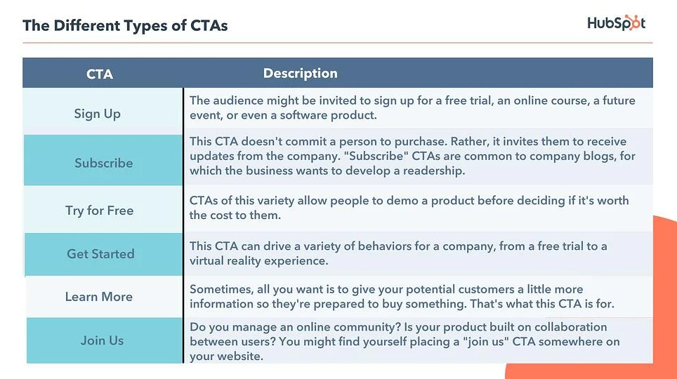
Below are some samples of CTA button copy you could use in your marketing:
We’ve also collected more ideas for CTAs copy here.
The CTAs listed above all share one function; however, their language can vary. And today, marketers worldwide use their unique ways to create leads for their businesses.
Let’s get specific about your CTA buttons and what you can do to improve them.
Why Should You Improve Your CTA Button?
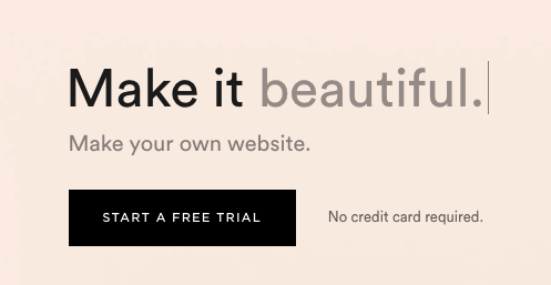
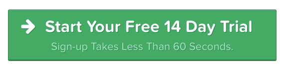
Remember that you can use your call-to-action button in any case when you want your user to take action. As a result, this is the turning point that decides whether you’ll have a conversion or a bounce. From Optimizely, here’s an easy example so you can see how you turn yours into a high-converting CTA button:
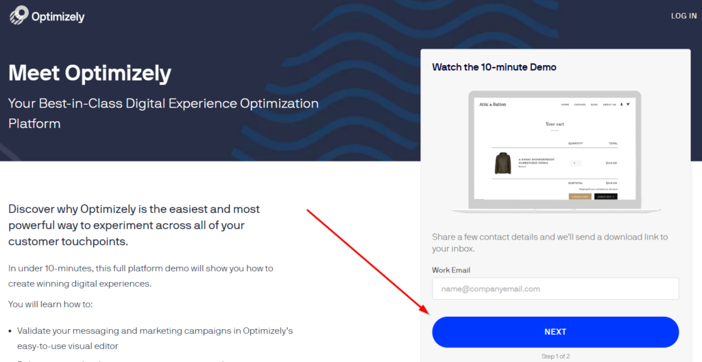
As you can see from the example, the button is a standard call-to-action button that you’d find on a landing page. It includes copies all around it, as well as a form for the guest to fill out. Since this is the most basic button, we will show you how to make it stand out. To accomplish so, one of the ways to do it is we need to elicit emotion from our viewers.
There are six steps we can use to approach customers before they click on our CTA button; these are what a CTA button’s best practices are according to Marketing Experiments:
- Attract people’s attention
- Make a connection
- Introduce a problem
- Get the viewer to engage in the problem
- Build suspense by introducing a dilemma
- Maintain momentum

Try FREE Magezon Page Builder!
Easily create your engaging Magento pages in any style whenever you want without relying on developers or designers, just by drag & drop.
8 Must-Have Characteristics of the High-Converting CTA Buttons and Examples
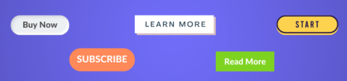
1. They Are Buttons
You should not try to make your call to action design anything other than a button since it is so critical, so necessary, and so incredibly powerful. With a CTA button, you can be creative regarding the design (colors, how they contrast, borders, etc.) But at the end of the day, you’ll still need to stick to the basic function of a button.
In reality, investing in a specific site that represents your brand is generally a good choice but sticking to the tried-and-true button design when it comes to CTAs is a good choice here.
For a basic CTA button, these are what you need:
- Text-based content.
- Use a common shape (rectangle). They may have rounded corners, curved edges, shadow effects, and a clear form or border.
- It contrasts well with the rest of the website.
Simply put, users need to quickly recognize where their buttons are and are ready to convert. That’s why major companies, with years of testing and optimization knowledge, still use this standard style.
2. Use Compelling Copy
Let’s look at some of the best examples of CTA buttons to see how effective their copies are. More specifically, we’ll see how a copy impacts whether or not consumers click. Sunglass Warehouse’s “Do It” button is a good example.
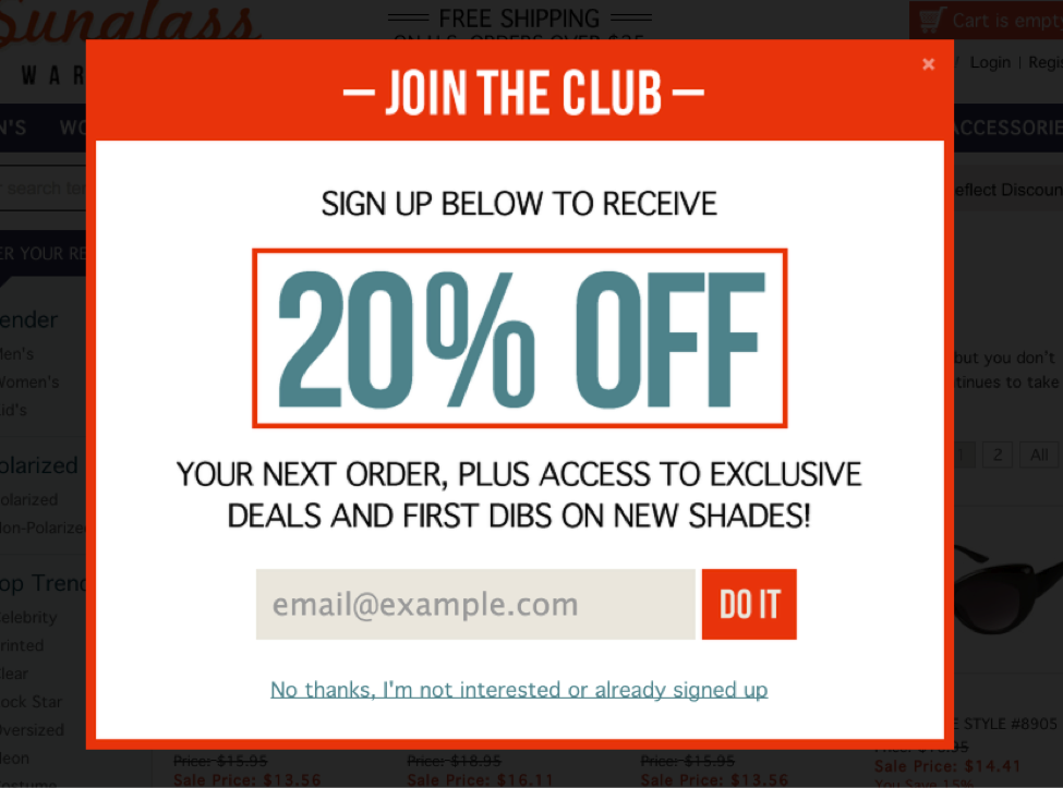
The copy is limited, so you can’t beat around the bush; you must be upfront about what the customers will receive if they click. You can use a super short button copy if the copy around your button is sufficient.
The point here is not to overcomplicate things. You’ll put yourself in a difficult situation by attempting to think of creative ways to make any button on the site stand out from the rest of the website. The most powerful words in a CTA button are often the simplest ones. Because of this, many CTA buttons begin their content with the same set of verbs. Wishpond cites the following as the most effective:
- Start
- Stop
- Build
- Start
- Learn
- Join
- Discover
This is because each verb suggests an activity and a specific benefit to the reader. The verbs tell your customers what they will get by clicking your button.
Using terms that have been proven to drive action from people is another way you can try. The following words have been identified as some of the most powerful in the English language: You, Easy, Guarantee, Save, New, Proven, Results, Free. Each of these is compelling, yet they generate strong feelings in the prospects.
Creating a sense of eagerness or exclusivity is another strategy many websites use in their CTA language. Some customers or potential leads may remember to return, but not all will; this reduces your chances of earning a sale or sending away leads from your site.
Here are a few CTA button copies you can use to get the customers to click:
- Only X more days to go.
- Nothing else is better.
- Only a short time left!
- Last day to get what you want
- The offer expires at the “time”
- Hurry
- Immediately
Finally, limit your CTA copy to a reasonable length to make it a high-converting CTA button. More than 10 or 15 words is too long; you should make it concise. If you need, in some circumstances, two-sentence buttons are acceptable.
3. Place Logically
The placement of the CTA buttons is an important factor regarding UI/UX. Users are unlikely to land on a further away target and smaller in size.
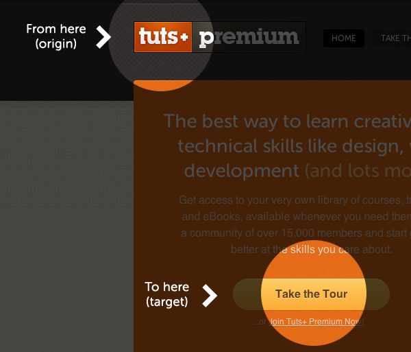
As you can see, the company’s logo quickly catches your eye when you land on the website. And according to Fitts’ Law, moving to the page’s main CTA is a simple process.
The basic idea here is to place your button in your users’ direct line of sight. In other words, consider your readers while deciding where to put your buttons.
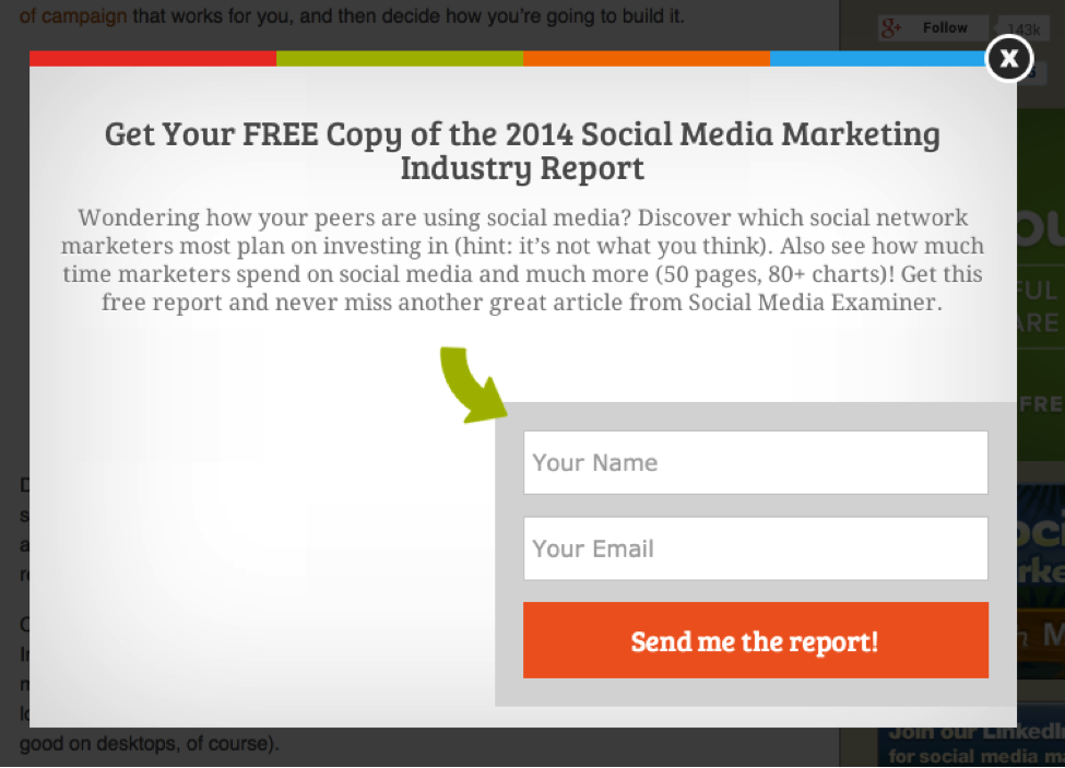
Without some extra design elements, your CTAs may not be prominent enough on your pages. Here on Social Media Examiner landing page, you can see an arrow pointing precisely to the form even though the button isn’t in the center.
You can also include the arrow directly inside the button. Below is an example from ClickFunnels that you may learn from.
This technique draws the customer’s attention to the main offer on the button. If you add buttons on your landing pages, it’s better to stick to a standard format that’s already proven effective.
As with buttons, users generally expect a certain flow on landing pages. On many landing pages, you’ll find the following layout they use to create the best CTA buttons:
- Headline
- Marketing copy
- Capture forms and CTAs
So, why should we use this layout? Simply because users are already familiar with it. Your visitors know there will be a CTA button at the end of the page.
Predictability is also important when it comes to attracting new customers. They are going to need some information about your business before converting. If you have a lengthy landing page, this is especially critical.
In the case of a complex, pricey, or unique product, you need to include in-depth explanations rather than only a few sentences of text. You need to illustrate the value you provide and make sure your potential customers know exactly what it is you’re offering.
For example, this page has three extensive paragraphs before the lead form.
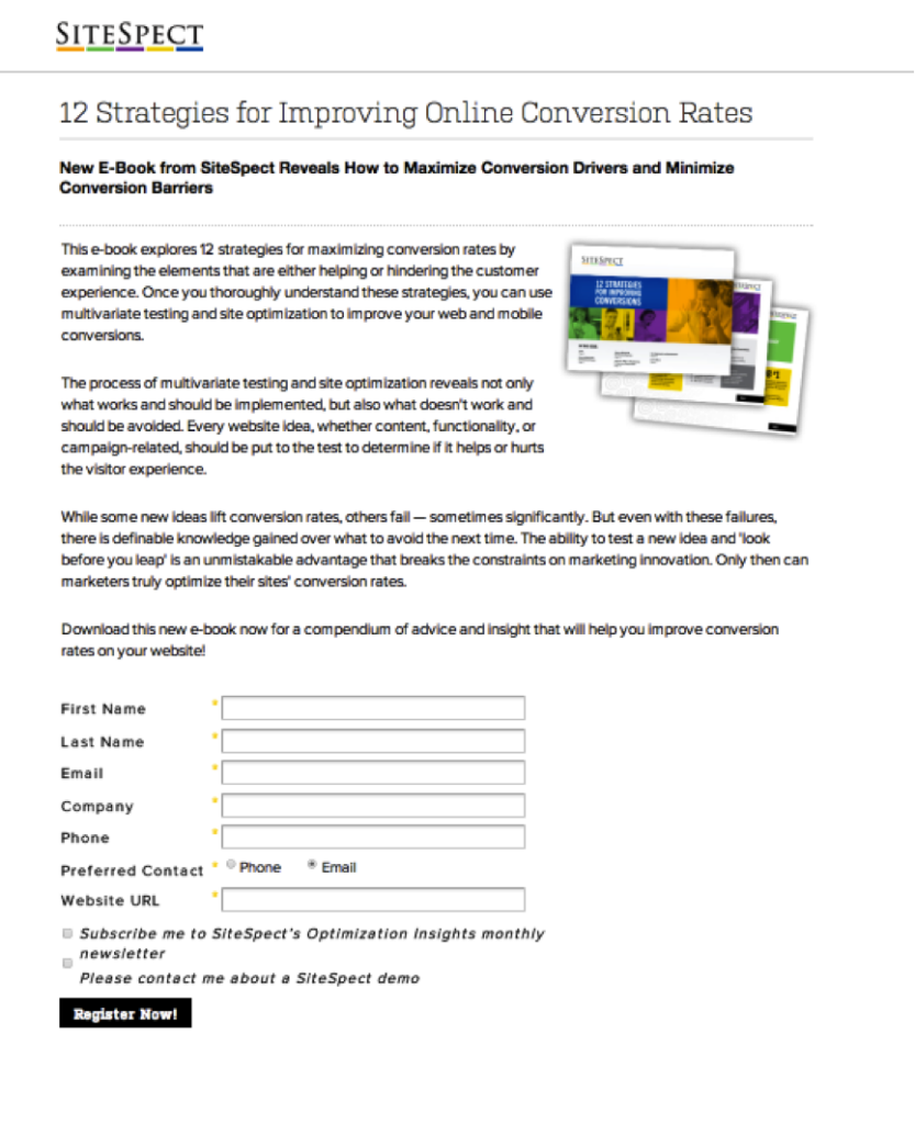
Because it follows a logical layout, most people will know precisely what is at the end of the process.
This does not mean that you must follow other websites exactly. Your ultimate goal is to set up your pages so that they are easy to navigate for your target audience.
If unsure where to put your buttons, you may use the A/B test to collect data first. In other words, you can create some versions of your page with CTAs in different places. Then you’d decide how much traffic you should send to each version; in most circumstances, dividing it evenly makes sense. Finally, you’d choose the winner depending on which page received the most clicks.
4. Use Contrasting Colors
When choosing a button’s color, remember that it should be distinct from the rest of the page. This is because users will only click on your CTAs if it attracts their attention. One of the simplest and most effective methods is to paint them differently.
Let’s look at this call-to-action button from CrazyEgg.
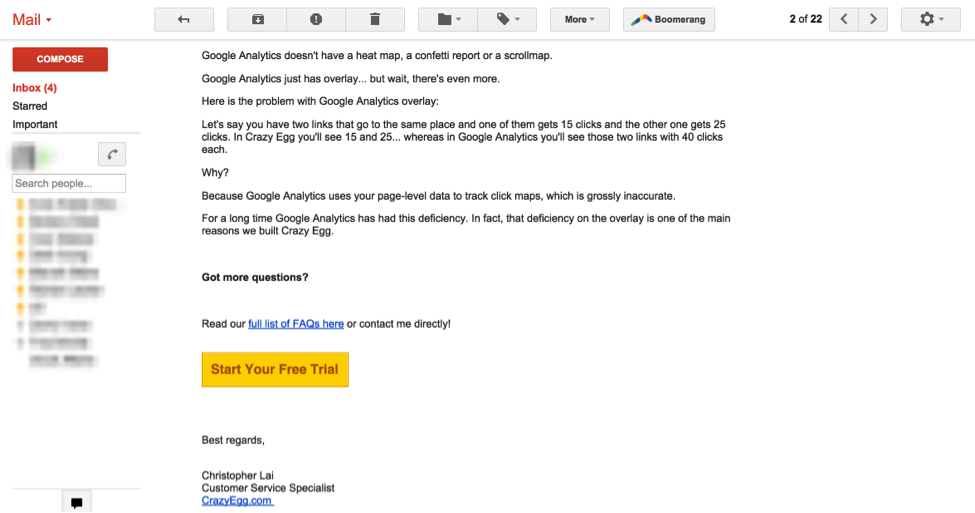
What is the thing that catches your attention first? The bright yellow button. It stands out from the rest of the email.
Let’s look at another example from the Pagewiz landing page.
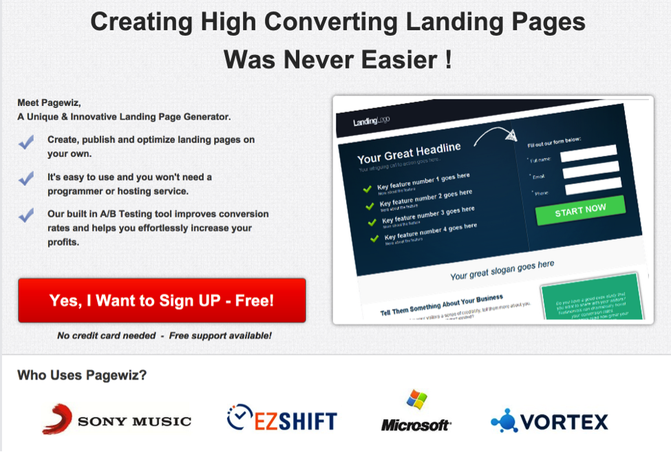
As soon as you see the red button alongside black writing, you know it’s calling out for your attention. Red is a common button color, as you’ve already learned. However, it is not always the best choice. Anything that stands out from the rest of your design will work just as well.
Remember that a contrasting hue is an excellent way to capture users’ attention and encourage them to click.
Try FREE Magezon Page Builder!
Easily create your engaging Magento pages in any style whenever you want without relying on developers or designers, just by drag & drop.
5. Have Close Proximity to the Previous Action
You already know that the buttons on your page should be placed logically with the informative copy. However, while you build your pages to direct visitors to the buttons, you should also notice to place them close to the prior action.
After all, effective CTA buttons make it easier for consumers to convert, and they must align with the user’s vision and actions. But depending on how your page is set up, it might not be as simple as placing a button at the end of a chunk of copy. This is why parallax scrolling, for example, is common on many websites. You can learn more about the parallax effect here.
This effect helps minimize the risk of missing potential customers. Furthermore, if you think about it, you could improve the user’s experience by allowing them to convert as they browse. It also helps keep the CTA button always close to the previous action.
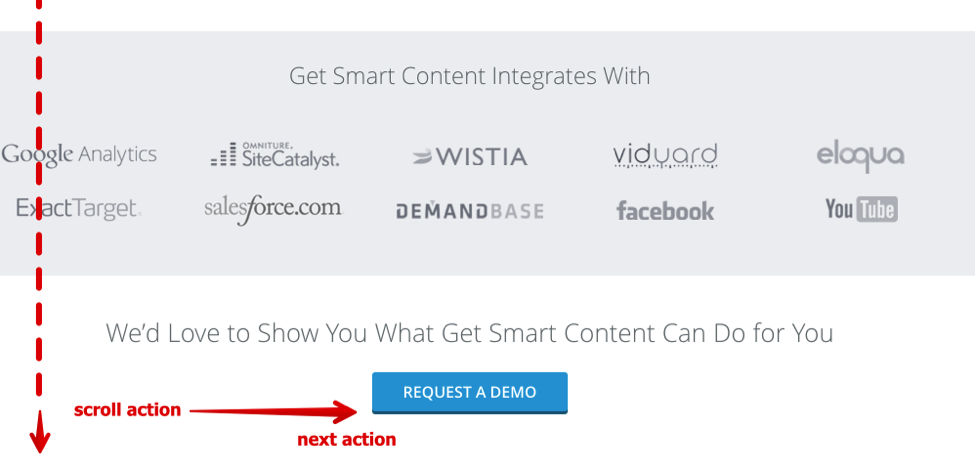
So as you construct your CTA buttons, remember to adjust the positioning of your site and how people might interact with it.
While arranging the CTAs, remember your user behavior and flow to ensure the buttons align with their browsing habits. As a result, you’ll make it much easier for those viewers to take action.
6. Stand Harmoniously with Other Elements
High-converting CTA buttons generate purchases and lead and raise revenue for your business. In the long run, they can also affect your success or failure. To prevent them from being overshadowed by less important elements, they should never be placed in a position of competition.
The CTA button must be the most prominent and attention-grabbing element for a page to create conversions. Otherwise, consumers can simply ignore it or be prompted to do something that generates short sales, like reading a copy or viewing a video.
Each CTA button on your site should have plenty of white space. Take this example from Spotify:
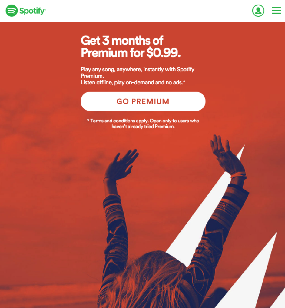
Looking at this, was “Go Premium” the first thing you noticed? In fact, this is the only place where customers can take action unless they open the menu bar to access the additional links.
Furthermore, you can use multiple CTA buttons to get users more interested in your information and push them to discover more about your brand. It’s fine to provide your visitors with numerous choices and a little competition among the buttons.
7. Use First Person
Customers love it when you directly address their wants and desires.
When creating call-to-action buttons, they usually recommend using the second-person pronouns “you” and “your.” However, if you want to engage more with your customers, I recommend the first person, as Flint McLaughlin from Marketing Experiments suggested. With this, you will talk to them, not to them.
The results will look like this:
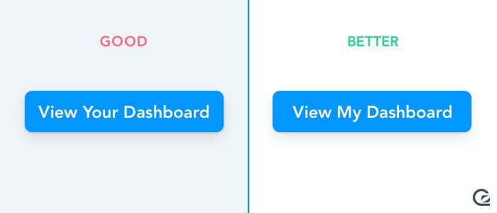
The first person is obviously more tempting because it gives your consumer the feeling of ownership.
Another conversion issue you must beware of is the word “we”. When you use the term “we,” you seem to push your product too hard rather than trying to solve the customer’s issues. Using the word “we” too often paints yourself as untrustworthy, not a spirit of cooperation. Only using the first person can establish trust and create enthusiasm through ownership.
8. Be Super Specific
Another way to entice your readers to hit those CTA buttons is to inform them precisely what they’ll receive.
An important reminder is that your call to action copy should not be long. We can enhance conversions and learn a new technique for the future by arousing intrigue with a specific offer. An A/B test conducted by The Next Web is an excellent example of how this was accomplished.
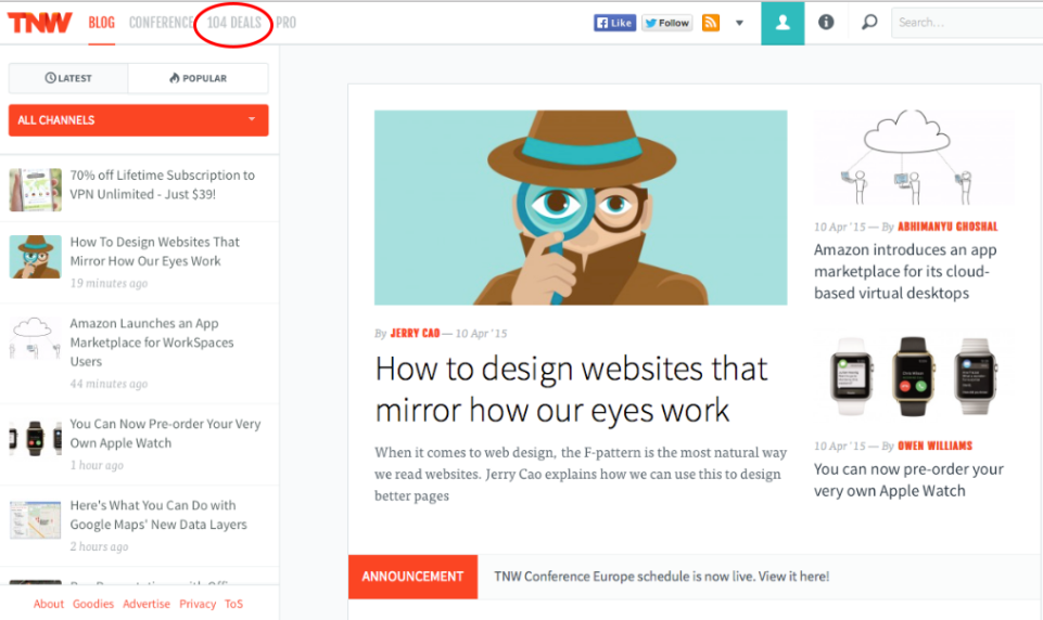
They tested two distinct calls to action to increase exposure to their deal pages. The first button only said “deals.” The second button specifies the number of buyers, such as “104 deals” in this example.
Which one did you think performed better? Since they made it more intriguing, the second version generates more views for their deals pages. They enhanced conversions and found a new tactic for future use by raising interest with a specific offer.
A/B Test Your CTAs
Ultimately, the only method to optimize your call-to-action buttons and maximize conversions is to conduct testing. You probably know that CTA advice tends to focus on testing. So you’ll need to master A/B testing. And it’s not difficult at all.
Start adjusting your call-to-action buttons, and you’ll see that simple changes may have a big impact. Your writing and the button’s surrounding parts should also be tested.
Not all of the advice in this post will work for you, so be sure you try it all. When you find what boosts your conversions, don’t stop; keep testing because there’s always room for improvement.
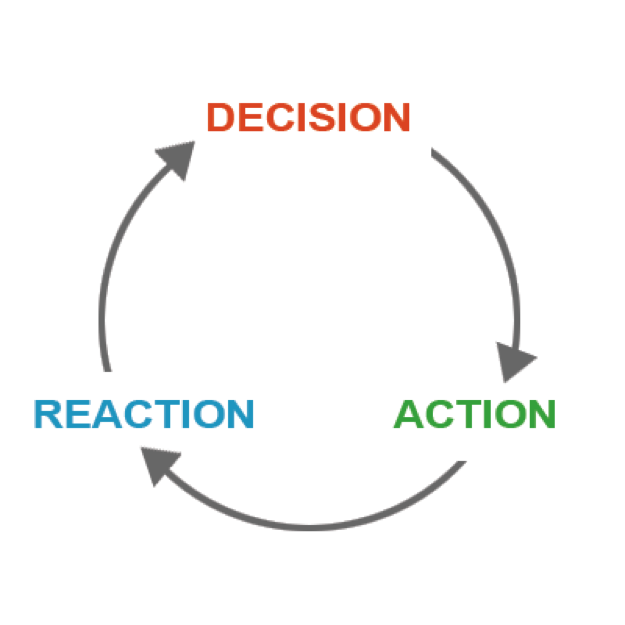
These actions and reactions are all interconnected in a continuous cycle of decisions, activities, and replies, then again, decisions. It is possible to increase conversions and revenue by focusing on your call to action’s most important elements.
Please, don’t just copy your rivals. Copying other people’s ideas may work for you occasionally, but don’t count on it. You’ll have to develop something new at some point; the earlier you start, the better.
You can discover the best methods for a high-converting CTA button through testing.
Conclusion
CTA buttons don’t have to be a hard-to-optimize element. The best way is often the most obvious one. Keeping your users in consideration and making it easy for them to accomplish your goals is all that really matters. Thank you for reading; we hope you’ve got all you need to improve your CTA buttons.
If you are a Magento merchant and don’t know which extension to build your website, consider Page Builder from Magezon. As a trusted Adobe partner, we have satisfied thousands of customers with a vast collection of drag-and-drop extensions, helping you create a high-converting and unique store in minutes.
Don’t take my words for granted; see how your website can be with Magezon Page Builder and what others say about us:


