 Magezon Blog Help Merchants Build Comprehensive eCommerce Websites

To develop and learn how to make a landing page for your digital marketing brand, we must look at the top industry leaders’ best, most inspiring landing pages.
After all, these action-oriented, stand-alone web pages are critical for moving customers through the buyer’s journey at every stage. A good landing page design is vital for any marketing strategy, especially at the enterprise level, if well-known organizations use them.
The most inspiring landing pages below are from these 31+ major companies. Read and look through these examples of good landing pages to begin learning from the best to design your own highly effective post-click landing page.
Table of contents
- What Is a Good Landing Page?
- 31 Inspiring Landing Pages Examples for You
- 1. Slack
- 2. Google Hire
- 3. IBM
- 4. Intercom
- 5. Lyft
- 6. Marketo
- 7. Oracle
- 8. Uber
- 9. LendingClub
- 10. Microsoft
- 11. Salesforce
- 12. AWeber
- 13. Mixpanel
- 14. GetResponse
- 15. HubSpot
- 16. Constant Contact
- 17. Zoho
- 18. Squarespace
- 19. Infusionsoft
- 20. Optimizely
- 21. Drip
- 22. Aura Dating Academy
- 23. LandingFolio
- 24. OutskirtsPress
- 25. GKIC
- 26. James Clear
- 27. Noah Kagan
- 28. GrowthSupply
- 29. Email1K
- 30. ConvertKit
- 31. MeetEdgar
- Conclusion
What Is a Good Landing Page?
A landing page on a website serves a specific goal, such as converting visitors into leads. While landing pages come in various shapes and sizes, the goal is always to generate more leads.
Lead forms on landing sites ask visitors for their contact information in exchange for anything of value, often known as an offer.
A good landing page example can remove navigation, competing links, and different options. It helps you grab your visitor’s entire focus and direct them to where you want them to go, which is your lead form.
To summarize, inspiring landing pages are here with the goal and the ability to converting visitors into customers. And here are some of the best examples of good landing pages for your landing page inspo.
31 Inspiring Landing Pages Examples for You
1. Slack
One of the most inspiring landing pages has to be Slack.
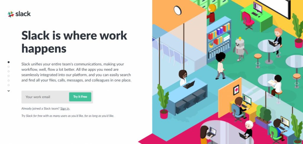
What the Page Does Well
- With Slack, you can see all relevant information in a unique scrolling feature, allowing visitors to get information without going up and down the page. This is a landing page inspo and makes Slack one of the coolest landing pages.
- The lead capture form is always visible as users scroll through the information.
- Furthermore, because it’s short, direct, and uses the term “free,” the CTA (Call to Action) button wording is powerful.
- Visitors are more likely to complete the form with only one form field.
- The website also uses each part’s vibrant, interesting, relevant images. They also express brand colors.
- Visitors are more likely to want to utilize Slack with social proof on the main page.
What Can Be Tested/ Improved
- The Slack logo, “See all apps,” “Sign in,” “product,” “price,” “See customer tales,” and “Enterprise Grid” are various exit buttons, making it more likely for viewers to depart without converting.
- Clients may hesitate to give their email addresses if there is no privacy policy.
2. Google Hire
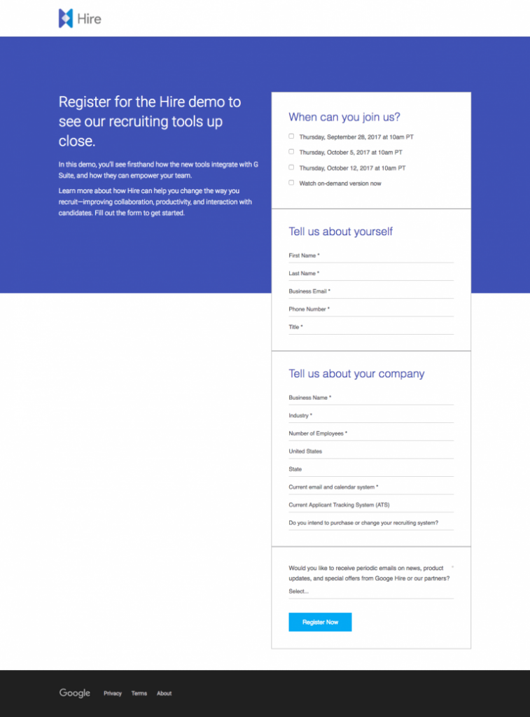
What the Page Does Well
- When visitors arrive on the page, the Hire logo in the top left corner immediately informs them of their location. By doing this, Google Hire stands out from other landing pages. Here, Google presents itself as one of the examples of good landing pages. Because it isn’t a hyperlink, consumers won’t click away, making it an excellent post-click landing page.
- Google Hire also uses a clear headline to inform prospects that the demo will include recruiting tools.
- Visitors can swiftly browse and decide whether or not they want to convert on the offer using minimal, to-the-point copy.
- Furthermore, encasing the form makes it stand out on the page, boosting conversion rates.
- Google Hire is also a good landing page example because it gives users trust values. The footer’s privacy policy makes prospects feel more comfortable providing personal information.
What Can Be Tested/Improved
- The message match should be better to be one of the more inspiring landing pages. A Hire webinar campaign directs users to a post-click landing page with a CTA button asking users to sign up for the upcoming webinar. The post-click landing page doesn’t mention a webinar but offers an on-demand demonstration. If Google Hire views their webinar and demo as the same thing, improving the message alignment between the two pages will reduce visitor confusion.
- Even at the consideration stage of the marketing funnel, 14 form fields are a lot. Breaking things down into multiple steps could reduce friction and increase conversions.
- The turquoise CTA button also does not help by matching the other blue shades on the page.
- The page is off-balance. Adding a post-click landing page feature to the left of the form’s bottom, such as a customer testimonial or an eye-catching image, could improve the page’s aesthetics.
- Overall, Google Hire can use some more landing page inspo from some of Google’s older effective landing page examples.
3. IBM
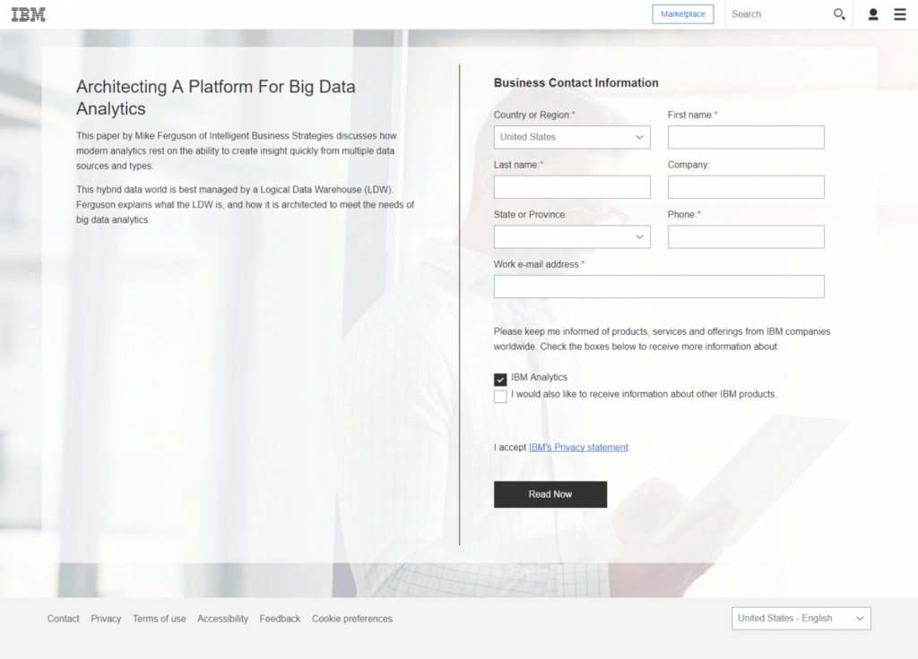
What the Page Does Well
- IBM is a good contender for a good landing page example. The title stands out and entices visitors to scroll down the page to discover more about the deal.
- The white paper’s minimal copy delivers a quick summary without overloading prospects with extraneous material.
- In theory, allowing users to swap languages is a fantastic concept. But unfortunately, doing this directs customers to the home site when they select a different language.
What Can Be Tested/Improved
- Header and footer navigations can easily divert attention away from the current offer, causing visitors to abandon the page without converting. It would be more visually attractive to balance the page by putting an image or customer testimonial on the left side.
- According to standard landing page quality standards, the CTA button can improve. The language can be more consumer and benefit-oriented, and the color can be more contrasted and attention-grabbing. With the colors adjusted, IBM can be one of the most inspiring landing pages.

Try FREE Magezon Page Builder demo today
Easily create your high-converting Magento landing pages in any style whenever you want without relying on developers or designers. Just by drag & drop.
4. Intercom
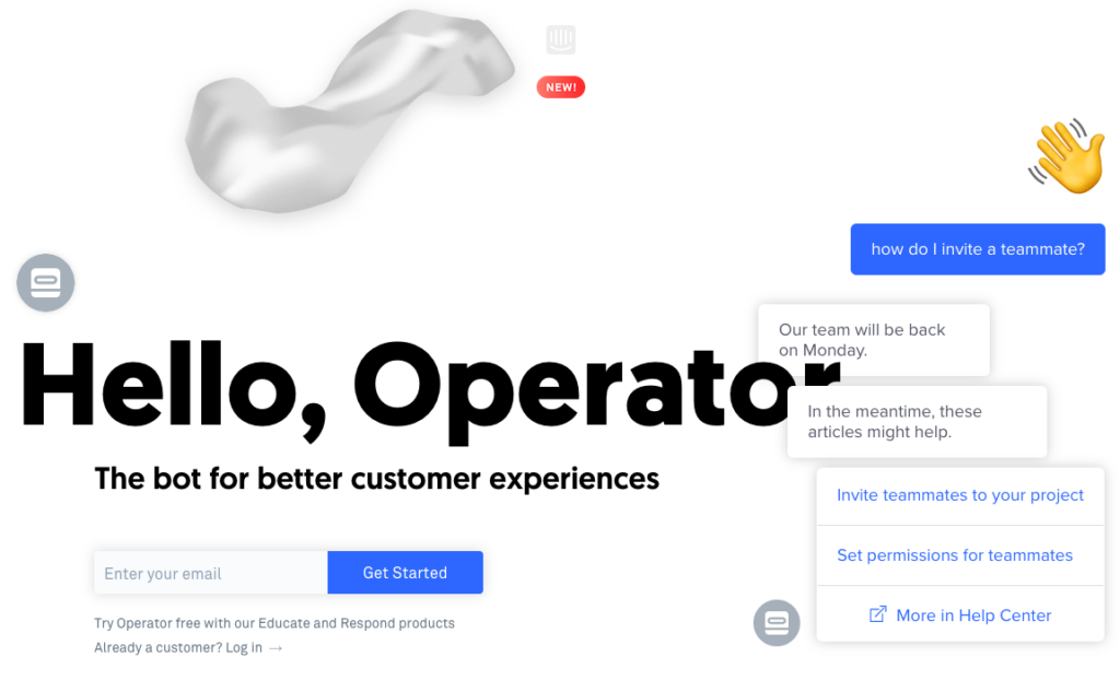
What the Page Does Well
- Incorporating humor into your landing page is a perfect landing page inspo. It makes this one of the more special, inspiring landing pages, particularly in the section titled “Today’s Bots are Really Annoying,” which aids in developing a deep, compassionate, social touch with visitors. This distinguishes Intercom from many examples of good landing pages.
- Section headers with minimum copy inform prospects about Operator’s features (and how they may profit from them) without cluttering the page.
- The website will be more accessible and consumable with enough white space.
What Can Be Tested/Improved
- The title is somewhat obscured. Even though humor is a great thing in a good landing page example, it makes the title harder to understand.
- Furthermore, devs can slightly shift the text boxes that conceal it to make the headline more visible to visitors.
- Various exit links — the Intercom logo at the head and bottom of the page, then the register below the first form, and the “Learn more” link beneath the second form — may deter visitors from converting.
- Since many items on the website have identical formatting and appear clickable, the form and CTA buttons blend in with the rest of the page.
5. Lyft
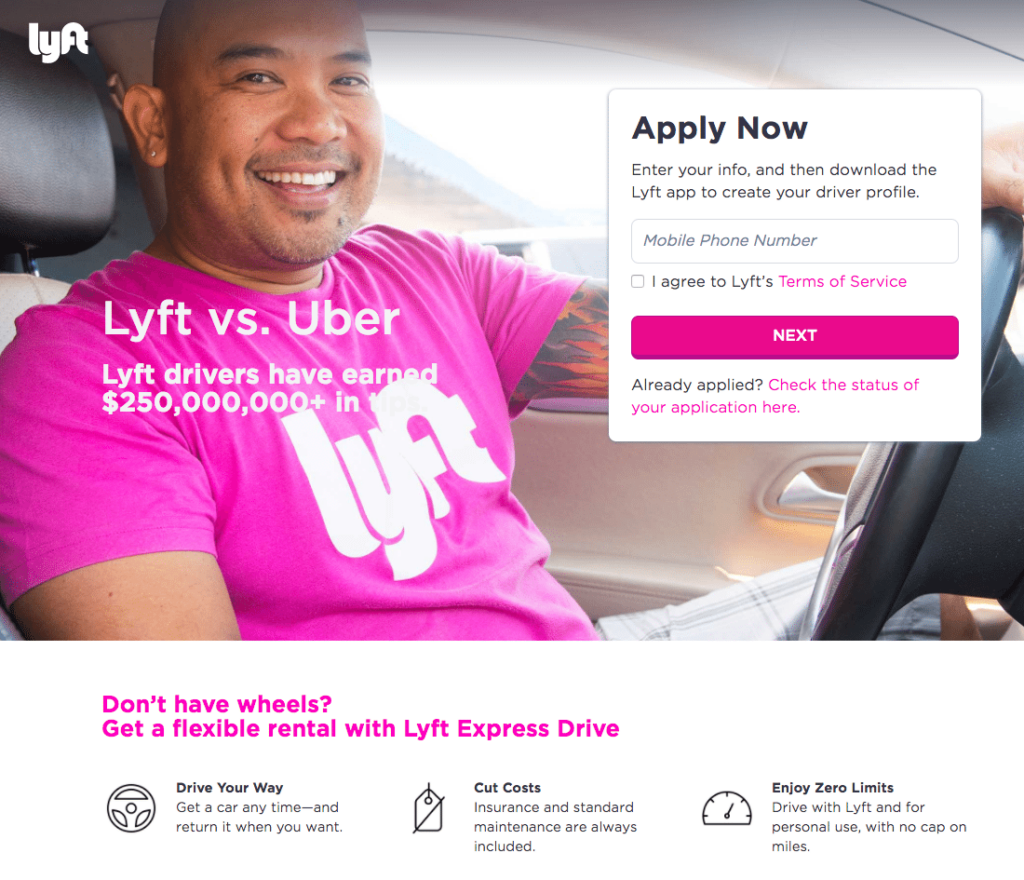
What the Page Does Well
- The sub-headline acts as social validation, informing visitors that others have had positive experiences with Lyft.
- As the one-field form seeking a mobile number is quick and straightforward to fill out, it won’t put off many potential customers.
- Leaving the opt-in box unchecked gives the impression that the candidate has complete control over their decision.
- Interest in visitors may rise with the offer of a $250 bonus.
- The “Apply Now” CTA button is an anchor tag that directs visitors to the top of the page, where they can swiftly fill out the form.
- Visitors can use the calculator to see how much income they could make if they drive for Lyft.
- To emphasize the major advantages of working for Lyft, the “Why Lyft” section employs imagery and minimal, basic prose.
- The “How Lyft Driving Works” slider describes how Lyft’s mobile app works.
- Regarding operating for Lyft, “Lyft Insurance Protection” and “Passenger Ratings” give drivers peace of mind, putting Lyft on the most inspiring landing pages list.
What Can Be Tested/Improved
- Many exit links, such as the Lyft symbol and several clickable terms throughout the material, may cause visitors to become distracted and abandon the website before converting.
- The headline compares Lyft to Uber, and there’s nothing else here on the website that does so.
- The white writing does not stand out against the white text on the man’s shirt.
- Redirecting the man’s sight toward the lead capture form would encourage more people to fill it out.
- “Next,” the CTA button copy, is as dull as it gets. Changing to something more appealing, such as “Start making money immediately!” would enhance conversion rates.
- Devs have used the color pink so frequently on the page, which makes the pink CTA button not stick out as much as it should.
6. Marketo
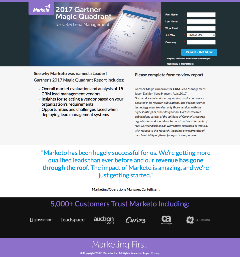
What the Page Does Well
- The headline informs visitors about the report’s topic, a must-have for any inspiring landing page.
- Visitors can see what they’ll get if they select to get the report by looking at the image.
- Clients may read the page using bullet points to see what the report contains. Being direct like this is special, as many examples of good landing pages don’t do this.
- Social evidence, such as a client testimonial and business badges, boosts the offer’s and the organization’s overall trustworthiness.
What Can Be Tested/Improved
- The Marketo symbol and the Legal link at the bottom are exit links, letting users leave the website without receiving the report.
- For anyone at this point of a buyer’s journey, the 5-field form could be frightening. Removing “Job Title” and “Company” may encourage more people to fill it out.
- Because the CTA button color is already elsewhere on the website, it doesn’t stick out as much as it should.
- The copy on the CTA button is ambiguous. It’s possible that changing it to “I want the report!” will motivate more people to click.
- The huge piece of italic copy is unnecessary, and deleting it could improve conversion rates.
- The site can easily enhance customer testimonial trustworthiness by including a full title and headshot.
7. Oracle
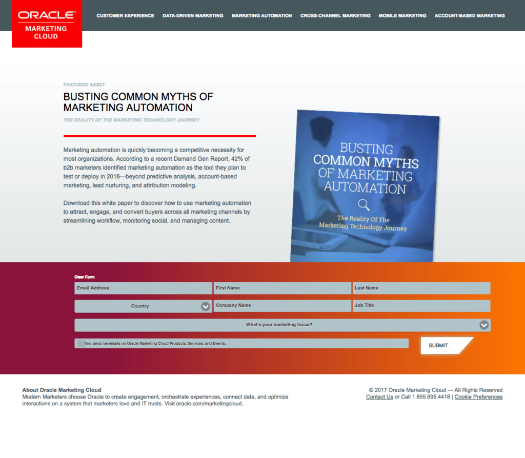
What the Page Does Well
- Visitors can see a sample of what they’ll get if they download the white paper by looking at its picture. This method, minimalism, is one of the most effective ways to make landing pages and good inspo.
- The form’s contrasting hue attracts attention, prompting visitors to fill it out.
- The opt-in box guarantees that those who opt in wish to acquire emails from Oracle.
What Can Be Tested/Improved
- Visitors may leave the site without getting the white paper due to the company logo and navigation at the top of the front page.
- Reading the small copy on and below the form fields is tough.
- Since white is at the front and bottom of the page, the white CTA button does not shine as much as possible.
- Exit links in the footer give visitors even more options for leaving the website.
8. Uber
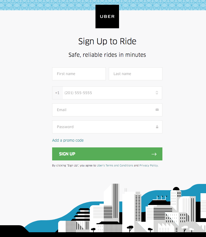
What the Page Does Well
- As a lift service, Uber has one of the most inspiring landing pages for this kind of service. Visitors can easily tell where they are by looking at the Uber logo at the top of the front page. It’s also a bonus that it’s not an exit link since it doesn’t connect to the homepage.
- Five form fields are sufficient for a registration form, particularly because they do not request sensitive information.
- The extra promotion code field is clever because it doesn’t appear until the prospect clicks, limiting the form to only five areas.
- The green CTA button sticks out because there is no other green on the page.
- The arrow on the CTA button serves as a directional indicator, informing visitors that they should click to see what’s on the other end of this post-click landing page.
What Can Be Tested/Improved
- Almost none of the material on the page has the potential to make visitors feel uninformed and uncertain.
- Including social validation, such as a cited review from a recent Uber rider, may help visitors feel more confident.
- The language on the CTA button that says “Sign up” doesn’t give off a personal vibe. “Get a ride right now!” is more exciting and descriptive.
9. LendingClub
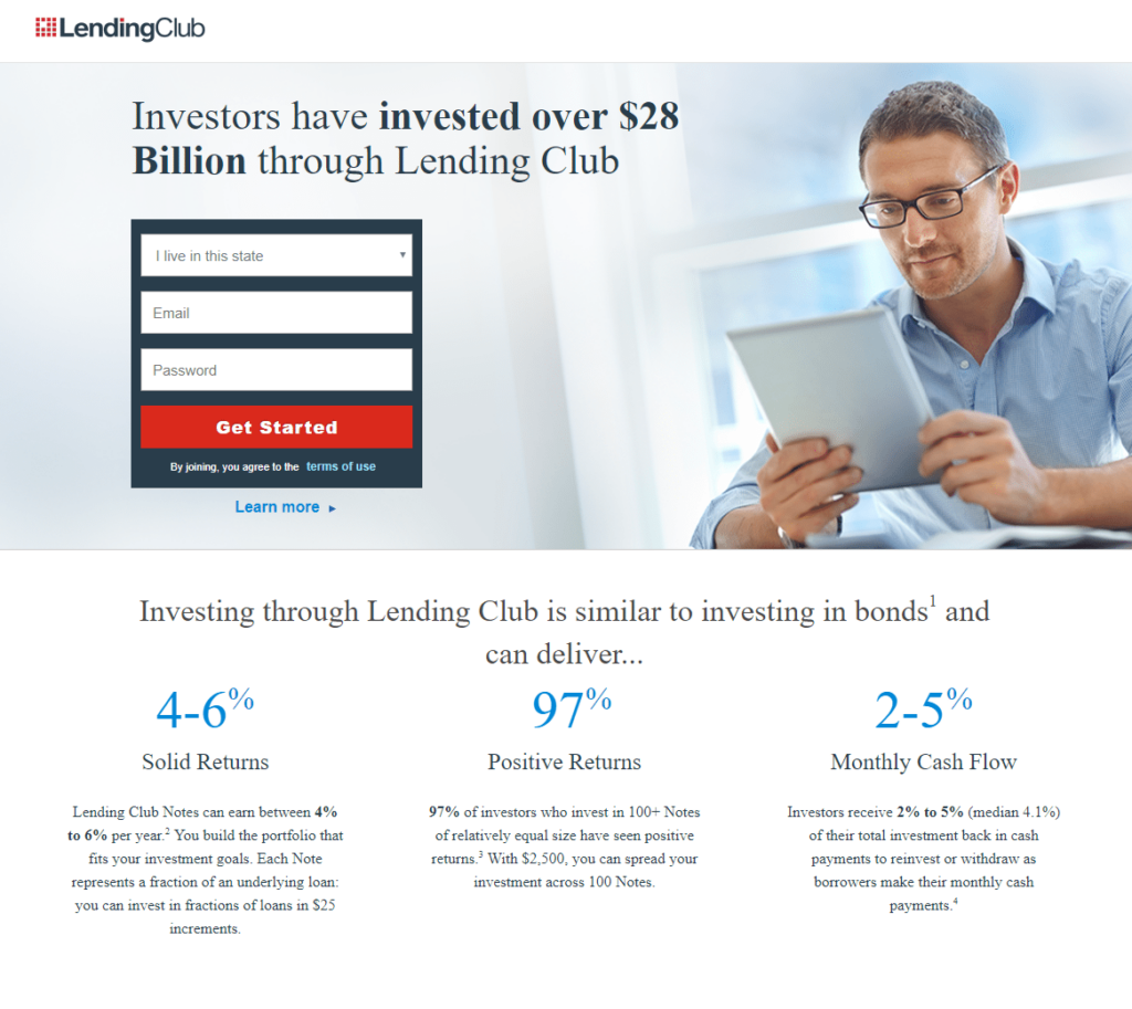
What the Page Does Well
- The value proposition is obvious with bold formatting in the headline.
- The use of color contrast to encapsulate the form draws attention to it.
- The red CTA buttons stand out on the website and likely increase conversions.
- The “Investing with LendingClub” section summarizes the primary advantages of cooperating with the company without the overwhelming page-filling process. The exact investment percentages also act as social confirmation.
- The company logos also serve as social proof, informing visitors that LendingClub is reputable and trusted by many well-known firms.
- Prospects have more opportunities to convert with multiple CTA buttons.
What Can Be Tested/Improved
- The LendingClub logo, “terms of use,” “Learn more,” various sentences in the small print, and the footer layout are all possible exit links that might send visitors away without converting.
- Shifting the man’s eyes in the shot to look at the lead capture form could inadvertently inspire more people to fill it out.
- More conversions will likely go around by changing the CTA button copy to something more appealing and intriguing, such as “Start investing today and earn rewards!”
- The portion of fine print at the bottom of the page is excessive and may lead potential customers to perceive the company as having a hidden agenda.
10. Microsoft
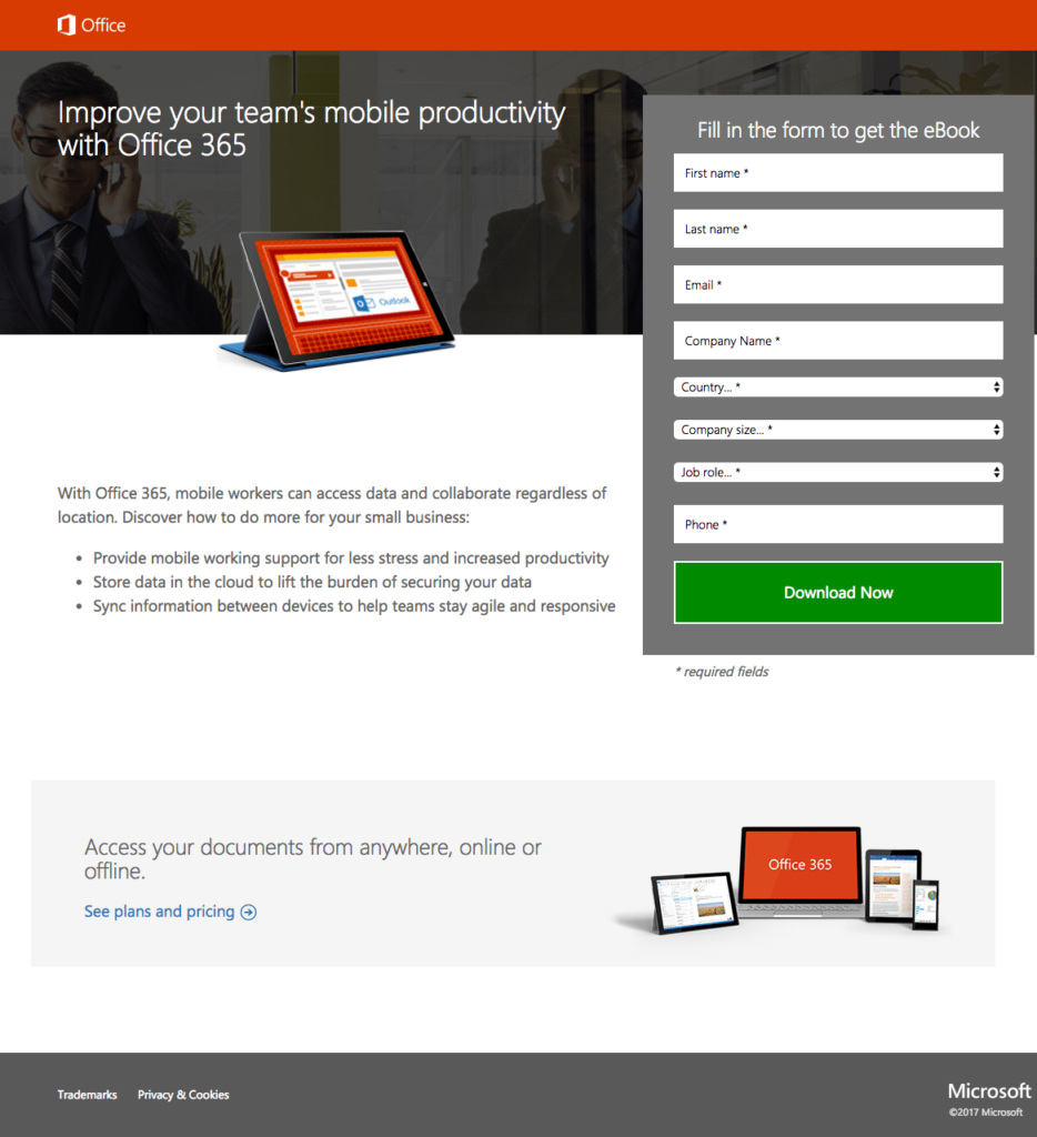
What the Page Does Well
- We all know Microsoft as the tech giant, but it also hosts one of the most inspiring landing pages in the tech field.
- Visitors can increase their team’s mobile efficiency with Office 365 through the benefit-oriented headline, encouraging them to learn more with the ebook.
- Visitors can see what they’ll get if they download the ebook by looking at the product image. Microsoft can also improve conversion results by enlarging it and making it more realistic.
- Potential consumers may scan the page for key information with bullet points and the least copy.
- The encapsulated form stands out, drawing attention and encouraging visitors to fill it out.
- Because the CTA button contrasts effectively with the rest of the website, the green CTA button attracts attention.
What Can Be Tested/Improved
- The hyperlinked Office logo can cause customers to exit by preventing them from seeing the deal offer and converting.
- The man’s picture seems unrelated to the offer. It might be more efficient to replace it with someone who uses Office 365 or reads the ebook.
- Eight required form fields may be overwhelming for someone who is only in the consideration stage of the buyer’s journey.
- The copy for the CTA is neither precise nor engaging. It’s possible that altering it to something more tailored and thrilling as “Send me the eBook!” would motivate more prospects to click.
- “See plans and pricing” at the bottom of the page may divert attention from the primary offer and restrain conversion.
- Adding social proof to the website, such as customer feedback or trust stamps, will boost trustworthiness.
Try FREE Magezon Page Builder demo today
Easily create your high-converting Magento landing pages in any style whenever you want without relying on developers or designers. Just by drag & drop.
11. Salesforce
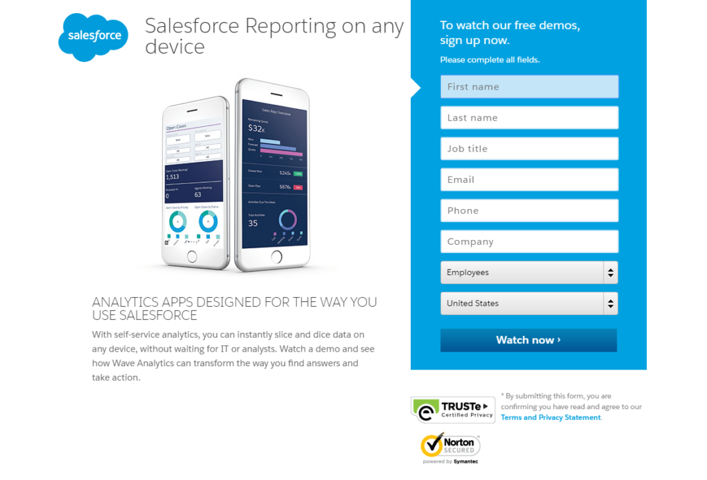
What the Page Does Well
- The compelling primary and secondary headlines recognize and offer a solution, making Salesforce a good landing page example and one of the inspiring landing pages.
- Visitors can preview the Wave Analytics mobile app in the image on the website.
- The offer has simple wording and a precise manner without overcrowding the page with information, making this a more inspiring landing page.
- The encapsulated form‘s color contrast makes it stick out, likely attracting more people to fill it out.
- The arrows are directional cues; one point to the first form field and the other to the CTA button.
- Prospects may trust that their private information will be safe and private thanks to trust badges and privacy policies.
What Can Be Tested/Improved
- Exit links, such as the Salesforce logo, trust badges, social network links, and footer links, help users leave this page quickly.
- The presence of eight required form fields may discourage users from filling out the form. Removing unneeded queries or switching to a multi-step form would minimize friction and increase downloads.
- The CTA button is blue and blends in with the blue form. Changing it into A more contrasting color (such as orange) will attract more people.
- The CTA button can benefit from changing to “Show me the Wave Analytics demo!” to be more appealing.
- Including social evidence, such as a Salesforce customer reference, would boost visitors’ trust and increase demo views.
12. AWeber
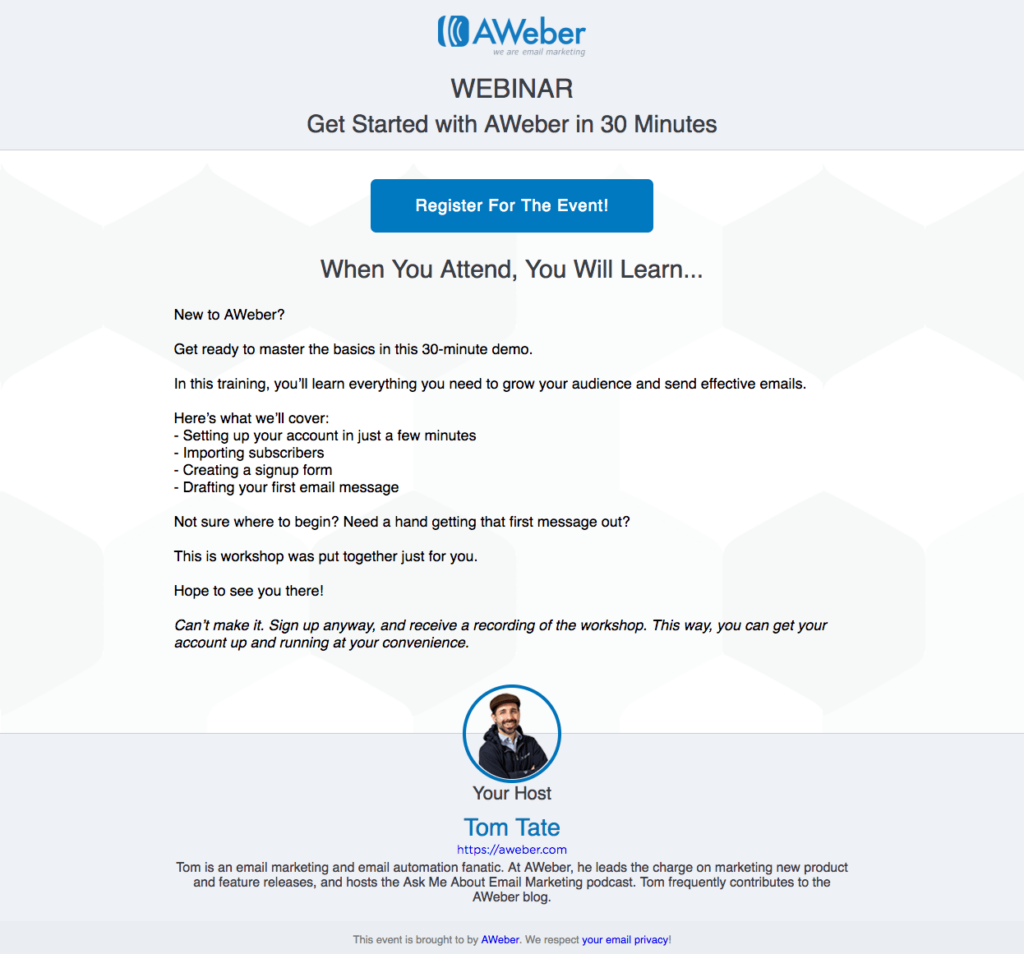
What the Page Does Well
- The headline informs prospects that the webinar will last only 30 minutes, making a good landing page example.
- The CTA button looks prominent, so visitors will notice it immediately when they arrive at the website. The copy is also descriptive and intriguing, likely to entice prospects to click.
- Visitors can remove the lead capture after the 2-step opt-in design, and clients only see it when they hit the CTA button. As a result, there will be less friction and more conversions.
- Visitors only need to complete three form fields, which include the event date/time, name, and email.
- Including Tom Tate’s headshot and description is beneficial because prospects can see and learn more about who will be presenting. Although, expanding the image would very certainly improve its effectiveness.
- Visitors will likely feel more comfortable handing out their personal information thanks to the privacy policy link at the bottom of the page.
- Looking out for the consumers, AWeber is one of the most inspiring landing pages.
What Can Be Tested/Improved
- Devs should try creating the website in a color that isn’t everywhere else on the page to make the blue CTA button more attention-grabbing,
- Different styles (indenting the list, including imagery or arrows, bold font, etc.) might make the “Here’s what we’ll cover” part stick out more, encouraging people to read it.
13. Mixpanel
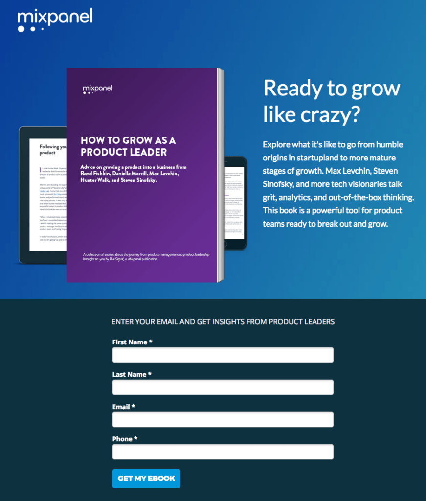
What the Page Does Well
- The headline is great in customization and is also geared towards customers’ benefits, striking right into what visitors want to see and their purpose when visiting the website.
- Prospects know they can see the ebook on various devices thanks to the image.
- The quick ebook summary gives users a brief review of the ebook.
- The 4-field form is quick and straightforward, allowing visitors to fill it out.
- The first-person language of the CTA button copy makes consumers feel connected to the offer.
- The “What’s Inside Your eBook” section expands the short description above and highlights critical things made in the ebook and what product leaders have to say about them. It’s also a fine touch to include headshots.
What Can Be Tested/Improved
- The form’s headline is deceptive. It implies that an email address is the only information required when three more form fields are needed to claim the ebook.
- The blue CTA button blends in with the remainder of the page’s color scheme, so it doesn’t stick out. It might be more effective to test it in a color that isn’t used everywhere on the website.
- Adding trust signals, such as a privacy policy or security badges, to guarantee people that their personal data will be protected could boost lead generation.
14. GetResponse
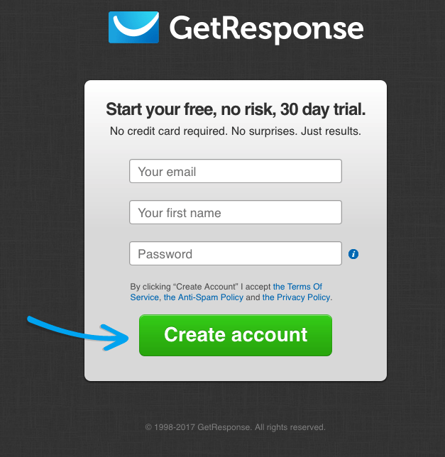
What the Page Does Well
- The headline clearly states this offer and how it can benefit.
- The subheadline complements the title nicely, describing how customers might profit from the offer.
- The arrow serves as a navigational pointer, aiming straight at the CTA button.
- The terms of service, anti-spam policy, and privacy policy are all clearly stated to ensure that personal information is handed over confidently.
- The three-field form has a low entry barrier because it doesn’t even ask for a last name.
- The color of the CTA button is a good contrast that isn’t used anyplace else on the page. For being clear and coherent, GetResponse is one of the most inspiring landing pages for email marketing services.
What Can Be Tested/Improved
- The logo is associated with the home page, sending users away before discovering the offer and converting.
- There isn’t a lot of descriptive text. The site can obtain more conversions by informing more about GetResponse and its major perks.
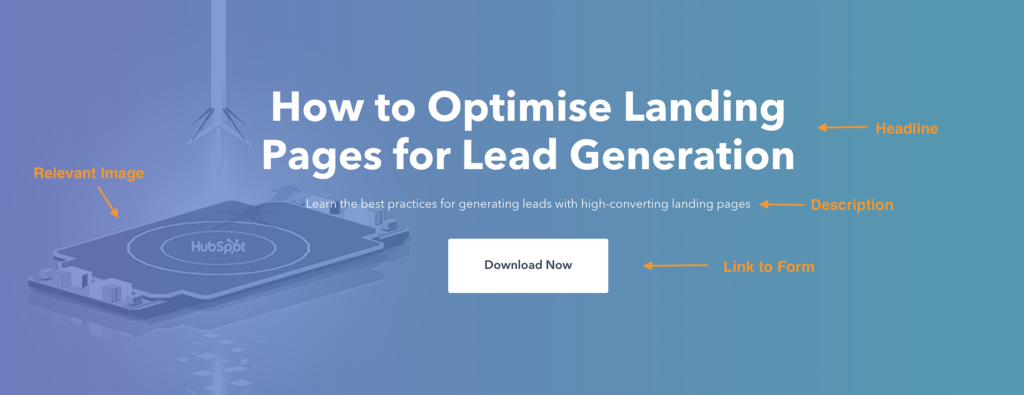
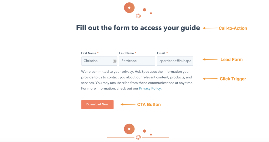
15. HubSpot
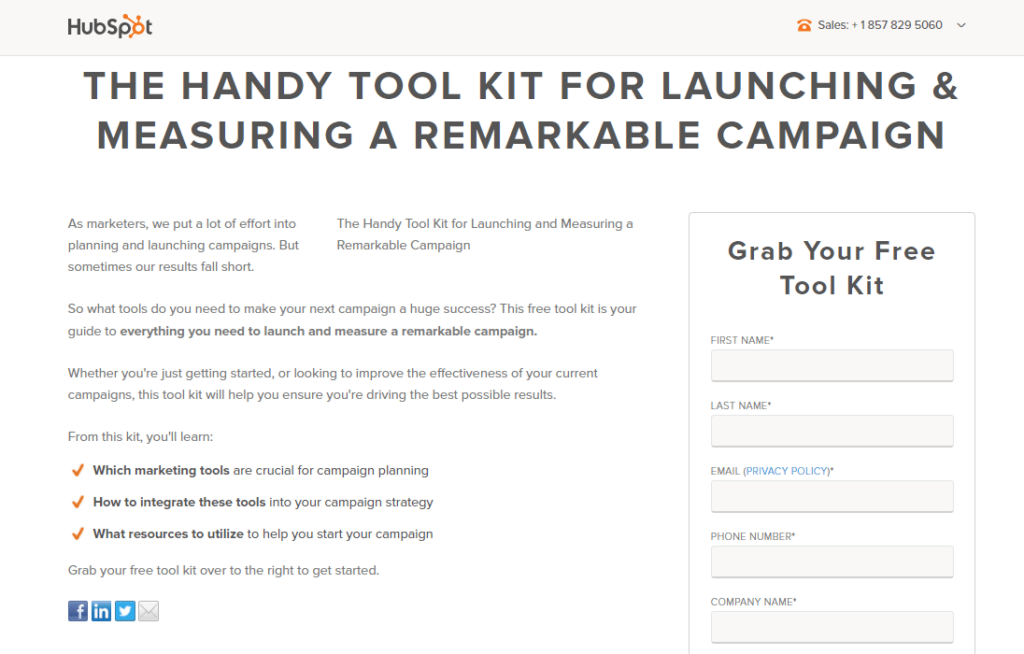
What the Page Does Well
- The user experience is enhanced with the click-to-call phone number.
- The page title summarizes the deal and explains how it will help visitors.
- Scanning this page is quick, straightforward, and convenient, thanks to simple sentences, key points, and bold type.
- Encasing the form truly stands out more on the page and will likely encourage more people to fill it out.
- The form’s title informs prospects that the toolkit is free. On the other hand, including it in the headline would be more effective.
- Prospects may easily access the privacy policy by clicking the link next to the email field rather than scrolling to the bottom of the page.
- Because there isn’t much else on the blue page, the CTA button stands out.
What Can Be Tested/Improved
- The HubSpot logo in the top-left corner links to the homepage, which may redirect users away from the website.
- It’s unnecessary to repeat the heading beneath the primary headline; it also adds clutter to the page.
- Visitors may be redirected away from the page due to social sharing buttons and diminishing conversion rates.
- The 12-field form is excessive and could be intimidating to visitors. Removing some fields or changing them into a multi-step form might get more people to fill out.
- The copy on the CTA button is ambiguous. It’s possible that changing it to “I want the toolbox!” may inspire more visitors.
- The balance of the page is off. A sample image of the toolkit or a reference from someone who has received the toolkit would help to balance the page and boost conversions.
16. Constant Contact
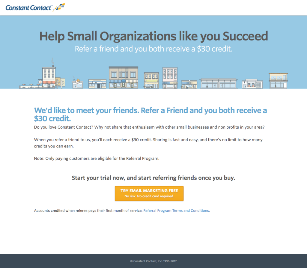
What the Page Does Well
- The headline and the subheadline are benefit-oriented and assist one another well; they are must-have items for inspiring landing pages.
- Visitors can comprehend the offer without being overwhelmed by too much text when using minimal copy.
- Because the orange CTA button contrasts effectively with the other colors on the page and sticks out.
- Visitors may get most of the details about the deal without being sidetracked or intimidated by a form, thanks to the click-through layout design with the lead capture form on the linked page.
What Can Be Tested/Improved
- The hyperlinked logo may lead people to exit the website without allowing them to read the complete offer.
- The CTA button includes excessive material, making it tiny and hard to see. “No risk. No credit card required.” might be moved below the button.
- Prospects may be hesitant to convert if there is no privacy policy.
- Including social validation, such as a client testimonial, would likely increase conversion rates by making prospects feel more confident in supporting Constant Contact.
17. Zoho
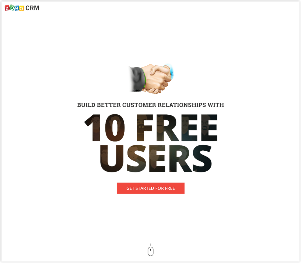
What the Page Does Well
- The headline advertises two advantages of joining the free Zoho CRM plan: better customer service and ten free users.
- The word “free” appears on multiple pages, including the headline, CTA buttons, and descriptive copy.
- Multiple red CTA buttons contrast well, stand out, and draw attention. The first button is an anchor tag that directs visitors to the contact form at the bottom of the page.
- The mouse icon indicates that visitors can scroll down for more information. It’s also an anchor tag, which means they’ll be taken to the next part without navigating if they click it.
- The broad list of features encapsulates everything Zoho CRM has to offer.
- The 2-step opt-in design reduces friction by solely displaying the form until visitors hit the bottom CTA button.
- The yellow outline calls attention to it and will likely boost conversion rates.
- The 3-field form decreases friction by solely requiring a name, email, and password.
- Only interested potential customers can receive Zoho’s content by checking the newsletter.
What Can Be Tested/Improved
- Exit links, such as the Zoho logo, “Terms of Service,” and social media links, may drive visitors away from the page before they may convert.
- Although the handshake image is appropriate for the offer, a photo with two individuals could be more effective.
- The “Sign up” CTA button copy on the form should be enhanced. It is the same as the CTA button on the top of the page: “Get started for free.”
18. Squarespace
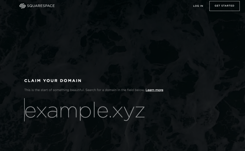
What the Page Does Well
- “Claim your domain” is a great headline because it portrays a feeling of necessity. Prospects must register their preferred domain name before everyone else.
- The “Learn more” link in the subhead is an anchor tag that directs visitors to a page where they may learn more about the deal.
- The clean, consistent font throughout the page gives a professional feel.
- The text is easy to follow and absorb because of the small pieces of copy.
- Comparing Squarespace to its competitors, we can easily see how picking Squarespace over anyone else can benefit you in various ways.
- The woman’s stare at the bottom of the page is fixed on the section heading, likely to draw the visitors’ attention.
What Can Be Tested/Improved
- Visitors can quickly leave the website without taking action due to links at the header and full footer navigation.
- The domain field is annoyingly integrated into the rest of the page. Despite its size, it appears to be just another design detail on the website, and visitors may easily miss it.
- If the CTA buttons were a more contrasting color, such as red or yellow, they would “pop” more on the page.
19. Infusionsoft
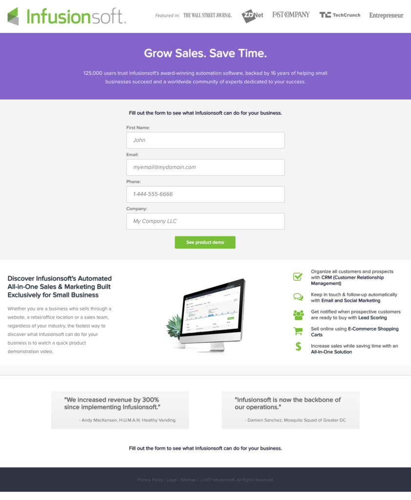
What the Page Does Well
- Prospects are given a sense of assurance and trust through social proof, including company badges at the front of the site and customer feedback at the bottom.
- The headline does a fantastic job of recognizing a visitor’s issue, coming to terms with them, and then offering a solution.
- The subheadline assists the title nicely, highlighting some of the most important advantages of working with Infusionsoft.
- Prospects are more likely to fill out the straightforward, four-field form because it simply asks for basic information.
- The CTA button copy explains what they will get if they fill out the form and click.
- The list of Infusionsoft’s services informs potential customers about the benefits they will obtain if they collaborate with the company. This section’s iconography and bold font help to bring attention to it.
What Can Be Tested/Improved
- Including a click-to-call element to the mobile number would allow customers to contact the company quickly and easily, enhancing their entire experience.
- Widening the CTA button may grab more attention and, as a result, encourage more people to click.
- Because green has already been used in the company logo and the small icons listed in the part below the button, the color of the CTA button might be modified to draw more attention.
- If the image were bigger and easier to see, visitors would have a better preview of the software.
20. Optimizely
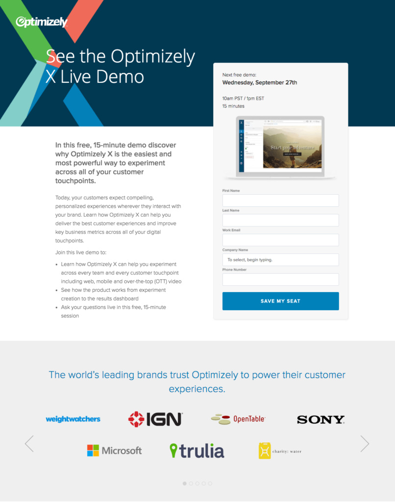
What the Page Does Well
- Visitors can learn quickly about the demo by scanning the page with a bulleted copy.
- Encapsulating the form in a box makes it stand out and likely increases conversions.
- Visitors can see how the sample will look by looking at the computer image on the form.
- For a decision stage offer, the 5-field form is appropriate.
- Scarcity and urgency are used so the CTA button copy can entice visitors to sign up for the demo. “Save my seat” means that just a few seats are available and must be reserved.
- Using company logos as social proof informs visitors that Optimizely is recognized by some of the world’s most well-known firms. In addition, the arrows in this area serve as directional indicators, hinting that there are yet more logos to be discovered.
What Can Be Tested/Improved
- The navigation at the header and footer should be deleted as they drive visitors away from the site and gain lower conversion rates.
- The blue CTA button does not stick out as much as a yellow or orange one.
- Visitors are distracted and driven away from this website by the social sharing buttons at the bottom of the page, which also function as exit links.
Try FREE Magezon Page Builder demo today
Easily create your high-converting Magento landing pages in any style whenever you want without relying on developers or designers. Just by drag & drop.
21. Drip
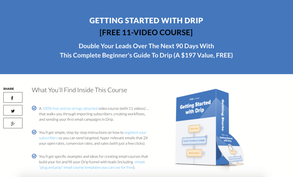
What the Page Does Well
- The term “free” has an enticing ring to it. “$197” is a great word to utilize. This tells the client how much value they may expect when they register. It is incentives like this make websites (Drip in particular) the best landing pages for conversion.
- “Double your leads in the next 90 days” is a compelling headline that expresses a clear benefit with precision.
- Customers know exactly what they are going to get when they register. There’s no BS here; everything is completely transparent.
- Giving away stuff without asking for anything is an intriguing thought.
What Can Be Tested/Improved
They might try removing the “Facebook Like” button right next to the Drip logo to limit the possibility of customers clicking and getting redirected to another site without converting.
22. Aura Dating Academy

What the Page Does Well
- The yellow CTA button stands out from the rest of the page.
- The term “free” has an intriguing ring to it. Again, putting free or massive sales can be very good if you try to be one of the best landing pages for conversion.
- A good benefit is also offered here – This page knows exactly who its client is; therefore, it can customize benefits and confidently engage women.
- The page creator’s knowledge is highlighted in the detailed testimonial.
What Can Be Tested/Improved
- The page can test how the visitors react to no video. People value their time and may not want to watch a video before deciding whether or not to participate.
- Another thing that this page can do is experiment with a new batch of headlines. The phrase “effortlessly engaging” sounds like it belongs on a social media site rather than a dating site.
23. LandingFolio
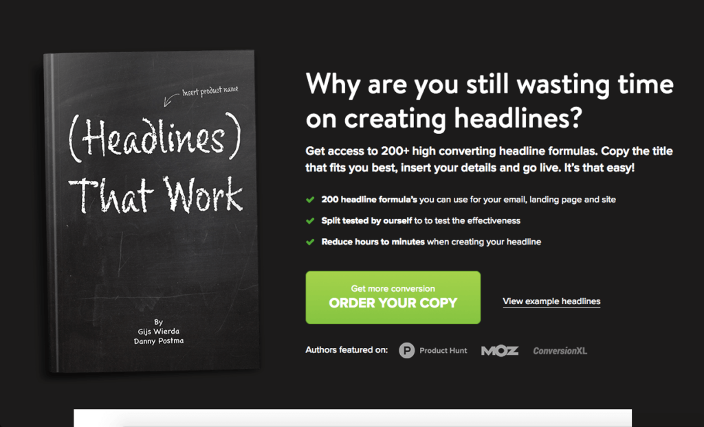
What the Page Does Well
- The headline instantly focuses on a problem.
- The subheading perfectly conveys the customers’ difficulties.
- The included company logos provide social proof, which builds trust.
- A large green CTA button stands out on the page.
What Can Be Tested/Improved
- There are a couple of grammatical problems that make it difficult to read.
- The developer can also test the button copy by selecting “purchase your copy” or “get more conversions.”
- Furthermore, they can also try deleting the “see example headlines” link next to the CTA button because it diverts attention away from the CTA. With these changes, LandingFolio can become one of the best landing pages for conversion with its rich content.
24. OutskirtsPress
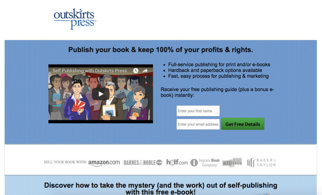
What the Page Does Well
- The page gives a lot of promises; it’s fantastic — it solves a major issue for their future.
- Benefits are easily seen by skimming through bulleted points.
- The logos make it simple for authors to know where to publish their books.
What Can Be Tested/Improved
- Instead of “get free details,” the CTA could say, “get a free ebook.”
- To emphasize the ebook download, they should move the part where it states, “discover how to take the mystery and the work out of self-publishing with this free ebook” higher.
25. GKIC
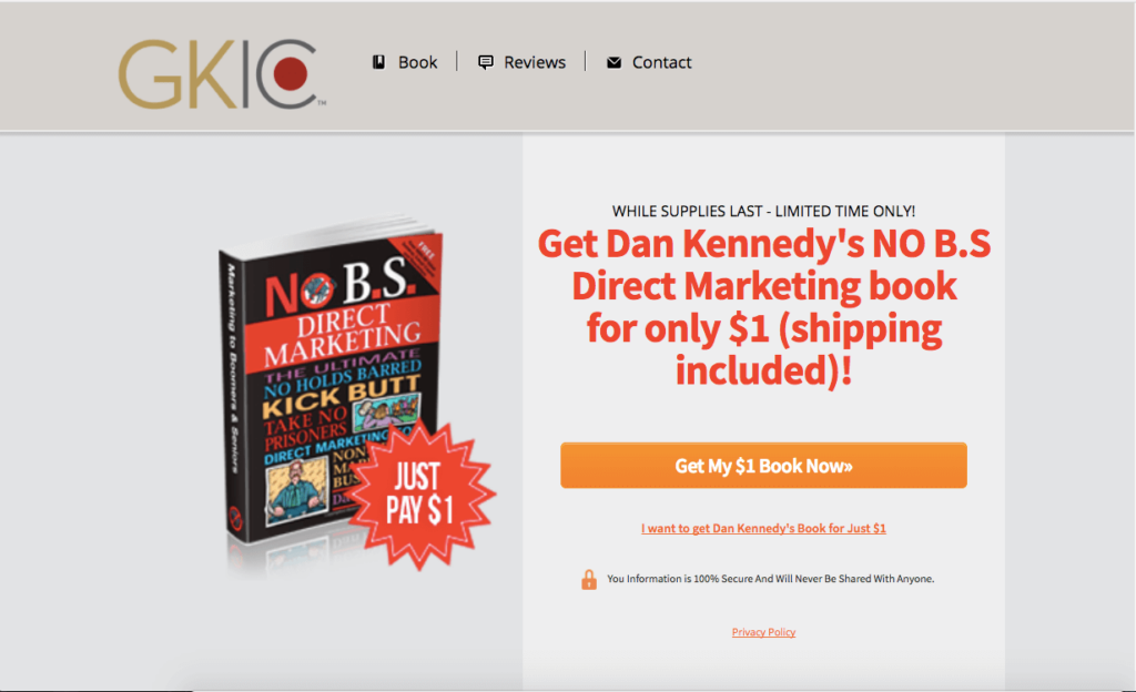
What the Page Does Well
- Dan Kennedy is a well-known brand name within this field (as well as a multi-best-selling author), which aids social validation.
- For many people, $1 for a digital copy is a great value and gives the impression that this is among the best websites for conversion.
- The fact that there is a limited amount of time creates a sense of urgency.
- The phrase “shipping included” adds to the “excellent offer” and makes it stand out even more.
What Can Be Tested/Improved
- The visual quality of the book might be improved.
- It’s unnecessary to use two CTAs at the same time.
- Consider deleting the top menu and concentrating on increasing conversions. This website is already doing good with its offers; by considering these recommendations, GKIC can be one of the best landing pages for conversion.
26. James Clear
What the Page Does Well
- The value offer is excellent, making James Clear a landing page inspo and one of the best landing pages for conversion of ebook sales. You can acquire a weekly five-minute wisdom email by joining his free newsletter.
- A huge and particular number makes the newsletter appear very popular, which is a good application of social proof.
- Bullet points help visitors understand the page clearly — the text is clear and transparent.
What Can Be Tested/Improved
The developer should try anything connected to ebooks, such as “Download your free eBooks!”
27. Noah Kagan
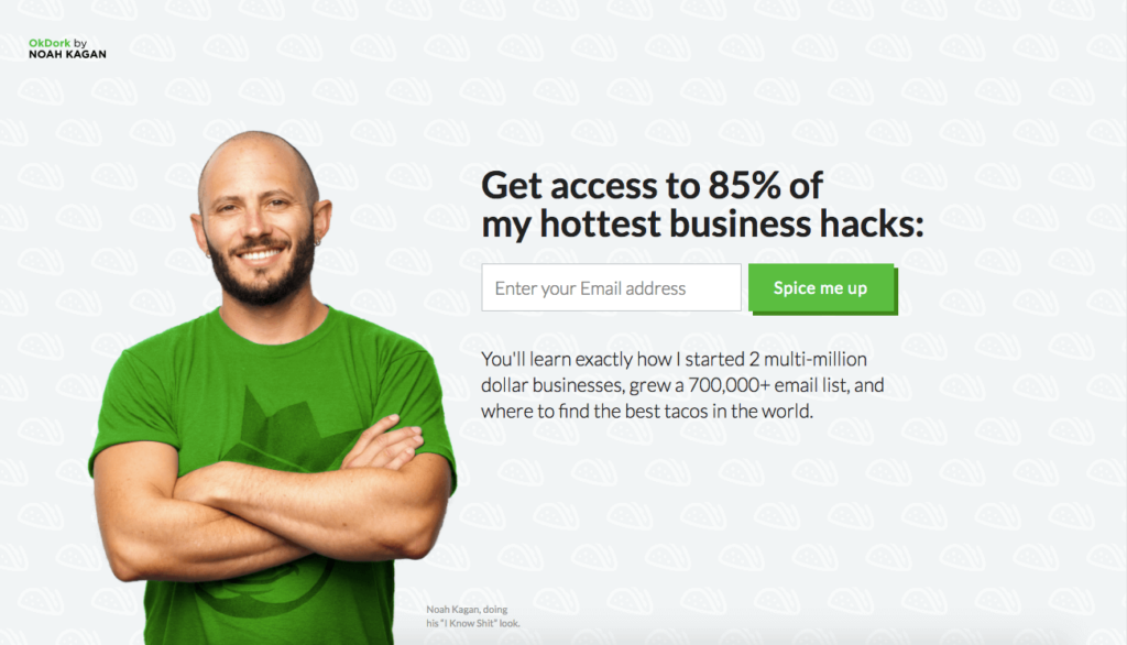
What the Page Does Well
- The minimalist landing page lets prospects focus on the solo action accessible to them: Registering. e
- The green CTA button stands out on the page.
- Benefits are communicated in copy, and prospects are told exactly what they may expect to learn.
- It’s good to use a prestige name’s testimonial for social proof
What Can Be Tested/Improved
- Vague call-to-action heading. It’s unclear what 85 percent of my most popular business hacks actually mean.
- Instead of “spice me up,” I’d try a different CTA.
28. GrowthSupply
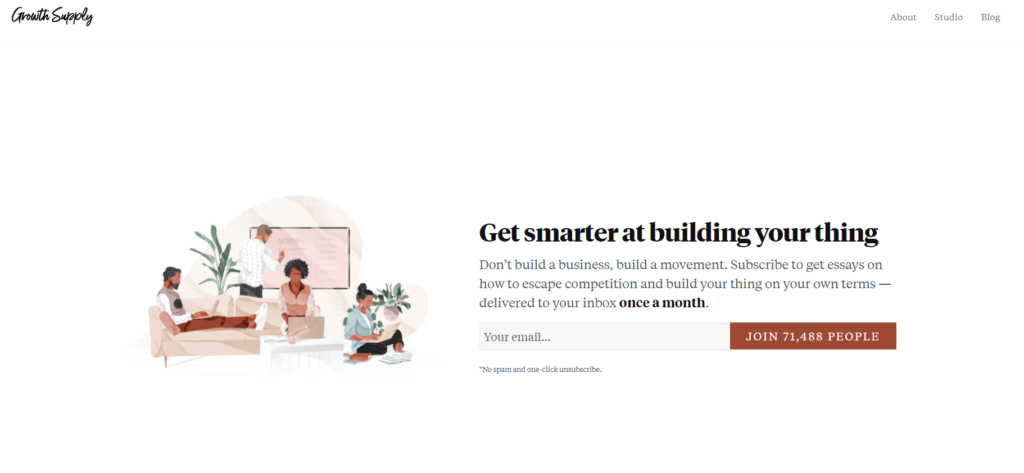
What the Page Does Well
- The page knows just what its customers need and strikes there. In the detailed description, the page also details what the customers are gonna get when they subscribe.
- “Join 52,134 individuals” is a specific call-to-action that makes the newsletter appear popular.
What Can Be Tested/Improved
- It’s unclear what “become smarter at growing startups” means.
- It’s unclear what the phrase “most cluttered marketplace in history” means.
29. Email1K
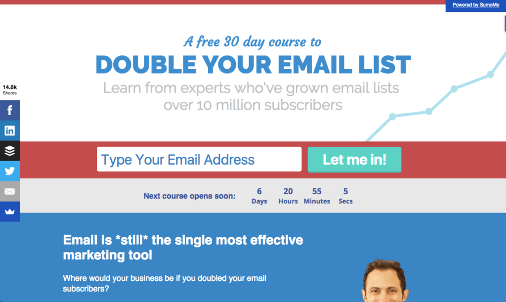
What the Page Does Well
- The headline indicates a significant benefit.
- The CTA form is visible and appealing.
- The countdown timer symbolizes the importance of signing up quickly to preserve a slot.
- Expert contributions are more likely to be trusted by users, encouraging them to act; it lends legitimacy to a project, which is a good landing page inspo,
What Can Be Tested/Improved
- The page can include more detail on the course’s cover to make it a good landing page design.
- Start a small business?” performs better; the developer can try it.
30. ConvertKit
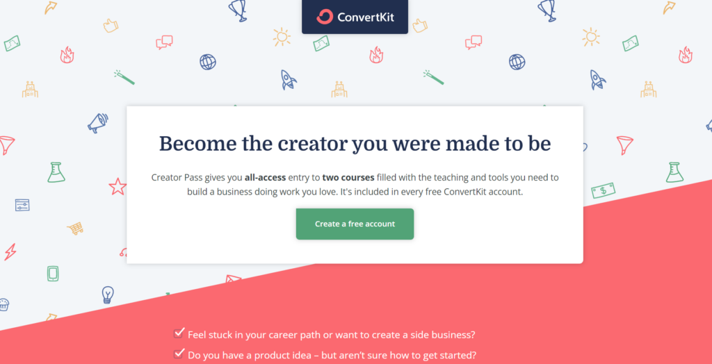
What the Page Does Well
- The headline aims directly at customers without any shortcomings.
- The description tells customers exactly what they will be receiving.
- Bullet points help customers trace their issues.
What Can Be Tested/Improved
- I believe I could tell a stronger, more intriguing story. The current tale feels too “ordinary” and “watered down” and doesn’t address the audience directly.
- The CTA button isn’t appealing; the website should add an option where customers can get free courses.
- Free options are not demonstrated clearly
31. MeetEdgar
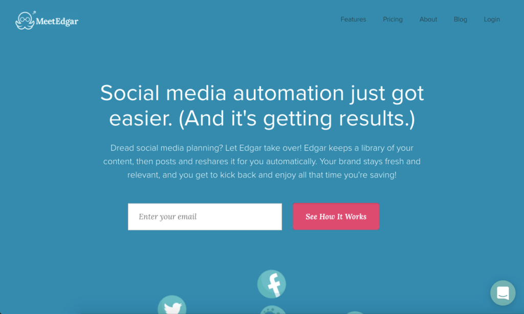
What the Page Does Well
- The headline is excellent. MeetEdgar is well-versed in its target market and recognizes that social media ROI is a source of skepticism. A single statement addresses their arguments and describes their predicament. Knowing customers makes MeetEdgar one of the most inspiring landing pages.
- The promise appeals to me. “Saving time” is a fantastic benefit that everyone appreciates.
- The red CTA button pops against the blue background.
What Can Be Tested/Improved
The developer can add more copies before the CTA. The last copy does not clarify how well it works if people join.
Conclusion
There you have it: some of the world’s most well-known corporations with some of the most inspiring landing pages on the internet. You don’t have to start from scratch when creating your landing pages; look at examples of good landing pages and try to replicate the winning features. e
Then, test, tweak, and assess various approaches to improve your own based on what the experts say. Then sit back as the best landing pages for conversion bring you great results.
Don’t overlook the post-click stage; provide each prospect a unique experience from beginning to end.
Try FREE Magezon Page Builder demo today
Easily create your high-converting Magento landing pages in any style whenever you want without relying on developers or designers. Just by drag & drop.


