 Magezon Blog Help Merchants Build Comprehensive eCommerce Websites

With a worldwide market worth over $3 trillion, the fashion business is one of the most valuable industries nowadays, making the digital competition extremely fierce among brands; even world-famous labels such as Prada and Versace spend considerably on website design to present themselves better to their customers.
In this article, we will share 25+ best fashion website examples and many tips that you can apply to your own. Without further ado, let’s jump right in.
Table of contents
30+ Best Fashion Websites for Your Inspiration
1. Bouguessa
The website prioritizes simplicity with an emphasis on large, neatly arranged, but creative photos from the header to the footer of the homepage. As you can see, the first thing that greets you is a large photo of the model in the hero header. Scrolling down a bit is a male model to the right of another product model. A little below are the best sellers, and finally are the photos of models in creative yet strange poses of Bouguessa’s latest collection.
What I like about the website is the arrangement of different sections to make them stay far enough from each other thanks to the appropriate gaps and the white background. This helps ease my eyes and navigate the page easily.
→ Use grid to create a good website like Bouguessa: 3 Things to Remember Before Creating Website Grids
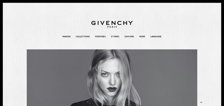
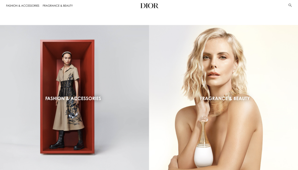
2. Dior
Dior’s website is surprisingly minimal. They use elegant fonts and a black-and-white color palette to make the photos of their models and products stand out. Since they have many items for different customers, they have separated the navigation into six generic drop-down options that are accessible on the header bar with pictures.
→ Choose the appropriate color scheme: 10 Useful Tips to Choose a Color Palette for Website
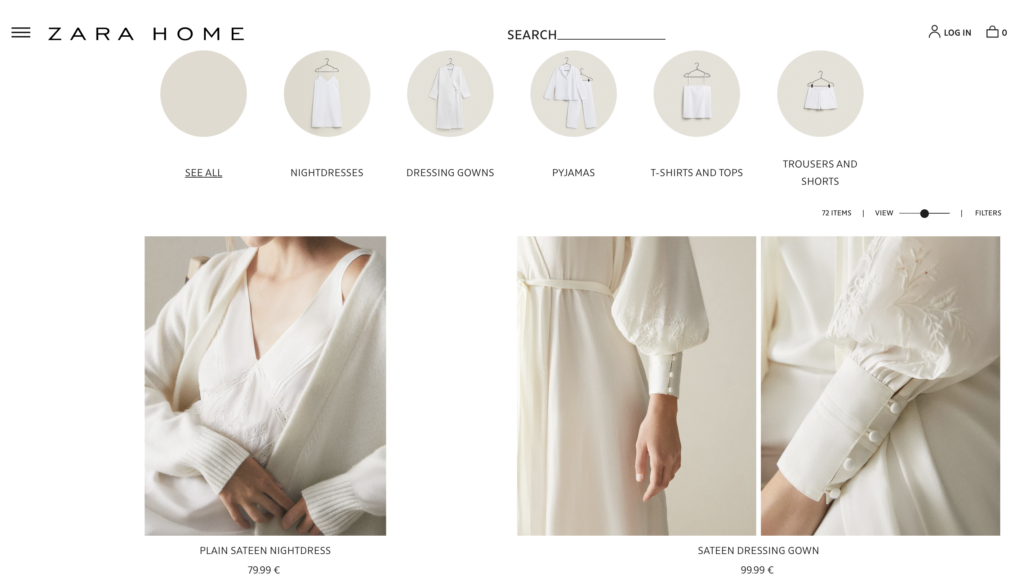
3. Zara
First of all, the homepage has big pictures of their newest collection on a slider to make them like the magazine covers on the rack and a sticky navigation burger bar on the bottom left side. If you click one of their product pages, you’ll see how the clothes and models are showcased from different perspectives and distances. While building your own website, you should offer the zoom functionality like Zara to help customers easily identify what material is used. Moreover, to encourage cross-sales, pay attention to listing the matching clothes and accessories under a specific product. You can see the video below for a better understanding.
→ Optimize your homepage: 25+ Ecommerce Homepage Best Practices With Examples
4. Femme & Fierce
The clothing at Femme & Fierce has been hand-picked by editors from some of the most prestigious global labels. This business is dedicated to bringing you the most fashionable statement items and quickly developed season staples. With its fluid animations, the website seems attractive and imaginative. It is made more creative by using contemporary and adorable fashion-related gif pictures. The website employs a sidebar menu to assist visitors in browsing fashion items conveniently.
→ Optimize your navigation bar: A Complete Guide to Creating Effective Website Navigation Bar
5. Verge Girl
Verge, a worldwide distributed women’s fashion internet shop, has a tongue-in-cheek appearance to emphasize its breezy and summery apparel. Their homepage’s primary picture, which has a scrapbook-like visual appearance, presents the same models in multiple colors, styles, and physical emotions to create the impression that this business is about experimenting and discovering the perfect look for you. Their quick calls to action are smartly brought up to retain the image of young fun and flexibility in design, with “Shop Our Obsession” ringed as if scribbled long-hand. In addition, each of the most popular apparel styles is advertised on the site in case buyers already know what they’re searching for.
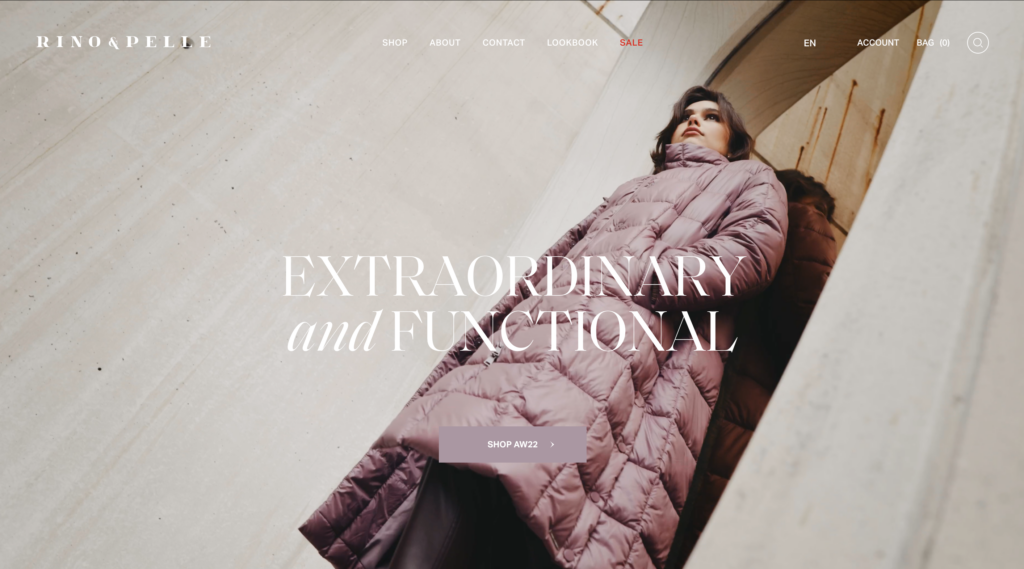
6. Rino-Pelle
As one of the best fashion websites, Rino-Pelle is jam-packed with exciting elements worth examining and beautiful web element animation. The hero header has a large and robust title and dynamic artwork that moves from left to right. They are nicely woven together, from animation upon scrolling to a clever hover effect, sleek and attractive video integration, and aesthetic hierarchy.
→ Create stunning product videos with inspiration: 19+ Best Product Demo Videos to Inspire You and How to Create One
7. Rollie Nation
You’d think Rolli, a specialist company focusing on travel shoes, would have a website with a complex visual design to attract visitors. However, it’s not what it seems. Their vibrant pastel images were highlighted on a white background, giving the website an elegant impression and effective navigation. Instead of creating an unusual site, they want to concentrate on the actual parts of the items’ style, establishing that their brand is open and inviting.
8. Olive
Olive’s website has pictures of cool-looking young models in fall attire to introduce the brand’s main product line: long sleeves and complicated earth tones from the past combined with modern material and cuts.
Because most of the items are primary colors and have little combination with others, the white background and adequate blank space are enough to help their photos stand out. In addition, their genuine stock sites load swiftly and include high-definition photographs that seem authentic and zoomable to show the product’s material.
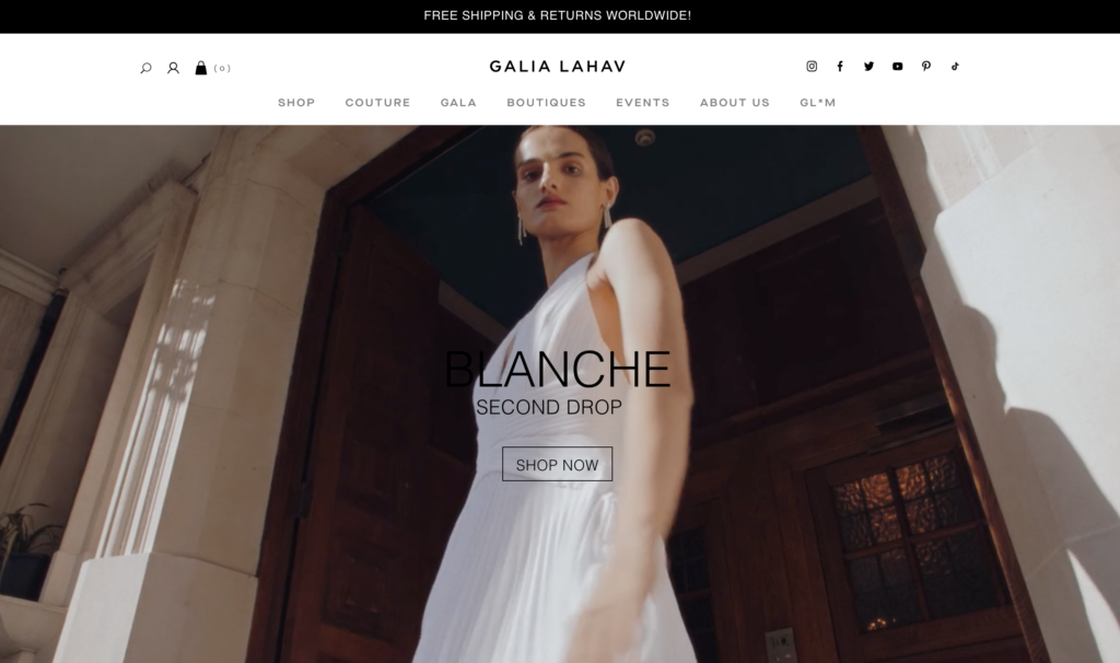
9. Galia Lahav
Galia Lahav is a Tel Aviv-based fashion firm founded in 1984 and is most renowned for its wedding and evening apparel. Galia Lahav has an impressive website design that uses unique and modern elements. The hero header, in particular, greets visitors with a video montage of their clothes on models. Visitors can then utilize the call-to-action buttons to locate other wedding and fashion goods. In addition, a sticky header, social networking connections, video integration, a clean and elegant layout, and more are all significant features.
→ Create effective CTA buttons: 8 Must-Have Characteristics of the High-Converting CTA Buttons and Examples
10. True Liks Wear
The company started making golf shoes, but it is now in many other fields. Its website is simple with elementary colors like black, white, and grey. The pictures are also monochrome, harmonizing with the background for the best navigation experience and ease for the eyes. Their “About TRUE” section successfully showcases how they discover the best techniques to make their shoes comfortable and ensure your foot is always in a natural-feeling posture through a helpful graphic.
→ Pick a color scheme for your website: 40+ Amazing Color Schemes for Websites That Engage Users
Try FREE Magezon Page Builder!
Easily create your engaging Magento pages in any style whenever you want without relying on developers or designers, just by drag & drop.
11. Talia
Talia is a women’s clothing brand renowned for its quality, style, and comfort. Its creative fashion website is a lovely source of inspiration for fashion enterprises worldwide. Talia’s website employs a full-screen layout that showcases fashion photographs, collection titles, a menu, the name of the brand, and a preview of the following image through a slider. Along with the GSAP animation, everything seems majestic. In addition, a picture shows on the catalog page when the user hovers over a product. They also provide reviews to boost the brand’s trustworthiness.
12. Paolita
The website is aesthetically engaging thanks to the large, high-quality photographs and decent typography. A smooth slider in the hero header showcases several fashion-related photos with diverse storylines. Other sections use large visuals to convey the content, making it seem more appealing. On the product page, the “Complete the look” section below plays as an introduction to other products and helps visitors match clothes better.
13. Maison Labiche
The French firm Maison Labiche specializes in a unique niche; embroidered t-shirts, socks, coats, and bags. Since their clothes have a vintage vibe with a brown tone, white is used for the background to highlight the products. Thinking about the customers, they also create a Personalization section to change the text that will be embroidered (it’s really cool, you can try it yourself!). With various clothes, shoppers can pick anything that suits them and understand that embroidery is not just suitable for only one sort of clothes or style.
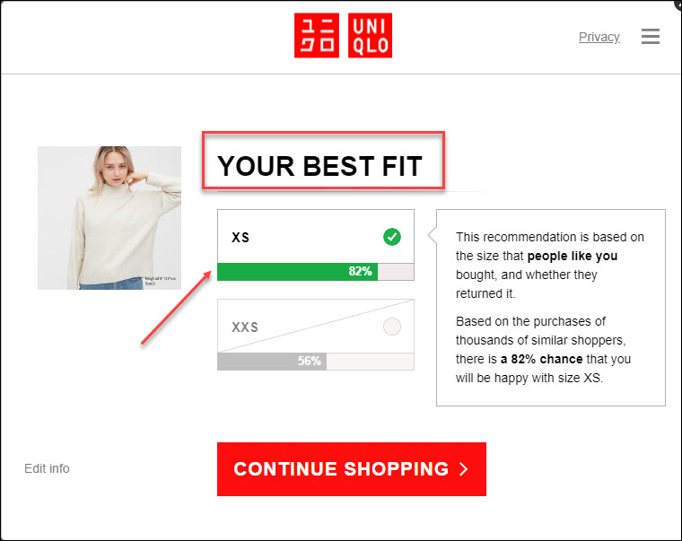
14. Uniqlo
This is not a strange brand anymore, you can buy clothes from Uniqlo almost everywhere, but have you ever visited their website? It is one of the smartest ones if I have to say. When you arrive at their homepage, everything from the new arrival, the news, events, and the best sellers can be found right on the big pictures on the slider. There’s nothing much for you to discover if you scroll down further.
The background is white with proper blank space to prioritize simplicity and effectiveness. Try clicking their product page, and you’ll be pleased with how they choose to present their clothes. No special motion; there’s are just pictures taken from different perspectives and a video. Besides the customer reviews, one thing I really like about its product page is the dedicated size recommendation function they offer, as you can see below.
15. Nikos Koulis
The Greek designer Nikos Koulis has a keen eye and a genuine love for jewelry. Her website design is notable for its fluid slider showing its major items in large images and a prominent CTA on the right. The sticky left navigation bar makes it easier to navigate the page with all the necessary items. Meanwhile, the collection page looks excellent regarding aesthetic hierarchy and white space. It also uses a zoom-in effect to let shoppers inspect the product’s intricacies.
16. Lasse Pedersen
Fashion is more than just apparel; it’s also about accessories, such as footwear, lifestyle, cosmetics, or haircut. That’s why we include Lasse Pedersen as one of the best fashion website designs. Its website reveals different sections with a unique scrolling method. The content is divided into Editorial and Commercial categories with similar structures. Overall, the design is interesting and impressive, especially with GSAP animation.
17. Gitman
Gitman has produced the best shirts and ties in the United States for almost a century. Its website is a great example of easy navigation for you to learn. It has a minimal style to present the items. The menu, logo, search bar, and store with mega menu are all shown on the header. The shirts’ photos are visually appealing and organized in a grid to help evaluate quickly.
→ Make your search bar effective: 15 Search Bar Design Best Practices in Details 2022
18. Limnia
As fashion includes accessories, Limnia is worth considering in this list of the best fashion websites. It is a brand known for creative, customized jewelry lines that evolves with the customers with a website designed with an asymmetrical layout, clever animation with GSAP, and visual hierarchy. When you arrive at the homepage, a big, high-quality video will capture your attention, giving you the first impression about their products; light, elegant, and pretty.
While such features are fantastic, other areas also contribute to the overall appearance and feel of the website. For example, overlapping photos bring design originality and the parallax effect. The website also employs a sticky header with a menu to help with easier navigation.
19. Sezane
Sezane provides ladies with high-quality products with a Parisian flair. The website is straightforward and elegant, with a magazine-like layout, and employs a boxed design to evenly distribute the content. While the header contains important features such as the logo, menu, and search bar, the footer contains social networking connections and newsletter subscriptions. This website also makes use of a giant menu to display submenus conveniently.
20. Lacelier
Lacelier is a company that was created to focus on women. The video above the fold is placed in a boxed layout to leave both sides of the screen neat and clearly explains the brand. On the other hand, the website is presented in grids with subtle animations as the viewer scrolls down to increase interest in navigating. One convenient feature is the sticky menu bar to help visitors easily access their needed pages.
Try FREE Magezon Page Builder!
Easily create your engaging Magento pages in any style whenever you want without relying on developers or designers, just by drag & drop.
21. Mango
This website of Mango is a great example of “simple is the best.” It doesn’t add many details to the homepage, only 5 big pictures of their main product lines with attached links; women, men, teens, kids, and house, a sticky navbar, and a newsletter section on the footer. Arriving at their product page, each item takes a slider to display, as you can see in the video below. While scrolling, you can see two products simultaneously in a quick view with available sizes and colors. Now, click a random item and discover. If you don’t know how to match clothes beautifully, Mango has offered a complete your look section right below.
22. Net-a-porter
The website of this fashion brand from Hong Kong does not use too many fancy and complicated effects. Instead, they focused on pictures of models wearing their designs. Using white tones for the background and adding appropriate space between elements on the page makes visitors can focus more on the outfit. When you click on their product page, these elements are similar. You’ll be able to fully focus on product discovery thanks to a clean layout on a white background. A nice feature of this site is the How to wear it section right below. You can refer to this method to improve cross-purchase rates and promote other products.
23. Farfetch
Another website that focuses on simple design that you can follow. Farfetch, like many other websites that we’ve mentioned above, used a white background to highlight the images of its products and models. One of their strong points is how they leave enough gaps to make the photos stand out and easier for users to navigate. Different sections are spaced fairly evenly to make distinguishing easier.
If you click on one of their products, you can see that they have included all the essentials that users will likely need, like details, size, and shipping. Especially the Complete the Look section below helps increase the possibility of cross-selling related products. In addition to the direct hover-over effects on product images, you can see that this website does not use any effects that are too complicated and can be annoying or distract the users from their initially desired items.
24. Fortress of Inca
Fortress of Inca is one of the best fashion websites with minimal design. Laconic elements and a light color palette help the brand’s core theme to stand out. Although the website seems simple and inadequate, all the required functionalities are available and readily accessible.
25. Valentino
Valentino’s fashion web design inspiration will give you some valuable ideas. On each page, elegant typefaces and a clear picture structure are coupled with basic yet effective design components such as categories and buttons. In addition, the Valentino website homepage organizes elements pretty well without clutter.
26. Revelry
If you’re about to open a wedding dress store, don’t miss out on Revelry, a basic and soft fashion website design. The sticky navigation bar at the header helps users easily find their needed page. An interesting part of the homepage that few websites have is the unboxing video section right below the banner, giving users a visual look at what the product will look like after receiving it. This is a pretty cool but effective little detail that you can apply to improve the conversion efficiency of your website.
In addition to the unboxing part, for each product, below are reviews from customers who have purchased it to increase the brand’s reliability. Consider this section to make your site more trustworthy.
In terms of design, just like the websites above, they also use a white background and appropriate gaps to make the website look more “breathable” and easier to navigate.
27. Cropp
The website for the fashion and art design company Cropp features enormous images of models wearing clothing in modern settings. The style is bold and adventurous. Modernistic typefaces and specific design components support the brand’s aesthetic and philosophies.
28. Julie Cristobal
Julie Cristobal is a Paris-based French stylist who studied fashion at L’Atelier Chardon Savard and has worked for publications such as Wad, Crash, Jalouse, and L’Officiel. Her website provides a glimpse into her personality with a horizontal scroll to showcase various apparel styles through thumbnails. Web components display delicate and pleasant movement and give beauty to the entire design since it includes the GSAP animation. In addition, the About page has a minimalist style with a black backdrop and white lettering.
29. Matches Fashion
One thing the websites we have mentioned above have in common is simplicity. With Matches Fashion, simplicity is a key edge to be concerned about, but in addition to that, there is uniformity. Yes, what I am talking about is uniformity in product photography. Try clicking on Women and scrolling down a bit. Do you see all the models standing in the same pose?
On the other hand, this website also provides a Your Matches section to increase sales for related products. You can follow this pretty cool detail to optimize your website and impress your customers, so they stay longer.
30. Everland
Websites that use large images to highlight their products with a white background and appropriate blanks are my favorite. Everland is the prime example I’m talking about. Their homepage is filled with large images, and you will hardly be able to come across any paragraphs.
For the product page and other websites, we have discussed, this is also a good example that you can follow to bring in more sales for your fashion business.
31. Elena Iv-Skaya
The next stop on our list of the best fashion website designs is Elena Iv-Skaya. Thanks to the GSAP animation, the website is outstanding, contemporary, and fascinating. The hero header, in particular, displays a gorgeous showcase of many photographs using a creative slider. On the other hand, the asymmetrical arrangement makes other areas look grander.
22 Tips to Optimize Your Fashion Website
Visual Design
1. Make a Simple Layout
Clean and simple web design is a feature shared by the websites of well-known fashion firms. Simplicity highlights the products, whereas a complex layout might mislead visitors and raise bounce rates.
→ Decrease bounce rate with tips: How To Reduce Bounce Rate For Your Website in 2021
In addition, fashion websites’ user interfaces should extensively use white or empty space. Why? Because negative space or blank space on a fashion website (mobile or desktop) indicates luxury and exclusivity. Consider musicians using silence to create an emphasis; website designers apply the same method. Filling every available inch of a fashion website with symbols, CTAs, banners, etc., is a quick way to destroy the design.
2. Be Visual
What shows is what sells. Display large, high-quality product images to draw your visitors’ attention and direct them around your website. Making an apparel fashion website text-heavy, on the other hand, is a fast way to ruin the experience. The content must be kept to a minimum. If you include more text than is required, your traffic will begin to bounce.
3. Select the Right Typography
To assist buyers in recognizing the brand, several businesses employ distinctive type fonts in their clothes website design. In addition, contemporary companies use strong, bespoke fonts to emphasize their message.
4. Express Fashion Brand Identity
Consistent visual identity is crucial in many sectors, and fashion is no exception. So, if you want to create an engaging fashion website, you’ll need more than simply a logo. You must understand the color palettes and fonts used for headers, paragraphs, and icon sets. The background color of the products should be uniform; if you use white, use white for every item. On the other hand, your website should be out of the ordinary and stand out from the crowd. When customers arrive at your website after browsing a competitor’s, it should seem better.
User Experience
1. Design for Mobile Devices
Most people use mobile devices to access the internet. So be sure to consider mobile displays when creating a website design carefully.
2. Easy to Navigate
A good website is simple to use, and this is made possible through intuitive navigation. So ensure that even non-technical shop visitors won’t have problems locating the items they’re seeking.
Make it easy to navigate to encourage people to stay on your fashion design website longer. Additionally, if a clear path for making the purchase is provided, your sales will increase. Don’t forget to add a menu link to the page that lists your offline businesses is a modest tip. Many individuals still like traditional offline retail. Make an effort to make the navigation consistent, simple, and intuitive.
3. Allow Guest Sign In
Guest checkout is a tried-and-true method for generating more sales, particularly for those who may be in a hurry or don’t want to register at your business (if this is their first transaction).
Try FREE Magezon Page Builder!
Easily create your engaging Magento pages in any style whenever you want without relying on developers or designers, just by drag & drop.
Product Pages
All of your efforts and investments result in the sales pages. Therefore, there’s no other way besides optimizing for conversion to not waste your time and money. Conversion rate optimization (CRO) is both a science and an art to enhance revenues while maintaining the same number of visits. In other words, CRO boosts income while lowering costs.
1. Create Worth Browsing Product Pages
As more companies sell online, the best fashion website ideas are similar to e-commerce. When picking a clothing site design, remember that the product pages are where visitors may quickly convert into buyers, increasing your conversions and your profit.
Here are the factors that you should optimize: :
- Photographs and videos: Customers want to see how the product appears in person and from different perspectives.
- The “Add to Cart” button: It should be prominently displayed on the website, prompting users to click on it as quickly as feasible.
- Product descriptions: They must show the product in depth, emphasizing its unique features and advantages. All possible colors and sizes must also be shown.
- Buttons for social networking: People spend much time on social media. So it’s a good idea to include a social sharing button to capitalize on word-of-mouth marketing.
- Section “Customer Reviews”: What people say about your items significantly influences your visitors’ purchasing choices. You may be tempted to delete unfavorable reviews or compose bogus ones, but being honest is much preferable. Genuine reviews imply a sensible purchase selection and fewer returns and refunds.
- Sell a complete look: Turn yourself into a stylist by giving your customers a ready-to-wear appearance. This is how to help customers see you as a dedicated and understanding business.
→ Learn to optimize your testimonial page with examples: 50+ Stunning Testimonial Page Examples
2. Provide Enough Sizing Information
Choosing the proper size for clothing is a critical phase of the purchasing process. According to some studies, people can be hesitant to purchase a product if they are unsure about its size. Furthermore, if the right size is not immediately evident, visitors may leave the site searching for further information, increasing the likelihood that they will not return.
3. Consolidate Product Variations Into a Single List Item
Apparel product variations — mainly colors and sizes or less-common variations — significantly affect customer purchase choices.
There are two methods to present these product variations in the product list:
- Variants are integrated into a single list item and indicated using swatches under the thumbnails.
- Variations are shown individually, with each variant — say, various colored shirts — having its list item.
When product variations are integrated, it is easier to learn about the product (for example, when viewing any product, customers can know all its available variations) and increase the chance of purchasing. The variants must be connected in the product database, which is necessary for merging variations in single list items.
As a result, sites that offer items from numerous suppliers should post-process product data to connect variants of specific products to maintain consistency.
4. Create a Button for Each Size Variation
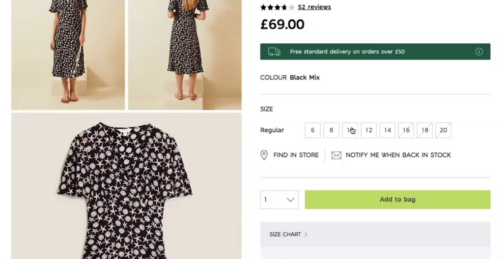
In a typical clothes website design, visitors must check whether their size is available for each variant – a potentially time-consuming process that often leads to customers giving up.
As a result, instead of utilizing a drop-down with the size choices concealed by default, reveal the size options by employing button-like selectors ( see the image above) to ensure that the important product difference is immediately visible to consumers.
5. Display Apparel Product Images on a Human Model
It is crucial to provide customers with the appropriate clothing product photographs. However, they can only get an in-store experience by seeing the product worn on an actual model, as they’ll obtain a better visual grasp of the product and feel more secure in buying it. Without “Human Model” photographs, customers won’t feel trustworthy enough to buy your items.
6. Make Sure That the Product Images Have Sufficient Resolution and Zoom
Low-quality photos harm users’ views of items. In many cases, having low-quality images is almost as bad as not having any images. Why? Because users are encouraged to explore a product visually — for example, by a thumbnail in the product page photo gallery — but are incredibly frustrated when they open the larger image and find it grainy or pixelated.
On the other hand, sites with consistent high-resolution product photographs are seen more favorably by users and seem more polished and professional. Customers are more confident buying things they can have correctly visually researched.
Marketing
1. Prioritize Lead Generation
Most visitors will not purchase your stuff when they initially visit your website. Instead, they look around, then leave and (maybe) return. As a result, it’s a good idea to capture their email addresses as soon as they appear on your website. It enables you to reach out to them using email marketing, which has the best ROI of any Internet marketing channel.
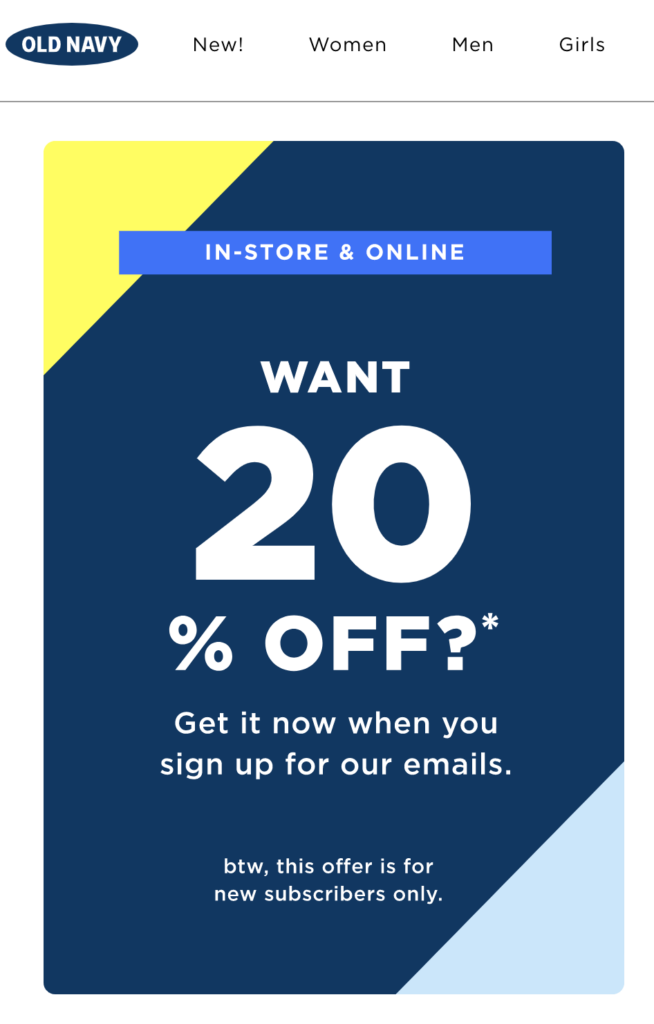
Old Navy, an example below, provides a substantial 20% discount for joining the mailing list, so the firm may send them emails about special deals and new goods. According to research, you may make $32 for every $1 spent on email marketing.
2. Create and Publicize a Loyalty Program
Selling to existing customers is one of the most cost-effective company tactics since it is five times less expensive than selling to a new one. In addition to other channels, successful fashion firms have fan clubs or loyalty programs they promote via their websites.
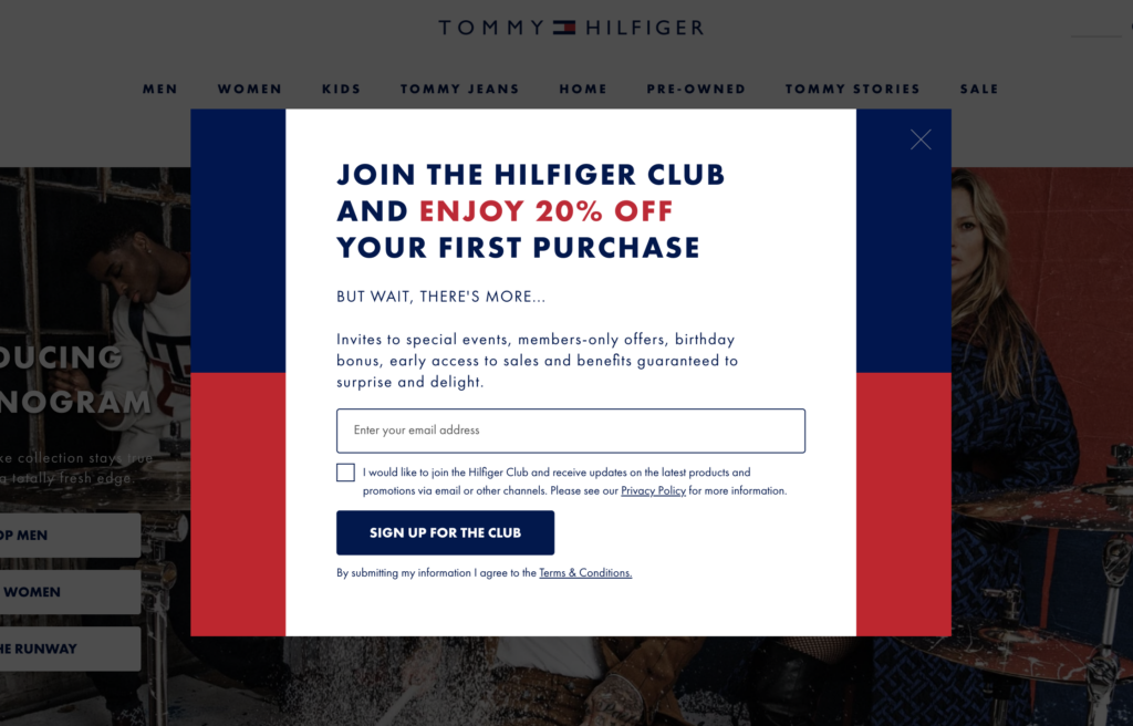
Many websites above use pop-ups to collect customers’ emails; as you can see from Tommy Hilfiger immediately asks visitors to join their “exclusive” club. Hilfiger entices customers with a 20% first-purchase discount, as well as recurring incentives and rewards.
3. Provide a Discount
The fashion business is very competitive. That’s why, on their homepage, most high-street fashion websites provide discounts above the fold to keep visitors from leaving and going to rivals.
4. Geographical Market Content
If you are (or want to be) a national or global fashion brand, you need to tailor your items and content to diverse regional markets. Taking on a local appeal makes your product or service more approachable. Moreover, purchasing occasions and fashion trends change by area, necessitating localization.
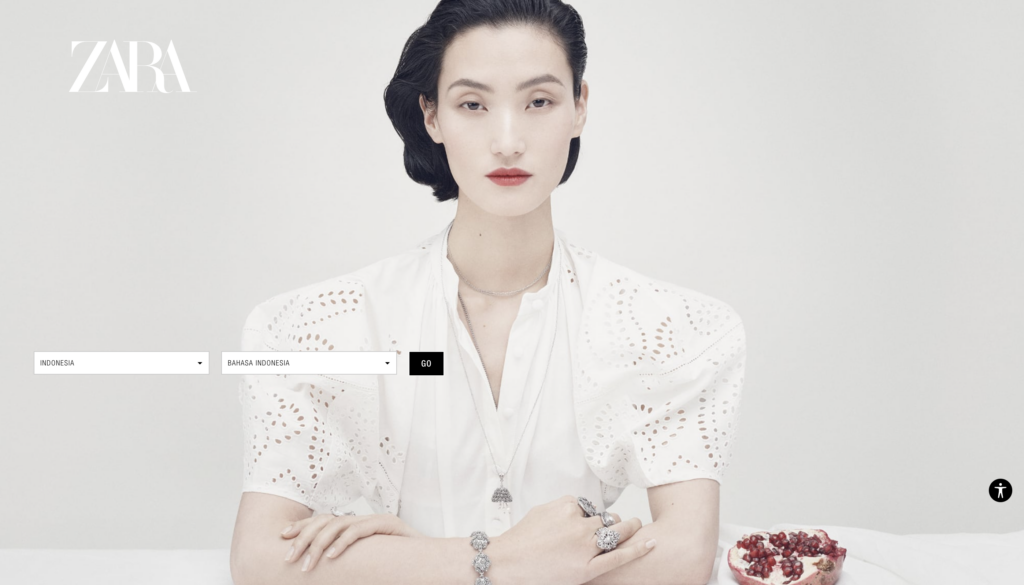
When you initially access Zara’s website, you are asked to pick your location. For example, the website would display material tailored to your area if you were in Indonesia.
Conclusion
Like other industries, fashion websites strive to capture their users’ interest. We’ve covered the fundamentals of building a great website, including why they’re essential and how to make yours stand out. The fashion website examples above are unique and communicate clearly with beautiful images. If you intend to build one for your clothing business, don’t ignore the best ideas we’ve mentioned.
If you are a Magento merchant and don’t know which extension to build your fashion website, consider Page Builder from Magezon. As a trusted Adobe partner, we have satisfied thousands of customers with a vast collection of drag-and-drop extensions, helping you create a high-converting and unique store in minutes.
Don’t take my words for granted; see how your website can be with Magezon Page Builder and what others say about us:


