 Magezon Blog Help Merchants Build Comprehensive eCommerce Websites
Typography in web design makes up 95% of the creation of a website. Many factors, including font choice, the text’s length and size, and the typographical arrangement’s hierarchy, aid in the site’s navigation.
Typography impacts how a web page’s content is viewed and interpreted by its viewers. If you grasp the importance of typography in branding and web design and apply these tactics, you’ll be able to stand out in your market and provide a better online experience for your customers.
Here, we’ll cover all you need to know about typography, including the significant typographic elements and the golden rules for effective typography in web design.
Table of contents
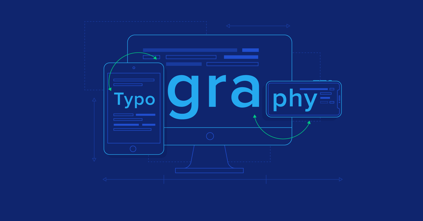
What Is Typography in Web Design?
Typography generally controls how text appears to the reader and how the words appear on a screen or page.

It is helpful to focus on the text we read on websites. This is because web typography best practices often differ from printed text, and there is much more to consider online.
In addition to readability, you should develop digital writing for:
- Shorter attention spans: There are nearly unlimited website designs, many of which have impressive lettering, so do everything you need to optimize your website and steal attention from them.
- Skimmability: Users tend to visit websites seeking something particular and want to discover it quickly.
- Accessibility: Because not all internet users interpret or interact with online content the same way, accessibility is essential.
- Diversity of devices and screen sizes: The text should be readable across digital mediums.
Web typography has its category for all of these factors.
Furthermore, typography in web design includes how we create the appearance of the text — fonts, colors, and style — and how we deliver the content on its related web page. These things are important since they contribute to a pleasant reading experience for many people.
Web Typography Terms
Typography is a broad area, and it’s essential to know some basic terms to understand how to incorporate suitable types into your website.
1. Typefaces and Fonts
A typeface consists of a collection of alphabetic and numeric characters that have been given a special appearance and feel. Arial, Times New Roman, Helvetica, Courier, and Calibri are the most common typefaces.
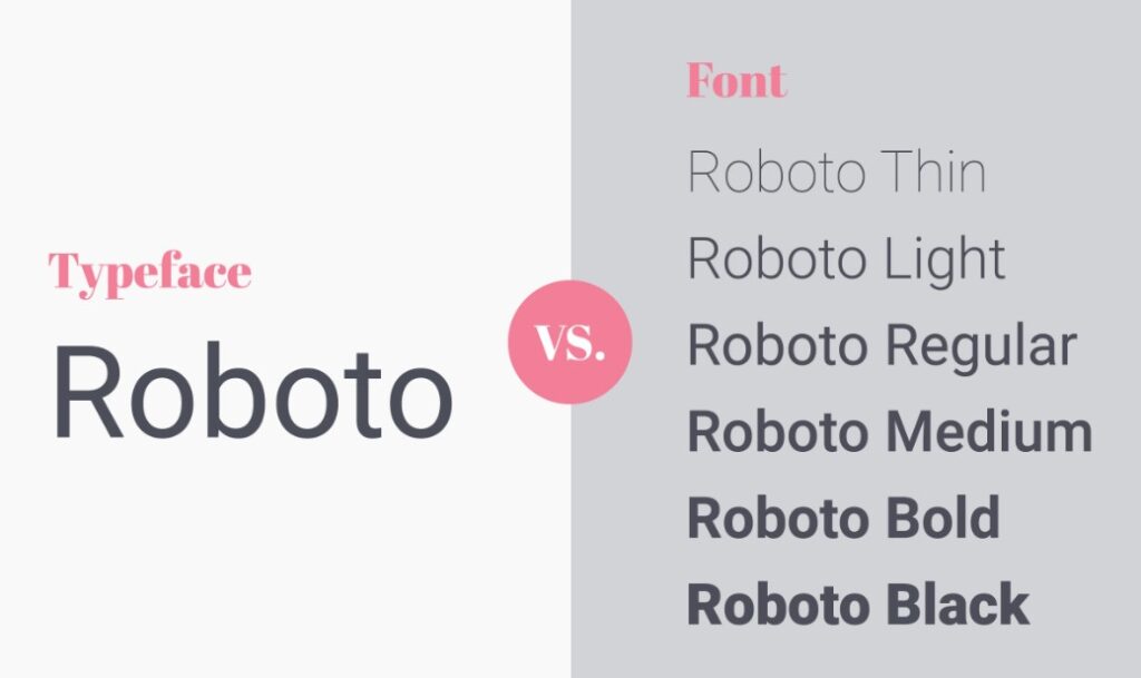
But wait, aren’t these fonts? Not entirely. A font is a specific typeface instance. Besides having distinct variations in weight and size (such as 16 px vs 24 px), a font may also have other stylizations to further differentiate them from one another (e.g., rounded or unrounded, italicized or non-italicized).
This is why typefaces are sometimes frequently referred to as font families: they are the broad style category for a group of particular fonts.
The contrast between font and typeface is subtle but significant when we delve more into online typography principles in web design. So first, let’s look at the language we use to describe fonts.
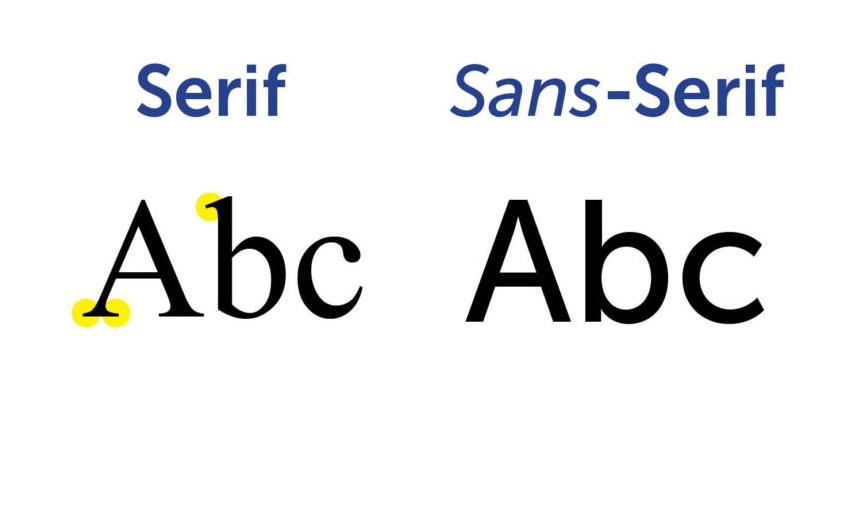
2. Serif and Sans-Serif
Multiple fonts adhere to two distinct font styles: serif and sans-serif. A serif is a tiny decorative outgrowth from a letter’s main stroke. Sans serif fonts are those that lack these ornaments.
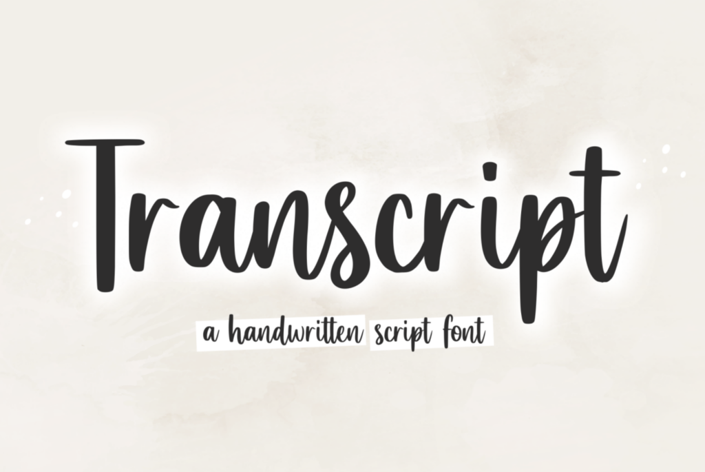
In addition to serif and sans-serif fonts, script fonts are used on the web, but far less often than serif and sans-serif fonts. This is because script fonts are made to look like handwriting, with their diverse and frequently fluid strokes. However, the script is more difficult to read than serif and sans serif and should be used for specific cases such as headlines and invites.
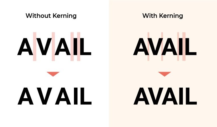
3. Kerning
“Kerning” is the horizontal gap between two different letters. You can use smaller or wider kerning on your fonts if you want better readability and fewer awkward gaps. Each pair of neighboring characters in standard fonts has its own kerning, ensuring that all letters tightly fit together.
4. Tracking
Another important aspect of readability in typography is word tracking. It’s easy to see whether a line of text is excessively big or too narrow.
As with kerning, tracking refers to the distance between the letters in a sentence. However, when it comes to tracking, it refers to the spacing between all the characters in a line or a block of text, not simply two specific letters.
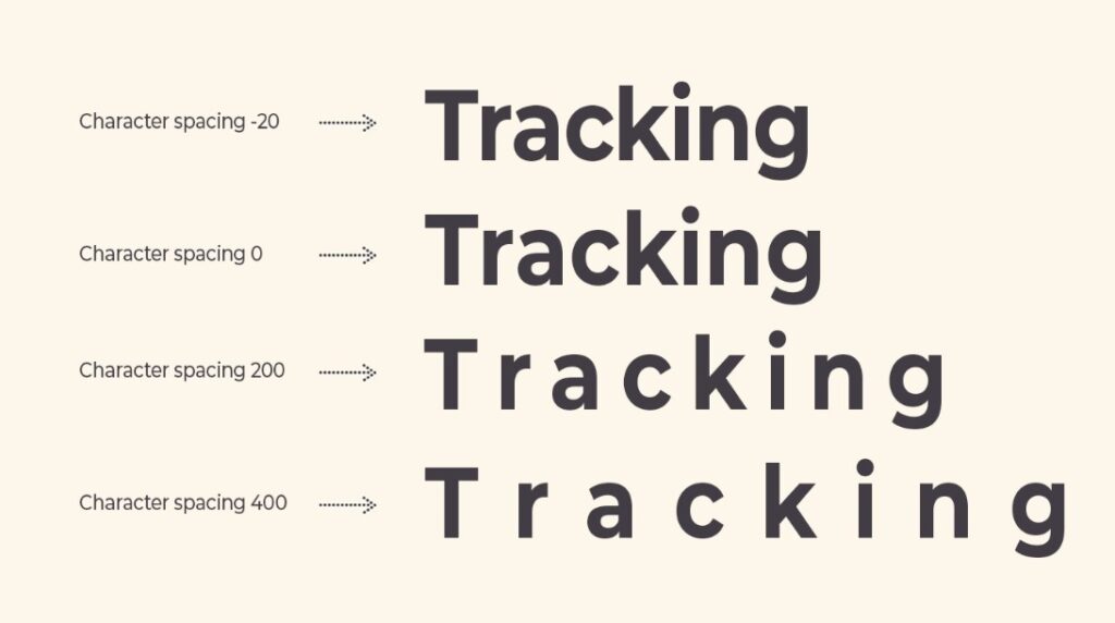
5. Leading
The leading between paragraphs is the space between each line in the text. The leading may be stated in pixels or points; we also use terminology like “single-spaced” or “double-spaced” to describe it.
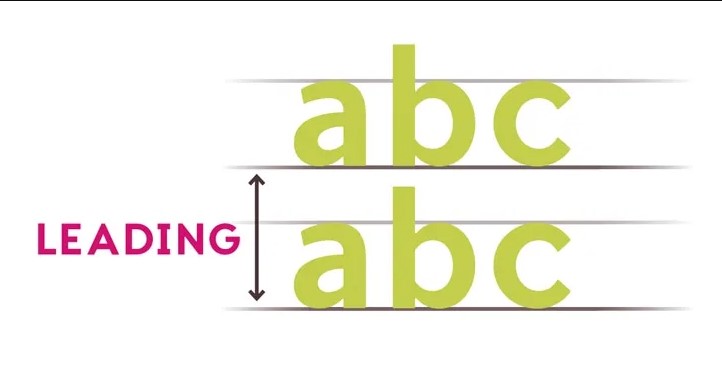
Regarding text organization, too much or too little leading might be unpleasant to read, creating a bad example of typography in web design.
6. Hierarchy
Most web pages, especially those with a lot of text, divide content into sections based on the topic. We use headings to identify and categorize these parts. The order from the most to the least prominent text is what we call the hierarchy.
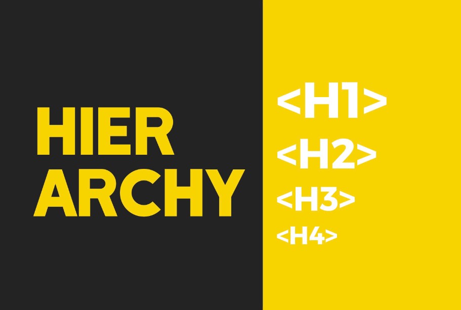
The importance of hierarchy cannot be underrated when creating user-friendly websites. By glancing at the titles alone, readers should be able to jump to the part that is most relevant to them. Distinct font sizes, weights, and styles, even different fonts or typefaces altogether, all serve to indicate hierarchy in typography.
In a standard blog post, the title text (also known as “Heading 1” or “H1”) is placed at the start point of the hierarchy, followed by section headers that increase in specificity and decrease in visual prominence (H2, H3, etc.). Finally, the body text is the shortest yet includes the most information for readers.

Try FREE Magezon Page Builder!
Easily create your engaging Magento pages in any style whenever you want without relying on developers or designers, just by drag & drop.
Why Is Typography Important in Web Design?
There is a lot more to typography than just picking an attractive font. UI design would be incomplete without it.
Typography establishes a clear visual hierarchy, generates visual harmony, and sets the tone for your digital product, all contributing to a satisfying user experience.
Let’s dive deeper into each role of typography in web design.
1. Maintain Consistency
One of the importance of typography in web design is that it creates consistency. Typography helps a website seem more professional since it maintains a consistent style.
Typography in web design follows many web rules, resulting in a clear hierarchy of messages that makes your website easier to understand for users.
We can avoid various cumbersome users may encounter if your fonts are the same size and style. In addition, your readers will easily understand what you’re saying if you use the same font throughout the content.
2. Captures Reader’s Attention
Your website’s typography has a significant influence on how users perceive it. Using good typography, your site’s visual hierarchy (sorted by importance) may be improved. As a result, helps focus the attention of your visitors on certain parts of each page.

3. Creates and Enhances Reputation
Good typography can boost your website’s reputation, and prospects also begin to associate the font on your website with your business. Typography that is distinct and consistent will create a positive user experience, build user trust, and support the expansion of your brand.
4. Improve Readability
When reading a lot of text, especially on a computer or smartphone screen, you’re more likely to experience eye strain and fatigue. Great typography in web design helps by applying larger fonts, a solid and readable typeface, and empty spaces between paragraphs to avoid fatigue and stimulate binge-reading. This may distribute the information more efficiently.
5. Maintain a Sense of Order
One of the most crucial typographic concepts is the use of a hierarchy. Typographic hierarchy makes it easy to identify the most critical parts of the material so that they may be read first. Therefore, your site’s visitors must get the most crucial information in a visual form as soon as possible.
In this era of shorter online attention spans, designers are urged to be concise and create content that allows visitors to absorb critical information quickly.
Golden Rules for Every Effective Typography Factor in Web Design
Sans-serif fonts used to be the norm for online fonts. However, the laws of online typography in web design have evolved compared to the early days of the internet. No need to use a safe sans-serif font on your website unless it serves a specific purpose. The new website typography guide may not be what you think they are.
1. Types of Fonts
The number one rule is that typography in web design has no right or wrong font style.
The crisp, high-quality displays on today’s desktops, tablets, and smartphones weren’t available on early screens. Hence, sans serif fonts were formerly standard in website and app design because it is easy to read in many screen resolutions. But nowadays, most designers no longer have to worry about that.
So, try different fonts. You can mix and max fonts, even handwritten or experimental typefaces.
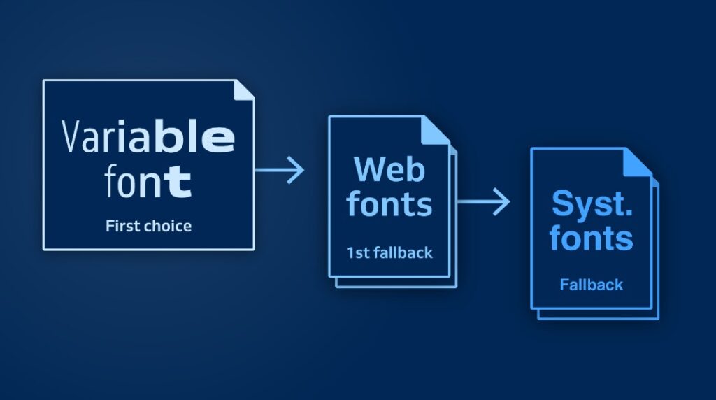
We divide fonts into 3 categories, which are:
- Web fonts: These fonts are what the browser will automatically download right after the visitors access the page. In other words, they are the same in all browsers. Web fonts are a part of CSS and can be used on various websites. Google Fonts and Adobe Fonts are the most popular sources of online fonts (formerly Typekit). If you want your website to appear the same on every device or browser, you need to use web fonts.
- System fonts: These typefaces render typography on websites using the fonts installed on your computer. It’s still a common approach, but the later design will seem different depending on the user and their device, unlike web fonts.
- Variable fonts: OpenType variable fonts are the most recent technique for delivering internet fonts since they allow several variants of the same typeface to be included in one font file rather than having a separate font file for each weight, width, or style change. Fonts may now be animated, allowing them to transition between different widths, weights, and styles without losing their original shape.
What to remember about types of fonts
- Limit the typefaces you use: A website with many fonts (more than 3 different) appears disorganized and unprofessional.
- For content, use serif fonts rather than serif fonts (if you use serif and sans serif fonts): Sans serif fonts work better on screens than serif fonts, preferably for headlines and print.
2. Font Size and Scale
If you’re designing internet fonts, you should apply relative measurements to build a typographic scale so that everything looks the same regardless of the screen size, browser, or device.
Compose a better typographic scale by measuring in ems or rems and percents. Ems depend on the viewer’s browser’s default font size, and proportions can be used to scale font sizes up or down.
Based on a fixed measurement, 1 em is about 16 pixels, which is a good place to start scaling. For example, if you want the font size of the body text to be around 18 px, divide the pixel size you want by the parent font size (16 px) to get the measurement in ems (in this case, 18/16=1.125 em).
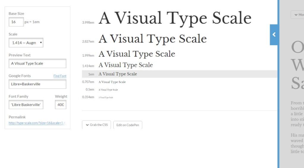
This ems method can take up to 3 digits after the comma, thereby increasing the accuracy of typography in web design. On the other hand, using a fixed measurement prevents the browser from making modifications. Plenty of people alter their browser settings and zoom in, and your website should be able to react to these changes.
What to remember about font size and scale
Size your text appropriately: Font sizes must vary on various devices. On a desktop display, there is more space, so fonts may (and should) be more prominent; however, on a mobile device, the screen is smaller; therefore, we should reduce the font size so that all of the content fits on the page. Don’t go crazy with the font size.
3. Accessibility and Readability
The third rule in web design typography rules is: Typography in web design should be easy to read, understand, and use. Using visual hierarchy and CSS hierarchy can help you do this.
Connect your typographic scale to CSS custom properties to guarantee readability. The body, header, subheader, and so on should all have a specific function. Use your font-scaling system and apply the relevant CSS functions to each font size.
Consistency in typography’s aesthetic and technical features offers a smooth reading experience for the reader. It also creates visual patterns that make text simpler to skim and understand.
Consequently, it is more likely that your content will be easily read by both people and search engines if you connect visual hierarchy with CSS hierarchy.
Another essential consideration in technical typography is to select fonts for websites that users of different abilities can understand. To guarantee that your type elements are accessible, there are a few things to keep in mind:
- Use a base font that users can read without obstacles. Depending on the typeface, this is frequently 16 px or larger.
- The x-height of the font you choose should be big and consistent.
- Put your content in order by using headers and subheadings.
- Take measurements using a relative scale.
- Avoid using text images since they appear grainy, are difficult to read by search engines, and do not resize to fit different device sizes.
- Compare typestyle using The Web Content Accessibility Guidelines (WCAG).
What to remember about accessibility and readability
- The content must employ mixed capitalization: It’s tough for the user to read and scan text completely in uppercase or small caps. A website using all-caps text appears unprofessional and untrustworthy.
- Use standard fonts for website fonts: Users are more familiar with and can read them more easily and quicker.
Try FREE Magezon Page Builder!
Easily create your engaging Magento pages in any style whenever you want without relying on developers or designers, just by drag & drop.
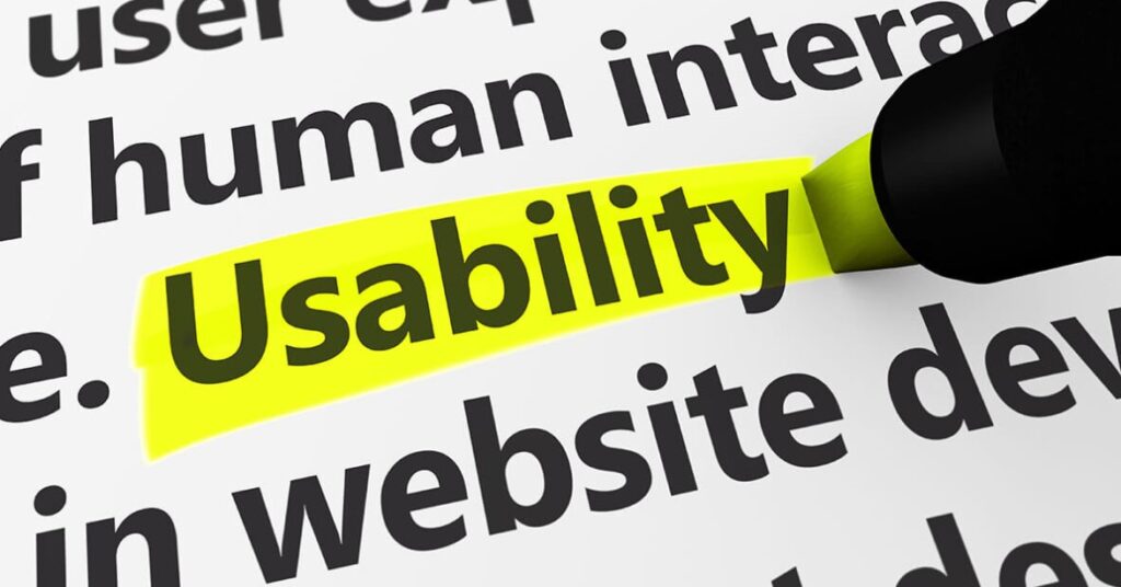
4. Usability
Usability isn’t usually the first consideration regarding typography in web design. Instead, people usually think of it as design features like buttons, links, and graphics.
Typography, however, must also be usable. To create a readable type design, you must choose and be loyal to a specific font palette. Web designers should use one to three font families on a website.
Choose fonts that have unique visual identities and are not similar. Ideally, the fonts should match letterforms and x-heights, but any variances should be noticeable even if they don’t. To create contrast, you may employ a variety of typeface categories (such as serif and sans serif) or various weights, colors, and sizes of fonts. Changes in font size and style may improve readability and comprehension.
Popular and well-known fonts might be the simplest for many people to read since their eyes are already familiar with them.
Color can influence user experience. Some don’t work well with the text. Avoid them or use them sparingly:
- Bright blue: People are likelier to think it is a link if the font is bright blue.
- Red or green: People who are color blind may have difficulty reading in red or green.
- Same color as the background: It might make it harder to read.
- More than one color for the typeface: When there is too much ornamentation, it becomes cluttered and difficult to read quickly; if you must use a colored type element, use just one.
The best web typographers also know that using text elements as links on various devices may be difficult. On smaller displays, touching an inline text link might be difficult, and it becomes much more difficult when there are numerous links in the same section or paragraph.
Avoid using inline text links wherever feasible, and instead, use buttons. This handy feature helps reduce user mistakes by providing a visual clue that a text element is a link.
What to remember about usability
- Limit the usage of different font colors.
- Avoid using blue in content
- Avoid using red and green text coloring
5. Space and Contrast
If you hadn’t previously considered it, excellent typography in web design relies heavily on white space and contrast as they enhance readability, accessibility, and aesthetic appeal.
Line spacing may be the most crucial consideration depending on the importance of text spacing. There is a risk of misunderstanding and difficulty reading if there is too much space and paragraphs or multi-deck headings cause they don’t go together. Users who find it difficult to read long material passages due to a lack of white space may ignore the content altogether.
Remember the following typography guidelines:
- A reasonable starting point for line height for most fonts is 1.5 times the font size.
- Increasing the spacing may improve reading for typefaces that are smaller, lighter, or narrower.
- For fonts with a width of 80 pixels or more, a little less space may be suitable.
- Add line space to typefaces with long descenders.
- Reduce line spacing for text with all capital letters, no descenders, or short descenders.
- The line height should be increased between distinct type hierarchies, such as between a header and body copy.
Contrast is any text element that distinguishes itself from another aspect of design.
The writing on a well-designed website has enough contrast, making it simple to see and understand. This signifies that its hue is distinct from the backdrop.
- Differentiates itself from other text parts.
- Provides sufficient separation between pictures, videos, and other design components.
- Is proportional to neighboring items.
What to remember about space and contrast
- Space between characters should not be reduced: Increasing the character spacing to fit in more text makes the text dense and difficult to scan.
- Provide enough interline spacing: As a starting point, you should choose a spacing of 1.5, equal to half the height of a line of text. This distance should be increased somewhat for headings. Next, start with a spacing of 2.5 between paragraphs and go from there.
6. Line Lengths Matter
Creating text blocks that are easy to read for typography in web design is just as crucial as picking the right font and size. More weighty text components mean that this becomes more necessary.
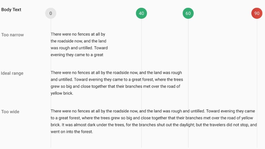
To start, here are some fundamental typography rules for web design for determining container element sizing:
- A line width of 45 to 80 characters for desktop computers is ideal (including spaces and punctuation).
- For body text, the recommended amount of characters per line is 66.
- Keep the line lengths on smaller displays as minimal as possible.
Is there a final consideration for line length? Avoid the use of hyphens. When used in books and written materials, it’s OK, but it may become messy online. Text block spacing may indicate that your lines are too long or too short without hyphenation.
What to remember about line length matter
Keep your lines between 45 and 80 characters long. The longer the line, the more difficult it is for the eye to return to the left side of the text block and discover the beginning of a new line.
7. Break It Up
The text should not seem like a book when read on the web.
Style, font selection, hierarchy, and how text blocks are divided to assist reading are all essential aspects of good website typography.
To allow users to skim material, employ paragraphs, lists, blockquotes, and various components. The simple for people to look through your website and find what they want, the more likely they will stay there. From an internet marketing standpoint, they’re also more likely to convert if the page aim is precise.
Experiment with several text block variants and forms to see what reading style your audience loves, and then build additional text pieces in that format. Create proper hierarchies for each type, such as CSS standards for bullet or numbered lists, FAQs, quotations, or other text components.
What to remember about breaking it up
Don’t make your website look too lengthy. Do an A/B test to see which appearance is the most appropriate for your readers to have the best experience on your website.
Conclusion
Good typography hasn’t evolved much in its theory throughout the years, but it has seen significant evolution in its implementation. Adhere to the typography guidelines above to guarantee your projects contain current font styles and best practices. We’ll see you in the future with more helpful articles. Thanks for reading!
If you are a Magento merchant and don’t know which extension to build your website, consider Page Builder from Magezon. As a trusted Adobe partner, we have satisfied thousands of customers with a vast collection of drag-and-drop extensions, helping you create a high-converting and unique store in minutes.
Don’t take my words for granted; see how your website can be with Magezon Page Builder and what others say about us:


