 Magezon Blog Help Merchants Build Comprehensive eCommerce Websites

Website design’s importance is evident. 75% of consumers judge an enterprise’s reliability after looking at the corporate website design. Impressively enough, when it comes to the best-designed sites with a good interface, they can raise conversions by 200% and whatnot.
And it is worth noting that website design is not only about a Homepage. It is about every page and includes the contact us page. More often than not, designing these pages with simplicity but efficiency in mind would be best.
So what makes your most suitable, simple contact us page? Find the answer right below.
Also, what are the best examples in this regard? Keep reading this article to discover the top picks that get back to the basics in the most effective and productive way possible. Hopefully, they will be your endless inspiration to take your website to the next level.
Table of contents
- Why Should You Create Good Contact Us Pages?
- Best Practices for a Simple Contact Page
- 1. Only Include Necessary Questions
- 2. Let Your Visitors Know at First Glance That They Are Contacting Real People
- 3. Have Links to the Frequently Asked Question Section (FAQs)
- 4. Justify the Reason for Contacting You
- 5. Have Smart Contact Us Ideas
- 6. Include Links to Your Active Social Media
- 7. Make Your Contact Options Centrally Arranged
- 8. Ensure the Consistency Between This Page Design and Your Site’s Other Pages
- 9. Ensure Simplicity
- Top 10+ Simple Contact Us Page Examples
- Conclusion
Why Should You Create Good Contact Us Pages?
If you are building a website, below are some reasons for developing a Contact page instead of asking users to send you emails.
- Gives your site visitor contact options: That means it would be advantageous to let them decide what they prefer rather than asking them to email you.
- Receive more leads: Thanks to a contact form accessible, new customers can get in touch more efficiently, and you get more leads accordingly.
- More integrated with your site: As a result, when they have finished reaching out to you via your simple contact us page, your users can keep perusing the website.
Best Practices for a Simple Contact Page
Consider the following notable practices to ensure your users do not hesitate to reach you for questions, support, and more about your company!
1. Only Include Necessary Questions
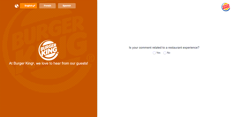
It is not advisable for your best contact us page design to be like a lengthy questionnaire survey. Ask for the necessary information only. For instance, Burger King is an inspiring example of using the interface of a smartphone smartly to ask for customer information. By creating an interesting experience, this popular burger brand successfully encourages their users to answer all the questions needed.
2. Let Your Visitors Know at First Glance That They Are Contacting Real People
More often than not, people are unwilling to submit a contact form. They fear wasting time filling in the form but getting an automated service or no response. So, we recommend including your support team’s pictures when you design the contact us page to help your users be confident that real people will respond.
3. Have Links to the Frequently Asked Question Section (FAQs)
When it comes to simple questions, your visitors can find them easily in your FAQs part. Your support team will not become preoccupied with getting back to that type of question, so you get the best of both worlds.
4. Justify the Reason for Contacting You
Specifically, how can you be of help to you? Specify some key points. Consider including a subheading on the page – for example, “For general questions, reach out to us here.” “Visit us here.” (with a map to your office). By doing so, your users will have a better idea of what to expect from contacting you.
5. Have Smart Contact Us Ideas
People get in touch with your business for many reasons. That is why they may return more than once to submit a contact form. With the help of smart forms, your visitors can choose between the fields. Also, that allows you to gather the correct info.
6. Include Links to Your Active Social Media
Sometimes, users want to reach you via your social media platform for quick responses. So, having your social links on your simple contact us page will be best. It would be perfect for including your social media platforms at the end of the form, where users can find them easily.
7. Make Your Contact Options Centrally Arranged
If you provide a couple of choices for visitors to contact, you should centralize them. For example, set them up on the right side of your contact us page design like Le Creuset has done to their page. That way will be more straightforward for users to choose the specific way they prefer to reach you.
8. Ensure the Consistency Between This Page Design and Your Site’s Other Pages
It will be fantastic to build a beautiful contact page that simultaneously matches your branding. In other words, its illustrations, fonts, and colors are comparable with your website’s other pages.
9. Ensure Simplicity
Finally, please do not use a too complicated, confusing, and cluttered contact us page template. Make it straightforward and user-friendly so visitors can easily find what they need. Most of the time, simplicity equals attaining your aims to convert more users into leads.
For example, avoid image overuse and content packed with too much information. That is highly likely to confuse (or even irritate) users because all they need may be talking to someone.

Try FREE Blue Form Builder demo today
Create whatever type of Magento form in any style you want just in minutes without relying on developer. Just by drag & drop.
Top 10+ Simple Contact Us Page Examples
1. Starbucks
The American company that has been around for over 35 years as the world’s largest coffeehouse chain does know how to impress its customers with its products and contact page.
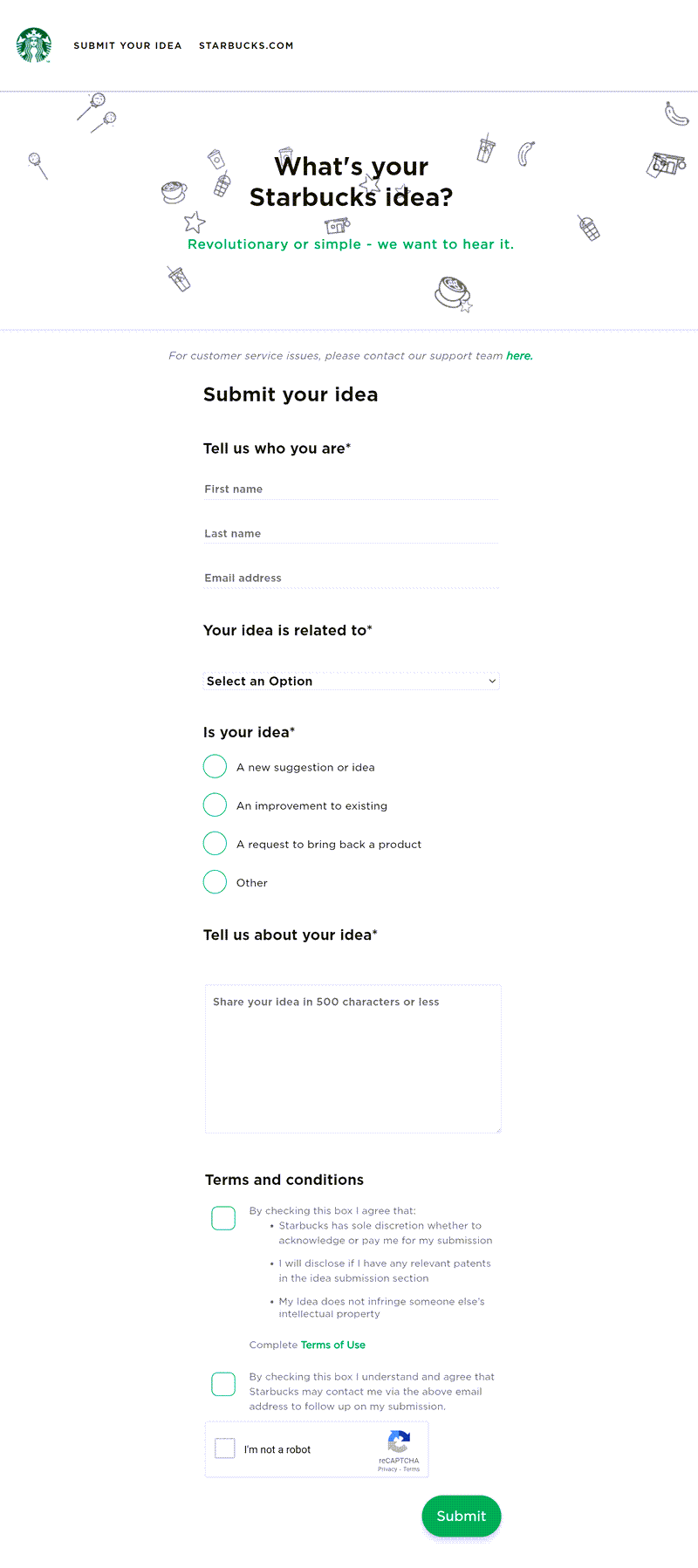
It is genuinely the definition of simplicity. You will not be able to find out any unnecessary information. In the clean, white background, subheadings and texts stand out for your most uncomplicated navigation.
What is more? The CSS animation in the Heading makes it cute. Above all, what makes it unique is that they do not call this a contact page but “What’s your Starbucks Idea? Revolutionary or simple – we want to hear it.” Another way to say contact us!
2. Burger King
Established in 1954, Burger King is the world’s 2nd largest fast-food hamburger chain.
Visiting their website, you can see that they break down their contact us page into six categories: Digital Support, Restaurant Support, Frequently Asked Questions, Crown Card, Find a Burger King Near You, and Free Whopper for Your Thoughts.
After choosing the category, customers will get navigated to a different page. There, they will find a specific contact form. For example, Hit “Contact guest support,” and you will see a new contact page asking whether your comment is related to a restaurant experience. And in a split second, it leads you to the simple contact us form.
| In case you are interested, Burger King also appears on our List 40+ the most famous companies that use Magento in 2021. |
3. Dinnerly
A pretty newcomer in the market, New York-located Dinnerly proves how capable they are of quickly becoming one of the fattest and most affordable meal delivery services these days.
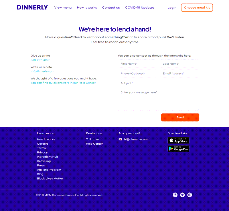
Speaking of their creative contact page, instead of saying contact us, they welcome you with “We’re here to lend a hand!”
Also, the contact form is short, asking the customer to provide only six basic pieces of information. That way manages to encourage visitors to write. As a bonus, it uses a fun color to touch up the simple page.
4. Snake River Farms
Founded in 1968 in Caldwell, Idaho, Snake River Farms is American Wagyu Cut’s top-notch purveyor.
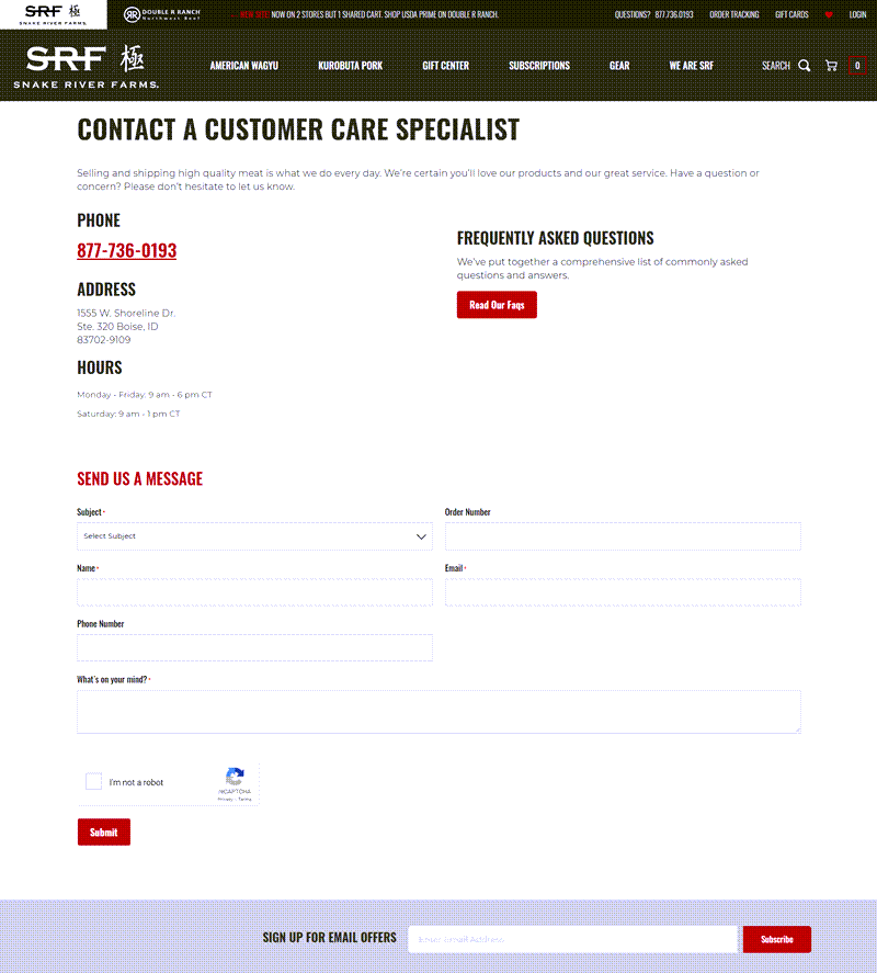
And their simple contact us page is worth appreciating and learning from. Everything is clean-cut, from the phone, address, and office hours to FAQs and ‘Send us a message form. You may notice that the pop-up appears when customers first see the page. Its presence on a contact page is a great chance to build up your email list.
5. Moschino
Founded in 1983, Moschino is an Italia-based luxury fashion company specializing in clothing, luggage, footwear, accessories, & fragrances.
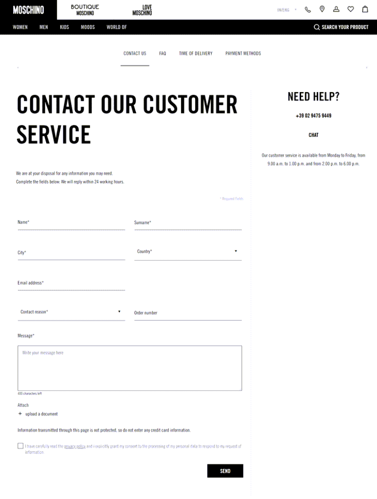
Regarding their website, the best contact page design may effortlessly impress you. It looks exactly like a contact form, but they make its aesthetic thanks to the classic black and white theme, font, size, and spacing between lines.
| Aside from Burger King, Moschino’s website is also one of 40+ the most famous companies that use Magento this year. |
6. Tacori
Established in 1959, Tacori is a popular U.S jewelry design and manufacturing business located in Glendale, California.
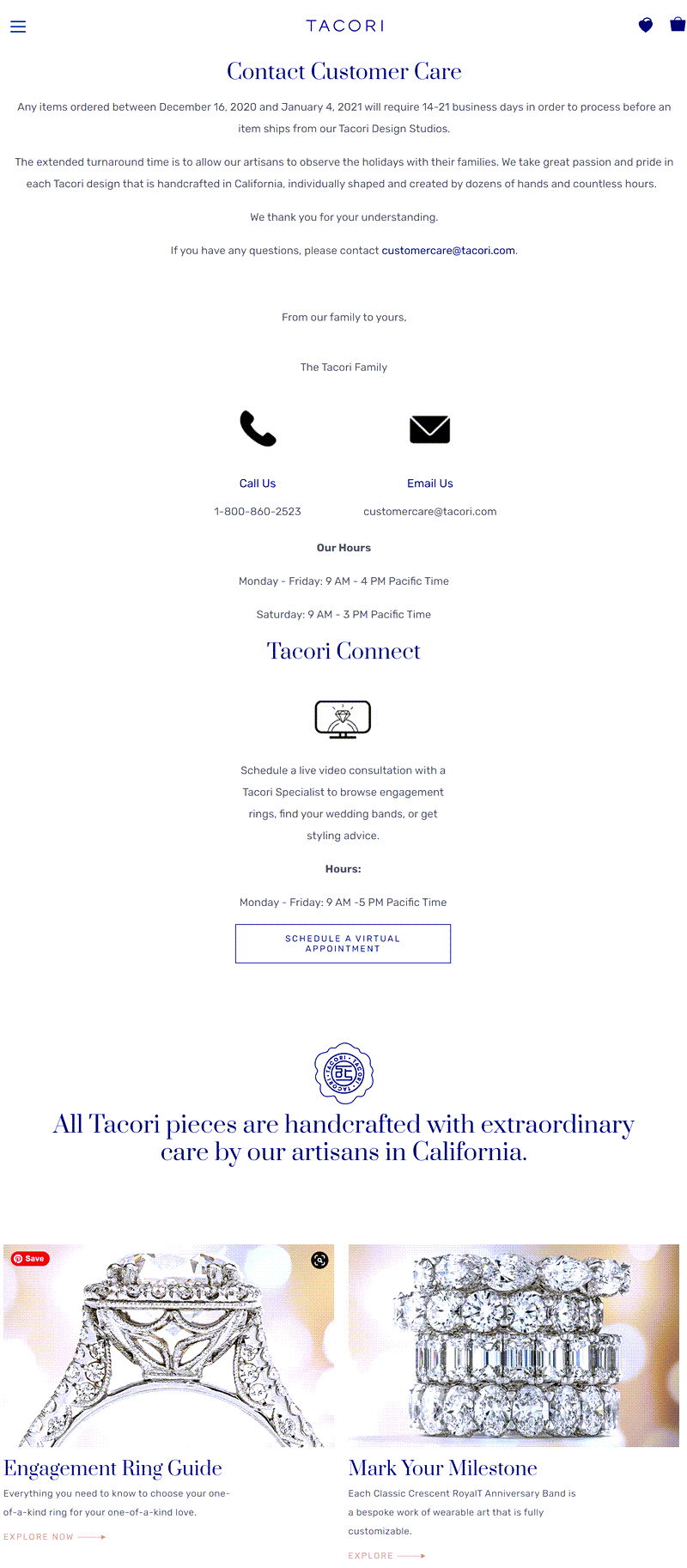
There are some reasons you may want to get some contact us page inspiration from theirs. It is a seamless combination of simplicity and impressiveness.
The page’s first part includes three contact options: Call Us, Email Us, and Schedule A Virtual Appointment. The latter choice is something genuinely worth copying. It allows for a live video consultation with the company’s in-charge specialist and an indirect way to let visitors know more about their products. For the second part, they did not forget to promote products by showing off enticing images and captions that matter.
7. Pit Viper Sunglasses
Pit Viper was established in 2012 in Salt Lake City, Utah as a bold sunglasses maker for people demanding “respect and authority.”
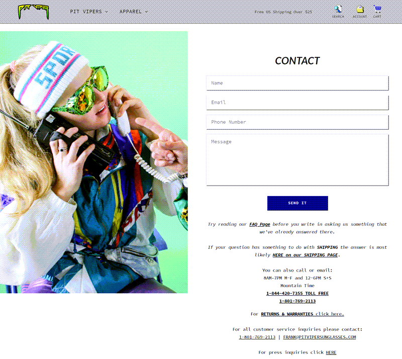
They make their website impressive while being far from a complication. Let’s see the example of the contact us page. The straightforward contact form aside, it briefly lists out five other convenient contact options for various purposes. They are general inquiries, shipping, return and warranties, customer service, and press inquiries.
They make it strikingly cool, thanks to the retro theme.
8. Le Creuset
Founded in 1925, Le Creuset is a top-of-the-line French cookware manufacturer famous for its colorful cookware. You can quickly figure out that trademark feature when visiting its website, including the simple contact us page.
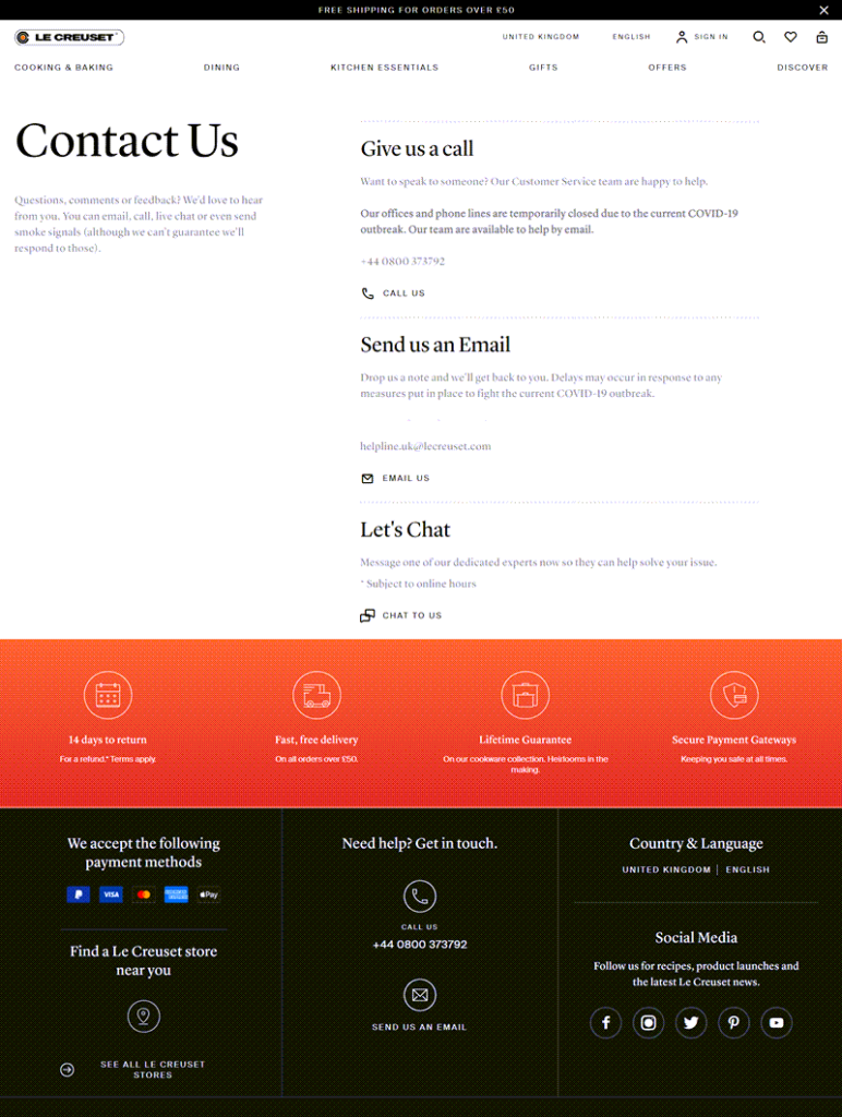
It is a typical example of how to centralize contact options. Three choices are readily accessible on the right side of the page’s first part. They are “Give us a call,” “Send us an Email,” and “Let’s Chat.” The latter three parts do not forget to promote their trustworthy service, list different payment options, active social media accounts, and newsletter subscriptions.
The parts’ arrangement is neat and clear thanks to visible separate lines and colors.
9. Spendee
Founded in 2013 in Prague, the Czech Republic, Spendee is a reliable personal finance application that lets you keep tabs on your finances.
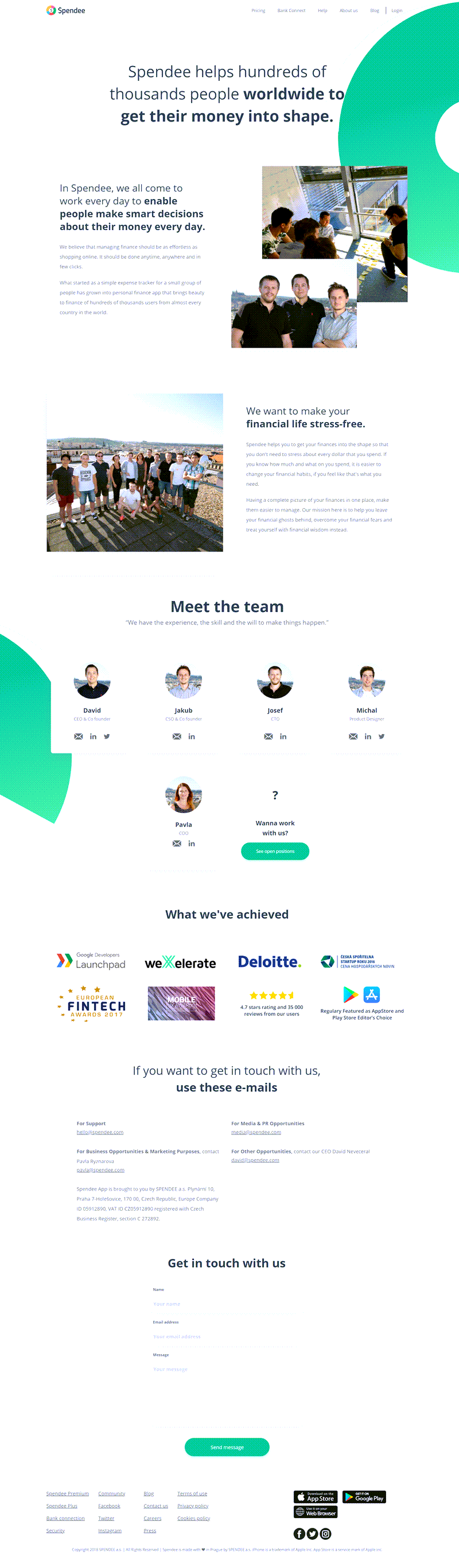
Their simple contact us page is noteworthy when covering every essential and crucial information to help users reach them. The most convenient and user-friendly element? A messenger box with “Leave us a message” at the bottom can initiate an engaging conversation.
10. Solo Stove
Solo Stove is a well-known design house & supplier of compact, quality fire pits & camping stoves. It was founded in 2011 in Dallas, TX.
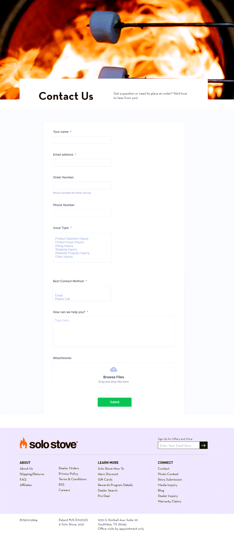
You will not be able to get enough of their beautiful contact us pages. They use three boxes to make a simple form for each contact option.
On top of that, the company inserts a remarkable quality photo for the heading. As you can see, that approach is different from the rest.
11. Ripco Real Estate
Formed in 1991 in Jericho, NY, America, Ripco offers top-tier services related to real estate management.
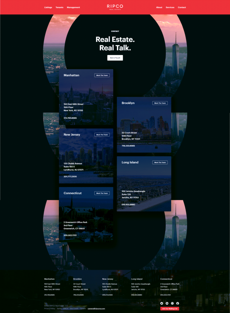
Their simple contact page is an optimal blend of bold heading (“Real Estate. Real Talk.”) and a polished card-style design to make the essential contact information over four offices stand out.
You may particularly like that all offices provide a Call To Action to “Meet the Team.” That allows users to be more particular about their chances of contacting real people and grow trust along the way.
Conclusion
We hope the simple contact us page examples above inspire you to improve your website. Factor in what makes them different & critical points to create an effective page. Consider your company’s products/ services, culture, & entire website before starting to ace your contact page.
Try FREE Blue Form Builder demo today
Create whatever type of Magento form in any style you want just in minutes without relying on developer. Just by drag & drop.

