 Magezon Blog Help Merchants Build Comprehensive eCommerce Websites
The website grids split pages horizontally and vertically to help designers layout elements in an orderly and consistent manner within the interface. On the other hand, while optimizing user flows for different screens or windows, it’s hard not to repeat design similar schemes and layouts. That’s when grids come in handy, as it helps develop wireframes, templates, or standardized layouts more easily.
It might be overwhelming initially, but if we split the process into steps, you will have a clear picture of what and how to execute everything. Let’s dive into today’s article to learn the 4 simple steps of creating with some basic knowledge and the best practices to optimize them.
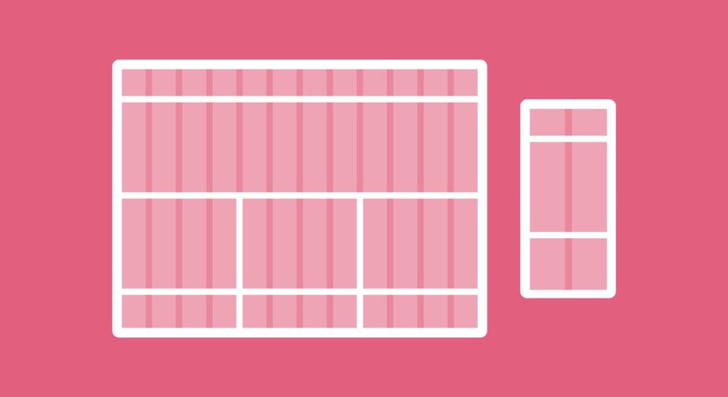
The Grid Anatomy
Learning and understanding the basics is essential to work with everything quickly and effortlessly, and creating website grids is no exception. Our first step now is to get to know the components of every website layout:
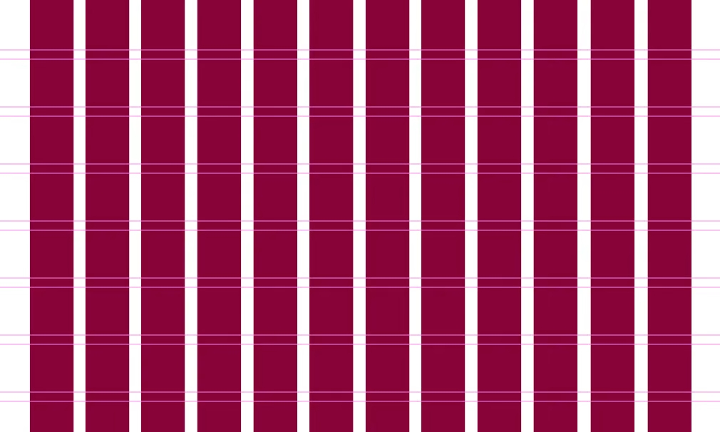
1. Columns
Columns are vertical elements that span the content area’s height and are considered the “building blocks” of the grid. What’s unique about columns is that the more columns there are in a grid, the more flexible it is, but the usual number of columns to use is 4 on mobile, 12 on desktop, and 8 on a tablet. Column width in most grids ranges between 60 and 80 pixels, affecting the width of your actual content.
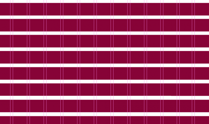
2. Rows
Rows are the horizontal portions of a grid. Surprisingly, web design frequently ignores the function of rows in a grid. This, however, is not what we would call a best practice. We will discuss rows further later.
3. Modules
Modules are space units created by joining rows and columns. Because each design element (text, images, buttons, etc.) fits into the modules defined by the rectangular patterns in a grid, modules are the building blocks of a page.
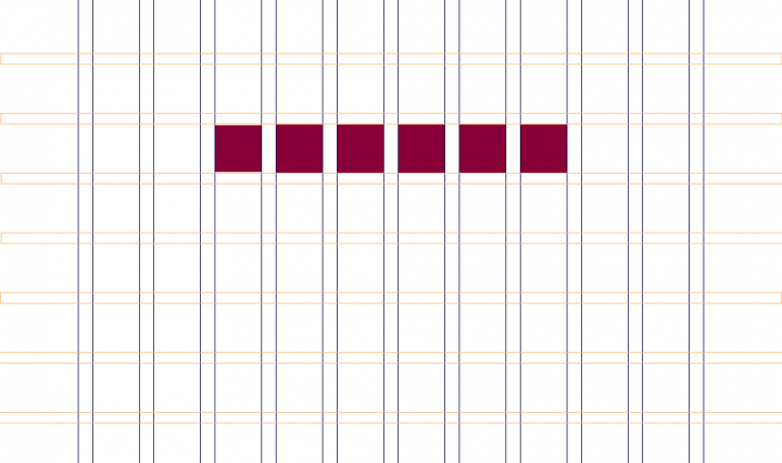
4. Gutters
Gutters are the lines that run between columns and rows, separating each unit. 20px is a typical gutter size. The function of gutters is to provide negative space (large or tiny) between columns and rows.
5. Margins, or “outside gutters,”
Margins are the white space between the format and the outer border of the text. On mobile, side margins are typically 20 to 30 pixels wide, which can vary considerably on desktop. Remember that the margin’s size has no bearing on the size of the content inside it. In the context of layout grids, the prescribed space around an element directly refers to the distance between the format and the outer boundary of the content.

Try FREE Magezon Page Builder!
Easily create your engaging Magento pages in any style whenever you want without relying on developers or designers, just by drag & drop.
Types of Grid
Although the name “grid” indicates a purely square-based structure, it does include several sub-types. We will examine different design examples that illustrate each grids type below:
1. Block Grids: a Traditional Option for Single Posts and Articles
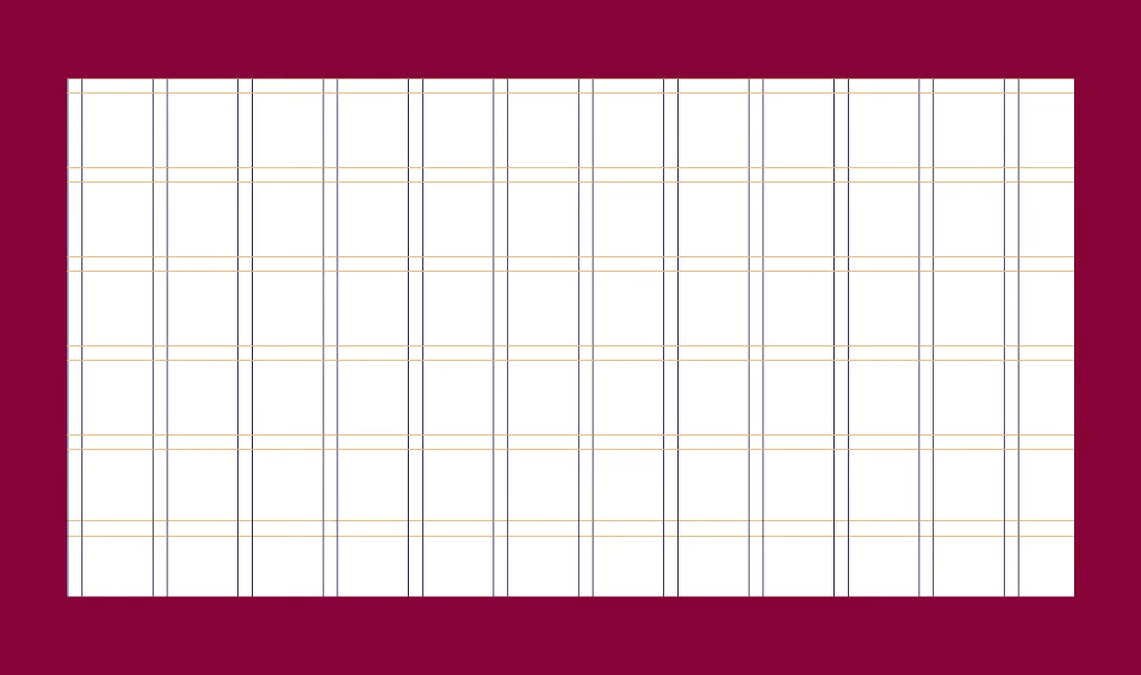
Block grids, also known as single-column or text grids, are the most basic website grid style. They are made up of a single column and may showcase single or many components stacked vertically and surrounded by margins. To borrow the terminology from before (“Anatomy of a Grid”), block grids are large rectangular regions that occupy most of the area inside a format.
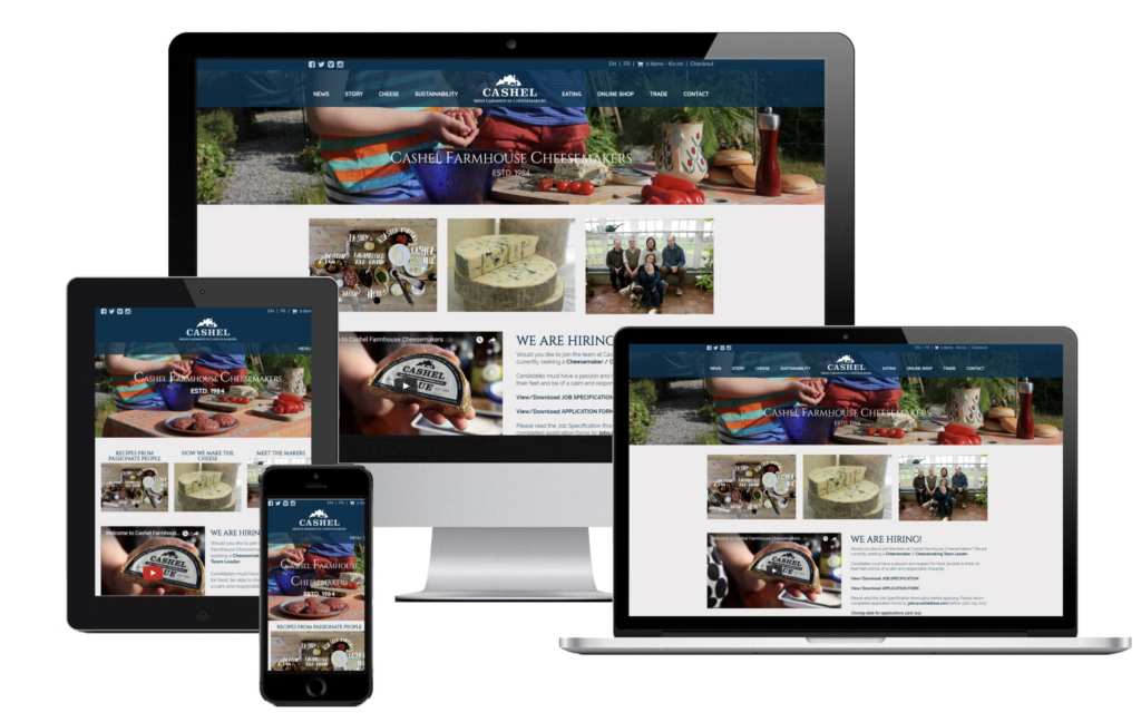
Single post pages, usually for single blog posts, are among the most popular use cases for block grid layouts. When your goal is for website visitors to like your content, the more vertical, concentrated reading experience you provide, the better they will enjoy your content. I’d like to take an example from Magezon‘s privacy and cookie policy page below to illustrate what block grids actually look like.
2. Column Grid: Equally Divided
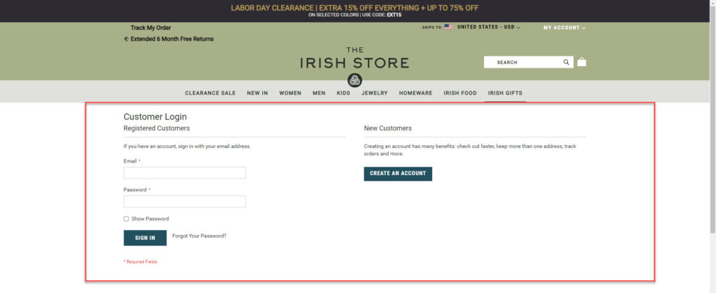
Column grids can include as many columns as possible, and designers are the one who decides the number. When you put text and pictures inside, they align with the vertical lines and flowlines of the columns. Design components can be positioned inside one column or across two or more for different purposes. On the other hand, the gutters should be proportionate and constant across the page. A column-based grid is the best option to provide information for different subscriptions, products, or plans on a pricing page.
Numerous websites use this column grid layout to arrange their content, but a prominent example that we can see is The Irish Store – a Magento-based website.
→ See more restaurant/ food website examples: 25+ Inspiring Restaurant Website Examples 2022 (With Tips)
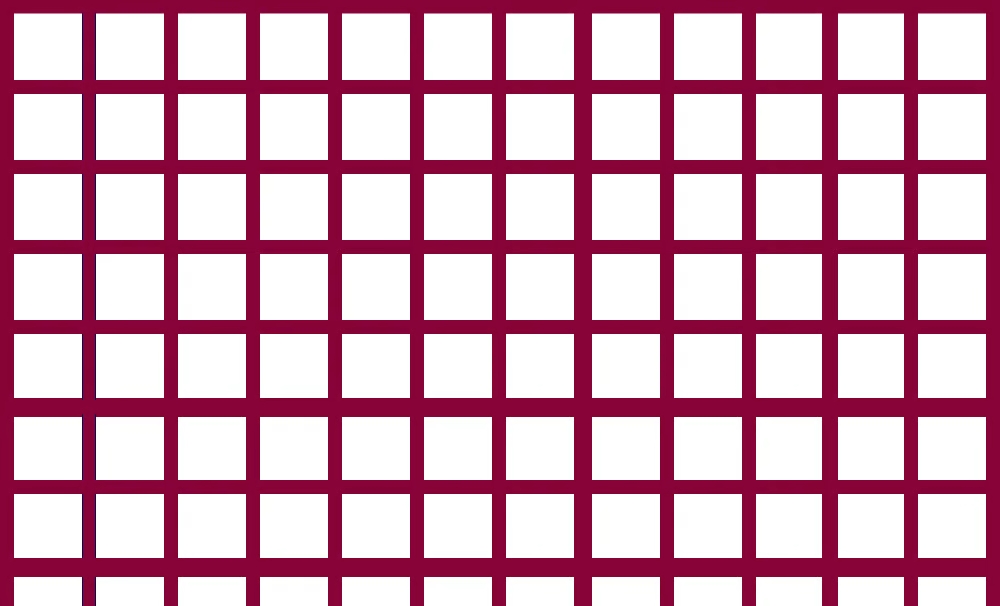
3. Modular Grid: Perfect Symmetry
Modular grids are made up of columns and rows to create modules of the same size and are mainly used to simultaneously display multi-content for simple access. Mobile phone home screens showcasing the whole collection of apps or eCommerce website product pages are common use cases. As you can see on Helly Hansen‘s product page below, this Magento-based website generates perfect symmetry for its men’s sailing jackets category to provide visitors a clean and clear user interface.
→ Learn the product page from A-Z: PDP Ecommerce Product Detail Page: Best Practices & Examples
4. Hierarchical Grid: Organized Yet Freestyle
Hierarchical grids, often known as “freestyle grids,” are grids in which content, depending on the importance of each section, is placed among columns and rows. As a result, the column widths and row heights differ across the grid. Below is an example from another Magento website, Fred Perry‘s homepage, which you can learn from.
→ Optimize your homepage: 25+ Ecommerce Homepage Best Practices With Examples
Website Grids Layout Best Practices
1. Respect Responsive Design
When a page or site is responsively built, the page layout and content adjust to multiple devices and browser widths. This implies that when the screen size varies, so will the number of columns and their breadth.
However, there is a difference between traditional design and responsive design grids. Design grids rigidly adhere to a baseline grid, but responsive grids are flexible, which means grid columns may scale and reorient based on the user’s viewport. For example, shrinking screen sizes will lead you to the next breakpoint with a fixed grid, and side margins will automatically reduce until the next breakpoint.
A responsive grid, often known as a fluid grid, is what you see when items change dynamically as the browser/screen decreases. Responsive grids align and arrange your material logically, showing their information hierarchy. This implies that the tiles and grid content also shrink when the viewport shrinks.
2. Allow for White Space
Readability, scalability, information hierarchy, and general breathing area around and between design elements benefit from white space in website design. It seems evident that white space is an inherent component of website and layout grids, given its crucial relevance in layout design. Grid layouts are determined by the dimensions of their columns, rows, and spacing—the height and breadth of the white space between them.
The 8pt Grid System is a grid-based design technique popular among web designers introduced by Google’s Material Design standards. Designers use a grid of 8 × 8 pt squares in the Material Design system. Therefore, every element on the page will be multiples or divisible by eight. The fascinating thing is that this applies not just to grid items like photos, buttons, or words but also to white space units, which must be a multiple of eight. This demonstrates how crucial white space is in grid design, to the point that its measurements and specifications are equally as critical as columns and rows.
3. Keep the Golden Ratio
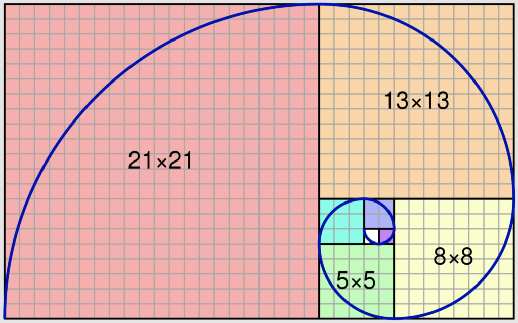
When trying to improve the grid design’s size, balance, and layout, many designers employ a concept known as the Golden Ratio. The Golden Ratio is a proportion that equals 1.6180, which applies to the width and length of pictures, objects, or forms next to one another and the construction of a single shape or element. Designers may use it to determine how to split the horizontal space available on the page and how much room to allow for and around each element.
You can apply Golden Ratio while creating a website hero section in a full-width layout with two separate sections for the hero picture and hero text. To decide on the text size, picture size, etc., first, you must pick what ratio to split the columns into, which will lead you to decide how large your picture and font will be and what to emphasize more.
In terms of the overall layout grid, the Golden Rectangle and the Golden Ratio each assist web designers in choosing:
- How to split the page’s space.
- How many columns should be used?
- How wide should columns be?
- How much space should be added between columns?
- Module dimensions and different layout grid elements.
This guidance considers various elements, including page width, content size, and the number and size of modules the content will require on a grid. Regarding accessibility, the Golden Ratio guides the user’s eye to specific points or places on a screen after designers define and apply their content and design scheme’s hierarchy.
4. Follow the Rule of Thirds
Another web design method that helps designers achieve aesthetically balanced website grid layouts and image placement is the Rule of Thirds. This method applies a grid overlay to the design area, dividing it into thirds, horizontally, and vertically. The line intersections divide any picture or page section/space into nine equal portions. According to the Rule of Thirds, placing “objects of interest” on the “thirds” of a picture will attract user attention in a more powerful, aesthetically appealing way.

In web design, the Rule of Thirds is frequently used to establish some of the most critical grid and layout-related design considerations, such as:
- Which grid should you use?
- What dimensions should each grid element have?
- Where should the most crucial aspects should you place?
- What image ratios should you use?
- How much should negative space should you include around and between elements?
5. Testing
This is probably the final step. Remember that you can always make changes to your UI grid design. Designers should assess and iterate the grid depending on the results of those tests, just like every other design element.

Conclusion
As we have explained above, all the fundamentals you need to know before beginning to design your website grids as a designer, developer, or hobbyist are covered. Follow this guideline to develop the best-looking website to create an impression in customers’ hearts, and enhance user experience.
If you are a Magento merchant and don’t know which extension to build your website, consider Page Builder from Magezon. As a trusted Adobe partner, we have satisfied thousands of customers with a vast collection of drag-and-drop extensions, helping you create a high-converting and unique store in minutes.
Don’t take my words for granted; see how your website can be with Magezon Page Builder and what others say about us:


