 Magezon Blog Help Merchants Build Comprehensive eCommerce Websites
Hi, long time no see. I’m back with the Magento Page Builder series. After content type articles, I’m pretty sure it’s probably not easy to put what you’ve learned into practice. That’s why we’ve decided to create page samples and give you detailed instructions on how to make them. Hopefully, they’ll help a lot.
——————-
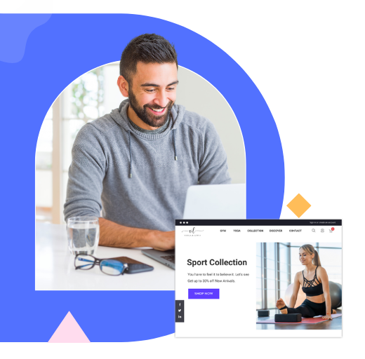
So today, you’ll learn to build a restaurant landing page with Magento Page Builder.
Table of contents
Before You Start, Keep These Things in Mind
Tip 1: Make sure you have a firm grasp of landing pages. You need to understand:
– what it is used for
– what elements a landing page should include
– how to optimize these elements for high conversions
Don’t rush head-first without first learning the basics of a landing page. Except for luck, your efforts surely won’t pay off. Here’s the guide to the landing page that you should follow.
Tip 2: Building a landing page is not a challenge if your business has brand guidelines. Otherwise, you must determine your brand personality and then choose appropriate design elements (typeface, color, image, icon, etc.) before creating a landing page. If your brand is energetic, and youthful, make sure that every design element reflects that.
Tip 3: Search restaurant landing page design from others for ideas and inspiration. Ideally, their design should be aligned with your brand personality. Pinterest, Dribbble, Google Image, etc., can be great sources of your inspiration. So, make the most of them. Don’t get me wrong that you should copy and paste. Improve it and make it your own.
Tip 4: When seeking ideas and inspiration, you may be overwhelmed by various well-designed landing pages. Having experienced this matter, I totally understand your situation. From my experience, you’d better pick 2-3 landing page examples that capture your attention initially. Once you’ve found enough choices, stop searching. Keeping on seeking helps nothing but waste your time. Instead, spend your time on making your page outline.
Tip 5: At this point, you have to determine:
– What sections your landing page includes
– What content types are used in every section
This may take you some time at first, but you’ll find it much easier during the creation process.
Tip 6: All images on this landing page come from Unsplash, a free image stock. I’ll include their links in this article so you can get these assets for practice. That’s also our way of giving a shout-out to the authors who contributed these images.
Tip 7: The images are large, which may slow down the page loading. This hurts both the user experience and SEO of your site. In this case, image compression tools, like Tinypng, are a need. Make sure your images remain high quality after compression. If you over compress them just for optimizing page speed, your images will become low-resolution, which undoubtedly ruins your user experience, too.
Try FREE Magezon Page Builder demo today
Easily create beautiful, engaging Magento website in any style whenever you want without relying on developers or designers. Just by drag & drop.
Create a Restaurant Landing Page Using Magento Page Builder
Before jumping into the Magento Page Builder workspace, make sure:
- The admin session lifetime is set long enough so you won’t be interrupted by the session timeout.
- WYSIWYG Editor in the WYSIWYG Options configuration is enabled.
- Page Builder in the Advanced Content Tools configuration is enabled.
| You may like also: How to Configure Page Builder in Magento 2 |
Okay, we can now go to Content → Pages. Click on Add New Page to create a new page.
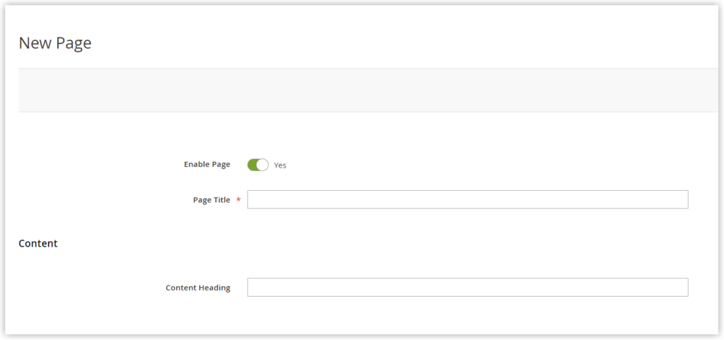
Once you land on the creation page, keep these things in mind:
- Enable the page. Many of you may be wondering why the page can be published while it’s not yet finished. Well, it’s because there are cases when you can preview the changes on the front end only. For instance, when you apply CSS to an element, you must load the page on the front end to see how it looks.
- Give a name to the page by filling out the Page Title field.
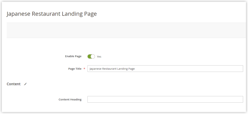
- Content Heading: Leave this field empty. Read this Heading content type article to learn more about the Content Heading field.
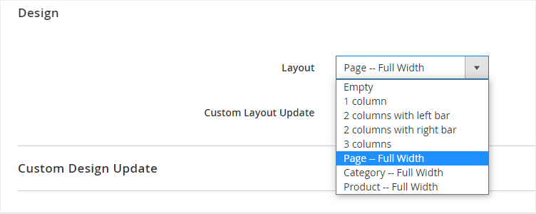
Scroll down to Design, then click to expand it. Under Layout, set to Page – Full Width to make the page expand to the entire width of your screen.
When you’re done, click Save on the right upper corner.
Now that I’ve given you a quick rundown of the restaurant landing page, you’ll be able to determine which sections are on the page.
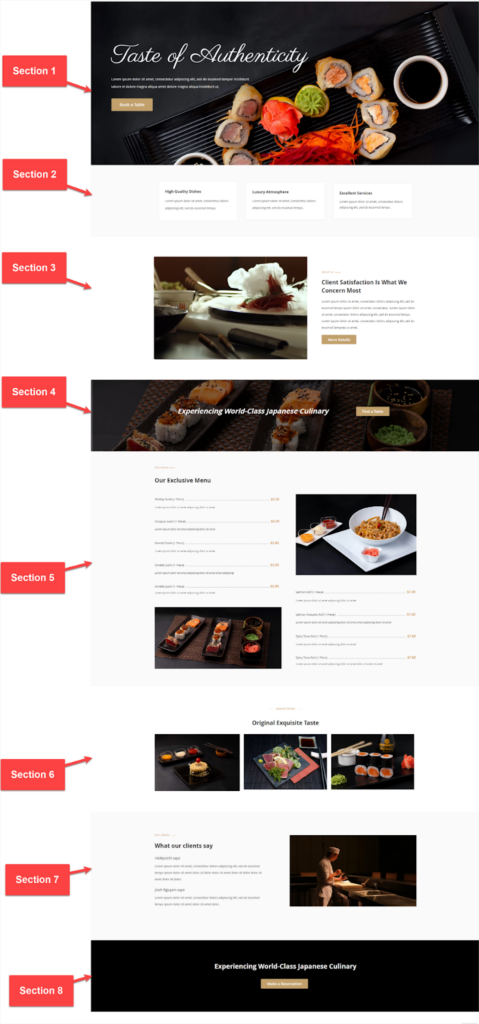
As you can see, the page is divided into 8 different sections, each of which serves a purpose that contributes to the ultimate goal – having clients reserve a table. I’ll take you step-by-step through each one. Okay, let’s begin with Section 1.
Section 1: Introduction
First, let’s see what content types are used in this section:
- A full-width row with its background image
- Headline – Heading content type
- Subheading – Text content type
- CTA button – Button content type
Let’s start with the row.
Step 1: Add the row.
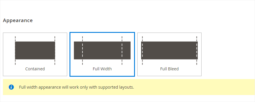
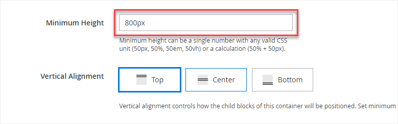
- Select Full-Width for the row under Appearance so that its background image will occupy 100% of the browser screen width while its content is limited to a defined area.
- Minimum Height: Set the row’s height to 800px to almost show the entire image.
- Choose Image as the background type.
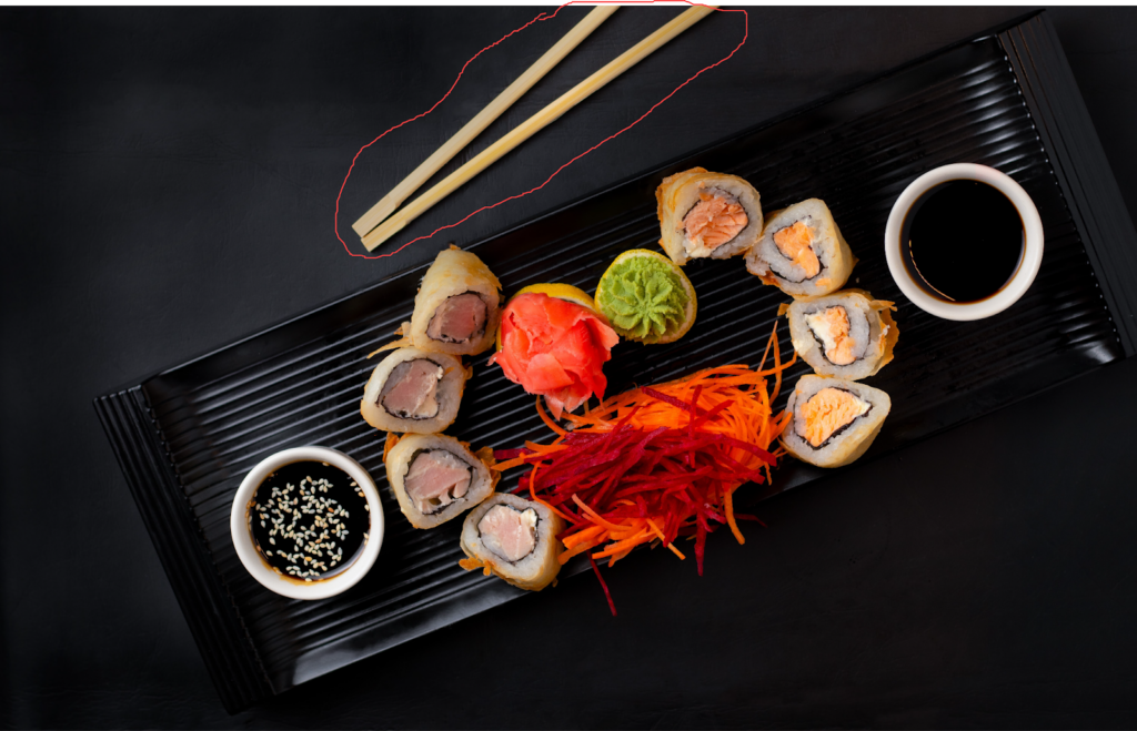
- Upload an image background by clicking Upload in the Background Image field. If you’ve uploaded the image to your gallery, you can choose it from there.
Note: See the chopsticks highlighted in red? I’ll remove the chopsticks from the image to place the content, making the text copy easier to read. To do it, follow this video tutorial.
- Background Mobile Image: In the scope of this tutorial, we don’t apply a background image for mobile devices. On the other hand, we highly recommend using it to ensure your food landing page looks good on these devices.
- Set Cover for Background Size so that the background image resizes to cover the entire row.
- Set Background Position to Top Left.
Okay, we’ll now add content to the row.
Step 2: Add a heading.
Let’s start with the headline. To add the headline, use the Heading content type. Here’re its settings:
- Heading Type: H1
- Heading Text: Taste of Authenticity
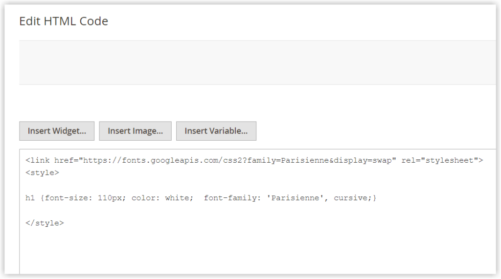
This content type provides a few styling options for customizing the heading. To style the heading, I’ll use the HTML Code content type. For detailed instructions, please refer to this blog post.
Here are the heading settings:
- Font: Parisienne, a minimalistic handwritten script font
- Font Size: 110 px
- Font Color: White
Open the HTML Code settings. Insert the codes below:
<link href="https://fonts.googleapis.com/css2?family=Parisienne&display=swap" rel="stylesheet">
<style>
h1 {font-size: 110px; color: white;  font-family: 'Parisienne', cursive;}
</style>
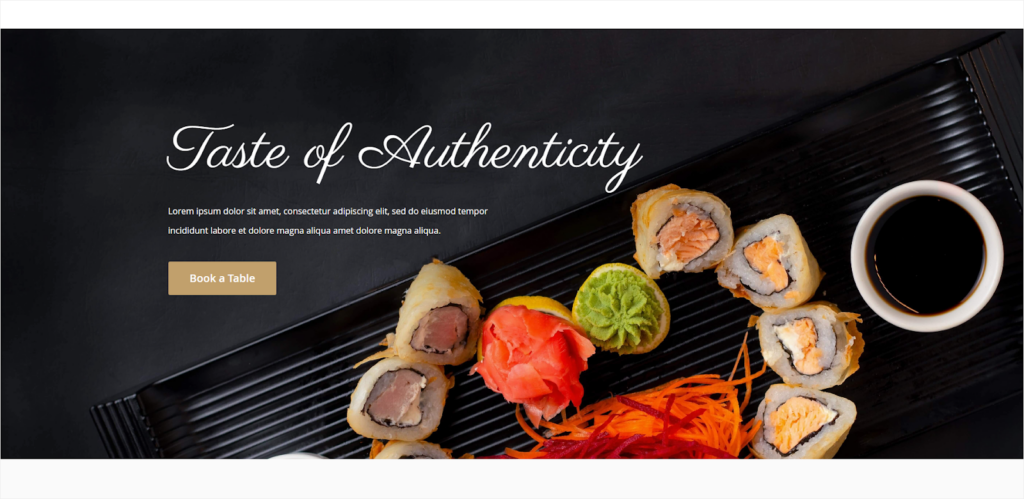
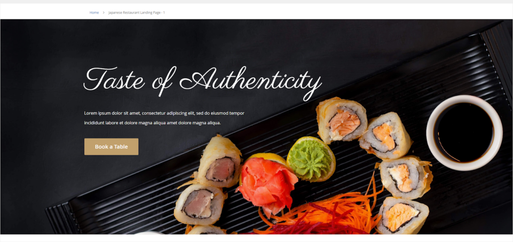
Let’s see how it looks on the front end:
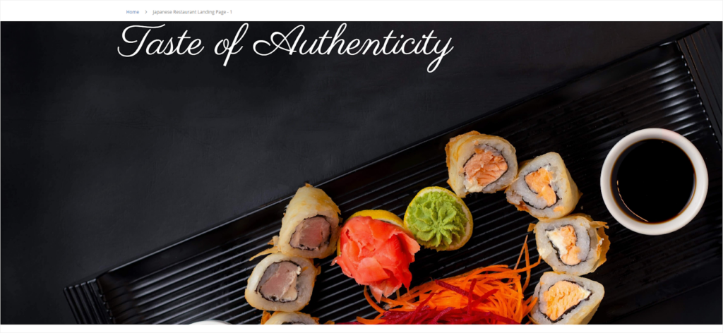
I want the headline to be in the middle left of the background image. So, I’ll increase the row’s top padding by 170px.
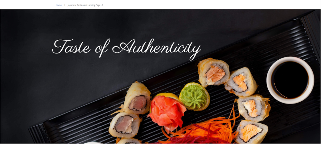
Looks great? The white headline stands out against the empty black background.
Step #3: Add a subheading using the Text content type.
Here’s the settings for texts:
- Text: “Lorem ipsum dolor sit amet, consectetur adipiscing elit, sed do eiusmod tempor incididunt labore et dolore magna aliqua amet dolore magna aliqua.”
- Font Size: 16px
- Line Height: 36px
- Text Color: White
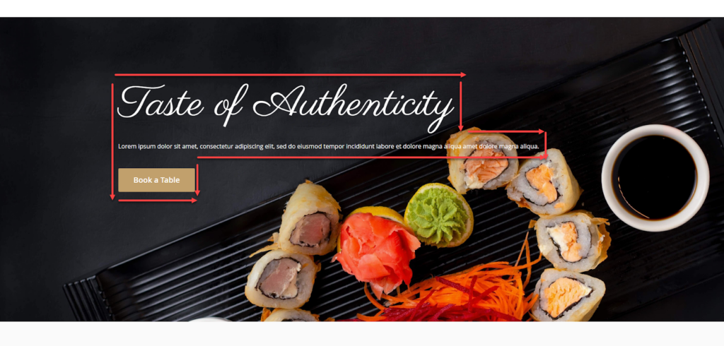
- Right Padding: 650px. This keeps the texts from overlapping the sushi in the image, helping them be more legible. Also, the subheading text becomes shorter than the headline but longer than a button, which creates a pleasing-to-the-eye design. Look at the two images below and you’ll understand what I am saying.
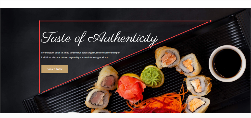
Step 4: Add a CTA button.
Follow these settings:
- Button Text: Book a Table
- Button Type: Primary
- Button Link: Select URL and paste the link: https://www.magezon.com/magezon-page-builder-for-magento-2.html
- Tick the Open in new tab checkbox.
Let’s check the result:
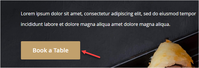
It’s fine, but I want to change two points on the button.
- I’d like to create more space between the button and the text. So, I’ll add 30px to the parent button’s top padding.
- I want to pick a color that matches the overall design and reflects the brand. To this end, I use an eyedropper to pick the sushi color and then adjust the hue. The chosen color is #c1a06c.
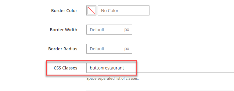
To change the button background color, I’ll have to apply CSS to it.
→ Learn more: How to customize the button using HTML Code
- Name the CSS class of the individual button.
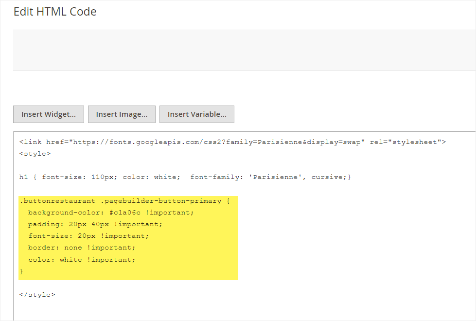
Below are the CSS codes for this button:
.buttonrestaurant .pagebuilder-button-primary {
  background-color: #c1a06c !important;
  padding: 20px 40px !important;
  font-size: 20px !important;
  border: none !important;
  color: white !important;
}
Insert them into the HTML Code editor.
And tadaaa:
We’ve finished Section 1. Let’s move on to Section 2.
Try FREE Magezon Page Builder demo today
Easily create beautiful, engaging Magento website in any style whenever you want without relying on developers or designers. Just by drag & drop.
Section 2: Why Choose Us?
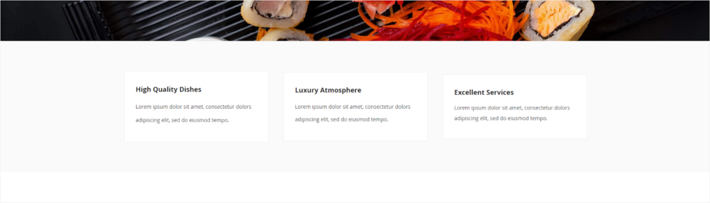
Next is the Why choose us section. It’s extremely useful in earning customers’ trust.
The preceding section is quite striking, therefore the design for Section 2 should be simple. It acts as kind of a visual break to make users feel at ease. Now let’s see what elements are used in the section.
- A full-width row with 3 columns
- Each column has text.
Okay, let’s begin with the row.
- Set Full-Width for the row.
- Minimum Height: 350px
- Vertical Alignment: Vertically center the content inside the row.
- Background Color: #fafafa. I chose light gray as the row’s background color because it gives this landing page a crisp and clean look. It’s also a way to distinguish between this section and the one below.
- Top & Bottom Padding: 120
Click Save.
Next comes the column. Drag and drop a Column placeholder into the row. Customize the column as follows:
- Select Centered to vertically center the column within the row.
- Vertical Alignment: Vertically center the content block inside the column.
- Background Color: #ffffff (White)
- Left, Right Margins: 20px
- Top, Bottom Padding: 15px
Add Text to the column with its settings:
- Enter 2 pieces of text in the text editor:
- High Quality Dishes:
- Font Size: 18px
- Line Height: 36px
- Bold the text
- Text Color: #333333 (A dark shade of gray)
- Lorem ipsum dolor sit amet, consectetur dolors adipiscing elit, sed do eiusmod tempo.
- Font Size: 14px
- Line Height: 36px
- Text Color: #333333
- Customize the text container:
- Top, Bottom Padding: 15px
- Right, Left Margin: 30px
| Pro tips: – Don’t put too much text inside narrow columns. Otherwise, it’ll be hard to read, and it doesn’t look good. – Ensure sentences have at least 3-4 words long. If there are only 1-2 words in a sentence, cut it off or add more text to the sentence. – Never use pure black in typography because the pure black text on a white background (contrast) makes it difficult for the eyes to read. Instead, use dark gray for text. |
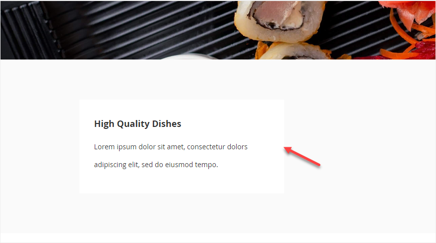
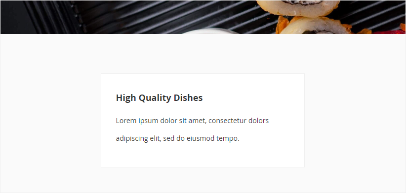
The white column doesn’t stand out against the light gray background. So, I’ll add the border to the column. Because the design is minimalism-oriented, I’ll use a solid line rather than a shadow for the border. Let’s see the result:
Isn’t it better now? Next, I’ll duplicate this column (2 more columns), then change the text inside these columns. Check it out.
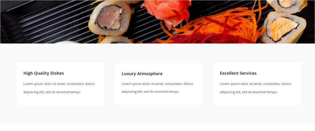
Perfect, don’t you think? Let’s move on to part 3.
Section 3: About Us
This part gives your customers an overview of the restaurant, helping them learn more about you.
Section 3 is made up of what elements? Let’s see.
- Two columns in a full-width row
- A video in the left column that showcases the art of making sushi and sashimi
- Text in the right column that tells visitors about the restaurant
- A button under the text for visitors who want to know more about you
Okay, let’s begin.
Step 1: Add a Row placeholder under the row in section 2. Here’re the Row settings:
- Choose Full-Width for the row.
- Set 120px for the row’s top and bottom margins.
Step 2: There’s a video in the first column. However, I don’t add a video using the Video content type. Instead, Slider is my choice. Here’s the reason:
In the case of using the Video content type: The video appears with “Watch later,” “Share,” “Logo,” etc. when you hover over it. However, this loses elegance and fancy. Take a look at these to see what I mean.
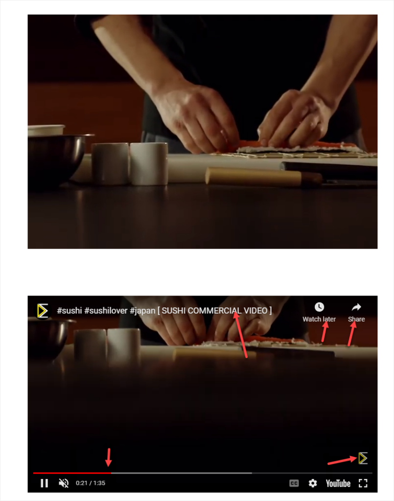
This doesn’t happen when you’re using Slider. So… here we go.
Add Slider to the left column. Click the dot navigation to customize the individual slide.
- Minimum Height: 500px
- Background Type: Video
- Video URL: https://www.youtube.com/embed/pnXdkmRpcsA
Keep these settings unchanged:
- Infinite Loop: Yes
- Lazy Load: Yes
- Play Only When Visible: Yes
Click Save to apply the settings.
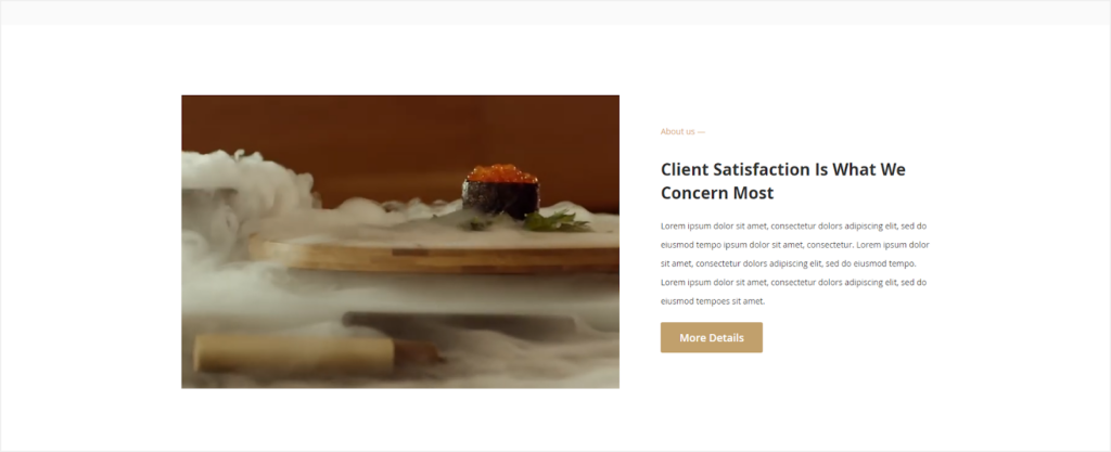
Step 3: Create the second column with texts. Apply these settings for this column:
- Select Centered.
- Left Padding: 70px
- Content block inside includes:
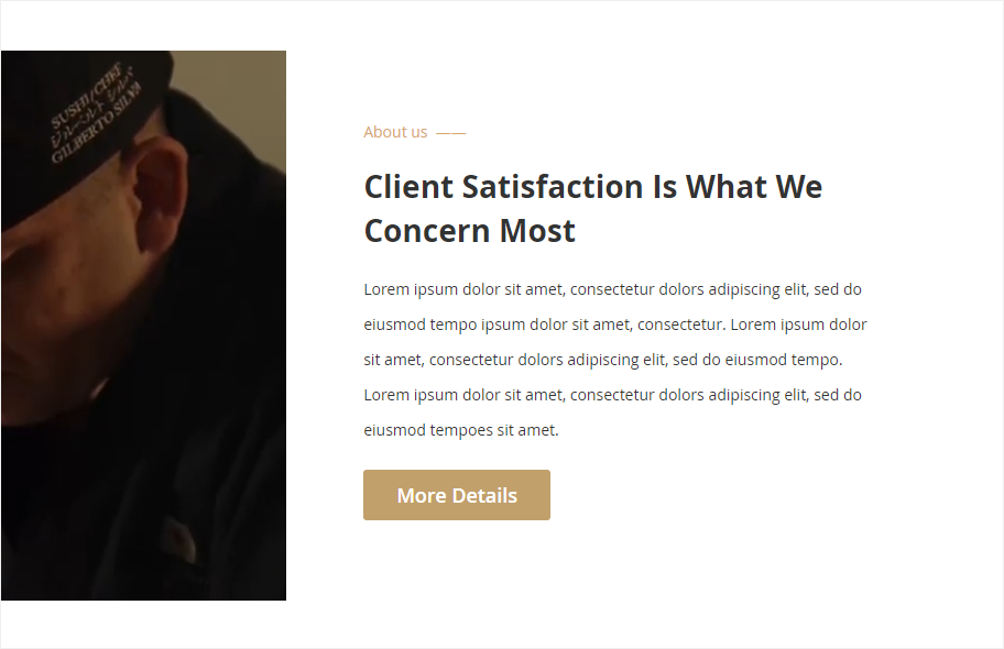
– Text 1 “About us”
+ Font Size: 14px
+ Font Color: #d7a885
+ Special Character: Em dash
– Text 2 “Client Satisfaction Is What We Concern Most”
+ Heading: Heading 2
+ Font Size: 28px
+ Font Color: #33333
+ Line Height: 40px
– Text 3: Lorem ipsum dolor sit amet, consectetur dolors adipiscing elit, sed do eiusmod tempo ipsum dolor sit amet, consectetur. Lorem ipsum dolor sit amet, consectetur dolors adipiscing elit, sed do eiusmod tempo. Lorem ipsum dolor sit amet, consectetur dolors adipiscing elit, sed do eiusmod tempoes sit amet.
+ Font Size: 14px
+ Font Color: #33333
+ Line Height: 32px
– Button
+ Button Text: More Details
+ Button Type: Primary
+ Button Link: URL – https://www.magezon.com/magezon-page-builder-for-magento-2.html
+ Tick the Open in new tab checkbox
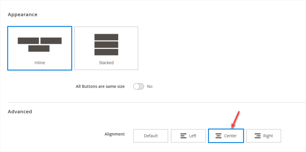
+ Alignment: Left. This setting applies to a single button. However, if the parent button’s alignment is set to Right, the individual button will be aligned to the container’s right side.
Click Save to apply the settings. Let’s visit the front end and see how it looks.
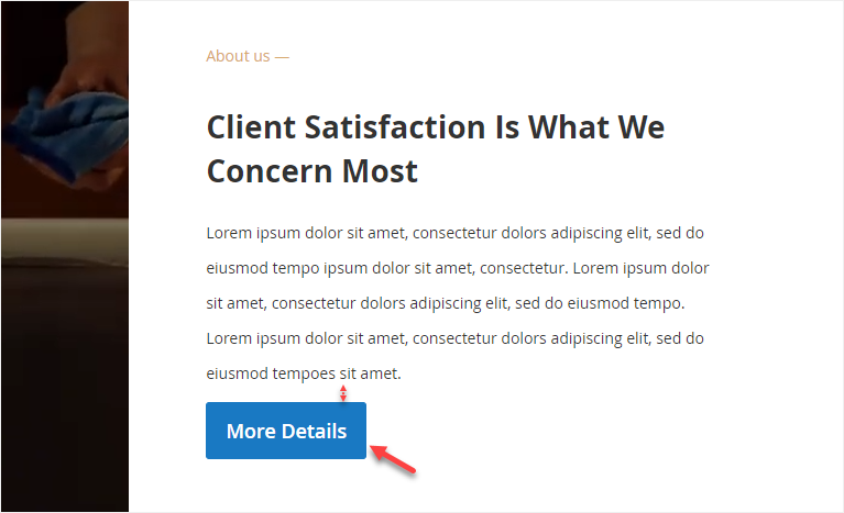
I think the section will be more perfect with more padding between the text and button. So, I’ll add 10px to the text padding. Also, I’d like to change the button background color.
- For the button background color, go to the individual button.
- In the CSS Classes field, enter button-this-page. Click Save.
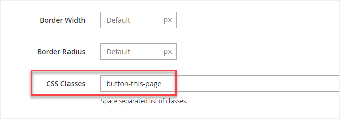
- Scroll up to the section with the HTML Code. Then, insert these pieces of code into the editor:
.button-this-page.pagebuilder-button-primary {

  background-color: #c1a06c !important;

  padding: 15px 32px !important;

  font-size: 15 px !important;

  border: none !important;

  color: white !important;

}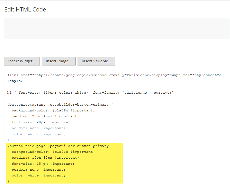
Exactly what I expected. Hehe.
Okay, let’s move on to the next section – Repeated CTA.
Section 4: Repeated Call-to-Action
CTAs are the most critical element of a website landing page. Repeating CTA buttons several times on this type of page is a good way to increase click-through rate and reach the ultimate goal. For that reason, the landing page includes Section 4.
Okay, let’s analyze this section.
- A full-width row with an image background
- Two columns in the row. One contains text, while the other contains a CTA button.
Let’s go to the details.
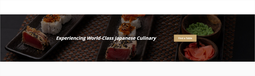
Step 1: Add a row with the following settings:
- Full-width
- Minimum Height: 400px
- Background Image: Upload this image https://unsplash.com/photos/MNbOMvT1cUU (Source: Mahmoud Fawzy). To make the white text stand out, I’ll apply a dark overlay to the image.
- Set Parallax Background for the image background because the parallax scrolling will make it more interesting to look at.
- Toggle Enable Parallax Background to Yes.
- Parallax Speed: 0.5
Next, drag and drop a Column placeholder into the row. The layout consists of 2 equal columns. However, I want to resize them as follows:
- The left column: 8/12
- The right column: 4/12
Let’s start with the left column.
Step 2: Customize the left column with these settings:
- Minimum Height: 400px
- Vertical Alignment: Center
Next, add texts to the column using Text content type.
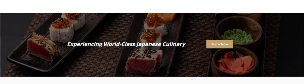
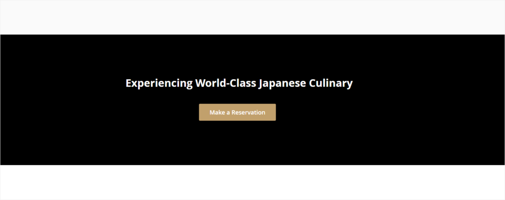
- Type these pieces of text in the editor “Experiencing World-Class Japanese Culinary”
- Heading: Heading 2
- Font Size: 34px
- Line Height: 36px
- Font Color: #ffffff
- Bold the texts
Step 3: Apply these settings to the right column:
- Minimum Height: 400px
- Vertical Alignment: Center
Add a button to the column with these settings:
- Button Text: Find a Table
- Button Type: Primary
- Button Link: URL – https://www.magezon.com/magezon-page-builder-for-magento-2.html
- Tick the Open in new tab checkbox
- CSS Classes: button-this-page
Save the changes. Let’s see the page on the front end:

The result shows that this section still needs to be customized.
I want more space between the button and text. To do it, simply go to the button’s container setting. Set Alignment to Center.
Hope this is a final.
Looks good, huh?
We’re done! Move forward to the next section – Our Menu.
Try FREE Magezon Page Builder demo today
Easily create beautiful, engaging Magento website in any style whenever you want without relying on developers or designers. Just by drag & drop.
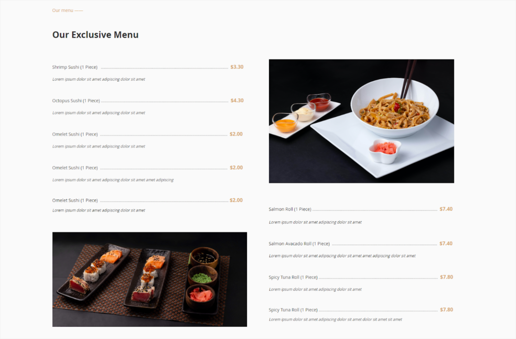
Section 5: Our Menu

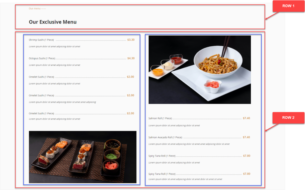
Step 1: Create row 1. Apply the following settings:
- Row container: Top Padding – 120px.
- Text “Our menu”: Duplicate the text in the About Us section. Then change the text.
- Heading Text “Our Exclusive Menu”: Duplicate the heading text in the About Us section. Then change the text.
Step 2: Create row 2. Apply the following settings:
- Row container: Bottom Padding – 120px.
Add columns. I’ll first create the left column (Column 1), then duplicate the other one.
Step 3: Customize Column 1.
- Add Text:
- Dish name: Applies the same settings as the body texts in other sections.
- Dish price: Applies the same settings as the body texts in other sections. The difference is, the text color is #d7a86e.
- Description: 12px for font size. Italicize text.
- Bottom Padding: 30px.
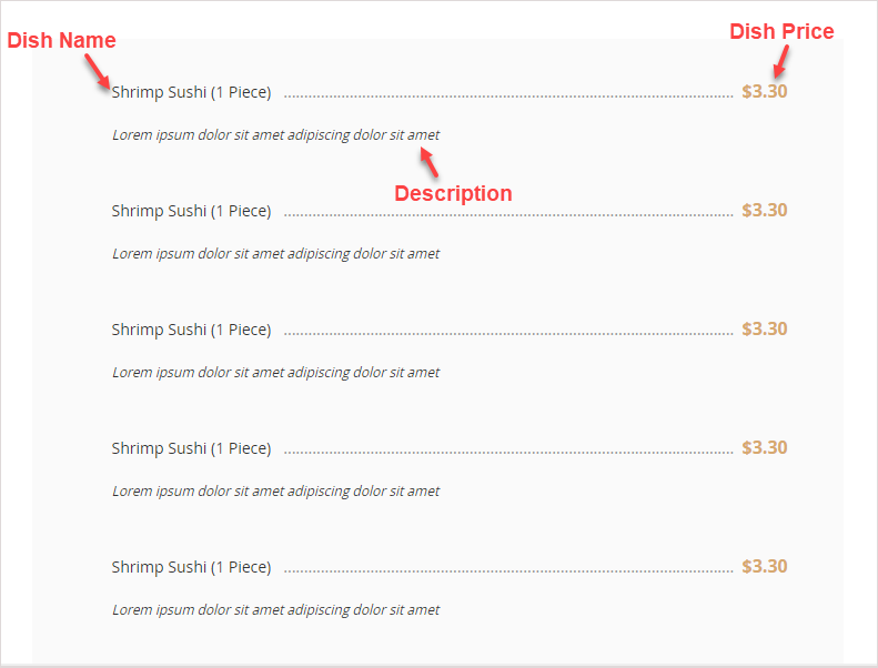
- Duplicate the text into 4.
- Add an image: Use this image https://unsplash.com/photos/MNbOMvT1cUU (Source: Mahmoud Fawzy).
Step 4: Create column 2 by duplicating Column 1 and then modify it.
- Use the image https://unsplash.com/photos/8HHBQUERnro.
Here’s the result:
Section 6: Special Dishes
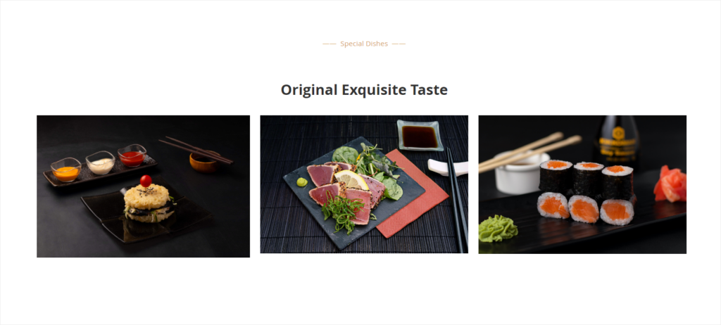
This section showcases the most special dishes in the restaurant. There is a row including texts and three columns with images. Here are the settings to create the section.
- Row
– Full-Width
– Top & Bottom Padding: 120px
- Text – Special Dishes
– Duplicate the settings of the text “Our menu” in the above section. Then change the text into “Special Dishes”.
- Text 2 – Original Exquisite Taste
– Duplicate the settings of the text “Our Exclusive Menu” in the above section and change the text into “Original Exquisite Taste”.
– Bottom Padding: 40px.
- Column 1:
– Left Margin: 10px
– Right Margin: 10px
– Add an image to Column 1 by dragging the Text placeholder to the stage.
– Upload this image https://unsplash.com/photos/n1C4mDAffC0 (Source: Mahmoud Fawzy).
- Column 2 & Column 3: Duplicate Column 1 into 2 columns. Drag to resize them, then change their images.
– Image (Column 2): https://unsplash.com/photos/Hcdx1zVQJ6Y (Source: Wesual Click).
– Image (Column 3): https://unsplash.com/photos/FBezBX26dyY (Source: Mahmoud Fawzy).
Section 7: What Our Clients Say
Users tend to give more credit to you when they have heard someone else talking positively about your products. This is where this section comes in.
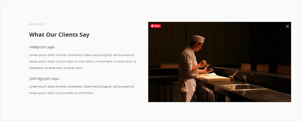
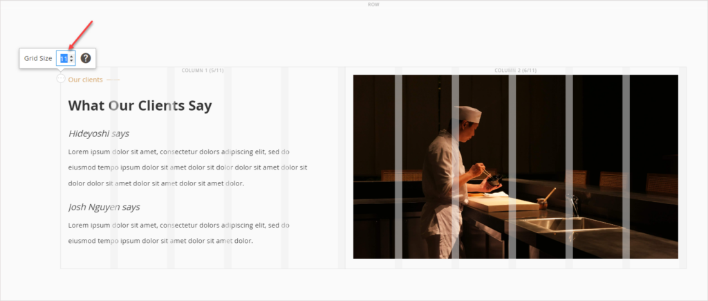
There is a thing special in this section. That is, the total number of columns in the grid is set to 11, not 12 as usual. Why?
The image is smaller than my expectation if I set the 6/12 for each column. Meanwhile, if I set 5/12 for the column with text and 7/12 for the one with the image, the image looks much bigger than the text. And I don’t like that.
So, I set 11 columns in the grid. 5/11 for the column with text and 6/11 for the one with the image. The image is as large as expected while not being too large compared to the text.
Here’re the settings of this section:
Row
- Full-width
- Background Color: #fafafa
- Top Padding: 120px
- Bottom Padding: 120px
The left column (5/11)
- Left Padding: 50px
“Our Clients”
- Duplicate the settings of the above section and change the texts.
“What Our Clients Say“
- Duplicate the settings of the above section and change the texts.
“Hideyoshi says“
- Font size: 18px
- Italic format
- Top Padding: 20px
“Lorem ipsum dolor sit amet, consectetur dolors adipiscing elit, sed do eiusmod tempo ipsum dolor sit amet dolor sit dolor dolor sit amet dolor sit dolor dolor sit amet dolor sit amet dolor sit amet dolor.“
- Bottom Padding: 3px
The second testimonial: Apply the same settings above.
__________
The right column (6/11)
- Centered
- Add an image (https://unsplash.com/photos/3EzCJozHHL0 ) to the column. (Source: Unsplash)
Section 8: Call to Action – Book a Table
And the final section – getting people to take your desired action. This section looks quite simple.
- A full-width row with a black background.
- Inside the row is a heading text and a CTA button right below.
Here’re the settings:
Row
- Full-Width
- Minimum Height: 400px
- Vertical Alignment: Center
- Background Color: #000000
Text “Experiencing World-Class Japanese Culinary”
- Format: Heading 2
- Text Color: White
- Bottom Padding: 30px
Button
- Duplicate the button in the Repeated CTA section. Change the button text to “Make a Reservation”.
Click Save to apply all the settings.
Pheww! Finally, the landing page creation comes to an end. Let’s check it one more time from head to toe.
Isn’t it fantastic? This landing page is a great start for beginners to practice with Magento Page Builder. Once you’ve got used to it, it’s possible to create landing pages like this in some hours.
Our advice is that you’d better look at it several times to make sure it looks proper. You can ask your friends whether it’s okay or what needs to be changed.
Magezon Page Builder, Yeap! We Want to Introduce Our Product
After detailed instructions, I bet you’ve learned how to build a landing page effectively. The more you practice, the more skillful you’re at using Page Builder and, as a result, creating visually stunning web pages that contribute to your business growth.
Aside from helping you guys use Page Builder from Magento, we’d also like to introduce ours. You can skip this part if Magento Page Builder Open Source satisfies your demand. But if you are seeking an advanced page builder to help you boost your website and sales to the next level, Magezon Page Builder is worth considering.
Rather than showing all features Magezon Page Builder boasts, we’ll put focus on the obstacles users of Magento Page Builder are facing when building the above restaurant landing page and how our page builder can resolve them.
- A challenge with Magento Page Builder is that there is a limitation in customizations. If you want to customize any element, using CSS is a must. Those knowing a little code may find it easy to start; in fact, it takes quite a lot of time, though. It becomes a real challenge for those with the slightest idea about code. Magezon Page Builder can get rid of your headache no matter who you are.
Let’s see whether Magezon Page Builder can help.
- In Magento Page Builder, I can’t style the heading the way I wish. All that can be changed is to choose the heading type and change the text. Using Magezon Page Builder, you have access to various fonts so that you’ll be able to select the one that reflects your brand. (The builder needs to be integrated with the Font Builder plugin). With plenty of styling options, it’s never been easier to customize the heading to your liking.
| Note: In the new version of Magezon Page Builder that will be rolled out soon, we’ve integrated more built-in fonts. Also, users can upload any font they desire. Any element such as Text Block, Heading, Button, etc. that includes texts will feature this functionality. →Learn more about Font features in the new version of Page Builder. |
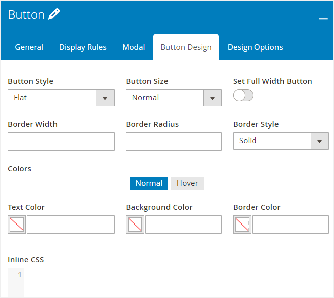
- Buttons in Magento Page Builder Community Edition, in particular, provides users with basic functionalities such as adding button texts or a link. However, to create the above landing page, I want more than that. Magezon Page Builder can surely help you with it. Beyond this expectation, this tool comes with numerous customization options to change the button’s appearance whenever you want.
- Another challenge when using Magento Page Builder is its performance. As you can see, it takes quite a lot of time and patience to wait for the page loading. In the case of using Magezon Page Builder, you’ll save a significant amount of time thanks to its high performance. In the next version, we’ll have enhanced our builder’s performance to meet our customers with increasingly high demand.
- In case you want to transfer the landing page to another website, Magento Page Builder can’t help. The only way to deal with your matter is touching codes. If you fall into the group “Codes hates me”, Magezon Page Builder is the way to go. With the Short Code functionality, you can copy the landing page into the website you want just in a few clicks.
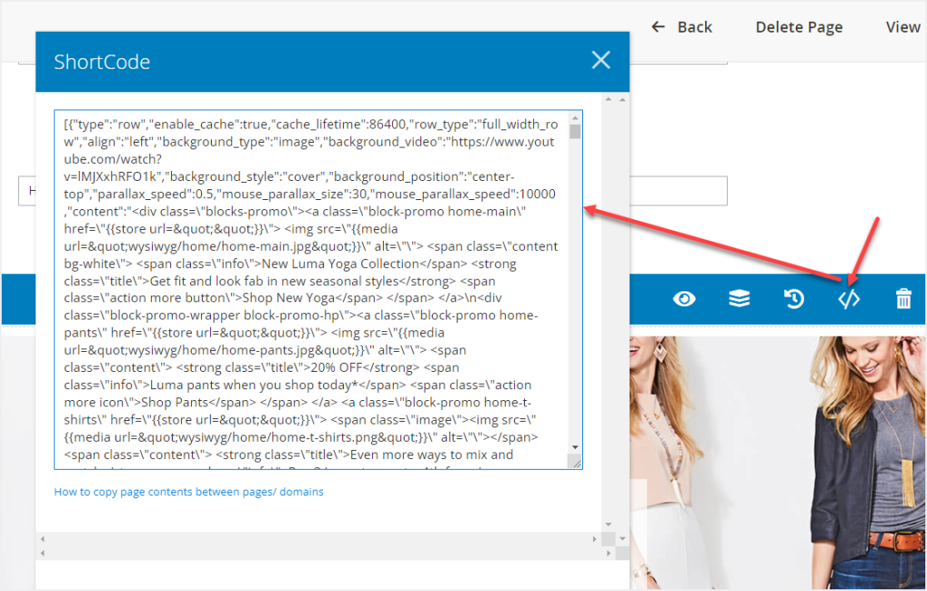
Short Code is particularly useful when you want to apply the same settings of any row, column, or element to others.
Actually, Magezon Page Builder boasts a lot of features that have not been listed here. On the other hand, I think this helps you partly understand our builder. Give it a try once if you are interested in this page builder. It won’t let you down, I promise.
It’s Time to Create Your Own
We’ve covered the essential steps and tips on how to create a landing page in Magento 2. So, now it’s time to roll up your sleeves and create landing pages on your own. Don’t worry about HTML, CSS, or something like that. Just take action. Don’t hesitate to reach us if you have any issues. We’ll always be here to help you out.
For more useful yet interesting Magento Page Builder tutorials, visit this series.
Try FREE Magezon Page Builder demo today
Easily create beautiful, engaging Magento website in any style whenever you want without relying on developers or designers. Just by drag & drop.


