 Magezon Blog Help Merchants Build Comprehensive eCommerce Websites

It’s critical to capture the eye of a potential consumer in this day of scanning and skimming through the material. In fact, according to MIT neuroscientists, the human brain can comprehend a picture in as little as 13 milliseconds. When first visiting a website, most visitors will scan the page for aesthetically appealing information, and only then will they begin reading. So, even if you have a fantastic product or service with outstanding text, you risk losing a potential consumer if you don’t show it well.
That’s why design is essential to communicate with your customer. No matter how important or fascinating the information you’re giving is, if you can’t get your visitors to pay attention, you’ve failed.
The icon is a simple and efficient method to attract people to your website’s content. In this article, we’ll show you why you should use icons on your website and how to do it efficiently.
Table of contents
| Trending articles: 12 Best Digital Products To Sell in 2021 How to hire a web developer 27 best eCommerce websites in 2021 |
How Icon Helps Create a Better Landing Page
Icons are everywhere in our daily lives and are found on any interface, road sign, keyboard, etc. They assist us in better comprehending and interpreting information. Moreover, we can communicate a concept quickly not just offline but also online by using icons. As a result, it’s critical to comprehend how and why to employ them.
In web design, icons are everywhere. When implemented correctly, they may significantly improve a landing page‘s UI/UX design and user experience. Icons are particularly effective for assisting visitors in scanning a website since they provide a visual clue about the material. Let’s examine why you should use icons in your website design and how to use landing page icons effectively.
Increase Readability (Visual Anchor) by Providing Structured Information
- Produce a great list
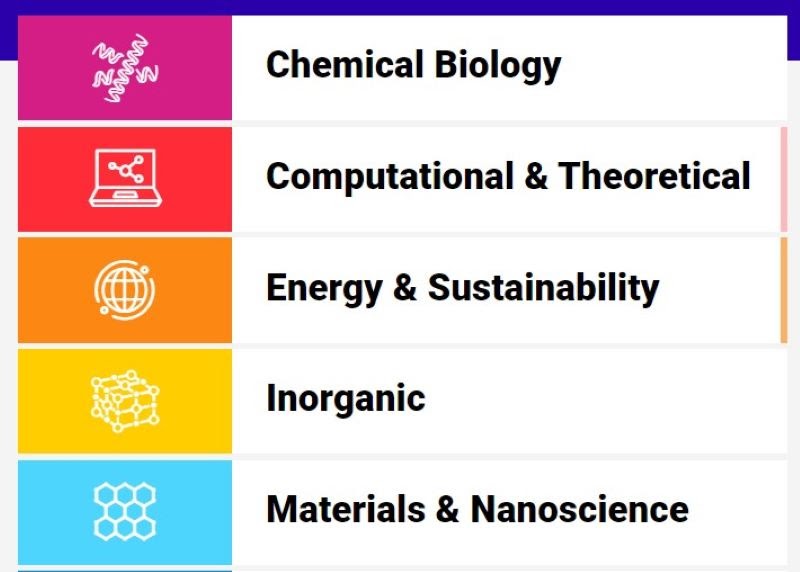
Although using words to convey concepts is the most direct method, too much text might cause readers to become bored. They will lose concentration and ignore the message entirely. As a result, using landing page icons to represent these tasks and characteristics might be much more useful. They provide diversity to the section and a visual interpretation of the topic. This makes it much easier for the user to connect the icon to the notion and comprehend the specified features or functionalities.
- Produce a nice ordered list

Icons for web pages may help your sorted list seem more appealing. Standard bullets, on the other hand, can be tedious. Too many bullet lists may be confusing and unproductive in terms of readability. To draw attention to paragraphs and other blocks of text, you may utilize interesting symbols instead of ordinary bullets. Just be careful not to overdo it.
→ Use landing page builder to simplify your process: 10+ Best Free Landing Page Builder to Capture Leads 2022
Make the Landing Page More Appealing and Personable
Icons come in a variety of styles. Shadows and reliefs, planes, linear, 3D effects, and other effects are used in specific icons. The addition of individuality to the entire design is achieved by utilizing a distinct style in your symbols.
From a visual standpoint, perspective icons may add charms to a website. As a result, for a more corporate design, it’s critical to select symbols that aesthetically match your website’s aesthetics.
If your firm requires seriousness and professionalism, avoid using corny icons. On the other hand, if your company caters to young people, why not use more attractive symbols?
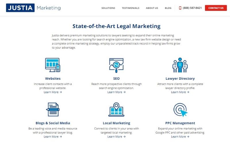
If your firm requires seriousness and professionalism, avoid using corny icons (Source: Justia)

Try FREE Magezon Page Builder demo today
Easily create your engaging, high-converting Magento landing pages in any style whenever you want without relying on developers or designers. Just by drag & drop.
How to Use Icons on a Landing Page
The primary goal of employing icons should be to assist the user more efficient in absorbing and processing information. Using icons effectively adds substance to even the most basic text, allowing for effective communication without unnecessary words. Icons should be used to bring attention to your content rather than to detract from or replace it.
Use Various Icons to Draw Attention to Specific Features
Although listing services are a realistic and important element of efficient marketing, lists are bland and uninteresting. Adding symbols to your feature lists will help them become more interesting.
Icons for website design serve as a visual invitation for users to try out specific features of your website. So, icons should draw your users’ attention and direct them to the part. Once you’ve gotten their attention, explain why the feature is so fantastic.
Think about what you’re attempting to say with the content and base the symbols on that. What is the website’s or article’s main theme? The colors used are? What is the fashion trend? Modern? Classic? Icons should visually integrate the concepts represented in the material and the website’s overall identity.
Replace the Bullets
The standard bullet is an outdated design that will likely bore you, so you may consider expressing your thoughts with more appealing symbols. Ticks, for example, and arrows. This will undoubtedly attract the attention of users.
Bullets are more difficult to distinguish and recall than icons. Unlike them, which are all the same, symbols are considerably more distinctive and, as a result, identifiable. It’s also a lot simpler to identify between different chunks of text. However, don’t overdo it since too much of anything is bad.
Make the CTA and Button More Appealing to the Eye
First of all, a CTA button is a button. However, just drawing a green rectangle with rounded edges isn’t enough. Your CTA is made up of two parts: design and content. Several studies have shown that both have a significant impact on conversion rates. As a result, you should make it obvious and appealing.
Use icons for website design to serve as a visual invitation for users to try out specific features of your website. So, icons should draw your users’ attention to the part and direct them to it. Once you’ve gotten their attention, explain why the quality is so fantastic.
You should use icons for web pages in your call to action. They are not the same as words but may say a lot and become an important feature for your CTA button. Icons are likely used for extra motivation, combined with phrases or just replaced regular buttons. Simply maintain the trendy so that users recognize your goods as nice as your button symbols!
→ Get inspiration for your CTA button: 25 Proven CTA Examples Across all Platforms
Decorate the Menu Items to Make Them More Appealing (Breadcrumbs, Navigation Bar)
One of the most important factors of a website’s usability is its navigational ease. Visitors are more likely to readily stay on a website to discover what they’re searching for. That’s why you should enhance user experience, which boosts website visits and potentially increases income and profit.
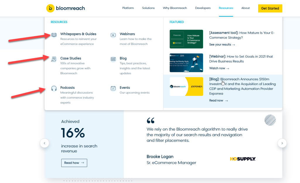
Icons, as we all know, help in the visual explanation of concepts. In addition, they may also be used as distinguishing features in website navigation, such as making it simpler to find and follow certain content across the site. As an example, suppose your company offers five distinct services, each representing a different symbol on the webpage. If the new page includes the same service logo in the hero area as the previous page, it will be much easier for the user to grasp what service he or she is diving into after clicking on one of the service icons.
Use Icons to Go to Social Media (Button for FB, Instagram,…)
Most social media symbols are readily identifiable due to their prevalence in our everyday lives. You don’t need to know the platform’s name to recognize the blue “F” symbols for Facebook and the bluebird emblem for Twitter. That’s why most individuals also understand what happens if they click on such symbols on a website or in an email.
This is a fantastic chance for marketers and company owners to use social media symbols in their marketing strategy. You may use them on your home page, blog articles, or websites.
Including social network buttons on your landing pages is a great approach to making it easy for your visitors to visit your social media accounts. They may find out more about your company’s products and services there.
Try FREE Magezon Page Builder demo today
Easily create your engaging, high-converting Magento landing pages in any style whenever you want without relying on developers or designers. Just by drag & drop.
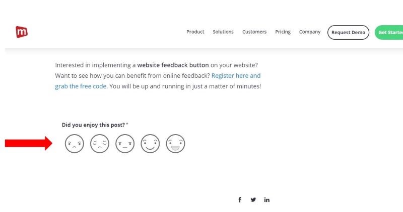
Obtain Feedback
A feedback button is a hidden tab on your website, online course, or web application. When your consumers run into an issue or have a suggestion, they may use a feedback button to provide you with immediate on-page feedback.
There are several advantages to including feedback button symbols for web pages. For example:
- Catch your customers’ attention
- Add charm to your website
- Shows your consumers that you value their input and are interested in hearing what they have to say.
- Instead of people discussing concerns on social media, feedback is delivered via a private channel under your control.
List of Icon Library/Source
Here is a list of icons for web design that can assist you in refreshing your website:
1. The Noun Project
The Noun Project, one of the biggest icons library for website design collections on the internet, contains a symbol for virtually anything you can think of. The site offers plenty of symbol diversity sourced from various artists, so online and app creators may pick distinctive visuals that consumers haven’t seen a hundred times. This is a searchable symbol collection with a large number of icons.
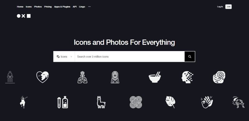
Highlight features:
- There are both free and paid download alternatives.
- A Mac program with icon sets.
- On a near-daily basis, new icons are added.
2. Canva
Canva is a website that provides its customers with a free and paid design platform. Thousands of free icons on Canva could help you improve your designs like a pro. From basic signage to iconic symbols, Canva’s stock photo library is brimming with icons for web design you can use in your projects to convey your message without using words.
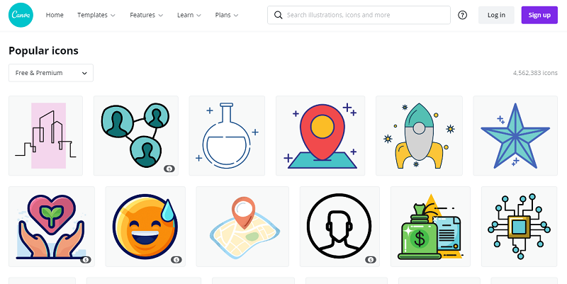
Highlight features:
- There are both free and paid download alternatives.
- Available for iOS, Windows, and even mobile apps.
- Newly updated icons.
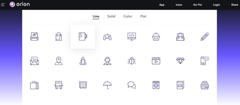
3. Orion Icon Library
Orion is a Pixeden project that aims to give highly customizable web icons that can be edited straight from their web app. With the web app, you may make various changes to your symbols, including line, solid, color, and flat ones, all in a consistent and exact design. If you know precisely what you’re searching for, you may use the search box or browse through their icon packs to get the icon for the website design you need.
Highlight features:
- Thousands of free icons, with many more if you upgrade to their pro subscription.
- “No attribution needed” license is included in the Pro plan.
- To change your icons, use this simple and straightforward online tool.
4. Iconmonstr
Iconmonstr is an icon library with over 4000 items divided into 300+ categories. Each symbol set includes outlines and filled versions of the images to guarantee that they may be used in various design applications. The good news is that you can obtain the code from the website, so you don’t have to download anything.
Highlight features:
- All icons are available for free usage.
- Symbols set that is useful.
- There are four different download formats to choose from.
- They will optimize and simplify icons to use on the web.
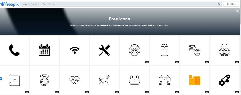
5. Freepik
Freepik, as the name indicates, has a large collection of free images, vectors, and landing page icons. The site’s icon collection has over 100,000 images that visitors may search or explore by subject. The symbols range in complexity from simple to complicated with a choice of line, filler, and colors. Each one has its own set of limitations when it comes to licensing.
Highlight features:
- Personal and commercial use are both free.
- PNG, EPS, and SVG icons are available for download.
- Other vectors and pictures will be ready to modify to serve as icons.
- Regularly, they will introduce new icons.
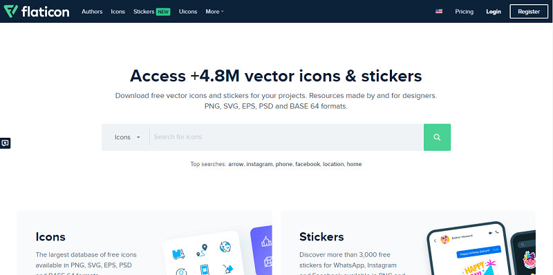
6. Flaticon
This collection contains over a million vector icons. Users of Flaticon can download an infinite number of icons and have complete control over design elements. All icons may be customized to fit individual designers’ specific color and size requirements. Moreover, users can also create symbol fonts for personal and commercial usage.
Highlight features:
- There are both free and paid subscription options available.
- Every month, there will be new icon sets.
- There are several file types to choose from.
- There are both raster and vector icons available.
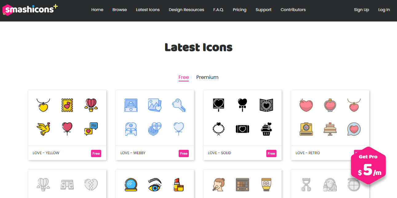
7. Smashicons
Smashicons has over 175,000 icons in its library, making it one of the most complete collections of icons for web design available. Unlike some of the other icon libraries listed, not all these symbols here have the same design. As a result, if you want to maintain a consistent look and feel on your website, you must guarantee that all the symbols you use are included inside a certain icon set.
Unlike other icon sites, Smashicons requires users to pay $5 per month to use the icons for website design. With $5 per month, you’ll have access to their entire collection of existing and any symbols they’ll release in the future.
Highlight features:
- Although they don’t all have the same style, this is a big collection of icons.
- All of the icons are cross-platform compatible.
- An easy-to-use online tool for searching and finding the icons you want.
Conclusion
Icons are similar to accessories. It makes your website more appealing, piques users’ attention, and makes them want to learn more about your company. Icons provide that buttoned-up sense of wholeness and aid in communicating an underlying sense of style or personality to others. If you want to give your website a unique style or simply want your content to be more accessible to customers, learn how to add icons to your website now!

Try FREE Magezon Page Builder demo today
Easily create your engaging, functional Magento pages in any style whenever you want without relying on developers or designers. Just by drag & drop.


