 Magezon Blog Help Merchants Build Comprehensive eCommerce Websites
An effective landing page is key to generating more traffic, leads, and sales. With this landing page builder tutorial, you’ll learn to design best practices and how to make a responsive landing page. Moreover, after completing this tutorial, we are confident that you, too, as a beginner, will be able to advance your CSS skills.
Table of contents
- Why Choose HTML to Make a Good Landing Page?
- How to Make a Good Landing Page in HTML, CSS, and JavaScript?
- How to Make a Good Landing Page That Is Responsive?
- What to Pay Attention to When Making a Good Landing Page?
- Conclusion
Why Choose HTML to Make a Good Landing Page?
Landing pages are about increasing conversions, meaning the offer and the page’s appearance must have a clear goal. Learning a little coding to get the landing page of your dreams may be worthwhile.
HTML, or Hypertext Markup Language, is familiar to any tech-savvy. A web page’s coding language is HTML. A landing page can be built from the ground up using HTML and CSS, the style language of HTML. In either case, you can go beyond the limitations of drag-and-drop editing if you use a website builder or CMS.
You may be insecure about writing code to create a simple landing page but don’t let that stop you. With a little effort, you’ll be able to learn how to make a good landing page on your own using HTML.
How to Make a Good Landing Page in HTML, CSS, and JavaScript?
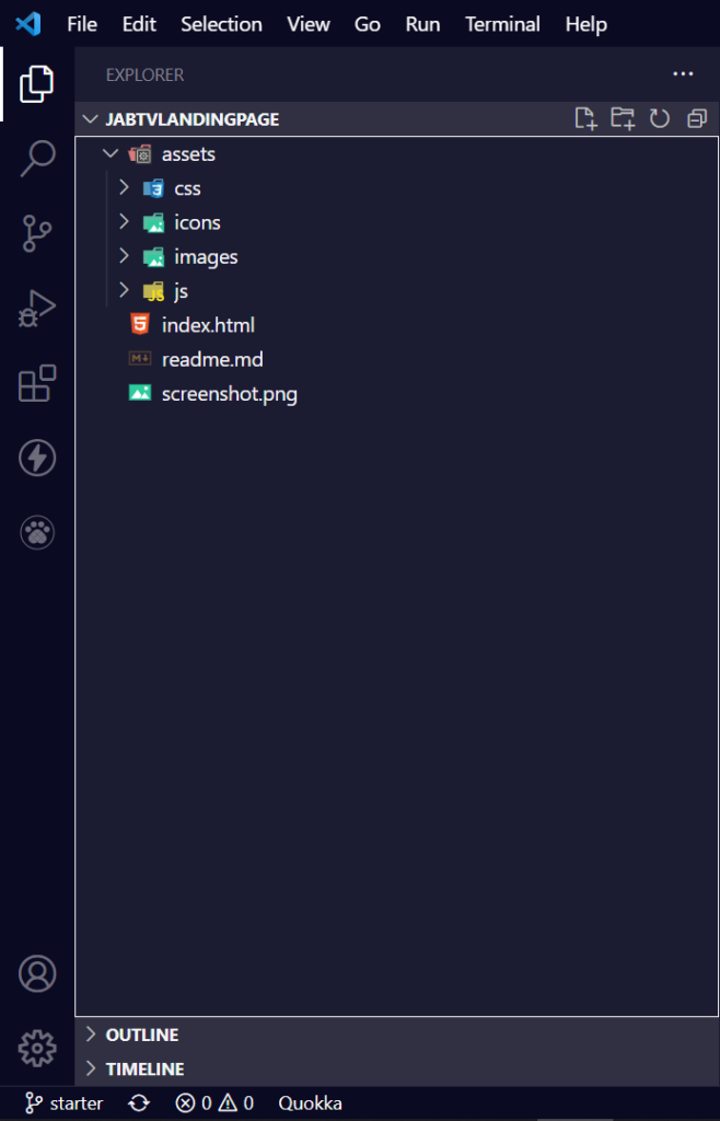
The Project Folder Structure
Folders are organized according to a standard convention among front-end developers.
The root contains the readme and HTML files, as well as a snapshot of the readme. Subfolders within the assets folder house the CSS, JavaScript, icons, and pictures.
The Basic HTML Boilerplate
This is what a basic HTML boilerplate should look like; this code will later translate to a good landing page structure:
<!DOCTYPE html>
<html lang="en">
<head>
<meta charset="UTF-8" />
<meta http-equiv="X-UA-Compatible" content="IE=edge" />
<meta name="viewport" content="width=device-width, initial-scale=1.0" />
<!-- Web page CSS -->
<link rel="stylesheet" href="assets/css/styles.css" />
<!-- Simple lightbox CSS -->
<link rel="stylesheet" href="assets/css/simple-lightbox.min.css" />
<!-- Favicons -->
<link
rel="apple-touch-icon"
sizes="180x180"
href="assets/icons/apple-touch-icon.png"
/>
<link
rel="icon"
type="image/png"
sizes="32x32"
href="assets/icons/favicon-32x32.png"
/>
<link
rel="icon"
type="image/png"
sizes="16x16"
href="assets/icons/favicon-16x16.png"
/>
<title>JabTV Landing Page</title>
</head>
<body>
<!-- Navbar -->
<!-- Dark/light theme switcher -->
<!-- Bars -->
<!-- Hero section -->
<!-- About section -->
<!-- Lightbox image gallery -->
<!-- Jab TV Stakeholders -->
<!-- Email subscription -->
<!-- Social icons -->
<!-- Scroll to top button -->
<!-- Web page script -->
<script src="assets/js/app.js"></script>
<!-- Ion icons CDN -->
<script
type="module"
src="https://unpkg.com/[email protected]/dist/ionicons/ionicons.esm.js"
></script>
<!-- Simple lightbox -->
<script src="assets/js/simple-lightbox.min.js"></script>
<script>
// Simple lightbox initializer
</script>
</body>
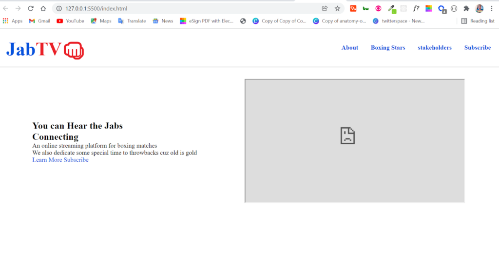
</html>The landing page will be coded section by section to keep things simple.
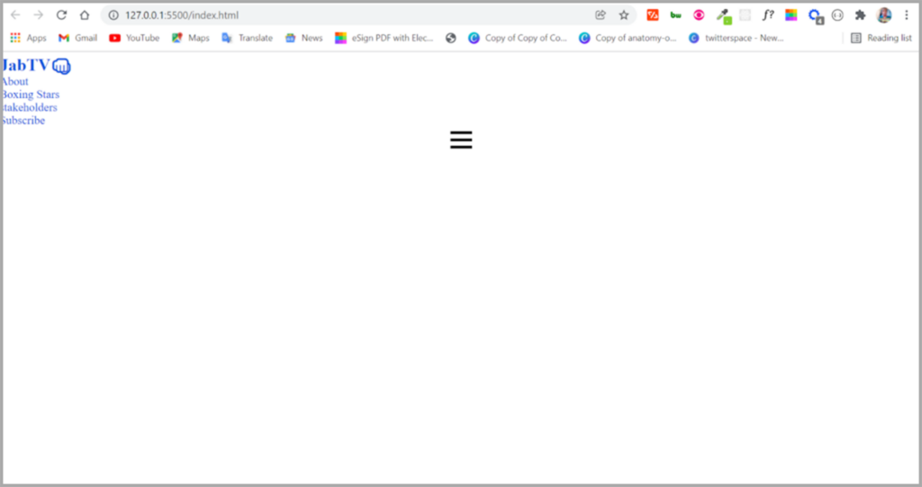
Making the Navbar
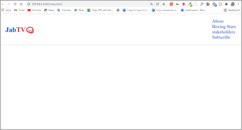
The nav menu is next to the logo, which links to other site sections. The navbar is incredibly important in how to make a good landing page. The lighter and darker theme switcher will be placed between the logo and navigation elements later, but for now, let’s concentrate just on the logo and menu items.
We’ll use a combination of words and emojis in a span tag for the logo so I can style them in various ways.
The logo’s HTML is as follows:
<nav>
      <a href="#" class="logo">
        <h1>
          <span class="jab">Jab</span><span class="tv">TV</span
          ><span class="fist">👊</span>
        </h1>
      </a>
</nav>
“Jab TV” and a punch emoji are combined to form this header.
Generic links are used in an unsorted list tag to create the navigation menu elements, as demonstrated in the following snippet:
<ul>
        <li class="nav-item">
          <a href="#about" class="nav-link" id="nav-link">About</a>
        </li>
        <li class="nav-item">
          <a href="#stars" class="nav-link" id="nav-link">Boxing Stars</a>
        </li>
        <li class="nav-item">
          <a href="#stakeholders" class="nav-link" id="nav-link"
            >stakeholders</a
          >
        </li>
        <li class="nav-item">
          <a href="#sub" class="nav-link" id="nav-link">Subscribe</a>
        </li>
We’ll also need a few bars to make it more mobile-responsive. On desktop computers, the bars are hidden; however, they are visible on mobile devices.
Instead of icons, I’ll use bars created from scratch in HTML and CSS. You’ll see the bars as span tags inside of a hamburger-classed container div.
<div class="hamburger" id="hamburger">
<span class="bar"></span>
<span class="bar"></span>
<span class="bar"></span>
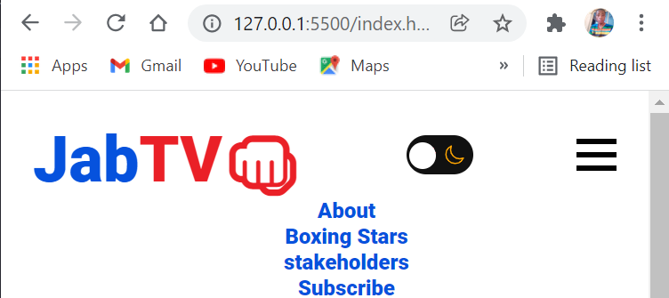
</div>The following is what the browser’s navigation menu currently looks like:
Styling the Navbar
We need to spruce the navbar up as it’s looking a little unattractive. We’ll utilize Flexbox to position the menu and logo items next to one other, making it look like one.
The Roboto font will be used for the entire website. In addition, I’ve specified a few CSS variables and performed a few simpler resets.
@import url("https://fonts.googleapis.com/css2?family=Roboto:ital,wght@0,400;0,900;1,700&display=swap");
/* CSS Variables */
:root {
--normal-font: 400;
--bold-font: 600;
--bolder-font: 900;
--primary-color: #0652dd;
--secondary-color: #ea2027;
--line-height: 1.7rem;
--transition: 0.4s ease-in;
}
/* Smooth scroll effect */
html {
scroll-behavior: smooth;
}
/* Resets */
* {
margin: 0;
padding: 0;
box-sizing: border-box;
transition: var(--transition);
}
body {
font-family: "Roboto", sans-serf;
}
ul li {
list-style-type: none;
}
a {
text-decoration: none;
color: var(--primary-color);
}
a:hover {
color: var(--secondary-color);
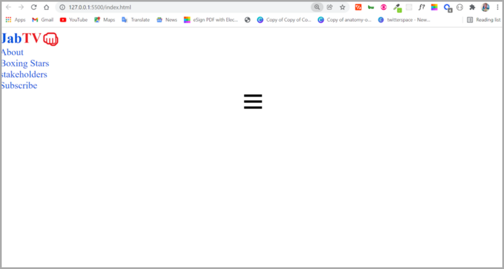
} We’ve removed the predefined baseline margin and padding and replaced them with border-box in the CSS code above. When the padding and margins are set, they’ll appear more deliberate.
I also set a transition (specified in the variables) for each transition, so you can observe it.
The primary and secondary colors are associated with the blue and red colors of the link before and after hovering.
The first.span> will be red, the second.span> will be blue, and the.fist will be red. CSS variables designate red and blue as secondary and primary colors, accordingly.
For this website, I went with the traditional colors of amateur boxing and other combat sports: red and blue.
.fist {
  color: var(--secondary-color);
}

.jab {
  color: var(--primary-color);
}

.tv {
  color: var(--secondary-color);
}
This is how the navbar currently appears:
Furthermore, we will use the Flexbox layout for the menu and logo elements. Because we only require them on mobile devices, I’ll also hide the bars.
nav {
  background: #fff;
  display: flex;
  justify-content: space-between;
  align-items: center;
  padding: 1rem 1.5rem;
  box-shadow: 2px 3px 2px #f1f1f1;
}
A box shadow was used to clarify where the navbar ends to the user.
We’ll also improve the user experience by making the navbar stationary at the head of the page.
We’ll accomplish this with four simple CSS lines:
 position: sticky;
  top: 0;
  left: 0;
  z-index: 1;
I’ll use a display of none on the .hamburger class to keep the bars hidden:
.hamburger {
  display: none;
}
The navigation bar of this landing page in HTML code has been significantly improved:
However, the logo might be a little more prominent. Consequently, we’ll use Flexbox again to ensure the menu items are not stacked on top.
.logo {
font-size: 2rem;
font-weight: 500;
}
ul {
display: flex;
justify-content: space-between;
align-items: center;
}
.nav-item {
margin-left: 2rem;
}
.nav-link {
font-weight: var(--bold-font);
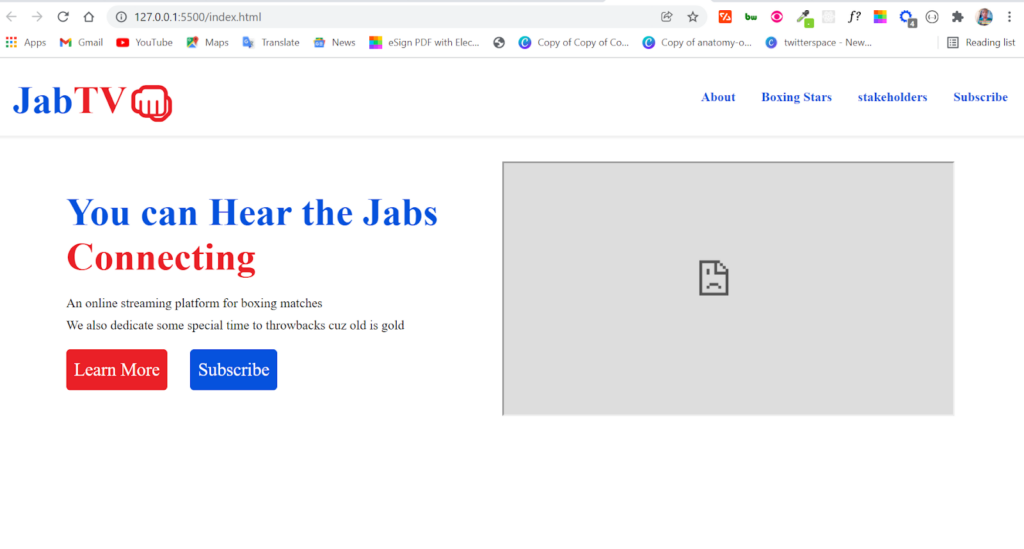
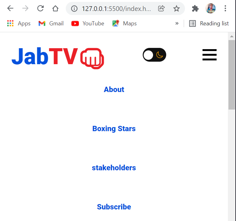
}Observe the navigation bar:
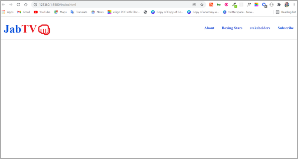
That’s how we can bring it to the next level.
Also, notice that the logo isn’t an image, so you can always use CSS to update it. Making the Hero Section
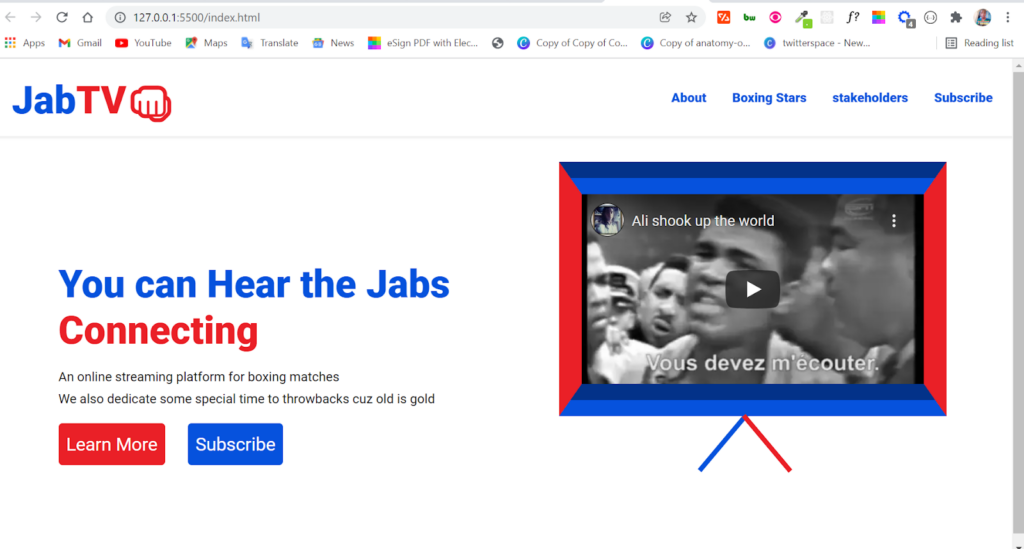
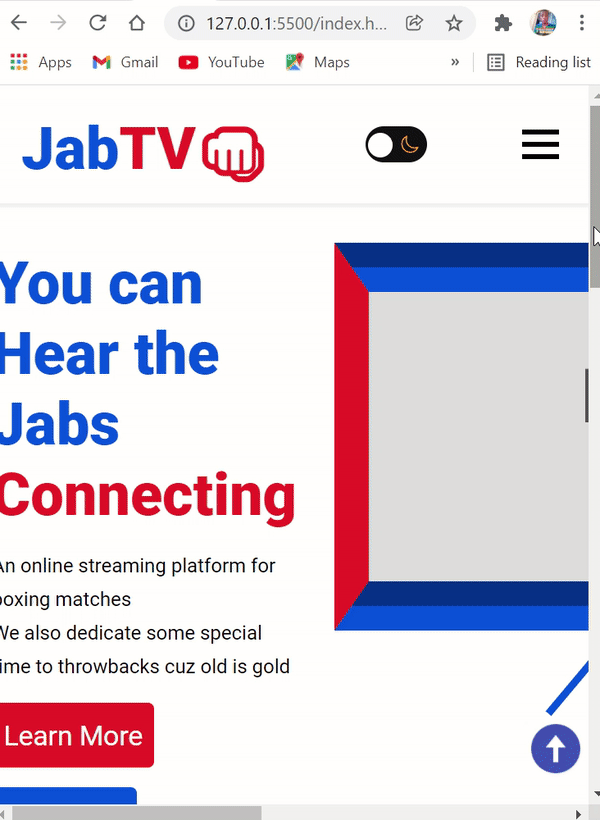
Call to action (CTA) buttons and an old-school TV created with CSS art will be included in the hero section. Using the iframe tag, we’ll be able to display a video inside of the TV screen.
The renowned boxer Mohammed Ali will be featured in the next video.
In a nutshell, we’re aiming for this:
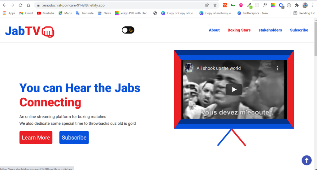
The HTML code for the hero section is as below:
<section class="hero">
<div class="intro-text">
<h1>
<span class="hear"> You can Hear the Jabs </span> <br />
<span class="connecting"> Connecting</span>
</h1>
<p>
An online streaming platform for boxing matches <br />
We also dedicate some special time to throwbacks cuz old is gold
</p>
<a class="btn red" href="#">Learn More</a>
<a class="btn blue" href="#">Subscribe</a>
</div>
<div class="i-frame">
<iframe
width="560"
height="315"
src="https://www.youtube.com/embed/sUmM_PFpsvQ"
title="YouTube video player"
frameborder="10"
allow="accelerometer; autoplay; clipboard-write; encrypted-media; gyroscope; picture-in-picture"
></iframe>
<div class="stand-1"></div>
<div class="stand-2"></div>
</div>
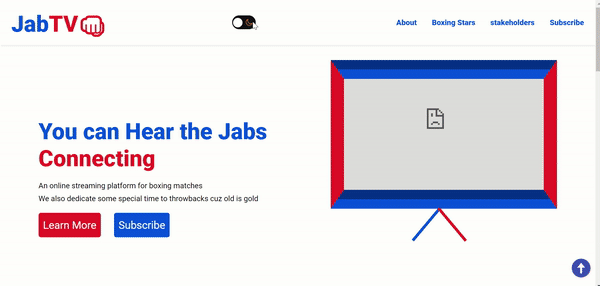
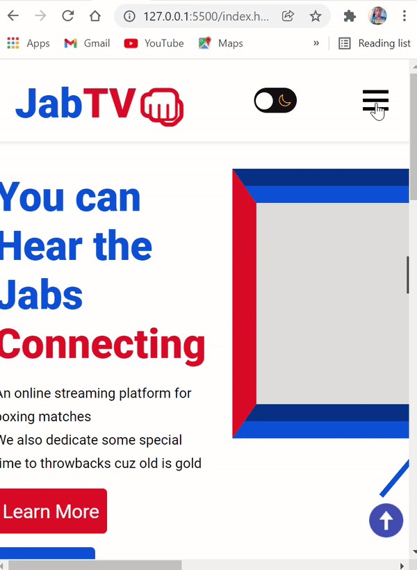
</section>Here’s what we get in the browser with the HTML above:
Try FREE Magezon Page Builder!
Easily create your engaging Magento pages in any style whenever you want without relying on developers or designers, just by drag & drop.
Styling the Hero Section
We need Flexbox to better align the content and the television simultaneously.
display: flex;
  align-items: center;
  justify-content: space-between;
  gap: 1.9rem;
  max-width: 1100px;
  margin: 2rem auto -6rem;
}
In addition to using Flexbox to align the elements, I set the section’s maximum width to 1100px to ensure that the user does not have to keep scrolling to the very end of the section to see its content.
Furthermore, to keep all of that in the section in the middle, we used a margin of -6rem at the bottom and 2rem at the top.
This is what we’ve got in the browser so far:
To be able to customize the h1 text in the hero section differently, we put it in its own span tag.
Because of this, we’re going to target the span tag text’s class properties:
.intro-text h1 {
  font-size: 3rem;
  margin-bottom: 1rem;
}

.intro-text h3 {
  margin-bottom: 0.5rem;
}

.hero p {
  line-height: var(--line-height);
}

.hear {
  color: var(--primary-color);
}

.connecting {
  color: var(--secondary-color);
}
At first, we assigned the following styles to the two buttons:
.btn {
  margin-top: 1rem;
  display: inline-block;
  padding: 0.8rem 0.6rem;
  border: none;
  font-size: 1.4rem;
  border-radius: 5px;
  color: #fff;
}

.red {
  background-color: var(--secondary-color);
  margin-right: 1.5rem;
}

.red:hover {
  background-color: #f1262d;
  color: #fff;
}

.blue {
  background-color: var(--primary-color);
}

.blue:hover {
  background-color: #095cf7;
  color: #fff;
}
It is beginning to take shape:
The next step is to give the iframe the appearance of television. We’ll be able to accomplish this thanks to the border property.
Remember from the HTML that we’ve got two div elements with properties of stand-1 and stand-2. We will use the transform property to rotate and skew the elements in the two div tags to create platforms for the old-school TV.
iframe {
  max-width: 30rem;
  border-top: 40px groove var(--primary-color);
  border-bottom: 40px groove var(--primary-color);
  border-right: 28px solid var(--secondary-color);
  border-left: 28px solid var(--secondary-color);
}

.stand-1 {
  height: 90px;
  width: 6px;
  background-color: var(--primary-color);
  transform: rotate(40deg);
  position: relative;
  top: -16px;
  left: 200px;
}
.stand-2 {
  height: 90px;
  width: 6px;
  background-color: var(--secondary-color);
  transform: rotate(-40deg);
  position: relative;
  top: -105px;
  left: 255px;
}
For the stands to be moved about, we utilized the position property and set this to a relative, which later enabled us to assign left and top properties to the stands.
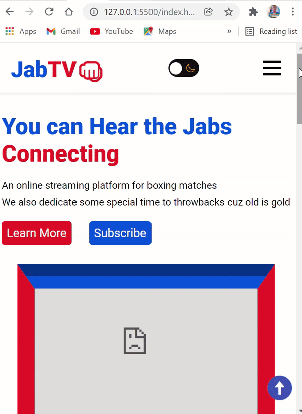
There is now a complete hero section:
Making the About Section
Most importantly, the about section should do exactly what it’s called: provide a brief explanation of what JabTV is all about. An image and a few lines of text will make up this part.
Obviously, using HTML in this part couldn’t be easier:
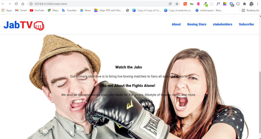
 <section class="about" id="about">
      <h3>Watch the Jabs</h3>
      <p>
        Our primary objective is to bring live boxing matches to fans all around
        the world
      </p>

      <h3>Its not About the Fights Alone!</h3>
      <p>
        We also air documentaries specially made for the greats, lifestyle of
        boxers, news, and more.
      </p>
</section>
You may wonder why there is no img tag in this example because I planned to utilize the CSS background property to incorporate the background property.
What’s behind the background property?
- firstly, background-image
- background-color
- background-repeat
- background-origin
- background-position
- background-cover
- background-attachment
- and finally, background-clip
You can always leave out any of the property you don’t want to use.
Flexbox will be used to align the HTML text with the background image in addition to the background property.
Flexbox allowed us to use the position property more simply:
.about {
  position: relative;
  background: url("../images/jab-transformed.png") no-repeat top center/cover;
  height: 600px;
  display: flex;
  align-items: center;
  justify-content: center;
  flex-direction: column;
  gap: 1.5rem;
  margin: 2rem 0;
}
In the browser, this is how the section appears:
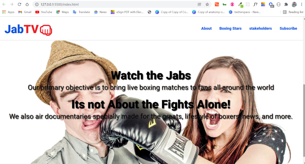
We can use CSS here to enhance the readability of the content:
.about h3 {
  font-size: 3em;
  margin-bottom: -20px;
}

.about p {
  font-size: 1.5em;
}

.about h3 {
  text-shadow: 2px 2px 2px #333;
}

.about p {
  text-shadow: 2px 2px 2px #333;
  font-size: 1.8rem;
}
Since these texts are placed on an image, I applied a text shadow to them. This should be done in all projects to make them more accessible.
Finally, the About section now has a more polished appearance:
Try FREE Magezon Page Builder!
Easily create your engaging Magento pages in any style whenever you want without relying on developers or designers, just by drag & drop.
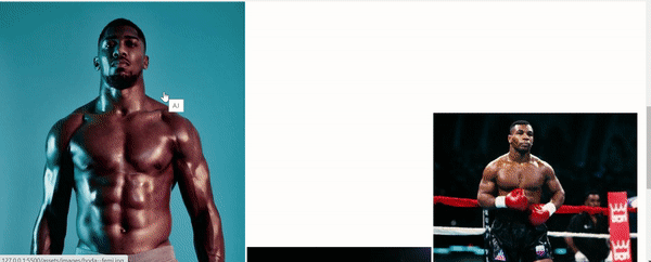
Making the Lightbox Image Gallery
We’re not going to start from scratch on the lightbox image gallery because that would make this lesson too long. For the alignment of the images, I’ll be utilizing a plugin called simple lightbox and CSS grids.
Yet, we still need to use the easy lightbox plugin, go to their website and download it. The minified CSS and JavaScript files are all we need.
As we have done with the starter HTML, copy and paste the downloaded zip file’s minified CSS and JavaScript files into the assets subfolders and link them accordingly.
For the lightbox to work, the picture must be wrapped in an <img> element with an anchor tag (<a>).
It is also necessary that the href of the anchor tag correspond with the image source. Finally, all of these elements must be contained within a div tag to which you must apply a class property.
The gallery will be initialized with JavaScript using this class property. You won’t have to worry about JavaScript because it’s not difficult. In fact, the gallery will showcase some of the greatest boxers of all time.
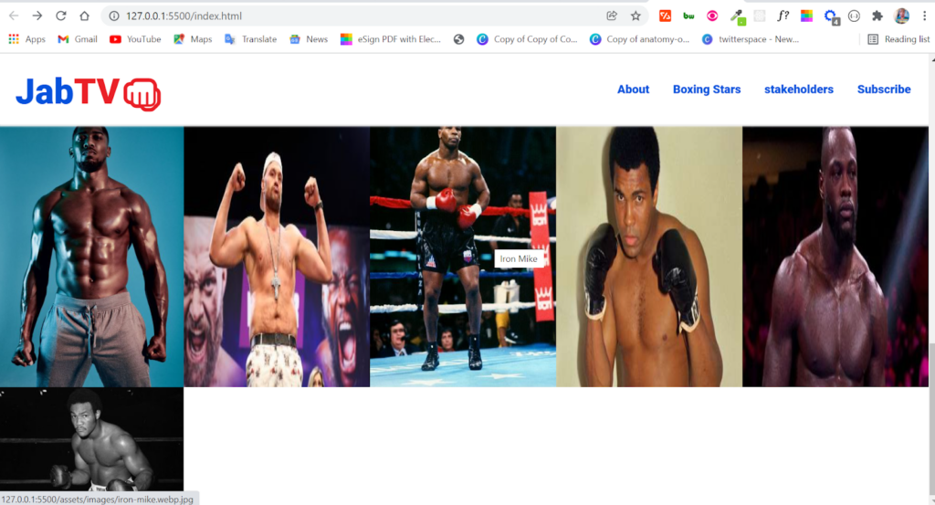
In this case, the code snippet for the lightbox image gallery is below:
<section class="stars" id="stars">
      <div class="stars-gallery">
        <a href="assets/images/boda--femi.jpg" class="big">
          <img
            src="assets/images/boda--femi.jpg"
            alt="Anthony Joshua"
            title="AJ"
          />
        </a>

        <a href="assets/images/tyson-fury.jpg" class="big">
          <img
            src="assets/images/tyson-fury.jpg"
            alt="Tyson Fury"
            title="Gypsy King"
          />
        </a>

        <a href="assets/images/iron-mike.webp.jpg" class="big">
          <img
            src="assets/images/iron-mike.webp.jpg"
            alt="Iron Mike"
            title="Iron Mike"
          />
        </a>

        <a href="assets/images/ali.jpg" class="big">
          <img
            src="assets/images/ali.jpg"
            alt="Mohammed Ali"
            title="The Greatest"
          />
        </a>

        <a href="assets/images/wilder.jpg" class="big"
          ><img
            src="assets/images/wilder.jpg"
            alt="Deontay Wilder"
            title="Bronze Bomber"
          />
        </a>

        <a href="assets/images/big-george.jpg" class="big">
          <img
            src="assets/images/big-george.jpg"
            alt="George Foreman"
            title="Big George Foreman"
          />
        </a>
      </div>
</section>
One line of JavaScript is all that’s required to get the gallery to work and scroll smoothly while viewing the images:
<script>
var lightbox = new SimpleLightbox(".stars-gallery a");
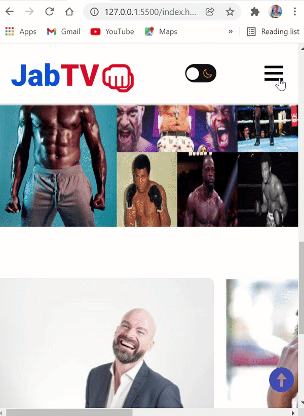
</script>Thereafter, what we have now is a working lightbox image gallery:
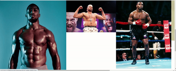
Styling the Lightbox Image Gallery
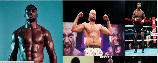
We will use the CSS Grid to fix the pictures’ misalignment.
.stars-gallery {
  display: grid;
  grid-template-columns: repeat(5, 1fr);
}
The div was targeted with a class of stars-gallery in the CSS code example above and given a grid layout so that further CSS properties could be applied to the components within the div.
Grid-template-columns: repeat(5, 1fr) will define the column into 5 columns as we needed previously.
In brief, the gallery now looks like this:
However, there is a White space, and one image is no longer visible.
Nevertheless, we will fix that by giving the images 100% of the height and width as the snippet below:
.stars-gallery img,
.stars-gallery a {
  width: 100%;
  height: 100%;
}
Naturally, now we will define a grid row and column for the first image after targeting it.
.stars-gallery a:first-child {
  grid-row: 1/3;
  grid-column: 1/3;
}
The first image will fill the first two rows horizontally and the first two columns vertically in the specified grid row and column.
We’ll also create a grid column for the second image:
.stars-gallery a:nth-child(2) {
  grid-column: 3/5;
}
We have rearranged all of the images in our photo gallery and have been and are operating properly:
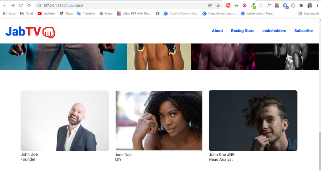
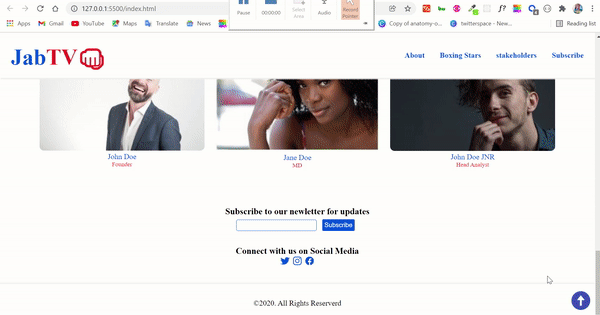
Making the Stakeholders Section
Most importantly, JabTV’s stakeholders are the people who make it happen.
The HTML is in the following snippet:
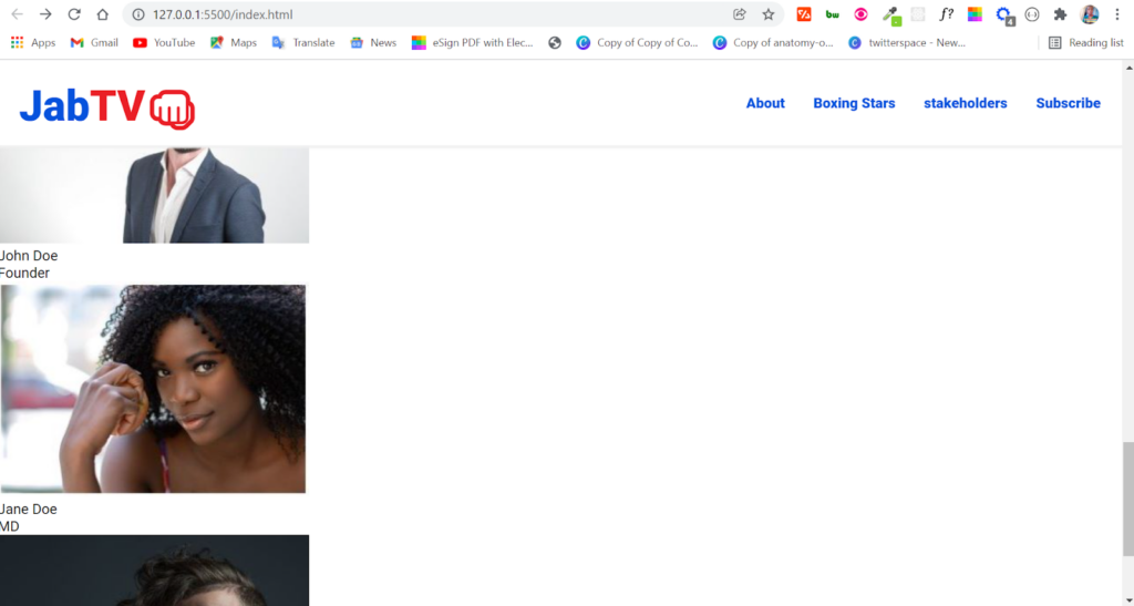
<section class="people" id="stakeholders">
      <div class="stakeholders">
        <div class="persons">
          <div class="person-1">
            <img src="assets/images/john.jpg" alt="John Doe" />
            <p class="name">John Doe</p>
            <p class="role">Founder</p>
          </div>
          <div class="person-2">
            <img src="assets/images/jane.jpg" alt="Jane Doe" />
            <p class="name">Jane Doe</p>
            <p class="role">MD</p>
          </div>
          <div class="person-3">
            <img src="assets/images/jnr.jpg" alt="John Doe Jnr" />
            <p class="name">John Doe JNR</p>
            <p class="role">Head Analyst</p>
          </div>
        </div>
      </div>
</section>
From the top, here’s how it looks:
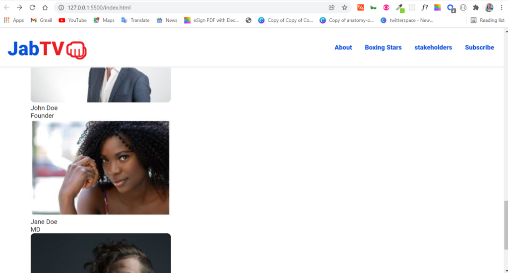
However, we’ll have to make it look better.
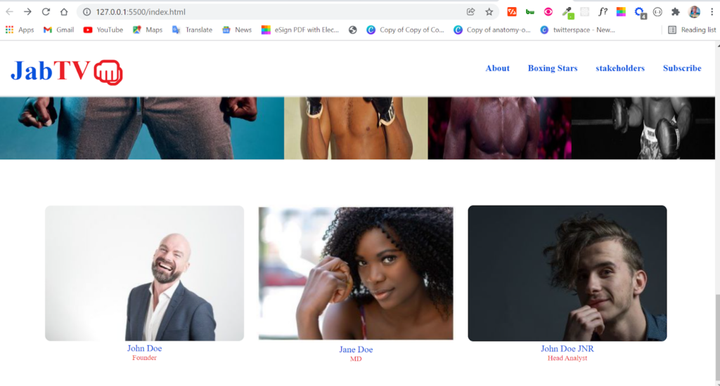
Styling the Stakeholders Section
When displaying the photographs, names, and participants’ positions, I’ll use a CSS grid, but if you prefer, you may utilize Flexbox. The section will have a minor adjustment, and we’ll get to it now.
 .people {
  margin-top: 2rem;
  padding: 1rem 0;
}

.stakeholders {
  margin: 2rem auto;
  max-width: 1100px;
}

.stakeholders img {
  border-radius: 0.6rem;
}
I used a margin-top of 2rem to lower the section in the code snippet above. This was specifically done for the .people class.
After that, I targeted the .stakeholders class and gave it a 2rem margin on the top and bottom. I used auto-centering to keep things in place.
After targeting the .stakeholders class, we’ll define the height of the section as 1100px maximum, creating space to both the left and the right. This makes the section pops out even more.
This brightens up the site a tiny bit:
Finally, we used a CSS grid to arrange the images and text.
.persons {
  display: grid;
  grid-template-columns: repeat(3, 1fr);
  place-items: center;
  gap: 1rem;
}
Because a div contains 3 images:
- We created 3-columns for this section
- Furthermore, we placed the place-items, and everything else centered on the 3 columns mentioned above.
- Finally, we added a gap property 1rem of space between items in div tags
The only ugly thing left is the text:
To improve the appearance of the text, we’re going to use the .name and .role classes to target it, position it in the center, and afterward give it a color and font as needed:
.name {
  color: var(--primary-color);
  text-align: center;
}

.role {
  color: var(--secondary-color);
  text-align: center;
  font-size: 0.8rem;
}
The section is now satisfactory:
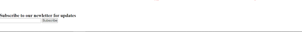
Making the Email Subscription Section
The section for email subscriptions will be kept to a minimum. I’m not going to do anything with the site as is.
Formspree can be used for this if you only want to collect email addresses. However, a service such as Mailchimp or Convertkit will allow you to do something about the emails you’ve gathered.
There are just 12 lines of HTML in this section:
<section class="sub" id="sub">
      <h3>Subscribe to our newsletter for updates</h3>
      <form action="#">
        <input
          type="email"
          name="email"
          id="email-sub"
          class="email-sub"
          required
        />
        <input
          type="submit"
          value="Subscribe"
          id="submit-btn"
          class="submit-btn"
        />
      </form>
</section>
As you can see, the form contains an email field and a submit button. In the browser, the section is looking quite nice:
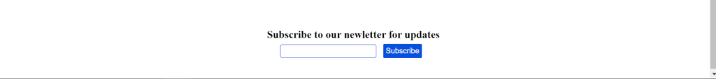
Styling the Email Subscription Section
The h3 and form should be in the center, and the subscribe button should also look fine.
To center the h3 and form, this is how we did it:
.sub {
  margin-top: 2rem;
}

.sub h3 {
  text-align: center;
}

form {
  text-align: center;
  margin: 0.4rem 2rem;
}
In addition, we added a margin of 2rem to make it move closer to the bottom of the section.
We used a margin of 0.4rem there at the top and bottom and 2rem on the right and left sides to distance the form from the h3.
The form now looks great:

Next, we need to improve the look of the subscription button and input area. To apply some styling to the input field, I will target the class of .email-sub that we linked to it.
.email-sub {
  padding: 0.2rem;
  border: 1px solid var(--primary-color);
  border-radius: 4px;
}

.email-sub:focus {
  border: 1px solid var(--secondary-color);
  outline: none;
}
This is how the input field with the CSS above turns out:
- For better spacing, we gave the input padding of 0.2rem and gave it (the input) a solid blue border of 1px.
- When focused, that is when you’re trying to type in the input; we made the corners of the input level with a border radius of 4px.
- Finally, we set the outline virtually nil to remove the outline displayed while inputting in the feedback areas.
We improved the look of the subscribe button by using the following CSS:
.submit-btn {
  background-color: var(--primary-color);
  color: #fff;
  padding: 0.3rem;
  margin: 0 0.5rem;
  border: none;
  border-radius: 2px;
  cursor: pointer;
}

.submit-btn:hover {
  background-color: #095cf7;
}
The subscription area is much better now::
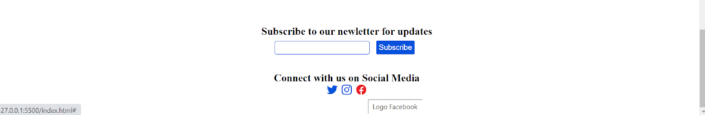
Some social icons will also be included in the area.
In terms of the icons, I intend to use ionic icons.
An anchor element will be used to enclose the icons, allowing them to inherit the CSS resets’ styles for links.
<section class="social">
      <h3>Connect with us on Social Media</h3>
      <div class="socicons">
        <a href="#"> <ion-icon name="logo-twitter"></ion-icon> </a>
        <a href="#"> <ion-icon name="logo-instagram"></ion-icon> </a>
        <a href="#"> <ion-icon name="logo-facebook"></ion-icon> </a>
      </div>
</section>
The CSS for the social icons isn’t that difficult:
.social {
  text-align: center;
  margin: 2rem;
}

.socicons {
  font-size: 1.3rem;
}
In the end, this is what the email subscription section looks like now:
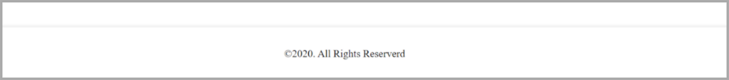
Making the Footer
There’s just one line of HTML in the footer:
<footer>©2020. All Rights Reserved</footer>
For your information, The © character entity is the © you see in the website footers.
Six lines of CSS are all that are needed to do the task.
footer {
  border-top: 1px solid #f1f1f1;
  box-shadow: 0px -2px 3px #f1f1f1;
  text-align: center;
  padding: 2rem;
}
The footer has been given a box-shadow and a border-top to correlate better with the nav bar.
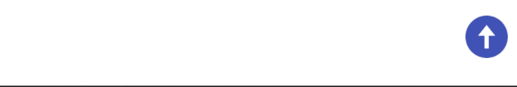
Making the Scroll-to-top Button
Equally important, we’ll add a “scroll to the top” button for a better user experience. If the users click, this button will send them to the top of the page no matter where they are.
The code snippet below contains the HTML for the scroll-to-top button:
<i class="scroll-up" id="scroll-up"
     ><img
       src="assets/icons/icons8-upward-arrow.png"
       class="socicon up-arrow"
       alt="up-arrow"
/></i>
We’ll use the class attributes for styling purposes, and we can see the ids to select them in our JavaScript file. In CSS and JavaScript, this is how things work.
To ensure that the button is always visible and attractive, we will give it a set point and increase its width and height to make it more noticeable. A cursor or pointer will also be added so the user can see what is going on when they hover their cursor on it.
.scroll-up {
  position: fixed;
  right: 0.5%;
  bottom: 3%;
  cursor: pointer;
}

.up-arrow {
  width: 3rem;
  height: 3rem;
}
Seven lines of JavaScript will complete the scroll-to-top feature:
const scrollUp = document.querySelector("#scroll-up");

scrollUp.addEventListener("click", () => {
  window.scrollTo({
    top: 0,
    left: 0,
    behavior: "smooth",
  });
});
First, I selected the button in the first line by assigning it to a variable called scrollUp.
Since querySelector() is said to be faster, that’s what we used. You can also consider getElementById.
Furthermore, we can use EventListener, a crucial component of the DOM (Document Object Model) to track the user’s click action on the button.
In the eventListener() function, I brought in a window object method called scrollTo, which helps move to anywhere on the web page, which makes it easier to move across the web page.
We must assign property of either top and left or top and bottom to instruct the scrollTo function where to scroll. So we gave it a 0 for the top and left.
After setting the behavior property to “smooth,” everything animates smoothly whenever the button is clicked.
The scroll-to-top button on our site is now fully functional:
We’ve finished building our website and are ready to go live! However, many people prefer using websites in dark mode; let’s include a dark and light theme switcher.
Making the Dark and Light Theme Switcher
Besides, we plan to add the system-wide dark switcher in our sticky navbar to make it accessible anywhere on the landing page.
We’ll be using the following:
- Firstly, an input type of checkbox to alternate among dark and light modes, and a div with the class of theme-switch to include everything.
- A label for the moon (dark mode) and sun (light mode) icons
- Inside the label is a div with a switcher class that creates a ball-like shape. When the user selects the “light” or “dark” mode, this shape will hide one icon.
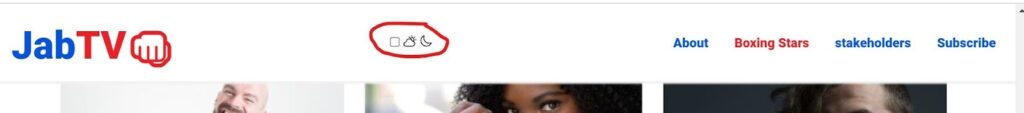
This is what the HTML code looks like:
<div class="theme-switch">
    <input type="checkbox" class="checkbox" id="checkbox" />
    <label for="checkbox" class="label">
       <ion-icon name="partly-sunny-outline" class="sun"></ion-icon>
       <ion-icon name="moon-outline" class="moon"></ion-icon>
       <div class="switcher"></div>
    </label>
</div>
It appears like this on our browser:
Style the Dark and Light Theme Switcher
First, we will make the checkbox invisible and position it absolutely. .
Utilizing a checkbox to toggle between light and dark mode is what we need, but it doesn’t have to be visible to the user.
.checkbox {
  opacity: 0;
  position: absolute;
}
Thereafter, using Flexbox, we’ll set the label to a relative position, center everything, and apply a dark backdrop to the Flexbox container. This will make the dark theme switcher more noticeable.
.label {
  width: 50px;
  height: 29px;
  background-color: #111;
  display: flex;
  align-items: center;
  justify-content: space-between;
  border-radius: 30px;
  padding: 6px;
  position: relative;
}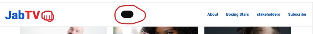
As has been noted, only a dark background is visible currently. Don’t worry. You will see everything in no time.
Do you remember the div with the class of switcher? We’ll make it round and white to look like a ball. Because it’s contained in the label with relative position, we’ll position it to absolute.
.switcher {
  background-color: #fff;
  position: absolute;
  top: 5px;
  left: 2px;
  height: 20px;
  width: 20px;
  border-radius: 50%;
}
Using CSS as a method of rounding is really simple; you only need to set the width, height, and border-radius properties to 50%.

Keep the icons visible by providing the right hues of reddish for the sun and yellowish for the moon in our dark theme switcher.
.moon {
  color: #ffa502;
}

.sun {
  color: #ff4757;
}
Finally, to move the ball left and right, we need to use the: checked pseudo-class on our checkbox and target the ball with a class of switcher, then use the transform property to move it by setting a figure in pixels:
.checkbox:checked + .label .switcher {
  transform: translateX(24px);
}
Our ball now moves, and the icons display correctly:

Now, we will use JavaScript to switch between light and dark modes and change the colors for dark mode.
The following is a sample of the colors used in our dark theme:
body.dark {
  background-color: #1e272e;
}

body.dark .bar {
  background-color: #fff;
}

body.dark p {
  color: #fff;
}

body.dark h3 {
  color: #fff;
}

body.dark nav {
  background-color: #1e272e;
  box-shadow: 2px 3px 2px #111010;
}

body.dark ul {
  background-color: #1e272e;
}

body.dark .name {
  color: var(--primary-color);
}

body.dark .role {
  color: var(--secondary-color);
}

body.dark footer {
  color: #fff;
  border-top: 1px solid #111010;
  box-shadow: 0px -2px 3px #111010;
}
Using JavaScript and the DOM’s toggle() method with the change event, we were, in fact, able to turn the body .dark class on and off as follows:
const checkbox = document.querySelector("#checkbox");

checkbox.addEventListener("change", () => {
  // Toggle website theme
  document.body.classList.toggle("dark");
});
Soon, you can assign the checkbox with the id #checkbox to a variable called checkbox. To avoid confusion, it’s best to utilize ids for JavaScript and CSS classes.
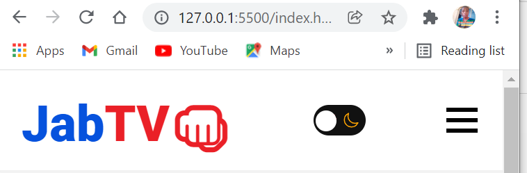
Positively, on our landing page, users can now choose between a light and dark mode:
How to Make a Good Landing Page That Is Responsive?
A responsive landing page is a web page that renders correctly on all the devices such as computers, mobile phones, tablets, or different operating systems. A responsive page must remain accessible to all users and make the most of your opportunities.
We need to look at how to make a good landing page that is at the same time responsive. We must create a hamburger menu for tablets and phones inside a media query. Once again, we’ll utilize Flexbox and Grid to stack the parts on top of each other.
Try FREE Magezon Page Builder!
Easily create your engaging Magento pages in any style whenever you want without relying on developers or designers, just by drag & drop.
Making a Hamburger Menu for the Landing Page
The first thing we’ll do for the hamburger menu is to make the bars viewable on devices with a screen width of fewer than 768 pixels.
A cursor or the pointer will be added to the bars to let users know they can interact when they hover their mouse over.
@media screen and (max-width: 768px) {
  .hamburger {
    display: block;
    cursor: pointer;
  }
To make the navigation menu elements stack on each other, we will target the unordered list they’re contained in and change its flex-direction to a column.
We can also use a white background and then center-align all of the items, and setting the left property of the list items to 100% will make the list invisible from the viewport.
ul {
    background-color: #fff;
    flex-direction: column;
    position: fixed;
    left: 100%;
    top: 5rem;
    width: 100%;
    text-align: center;
  }
Our browser currently looks like this:
By attaching a class attribute of active, we’ll make the navigation elements visible by adding the class property of active to the unordered list that contains them by setting left to 0. JavaScript will turn on or off this class when the user clicks on the bars.
ul.active {
    left: 0;
}
The navigation items are not tidy yet:
We’re going to use the .nav-item class to give the navigation menu items some margin, so they’re evenly spaced out:
.nav-item {
    margin: 2rem 0;
  }
With the margins of 2rem on the top and bottom and 0 on the left and right, the navigation menu items look like this:
Finally, we need to ensure the bars transform to an X shape when clicked, then revert to the bars when they are clicked a second time.
Attaching an active class to the hamburger menu and rotating the bars is how we accomplish this. JavaScript will toggle this active class.
.hamburger.active .bar:nth-child(2) {
    opacity: 0;
  }

  .hamburger.active .bar:nth-child(1) {
    transform: translateY(10px) rotate(45deg);
  }

  .hamburger.active .bar:nth-child(3) {
    transform: translateY(-10px) rotate(-45deg);
  }
We’ll need some JaveScript to do the toggling: :
const hamburger = document.querySelector("#hamburger");
const navMenu = document.querySelector("ul");

function openMenu() {
  hamburger.classList.toggle("active");
  navMenu.classList.toggle("active");
}
All we accomplished in JavaScript is as follows:
- The bars and the unordered list are selected with the id of the hamburger and the element (ul), respectively.
- To acquire the class lists for the hamburger menu and unordered list, we wrote a function called openMenu and then used the toggle() method to pull the active class…
Navigation menu items can now be switched back and forth.
Nevertheless, there’s a problem. For a better user experience, we need to make the menu items invisible whenever clicked.
We’ll need JavaScript once more to accomplish this task. We’re going to:
- Use the querySelectorAll() to select all the nav elements by targeting their ids.
- Use the forEach() array method to wait for a click event on the nav menu elements.
- Remove the .active class from the nav menu by writing a function that will eventually return it to its original state.
const navLink = document.querySelectorAll("#nav-link");

navLink.forEach((n) => n.addEventListener("click", closeMenu));
function closeMenu() {
  hamburger.classList.remove("active");
  navMenu.classList.remove("active");
}
Our mobile menu now works perfectly:
Moreover, other website areas do not display well on mobile devices. Even the horizontal scrollbar is bothersome.
This can be fixed by adding the following styles:
 .logo {
    font-size: 1.5rem;
  }

 .hero {
    flex-direction: column;
    max-width: 500px;
  }

  .intro-text h1 {
    font-size: 2.3rem;
  }

  .btn {
    padding: 0.5rem;
    font-size: 1.2rem;
  }

  iframe {
    max-width: 26rem;
  }

  .stand-1 {
    left: 170px;
  }
  .stand-2 {
    left: 225px;
  }

  .about {
    text-align: center;
  }

  .persons {
    grid-template-columns: repeat(1, 1fr);
  }
}
CSS above reduces the size of each part and changes the direction of the column, allowing the TV stands to properly align.
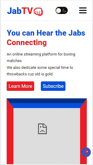
There is a lot of room for improvement on the mobile landing page.
We will also make some changes to the landing page to make it responsive on smaller phones with a screen width of 420px or below:
@media screen and (max-width: 420px) {
.hero {
max-width: 330px;
}
.intro-text h1 {
font-size: 2rem;
}
iframe {
max-width: 330px;
}
.stand-1 {
left: 140px;
}
.stand-2 {
left: 195px;
}
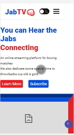
}We now have a responsive landing page:
What to Pay Attention to When Making a Good Landing Page?
Learning how to make a good landing page can boost your internet visibility. And these are some things to bear in mind if you want to have a good landing page:
- Define your end goal. Decide what you want your landing page to accomplish, and then stick to that goal in all of your site’s design elements.
- Organize the visual content. Select the most important elements and make them stand out.
- Use a high-quality CTA to drive action. To help your landing page visitors, make it obvious what they need to do.
- Create an eye-catching design. Impress your visitors with a captivating design, encouraging them to click and learn more. You’ll also want a well-thought-out layout. “Most visitors don’t go all the way to the bottom of a landing page,” says Emannuel Schwab, Creative Acquisition Manager at Wix. Place your design and information “above the fold” to maximize this marketing tool’s effectiveness and provide the greatest user experience.
- Write killer copies. Keep your content short and concise, with eye-catching headlines encouraging readers to continue reading.
- Make use of visuals. Set the tone and captivate your audience with eye-catching graphics. They can also serve as a visual representation of your product.
- Highlight the value. Make it clear to your audience why they should click on the CTA. Is there anything in it for them?
- Go for the hard sell. You create a landing page for selling purposes, so state it frankly.
Conclusion
Learning how to make a good landing page is one of the most important tools for your online business, and HTML is the best tool you can use. You may develop different landing pages and run A/B tests to see which ones perform better. This method will elevate your web marketing experience and affect how customers view your site. There is a wealth of information that can be gleaned from this tutorial. You can use these features in any current or future project, so don’t hesitate to return to this article whenever you need it.
If you are a Magento merchant and don’t know which extension to build your website, consider Page Builder from Magezon. As a trusted Adobe partner, we have satisfied thousands of customers with a vast collection of drag-and-drop extensions, helping you create a high-converting and unique store in minutes.
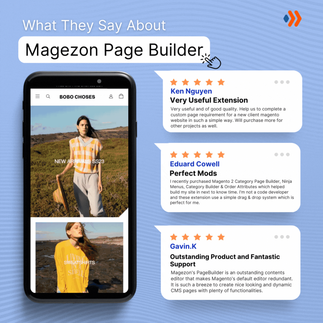
Don’t take my words for granted; see how your website can be with Magezon Page Builder and what others say about us:


