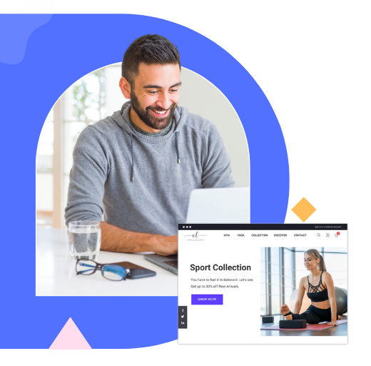
 Magezon Blog Help Merchants Build Comprehensive eCommerce Websites

A poorly optimized product page will cost your online business significant potential income. Conversely, using best practices can offer your visitors the last push to take action and propel them along your sales funnel. Good e-commerce businesses use at least one strategy on their product pages, such as testimonials, fear of losing out, product suggestions, etc.
Below are 25+ best product page examples with lessons for you to take away.
Table of contents
25+ Best Product Pages With Takeaways
1. Lush: Use Content to Educate Your Visitors
When optimizing your product pages, there is one thing you should never forget: everything you do must be consistent with your value proposition. Consider what value you want to provide your visitors before you begin. Is it your quick delivery option, unbeatable satisfaction guarantee, a wide selection of products, use of natural components, or something else?
In our first product page example, Lush, a well-known website for its eco-friendly products, decide to make its environment-centered value proposition as prominent as possible.
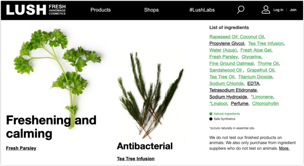
It also uses badges and certifications to strengthen visitors’ trust.
Takeaways:
- Maintain alignment between your product pages and your value proposition.
- Produce thorough and informative product descriptions.
- Use content to educate your visitors, and link to pertinent stuff on product pages.
- Use featured videos to demonstrate how to utilize your products.
2. AstleyClarke: Telling Stories for Daring Products
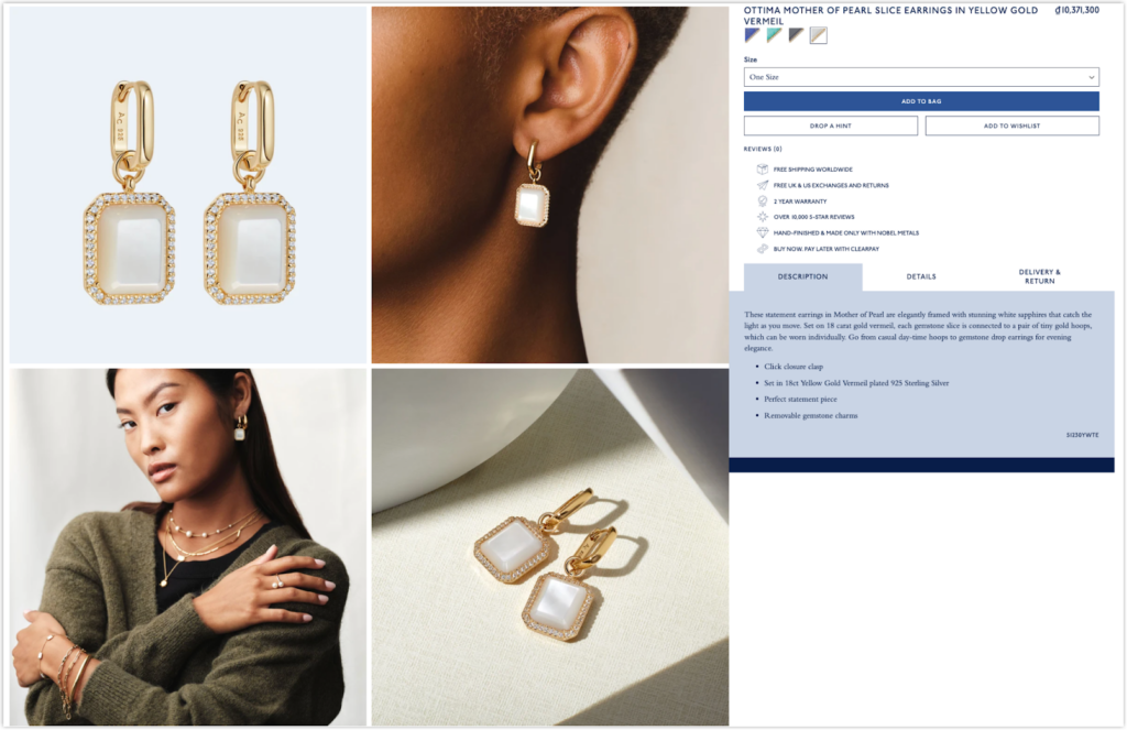
AstleyClarke is known for its bold jewelry, so the company tried to make its product detail page as daring as the brand. The description is direct and easy to understand without confusing technical information. They also promoted relevant products in the Shop the Look section to increase cross-selling.
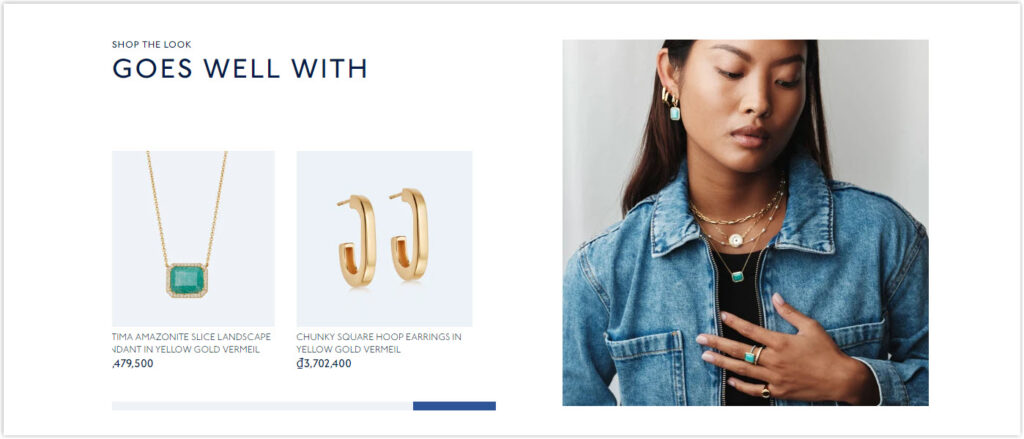
Takeaways:
- Provide only the most essential product information to keep your visitors engaged.
- Keep the product page as straightforward as possible
- Build a community to collect social proof.
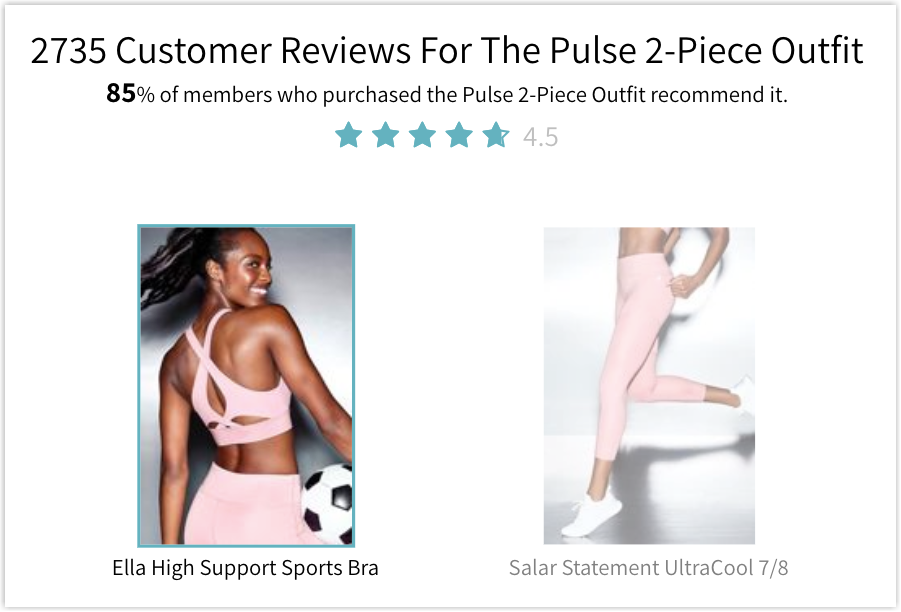
3. Glossier: Nothing Is Left to Chance
Glossier’s product page provides the value proposition and necessary information for customers shortly and adequately, thanks to the drop-down menus, as you can see below. Using this, the page doesn’t look cluttered, and visitors won’t get distracted from the brand’s aim: converting.
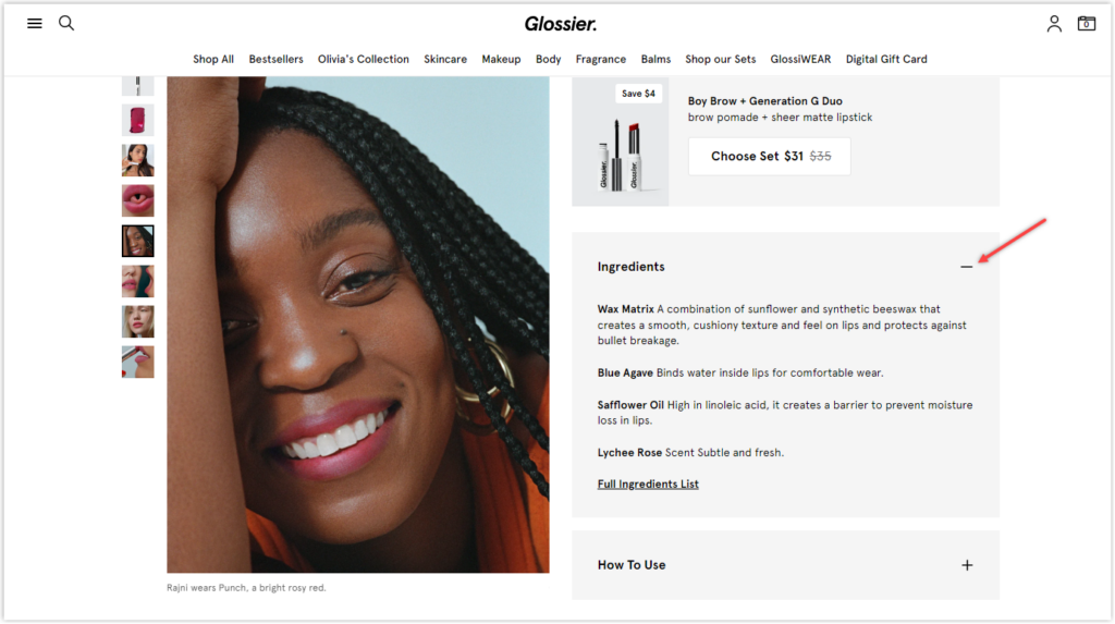
The review section is placed intelligently when instead of placing it at the bottom like most other brands, they put the reviews with 5-star ratings right next to the product image.
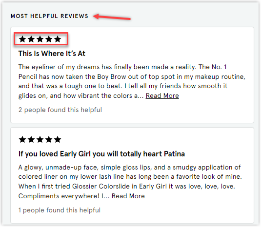
Takeaways:
- Keep your website layout clean and simple.
- Customer reassurance: It’s a well-known purchasing psychology that people want to do what experience the products helped the previous customers. So, on your product page, include qualified reviews to encourage prospective buyers, and try answering any concerns about your items.
4. Allbirds: Warm Leads on Product Pages
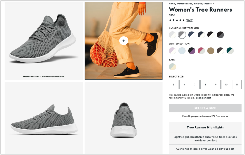
The best part of this site is that it demonstrates how the shoes appear and feel when you walk in through various perspectives and a model video. If you scroll down further, you’ll see images of their shoes in different areas, giving you a more apparent imagination. You can also find its creative customer reviews section right below. Instead of having to read all of the thoughts and summarize yourself, they did it for you. Moreover, they also provide a detailed filter so you can see which review is helpful.
Takeaways:
- Optimize the reviews section, or build a dedicated testimonial page.
- Use brief videos to show the product in practice.
5. Ban.do: Use Persuasion Triggers
This is what Ban.do emphasizes their product pages: combining social evidence for credibility and using bestselling tags for FOMO.
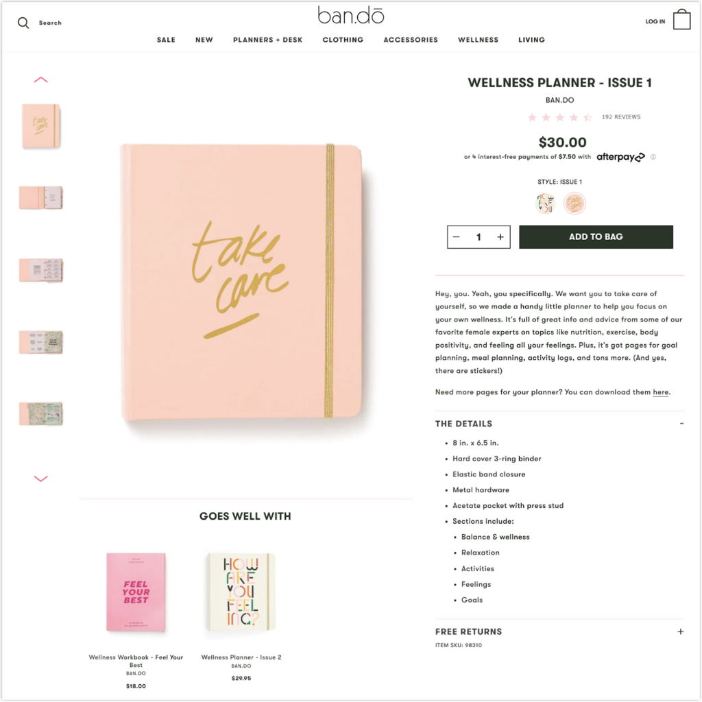
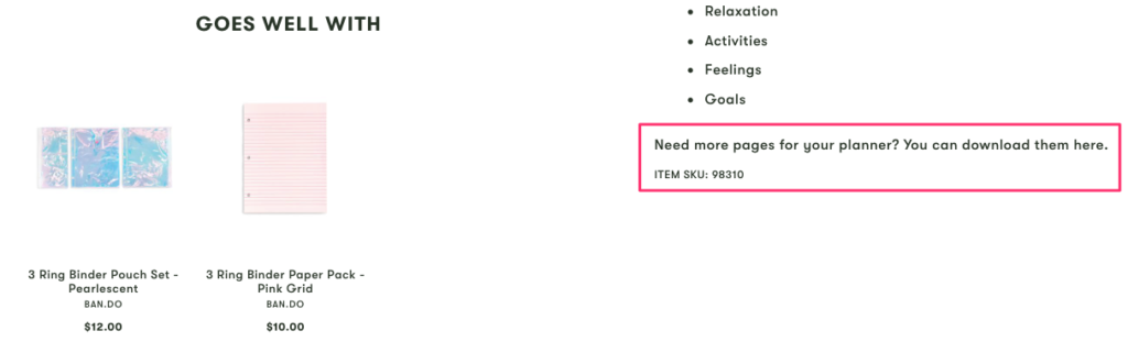
They use a warm and approachable tone when writing product descriptions to make them consistent with the brand voice. Even their cross-selling section is subtle, “Goes Well With.”
Moreover, when buying a planner, whether or not you buy the product, you will be provided with add-ons. For example, you may free download and print additional pages for your planner. In this manner, Ban.do take care of the problem for you, and you never have to worry about running out of pages.
Last but not least, the social proof section uses the authority of experts and user-generated content. First, they quote several professionals who were involved in the creation of this product. Then, they show images of satisfied consumers using the product to provide further social evidence.
Takeaways:
- Use “bestseller,” “trending,” or “selling quickly” tags to build social proof and a feeling of urgency.
- Create product descriptions that are consistent with the tone of your brand.
- Use a soft tone when cross-selling.
- Provide complimentary extras or refills that enhance the product.
- Display your workers’ faces and show their skills in the sector.
Try FREE Magezon Page Builder!
Easily create your engaging Magento pages in any style whenever you want without relying on developers or designers, just by drag & drop.
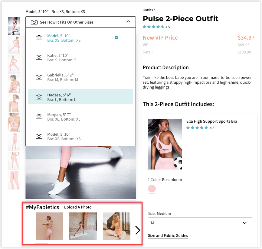
6. Fabletics: Increase Signups by Creating Curiosity
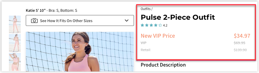
Price is one of the top three things most considered when buying online. Therefore, don’t hesitate to offer better prices than your competitors or prominently display which item is discounted. One of the most common ways to highlight your price advantage is to compare it with the original price. You can see below where Fabletics practices it by displaying that the “New VIP Price” is twice as cheap as the list price.
When seeing a product, even though it’s shown from as many angles as possible, it will not look the same on two people. That’s why Fabletics allows you to pick models to know how their items would look on you. If you want to view the items on actual people rather than models, Fabletics curates customer images alongside the model shots.
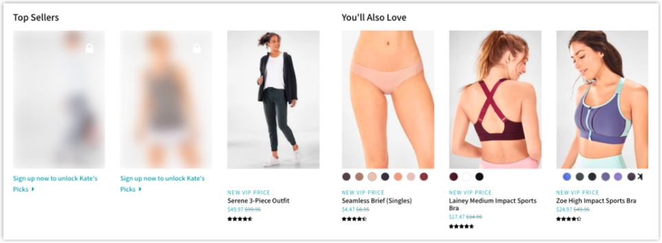
When you scroll down to the product suggestions, you’ll notice some products are hidden and may be unlocked upon joining. Wonder what they can do? They’re there to create curiosity and a strong sense of membership exclusivity.
Moreover, a summary section above the product evaluations helps you quickly understand the product without reading all the customer reviews. Same as Allbirds’s.
Takeaways:
- Compare the membership prices with regular retail prices.
- Add several pictures of the product in different settings.
- Use photos of your customers as part of your product photos.
- Add a few hidden products or articles that can only be seen after you sign up.
- Give a brief overview of the product reviews.
7. Bang and Olufsen: Using the Details to Your Benefit
Bang & Olufsen sells its 3-in-1 via a unique technique. This product description page informs you of crucial specs, such as noise cancellation and handsfree, and how these features will benefit you in the long term. So you understand that its three internal microphones will provide you with the most incredible connection possible during long calls or meetings.
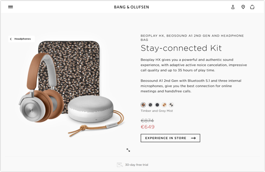
The product page for Beoplay has a fundamental but elegant design. You may also choose between different headphone designs and get a preview of how the headphones will seem in real life. There are enough options to choose from without overwhelming buyers. Beoplay also explicitly indicates a 30-day free trial period. When you click on that part, you are sent to a website with a short return policy FAQ.
Takeaways:
- Include specs carefully.
- Make warranty and return policies prominent on product pages.
- Use only minimal design.
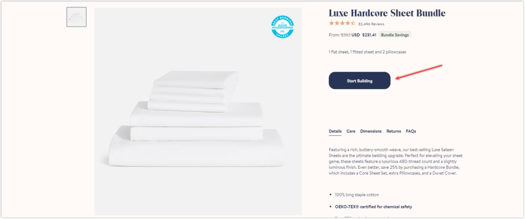
8. Brooklinen: Use Messenger to Reduce Cart Abandonment
Take a peek at one of the best product page examples by Brooklinen, the sheet bundle. What strikes me the most is the Start Building button, as shown in the image below, a substitute for different sizes, colors, and pattern options. Thanks to the attractive copy, it successfully evokes curiosity from customers and does not clutter the page with details.
After clicking, you will be directed to another page where you choose the most suitable products for your house, from the core sheet set to the pillowcase.
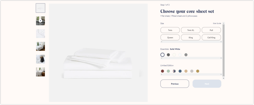
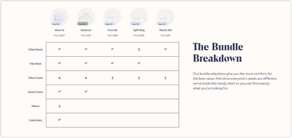
They also provide customers with the Bundle Breakdown section to help them find exactly what they’re looking for.
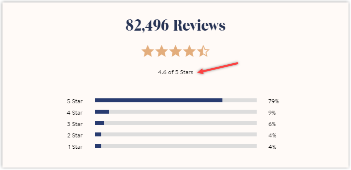
Besides displaying only regular reviews, Brooklinen shows the total numbers and a brief summary. As you can see from the image below, there are over eighty thousand reviews, and 79% are 5 stars, making the average rating 4.6 out of 5 stars.
Takeaways:
- Be creative in helping customers make their choice.
- Include a review summary to save their time and quickly make a purchase.
- Keep your customers’ needs in mind and expect what they might require.
9. Away: Allow Personalization
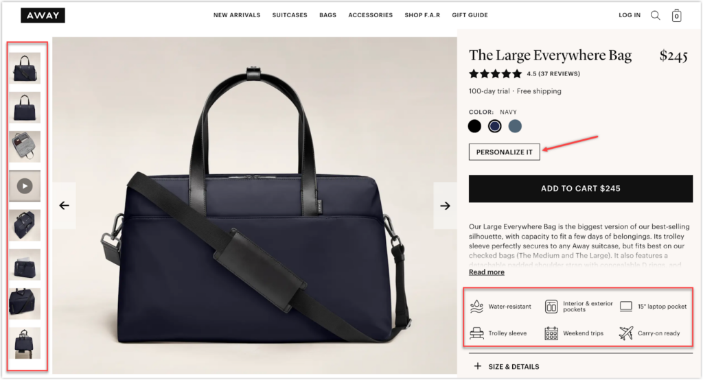
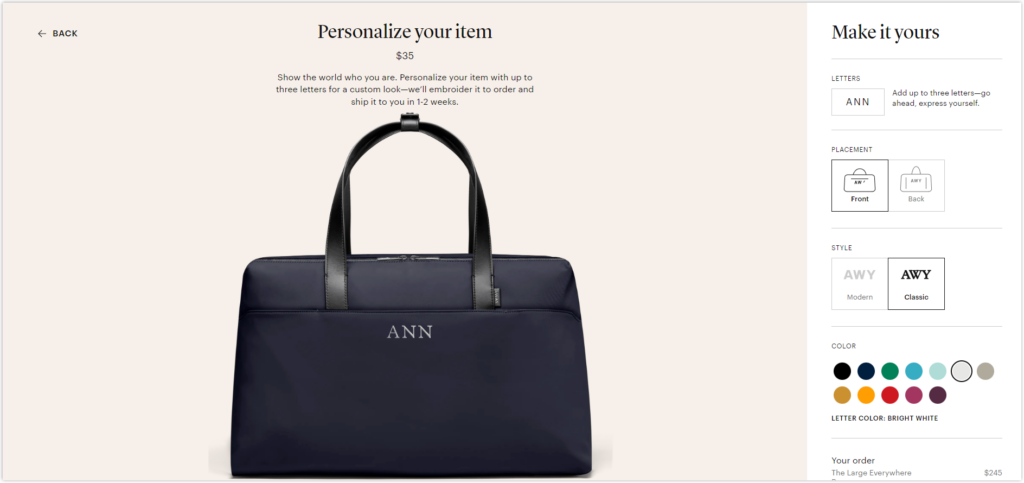
What is unique about Away’s product page is how they carefully and engagingly illustrate the items’ specs. Besides the adequate number of photos, they use icons and a brief description for each detail, as shown in the above image. Personalization is an excellent technique to upsell leads and raise the average order value on your product pages. If you click on the catchy Personalize it section, below is what you see:
To save space, Away hides its “Features and information” and “Our return policy” sections by default. If you want to learn more, click the + button and scroll down to read about it.
Takeaways:
- Show the product ratings below the product titles.
- Explain different product options for customers.
- Try to hide longer pieces of information to save space.
- Think about adding a way to customize your products.
- Give suggestions for products that go well with the original.
- Let people ask questions and answer them on the product page as soon as possible.
10. Sonos: Take Advantage of Visual and Typefaces
At first glance, the most striking details are the rating section next to the price, the brief description with icons, and the View in Your Space button.
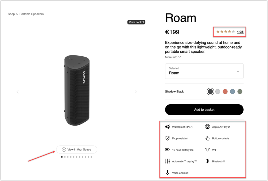
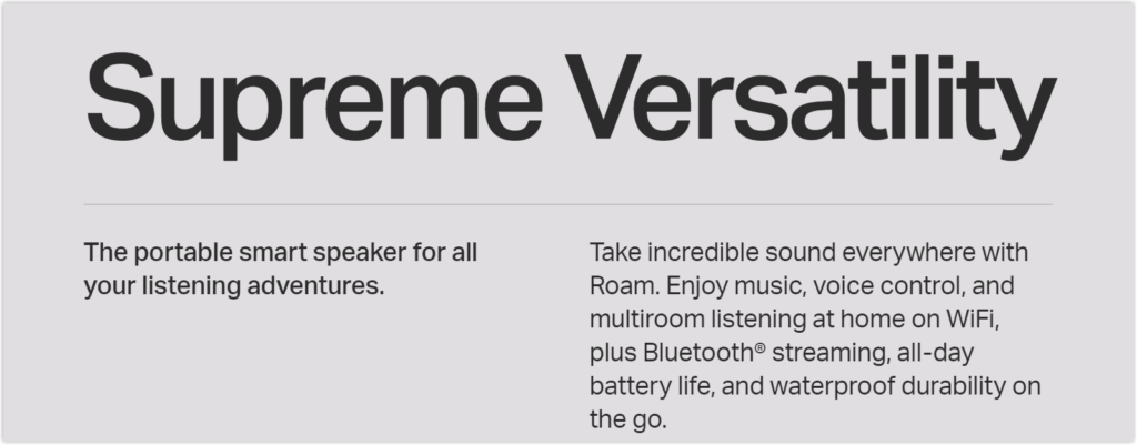
The font size has been given priority to make the content on this page easier to scan. To support its more significant value, Sonos employs larger typefaces. All other sections are in smaller letters for those who genuinely want to read through the explanation. The copy is clear and emphasizes the product’s mobility as one of its key benefits.
As you scroll further, more images will be displayed to represent its unique selling proposition, making it the most detailed product page so far. Images of the product in various settings help consumers form an impression that may affect their choice to purchase.

Takeaways:
- Use strategic fonts.
- Apply tactical images.
11. Vinomofo: Let Customers Make the Most of Your Products
As previously said, make it prominent if you offer a lower cost. A similar approach is used by Vinomofo, who compares their offer to the total retail price. They also design a sticky badge saying that the current price is 67% cheaper than usual, emphasizing that the amount visitors can save is worth considering. The business also provides customers an anticipated delivery date to establish expectations and alleviate concerns.
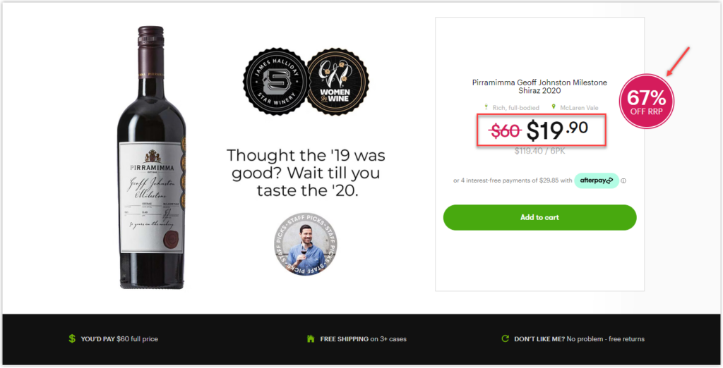
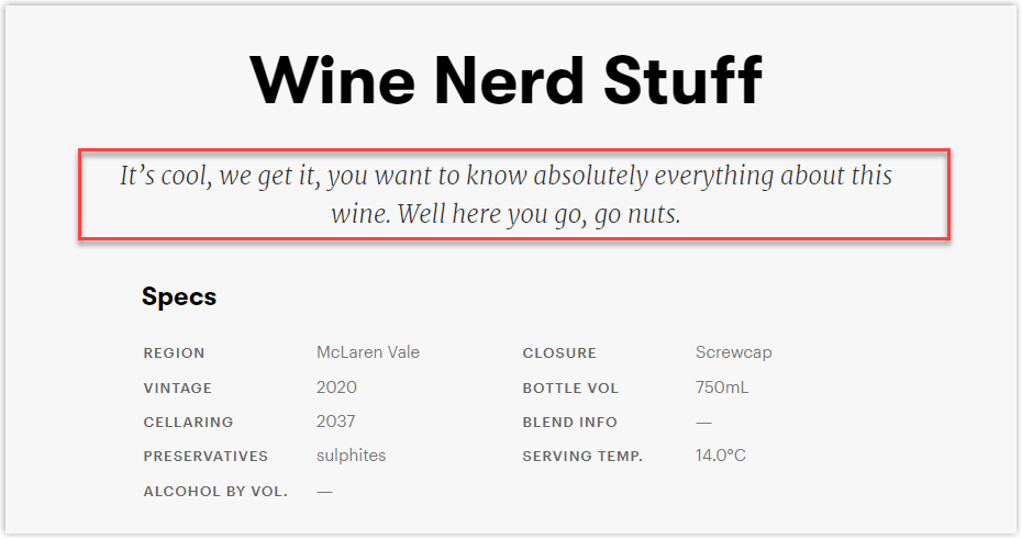
Instead of writing a typical product description, they have a unique way to capture visitors’ attention:
Takeaways:
- Compare your sale prices to the total retail prices and display how much visitors can save.
- Tell people when they can expect.
- Offer a price guarantee and free returns.
- Make suggestions about how to use your products.
12. ASOS: Help Visitors Find What They Want Quickly
One of the top online retailers in the world, ASOS, has an excellent product page design.
Many will find the product title “Neck jumper in green” valuable and detailed if they look for this item in green. As you can notice, these are keywords, and since they are keywords, they will help this site get a higher rank on Google Search pages, and their visitors will find what they want faster.
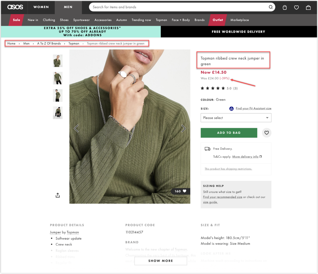
Additionally, ASOS uses breadcrumbs on all of its product pages to aid visitors in navigating different items and sections. Besides simplifying the discovery of the roadmap to the product for future site inquiries, it also makes it easier to return to a previous category. This is extremely helpful when you provide a lot of product types.
In terms of price, they compare the old and new prices, saying that visitors can save up to 39% of the original.
Takeaways:
- Remember the strategic placement of keywords.
- Ensure clean navigation via breadcrumbs.
- Show how much visitors can save if buying the item.
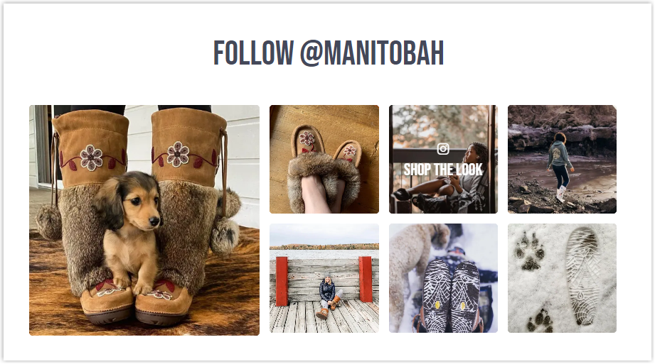
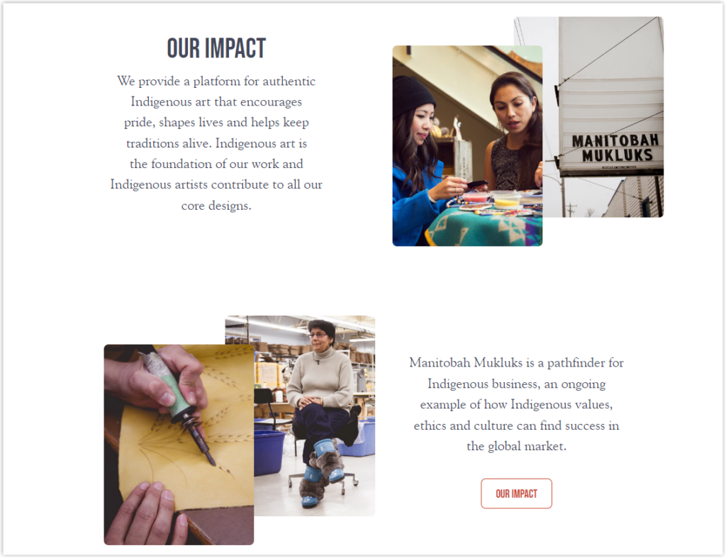
13. Manitobah: Community-Based With Authencity at Its Core
Manitobah collects testimonials via community-driven social proof instead of standard emails. They use Instagram to encourage customers to upload and tag the brand on their photos while promising to include them in Manitobah’s product page reviews. This is a way to promote to other visitors that real people have used their products.
Manitobah also promotes its products by sharing stories, another strength of this product page. The goal of the business, along with the inspiration for the boots and the story of community building, are clearly stated to strengthen the authenticity’s value proposition.
This product page is more systematic in its approach to cross-selling than other product sites. It displays relevant boots and shows them off as a set rather than randomly. This deal is highly tempting since it provides a discount on both items compared to the starting price. What the below video for better understanding:
Takeaways:
- Be creative in asking for testimonials.
- Use storytelling.
- Apply smart cross-selling strategy.
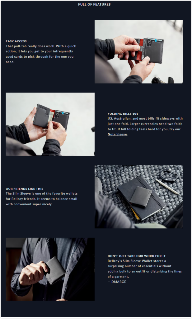
14. Bellroy: Assist Customers in Making Better Decisions
Consumers who purchase online face a lot of risks since they cannot interact with or try things as they can in physical stores. Therefore, Bellroy has devised a clever method to improve this situation. For example, based on the uses of their items, they provide customers with different choices of several sizes. Moreover, Bellroy uses a size comparison tool to help visitors better visualize and cooperate with a third party called Tangible that allows you to compare the products with other items you may already own, such as an iPhone, a key, or a credit card.
I don’t know about you, but for me, a website that pays effort into taking pictures or videos to show products’ features will always leave a better impression. And Bellroy is a prominent example, as you can see from the image below:
Takeaways:
- Guide visitors to choose the best product option.
- Using real-life examples to explain options in depth.
- Use a third-party tool to help your visitors imagine precisely what your products look like in practice.
Try FREE Magezon Page Builder!
Easily create your engaging Magento pages in any style whenever you want without relying on developers or designers, just by drag & drop.
15. Missguided: Take Advantage of the Above-the-fold
Missguided puts a lot of work into ensuring the above-the-fold converts right away on their product page. The first thing you’ll notice on this part is a clear incentive with a good deal that makes customers feel they must immediately buy the products.
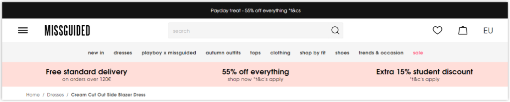
Missguided concentrates on creating a customer area to address the many consumer inquiries regarding a product; they make a specific link for each conceivable question. All of these FAQs link to articles that explain how to address these questions.
Each offered shipping option is clearly described on this product detail page, along with a breakdown of the associated costs. Thanks to this, customers can mentally compute their orders and check out with an accurate estimate.
Takeaways:
- Trigger purchase decision on above-the-fold.
- Pay attention to the customer part.
- Make rates of delivery transparent.
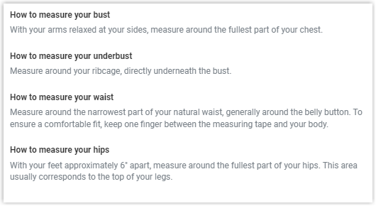
16. Forever 21: Help Visitors to Find the Best Sizes
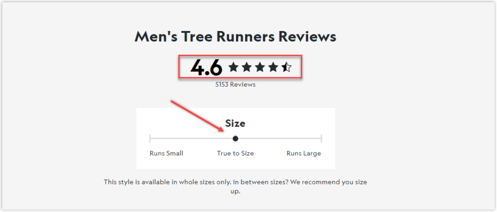
As we all know, anyone who buys things online needs to know precisely if the product will perfectly suit them, and if any page can provide a unique feature to measure and compare the sizes, it will sell more. With the Find my size and Size Guide function that Forever 21 offers, there’s no doubt that its conversion rate is high.
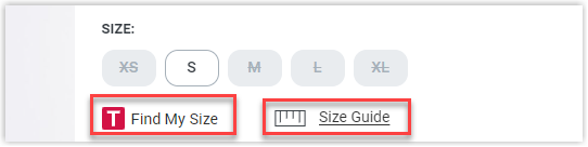
Besides offering a size table, Forever 21 also describes how to measure to get the correct numbers.
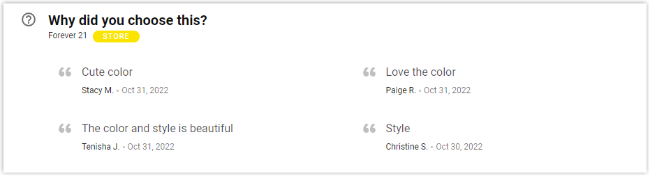
After the basic product details, you’ll notice a section with the heading Why did you choose this?. Here, customers’ quotations are shown, stating why they bought the items. It’s a straightforward approach to gathering customer testimonials for products and using them to influence future buyers.
Takeaways:
- Help your visitors to find the perfect size.
- Ask them a question about your items.
17. Nordstrom: Set up a Store-Shopping Experience
On its e-commerce website, Nordstrom offers an intelligent approach to illustrate how to be in its physical store by inserting a short video in each product. This is footage of their sales representatives discussing the items’ specialties and how they will dress them.
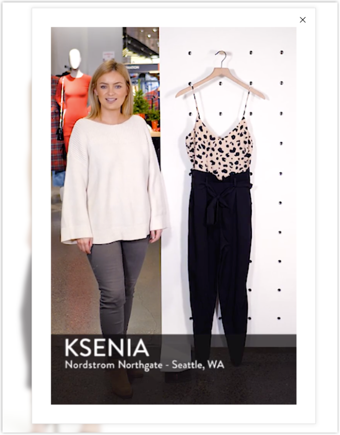
The “Looks” section is also a significant part, which can be found when you scroll down. Here, Nordstrom styles the product with different items from their store, or visitors can choose which items will fit their style by using the shuffle button to receive a new suggested appearance. This is an excellent method to gain more sales through cross-selling.
Takeaways:
- Take videos of your staff discussing the product and add them to the photos section.
- Make a Connect with Visitors campaign to give them more information about your products.
- Cross-sell by combining other things you sell.
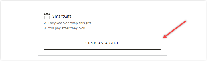
18. Pandora: Offer Gift-Wrapping Service
Let’s check one of the best product pages – Pandora – a brand that sells giftable products, to see how they make it easy for visitors to send gifts. Have you ever visited an online store for gifts and wished there would be an option that required the staff to prepare and send the gift to your beloved ones? If so, Pandora is what you’re looking for.
Pandora also uses a third-party tool to provide visitors with the Try it on function, helping to see how they look wearing the items.

Every website tries to cross-sell and gain more sales, and Pandora is no exception. However, instead of simply stating Shop the look or You may also like, it uses a wiser method, combining social proof. This is an excellent way to increase users’ trust and encourage them to buy more.
Takeaways:
- Apply a third-party tool to help visitors imagine precisely the items in practice.
- Offer to wrap if users want to send your products as gifts.
- Combine cross-sell with social proof.
19. Tangle Teezer: Increase Sales Using Customer Guides
Not many eCommerce shops can pull this off, but Tangle Teezer did an excellent job integrating videos demonstrating how to use the product in real-time.
Because it requires lots of persuasion before purchasing, it reaffirms your desire for the item before the checkout process starts. To make it more convincing, these videos, which are sharp, clear, engaging, and educational, show the product utilized by a target audience.
Tangle Teezer highlights value propositions using icons because they are easier to scan and understand than lengthy, exhausting text.
Takeaways:
- Use videos to highlight your product’s advantage.
- Use icons to show the value proposition.
20. Birkenstock: Use Visuals Smartly to Emphasize Value
Because they understand how insecure visitors may feel when shopping online, there will be different images with super clear details for each product variant. The item will change when clicking on a particular color to help users easily imagine and compare. On the other hand, the images are of high quality, as when you look at their photos, you can even “feel” the material.
To help visitors gain more knowledge about the products instead of simply writing about the value propositions, Birkenstock creates a more creative method, combining detailed images with short texts in a slider. Watch the video below for a better understanding.
In terms of social proof, this brand decides not to simply add reviews to its product page. Birkenstock uses user-generated content or images taken by its actual customers. This is an excellent way to enhance visitors’ trust and encourage customers to take photos while using the items and tag the brand to appear on its pages.
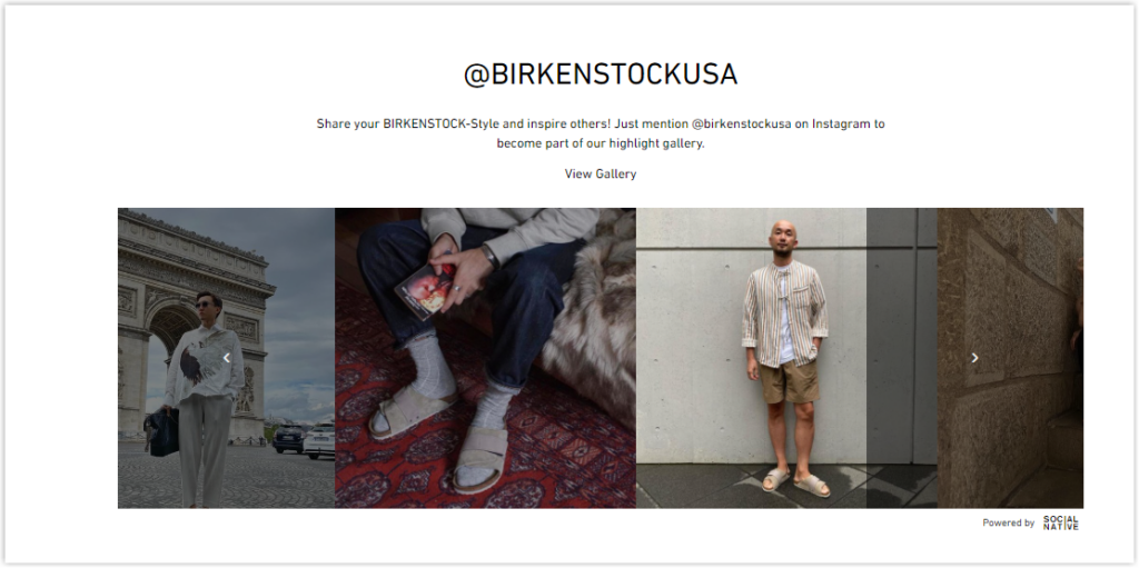
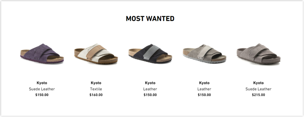
You must be familiar with Related items, or You may also like sections on many other product pages. This time, let Birkenstock spice things up a little bit with its Most Wanted section to increase cross-selling. Nobody wants to be left out, and this phrase did an excellent job of creating FOMO and evoking user curiosity.
Takeaways:
- Take photos of all of your products’ variants.
- Be creative and thoughtful in providing value propositions.
- Create FOMO and evoke curiosity to increase cross-selling.
21. Nudie Jeans: An Immersive Description of a Product With VR
When users click on the plus icons, the details description will appear. For instance, you know that the jeans’ bottom has a tight leg opening and an ankle-hugging design. A rotate option provides a 360-degree perspective of how the item looks on a natural person.
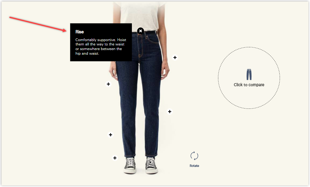
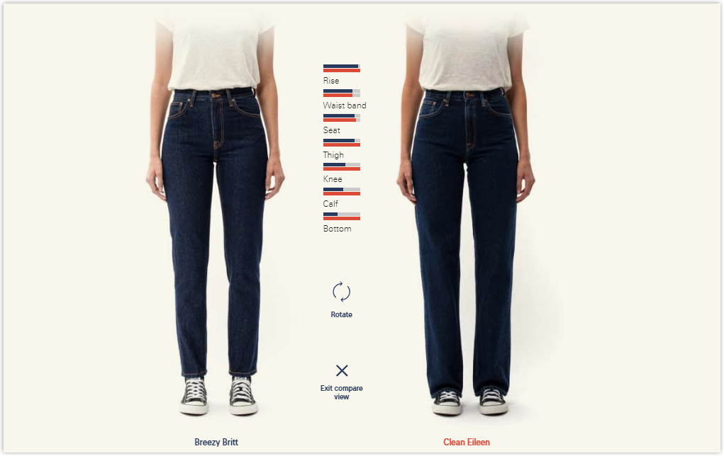
Visitors can also compare the current ones with other pairs of jeans by clicking the “compare” button. As a result, you, as a consumer, experience a retail changing room.
Takeaways:
- Use 3D description.
- Allow visitors to compare different styles.
22. Everland: Building Customer Trust in a Smart Way
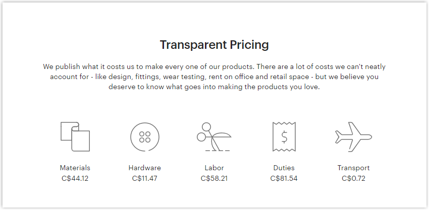
The unique thing about this product page is that instead of putting shipping or return policies in the description next to the product image, Everland has inserted them in the middle. This is a thoughtful approach because when referring to any product, most users look closely at the picture and do not read the description, leading to many problems later.
Another impressive thing about Everland is how it publishes the cost to complete an order for a product.
Takeaways:
- Be thoughtful in providing information.
- Be honest in publishing the costs.
Try FREE Magezon Page Builder!
Easily create your engaging Magento pages in any style whenever you want without relying on developers or designers, just by drag & drop.
23. Cult Beauty: The Right Way to Show Prices and Bundle Products
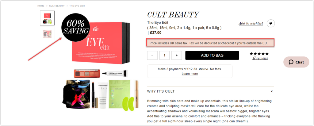
Cult Beauty provides a 60% limited discount on a selection of goods on this page to create a sense of urgency and FOMO. As a result, old stock can be sold out, customer lifetime value can be raised, and customer loyalty can be improved.
It also knows that the prices on this page could confuse the typical buyer as they include UK taxes. However, it makes it explicit in a disclaimer that they will be subtracted at the checkout page for non-UK transactions. It’s difficult to overlook this disclaimer since it’s marked in red.
Takeaways:
- Make discount prominent.
- Show transparent pricing.
24. Réard: Using a Simple Design to Convert
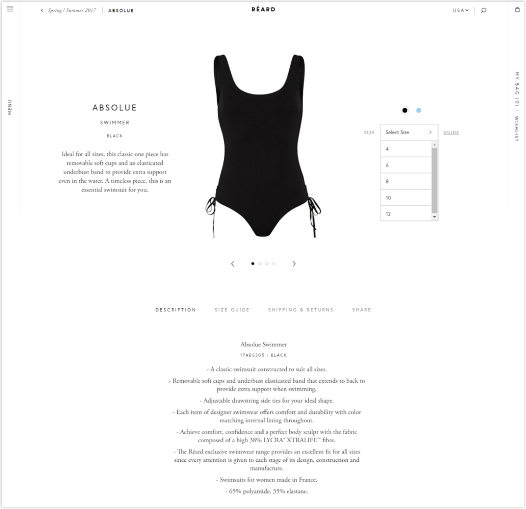
The product page of Réard is simple yet effective, with enough white space and no unnecessary clutter. The description is delivered in bullet points and a monochrome color style. Additionally, an interactive design describes the product and provides information about size and delivery using dropdowns and sections. All were created to get rid of endless scrolling.
There are two primary colors for the Réard bathing suit, and this product page clearly illustrates both variants for prospects. Visitors can also see the swimwear’s front and back views. With phrases like “timeless” and “perfect for all sizes,” it successfully explains the advantages of purchasing this swimwear, dispelling shoppers’ concerns regarding its longevity.
Takeaways:
- Use minimalist design.
- Provide a simple in-store experience.
25. MAC Cosmetics: Getting More Sales by Giveaway
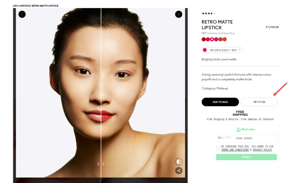
Besides having a clean and direct product page, MAC shows how thoughtful it is when providing a Try it on section. Visitors can upload their own photos or choose the most identical models to see how the items look in real life.
At the checkout page, just below the CTA button, MAC provides a free sample to customers as an excellent incentive to move them along the sales funnel. They also offer free shipping and returns and emphasize the number of people who have purchased these products. This encourages prospects to buy other things within this restricted time frame. And if there’s one thing eCommerce customers appreciate, it’s the ability to return a product inside the guarantee term.
Takeaways:
- Use unique design.
- Allow visitors to imagine the actual products.
- Employ psychological triggers.
26. The Ordinary: Where the Customer Sells for You
The Ordinary’s excellent and reasonably priced line of natural products has made it a cult favorite among online skincare users. The company has always prioritized the community’s needs, using influencers and regular people as spokesmen. That has incredibly worked in their favor, generating free viral influencer marketing! This community-first approach is reflected on their product page, which includes a specific testimonial section for social proof.
The Ordinary is aware that every consumer has a different need for skincare. Therefore, reviewers are categorized according to skin type, tone, age, and skin issues. In addition, it assists prospects in locating the precise evaluation. Customers may also assess whether or not the review was helpful and see the review date.
To avoid having to scroll down the page to see product information, The Ordinary’s product page employs a navigation panel. So, a click will take you to the product part you wish to read about. This adopts a novel strategy that vastly enhances user experience. Because the product overview is organized using symbols and bullet points, it is simple to read and understand.
Takeaways:
- Consider having your community do the job on the detailed review page. Reviews may be persuasive, and it’s a good marketing tactic to experiment with on your product page.
- Use a navigation panel that is easy to understand.
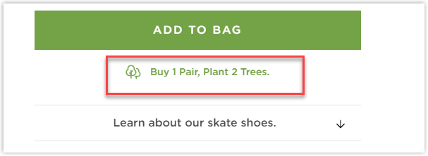
27. Cariuma: Cause Marketing Driven
Cariuma uses its product to create a community by telling potential how they can support the environment by purchasing a pair of shoes. As a result, two trees are planted for every transaction, and our earth is saved. Through this copy, they gently convey one of their brand principles, sustainability. Additionally, it’s a terrific technique to entice prospects to feel at ease enough to buy other shoes.
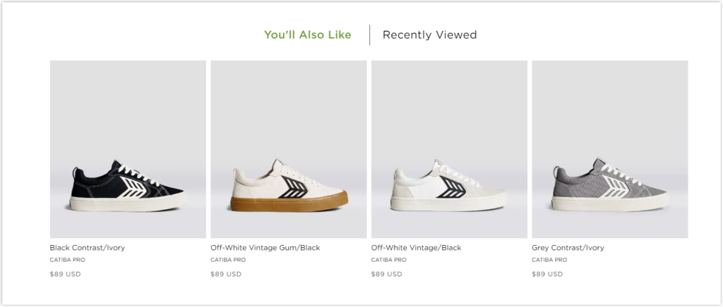
Since this is a limited-edition item that often runs out of supply, Cariuma incorporates several items under this category to make it easier for buyers to locate alternatives. In addition, there are several varieties since these items are divided into categories depending on gender and material.
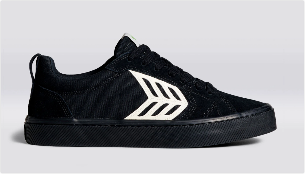
This product page offers a variety of photos for all available color options and a video with a model who rotates 360 degrees to demonstrate how the product appears in real-time.
Takeaways:
- Promote community benefit if buying the products.
- Use integrated product categories.
- Take advantage of images and visual appeal.
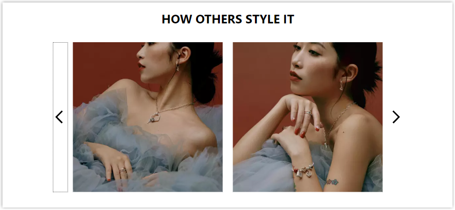
28. Hermes: Increasing Conversions Via Exclusivity
As a premium brand, Hermes pitches its product via exclusivity and product storytelling.
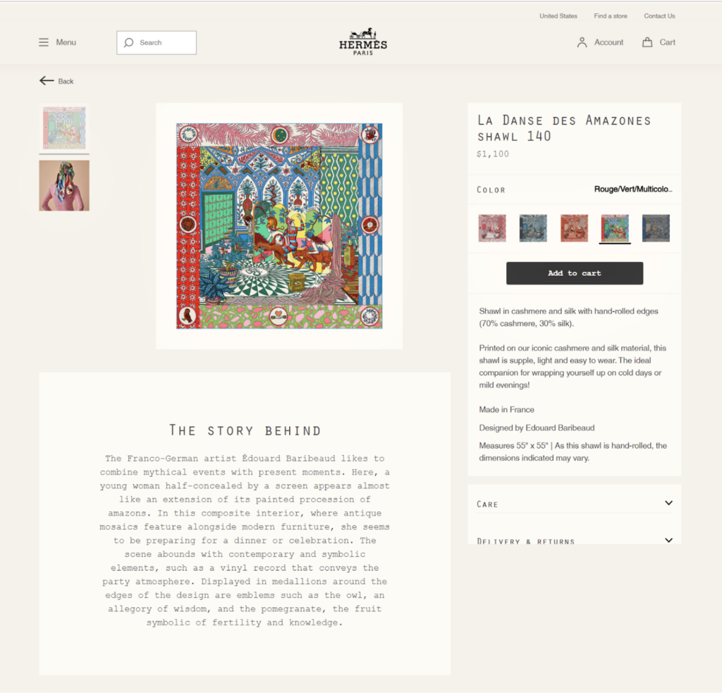
Takeaways:
- Product storytelling: Hermes uses storytelling to educate potential buyers about the history of its product. The product description includes phrases like “ideal companion” to demonstrate that proceeding with this purchase will provide lasting value.
- Hermes communicates exclusivity using luxurious items such as 70% cashmere and 30% silk. There would also be “hand-rolled edges.” These descriptive components aid in the justification of high price points. As a result, it’s a terrific product page to model when building sites for high-end things.
Conclusion
Product pages are the core of an e-commerce website. You can turn more visitors into clients and raise your sales income with minor changes. Feel free to take inspiration from the examples above and use some of these methods in your online business.
If you are a Magento merchant and don’t know which extension to build your website, consider Page Builder from Magezon. As a trusted Adobe partner, we have satisfied thousands of customers with a vast collection of drag-and-drop extensions, helping you create a high-converting and unique store in minutes.
Don’t take my words for granted; see how your website can be with Magezon Page Builder and what others say about us:


