 Magezon Blog Help Merchants Build Comprehensive eCommerce Websites

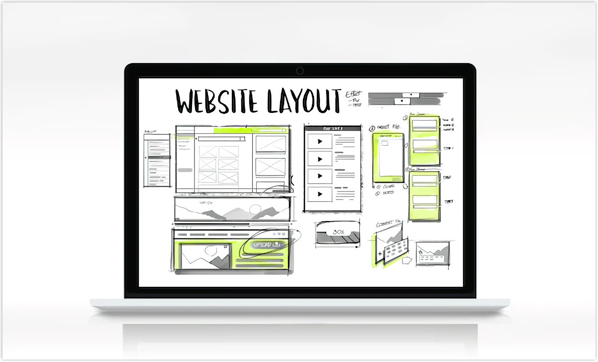
Having great website layout ideas is essential because designing a web page doesn’t only mean making it visually beautiful but also putting all the imagery, fonts, and colors in a practical, intuitive, and efficient way.
A good website layout helps attract customers’ attention and allows them to find the information they need on your page quickly. It’s like a skeleton that provides content hierarchy and straightforward navigation.
Check out our list of website design layout ideas below to make your site appealing and encourage users to take desired actions.
Table of contents
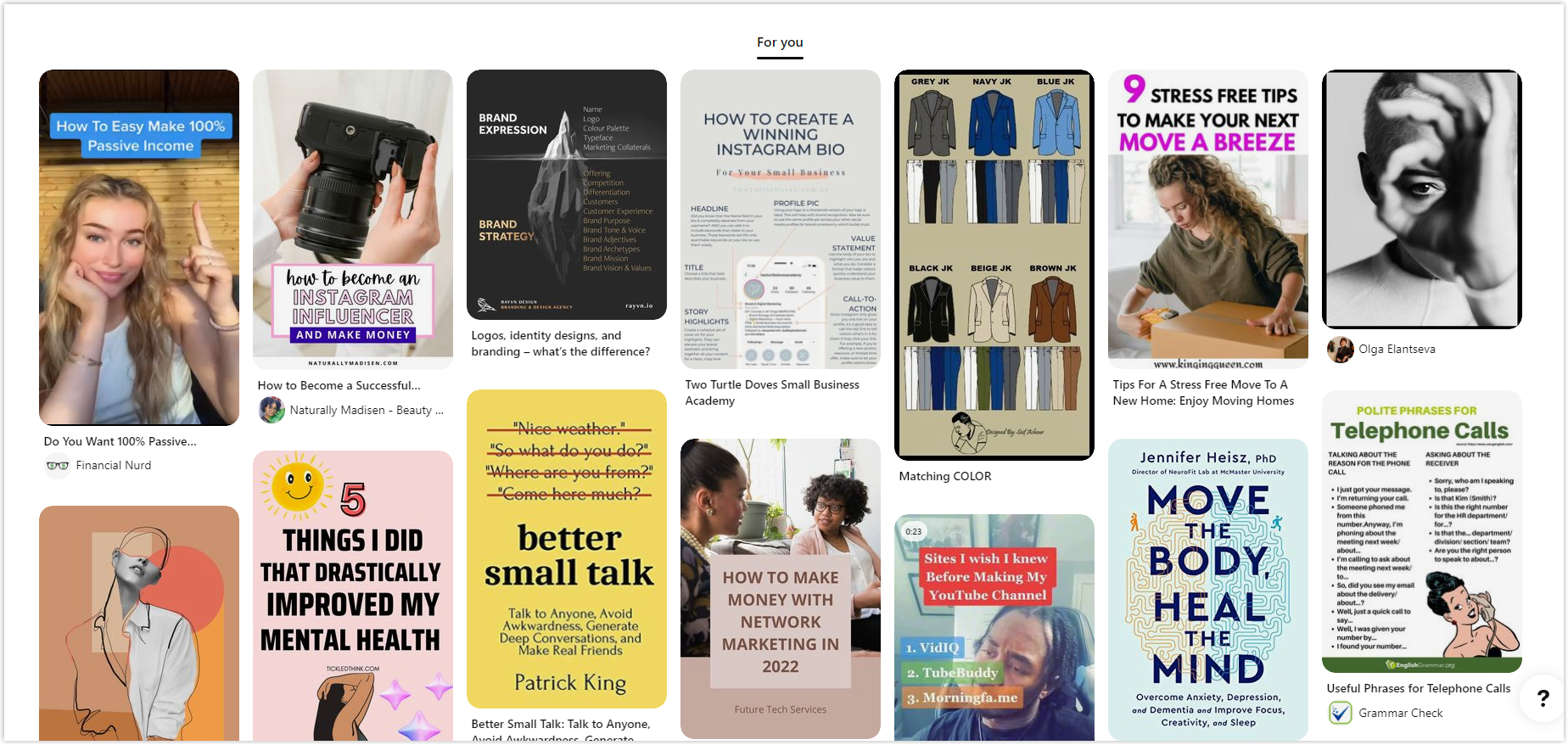
11 Most Common Website Layout Ideas to Convert More
1. Z Pattern
The first candidate in our list of website layout ideas is the Z pattern formed based on natural eye movements. When reading, our eyes follow zig-zag patterns, starting from the upper left-hand corner, following the Z shape, and ending at the bottom right corner.
Tracing this eye route, this layout places the critical information/ elements on eye-stopping points. For example, the logo will be in the top left corner, then the navigation menu with a call-to-action in the rightmost corner.
As viewers move their eyes along horizontal and diagonal lines, captivating visuals (such as video) and a concise line of text about the site are utilized to grab their attention. You can continue this alternating pattern as much as you want to engage visitors and make them scroll to the end.
The bottom of the layout should lead customers to action (book a service, register for a course, buy a product, subscribe, etc.). It’s usually a good website layout for highly visual pages or landing pages with a particular conversion purpose.
2. F Pattern Layout
F pattern is another popular choice among web page layouts. This pure classic model, similar to the Z pattern, also follows the quick scan of human eyes while reading.
It’s suitable for data-heavy websites which require lots of skimming skills. For example, you can use it for your blog’s home and individual blog post pages. The tip is to put the most essential information and valuable elements first, as the top horizontal part attracts most users’ attention. Since people tend to stay longer at the top of your page, you can place a headline, subtitle, featured image, and anchor text to navigate visitors to targeted relevant parts.
Next, invest in the vertical line on the left of your page, as customers are likely to notice that area more. Icons, imagery, numbering, or bullet points are some suggestions to maximize the usage of the F-pattern layout.
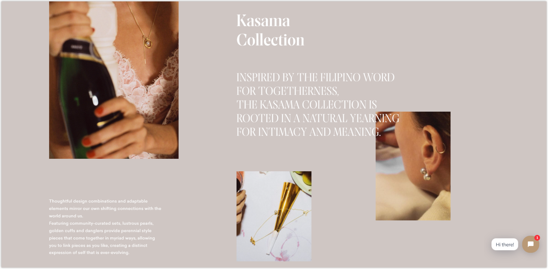
3. Split Screen Layout
You shouldn’t miss trying out the split screen when looking for eye-catching website layout ideas. Vertically separating the screen into two halves with two-tone background and perfect symmetrical balance creates a good sense of aesthetics.
For example, you can use visual aid on the left combined with texts on the half right of the screen. This template design allows you to express two different or the same ideas from two aspects.
Furthermore, it’s a super effective option compared to different website layouts when you want to give your customers two choices, such as “For Him” and “For Her,” “Men’s,” and “Women’s.” You can consider this candidate among eCommerce website layout ideas to achieve two goals without asking users to scroll down or go to another page.
The trick to making the split layout even more appealing is to let every two halves function differently. Avène uses parallax scrolling on just one side to keep them engaged on-site.
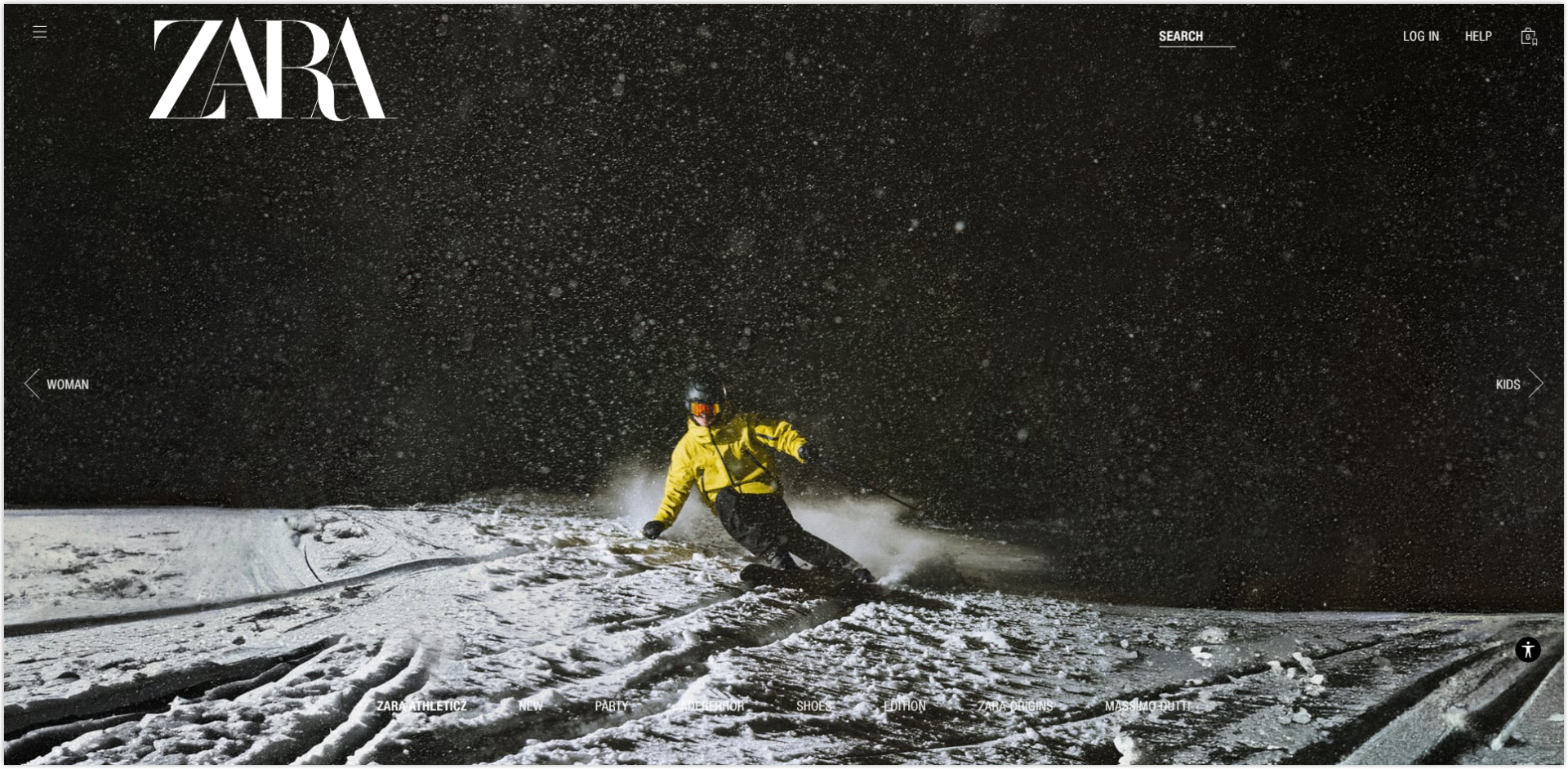
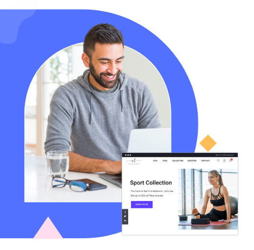
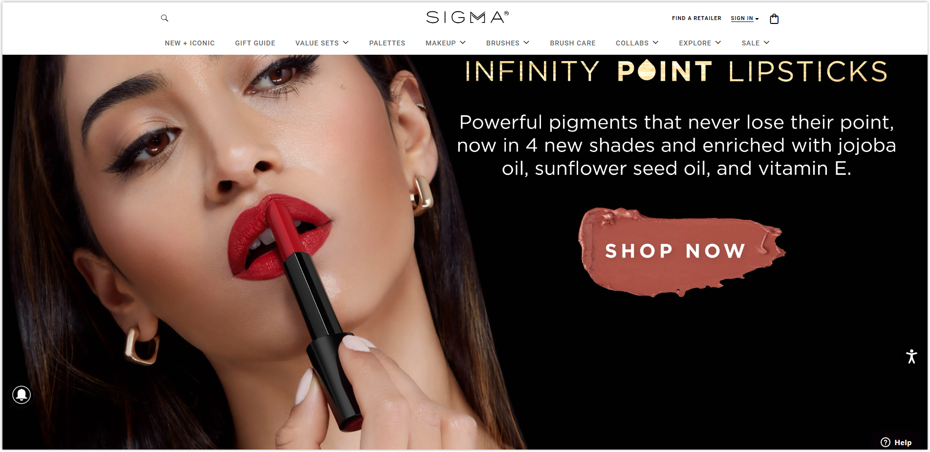
4. Fullscreen Image Layout
Do you know high-quality images can create cool website layouts? That’s what we call a fullscreen image layout. It’s one website layout idea that works well on mobile devices. Placing a large, high-resolution visual (photo or video) in the front and center of your page immediately grabs clients’ attention and immerses them in your content.
Choose a fullscreen image that best represents your products or service. Remember to add short text, such as slogans, to impress customers about your brand.
Along with it are the navigation features and call-to-action overlaid on the photo background. So, if you’re still struggling with webpage layouts, the fullscreen image option is an excellent way to highlight your product or service. For example, a picture of aromatic hot espresso can be ideal for your coffee shop website.
5. Single Column Layout
A single column is the most simple and straightforward website layout design example. The text is presented in one vertical column, causing almost no difficulty in use for users.
Once they get to this kind of website, most viewers immediately know how to function by scrolling down for more details. It’s more suitable for text-heavy sites than other types of website layouts.
Since there is a lot of text data, you should add headers, sub-headers, line breaks, and imagery to let readers not be overwhelmed by text. Remember to utilize the “Back to Top” button and a fixed menu to create convenience for users.
Try FREE Magezon Page Builder!
Easily create your engaging Magento pages in any style whenever you want without relying on developers or designers, just by drag & drop.
6. Asymmetrical Layout
One of the ways to have excellent website layout ideas is to split the screen asymmetrically. This division makes viewers feel the visual movement of objects unequal in size and weight.
So, you should decide which element you want to drive customer engagement (photo of your product, subscribe action, etc.). Then, you distribute the parts with different colors, scales, and widths to intentionally let users focus on the most special one. Giving the highlighted detail bold and making it bigger or brighter are how you can turn it into a focal point.
Suppose you launch a business website or design agency portfolio. In that case, the asymmetrical layout can be one of the best web page layout ideas as it obtains an innovative look attracting customers.
7. Box-Based Layout
The next option on our list of website layout ideas is box-based or grid-based. You divide your web page into geometric shapes and fill them in with some content. Each shape/ box contains information, and users can click on it to view more details on other web pages.
The first large box (or featured box) on top of your site should be your page’s title, brief introduction, and navigation bar. You can add relevant pictures in other smaller boxes to build your brand identity.
We can find many box-based web design layout examples. Their layout still follows some rules and concepts of grids, but at the same time, they show their creativity. Their boxes vary in size; some overlap others, giving the page a modern look. This unified type also fits the graphic design portfolio as it can link each box to different project pages to introduce it to the clients.
8. Cards Layout
Like box-based, the card layout is built based on various boxes. Each of them delivers a piece of content.
This model is sometimes considered non-hierarchy as all items are equal, and none stand out from others. When you apply the card layout with identical features (font, size, etc.), importing content to each card is straightforward.
This design suits all screen sizes and improves users’ experience by allowing readers to approach different browsers easily among the large amount of data provided. A vlog or online store are two content-rich websites that can implement the card’s layout efficiently.
9. Horizontal Strips Layout
One of the most creative website layout ideas is the horizontal strips, where the long scroll turns into full-width strips. Each strip is a (near) full-screen fold that contains different content.
Color scheme, content types, etc., define the difference between horizontal strips. You also can combine some effects, such as parallax scrolling, to surprise users every time they scroll. If you have one-page websites where customers should scroll long, this layout is worth trying.
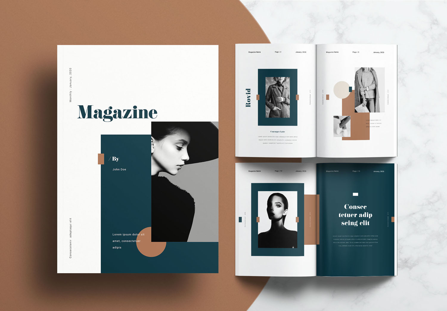
10. Magazine Layout
As its name states, this layout is based on a multi-column grid, as you usually see in magazines or newspapers. You can modify each column according to your preference and the complex visual hierarchy.
You should pay attention to the size of the elements, placement (put larger images and headlines on top), and amount of details involved. Adding pictures to the layout can make viewers more focused and less tired when looking at the plain text.
Another option is to combine it with different website layouts, such as the F pattern. This combination helps readers digest information better in logical and uncluttered design. Implement this magazine layout if you have blogs, news publications, or other content-heavy pages.
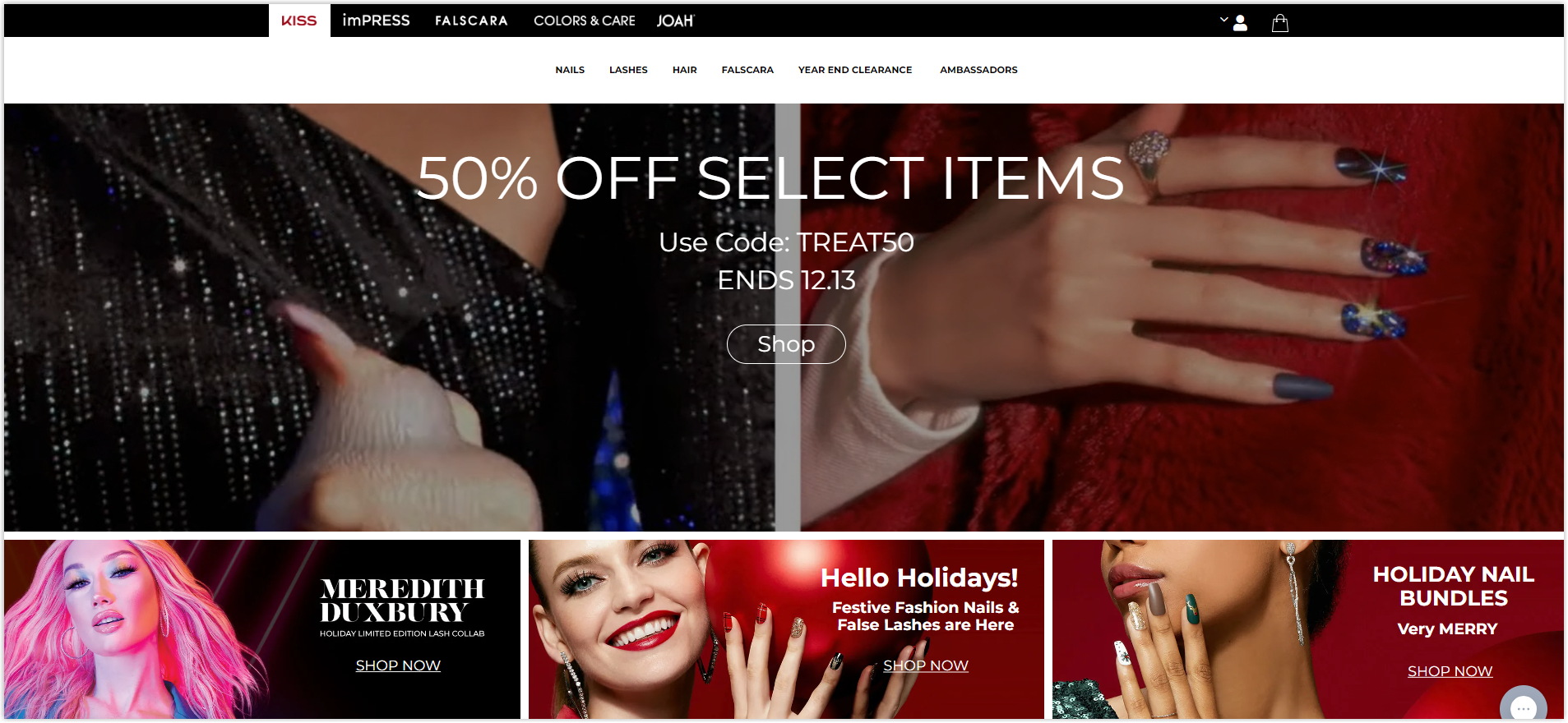
11. Hero Layout
One of the best web layouts is the Hero Layout. It’s similar to the full-image background, yet with a few changes. Your homepage’s banner photo above the fold is the hero or the main character. With this layout, you usually see the navigation above the image, text, and icons below.
People use this layout to promote a product or service, but it can be suitable for many other business models. The visual photo impresses users, so choose the high-resolution one and try some tips to improve your product image.
How to Choose the Right Layout for Your Website
While searching for your web page layout ideas, consider the two factors below to achieve your business’s ultimate purpose.
1. Website Pages Layout Should Be Appropriate to Your Content
There are thousands of web layouts, but not all of them fit your business. The template you choose should be able to tell your story and deliver your message to your clients logically and efficiently. Since website layouts are not the same, some may work perfectly with your content, while others may not.
For example, a magazine layout is not likely an ideal choice if you want to showcase your products. Instead of that, you may need to look for a card layout.
Look at others of the exact niche for reference, test your selected template to ensure its elements are organized to attract customers, and navigate them according to your goal.
2. Use Common Types of Website Design Layout
The most common and classic ones are highly recommended to use because of some reasons. They’re all built based on the principle of design, and the most important thing is they get ideas from users’ past experiences and existing expectations. It means users tend to feel easy to use with these well-known and tested cool website layouts.
Thus, the familiar, simple website layout ideas can create a more intuitive and friendly interface, enhancing the message and usability. However, the 11 website layout ideas above are not fixed, and combining them to create a unique layout is possible.
Wrapping Up
It doesn’t matter what business you have on the internet; having a proper layout is crucial to building a beautiful and communicative website. The more intuitive your website interface is, the longer your users stay. So, keep this in mind.
Hope this article partly helps you to build your unique and high-converting website. If you have any ideas, leave them in the comment section, and don’t forget to expect more qualified articles to optimize your UX UI.
If you are a Magento merchant and don’t know which extension to build your website, consider Page Builder from Magezon. As a trusted Adobe partner, we have satisfied thousands of customers with a vast collection of drag-and-drop extensions, helping you create a high-converting and unique store in minutes.
Don’t take my words for granted; see how your website can be with Magezon Page Builder and what others say about us:


