 Magezon Blog Help Merchants Build Comprehensive eCommerce Websites

Last time, we discussed the top 25 Magento clothing stores with a profound analysis of color, layout, typography, etc. In today’s article, to continue our series of discovering outstanding websites in different industries, we’ll get to know the 15 best Magento beauty stores we’ve compiled right below.
Each website will provide a different lesson, so read till the end to get all the knowledge you need to optimize yours. We’ll also divide them into segments for easier understanding. Let’s begin with makeup stores.
Table of contents
Magento Makeup Stores
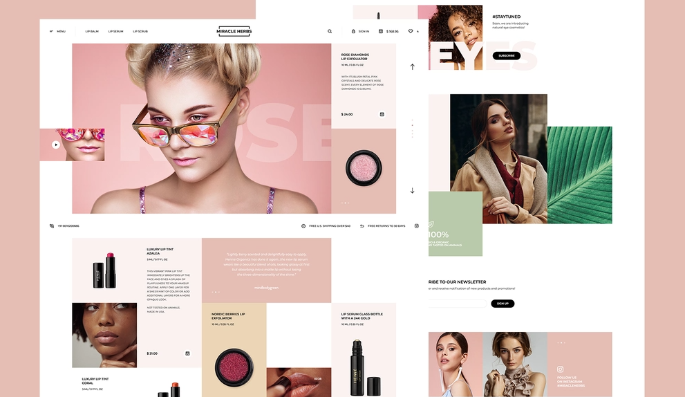
1. Kiss
Rate: 8/10
Color
Kiss uses white, black, and gray, a standard set of neutral colors on numerous websites for different sections to create contrast and help typography, images, and other visual elements stand out.
→ Don’t like them? Discover more color schemes: 40+ Amazing Color Schemes for Websites That Engage Users
Layout
The homepage is the familiar hierarchy grid you can see on almost every website since it’s the most suitable to emphasize particular parts. White space is not overused and is enough to create a connection and distinction. Instead of only displaying new collections or best sellers on the main page, this Magento beauty store created a dedicated section for different brand categories in a modular grid. This may seem creative, but I don’t like it much. It’s too big for the rest, and it makes me overwhelmed. Placing these categories on a smaller slider or grid can be better.
You can also see the modular grid on the product listing page with the centered items to help visitors navigate easily. I like how they arrange bigger negative space among rows than among columns for users to focus on only 4 products simultaneously.
Kiss also makes its product page look simple and effective with the slightest details. Overall, the layout keeps users longer because they can find what they need easily and quickly. You only need to scroll three times to get all the necessary information; they’re not hidden anywhere.
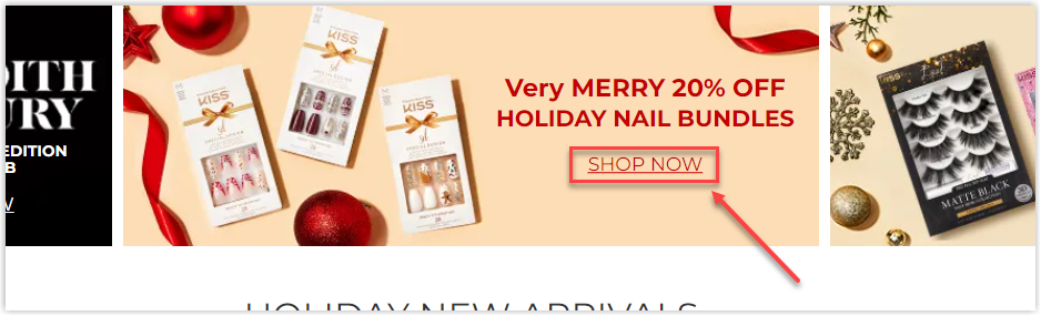
CTA
To be honest, this is the Magento cosmetic store that uses the most button styles. On the homepage, two significant types are rectangles and hyperlinked text.
Red rectangles are on the hero banner, black on the holiday new arrivals section, and rounded corners white on a giant image. They will change color on hover and are prominent enough for visitors.
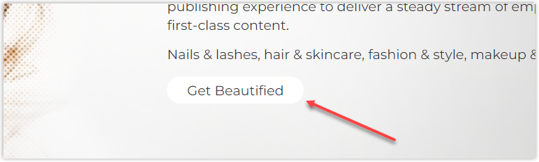
If you plan to use only text, remember to underline them, so your users will know there’s a link to click on, like how Kiss designs its CTAs.
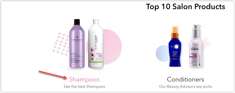
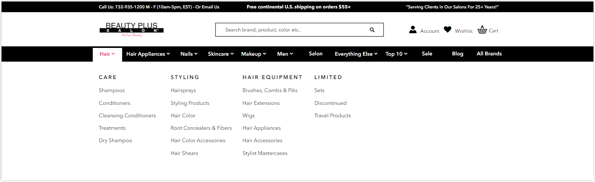
Navigation Bar
This Magento beauty store also uses the sticky navbar to display its most prominent menus, making navigation easier. Each section includes, at most, two levels, keeping the search process simple and effective.
Images
They all have high quality and are highlighted. Product images are uniform with a gray background for more straightforward navigation. All angles are provided, and you can easily zoom in and out to see every detail.
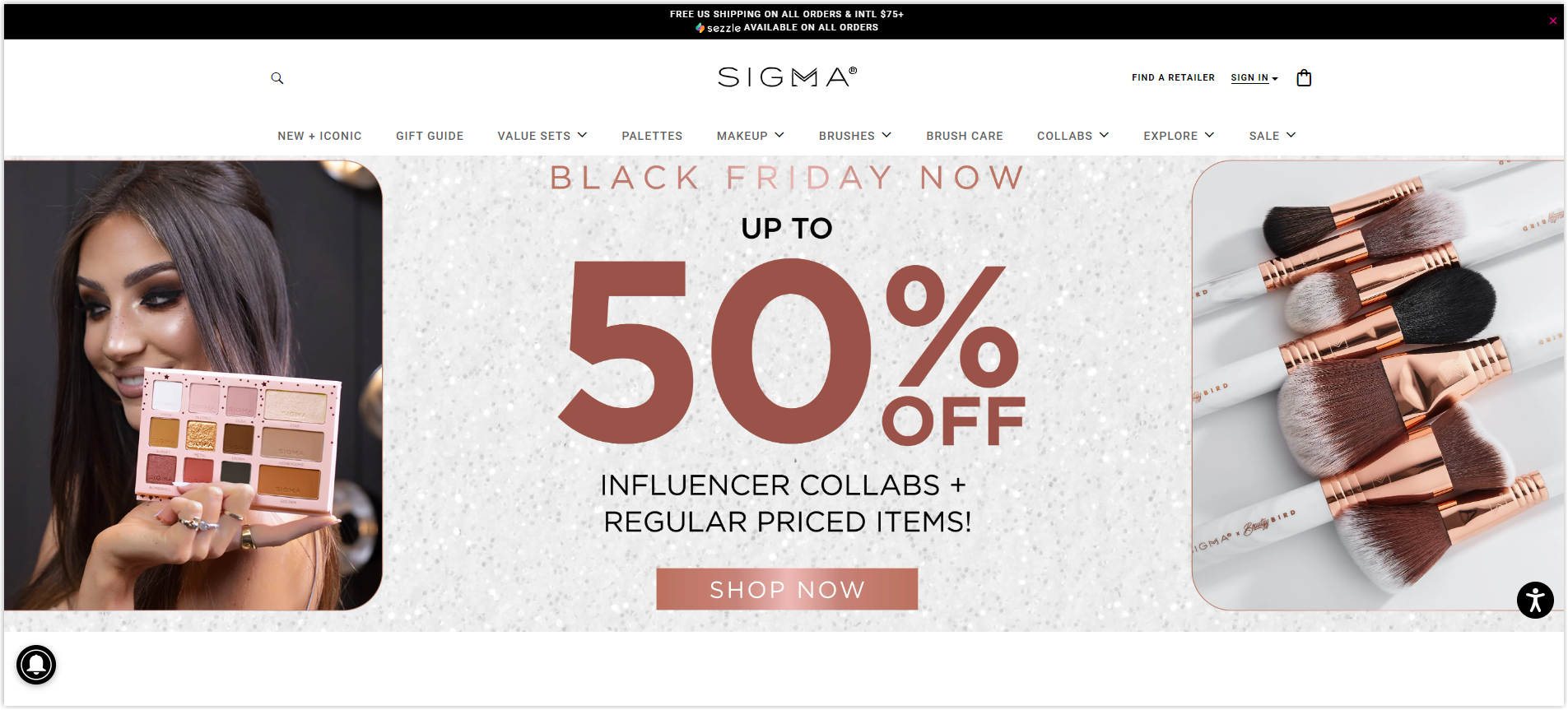
2. Sigma Beauty
Rate: 8/10
Color
As I said before, the best color combination for web design is black, white, and gray, as they are enough to contrast without making your site “too much.” That’s also what Sigma Beauty thinks when choosing its website’s color scheme.
Layout
Sections on the homepage are arranged on the familiar hierarchy grid with adequate white space. Thanks to this, the website can easily highlight important parts, such as sales or new arrivals. The hero banner is made to focus on the Black Friday sale campaign.
I like the product listing page and the reviews’ summary, and other categories under each item for more straightforward navigation. Its filter includes everything visitors need when looking for their desired products. For some specific items like a best seller, there’s also a tag as a persuasion trigger to encourage clicking and buying.
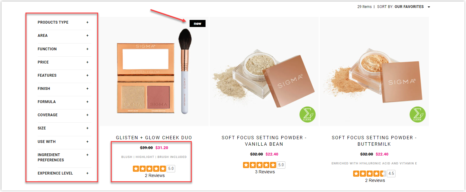
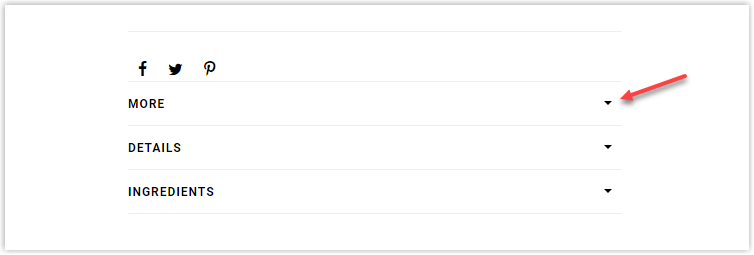
There will be more things to say about Sigma Beauty’s product page. It uses drop-down menus to save place for ingredients and other specifications, which is a good point.
However, I don’t like how they arrange information below the product’s name. They are somehow unreasonable and uneasy for the eyes.
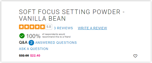
Letters (5.0, 3 Reviews, Write a review) in number 1 aren’t appropriately aligned; they should be placed vertically centered within the two red lines. On number 2, the small circle in blue makes the letters look like they have different sizes, and the page seem cluttered. The Ask a Question should be on the same line as Answered questions.
On the other hand, the reviews section was set into a full-width layout, leaving ample space in the middle of the screen, which is unnecessary and annoying for visitors since they will be lost at first and don’t know where to look.
Typography
There’s only one typeface used to create consistency and uniformity. It is also a sans-serif font, which is easy to read and scan. However, on the homepage, the Trending section with the text below each image is not appealing and neat enough. The text should be evenly aligned on both sides, and the bodies should be smaller to make the titles more prominent.
The same problem happens with the part below.
CTA
All the buttons are rectangles with simple and direct copies. Thanks to the logical arrangement of surrounding elements, Sigma Beauty successfully makes the CTAs prominent enough and encourages visitors to click.
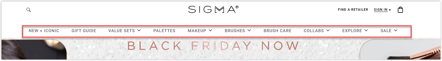
Navigation Bar
This Magento beauty store doesn’t try to make its navbar stunning or appealing. It just wants to ensure navigation throughout the website is as easy as possible by making it sticky and including necessary menus. However, the brand has not successfully created an effective navbar by adding too many sections. Their 10 menus make it difficult for users to follow and indicate what they want.
Images
Sigma Beauty really put effort into taking and editing its images throughout the website. They are of high quality and successfully highlight the products. Some photos even make it possible for visitors to feel the material.
3. Temptu
Rate: 9/10
Color
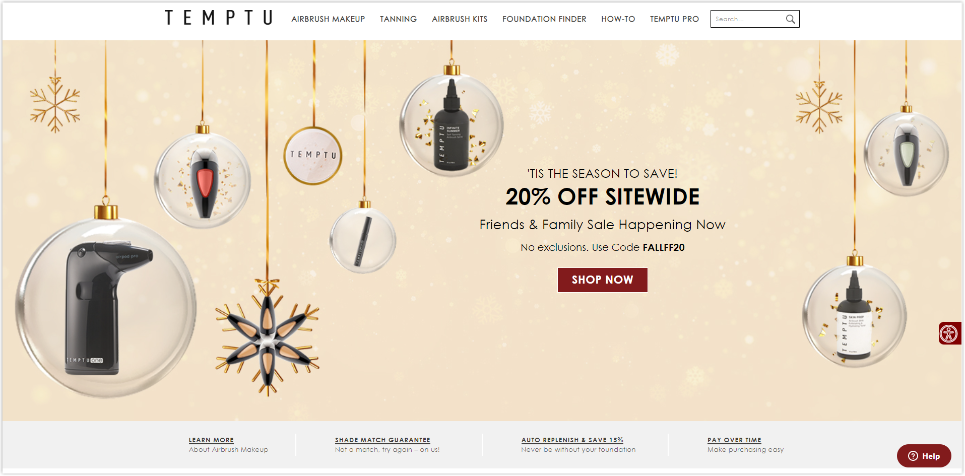
This Magento makeup store uses four colors for its website: white for the background, black for letters, grey for additional information, and red for CTAs or highlighted sections.
Layout
The homepage is arranged in a collapse layout and displays different sections based on their importance. I like how everything is aligned in the center to help visitors to focus easier. The negative space is used ideally to make the page look harmonious and balanced. It also successfully guides users through each section without distraction.
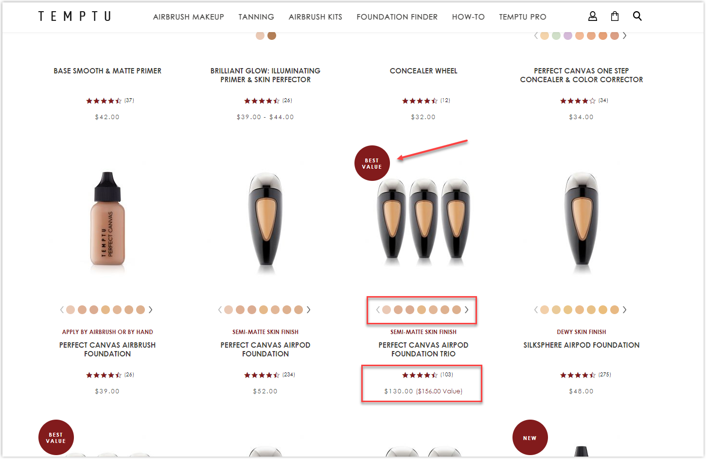
The modular grid is also used for the product listing page. It also displays all options for each item along with the average rating stars and total votes to encourage visitors to click and save time researching. There’s even a tiny tag in red to show which item is a best seller, best value, or new arrival.
Temptu’s product page is a good example compared to Sigma Beauty’s. Let’s not talk too much about the images section on the left and look at the information side. Everything is accurately aligned, making it easier for the eyes and quicker for visitors to find what they need.
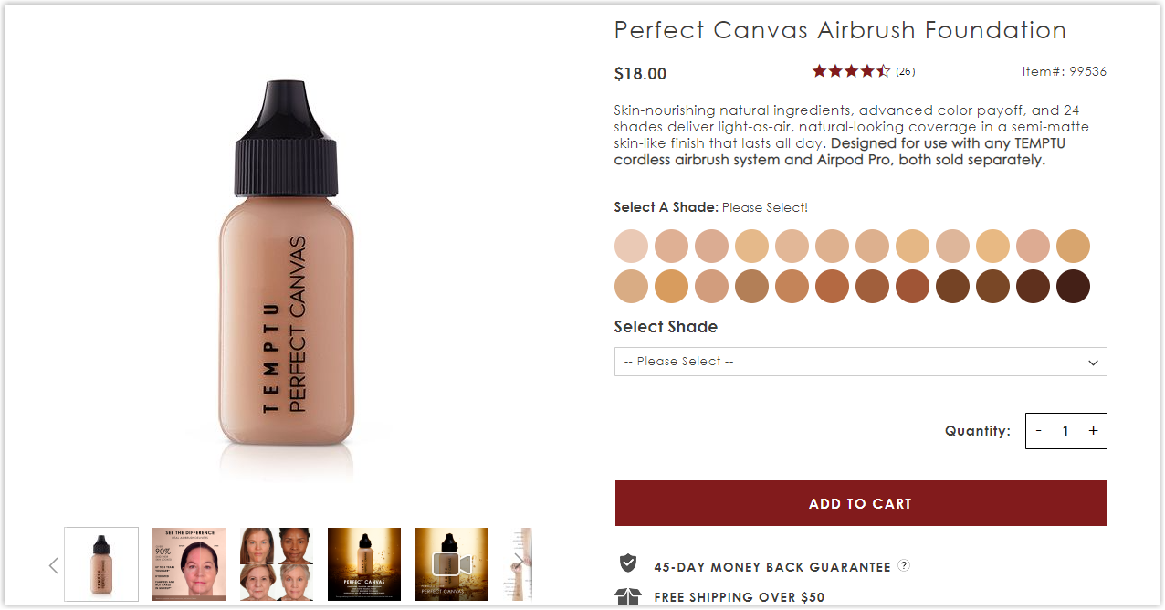
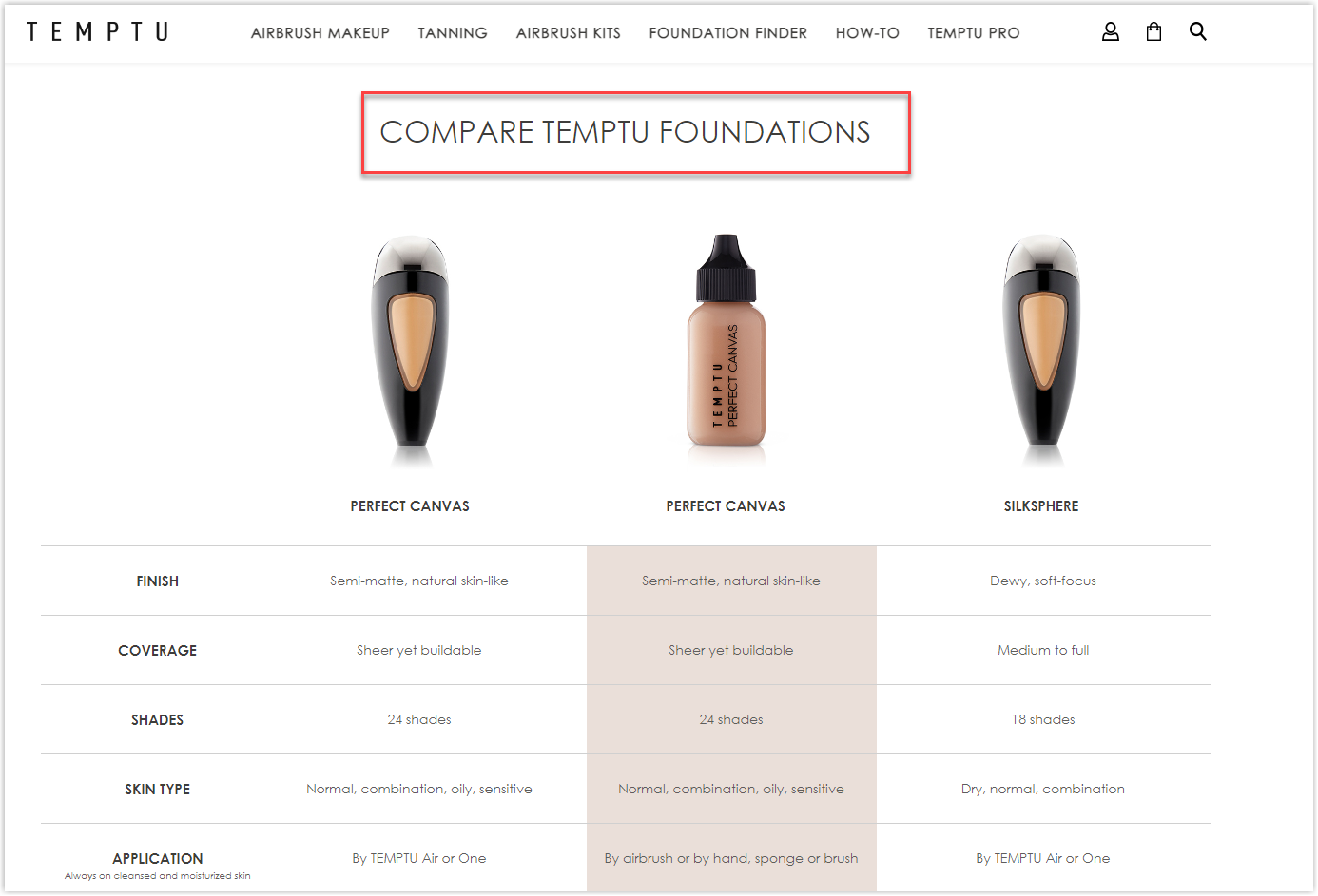
You can also learn to add a comparison table among different products from this Magento website.
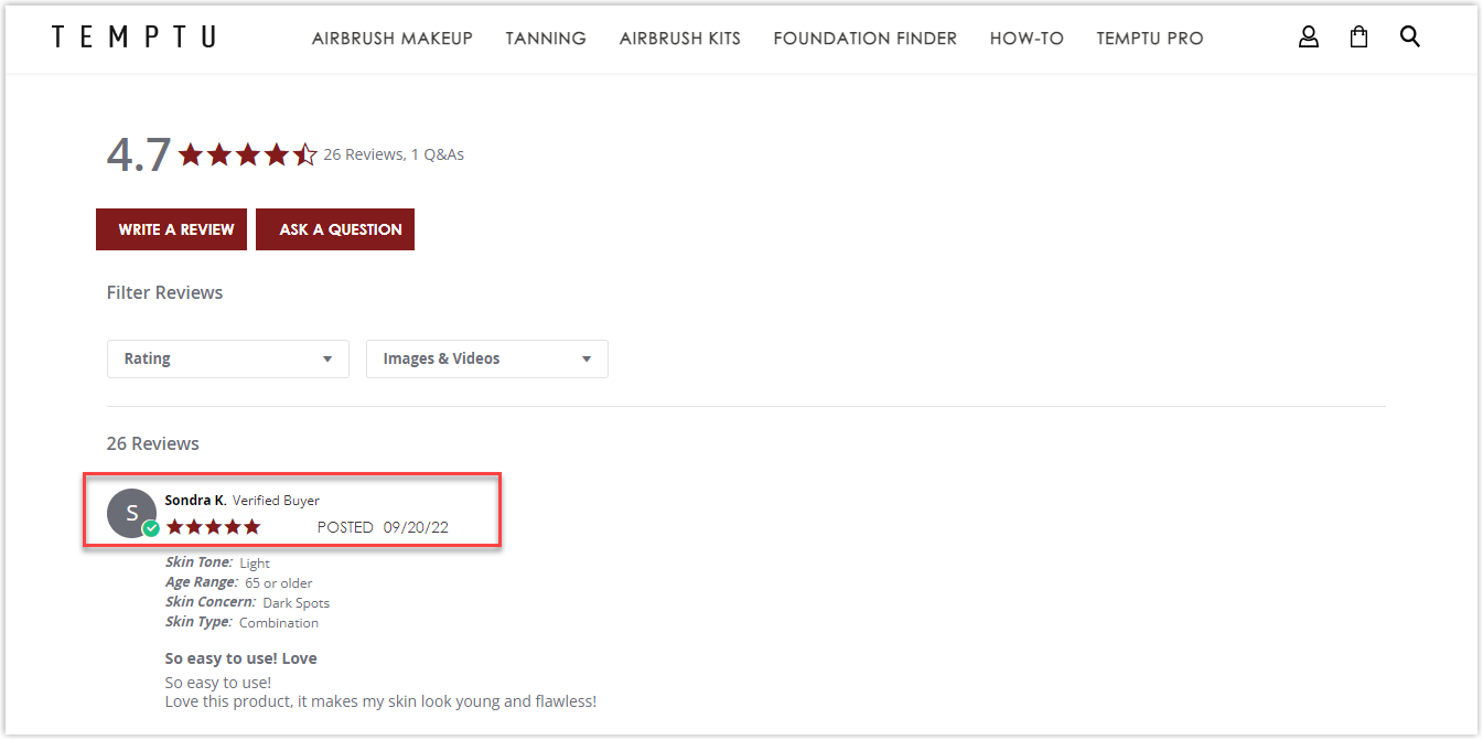
Its reviews section is what I expect to see, as everything is centered, making it easier to find the reviewers’ information, unlike what I’ve experienced on Sigma Beauty’s website.
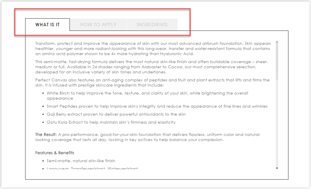
While some brands prefer dropping-down menus, Temptu uses tabbed navigation in numerous areas. This helps you stay in the same place while alternating views, but it may take more places than drop-down cause you can’t collapse or hide every menu. However, if you don’t want your visitors to ignore what you want to educate them about, this is a suitable choice.
Typography
If you pay enough attention, you can see that nearly all websites will choose a sans-serif font for their pages. Temptu is no exception.
On the other hand, it successfully separates titles and bodies by bolding and increasing the titles’ sizes, creating a clear hierarchy.
CTA
The buttons have two styles: the rectangle and the hyperlinked text.
Though the copy is not extraordinarily appealing, thanks to the contrast created by the color, visitors can quickly locate and click on the buttons.
Navigation Bar
This Magento eCommerce website also uses drop-down menus with only necessary sections to keep the pages simple and easy to navigate.
Images
Temptu really understands the task. All the images are of high quality and carefully taken. Look at their hero banner, and you can see how much effort they’ve put into editing images to impress visitors.
All products are photographed against a white background to create consistency and a professional appearance for the brand.

Try FREE Magezon Page Builder!
Easily create your engaging Magento pages in any style whenever you want without relying on developers or designers, just by drag & drop.
Magento Skin Care Stores
4. Caudalie
Rate: 7.5/10
Color
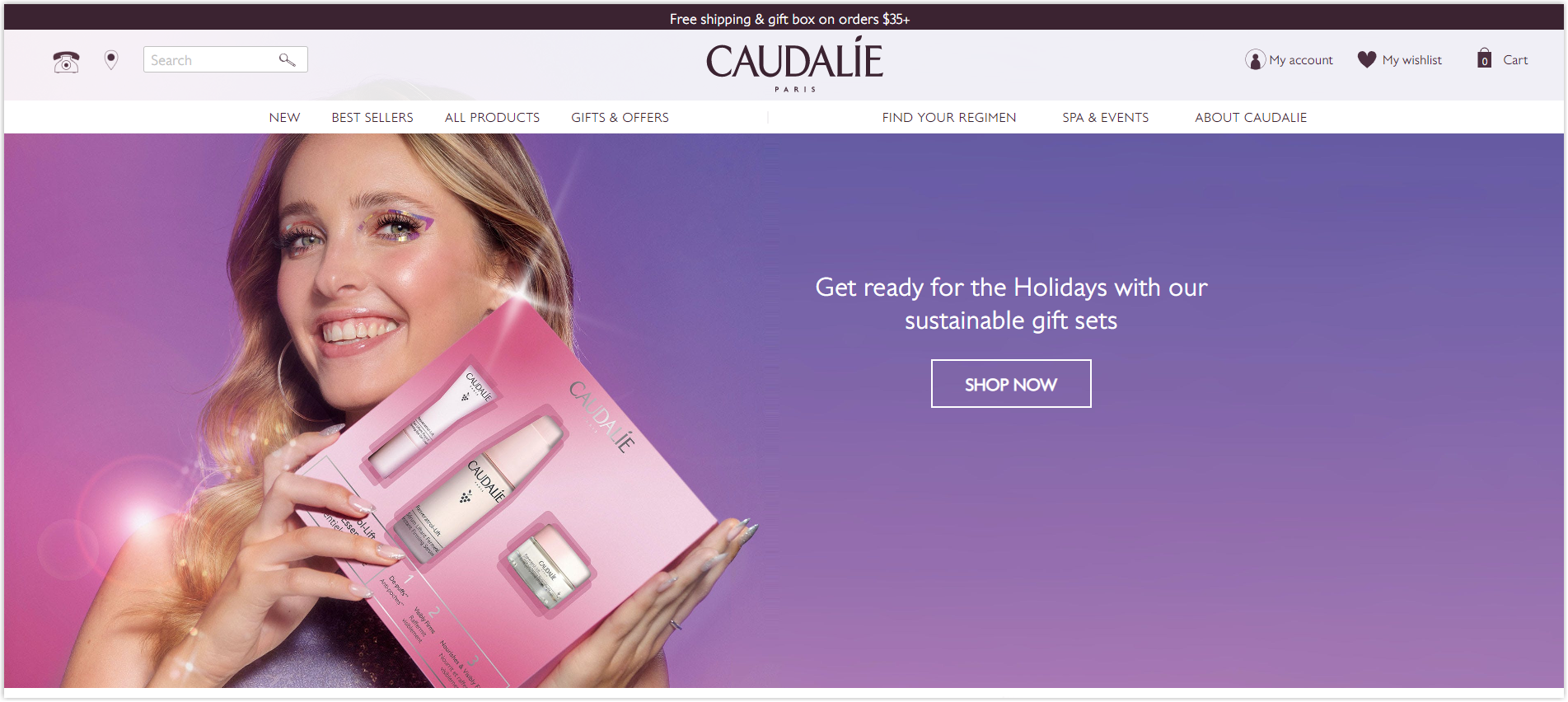
Try scrolling through the homepage, and you’ll immediately notice the primary color of this website, purple, which is taken from Caudalie’s logo.
Right at the hero banner, you can see the model holding a product package in front of a purple background. This color also inspires her makeup and clothes. However, this Magento beauty store also uses white and gray for different sections to create contrast.
Layout
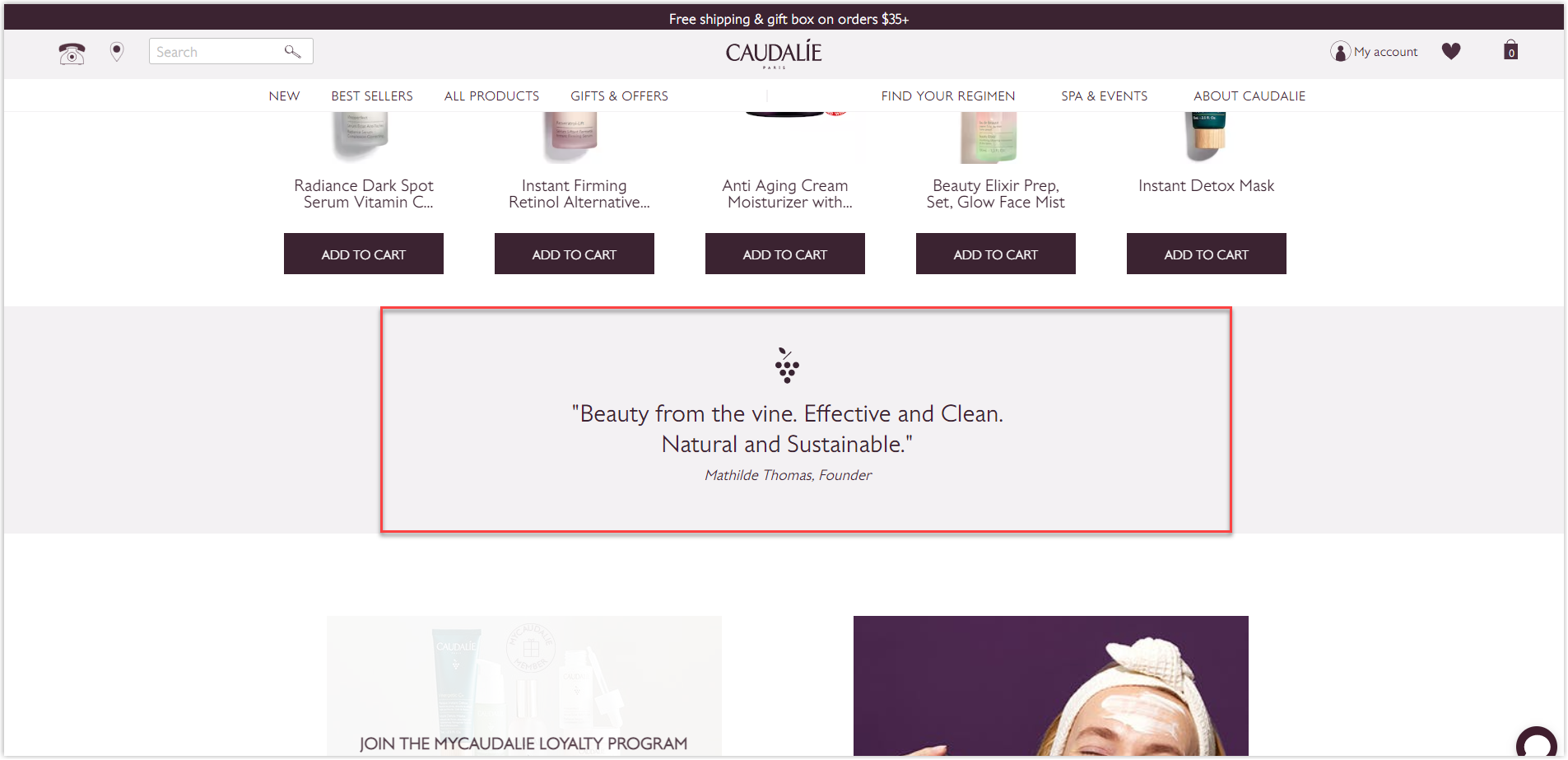
The homepage uses the hierarchy grid. Except for the hero banner and footer navigation, it keeps everything in a contained width layout to center them and enhance UI. I like how it inserts a quote among sections as a break for visitors and has little space between each part to separate them better while maintaining a proper connection.
The product listing pages use the typical modular grid to display items and center them with the contained-width layout. In the right corner of each product’s box, there’s a heart icon to help you save what you like quickly. White space is used considerably and reasonably not to overwhelm visitors.
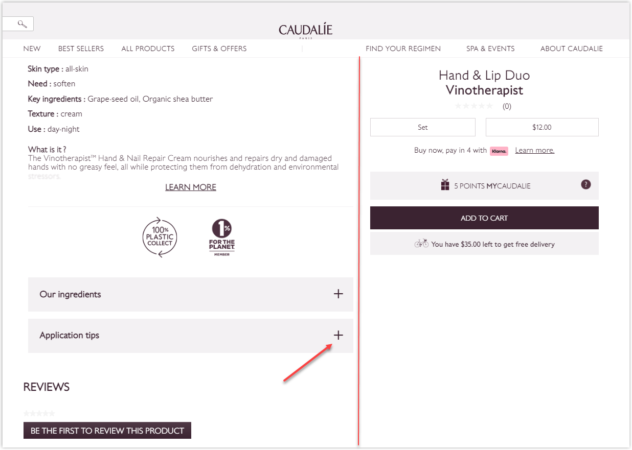
I like how Caudalie keeps everything simple and direct on their Magento web design by adding only necessary elements to their product page. There are two columns; one is for the image with specifications, and the rest is for the name, price, and buttons. It uses the overlay effect to make the right column stay still while scrolling.
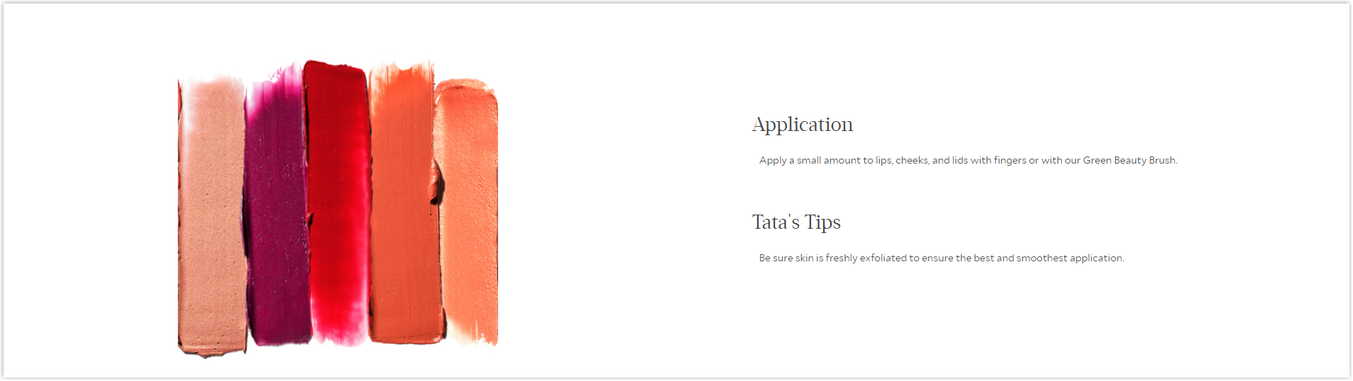
It also takes advantage of the drop-down menus to save space, so if you want to learn about the ingredients or application tips, simply click on the plus icon, as in the picture below.
Typography
Caudalie has its customized typeface to use all over the website. It is a sans-serif font, which is easy to read and scan.
To create a hierarchy for typography, this Magento beauty store bolds or capitalizes letters and increases line spacing to differentiate titles and bodies.
CTA
The buttons are purple (on the homepage) or transparent (on the product page) rectangles, depending on how much Caudalie wants to emphasize the section. On the main page, below the hero banner, is the brand’s new gift sets with purple radiant buttons, the most aesthetic ones throughout the website. In other words, this is the section they want to highlight the most.
It also adds micro-interactions to interest users and encourage them to click.
Navigation Bar
This website chose to use a sticky navbar in pink to display its most essential menus, such as New, Best sellers, All products, etc. As we all know from the last article, where I analyzed the best fashion websites, designing a sticky can provide visitors with a seamless navigating experience.
Images
The quality is not high but acceptable. However, to be fair, this is not a website for clothes that. Visitors will need to see the details and have the most precise feeling about the material. They only need to know the ingredients in the description to decide whether it suits their skin.
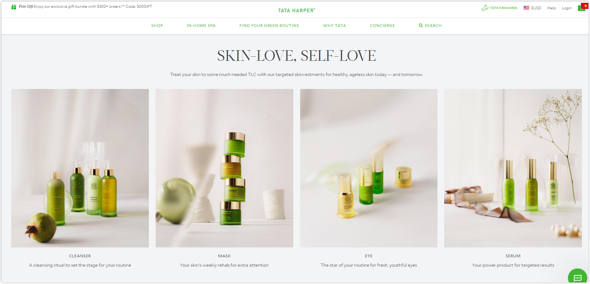
5. Tata Harper
Rate: 9/10
Color
The primary colors here are green, gray, white, and black. Green is taken from the brand’s logo to express its products’ message: vegan and friendly to the skin.
Layout
It uses the hierarchy grid in a collapse layout to highlight necessary sections on the homepage. This method is helpful if you want your images to be more prominent than the text. I like how this Magento beauty store centers everything to help visitors focus quickly. The negative space is adequately used to create balance and harmony, easing the navigation.
Every of Tataharper’s product listing pages comes with a hero banner. The provided filter consists of necessary criteria for users to find what they need effortlessly.
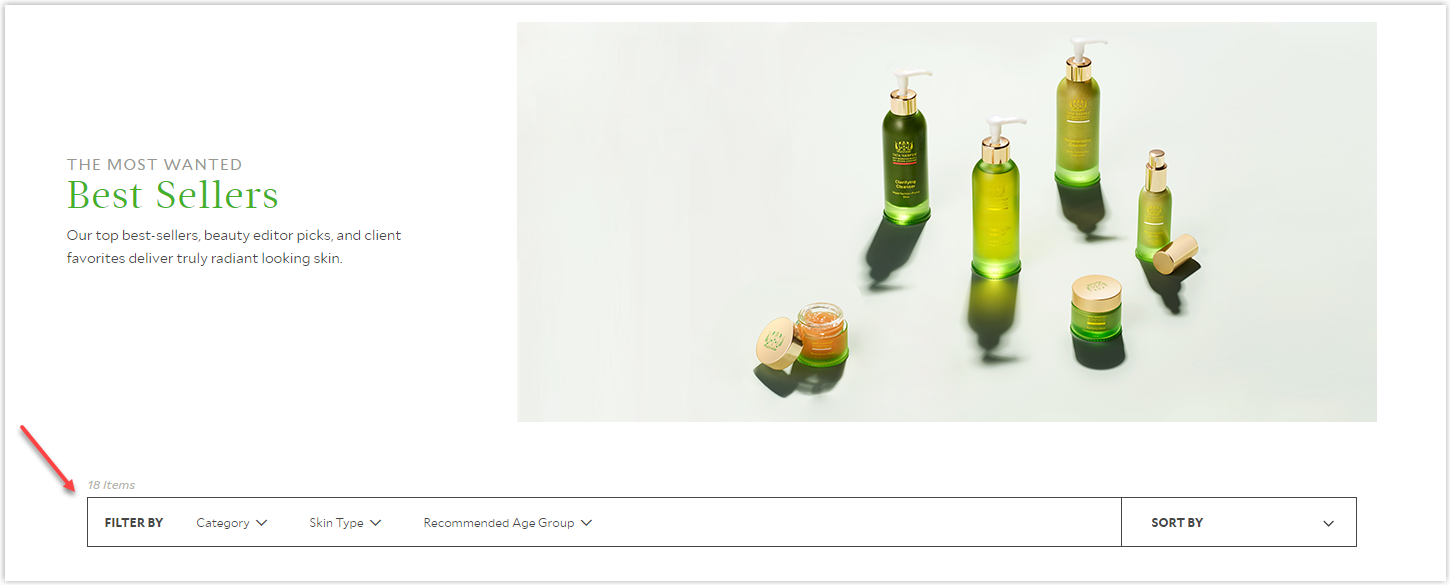
The modular grid is used with proper white space to display the products. This is a typical layout for any website cause it is easy to display images and information without cluttering the page.
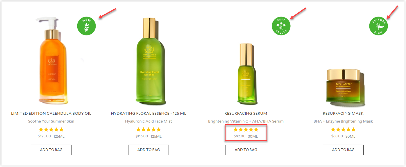
This Magento skincare store also pays attention to the user experience when adding tags of best sellers, top picks, or new arrival and star ratings right under each item for better navigation.
Let’s move on to the product page. I won’t discuss the information and details under the product’s name because Tataharper has done a great job. But the section below is quite confusing. The way it arranges elements in a full-width layout with ample white space in the middle makes it harder to look at. It would be better if they were centered so that users could quickly catch the information. You may find it hard to understand what I mean, so click on their website’s link to discover.
Typography
Using one typeface is typical for Magento web design because it helps create consistency for the whole website. It is also easier for designers to clearly show hierarchy by only bolding, capitalizing, or increasing letter size for titles.
CTA
There are two primary styles of CTA buttons on Tata Harper’s Magento website, typical rectangles in different colors and hyperlinked texts.
Thanks to the proper arrangement of surrounding elements, the buttons are prominent enough to locate and encouraging to click on.
As you can see, above the CTAs is an ample negative space to distinguish, making them easy to recognize and separate from the rest.
Another method to stand your CTAs out besides white space is the image below.
This Magento skincare store uses light gray for the description’s color, making it less prominent than the product’s name.
Navigation Bar
Tata Harper’s website also uses a sticky navbar to help increase user experience. Each menu is illustrated clearly with pictures and only includes one level, encouraging users to discover further what the store has.
Images
All images are taken with high resolution and are aesthetically pleasing. Tata Harper made the banners as artistic as possible by reasonably placing different items around the products to highlight them, striking visitors at first sight.
Product pictures on the listing page are made to look like the brand places items on the ground, and every time you hover over them, you can have a better feeling of how they look practical.
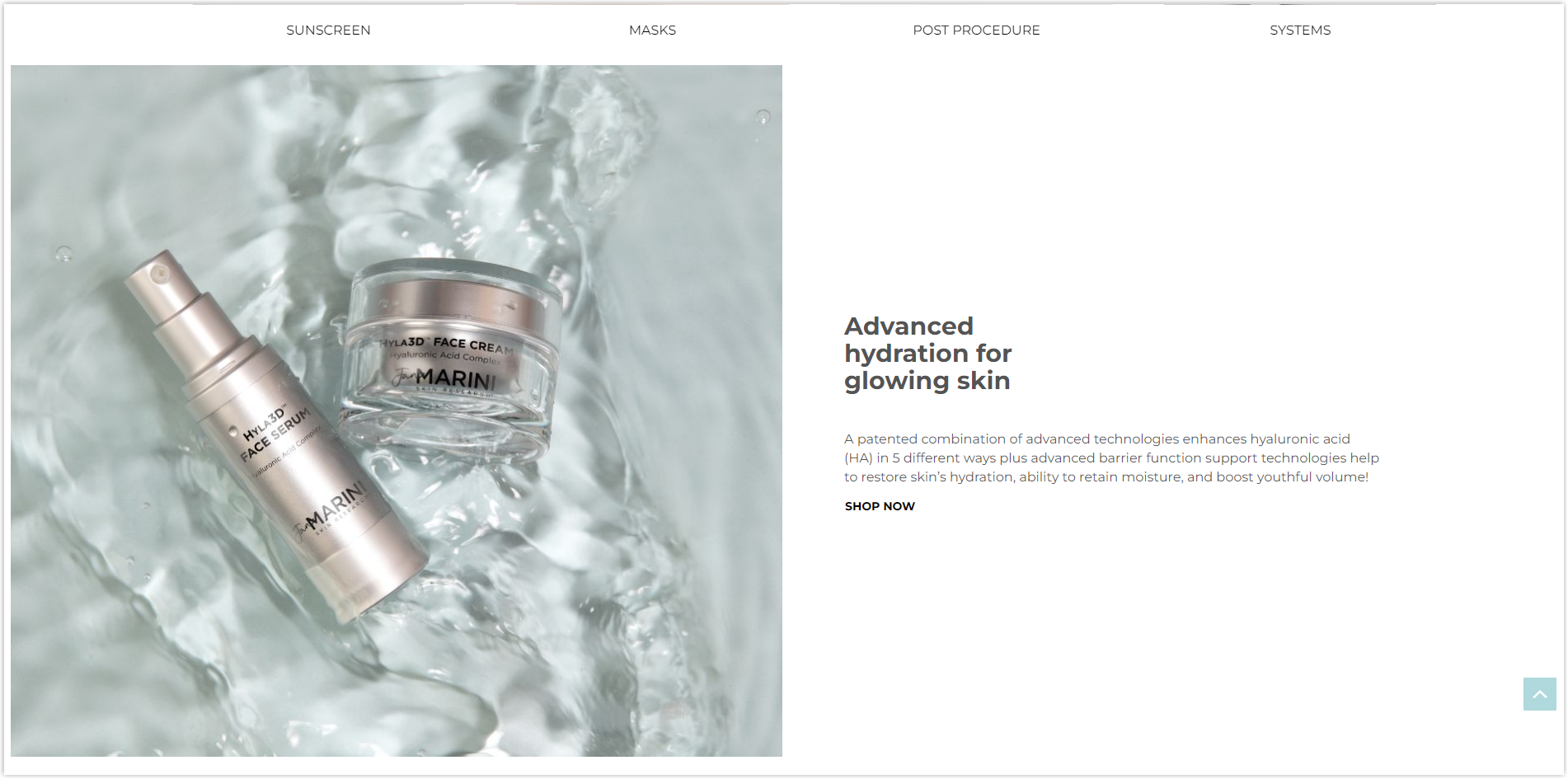
6. Jan Marini
Rate: 7.5/10
Color
Blue tones are the prominent colors of this Magento beauty store, as you can see right from its hero section below. Why? Because of the brand’s name: Jan Marini with marini is marine in Italian, and Jan in the logo in blue. This is also the most used color for websites, as it conveys reliability, inspiration, faith, intelligence, and optimism. You can learn from the examples and apply them effectively to your site.
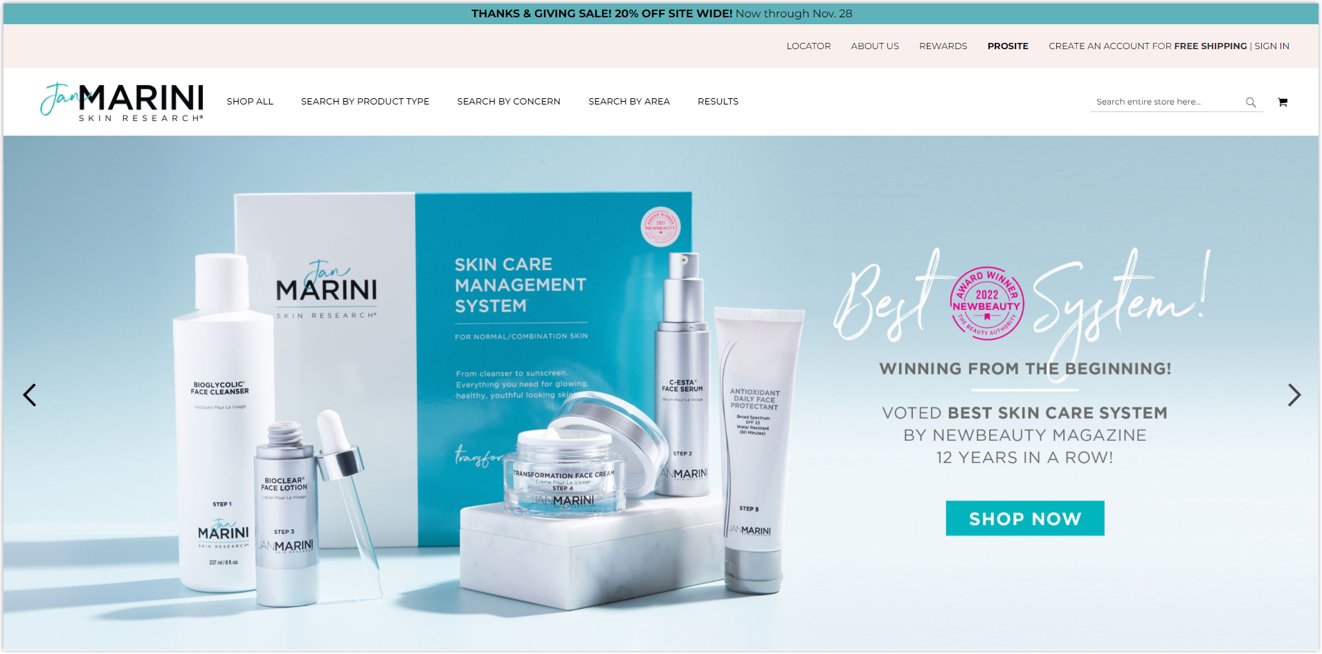
Layout
The homepage of Jan Marini is a prominent example of a hierarchy grid with three big banners.
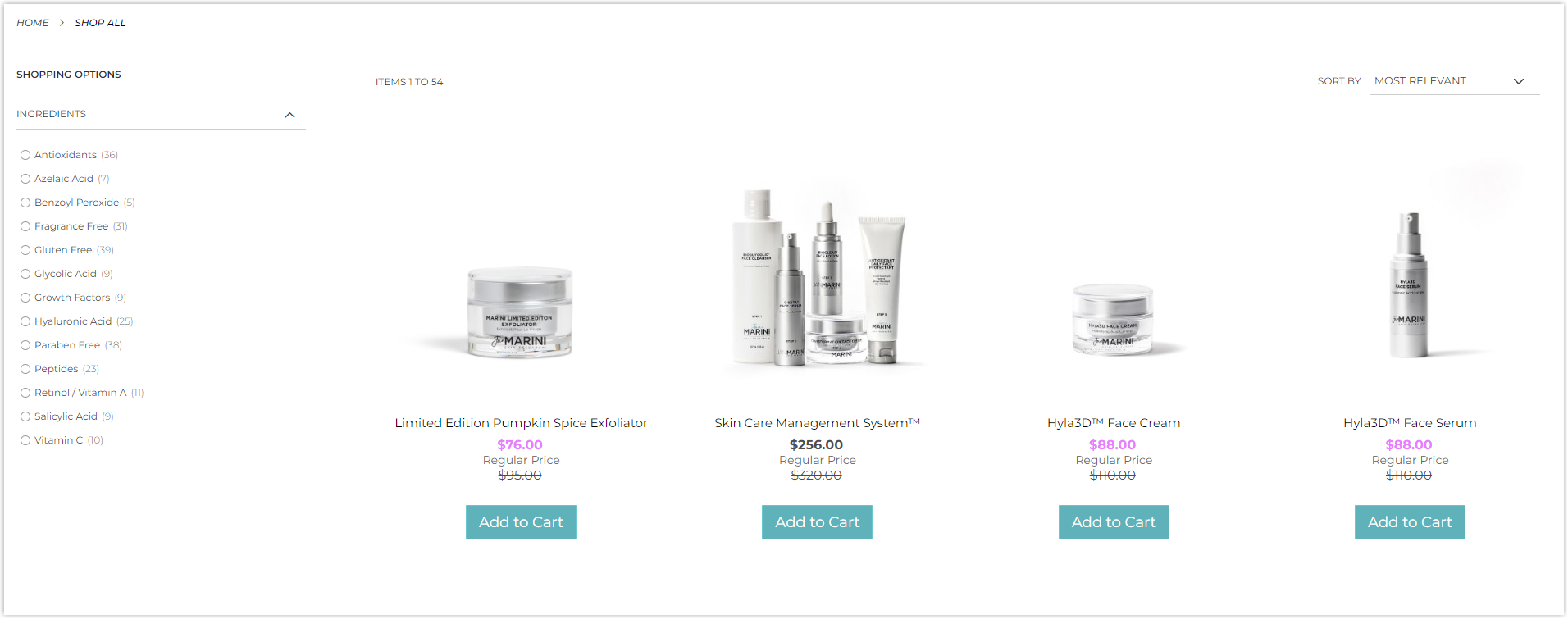
The listing page arranges products in a modular grid to help users navigate more easily. It includes an effective filter that sorts products based on their ingredients, helping visitors to know which product is suitable for their skin.
Every element on the product page is arranged on a full-width layout, but I don’t like it personally. It makes it hard to navigate with too much white space, and the information (product’s title and description) is aligned closely to the margin.
Due to the layout, the text below is also hard to read, with more than 200 characters in a line, which we will discuss more in the typography part.
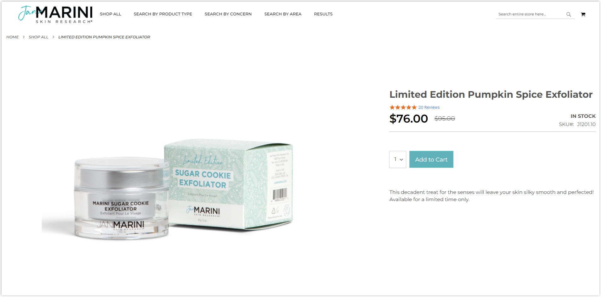
However, if you’re using your phone, everything will look better.
Typography
Only one typeface is used in this Magento beauty store, sans-serif Montserrat. To create a hierarchy and help users to navigate quickly, Jan Marini takes advantage of capitalization, line spacing, different colors, and letter sizes.
However, the problem lies in the line length, particularly on the product page (some of them). Below is an example on the PC screen.
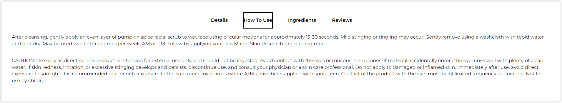
There are too many letters on a line, while the recommended numbers are between 65 and 80. This makes it difficult for users to get the information since it creates a daunting reading experience.
However, the typo on smartphones looks more reasonable.
CTA
There are two styles for the buttons throughout the website: rectangles and hyperlinked text. Thanks to the reasonable arrangement and colors of the surrounding elements, it’s easy for visitors to locate the button and click.
Images
All are carefully taken and edited to create consistency and help users imagine how the product will feel in reality.
Try FREE Magezon Page Builder!
Easily create your engaging Magento pages in any style whenever you want without relying on developers or designers, just by drag & drop.
7. Avène
Rate: 9.5/10
Color
The main colors of this Magento beauty shop are orange-pink (taken from the logo and products’ containers), with the help of white for the background and black for the letters.
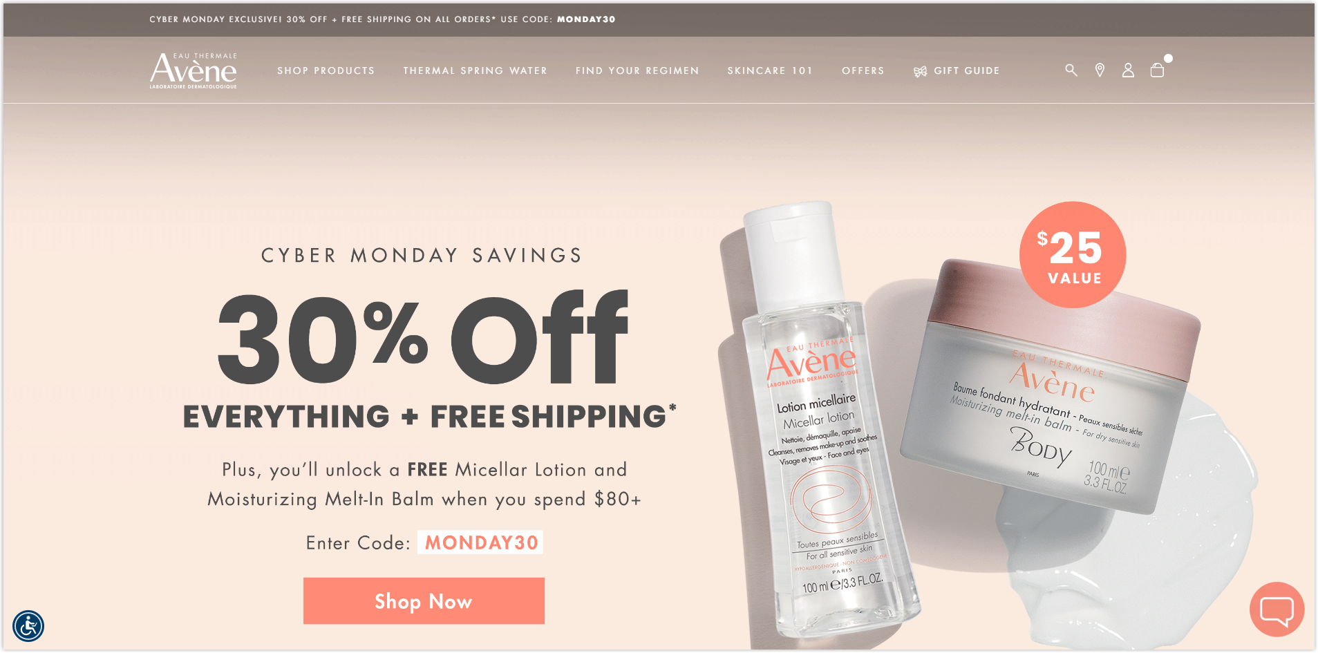
Layout
Avène has an impressive homepage with prominent sections in a hierarchy and a collapse layout to highlight images. The white space is adequately used for a perfect balance among different elements, a professional appearance, and longer time spent on site. While scrolling through the page, each section with a different arrangement incites me to interact longer.
The listing page still uses the modular grid to display the products with brief information, such as price, ratings, benefits, and name. As a user, you will also want to know the benefits to your skin, and by hovering over any item, you can see them. This is an excellent UX tactic to assist visitors.
Typically, images will be placed on the right of the product page, but in this case, it’s entirely converse. As the reading flow is usually from left to right, by doing this, visitors can easily read product specifications.
Moreover, instead of placing elements in a collapsed layout, the left side is kept still, keeping the Add to Bag button in visitors’ sight.
Typography
Two typefaces are used for this Magento skincare store; both are sans-serif. Now, look at the image below to see how it designs typography to create a hierarchy.
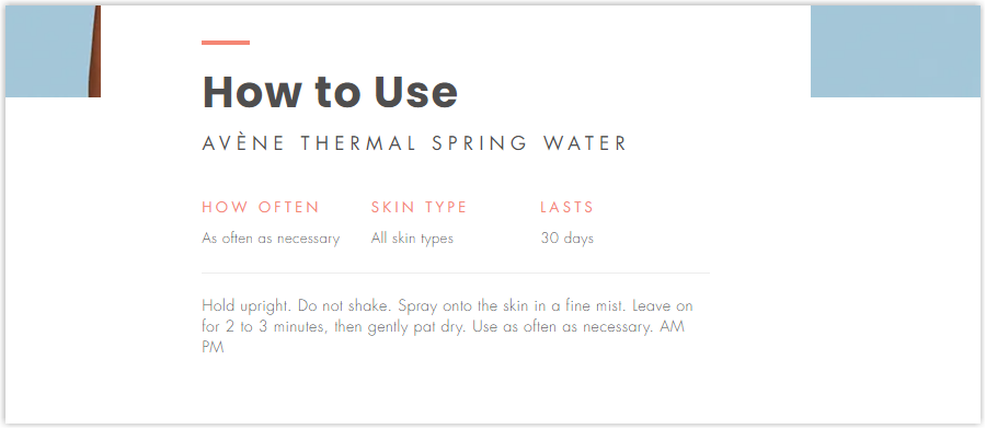
As you can see, Avène takes advantage of capitalization, bolding, color, line spacing, and letter sizes so that you can easily distinguish between the title and body. Thanks to the intelligent design, it naturally creates a top-to-bottom reading flow for users.
CTA
There are also two main types of buttons: rectangles and hyperlinks. This Magento website makes most buttons change color on hover, creating micro-interactions to encourage users to click.
Navigation Bar
The sticky bar helps visitors navigate easier because it’s always visible, and they can immediately know what the website has. To enhance UX, each menu includes images to illustrate the products better and micro-interactions to keep users interested.
Images
As a big brand in the skincare industry, investing in visuals is a must for Avène. That’s why all the product photos are of high quality and consistent.
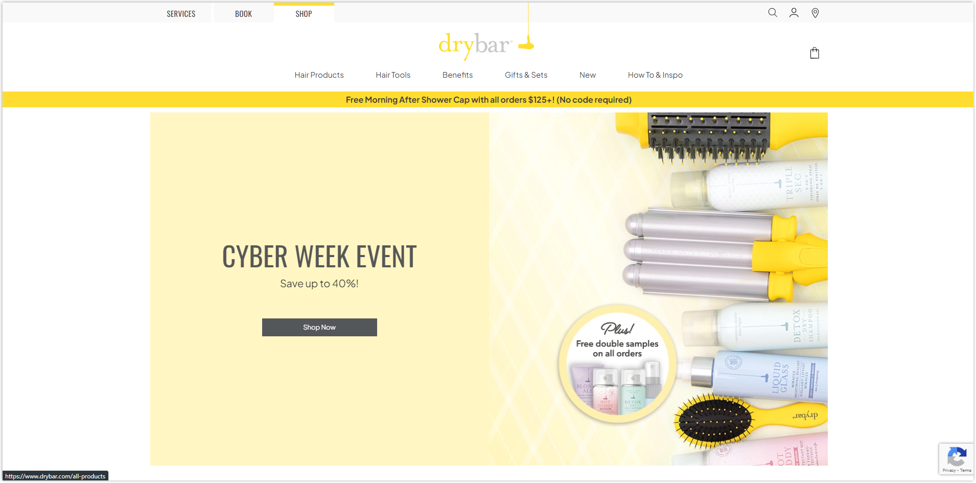
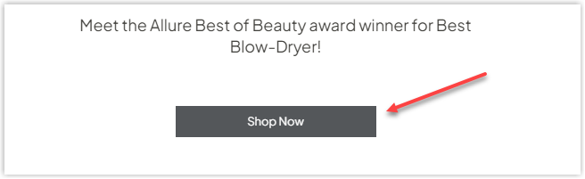
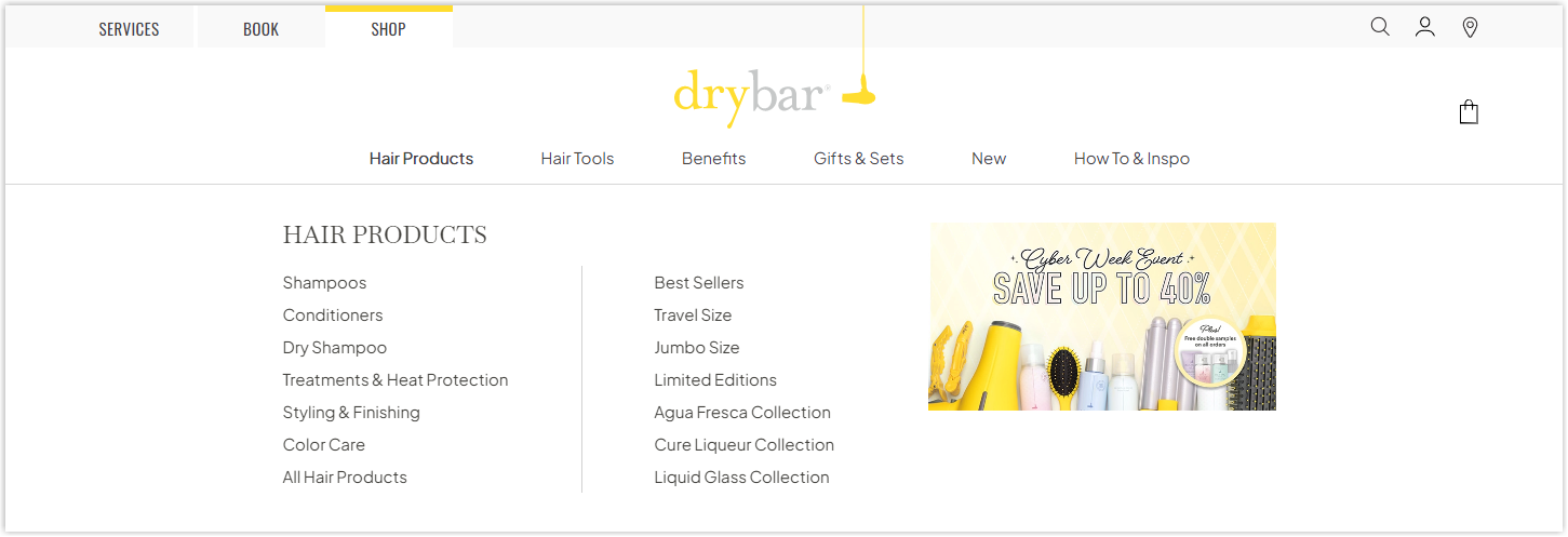
8. Drybar
Rate: 9/10
Color
The yellow in Drybar’s logo is also the primary color of this Magento beauty website. However, the neutral combination in web design, white, black, and gray, is still used on the background and letters.
Layout
The homepage arranges different sections in a hierarchy and collapsed layout to highlight the best sellers, sales campaigns, and new arrival.
The white space on both sides makes sections centered, helping users to focus more easily.
Besides solely displaying the products in a modular grid, this Magento 2 website also includes the necessary information for each collection on the listing page.
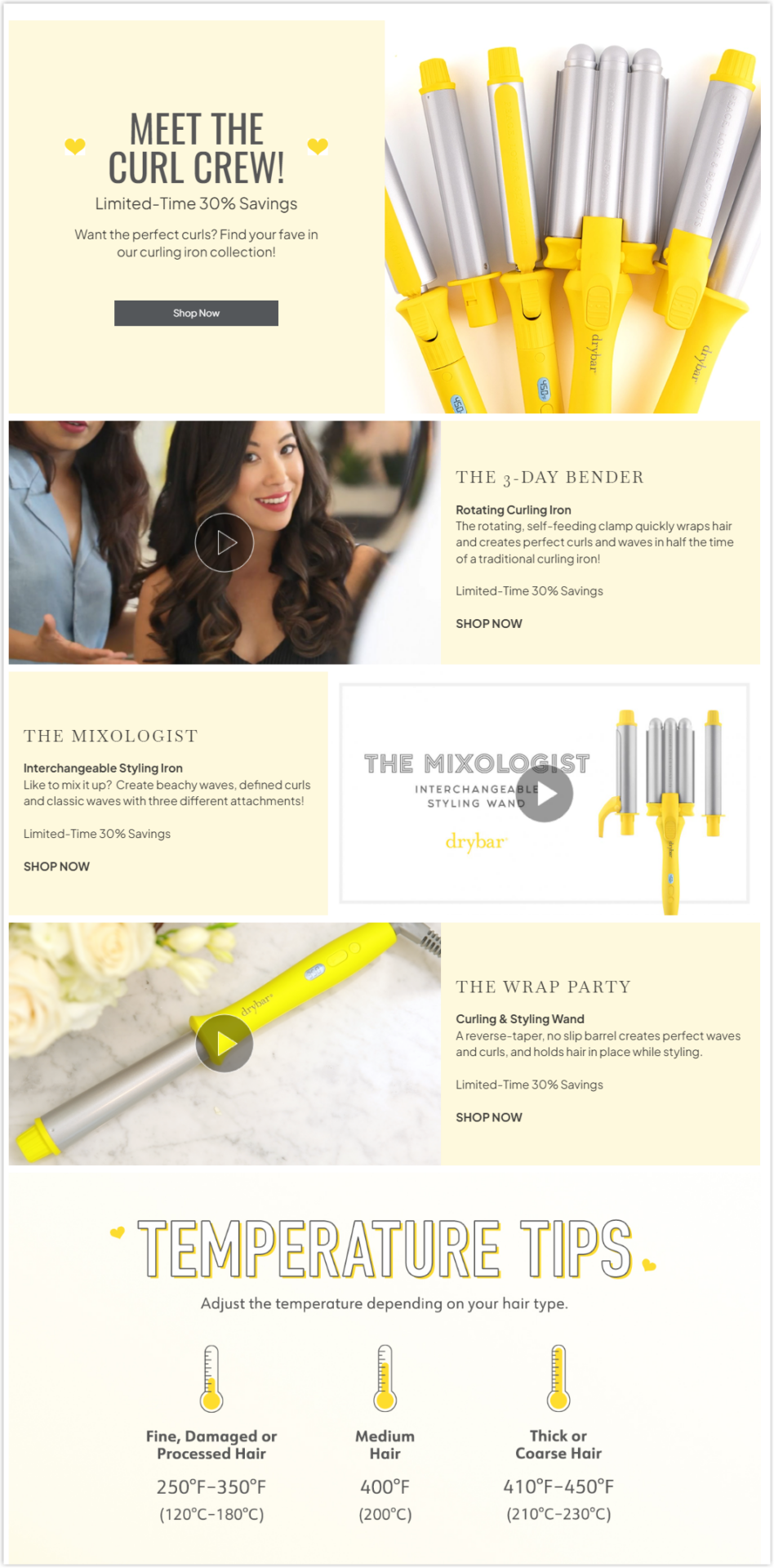
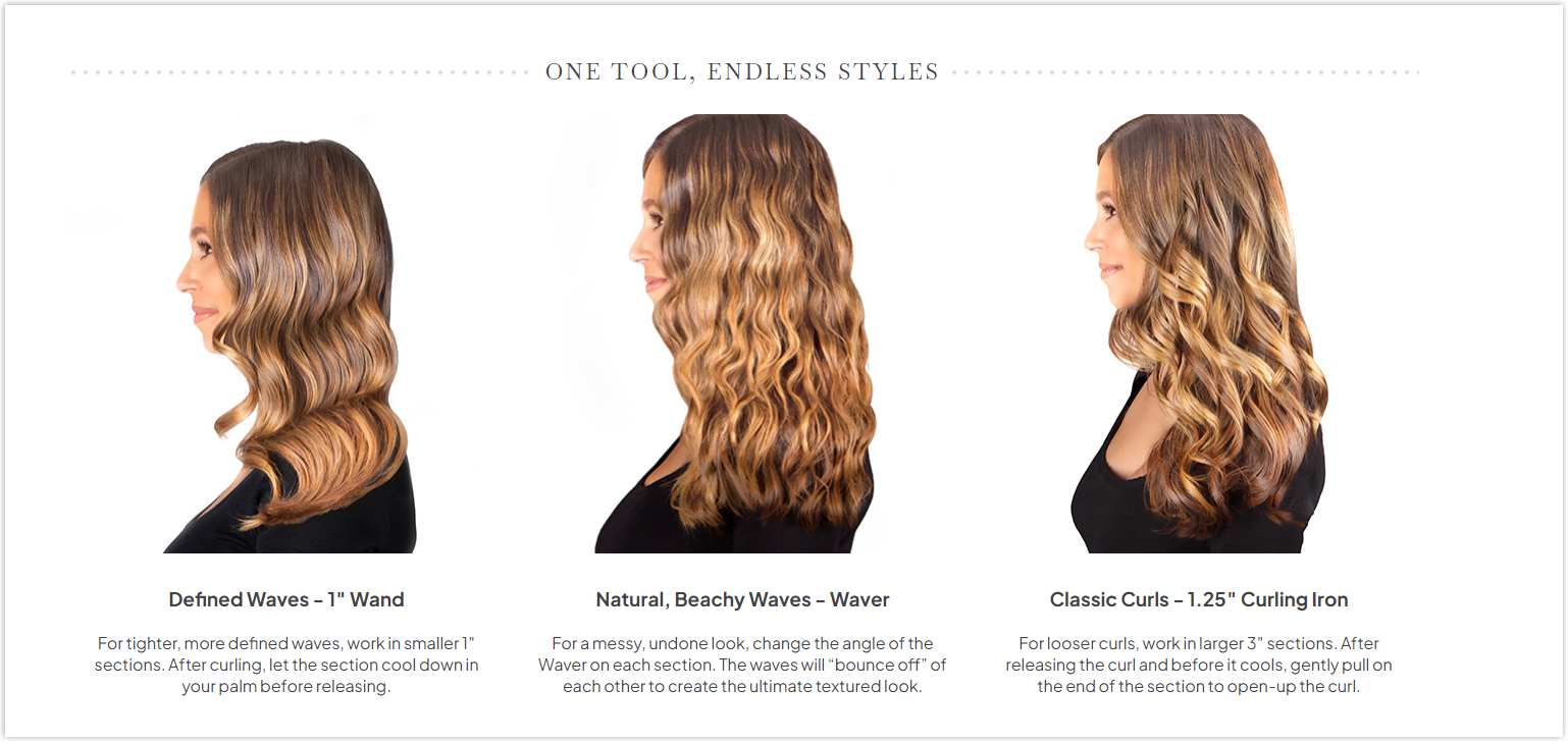
Curling irons collection
The product page is simple and direct. It doesn’t use any drop-down menu, but thanks to the intelligent arrangement, it’s not overwhelming, and users can navigate easily. You can discover one of them here.
Typography
There are two typefaces used throughout the site, sans-serif and serif font. You can look at the below image to see how this website creates a hierarchy for the typography by using different typefaces, bolding, line spacing, and adjusting letter sizes.
CTA
Drybar uses two buttons for its website: rectangle and hyperlinked text. The harmony created by the surrounding elements helps the CTAs stand out and encourage visitors to click.
Navigation Bar
The sticky and consistent navbar makes navigation more straightforward with only necessary menus, and each includes no more than one level with images for illustration.
There’s a small but exciting detail you will want to try; you can watch the video below or discover it yourself.
Images
Every image is taken and edited carefully to highlight the products and create consistency.
9. Byredo
Rate: 7.5/10
Color
This is when we return to the basic with the legendary color combination. Yes, you guessed it correctly. They are white, black, and gray. There’s nothing too special about colors, so let’s move on to the next section.
Layout
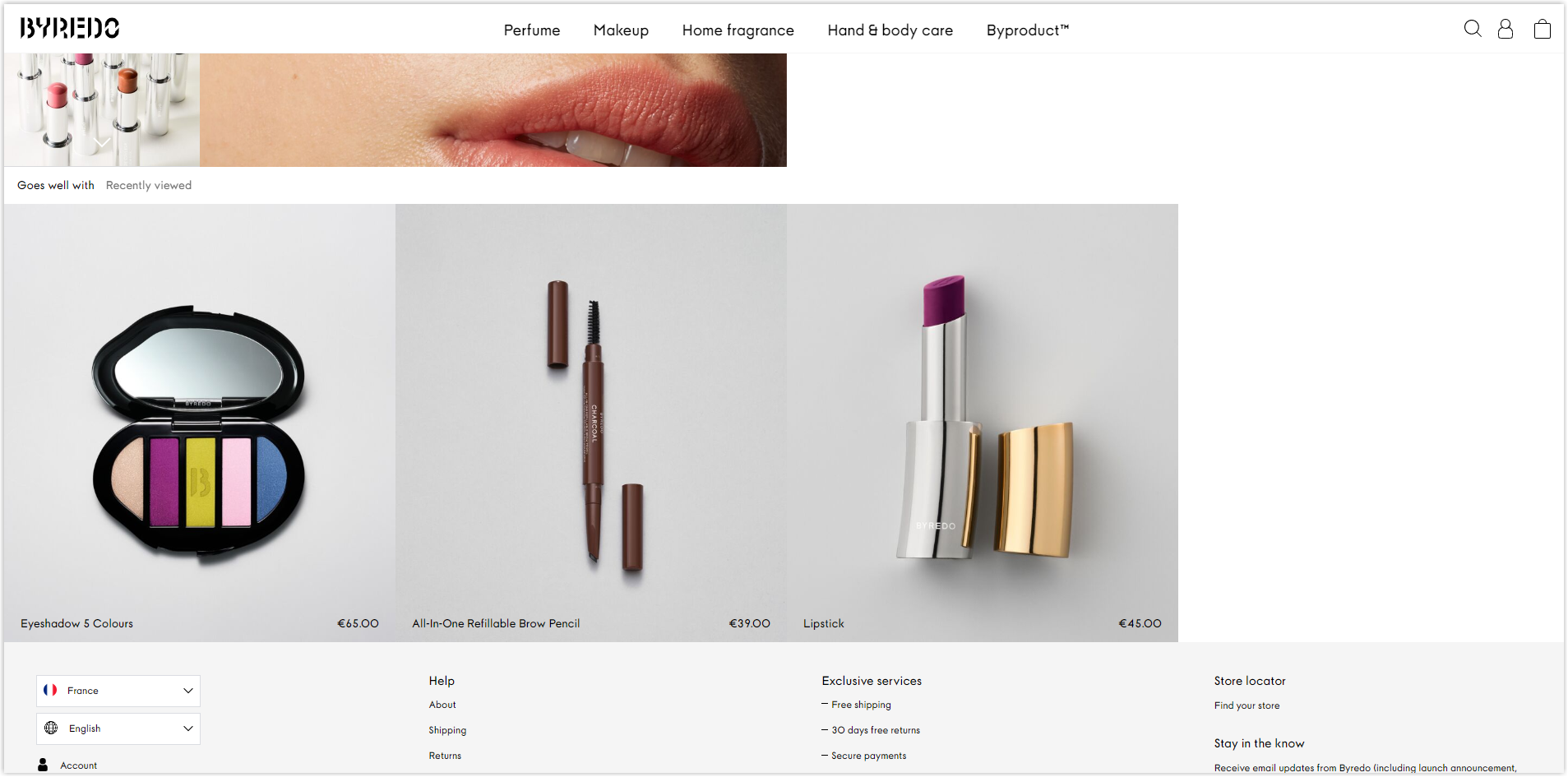
The homepage is a gallery where Byredo only displays its products’ prominent pictures without a hero section. Though it looks artistic initially, it’s not that satisfying when used. Some specific parts are easy to understand, while some are not. For example, clicking on the blanket photo will take you to the blanket collection, but the incense won’t take you to the corresponding collection.
The same layout is used for the listing page.
Seems like this Magento beauty store doesn’t like white space, or it tries to be unique. What do you think about the below section?
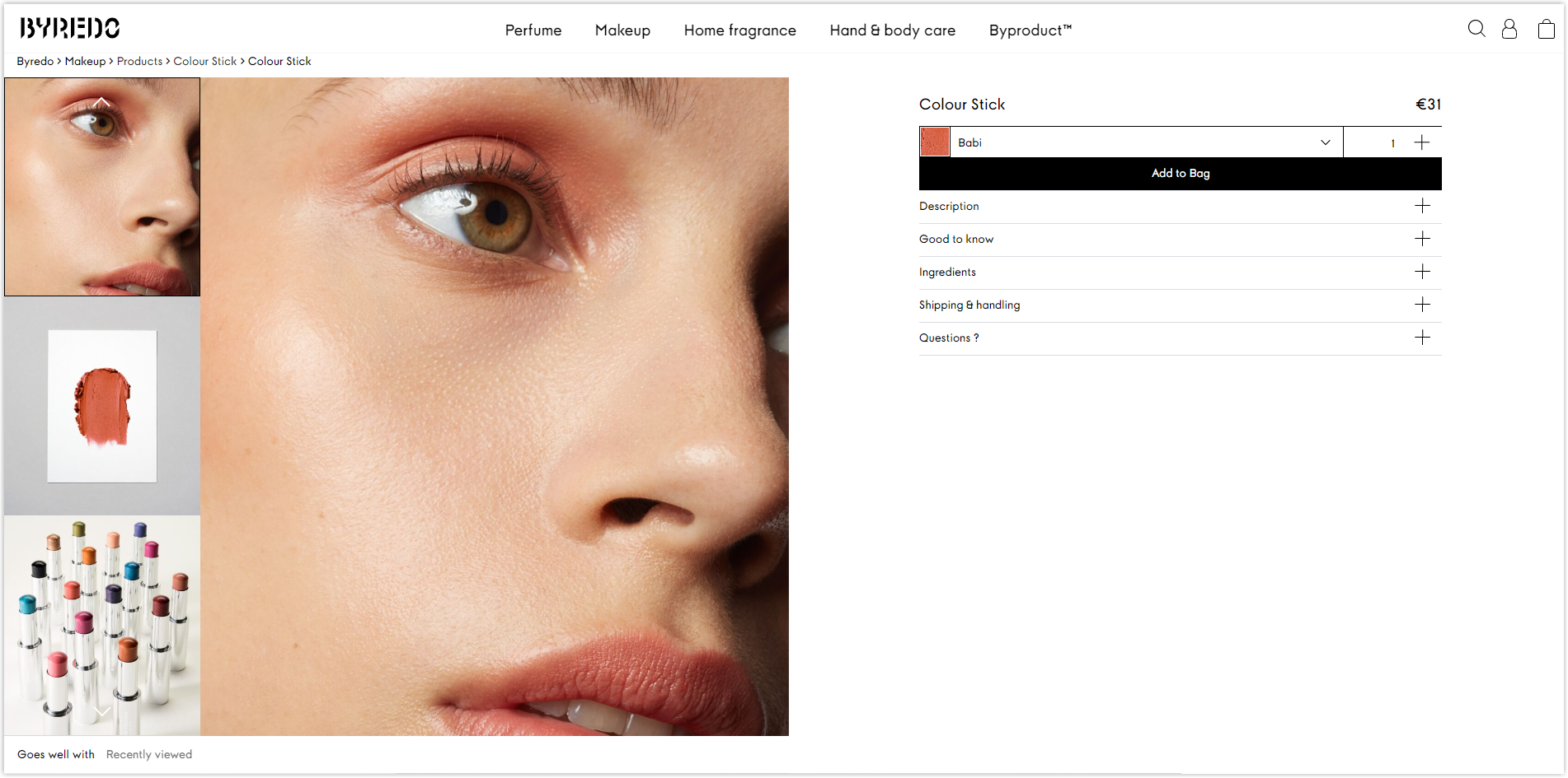
This hero section from the product page doesn’t make me satisfied. There are two locations where Byredo should add negative space to make it easier for the eyes: the left margin and between the main picture with the vertical photo slider.
Now, below is another part that also confuses me.
It would be better to be centered with proper white space on the left.
Typography
As a website that focuses mainly on visuals, there’s nothing much to say about its typography besides the only typeface it uses throughout pages.
Navigation Bar
Byredo also uses a drop-down sticky menu bar to assist visitors in navigating its website easier. Each menu includes images for better imagination.
Images
Every photo is taken and edited carefully to highlight the products and promote the brand’s professionalism.
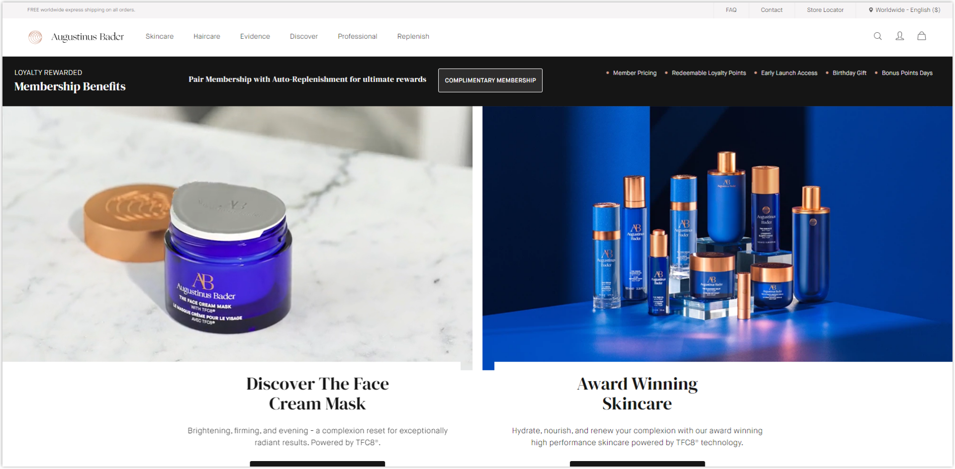
10. Augustinus Bader
Rate: 9/10
Color
The neutral color combination of white, black, and gray contrasts different sections, helping users understand and navigate the site easily.
Layout
This Magento beauty store uses the hierarchy and collapsed layout to highlight essential sections such as bestsellers or new arrivals.
Products on the listing page are arranged in the familiar modular grid to make it easier and quicker for visitors to find what they need.
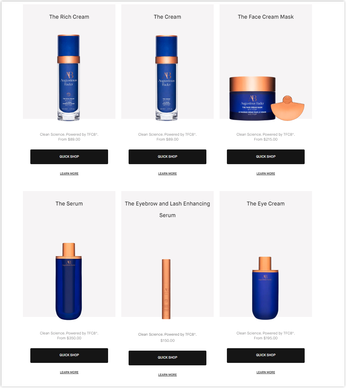
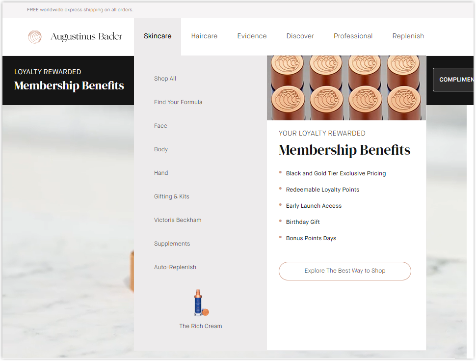
The generous white space the product page uses impresses me the most when visiting it. Most of the sections are centered for users to focus quickly.
Typography
There are three fonts used throughout the website for the body and title. See the image below for an example of how Augustinus Bader designs its typography.
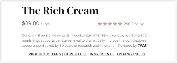
By bolding, capitalizing, changing text colors, and adjusting letter sizes, this Magento skincare store successfully creates a typography hierarchy, helping users navigate and understand pages easily.
CTA
For prominent parts, the buttons are rectangles with different colors, black or pink-orange.
For other parts, the CTAs are hyperlinked text.
This method highlights and drives users’ attention to certain parts that will likely convert.
Navigation Bar
The drop-down menu bar is used without being sticky. Though this helps pages look more spacious, it doesn’t benefit navigation. Visitors must scroll to the top if they want to discover other pages, and they can’t know what the website has.
However, it only includes the main menus, each with an image to illustrate.
Images and Videos
All are high-quality and edited carefully to highlight the products and create consistency. I’m impressed with the natural video on its hero section on repeat to attract visitors.
Try FREE Magezon Page Builder!
Easily create your engaging Magento pages in any style whenever you want without relying on developers or designers, just by drag & drop.
11. Myriad Beauty
Rate: 8.5/10
Color
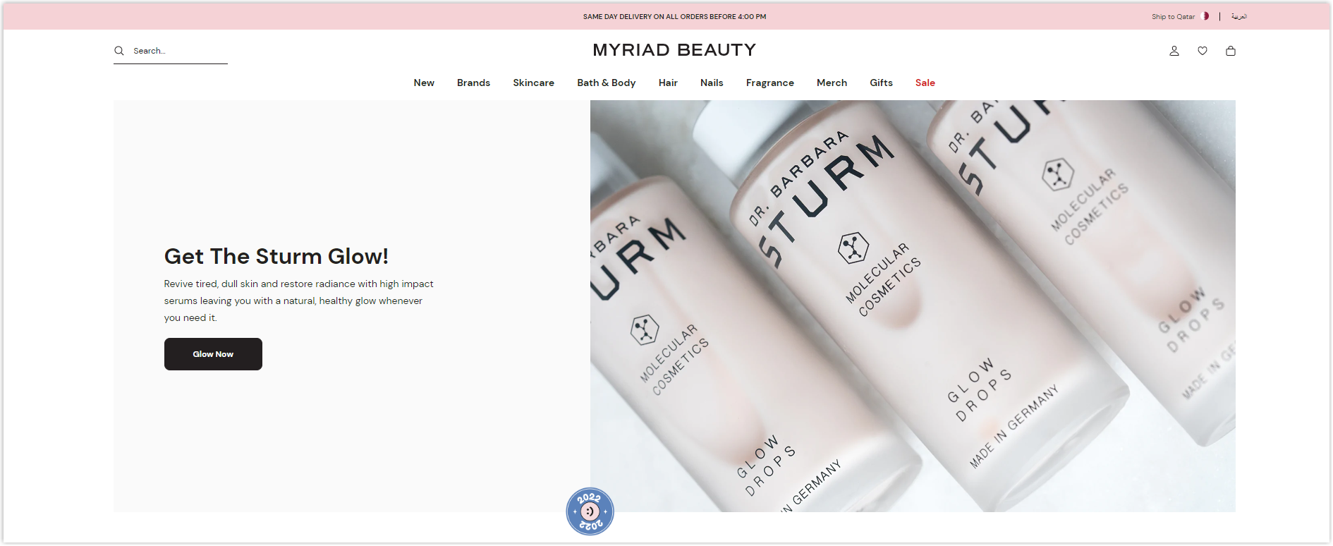
When you visit Myria Beauty’s website, you can immediately see a pink tone on different sections. The neutral colors, white, black, and gray, still benefit pages since they don’t interfere with the general design.
Layout
The homepage is arranged on the hierarchy and collapsed layout to highlight the products’ images.
This Magento beauty store displays products on a modular grid on its listing page. Some of the benefits have been mentioned above; you can scroll back to read or discover further here.
The product page takes advantage of the negative space to highlight the product right at the top and separate it from the rest.
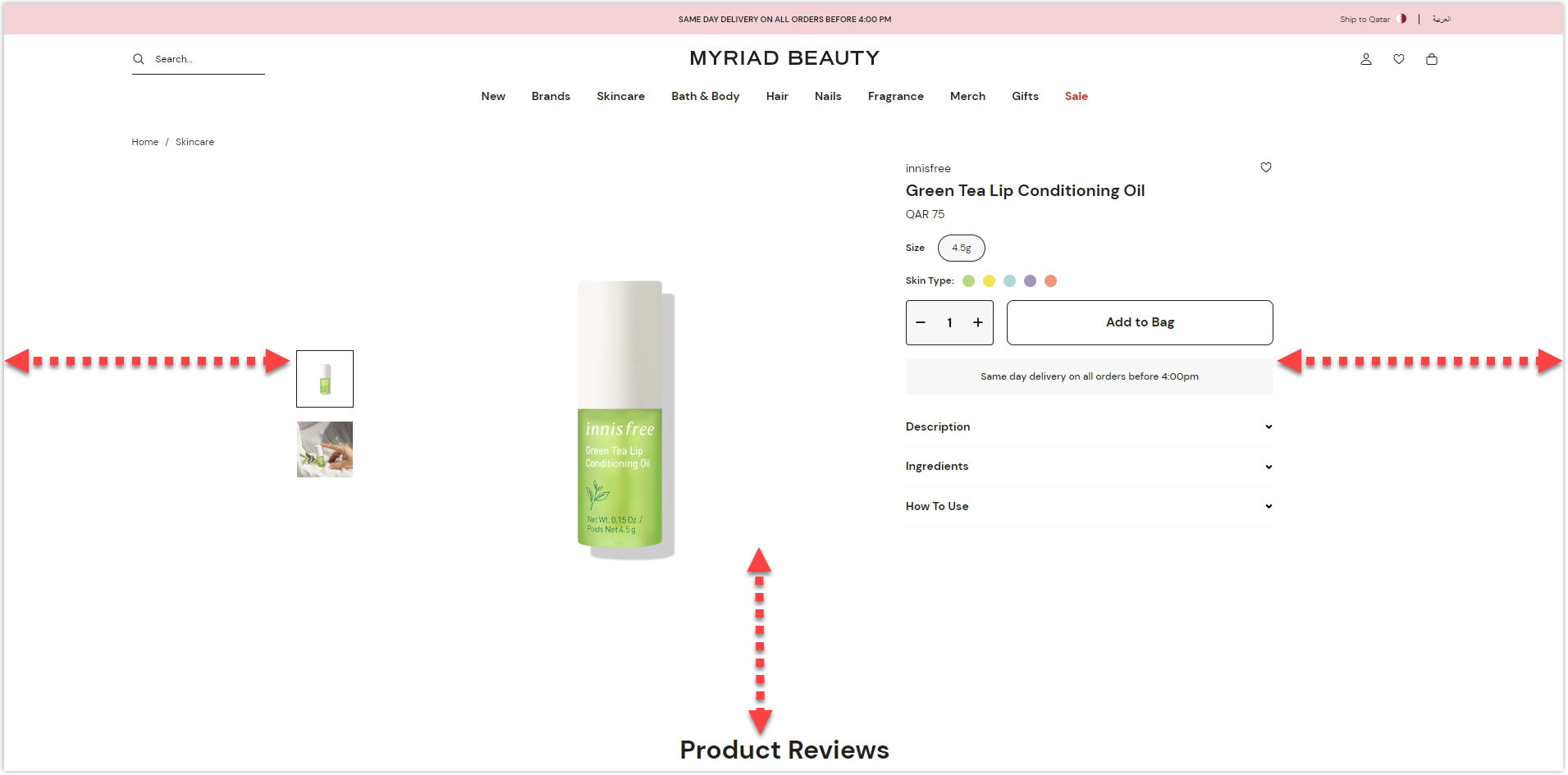
On the other hand, Myria Beauty uses drop-down menus to display specifications to make the page look neat and not overwhelm users with information.
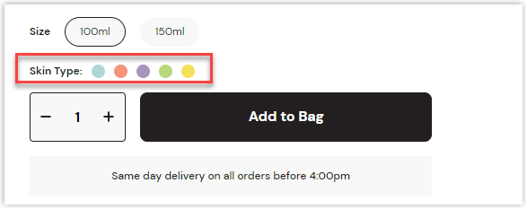
However, regarding UX, there’s a minor problem with the type of skin to select; it’s unclickable. I don’t know what it’s for.
Typography
Unlike Augustinus Bader, this website uses only one typeface for both titles and the body. Capitalizing, bolding, increasing spacing, changing colors, and adjusting size successfully creates a hierarchy for typography and professionalism for the brand.
Navigation Bar
Visitors can benefit from the drop-down, sticky navbar of this Magento-based website. It includes only necessary menus, and each has images for illustration.
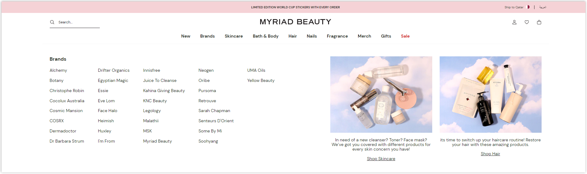
Images
Though all images are taken carefully, I can’t find a single one of the products inside to help users imagine more clearly how the products gonna look and even feel in reality. Hence, increasing the conversion rate.
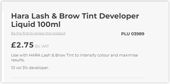
13. Aston & Fincher
Rate: 8/10
Color
Aston & Fincher’s logo is designed in black and white. Therefore, its website uses black, white, and gray as the main colors. They help this Magento store example be easier to understand and navigate.
Layout
The hierarchy grid makes the homepage neat and has a highlight for users to focus on.
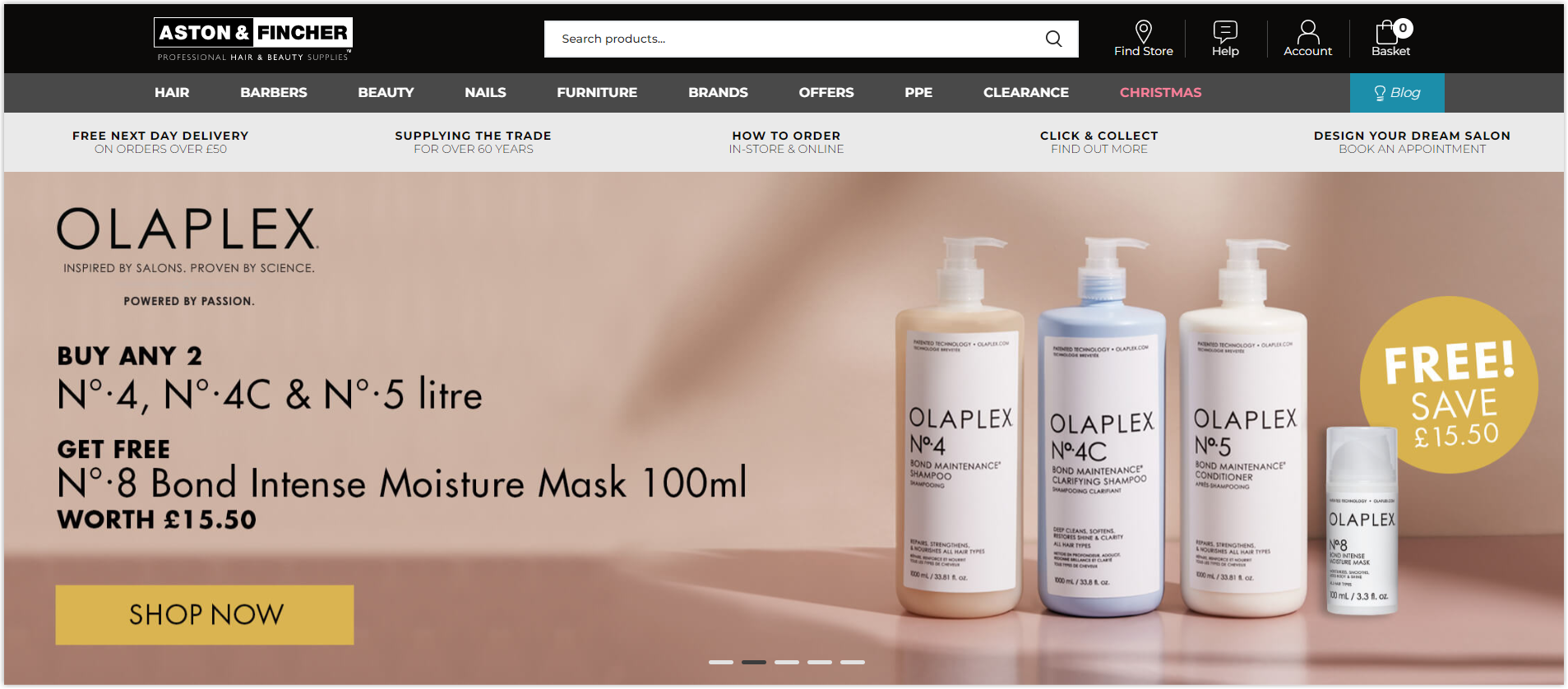
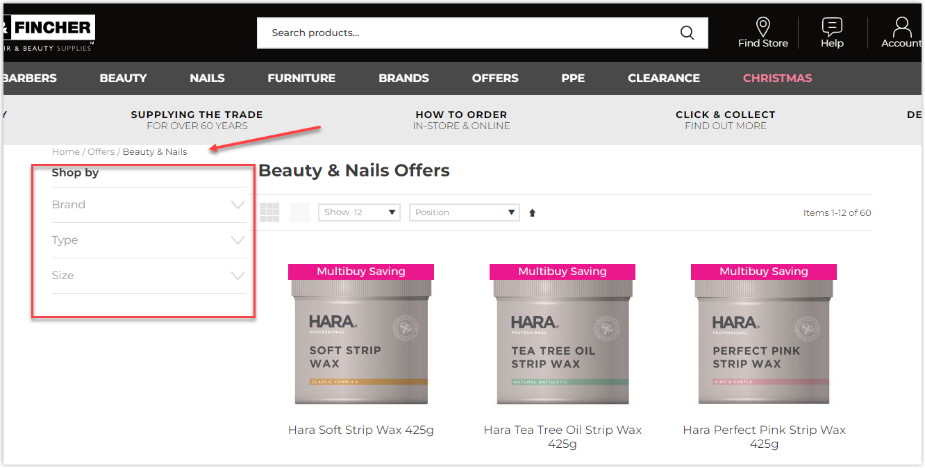
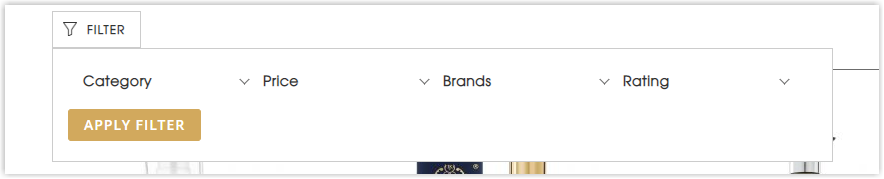
The listing page also uses the familiar modular grid to display the products because it helps create visual consistency through constraints. A complete filter is also offered for visitors to find what they need quickly and easily.
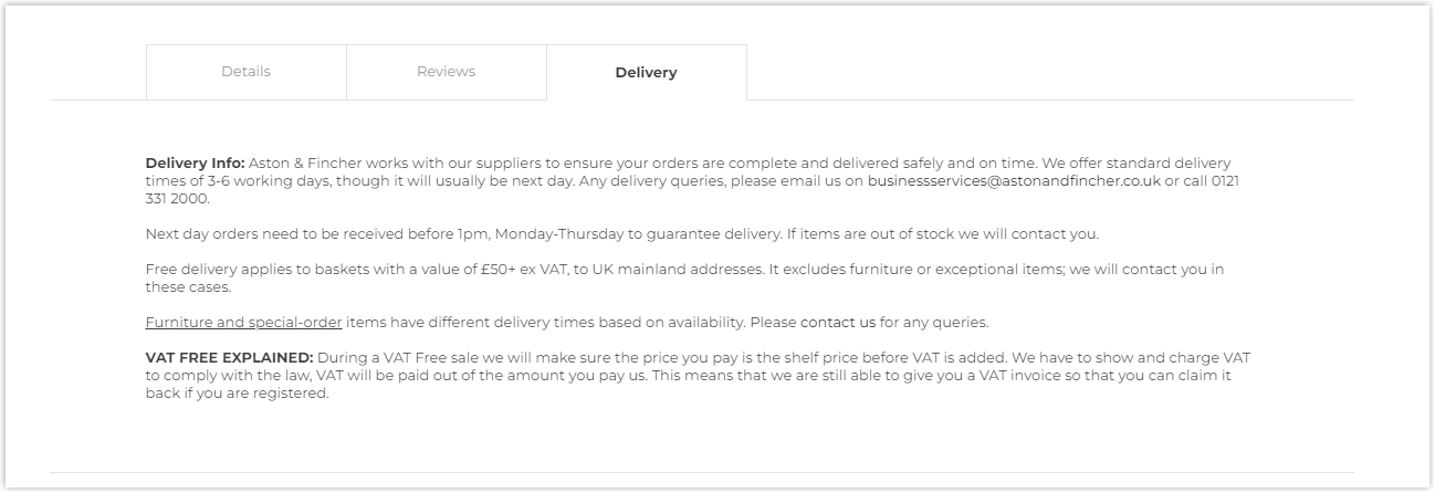
On the product page, different sections will have their own color to be distinguished better. To make it look neat, Aston and Fincher combine some menus( Details, Reviews, Delivery) in tabs.
Typography
Only one sans-serif typeface is used to make it easier to scan and understand. This Magento beauty store uses bolding, adjusting letter sizes, changing colors, and increasing line spacing to create the hierarchy.
CTA
Still has two familiar types of buttons, rectangle and hyperlinked text. Classic but effective.
Navigation Bar
The menu bar isn’t sticky to help users navigate, but there aren’t many elements and sections, so it won’t take much effort to scroll back to the top.
On the other hand, each menu has images to illustrate, helping users to imagine easily.
Images
High-quality images are used to highlight the products.
13. Beauty Plus Salon
Rate: 8/10
Color
The three prominent colors, black, white, and gray, are still used in this Magento beauty store.
Layout
All the sections on the homepage are arranged in a hierarchy, collapsed layout with proper negative space on both sides, making it easier for users to focus.
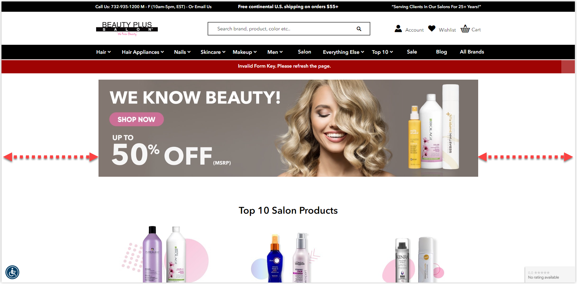
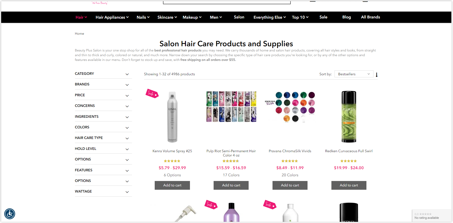
The listing page uses the modular grid to make it easier to display products with necessary details such as rates, prices, and names. A complete filter allows users to find what they want more quickly.
The negative space also benefits the product page while every element is centered. If you want to understand better, click the link above and discover it yourself.
Typography
A sans-serif font is the only typeface in this Magento beauty store. This helps the website have a consistent, professional appearance, and users easily navigate.
The number of characters on a line is appropriate and how the site creates the hierarchy is reasonable.
CTA
Two button types used are rectangles and hyperlinked text with the help of the reasonable arrangement of the surrounding elements, making it easier for visitors to locate and click on. The micro-interactions also encourage users to take action and converse.
Navigation Bar
This Magento beauty store also uses its website’s drop-down sticky menu bar. I like how sites use the full-width layout for their navbar because it helps users focus and navigate more easily.
Images
There’s nothing to say much about the quality of the used images since they are all carefully taken and edited, making the site professional and consistent.
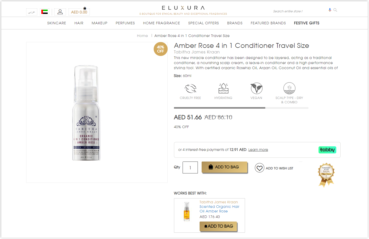
14. Eluxura
Rate: 8/10
Color
As you can see, the prominent colors here are gold, white, black, and gray, converting the luxury vibe of the brand, like its name, Eluxura.
Layout
The homepage is still the hierarchy grid with the giant hero banners of the best sellers, new arrivals, and prominent collections.
However, the CTAs aren’t appropriately aligned in the gift collection section, which makes the page seem cluttered and unprofessional. I drew a red line for you to understand easily.
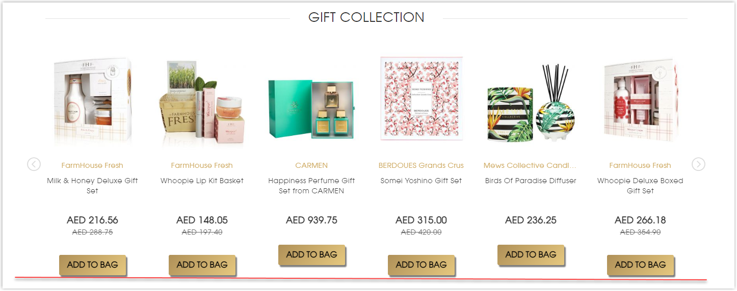
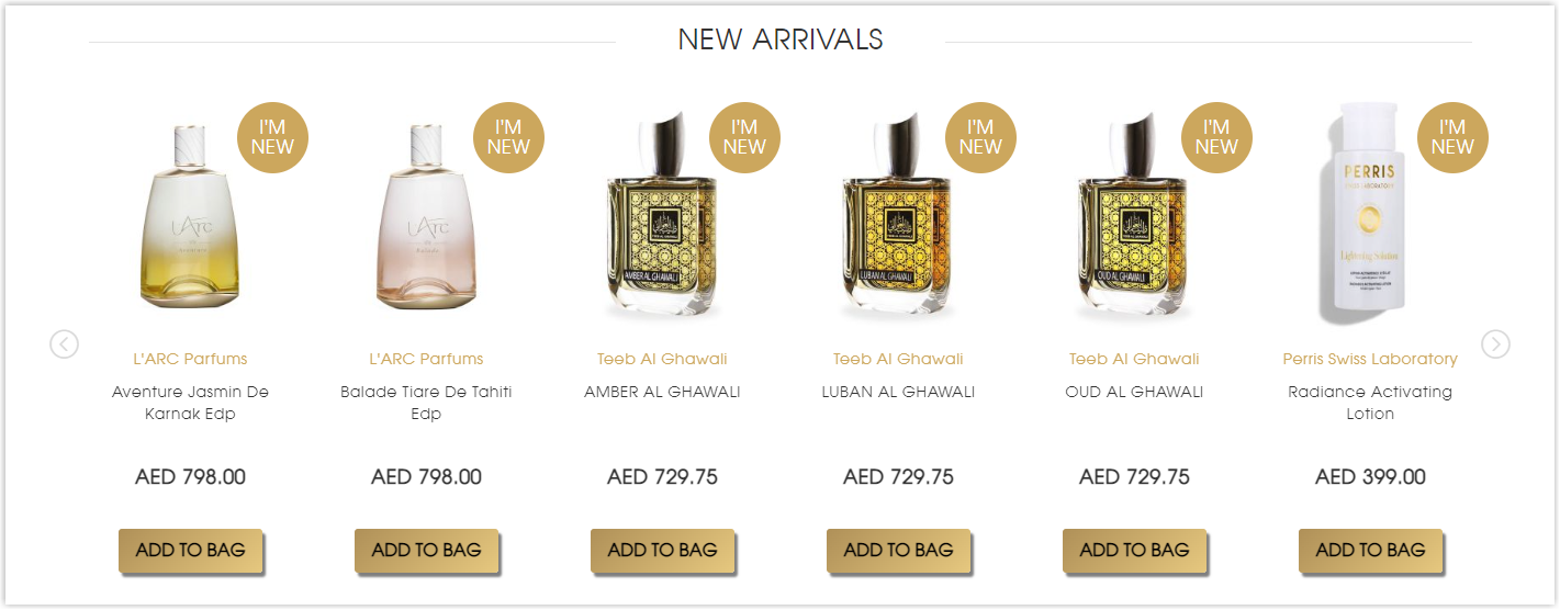
While it should be like this:
Different products are displayed in a modular grid on the listing page, with a complete filter for users to find what they need faster and more efficiently.
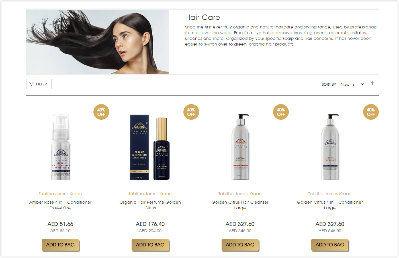
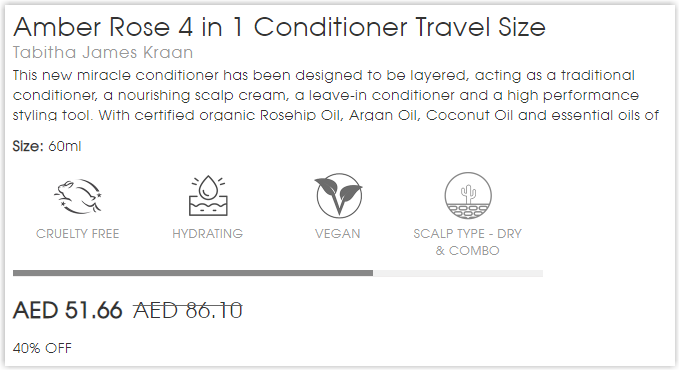
I like how this Magento beauty store neatly arranges elements perfectly within the hero section on the product page. Everything is centered on helping visitors focus quickly and find what they need faster.
Typography
Only one typeface is used throughout the website for consistency and professionalism. This is the tactic that most famous brands use in designing their sites.
On the other hand, they apply some methods I’ve mentioned above to create a hierarchy and highlight specific elements, including bolding, capitalizing, increasing line spacing, changing colors, or adjusting letter sizes.
Navigation Bar
Eluxura also uses the sticky drop-down navbar to display its essential sections. Though they don’t include images for each menu like others, there’s no difficulty for users to find what they want.
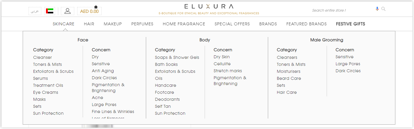
Images
To be honest, their images are just acceptable. If you take a closer look at the banners, you will notice that they aren’t formatted carefully and are blurry, making the website unprofessional.
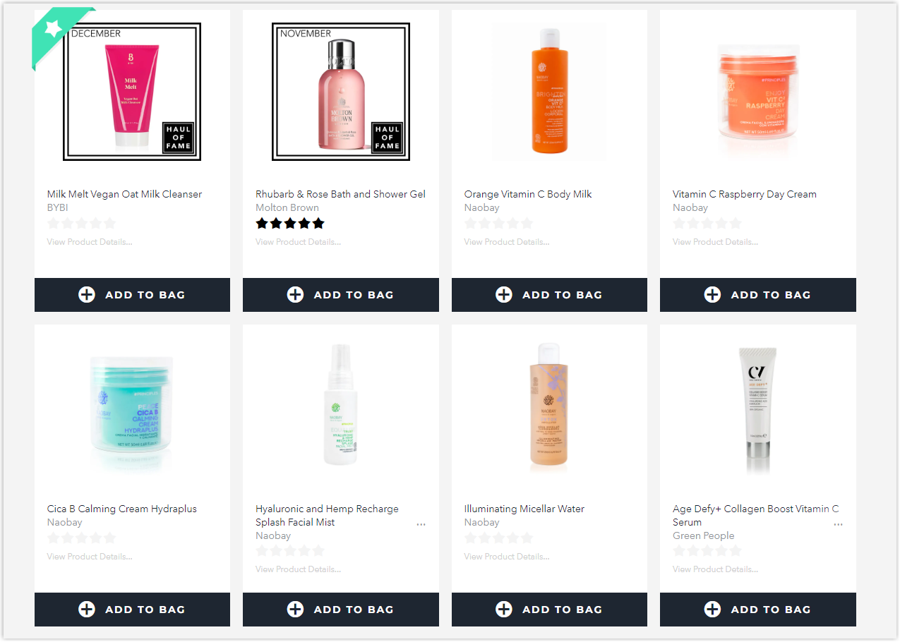
15. Last in Beauty
Rate: 7/10
Color
The logo is pink, so this Magento beauty store uses it for specific essential elements, like the CTAs. For the rest, the white, black, and gray combination still be in charge.
Layout
It’s the collapsed layout that the homepage uses to display different sections, helping users to navigate more easily.
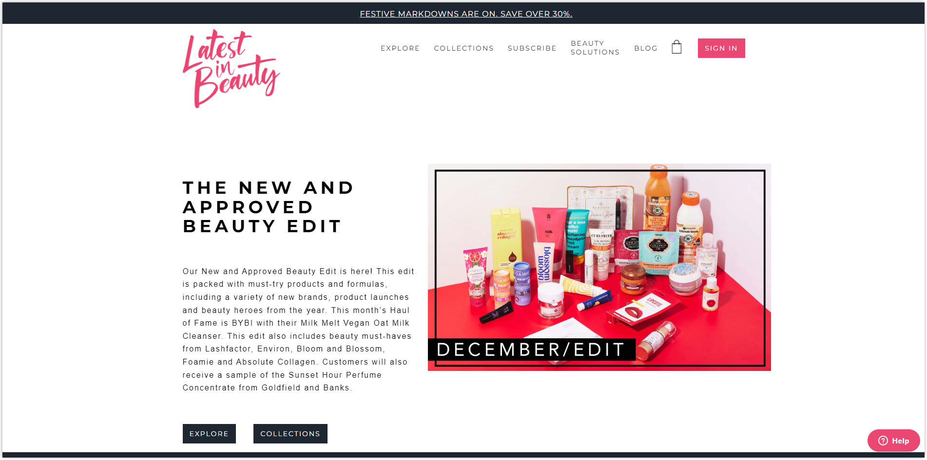
The listing page is still arranged on a modular grid to help visitors find what they need faster. However, regarding UX, it’s not easy for me to find the listing page from the navbar; I had to click on Explore, though, as usual, it’s the Collections that will capture users’ attention.
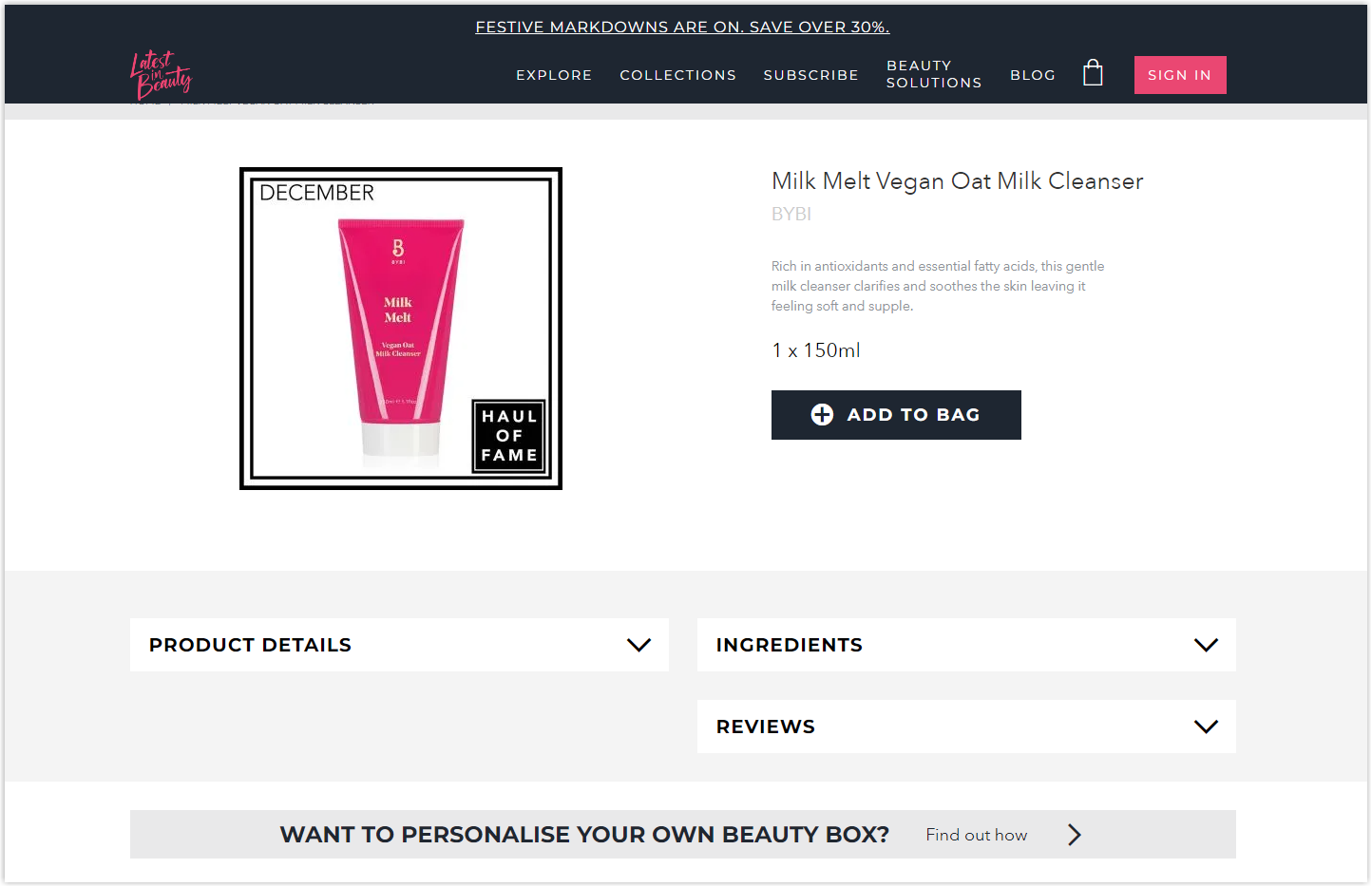
Below is everything you can find on this Magento beauty store’s product page. The layout is simple and direct, so that I won’t discuss it any further.
Typography
There are two sans-serif fonts on this Magento shop example, making it easy to scan and navigate. It also uses the methods I’ve stated above to highlight specific elements, including bolding, capitalizing, increasing line spacing, changing color, and adjusting letter sizes.
CTA
The basic rectangle buttons are used to encourage actions from users, and all of them are equipped with micro-interactions.
Navigation Bar
Unlike most other sites, the menu bar is sticky, not drop-down, and left-aligned. However, thanks to the micro-interactions, it keeps me interested in discovering.

Images
They are not super impressive, but they are enough to look at.
Disclaimer
- All the comments are experience-based; this article is not meant to insult any individual or organization.
- The websites are experienced only on PC screens. Please tolerate any mistakes or deficiencies if you use them on other devices.
- Due to the ideal length of the article, I can’t write about every page, and some aspects might not be covered entirely. Please comment below if you have any ideas that you want to add.
Did You Get the Important Takeaways?
Alright, what you’ve been waiting for is finally here. Let’s discover the lessons you can take away right below:
Colors: There’s nothing wrong with being creative when adding colors to your website, but it’s recommended to include those in your logo or if you don’t know how to mix them appropriately, consider black, white, and gray.
Layout:
- A hierarchy grid is highly recommended for your homepage and product page.
- To display your products effectively, use the modular grid.
- White space, or negative space, is essential in making the page balance and easy to navigate.
Typography
- Use only one typeface to simplify your website unless you have profound knowledge of typography in web design.
- Try capitalizing, bolding, adjusting letter size, increasing line spacing, and changing colors to separate titles and paragraphs.
CTAs
- Arrange the surrounding elements and adjust the line spacing to make your buttons easier to recognize.
- You can choose between hyperlinked text and rectangles depending on the images and other sections.
Navigation Bar
- Use sticky and drop-down menus to make navigation easier.
- Include images for each menu.
- Display only necessary menus and one level for each one.
Images
- Only use high-quality images. Don’t make your website look unprofessional.
- Product images should only be taken with a uniform background color.
- Add filters to make them look consistent.
- Photos with models should highlight your products.
Build Your Stunning Website With an Innovative, Comprehensive Magento Website Builder Tool From Magezon
Now, I believe you can’t wait to start creating your Magento beauty website, stand out from competitors, and earn more sales. However, though this platform is ideal for anyone, it requires daunting work with all the coding knowledge.
You don’t have to worry about that anymore. Based on the Core Builder, we provide the Magezon Builder extensions to help you build your website by only dragging and dropping. There are four most significant builders among our 14 builders that I’d like to share with you.
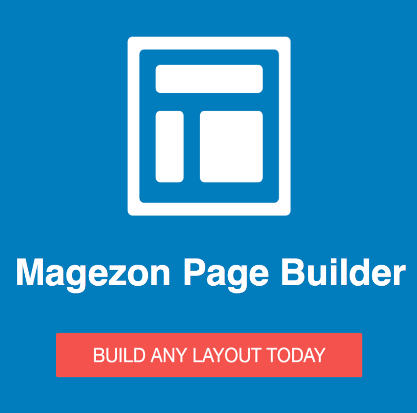
First, Magezon Page Builder is our best seller with more than 50 elements, including simple text blocks, advanced CTAs, product lists, and product sliders. Thanks to the WYSIWYG integration, you can easily manage your design process.
Every website needs an effective navigation bar, so our Ninja Menus is here to help you. With this extension, you can have a fully responsive navbar with 8 pre-made menus and 11 elements with the fastest load time.

We also have the Blue Form Builder to assist you if you need to create forms. 10 form templates, more than 35 fantastic elements, and various plugin integrations will help you build any form type you want.

Having a high-converting product page is a must for any eCommerce store owner. With 30+ elements, a fully responsive design, and many layout templates, our Single Product Page Builder is everything you need to attract more customers and earn more sales.

Before You Go
With the 15 best Magento beauty websites above, I know you have enough inspiration to build yours. Pay attention to every element, including color, layout, CTA, typography, navigation bar, and images, to stand your site out. Don’t forget to read carefully the summary I’ve made with all knowledge you need.


