 Magezon Blog Help Merchants Build Comprehensive eCommerce Websites
As a reputable eCommerce platform for more than 14 years, Magento has gained the trust of many organizations from different industries. It’s not hard to find a fashion, car, or cosmetics store with a website built in Magento. However, if you pay close attention, you can see that the number of clothing stores nearly outweighs the others. Therefore, today’s article, the first of our new series, will discuss Magento clothing stores’ UX and UI design.
Read till the end because there will be many things you can learn to optimize your website and earn more sales. To help you follow easily, I will evaluate stores from different segments. Let’s start with stores for sports and outdoor activities clothes.
Table of contents
Sports and Outdoor Activities Clothes
1. Liverpool
Rate: 9/10
One feature of Magento’s websites that you can recognize is their simplicity and ease of use. Most of them don’t use too many special effects; they will focus on the efficiency of the user experience. Liverpool’s Magento web design is a prime example of this.
Color
The website’s primary color is a symbolic red from the team’s logo. Combined with white has created a moderate contrast to help increase the prominence of essential components such as CTA buttons or price.
→ Use tools to generate your website’s color: 15+ Best Color Palette Generators for Website 2022 (+FAQs)
Layout
Most websites today apply a hierarchical grid on their homepage because it helps brands highlight essential parts (such as sales or new product releases) to attract visitors and turn them into customers. That has been successfully applied on the Liverpool website.
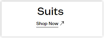
The hero banner for users to pay attention to is the LFC fashion collection, the most iconic and best-selling product. This helps visitors know that this Magento clothing store sells sportswear and other items related to or inspired by the football team.
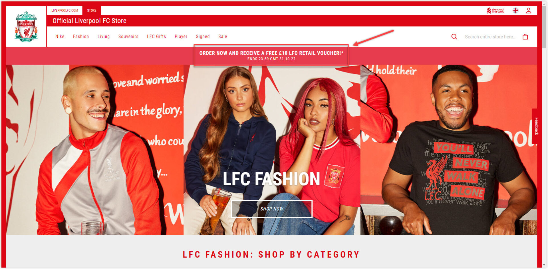
In addition, the phrase “Order now and receive a free 10 LFC retail voucher” right above the banner, although not too sophisticatedly designed, are still enough to attract users. This is a practical design that most popular sites are adopting, so remember to use it.
Below are other sections to introduce additional product lines, best sellers, new product lines (LFC NIKE training, LFC Retro Jerseys), and other attractive offers.
Like many other websites, Liverpool also applies a modular grid on the product list page to create synchronization and help visitors quickly navigate products. Below each item are available sizes and reviews (if any). In addition, users can also apply filters to save time and effort. This is a detail worth learning because now everyone wants to surf the web as quickly as possible; if visitors find that finding products on your website is not intelligent and takes a lot of time, your competitors is the beneficiary.
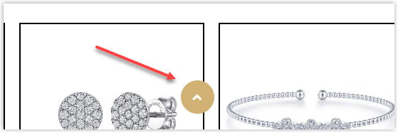
The detailed product pages include high-quality images with full angles to help visitors visualize more easily. Liverpool also provides complete manufacturing information, delivery and return policies, and reviews from previous customers.
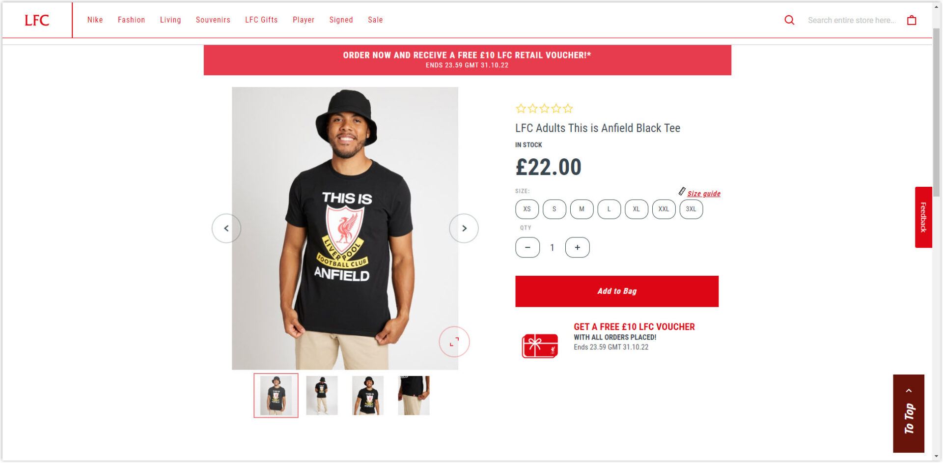
Reasonable white space is also a detail worth learning from Liverpool’s Magento fashion store because it helps the elements have coherence and independence.
Typography
Liverpool uses a single typeface throughout the website and only changes the fonts, i.e., bold, italic, and text size. After all, simplicity is the best.
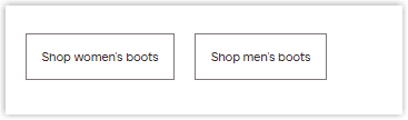
CTA Buttons
The buttons are placed logically with moderate contrast to make it easier for users to identify. On a white background, the CTAs will be red with white copy; for images, the buttons will have a white border around the low-opacity black background and white copy.
Navigation Bar
To make it easier for visitors to navigate pages, Liverpool has made their navbar sticky right in the header. This is the favorite feature of visitors when visiting any website because it helps them save time. The menus only include important and prominent categories. Smaller parts will be dropped down to save space and have only one level.
→ Learn to create your navigation bar: A Complete Guide to Creating Effective Website Navigation Bar
The footer includes other sections visitors may not find in the header with social buttons like Facebook, Twitter, and Liverpool’s partners’ logos.
Images
Images used throughout the website are high-quality and carefully selected to help convey the product’s message (dynamic and playful).
2. Mitchell and Ness
Rate: 9/10
Color
The color synchronization of the logo and website is evident that web designers should know. Therefore, Mitchell & Ness used two primary colors, black and white, to color their Magento clothing store.
In addition, because black is always a color symbolizing luxury and class, it makes visitors look at the products on the pages to think of high quality.
>> Discover tips for choosing colors for your website: 10 Useful Tips to Choose a Color Palette for Website
Layout
In general, the homepage alternates between sliders of different sizes and styles. A slider banner will be interspersed with a product slider.
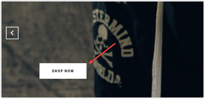
The main hero banner section has a few featured images of the brand’s featured collection, and below are the detailed products. Scrolling down is also the same format, and the end of the page is images of customers who have bought and worn the brand’s clothes for social proof. A thousand promoting words for quality differ from a picture from your customers.
The product listing page is not just an ordinary modular grid; it includes a banner above it to illustrate each collection. Next to the products is a filter that makes it easier for visitors to find the desired items. The filter here is much more detailed than Liverpool’s because it includes all available entries. Soon, this Magento fashion store website also consists of a section called Most Popular Styles, so visitors can easily navigate when searching for products and making shopping decisions quicker.
Clicking on any item will take you to the detailed product page. This is divided into two clear vertical sections, with one side being an image and the other being specifications, prices, sizes, shopping policies, and more. An intelligent strategy of Mitchell & Ness is to add the Finish The Fit section below. This is a great way to increase cross-selling and sell more.
Typo
Like Liverpool, the Mitchell & Ness website uses only one typeface with different fonts. This creates synchronization and minimalism to increase the quality of the user experience.
CTA
The CTAs on the homepage are designed with only one style, a black copy in a white rectangle. However, it is easy to locate them, and the simplicity also makes visitors focused on the main images.
→ 100 high-converting copies for your CTAs: 100 Last-Minute Call-to-Action Phrases to Double Your Conversion
One special CTA button in red appears on every page you visit and says Get 15% off, but I don’t know what it is for because when I try clicking it, nothing happens. However, it is an excellent detail that you can add to your website to increase conversions.
Navigation Bar
The drop-down navbar is centered, keeps sticky in the header with the most needed menus, and has only one level. However, because there is no To top section like Liverpool’s, visitors may take some time to scroll up while navigating (especially on product pages.)
Images
On the homepage, images are sharp and accurately illustrate the sports vibe with products worn by players. On the product page, images with a white background create synchronization and are easier to navigate.
Even though they don’t provide customers’ reviews on each product detail page, they create a dedicated testimonial page with pictures from tons of people who have bought and been satisfied with their clothes.
→ 50+ compelling ideas for your testimonial page: 50+ Stunning Testimonial Page Examples
3. O’Neills
Rate: 8.5/10
Color
The primary color of this Magento clothing store is green, combined with black from the logo and white as the background to create contrast. Green is not only a design color but also their apparel color, as seen on the products. It is the color of luck, growth, and calm; many brands have chosen it to design their websites.
Layout
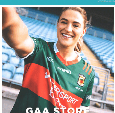
A familiar hierarchy grid is used. Unlike the websites above, O’Neills does not use hero banners for its homepage but instead includes two large images for its most famous product lines, GAA and rugby.
Overall, the homepage will be divided into sections by collection, Jerseys, Irish, and NBA, respectively. Each collection is divided into two columns; one is a large illustration with a model, and the other is for featured products or best sellers.
In addition to using the modular grid on the product listing page, it is also worth noting that the detailed filter is placed inside the upper banner and left. With them, customers can easily find the desired product without wasting too much time.
The product detail page is divided into three columns. The first column summarizes the images that will appear, the next is the large image, and the last is other detailed information. Right below is the We Recommend section introducing products that can be combined.
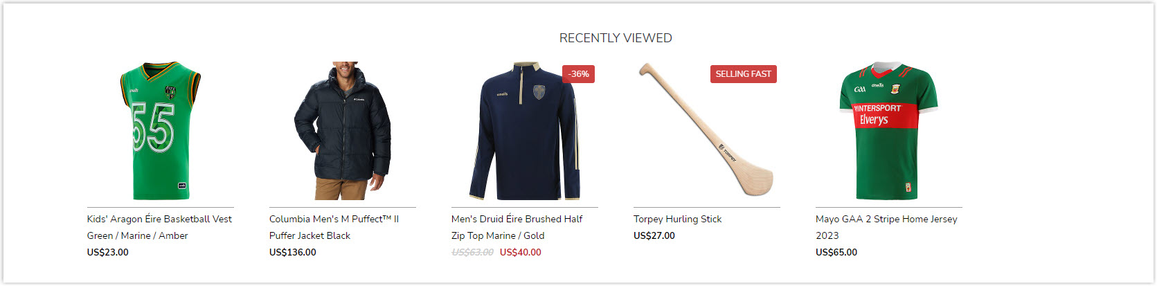
Finally, the Recently viewed section has a unique feature that the top Magento clothing stores above need to have. With this content, visitors can review their navigation history, saving time and increasing the likelihood of a purchase. Think about it, every time you shop online, do you also surf through many items and can’t remember? When you want to buy, do you wish there was a browsing history?
On the other hand, I do not appreciate the homepage’s whitespace because the sections look pretty close together. However, white space has done its job well for product pages and provides a good user experience.
Typography
Like the previous Magento websites, O’Neills uses only one typeface with different fonts for the same purpose and effect.
CTA
The remarkable thing about this best fashion website is that they have hidden the CTAs and adjusted them to only appear on mouse hover. They are also designed with a uniform style, black copy in a white rectangle. Simple but effective.
Navigation Bar
Because there is no sticky menu bar in the header and no button to go top immediately, users may have to take some time to scroll back to the top of the page if they want to find the categories they need.
Images
Using high-quality images is a must for fashion brands. And O’Neills’ Magento apparel store did an excellent job, too. The invested images will help visitors have a favorable view of the brand, thereby partly evaluating the quality of the products they will receive. On this website, the images of product details are taken with high resolution, helping visitors to visualize the actual material and color of the apparel easily.
The images on the model’s homepage also show the most sporty vibe possible.
Try FREE Magezon Page Builder!
Easily create your engaging Magento pages in any style whenever you want without relying on developers or designers, just by drag & drop.
4. Helly Hansen
Rate: 9.5/10
Color
The primary color Helly Hansen has chosen for its website is red, taken from the company’s logo. Red in web design symbolizes passion and importance, stimulates energy and excitement, and is very suitable for a website selling outdoor activities and sports apparel.
Layout
Helly Hansen’s Magento website is an excellent example of the saying simple is the best. Unlike the previous ones we discussed, they have narrowed to only necessary details on the homepage. The hero banner part is even just a picture of mountains and two people climbing, not including a single text.
They still use the familiar hierarchical grid, obviously. The introduction for the company’s Mid-Season Sale campaign is right below the banner. Below are two large photos on both sides, introducing the two most outstanding collections. Despite being simple and less detailed, the homepage has everything visitors need.
The product listing page is divided into segments: women, men, kids, and gears. Each segment contains other sub-collections. It may be because of this that the product filter of this Magento clothing store is not so detailed.
Each collection will arrange products in a modular grid with ratings, prices, and options below.
Coming to the product detailed page, you will be impressed with how this best fashion website has been arranged so that users can focus on the product to the maximum. Even though it uses a three-column layout like O’Neills, the middle takes up the most significant area (700 px), not to be unaffected by the two adjacent ones. The sections below are all logically arranged and separated with appropriate white spaces and colors to create contrast.
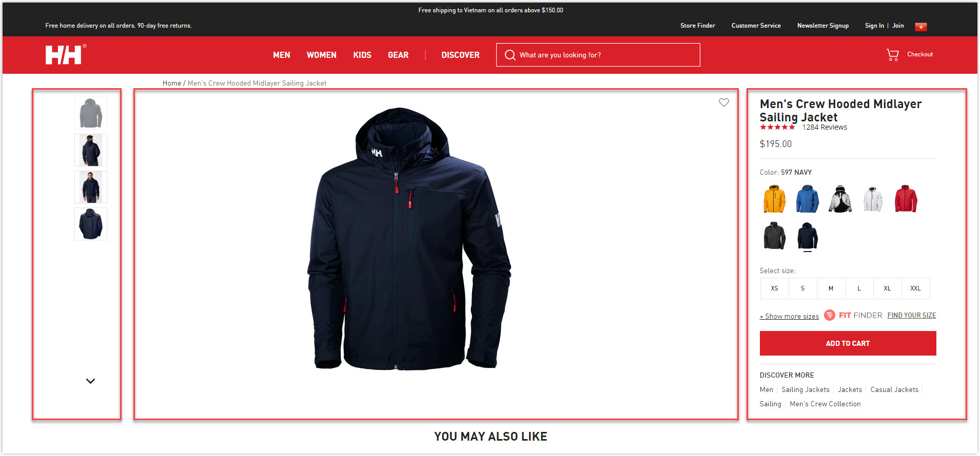
Typography
Except for the reviews written in Open sans, Helly Hansen’s Magento clothing store only uses a single typeface, DIN, with different fonts like a pro or black.
CTA
There are three main styles for CTA buttons. The black button with a white copy on the background, the white button with a black copy on the image, and the red button with a white copy are reserved for the email collection (it feels urgent and essential).
Navigation Bar
This red sticky drop-down menu bar helps users quickly navigate the website and find the page they want. As a site that focus on simplicity, Helly Hansen includes only four menus representing four of the company’s most prominent collections.
Images
The images are carefully selected with high resolution, helping to improve the website’s professionalism and increase customers’ trust.
5. 5.11 Tactical
Rate: 9/10
Color
The two primary colors in the Magento fashion store of 511 Tactical are black, white, and orange. The colors are spread evenly throughout the website, creating the proper contrast to highlight important details like a new collection, best sellers, or sale campaigns.
Layout
On the homepage, the hero banner section with images of the company’s featured items is prominently arranged and attracts visitors’ attention. The different sections are also logically arranged and separated by moderate spaces. Due to the use of a hierarchy grid, the essential parts are highlighted. In addition, if you look vertically, you will see that the details are staggered together, making them easier to see.
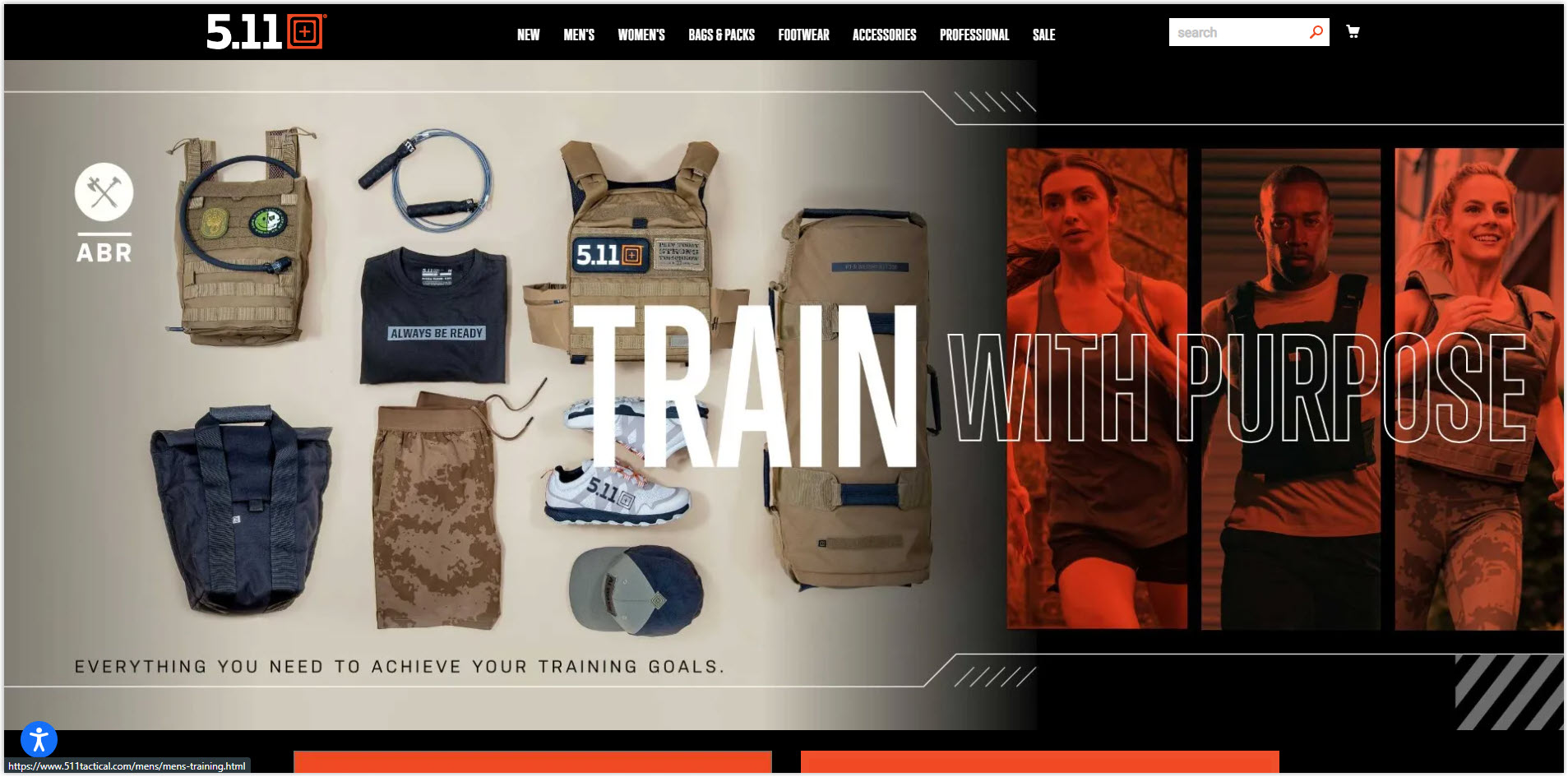
Unlike the above best clothing Magento stores, when you click on any segment (e.g., women’s), instead of being taken to a product listing page arranged on a regular modular grid, you will be taken to a general product page. Here, you will know how many subcollections are in a segment. A new page with entire filters and products on the new modular grid appears when clicking on any set.
The product detailed page section is similar to the pages mentioned above. The commendable point here is white space’s full and appropriate use to make navigation easier. 5.11’kw also optimizes cross-selling by adding two more sections: You may also like and Recommended for you.
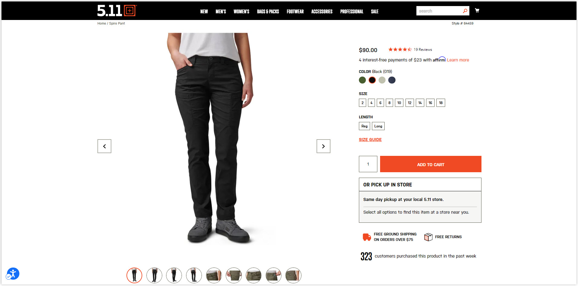
Typography
There are two primary typefaces used in this fashion website design: nudista and trumpgothicpro, but there is no apparent difference between them. The only difference is that tracking with trumpgothicpro’s tracking is a bit narrower. Another typeface is open sans, but it doesn’t appear too much.
CTA
All buttons are designed in a single style; a white copy inside an orange rectangle.
The unique feature of 5.11’s Magento eCommerce website is the integration of the CTA into the image, which helps the page look more compact. Still, it is easy to make the CTA sink without proper arrangement.
Navigation Bar
Also, a drop-down menu was made sticky at the top of the page to make navigating as convenient as possible. Menus are the most prominent segments, short and straightforward. A unique feature here is changing the bar’s color from gray to black so as not to occupy the spotlight of other sections when users are navigating below.
Images
As a reputable brand, large images such as banners or collection illustrations are carefully taken with high quality, giving them a sporty feel. Product photos are made synchronously with a white background to create professionalism and credibility.
Casual Clothes
6. Barbour
Rate:7.5/10
Color
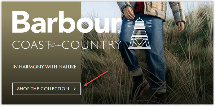
Barbour’s style is defined for those who live in the suburbs or enjoy outdoor activities. So what is the highlight color of this Magento clothing store? Are you thinking of old and faded brown or green? Then you guessed it right.
Layout
The homepage is still designed according to the familiar hierarchy grid to display different sections depending on their importance. Spacing between each section is evenly divided by reasonable spaces. However, even if the parts are separated, cohesion is not optimized. It is partly because the images used in each section have a faded color combined with blank space.
Except for the hero banner, the rest is nothing special. I like the pages in the Discover section more because at least I stopped at a few places.
The product listing page section also has the same problem. Clothes with bold colors can create accents and stand out from the background, while lighter clothing almost dissolves and discourages visitors from clicking.
On the other hand, the detailed product page does an excellent job in design, though not the best. The images are presented loud and clear on the left side of the page, enough for visitors to focus on.
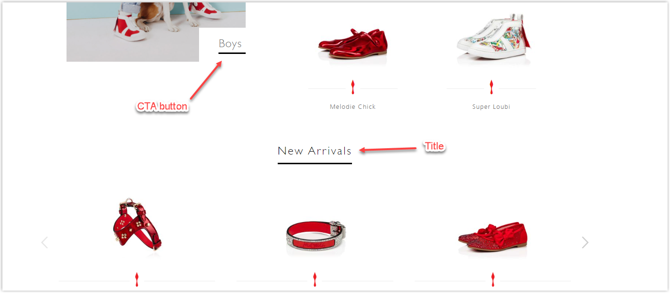
Typography
This Magento 2 website uses only one typeface: sans serif Futura PT W05 Book. Thanks to an effective hierarchy, the titles and body are clearly separated. Unlike previous websites, Barbour added a text section to describe the different collections, as shown in the image below. Each line only includes 40 to 60 characters to ensure readers capture the complete message.
CTA
There are two main types of Barbour’s Magento clothing store CTA, one is linked text, and the other is a regular rectangular button.
The CTAs are attractive enough for visitors to know which buttons are, but in terms of the overall page, here is the homepage; they are pretty lackluster.
On the other hand, the buttons on pages in the Discovery section are more creative and look more eye-catching.
Navigation Bar
Menus bar includes only the brand’s most essential and prominent collections. Barbour also designed their navbar most simply.
Images
Product images are of good quality and sharp. However, in certain parts, the quality could be much higher in the banner parts. You can immediately notice it in the hero banner. In addition, Barbour may consider capturing images on the homepage with more prominent colors to attract users and motivate them to visit other pages.
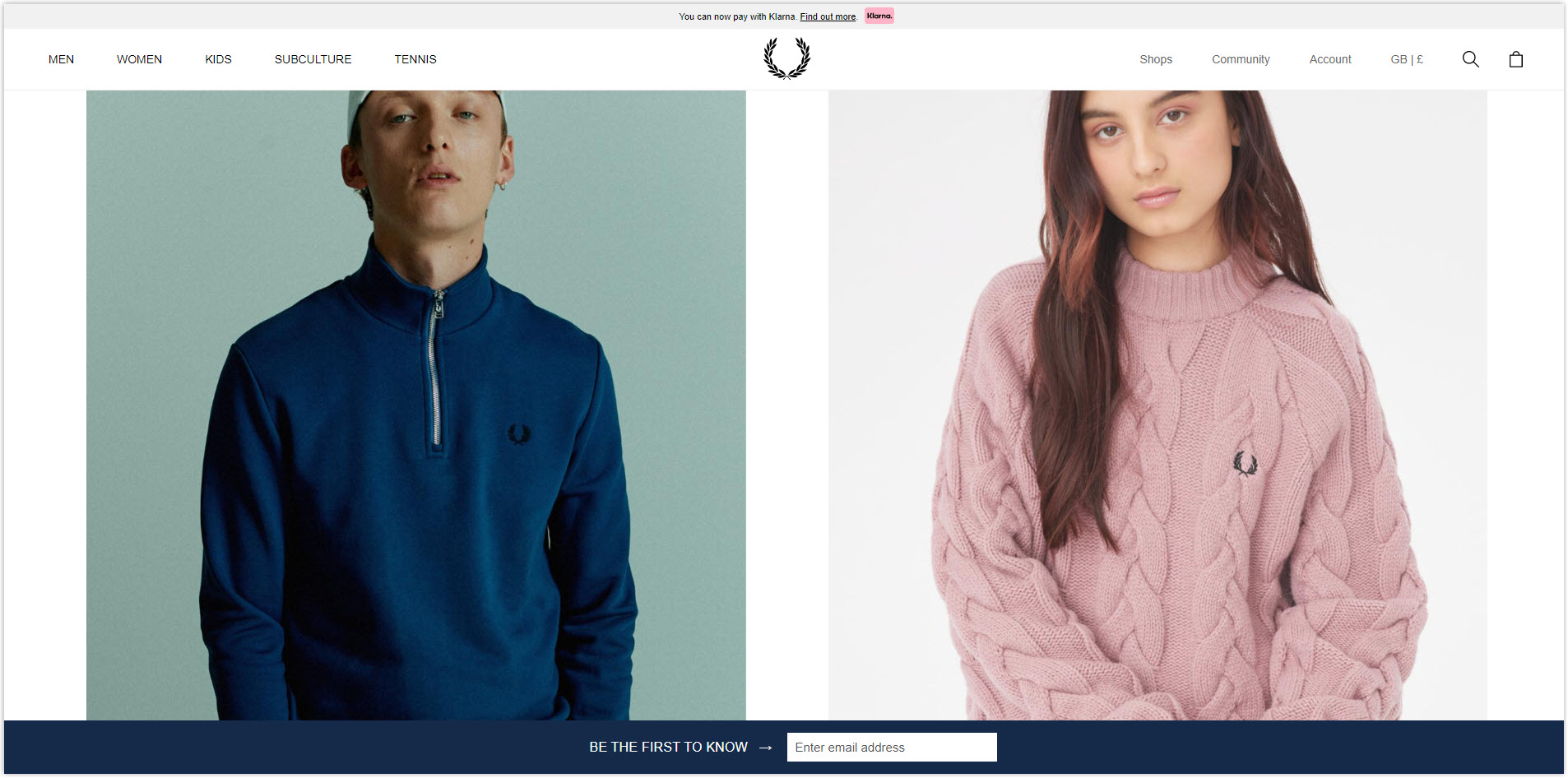
7. Fred Perry
Rate: 8.5/10
Color
Fred Perry is known for his streetwear and sportswear styles, polite yet rebellious. Therefore, its website is designed to look unique to convey the apparel’s style. The colors used are generally just two primary black and white colors, with some gray points added to create contrast and distinguish different parts.
Because Fred Perry’s clothes are quite an undertone, only black and white is best suited to not drown out the product images but still just enough to make them stand out.
Layout
The most commendable point of this website is the liberal use of white spaces. The sections are separated from each other. Thanks to that, although the homepage is detailed, it’s not overwhelming. A hierarchy grid helps this Magento fashion store to organize elements scientifically and highlight important sections.
The difference in Fred Perry’s product listing page is that they not only use the standard modular grid but also combine it with a hierarchy grid to showcase featured collections and separate different product lines.
Unlike the sites above, the detailed product page no longer includes sections encouraging cross-selling. This time, the three parts to introduce and display the product are divided equally, with the big image in the middle.
Overall, all of Fred Perry’s pages are spacious and do not involve too many details, making navigation easier.
Typography
This website uses only one typeface with different fonts for the title and body, Helvetica Neue.
CTA
All the CTA buttons used have only one style: a black copy in a white rectangle. Some specific CTAs will only appear on hovering, unlike the integration into the image as in 5.11 Tactical. The strength of this is to help visitors ultimately focus on the image, but the weakness is that they will not know if there are CTAs.
Navigation Bar
The menus are simplified and include only the major sections. The unique feature here is that it is designed not to be 100% sticky like regular websites. For example, on the homepage, when scrolling to the end of the hero banner, it will disappear, and if you keep scrolling down, you won’t see it. But scroll up once, and it will appear again. This smart design has the same function as 5.11 Tactical’s color-changing navbar, helping visitors focus entirely on the pages’ details. See the video below for a better understanding.
Images
There isn’t much to say about the images used, as they are almost perfect already. High resolution and carefully edited uniform style create professionalism for the entire business and increase customer trust.
However, one point that can annoy you is the huge size of some images, making them not fit on a page, and even when you try to zoom out, you still cannot see the whole picture.
Try FREE Magezon Page Builder!
Easily create your engaging Magento pages in any style whenever you want without relying on developers or designers, just by drag & drop.
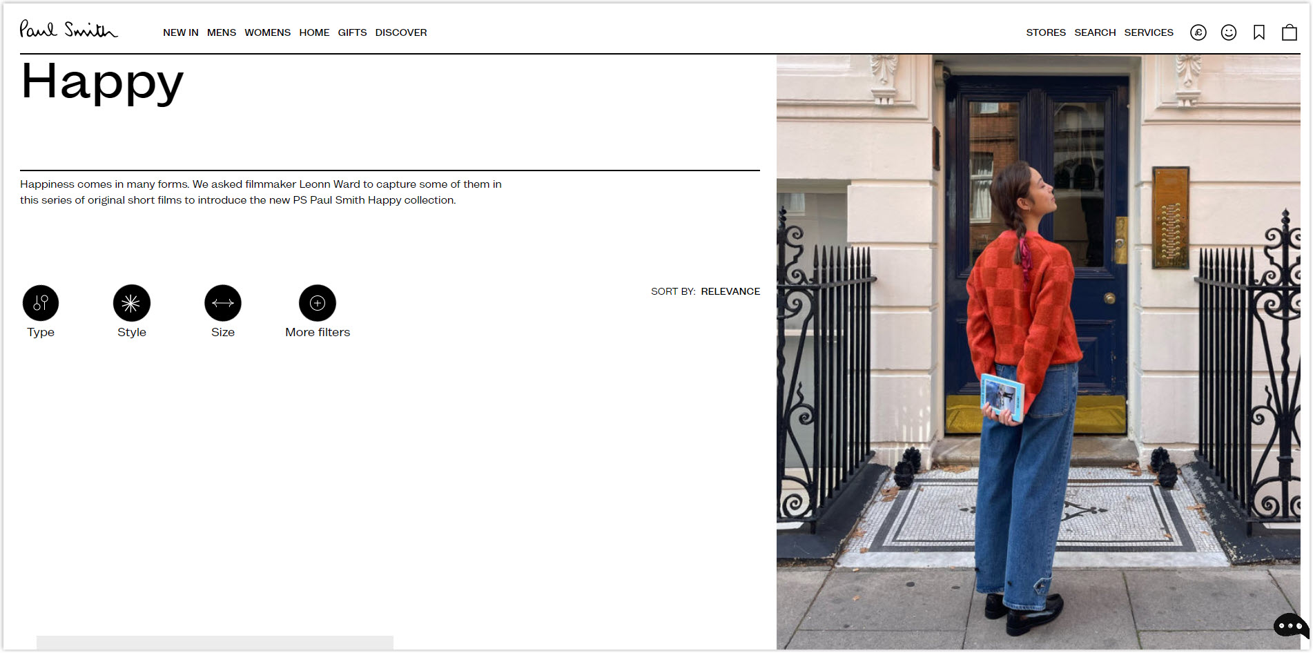
8. Paul Smith
Rate: 8/10
It can be said that Paul Smith has created a pretty creative website compared to the unique layouts.
Color
This Magento clothing store also uses a white background to highlight details and sections. This website’s three primary colors are white, gray, and black. However, in the navigation bar, each segment has its color. For example, Mens is yellow, and Womens is green.
Layout
The sections on the homepage are arranged in a familiar hierarchy grid. Still, the hero banner section is no longer just a single image but contains images of the two most prominent collections, Mens and Womens. There is a large white space between the sections, and the illustrations are also prominent.
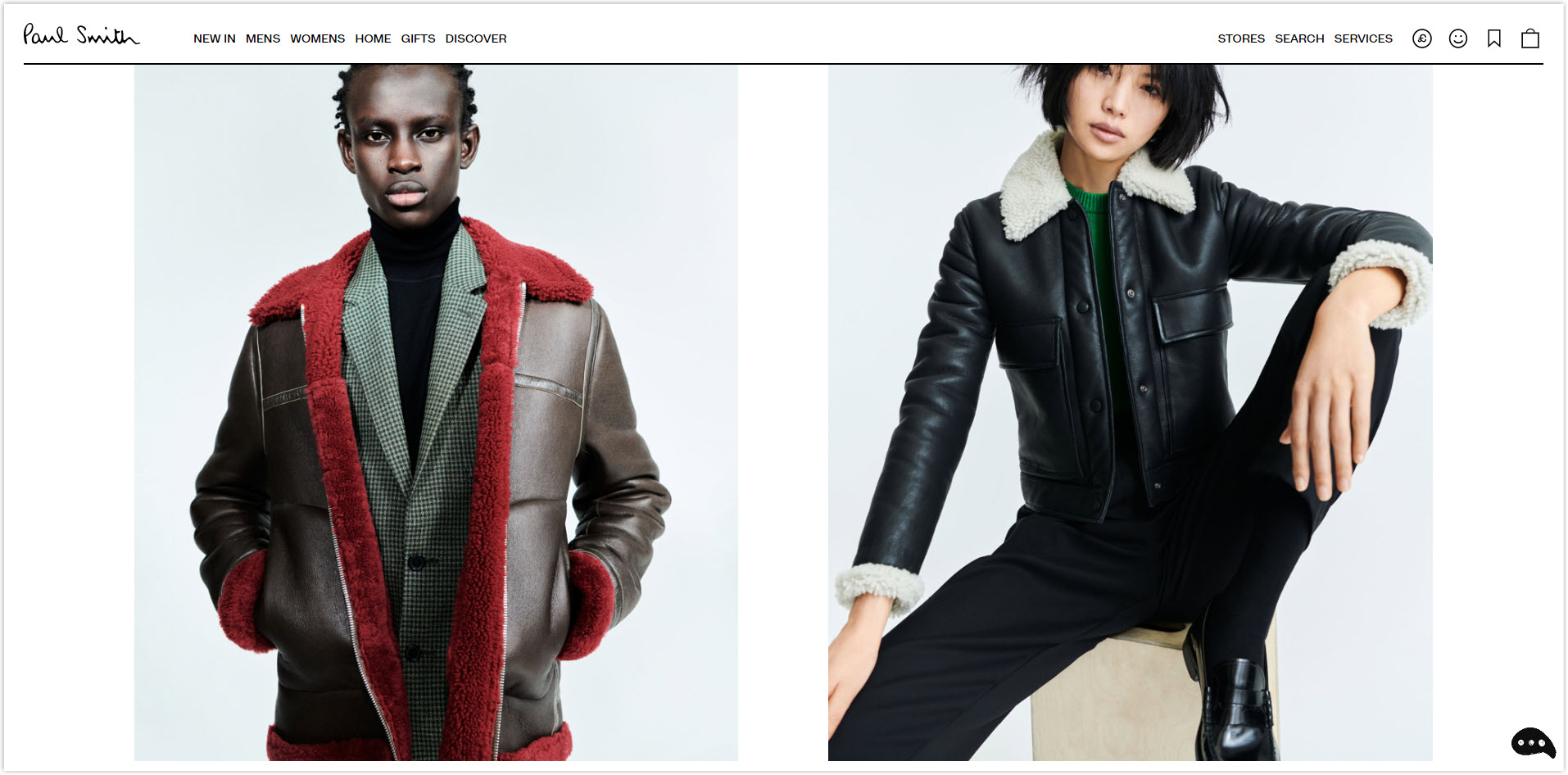
The part that stands out the most is where I recorded the video right below.
Have you noticed that the two side-by-side images are always interlaced? This is where the brand showcases the collections they want to promote the most.
After a period of experience, I can say their arrangement is like an exhibition.
The items on the product listing page are still arranged in a familiar modular grid, but the images are much larger than on previous websites. With different collections, Paul Smith also includes a banner at the top of the page to introduce, but instead of a small banner, they dedicate an entire hero section. The space between sections is also aligned to make the whole page as spacious as possible.
The product detailed page section can look cluttered to some customers, especially older customers, where simplicity is their priority. This is a creative approach to introducing products for young people, but only some will agree with this arrangement.
Typography
Paul Smith uses only one typeface with different fonts for their fashion website design, sans serif Mint Grotesk. This font is quite eye-catching and easy to scan for users. The typography is generally relatively easy to read, does not abuse capitalization, the spacing is just enough, and the contrast is reasonable. There is a clear difference between headings and bodies.
However, the length of the line could be more reasonable. On pages in the Discovery section, the line length can sometimes be up to 100 characters, exceeding the recommended 80 characters, making it difficult to read.
CTA
On the homepage, most buttons are just text links with an arrow pointing to the right. When hovering the mouse over, it will redirect to only horizontal.
In general, they are simple but still enough for users to know where to click and are arranged in order of reading and quite harmonious with other details. Copy is explicitly used but needs to be more appealing; at most, it is still Shop now.
Navigation Bar
Still, the familiar and convenient drop-down menus bar. Paul Smith only participates in a few menus, making the bar neat and easy to use. It is sticky at the top of the page and will appear exactly like Fred Perry’s navbar.
Images
To synchronize with the monochrome, simple, and rather dark outfits, the images used are also added a filter layer to reduce the freshness. All are carefully and professionally shot against a gray background. They also edited the photos so the products had clean cutouts and realistic reflections.
9. Moschino
Rate: 8/10
Color
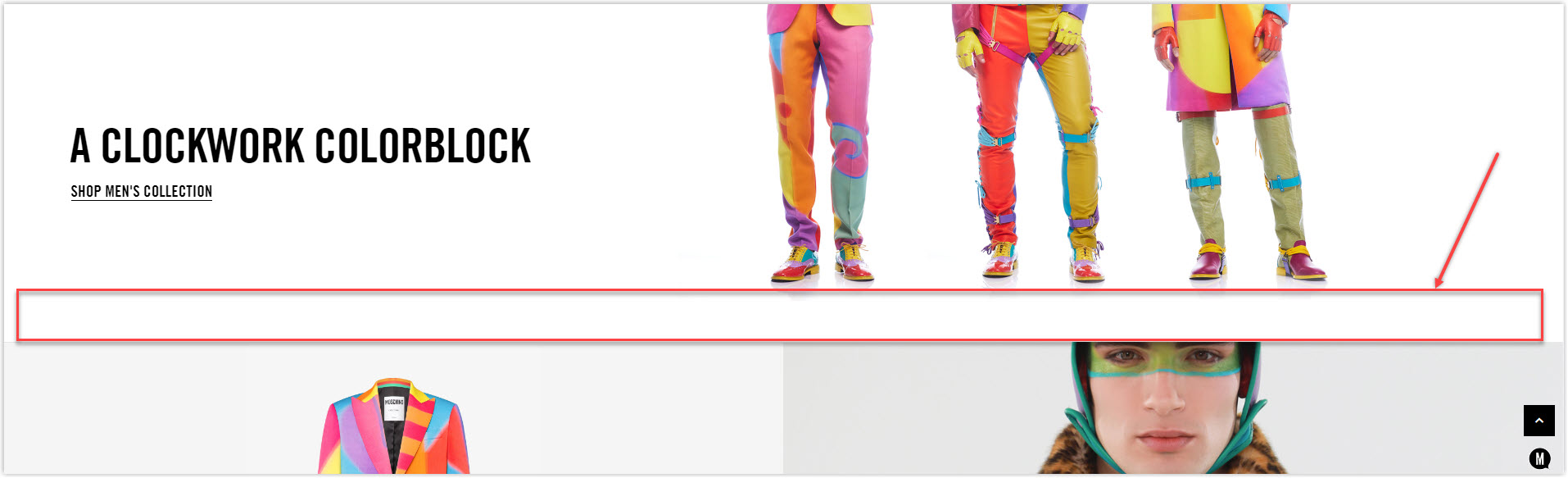
The website’s primary color is still the familiar black and white from the brand’s logo. These two colors are simple but effective enough to create contrast for different sections. If you pay attention, you will see that Moschino’s costumes are pretty eye-catching and colorful. Therefore, to be able to highlight them, black and white is the most reasonable choice.
Layout
White spaces are not used as generously as Paul Smith’s because they have taken advantage of the spaces on the image, as you can see below. Sections are also arranged on a hierarchy grid to highlight important sections.
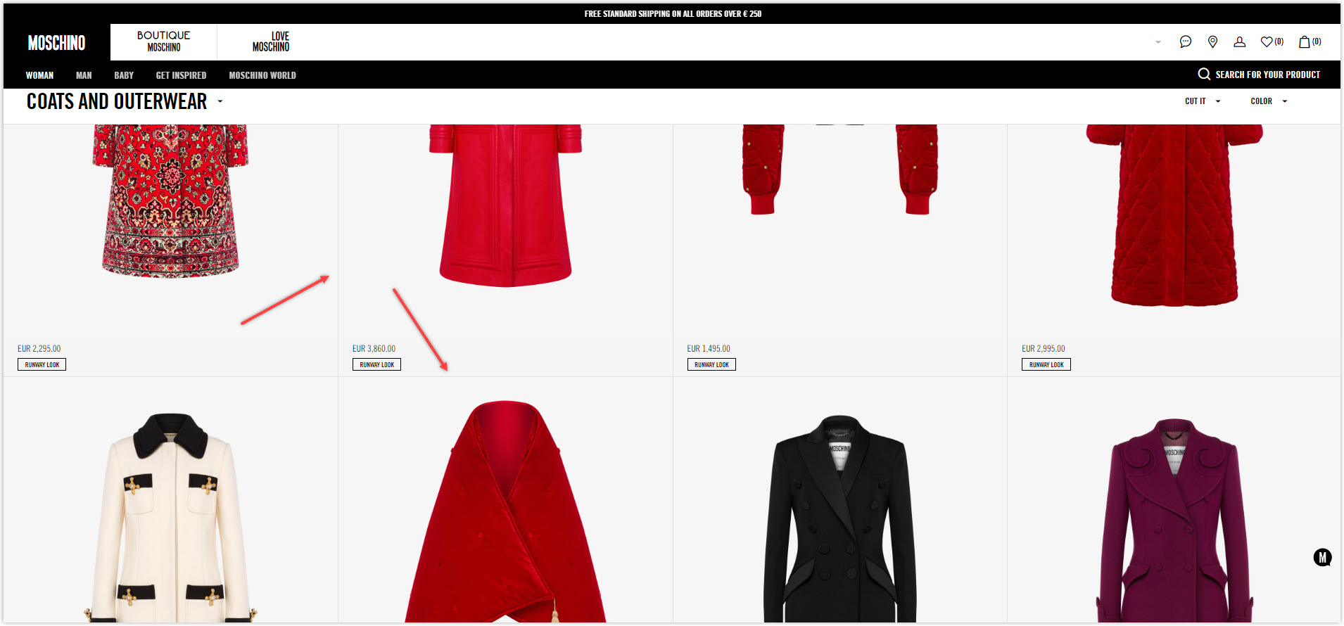
On the product listing page, Moschino does not include a banner for each collection but directly displays products on the modular grid. There is no blank space between the product, and horizontal and vertical lines separate them. However, because the images used have their own space, they do not look overwhelming and are still separate from each other.
The detailed product page is straightforward and spacious, with two main sections: product images on the left and information on the right. The details are arranged separately and do not affect each other.
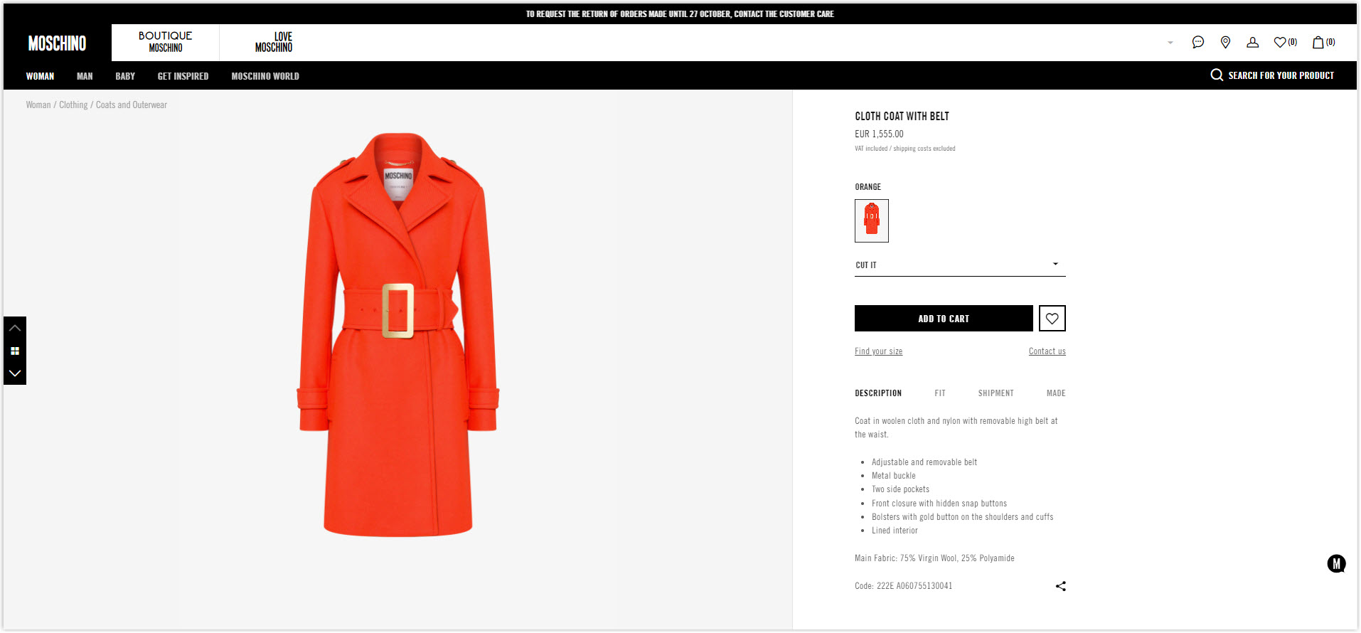
Typography
Moschino’s Magento 2 website uses only one typeface, sans serif TradeGothic with different fonts. The typo is generally relatively easy to read; compared to Paul Smith, I rate this website a bit higher. They also use hierarchy and spacing between lines to separate the title from the body.
CTA
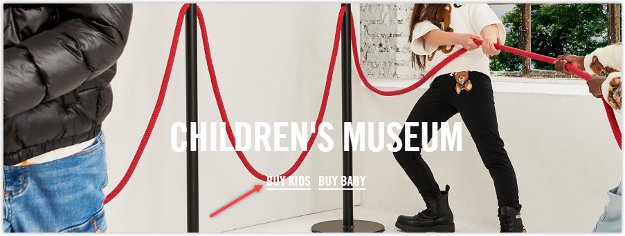
Like Paul Smith, Moschino’s CTA doesn’t have the rectangular shape of a regular button but instead has linked text that will change if the mouse hovers over it.
This seems creative, but for sections with featured images, it can be difficult to navigate to see where the button is located. For example, let’s look at the Children’s museum section below.
Navigation Bar
Moschino also uses drop-down menus and makes them sticky at the top of the page for easier navigation. The menus are also minimalistic and include only the most prominent sections.
Images
The images used are of high quality, with just the right amount of space to make the website look more spacious. This is the most consistent product photography page ever. Let’s watch the video below.
Did you notice that all the products only consist of two images, one of the products and one of the models?
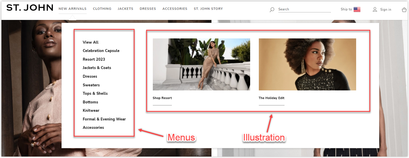
10. St.John
Rate: 8.5/10
Color
Overall, the website of St. John has a noble, luxurious bass brown tone that matches the brand’s clothing style as they declare their products. Brown is also a color of stability, trust, and balance.
Layout
St. John also chooses a hierarchical grid for its homepage. Unlike Moschino, its layout is easy to understand, and you only need to scroll about twice to grasp the idea. The spacing between the sections makes them stand out but still well-linked together and not as disjointed as Barbour’s homepage.
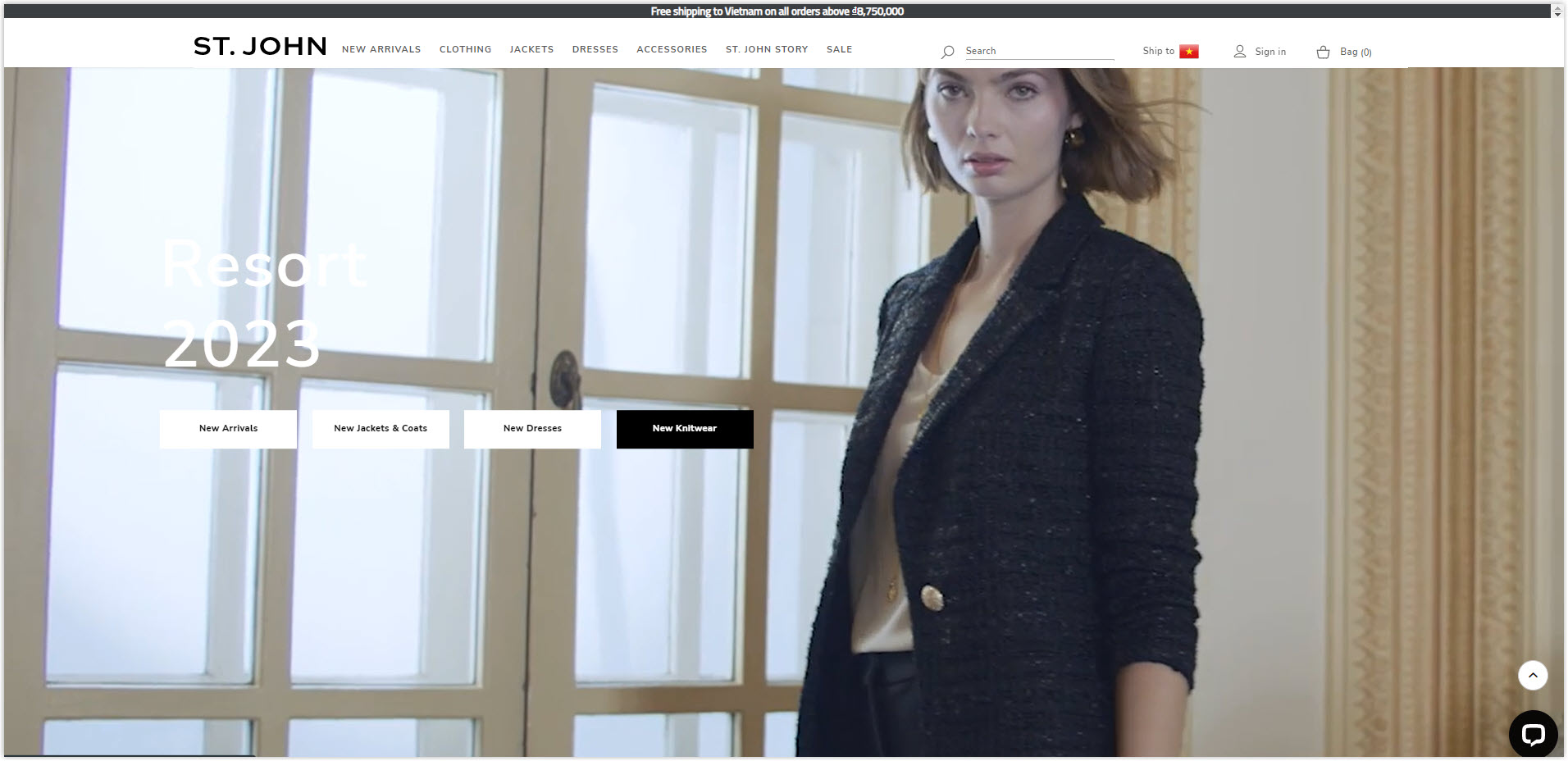
The product list pages are arranged in a simple modular grid. Between items, there will not be a component constraint to distinguish them like lines, but only when hovering a new frame will appear. This does not enjoy what to navigate the visitor’s capabilities.
The product detail page is also divided into three main sections. I prefer this arrangement because the images are big enough and can still be easily navigated (with the zoom feature on hover.) St.John doesn’t include too many details like Paul Smith; it will suit most customers.
Typography
This Magento fashion store only uses one typeface, Nunito Sans, with proper tracking, easy to see, and readable. Line spacing is adjusted correctly, and fonts are changed to create a hierarchy. The text is aligned on pages with more text, like History, so each line contains no more than 80 characters. Overall, the typography of St. John did its job well and was unaffected by the other components.
CTA
The style CTA that this one of the best Magento websites uses throughout the pages is the style text attached to the footer. The copies are also simple, direct, and nothing too creative. This design is basic but prominent enough for visitors to know it is a button.
Navigation Bar
It’s a typical sticky bar on a white background with only necessary menus such as New Arrival, Clothing, Jacket, etc. Each section has one level to simplify the search process and apply a consistent style.
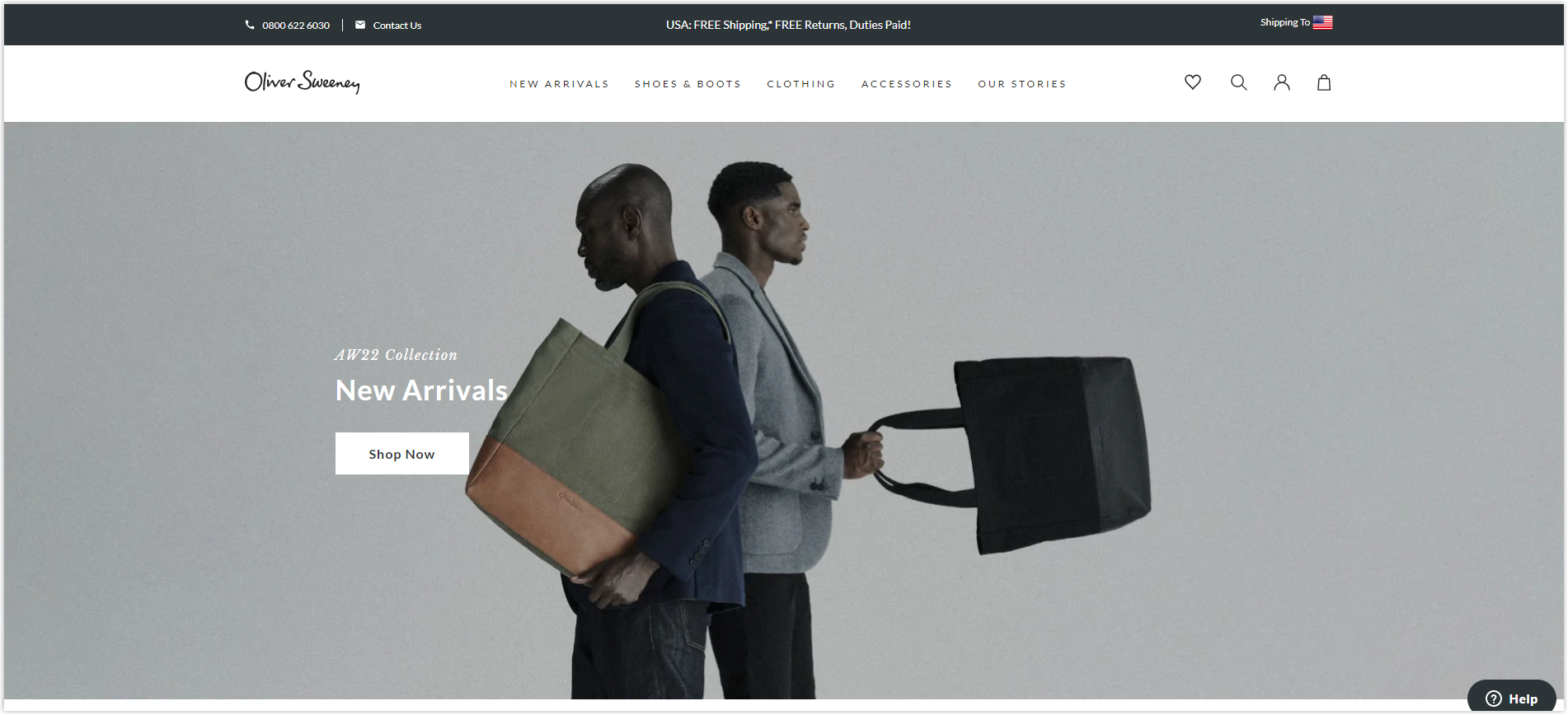
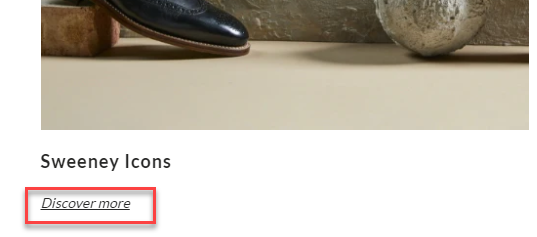
11. Oliver Sweeney
Rate: 8.5/10
Color
The colors used are mainly black, white, and gray for the different sections. These are primary colors but still, create a good contrast and highlight the necessary details. They are evenly distributed throughout the website, creating unity among pages and making navigation easier.
Layout
On the homepage is still the familiar hierarchy grid to display special collection sections. Blank space is used flexibly and reasonably to make navigating the page easier. Moreover, it helps different components not be affected by each other.
The product list page uses a modular grid like other websites but with a sticky detailed filter right below the navbar to help visitors find the products they want as quickly as possible.
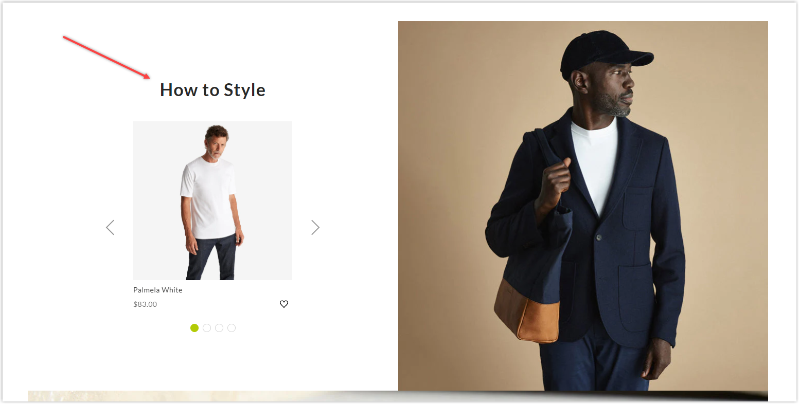
On the product detailed page, the hero section is divided into two unequal parts, with the image section being twice as large as the product information section. This helps visitors quickly focus on the product, but the image is still slightly skewed to the left, and I prefer it in the middle.
Instead of using only a tiny space on the product page to promote cross-selling, Oliver Sweeney displays it in a large area as a hero banner named How to style.
Typography
Like other websites, Oliver Sweeney only chooses a single and very readable typeface, Lato sans serif, with different fonts. Hierarchy and leading are fine-tuned to highlight different sections.
CTAs
The buttons on the homepage are basic rectangles in white or no color, with a simple copy that is not too appealing but attractive enough for users to click because of the beautiful illustrated images and videos.
However, on Our stories page, they are just hyperlinked text.
Navigation Bar
Only essential menus are included to avoid confusing visitors and make it easier for them to find their desired products. Oliver Sweeney has chosen for his website a sticky bar so that customers can easily access any product page wherever they are.
Images
Images used are high quality; they are not broken when zoomed in. Image editing also focuses on creating website consistency by applying synchronous filters. If you pay attention, you’ll see they have the same gray tone. Product images are carefully taken and edited on a white background to help visitors easily observe and have a preliminary assessment of themselves.
12. The Irish Store
Rate: 8/10
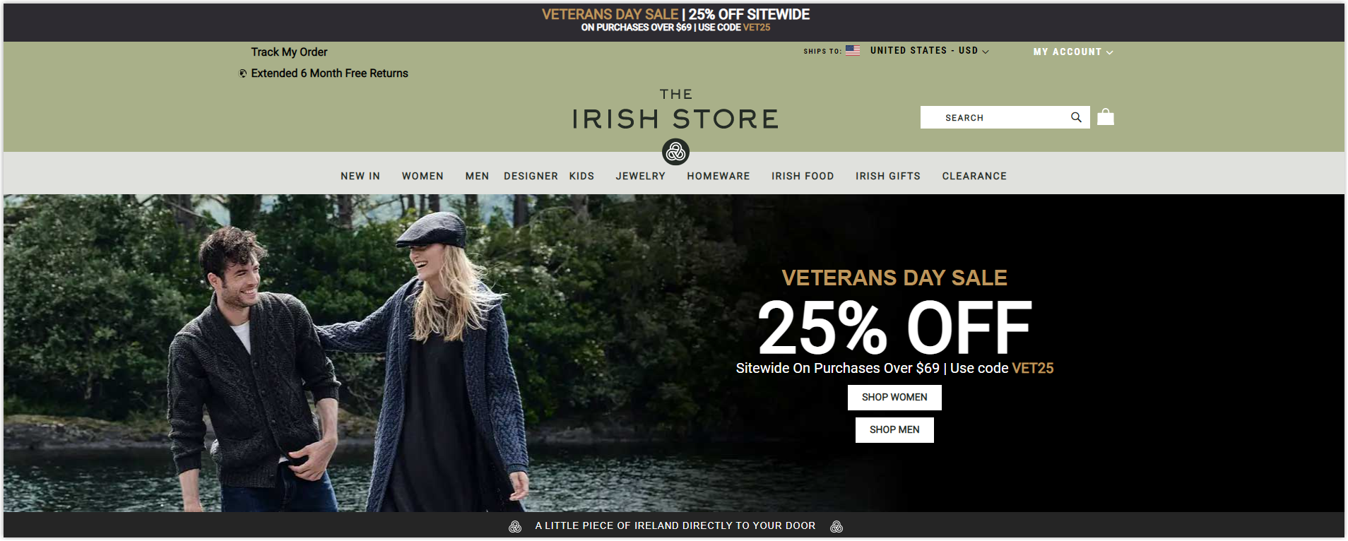
This must be the most straightforward website, with only essential elements and barely any particular features or effects.
Color
This Magento clothing store has a dark to light green tone contrasting the different parts taken from the brand logo.
Layout
Homepage is still the familiar hierarchy grid to display different sections depending on their importance. Blank space is used appropriately to help elements have a clear separation and to make navigation more efficient.
The product list page of The Irish Store arranges products in a modular grid and combines them with detailed filters to help visitors find them easier.
The product detailed page is presented simply and neatly with three main sections: images, details, and policies. In addition, The Irish Store does not promote cross-selling like other sites, so it is even neater.
Typography
This one of the best fashion Magento stores uses only one typeface with different fonts. To create a hierarchy, they increase the size of the text, capitalize it, or increase the line spacing.
CTA
Buttons have just enough contrast with the surrounding parts to encourage visitors to click. The copy section is not too creative but provides enough information for users to know where clicking on them will lead.
Navigation Bar
The Irish Store does not apply sticky menus, so visitors must scroll up whenever they want to find any page. It also includes only its most essential and prominent menus.
Images
Personally, the image used in all parts is not very sharp. Just zooming up once can see the broken image lines. The appearance of the banner is also not too good quality, which can lead to visitors having a wrong impression of the brand’s professionalism and increase the bounce rate.
Try FREE Magezon Page Builder!
Easily create your engaging Magento pages in any style whenever you want without relying on developers or designers, just by drag & drop.
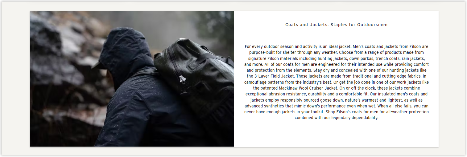
13. Filson
Rate: 9/10
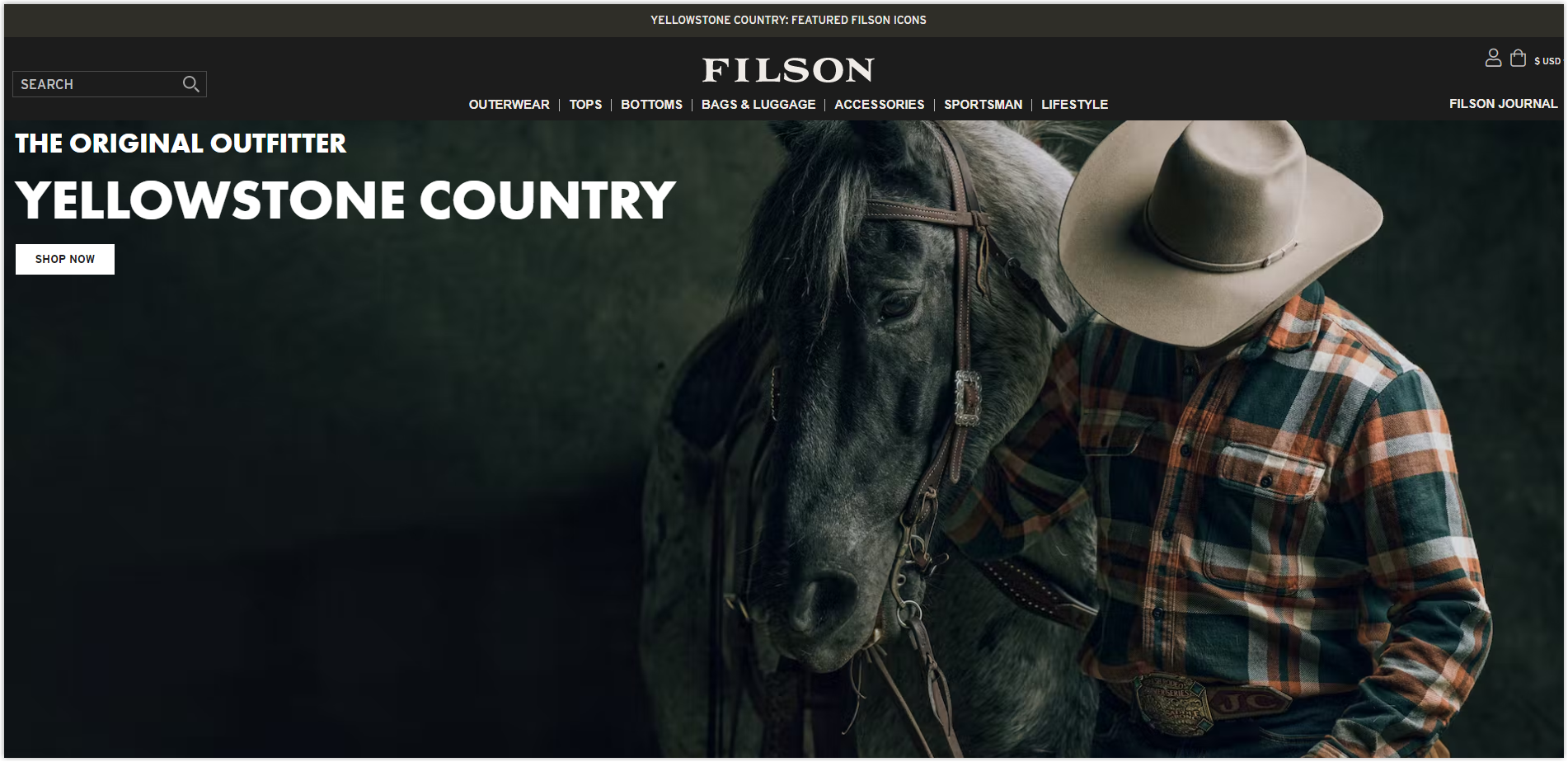
Color
Filson also uses green tones for their website but compared to The Irish Store, they are less fresh. The background, instead of white, is a deep cream color but can still help the sections stand out.
Layout
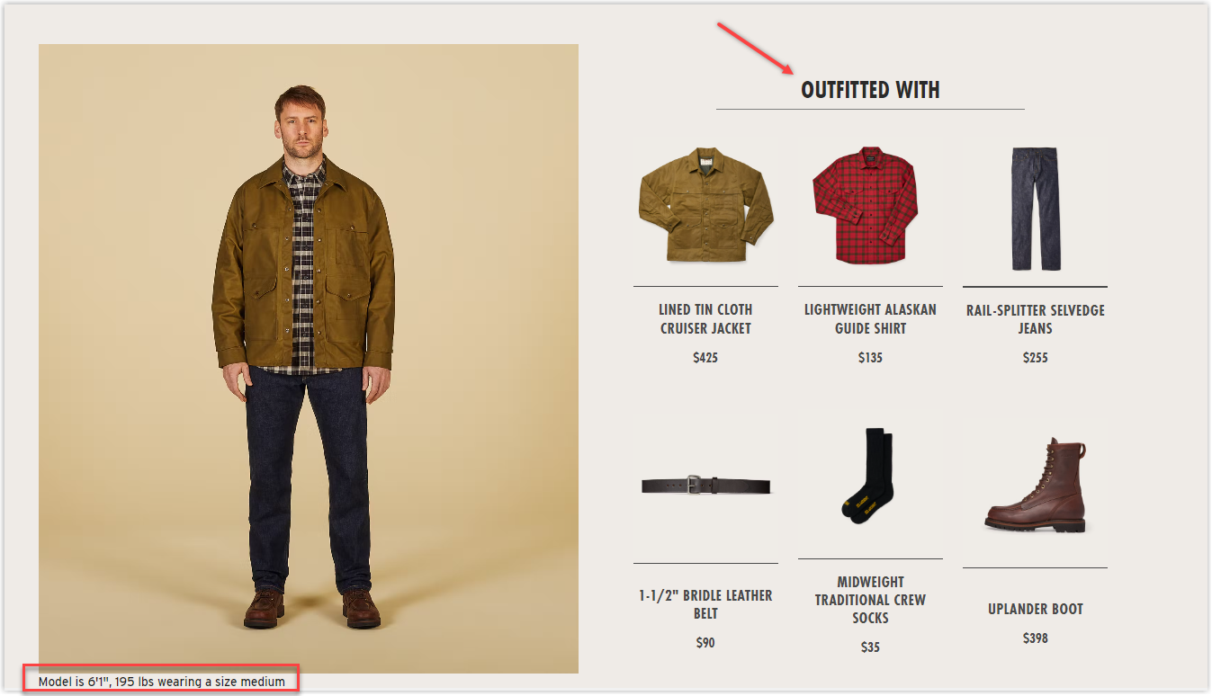
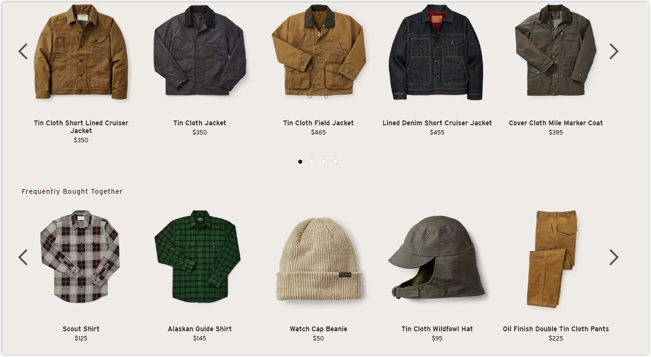
The sections all have different grids but are similar to the websites above. The homepage uses a hierarchy grid, the product list page uses a modular grid, and the most obvious difference will be in the product detailed page.
On the other hand, on the product listing page. Filson includes a short introduction to the various collections below.
This top Magento clothing store has displayed the detailed product page clearly and carefully with all the necessary parts. The cross-selling section is arranged both in the middle and bottom of the page.
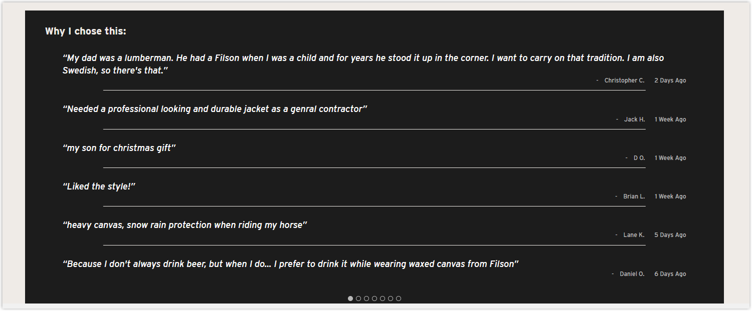
Same with reviews. In addition to detailed reviews like other websites, here includes a summary section, a featured review section, and a thorough review section.
Space is used rationally and effectively on all pages to make navigation more convenient.
Typography
Filson uses only one typeface and different fonts. Hierarchy is created by bolding or printing the titles and creating appropriate spacing between lines. In general, typography is relatively easy to read and navigate for visitors.
CTA
The buttons have a basic rectangular shape and are white, with enough contrast with the surrounding parts. The copy is not too unique and appealing but enough for visitors to understand where it will take them.
Navigation Bar
Filson applies a sticky bar to their website to make it easier for visitors to navigate. The different menus are also illustrated with pictures for ease of visualization.
Images
The images used are of high quality, sharp, and adjusted with a moss green tone to create a similarity for the entire website. All products are photographed on a white background so visitors can easily focus and assess more accurately. In addition, Filson provides images from all different angles of the product.
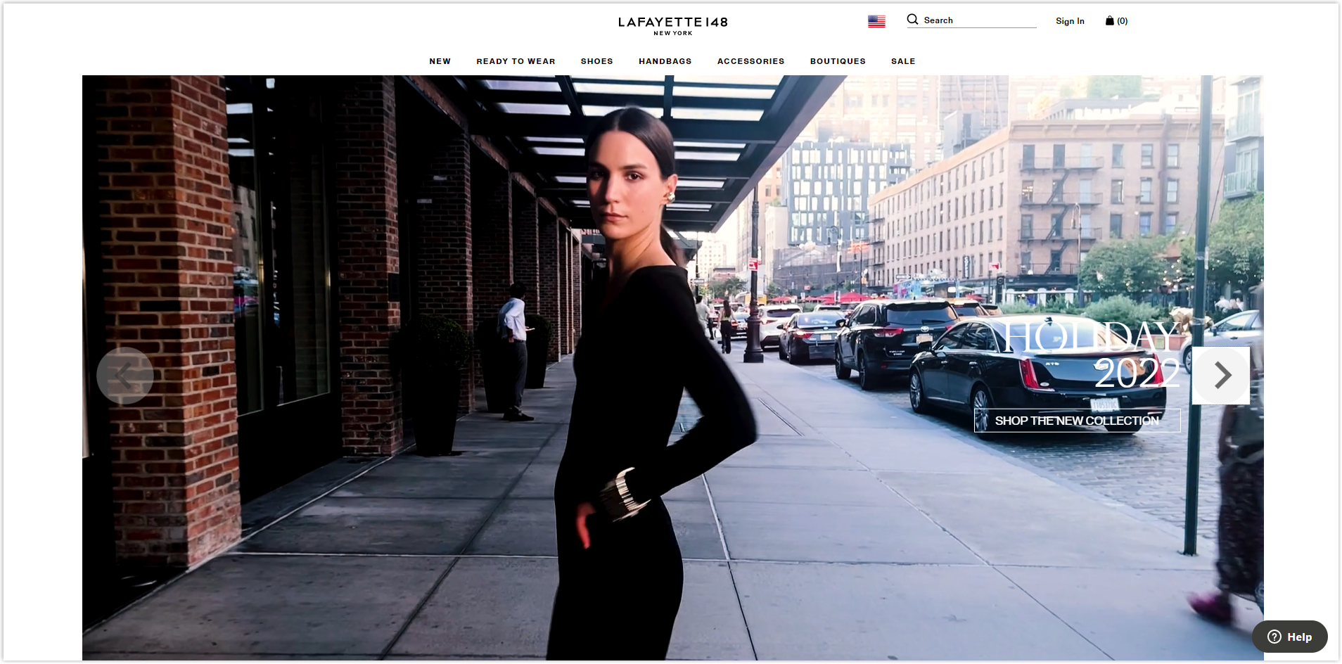
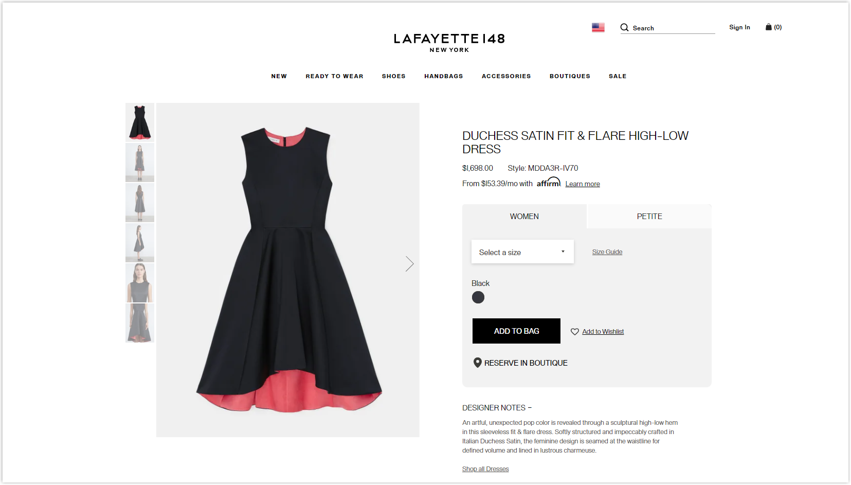
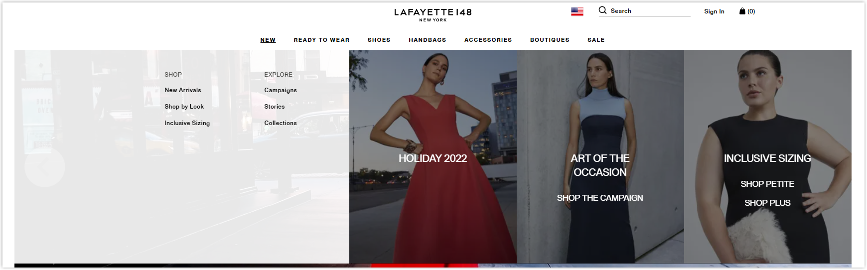
14. Lafayette
Rate: 7.5/10
Color
Lafayette uses only three primary colors for its website: white, black, and gray. Just enough to create contrast and make different parts stand out.
Layout
Similar to the previous websites, each page has a different layout. The homepage is still the familiar hierarchy grid, the product list page is modular, and the difference lies in the product detailed page.
The remarkable point on the homepage is the large-sized images that help to leave a deep and quick impression on visitors. The white space is also ample, making the sections separate, and assisting visitors in focusing on a particular part. However, it also makes different sections to be inconsistent and unrelated to each other.
The prominent white space on the product detailed page makes navigation easy for product images to quickly leave an impression on visitors.
Typography
Lafayette uses the most common typeface you’ll find anywhere, Arial. Hierarchy is created by capitalizing, bolding, and increasing the font size and line spacing.
CTA
I find the buttons not prominent and appealing enough for visitors to click. Only with dark images or videos can these buttons be noticed.
Navigation Bar
Lafayette uses a sticky bar for her website with the most important menus, and each menu comes with illustrations.
Images
On the homepage, the images used are of high quality and focus a lot on the models to highlight the brand’s outfits.
Product images are taken synchronously on a white background to help visitors focus entirely, and when zoomed in, they can ultimately see and imagine the material.
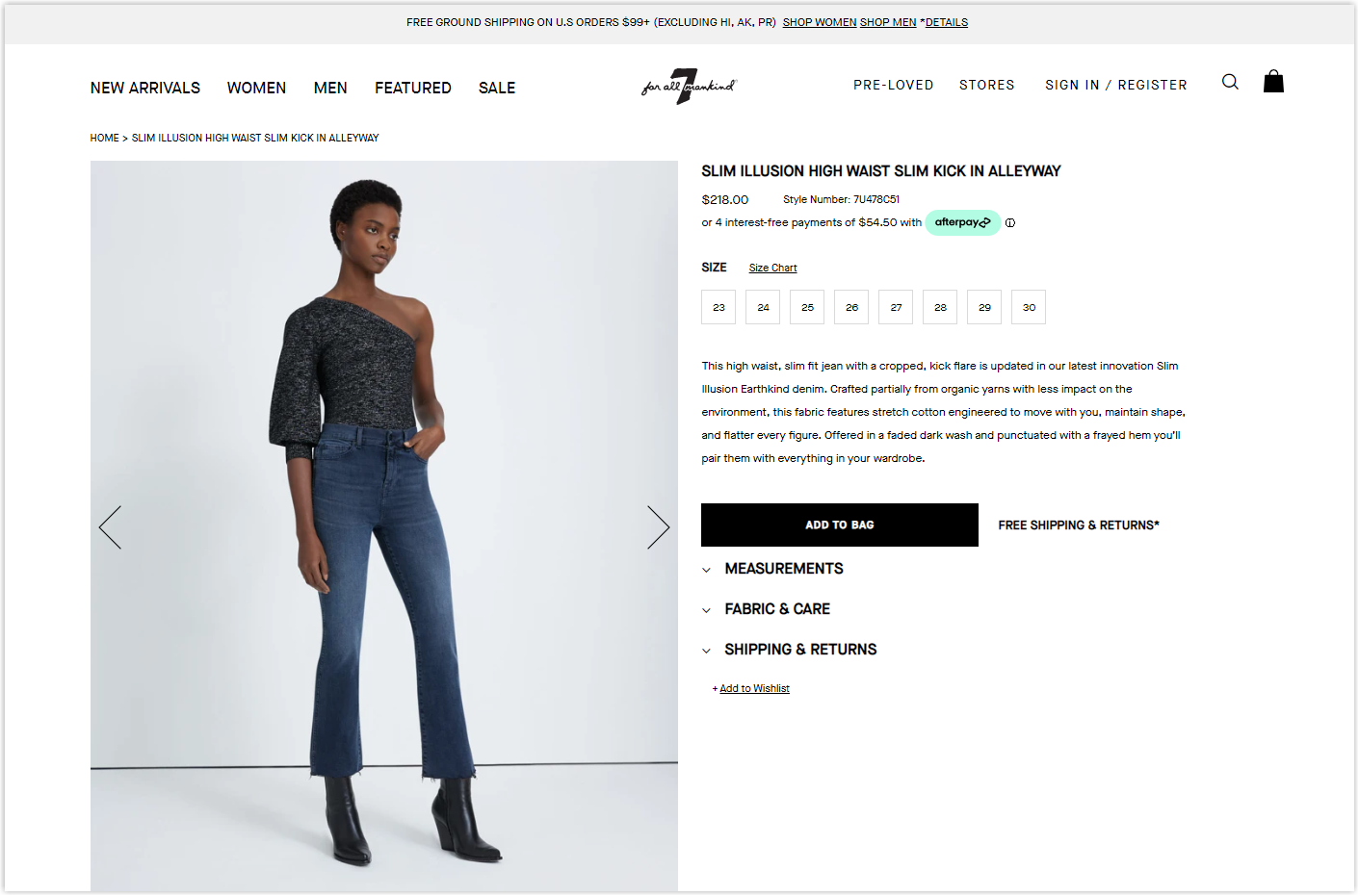
15. 7forallmankind
Rate: 8/10

Color
Still has the same three familiar colors from previous websites: white, black, and gray. Most brands will use this trio of neutral colors in their web design because they are simple but give the best results.
Layout
On the homepage, all sections are in full-width mode, so 7forallmankind can display more details and completeness. Although it doesn’t use as much blank space as Lafayette, the sections are still separate while still being linked.
The product listing page still uses a modular grid to display different products. In addition, the brand also includes a brief introduction below to create more buying motivation for visitors.
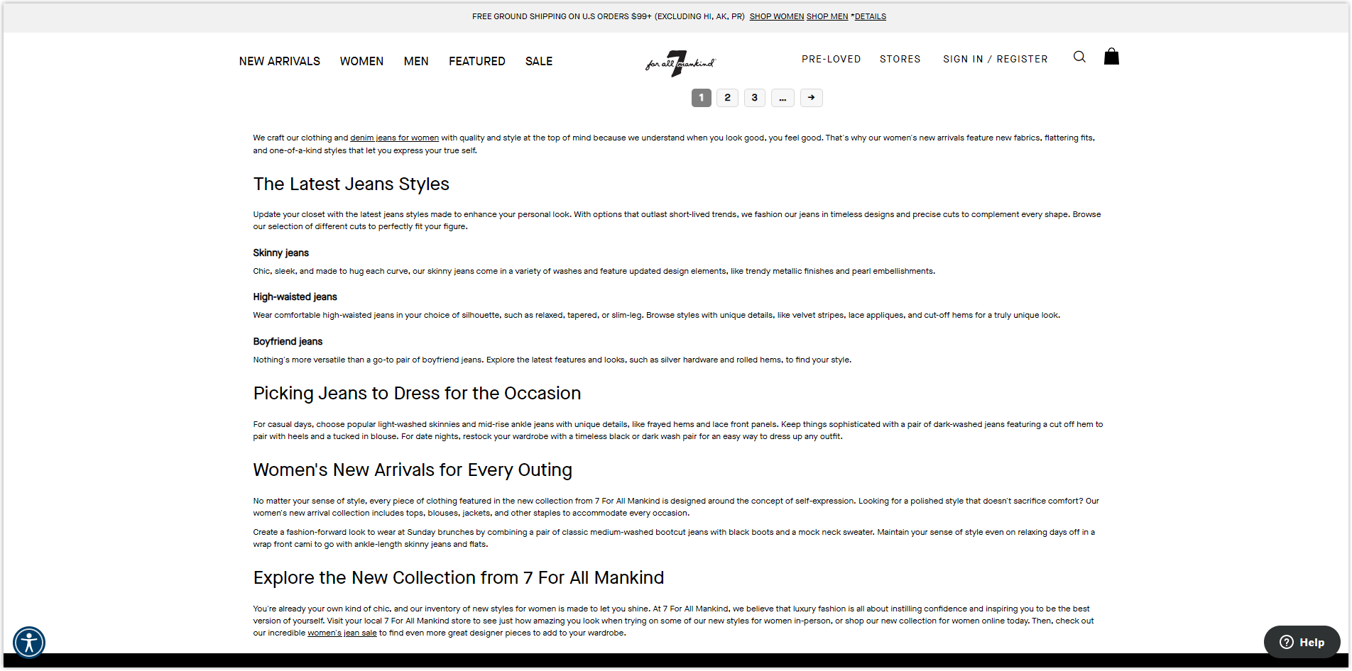
The detailed product page is designed to be simple and nothing too special. The details are concentrated mainly in the middle of the page, making it easier for users to focus on the product.
Typography
The only typeface used here is Maisonneu sans serif, which is relatively easy to read and scan. 7forallmankind has also built an excellent hierarchy to separate the different sections.
CTA
There are two main types of buttons, black rectangle with white copy and hyperlinked text. Both are simple designs but still prominent enough for visitors to click through.
Navigation Bar
This top Magento clothing store also uses sticky menus with the most significant sections.
Images
The images used are high quality and professionally taken to make the outfits stand out.
Shoes, Underwear, and Accessories
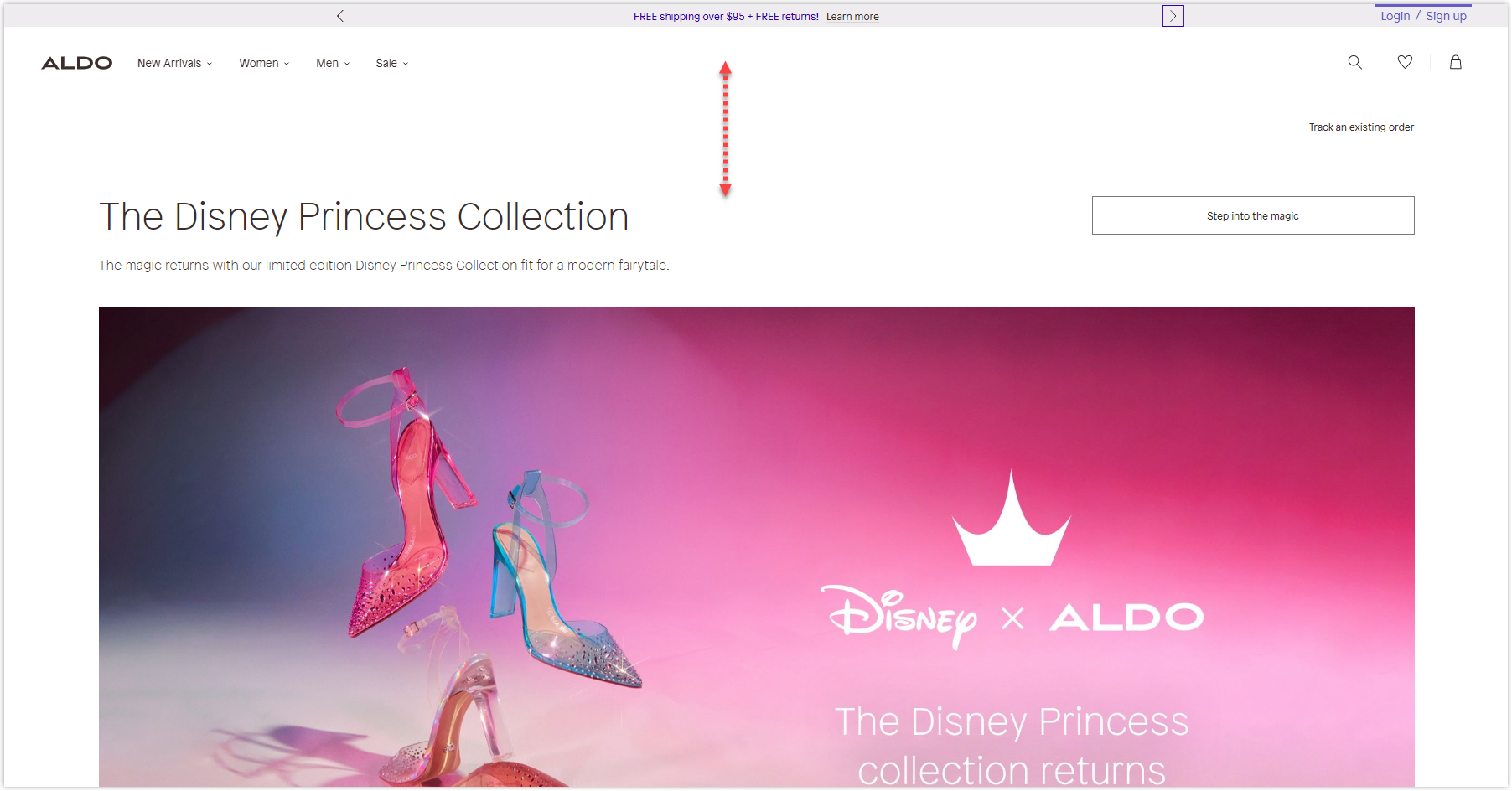
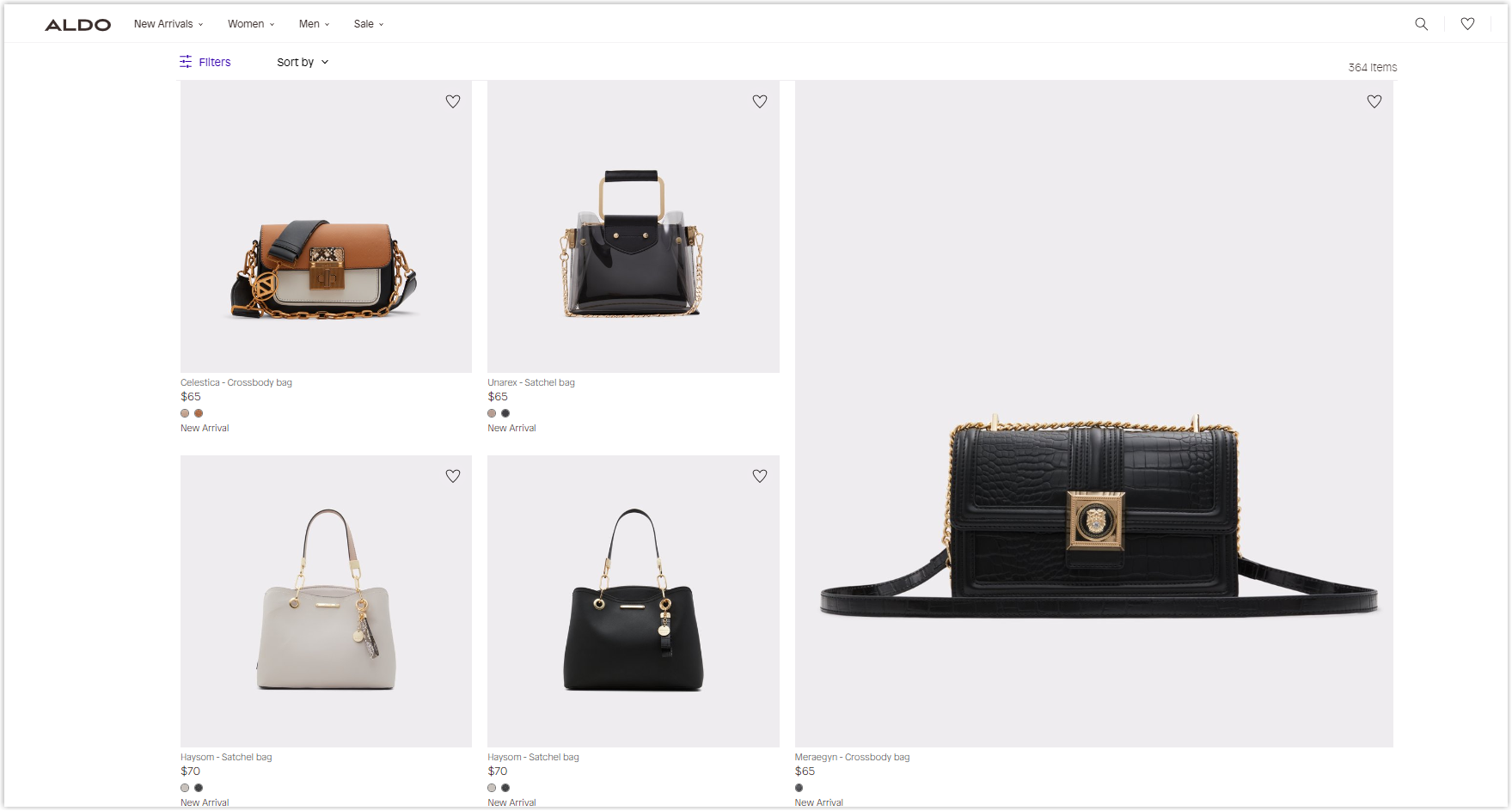
16. Aldo
Rate: 8/10
Color
The popular neutral color sets of white, black, and gray are still used because they highlight the company’s products easily.
Layout
The same hierarchy grid as other websites, but on the homepage, the problem is the ample and unnecessary blank space in the hero section, making the banner not prominent enough when visitors access it.
On the product listing page, the products are not simply arranged in a modular grid but are divided by collections, making it easier for visitors to navigate.
The product detailed page is designed to focus heavily on products with large images. Blank space is also used sensibly to help the parts have different degrees but still connect.
Typography
Aldo uses only one typeface for its website for easy navigation and consistency. The hierarchy is also made clear by bolding, capitalizing, and increasing the font size and line spacing.
CTA
Aldo’s buttons are not too prominent because it is just transparent rectangle with a small copy inside. But because the arrangement is only placed on a monochrome background, visitors are still likely to click. Otherwise, they may be ignored.
Navigation Bar
This website also uses a handy sticky bar like many other websites, and it’s been as minimalistic as possible, with only the four most prominent menus to help users easily navigate and focus.
Images
The images used are high quality, especially on the detailed product page. Visitors can completely imagine the materials used just by looking at them. They are also shot professionally and in sync to stand out even with the model.
17. Christian Louboutin
Rate: 8/10
Color
This Magento website still uses the standard neutral color set of white, black, and gray.
Layout
Christian Louboutin’s homepage highlights the generous use of blank space on the sides so that visitors can focus entirely on the central elements.
The product listing page still uses a modular grid to display different products, and the product detailed page is presented straightforwardly and concisely. The white space here also occupies a large proportion to highlight the product and necessary parameters.
Typography
This website uses two primary sans serif typefaces, Avenir and Frutiger, because they are easy to read and scan. The way for them to create a hierarchy is to underline the titles and increase the font size.
CTA
Buttons are not designed to be too prominent but simply hyperlinked text with a larger font size. Although it’s enough for visitors to know it’s a button to click, they can be confused with the title when this website design these two elements to be similar.
Navigation Bar
A simple sticky bar that helps users easily navigate different pages. The unique point is that they have added some interactive details to the logo to make it more interesting.
Images
It can be seen that Christian Louboutin carefully invests the image through their editing. The product is also carefully photographed and synchronized with a white background to help users imagine the material.
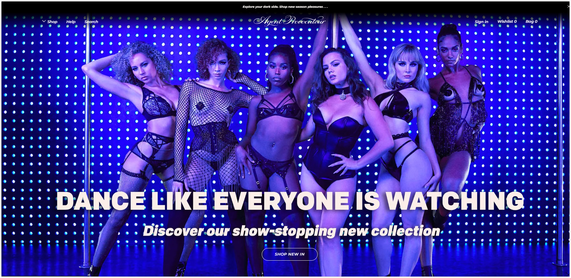
18. Agent Provocateur
Rate: 8/10
Color
With a website about lingerie, color can’t be too casual. Here Agent Provocateur uses pastel pink as the background instead of the white color of other websites.
Layout
The website’s homepage does not have blank space in the margins, but it is only among the sections because the brand wants to highlight the images more.
The modular grid is no longer used for the product listing page but instead for the product detailed page.
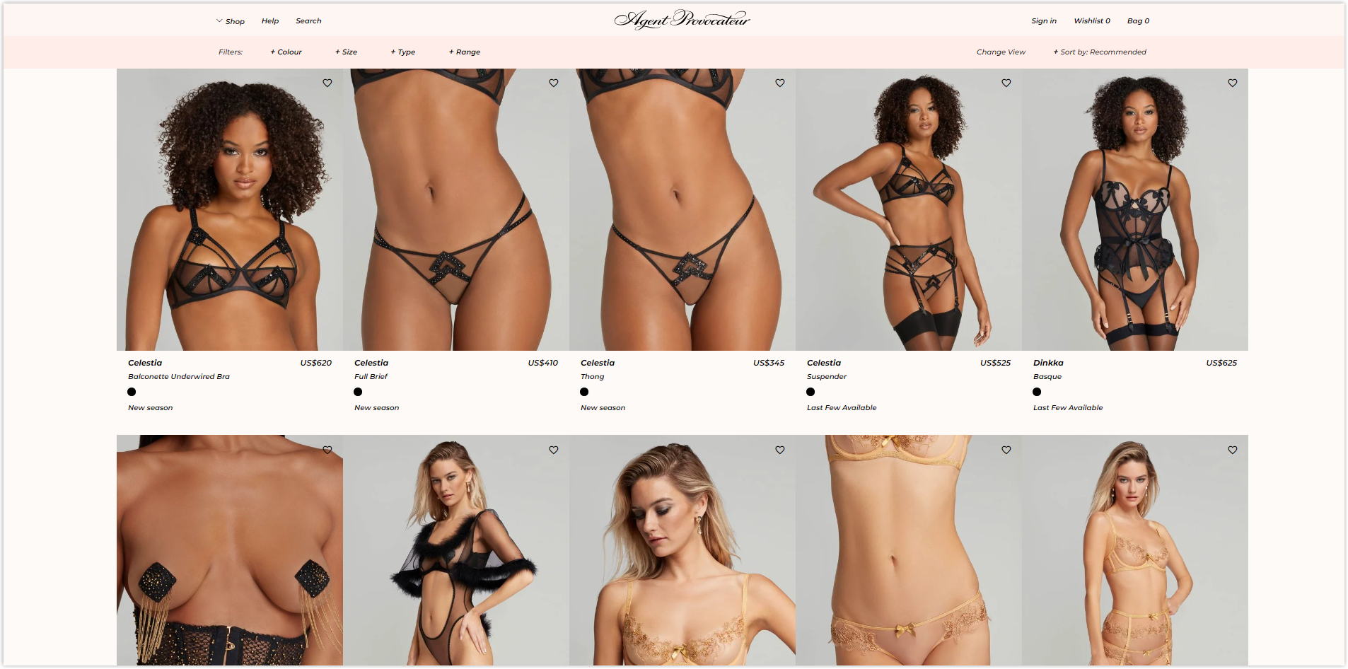
Typography
Only one typeface is used, sans-serif Montserrat, which is easy to read and scan. Moreover, it creates consistency between the sections on the page and the pages on the website. Hierarchy is created by the spacing between lines and font size. Simple but effective.
CTA
There are two main types of buttons used. One is a black rectangle with a white copy, and the other is a transparent white-bordered capsule with a white copy. Both are simple but can still help visitors quickly locate and click.
Navigation Bar
Agent Provocateur designed a straightforward drop-down sticky bar with only 6 menus divided equally into both sides. Each menu, when hovering the mouse, has a clear illustration.
Images
True to its name, this brand uses compelling images and can easily make an impression at first sight. They are of high quality and are captured with care and professionalism so that users can focus on the outfit. Product images are all on a gray background to create synchronization.
Try FREE Magezon Page Builder!
Easily create your engaging Magento pages in any style whenever you want without relying on developers or designers, just by drag & drop.
19. Catbird
Rate: 7.5/10
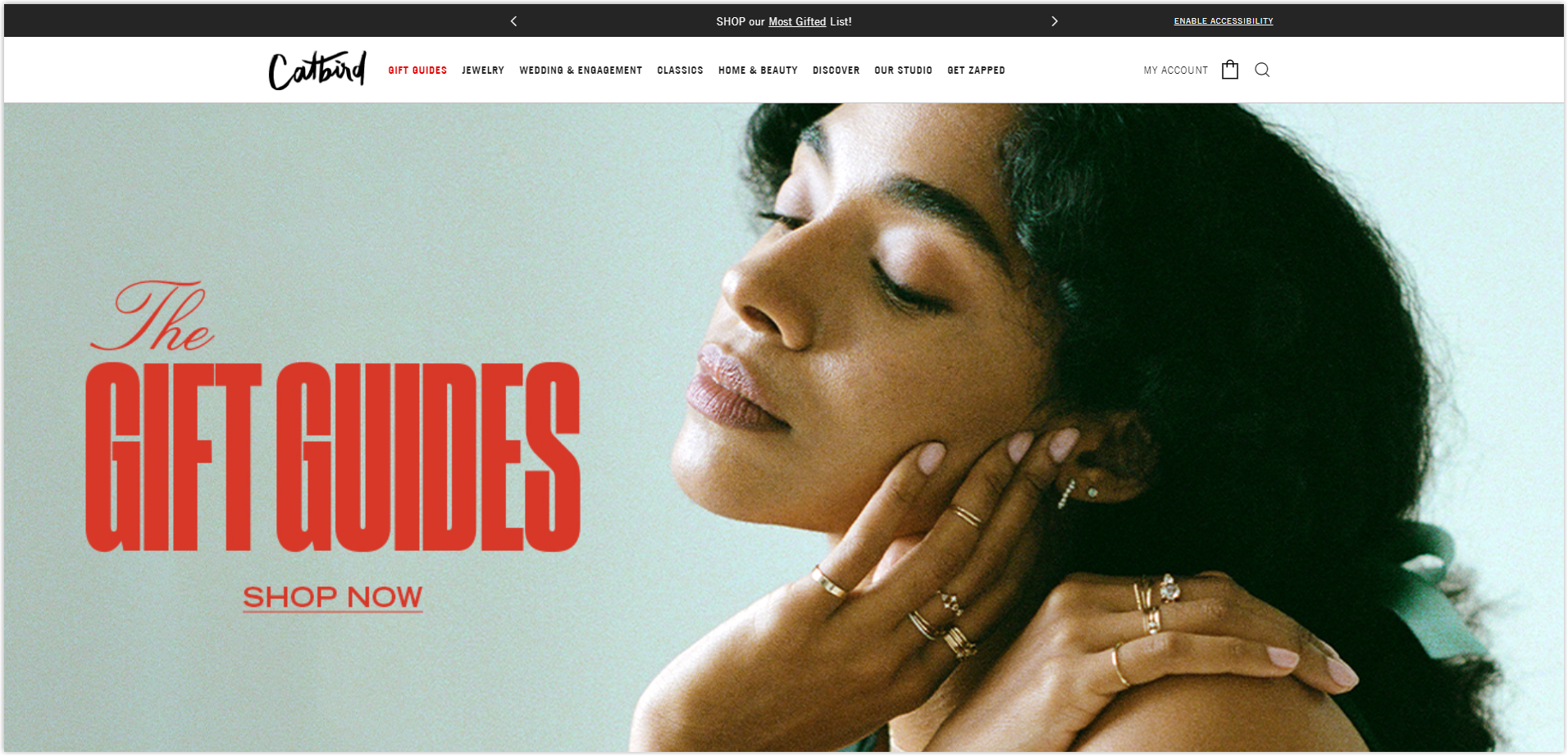
Color
This website uses black and white gray tones for the pages.
Layout
The different pages still use the same grids as the previous websites, and nothing too special. Catbird has used blank space well to separate the sections but still creates a good connection.
Typography
This Magento website uses two different typefaces, sans-serif Trade Gothic and serif Adobe Garramont Pro to help create a hierarchy and separate different sections more clearly.
CTA
Buttons are also designed to be simple but with large sizes. There are two main styles: a black rectangle with white copy and hyperlinked text. However, on images with a lot of detail, leaving the CTA as the text makes it sink and difficult to read, as shown below.
Navigation Bar
Catbird also designed a sticky drop-down menu bar for its website to make it easier for visitors to navigate the pages. Each menu has clear illustrations.
Images
The images on the banner are large, and most are sharp, although there are still images of slightly low quality, as shown below.
On the other hand, product images are carefully taken with the same white background to create synchronization and increase professionalism.
20. Vision Boutique
Rate: 7/10
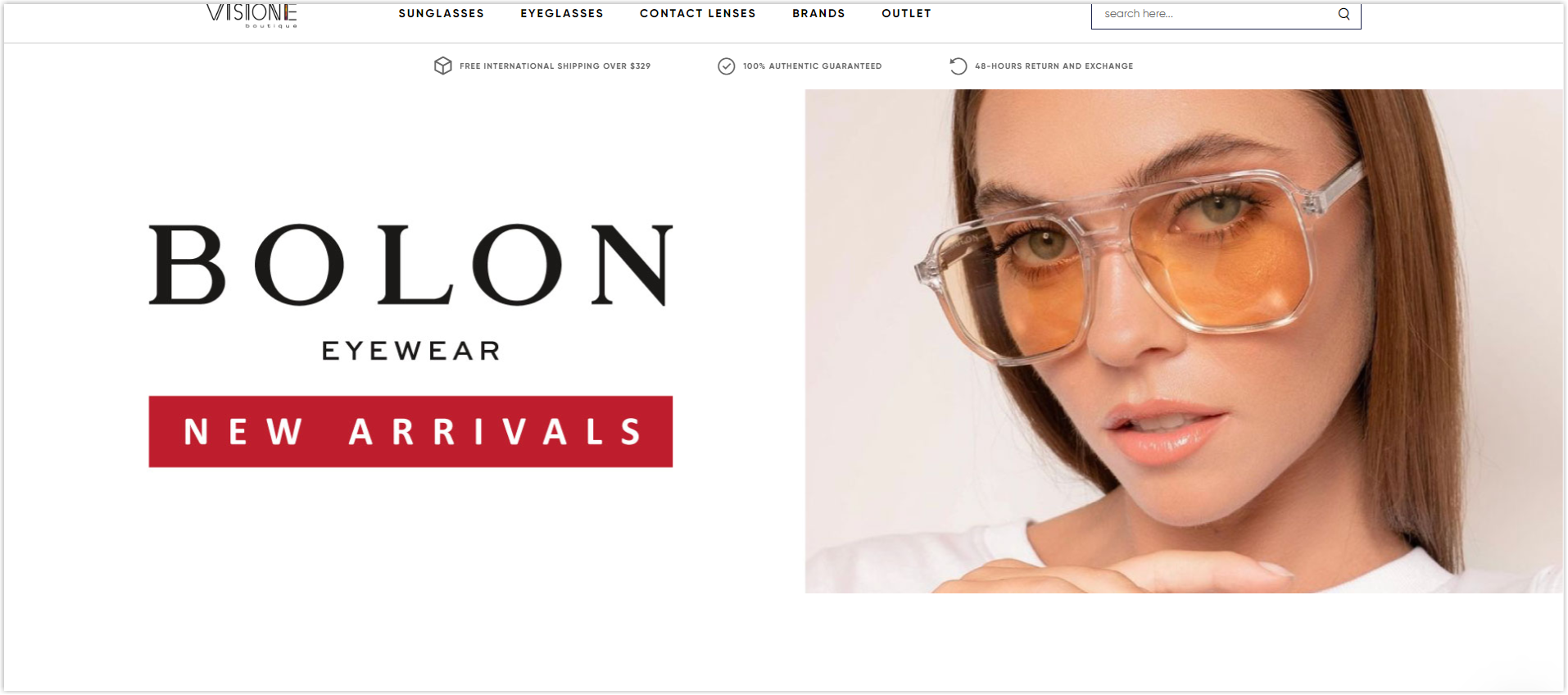
Color
Vision Boutique still uses the familiar black-and-white trio in the analyzed websites.
Layout
The different pages in this Magento website are still designed according to the same grids as the examples above and are nothing too special.
Typography
This brand uses up to three different typefaces for its website, including sans-serif and serif. However, they look pretty similar, so they do not make the pages lose cohesion and help the sections have their character.
CTA
The buttons are all rectangular and have different colors with white copies. Just prominent enough for visitors to click but only affect other sections a little.

Navigation Bar
A sticky drop-down bar is the choice of many websites, and Vision Boutique is no exception. They show only the five most important sections, and each menu has specific illustrations.
Images
All are of high quality, and especially on the product pages, there is a hover-to-zoom function; when zooming on, the image has a clear cut, and it is easy to visualize the material.
21. Shinola
Rate: 7.5/10
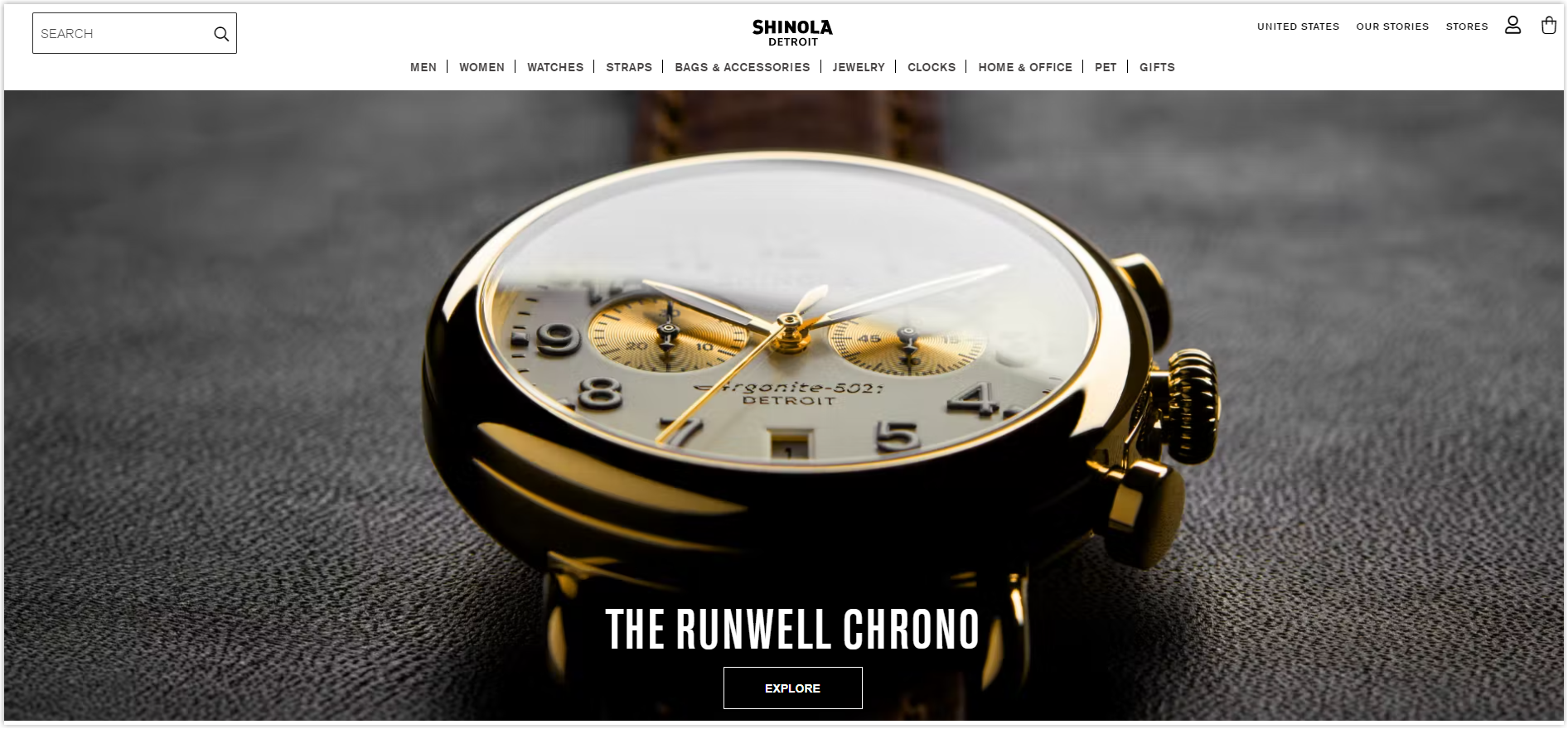
Color
Shinola uses white for the background, black for the text, and gray for other particular parts.
Layout
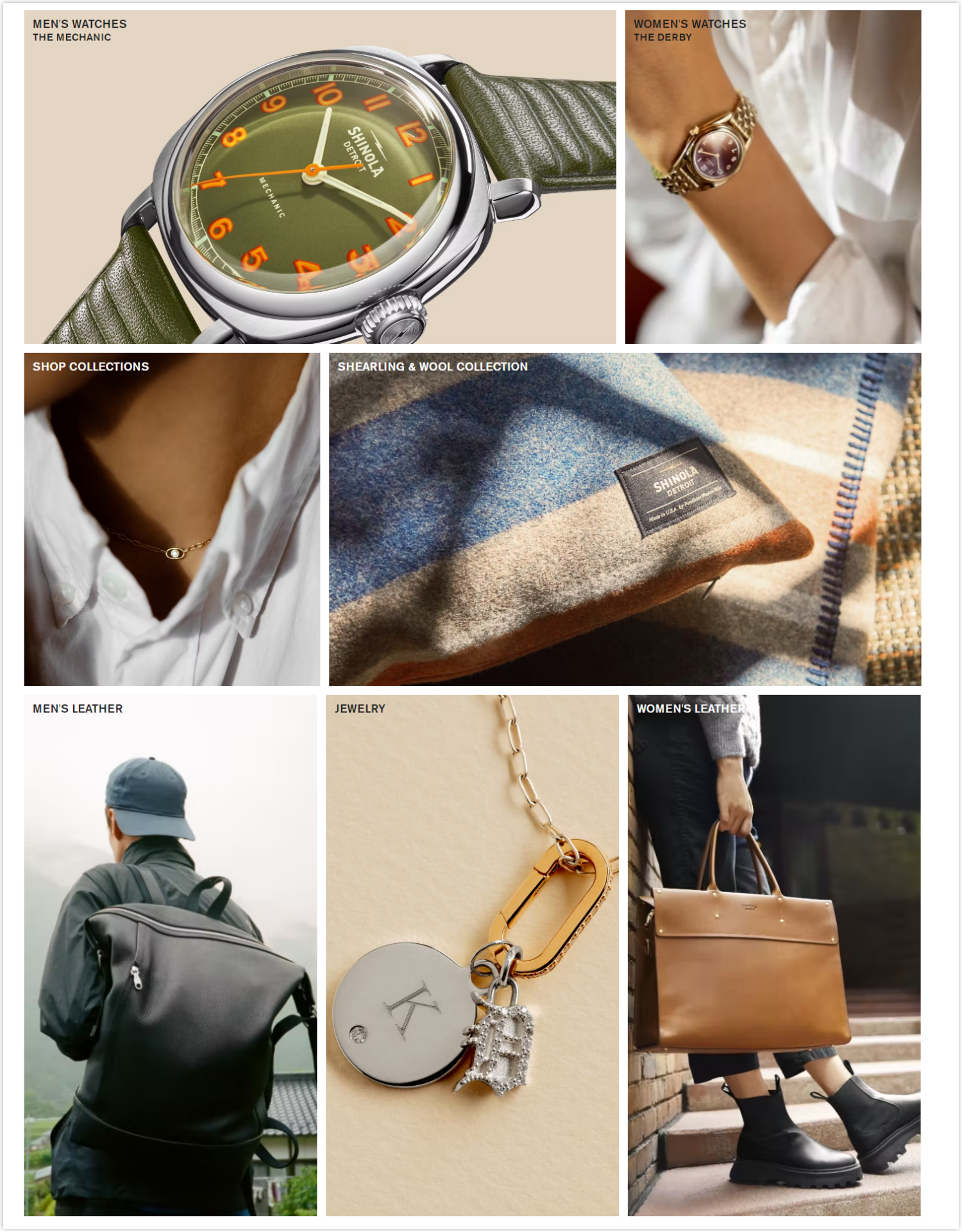
On the homepage, right after the hero banner section, Shinola displays images of featured collections. This section is like an image gallery arranged in a hierarchy grid. Looks quite eye-catching and neat to help visitors quickly understand what this website will include.
The product listing page is still the familiar modular grid, while on the product detailed page, the image section takes up more than two-thirds of the page.
Typography
Shinola uses only one sans-serif typeface for their entire website because it’s easy to read and scan and is suitable for both title and the body. Increasing font size, line spacing, and bold and capital letters help create a logical hierarchy.
CTA
This best Magento website does not use too many buttons but only focuses on the homepage with a transparent rectangle with a white border and white copy, as shown below.
Navigation Bar
Menus are arranged on a sticky drop-down bar to facilitate navigation no matter where visitors are on the page. However, the number of menus is a bit too much, and removing or combining a few menus is possible.
Each menu has specific and clear illustrations.
Images
All are high quality and look sharp enough for users to imagine what the material and product would look like in real life.
22. Osprey London
Rate: 7.5/10
Color
Nothing special because this fashion website design uses only white as the background, black for the text, and gray for the rest.
Layout
The homepage still uses a hierarchy grid, and the product listing page is still a modular grid. The product detailed page is also nothing special, other than that all of the above pages effectively use blank space to separate sections from each other and simultaneously create a logical connection.
Typography
Osprey London uses two different typefaces, the Libre Baskerville serif for the title and the sans-serif Lato Regular body. This helps to create a natural hierarchy and easier navigation.
CTA
Buttons all have the same black rectangle shape with the copy inside. Simple but outstanding enough for visitors to click on and know where they will be taken.
Navigation Bar
This best fashion website uses a drop-down bar. Still, it is not sticky like other websites, making it difficult for visitors to navigate the page because they will have to scroll up to the top of the page if they want to go to any other page.
Images
The images are all high quality. However, the hero banner is a bit blurry, and the details can be seen in the image as it is broken.
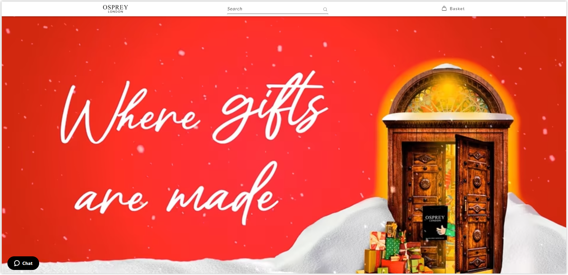
Product images are carefully taken on a white background, with high quality, and when zoomed up, they are not broken, helping users to visualize the material used.
23. Chopard
Rate: 8.5/10
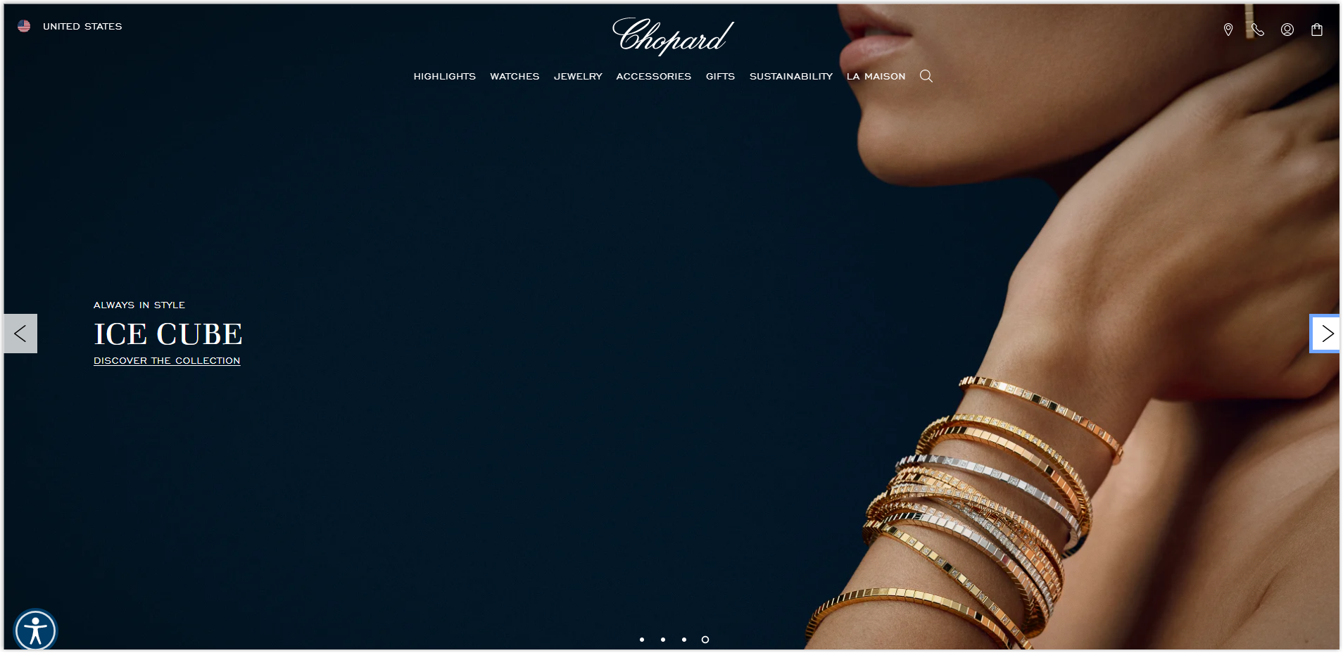
Color
Three standard colors are found on this best fashion website, so we will not discuss this further. You can visit Chopard to learn more about how they organize them.
Layout
Pages are still indexed based on familiar grids from the homepage to the product listing and detailed page.
Typography
Chopard uses three different typefaces for its website, with sans-serif fonts for the body and serif for the title. This makes navigating more effortless, and the fonts are similar, making the pages manageable.
CTA
There are two main types of buttons: a transparent rectangle with a black border and a black copy, which, when hovering, will change to black, and one is hyperlinked text. Thanks to the right arrangement, both categories stand out just enough for visitors to click.
Navigation Bar
Chopard also uses a sticky drop-down bar to make it easier for visitors to navigate. The menus displayed are also the most important ones on the website. Each menu is fully and clearly illustrated with accompanying illustrations.
Images
All images on the website are of high quality. When zooming up, the image is not broken, and users can imagine what the material will feel when touched.
24. Bulgar
Rate: 8/10
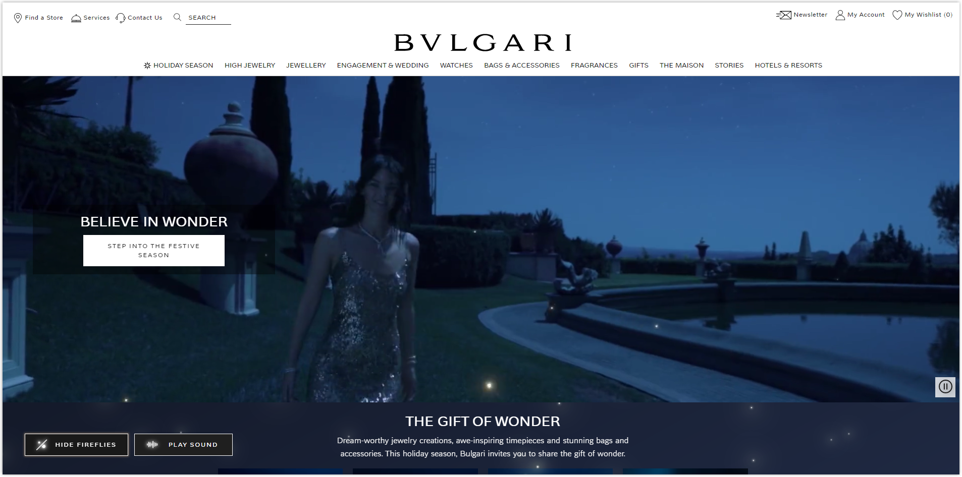
Color
The colors used on this website are still the three most basic colors, white, black, and gray.
Layout
Still the same familiar grids for different pages that we learned from previous websites. Whitespace is used sensibly to separate sections and make navigation easier.
Typography
Bulgaria only uses a typeface with the same name as the brand name to create synchronization. This is also reasonably easy to read and scan font, making a good impression on visitors and encouraging them to spend more time on the website. Thereby increasing the conversion rate.
CTA
This Magento-based website uses only basic rectangular buttons with different colors. Stand out enough for visitors to know where to click and where they will be taken.
Navigation Bar
This can be considered the most impressive sticky drop-down menu so far when each menu is illustrated clearly and attractively. Users can quickly learn and go to the page they need.
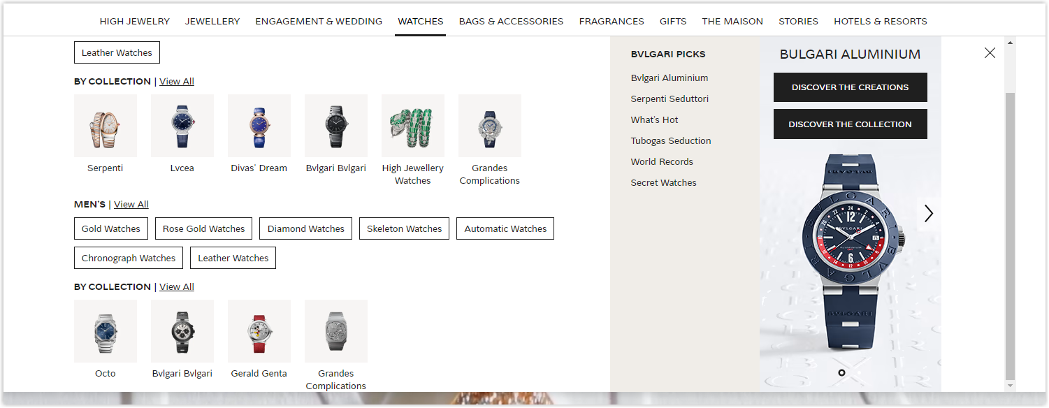
Images
All are high quality and carefully photographed to make the products stand out. Product images are taken on a gray-cream background so visitors can quickly observe and evaluate. When zooming up, it is not broken, and visitors can also judge the material of the items.
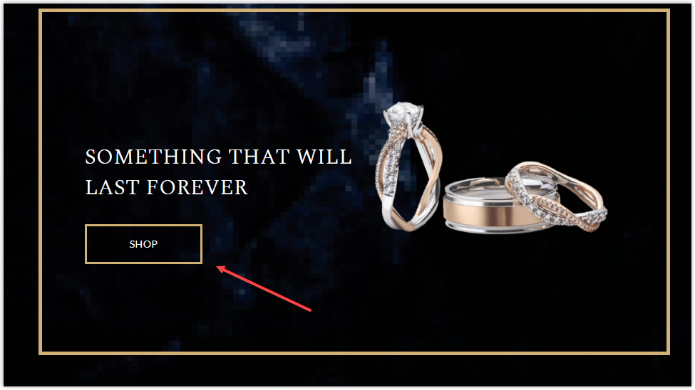
25. Hannoush
Rate: 7.5/10
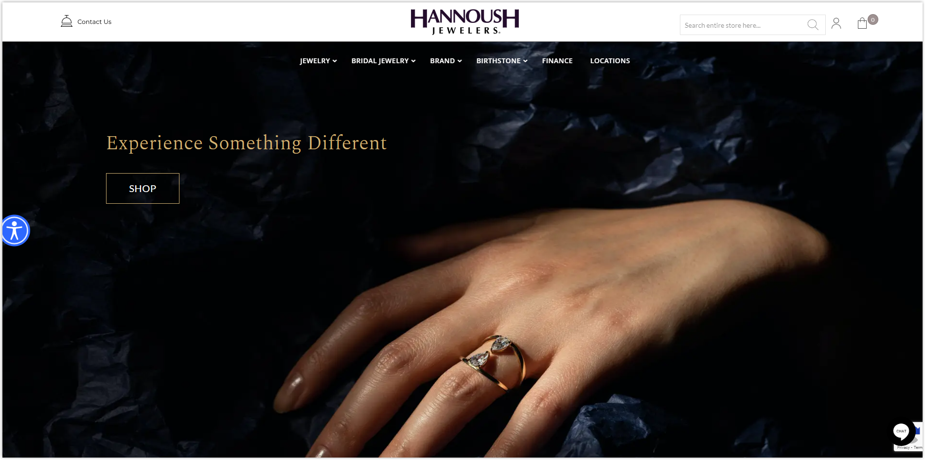
Color
This Magento web design likes the darkest color. As soon as you enter the homepage, you can see that the dark parts are the majority and the rest of the pages have a background of black and blue. In general, there are only three primary colors: black blue, white and yellow, in which black blue, and white are used as the background and yellow for the text.
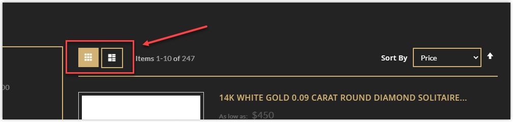
Layout
There is nothing special about the layout used for different pages except the product listing section. Other websites only display products in a default layout, but Hannoush allows visitors to change it.
Typography
Three typefaces are used in this best fashion website, including two sans-serif fonts and one serif for the title and body. Hannoush has built the hierarchy by bolding, capitalizing, and increasing the font size and line spacing. The typography here is relatively easy to read and scan, which facilitates navigation.
CTA
This Magento-based website uses only one button type: a transparent rectangle with a yellow border and a white copy inside. Although not too prominent, thanks to the harmonious arrangement with the surrounding components, it has helped visitors to locate and encouraged them to click easily.
Navigation Bar
Hannoush does not use a sticky bar like other websites but does include a small arrow in the middle so that users can quickly return to the top of the page without having to scroll many times.
Images
All are high quality, taken carefully and synchronously. This is also a factor that helps create more trust and increase conversion rates.
Disclaimer
- All the comments are experience-based; this article is not meant to insult any individual or organization.
- The websites are experienced only on PC screens. Please tolerate any mistakes or deficiencies if you use them on other devices.
- Due to the ideal length of the article, I can’t write about every page, and some aspects might not be covered entirely. Please comment below if you have any ideas that you want to add.
Important Takeaways You Don’t Want to Miss
Pheww, you’ve gone a long way until here. I know that’s a lot to learn, so below are some essential lessons I’ve summarized that you will need:
Colors: Use your logo’s colors or neutral colors like black, white, and gray.
Layout:
- Apply a hierarchy grid for the homepage and detailed product page and a modular grid for the product listing page.
- Pay attention to the white space; too much can cause disconnection, and too little will make it hard to navigate.
Typography:
- Two to three typefaces are acceptable, but if you don’t know how to use them harmoniously, only one is enough.
- Create a hierarchy by capitalizing, bolding, and increasing line spacing and letters’ size.
CTAs:
- Place them reasonably among other elements for easier recognization. Pay attention to the line spacing to help visitors distinguish.
- There are two prominent types of buttons: hyperlinked text and rectangles. Choose the most appropriate one depending on the images and how you organize different sections.
Navigation Bar:
- Use sticky and drop-down menus to make navigation easier.
- Include images for each menu.
- Display only necessary menus and one level for each one.
Images:
- Only use high-quality images. Don’t make your website look unprofessional.
- Product images should only be taken with a uniform background color.
- Add filters to make them look consistent.
- Photos with models should highlight your products.
Get to Know an Innovative, Comprehensive Magento Website Builder Tool From Magezon
Do all websites above look stunning and impressive to you? Do you want to have one as such? But are you insecure about your coding skill since Magento is not that easy to use and require a lot of technical knowledge?
Magezon builder extensions developed based on our Core Builder will help you solve all those problems; all you need to do is drag and drop. Among 14 builders for a complete website, there are four most prominent and best seller ones that I’d like to introduce below.
The first one is Magezon Page Builder. We provide over 50 elements, from simple text blocks to advanced CTAs, product lists, and product sliders. You can say goodbye to the tiring process of switching between the front and back end to see the result because we have the WYSIWYG integration.
Don’t ignore the Ninja Menus extension if you need an excellent navigation bar. It’s fully responsive, has 8 pre-made menus, and has 11 elements with the fastest load time.
How about creating forms? Don’t worry; Magezon has the Blue Form Builder to help you. We want to save you time, so we provide more than 10 form templates and more than 35 fantastic elements. You can create any form type with a wide range of plugin integrations.
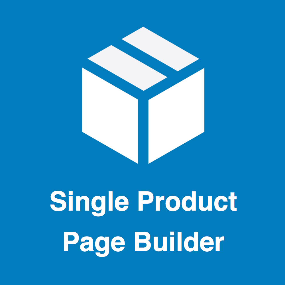
As an eCommerce store owner, you must be concerned about creating an excellent product page quickly. That’s when our Single Product Page Builder comes in handy. With this extension, you’ll have 30+ elements, a fully responsive design, and many layout templates to assist you in luring more customers and increasing your conversion rate.
Wrap It Up
Above are the 25 best Magento fashion websites you need for inspiration and what can be taken away to optimize yours. I’ve analyzed them carefully in different elements such as color, layout, CTA, typography, navigation bar, and images for your basic but specialized knowledge. I would appreciate it if you could read everything I wrote, but the summary will greatly help if you can’t.


