 Magezon Blog Help Merchants Build Comprehensive eCommerce Websites

You should consider your product listing page design as an eCommerce business owner. The page works like a catalog to offer your products and services. When the customers stay on it, it means there’s potential that they will make a purchase and just need a push.
If you don’t know what to do to increase conversion from your eCommerce product listing, learn some of our tricks below. They can help you avoid common mistakes, such as overwhelming information and options, confusing navigation, low-quality images, unselective descriptions, etc.
Keep reading on, and your listing in e-commerce will look professional, enhancing the users’ experience and driving potential buyers down the funnel to final purchase.
Table of contents
| Trending now: 33 Unique Website Footer Examples and Why They Work 11 Website Layout Ideas for User Experiences (+ How to Choose) 25+ Best Product Pages and Lessons to Take Away |
Visuality
1. Pay Attention to the Layout
The layout is the first thing to notice when creating a product listing page. Take into consideration the below tips to optimize yours.
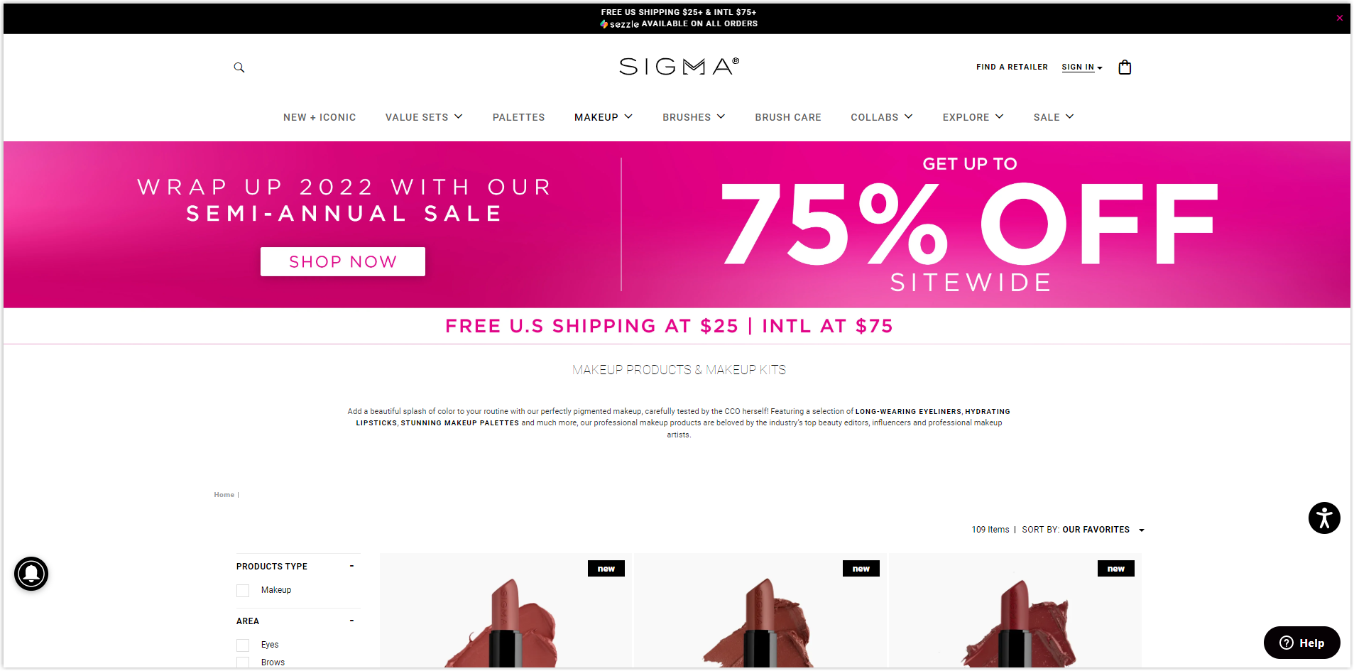
1.1. Use eye-catching banners or compelling headlines
A banner on top of your PLP is an excellent way to inform visitors about the ongoing discount campaign and briefly introduce the collection. However, it should not be an obstruction to their shopping process. You can display it as an unclickable link, just for informing purposes.
Then, you can add to the left of the banner a box of text, including clickable product categories, so they assist the shoppers in adjusting their search options and finding the most suitable one on the eCommerce product listing.
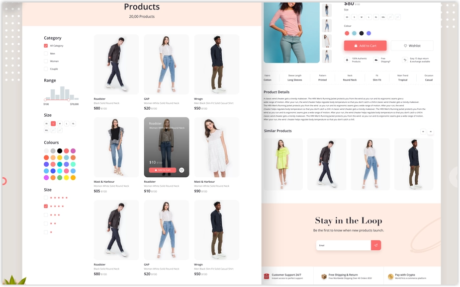
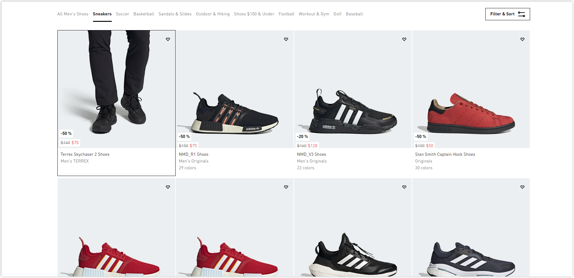
1.2. Apply two to four pictures per row in the grid view
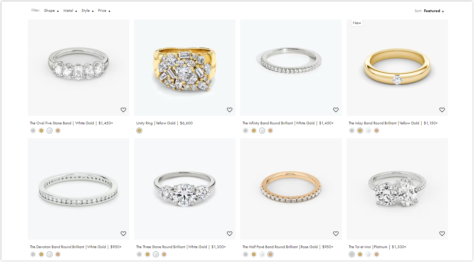
The reason for this number is the aesthetic look. Plus, when the items exceed four per row, each of them will be very small, creating difficulty for buyers to have a general look at the product, thus decreasing the clicking percentage.
Before deciding how many items to display, you should also consider how big the images are, how much information you need to include, and how many products you want to introduce to the customers. Three things to remember before creating website grids may also be helpful for you.
1.3. Include the “load more” option or pagination
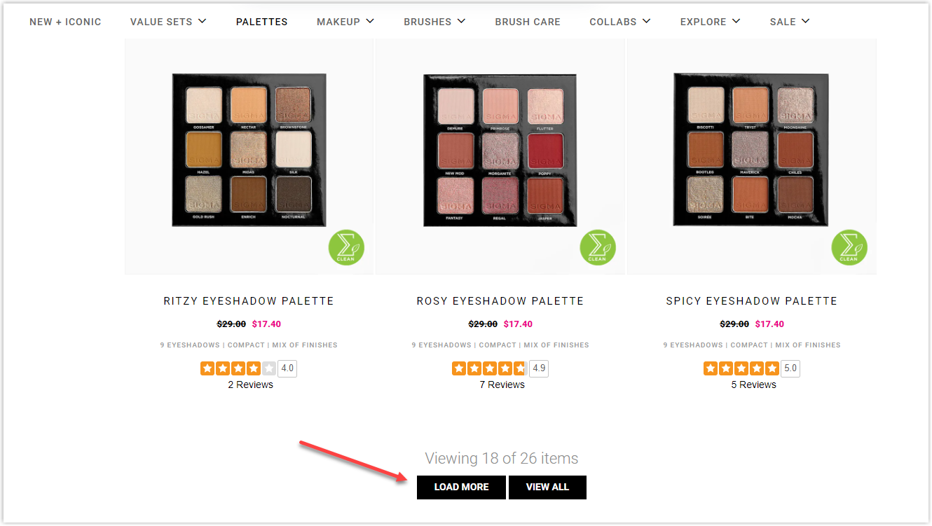
Unstoppably displaying items can overwhelm your clients and prevent them from making decisions. That’s why your eCommerce listing page should have a “pause.”
When there’s a force to stop, buyers have more time to consider what they have seen rather than be immersed in endless online listing products. Especially if your clients are aiming for expensive items, pagination allows them to reference and quickly return to their top preference if needed.
2. Optimize Product Images
2.1. Upload high-quality pictures that sufficiently describe your products
More than 80% of shoppers in the US agreed on the high importance of product images to their buying decisions. To have accurate high-quality pictures, you should consider their accuracy in displaying your items. They should provide the customers with adequate details and inspire them enough to purchase.
The more you show your items in real life, the better. For example, displaying how the clothes look on the models or showing how your sofa fits in the living room is how you want to present your products.
2.2. Give more angles or views on hover
One of the product listing page’s best practices is using every web surfer’s hover. It helps you present your products more before they click on the detail page.
When the shoppers hover the mouse on the item, it’s displayed with different angles or views. For example, if you sell jewelry, besides showing the design of your products, you can swap the picture of them on people’s hands or wrists or display the information about the metal and carat weight.
2.3. Standardize the images
It’s not always possible, but you should try to create as much harmony as you can for the sake of the aesthetics of your product listing page design. You should choose the same background colors, angles, or ways of displaying to create a harmonious look. It benefits both your business and customers. You can achieve a strong brand image while users focus and navigate easily.
3. Show Products in Action
Showing items in action is another idea to improve your product listing page design, but you must find something to support your value proposition. For example, if you have a cosmetic brand, you can use a GIF to show how different colors of mascara look on the eyes. You can use short and moving clips to make your product listing page lively.
4. Don’t Forget the Footer
The footer can grow users’ impressions on your website and provide them with helpful information about your brand. You can include product categories, trust badgers, data protection, return policy, social media channels, and contact details. Have a look at 33 unique website footer examples and why they work to improve yours.
Plus, remember to make the footer as user-friendly as possible. It’d better work as an excellent navigation to end the shopping journey in a convenient way.
A convert-cart tip you can apply for your product listing page UX is to include User Generated Content. Encourage your buyers to share their experience of using your products. To do this, you should make customers keep in touch via opt-in email and navigate them to your social media channels by including clickable icons.

Try FREE Magezon Page Builder!
Easily create your engaging Magento pages in any style whenever you want without relying on developers or designers, just by drag & drop.
User Experience
5. Include Product Description
The next thing you should do to have a perfect product listing page design is to improve the user’s experience by including “just enough” product descriptions. You must write the information carefully to encourage viewers to click on it and discover more or learn from the most creative product descriptions we’ve compiled.
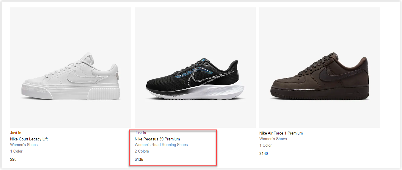
The two safe elements to display are names and prices. The other information is determined by who your customers are and what criteria they’re looking for in an item.
You can consider picking one or more of the following options depending on the types of your potential buyers.
- Colors and sizes
- Bestsellers
- Star ratings
- Discounts
- Stock availability
Remember that the eCommerce website’s best practices are only for your reference. You copy good things, but first of all, it should fit your brand.
On the other hand, you may think star ratings, best sellers, or low-in-stock may nudge shoppers to buy. It might be true with electronics or low-cost fashion products, but it might not work for luxury items such as jewelry, artwork, or anything exclusive. For example, “premium” or “new collection” would be more drooling on a necklace than the “best seller.”
6. Add a Quick Look Inside
Your listing page design will be more appealing with a “quick look inside” rather than a standstill image. It’s an intelligent way to display the inside of your products to your visitors so they can know more about the item they want immediately. Above all, save your users as much time as possible.
Let’s take a look at the wallet site Bellroy. Viewers can know the inside compartments and what they can fit in when they click on a quick look inside.
7. Give Visitors More Information
Again, choosing information smartly to display on your product listing page design is crucial. You don’t want to overwhelm your visitors with much information, especially with limited space.
It’s quite a norm when brands show the title of their products and short text to describe them. What if you have more (materials, price, etc.) and don’t know what to display? You can display your messages as scrolling text, text slides, or in the form of bullet points when users point to the viewfinder icon. This way will make our eCommerce listings look neat and clean.
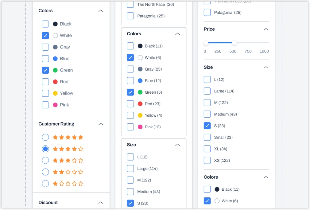
8. Optimize Filters & Sorting
When working on the product listing page design, don’t forget to add filters and sorting, as it can direct users to what they probably will pay money for. Filters help customers find exact items that suit their budgets, tastes, and intentions.
For example, sorting by newest or most popular is for frequent customers, and sorting by price is for those who target affordable items.
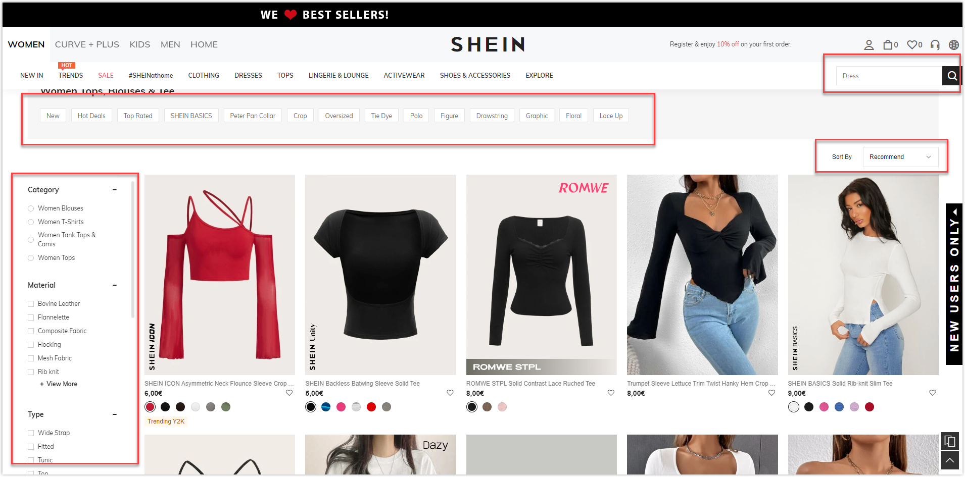
9. Make Navigation an Easy Walk
We all know a navigation is essential in making your listing page design outstanding and high-converting. Here are some tips you can consider to simplify the menu.
- Place product categories on the top, so customers can easily find what they need.
- Apply an easy-to-use search bar.
- Add a filter function, allowing users to find their desired products.
- Allow buyers to rank items.
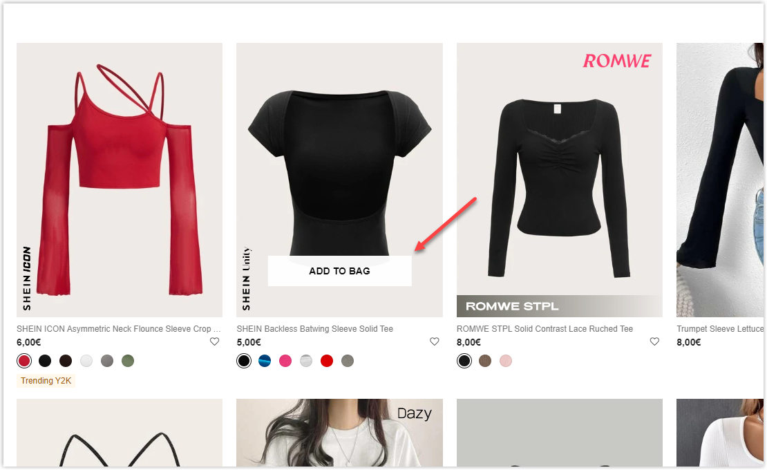
10. Optimize Calls to Action
High-converting CTAs are essential to all websites as it encourages visitors to take desired actions. Your eCommerce listing page should include this function, yet with some notice when applying.
- A “quick add” button on your product listing page is essential but may not work with all products. For expensive items, such as furniture or electronic devices, viewers are willing to see more rather than immediately add to the cart.
- A Wishlist or “favorite” button should be used wisely, as it has both pros and cons. It reminds visitors about their favorite options and revisits them, but sometimes can reduce the emergency of pressing “purchase.” Make sure you use this function for retargeting or reminding customers about what they left behind. If they don’t come back to the Wishlist, it’s useless.
- Lastly, remember to do it consistently with all items on your website. It makes no sense and causes confusion for your visitors when they can not add all products they like.
11. Optimize SEO
Since the product listing pages are usually rich in keywords and links, optimizing them properly can increase conversion rates to nearly 11,5%. So apply the SEO principles below to use their attributes fully.
- Optimize the title tags
- Have an original and unique meta description
- Use internal links
- Apply rich snippets and image alt attributes
12. Make Sure You Have Two Seconds or Less Loading Speed
Nearly 50% of web surfers expect the waiting time for a web to load in less than two seconds, and 40% will give up if they need to wait more than three seconds.
So, letting your buyers wait too long to visit their desired page will create an uncomfortable experience and become a barrier that can stop the shopping journey. Ensure you’ll not make this mistake when working on the product listing page design.
Try FREE Magezon Page Builder!
Easily create your engaging Magento pages in any style whenever you want without relying on developers or designers, just by drag & drop.
Purchase Triggering
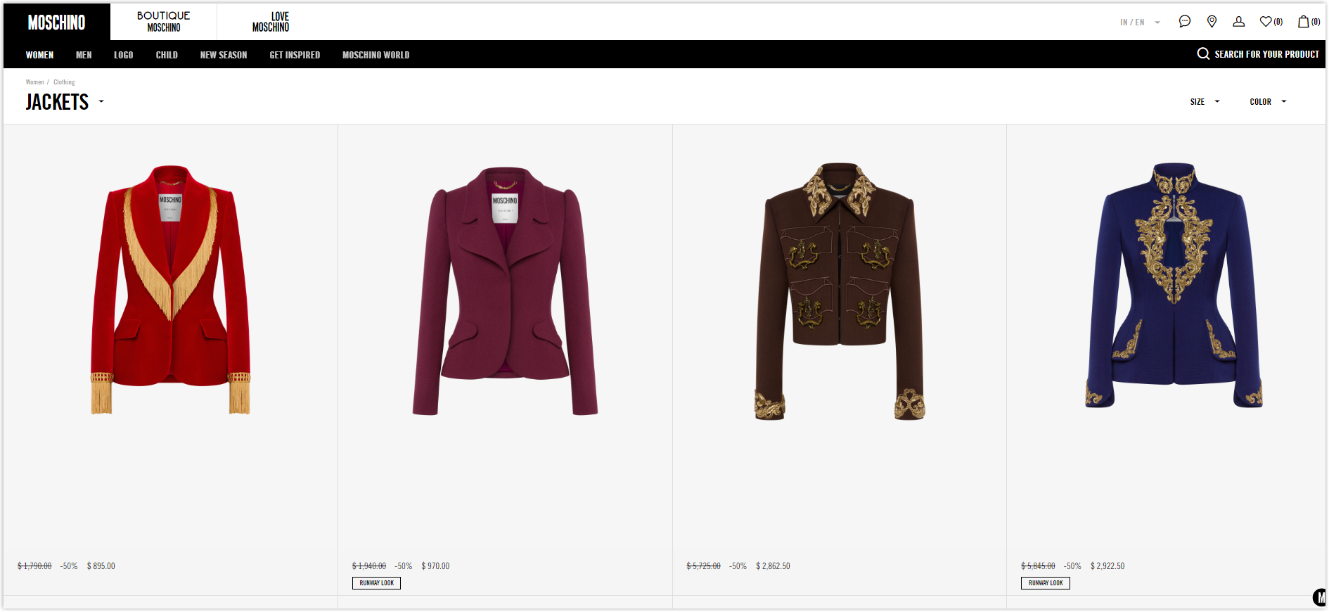
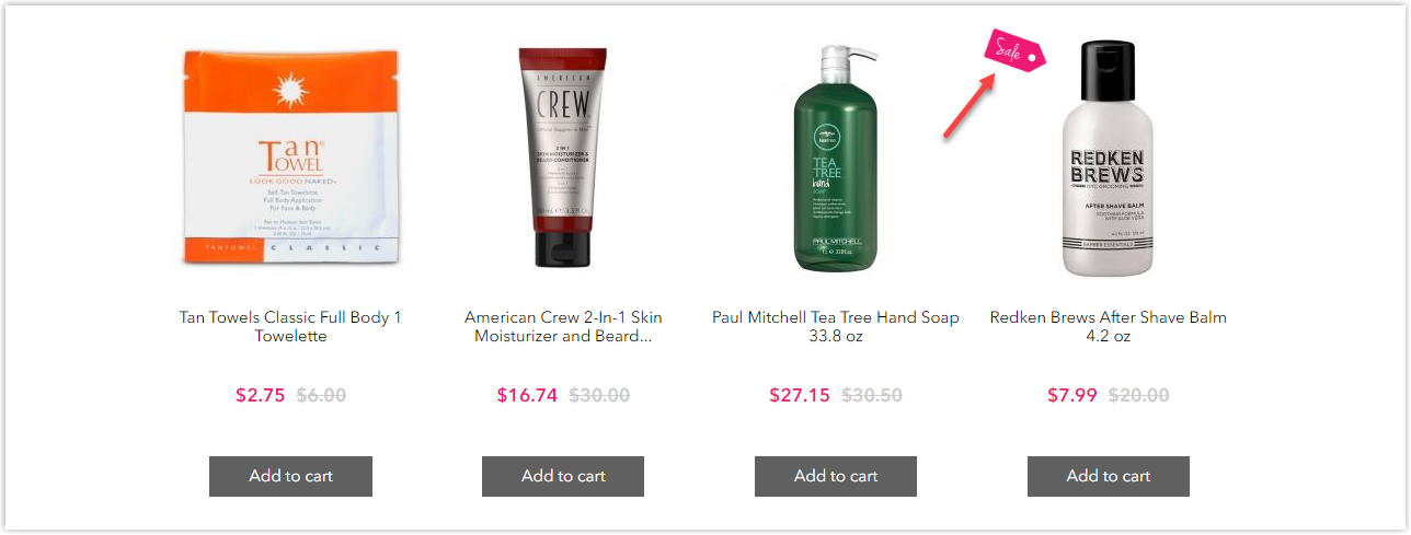
13. Make Sales & Savings Prominent
Your product listing page design can increase sales by highlighting the price deduction and putting it in an eye-catching place, so visitors will notice it immediately. However, keep in mind that big sales don’t always work. For high-end fashion and jewelry, the 90% discount sounds more suspicious than inciting.
Cost-saving bundles are also a great way to grow your sales. You can upsell your clients by showing them the benefits of buying two or three instead of one item. As a result, customers can save money, and you can increase your average order value.
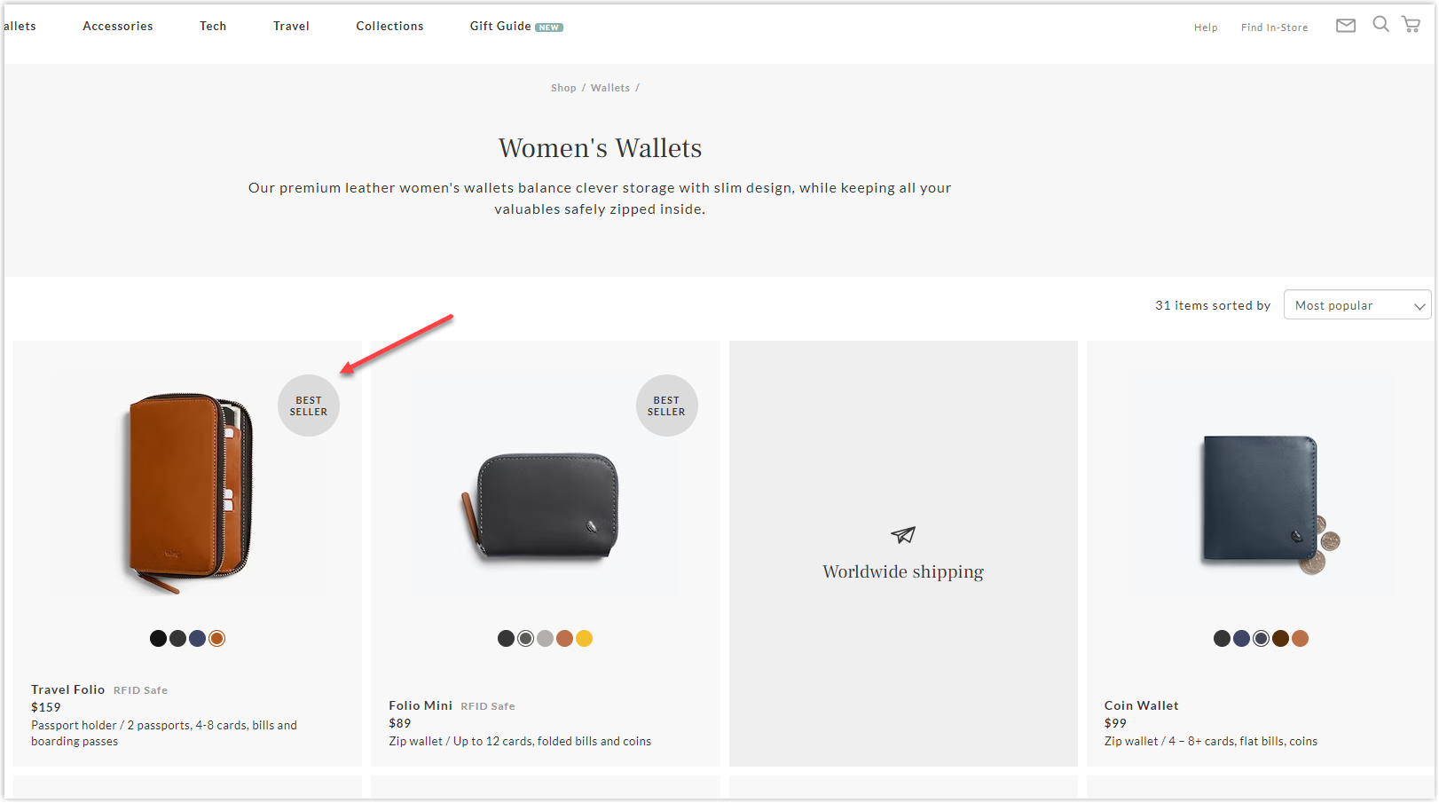
14. Keep the Best on Top
Targeting the best-selling products is a valuable tactic you can apply for your product listing page design. When shoppers visit a page and see items selling well, they will likely trust the brand and buy more. Next, ensure that you not only put your best products on top but highlight them, such as giving them the title “bestseller” so customers easily distinguish between other items.
15. Add Personalization
Adding personalization to your PLP means using technology to specify products (based on tastes and preferences) for customers. You can maximize the use of personalized recommendations as below.
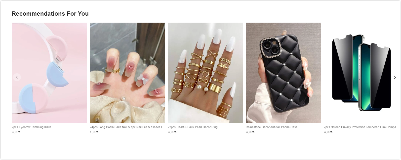
15.1. Highlight relevant items by applying recommendation carousels
Tools like visual AI can “read” the images a customer interacts with and help your personalization engine recommend everyday items more accurately. Therefore, visitors can save time scrolling and have a smooth shopping journey.
15.2. Place the most relevant items on top of the page
When the users search for something, hundreds of results can pop in, causing frustration. To make your clients step closer to purchase, you need to optimize your merchandising strategy to display the items that match their tastes and intentions.
15.3. Show similar results to what shoppers are likely to buy
Allowing users to see the most related products indicates your page is curated, and customers can quickly narrow down their criteria.
15.4. Provide one-on-one assistance
Personalization can be done by giving an assistant. Though it’s online shopping, your PLP eCommerce will look more professional with the function. You can offer a “book an appointment” option when the clients move the cursor over the images, and you will see it’s especially effective when the purchase is a high-end product.
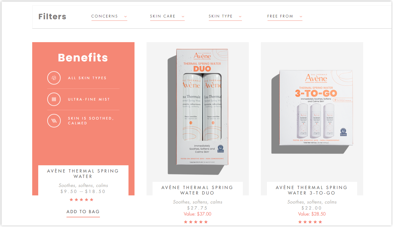
16. Add Product Ratings
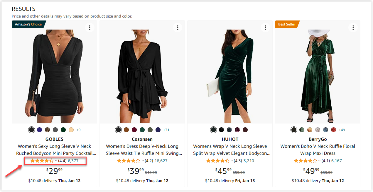
Your product listing page design can help improve users’ experience by adding ratings. This social proof is a big push for your visitors to come to the next step of the sales funnel.
It doesn’t matter when there are not 100% five stars, as the primary purpose of the ratings is to create curiosity and first-sight impressions. The buyers will still be curious to click more since they know somebody who bought and experienced your products. Adding the total ratings is also recommended since visitors will know the product’s popularity.
17. Feature “Recently Added/ Viewed” for Repeat Customers
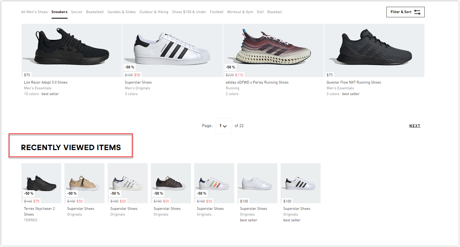
The feature “Recently Added/ Viewed” works for both old and new customers as it will give a “ting” to their attention. This function has two purposes: to prolong the time customers stay on your page and to persuade them to buy something in their favorite categories.
Wrapping Up
The product listing on eCommerce is like a bridge to bring users one step closer to buying decisions. It’s where you can apply different strategies to increase your conversion.
However, don’t look for a one-size-fits-all recipe for your product listing page design. All the tips above are proven effective, but some may work for specific products, while they can be meaningless to others. Therefore, consider these practices if they suit your specific target buyers to have the best listing page design for your business.
Lastly, if you want to build a comprehensive and high-converting Magento website, check out the Website Builder Suite from Magezon, Adobe’s trusted partner. We have everything you need to create necessary pages in any style by only dragging and dropping. Don’t worry if you’re not that good with coding. We’re here to help.


