 Magezon Blog Help Merchants Build Comprehensive eCommerce Websites

The homepage is vital for any business as it is the first impression. It needs to be aesthetically pleasing and give a brief but informative overview of what your business is about and what services or products you offer. While it’s great to be excited about this page as it can be a make-or-break for many businesses. What if it’s your first time designing a homepage? Are you struggling to decide what elements to feature?
Not to worry! Today’s blog post will examine 14 must-have elements for a fantastic homepage layout design.
Table of contents
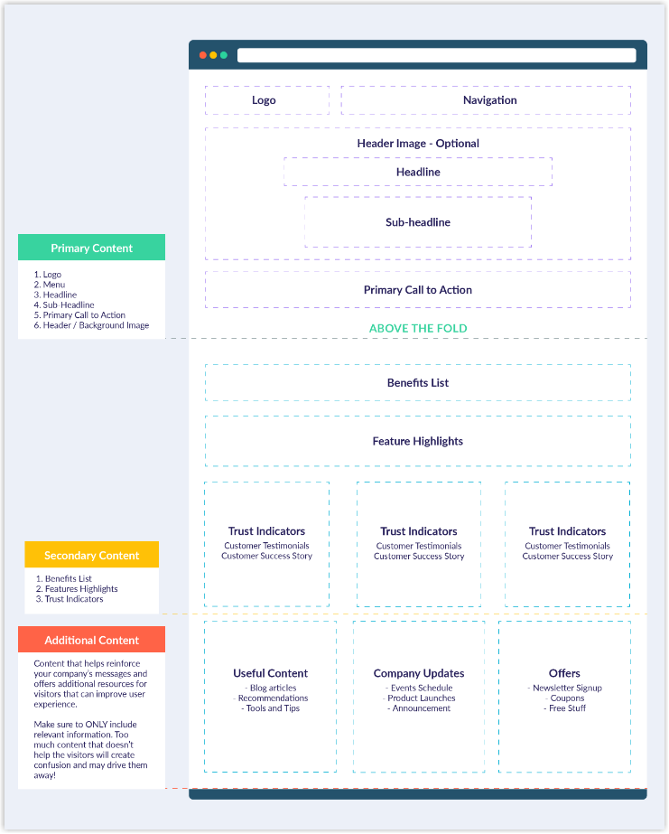
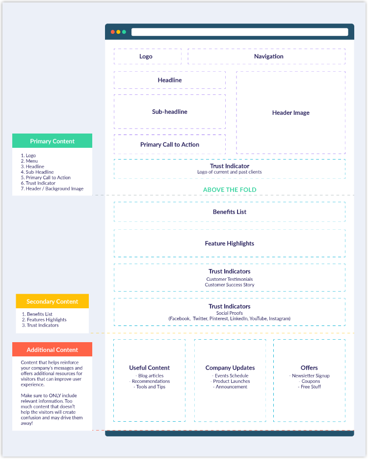
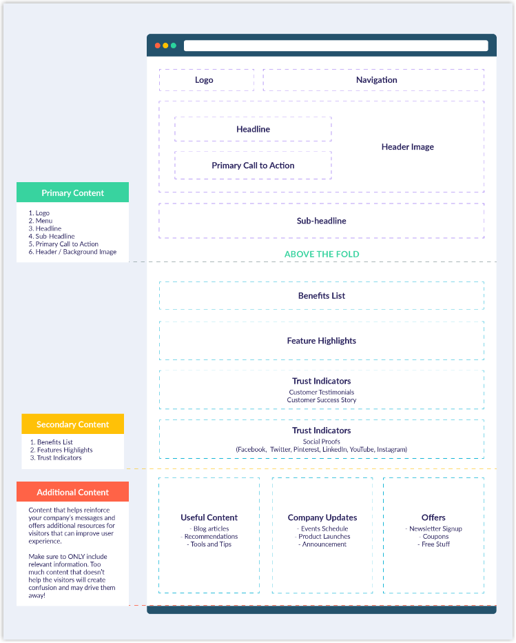
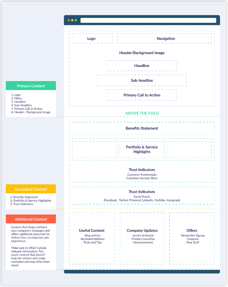
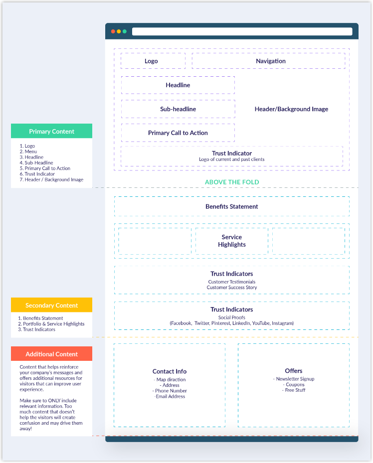
14 Must-Have Elements When Designing a Homepage
1. Logo
The logo is one of the most important aspects of a website because it is a visual representation of the company’s branding and identity. Hence, it should be placed in the most conspicuous location on every basic home page design, the header, so visitors can easily see and click on it to return to the homepage.
2. Navigation Bar
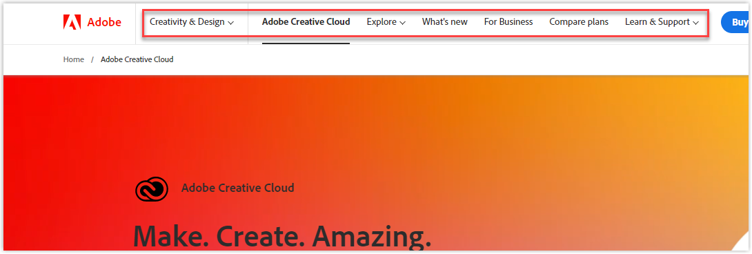
A navigation bar with a practical search box is the second key element that your website’s header should include. It should be prominent, and the items should be easy to understand since it provides an overview of the website‘s content. Moreover, with descriptive and thorough navigation, users can quickly find what they are looking for on your site and reduce bounce rates.
3. Headline
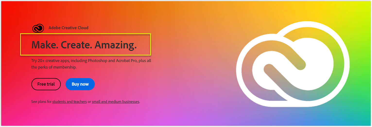
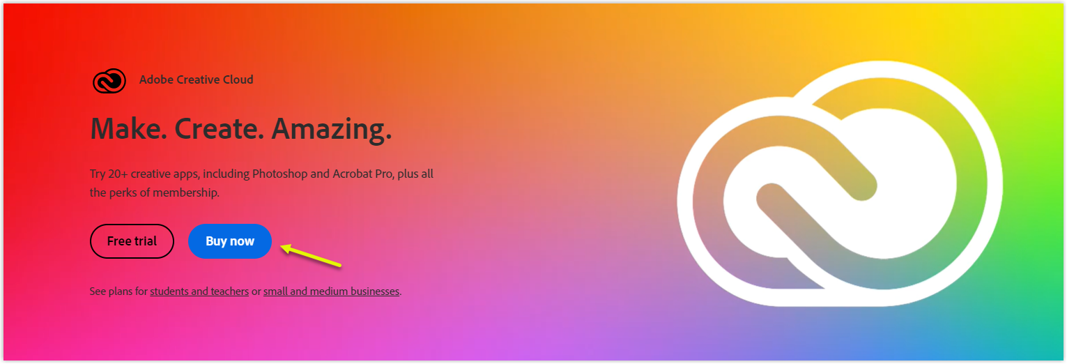
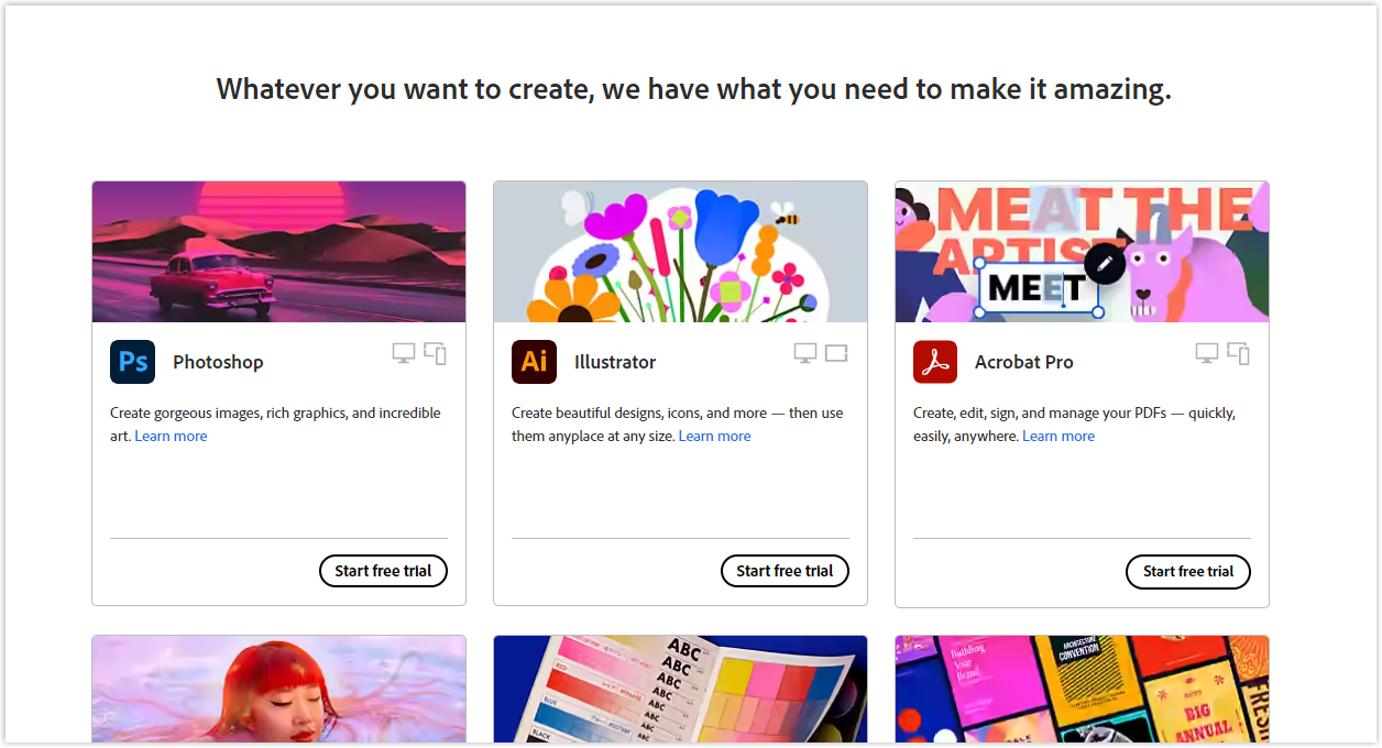
Within 3 seconds of visiting a website, potential customers need to understand what the business offers. This is where a compelling headline comes into play. Your headline should be able to communicate your business in just a few words.
Let’s take a look at Adobe’s example. Their message is simple yet effective: “Make. Create. Amazing.” They don’t need to use difficult jargon to try and impress the customers – they let their work speak for itself.
4. Sub-Headline
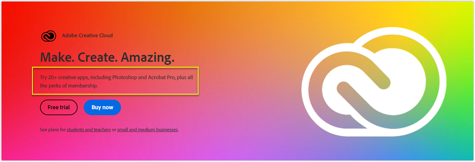
The sub-headline is just as important as your headline when it comes to designing a homepage. It should be brief yet descriptive to elaborate on your main message, with the goal of solving a common pain point. This can be done by zeroing in on a specific problem your product or service can help with. Doing this can reassure potential customers that you understand their needs and can offer a solution.
5. Primary Calls-to-Action
Another goal of designing a homepage is to persuade visitors to explore your website further and guide them down the sales funnel. Therefore, ensure you include appealing calls-to-action (CTAs) above the fold to direct people to different stages of the buyer’s journey. On the other hand, you should place them in easy-to-find spots throughout the homepage so your customer can take action immediately.
Besides, they should be attention-grabbing in a color that will stand out against the rest of your website’s color scheme while still complimenting the overall design. Keep the copy short and sweet – under five words – and make them action-oriented so visitors feel compelled to click on whatever you’re offering.
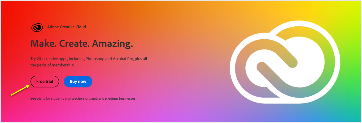
For example, Adobe handles CTAs clearly and directly to show customers what to do. The “Buy now” CTA is an excellent example of this – the blue color pops against the image background and immediately catches the eye. Plus, by placing it on the right side near the center, they’re directing customers toward the purchase option instead of the free trial button.
6. Secondary Calls-to-Action
CTAs are like little arrows pointing the way to your website’s conversion goal. Besides a primary CTA, your homepage should include some secondary ones to provide additional opportunities for conversion for people who aren’t quite ready to commit to your main objective. They can be your contingency plan and offer motivation for those who might not be ready for something as high-commitment as you’re asking.
7. Supporting Image
When designing a homepage, you should use images that capture emotion, drive action, and clearly communicate your offers. Regarding mobile user experience, high-quality compressed images are specifically recommended. On the other hand, add alt text to your images to make them more accessible, improving your SEO score.
Try FREE Magezon Page Builder!
Easily create your engaging Magento pages in any style whenever you want without relying on developers or designers, just by drag & drop.
8. Benefits
When marketing to potential customers through your website homepage design, it’s not enough to simply describe what your product or service does – you need to explain how it can benefit them. Your prospects are looking for reasons to buy from you, so make sure your marketing emphasizes the advantages of your offering.
9. Features
You can also list some of the critical features of your eCommerce homepage design and the benefits already provided above. This gives people a better understanding of what they can expect from your products and services. And as always, keep them short, concise, and easy to read.
10. Success Indicators
Besides sharing customer success stories, putting awards and recognition front and center on your homepage can create a great first impression. If your company has received industry accolades or was voted the best new app, don’t hesitate to prominently display this information on your homepage.
11. Testimonials or Social Proof
Surveys show that 95% of consumers consult social proof before purchasing, and 58% say they would pay more for a brand with good reviews. Therefore, it’s always essential to feature those elements when designing your homepage.
Showcase your best case studies or reviews in video interviews or detailed narratives with data to support your claims about your impact on your website, visitors, or potential customers. This will help show them that you’re not just making idle boasts about your accomplishments. Besides, when you include video interviews as part of your content strategy, be sure to highlight the most important details that’ll speak to the success of your past clients.
12. Highlights of Your Content
Ensure your website’s homepage showcases your best and most popular content to encourage new visitors to subscribe. This will help you build a more robust inbound marketing strategy and grow your audience.
Moreover, remember to include blog articles, webinars, podcasts, and other content to show your expertise, help build trust with potential customers, and offer users a low-risk way to convert and start a relationship with your brand. By providing helpful and insightful content, you’re more likely to win over users who may be hesitant to commit to your product or service.
13. Subscription
With the use of plugins and third-party services, invitations to subscribe to newsletters or email updates can come in many forms, such as headers, footers, pop-ups, fly-ins, scroll or exit-induced windows, and more.
Another popular option is a static homepage section that entices visitors to subscribe to a website host’s content. This section may be in the form of a row, sidebar, footer, or hero shot. So, if you’re looking to build an email list as part of your digital marketing strategy, you can do a few things to make it happen.
- Adding a subscription form on your home page
- Including a subscribe link in your menu bar
- Placing a subscription form in a pop-up or lightbox
- Asking people to subscribe at the end of your blog posts
- Creating a CTA directed to your landing page is dedicated to collecting email subscribers.
These strategies can help you get more people signed up for your email list, so you can start building relationships and growing your business.
14. Video (Bonus)
With over 2.1 billion active users monthly, YouTube videos are perfect for adding to a website. They are perfect for when you want to reuse, summarize, or review information. Besides, did you know that 73% of people are more likely to buy a product or service after seeing a demo video?
Okay, now that you know what to include in your homepage design, let’s move on to how you should arrange them to create the most sales.
Read more: 20 Best Home Page Design Examples for Website
Recommend Effective Homepage Layouts to Copy
1. Bold: Appropriate for an E-commerce Store
The first layout is a popular choice for many industries, especially eCommerce stores, as it lets you put your headline front and center, where it will be seen immediately.
This template type is ideal for visual businesses, such as florists, studios, fashion, or tour operators. Since images capture people’s attention better than words, this template is perfect for them to reach their targeted audience. An image is placed front and center to give visitors a glimpse of what is offered, grab their attention, and keep them staying longer.
On the other hand, you can also use multiple CTAs on the home page for users to find what they’re seeking easily and quickly. Check out the below example from O’Neills with numerous buttons throughout their front page:
This is especially helpful if there are plenty of choices and avenues your visitors can take. So, having clear and concise CTAs can guide users to the right page or product, making their experience on your site much better.
Try FREE Magezon Page Builder!
Easily create your engaging Magento pages in any style whenever you want without relying on developers or designers, just by drag & drop.
2. Informative: Excellent for Service Providers
The second template is perfect for businesses that don’t rely much on images. You’ll find this type of layout more often on websites that offer services rather than products.
Let’s take a look at Trello to see how it emphasizes its service on the headline and sub-headline.
The big, eye-catching headline lets visitors know what they can benefit from the business and create curiosity to discover more. Thanks to the intelligent arrangement, users will be drawn naturally to the sub-headline and, eventually, the CTA. The blue button contains one of those powerful words, “free,” allowing visitors to try out their product without any commitment or cost.
3. Brand Statement: Ideal for Fashion Brands and Mobile Traffic
The third layout looks pretty similar to the first one, but there’s less text. This way, images, and headlines can say more to help customers to get the most essential information and keep them discovering.
With this layout, they’ll see short information about what they need to know and why they should care about your service/product. You can refer to the below example from Helly Hansen below to see how they take advantage of images:
4. Dedicated to Images: Perfect for Designers and Photographers
The fourth layout is often used by creatives such as photographers, designers, musicians, and illustrators. This is because their professional portfolios are better represented with visuals than the copy.
And when it comes to marketing themselves, these websites are more focused on elegantly displaying photos and artwork rather than writing long paragraphs about their work. For example, on Veronica Solomon’s interior design website, her homepage layout is dominated by an image of her in an eclectically decorated room. This tells us more about what she can offer than a lengthy and unnecessary sub-headline would, and it is relevant to her business.
5. A Mix of Images and Text: Grate for Restaurants and Other Food-Related Businesses
Our final recommended layout is ideal for creative businesses like food and beverage restaurants that want to include more text in their headlines and sub-headlines.
This is handy if your business relies on clever copy and stunning visuals to convey the message. Plus, featuring trust signals at the top of the page instead of the bottom helps quickly build and solidify customer relationships. Check out how Red Bamboo designs its homepage:
Ready to Design Your Dream Homepage?
Now that we’re pretty sure you can understand critical elements and how to arrange them to create a beautiful and engaging homepage that wins your ideal customers. So it’s time to create or optimize yours. You can ask developers or do it yourself with a drag-and-drop editor.
If you’re a Magento store owner planning to build an impressive and high-converting homepage on your own, consider FREE Page Builder from Magezon, an Adobe trusted partner. With a user-friendly drag-and-drop interface and diverse powerful features, you can easily design or redesign any style whenever you want without relying on developers or designers.
More Magento extensions are also available to create all necessary pages and elements for your website. Don’t worry if you’re not that good with coding because these extensions are the solution.


