Magezon Blog Help Merchants Build Comprehensive eCommerce Websites

People often overlook footers and only see them as a place to put contact info and legal copyright notices. However, they can help raise your website’s position in search engines, enhance users’ experience, and increase the conversion rate.
To create one for you, besides the best practices, you also need ideas from the formers. Check out our list of 33 fantastic website footer examples below, and see how different companies get their jobs done.
Table of contents
33 Website Footer Examples to Keep Your Visitors Engaged
1. HUGE
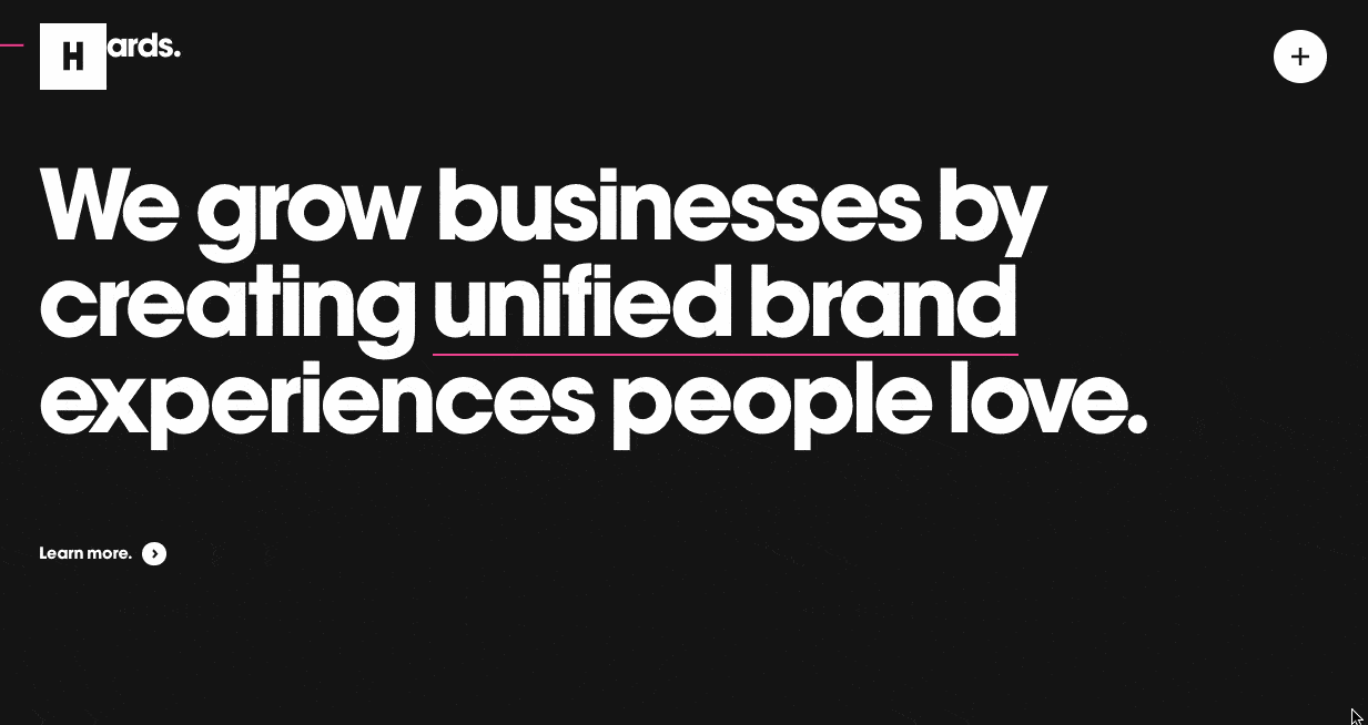
The first and the best website footer we will cover today is HUGE, a top-notch digital agency that has helped create some of the world’s most innovative brands and experiences. You’ll see that their mission is reflected in the design of the website and the footer.
As you reach their impressive footer, you’ll see a big, bold “Hello” in bright green letters designed to attract the client’s attention. Also, the background color automatically transforms from black to green to create a feeling of energy and excitement.
More so, on the right side, you’ll find helpful links and contact information for inquiries. And on their left is the logo with the tagline: “Make huge moves.” to remind visitors of their mission and make a long-lasting impression.
2. Aisle
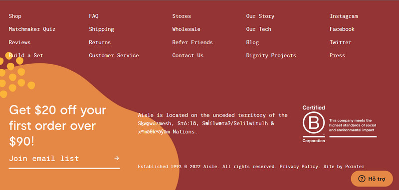
Aisle is an eCommerce company dedicated to providing sustainable and ethical alternatives to disposable menstrual products such as pads and tampons. Their website informs and inspires customers to switch to their reusable products to help reduce environmental waste.
Regarding the footer, the Aisle team decided to mix things up a little by selecting two colors instead of a plain white tone to ensure customers have a long-lasting impression before leaving. The opt-in email form and CTA vouchers also stand out thanks to the orange background and yellow shapes.
3. Ajeeb
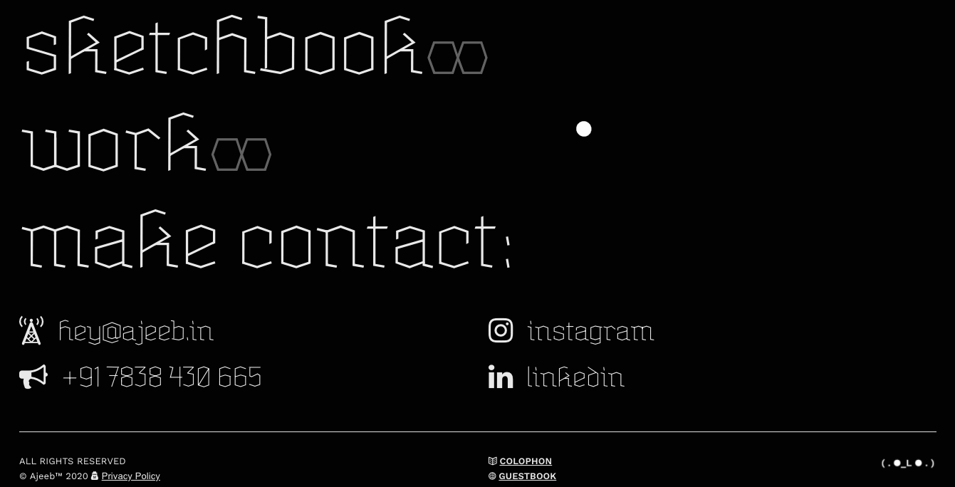
Pranjal Kaila, or Ajeeb, is an interdisciplinary designer creating interactive spatial and sensory experiences. His website reflects his skills, with every part of it, from the header to the footer, designed to be engaging and visually appealing.
Ajeeb has made the footer an excellent example of a trendy website with everything you need. The cursor acts like a spotlight – the text will change to bold and blue when you hover over any of the links, and this is not just a random thing adding up to the footer. Those combine to create a Riso print style, interactions, neon color effects, and holographic images. And it still manages to look neat and tidy.
The footer covers the black screen, with big titles highlighting the main pages and contact information. This makes it easier for potential customers to find the information they need when they scroll down, reducing browsing time.
4. Superfluid
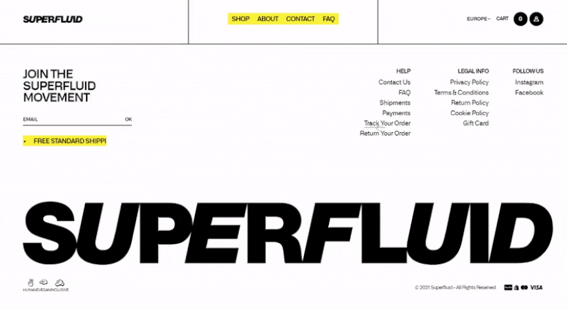
If your website’s design style is audacious and out-of-the-ordinary, you should not skip this website footer example from Superfluid. It utilized the bold trend to its advantage by finishing with a large, black, striking brand logo that takes up half the footer. This perfectly steals your mind from the first look.
As you can see, Superfluid has a well-designed footer that contains all the necessary links, such as shipping and billing information, legal, FAQ, and social media. It uses a yellow carousel, effectively driving users to the call to action.
5. Spline Group
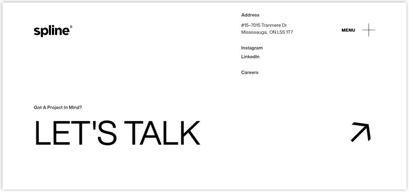
Spline Group is an engineering firm dedicated to effective communication and simplicity. This is evident in its footer design, which features minimalist black text on a white background. There are an address and links to their Instagram, LinkedIn, and Careers page. Under that is a much larger, simple, and appealing CTA: “Let’s talk.”
6. Art4web
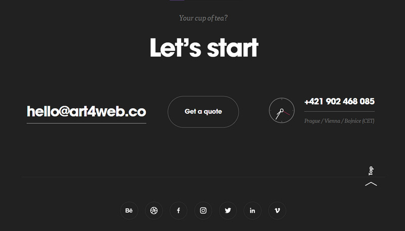
Art4web is a creative digital and branding studio dedicated to designing unique websites, mobile apps, and brands. Its unique website footer example provides 3 ways for potential customers to get in touch: email, filling out a form to request a quote, or calling them. Alternatively, they can connect with Art4web on any social media platform represented by the icons below to get started on their project.
7. Tāmras Gin
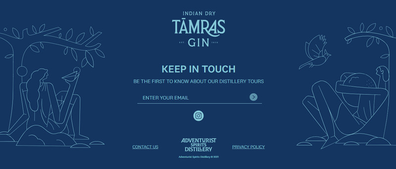
Tāmras Gin’s website aims to transport you to the Colvale village in Goa with its lush paddy fields, backwaters, and rustic charm, which are also captured in the footer.
The hand-drawn animations are visually appealing and help reinforce the brand and encourage visitors to take action. This visual represents the botanicals and citrus fruits used in their gin and how they combine to create a refreshing, relaxing drink.
Moreover, framing the logo, opt-in email form, and other standard elements in the footer helps visitors connect with the brand and take action via signing up for the email list or following Tāmras Gin on social media.
8. Callista
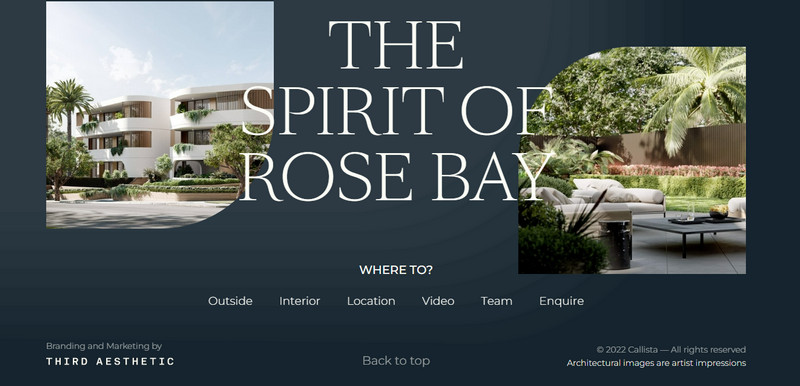
Callista is a brand new development of luxurious apartments in the lovely Rose Bay. Its website has been designed to provide potential customers with a virtual tour of the apartments and give them all the necessary information. Therefore, their footer contains images of the front and back of different apartments. It features a navigation menu that’s easily within reach that says “Where to?” in an attractive way.
With this attractive invitation, visitors will likely want to explore the development more by clicking on certain navigation links that’ll take them to an interior or exterior tour, location, or video tour. Not only that, but the footer also contains a “Back to top” button that encourages visitors to keep scrolling and browsing through the website.
9. Envoy
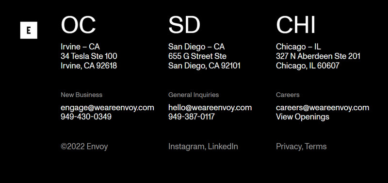
Envoy is a digital innovation company that creates transformative brands and digital experiences. Its website is an excellent example of what a transformative digital experience can look like, from the header up to the footer.
Its footer is precise but efficient, displaying the three office locations in a tidy, three-column layout. And for those who may want to get in touch with the firm for different reasons, there are three ways to do so depending on the inquiry. We love how Envoy kept their branding consistent throughout the website’s header and footer by using a black-and-white color scheme.
10. gOOOders
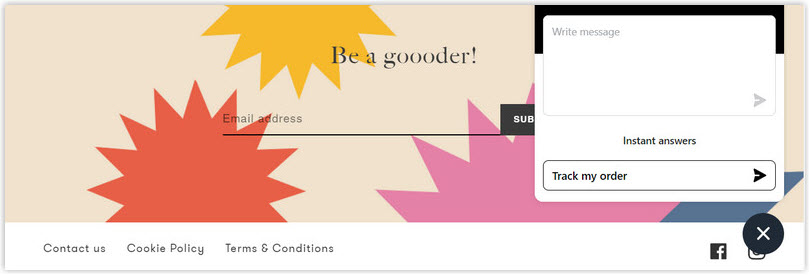
At gOOOders, the website footer is focused on helping you take action. Many of it is dedicated to their email sign-up form, so customers can stay up-to-date on all the latest news and offer from their brand. The background is colorful and animated, making it easy for your eyes to focus.
Below, gOOOders has also included a white row in their footer with a copyright notice, a contact link, links to the cookie policy and terms and conditions on the left hand, and social media icons located on the right. This footer style is perfect for websites that want to convert visitors into customers!
11. Hideout Space
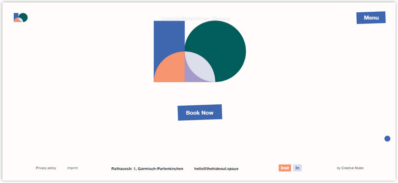
Hideout Space is the perfect place for small startups and teams to come together to work hard and play hard. Located in the beautiful area of Garmisch-Partenkirchen, there are endless opportunities for adventure, from hiking and swimming to exploring the surrounding area. The website is designed to give visitors a taste of what they can expect and encourage them to book their trip when they reach the footer.
As the user scrolls down to the footer, Hideout Space’s logo pieces slide in from the top and settle right above the button. And the “Book Now” CTA button is a practical design choice because it is simple yet compelling. They have also put the button centered on the page and share the same color as the cursor, making it more likely to grab attention.
This effectively creates a sense of “arrival,” which will help direct the user’s gaze and focus and encourage users to take action. It also has a larger font size than the links, contact information, and social media links at the bottom, helping establish a visual hierarchy.

Design Magento Header & Footer for FREE
Create or optimize a high-converting footer on your Magento website in minutes without the need for coding. Everything, simply drag and drop.
12. Lemkus
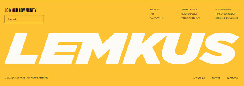
Lemkus is a leading retailer of sporting apparel and branded sneakers in South Africa. It prides itself on having a website design that is as unique as its product designs. The footer on the homepage serves as a great website footer example, with an appealing background in yellow.
Moreover, the big, bold logo “LemKus” in the footer creates a visually striking and unique look that helps the brand stand out from the competition. This also ensures visitors remember the brand name long after leaving the site. Besides, other aspects of their footer are just as well designed and arranged to help visitors locate what they need.
13. Lorelei Londres
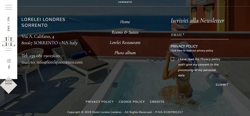
The Lorelei Londres is a luxury hotel in Italy that seeks to provide the best in hospitality and charm. Regarding meeting these goals, the hotel’s footer does a great job. You’ll find contact information on the left, navigation links in the center, and an opt-in newsletter form to the right to anticipate customers’ questions so they can easily find the information.
Additionally, the website’s footer is simple and clean. The privacy policy and submit the form on the right side and additional links to the privacy policy, cookie policy, and agency information on the left side. The image background is in keeping with the brand and gives the impression of a relaxing and enjoyable experience.
14. Tenzo
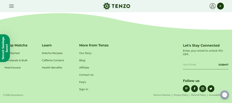
At Tenzo, their mission is to provide a clean caffeine beverage alternative to coffee by selling matcha tea in an affordable and accessible way. It has designed a footer that perfectly reflects its matcha brand. The primary color chosen for the background is green – which is characteristic of the matcha product they are selling.
They then choose a deeper green tone to highlight the information in the footer so guests can easily find what they are looking for. The same color is chosen as the icon for their social media channels in the right corner. This creates an excellent, cohesive image of matcha that’ll be hard for customers to forget.
In addition, the footer can be used as a final call-to-action button that encourages customers to stay on the page before they leave. As you can see, the brand chose the brightest green with a black border that reads “Secret Savings Here!” to make customers curious and more likely to click to receive the offer. In my opinion, this is one of the best footer design website examples to get inspired!
15. Will Ventures
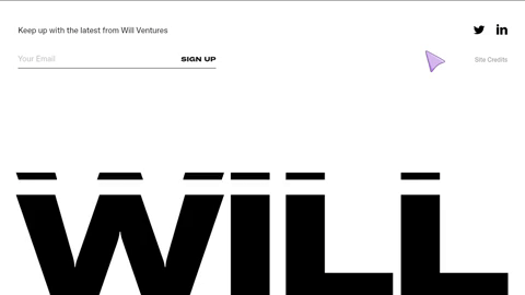
Will Ventures is an early-stage venture capital company mainly working with consumer, health, and media startups. The black and white coloring of the website helps to present clear options and prevent information overload for the user.
The footer of a website is typically where users will find contact information or social media links for the company. However, if a website’s footer only contains these elements, it can seem bland and uninteresting.
Will Ventures has solved this problem by animating the text “WILL” to move up and down the page, keeping users engaged. This is a simple but effective way to add personality to a website and make it more enjoyable.
16. Tapbots
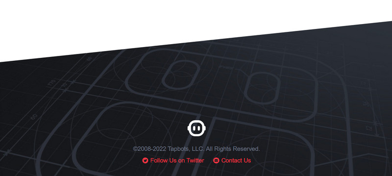
The Tapbots website footer design is an excellent example. It is creative and simple, with easy-to-understand illustrations. Only one logo and two social media links lead to their contact information, it’s still appealing and memorable thanks to the cute robot logo, which ties in perfectly with the name “Tapbots.”
17. The Noun Project
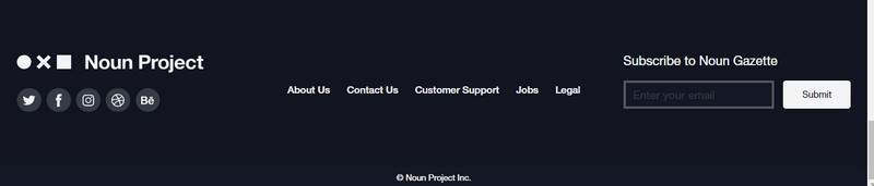
The Noun Project has combined contrasting colors, black and white, for the entire web page, but amazingly used in a well-organized way from the header to the footer. The footer is simple but includes all the essential components, like social media links, menus, and email addresses, making it easy for customers to navigate.
On the left are icons that lead to the brand’s channels. In the middle is contact information, legal policy, and more. And on the right, customers can easily subscribe to the company’s newsletter. So, if you love simplicity, this is the best website footer design inspiration you can leverage.
18. Jarad Johnson

No rule says you must cram your footer with content. Sometimes it’s better to keep things simple. That’s why Jarad Johnson has done an excellent job with his page – the brand has kept the footer content to a minimum, with just four icons and media links. Visitors can quickly get in touch with the company if they need to.
19. The Ministry of Type
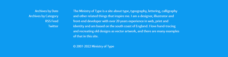
The Ministry of Typer is one of the great ideas for using your website footer to promote your work to visitors. Including information about the author helps visitors relate to the site. If you have the same purpose, you can design your website footer similarly.
20. Bei Blog
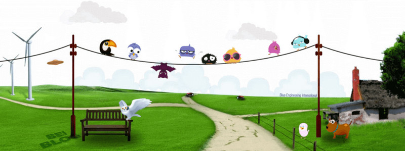
The Bei blog footer uses a unique design feature – instead of including contact information or a call-to-action, it uses a cartoon illustration as its background. This design choice has been successful for the website, as it helps the footer stand out and appear more visually appealing.
21. Mom & Popcorn
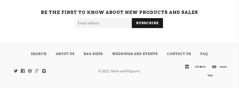
Mom & Popcorn‘s website aims to guide those looking for the best gourmet popcorn. Its footer is designed in a way that’s easy to navigate. It has a modern design to capture attention and an email collection with captions that attract and encourage customers to leave their emails. After all, who doesn’t want to be “the first” to know about new products and special offers?
22. Cantilever Fish and Chips
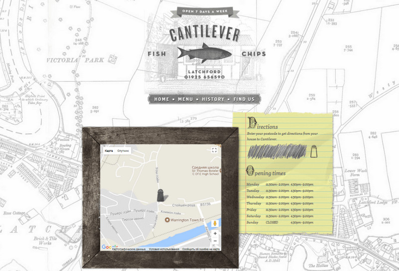
Cantilever Fish and Сhips’s website footer is an excellent example of incorporating geographical location into a footer. By including the restaurant’s location and important information like business hours and how to find the restaurant, Cantilever Fish and Сhips make it easy for potential customers to find the restaurant and get the information they need.
Design Magento Header & Footer for FREE
Create or optimize a high-converting footer on your Magento website in minutes without the need for coding. Everything, simply drag and drop.
23. Avo
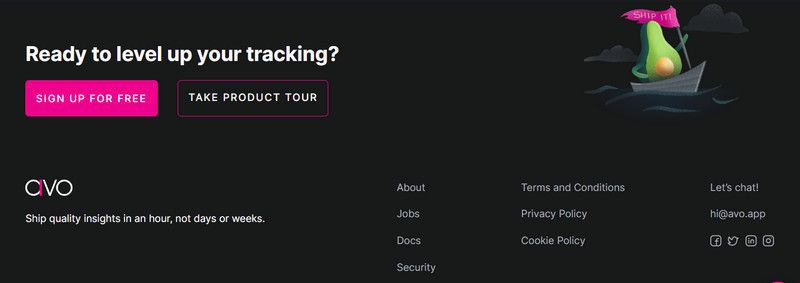
The Avo website has an excellent footer idea with eye-catching CTAs to encourage visitors to take action. There are a few inline footer links to simplify the page and users’ experience. Besides, we also love the avocado character embarking on an oceanic adventure to the right of the input field – it’s a fun and creative way to symbolize taking the first step.
24. Clade Design
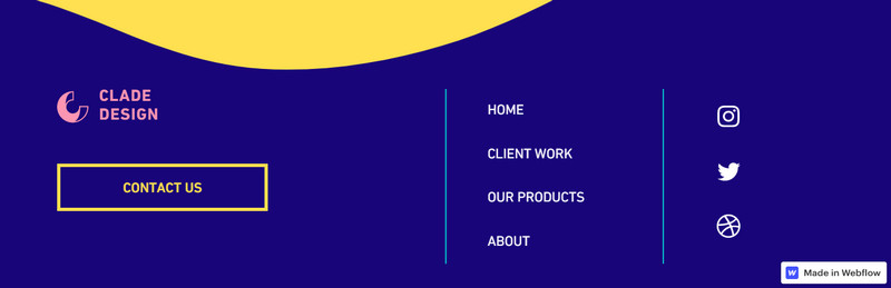
This footer design from Clade Design is a perfect example of how simplicity can be just as effective – if not more effective – than a design that’s crammed full of information and links.
Their footer idea fits perfectly with the rest of the site’s design by including only a few links, a clear call-to-action button, and a social media icon block. With its contrasting colors and unique approach, the contemporary webpage footer from Clade is much easier on the eyes. This creativity brings a freshness to footer web design that is much appreciated.
25. Designies
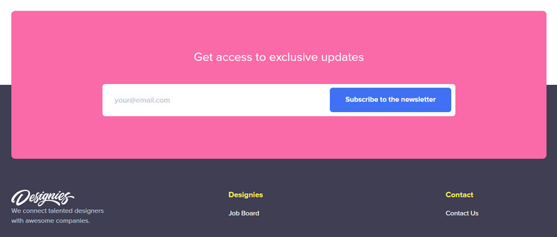
Designies‘ website layout is full of white space, and their footer is a dark pink that stands out against dark gray and black. When you scroll to the bottom of the page, you’ll see a caption encouraging users to enter their email and an appealing “Subscribe to the newsletter” button.
The inline links become the primary navigation, and if someone wants to explore different areas of the website, it’s easy to find a link that will take them there. No one is left without a means of navigation, no matter where they are on the website.
26. Hologram
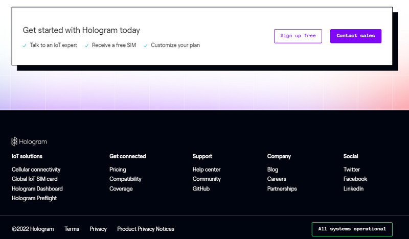
As you can see, the sticky menu bar allows Hologram to remove a few unnecessary links in the footer, making it look simpler and not overwhelming users.
Their footer is carefully designed to be visually appealing and effective. It’s divided into two contrasting sections – white and black – with a box in the upper part that uses a drop shadow effect to help users focus on the content inside. This section provides information about the services featured by Hologram, and they also contain two prominent CTAs to incentivize visitors to take action immediately.
27. Savvy
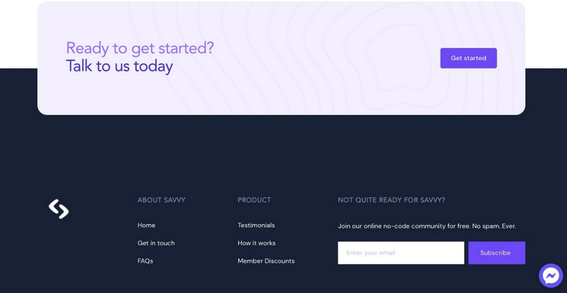
Savvy is another excellent example of a simple footer design for websites you can’t skip. Although it has since been updated, we still wanted to include it on this list because the old version of this site footer was so impressive.
At Savvy, they build custom tools and apps for businesses with low code using the Z-layout that precedes their footer. They have designed a sleek and modern-looking footer for their website. The footer contains two blocks, one larger block with straight lines and a smaller box with rounded corners that contains a purple call-to-action button motivating “Get started.”
Below, you’ll find inline links to the most important pages and an email subscription form – making it a quick and easy process for users to subscribe.
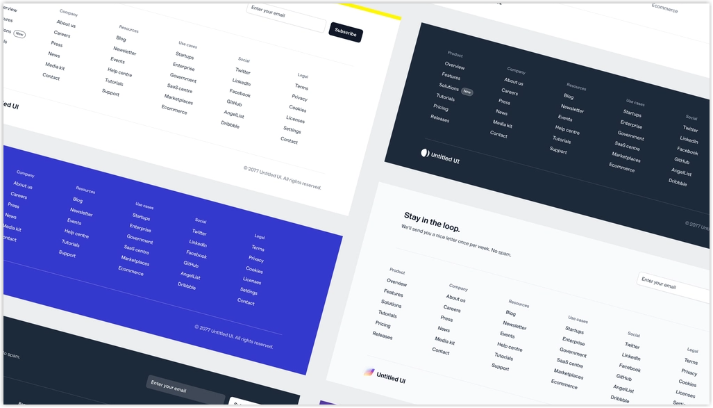
28. Astra
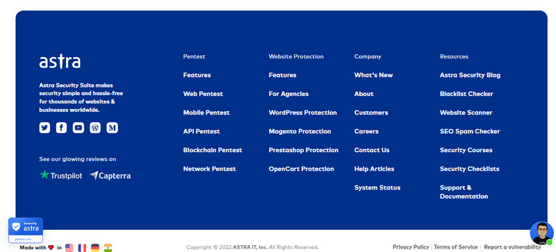
The navy blue footer of Astra signals the end of the journey for the viewer. Its uniform set of columns, inline links, and tidy social media block provide a linear contrast to the rest of the design, making it the perfect way to finish things.
29. Brass Hands
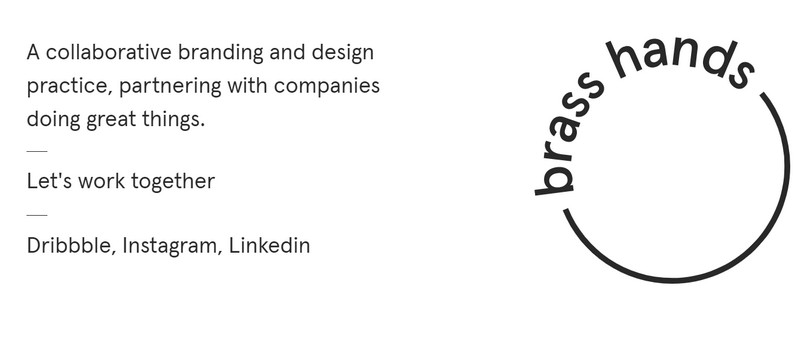
As you scroll through the website for the branding agency Brass Hands, you’ll notice the smooth user experience with text that gently shifts into place. The featured projects zoom in on hover, and other design elements are well-executed. Nothing is jarring or out of place, and the overall layout has a sense of cohesion.
And When you scroll down to the page’s footer, it’s a clean and simple design. The line that says “Let’s work together” and the links to their social media pages make this footer an effective end to Brass Hands’ landing page.
30. Vectornator
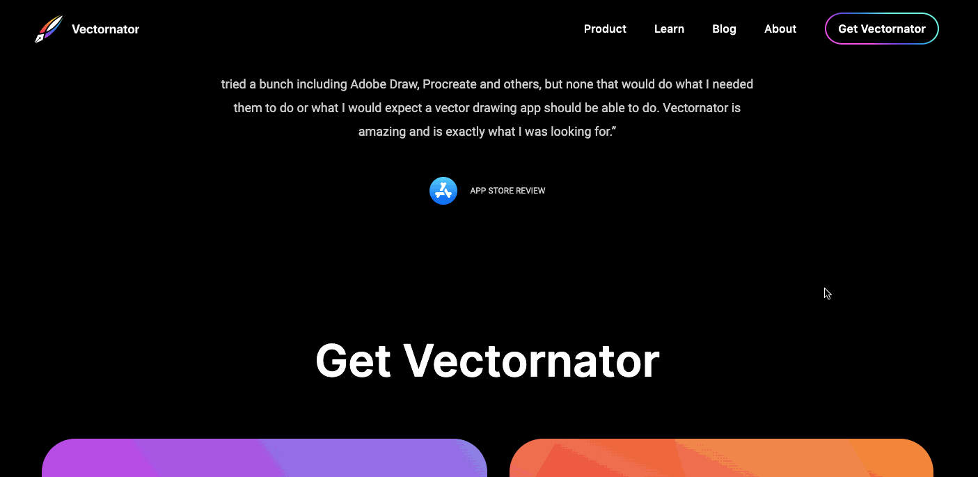
When you reach the footer, you’ll already be impressed by Vectornator‘s creative potential. There’s no need to reiterate what makes this software unique or to add anything new in the footer – the inline links it contains will point you in the right direction. This excellent lesson in restraint shows how sometimes the best footers are the most straightforward designs.
31. Hi5
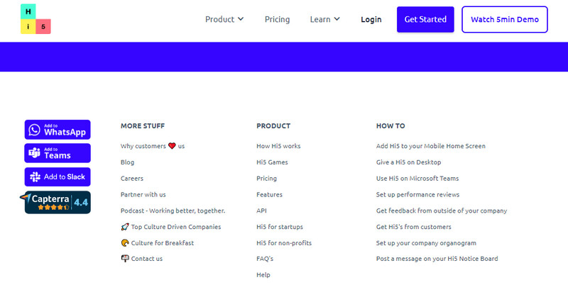
The left-hand side of the Hi 5 footer has buttons that allow you to download the app on WhatsApp, Add to Slack, and more. And the dark blue makes these buttons more visible, making them the focal point of the footer.
Hi5’s right footer is packed with company information, from the addresses of their international offices to a social media button block. Despite the content, the footer uses white space and color effectively to keep everything in order.
32. Appasaurus
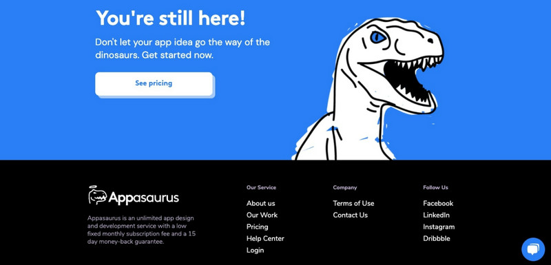
The design of the Appasaurus’s footer includes a fun connection to the rest of the design with a Tyrannosaurus dinosaur and the words “Don’t let your app idea go the way of the dinosaurs. Get started now.” This fits in very well with the white button below it.
More so, Appasaurus’ black footer background is always chic and goes well with the white and blue elements above. They also include connections to their social media pages and a short list of navigation options.
33. letsone
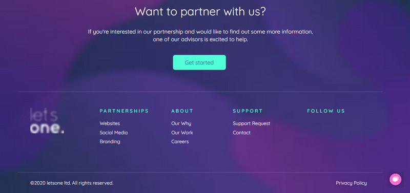
This website footer by Letsone is chic and perfectly captures the essence of its brand. The company provides visitors with all the information they need and has a cohesive look thanks to the recognizable background from the header. The logo in the footer also reinforces their branding efforts.
The website’s elements are organized cleanly, with headers and lists. Also, the hierarchy is clear, with the CTA placed prominently at the top of the footer in a large font. They’ve used a bright, contrasting color like pink to ensure visitors don’t miss the live chat option.
The Bottom Line…
So, we’ve finished the list of 33 website footer examples with different styles depending on their branding campaigns. I believe you’ve found your inspiration to create one or upgrade yours to convert as many customers as possible. Remember to sync the color with the rest of the website, include all necessary links, and add CTA buttons to encourage visitors to take the desired action.
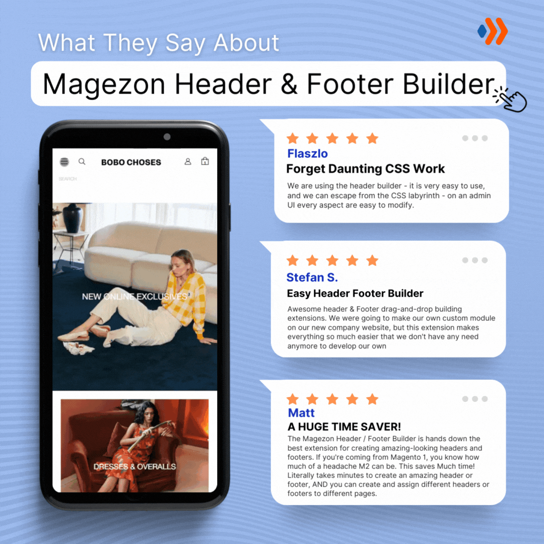
If you’re a Magento store owner planning to build an impressive and high-converting footer, consider Magento 2 Header and Footer Builder from Magezon, an Adobe trusted partner. With a user-friendly drag-and-drop interface and powerful diverse features, you can easily design or redesign any style whenever you want without relying on developers or designers.
More Magento extensions are also available to create all necessary pages and elements for your website. Don’t worry if you’re not good with coding because these extensions are the solution.