 Magezon Blog Help Merchants Build Comprehensive eCommerce Websites

If you were the owner of a coffee shop, you must understand the importance of having a website. How many coffee shop websites have you visited? Is there a particular website that you found memorable? Do you want a compilation to get inspiration from? Then you’ve come to the right place; below are our 10 examples of big brands you may be interested in.
Read till the end to get the best practices to optimize your website and increase your engagement and conversion rate. Now, without further ado, let’s start our today’s article.
Table of contents
10 Popular Coffee Shops Websites to Take Inspiration From
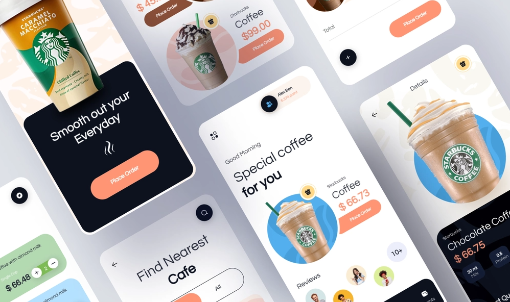
1. Starbucks Coffee
There’s nothing much to say about the coffee of this global brand except for its high quality and good flavor. But today, we’ll look at their website design and see what we can learn.
- What they do well
First things first, simple is the best. I say this because Starbucks only uses a two-column-based grid layout to showcase its best sellers and the newest items. Each block contains four parts: On the left is a title in the biggest size, a description, and a clear call-to-action button. On the right is a picture of the product or the service. With this arrangement, the homepage is clear and easy to navigate.
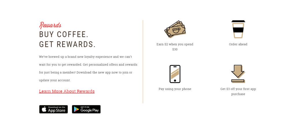
Now, move to the top of the page and look closely at its navigation bar with only three menus on the left: Menu, Rewards, and Gift Cards, and three CTAs on the right: Find a Store, Sign in, and Join Now. These are the pages that Starbucks’s visitors will most likely take action on. However, don’t worry that there isn’t a page you’re looking for; scroll down to the bottom to see its comprehensive menus.
→ Create an effective navigation bar: A Complete Guide to Creating Effective Website Navigation Bar
It will be a long if we discuss everything on their coffee shop website, so we’ll discover their menu page, the first page you probably go to. On the left are all the coffee categories they’re offering, including Drinks, Food, Merchandise, etc. If you click on the smaller menus, you’ll see the products with clear images for better imagination.
- What can be improved?
The only thing I want them to improve is their products’ photos on the menu page; they don’t impress me and are alluring enough to encourage me to order a drink.
That’s my subjective opinion. What about you? Go and discover the website yourself!
2. The Coffee Bean and Tea Leaf
With more than 1,200 stores worldwide, The Coffee Bean and Tea Leaf is now an indispensable part of many coffeeholic. Let’s see how they design their online coffee shop website.
- What they do well
If Starbucks uses only one grid layout to design its website, with TCBATL, you will see an interesting combination of many different grids. Each section looks completely different from the others. They showcase their brand color, purple, right at first sight, with the giant banners at the top of the homepage. Scrolling down, you’ll see all the most important pages arranged from top to bottom, including their newest products, best sellers, coffee stores, and stories.
→ Pick a color scheme for your website: 40+ Amazing Color Schemes for Websites That Engage Users
Now try this, scroll and stop at any section you like. Do you get distracted by other sections? Correct. You don’t. This is thanks to the reasonable proportion of the photos that make us focus entirely. Their CTAs are also designed and placed prominently enough to encourage clicking.
→ Create effective CTA buttons: 8 Must-Have Characteristics of the High-Converting CTA Buttons and Examples
On the other hand, their products’ photos impress me the most as they make me want to order right away, on both their homepage and menu page. Speaking of the menu page, you can go now and discover yourself; my pleasure to help you have a drink.
- What can be improved?
As a coffee shop website, it would be necessary to show your locations clearly. If Starbucks makes a sticky Find a Store button on the bottom of the menu page, in TCBATL, there’s only a small one in the left corner. For me, this is hard to find.
3. Biggby Coffee
If you’re living in Midwest US, Biggby Coffee must be something familiar. With more than 240 franchise shops, its website makes me curious enough to include it in this list of the best coffee shop websites. Now let’s start discovering.
- What they do well
Unlike the three websites above, Biggby decides to showcase its menu right on the homepage inside a slider. If you click the View All button, you’ll see its main product categories placed beautifully in a module grid layout with different colors in each block. Although they only use primary colors, the website doesn’t seem weird and outdated; instead, it looks simple yet effective.
CTA buttons are found in every menu block but only appear on hovering. Try it yourself! You’ll see how effectively it helps read the product’s description without distraction.
On the other hand, their navigation bar is sticky at the top of the page, making it easier to access essential pages such as Our Menu, Locations, About, Job listings, etc. If you look at the bottom of the page, there’s a customer photos gallery to showcase their happy moments with Biggby’s drinks. This serves as social proof to increase its reputation and encourage customers to order. If you can, try creating a dedicated testimonial page with a compilation of your satisfied customers, they can be videos, photos, or just plain text.
Ok, now let’s see what’s inside the product page. Simply try any drink type you like; you’ll see a blue background, and when you click on a random product, the page will send you to the center with all of its information. Go, discover, and order yourself a drink!
- What can be improved?
Biggby focuses mainly on the effectiveness and convenience of its coffee shop website, so there aren’t many motions. They can make the website more exciting, and visitors may want to stay longer to discover. However, it’s not a big deal as they already have every necessary element.
3. Caribou Coffee
- What they do well
Our fifth candidate on this list of the best cafe websites has some fun with typography and colors. At first sight, you’ll see their two newest drinks right above the fold of the homepage to capture visitors’ attention. Did you notice how they designed the drink’s caption in each block? It’s big enough to read yet creative to make an impression. If you take a closer look, you’ll see how they arrange the color by using the orange tone at the top and the blue tone at the bottom.
You want to see their menu, so let’s jump in. I don’t have much opinion about a coffee shop website design since they make their menu clear and easy to navigate. They also include all the ingredients information right above each drink’s name. If you want to search for another drink type, just look at the left navbar and choose from it.
One impressive thing to me is their product photos. Using the glass cup, you can see what’s inside each drink and even imagine its flavor. Not only with drinks, but they also took some stunning food photos, such as sandwiches, burritos, and croissants.
→ Improve your product image with tips: 19 Best Tips to Improve Your Product Image for Ecommerce
- What can be improved?
I was surprised and confused using their menu page because the food and drinks were unclickable. Normally, I can simply click on one of the drinks and place my order, but with Caribou, there isn’t that option.
On the other hand, it would be much better if they made their navbar sticky, so I don’t have to scroll all over to the top anymore.
That’s all my impression of Cariou’s website. What about you?
4. Peet’s Coffee
- What they do well
You can surely try this coffee shop website if you need more interactive features. But don’t be disappointed if you can not find it on the homepage; you can play with it later. Now, if you look at the homepage, you can grasp the feeling of the original coffee craft in the slogan they say. Their above-the-fold section displays a giant landscape picture as a metaphor for their process of making coffee from scratch. The use of brown color, the color of coffee beans, in their product photos and CTAs also say that their coffee is original.
As you scroll down, you will notice that it uses much white space to make each section stand out and easier to navigate. Overall, the homepage was arranged in two columns with clear CTAs.
→ Best practices to create an effective grid: 3 Things to Remember Before Creating Website Grids
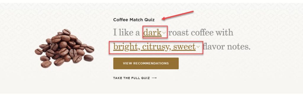
Let’s move to the most awaited part. Use Ctrl + F to search for the Coffee Match Quiz, and we can start.
→ Get inspired with interactive websites: 20 Interactive Website Examples That Keep Your Users Engaged
This is an interesting feature of Peet’s Coffee to help visitors decide which coffee type suits them; you can consider this on your own coffee website design. Click Take the full quiz and see for yourself how thoughtful Peet is.
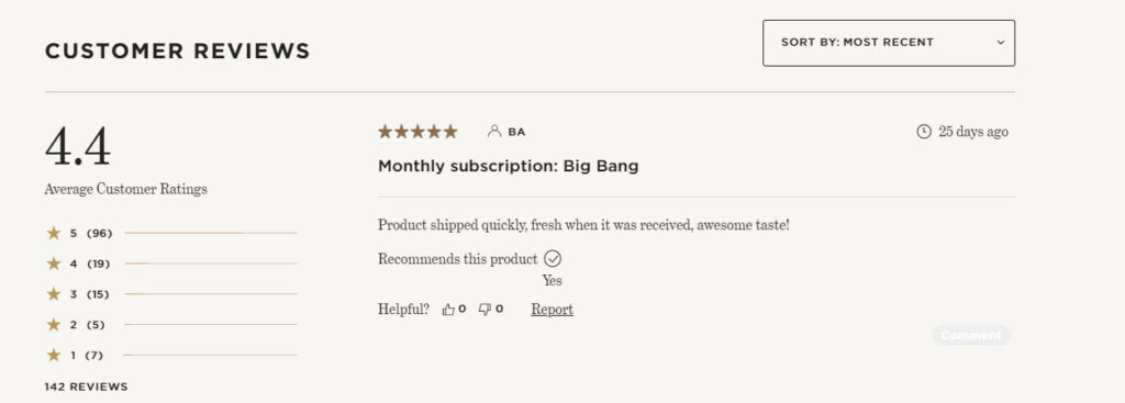
Of course, we can not miss their product page, but I’ll just comment briefly. One special thing about it is the customer review section, where you can read and decide if you want to buy the products or not.
- What can be improved?
There’s nothing much to say since they did an excellent job creating their coffee shop website. If I have to comment, I would love a menu section on the navigation bar. Ok, let’s move on to the next shop.

Try FREE Magezon Page Builder!
Easily create your engaging Magento pages in any style whenever you want without relying on developers or designers, just by drag & drop.
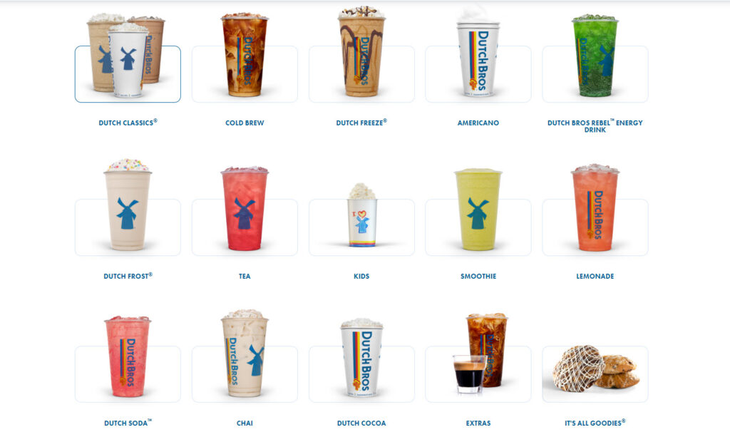
5. Dutch Bros Coffee
- What they do well
It seems like the priority of this online coffee shop website is the new arrival since it displays big pictures of the newest collections above the fold with prominent CTAs right in the center. One thing I love about Dutch Bros is how they place the menu section right below the banner, which means you only need to scroll once to see what product categories they have. They also create a good combination of colors within the page; one white section interleaves with one blue.
Let’s move on to the product page to see what you can learn. When you first arrive, you’ll see the same arrangement with the homepage, the new arrival at the top. Try clicking on each drink to explore more. Now, scroll down briefly and see all the categories in a module grid. Enough white space makes it easy to navigate the page and choose the drink visitors want.
- What can be improved?
Though there aren’t many things to say about this coffee shop website idea, I still want to recommend adding some photos of their customers enjoying their coffee as social proof.
Go explore yourself to see if you have the same idea as me.
7. Dunn Brothers Coffee
- What they do well
Dunn Brothers’ website prioritizes the accessibility of visitors by including only necessary details on its homepage. There are no special motion or interactive features. This coffee shop website is a great example of the saying “Simple is the best.” It uses brown as the main color scheme to demonstrate the color of coffee and interleaves white with brown to create contrast for different sections. On the other hand, if you look closely, you’ll see how easy it is to navigate through the homepage, thanks to enough blank space they use.
→ Tips to Choose an effective color scheme: 10 Useful Tips to Choose a Color Palette for Website
Another thing I like about their homepage is the placement of product photos. Do you recognize that they always let a little part of them outside the section’s banner? This creates a floating effect for the images to be more eye-catching.
Now, let’s move on to the main part, the Menu section. There’s nothing much to say; this page is simply a list of all the drinks and food Dunn Brothers offers with necessary details. A special thing here is the nutrition section they provide. Go explore, and you’ll be impressed by the detailed information.
- What can be improved?
This coffee shop website already has everything you need but if there’s anything I want them to improve, it is their menu page. There are no drink photos to be found. Therefore, I can’t imagine what the coffee will look like.
Ok, that’s a brief review for Dunn Brothers; what do you think? Go discover yourself, and tell me your idea in the comments section.
8. Seattle’s Best Coffee
- What they do well
This online coffee shop website clarifies that they offer food and beverage at the top banner with two big pictures. Besides the banner, other sections are inside a piece of paper placed above a big white table. Overall the homepage is easy to navigate with enough white space; you can easily understand what they are and what products they offer.
Let’s discover their menu page. Seattle’s Best Coffee has two main menus: Beverage and Food. They use a module grid to display product photos and a pastel background to make the drinks and food look more prominent. The pictures are professionally taken to allure visitors.
- What can be improved?
It would be great if they could add a sticky menus bar, but it’s not a big deal because this coffee website design doesn’t have much content to display. Their menu only has three categories for beverages and four for food.
Click on the link to discover the website, and let me know your ideas in the comments section below.
10. Costa Coffee
- What they do well
The best that Costa Coffee does to its website is simplicity. It includes three sections; you only have to scroll about three times to discover everything on their homepage. The first part is the banner containing a picture of their best sellers and a slogan on the left. The second part is the new arrival, and the last one is a comprehensive menu. Since purple is their brand color, their coffee shop website design reflects that by interleaving white and purple to show the contrast among sections.
If you click on their menu page, you will see how creative ad thoughtful they are. Below is my favorite part.
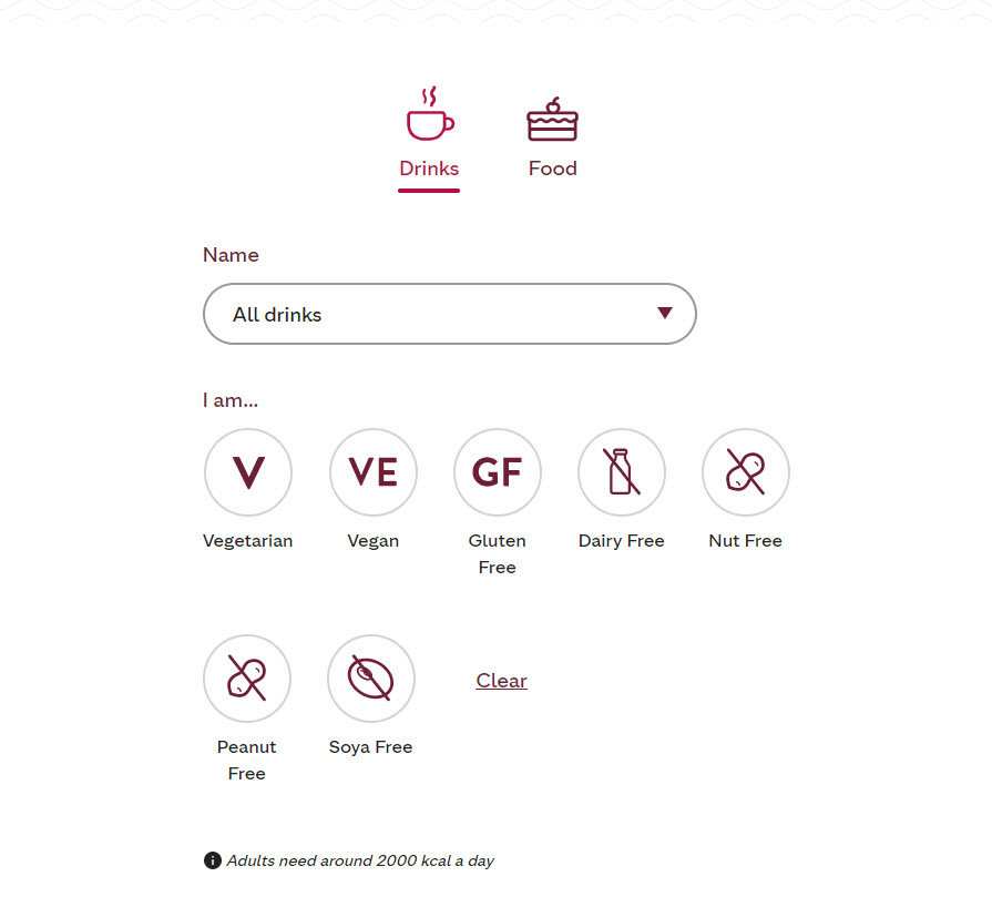
There are two main menus for food and beverages, but that’s not all. You not only can choose your favorite drink from the general menu, but you can also customize the criteria for your choice. For example, if you are a vegetarian, simply click the Vegetarian option, and the system will sort out all the suitable drinks for you.
On the other hand, their product photos are professional and alluring enough for me to place an order.
- What can be improved?
Everything on their website is already reasonable and adequate, but it would be great if they could consider a sticky menu bar, as sometimes having to scroll to the top is quite inconvenient.
10. Noc Coffee
- What they do well
What makes this coffee shop website unique is its simplicity of design. When you first land, you will see its navigation bar with a white background in the middle, the shop’s logo at the top, and the menu items right below. This makes navigating easier and more exciting. In the full-bleed mode, they use the video of two female staff doing their job on two vertical halves of the home page. By doing this, Noc Coffee successfully helps its customers imagine what their shop looks like and encourages them to actually pay a visit.
Now, let’s dive a little deeper into the menus bar. If you hover over each item, the illustrating videos will respectively change with a brief description on the right side. For example, with the Roastery page, you will see the video of the coffee beans being roasted automatically on a pan. So what if you click on it? You will still see a two-column-based grid layout, but there is more to read on the right side. If you want to return to the navbar, simply click on its logo in the middle of the page.
- What can be improved?
One thing I find pretty inconvenient is the placement of their menu. It would be better to place it more prominently on their navigation bar. How about you? Go discover yourself to see how great a job they did with their coffee website design.
Overall, all the coffee shop websites above prioritize simplicity. They don’t add many details to their homepage or menu page, so visitors will navigate more easily. But that is just one part of the problem; if you want the best coffee website design, there is more to learn. In the next section, we will focus on some best practices, so you can optimize your website and increase your conversion rate.

Try FREE Magezon Page Builder!
Easily create your engaging Magento pages in any style whenever you want without relying on developers or designers, just by drag & drop.
Essential Tips for Improving Your Coffee Shop Website
Branding and Visuality
1. Have a brand concept
The first website design best practice is that you need to define your brand concept before designing your coffee shop website. In other words, what do you want your online coffee business to be known? A modern and sophisticated coffee shop or a quaint one? Decide which one is you and ensure your website’s theme, colors, and images leave your target audience with a deep impression.
2. Ensure everything is clear and simple
If you notice, every best coffee website design we’ve discovered above has one thing in common; simplicity. Sure, you want to show the world that your website has all the features and functionalities that can be special and unique, but those may not be what your customers want. Every time you add something, you add a layer of complexity.
Remember that when a visitor arrives on a random page, if they can’t know what they’re able to do and what information they will get, they’ll abandon your coffee shop website.
How to know what should be included? Simply call out your centered products. For example, if you sell a coffee subscription, display it on every page. At the same time, think about what your customer would want to know and do with your coffee; maybe they are vegetarian and want a drink that suits their taste. Add that functionality, but smartly and clearly. You can revisit Costa’s coffee shop website to get the idea.
3. Pay attention to visuality
You must include a list of your products to keep people informed and encourage them to order or visit your shop, but only words won’t help. In other words, your visitors would be most interested in looking at your food and beverage photos. Let’s be honest; reading cappuccino coffee can’t be as enticing as seeing it in the picture.

However, except for the menu page, don’t display photos of every product you sell. On the homepage, include pictures of your best sellers and seasonal drinks. Some videos may be a great help also; they can be your staff making the coffee, your customers’ reviews, or a brief introduction to your brand.
One reminder is not to use generic photos online; instead, hire a professional photographer to do the job for you. Just ensure that your pictures are unique. Ok, let’s move to the following website UX best practice.
User Experience
1. Post your menu and update it regularly
As we’ve analyzed above, besides the homepage, the menu page is the second most crucial destination your visitors would visit. When they arrive at your coffee shop website, they want to know what products you are selling. They will likely abandon you and go to other coffee shops without one good menu.
On the other hand, make sure your menu is up to date. Your customers don’t want to be told that a product is frequently unavailable in your coffee shop even though they can see it on the online menu.
2. Keep your basic contact information clear
What would your customers want to know about your coffee shop? It’s your opening hours and day or your phone number and email address. Therefore, display them prominently and update them regularly.
If you receive any questions via email, make sure you actually answer them all. It would be better to have an automated email to let your customers know they will receive an individual response.
3. Create a mobile-friendly website
We’re talking about making a responsive coffee website design. The number of people using their smart devices to look up their needed information is increasing, and you don’t want to be left out of the trend. Think about it, when you want to search for the nearest coffee shop, what would you use? Designing a website on a PC or laptop would be easier, but your customer should be your priority.
4. Showcase the atmosphere and facilities
Customers may have multiple purposes when they come to your coffee shop. It can be working, meeting up with friends, or quickly picking up their favorite drink on their way to work. Therefore, your website must let them know if you offer free wifi or not, if you have tables where they can plug in their laptops to work, or if you decorate your shop pretty enough for them to take some pictures. In other words, try to help your customers imagine your shop as precisely as possible.
5. Create a dedicated location page
If your coffee shop is a local chain and your brand has different places of business, then a Locations page is necessary. It will help your customers know which branch is the nearest to them and if you offer different food or drink menus among locations, then clarify it by saying, for example, “Menu will be varied among branches.”
6. Optimize online ordering
Your coffee shop website’s effectiveness depends on how many buyers it converts. You can optimize online ordering through the following:
- Highlighting your menu and making it interactive
- Displaying special deals of the day
- Offering a one-click ordering option and online reservation
- Encouraging email sign-ups
Marketing
1. Prioritize conversion rate
The conversion rate of a coffee shop website is defined by the total number of visitors who bought coffee or signed up for a coffee subscription. Simply put, it is what you should pay attention to when improving your website performance. More visitors have a pleasant user experience means more lead form submissions or email subscriptions and, eventually, more sales. However, remember that more traffic doesn’t mean you’ll get more sales; the point here is to get more qualified traffic that converts into sales.
2. Promote other products you’re offering
If you carefully discover the best coffee shop websites above, you will see that most of them don’t just sell beverages. Instead, they will have a dedicated website to showcase their other products, such as books, mugs, or house-roasted coffee. Remember to display them in categories to help your customers navigate more easily.

Wrap Up
That’s the end of the article already. Have you got what you need? Did you get inspired by the examples? I’m sure that after all the knowledge above, creating a coffee shop website is no longer a challenge for you. If there is anything you want to know about designing a website, don’t hesitate to visit our eCommerce blog.
If you are a Magento merchant and don’t know which extension to build your website, consider Page Builder from Magezon. As a trusted Adobe partner, we have satisfied thousands of customers with a vast collection of drag-and-drop extensions, helping you create a high-converting and unique store in minutes.
Don’t take my words for granted; see how your website can be with Magezon Page Builder and what others say about us:


