 Magezon Blog Help Merchants Build Comprehensive eCommerce Websites

Hi, Jane’s here. In this guide, I’ll show you how to create a coffee landing page in Magento 2, using Magento Page Builder. You’ll learn the essential steps and tips for an effective landing page. Besides, I’ll note down all the settings for building the whole landing page, making it easier for you to practice along.
Before getting started, there are guidelines and mindsets to keep in mind. Once you’ve taken a firm grasp of them, you’ll know the process of building a web page methodically. As a result, a ton of time can be saved.
Table of contents
Let’s See the Page Structure
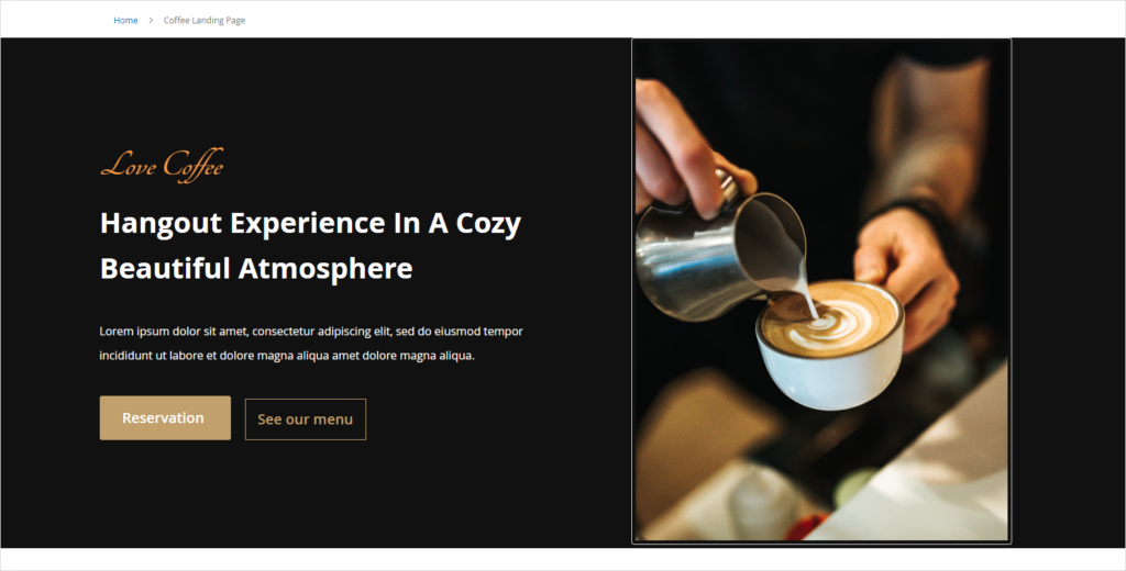
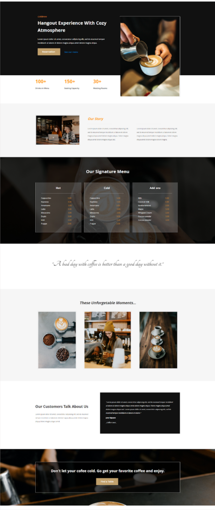
Look at our coffee shop landing page sample and see what’s on it.
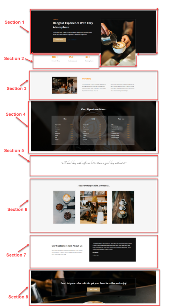
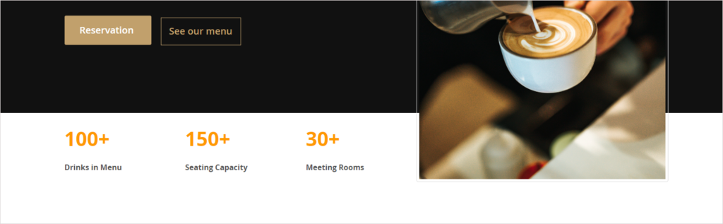
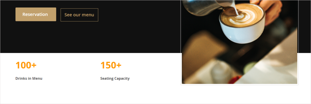
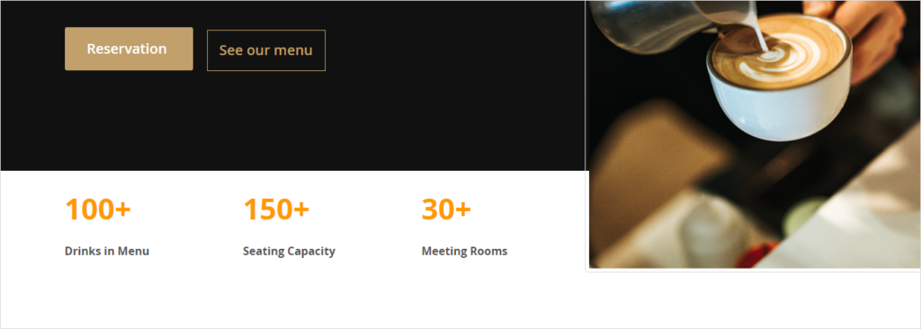
- Section 1 is the first thing to make an impression on visitors. It comprises a headline, subheading, 2 CTAs, and an attractive hero image.
- Section 2 shows specific numbers on dishes, seats, and meeting rooms. It not only helps provide the information briefly but also immediately hooks your site visitors. This section includes three columns with formatted texts inside.
- Section 3 gives users a clear idea of who you are, what you’re offering, who you’re serving, etc. There are three columns in a full-width row with a gray background. The first column embraces an image, while the two remaining columns are made up of text.
- Section 4 showcases your special menu with 2 different types of drinks and add-ons. Each is included in a column with a transparent background. Behind these columns is a large image extending the entire width of the screen.
- Section 5 cites an inspirational coffee quote that is a visual break for your site visitors. This section is quite simple, using texts in a script font.
- Section 6 features a stunning gallery of your coffee shop. To create this section, we use a gray background in full width. On top of it are three columns, each of which has an image.
- Section 7 serves as a way to show off how your clients benefit from your products, giving the potential customers incentive to make a reservation. This section has a simple design that includes 2 columns. The column with testimonials of customers is made to be outstanding with a black background.
- Section 8 is the final section as well as the decisive part of the whole page – getting people to make a reservation in the coffee shop. The most indispensable factor is a prominent CTA button and an attention-grabbing hook right above.
Once you’ve had an overview of what this cafe landing page includes, we can now start creating it.

Try FREE Magezon Page Builder demo today
Easily create beautiful, engaging Magento website in any style whenever you want without relying on developers or designers. Just by drag & drop.
Create a Coffee Landing Page With Magento Page Builder
In this part, I won’t explain how to do some configurations before using Page Builder and how to access the Magento Page Builder workspace ‘cause everything can be found in this guide.
Okay, start with Section 1.
Section 1 – Introduction
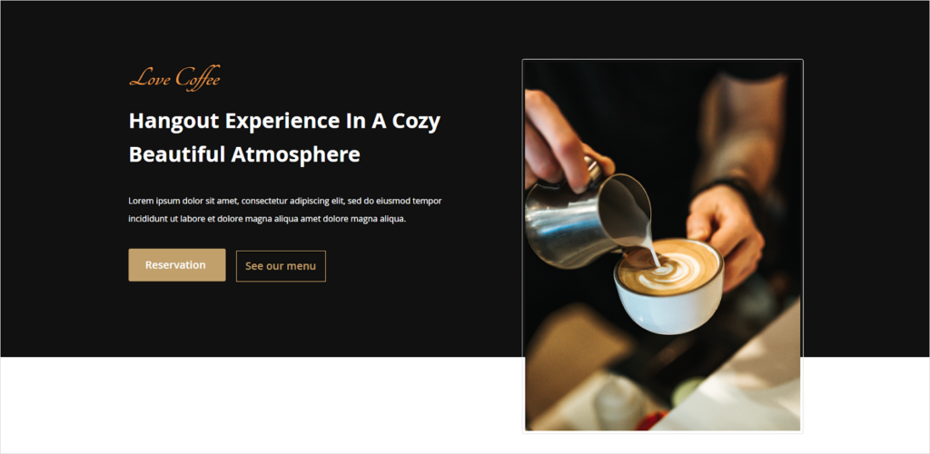
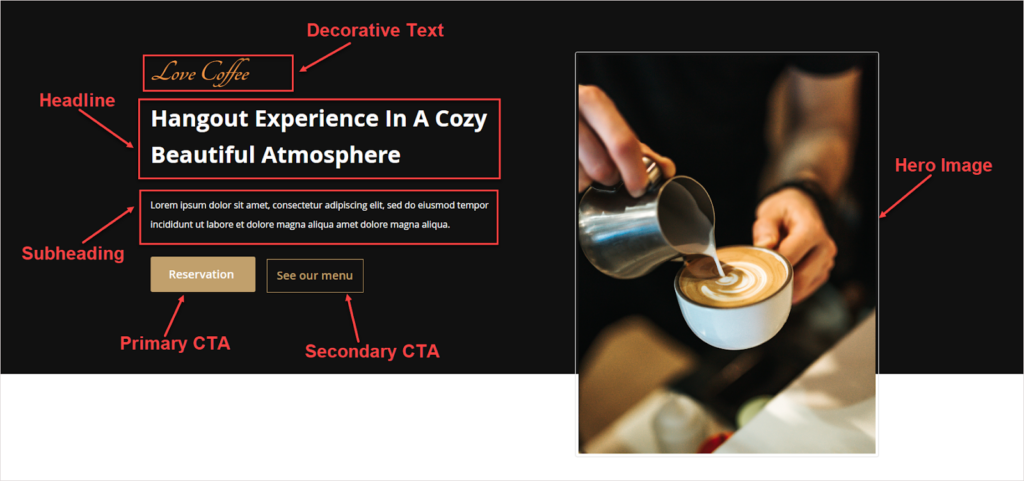
1. What’s Special Here?
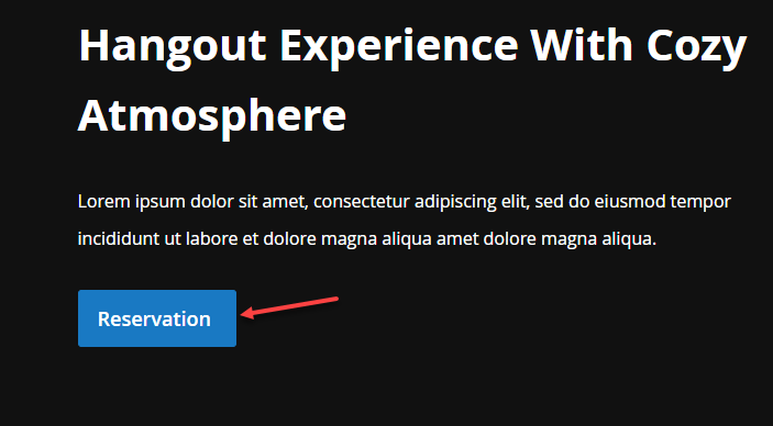
- Primary CTA button: We change its background color to the one that suits the overall design.
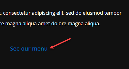
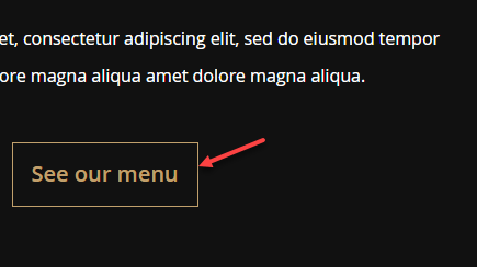
- Secondary CTA button: We’ll add borders to the button and change its text color using CSS.
- The hero image is not included within its parent row as normal. It overlaps its parent row and the row below, making the first section unique and stylish.
2. How Did We Do?
a. Customize the background color of the primary CTA button
- You don’t have to give a CSS class name to this button. The only thing to do is write the button codes and use the !important rule to override its existing rules. Follow these codes to style the button:
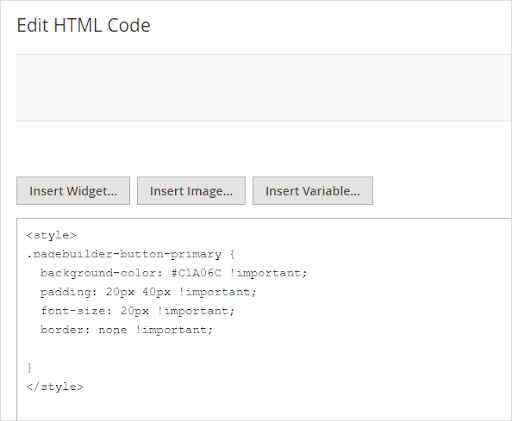
→ Read more: How to style an element using CSS in Magento Page Builder
Before:
After:
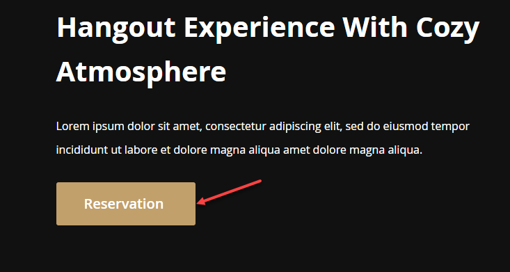
Note: The “pagebuilder-button-primary” class is applied to all buttons with no CSS names. That’s why the CTA button in the last section (“Find a table”) has the same appearance as the above one, even though you haven’t set the CSS class for it.
b. Change the secondary CTA text color
- Inspect to get the CSS Class of the button link. (pagebuilder-button-link)
- Insert the following into the HTML Code editor:
 .pagebuilder-button-link {

  font-size: 20px !important;

  color: #C1A06C !important;

}Before:
After:
c. Create the overlapping Image
- This image’s style differs from the others on the coffee shop landing page. So, I’ll give it a separate CSS name.
- We have written CSS codes of the image, then inserted them into the HTML editor:
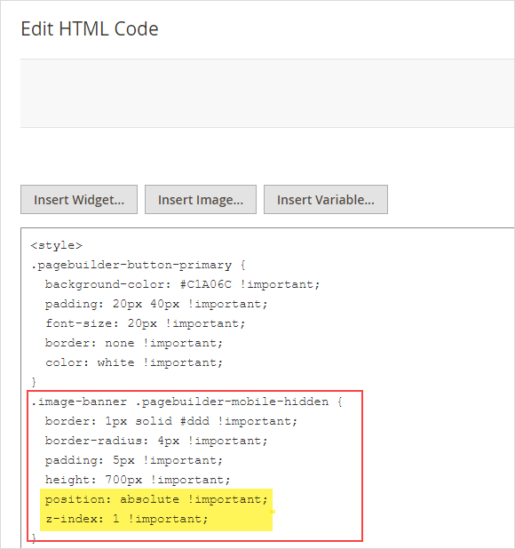
You may not know the two properties highlighted in yellow. So, let me explain.
- Z-index: The z-index property defines the order in which elements are positioned. We often use this property to place an element on top of the others. An element with a higher z-index is in front of an element with a lower z-index.
Because this element has no positioned parents, this element with the z-index (1) will be on top of the others.
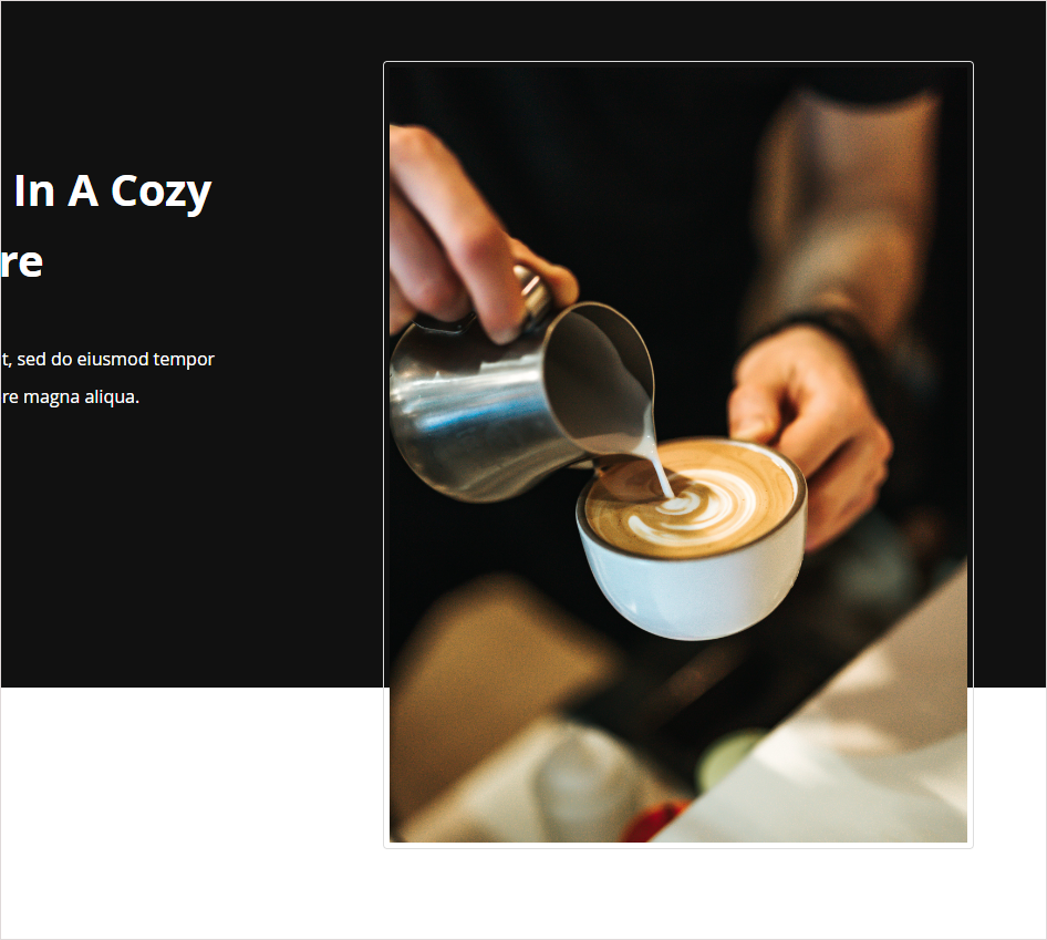
- Position: To use z-index, elements need to be positioned. As you can see in the image below, even though I’ve set the z-index to 1, the hero image still doesn’t overlap the row. It’s because I haven’t applied the position property to the image.
In my case, I want the image to move along as the page scrolls so I set the position to absolute.
→ Learn more about the position property HERE.
c. Which Settings to Apply in Section 1?

We’ve listed all settings for this section so that you can practice along.
| Row |
| Full-Width |
| Minimum Height: 650px |
| Background Color: #111111 |
| Vertical Alignment: Center |
| → Read more: How to use Row content type in Magento Page Builder |
| Column 1 |
| Vertical Alignment: Center |
| Right Padding: 100px |
| → Read more: All about Column Content Type in Magento Page Builder |
| Content Block in Column 1 |
| 1. Decorative text “Love Coffee” |
| Font Size: 52px |
| Font Color: #F79743 |
| CSS Classes: text-in-section-1 |
| Code snippets for inserting in the HTML Code editor: .text-in-section-1 {font-family: ‘Tangerine’, cursive;} |
| → Learn how to add text in Magento Page Builder. |
| 2. Heading text “Hangout Experience In A Cozy Beautiful Atmosphere” |
| Format: Heading 1 |
| Font Size: 40px |
| Line Height: 64px |
| Font Color: White |
| 3. Body text “Lorem ipsum dolor sit amet, consectetur adipiscing elit, sed do eiusmod tempor incididunt ut labore et dolore magna aliqua amet dolore magna aliqua. |
| Font Size: 16px |
| Line Height: 34px |
| Font Color: White |
| Bottom Padding: 30px |
| 4. Primary CTA button |
| Button Text: Reservation |
| Button Type: Primary |
| Button Link: URL – https://www.magezon.com/magezon-page-builder-for-magento-2.html |
| Tick the Open in new tab checkbox. |
| Code snippets for inserting in the HTML Code: .pagebuilder-button-primary { background-color: #C1A06C !important; padding: 20px 40px !important; font-size: 20px !important; border: none !important;} |
| → Learn more: How to add buttons in Magento Page Builder |
| 5. Secondary CTA |
| Button Text: See our menu |
| Button Type: Link |
| Button Link: URL – https://www.magezon.com/magezon-page-builder-for-magento-2.html |
| Mark the Open in new tab checkbox. |
| Border: Solid |
| Border Color: #c1a06c |
| Border Width: 1 |
| Left Margin: 10px |
| Code snippets for inserting in the HTML Code: .pagebuilder-button-link { font-size: 20px !important; color: #C1A06C !important;} |
| Column 2: No settings |
| Content Block in Column 2 |
| 1. Hero Image |
| Upload this image (Source: Unsplash) |
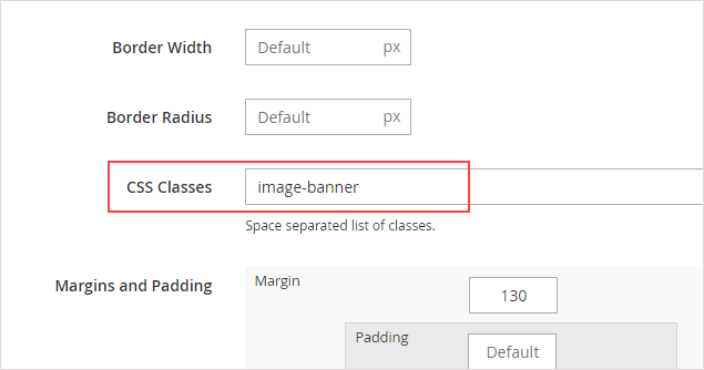
| CSS Classes: image-banner |
| Code snippets for inserting in the HTML Code: .image-banner .pagebuilder-mobile-hidden { border: 1px solid #ddd !important; border-radius: 4px !important; padding: 5px !important; height: 700px!important; position: absolute !important; z-index: 1 !important;} |
| → Read more: How to Add Images in Magento Page Builder |
Try FREE Magezon Page Builder demo today
Easily create beautiful, engaging Magento website in any style whenever you want without relying on developers or designers. Just by drag & drop.
Section 2 – Why Choose Us
1. What’s Special Here?
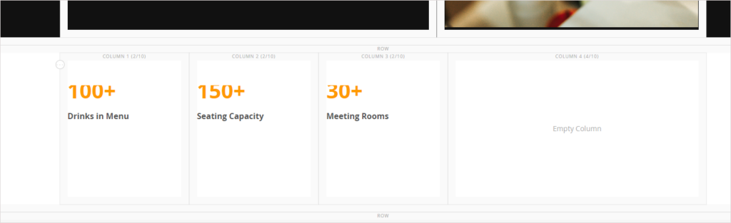
We make use of the empty space on the left side to put the achievement counter numbers.
b. How Did I Do?
Honestly, I spent quite a lot of time on this section. There are two things to take notice of:
- The first equal three columns shouldn’t be placed in the area where the hero image is overlapping because the image is more likely to hide the column’s content. (See the image).
- These columns also need to be large enough to look spacious.
So, what did I do? I changed the number of divisions in the grid from 12 to 10, with 4 divisions in the fourth column and 2 divisions for each of the remaining columns.
It’s good, right?
3. Which Settings to Apply in Section 3?
Look at the backend to understand how the second section is structured.
| Row |
| Full-width |
| Background Color: #ffffff |
| Column 1 (2/10) |
| Minimum Height: 200px |
| Vertical Alignment: Center |
| Right Padding: 50px |
| Content Block in Column 1 |
| 1. Text “100+” |
| Font Size: 42px |
| Font Color: #ff9900 |
| Bottom Padding: 10px |
| 2. Text “Drinks in Menu” |
| Font Size: 16px |
| Font Color: #525252 (Dark Gray) |
| Column 2, 3 (2/10) |
| Duplicate the first column as a whole. Change the text accordingly. |
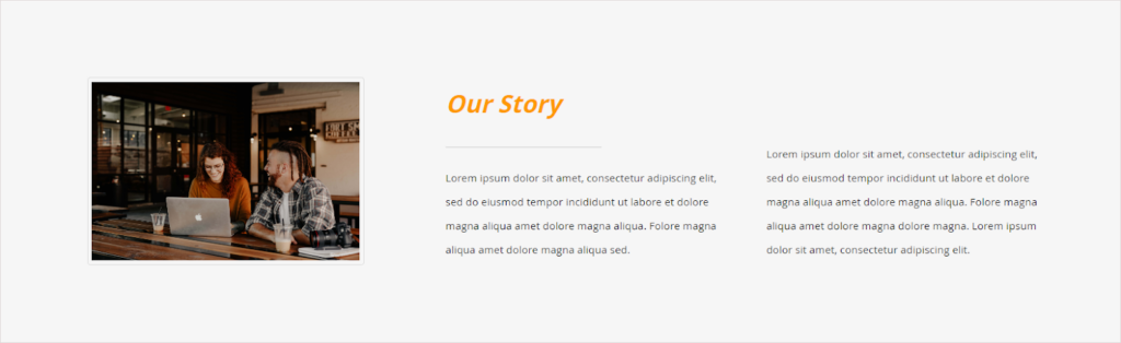
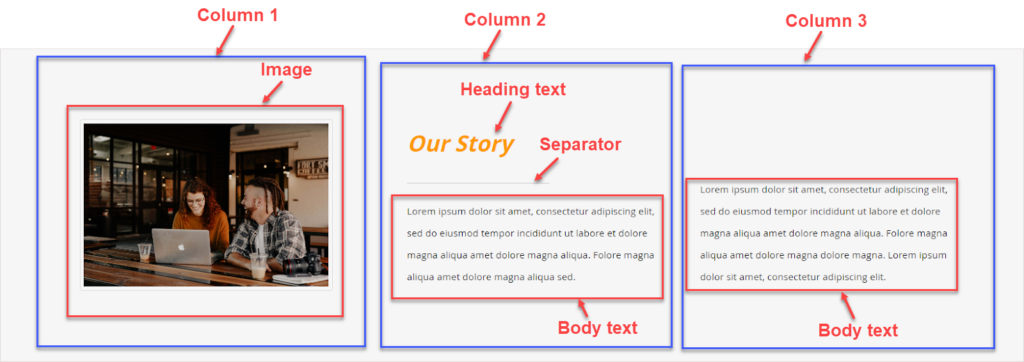
Section 3 – Our Story
1. What’s Special Here?
Well, there’s almost nothing special here. The only thing to do is to do the basics very well. Let’s say, the space between column 1 and 2 should be larger than the one between column 2 and 3. This tells the audience, the latter columns fall into the same content block.
I’ll go straight to this section’s settings.
2. Which Settings to Apply in Section 3?
| Row |
| Minimum Height: 400px |
| Vertical Alignment: Center |
| Background Color: #f6f6f6 (Light Gray) |
| Top Padding: 100px |
| Bottom Padding: 100px |
| Column 1 (4/12) |
| Vertical Alignment: Center |
| Right Margin: 70px |
| Drag and drop an Image content type into the column. Upload this image (Source: Unsplash) |
| Column 2 (4/12) |
| Minimum Height: 250px |
| Vertical Alignment: Bottom |
| Left Margin: 50px |
| Content Block in Column 2 |
| 1. Heading text “Our Story” |
| Formats: Heading 2 |
| Font Size: 32px |
| Font Color: #FF9900 |
| Italic |
| 2. Separator |
| Add Divider content type right below the heading text. – Line Width: 50% |
| 3. Body Text |
| Enter the text “Lorem ipsum dolor sit amet, consectetur adipiscing elit, sed do eiusmod tempor incididunt ut labore et dolore magna aliqua amet dolore magna aliqua. Folore magna aliqua amet dolore magna aliqua sed.” |
| Font Size: 14px |
| Font Color: #33333 (Dark Gray) |
| Left Margin: 50px |
| Column 3 (4/12) |
| Duplicate Column 2. Then change the text. |
Section 4 – Our Signature Menu
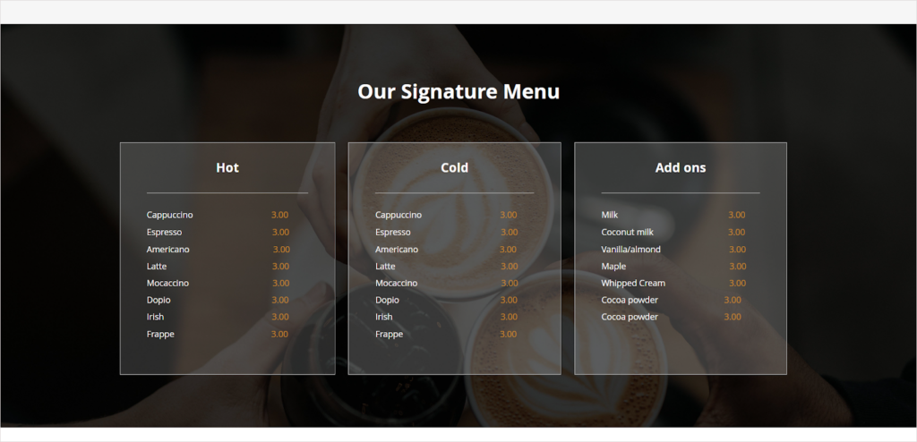
1. What’s Special Here?
To make the content more outstanding, each column is covered with a transparent overlay.
2. How Did I Do?
To create a transparent overlay for the columns, first set their background color to #f6f6f6. Decrease the color opacity to 16% to be able to see what is underneath.
3. Which Settings to Apply in Section 4?
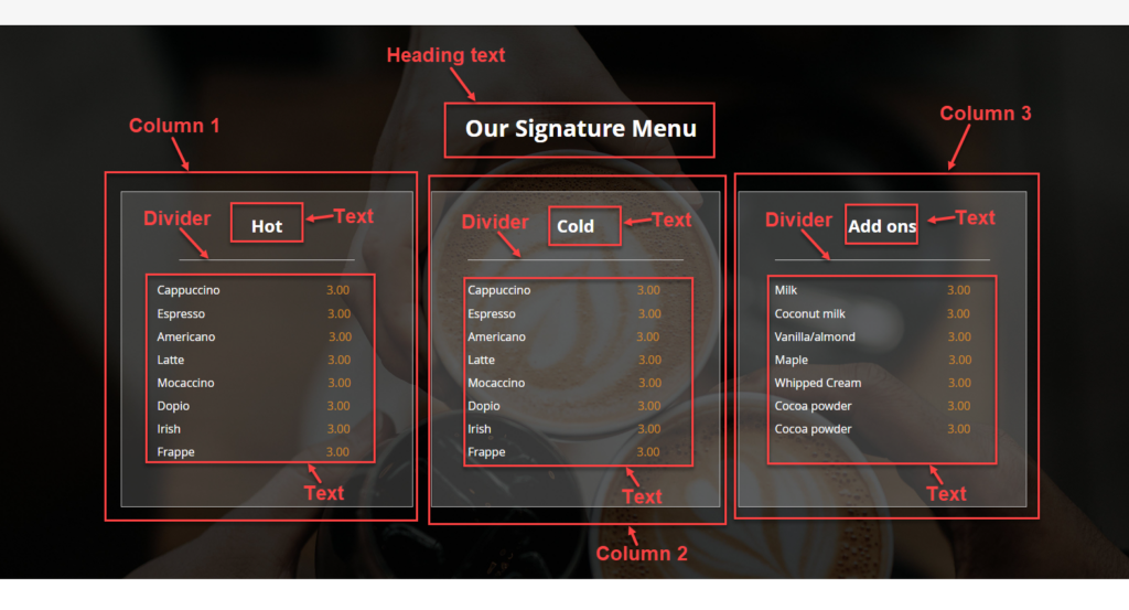
| Row |
| Full Width |
| Vertical Alignment: Center |
| Background Image: https://unsplash.com/photos/6VhPY27jdps (Add a transparent dark overlay to the image to make the text stand out. ) |
| Top Padding: 100px |
| Bottom Padding: 100px |
| Heading Text “Our Signature Menu” |
| Text: Our Signature Menu |
| Formats: Heading 2 |
| Font Size: 32px |
| Font Color: White |
| Center the text |
| Bottom Margin: 70px |
| Column 1 (4/12) |
| Minimum Height: 400px |
| Border: Solid |
| Border Color: #c1c1c1 |
| Border Width: 1 |
| Top & Bottom Padding: 30px |
| Right & Left Padding: 50px |
| Right Margin: 20px |
| Content Block in Column 1 |
| 1. Text “Hot” |
| Font Size: 24px |
| Font Color: #ffffff |
| Bold the text |
| Center the text |
| 2. Separator |
| Line Width: 80% |
| Alignment: Center |
| 3. Body text |
| Text: Cappuccino, Americano, Latte, Mocaccino, Doppio, Irish, Frappe, 3.00 |
| Font Size: 16px |
| Line Height: 32px |
| Font Color: #ffffff for drink name, #ce8b25 for 3.00 |
| Column 2, 3 |
| Duplicate the first column and then change the text. |
Section 5 – Coffee Quote
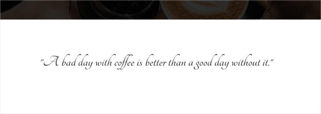
1. What’s Special Here?
As a visual break for your site visitors, section 5 looks quite simple. The highlight of this section is using a script font that looks like stylized handwriting. The font gives you a sense of elegance, creativity, and freedom.
2. How Did I Do?
As you know, we can’t change the text font in Magento Page Builder so we have to apply CSS to the text. The script font I’m using is Tangerine, a Google-based font. To change the text font, please refer to Section 1 of this blog.
3. Which Settings to Apply in Section 5?
| Row |
| Full-Width |
| Minimum Height: 400px |
| Vertical Alignment: Center |
| Content Block in the row |
| Text: “A bad day with coffee is better than a good day without it.” |
| Center the text. |
| CSS Classes: text-below-banner-image Insert the codes of the text into the HTML Code editor: .text-below-banner-image {font-size: 65px; font-family: ‘Tangerine’, cursive;} |
| Bottom Padding: 30px |
Section 6 – Our Gallery
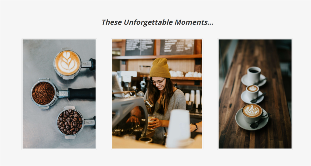
1. What’s Special Here?
Here we have a big italic title and three columns with images that suit the whole theme.
2. Which Settings to Apply in Section 5?
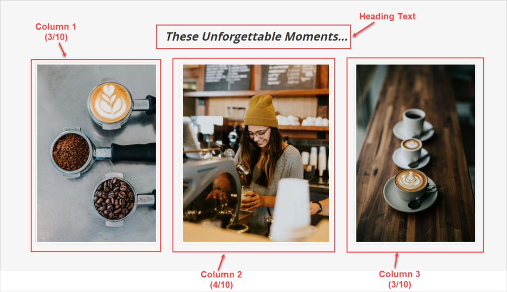
| Row |
| Full-Width |
| Vertical Alignment: Center |
| Background Color: #f6f6f6 |
| Right and Top Padding: 100px |
| Content Block in the row |
| 1. Heading Text |
| Text: These Unforgettable Moments… |
| Bold and italicize the text |
| Column 1 (3/10) |
| Add an image to column 1 (https://unsplash.com/photos/69ilqMz0p1s ) |
| Column 2 (4/10) |
| Add an image to column 2 (https://unsplash.com/photos/9fHMo1-5Io8) |
| Column 3 (4/10) |
| Add an image to column 3 (https://unsplash.com/photos/x5FhHp3-UlI) |
Section 7 – Our Customers Talk About Us
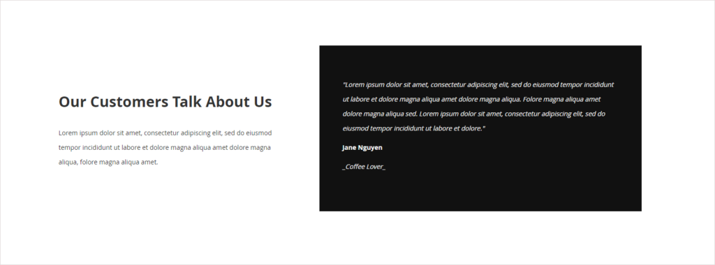
1. What’s Special Here?
The section is designed with 2 columns including texts. What captures visitors’ attention here is the testimonials on a black background. Uhm..nothing’s special here so let’s jump into this section’s settings.
2. Which settings to apply in Section 7?
| Row |
| Full-Width |
| Minimum Height: 500px |
| Top & Bottom Margin: 100px |
| Vertical Alignment: Center |
| Column 1 (5/12) |
| Appearance: Centered |
| Content Block in Column 1 |
| 1. Text “Our Customers Talk About Us” (Add Text content type to the column.) |
| Formats: Heading 2 |
| Bold the text |
| Bottom Padding: 15px |
| 2. Text “Lorem ipsum dolor sit amet, consectetur adipiscing elit, sed do eiusmod tempor incididunt ut labore et dolore magna aliqua amet dolore magna aliqua, folore magna aliqua amet.” |
| Apply the same settings of the body text in the section above. |
| Column 2 (7/12) |
| Appearance: Centered |
| Vertical Alignment: Center |
| Background Color: #222222 |
| Content Block in Column 2 |
| 1. Text “Lorem ipsum dolor sit amet, consectetur adipiscing elit, sed do eiusmod tempor incididunt ut labore et dolore magna aliqua amet dolore magna aliqua. Folore magna aliqua amet dolore magna aliqua sed. Lorem ipsum dolor sit amet, consectetur adipiscing elit, sed do eiusmod tempor incididunt ut labore et dolore.” |
| Change the text to white |
| Italicize the text |
| 2. Text “Jane Nguyen” |
| Change the font color to white |
| 3. Text “_Coffee Lover_” |
| Italicize the text |
| Change the text to white |
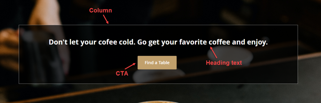
Section 8 – Call-to-Action
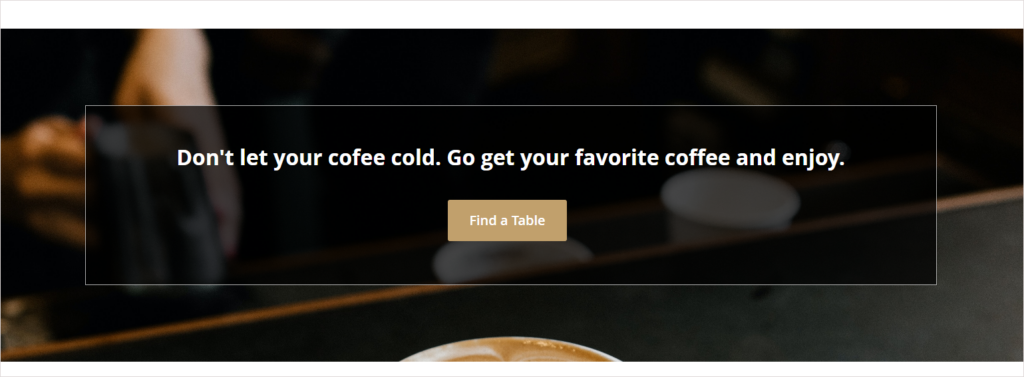
1. What’s Special Here?
To help the text stand out from a busy background, I apply a transparent overlay over the column that contains the text. Besides, the thin line for the border helps the eyes focus on the hook and CTA in such a background.
b. How Did I Do?
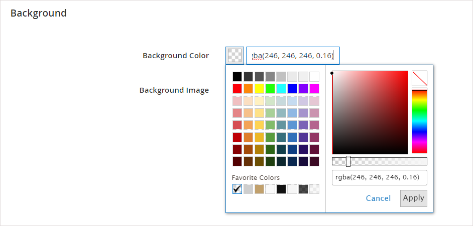
- To add an overlay to the column, simply set the column’s background color to #f6f6f6. Then, decrease the opacity to 70%.
- It’s easy to add borders to the column, correct? Hence, I’ll show how-to in the next part.
c. Which Settings to Apply in Section 8?
| Row |
| Full-Width |
| Minimum Height: 500px |
| Vertical Alignment: Center |
| Background Image: Upload this image. |
| Column |
| Appearance: Centered |
| Minimum Height: 270px |
| Vertical Alignment: Center |
| Background Color: #000000. Opacity: 70% |
| Border: Solid |
| Border Color: f6f6f6. Opacity: 70%. |
| Border Width: 1 |
| Content Block in the column |
| 1. Text “Don’t let your coffee cold. Go get your favorite coffee and enjoy.” |
| Formats: Heading 2 |
| Font Size: 32px |
| Font Color: White |
| Center the text. |
| Bottom Padding: 30px |
| 2. CTA button (Add a button to the column) |
| Button Text: Find a Table |
| Button Type: Primary |
| Button Link: URL – https://www.magezon.com/magezon-page-builder-for-magento-2.html |
| Tick the Open in new tab checkbox. |
| Alignment: Center |
Let’s check the coffee landing page.
Save More Time With Magezon Page Builder
It can’t be denied that Magento Page Builder Open Source is good enough to build a landing page that wows your visitors. The coffee landing page in this tutorial has proved what I’m saying.
However, it’ll take you a long time to get things done. Because Magento Page Builder offers a limited number of styling options, it takes plenty of time to customize their page as you wish.
If you don’t know programming languages or have a tech-savvy friend willing to help, you should look for an advanced page builder from the third-parties, like Magezon Page Builder. With diverse customization options, our page builder empowers you to create your page in the way you like without the coding skills. This page builder boasts a user-friendly interface and high performance, which has become an optimal choice for many Magento businesses.
| Good News: This year, we have released the new version of our Page Builder that ensures fast business growth. Interested in this fantastic tool? So, let’s check Page Builder 3.0 sneak peeks out to see how powerful and diverse the new features are. |
| Keep reading to optimize your website landing page: 30+ Most Inspiring Landing Pages Examples 19 Types of Landing Pages (+ How to Choose the Right One) 25+ PPC Landing Page Best Practices to Boost Conversions 10+ Best Free Landing Page Builder to Capture Leads |
That’s All for Now
Hopefully, this how-to article can help you create a landing page in Magento 2. Feel free to comment below if you have any issues during the creation process. Don’t forget to follow the Magento Page Builder tutorials for more useful information.
Try FREE Magezon Page Builder demo today
Easily create beautiful, engaging Magento website in any style whenever you want without relying on developers or designers. Just by drag & drop.


