 Magezon Blog Help Merchants Build Comprehensive eCommerce Websites

White space in web design is more important than many people think. It’s a powerful creative element offering your website a harmonious, attractive, and practical layout. Today’s article will discuss the topic, provide some tips to apply it successfully, and give examples. Follow along!
Table of contents
What Is White Space in Web Design?
White or negative space is the unmarked area around and within visual elements such as logos, images, and text. It includes:
- Wide margins on the page
- The white space around or within images
- The spaces between text blocks and each letter (also known as kerning in typography)
The use of white space in web design became popular in the first half of the 20th century. Thanks to its versatility, more and more designers prefer to include it in their work.
The white-space websites are usually balanced. The space helps direct visitors’ eyes to certain areas and improve user experience. The exciting thing is you don’t have to create the space with white or a solid color. You can even choose the gradient background as a white space since it can frame the subject.
Why Is White Space Important in Web Design?
1. It Organizes and Creates Logically Structured Content
By separating and grouping different elements, white space on a website shows how they are connected and provides users with better-organized visual information.
The use of white space in web design is based on the proximity design principle. According to it, people tend to see objects placed closer together as a single unit rather than individual, unrelated parts. The web artists will increase or decrease the space to group or divide elements, assisting viewers in logically processing information.
2. It Makes Content Easier to Read
White space in web design improves the readability and legibility of your content. You can do it by adding negative space to separate blocks of text or around it, making it easier on the eyes. Thus, readers will be able to handle the information, especially when you have long content to deliver. You can also apply various colors, shapes, and other elements to keep your website attractive, even when minimal.
3. It Prompts Users to Take Action

The great thing about negative space is it presents a clear visual hierarchy, making it easier for users to find the information they need. If you want to increase user interaction, applying plenty of white space around buttons, headers, headlines, and navigation bars can help. Proper white space implementation eliminates distracting factors and keeps viewers focused on the content’s purpose.
4. It Attracts Users to Focus on Important Elements
The bigger white area around certain sections usually brings more attention to them. It will also propel users to take action. Using a good amount of white space with proper alignment can highlight the CTAs (including directing visitors to make a purchase, schedule an appointment, or reach out for more information) and other parts you want visitors to focus on.
5. It Promotes Symmetry and Creates an Elegant Aesthetic
A good website usually obtains an equal proportion and distribution between elements and spaces. The balance and visual hierarchy resulting from negative space create an appealing look, contribute to the overall unity of a design, and improve user experience. Maximizing white space is a good choice if you are pursuing minimalist design. It will give your website a clean yet luxurious and sophisticated appearance that can enhance your branding design.
4 Different Types of White Space
1. Micro White Space
You usually see smaller gaps and buffers around content, such as between letters, words, paragraphs, images, or content in a grid, navigation links, and form fields. Its purpose is to make your content easier to digest, thus, improving comprehension.
2. Macro White Space
It refers to larger areas containing no content. It’s used:
- In the website’s margins
- Around the brand logo
- Between sections on a page
- In hero section
- Between the main content and sidebar
- In images
- Around CTA sections
Macro white space helps improve the web layout and navigation. Note that, like the micro white space, it doesn’t just define white space based on size.
3. Passive White Space
It’s the natural space occurring or appearing in the design or typography with or without your placement. However, you can control its sizes to meet your criteria of aesthetics.
4. Active White Space
It refers to the space web designers intentionally add to enhance traffic flow. The purpose is to guide visitors to the desired areas, eventually leading to conversion.
→ Learn how to increase conversion rate: 3 Steps to Increase Conversion Rate For Your Website
9 Best Practices to Use White Space Effectively
1. Manage Visual Hierarchy

A cluttered layout can disorient visitors; thus, you need a clear visual hierarchy to tell them where to go, what to focus on, etc. You should use white space in web design to highlight important parts, give a logical order for users to go through, and increase their experience with your brand.
2. Apply White Space Around the CTAs

Whether your Call To Action is ‘Subscribe,’ ‘Buy Now,’ or ‘Make a Reservation,’; you should surround them with negative space. Instead of isolating the text and buttons, you should add enough space so users can easily find and click on the section.
You should use this tactic with the CTAs and contact and checkout forms, so visitors can quickly spot it. Therefore, you can reduce the sign-up process abandonment.
3. Pay Attention to Mobile Versions
Mobile devices with small screens offer users less space; thus, white space is a great solution. Some desktop versions look good, but the mobile one may shorten the text, and people need help with their thin screens. However, you can fix it by increasing the font size, adding extra paragraph breaks, and experimenting with white space.
4. Pursue the Clean and Minimal Design
Minimal design always benefits clarity and cohesiveness. When you have a cluttered content-heavy design, it will affect cognitive overload, leading users to lose interest. Ensure you keep design elements to a minimum and have enough white space around the text for balance and harmony.
5. Wireframe Your Website Design
Creating a wireframe for your website helps optimize its usage. It nails down the design and determines the correct quantity of spacing and padding around each element. Besides, you can have a chance to try different white spacing for web design before you move through more increasing fidelities.
6. Orient Users on Your Website
Negative space in UI design can guide the users’ eyes. First, you need to organize the content within 15 points on the page and set the order of priority from the most important element to the least one. For example, the order can be the logo, the navigation bar, the hero image, the paragraph, etc. Next, consider where you will effectively put the macro white space when you place the elements.
7. Put Related Elements Close Together
According to the Gestalt principle of proximity, people tend to address closely-related elements to have similar attributes. You can apply this principle by grouping related elements close together. For example, in form design, name and address are usually put together in the personal detail group, then a bit of space is added and followed by another group.
8. Text in White Space Design

Keep the paragraph column widths and margins within a limited width to make the text easier on the eyes and develop readability. Including one idea per paragraph is a valuable technique to decrease the margin size. In addition, line spacing is also crucial. Leave a little space between lines, and make each line on top of the other. The ratio of 130-150% of font size is ideal.
9. It Can Be any Color
White space doesn’t mean it always has to be white. You can use any color, a patterned or textured background, or a background image.
White space in web design plays a more significant role when your site is long-scrolling. It keeps the flow of the page and manages the organization (including emphasizing the critical content). Alternating complementary blocks of color down the page shows the significant effect of separating different sections while maintaining the content’s flow and direction.
Now let’s discover some stunning examples so you can know how to use the white space effectively.

Try FREE Magezon Page Builder!
Easily create your engaging Magento pages in any style whenever you want without relying on developers or designers, just by drag & drop.
19 Best Examples to Learn From
1. Squarespace
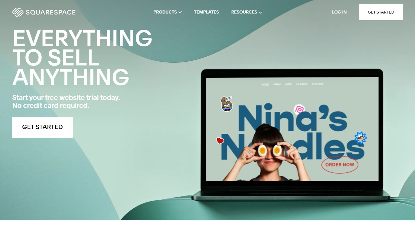
Squarespace is an excellent example of applying white space in web design successfully. The space around the visual aid on the right hand of the page captures users’ attention. The CTAs button on the left also stands out clearly against its background.
2. Bear Creek Distillery
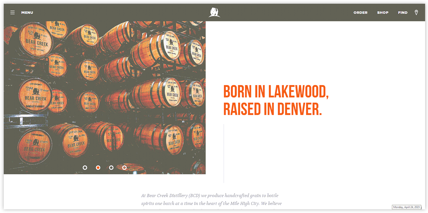
The sparsity in the design of Bear Creek Distillery doesn’t make it look boring but delivers to visitors the message of what they can do best: distill. The site also contains minimum distractions (only pictures on the left and extensive text on the right), making the website stand out among others.
3. Apple
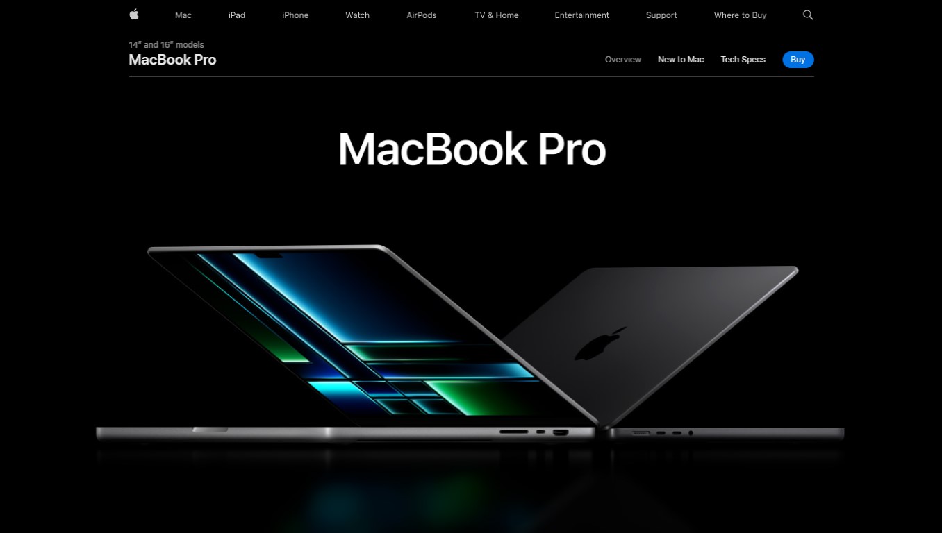
It will be a mistake if you don’t mention Apple as a creative website implementing white space effectively. The negative space black background successfully highlights their products.
4. Progressive Punctuation
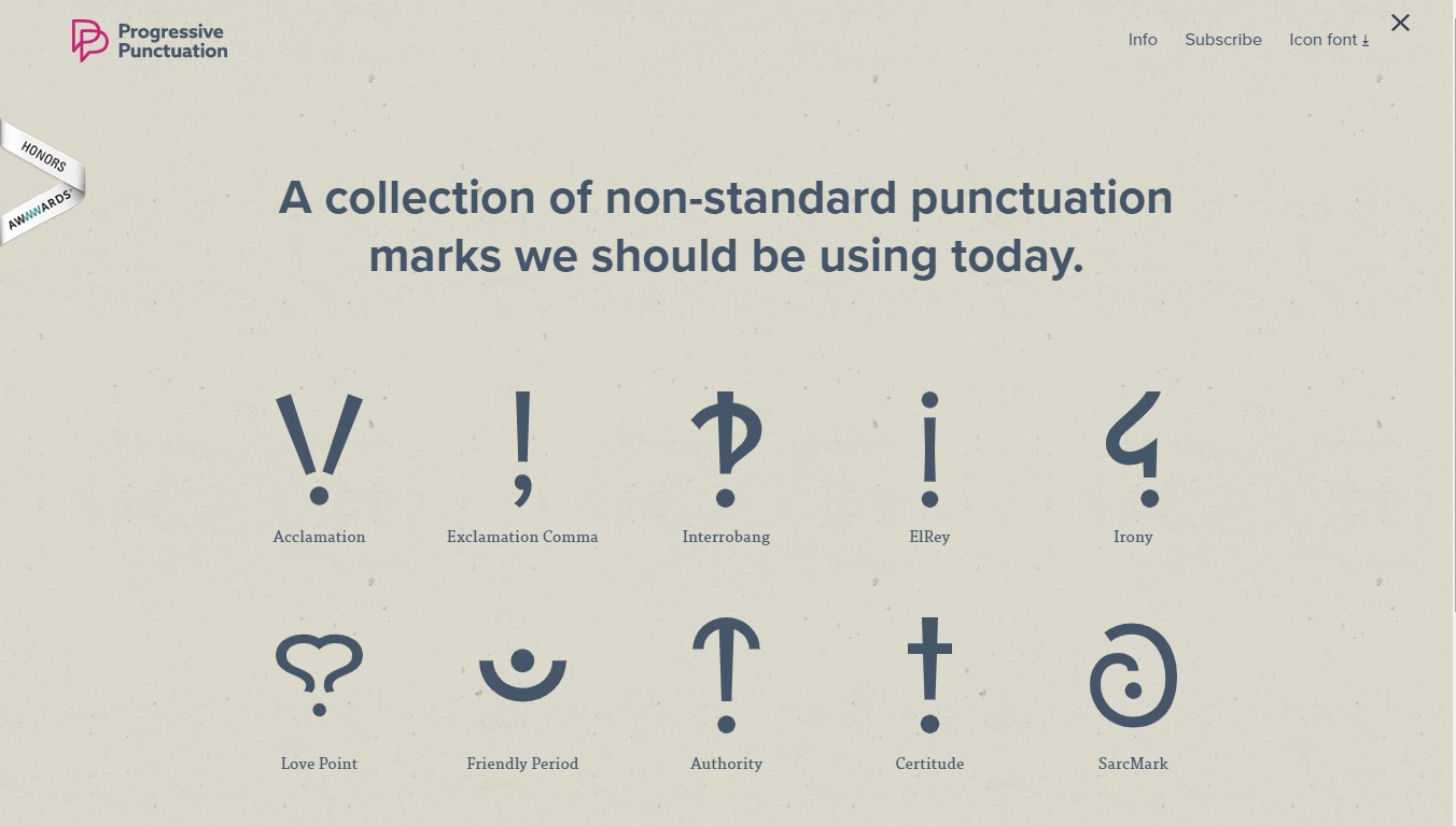
The website has a good idea and practice of using white space between each icon of the non-standard punctuation marks to attract visitors, make them curious, and guide them to click on the symbols.
5. Seedlip

With Seedlip, the white space (with the same color chrome as the image) is intentionally added to the background, giving users a soothing feeling to the eyes and a guide to the Discover More button.
6. Fraemohs Homes
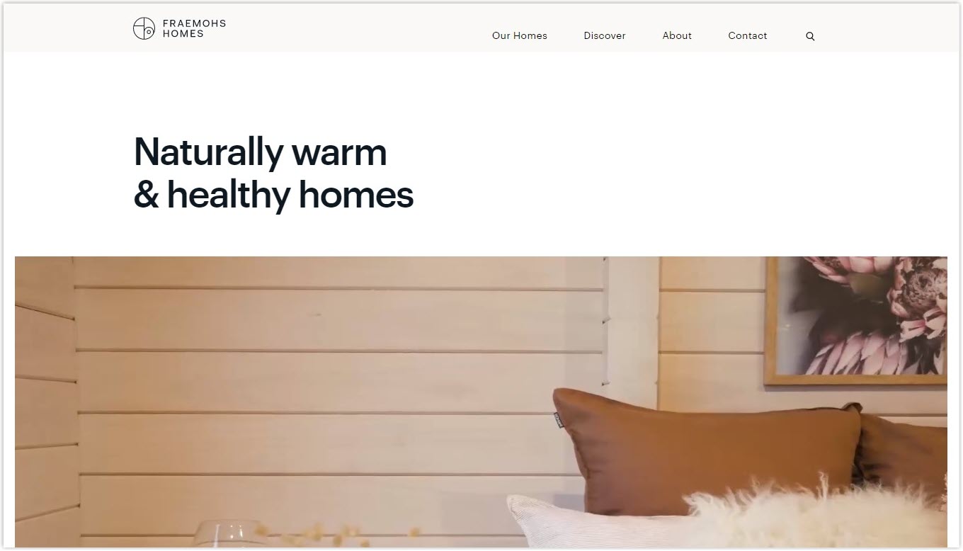
Fraemohs Homes, a website about designing and building houses, is the master of deploying white space. When entering the page, visitors will feel the luxury and elegance message that the brand wants to deliver without feeling overwhelmed.
7. Pocket Penguins
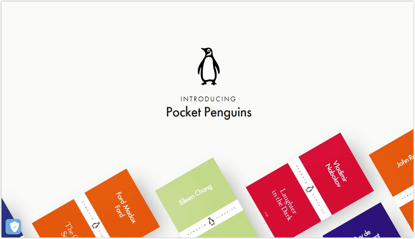
Pocket Penguins use bold colors with bold text, making the colors stand out firmly against the background. People feel excited and immediately notice their products (book covers).
8. Museum of Peace and Quiet
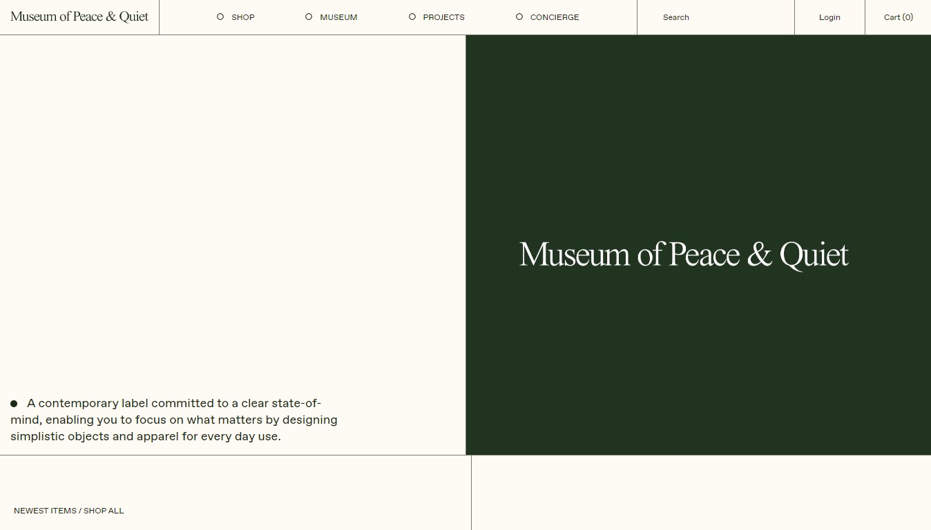
The site has an exciting and unique approach to white space in web design to promote peace of mind and tranquility through its clothing range. Though there’s a three-line text, visitors will feel energized to read as their eyes and head are provided with clear-headedness and relaxation.
9. Juliana Cavalcanti
Juliana Cavalcanti shows a careful white space layout with images surrounded by negative macro space. They are arranged and layered in perfect juxtaposition with neatness, creating perfect harmony and a feeling of minimalistic but luxury.
Try FREE Magezon Page Builder!
Easily create your engaging Magento pages in any style whenever you want without relying on developers or designers, just by drag & drop.
10. Blackballoon Creative Agency
You can learn about white space in web design from Blackballoon, a Parisian creative agency. It uses different photo sizes constantly in flux with fancy transitions, making the site look dynamic and vibrant yet with enough room to ‘breathe’ with the negative space.
11. Quip
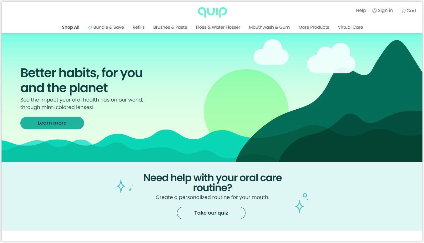
The site is doing well at using white space to deliver its message of providing oral health products. They don’t use mono color but a background that creates a feeling of freshness and cleanness.
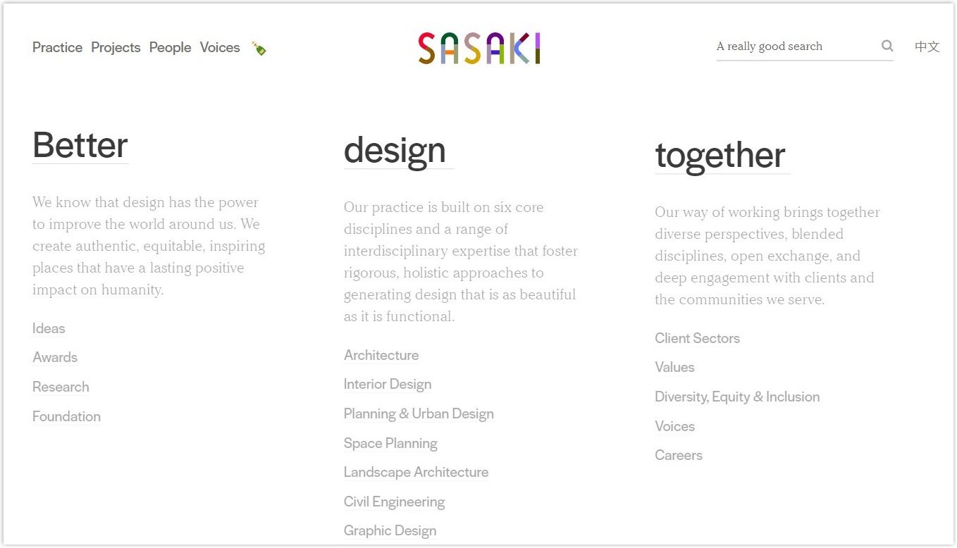
12. Sasaki
Sasaki is a design agency that utilizes white space for many purposes, such as highlighting the logo, drawing users’ attention, and providing a guide through grouped sections.
13. Karel de Stoute
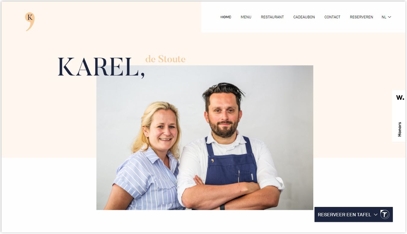
Karel de Stoute is a clever white-space website. They use overlapping text and imagery against a smooth pastel space to highlight their service and leave the navigation bar with plenty of breathing room so users can easily follow.
14. Avery Cox Design
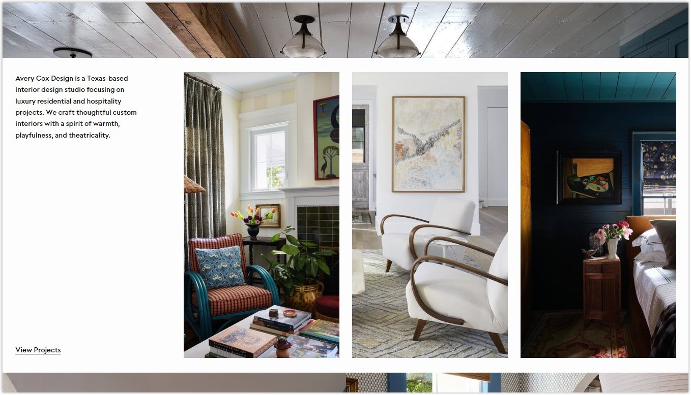
Avery Cox Design displays its projects on a white background to highlight its best design service. They apply dividing macro space with each page section, providing users enough room to breathe and digest the content.
15. Wealthsimple
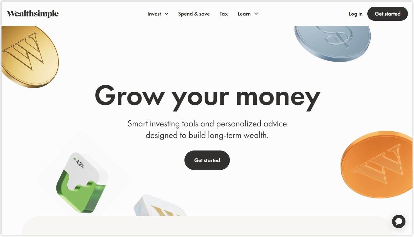
The wealth management company, Wealthsimple, goes directly to tell visitors about their service right in the center of the page that no one can ignore. The message is emphasized by the surrounding white space and supporting but not distracting elements (colorful coins). The CTA button is also prominent on the white background.
16. Woven Magazine
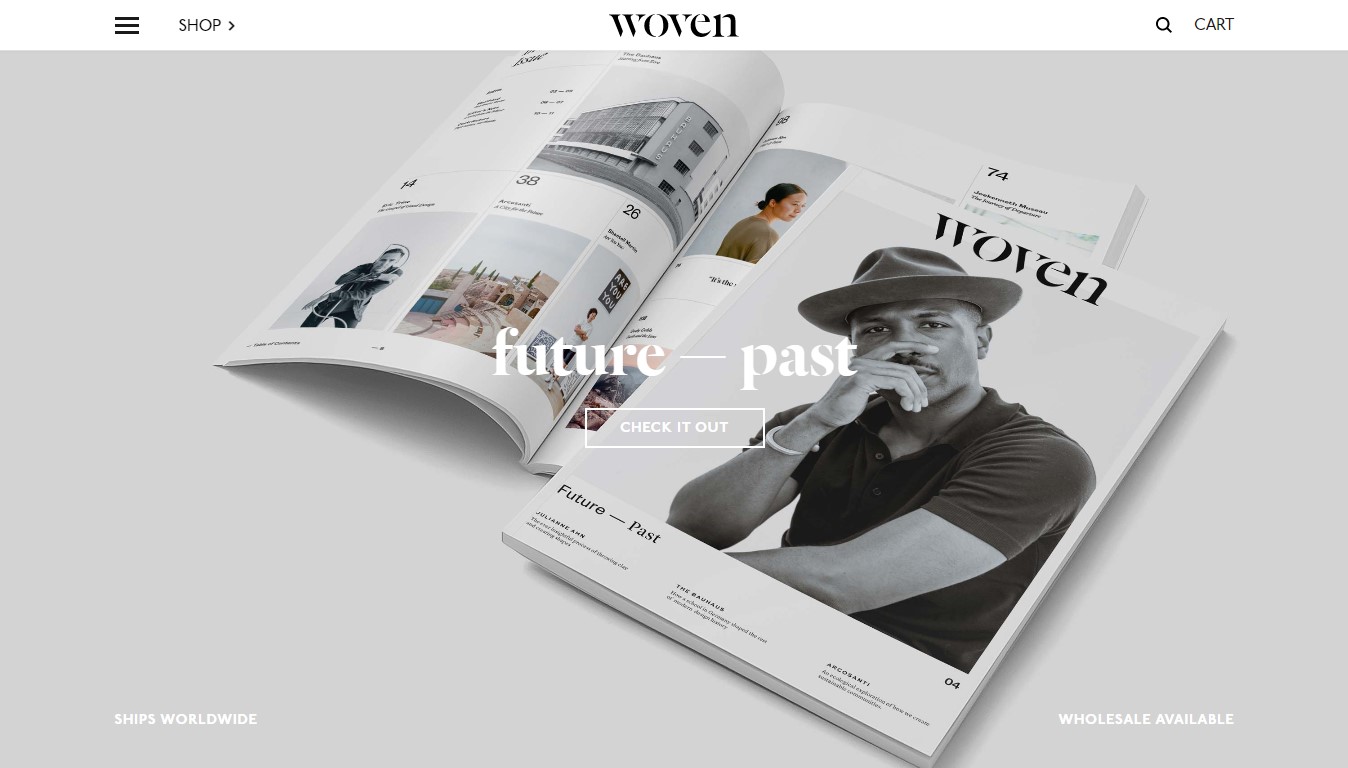
Woven Magazine has its way of applying white space in web design. On the top of the page, there are three elements: menu, logo, and search bar are separated by considerable but equally-proportioned negative space. A wide hero image in the middle is also comfortable to their eyes.
17. Heights

On the Heights website, the hero image works harmoniously with the blue background, showcasing a great example of white space that doesn’t have to be white. All elements, such as the logo, navigation bar, catchphrase, and CTA button, are given enough room to breathe, so visitors will not feel lost in the content.
18. Maison De La Luz’s Margins
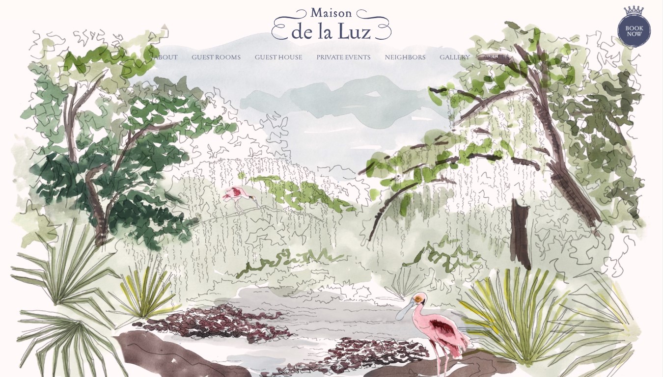
Obtaining a beautifully illustrated design is not the only fantastic thing about this website. The site shows its well-thought-out white space on its single page. For example, when you click on the About page and scroll down, pictures and texts come in order with the great support of white space between and on the lateral margins.
19. Sweetgreen
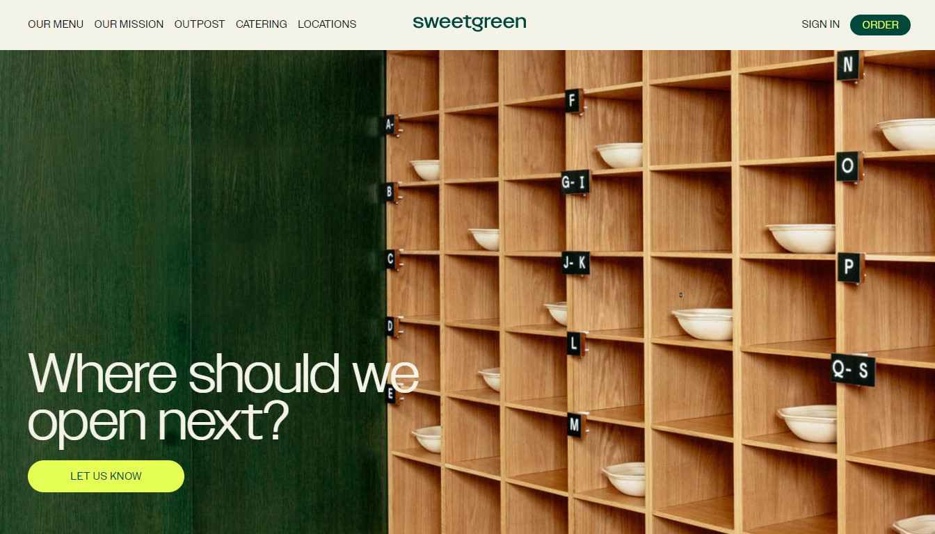
Sweetgreen is a tremendous website when they use white space for all the elements on top of the page. People also feel a lot of space with their hero image, striking users directly to the main question and the CTA button.
The Bottom Lines
Many people underestimate the importance of white space in web design, yet our article proved the opposite. It’s an essential element to make your page shine and stand out. Again, white space in web design is not wasted space. Using it with our tips above can turn it into your website’s best friend and benefit you a comfortable, enjoyable, and easy to interact with.
If you are a Magento merchant and don’t know which extension to build your website, consider Page Builder from Magezon. As a trusted Adobe partner, we have satisfied thousands of customers with a vast collection of drag-and-drop extensions, helping you create a high-converting and unique store in minutes.
Don’t take my words for granted; see how your website can be with Magezon Page Builder and what others say about us:


