 Magezon Blog Help Merchants Build Comprehensive eCommerce Websites

Flat website design is increasing its popularity. It improves user experience on websites and apps and ultimately leads to conversion growth. This article will discuss this design approach, why you should use it, and what principles you must remember while applying it. We’ll also include some examples for you to get inspiration.
Table of contents
What Is Flat Design?
It refers to the minimalistic two-dimensional (flat) illustrations for web and mobile interfaces. It is the opposite of skeuomorphism, in which real-life objects are reassembled. This design approach eliminates unnecessary styling and elements of the three-dimensional illustrations, such as gradients, textures, and drop shadows. Flat web design usually includes (both) sober and bright colors, crisp shapes, scalable graphics, and sans-serif font.
5 Benefits of Flat Design Website
1. It Helps With the Readability
Improving readability is one of the cornerstones of flat illustration. A flat website design lets users understand the content better and easier regardless of desktop or mobile versions. The design doesn’t include any complex images but simplified icons and vectors. These minimalistic icons combined with text create no difficulty for users to grasp the idea of your site.
The approach emphasizes straightforward typography, sans-serif fonts, and single contrasting color for the text background. Thus, educating visitors about your products and services will be easier. Once they know more about your brand, the conversion chances will increase too.
→ Learn to optimize your typography: Typography in Web Design: 7 Golden Rules You Should Follow
2. It Brings No Distraction
The minimalism in flat web design gives priority, highlights prime content, and eliminates distractions such as decorative elements or embellishments. Therefore, users will go directly to where they’re steered to. Using white space is one of the tricks to help flat website design obtain this purpose.
3. It Rescues Users From Slow Loading Time
No visitor wants to experience slow-loading websites and apps that tend to bounce away, which is a not-so-good scenario. A flat UI website is ideal when you cannot cut down the content and must maintain a fast loading speed.
The site doesn’t contain heavy images, graphics, or other skeuomorphic properties but only smaller file-size elements. A fast-loading website will not irritate users, thus, increasing the chance of a higher conversion rate and revenue.
→ Avoid the UX/UI mistakes to level up your website: 8 Most Common UI/UX Mistakes You Should Avoid
4. It Benefits Your SEO
Fast loading speed is one of the most critical factors in website SEO. Flat website design not only helps you to decrease load time but also improves your site’s search engine rankings, which are harder to gain if you have a graphic-heavy slow site. The flat web design will likely bring your site to the top of SERPs, tapping high-intent users on search engines. Normally, these users are those who will make purchase decisions.
5. It Has an Up-to-Date Look
Statistics show that web users only spend about 50 milliseconds deciding if they like a website. They can’t go through your site in such a short span, so obviously, the look influences their opinion.
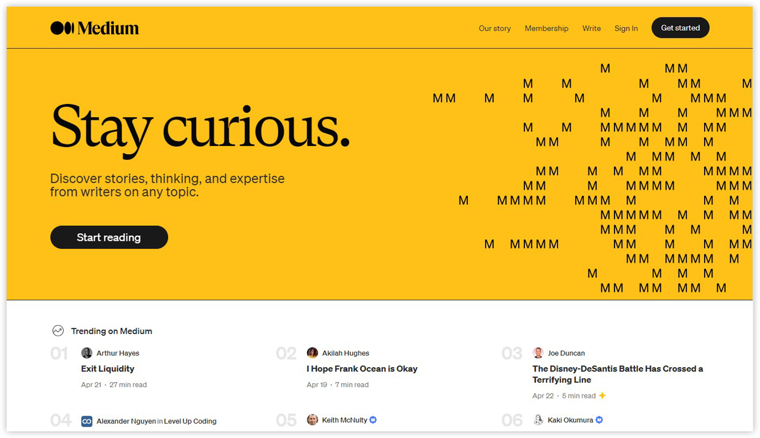
Flat design gives a modern look and feels, positively affecting visitors’ first impression. Many giants in the industry, such as Google, Apple, Microsoft, etc., have accepted this design approach with open arms.
Usability Problems of Flat Design & the Popularity of Ver. 2.0
1. Usability Problems of Flat Design
Though flat website design brings tremendous help, overusing it can cause some issues. Some of them are:
Problem #1: It Makes It Harder for Users to Recognize Clickable Elements
When you use three-dimensional effects, a natural illusion of depth is given to your website, allowing users to find the interactive elements faster. They can be clickable buttons and icons or fill-in forms. However, with a flat web design, there are no visual signifiers of clickability.
In the past, clickability was indicated by gradients, textures, raised edges, or drop shadows; thus, people knew what buttons and objects they could click. However, you need help finding enough visual signifiers and guessing which elements are clickable in the flat website design. Designers must work hard to solve this issue with a smaller toolset: colors, shapes, proximity, and contextual elements.
Problem #2. It Reduces Discoverability Due to the Lack of Z-pattern
People usually move their eyes following three dimensions: the x-, y-, and z-axis. When they enter a minimalist design website without 3D effects, they will experience something different from what they usually do. Visitors need more time to decode the information, discover relationships between objects, and understand the site’s visual hierarchy.
Problem #3. It Gives Less Information
The flat website design was claimed to deliver low information density by the UX expert Nielsen-Norman Group. They gave an example of the website of the Los Angeles Times. The site only has a few stories, headlines without summaries, and barely recognizable grouping.
Giving less information may result from the purpose of removing distractions. However, when minimalism is overdone, you’ll fail to achieve the goal of transforming information for the viewers.
2. The Popularity of Flat Design 2.0 (+ Its Features)
2.1. The Rise of Flat 2.0
“Flat 2.0” or “Almost Flat” design, a new, more mature version, is made to remove the usability flaws of flat design. The flat style is kept with three-dimensionality added back: highlights, subtle shadows, and layers.
If you apply Flat 2.0 properly, you can troubleshoot the usability problems mentioned above by providing a little skeuomorphism (realism) again and some depth and details. At the same time, you can still take advantage of minimalism, such as clarity, streamlined websites, and faster page loading time.
2.2. Features
Feature #1. Color, Gradients, and Context
Flat 2.0 allows designers to apply more saturated colors to highlight text or buttons and more context clues to assist users in understanding certain elements. For example, an arrow on the page’s right side tells users to swipe right. Within the limited palette, web designers can still show their creativity by using gradients. Combining colors and gradients can bring endless possibilities for your flat website design.
Feature #2. Depth and Shadow
When designing the CTA button, designers can play around with drop shadows, raised elements, and sunken buttons to make the part stand out. Aesthetics is not the only purpose of using these elements, but inspiring users to take desired actions.
Feature #3. Animation
Combining flat designs with simple animations is easier than more detailed ones. These animations include banner sliders, changing color on hover or action, moving with the page, etc.
Feature #4. Simple font
The typography should go well with the flat design to create harmony for the site and gain its primary purpose of minimalism. You should keep it simple and avoid decorative elements.
→ Most popular fonts for websites: 21 Most Common Font Names for Websites of All Time

Try FREE Magezon Page Builder!
Easily create your engaging Magento pages in any style whenever you want without relying on developers or designers, just by drag & drop.
Principles of an Effective Flat Design Website
1. Principles of an Effective Flat Design
Principle #1. Icons
Flat design has nothing to do with over-complicated symbolism. The icons should be basic and simple. Giving those symbols a clean design is also essential to help users easily understand their purpose. You can use bold, monochrome palettes for icons. However, to make the CTA button stand out, you should use bold and contrasting color combinations.
Principle #2. Images
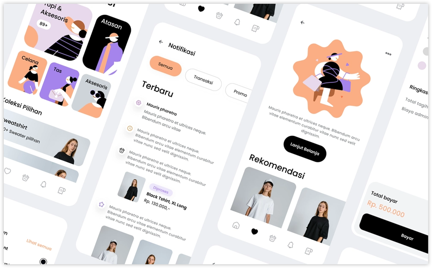
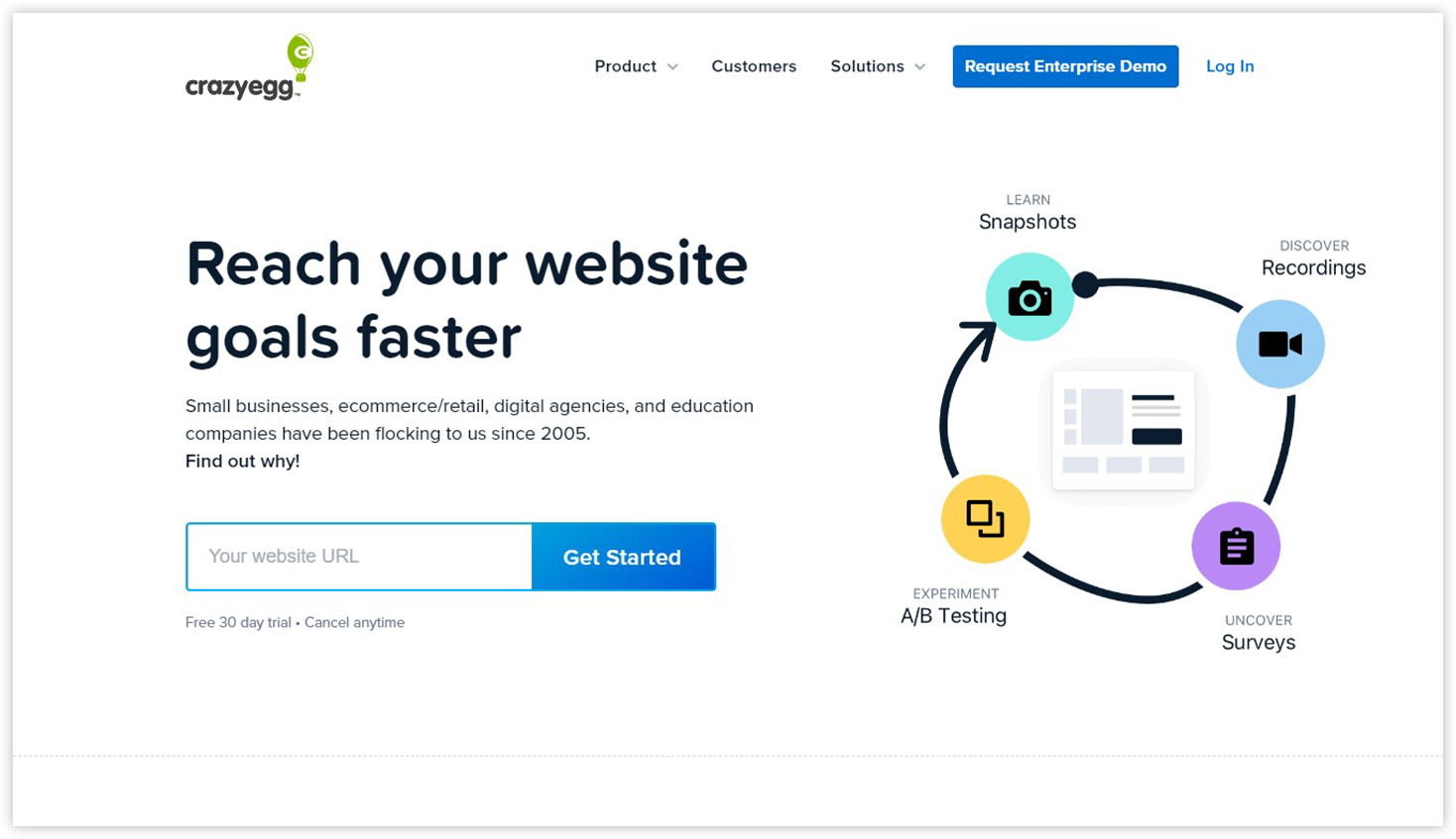
‘A picture is worth a thousand words.’ This old saying is completely true for flat website design. A good image can substitute text and fully use valuable screen real estate. The simple vector images or bright, mono-color background will help you eliminate clutter and focus on those all-important UI elements. Moreover, choosing a correct photo to substitute words draws more users’ attention to the critical sections, such as CTA buttons.
Principle #3. Contrast
Contrast is a vital factor in responsive website design. Give your font bold colors and a sharp contrast to the background. Your site will be less user-friendly if your visitors need to strain their eyes to read the text.
Use only a few different fonts to make your text and font readable; otherwise, your site will become disjointed and lose its minimalist look. Instead of various fonts, stick to a simple one (Sans-Serif typography is the best for readability) and change its sizes and weights to make the page look active.
Principle #4. Visual hierarchy
A visual hierarchy can lead users to the most critical content by applying contrasting colors and element sizes. You can make your site more attractive yet keep the minimalistic idea by creating an illusion of 3D hierarchy when hovering between elements. For example, when users hover the cursor over one element or button, it will be enlarged, or its color will temporarily change.
2. Principles of an Effective Flat Design 2.0
Principle #1. The combination of 3D styling and z-axis
With Flat Design 2.0, you can play around with the effects of shadowing and light positioning again. When used sparingly, your flat website’s design elements, such as CTA buttons or graphic designs in images, will look deeper. The innovative version also lets you add different color gradients to each element to make them more ‘3D’. To create more effects and have a clear hierarchy, use the z-axis for layering. Think about the effects of parallax scrolling. Z-scale layering will give the illusion of a 3D environment.
Principle #2. Animations
Getting things moving on your website can provide more context and make your site more lively. Animations show users the spatial relationship between elements and guide them through your page with a 3D atmosphere. For example, visitors will know if they need to click on the icons or a list of cards. However, keep it simple without overdoing it. Especially if you don’t need the animations to fulfill a specific function, make it a minimum. Animations should never comprise a design.
Principle #3. Scalable vectors
Regarding flat website design and Flat 2.0, SVG elements should be considered. Avoid bitmap images as they don’t have a good scale. On the contrary, vector images scale well to suit the screen resolution of any device, creating great desktop and mobile responsive websites.
10+ Best Flat Design Websites That Inspire You
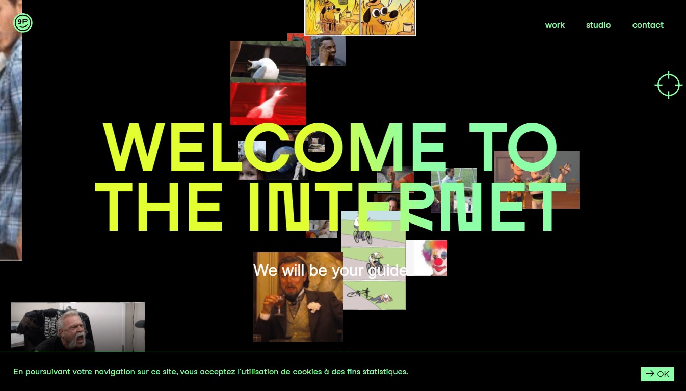
1. Studio 9P
The site has a deep flat design with the dynamic movements of multiple animations, transitions, and flashy imagery. The simple navigation bar and small arrow on the bottom right easily instruct users to the next step.
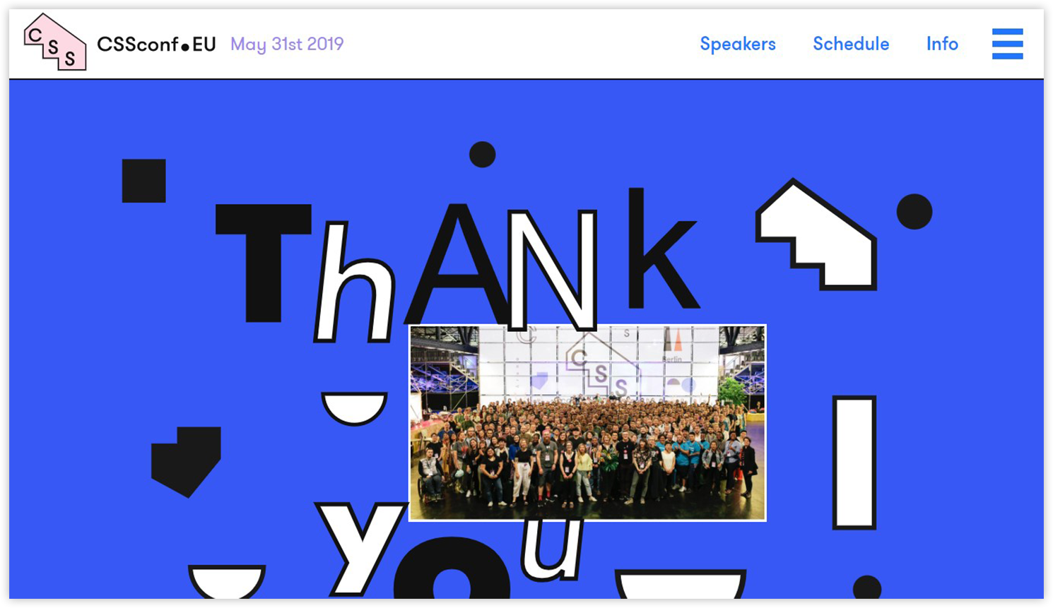
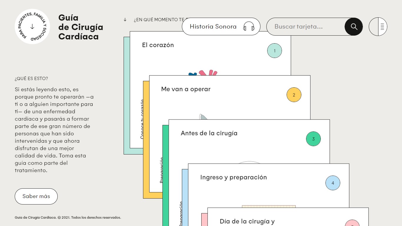
2. Cardiac Surgery Guide
It’s a visually appealing, compact, and helpful website with a flat design, colors, illustrations, and interactive UX animations. Users are navigated through the different options with ease.
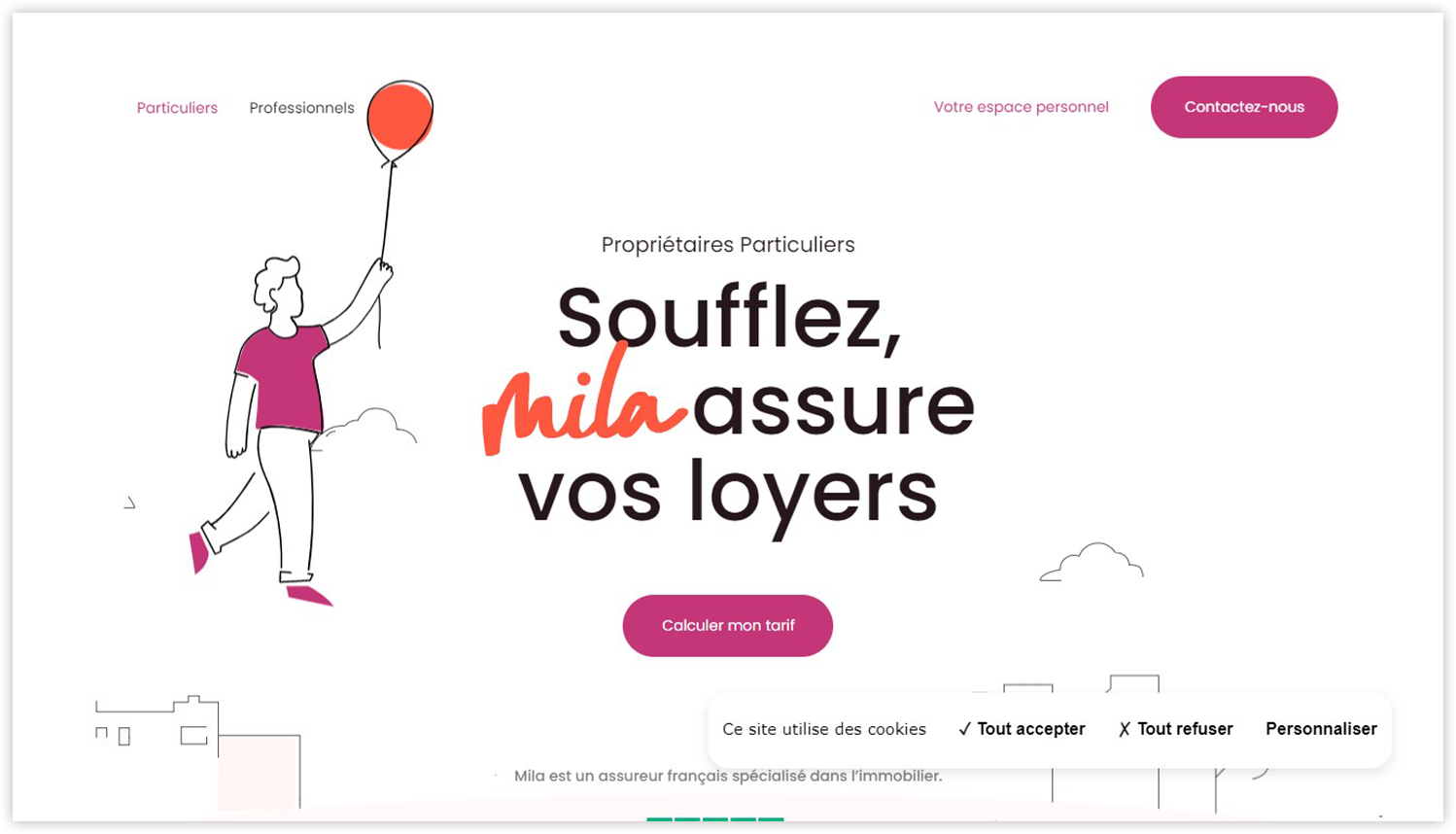
3. Mila Real Estate Professionals
The website uses a simple and clean outline, seamless micro animations, and a grand contrasting color scheme to create an experience that is clear and stylized but not boring or overwhelming.
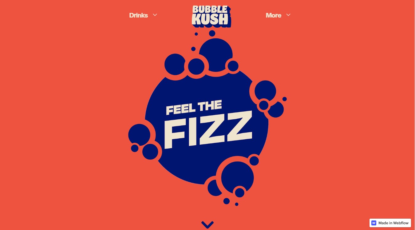
4. Bubble Kush
On the homepage, you’ll see an effective animation of flat shapes imitating bursting bubbles – a symbol of their cola drinks. The design is casual but fun and exciting, with enough motions.
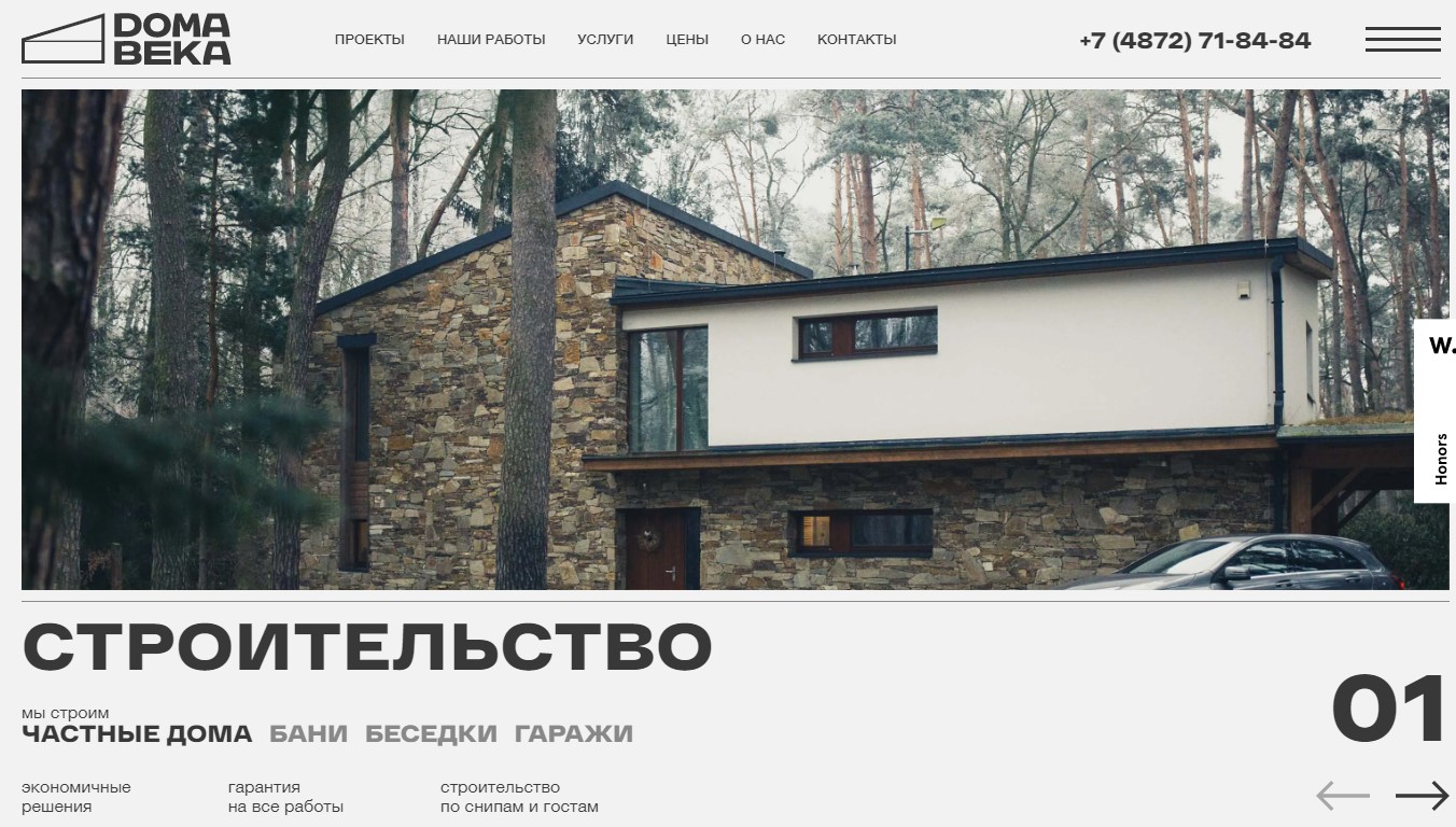
5. Houses of the Century
The Russian site Doma Veka, “House of the Century,” provides enough information on their flat design. They emphasize their service of constructing and designing houses with big high-quality images and combine them with clean design, impeccable structure, and smooth micro animations.
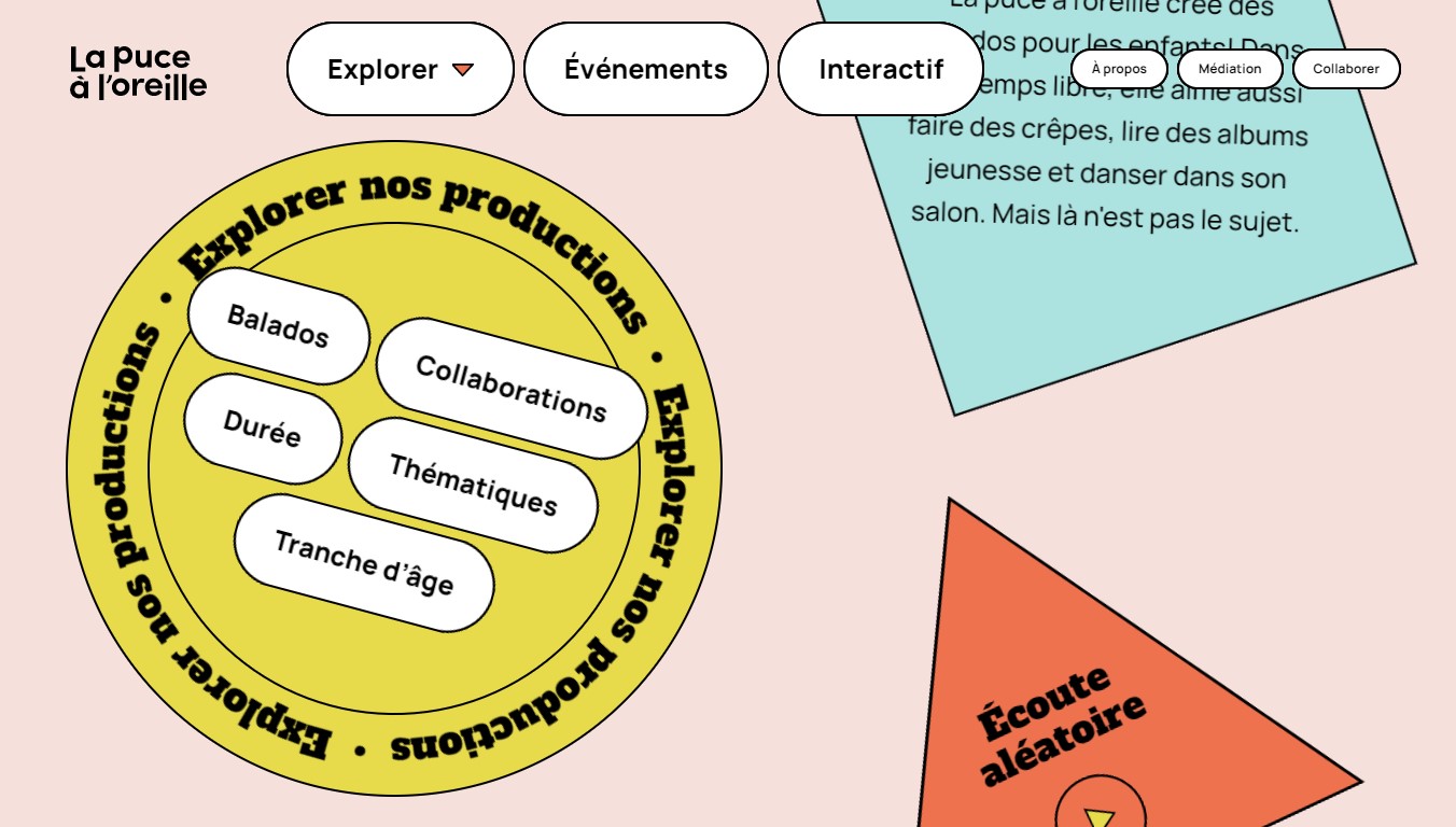
6. La Puce à l’oreille
As a podcast website for kids and teens, the flat design of La puce à l’oreille is super colorful and vivid, with a flat cartoon interface and amazing navigation placed in interactive shapes.
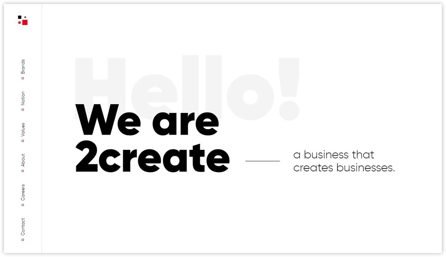
7. 2Create
2Create is a single-page website with scroll-to-section navigation. It includes the brand’s signature colors and brand font, smooth animations, and typography to attract users.
Try FREE Magezon Page Builder!
Easily create your engaging Magento pages in any style whenever you want without relying on developers or designers, just by drag & drop.
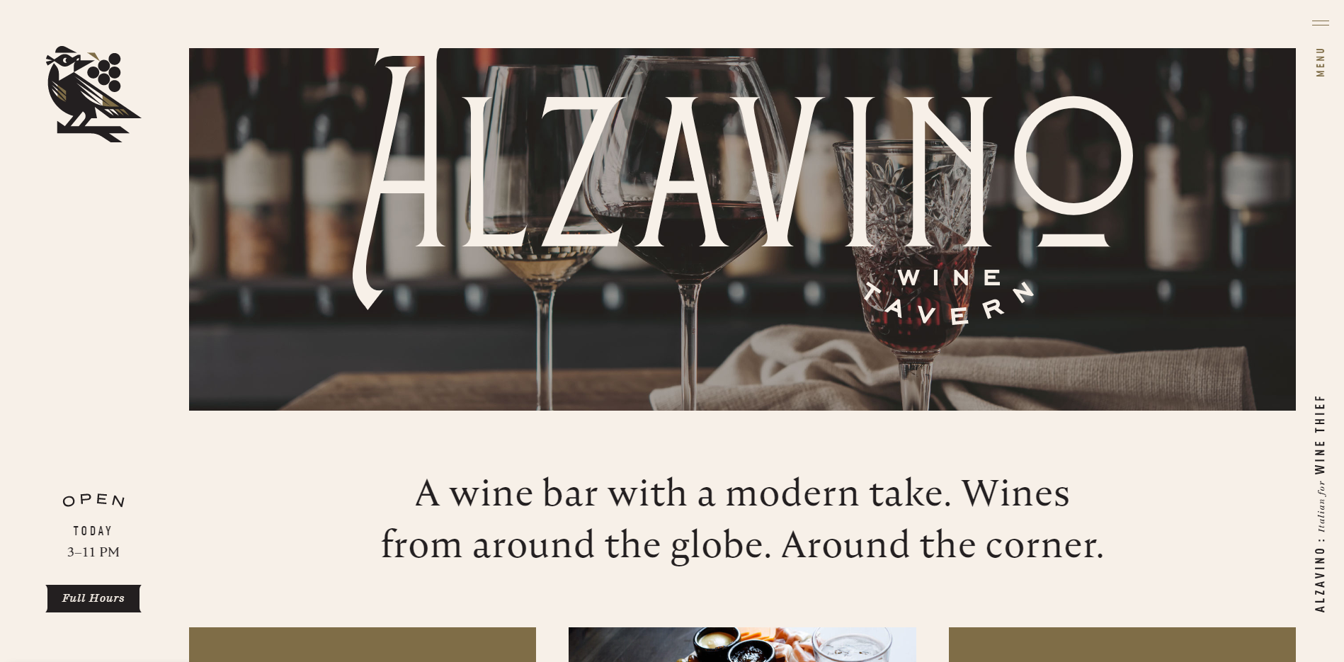
8. Alzavino Wine Tavern
When entering the website, you’ll feel it’s clean and professional, with minimalism and a wise choice of colors and fonts. It also creates the taste of modern and luxurious yet cozy.
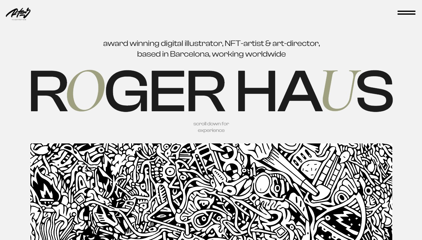
9. Roger Haus
You’ll be surprised when landing on the portfolio website of Roger Haus, a Spanish award-winning digital illustrator. It best shows the designer’s ideology of a flat design mixed with minimal and brutalist style. The site features cool cartoon illustrations, hand-drawn elements, and other fun animations.
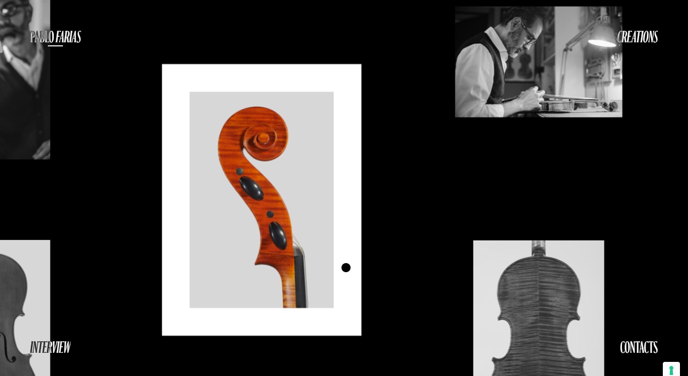
10. Pablo Farias
The site works like a beautiful museum, suitable for a master craftsman to display his artwork. The interactive gallery will lead you to find different art pieces, violins, violas, and cellos, watch the process, read an interview, or reach out for contacts.
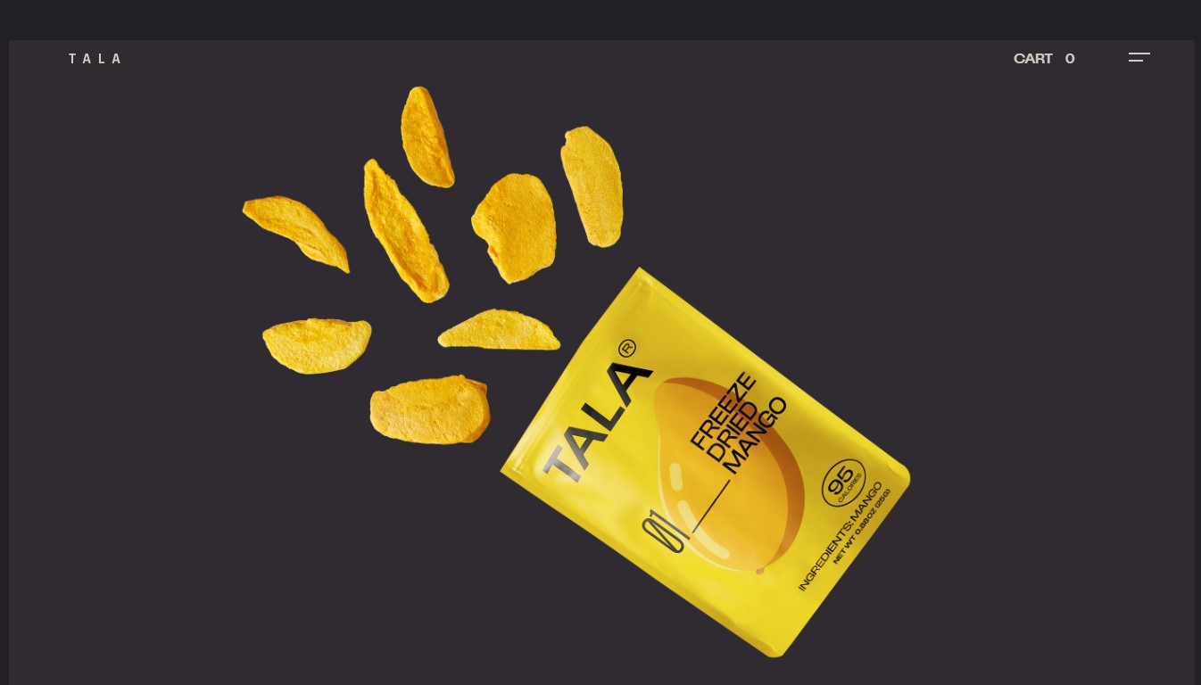
11. TALA
TALA uses real pictures of their products with nice hover animations to give visitors a clean and smooth journey through their website. They also do well with the dark mode, somber colors, and micro transitions.
The Bottom Lines
Despite some drawbacks, flat website design is growing and has quickly replaced skeuomorphism. Its grid-based, minimalistic layouts and simplistic elements offer a clean and clear yet responsive design. Flat-design websites usually offer better readability, reduce page-load time, and obtain SEO advantage. If you want to reach your ultimate conversion rate goal, this approach is worth- considering.
Now, if you are a Magento merchant and don’t know which extension to build your website, consider Page Builder from Magezon. As a trusted Adobe partner, we have satisfied thousands of customers with a vast collection of drag-and-drop extensions, helping you create a high-converting and unique store in minutes.
Don’t take my words for granted; see how your website can be with Magezon Page Builder and what others say about us:


