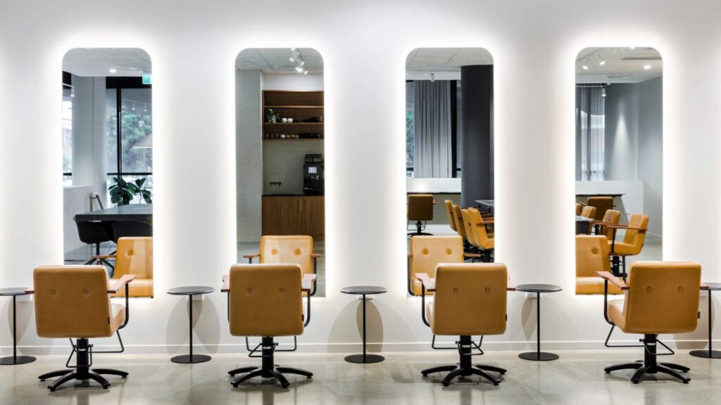
To survive these challenging economic times, many hair salons have begun to invest in developing wholly integrated and highly effective websites to boost their customer base.
The well-designed hair salon websites should contain all the compulsory elements, but what are those? This post will highlight the needed features and explore top hair salon website ideas. Remember to read till the end.
Table of contents
30+ Best Hair Salon Website Examples
1. Camerino Alzira Salon
Camerino Alzira is a highly interactive hair salon site that uses innovative visuals and moving elements to keep visitors interested. The website’s neutral color choice adds a lot of individuality and helps the content and photographs stand out. And although there are splashes of orange across the website, it isn’t too distracting to the eye. Moreover, the website has no navigation bar, making browsing simple since all the content is on the homepage.
2. Ginger Salon
Ginger Salon greets visitors with a gorgeous slider that is clean, contemporary, and attractive in design. This website allows customers to arrange appointments effectively and employs a stylish sticky header to boost retention.
→ Optimize your navigation bar: A Complete Guide to Creating Effective Website Navigation Bar
To promote its brand, Ginger Salon includes a pop-up video directly below the title. In addition, this site has descriptive and appealing call-to-action buttons, guaranteed to increase conversion rates.
While browsing, this fantastic website allows you to purchase hair care products that will enhance the quality and appearance of your hair. It also gives a variety of Salon locations, so customers from diverse areas may choose which salon branch is the most convenient.
3. Suki Salon
The beautiful color grading of the website is one thing that immediately stands out about this hair shop site. The blue tint on the photographs goes well with the rest of the colors on the page. And although the website is built practically conventionally, no one can dispute how professional it seems.
→ Choose a perfect color scheme: 40+ Amazing Color Schemes for Websites That Engage Users
4. Pastels Salon
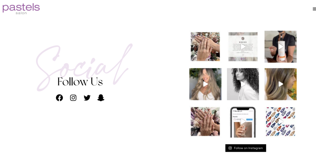
This hair salon website is one of a kind because it has a segmented multi-scrolling page design. The webpage seems to be a gallery screen. The multipage technology doesn’t alter the screen, so you may read more of the website without having to scroll down. The screen then switches to an entire image with text as an alternative.
This website’s sliding method isn’t as easy as it seems since one portion of the screen travels up while the other moves down. On the right side of the screen, there is also a burger menu that can be accessed to offer additional selections.
→ Add an interesting effect to your website: What Is Website Parallax Effect? (Pros & Cons + Best Plugins)
5. Lavish Salon
With a contemporary, clean, and basic design, Lavish Salon’s site makes it easy for customers to arrange an appointment online. The website menu is shown via off-canvas navigation. It offers a list of stylists dedicated to providing the most incredible hair care experience possible. Lavish Salon also has a Lookbook website with hairdo sets to pick from. This website also offers a variety of services for both men and women.
Additionally, Lavish Salon is aware of the advantages of blogging for websites. As a result, helpful blog posts never fail to wow prospective customers. Lavish Salon may significantly improve its search engine optimization in this manner.
Try FREE Magezon Page Builder!
Easily create your engaging Magento pages in any style whenever you want without relying on developers or designers, just by drag & drop.
6. Marco Ambrosi Hair Salon
This hair salon website makes the images, text, and other elements constantly move and interact with one another, creating a fun user experience. Although the movement is so small that it goes unnoticed initially, it improves the website’s seamlessness and smoothness.
At the very bottom is a haircuts gallery. The entirely black backdrop is an additional feature that few websites possess. And it’s a perfect option for this salon’s website since it helps the colored hair, especially platinum and blond colored hair, stand out from the backdrop.
However, it would be better if Marco could make the menu bar sticky since I have to scroll down all over again to get to the menus, and it’s not a satisfying and easy process.
7. Purecny Salon
Purecny is a neat, simple website with an excellent grayscale style. As a part of the user-friendly website design, an off-canvas menu is used. In addition, this website’s call-to-action buttons are strategically positioned to encourage visitors to convert to customers or clients.
→ Get some inspiration for your CTA copy: 100 Last-Minute Call-to-Action Phrases to Double Your Conversion
This website ensures visitors can reach the “about us” part or page to learn more about the highly qualified stylists, fantastic services for various men’s and women’s requirements, the salon’s location, and how to contact them.
→ Tips to write About Us page: How to Write an About Us Page Effectively (Tips + Examples)
8. Platinum Hair Studio
This website for Platinum Hair Studio seems to be quite polished and professional. However, the site’s structure is a bit different, in addition to the fantastic color palette it employs. By clicking on the images, you can quickly discover every salon service and the pricing list for that specific treatment.
→ Easily picking your website colors with generators: 15+ Best Color Palette Generators for Website 2022 (+FAQs)
The website’s backdrop gradually changes from white to pale pink once you reach the covid safety section before returning to white once you leave it. Although it’s unclear why this specific portion is a different color, it gives the website something unique.
9. Versa Salon
Weddings, proms, and debuts are just a few examples of significant events that need the services of a trained and experienced stylist. Customers can effortlessly arrange appointments with the stylist thanks to the Versa Salon website design. This site showcases its unique works with large and appealing photographs. It also uses a strong call-to-action button to turn visitors into customers.
Versa Salon offers promotions, gift cards, and discounts in exchange for recommendations. In addition, this website guarantees that users can refer to many testimonials, and it can assist in converting more prospects.
→ If you have a dedicated testimonial page, get inspiration here: 50+ Stunning Testimonial Page Examples
10. The Parlour Salon
Another excellent website devoted to the hair salon industry is The Parlour. It has a great header slider with large, clear pictures and unique CTAs. The sticky menu makes it easy to browse the website. They may quickly explore The Parlour’s narrative, see how competent the stylists are, know whether they’re seeking more dedicated stylists, or schedule an appointment right now.
This website also advertises its services and goods so that visitors know what to anticipate when they schedule an appointment. In addition, it will assist you in locating The Parlour Salon’s closest branch.
11. Cuts & Bruises Salon
This website stands out for its simplicity, not just in visuality but also in navigation. In other words, look closely at their homepage; what we can learn is how they integrate every necessary page into one. It also showcases some pictures of customers so prospects can understand what they can expect from the salon.
12. Groom Service Beauty Bar
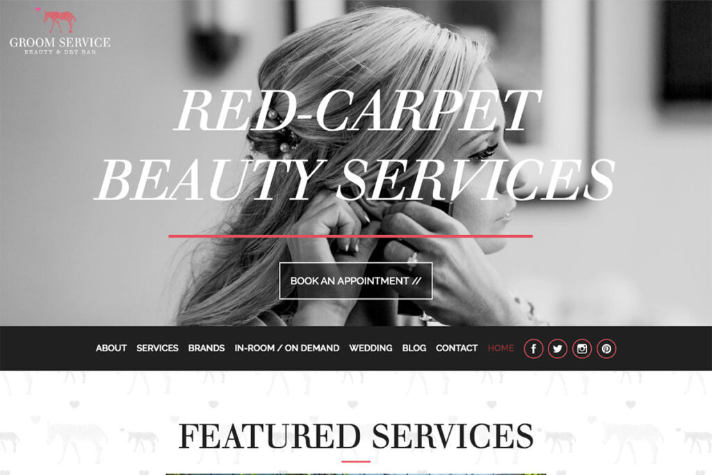
The correct white space, engaging graphics, and compelling taglines may help a website succeed. Groom Service Beauty Bar is a fantastic hair salon website design that deserves to be included on this list.
Groom Service Beauty Bar’s site features a huge, attention-grabbing title, a core call-to-action, and a supporting picture. In addition, the website employs a sticky header, as well as social media integration. Another outstanding element of this hair salon website is its unique exhibition of hair patterns through a flicking slider or carousel. As a result, the administrator may offer the most popular haircuts to guests during their appointments. Other important website sections include a blog, wedding, services, contact, and more.
13. The Charlee Salon
The Charlee Salon is for you if you want a basic website with a splash of color or something that stands out. The structure is straightforward, with only standard elements such as navigation bars, text, and photo components. However, it also includes a collage of various hairstyles that serves as the website’s main focus.

Try FREE Magezon Page Builder!
Easily create your engaging Magento pages in any style whenever you want without relying on developers or designers, just by drag & drop.
14. Appel Nouveau Salon
Appel Nouveau Salon is a one-of-a-kind, contemporary, and minimalist hair salon website design. On the homepage, it greets visitors with three significant options: hair, care, and visit, which serve as a navigation bar. You may also reach other website pages using the right sidebar menu. Visitors may quickly obtain information about Appel Nouveau Salon’s staff members and the services, goods, and contact page. In addition, this website allows prospects to book online without any difficulty.
15. Leo’s Hair
Leo’s Hair website is built quite simply, with the whole homepage consisting of alternating panes of text and images. The site has a dark background, emphasizing the flashes of color. This is the one to visit if you are searching for a simpler website.
16. Fringeny Salon
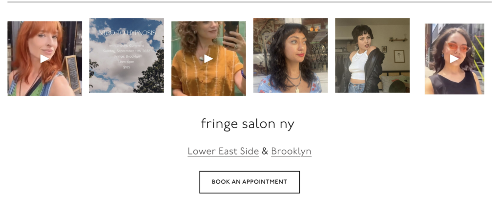
Fringeny is prepared to convince the public that they provide the greatest hair care services by using an alluring headline. Regarding visuality, this website never fails to employ crisp, significant photos on various pages and sections. In addition, a clear call-to-action is placed below the headline, making it more descriptive, noticeable, and eye-catching.
Fringeny’s website also has a fantastic visual hierarchy, which indicates the element’s degree of significance. Of course, the site supports making schedules easily thanks to the sticky header, the main call to action, and the services section. The sticky header, main call to action, and services section provide access. As a result, turning visitors into prospects is simple.
17. 23rd Street Hair Salon
The homepage of 23rd Street Hair Salon’s website is designed like a gallery. You only see a list of the many services and their costs once you scroll past the library, making it simple to set appointments since you know everything in advance. In addition, a banner slider at the bottom of the page makes it simple for customers to find what they’re searching for.
18. Urban Lift Salon
You may want to look at Urban Lift Salon if searching for an urban hair salon website design. It features a simple but attractive design made for salon supplies and services. It is a one-page website that provides summaries of its sections, services, goods, and booking options. Additionally, sticky headers are used on this website to guarantee that the navigation is constantly accessible to users, which might increase retention.
19. Soho Hair Salon
This website looks almost like a black-and-white magazine and is also partly interactive. For a brief while, the left half of the page remains stationary, while the right side slides down to expose additional content. Both sides open up to show even more text when you get to the end of the paragraph. The whole website is black and white with occasional splashes of natural color, giving it a distinct touch.
→ Have some fun discovering interactive websites: 20 Interactive Website Examples That Keep Your Users Engaged
20. Fabio Doti Salon
Fabio Doti Salon aims to provide everyone with expertise and a fantastic hair care experience, and this hair salon website design is a great model for you to follow. It organizes material smartly, from the supporting headline to the call-to-action, social network integration, and Instagram feed. It also has a newsletter signup area for further marketing reasons. Other significant sections on this website include services, staff or hair care professionals, portfolio, contact, and more.
21. Hedwig’s Hair Salon
Hedwig’s Hair Salon is a simple website design that helps customers schedule appointments quickly. There’s nothing much to say except the colors it uses for typography; you can watch the clip to clearly understand. On the other hand, a dedicated Instagram section in the footer of the front page for easy access shows how much effort they put into building their social platforms.
22. Luis Neto Hair Design
This is one of the hair salon websites if you are seeking ideas for one with a more traditional-looking. It has a homepage in the form of a gallery, but instead of the text flowing together with the images, it moves on top. The pastel motif helps the website’s other elements stand out. Moreover, this site is also quite simple to navigate since everything is organized neatly.
23. Forzakappers Salon
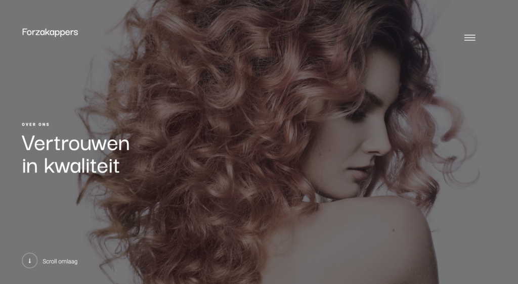
Forzakappers is one of the best hair salon websites with unique content that is easy to read and navigate. Moreover, the sleek and contemporary aesthetic of Forzakappers’ hair salon web design will inspire you.
The hero header greets visitors with many large, supporting photos. From there, any interested audience can quickly make appointments with Forzakappers. Forzakappers’s website uses accordion content to showcase its services, for instance, hairstyle, cutting, coloring, structural treatment, and hairpieces. Additionally, a list of licensed stylists is offered to clients to contact.
24. Jet Rhys Salon
Whether you’re a fan of this niche or an entrepreneur looking for methods to promote your company, Jet Rhys is an innovative and attractive model which motivates you to create trustworthy hair salon websites by establishing an internet presence. This website employs a video backdrop on the hero header to draw visitors’ attention. Furthermore, the hair care specialists shown artistically in a slider on this website generate a favorable impression.
25. Butchers Salon
Butchers Salon’s website offers a clean and straightforward layout. It provides a “green and moral salon located in the center of London.” Visitors can book online or phone the firm through the clear call-to-action on the hero header. In addition to the sticky header, the website’s user-friendliness is enhanced by the extensive, gallery-like navigation.
26. Fabio Scalia Salon
This website’s homepage has a high-quality video demonstrating the store’s atmosphere. You can simply arrange appointments, learn about the owner, and read blogs, all thanks to the user interface’s simplicity and effectiveness. The “Book Now” button encourages the user to click it.
27. Taylor Taylor London
Another inspirational hair salon website design that successfully built online trust is Taylor Taylor London. The navigational plan makes use of the off-canvas sidebar. Its backdrop of grey marble and simple but effective information also has an exquisite appearance.
Visitors may use the booking button at the top of this website without difficulty (call-to-action). It is also possible to see the salon’s hairstyling in its photo and video galleries. Additionally, this website provides terrific and practical things, such as products for hair that can be purchased online.
28. Zoyag Salon
Zoyag has an outstanding design and seems to be cutting-edge in terms of features. Specifically, this site dazzles the viewer with stunning visuals on the hero header, displayed through a great carousel. Zoyag also employs a sticky header for client retention, subtle motion when a picture has hovered over, a video backdrop, and more.
29. Neville Hair And Beauty
Neville Hair And Beauty are worth a look as part of your best hairdresser websites. This website design is one of the fantastic and one-of-a-kind designs that stylists might consider. It greets visitors with a full-screen carousel displaying various photographs of models’ fresh-looking haircuts and its outstanding services. Meanwhile, the navigation is shown via the off-canvas menu to visitors to choose from the About page, news, services, shows, and other alternatives. Of course, prospective consumers can always make reservations quickly and conveniently. Check out how beautiful this website may be as a model for your upcoming hair salon websites!
30. Millennium at Midtown Salon
A strong headline, a compelling supporting picture, and persuasive writing can make your hair styling websites stand out. Such characteristics were not overlooked by Millennium at Midtown’s website. The main menu and an informative header are where you’ll find the services menu, blog, gallery, gift cards, and more! Aside from that, it never forgets to include social network icons in the header to boost conversions. In addition, a video tour of their opulent facilities is included to make the website more attractive and intriguing. And there’s more. The website also has an Instagram gallery to boost client retention and social proof.

Try FREE Magezon Page Builder!
Easily create your engaging Magento pages in any style whenever you want without relying on developers or designers, just by drag & drop.
17 Best Practices to Optimize Your Hair Salon Websites
User Experience and Navigation
1. Be informative
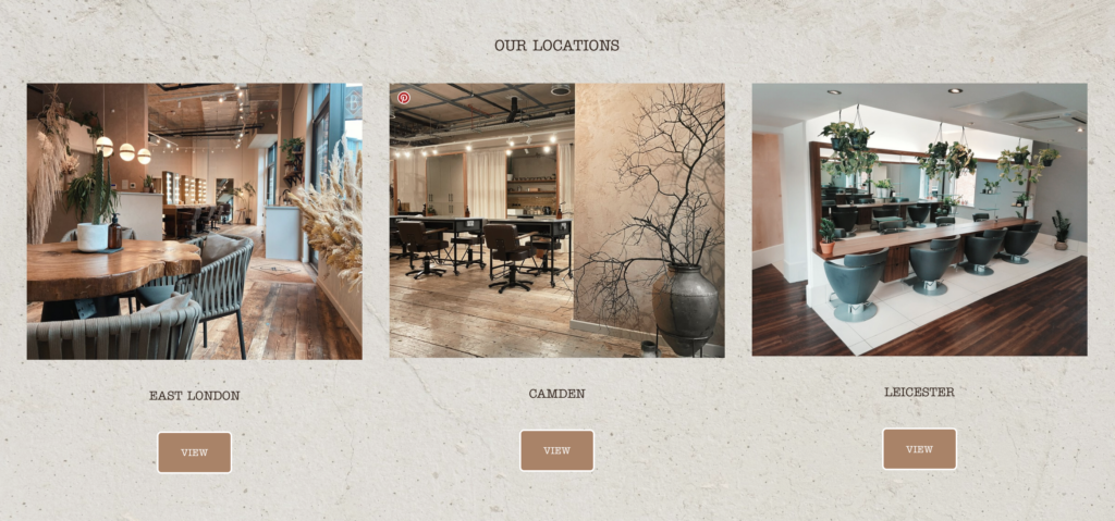
Good hair styling websites offer customer assistance with readily accessible and well-organized content. A hairdresser’s site should include information about the services provided, costs, and the company’s location.
Websites try to get on the top page of search engine results to increase visitors. Knowing your target demographic and publishing specific desired content on the website are the keys to boosting search engine rank.
2. It must be quick and mobile
Check that your website loads in under 3 seconds! Sure, 4 seconds may seem slight, but even a one-second delay may prevent 50% of visitors from remaining on your site! To keep your website speedy, avoid using huge images and videos. Also, since mobile devices now account for more than half of all internet traffic, be sure your website looks and functions correctly on the phone!
3. Recognize new technology
Videos, email, loyalty systems, SMS marketing, and online booking are examples of modern technology improving the consumer experience. Have you considered creating an immersive experience with a website and mobile app connection, from booking to visiting?
4. Keep things simple to find
Opening hours, available services, location and directions, and health and safety information should all be available.
5. Appointment booking
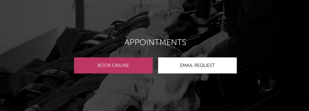
Visitors to hair salon websites need to book an appointment easily. Offering booking options across the website, particularly on the home page, is the ideal technique. In addition, customers can choose which stylist they wish to schedule using a complete booking system.
6. Include e-Commerce Features
Make it simple for customers to pay for your services online. Offering haircare items, gift cards, and vouchers are a terrific method to supplement your business’s revenue.
Visuality
1. Make your brand distinctive
In addition to your logo, your salon’s brand is represented through your choice of colors, fonts, picture style, and writing style. Make sure that your website makes all of these things clear. First, select a color scheme, the brightest colors for your buttons, and the second-brightest for your title. Then, choose two typefaces that contrast and stick with them.
2. Use creative visual design
In the beauty market, visuality is everything. Poorly designed websites will not persuade prospective clients to use your services.
3. Only take high-quality images and videos
Take your time with photographs and videos. Consider including a gallery of before and after photos and tools, goods, and equipment that you utilize. Top salon websites must have interior photography.
4. Include clear calls to action (CTA)
A CTA should appear on every page, usually in the form of a giant button, link, or picture. If this is the homepage? – Try “Schedule an appointment”. What about the services page? – Try “Learn more,” What about the contact page? – A “Contact us” button will work.
5. Simple is better
All the suggestions above will assist you in developing an efficient hair website design that converts visitors into customers. However, it’s simple to go overboard while designing one. It’s generally preferable to have fewer, shorter pages. Don’t make your sites too lengthy or have too many menu options; otherwise, you risk losing visitors. Keeping things basic is ideal.
Marketing
1. Sell benefits rather than features
What is the difference between “Keratin treatment is a method that smooths your hair by sealing protein in with heat” and “Want to get strong, silky hair that lasts? Take advantage of our Keratin treatment”? Sell the advantages of your items to your customers, not the things themselves.
2. Maintain your relationships
Beauty clients are often devoted to their salons. You should keep customers interested by providing new, individualized information, useful tools, and personalized promotions.
3. Show social evidence
Customers believe reviews written by genuine people, so you should display positive client feedback on your website. Then, encourage them to use your proposed hashtags while posting their new hairdo on their social network.
4. Get your business included in local directories
Include your business on Google Maps, Google Business, and other local listing sites. Take and publish professional photos of the interior and exterior to make it simpler for prospects to locate and evaluate you.
5. Participate in social media
Connect and engage as much as possible with your customers. In other words, contact them on social media. Re-purpose your content for multiple platforms and audiences.
6. Make sure to get email addresses
More than 80% of those who visit your salon’s website will depart without ever contacting you again. But this does not have to be the case! Add a popup to your website offering visitors to join your beauty club in exchange for a special discount and promotion. You now have their email address and can communicate with them. You’ll soon turn them into loyal customers!
Conclusion
It might be challenging to create hair styling websites that attract new customers. The tips in this article might assist you in developing a functioning and beautiful one. Let’s get inspired by some ideas above and create the best hair salon websites for you.
If you are a Magento merchant and don’t know which extension to build your hair salon website, consider Page Builder from Magezon. As a trusted Adobe partner, we have satisfied thousands of customers with a vast collection of drag-and-drop extensions, helping you create a high-converting and unique store in minutes.
Don’t take my words for granted; see how your website can be with Magezon Page Builder and what others say about us:
 Magezon Blog Help Merchants Build Comprehensive eCommerce Websites

