 Magezon Blog Help Merchants Build Comprehensive eCommerce Websites

Trying to build an effective online course landing page on the Magento platform? Then, you’ve come to the right place. In this tutorial, you’ll explore how to create and design such an e-learning landing page with Magento Page Builder Open Source. Don’t worry if you’re a beginner because we’ll explain everything as detailed as possible. Apart from learning how to create one, you may take inspiration from this clean and minimal course landing page example, I hope. So no more further, let’s dig in.
Note: With the thought of helping you create your page in the easiest way, we have used Canva, a free and easy-to-use graphic tool, to design all images on this landing page for online course. Canva can be the best bet especially for those who are having difficulty learning Adobe Illustrator. Trust me, you still can completely create visually stunning images with this awesome tool.
Before you’ve started to create your e-learning Magento landing page, it’s crucial to read these guidelines first. Then, you’ll know for sure how to build a web page methodically. You’ll also focus on high-value tasks instead of spending too much of your time on a specific task with little value.
Table of contents
Let’s Look at the Online Course Magento Landing Page Structure
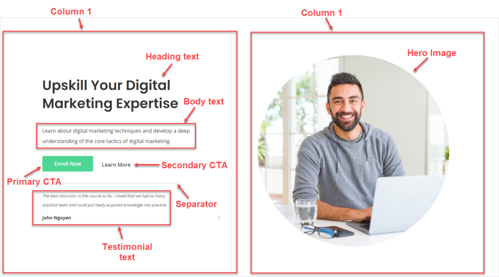
Okay, so now look at the image below to determine which sections are included on the course selling landing page and what content types are used in each section.
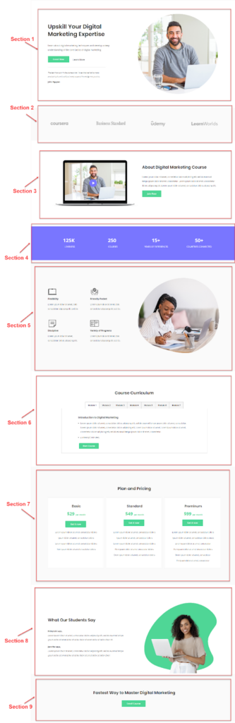
This online course Magento landing page has 9 different sections:
- Section 1 gives you a quick overview of this online course using a short, clear headline and subheadings. Right under are 2 CTAs. One is a green button, which is the primary CTA. The other, or the secondary CTA, is a clickable text. Besides, a testimonial right below is a big plus in earning your visitor’s trust at first sight. A thin separator is a small trick to make the section less text. On the screen’s right side is a big hero image with a man smiling and having good eye contact.
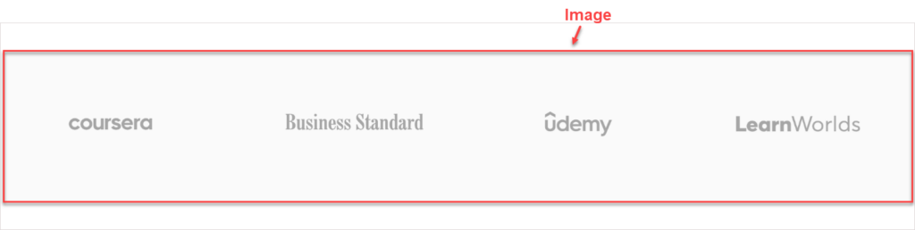
- Section 2 includes the reputable e-learning websites in which your courses are featured. This section helps you build your potential customers’ trust and let them know they can take your course on the platform they’re familiar with.
- Section 3 gives users a comprehensive understanding of your online course through a video. Visitors are more likely to convert after watching videos; therefore, in this section, we’ve placed a repeated CTA with a different strong copy, “Join Now”.
- Section 4 showcases what you’ve achieved, such as the number of learners, courses, or years of experience. These numbers are a great way to make your online learning course worth considering. White texts are of large sizes, standing out against a modern purple shade.
- Section 5 gives potential customers reasons why they should choose you. On the left side, the landing page demonstrates 4 benefits learners can take from this course. On the right is an image featuring an eager learner. This helps bring learners a good vibe, thereby creating a good impression on them.
- Section 6 lets learners know what they will learn and how long it will take. In this section, we’ve used the Tabs content type. This way, you can display as much information as you want without fretting about too much space being taken up. After grasping the details about your course, interested learners tend to get to know the course pricing. This is where section 7 comes in. 3 pricing packages are displayed in 3 different columns. Each of them has pricing information and a call-to-action button.
- Section 8 shows testimonials from your past learners, extremely helpful in gaining your customers’ trust. This section has a simple design with 2 columns. The left column includes texts, while the right one embraces an image.
- And the last is section 9. With an impressive hook, “Fastest way to master digital marketing,” and a strong CTA button, this section plays a decisive role in getting customers to register for the course.
That’s 9 sections on this landing page. We’ll show you how to create each of them.

Try FREE Magezon Page Builder demo today
Easily create beautiful, engaging Magento website in any style whenever you want without relying on developers or designers. Just by drag & drop.
Build an Online Course Landing Page With Magento Page Builder
First, you need to do some settings before making the page with Page Builder. Please refer to this blog to know how. After you’re finished with it, let’s set to work.
Section 1: Introduction

1. What’s unique here?
- The landing page has a modern, clean and approachable design. The default font, Open Sans, can be an option for this design. However, this font is not bold and loud enough. I want to look for another Sans Serif font that satisfies my demand. After looking for my desired font, I chose Poppins for heading 1 and body text. To do it, you need to apply CSS to them.
Before:
After:
- From the beginning, we’ve determined the light and bright shade of green as the primary color of this page. That’s why the CTA button should have the same color. However, the button background color is, by default, blue, and there is no setting option to change the color. Hence, you’ll have to use HTML Code content type.
Before:

After:
- Because the blue clickable text in the secondary CTA doesn’t suit the overall page, I’ll replace its default color with dark gray.
Before:

After:

- The image on the right has been made with Canva. To design this image, follow these steps:
+ Look for an image that expresses the brand personality. In our case, our assumed brand is towards youth, freshness, and honesty. Thus, I pick an image that depicts those personality traits.
+ Next, go to Elements in Canva. Type “Circle Frame” on the search box. Select a circle frame as you want. Next, drag and drop your image into this frame. Adjust the image’s position within the frame until you’re happy with it.

2. Which settings to apply in section 1?
| Row |
| Full Width |
| Minimum Height: 800px |
| Vertical Alignment: Center |
| Column 1 (6/12) |
| Centered |
| Vertical Alignment: Center |
| Right Padding: 70px |
| Content Block in Column 1 |
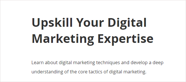
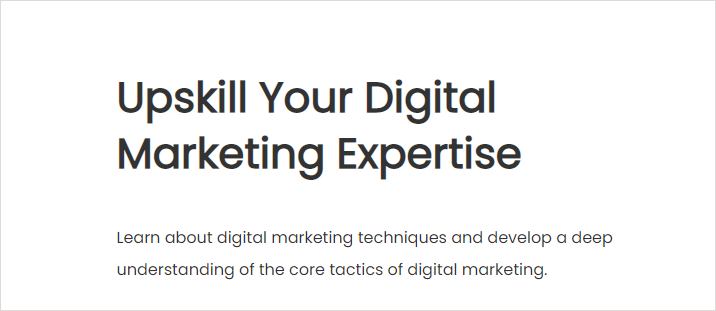
| Heading text “Upskill Your Digital Marketing Expertise” (Use the Text content type) |
| Format: Heading 1 |
| Font Size: 42px |
| Bold the text |
| Change its font into Poppins by inserting the CSS codes of H1 tag into the HTML Code editor:<link href=”https://fonts.googleapis.com/css2?family=Poppins&display=swap” rel=”stylesheet”><style>h1 { font-family: ‘Poppins’, cursive;}</style> |
| Body text “Learn about digital marketing techniques and develop a deep understanding of the core tactics of digital marketing.” |
| Font Size: 16px |
| Line Height: 32px |
| Right Padding: 20px |
| Bottom Padding: 20px |
| Change its font into Poppins by inserting the CSS codes of the body text into the style tags: body {font-family: ‘Poppins’;cursive;} |
| Primary CTA Button Text: Enroll Now |
| Button Type: Primary |
| Button Link: URL – https://www.magezon.com/magezon-page-builder-for-magento-2.html |
| Mark the Open in new tab checkbox. |
| Change the button background color by inserting the following codes into the style tags of the HTML editor:.pagebuilder-button-primary { background-color: #4ED695 !important; font-size: 16px !important; padding: 13px 37px !important; border: none !important;} |
| Secondary CTA |
| Button Text: Learn More |
| Button Type: Link |
| Button Link: URL – https://www.magezon.com/magezon-page-builder-for-magento-2.html |
| Mark the Open in new tab checkbox. |
| Change the anchor text color by inserting the following codes into the style tags of the HTML editor: .pagebuilder-button-link { font-size: 16px !important; color: #3F4247 !important;} |
| Separator |
| Line Width: 75% |
| Testimonial Text “The best instructor in the course so far. I loved that we had so many practical tasks and could put newly acquired knowledge into practice. |
| Font Size: 12px |
| Line Height: 28px |
| Italicize the text |
| “John Nguyen”: Apply the same setting but not italicize the text. |
| Column 2 (6/12) |
| Centered |
| Vertical Alignment: Center |
| Content Block in Column 2 |
| Image |
| Design the image with Canva. After that, upload the image into your server using the Image content type. |
Try FREE Magezon Page Builder demo today
Easily create beautiful, engaging Magento website in any style whenever you want without relying on developers or designers. Just by drag & drop.
Section 2: Featured in

1. What’s unique here?
What to take notice of is how to design the brand texts effectively. In this case, you can use Adobe Illustrator for text design. However, seeking the exact font is not that easy. Moreover, some brands have their own fonts that are unavailable to download. So, what should you do?
Here’s the way I did it.
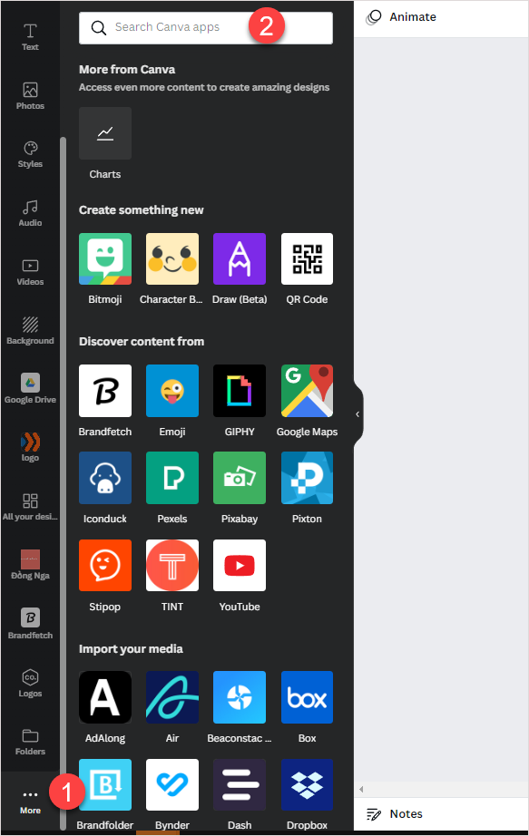
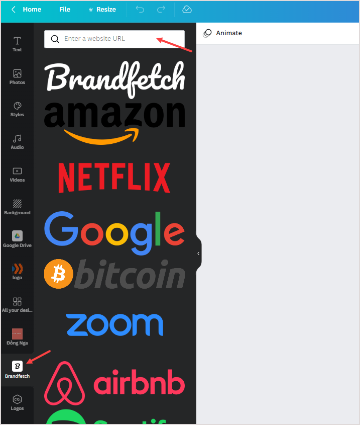
So go to the Canva website, then add an application named Brandfetch. This app allows you to add any logos to your design at your fingertips.
Simply enter the brand name in the search bar and instantly find the exact one. If there is no result, copy the website link and paste it into the search bar.
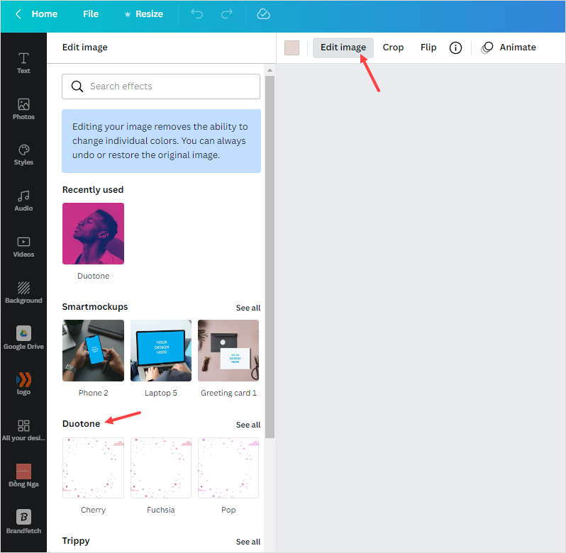
- When you have your wanted brand logo, you need to change its color to gray. But the thing is, all brand logos are in image file format, so you may not change the color. No worries. Canva offers a functionality called Duotone that lets you do that task. Give it a try.
2. Which settings to apply in section 2?
| Row |
| Full Width |
| Background Color: #fafafa |
| Content Block in the row |
| Upload the image you’ve designed with Canva. |
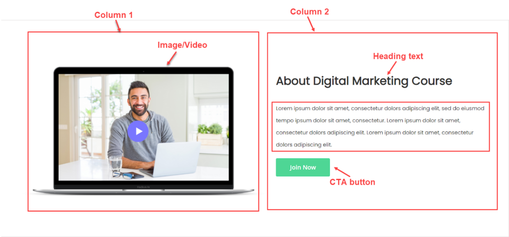
Section 3: About the Course
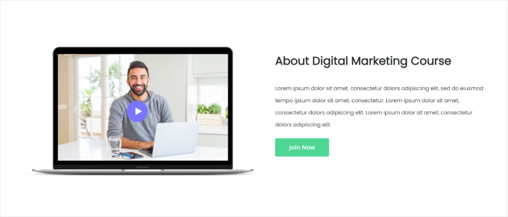
1. What’s special here?
- We’ve changed the heading text font into Poppins using CSS. The heading here is heading 2. When I applied CSS for heading 2, all heading 2s’s text on the page will automatically change accordingly.
- The image in column 1 is actually an image, not a video. However, we highly recommend you use videos to help potential customers have a deeper insight into your course, thereby increasing conversions.
2. Which settings to apply in section 3?
| Row |
| Minimum Height: 700px |
| Vertical Alignment: Center |
| Column 1 |
| Centered |
| Vertical Alignment: Center |
| Content block in Column 1 |
| Add the image to the column using the Image content type. |
| Column 2 |
| Centered |
| Vertical Alignment: Center |
| Right Padding: 30px |
| Bottom Padding: 50px |
| Content block in Column 2 |
| Heading text “About Digital Marketing Course” (Heading 2) |
| Format: Heading 2 |
| Font Size: 30px |
| Bold the text |
| Bottom Padding: 20px |
| Change its font by inserting the CSS codes into the style tags of the HTML Code editor:h2 { font-family: ‘Poppins’, cursive;} |
| Body text “Lorem ipsum dolor sit amet, consectetur dolors adipiscing elit, sed do eiusmod tempo ipsum dolor sit amet, consectetur. Lorem ipsum dolor sit amet, consectetur dolors adipiscing elit. Lorem ipsum dolor sit amet, consectetur dolors adipiscing elit.” |
| Font Size: 14px |
| Line Height: 32px |
| Bottom Padding: 10px |
| Note: In section 1, I changed the body text font using CSS. This modification is applied to the whole body text on the landing page. Therefore, the body text in this section is automatically changed no matter whether you use CSS or not. |
| CTA button |
| Button Text: Join Now |
| Button Type: Primary |
| Button Link: URL – https://www.magezon.com/magezon-page-builder-for-magento-2.html |
| Tick the Open in new tab checkbox. |
Section 4: Achievements
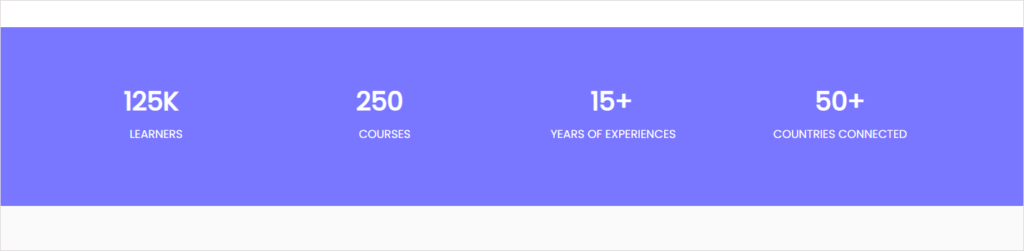
1. What’s special here?
The counter achievements in white are placed on a prominently purple background.
2. Which settings to apply in section 4?
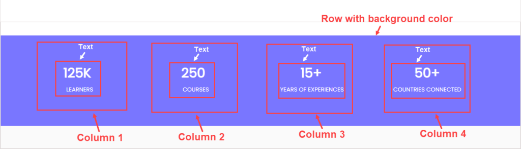
| Row |
| Full Width |
| Minimum Height: 250px |
| Vertical Alignment: Center |
| Background Color: #7976ff (Bright purple) |
| Column 1 (3/12) |
| Full Height |
| Vertical Alignment: Center |
| Content in Column 1 |
| Text “125K” |
| Font Size: 36px |
| Font Color: White |
| Bold the text |
| Center the text |
| Text “Learners” |
| Font Size: 16px |
| Font Color: White |
| Center the text |
| Column 2, 3, 4 |
| Duplicate column 1 three times. Drag to resize these columns in equal widths and then change the text. |
Try FREE Magezon Page Builder demo today
Easily create beautiful, engaging Magento website in any style whenever you want without relying on developers or designers. Just by drag & drop.
Section 5: Benefits of Our Course
1. Which settings to apply in section 5?
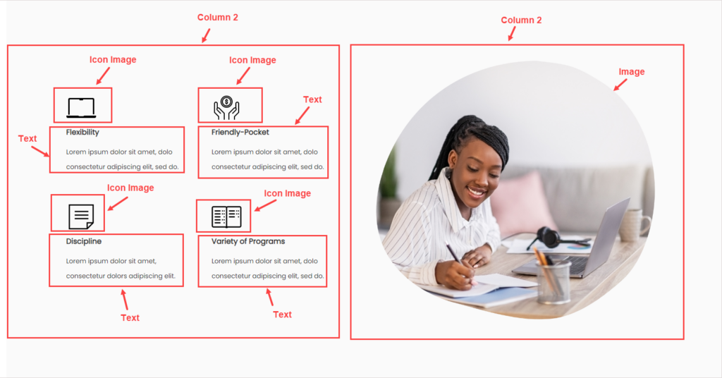
| Row |
| Full Width |
| Vertical Alignment: Center |
| Background Color: #fafafa (Light Gray) |
| Top Padding: 120px |
| Bottom Padding: 120px |
| Column 1 (3/12) |
| Centered |
| Vertical Alignment: Center |
| Right Padding: 50px |
| Content in Column 1 |
| Add the icon image to the column using the Image content type. |
| Text “Flexibility” |
| Font Size: 16px |
| Line Height: 32px |
| Bold the text |
| Text “Lorem ipsum dolor sit amet, dolo consectetur adipiscing elit, sed do.” |
| Font Size: 14px |
| Line Height: 32px |
| Duplicate the image and text (one more). And change the text and image accordingly. |
| Column 2 (3/12) : Duplicate Column 1 and change the content inside. |
| Column 3 (6/12) |
| Centered |
| Vertical Alignment: Center |
| Left Margin: 50px |
| Content in Column 3 |
| Add an image to the column. |
Section 6: Course Curriculum
1. What’s special here?
As I said above, the Tabs content type displays the course curriculum details while saving a lot of space. Every child tab contains text and a CTA button.
2. Which settings to apply in section 6?
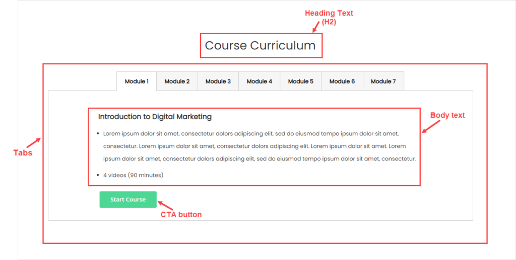
| Row |
| Full Width |
| Vertical Alignment: Center |
| Top Padding: 120px |
| Content in the row |
| Heading Text “Course Curriculum” |
| Duplicate the heading text of section 3. Then, change the text. |
| Tabs |
| The parent tab |
| Minimum Height: 330 |
| Tab Navigation Alignment: Center |
| Top Margin: 30px |
| Right Margin: 100px |
| Left Margin: 100px |
| Individual tab “Module 1” |
| Text “Introduction to Digital Marketing” |
| Font Size: 18px |
| Bold the text |
| Text “Lorem ipsum dolor sit amet, consectetur dolors adipiscing elit, sed do eiusmod tempo ipsum dolor sit amet, consectetur. Lorem ipsum dolor sit amet, consectetur dolors adipiscing elit. Lorem ipsum dolor sit amet. Lorem ipsum dolor sit amet, consectetur dolors adipiscing elit, sed do eiusmod tempo ipsum dolor sit amet, consectetur. 4 videos (90 minutes)” |
| Font Size: 14px |
| Line Height: 32px |
| Use bullet points |
| Button “Start Course” |
| Button Text: Start Course |
| Button Type: Primary |
| Button Link: URL – https://www.magezon.com/magezon-page-builder-for-magento-2.html |
| Tick the Open in a new tab checkbox |
| Change the button background color into the green in order to be consistent. Because the buttons used in this section have smaller sizes, then I apply different CSS codes. Name the CSS Classes start-course. Then write the CSS codes and insert them into the HTML Code editor:.start-course .pagebuilder-button-primary { background-color: #4ED695 !important; font-size: 15px !important; padding: 10px 28px !important; border: none !important;} |
| Other Tabs: Duplicate the first individual tab and then change the content inside. |
Section 7: Plan and Pricing
1. Which settings to apply in section 7?
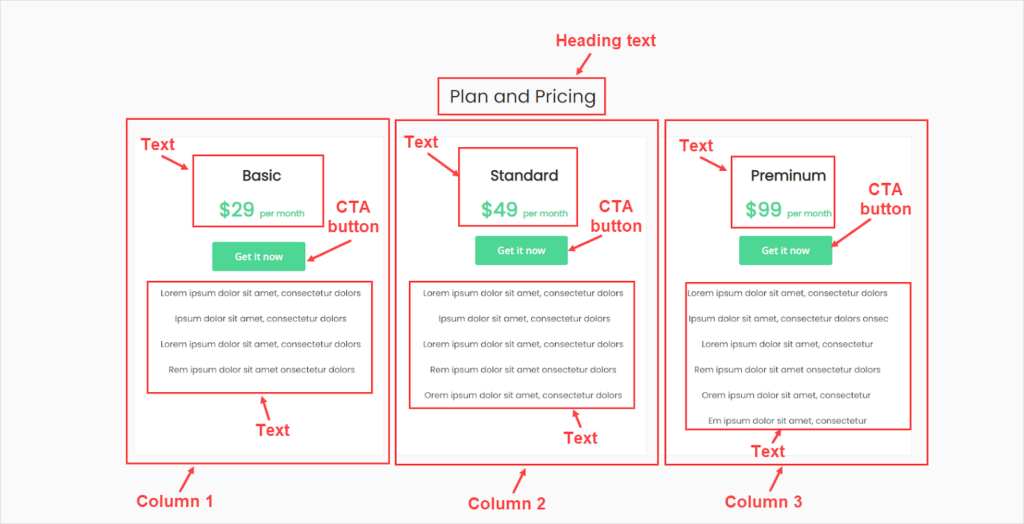
| Row |
| Full Width |
| Vertical Alignment: Center |
| Background Color: #fafafa |
| Top Padding: 120px |
| Bottom Padding: 120px |
| Content in the row |
| Heading text “Plan and Pricing” |
| Duplicate the heading text of the previous section. Then change the text. |
| Column 1 (4/12) |
| Minimum Height: 500px |
| Vertical Alignment: Top |
| Background Color: #ffffff |
| Border: Solid |
| Border Color: #f0f0f0 |
| Border Width: 1px |
| Top & Bottom Padding: 30px |
| Right Padding: 10px |
| Left Padding: 20px |
| Right Margin: 15px |
| Content in Column 1 |
| Heading text |
| Text “Basic”: Font Size – 24px + Bold and center the text + Bottom Padding: 10px |
| Text “$29”: Font Size – 32px + Bold and center the text + Text Color: #4ed695Text “per month”: Font Size: 14px + Bold and center the text + Text Color: #4ed695Bottom Padding: 10px |
| Button: Button Text: Get it now Button Type: PrimaryButton Link: URL – https://www.magezon.com/magezon-page-builder-for-magento-2.htmlTick the Open in new tab checkboxCenter the button within its container (Customize the parent button’s alignment). |
| Body textText: Lorem ipsum dolor sit amet, consectetur dolors Ipsum dolor sit amet, consectetur dolors Lorem ipsum dolor sit amet, consectetur dolors Rem ipsum dolor sit amet onsectetur dolorsFont Size: 14pxLine Height: 32pxCenter the text |
| 4. Column 2, 3: Duplicate the first columns (2 more columns). Drag to resize them to make sure they’re of the same width. Then change the content of each. |
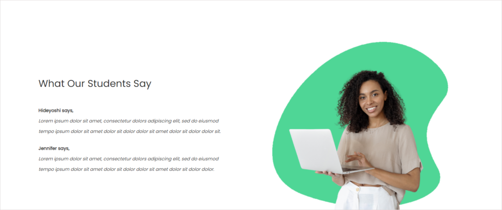
Section 8: What Our Students Say
1. Which settings to apply in section 8?
| Row |
| Full Width |
| Vertical Alignment: Center |
| Top Margin: 120px |
| Column 1 (6/12) |
| Full Height |
| Vertical Alignment: Center |
| Right Padding: 70px |
| Content in column 1 |
| Heading text |
| Duplicate the heading text of the previous section. Then change the text. |
| Body text |
| Font Size: 14pxLine Height: 32pxBold the text “Hideyoshi says,”Italicize the text “Lorem ipsum dolor sit amet, consectetur dolors adipiscing elit, sed do eiusmod tempo ipsum dolor sit amet dolor sit dolor dolor sit amet dolor sit dolor dolor sit.”Bottom Padding: 10px |
| Column 2 (6/12) |
| Full Height |
| Vertical Alignment: Center |
| Next, add an image to the column using the Image content type. |
Section 9: CTA

1. Which settings to apply in section 9?

| Row |
| Full Width |
| Vertical Alignment: Center |
| Background Color: #fafafa |
| Content in the row |
| Heading text |
| Duplicate the heading text of the previous section. Then change and bold the text. |
| CTA button |
| Duplicate the button of section 3. Then change the text. |
Now that you have learned how to create a simple yet stunning online course Magento landing page using Magento Page Builder. From my perspective, creating a visually aesthetic web page doesn’t necessarily require many striking factors. What you need to do is keep it simple and consistent.
Make Your Landing Page Perfect With Magezon Page Builder
The above landing page proves that you can create a good-looking landing page for courses using Magento Page Builder Open Source. If using CSS codes is not what matters, then there’s no reason to consider a page builder alternative. Otherwise, you should look for a tool that helps you effortlessly build an impressive web page while saving valuable time. Magezon Page Builder is a great tool that you should try. Known as a well-coded page builder at an affordable price, this extension goes beyond your expectations because of its various features. Try it once to know what our page builder can do for you.
This year, we’re going to release a new version of Magezon Page Builder that boasts various powerful functionalities. Learn more through the Page Builder 3.0 Sneak Peeks if you’re interested in. Apart from the website, we’ll announce this new version on Facebook, Twitter, and LinkedIn. So, stay tuned.
| Keep reading to optimize your website landing page: 19 Types of Landing Pages (+ How to Choose the Right One) How to Make a Good Landing Page with HTML, CSS, and JavaScript 30+ Most Inspiring Landing Pages Examples |
Wrap It Up
Hopefully, this how-to article can help those selling online courses on the Magento platform. Don’t forget to let us know whether you want to change anything else about our landing page. Leave your comments below and we’ll sure listen to your ideas. Once you’ve finished your online landing page, don’t hesitate to share it with us.
Try FREE Magezon Page Builder demo today
Easily create beautiful, engaging Magento website in any style whenever you want without relying on developers or designers. Just by drag & drop.


