 Magezon Blog Help Merchants Build Comprehensive eCommerce Websites

Red is one of the most intense and powerful colors on the spectrum that evokes passion, love, and excitement. You can find many red websites on the internet today, ranging from popular to small brands.
If your business also uses red as the primary color for web pages, this article will help you explore 20 stunning examples to get inspiration and create or optimize yours. From minimalist designs to flashy layouts, each successfully showcases the versatility and impact of red in web design.
Let’s start with the meaning of red and how to use it effectively.
Table of contents
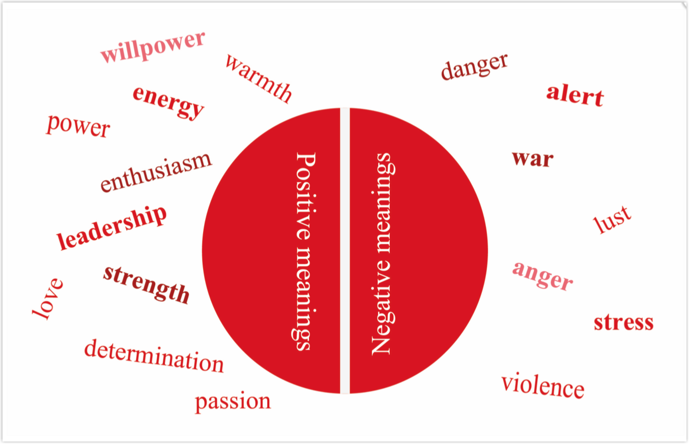
What Does Red Convey in Web Design?
Red is a dynamic and powerful color that immediately captures attention in web design. As the brightest and hottest hue in the color wheel, it brings energy and vibrancy to a site’s layout, making it impossible to ignore. It conveys strong emotions and motivates users to take action. Unsurprisingly, many eCommerce sites and web resources related to love, romance, charity, sports, fashion, food, design, and travel utilize red significantly.
Compared to orange, its neighbor in the color wheel, red is a more commanding and influential color that dominates the page. It is an excellent choice if you’re looking for warm shades that actively engage your audience and drive conversions.
How to Use Red Effectively?
Red is a color that packs a punch in web design. It can evoke emotions and motivate user behavior, but using it effectively requires some critical considerations.
- You should use red strategically and in moderation. Too much red can overwhelm viewers, making it difficult to focus on essential elements. To avoid this, use red to draw attention to calls to action or important messages.
- Remember to consider the context in which red is used. As red is often associated with warnings and danger, it’s important to avoid using it when it may cause confusion or alarm. You can minimize this by using it sparingly and pairing it with complementary colors “white, black, and gray” that create a balanced and harmonious color scheme.
- Don’t forget the tone and message of your website. A more subdued color palette may be more appropriate if your red website is related to a serious topic like healthcare or finance. If your website is related to entertainment or fashion, using red more prominently can create a bold, vibrant look that catches the eye.
- It’s essential to be aware of cultural associations with the color, as red can have different meanings in different parts of the world.
20 Best Red eCommerce Websites to Inspire You
1. Coca-Cola
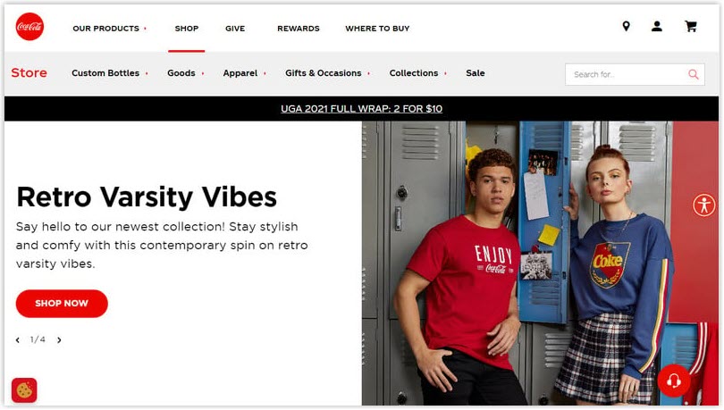

When analyzing the color scheme on the Coca-Cola Store website, we can see that the primary color used is red, the iconic color associated with the Coca-Cola brand. The company uses red throughout the website, from the header and footer to the product images and CTA button “Shop now.” This creates a strong visual identity for the brand and helps establish brand recognition and loyalty among customers.
In addition to the red color, the website also uses white and black as secondary colors. As you can see, white is used for the background and text, creating a clean, simple look that allows red to stand out. And the black color – Coca-cola applies them for text and borders, which provides a strong contrast against the white background and helps to frame the content.
2. Helly Hansen
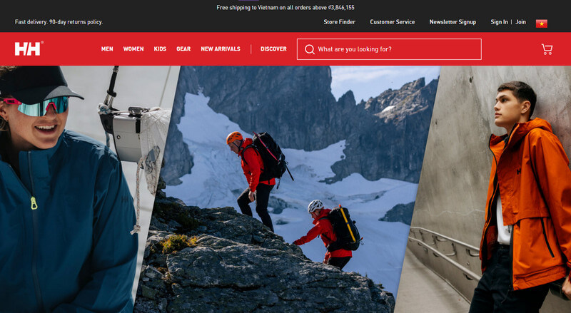

Helly Hansen uses red with the logo “HH” in white text, prominently displayed in the top-left corner. They successfully create a strong visual identity for the brand and help it stand out on the website.
The brand uses red sparingly as an accent color to draw attention to its header with a utility bar (sticky bar). This approach of red draws the user’s attention to the button and encourages them to click through to the product pages. The red navigation bar allows visitors to access any part of the site quickly, at any moment, without getting lost.
3. Liverpool FC
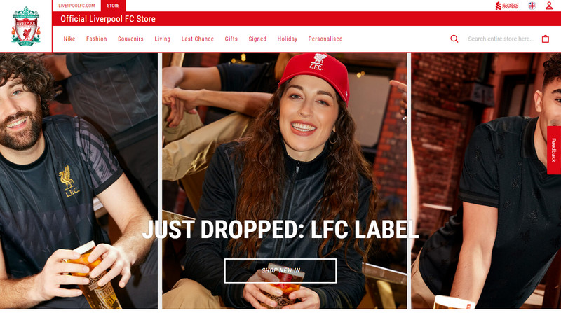

The website uses red, white, and black, reflecting the sports brand identity of Liverpool FC. The dominant use of red throughout the website highlights the importance and urgency of the club’s products. They apply the red consistently for call-to-action buttons to highlight important information such as sale prices and promotions and create contrast against the white backgrounds. The supporting colors provide a neutral backdrop for the dominant red color scheme to ensure it stands out and captures users’ attention.
4. Diesel
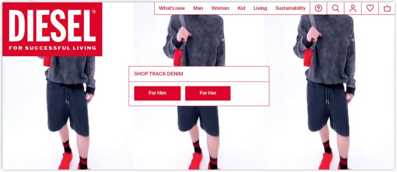

Diesel’s website has a bold, modern appearance that aligns with its edgy image. The website predominantly uses three colors – red, black, and white – to create a cohesive theme. Red is most consistently used throughout the website, appearing in the logo, CTAs, and even the text on the white navigation bar. This makes the website visually appealing and easy to navigate. Besides, the clothing and accessories are shot against the color of the background and allows the products to pop.
5. KFC
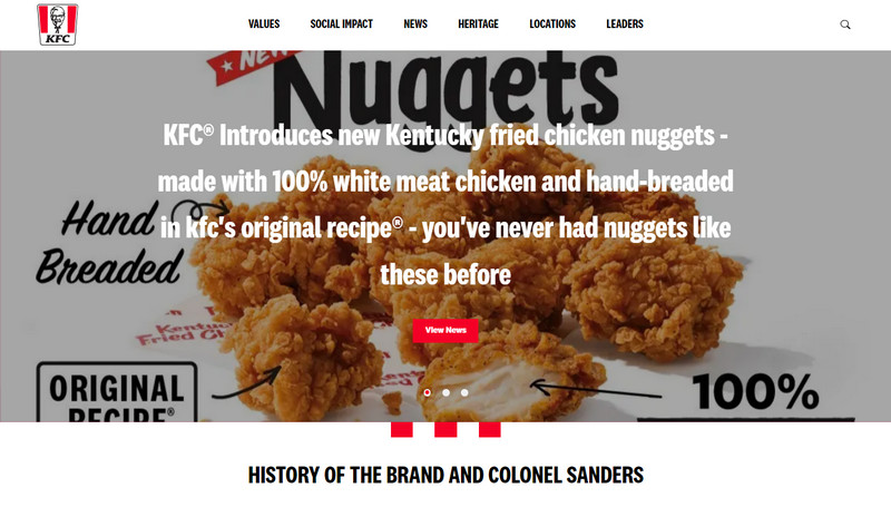

Finger-Lickin’ Good – KFC’s homepage features a large hero image of a bucket of chicken nuggets, with the red logo in the top left corner. The hero image is surrounded by a white background and black text, creating a bold, eye-catching, and yummy effect.
→ Create an effective hero section: Hero Section Design: What You Must Know Before Creating (+ Examples)
Scrolling down, you’ll notice that the buttons are set to red with white text to a high contrast = and make them easy to see and recognize.

Try FREE Magezon Page Builder!
Easily create your engaging Magento pages in any style whenever you want without relying on developers or designers. Just by drag & drop.
6. Heinz
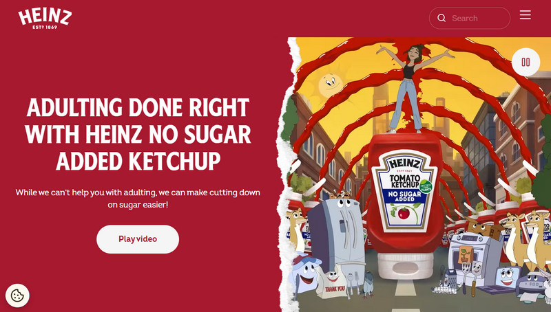

Let’s explore a topic we have yet to delve into – the relationship between red and food flavor. Color theorists suggest that red stimulates our appetite, making us feel hungrier when we see it. This is why it’s a popular color choice in many restaurants.
Heinz, as a tomato ketchup brand, has implemented the vibrant red of tomatoes on their homepage to create an impressive look. By implementing red in their design, Heinz has created a visually appealing website that effectively promotes their brand.
7. Budweiser
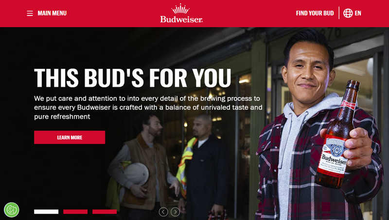

To maintain consistency with the brand identity, Budweiser has incorporated red into the design of its eCommerce website. This color is used on the navigation bar and CTA buttons, associated with Budweiser’s passion, energy, and excitement slogan. Budweiser has also carefully selected font colors to contrast with the red-white background and enhances the website’s readability and usability.
8. KitKat
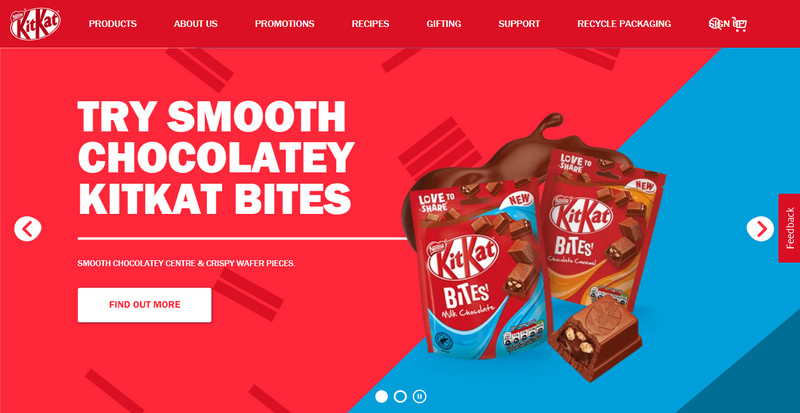

Kikat’s website employs a primary color scheme of red and brown, associated with its iconic packaging. The website creates a strong visual connection with the product and reinforces the brand image. The high contrast between red, blue, and brown also highlights the product packaging, helps it stand out, and catches the customer’s attention.
9. Nintendo
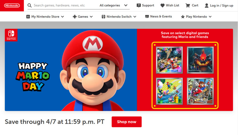

The website predominantly features red and white colors strategically placed on the page. They are used to draw attention to crucial messages and calls to action. It’s a brilliant design choice that ensures the user will notice the critical information.
10. Vodafone
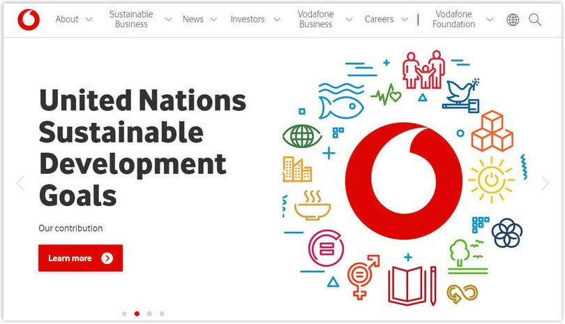

Vodafone, a sustainable company, has taken a page from Nintendo’s book by adopting a minimalistic approach with black and white as the primary colors. A few strategically placed red elements draw the user’s attention. The most prominent elements are the big logo and CTA buttons in bold red that stands out against the white background.
Incorporating a limited color palette has become a popular design trend in recent years. By reducing the number of colors on a website, designers can create a clean look, making it easier for users to navigate and engage with the content.
11. Chick-fil-a
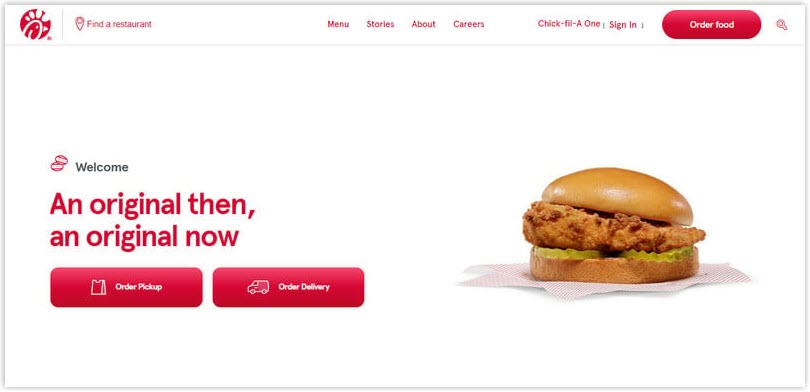

Chick-fil-a’s website logically uses red to create an inviting and cheerful atmosphere. Visitors are immediately drawn to the website’s hero image, which prominently displays a delicious-looking sandwich on a white background. The “Order Pickup” button in red provides visitors with an easy and quick way to navigate the ordering page.
12. Aprilia
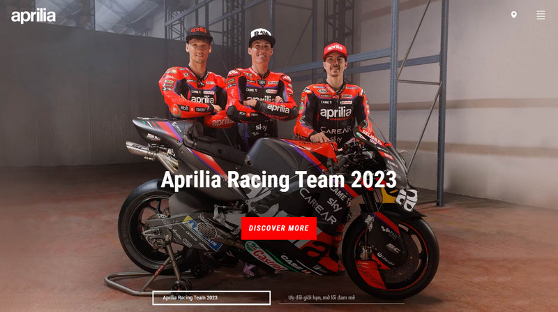

A motor brand — Aprilia, has chosen a bright red hue as its signature color to embody strength, speed, power, and intensity as a motor brand. It’s a fitting choice. Aprilia’s use of red is eye-catching and symbolic of the brand’s values.
13. Lay’s
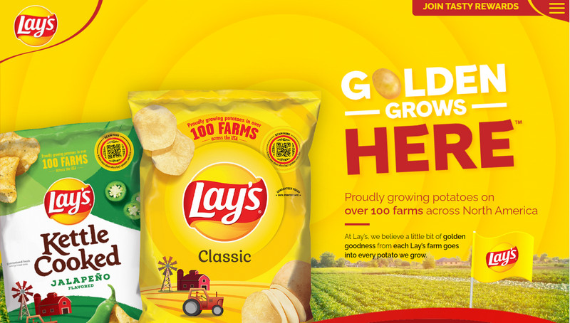

Lay’s website employs a captivating and visually appealing color scheme for its visitors, with the red accents dominating the website header and footer design and the hero image featuring yellow. This clever use of colors creates a lively and energetic ambiance that stimulates appetite. The contrast between the colors also generates a sleek and modern appearance and helps draw attention to the products’ vibrant colors and bold packaging
14. Wendy’s
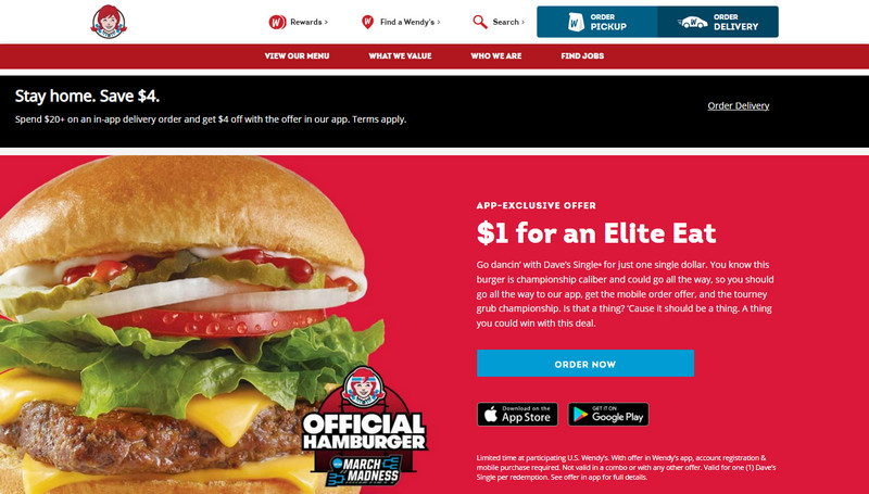

Wendy’s, the beloved American diner, understands the psychology of color and its effect on the human appetite and incorporates a generous amount of red into its website’s color scheme. Customers are stimulated while browsing through the crimson-colored backdrop with a giant hamburger as they select their favorite burgers and breakfast items.
The strategic use of red in Wendy’s website design is no accident. Studies have shown that color profoundly impacts our brains, triggering hunger and increasing our desire for food.

Try FREE Magezon Page Builder!
Easily create your engaging Magento pages in any style whenever you want without relying on developers or designers. Just by drag & drop.
15. Avis
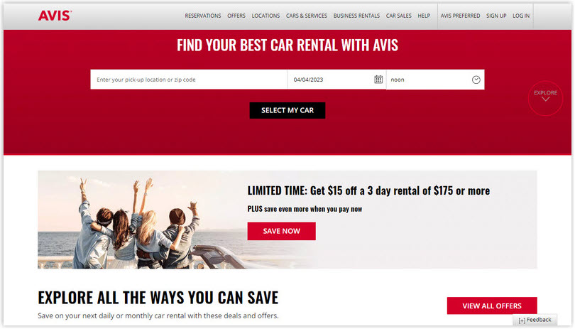

Upon visiting Avis’s website, the first thing that stands out is the dominant use of red. The red color scheme is consistent across various website elements, such as the navigation bar, call-to-action buttons, and promotional banners. This creates a cohesive look and feels throughout the site.
In addition to red, the website uses complementary colors like white and black for the body and gray for the footer. These neutral colors used for text and other page elements create a good contrast against the bright red background.
→ You might like: 33 Unique Website Footer Examples and Why They Work
16. Colgate’s
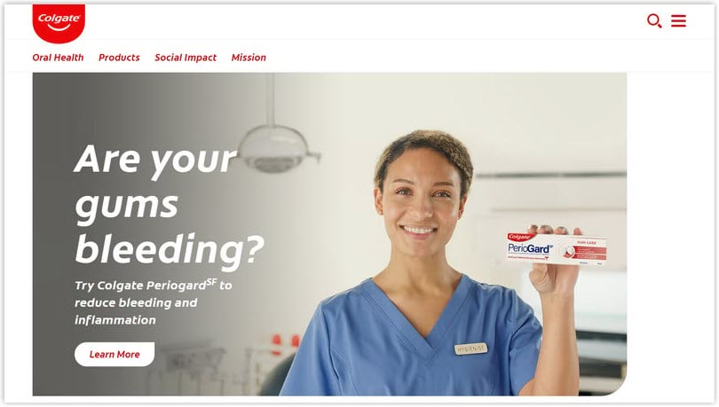

As soon as the page loads, visitors are greeted with a large banner that features a smiling dentist introducing Colgate. The white background helps create an impression of cleanliness and hygiene, while the red text and accents add a sense of trust and reliability.
17. Texaco
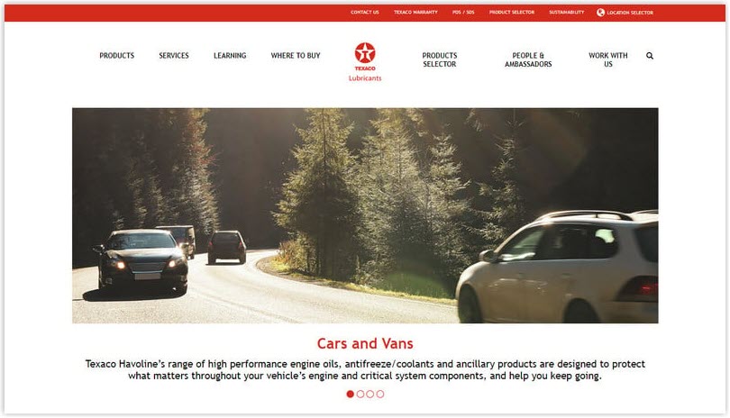

Texaco Lubricants’ homepage features a sleek design that captures the essence of the automotive industry. The top section of the page features a bold and eye-catching red navigation bar, which serves as an excellent starting point for users to explore the website. Under that, a prominent red star logo provides a striking contrast against the white background, drawing the user’s attention to the brand.
18. Exxon
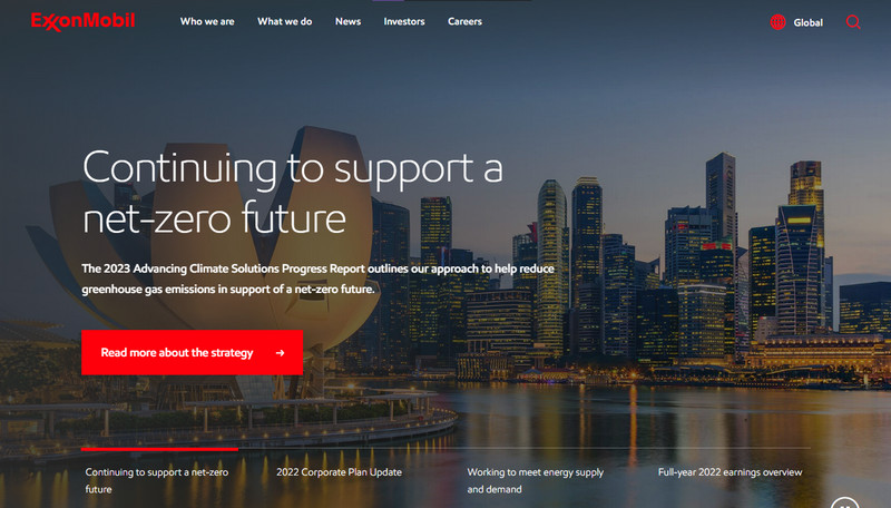

ExxonMobil employs a captivating blend of full-screen photography and the color red on its website. The design is visually striking and intriguing as you navigate through it.
The website’s key message is displayed in white, creating a contrast between the text and the background. When you hover over the titles, they change to the company’s signature red color, adding excitement and dynamism to the browsing experience.
19. Kellogg’s
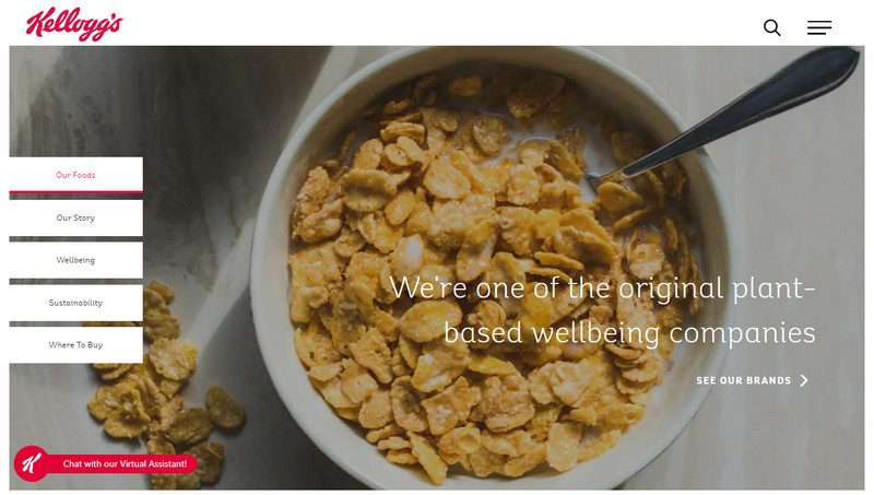

Kellogg’s uses a red underline for clicked menus on the left to provide users with a clear indication of their current location. This approach to color is straightforward and avoids unnecessary clutter in the website design.
20. Topo Designs
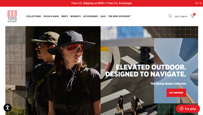

Topo Designs’ website boasts many colors. Red, the primary accent color of the site, is used judiciously to highlight crucial elements like buttons and links. The color contrasts sharply against the muted background and adds visual interest to the page.
The Bottom Line
These 20 best red websites’ color schemes demonstrate the power of color in creating a memorable and impactful online presence. As you can see, a careful combination can evoke emotions, set the tone, and ultimately influence user behavior.
Now, if you don’t know which Magento extension to easily build your red eCommerce website and gain more sales, consider Page Builder from Magezon. As a trusted Adobe partner, we have satisfied thousands of customers with a vast collection of drag-and-drop extensions, helping you create a high-converting and unique store in minutes.
Don’t take my words for granted, see how your website can be with Magezon Page Builder and what others say about us:


