 Magezon Blog Help Merchants Build Comprehensive eCommerce Websites

The eCommerce checkout page is one of the most important stages of your online store’s customer journey. A shopper might go through all the steps before checkout, but without careful design, they won’t convert. To get the most out of your visitors, you need to make sure the process runs smoothly. In today’s article, we’ll discuss the basics, best practices for designing, and some great examples of checkout page designs for desktop and mobile.
Let’s dig into it to see how you can design a checkout page that benefits your business.
Table of contents
What Is an eCommerce Checkout Page?
An e-commerce checkout page is where customers conclude a transaction. In general, on this page, what you sell, to who, and where will decide which essential details customers will need to fill up, such as the necessary information for delivery and contact details for invoicing.
If your shop is B2C selling digital downloads, buyers’ names and email addresses will be enough. However, if you sell to businesses, the company name and tax ID information might need to be filled up. When selling physical products, you’ll need to ask for the shipping address.
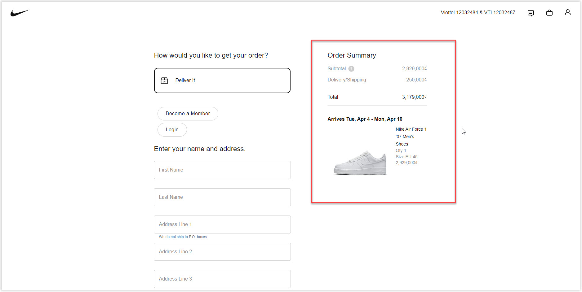
There are three main elements you should display on your eCommerce checkout page: name of the product(s) customers are going to order, cost belonging to an order including shipping fee and VAT, and picture(s) of your product(s). Since cart abandonment happens quite often with online stores, it’s necessary to have a simple and user-friendly checkout page design to encourage them to take purchasing action.
One-Page Checkout and Multiple-Page Checkout
There are two types of checkout pages: One-page and Multiple-page. As their names imply, the former is a single-page solution, whereas the latter is a step-by-step process.
Online retailers tend to use one-page checkout more as it’s said to be faster and more user-friendly. However, various case studies show that conversion-optimized multi-page checkouts can work equally effectively. Both options have their advantages and disadvantages.
One-Page Checkout
1. Pros
- Faster process: single-page and multi-page checkout requires quite the same number of form fields for customers to fill up. However, since all information is displayed on the same page, shoppers don’t need to wait for multiple pages to load; thus, they spend less time completing the checkout.
- Psychological booster: One-page checkout has a psychological advantage because customers can know exactly where they are in the process and how many more steps they need to take to complete the purchase. It motivates them to finish what they’ve started.
- Needless navigation: It doesn’t require navigation between pages to help users change or edit their information, as they can find all fields on the same page. Shoppers don’t need to return to the browser and re-enter the exact details, thus decreasing the risk of dropping off.
2. Cons
- Difficult to design: The designing process can become a nightmare if too many form fields are crammed into one page. It makes the layout cluttered and off-putting and causes shopping cart abandonment. However, this is not a big problem because you can absolutely arrange them in columns or use drop-downs to save space and make it easy to follow.
- Not suitable to collect data: No one can guarantee customers will not get bored and abandon their shopping carts. In this case, if it happens, you can only understand the reason if you use a session recording tool. Plus, all information filled up will disappear.
Multiple-Page Checkout
1. Pros
- Simpler to design: Spreading forms and fields across pages makes it easier to create a minimalist website design for your e-commerce, thus, giving an impression of a simple and fast checkout process.
- Easier to collect data: The checkout process is split into multiple steps, so you can capture all the filled-up data before the customers (if, in case) drop off the cart. For example, if they leave an email and abandon it later, the information is recorded, and you can use it to follow up with an abandoned cart email.
- Ideal for analyzing sales funnel: Since the checkout process includes several pages, you can use web analytic tools to examine where the process is stopped and make corresponding changes.
2. Cons
- Potential disheartening process: Customers can become disheartened when they see four more steps to finish on the checkout progress bar. As it’s too long and tedious, there will be a higher chance of abandonment.
- Bothering and annoying navigation: If shoppers want to edit or review the information they’ve entered, they must go back and forth between different pages. This time-consuming procedure can frustrate them and cause them to abandon their purchases.
Main Reasons Customers Abandon Checkout?
Checkout abandonment is when a customer leaves the checkout process after starting the payment, and it’s one of the factors leading to conversion loss. According to many studies, around 70% of checkouts are abandoned.
Before improving your eCommerce checkout page, you should understand the root reason for the abandonment:
- Unexpected costs and fees: When unexpected costs are added to the order summary, shoppers will have to reassess the value of the purchase. This added fee can also be the reason to make them change their mind.
- Complex checkout process: A fast and simple process is important for your e-business. When the checkout requires too much information to fill up and is difficult to follow, it will result in abandonment.
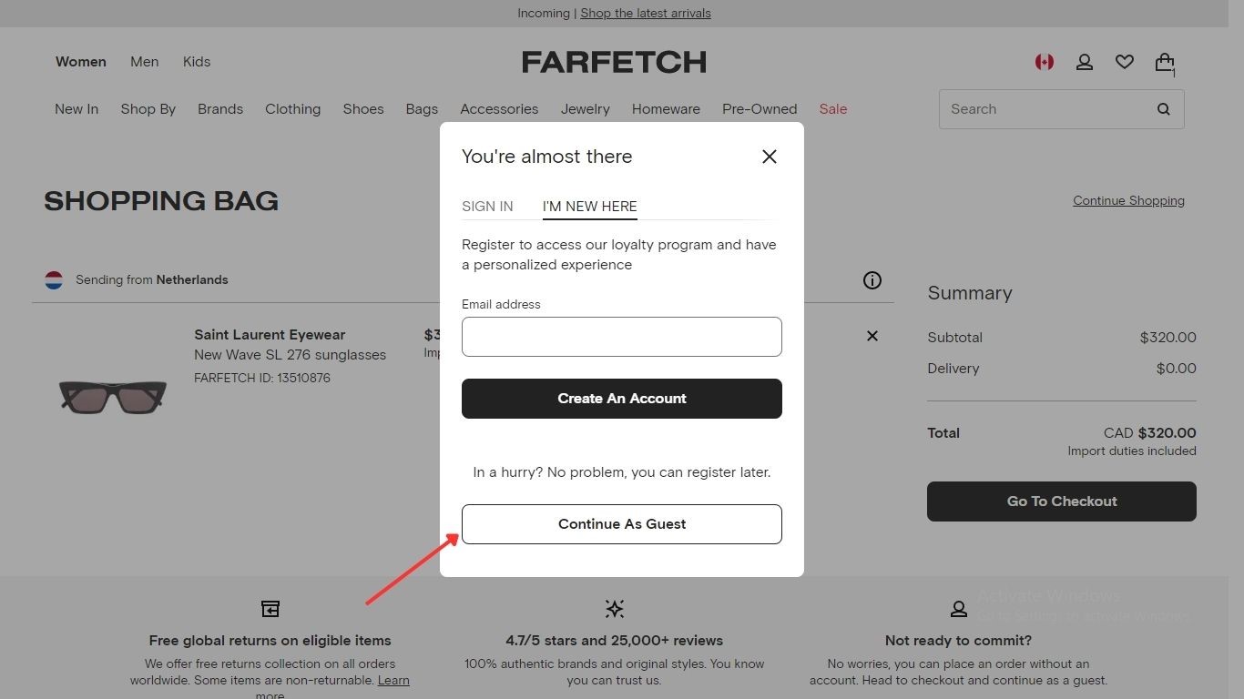
- Compulsory account register: Forcing users to create an account is not a smart move. Instead of hindering checkout, you should offer the options for guests, which will help you eliminate the risk of abandonment.

Try FREE Magento Page Builder!
Easily create any engaging and high-converting web pages in any style you want without relying on developers or designers just by drag & drop.
23 Best Practices for an Effective Checkout Page
1. Offer Guest Checkout Option
It would be best never to make the account register compulsory in your customers’ checkout. Just encouraging them to provide their emails is enough.
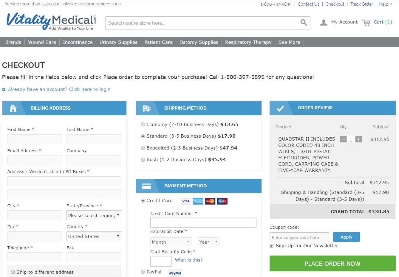
2. Provide Many Payment Methods
One of the old but gold eCommerce checkout page’s best practices is to offer shoppers many payment options. The more options you have, the more potential buyers will complete the purchase. Besides, starting with major providers allows most customers to proceed.
3. Focus on Mobile Design
Research shows that mobile checkout accounts for over half of all e-commerce payments. That’s why online businesses should prioritize mobile-friendly checkout UX design and make it uniform across all devices.
4. Place Trust Signals and Badges in Prominent Place
Trust signals, badgers, and seals give users peace of mind and increase your brand’s reputation. If you can guarantee customers that their personal and financial details are secured, they will confidently complete the purchase.
5. Apply Refine and Simplify Rules
Your checkout UX design doesn’t need to be complicated, or it can frustrate people. It should be clear, convenient, and accessible. Remember to remove unnecessary steps, and form fields, and streamline the procedure to guarantee a fast and efficient experience.
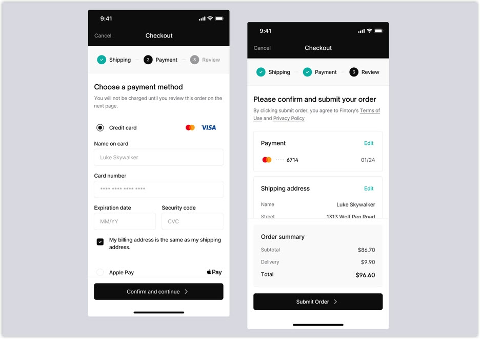
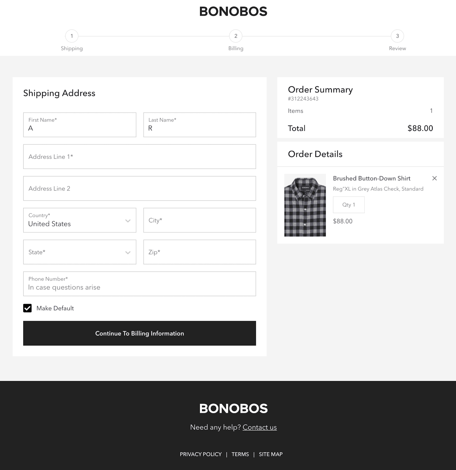
6. Apply a Progress Indicator
A progress indicator, a simple checkout instruction, shows a general picture of the total steps and indicates to shoppers where they are and how many steps are left. This tool is helpful for both types of eCommerce checkout pages, especially the multi-step and more complex checkout processes.
7. Eliminate Distracting Factors
Any unneeded distractions in your eCommerce checkout page may bother your customers and pull them away from completing the purchase. The general rule is to keep the process clean and clear. Think about removing the header and footer, menu options, and unnecessary buttons to keep customers staying on-site and focused till the end of the conversion funnel.
8. Include a Summary of Section
Creating a summary section or separate summary page is necessary when your customers add many items to purchase at once. It’s also a good method to decrease the abandonment rate.
Try FREE Magento Page Builder!
Easily create any engaging and high-converting web pages in any style you want without relying on developers or designers just by drag & drop.
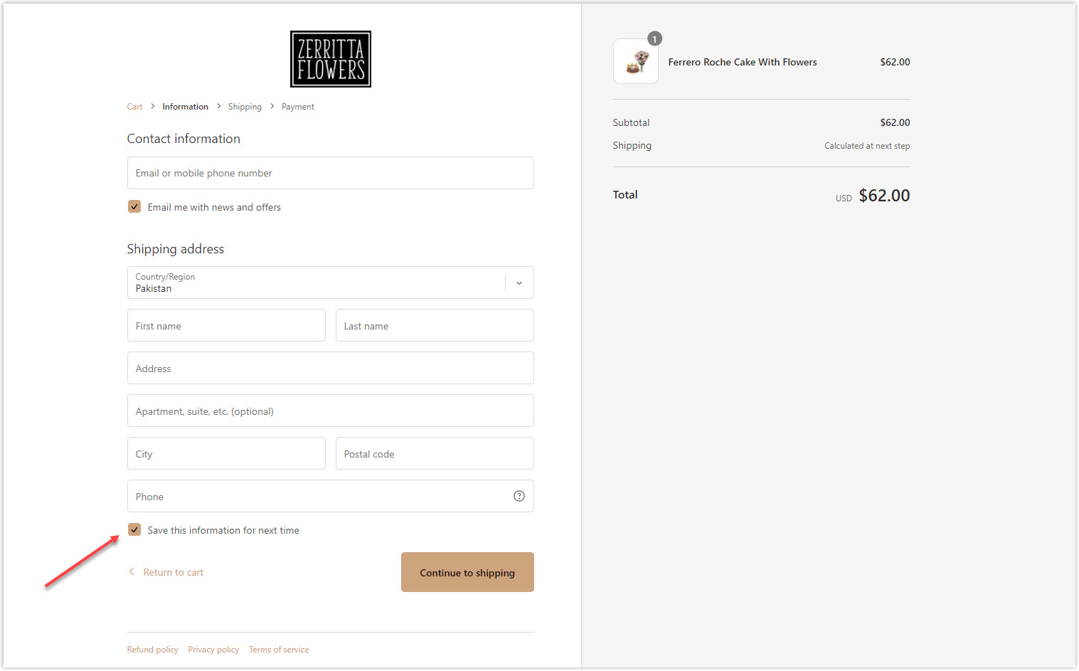
9. Allow Guests to Save Details for Later Use
Providing an option to save customers’ details for next time will give you a high score because nobody wants to fill in the same information over and over.
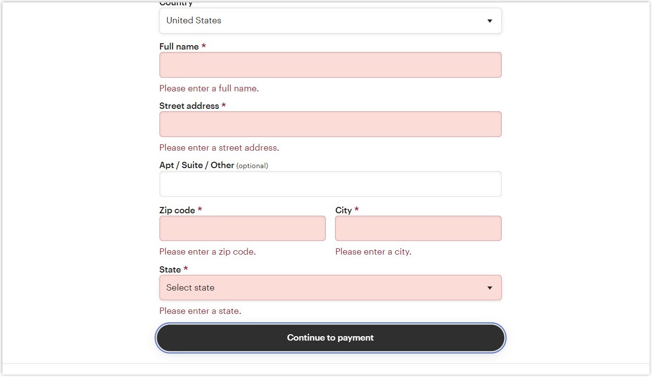
10. Notify Invalid Data and Input Error
Data validation and error notification help limit errors during fulfillment and receive more accurate customer information. This feature also guides shoppers to fill in the correct data for their purchase.
11. Give an Explanation for the Field Labels Neatly
It’s not rare when a customer doesn’t understand the form field labels and needs some explanation. You can offer help by showing a question mark ‘?’, using a mouseover effect, or displaying only one click to show the detail of what’s being asked. Those are also good ways to keep your webpage design neat, modern, and minimal.
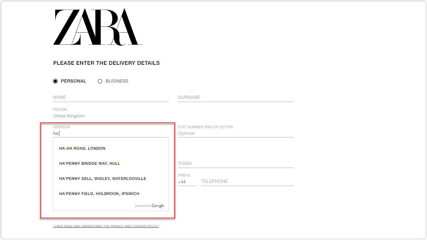
12. Autocomplete the Shipping and Billing Address
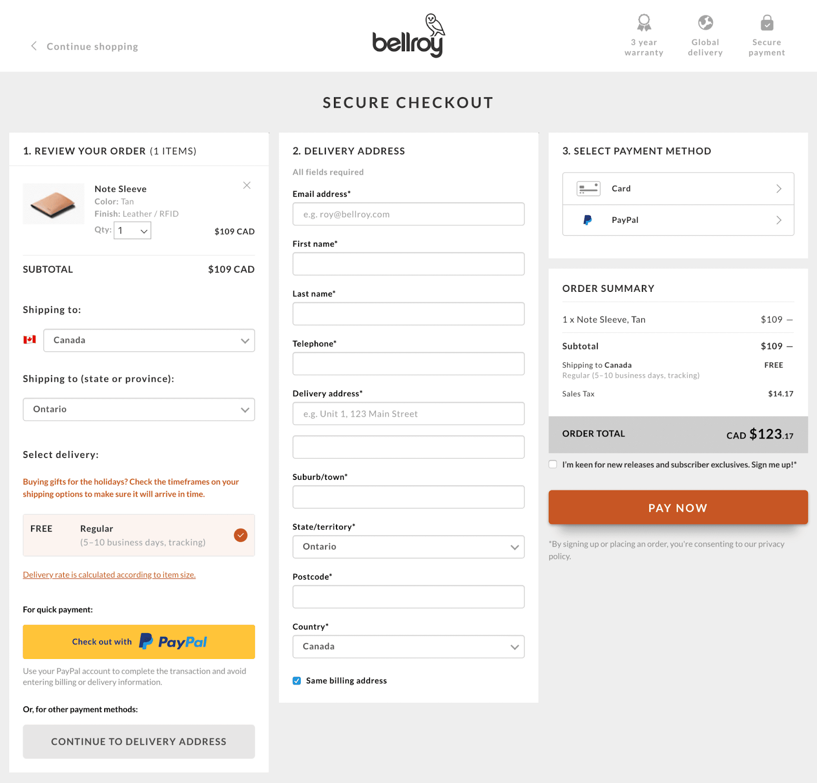
The longer customers stay on an e-commerce checkout page, the higher chance they will rethink buying a product. Google autocomplete works perfectly to speed up the process. Information on shipping and billing addresses will be automatically filled when customers start typing to save time by 20% and limit errors.
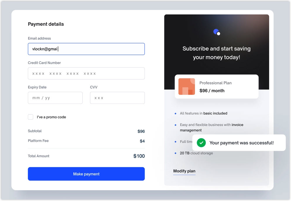
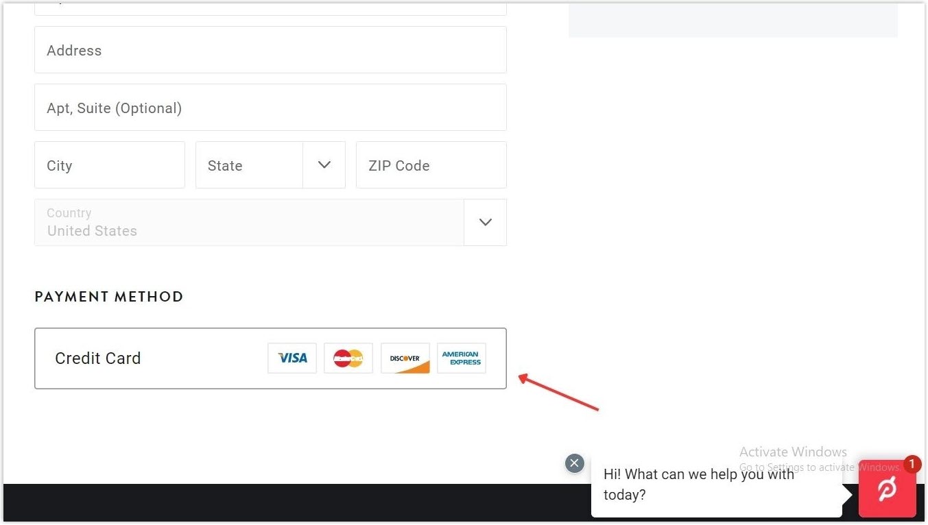
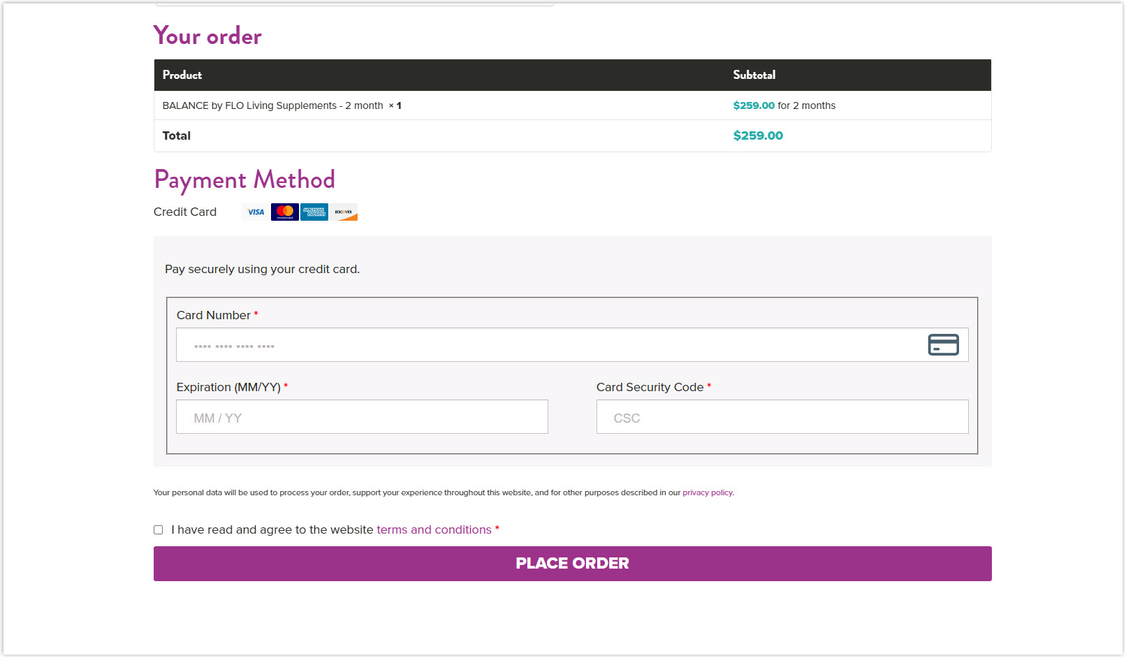
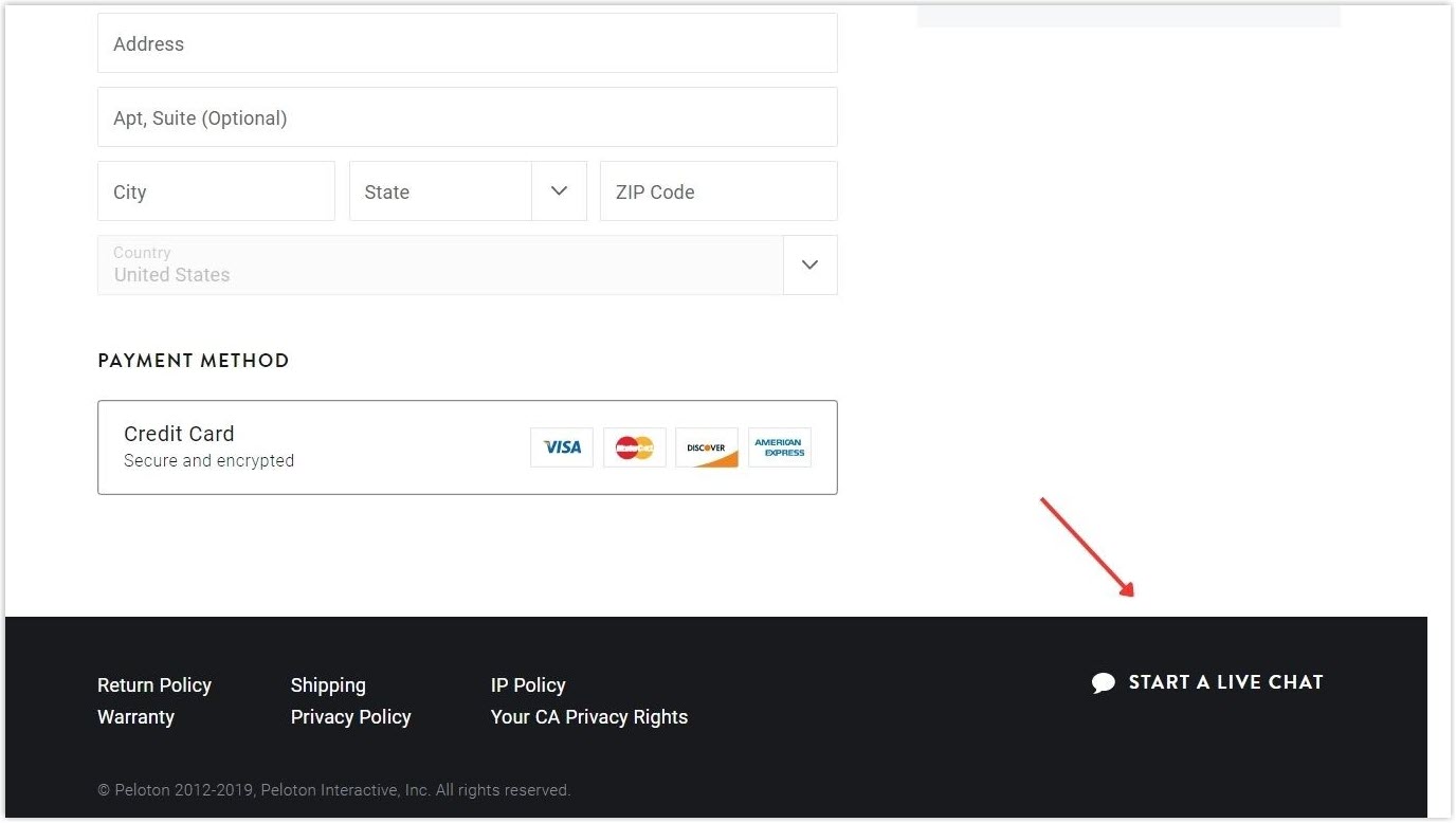
13. Place the Security Icons Close to Credit Card Fields
Users usually raise concerns about security when entering their credit card information. You can clear their doubts by placing the security icons close to the credit card section.
Also highlight the payment section on your checkout page.
14. Consider a One-page Checkout
Although single-page checkout has some disadvantages, it is still an ideal solution to make the process frictionless. All included in one page reduces steps, takes less time to complete, and is easier to follow. In general, it decreases checkout abandonment.
15. Ensure No Unexpected Costs Appear
It’s not a good idea to surprise your customers with additional charges to cause them to re-evaluate the purchase and hesitate to proceed. Information such as taxes, shipping fees, and other added costs should be displayed upfront so shoppers will understand how much they must pay before checkout.
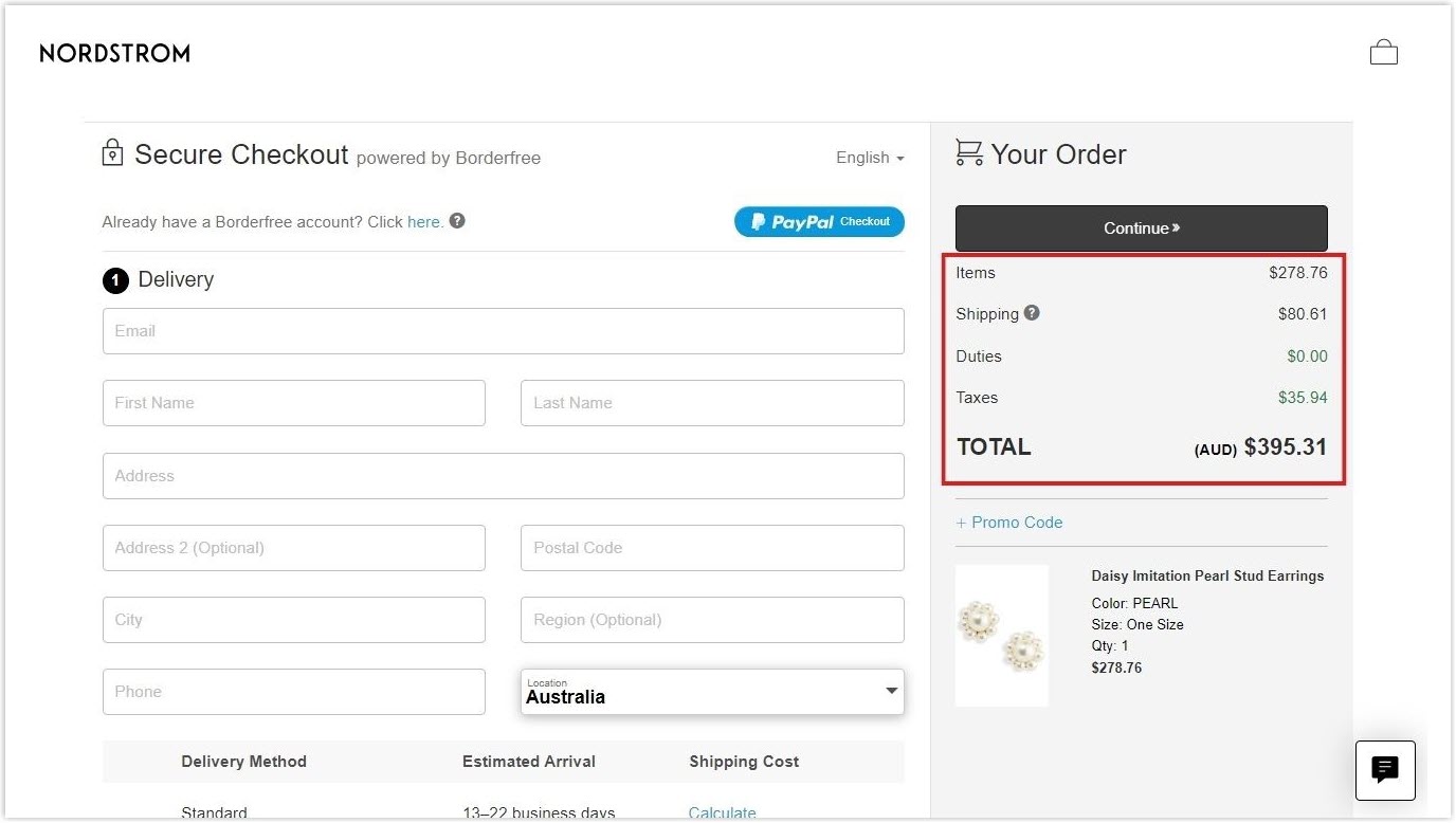
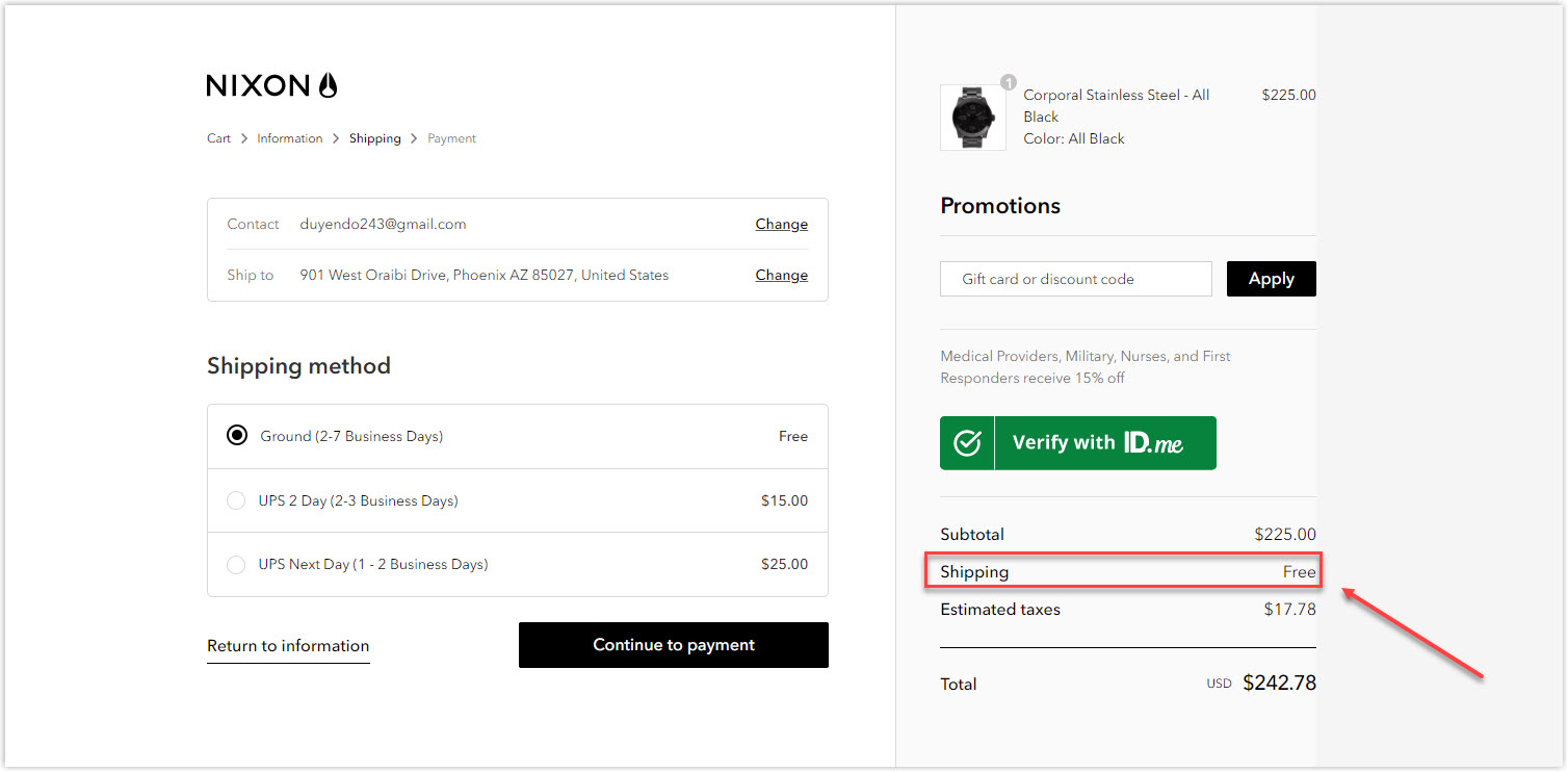
16. Provide Free or Cheap Shipping Fee
Due to the rise of Amazon Prime, free shipping has become a ‘default.’ Charging too much for delivery is one of the culprits of cart abandonment. Therefore, you should try to remove it entirely if possible. Besides, again, make additional costs transparent upfront to avoid surprising your customers.
17. Make Customer Support Available
You can try to identify common areas where customers usually have issues while proceeding with payment and offer a connection with support. Apply resources suitable for your business and customers’ demand, such as FAQs, live chat, a chatbot on user inactivity, or a call center. This support is valuable to clear the issues and keep shoppers on the buying track.
18. Understand the Reasons for Abandoned Checkout
To optimize checkout, you should assess exit intent by collecting feedback on why customers leave the process. You can apply the exit-intent popups, follow-up emails, etc., to understand the reasons and improve the eCommerce checkout page accordingly.
19. Make the Discount Code Field Less Prominent
It’s shown that nine over ten people use discount codes for their purchases. But when they come to the checkout page, offering a discount field will make them quit the page to find one.
Putting the field behind a drop-down is worth considering as it lets users with promotion codes apply it but does not create an off-putting issue for those who want to purchase without a coupon.

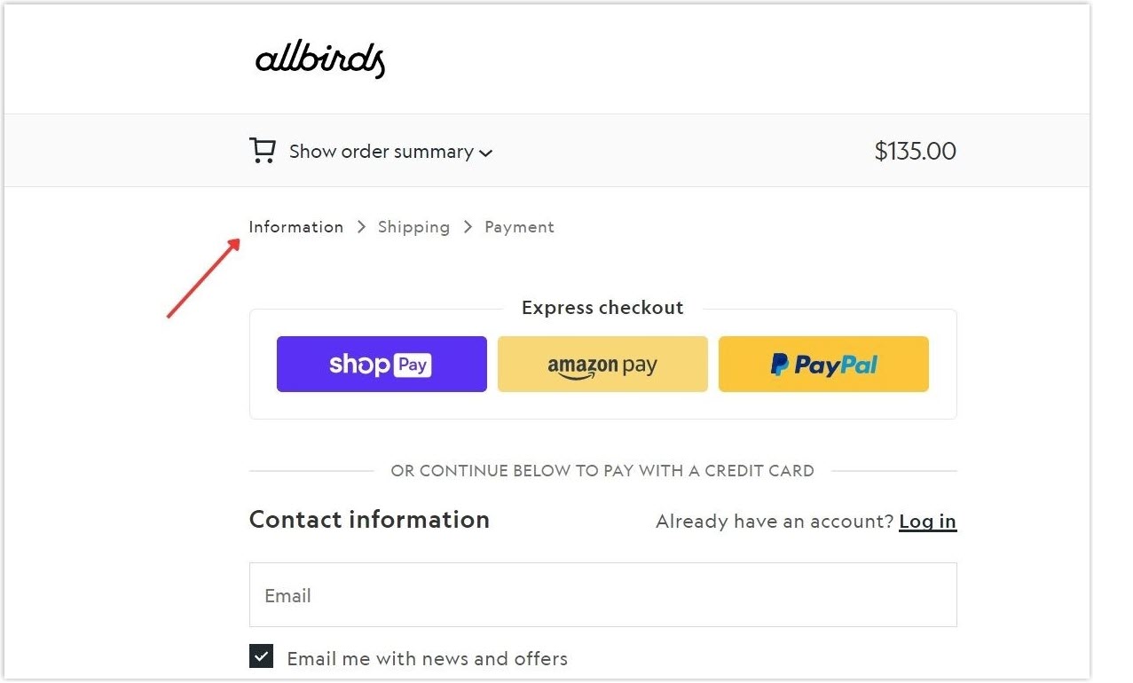
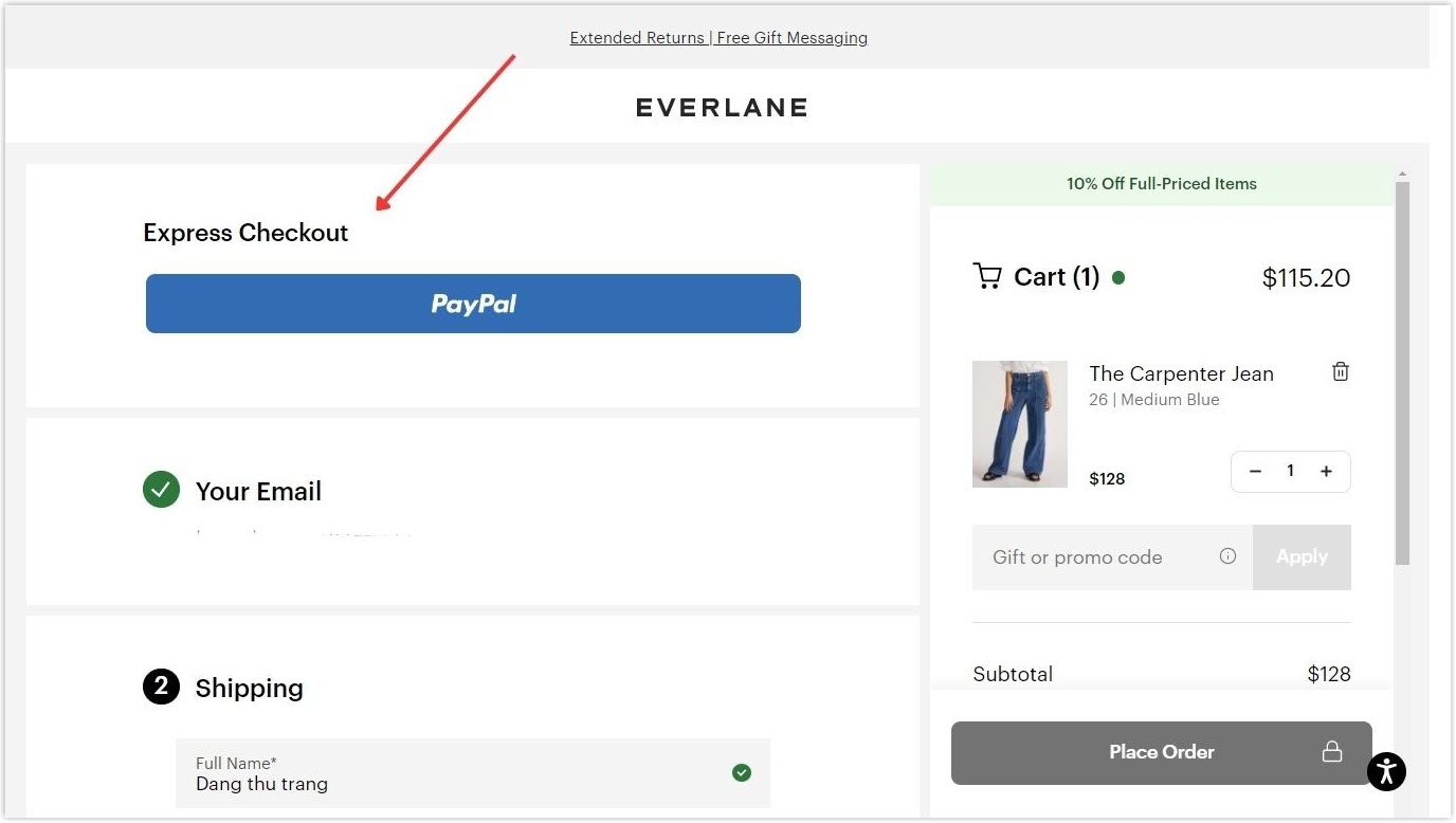
20. Enable Checkout Buttons
A great way to make the process ultra-fast, easy and efficient is by using the checkout buttons. Though customers must be members with existing information, they can save time and effort on every purchase they make.
21. Allow the Progress and Cart Content to be Saved
If your customers decide to leave, remember to offer them the option to save the progress and cart contents. It’s even better if you apply the auto-save feature so the item lists are recorded, and customers can easily resume where they’ve left off and recover the payment process.
22. Try to Recover the Checkout
Some eCommerce checkout page best practices are those that go beyond the checkout page itself. Recovering the abandoned checkout can decrease its influence on your business and regain the lost revenue. You can send the recovery email to remind customers what they’ve dropped off and guide them to return easily to continue their process.
23. Consistently Adjust and Improve
Checkout page design is not a one-time-and-done job, but it requires an endless cycle of testing, measuring, and adjusting. Do this regularly to maintain your checkout page UX and improve customer experience.
The Bottom Lines
Optimizing your checkout page design is not easy, but it doesn’t mean it’s impossible. After understanding the pros and cons of the two types of website checkout pages, you easily choose one to focus on. Pay attention to your customers’ desires and learn from the best practices above to build your business’s best checkout page design.
Now, if you don’t know which Magento extension to easily build your minimalist eCommerce website and gain more sales, consider Page Builder from Magezon. As a trusted Adobe partner, we have satisfied thousands of customers with a vast collection of drag-and-drop extensions, helping you create a high-converting and unique store in minutes.
Don’t take my words for granted, see how your website will look like with Magezon Page Builder and what others say about us:


