Magezon Blog Help Merchants Build Comprehensive eCommerce Websites

The unsung web design hero? The footer! Sure, it may seem small and insignificant, but a great website footer design can significantly impact user experience and engagement.
This article will explain why and cover everything from must-have elements to best practices for optimizing your footer. By the end, you’ll have all the knowledge and tools you need to create a functional and visually appealing site footer that keeps your visitors engaged and returning for more. Let’s get started!
Table of contents
What Is a Website Footer?
The website footer is part of a web page at the bottom. But don’t let its position fool you because the footer is packed with essential information that enhances a website’s overall usability.
It usually includes a copyright notice, a link to the privacy policy, a sitemap, your brand’s logo, and contact information. But that’s not all – you can also find social media icons and an email sign-up form. In other words, the footer is a powerhouse of information that can significantly improve your website’s user experience and engagement.
Why Is a Website Footer Important?
The website footer may seem like an afterthought in the grand scheme of web design, but it is a crucial element that can benefit visitors and businesses.
Benefits to Website Visitors
- Easy navigation: Footers are a valuable resource for visitors to find the information they need. When reaching the bottom, they may look for more exciting content or something they couldn’t find on your header menus, such as partnership and affiliate opportunities.
- Convenient access: Footers can save visitors from the hassle of going back to the header. They can easily find your contact details, subscribe to your newsletter, follow you on social media, or explore other products.
Benefits to Website Owners
- Reduced bounce rate: By leading visitors to other useful links, footers can reduce the bounce rate and increase visitors’ time on your site.
- Increased credibility: You can display your accreditation, client logos, or popular sites that feature your company to prove your competence. Meanwhile, copyright symbols and links to legal details and privacy policies can help build trust and influence potential clients to make an inquiry or purchase.
- Boosted social media conversion: When new visitors arrive on your website, they may not be immediately convinced to follow you on social media. However, as they become interested in your content and notice the certifications and client logos displayed in your footer, they will feel more compelled to subscribe and likely to purchase. Remember to add a sign-up or contact form on the footer to make it easy and convenient for visitors to subscribe.
- Additional business promotion: Aside from social media accounts and sign-up forms, you can include press releases, office locations, and your latest offers, making it an excellent opportunity for business promotion.
Essential Elements of a Good Website Footer
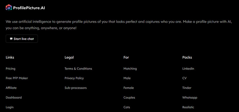
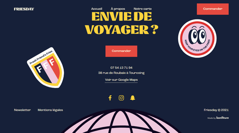
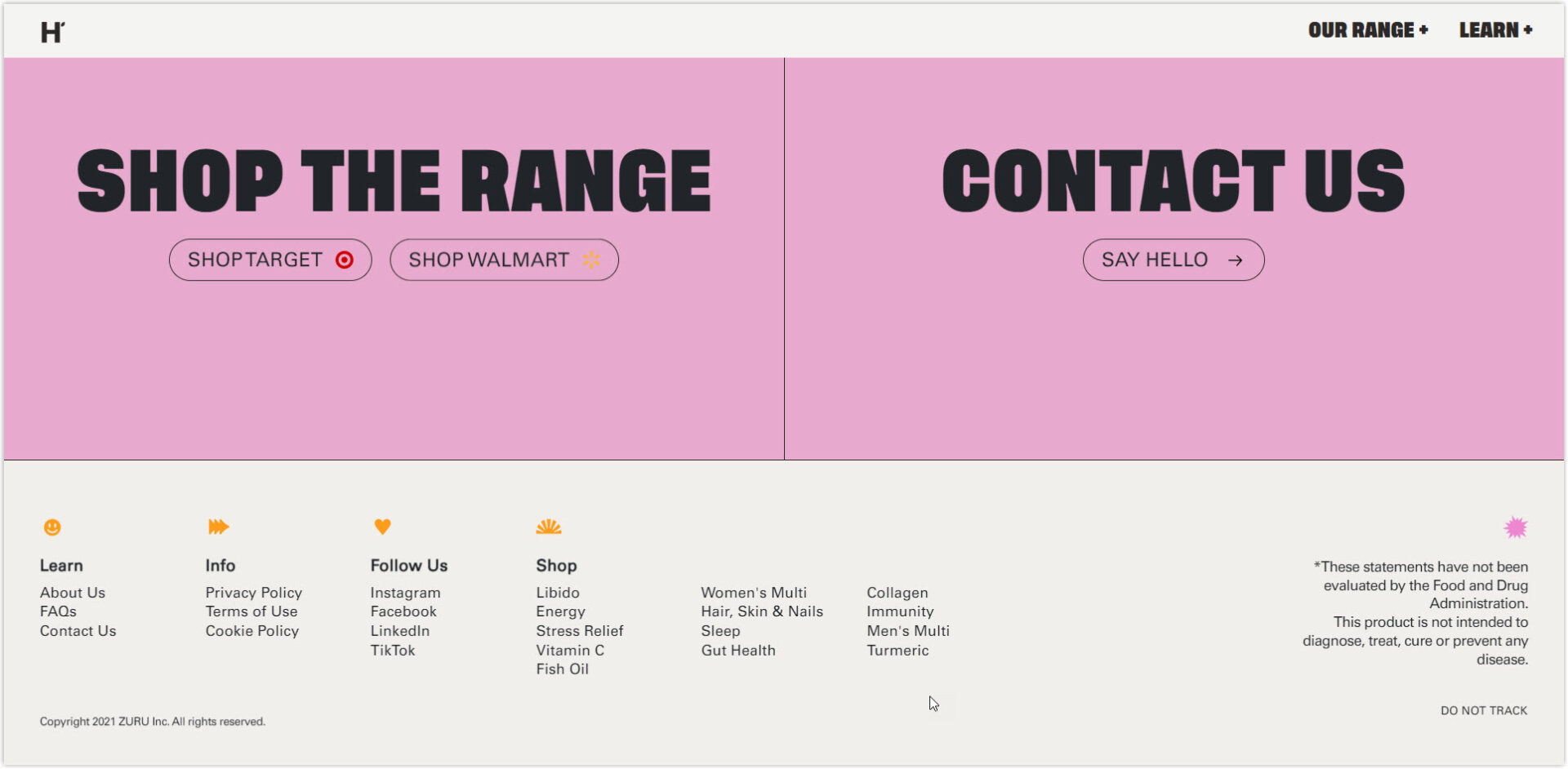
1. Logo
Rather than being an afterthought, webpage footers can be a powerful tool to reinforce your brand identity and leave a memorable final impression. Consider incorporating your logo uniquely by increasing the font size, adding an image, or including your mission statement or brand values.
Check out how ProfilePicture.AI uses its website footer design to convey its mission statement creatively. This can help visitors instantly understand the company’s purpose and offerings, even if they have not explored the website in depth.
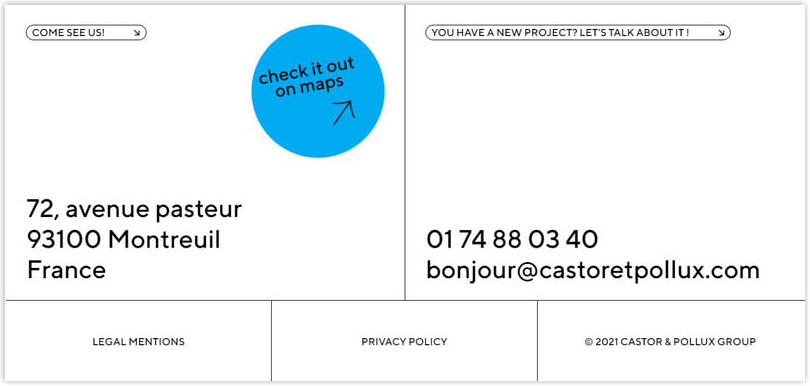
2. Contact Details
When turning visitors into potential leads, making it easy for them to contact you is crucial. That’s why website footer design often contains essential contact information like a business email, phone number, or mailing address. And, if you want to take it one step further, you can include a link to a contact form and optimize it to help potential leads to reach you easily.
In the webpage footer of Groupe Castor & Pollux, you’ll find a section dedicated to its contact information, an address, phone number, and email address.
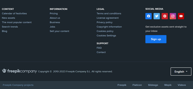
3. Copyright
The copyright notice is a critical element of a website footer design. It tells people that your website’s content is protected by copyright law and that you own it. This aims to prevent others from copying or stealing the content.
All you need is the copyright symbol © (or the words “Copyright” or “Copr.”), the year of publication or update, and the name of the copyright owner. Although it must only be on the homepage, it can appear on many pages.
Here’s an example from the Freepik homepage:
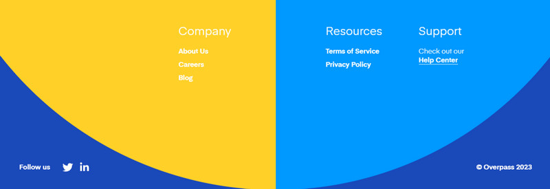
4. Privacy Policy Link
If you’re asking users for personal information, like their payment details, then Privacy Policy agreements are required by law. Ensure your Privacy Policy adheres to legal guidelines and is easily accessible on your website, preferably through a footer link.
You can get a cue as an example from Overpass:

Design Magento Header & Footer for FREE
Create or optimize a high-converting footer on your Magento website in minutes without the need for coding. Everything, simply drag and drop.
5. Website Map
Adding a sitemap to your webpage footer can be done in two ways: including multiple links to different pages or adding a single link to your XML sitemap.
The first approach is called an HTML footer, which includes links that don’t fit into the primary navigation bars or that encourage visitors to explore the site.
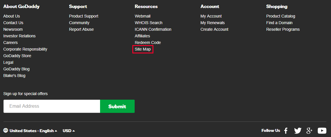
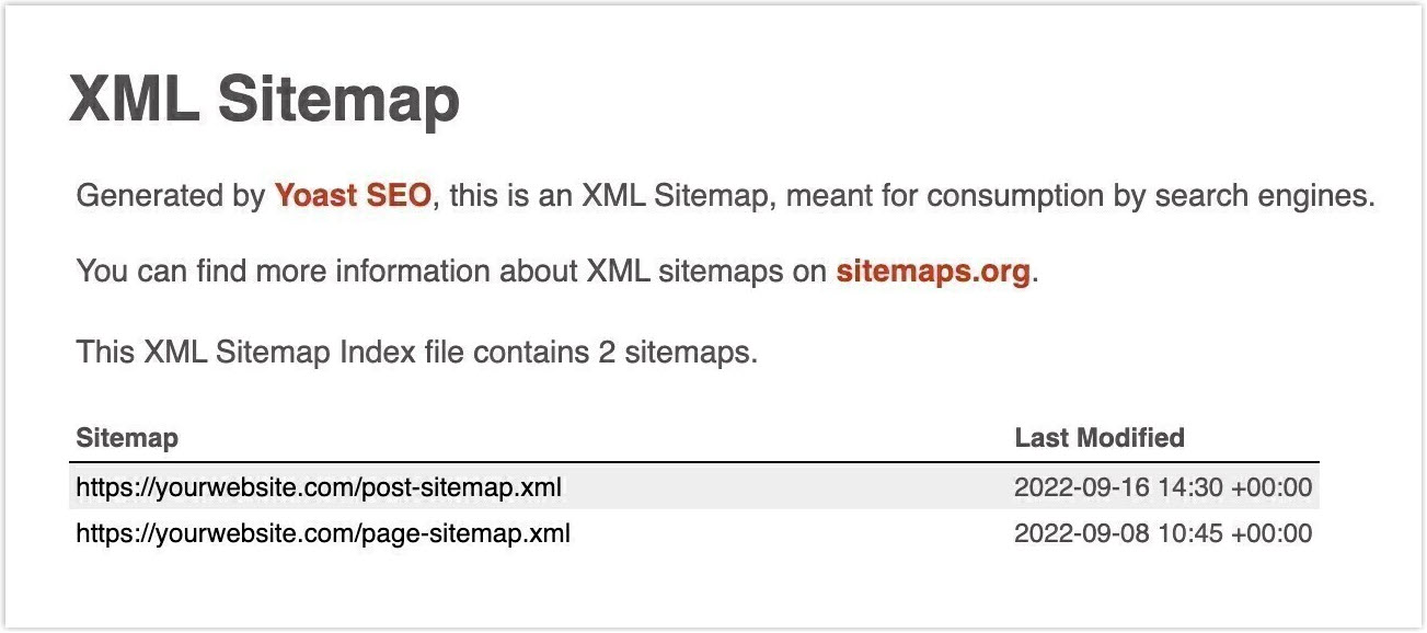
The second approach is providing the search engine bots a link to your XML sitemap. It is a file that contains essential URLs and information about your website’s pages and media files that search engine bots use to crawl and evaluate your SEO score.
Below is an XML sitemap created by WordPress’s Yoast SEO Plugin:
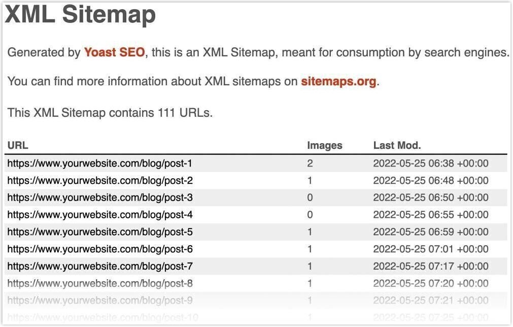
If you click on one of the links, there’ll be a list of URLs:
→ Elevate your footer website design game with 33 Unique Website Footer Examples and Why They Work!
6. Form for Email Subscription
If you’ve scrolled to the bottom of a website’ page, you’re probably someone who’d be interested in signing up for more. That’s why many websites include an email sign-up form in their footer – an easy way to grow their subscriber list and keep their biggest fans in the loop!
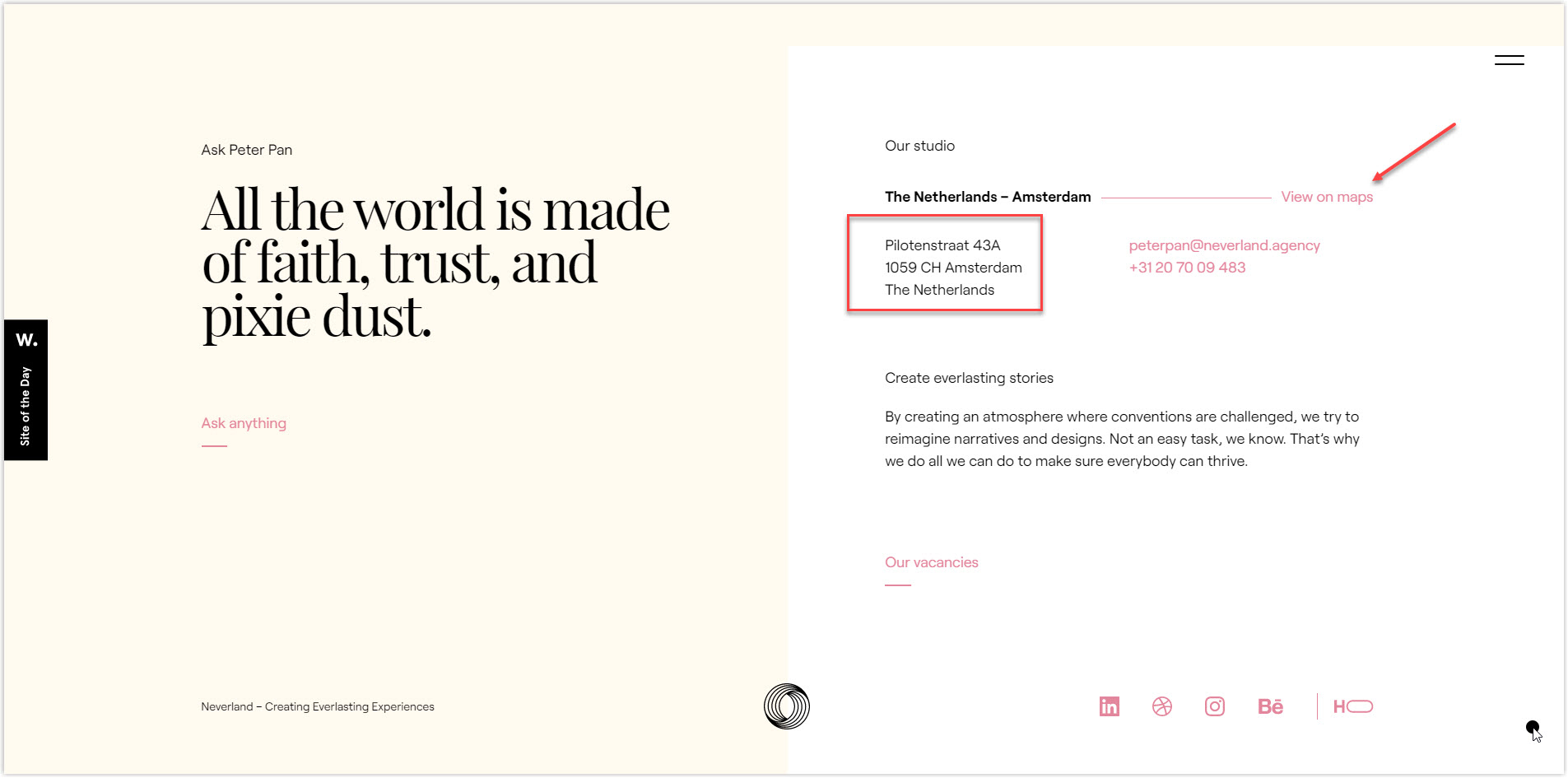
7. Location or Maps Information
Did you know that adding your physical location and hours of operation to your website footer can boost your local search results? By including a map or address, you’re proving to Google that your business is legitimate and making it easier for potential customers to find you.
This is especially important if you have a brick-and-mortar store or office that people can visit. Plus, listing your information in the same format as your Google My Business profile can improve your chances of appearing in search results and on Google Maps.
For example, Neverland Agency has made it easy for their clients by including their office address and a link to Google Maps on their website.
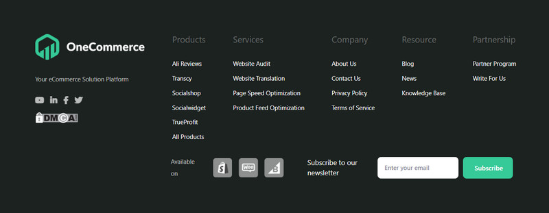
8. Important Pages Link
Your website has several crucial pages: login pages, product categories, service pages, FAQs, and contact forms. However, don’t simply duplicate your main menu in your site footer. Instead, you should prioritize the most valuable pages or focus on the content your visitors are most likely searching for.
Onecommerce is an excellent example of organizing these essential pages by dividing them into four categories: Product, Service, Resource, and Partnership.
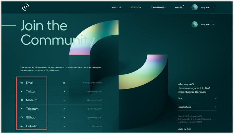
9. Social Media Profile Links
Social media is more than a fun distraction. It’s a powerful tool for businesses of all kinds. And, while you may already be sending your social media followers to your website, did you know that you can also benefit by directing website visitors to your social media accounts?
Doing so lets you engage potential customers, share interesting content and visuals, and showcase the community you’ve built around your brand. Plus, if social media is a significant source of revenue for you, this strategy is even more critical! To make it happen, consider including social media icons or even displaying images from your social feed (such as Linkedin, Instagram, and Twitter) in your footer.
Take a cue from E-Money, who put their social media icons front and center on the left side of their footer for maximum impact.
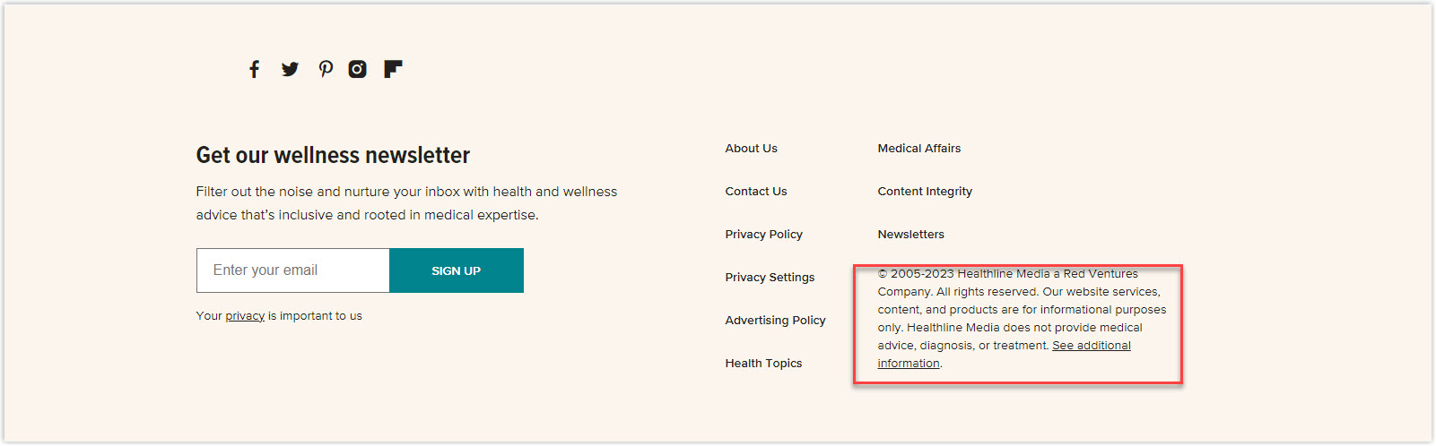
10. Legal Disclaimers
Including legal information like copyright, terms and conditions, and privacy policies on your website is important. However, if you’re in industries like real estate, CBD, or medicine, you may be required to include additional disclaimers or legal statements.
Here is an example from Healthline:
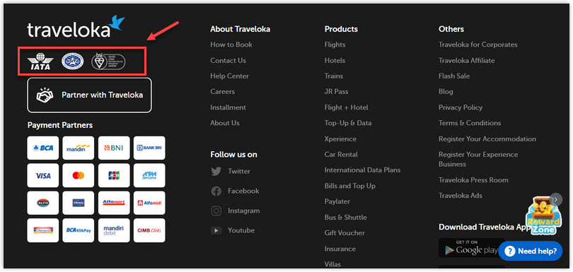
11. Testimonials or Awards
When it comes to picking a website, many users are drawn to the awards and testimonials a site has received. That’s why showcasing these accolades in the footer can be a powerful way to establish authority and build credibility.
However, be careful not to overdo it. Bombarding your visitors with too many awards and testimonials might give them the impression that you’re not a stable or mature company. Moreover, consider running usability and A/B tests with your audience to determine the appropriate testimonials for your footer.
Take a look at Traveloka example below:
Design Magento Header & Footer for FREE
Create or optimize a high-converting footer on your Magento website in minutes without the need for coding. Everything, simply drag and drop.
10 Best Practices to Design an Effective Website Footer
1. Prioritize Readability in Your Footer Design
As footer text is usually tiny and visitors tend to skim through it, creating a design that makes it easy to read is crucial. Here are some tips to ensure your footer is readable:
- Choose simple typefaces like sans serif
- Avoid using too many fonts or colors
- Take advantage of white space, and experiment with kerning and line height
- Use good color contrast to ensure visitors can comfortably read your anchor texts
And when it comes to color contrast, black text on a white background is the standard combination. However, if you want to add more colors, keep these tips in mind:
- Choose colors that complement your branding and overall website design
- Design with your target audience in mind, using gentle hues for elderly individuals, for example.
- Select colors that convey the emotion or personality you want to give to your site
- Make your calls-to-action (CTAs) stand out by using a different color, like The Guardian’s yellow buttons against a blue background
- You can also use contrast accessibility tools like Contrast, WebAIM Contrast Checker, Color Safe, Stark, and Accessibility Color Generator to generate color combinations.
2. Maintain the Footer Consistency With Your Brand
Your website is your digital identity, and it plays a crucial role in your brand image, especially for eCommerce businesses that mainly interact with customers online.
A solid and consistent branding strategy ensures that web visitors remember and associate your company with your logo, products or services, values, and a specific feeling or experience.
You have several options to explore for a website footer design that aligns with your branding. Here are a few website footer best practices:
- Choose colors that reflect your values or hues from your logo or marketing materials.
- Include your logo, mascot, or other visual elements representing your brand.
- Incorporate similar design elements, such as typography and layout, that you have used in other promotional materials.
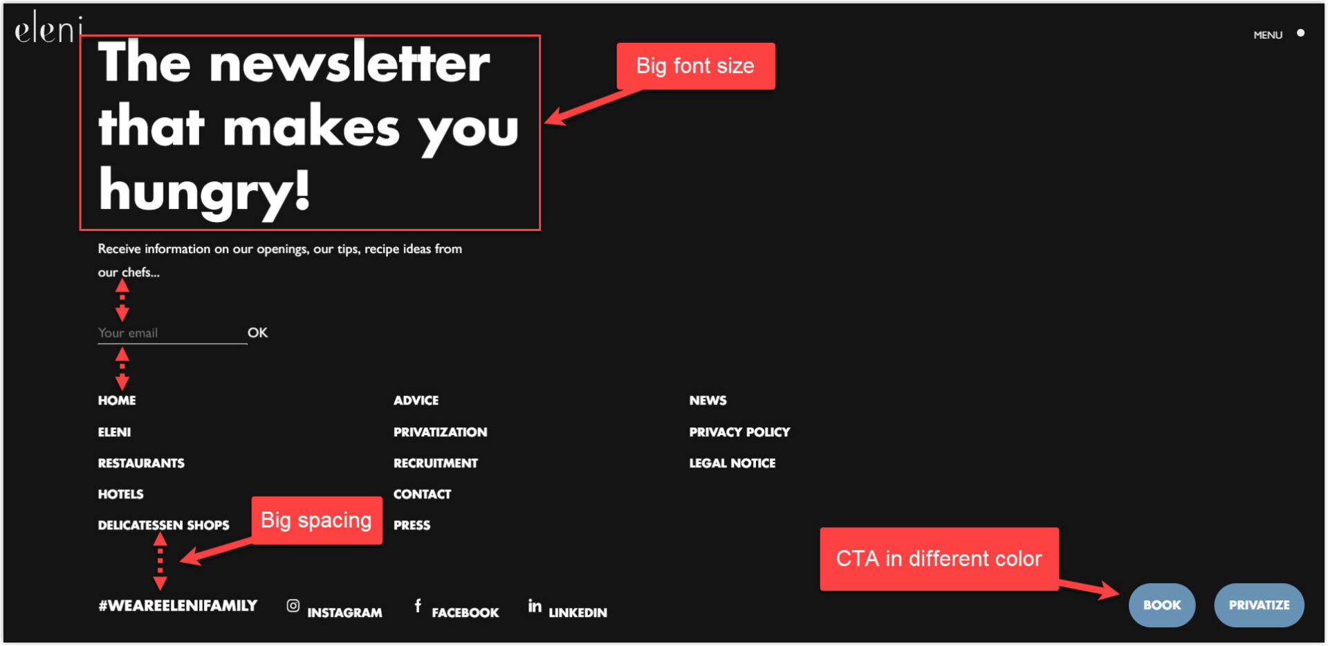
3. Keep Your Footer Organized and User-Friendly
Your webpage footer is like the cherry on top of a sundae – the finishing touch can elevate your site’s overall look and feel. Not only does a well-organized website footer design make your site easier to navigate, but it also helps visitors understand your company’s values and offerings. Below are some simple yet effective tips to help you:
- Divide your footer into columns and use clear headings to organize your content.
- Experiment with font sizes, line spacing, and text colors to create a visual hierarchy that guides readers’ eyes down the page.
- Add pops of color to differentiate footer sections of websites and make important information stand out.
Take a look at the footer of Eleni below:
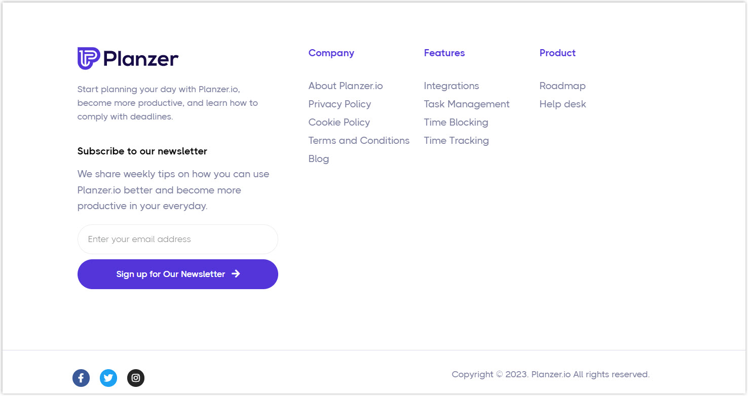
4. Avoid Overcrowding Your Footer With too Much Information
Trust me, less is often more. It’s tempting to cram as much information as possible in your website footer design, but that can quickly overwhelm your visitors. Instead, focus on the most helpful and essential content, and break it into easily digestible chunks.
Take a cue from Planzer, whose footer includes many links but still feels clean and organized. By dividing the content into clear categories and leaving plenty of white space, they make it easy for visitors to find what they need without feeling buried under an avalanche of information.
5. Consider Various Footer Layouts for Better Design
The footer web design largely depends on the amount and type of information you want to include. There are many ways to arrange your footer, and there’s no one-size-fits-all approach. Here are a few examples of different website footer designs that work well:
- If you only have a small amount of information to include, a narrow footer like the one on the Behance might be suitable.

- A taller footer with multiple columns, like the one on Byhabit‘s site, might be a good option if you have more content.
- Alternatively, you can consider a more visual eCommerce website footer with minimal text and lots of graphics, like Ketakuma‘s custom icons that showcase their essential links.
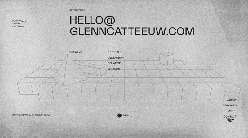
6. Add Creativity to Your Footer Web Design, but Don’t Sacrifice Functionality
Regarding page footer design, don’t be afraid to get creative and let your brand’s personality shine through. Incorporate unique shapes, custom graphics, and other exciting features to make your footer stand out.
Glenn Catteeuw Portfolio does an excellent job incorporating its brand design elements using 3D animation in the background. This approach adds a visually interesting element to their footer web design and reinforces their brand identity.
7. Ensure Your Footer Is Mobile-Friendly
With the rise of mobile browsing, it’s essential to ensure that your website footer design is easily accessible and functional on a smaller screen. So, to avoid overwhelming mobile users, consider breaking up your footer content into collapsible sections or minimizing it together.
Besides, remember that a user’s experience on your mobile site can significantly affect their perception of your brand, so make sure the footer section of the website is just as carefully crafted for mobile as it is for desktop.
8. Make Sure Your Footer Matches the Overall Design of the Page
Always keep your footer simple and easy to read, even if your website has a complex and interactive design. You can get creative and use colors, shapes, and other visual elements to make the transition from the page to the footer smooth and fun.
Take the below example, where the designer used animation to unhook all the shapes from the page background and let them fall into the footer.
9. Pay Extra Attention to Your Footer Links
Another critical factor you need to keep your eyes on is ensuring that all your links are accurate, up-to-date, and working correctly. Besides, if you include links to external or internal pages that are not directly related to your main content, it’s a good practice to open them in a new tab so that your visitors don’t lose track of your website.
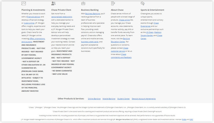
10. Stay Compliant With Relevant Regulations in Your Footer Design
Legal information, such as policies and disclaimers, is essential to modern web design. Designers should research their company’s responsibilities for displaying these links and ensure compliance.
For instance, in some countries, financial and investment products must exhibit their disclaimer information in the footer, making it readily accessible to customers. Check out this website footer design from Chase Bank as an example.
Design Magento Header & Footer for FREE
Create or optimize a high-converting footer on your Magento website in minutes without the need for coding. Everything, simply drag and drop.
4 Not-to-Dos When Designing Your Website Footer
1. Duplicate Navigation
Putting your main menu in the footer is a choice that needs careful consideration. If your web pages are lengthy, and users may miss the navigation when they reach the footer, then having the entire menu at the bottom is beneficial.
But, if your web pages are short and the main menu has too many items, this approach can annoy your website visitors. Therefore, always aim for a balance between usability and functionality when deciding on your footer navigation.
→ You might also want to read: A Complete Guide to Creating Effective Website Navigation Bar
2. Super Wide Footer
When designing your website’s footer, it’s essential to remember that a footer taking up too much space can be problematic. This is especially true when designing for mobile devices, where space is premium. To avoid this issue, it’s best to keep your footer simple and to the point. Don’t overload it with too much information or clutter; try to ensure it complements the rest of your site’s design. If you must include a lot of information in your footer, consider using accordion menus or other techniques to make it more manageable.
3. Endless Scrolling
Infinite scrolling has become a widespread technique in web design to keep users hooked on your website’s content. However, you have to think about its impact. Your footer is designed to provide users with essential information, links, and resources, but adding endless scrolling can make it challenging for users to access this information. As a result, users may become frustrated and leave your website without finding the information they need.
4. Over Use of Keywords
Over-optimizing your website content or footer is not a good strategy for improving your search page rankings. Google’s algorithm has become more competent in identifying keyword-stuffing techniques, which can harm your SEO results. Therefore, it’s best to avoid overdoing it and focus on a few essential keywords representing your website.
Wrapping Up
Undoubtedly, your website footer is a crucial component that can significantly impact your website’s success. A good website footer design can enhance the user experience, increase engagement, and improve SEO. We hope this guide has given you valuable insights and confidence to design yours.
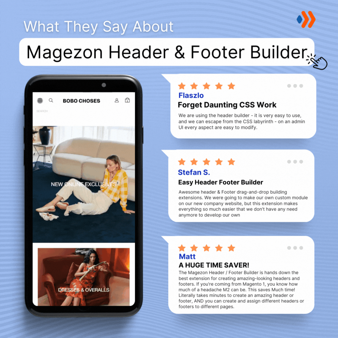
If you’re a Magento store owner planning to build an impressive and high-converting footer, consider Magento 2 Header and Footer Builder from Magezon, an Adobe trusted partner. With a user-friendly drag-and-drop interface and powerful diverse features, you can easily design or redesign any style whenever you want without relying on developers or designers.
More Magento extensions are also available to create all necessary pages and elements for your website. Don’t worry if you’re not good with coding because these extensions are the solution.