 Magezon Blog Help Merchants Build Comprehensive eCommerce Websites
Since its birth in 2016, Progressive Web App (PWA) has become increasingly important in eCommerce development on all platforms, including Magento. But let’s face it, building a PWA from scratch can be a bit overwhelming, especially if you’re unfamiliar with the process. That’s why we’ve put together this in-depth guide on UX/UI principles, steps to build a PWA Magento 2 in the front end and back end, and common mistakes to avoid along the way.
Whether you’re a seasoned developer or just starting out, our tutorial will greatly help build cutting-edge PWAs that deliver superior performance and user experience.
Table of contents
9 Winning UX/ UI Principles for Your Magento PWA
1. Remove the Footer
Installing heatmaps can provide some eye-opening data if you’re curious about how your website performs for mobile users. You might be surprised to learn that many users only make it all the way down to the footer if they have a specific goal in mind or struggle with navigation.
The footer is standard on all website pages, typically containing copyright notices, terms and conditions, social media links, and subscription forms. While it’s valid on desktop screens, it can take up too much valuable space on mobile devices. That’s why the native app doesn’t have a footer, and progressive web app design should follow suit. Removing non-essential elements from your PWA design can create a faster and more compelling mobile experience.
Take Spotify PWA, for example. The mobile version’s footer is brilliantly designed and intuitively organized by category. Clicking on each title or arrow reveals sub-categories for further exploration.
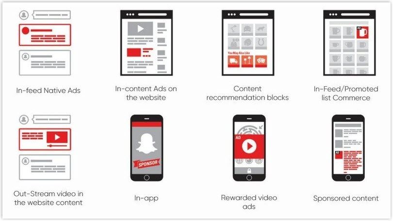
2. Display Fewer Ads
Magento PWA development offers a streamlined browsing experience, meaning limited ad space. While ads can generate revenue, finding a balance between revenue and user experience is crucial.
To achieve this, limit the number of ads and use non-intrusive formats like banners or native ads. Targeted advertising based on user interests and behavior can also improve the user experience. Remember to test ad placement and frequency using analytics tools.
For users who prefer an ad-free experience, consider offering a premium version to provide an additional revenue stream.
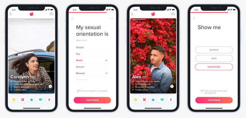
3. Keep It Simple for a Better User Experience
Making things simple and easy can do wonders for your user experience. If your customers face fewer hurdles, they’re more likely to give up on their tasks. To avoid this, focus on a streamlined PWA design by prioritizing the most critical functions and making them easy to use.
Tinder’s popular dating app is an excellent example of a successful PWA. Its intuitive and straightforward design allows users to navigate and interact with others on the platform easily.
4. Design a Progressive Web App for Desktop, Mobile, and More
If you want to create a successful Magento PWA storefront that works seamlessly on various platforms, it’s crucial to prioritize excellent UI and UX for both desktop and mobile users.
Let’s look at two Starbucks PWAs designed for desktop and mobile devices and see how they differ in user experience.
Desktop version
When designing the desktop version of your Impact PWA, don’t be afraid to get creative! Adding extra spacing and incorporating eye-catching visuals like illustrations or photos can make all the difference. The key is to strike a balance between simplicity and sophistication.
Take Starbucks’ PWA storefront, for example – it epitomizes a well-designed desktop experience:
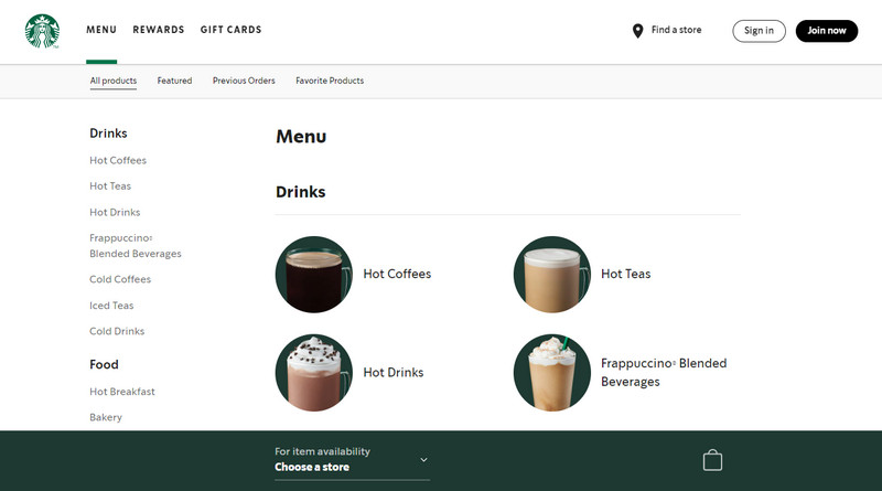
The menu page takes advantage of white space and a simple navigation design. Besides, categories are thoughtfully organized and accompanied by visual images, while additional information is neatly located at the bottom of each page. This minimalistic approach helps reduce clutter on the screen and provides a clean and straightforward interface for users.
Mobile version
Developing a mobile version of your website is like creating a mini-masterpiece. You must carefully curate the most important content your visitors crave and deliver aesthetically and functionally. To ensure your visitors have access to the essential features they need, add them to the navigation bar. This will help them quickly find what they’re looking for and keep them engaged with your PWA.
And Starbucks PWA for mobile is a shining example of this, with its clever use of a hamburger menu that fits snugly on a smaller screen. Plus, all the additional features and info are strategically placed in the app’s footer so users can easily find them.

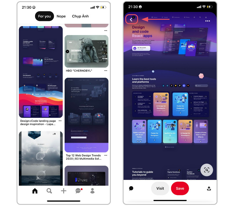
5. Enhance User Experience With Scroll Position Retention
Have you ever found yourself endlessly scrolling through a list on a website or app, only to lose your place when navigating away from the page or refreshing it? It’s an incredibly frustrating experience that can drive users away from your PWA. Luckily, there’s a solution: scroll anchoring.
Scroll anchoring is a technique that keeps your list in the same position, even if the content above or below changes. This is especially useful for Magento PWA development, which has dynamic content or frequently updating lists. And the best part? It’s easy to implement!
One way to use scroll anchoring is the CSS property overflow anchor. This property maintains the current scroll position, even if the content changes.
Another way to implement scroll anchoring is by using JavaScript. This method allows you to monitor the user’s scroll position and save it in the browser’s session storage. When they return to the list, their previous scroll position is retrieved, allowing them to pick up where they left off.
To simplify navigating, Pinterest has also implemented an evident and accessible white button. Therefore, users can effortlessly move back and forth between the pages they want.
6. Engage Users With Visuals, Animations, and Micro-Interactions
Adding visuals, animations, or micro-interactions can take your Magento PWA to the next level and create a memorable and enjoyable user experience.
Animations, like loading indicators or page transitions, can make the experience more dynamic and engaging. Micro-interactions, like button hover effects or confirmation messages, can help provide feedback to the user interactions and create a more intuitive experience. But be careful not to overload your PWA with too many of these elements, as it can negatively impact performance and usability.
If you’re looking for inspiration, check out LanCôme:
7. Add Custom Splash Screens to Your Magento PWA
A splash screen is more than just a loading animation. It’s a powerful branding tool that can make or break your PWA’s first impression. The default splash screen provided by PWAs may be functional, but it won’t do anything to differentiate your app from the competition. On the other hand, a custom splash screen can make a lasting impact on your users by showcasing your brand’s logo, tagline, or other defining characteristics.
However, creating a custom splash screen is not just slapping your logo on a static image. To make the most of this feature, you’ll need to create a high-quality graphic or animation optimized for the platform and device it will be displayed on. This means you should consider factors like image resolution, file format, and expected network speed to ensure your splash screen loads quickly and looks great on any device.
But that’s not the end. An excellent splash screen should also give users a sense of what to expect from your app. It should be visually appealing and on-brand, but it should also serve as a subtle cue that the app is loading in the background.
With creativity and attention to detail, you can turn your splash screen into a powerful tool for engaging and retaining users. So why settle for a generic loading animation when you can create a custom splash screen that truly represents your brand?
8. Create an Eye-Catching Home Screen Logo
When it comes to PWAs, they offer great flexibility as they don’t necessarily need to be found in an app store. However, your task needs to be noticed with the competition out there. That’s where a well-designed home screen logo comes in.
Crafting an outstanding home screen logo for your Magento PWA requires considering several factors. Firstly, the logo must be visually appealing, on-brand, and easily recognized. You can achieve this by using colors, typography, and design elements consistent with the rest of the app while conveying its overall tone and style.
Additionally, you should optimize the logo for the size and resolution of the device on which it will be displayed. A too-small or low-resolution logo can appear pixelated, while a too-large logo can be overwhelming and take up too much screen real estate.
Finally, don’t forget the context. The logo should be optimized for the background it will be displayed on, whether light or dark.
9. Achieve Smooth Page Loading in Your Magento PWA
Creating a seamless and lightning-fast app is crucial to keeping users engaged and preventing them from bouncing off your website. However, achieving optimal loading speeds can be challenging. Fortunately, you can do something to decrease your website’s load time: optimize the size and format of your website’s images and videos. Heavier media mean a slower website.
Another powerful technique is lazy loading, which involves loading only the content currently visible on the user’s screen, deferring the loading of images and videos further down the page until needed.
Caching and Preloading are also effective methods for improving load times. They store frequently requested data in the user’s browser cache, reducing the need to re-download the exact data for subsequent page loads.
Besides, it’s also essential to minimize the use of third-party scripts and plugins, as these can significantly slow down page load times and negatively impact overall performance. Therefore, carefully evaluate which third-party scripts and plugins are necessary for your app and remove any that are not essential.

Try FREE Magezon Page Builder!
Easily create your engaging Magento pages in any style whenever you want without relying on developers or designers. Just by drag & drop.
How to Build a Magento PWA on the Front End
If you want to build a progressive web application, keep your eyes on both the front and the back end.
In this section, we’ll focus on the front-end development of our PWA Magento2 tutorial. We’ll describe the entire process of building a homepage for a PWA using plain ReactJS.
Here’s what we want our homepage to have:
- A header
- A login/logout button that depends on the state of the application
- Several widgets, such as the featured products slider and several CMS blocks, can be managed via the Admin panel
- An email sign-up section
- A footer
Here are the steps to build this homepage; let’s look closer!
Step 1: Adjust the System for Further ReactJS Work
Before building the homepage, we need to adjust the system for further ReactJS work. Here’s what you must do:
1.1. Prepare the necessary configurations and setups on Ubuntu 18.04.
Let’s get started by preparing the necessary setup to launch ReactJS. First, we must install curl, a library for HTTP requests, and other dependencies.
No worries, it’s simple, and we can execute all the commands in the console. Here are the steps:
sudo apt update
sudo apt -y install curl dirmngr apt-transport-https lsb-release ca-certificatescurl -sL //deb.nodesource.com/setup_12.x | sudo -E bash -
1.2. Install nodeJS and NPM to launch our React app.
Now, we can install
- NodeJS – a runtime environment that uses JavaScript.
- NPM – used for managing the packages of nodeJS.
NodeJS is powered by the V8 engine and translates JavaScript into machine code. We will use nodeJS to launch our React application.
sudo apt -y install nodejsStep 2: Install ReactJS & Create an Application
Next, we need to install ReactJS and create an application. Here are the steps:
2.1. Install ReactJS
A PWA requires a framework capable of handling its unique features and functionalities. This is where ReactJS comes in. This popular front-end JavaScript library provides developers with an efficient way of building complex user interfaces for web applications, including PWAs.
npm install react@latest2.2. Implement server-side rendering on Magento using Razzle
Let’s start creating your application and implement server-side rendering on Magento. Server-side rendering, or SSR, is essential in building a PWA.
For our PWA’s SSR, we recommend using Razzle, a JavaScript framework that simplifies installation and configuration.
It’s crucial to note that Razzle should be added at the beginning of your PWA development process to avoid later difficulties.
If you skip this step, you may spend a lot of time updating your entire codebase or reworking it to make it work correctly with SSR. Therefore, we highly recommend using Razzle from the start.
One great thing about Razzle is that it allows you to customize your application’s name quickly. You can change the “my-app” part to whatever name you prefer.
sudo npm install -g create-razzle-app
create-razzle-app my-app
2.3. Navigate to the folder that holds our project
cd my-app2.4. Launch the application
Finally, it’s time to launch our application. Currently, we can launch the default application in its most basic form. Simply run the command below to start the server with our application. NodeJS will take care of the rest.
npm startGreat job, you have the app!
Step 3: Add Libraries
To create our PWA’s homepage, we need to add several libraries. Here are the most commonly used ones:
3.1. Swiper (necessary for adding sliders to the application)
npm install swiper --save3.2. SASS (used for working with the app’s CSS and styles)
npm install node-sass --save3.3. GraphQL (needed for the GraphQL protocol and its dependents, such as Apollo client and Graphql tag)
npm install graphql --save
npm install apollo-client --save
npm install apollo-cache-inmemory --save
npm install apollo-link-http --save
npm install apollo-link-context --save
npm install react-apollo --save
npm install graphql-tag --save
3.4. React Redux (allows you to change and monitor the application’s states)
npm install react-redux --save3.5. React Notifications (allows you to easily display notifications such as successful user sign-up, log-in, error notifications, and more.
npm install react-notifications --save3.6. Formik (used for simplifying form handling and authorization in our app)
npm install formik --saveStep 4: Let’s Build the App’s Architecture
Now it’s time to focus on the architecture of your app. As your app grows, it’s essential to use architecture with folders to maintain the code structure and navigation.
In general, for React development, it’s crucial to logically split the page into components to ensure that your app functions appropriately in the future. React is especially good at handling small components in large volumes.
Creating code that logically breaks down navigation and folder placement is also essential.
Your application has an SRC folder containing your app’s code within your project folder. To keep things organized, you should add several additional folders:
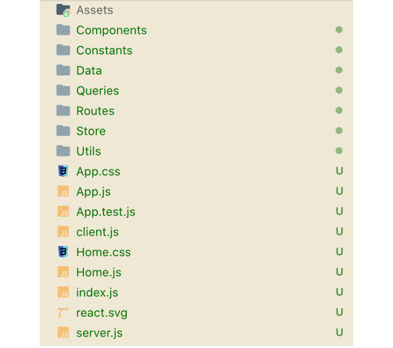
- Assets: Contains style and design elements, fonts, images, and other related items.
- Components: This consists of ReactJS components and the React application’s elements.
- Constants: Stores project constants, such as global elements essential for logic building.
- Data: Holds data, such as the main menu, for the PWA.
- Queries: Stores GraphQL server queries.
- Routes: Contains data on routing logic that determines which components will be launched on a page.
- Stores: Stores all Redux setups handle the application’s state, including user authorization data.
- Utils: Contains general functions used in the application.
Step 5: Assemble the App Based on the Laid-Out Architecture.
5.1. Put Together the App
Let’s start putting your application together by setting up its components:
- Redux – used in React for monitoring and changing the states of the application
- GraphQL – used in the front end for querying and describing which data should be obtained.
It’s essential to ensure that the link for the GraphQL endpoint is on the same domain as the React app. Otherwise, the Cross-Origin Resource Sharing (CORS) policy will block the rest of the links.
When setting up GraphQL, you must install a token for user authorization. This token will handle how users are authorized on the app. When a query to Magento occurs, Magento will see the token and understand that it’s tied to a certain customer or session, allowing it to distinguish whether the user is authorized or not.
Note that you should do the same thing in the src/server.js file.
<?xml version="1.0" ?>
<config xmlns:xsi="http://www.w3.org/2001/XMLSchema-instance" xsi:noNamespaceSchemaLocation="urn:magento:framework:Module/etc/module.xsd">
	<module name="MyHomepage_Slider" setup_version="1.0.0">
		<sequence>
			<module name="Magento_Catalog"/>
		</sequence>
	</module>
</config>
5.2. Configure Redux storage
In this step, we will configure the storage for Redux. The storage comprises reducers. Each reducer defines the possible actions with the data that are associated with it.
Our reducer should be structured as follows:

The following are the key files involved:
- Action.js
This file describes the possible actions that can be performed on the storage.
export const CHANGE_TYPE_OF_DEVICE = 'CHANGE_TYPE_OF_DEVICE';
export const UPDATE_CONFIG = 'UPDATE_CONFIG';

export function changeTypeOfDevice(deviceType) {
    return {
        type: CHANGE_TYPE_OF_DEVICE,
        deviceType
    }
};

export function updateConfig(config) {
    return {
        type: UPDATE_CONFIG,
        config
    }
};- Index.js
This file combines all the data from the above files.
export * from './actions';
export { default as AppReducers } from './reducers';
export * from './selectors';- Reducers.js
We need a file that gathers all the reducers together to initialize storage.
import {
    UPDATE_CONFIG,
    CHANGE_TYPE_OF_DEVICE
} from './actions';
import { DESKTOP_DEVICE, MOBILE_DEVICE, DESKTOP_SIZE } from 'src/Constants/App';
import { getWindow } from 'src/Utils/Environment';

const initialState = {
    typeOfDevice: getWindow().innerWidth > DESKTOP_SIZE ? DESKTOP_DEVICE : MOBILE_DEVICE,
    cmsBlocks: {
        items: []
    }
};

function app(state = initialState, action) {
    switch (action.type) {
        case UPDATE_CONFIG:
            return {
                ...state,
                ...action.config
            }

        case CHANGE_TYPE_OF_DEVICE:
            return {
                ...state,
                typeOfDevice: action.deviceType
            }

        default:
            return state;
    }
}

export default app;- Selectors.js
This file includes operations that enable the retrieval of data from our storage.
export const selectState = state => state.AppReducers;

export const selectTypeOfDevice = state => selectState(state).typeOfDevice;

export const selectCmsBlocks = state => selectState(state).cmsBlocks;
5.3. Configure Razzle
Next, we will move on to the Razzle configurations and setups. Specifying the alias for the src path that will be utilized to load the components is necessary, as exemplified below.
const path = require('path');

module.exports = {
    modify: (config, { target, dev }, webpack) => {
        config.resolve['alias'] = {
            'src': path.resolve(__dirname, './src/')
        }
        return config;
    },
};
5.4. Routes
Routes determine which page part will be changed and when it should happen. There are multiple ways to achieve this, as you can choose more than one router type. We’ve opted for the third Browser Router option because we want the URL to update as the user navigates the website. By doing so, users can save or share links to specific pages using regular complete URLs.
Define the rules that’ll outline how the required parts of the page will be displayed based on the indicated URL path. In our example, the exact match URL path “/” shows the homepage, whereas “/category” uses the category components.
As this is the entry point to our application, let’s use GraphQL to fetch and store the footer content in Redux. This location can also be utilized for downloading app settings, but since we don’t require them, we won’t upload them.
import React, { useEffect } from "react";
import { useQuery } from 'react-apollo';
import { useDispatch } from 'react-redux';
import { Switch, Route } from "react-router-dom";
import { NotificationManager } from 'react-notifications';

import {
    CMS_BLOCKS_IDENTIFIERS,
    DESKTOP_DEVICE,
    MOBILE_DEVICE,
    DESKTOP_SIZE
} from 'src/Constants/App';
import Footer from 'src/Components/Footer';
import Header from 'src/Components/Header';
import Home from 'src/Components/HomePage';
import Category from 'src/Components/Category';
import ContactUs from 'src/Components/ContactUs';
import { getWindow } from 'src/Utils/Environment';
import { updateConfig, changeTypeOfDevice } from 'src/Store/App';
import NewsletterWidget from 'src/Components/NewsletterWidget';
import { configQuery } from 'src/Queries/App.js';

const Routes = () => {

    const dispatch = useDispatch();

    const { data } = useQuery(configQuery, {
        variables: {
            'ids': CMS_BLOCKS_IDENTIFIERS
        },
        onError: error => {
            NotificationManager.error(getErrorMessage(error));
        }
    });

    if (data) {
        dispatch(updateConfig(formatConfig(data)));
    }

    useEffect(() => {

        const handleResize = () => {
            const newTypeOfDevice = getWindow().innerWidth > DESKTOP_SIZE ? DESKTOP_DEVICE : MOBILE_DEVICE;
            if (typeOfDevice !== newTypeOfDevice) {
                dispatch(changeTypeOfDevice(newTypeOfDevice));
            }
        }

        getWindow().addEventListener('resize', handleResize);
        return () => {
            getWindow().removeEventListener('resize', handleResize);
        }
    }, [dispatch, typeOfDevice]);

    return (
        <div className={'layout'}>
            <div className={'page-container'}>
                <Header />
                <main className={'page-main'}>
                    <div className={'page-wrapper'}>
                        <Switch>
                            <Route exact path="/" component={ Home } />
                            <Route path="/category" component={ Category } />
                            <Route path="/contact-us" component={ ContactUs } />
                        </Switch>
                    </div>
                </main>
                <NewsletterWidget />
                <Footer/>
            </div>
        </div>
    );
}

export default Routes;
5.5. Header
To determine how the page is constructed, the routes will depend on the address in the browser. We’ll start with the page header, which includes general information and the main navigation menu.
The code below pertains to the information components included in the header.
import React from 'react';
import { Link } from "react-router-dom";

import InfoBoxes from 'src/Components/InfoBoxes';
import Search from 'src/Components/Search';
import AccountMini from 'src/Components/AccountMini';
import NavigationMenu from 'src/Components/Navigation';

import logo from 'src/Assets/img/logo.svg';
import cl from './Header.scss';

export default () => {
    return <header className={ cl.header } id="header">
        <div className={ 'wrapper page-wrapper' }>
            <InfoBoxes />
            <div className={ cl.inner }>
                <Search />
                <div className={ cl.logo }>
                    <Link to="/" className={ cl.link }>
                        <img src={ logo } alt="" className={ cl.img } />
                    </Link>
                </div>
                <div className={cl.userNav}>
                    <AccountMini />
                </div>
            </div>
            <NavigationMenu />
        </div>
    </header>;
}
5.6. Login and logout
Next, let’s discuss the login and logout elements. This component’s behavior will depend on the application’s state. To allow users to log in or access their accounts quickly, we’ll utilize Redux to control the application’s state efficiently.
The following code is an example of how to authenticate the user and create a token, which will be saved to the local storage.
import React, { useCallback } from 'react';
import { Link } from "react-router-dom";
import { useSelector } from 'react-redux';
import { selectIsSignedIn } from 'src/Store/Customer';
import { useQuery } from '@apollo/react-hooks';

import useLogin    from 'src/Utils/useLogin';
import Loader      from 'src/Components/General/Loader';

import { customerInfoQuery } from 'src/Queries/Customer';

import cl from './AccountMini.scss';

export default () => {
    const { logout } = useLogin();
    const isSignedIn = useSelector(selectIsSignedIn);

    const { data, loading } = useQuery(customerInfoQuery, {
        fetchPolicy: "network-only"
    });

    const logoutCallback = useCallback(
        () => {
            logout();
        }, [logout]
    );

    if (loading) {
        return <Loader />;
    }

    return <>
        <div className={ cl.customer }>
            <div>
                <i className={cl.icon + ' icon-user'}>{isSignedIn && <span className={cl.stateIcon}></span>}</i>
                {isSignedIn && <ul className={cl.links}>
                    <li className={ cl.customerName }>Hello { data.full_name }!</li>
                    <li><Link to="/customer/account">Account Details</Link></li>
                    <li><Link to="/customer/address/list">My Addresses</Link></li>
                    <li><Link to="/customer/order/list">My Orders</Link></li>
                    <li><Link to="/customer/wishlist">My Wishlist</Link></li>
                </ul>}
                {isSignedIn && <span className={ 'clickable' } onClick={ logoutCallback }>Sign Out</span>}
            </div>
        </div>
    </>
}
5.7. Navigation menu.
Moving on to the navigation menu, part of the header. The navigation-related data is stored as a hardcoded set of elements in the src/Data/Navigation.js file.
import React from 'react';

import NavigationPoint from './NavigationPoint';
import { navigationLinks } from 'src/Data/Navigation';
import { prepareNavigation } from 'src/Utils/Navigation';

import cl from './NavigationMenu.scss';

const NavigationMenu = () => {

    const items = prepareNavigation(navigationLinks);

    return <nav className={ cl.menu }>
        <ul className={ cl.list }>
            { items.map(item => <NavigationPoint key={ item.url } item={ item } />) }
        </ul>
    </nav>
}

export default NavigationMenu;
5.8. Dynamic parts of the page
The page’s dynamic section follows the header, and its content will vary depending on the URL. For example, on the homepage, this area may display a slider with images, while on a category page, it may display product elements.
import React from 'react';

import Slider from 'src/Components/Slider';

const HomePage = () => {
    return <div>
        <h1>Home Page</h1>
        <Slider />
    </div>;
}

export default HomePage;
Let’s add a product and image slider to the homepage using the swiper library, which was added in the third step.
import React from 'react';
import { Link } from "react-router-dom";
import { Query } from 'react-apollo';
import Swiper from 'swiper/react';

import { DESKTOP_SIZE } from 'src/Constants/App';
import Placeholder from "src/Components/General/Placeholder";
import Error from "src/Components/General/Error";

import cl from "./Slider.scss";

import { hompageProductsQuery } from 'src/Queries/Homepage'

const Slider = () => {

    return (
        <Query
            query={ hompageProductsQuery }
        >
            {({ loading, error, data }) => {
                if (loading) return <Placeholder/>
                if (error) return <Error />

                const breakpointsSettings = {};
                breakpointsSettings[DESKTOP_SIZE] = {
                    slidesPerView: 5,
                    spaceBetween: 20
                };

                const params = {
                    slidesPerView: 2.2,
                    spaceBetween: 0,
                    loop: (items.length > 5),
                    loopedSlides: items.length,
                    breakpoints: breakpointsSettings
                };
                return <Swiper {...params}>
                    <>
                        {data.hompagePorudcts.map(product => {
                            return <div key={ product.id } className={ cl.productSliderItem }>
                                <Link to={ product.url } className={ cl.productImage }>
                                    <img src={product.image} />
                                </Link>
                                <Link to={ product.url } className={ cl.productName }>
                                    { product.name }
                                </Link>
                            </div>
                        })}
                    </>
                </Swiper>
            }}
        </Query>
    );
}

export default Slider;
5.9. The homepage slider area
To populate the products in the homepage slider, we must define the data we want to fetch using GraphQL. Depending on the frequency of data updates, we can either directly fetch data from the database or retrieve it from the cache to reduce database load.
For example, our application may contain dynamic data like featured products and static data like CMS blocks. Static data can be cached as it is not updated frequently. The following code demonstrates how to use frontend queries to fetch data.
import gql from "graphql-tag";

export const hompageProductsQuery = gql`
    query hompageProducts {
        hompageProducts {
            id
            name
            url
            image
        }
    }
`;
5.10. Email sign-up
To create the email sign-up section, we use something called CMS blocks. These blocks can show different types of information, such as text and a social media block that displays the content using a newsletter widget. We only want to display the subscription form to users who haven’t subscribed to the newsletter yet. Here’s the code we used:
import React from 'react';
import { useSelector } from 'react-redux';
import { Formik, Field } from 'formik';
import { useMutation } from 'react-apollo';
import { NotificationManager } from 'react-notifications';

import cl from './NewsletterWidget.scss';

import Loader from 'src/Components/General/Loader';
import { selectCustomer, selectIsSignedIn } from 'src/Store/Customer';
import { subscribeGuestToNewsletterMutation } from 'src/Queries/Customer';
import { getErrorMessage } from 'src/Utils/Graphql';

const NewsletterWidget = () => {
    const isSignedIn = useSelector(selectIsSignedIn);
    const customer = useSelector(selectCustomer);

    const [updateGuest, {loading: updateLoading}] = useMutation(subscribeGuestToNewsletterMutation, {
        onCompleted({ subscribeGuestToNewsletter }) {
            NotificationManager.success(subscribeGuestToNewsletter);
        },
        onError: error => {
            NotificationManager.error(getErrorMessage(error));
        }
    });

    if (isSignedIn && customer.is_subscribed) {
        return null
    }

    return (
        <div className={cl.subscribe + (isSignedIn ? ' ' + cl.signedIn : '')}>
            <div className={cl.main}>
                <div className={cl.content}>
                    <div className={cl.text}>Be in the know with our newsletter!</div>
                </div>
                <div className={cl['form-container']}>
                    <Formik
                        initialValues={{ email: '' }}
                        onSubmit={values => {
                            updateGuest({ variables: { email: values.email } });
                        }}
                    >
                        {({ handleSubmit, values, errors, touched }) => <form onSubmit={handleSubmit} className={cl.form}>
                            {!isSignedIn && <div className="inputBox">
                                <Field name="email" type="email" className={cl.input + ' input' + (values.email ? ' filled' : '') + (errors.email && touched.email ? ' validationError filled' : '')} placeholder={(errors.email && touched.email ? errors.email : '')} />
                                <span className={cl.label + " label"}>Enter your email address</span>
                            </div>}
                            <button type="submit" className={cl.btn + ' btn'}>Subscribe</button>
                        </form>}
                    </Formik>
                </div>
            </div>
            { updateLoading && <Loader /> }
        </div>
    );
};

export default NewsletterWidget;
5.11. Footer
Finally, we must add a footer section at the bottom to complete the homepage. It’s important to consider the differences between desktop and mobile devices and ensure that the footer is responsive and adjusts to different screen sizes. We can use Redux to achieve this.
The footer can be divided into two parts:
- The first part is a text block we can obtain from a Magento static block using Redux.
- The second part of the footer will display additional website navigation links. These links are stored in the file src/Data/Navigation.js as hardcoded navigation data.
import React from 'react';
import { useSelector } from 'react-redux';

import FooterMobile from 'src/Components/Footer/Mobile';
import FooterDesktop from 'src/Components/Footer/Desktop';
import { selectCmsBlocks, selectTypeOfDevice, FOOTER_CONTENT_BLOCK } from 'src/Store/App';
import { MOBILE_DEVICE } from 'src/Constants/App';
import { getCmsBlockByIdentifier } from 'src/Utils/App';

import cl from './Footer.scss';

const Footer = () => {
    const typeOfDevice = useSelector(selectTypeOfDevice);
    const cmsBlocks = useSelector(selectCmsBlocks);

    const cmsAbout = getCmsBlockByIdentifier(cmsBlocks.items, FOOTER_CONTENT_BLOCK);

    return <div className={ cl.footer }>
        <div className={ cl.footerRow }>
            <div className={ cl.footerCol }>{ cmsAbout.content }</div>
            <div className={ cl.footerCol }>{ typeOfDevice === MOBILE_DEVICE ? <FooterMobile /> : <FooterDesktop /> }</div>
        </div>
    </div>;
}

export default Footer;
Try FREE Magezon Page Builder!
Easily create your engaging Magento pages in any style whenever you want without relying on developers or designers. Just by drag & drop.
How to Build a Magento PWA on the Back End
This section will focus on the backend part of building a PWA Magento2. First, let’s clarify an important aspect of GraphQL:
- On the front end, GraphQL is used to query which data should be obtained, as we mentioned in the previous section’s fifth step.
- On the other hand, on the backend, GraphQL is used to outline the type of data needed and where to get it from.
Luckily, Magento has already integrated GraphQL support in various backend parts. We can use ready-made solutions like CMS blocks and customer information or create custom ones, like featured products. Adding and removing queries in Magento is straightforward.
Different types of GraphQL can be called when the page loads, such as general user information, store settings, or analytics. We can receive this data through GraphQL every time the page loads and use it for each user’s session.
Now, let’s go over the backend steps.
Step 1: Create a module
We start by creating a module on Magento 2. We need to make a folder for the module containing the organization name and module name.
Next, we create the necessary files for the module to function.
<?xml version="1.0" ?>
<config xmlns:xsi="http://www.w3.org/2001/XMLSchema-instance" xsi:noNamespaceSchemaLocation="urn:magento:framework:Module/etc/module.xsd">
	<module name="MyHomepage_Slider" setup_version="1.0.0">
		<sequence>
			<module name="Magento_Catalog"/>
		</sequence>
	</module>
</config>
<?php
\Magento\Framework\Component\ComponentRegistrar::register(
    \Magento\Framework\Component\ComponentRegistrar::MODULE,
    'MyHomepage_Slider',
    __DIR__
);
Next, execute the following command:
bin/magento setup:upgradeStep 2: Describe the GraphQL
To display products in the slider on our PWA homepage, we need to set up GraphQL query processing to receive the product data. We define the data structure and the type it can be submitted in.
type Query {
    hompagePorudcts: [ HomepageProductsGroup ] @resolver(class: "MyHomepage\\Slider\\Model\\Resolver\\HomepageProducts")
}

type HomepageProductsGroup {
    name: String
    url: String
    image: String
    id: Int
}
Then, we create a resolver that provides the queried data.
<?php
declare (strict_types = 1);

namespace MyHomepage\Slider\Model\Resolver;

use Magento\Framework\GraphQl\Config\Element\Field;
use Magento\Framework\GraphQl\Query\ResolverInterface;
use Magento\Framework\GraphQl\Schema\Type\ResolveInfo;
use Magento\Catalog\Model\ResourceModel\Product\CollectionFactory as ProductCollectionFactory;

class HomepageProducts implements ResolverInterface
{
    const HOMEPAGE_PRODUCTS_LIMIT = 10;

    /**
     * $productCollectionFactory
     *
     * @var ProductCollectionFactory
     */
    private $productCollectionFactory;

    /**
     * __construct
     *
     * @param ProductCollectionFactory $productCollectionFactory
     */
    public function __construct(
        ProductCollectionFactory $productCollectionFactory
    ) {
        $this->productCollectionFactory = $productCollectionFactory;
    }

    /**
     * @inheritdoc
     */
    public function resolve(Field $field, $context, ResolveInfo $info, array $value = null, array $args = null)
    {
        $result = [];
        $storeId = $context->getExtensionAttributes()
            ->getStore()
            ->getStoreId();

        $collection = $this->productCollectionFactory
            ->create()
            ->addStoreFilter($storeId)
            ->setOrder('sort_order', 'ASC')
            ->setPageSize(self::HOMEPAGE_PRODUCTS_LIMIT);

        foreach ($collection as $item) {

            $data = [];

            $data['name'] = $item->getName();
            $data['url'] = $item->getProductUrl();
            $data['image'] = $item->getImage();
            $data['id'] = $item->getId();

            $result[] = $data;
        }

        return $result;
    }
}
After finishing the GraphQL part, we must clear the cache before launching the application.
bin/magento cache:flush5 Common Mistakes You Should Avoid and Tips for a Superb Back End Magento PWA
Creating a progressive web application is no walk in the park. Every PWA has its own unique set of challenges, but fear not! We’re here to provide some pro tips to help you navigate the murky waters of front-end and back-end development.
By implementing these recommendations, you might save yourself a ton of time and effort. So without further ado, let’s dive into the good stuff.
Mistake 1: Oversized Components
Building a PWA front end can be challenging, but the first mistake to avoid is creating too large components.
Large components can cause the entire page to rerender, rather than just the necessary parts. This can slow down the browser and frustrate users. Therefore, you should organize your page elements into small components for efficient re-rendering.
Mistake 2: Forgetting the Key
ReactJS refreshes components based on the given key, so using one is essential to ensure that only the necessary elements are updated. Failing to use a key can result in React updating all elements, leading to slower performance.
| 1 2 3 | <ul className={cl.list }>{ items.map(item => <NavigationPoint key={item.url} item={ item } />) } </ul> |
Mistake 3: Incorrect Component Layout
Incorrectly laid-out components can cause unnecessary rendering when filters are changed. However, you can avoid this mistake by laying out components properly to prevent unwanted rendering.
Mistake 4: Overloading GraphQL Requests
You must avoid sending too much data in GraphQL requests, which can significantly slow down the app’s performance. Therefore, in this case, you should keep your requests concise and quick to ensure a fast user experience.
Mistake 5: Ignoring Service Workers
Final pitfall, Service Workers can cache resources in the browser, such as downloaded Javascript files, and improve performance. Don’t ignore this essential tool that can help you manage requests efficiently and speed up your Magento PWA.
Wrapping Up
Creating a Magento PWA from scratch may seem scary at first. Still, I believe you can confidently level up your online presence with an in-depth guide on must-know tips, mistakes, and detailed code for each website’s element above.
If you don’t know which Magento extension to easily build your eCommerce PWA and gain more sales, consider Page Builder from Magezon. As a trusted Adobe partner, we have satisfied thousands of customers with a vast collection of drag-and-drop extensions, helping you create a high-converting and unique store in minutes.
Don’t worry if you are not competent at coding, now you can confidently create any necessary page of your website in any style you want at ease.
