 Magezon Blog Help Merchants Build Comprehensive eCommerce Websites

If you’re planning to build a Magento furniture website and need ideas, you’ve come to the right place. In this article, you’ll discover the 19 most prominent examples, their success reasons, and essential lessons we’ll compile to help you optimize yours and earn more sales.
19 may be an intimidating number for some of you, so we’ll divide it into two main categories to help you follow more quickly, furniture and home decor.
Now, without further ado. Let’s jump right in.
Table of contents
15 Magento Furniture Websites
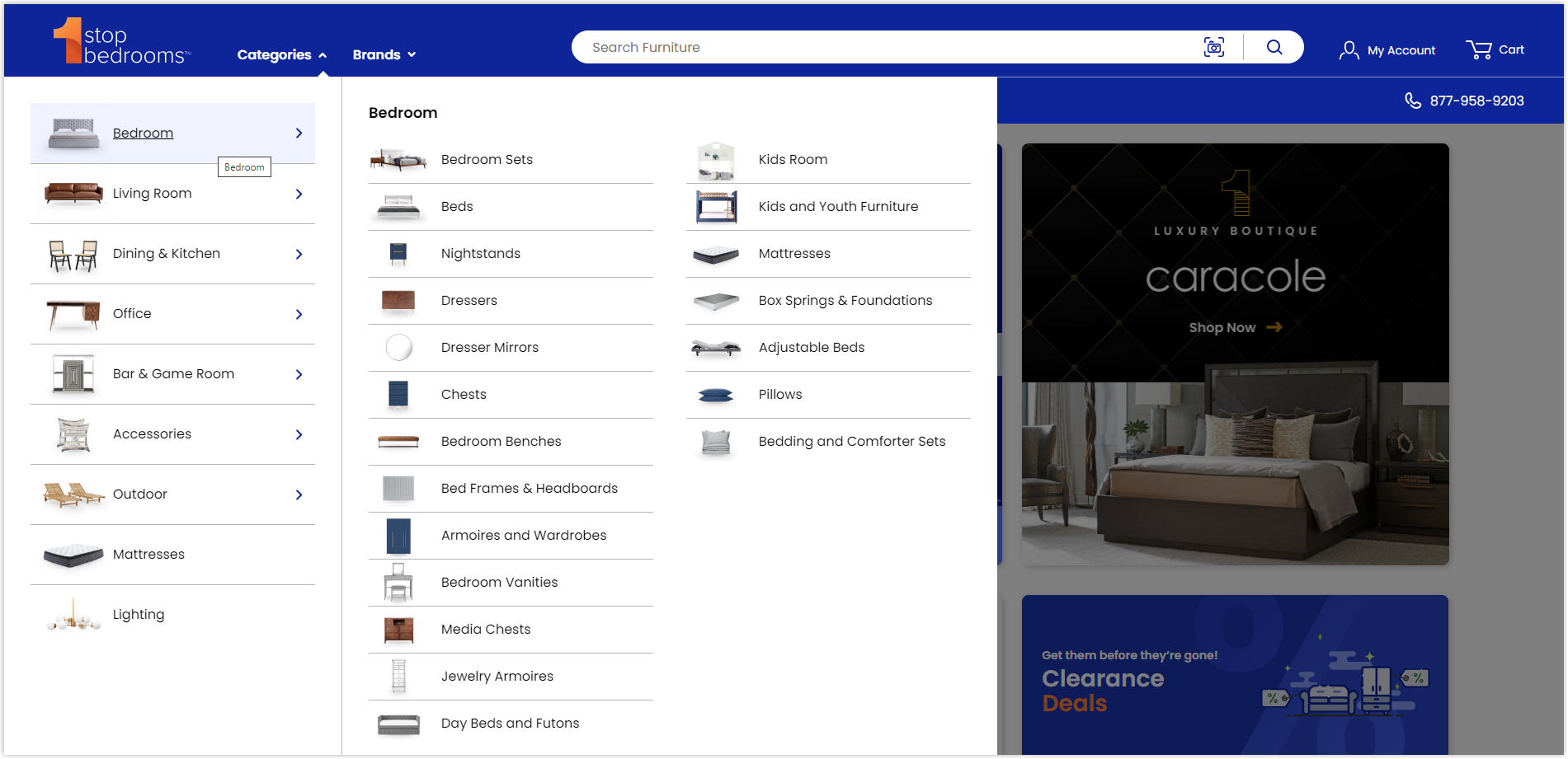
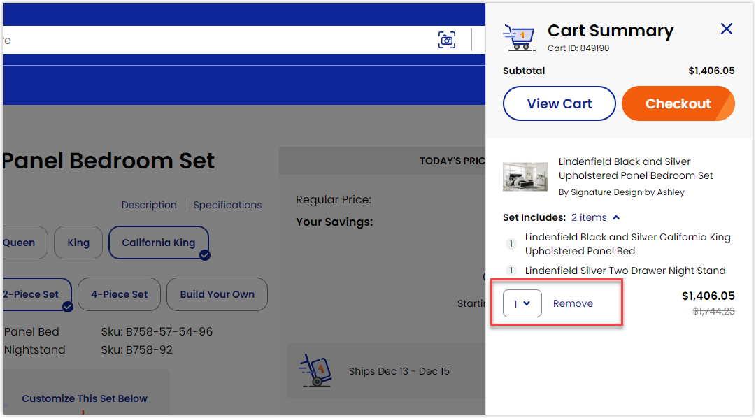
1. 1StopBedrooms
Rate: 9.5/10
1StopBedrooms is a well-known store for furniture with 15 years of experience based in Brooklyn, NY. As an expert in the industry, they indeed pay extra attention to their online presence. Once you arrive at their Magento website, you’ll experience standing in their physical store thanks to the high-quality images and intelligent arrangement of different sections. Despite a tremendous amount of catalog, it still delivered visitors a modernist, fresh, qualified, and neat look.
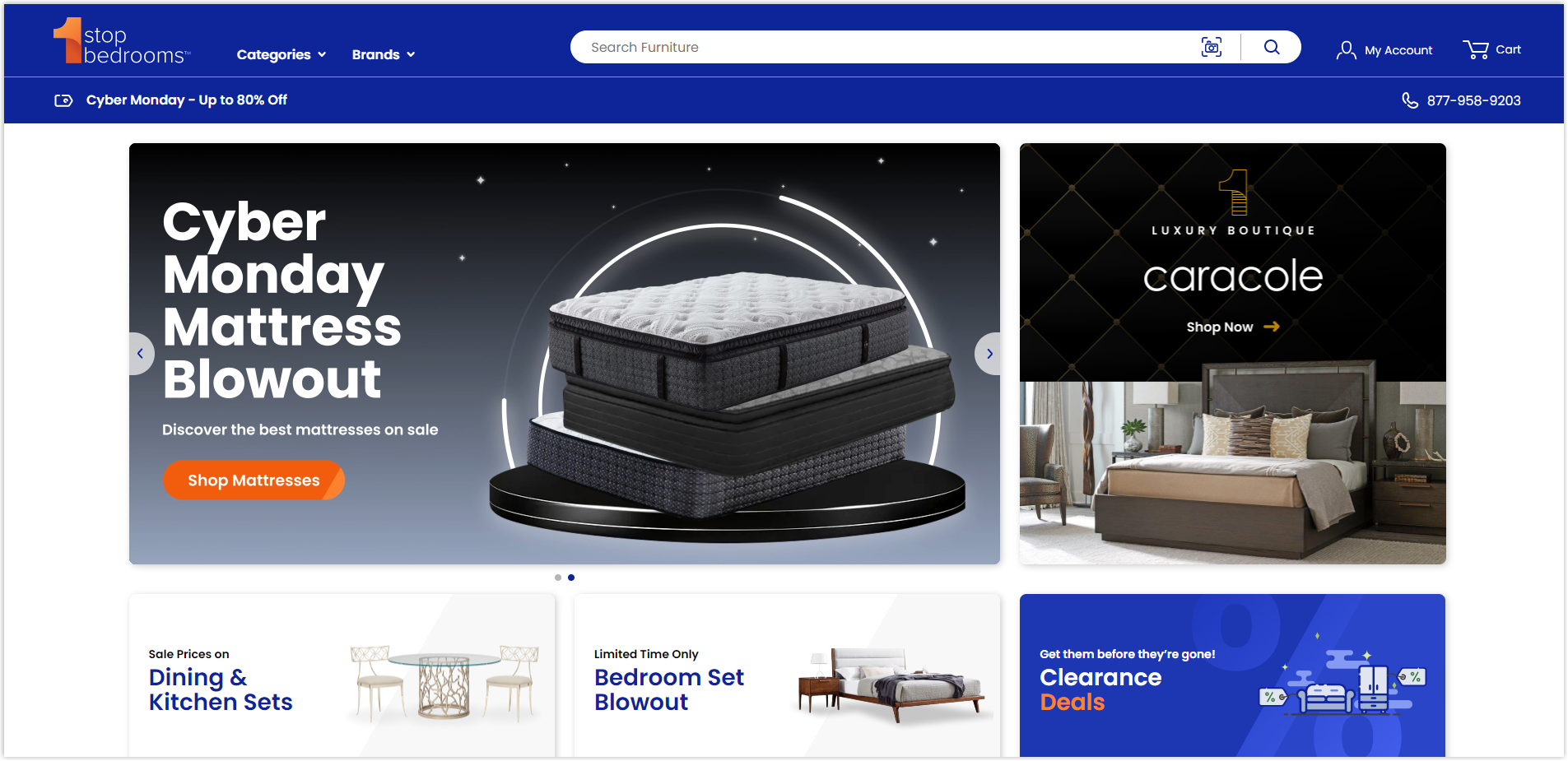
In certain parts, instead of going with the usual boring arrangement, they used their creativity to attract users. For example, the Trending section on the homepage “floats” the products to display prominent ones and allow visitors to interact.
→ Get the best practices to optimize your homepage: 25+ Ecommerce Homepage Best Practices With Examples
The navbar is presented in great detail with clear illustrations for each category not to overwhelm users but also to bring a professional and modern feeling to the brand.
All features are optimized to help users navigate the website most conveniently. In particular, to increase the ability to cross-sell, 1StopBedrooms also includes a product recommendation section right before visitors reach their Cart Summary. The final step to order is neatly summarized and allows customers to make changes at the last minute.
On the other hand, although it includes many unique features and heavy data, this best Magento furniture store has a breakneck page load speed that helps increase user efficiency. If you have time, don’t forget to discover this impressive website, there are many things to learn from.
2. 4Seating
Rate: 8/10
4Seating chose a simpler and more traditional presentation than 1StopBedrooms. Sections are arranged in basic layouts and do not integrate special effects or interactive features. However, thanks to that, navigating the page becomes easier because visitors can quickly understand the website and locate the part they want to learn. Furthermore, all elements on each page are centered on focusing users’ attention.
→ Learn the first thing about website grid: 3 Things to Remember Before Creating Website Grids
On the other hand, the images used are of good quality to help visitors visualize the product as truthfully as possible.
When adding products to the shopping cart, buyers will be directed to a separate checkout page with all the necessary information about their order.
Overall, this is a Magento furniture website with a simple design but full of necessary features. The priority here is to optimize the UX to retain users for as long as possible and increase brand credibility and sales. This is an example worth learning if you don’t have competent coding skills and the budget to hire a professional developer.
3. Sohomod.com
Rate: 9.5/10
With a modern, airy, bright, and fresh look, this Magento furniture website deserves to be on our list today.
Through clever color combinations in its online store, Sohomod has successfully conveyed its simple yet trendy interior style. The details are mixed together smoothly but highlight important parts to attract and retain visitors.
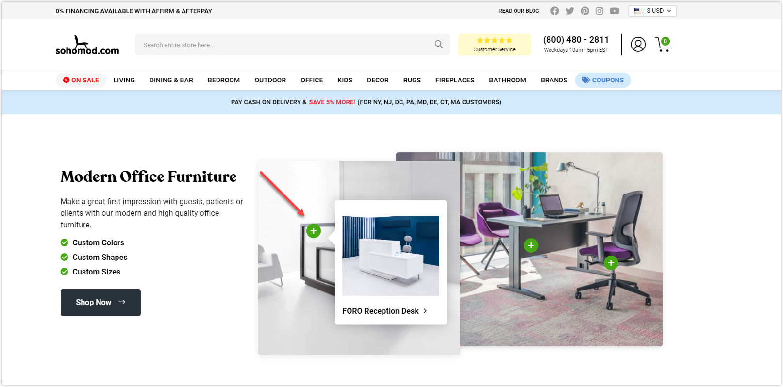
Like 1StopBedrooms, Sohomod has a massive catalog and needs to be organized intelligently to not overwhelm users and make it difficult for them to navigate. Therefore, each collection and category is displayed in the most innovative, detailed, and neat way possible. Take a look at the image below for an accurate understanding.
On the other hand, this is the first Magento web design that provides a zoom-in feature to see the product clearly without clicking on the image. This makes it easier for users to visualize the material of items and make purchasing decisions faster.
The load page speed is fast enough to retent users and encourages them to explore more. Overall, this website is worth learning for its trendy design that brings great affection.
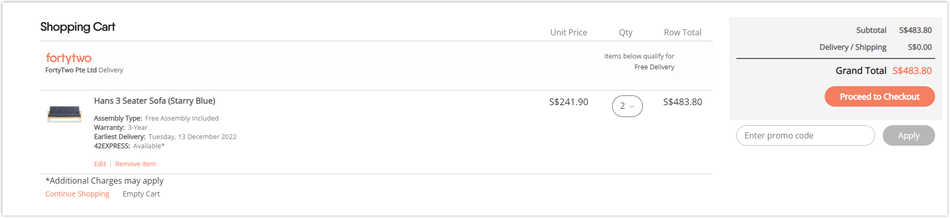
4. Fortytwo
Rate: 9/10
Unlike the modern style of Sohomod, the Magento furniture website of Fortytwo will welcome you with a warmer atmosphere. As a famous furniture brand in Singapore with decades of history, its physical and online stores are professionally and synchronously displayed.
The orange-pink gives users a warm, friendly, yet modern, trendy feeling. More than 20,000 products are intelligently arranged according to each category to help visitors not be overwhelmed when using and quickly finding the items they want. They are then further divided by space and product lines.
>> Learn how to choose colors for your website: 10 Useful Tips to Choose a Color Palette for Website
The navigation bar has specific illustrations and does not use too many levels that can confuse visitors.
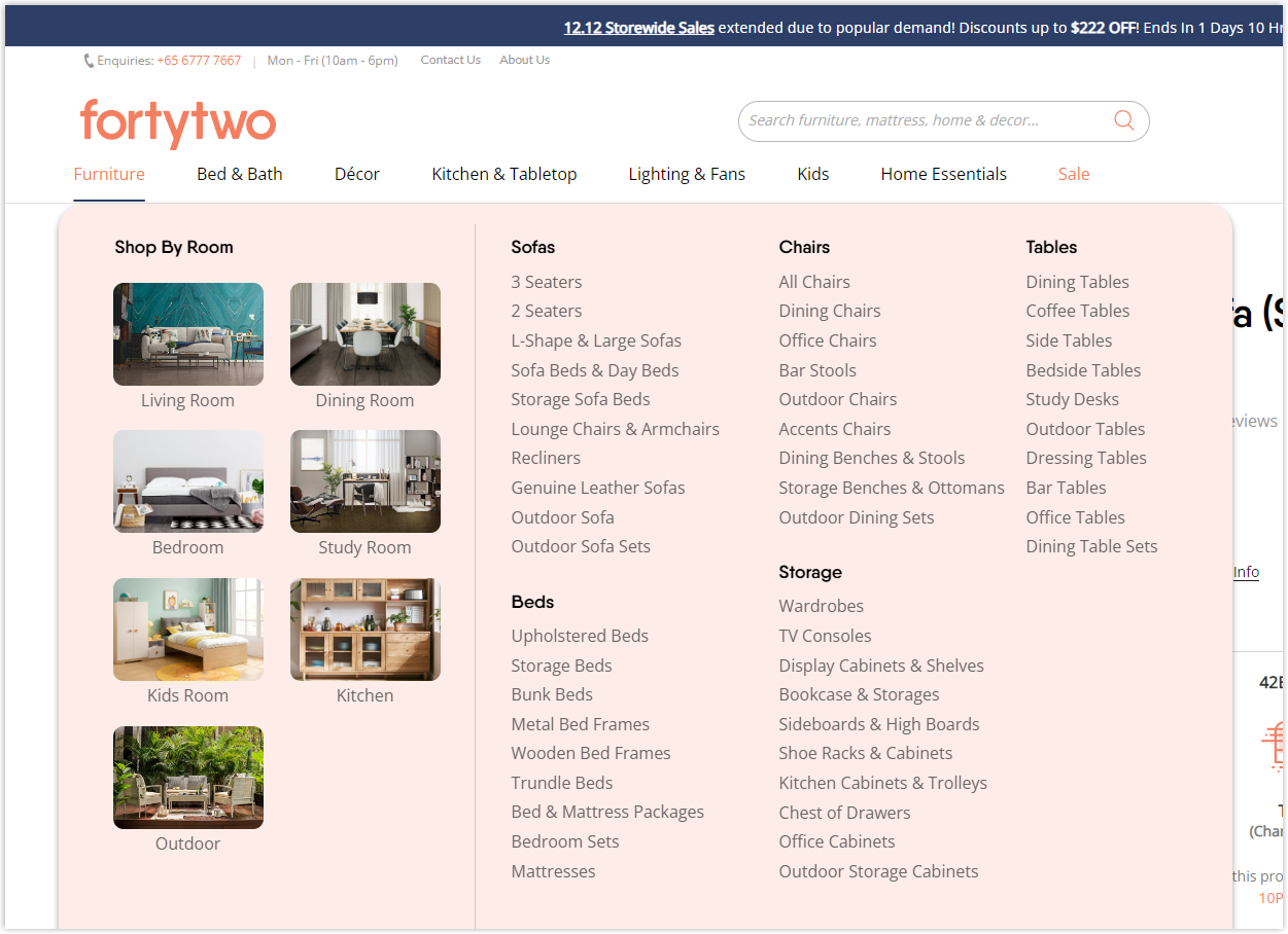
The images are high quality and detailed with actual product measurements to provide users with a realistic view of their individual needs, limiting returns and increasing the number of positive reviews.
Finally, the checkout process is easy to understand and can be done quickly.
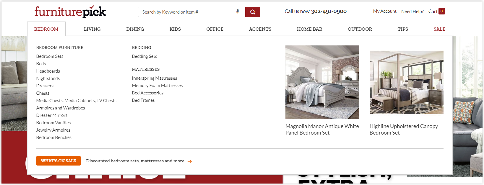
5. Furniture Pick
Rate: 9/10
This is your inspiration if you intend to design a website focusing on images. From the hero banner, Furniture pick has shown its style with impressive images and, a trendy typo design, bold typography.
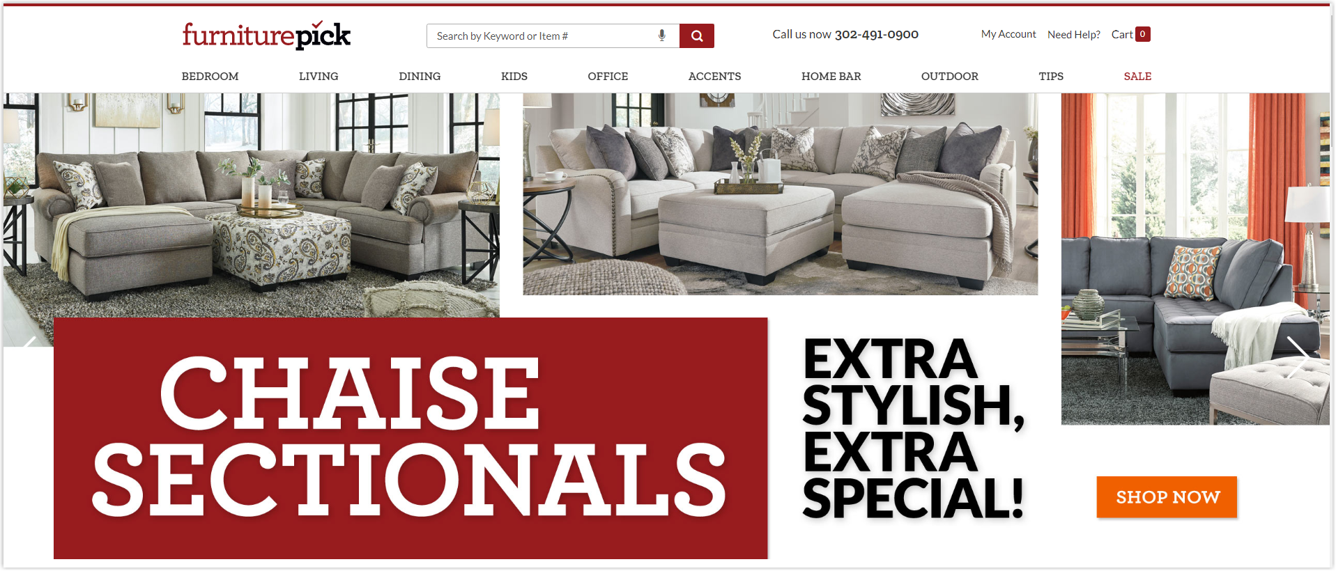
The sections below are all arranged like galleries with full-size images.
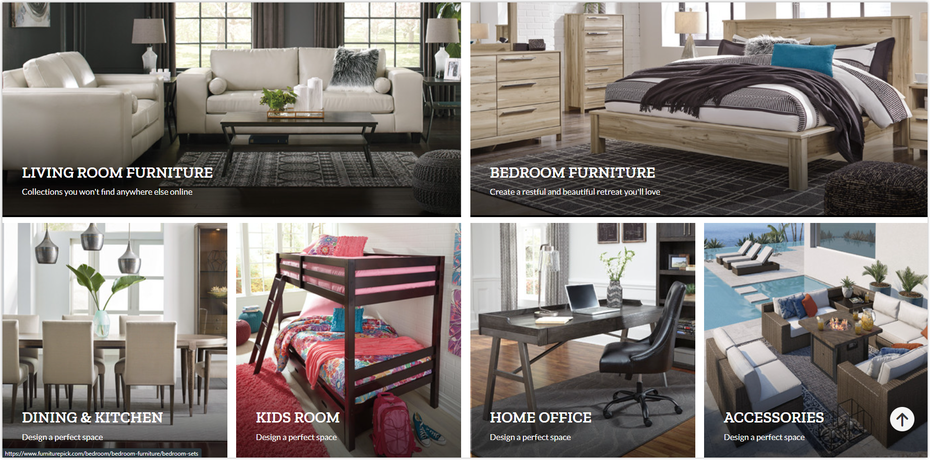
Menus bar is divided based on different spaces in the house; each category is clearly illustrated with pictures and includes no more than two levels to help visitors track and find their desired product faster.
In addition, this Magento eCommerce website also provides a complete filter on the product listing page to assist users in choosing precisely the item they want.
Fast page loading speed is also a plus point of Furniture Pick because it increases the quality of user experience and brand credibility.

Try FREE Magezon Page Builder!
Easily create your engaging Magento pages in any style whenever you want without relying on developers or designers, just by drag & drop.
6. Cox and Cox
Rate: 8.5/10
Since we are talking about websites that focus on images, let’s continue our list with Cox & Cox, a furniture company from Frome, Somerset, with a traditional yet modern style.
Right at the homepage of this best Magento furniture store, we can see how they take advantage of images and minimize unnecessary details to make navigation easier.
The navbar is also clearly illustrated with pictures, but the arrangement and selection of menus are not very smart and optimal. Instead of displaying synchronously according to different spaces in the house or product lines, Cox & Cox mixes them. Moreover, the number of menus exceeds the recommended number of fewer than 10. However, thanks to a good grasp of customer psychology, they have cleverly arranged the most prominent categories at the beginning and end.
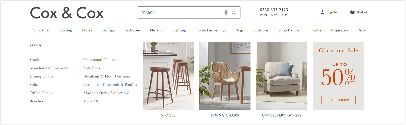
Overall, the website has a fast page load speed to enhance customer experience and increase retention. The checkout page is clearly designed and easy to use.
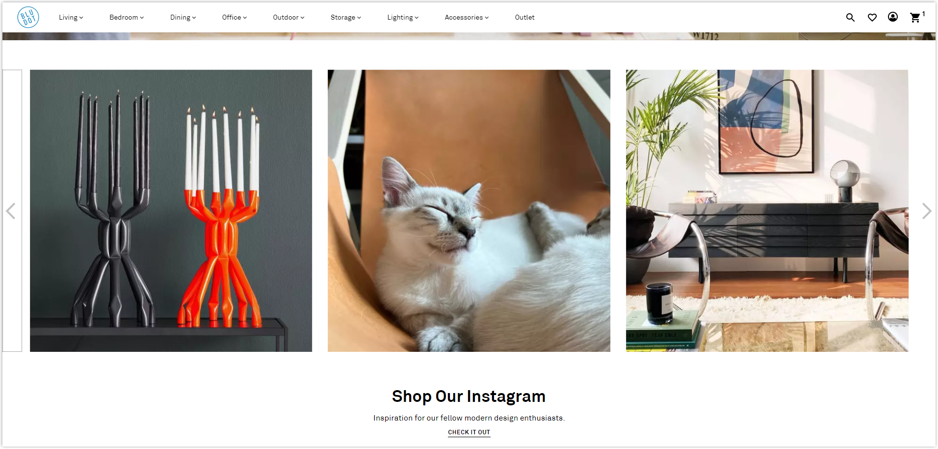
7. Blu Dot
Rate: 8/10
If you are a minimalist, never ignore Blu Dot. With a modern and medieval product style, this brand has a Magento furniture website that matches that. Stepping in here, you can immediately feel the breath of the times mixed with a little old imprint.
All sections on their homepage are arranged in horizontal strips layout with large images and not much focus on typography. That’s why the text is almost sunk into the background in some parts. You can understand by looking at its hero banner below.
The navigation bar is designed simply, and menus are selected according to different spaces in the house with specific illustrations.
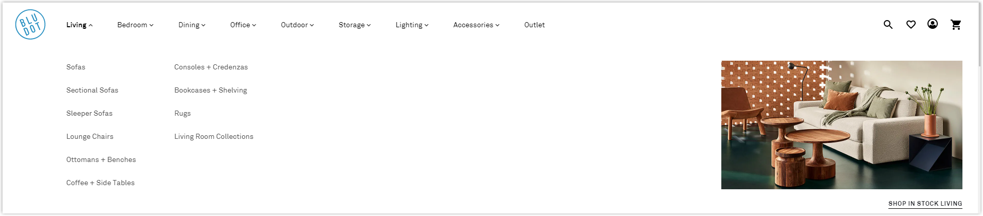
Page load speed is optimized when visitors only need to wait less than 1 second to be directed to a page they want. This enhances the quality of the customer experience and prolongs the stay. Moreover, the checkout process is quick and easy to not get visitors frustrated.
Integrating social networks on the homepage as social proof is another advantage you can learn. At Blue Dot, they use Instagram to display customers’ houses decorated with their products.
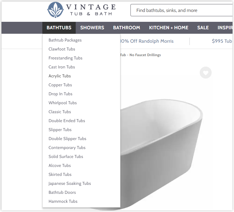
8. Vintage Tub & Bath
Rate: 8/10
With over 25 years of experience in the furniture industry, Vintage Tub & Bath has one of the best Magento furniture stores with a massive product portfolio. Over the past two decades, changes in interior styles have influenced their products and online store’s design.
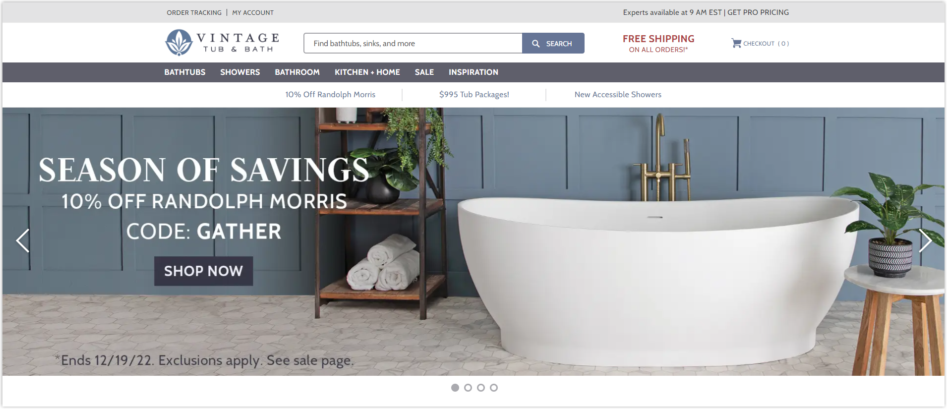
The primary color tone of gray and blue conveys a feeling of old mixed with modernity. This website doesn’t have much to discuss in terms of UI as it doesn’t use interactive features or be creative in arranging elements on a page. However, it also does not entirely follow the minimalist style of BluDot that we have just analyzed above. It displays the different sections in the most common way with the hero banner and featured sections.
Regarding UX, features are provided adequately for visitors to have the best experience. The navigation bar includes only the most prominent and essential menus. Fast page loading speed keeps users motivated to explore more and increases the time they stay on the site, thereby increasing the likelihood of a purchase.
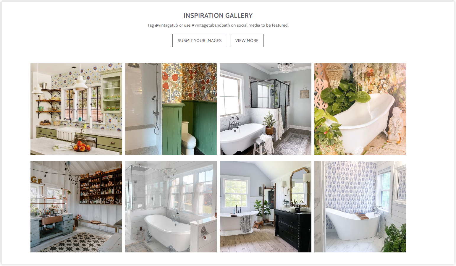
On the other hand, it also integrates Instagram into its homepage and displays images of its products in use to serve them as social proof. By doing this, users will better perceive what the items will be like in real life.
9. Totally Furniture
Rate: 8/10
Totally Furniture has a Magento furniture website with a design style similar to 4Seating’s, which we have had the opportunity to analyze above. Simple but effective.
The homepage has only three main sections to display different products and optimize navigation. As a brand with strength in wooden furniture, the colors used on the website also have a similar tone to create synchronization and increase professionalism.
The images used are also essential and of good quality to help users best visualize the products. However, you can still find some unclear ones that cannot be enlarged. This limits the ability to purchase and reduces the reputation of the website.
The menus bar is no longer integrated with images; instead, to display all categories and not be overwhelmed, they have added a drop-down section called Shop by Category to the left.
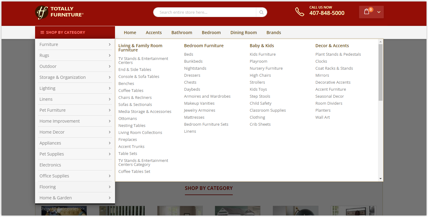
The page loading speed is also optimized to increase the quality of the user experience.
10. Sleep World
Rate: 8/10
Sleep World’s Magento furniture website utilizes a box-based layout to display elements. You can see this most clearly on their homepage. This layout helps visitors easily understand the website’s layout and quickly locate what they want.
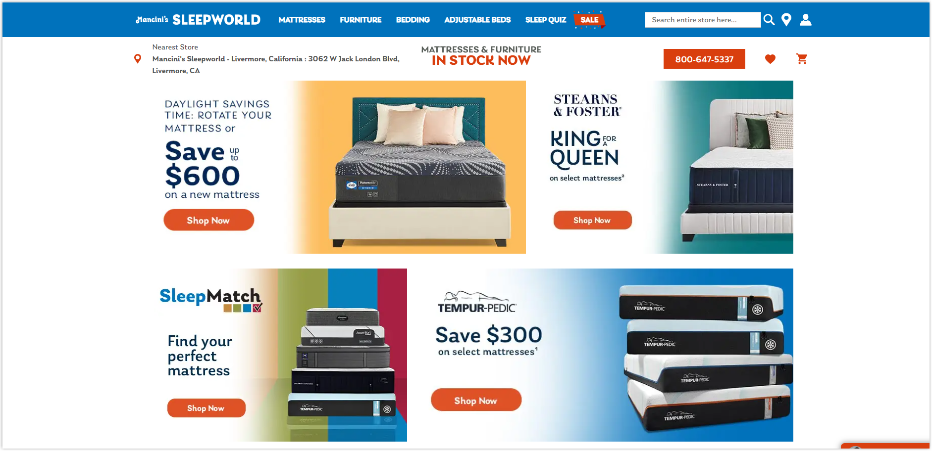
Overall, this online store feels airy, comfortable, and modern, partly showing the quality and style of the products.
The images are high quality to help users visualize the products and make the most accurate shopping decision. Furthermore, they are carefully edited to be consistent and attractive to buyers.
The features are fully provided to help visitors experience the website most conveniently. In addition, the fast page load speed also increases the time to stay on the page and improves the likelihood of a purchase.
Try FREE Magezon Page Builder!
Easily create your engaging Magento pages in any style whenever you want without relying on developers or designers, just by drag & drop.
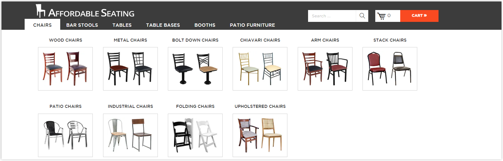
11. Affordable Seating
Rate: 8/10
What I like about this website is its careful arrangement and division of different categories of goods to help visitors easily navigate and quickly find what they want. You can look at the Shop by category section below the hero banner. If you click on any product, the sub-categories will help you find precisely what you need.
In addition, to narrow the options and save time for buyers, they also add the Popular products section below, increasing the ability to cross-sell and, above all, help visitors not think too much.
The images are of high quality, and there’s no distortion when zoomed in, helping users visualize the product’s material and essential details.
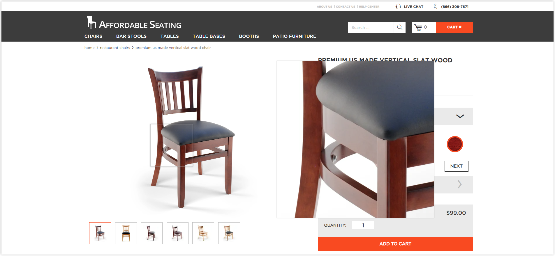
The navbar is presented neatly and efficiently in a completely different style from other websites.
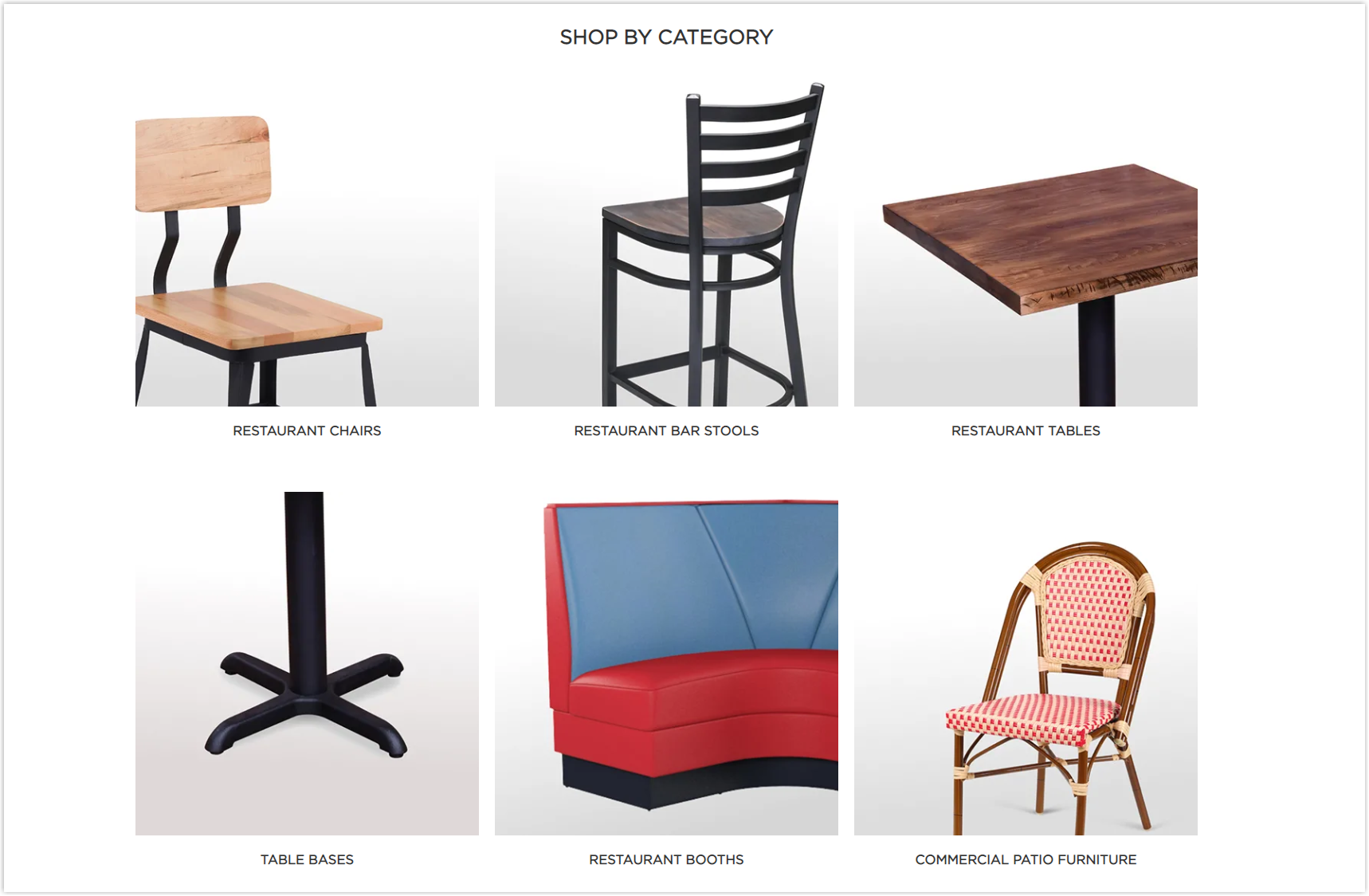
12. Furniture Cart
Rate: 8/10
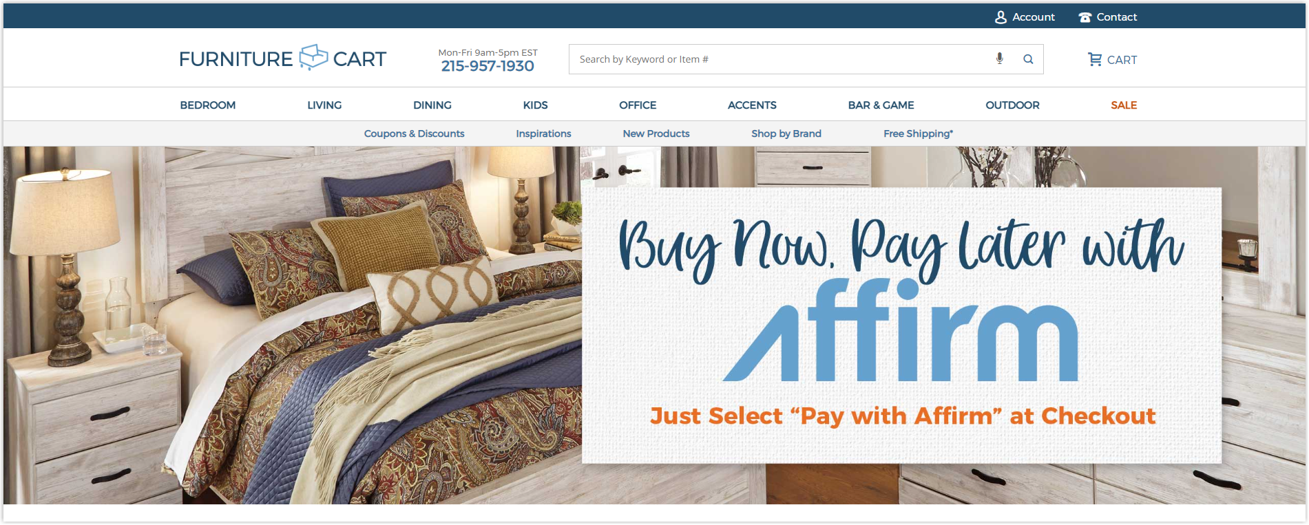
The first impression when entering this Magento furniture website is the vintage colors with a product style of the Middle Ages mixed with modernity.
The categories are eye-catching to help users quickly find the products they want. Menus bar is also designed to be understood easily and complete with clear illustrations, saving time searching and navigating faster.

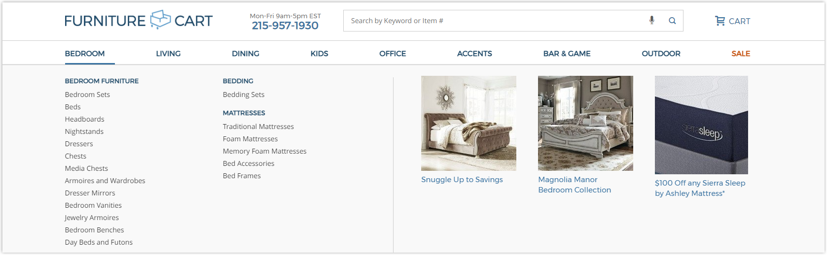
Essential features are provided to optimize UX, increase time on the page, and encourage users to explore more and purchase.
13. Bernie & Phyl’s
Rate: 7.5/10
Also a best Magento furniture store with a vintage and slightly old-fashioned style, Bernie and Phyl’s has a website that conveys precisely that, and you will feel like you are visiting their brick-and-mortar store.
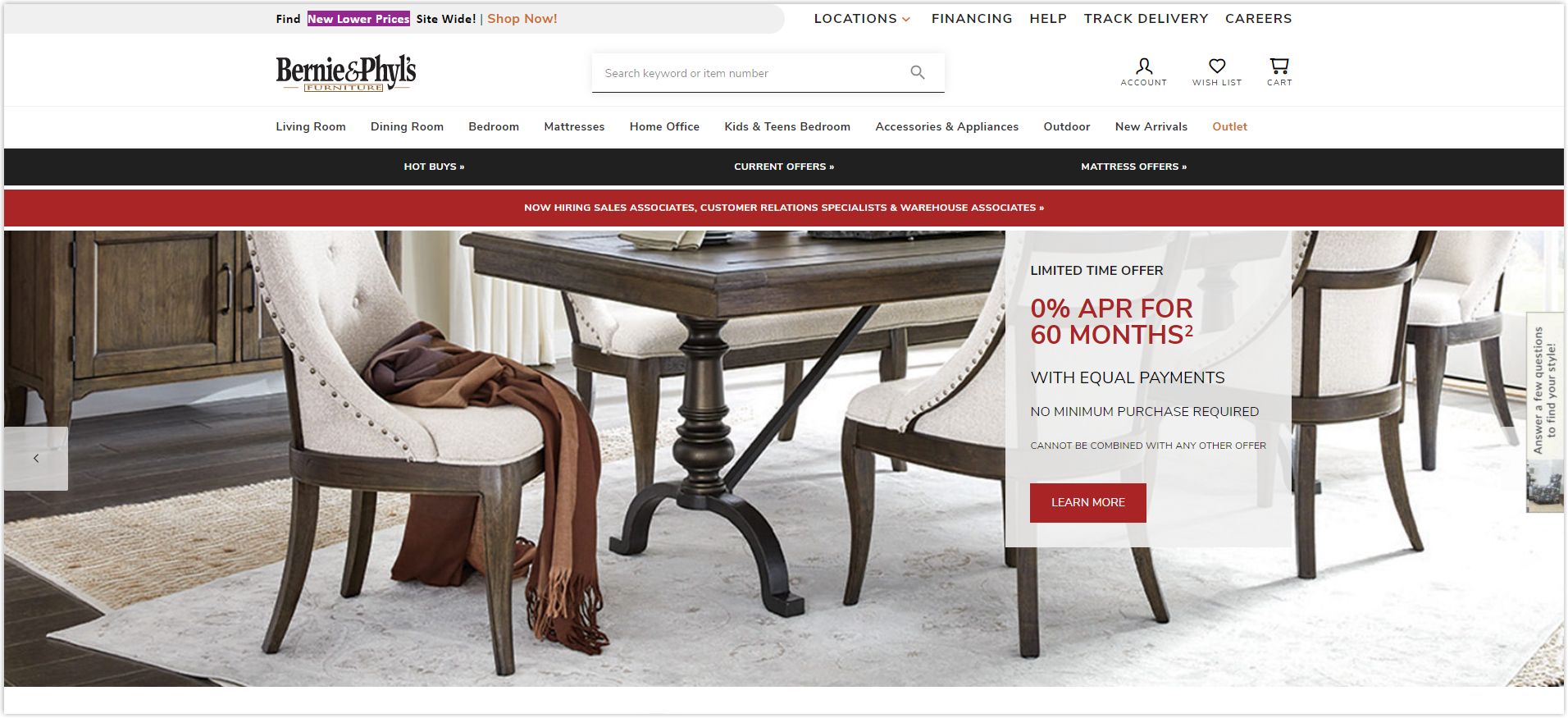
It does not use any special interactive features but only includes the necessary functions to meet the most basic needs of visitors. Because of this simplicity, navigating the website becomes more accessible, and users can quickly find the products they want.
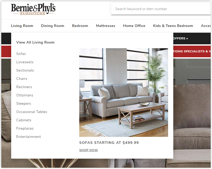
In addition, the navigation bar is also streamlined and arranged based on indoor spaces. Each menu is clearly illustrated with pictures.
If you want a website to serve users with the most basic needs of referring to products and orders, this is an example you should not ignore. However, remember your product style and physical store layout so that they can be synchronized with your online store. Branding is essential to make buyers remember you and return.
14. JYSK
Rate: 8/10
With more than 3000 stores worldwide, JYSK is a giant in the furniture industry that is no stranger to shoppers. However, their Magento website is designed simply, with only essential utilities for visitors’ needs.
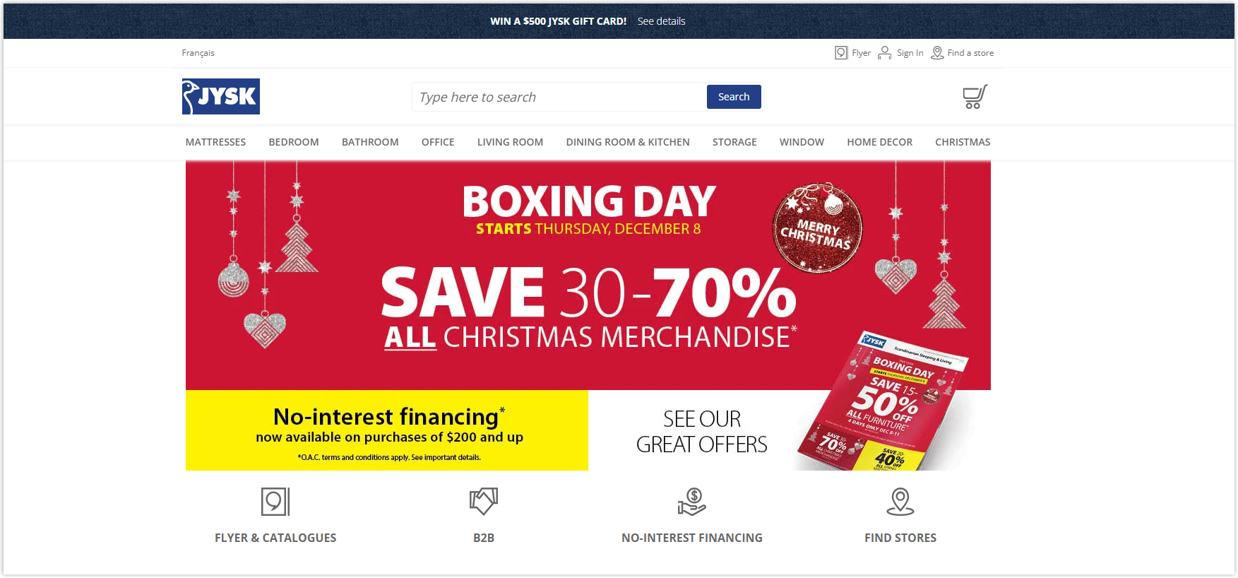
JYSK’s online store’s colors and logical arrangements help highlight the modern style of products. The color selection supports branding, helps users remember, and increases the likelihood of returning.
All features are fully provided to make the buying process faster and more convenient. If you only need a basic website, JYSK is an example worth learning.
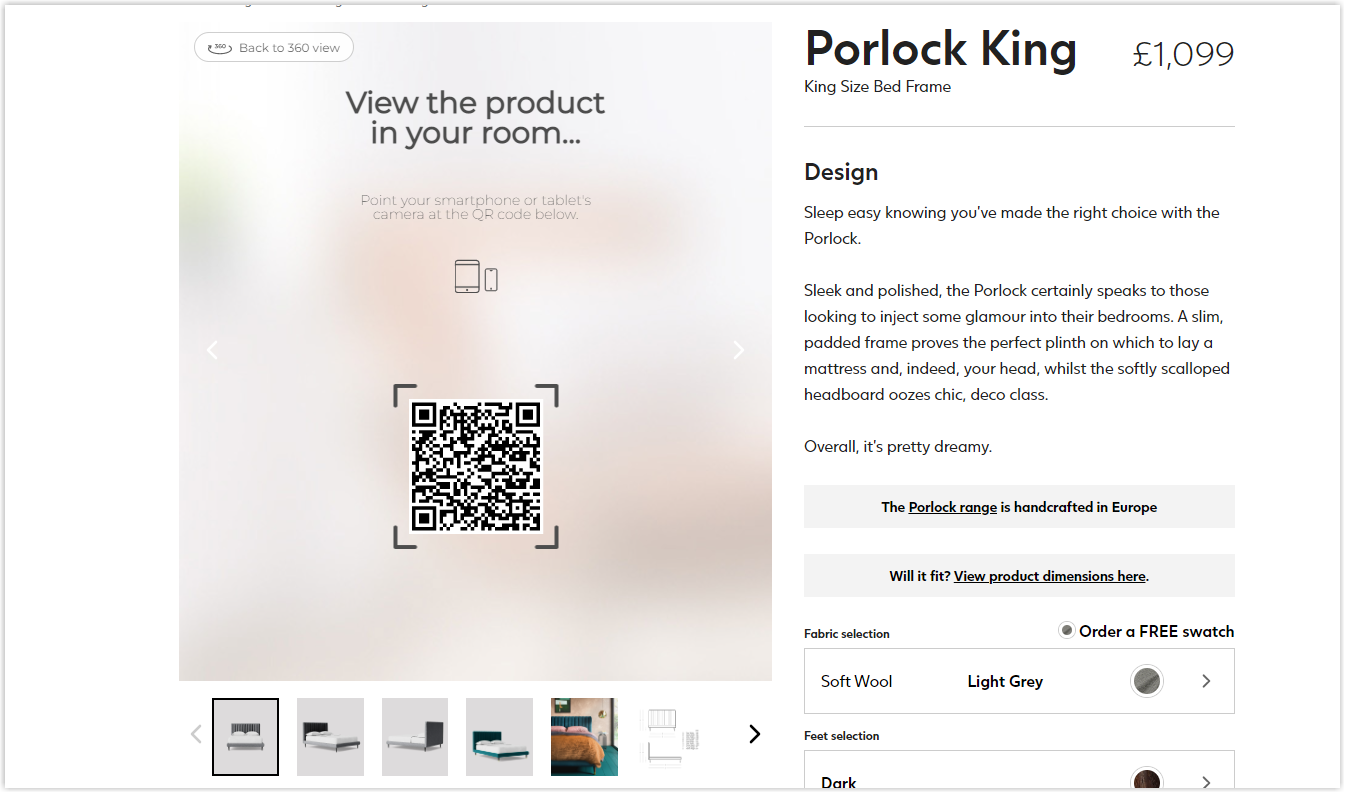
15. Swoon
Rate: 9/10
Let’s end the list of the best Magento furniture stores with a modern and minimalist website from Swoon. At a glance, you can immediately see that the product style of this brand is modern and trendy. Therefore, it’s a must for its online store to reflect this precisely.
On the home page, the arrangement of elements in a box-based layout makes it look neat and easy to understand. While the sheer number of products can make sorting difficult, Swoon, on the contrary, has made navigating websites and locating easier. Thanks to the division by product line, material, style, and space, visitors can find the items they want as quickly and accurately as possible.
The navigation bar and menus also include hot items, a feature no website has ever had.
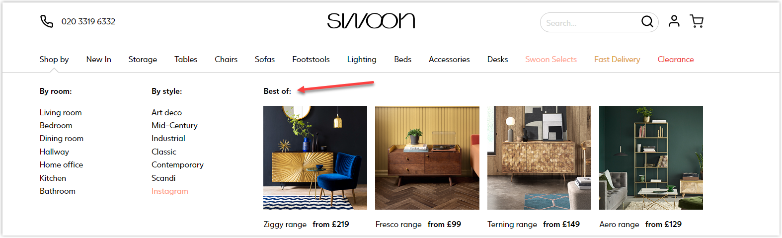
In addition, this Magento furniture website is also equipped with an intelligent feature that allows users to see the actual product in their home by scanning a QR code.
We’ve been discussing 15 prominent examples of Magento furniture websites to give you a brief idea of what an effective one should look like. In the following section, we will see also how the home decor websites are doing and what lessons can be taken from them.
Try FREE Magezon Page Builder!
Easily create your engaging Magento pages in any style whenever you want without relying on developers or designers, just by drag & drop.
4 Magento Home Decor Websites
16. Simon Pearce
Rate: 8/10
As a brand specializing in glassware with more than 30 years of experience, the market is no stranger to Simon Pearce’s extremely high-quality handmade products.
What about their website? Aiming for a simple style (like their glass items), this Magento home decor store chooses a box-based layout for the homepage so that visitors focus more on images and use a white background with the most minimalist arrangement.
All pages take full advantage of the white space to make the website look more harmonious and balanced. Images are carefully edited and selected with high quality to help visitors easily visualize the sophistication of the products.
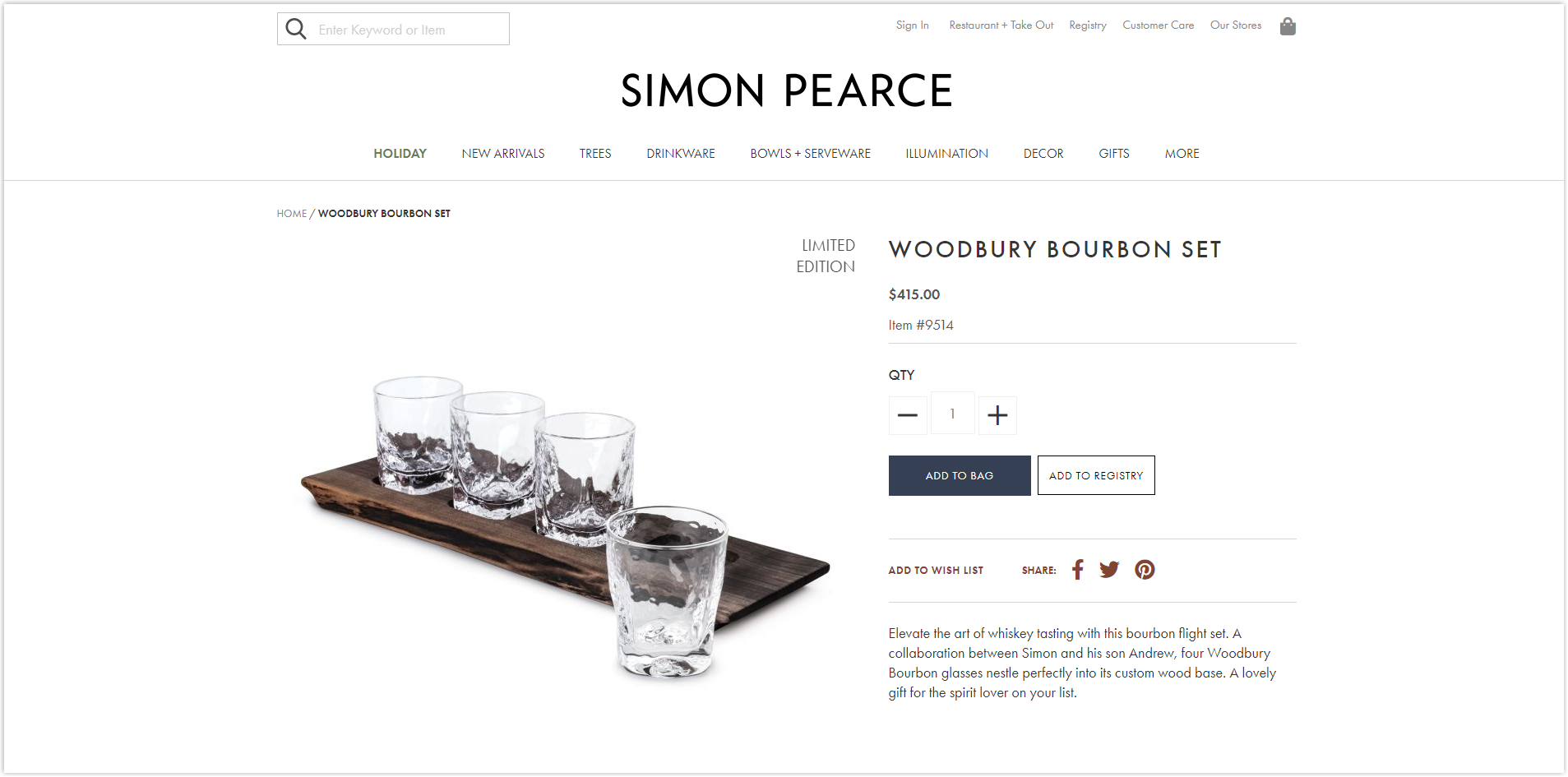
The features are fully equipped to help users purchase quickly and conveniently. Moreover, the fast page loading speed is a plus point that improves UX and increases the likelihood of purchase.
17. The Well Appointed House
Rate: 8.5/10
The Magento furniture website of a brand with more than 20 years of life certainly has something to discuss. The products of The Well Appointed House follow the vintage and a bit of a medieval style, so the website design is simple and elegant to highlight the products.
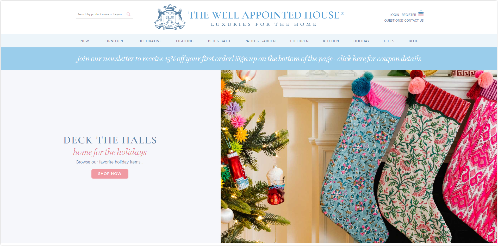
Cleverly used whitespace makes the elements look more balanced and harmonious. The primary color is also a light neutral to not outweigh the products.
The website does not choose to show all existing categories like other sites but instead highlights prominent collections, such as holidays and gifts, on the homepage. The navigation bar includes essential menus to help users find their desired products quickly.
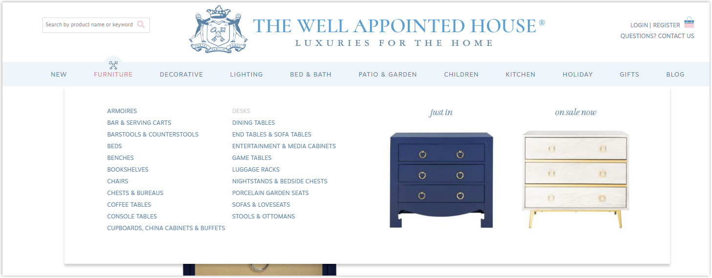
All features are optimized to improve UX and increase time on site and the likelihood of purchase.
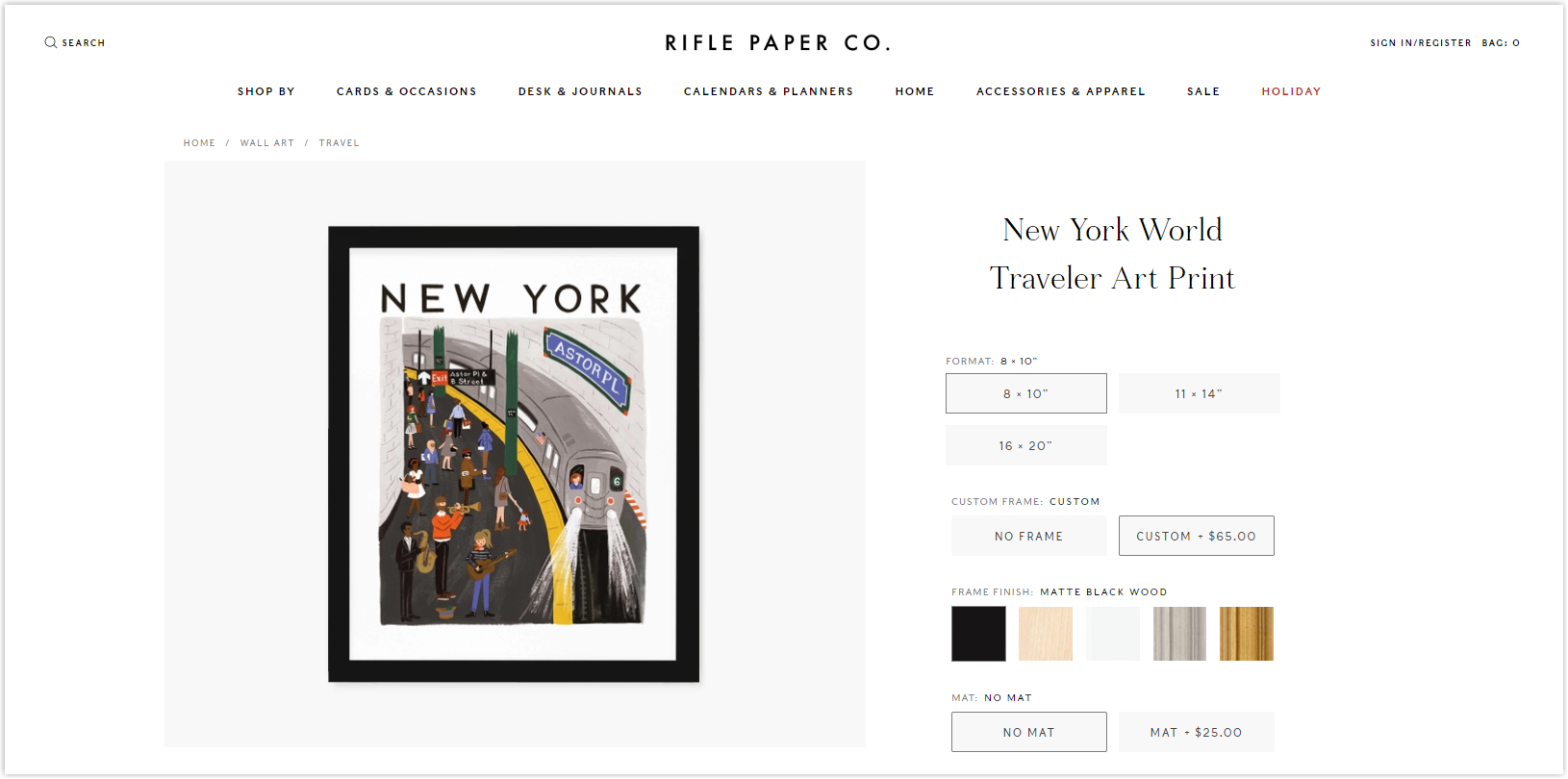
18. Rifle Paper
Rate: 8.5/10
Welcome to Rifle Paper’s world of colors and flowers. Because the products include many vibrant textures, the arrangement of details and the use of color are also minimal to highlight the items.
Clear categories make it easy for users to find what they want. The navigation bar includes the most prominent menus and clear illustrations for visitors to visualize easily.
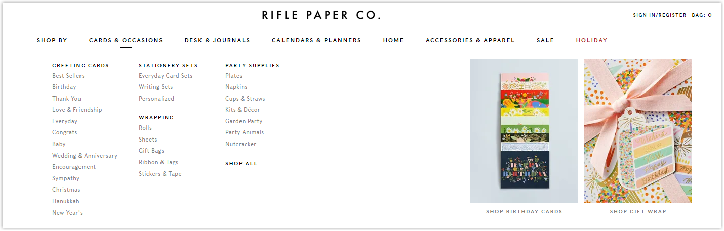
All the necessary features are fully provided, and buyers can also customize items to match their needs on the product pages.
19. Sunland Home Decor
Rate: 7/10
Before we analyze this Magento furniture website, be aware that it may not be your favorite style. Since the products are made with Native American inspiration, the arrangement of elements is a bit messy and outdated. Although it precisely reflects the product style and brand, not many people will like it. However, if your store also has similar products, this is an example that should not be missed.
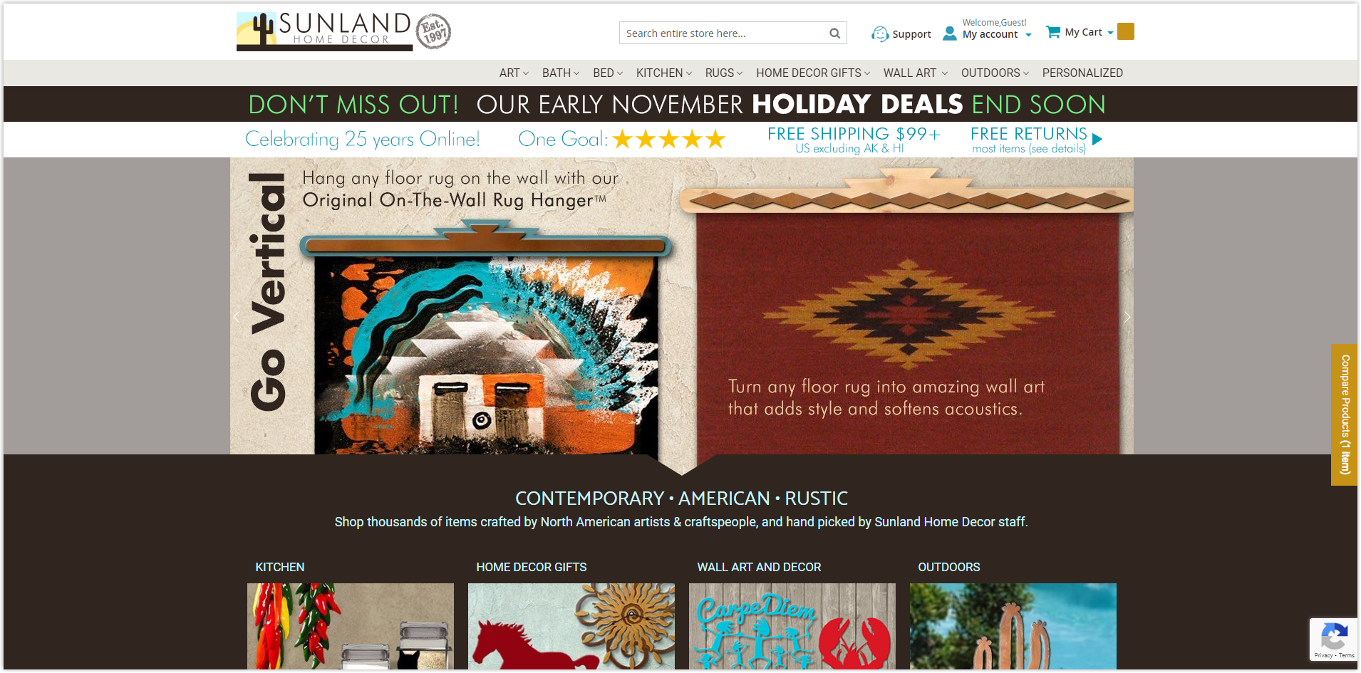
With a vast number of items in many different categories, the arrangement in this Magento shop has to improve more because users can be overwhelmed when looking for any product. The navigation bar should only add uniform images, not to make locating the product more complex. For example, the kitchen category below can only have one illustration on one side and menus on the other.
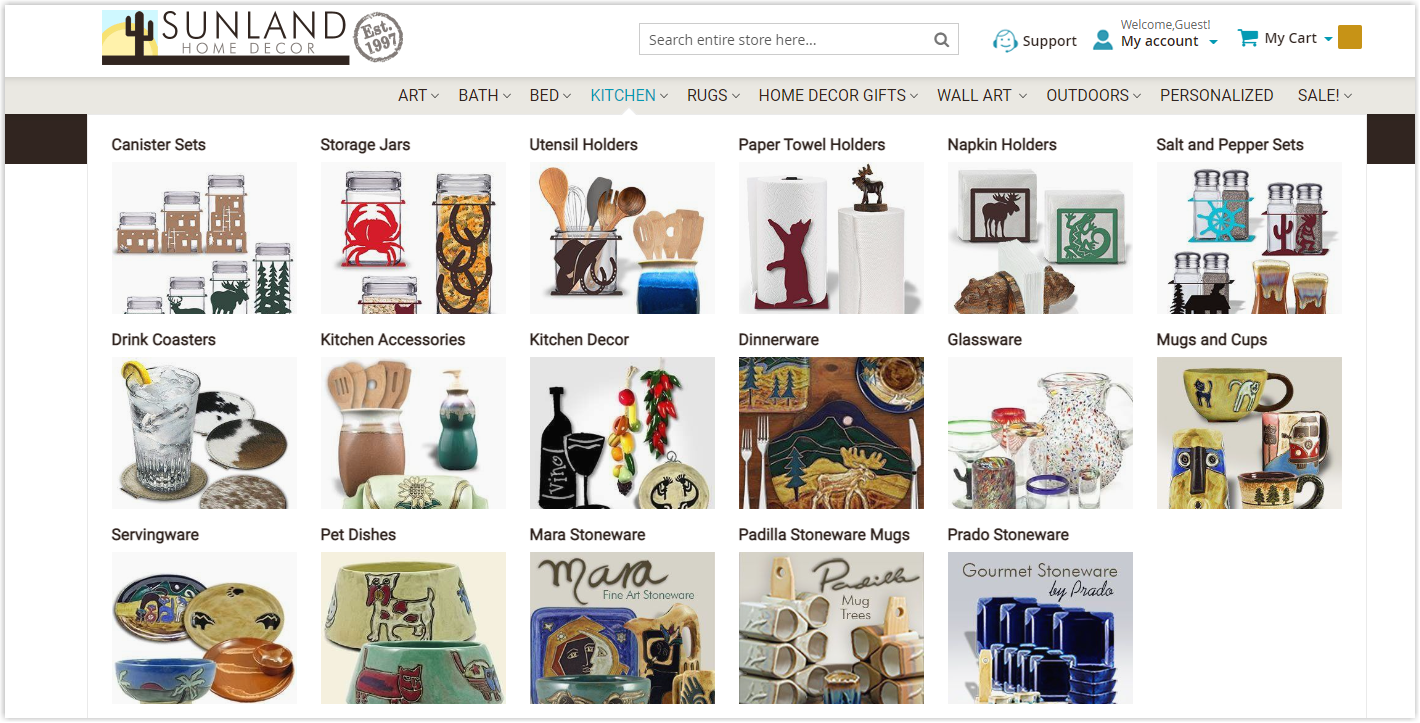
However, the fast and stable page loading speed is a plus. This helps visitors stay energized and increases the time on the page and the possibility of a conversion.
Build Your Furniture Website With an Innovative, Comprehensive Magento Website Builder Tool From Magezon
With the 19 best Magento furniture websites, I believe you’ve had a general look at what an impressive online store looks like. However, developing one like them is difficult because you need to have coding skills or spend a lot of money to hire experienced developers.
Magezon’s innovative, comprehensive website builder tools will ease your burden. We provide 14 builders based on the Core Builder to help you create all the essential elements and pages in any style you want by simply dragging and dropping. Try FREE demos for Magezon Page Builder, Ninja Menus, Single Product Page Builder, Blue Form Builder, and more to see how they can help you create a complete Magento store to impress customers, improve UX, and gain more sales.
More Magento extensions are also available to create all necessary pages and elements for your website. Don’t worry if you’re not that good with coding because these extensions are the solution.


