The best law firm websites have clear service descriptions and simple layouts, but they still present a powerful, distinct brand for your practice.
So, how do we create well-designed lawyer websites? In this post, we’ve compiled a list of the top thirty law firm websites to check out what makes these sites unique. Then, we share useful tips so you can create your law office website regardless of the firm size or whether you specialize in real estate law, family law, or criminal defense.
30 Best Law Firm Websites
A. Divorce, Child Support, and Family Law
1. Vaught Law Firm
The first one on this best law firm website list is Vaught Law Firm. What sets it apart from the competition is the personal feature, represented by the two major calls to action in the middle of the site: Meet Jimmy Vaught displays a one-minute introductory video, and Let’s Talk goes to the contact page.
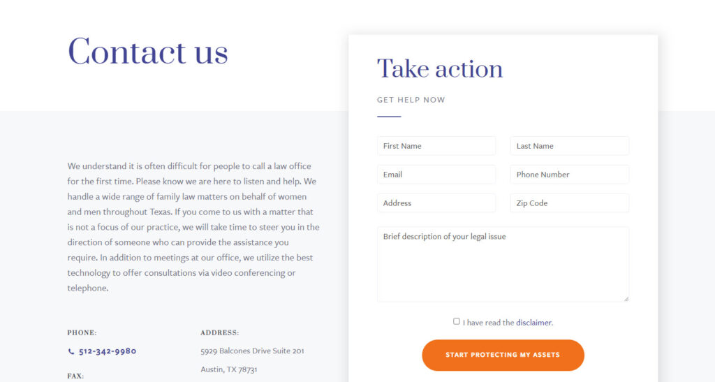
As you can see from the picture above of their Contact Us page. In the first sentence, they did a great job stating one common psychology of the clients finding a law firm, is afraid to call. What they say after that, like “Please know we are here to help,” immediately soothes their concern, making them feel secure and understood. They even offer to recommend someone else to help their clients if their services aren’t capable.
In order to gain more trust in customers, they wisely place their awards in the slider right below the big picture on the front page. Regarding trust, the website also makes good use of the dark blue color, representing knowledge, power, integrity, and seriousness without ruining the overall aesthetic.
2. Stanchieri Family Law
In some cases, less is more. Therefore, Stanchieri Family Law’s website design took a minimalistic approach. Their main color scheme combines only black and white, with a few red accents. On the other hand, they use a one-column layout and don’t put too many details on a page. If you take a closer look, most of their homepage sections have only one black background with white text.
→ Find inspiration to level up your homepage: 20 Best Home Page Design Examples for Website 2022
The usage of professional pictures also gives the website more credibility. The site heavily emphasizes its team, with each attorney getting a page highlighting their background and experience.
Especially, this law website design has a feature of a responsive website and a hamburger menu. This simple navigation style makes potential customers easier to understand and discover the site’s services regardless of their devices.

Try FREE Magezon Page Builder!
Easily create your engaging Magento pages in any style whenever you want without relying on developers or designers, just by drag & drop.
B. Business, Employment, and Workplace Law
3. Wards Lawyers
Wards Lawyers is prominent in this best law firm website list with a unique design. Right after you land on the page, you’ll see the introduction of the lawyers with photos and names.
What sets it apart is that visitors can see a row of letters representing the first letter of each service they provide. The image, practice, and color change once customers click on that letter. This creates a connection between information and makes it easier for potential customers to immediately contact the person in charge of their cases. Aesthetically, this helps the site look neat yet effective and allows clients to conveniently choose the services they need.
To gain more trust, this website also shows all awards automatically run in a slider at the bottom of the page.
4. Slinde Nelson
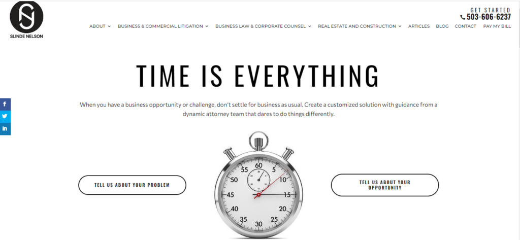
Another best law firm website design is Slinde Nelson. As the home page implies, time is everything. You shouldn’t have clients read lengthy introductions or bury your contact information far down on another page. The lesson here is to help visitors instantly comprehend what you provide and how to get in touch with you.
The basic combination of black and white colors aesthetically makes the site look professional and more credible. On the other hand, the menu always sticks at the top of the page no matter where visitors scroll down and has the full range of the services they provide. This feature makes it more convenient for them to navigate the website without obstacles.
Then how can clients contact them fast? No worries, there’s a phone number always visible in the top right corner of the page. Below the In a nutshell section, they also make an area for customers to fill in their contact information prominently.
5. Gecić Law
Gecić Law comes next on our best law firm websites list. This firm designs its pages in full-screen mode, helping customers to fully focus on the website. Right the moment you set foot on their website, the videos are the first things you notice, as this type of content is the most attractive one. I’m pretty sure that you are spending some time watching them without knowing it.
Not only the videos, they understand what strikes the visitors the most, the awards. As soon as you enter the home page, right in the center of the videos, there’s a caption in white saying, “LAW FIRM OF THE YEAR: SOUTH EASTERN EUROPE – THE LAWYER EUROPEAN AWARDS 2021.”
On the other hand, they apply a pretty good scrolling feature that makes customers want to scroll further down to discover more about the page.
6. Friedlander Misler
This is one of the most effective lawyer websites I’ve ever seen. The first minute you enter the website, you may notice their prominent slogan on a beautiful landscape picture, “Strong reputations, don’t go unnoticed,” and the drop-down menu on the left with FAQs to get to know about their business.
Another interesting thing is how they use pictures of the simple landscape behind the main text box, which look quite modern without affecting the readability of visitors.
On the other hand, they design quite effective footer with all their contact information on every page. If you click on their Contact Us page, you will be impressed by how caring they are. Look at the Directions section. Do you notice that they even show us the direction to their offices using different means of transportation?
→ Get inspiration to optimize your Contact Us page: Simple Contact Us Page: 10+ Examples That Work Like a Charm
7. Chelin Law Firm
Chelin Law Firm’s use of the dark blue main color, professionally captured photographs, full-screen header, solid style, and typography combine to create a beautiful, credible, authentic website.
→ Make your typography effective: The Golden Rules for an Effective Typography in Web Design
To make it convenient for visitors, they arrange the CTAs evenly throughout the page, in the most prominent places where customers will likely click.
Another interesting feature is the slow zoom-in and out of the image on the homepage, creating a feeling of reading moving texts. On the other hand, the website also utilizes the lazy loading effect to make it load faster and help customers not to be overwhelmed with information.
8. Taylor Jains LLP
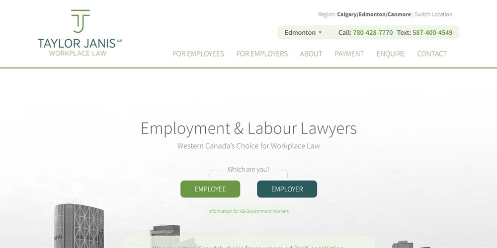
Taylor Janis, a labor and employment law specialist, has a clear, simple website with contact details prominently displayed. Answers to frequently asked questions, such as What is severance pay? and What qualifies as harassment? It can be found on the homepage. These assist potential customers in finding answers to their issues fast.
C. Multidisciplined Law Offices
9. Bienert Katzman Littrell Williams LLP
The website for BKLW is simple and professional with good uses of full-width photos and a dark color scheme. They use images of their office, the setting they are working in, and how employees dress to help customers visualize their office in real life and increase their credibility.
Right below the first image is the news section introducing the cases the firm has handled. On the other hand, they smartly present the information about their firm throughout the page with an award badge to reinforce the trust at the bottom. I’m sure that this is when the customers will contact you.
10. Vogel Verjee Law
This Calgary, Canada-based law practice’s website has a design that takes advantage of the images. The first thing you notice when visiting is the one-page home page with a big image.
In addition, the page sets it apart from others because of its convenience. Clients don’t have to scroll down to search for details since they can utilize the mega menu in the header. With this feature, they can also easily learn the basic information about their problem before contacting you.
11. Thomson Rogers
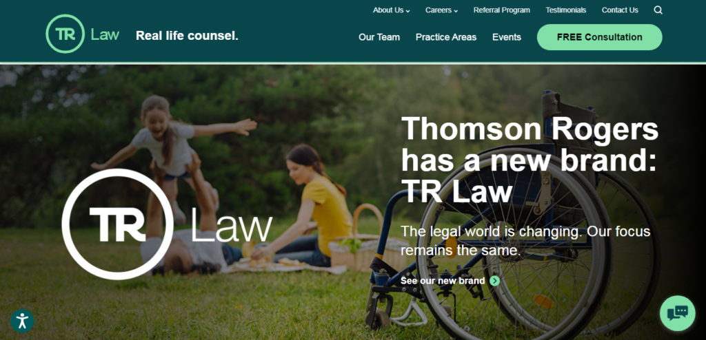
Thompson Rogers is the next example on our list of the best law firm websites. They have a straightforward layout, which makes it easy for visitors to navigate. Furthermore, it is simple to contact them thanks to the highlighted “Free Consultation” button, and a chat window pops up on every page.
On the other hand, they use the parallax effect, which is simple yet effective for readers to read the information they need. They also add social proof, which is many award badges and partner logos, at the bottom of the page, giving the site more trust.
12. FMBK Law
FMBK’s website has a professional, controlled vibe thanks to the color scheme and the good layout for content and images.
The most special and remarkable section is the lawyer’s introduction. They use the website’s interactive feature to display the lawyer’s image; customers will only see more details if they hover over it. This helps visitors not to be overwhelmed with information and the website to be neat.
FMBK also makes good use of the images to accurately illustrate each section’s content. Scroll a little down, and you’ll see an area for press and media mentions used for social proof.
13. Carbert Waite
The call-to-action buttons such as email and phone numbers are prominently displayed, which is convenient for customers to immediately contact with just one click.
You can tell that simplicity and clarity are what they want to emphasize by looking at the navigation bar with only four menus. The Legal Services is described clearly and completely, but the layout does not make the reader overwhelmed. The lazy loading effect is used reasonably to speed up page loading and improve user experience.
Like FBMK, they also show only pictures and names of the lawyers initially, and when visitors hover over the photos, more details will appear. The layout of this section makes it look easy for the eyes with a white background and the spacious distance between the images.
14. FBG Law
FBG Law is the next example of our best law firm website list. The layout is user-friendly with a professional, straightforward design. The use of dark blue underlines the firm’s professionalism as it conveys a clear, professional, and trustworthy image.
Additionally, the navigation bar is always stuck at the top of the page with the phone number in the right corner, which is convenient for visitors with just one click to contact the office.
The plus point of this site is that they make the most of the numbers; you’ll see it clearly when scrolling down to FBG by numbers section. These numbers work as social proof and help customers have more trust in the company.
The lawyer’s introduction is also arranged scientifically. Only pictures and names of the attorney appear on the homepage. Still, when you click on each image, there will be more details, including the learning process, work, and basic information like phone number, email, and fax.
→ Optimize your homepage: 25+ Ecommerce Homepage Best Practices With Examples

Try FREE Magezon Page Builder!
Easily create your engaging Magento pages in any style whenever you want without relying on developers or designers, just by drag & drop.
15. Rasmussen Starr Ruddy Law

Rasmussen Starr Ruddy has a straightforward website layout. Their menu includes all their services, making it easy for customers to navigate and choose their needs. One special thing about this page is that it provides statistics. You are attracted to quick facts like these, right? This is a great way to reduce bounce, increase engagement, and increase client contact likelihood.
In general, the firm’s website is simple to use and understand, which is essential for any sizable law practice that handles a wide range of legal expertise.
16. Aulich
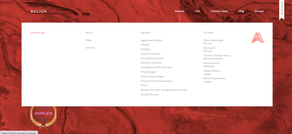
The first impression you’ll get when visiting Aulich is its simplicity and clarity. The background image and color of the navigation bar change as you hover over them to distinguish the areas from one another. One more remarkable thing is how this site displays all services when you hover over each section, making it easy for clients to navigate what they need.
17. Herrick

Herrick, a law company that handles more than a dozen different practice areas, has a fairly straightforward website that makes sense of everything. Each section is organized clearly, making it simple to navigate and obtain the information you need, even if they cover a wide range of case types.
D. Nonprofit and Civil Rights
18. Becket Law

Becket Law stands for religious liberty on the best law firm websites list.
Their website features examples of their work, particularly successful situations, by incorporating various photographs and comments. On almost every page of its website, Becket ingeniously provides information on its nonprofit status and the overall objective to increase support and donations.
19. Birken Law
Another one of the best law firm websites is Birken Law. The website uses 3 main colors, black, white, and purple, to create contrast.
The navigation bar is designed to be simple with basic menus, and they will stay in the same place no matter where you scroll. The phone number is also located right in the left corner, very easy to see.
Another thing I find really appealing about this website is its accessibility option. If you take a closer look, you’ll see an icon of a stretching person in the upper left corner that allows you to adjust the font size, page contrast, etc. This is a thoughtful feature for people with disadvantageous health conditions if they want to visit and seek help from Birken Law.
20. Mission Counsel KC

Mission Counsel KC is another top legal firm website. This webpage is straightforward but efficient. The website’s simple layout, subtle color scheme, and clever use of diagonal lines to match its logo contribute to the feeling of consistency and direction.
E. Accident, Injury, Malpractice, and Litigation
21. Staver Accident and Injury Lawyer
A personal injury attorney Staver’s homepage features a unique yet useful “tab” section. You can have some brief information about Staver by clicking the menus on the right without reloading the page. This makes it simple to immediately learn customers’ evaluations, the firm’s achievements, address, and contact information. The navigation bar is always at the top of the page, and the Choose a Section button on the left side of the screen helps visitors easily look for the information they want.
Each website page is organized smartly with all the necessary information you need without choking you. For example, if you click on the attorney page, their primary contact information is prominently showcased on the left border with the image, their education, and other details.
22. Struble
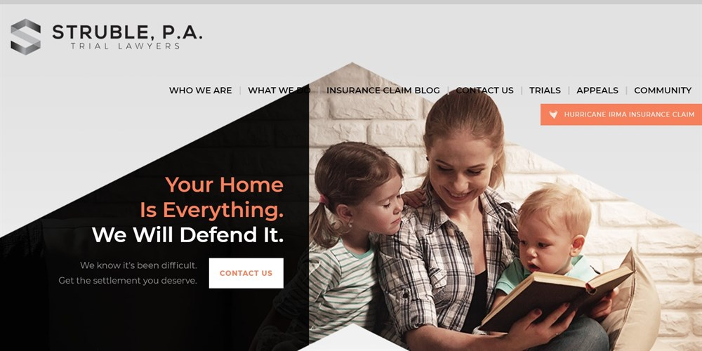
The first impression of this law website design is that the tagline matches the image attached at the top of the page. The image in a triangle shape in the middle looks like a roof, partly showing its target audience: women and children.
The way the firm arranges the page elements is also quite scientific. There is some white space, so visitors aren’t overwhelmed by the information, and the page looks more modern.
23. Jaszczuk P.C. Attorneys
Jaszczuk P.C. Attorneys’s website chooses a dynamic and amusing approach. You’ll be impressed as it’s not similar to any other law firm website you’ve seen while still giving potential customers useful information.
The site is designed as a shooting practice for the military. When you scroll to the third page, you can interact with it by hovering the mouse over the text to transform it into the gun’s aimer. Do you realize the urge to click?
The next page also takes advantage of this interactive feature. If you hover over the numbers to the left, the background will darken, and the information will appear corresponding in the center of the page.
24. Marrone Law Firm LLC
Marrone Law Firm is another website that conveys a sense of confidence with its basic design and neutral color scheme. The reviews and many awards on the homepage make the website stand out, giving visitors more credibility.
The website also has numerous motion graphics and videos that you typically wouldn’t find on a law firm’s website. The simple but useful menu allows visitors to easily look for any information they want. Marrone Law Office is one of the greatest law firm websites because of its well-designed layout that is both strategic and visually appealing.
25. TSMP Law Corporation

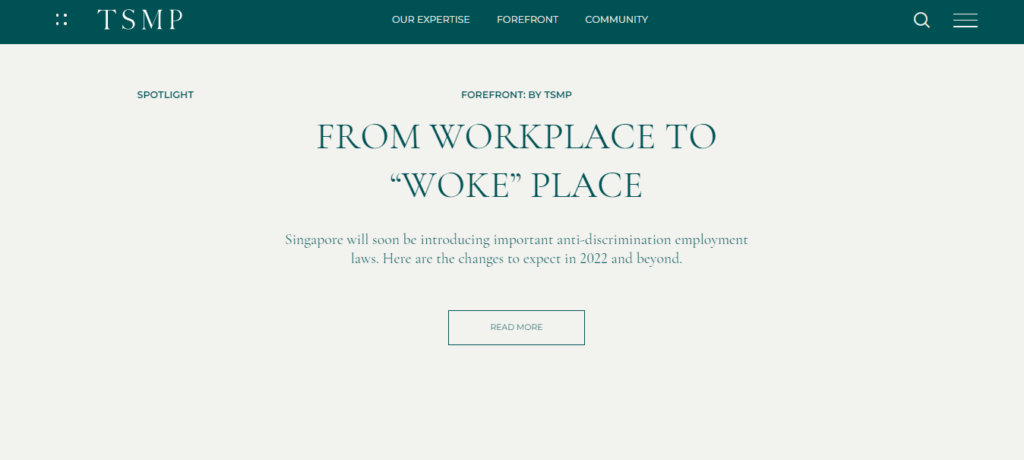
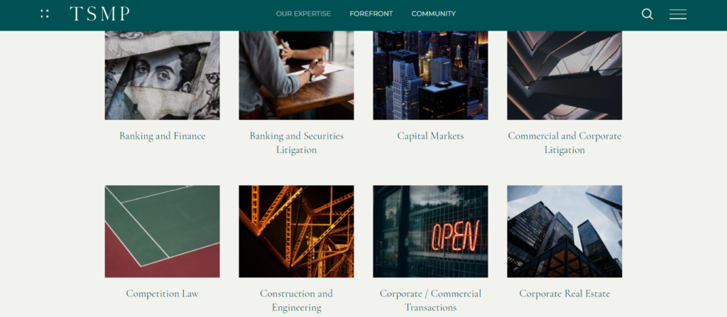
This website will leave a long-lasting impression on you thanks to its creative use of funny and chuckle quotes. It’s also worth noting how these quotes are presented uniquely and captivatingly. Professional serif fonts and a lovely green color scheme complete this sleek, minimalist, stylish design.
26. Litiguard
Litiguard Attorneys has a great website. It is minimalistic and imaginative to highlight content with black-and-white images and vivid text boxes. As a result, users are quickly drawn in. Additionally, how the photos and lively graphics move as you scroll down makes it quite captivating.
27. Barr and Young Attorneys
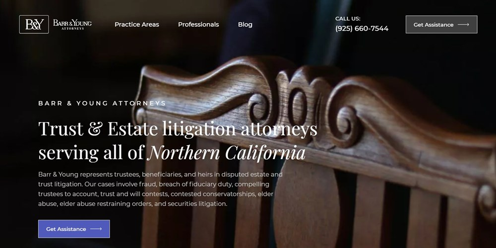
Barr and Young Attorneys’ website is dark, sleek, and heavily text-based. This is effective because it enables potential clients to grasp the firm’s expertise and service quickly.
The obvious Get Assistance buttons are another striking feature to take note of. One is placed right below the tagline, whereas the other is found next to the navigation menu section, which is always in the upper right corner. Both of these make it simple to get in touch with the team.
28. Forman Watkins
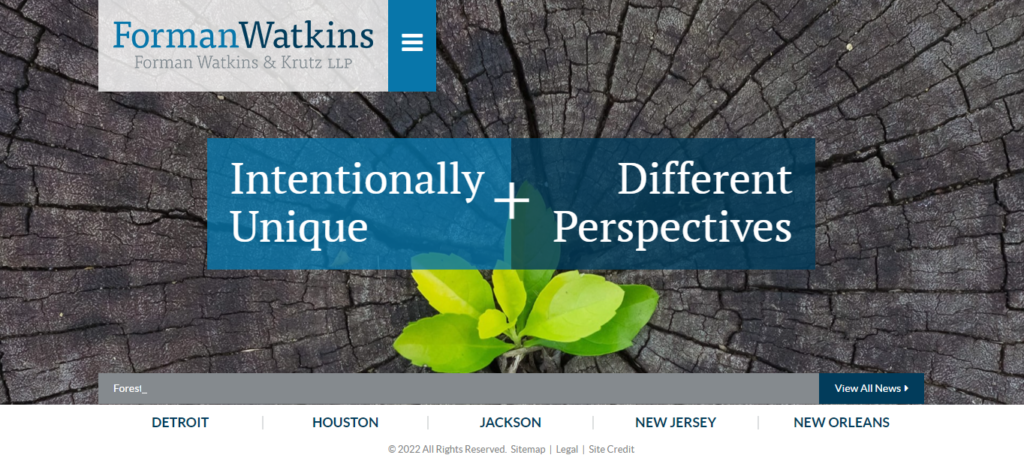
The law firm Forman Watkins has a unique website. Most content is presented on a single page with little to no scrolling. This makes browsing on mobile devices, which account for more than half of all global web traffic, straightforward.
29. Rinehardt
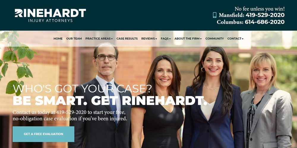
Rinehardt offers a well-made, user-friendly website. The Live Chat option, which enables you to ask questions regarding your case fast, is possibly its most obvious feature.
Without a doubt, this is simpler than calling or sending an email.
30. Quinn Emanuel

Quinn Emanuel Trial Lawyers is another law practice with gorgeous photos in its header. The colors all work together to highlight the white text. Their display is amazing thanks to the usage of gradients. Moreover, you can quickly find a lawyer from their firm in your location on the homepage.
You may get some inspiration from the best lawyer websites above. But to help you make an engaging and beautiful law website design, we will share some tips below.

Try FREE Magezon Page Builder!
Easily create your engaging Magento pages in any style whenever you want without relying on developers or designers, just by drag & drop.
10+ Tips to Have the Good Law Firm Website
Branding Tips
Besides logos and colors, great branding is essential. Your brand distinguishes you from competitors and how customers think of you. As a result, your website needs to represent your brand accurately. Here are some branding tips for your law website design.
- Use Your Law Firm’s Name and Logo
Your lawyer websites should feature your logo since this increases brand recognition. Once you build up brand recognition, potential customers will be able to recognize your posts both online and offline.
Additionally, you should utilize your firm’s name rather than exact-match domains like bostonpersonalinjuryattorney[dot]com in the URL of your website. Although this was common practice in the early days of the Internet, it has no impact on your SEO ranking.
- Use Your Brand Colors
Using your brand colors is a fantastic approach to make your law website design stand out, even with a readymade theme. They can be used as a website background, as buttons and calls to action, in links, or to visually separate various parts.
Remember to use your palette’s most vibrant hues, such as reds or oranges, for calls to action to make them simpler to identify.
Another tip is to ensure that the background and text have enough contrast.
- Highlight Your Benefits
It is also better to identify what makes your law firm unique and emphasize this throughout the design of your law office website. Potential customers can relate to you and determine whether you are the best lawyer or attorney for their case with your advantage, also known as a Unique Selling Point or USP.
You can use your expertise in your website’s headlines on the About page or your tagline.
Marketing Tips
The following tips can assist you in increasing your site’s visibility in search engines and attracting visitors to your site through social media and content marketing.
- Create a List for Your Law Firm With Google My Business
When you list your firm with Google My Business, you must submit your company name, address, website, and industry.
Once your company has been verified after entering a code, you can add more details, including your business hours, a description of who you are and what you do, and more. This enhances the likelihood that your website will appear in search results when someone searches Google for local lawyers or attorneys.
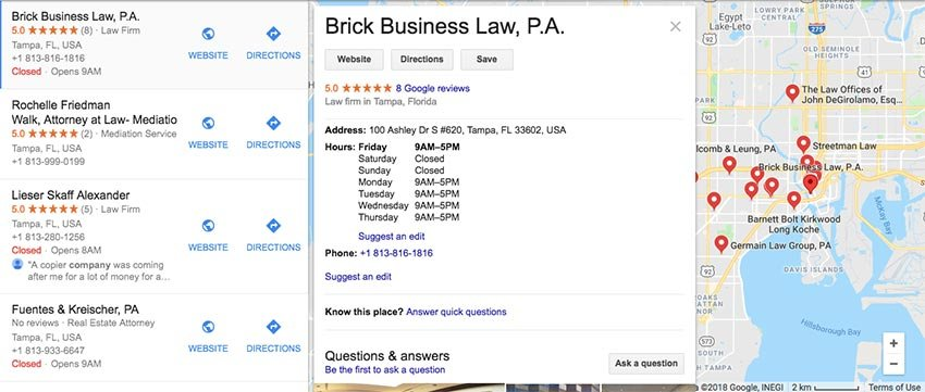
Check out the example below. These law firms have ratings, phone numbers, hours of operation, directions, reviews, and a link to their law firm’s website.
- Create Content Using Social Listening
Social listening will be as effective as case studies on your website. You can generate even more compelling content for your site, which will help you increase organic traffic to it.
This entails checking various social media platforms, including Facebook, LinkedIn, Twitter, etc, for specific phrases and hashtags associated with your business sector. By doing this, you can better understand what your “colleagues” are discussing and your potential customers’ problems and difficulties.
- Blogs to Attract More Targeted Traffic
Another good marketing tip is blogs. You can gain more results with significant relevant traffic through blogging.
According to a study in 2019 (as pictured below), on average, law firms that regularly had blogs on their websites received 1,593% more organic search traffic than those that didn’t. Even firms with aging blogs generated more traffic than websites without blogs, by 217 percent.
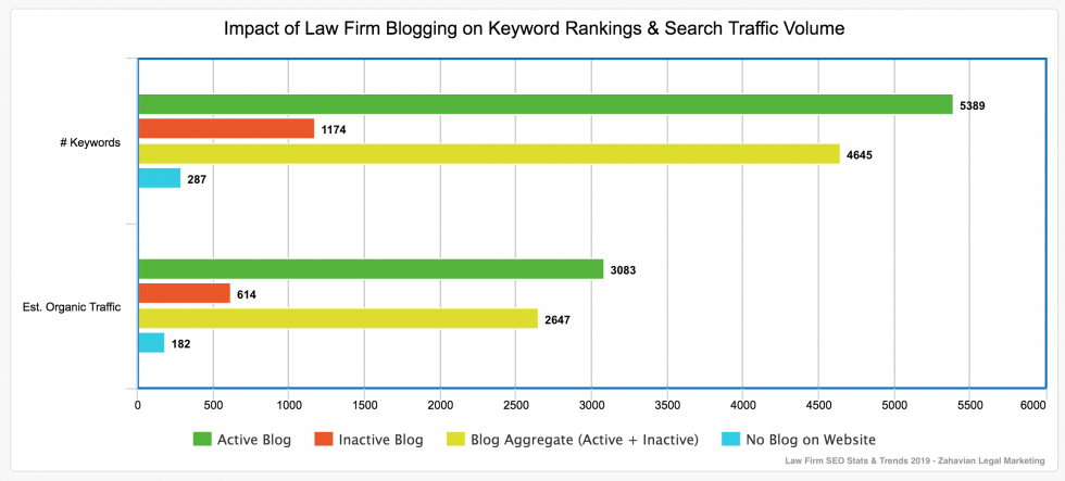
It is evident that elements like blogging frequency, keyword research, and blog article quality influence traffic. However, law firm blogs with top-notch content might anticipate generating high-quality traffic and lead.
If you optimize your website for search engines, you’ll gain more organic visitors. You should take advantage of WordPress’ excellent SEO tools if you utilize them for your website. Here are some SEO tips to keep in mind:
- Don’t use too many keywords to avoid having the opposite effect and causing search engines to penalize your website.
- Use alt text and proper titles for images so search engines can better grasp the information on your website.
- Make your material easier to read by using appropriate formatting, which will also assist search engines in recognizing the significance of the content on your pages and articles.
- Use contextual descriptions instead of “click here” or “click this” when creating links since they make it simpler for readers to grasp what the link is about and aid search engines in determining whether you are linking to relevant sources.
- Share Customer Reviews
To assist you in creating trust and confidence, use testimonials from past clients. Website visitors will be more likely to book a consultation if they learn that you have successfully handled and won cases that are similar to theirs.
According to the study, testimonials are the most powerful content marketing approach, so take advantage of them. You can showcase them on your homepage, dedicated testimonial page, or individual lawyer and attorney profiles.
→ Optimize your homepage: 25+ Ecommerce Homepage Best Practices With Examples
- Show Achievements and Practice Areas on Lawyer Profiles
Make sure to highlight your awards and accomplishments on each attorney page, whether you have a team of attorneys or not. This is another method for showcasing your abilities while building credibility and trust in potential customers.
Along with your contact information, it’s a good idea to list your areas of expertise so that clients will know who to contact immediately.
Law Firm Website Design Tips
The following tips for designing an attorney website will help you present the most crucial information to visitors and give them the greatest user experience possible, regardless of where or how they access your site.
- Describe Your Services
Your website should clarify your services and how you can help customers. Visitors can use this to quickly determine whether they should hire you and whether you are qualified to handle their specific problem.
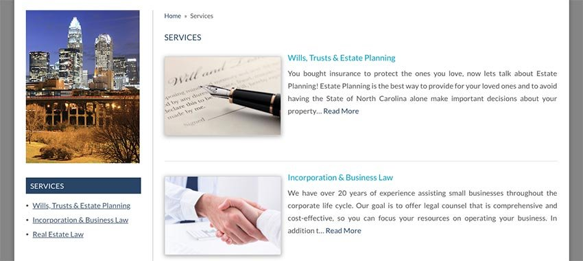
You can put them on your homepage, like testimonials, and give more details on a different page, or you can just link to the services page, like The Mendini Law website below.
- Use Multiple Calls-to-Action
The main objective of your attorney website design is to persuade people to contact you and schedule a consultation. To ensure this occurs, you must guide visitors around your website and employ a variety of calls to action that will make it easy for them to contact you.
The homepage of your website and other pages, such as the About page and the attorney profile pages, should also contain calls to action. They can also be placed in the sidebar of the blog page or below each blog article.
→ Find inspiration for your CTAs: 25 proven CTA examples across all platforms
12. Increase Accessibility on Your Website
Your site’s design may follow a set of design guidelines. However, not all website visitors will have great vision or be able to read the text over graphics and links. Therefore, you should install a plugin on your site for users to change the contrast, text size, font line height, etc.
→ Use the best fonts to optimize your website: Most common font names for websites of all time
Wrapping Up
Out of the best law firm websites above, which one inspires you the most? We hope you’ve gained law firm website design inspiration through our examples to make your page. And don’t forget to apply all or most tips in this post to create one of the top lawyer websites.
If you are a Magento merchant and don’t know which extension to build your law website, consider Page Builder from Magezon. As a trusted Adobe partner, we have satisfied thousands of customers with a vast collection of drag-and-drop extensions, helping you create a high-converting and unique store in minutes.
Don’t take my words for granted; see how your website can be with Magezon Page Builder and what others say about us:
 Magezon Blog Help Merchants Build Comprehensive eCommerce Websites

