 Magezon Blog Help Merchants Build Comprehensive eCommerce Websites

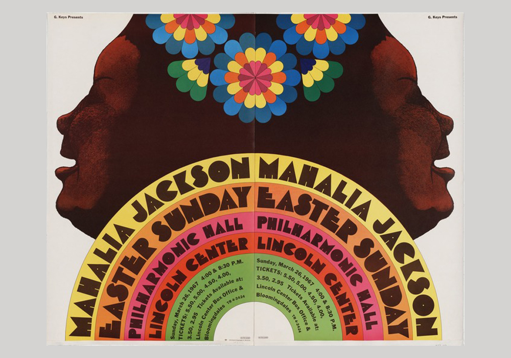
Poster of Mahalia Jackson concert (1967)
Fonts significantly impact the brand’s visual and website design as they affect readability and may also have a strong psychological effect on the guests. Did you know that there are already over 550.000 font names, and the number is growing? Creating effective typography for a website is never easy! Narrowing down the options and deciding which ones will work well on your website can be difficult, but fortunately, this guide will assist you in the process.
Below, we’ve compiled a list of the most common font names to choose from for your website.
Table of contents
| Must read: 30+ Best Font Combinations for eCommerce Websites (2023) 20+ Best Heading Fonts and How to Use Them Effectively 21 Most Common Font Names for Websites of All Time |
Why Do Fonts Matter?
“Typography is the craft of endowing human language with a durable visual form.”
― Robert Bringhurst, The Elements of Typographic Style
Fonts are essential for providing an excellent user interface, communicating brand values, and completing your web design.
It Says a lot About Your Business
Your font will represent your brand personality. Different font types convey different subconscious meanings to people, which can aid in developing brand identity.
Much like the words on your website, fonts communicate a message. That’s similar to when people say it is not what you say but how you say it—how you deliver the news is what matters.
Even if your message is unaffected, your reputation will suffer. Consider the most significant celebrity crush you’ve ever had. And what drew you to that person? Their confidence, beauty, style, or even their physical characteristics? Either way, you don’t know that person very well. They are images of someone you think is attractive, sweet, caring, enigmatic, or something else you feel is crush-worthy. Imagine that your ‘cute’ celebrity crush involves in a cheating scandal. They don’t look as adorable anymore, do they? Their reputation (as your crush) suffers from them going entirely against the picture you’ve offered them.
Using a font that contradicts the brand’s visual identity is akin to a cheating scandal. It erodes your reputation. Fonts that do not match the brand give the website an off-kilter feel.
“Brands are the image you portray about your company to the public; therefore, you can choose how you appear. A font is a choice that can make or break this image!”
Fonts serve a practical and aesthetic purpose. Furthermore, some fonts perform better in specific applications than others. Therefore, your fonts will reveal your brand to current and potential customers.
If you run a more professional and corporate-oriented business like a law office, you should use a more classic, official-looking typeface.
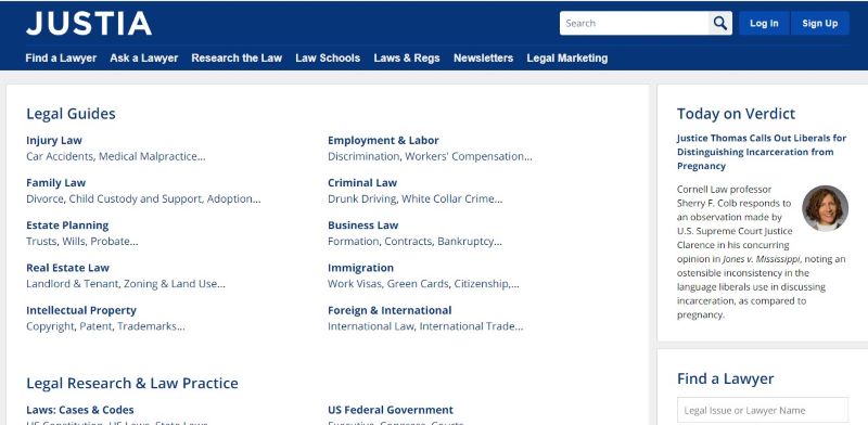
Justia is a website that provides free case law, codes, regulations, and legal information for students and lawyers. They picked Opens San, a San-serif typeface, to portray a sense of trustworthiness and seriousness.

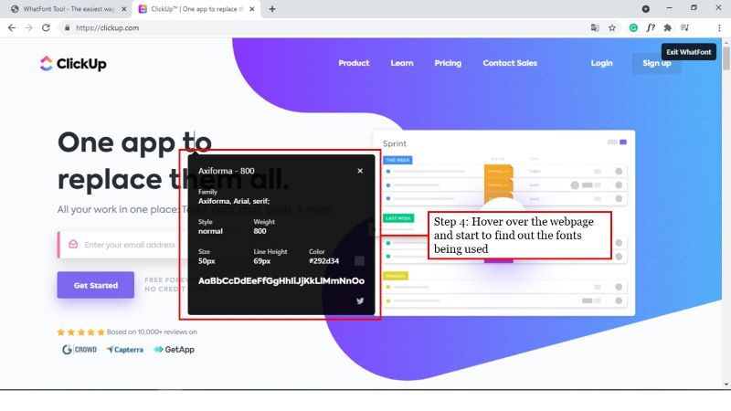
In the case of ClickUp.com, a technological website, it must be current, responsive, and credible. As a result, they utilized the sans serif typeface Axiforma.
It brings a different experience for the user.
The font communicates something to the user before they read the marketing message. Each font conveys a distinct meaning and has particular strengths and weaknesses. Users read between the lines to figure out what different fonts mean, and they form fast opinions about websites based on the font types they use. As a result, different font types will communicate various messages to users and bring a different experience.
Moreover, the reader can tell the most important thanks for the fonts. Therefore, one of the essential things to do is establish an information hierarchy. They assist the reader in determining which parts of the text are more significant.
As in the previous line, using a particular font led your attention to the appropriate element (playing out as bold formatting). Writers use this to show different actions, situations, speech, emotions, and emphasis in digital and paper formats. When the reader is looking for specific information, it is beneficial. The reader can quickly scan the text for the information they need.
In conclusion, the site’s overall architecture tells the user a story; fonts are components that help reinforce the narrative. It’s not only about what you want your users to see; it’s also about how they feel when reading your copy, and fonts help build the emotion you need to fulfill your blog’s function.

Try FREE Magezon Page Builder demo today
Easily style every aspect of Magento website the way you want without relying on developers or designers. Just by drag & drop.
How to Choose the Best Fonts for Your Website
01. Check if your fonts fit the tone of your brand.
Fonts are an essential part of branding. Check to see if your font scheme is consistent with the rest of your visual brand assets.
The font styles are chosen in a communication piece impact how people use them. For example, even a message about something severe like a theft wouldn’t be taken seriously if written in a silly and amusing typeface. On the other hand, a serious and business typeface on a launch poster for a new video gaming system would not effectively convey the message.
02. Arrange the fonts in order of priority.
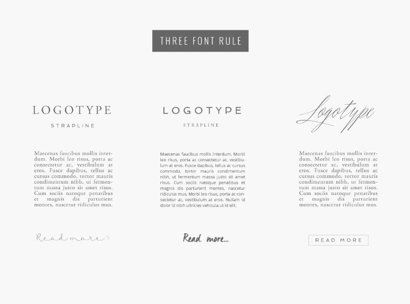
Never use more than three typefaces on your website as a general guideline. Limiting the number of typefaces on your website can improve its look and make it more accessible. Different amounts of emphasis should be assigned to each of these typefaces.
Choose a major typeface, a secondary typeface, and an optional accent font to maintain a clear sense of hierarchy. First, let’s categorize fonts into three types:
- Primary font: The primary font is the most visible and featured on the website’s headers. You should use it in your website’s titles because it is the most apparent. Even if it isn’t the most often used font on the site, this typeface will be most associated with your brand. Consequently, the major font on your website might be more visible and distinct than the other fonts.
- Secondary font: Most of your published website content will use the secondary font. This comprises paragraphs, descriptions, blog posts, and other types of content. While your primary font might be eye-catching and distinctive, your secondary font should be highly legible first and foremost. Complex fonts are more challenging to read when used across extended text sections.
- Tertiary (accent) font: This is a font you can use only for a specific purpose. The accent typo is typical for calls-to-action on websites, calling attention to the most crucial button on the page. Another choice for an accent font is the typeface in your logo design.
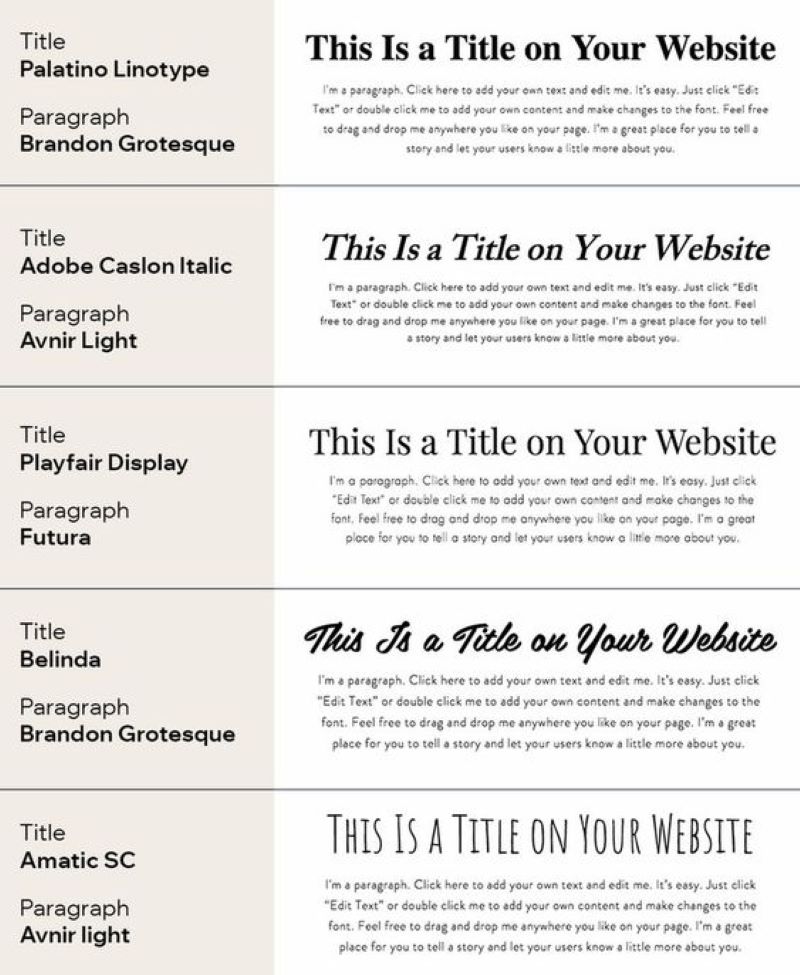
The use of the font is meticulously shown in the example below. If the title is written in a script font, the text should be written in a sans-serif font. This clarifies the knowledge hierarchy in the paragraph, making it easy for readers to understand the article’s content.
03. Know the basics of font classification.
Typography is a rich and diverse art form that encompasses everything from readability to text alignment and spacing. To begin, concentrate on the most critical classifications first: serif, sans serif, and script fonts:
- Serif fonts: A serif is a thin line at the end of a letter or symbol’s stroke. Serif fonts are traditionally connected with print and are considered classical and beautiful. Times New Roman, Georgia, and Bodoni are just a few examples.
- Sans serif fonts do not have serif lines at the ends of their letters. Sans serifs are a perfect choice for web design since they are clean, contemporary, and typically neutral-looking. Wix’s Madefor typeface, Helvetica, and the famed Comic Sans are just a few examples.
- Script fonts, including cursive fonts, are based on handwriting forms. Therefore, it’s preferable to confine this style to headings alone, as putting your body text in the script would be difficult for your readers to follow. Lobster and Lucida Handwriting are two examples.
04. Use text themes
After you’ve decided on a typeface, you’ll need to settle on letter sizes for big names, subtitles, and paragraph material. We’ve put together these ranges as a basic guideline for most websites to get you started:
- 30-70px for titles
- 22-30px for subtitles
- 16-20px for the paragraph
This method speeds up the design process and enhances your website’s user experience and SEO.
Besides size, other elements that affect a font’s visual weight include stylistic adjustments such as bold, italic, or underlining. On the other hand, excessive usage of these styles can have an overwhelming impact and detract from your message, so make sure to use them sparingly.
Tips for Choosing the Right Fonts for Your Website
01. Get inspired
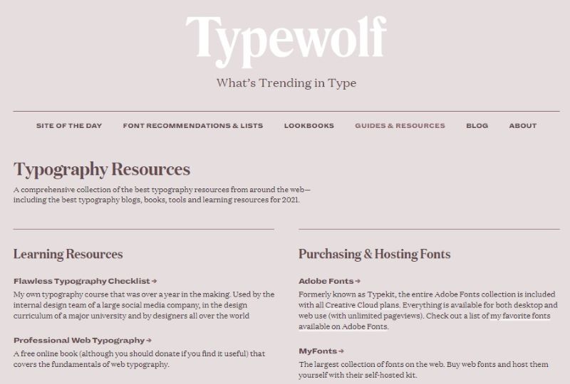
You may already have a few font types in mind, but before you make any decisions, it’s a good idea to look about to see what other people are doing. Fortunately, there are several font inspiration websites on the internet, such as Typewolf, where you can find countless font recommendations and lists to spark your imagination.
Following typography hashtags on social media or searching typography on Pinterest can give you a decent understanding of what’s accessible. You can also check out the eight typography trends to get inspired.
02. Less is more
Although using multiple typefaces in a single template may be appealing, doing so will result in an overwhelming or cluttered GUI. Starting with fonts from the same family is an excellent place to go (aka a single typeface). Since fonts with the same typeface were designed to fit together, sticking to one typeface would give your GUI a more unified appearance. If you’re slightly more similar to typography or had your heart set on more than one typeface, try and limit it to three maximum.
Many typefaces already have a wide enough variety to provide you with enough font variants for various purposes—so sticking to one or two shouldn’t make you feel constrained. Some typefaces, for example, contain italics, expanded, bold, and simplified alternatives, allowing for more innovative arrangements.
03. Readability assessment
Readability should be the top priority when selecting a font, particularly a secondary font—and certain typefaces are considered more readable than others.
Times New Roman and Georgia are two of the most common serif fonts. These default font styles are highly readable and are a good place to start if you want a serif font.
Although serif fonts, commonly used in print, are thought to be more legible, sans-serif fonts are famous for having a more modern and clean look than their serif equivalents, making them better for reading material on digital interfaces. Sans-serif fonts with decent readability include Helvetica, Futura, and Arial.
04. Make sure your fonts are scalable
At smaller sizes, typefaces with very fine letterforms or overly adorned designs may break, while at larger scales, they may be easily visible. When adding typography to the user interface, making sure your fonts are portable is crucial.
Fonts that can be expanded or minimized without distortion are known as scalable fonts, also known as outlier fonts or vector fonts. Each character’s outline is a mathematical formula. Aside from the fact that each font can have an infinite number of sizes, scalable fonts often take advantage of the resolution of the display unit. The higher the monitor’s size, the better a scalable font would appear.
Choose a typeface consistent with different sizes and supports readability and flexibility in any size if your font scheme (a family of fonts used in your product) uses fonts designed for multi-use, from small labels to larger headlines and bulk text. Lato, Univers, and Avenir are among them.
Try FREE Magezon Page Builder demo today
Easily style every aspect of Magento website the way you want without relying on developers or designers. Just by drag & drop.
Most Common Font Family
The font family may use a particular font (such as Heisei Mincho W9), but the outcome depends on the fonts built on the user’s computer. The browser and fonts mounted on the device will determine the final appearance.
For example, a default installation of Firefox on Microsoft Windows would display both serif and sans-serif as Times New Roman and both serif and sans-serif as Arial. There are five common fonts family:
1. Serif
Serif font glyphs usually have finishing strokes, flared or tapering ends, or true serifed endings. Times, Times New Roman, Palatino, Bookman, and New Century Schoolbook… are the best web fonts.
2. Sans-Serif
Glyphs in sans-serif fonts usually have straight stroke endings, with little to no flaring, cross stroke, or other ornamentation. Popular web fonts of Sans-Serif are Arial, Helvetica, Gill Sans, Lucida, Helvetica Narrow…
3. Cursive
Cursive fonts usually have to join strokes or other cursive features and those used in italic typefaces. Some of the cursive fonts: Comic Sans, Comic Sans MS, Zapf Chancery, Coronetscript, Florence, Parkavenue.
4. Fantasy
Fantasy fonts, as used in CSS, are primarily decorative though also having character representations. Examples include Impact, Arnoldboecklin, Oldtown, Blippo, Brushstroke…
5. Monospace
A monospace font’s sole condition is that all glyphs have the same width. The result is close to a manual typewriter and is often used to set machine code samples. Example: Andale Mono, Courier New, Courier, Lucidatypewriter, Fixed…
Most Common Font Names for Websites
1. Lato
Lato is the font that exudes a strong but inviting vibe thanks to its balance between gentle curves and robust construction. Since this sans-serif font was initially for corporate use, it works best for companies in that industry. As a result, Lato is currently used on sites such as Goodreads, WebMD, and Merriam-Webster.
2. Merriweather
Merriweather is a semi-condensed typeface with a medium contrast designed to be readable at small sizes. Despite the modern structure it has adopted for screens, Merriweather has a classic feel. This font retains a sophisticated feel ideal for brands that take themselves seriously, whether in standard, bold, or italic weight. For that reason, Merriweather has become the most common font for the website.
3. Helvetica
Helvetica is one of the most common font names in the world. It has clean lines and a crisp look and is easily readable. Because of its versatility, the font family contains more than 100 variations, including 22 different fonts in various weights, bolds, and italics. Despite being a traditional font, its success has endured due to its popularity and contemporary appeal. Helvetica is the font of choice for companies such as Fendi, Nestle, Panasonic, and Jeep, so you can be sure you’ve seen it.
4. Didot
Didot is an old and unique font family that was created for the first time in 1784. Although it dates from the 18th century, it is still a popular typeface digitized and made available for elegant logo designs. As a result, Didot has appeared on many logos over the years, despite being designed primarily for print. The two examples are the CBS eye (which has since been redesigned) and the Harper’s Bazaar logotype.
5. Open Sans
Open Sans is one font name frequently appearing as extensive, neutral, minimalistic, and highly readable. Although it’s a safe choice for most forms of websites, it’s better for companies that place a premium on usability and quality control. Open Sans is an excellent alternative to standard sans serif fonts with an extensive font library and excellent legibility.
6. Montserrat
Montserrat is a vibrant and lovely sans serif typeface. It was created to be scanned, so it works better in smaller body text on the internet. You can use this geometric sans-serif font virtually everywhere on the website, including headers and smaller text. It’s an outstanding alternative for a young audience with a bold and youthful aesthetic. Montserrat font names are the best font for website headers.
7. Georgia
Matthew Carter developed Georgia for Microsoft Corporation in 1983 and has since been made available on Google Fonts. It was influenced by the 19th-century Scotch Roman fonts.
Georgia font names first appeared as charming fonts for legibility and accessibility. It was intended for low-resolution screens for clarity. Georgia font names are now a common font for use.
8. Roboto
Roboto is a neo-grotesque font, which does not imply that it is aesthetically unappealing but pays homage to its Gothic roots. The sans-serif typeface is somewhat mysterious because it is geometric but has free curves. However, the result is a font that is both welcoming and competent. Google initially developed this font name as an Android system font, but now YouTube, Flipkart, and Vice.com are the sites that use it the most.
9. Gotham
It was released in 2000; Gotham is an adaptation of the ‘Gothic’ by 20th-century American Sign Makers. Because of its clean and modern appearance, this font name has gained popularity among designers over the last 16 years.
Gotham’s letterforms were influenced by New York City architecture and signs from the mid-twentieth century. The 2008 Obama presidential race and the Discovery and Taco Bell logos popularised Gotham font names.
10. Raleway
Raleway is a stylish sans-serif font family. It was initially intended to be a single font with a lightweight. However, this show font family has grown over the last decade to include nine weights ranging from slim to black. In addition, Raleway font names come in a wide range of types and characters, giving web designers many options on when and where they choose to use them.
11. Calendas Plus
Calendas Plus seems to be nothing more than some simple serif font names based on the sample. It is, though, an improvement on the original Calendas. This single font family now features unique characters that give every website or blog the appearance of a classic novel. In addition, Calendas Plus adds R and K swashes, a Q substitute, and titling ligatures to the list of ligatures and additional forms available in the original Calendas font names.
12. Hillenberg
Hillenberg is one of the font names with vintage style with ten different types: Regular, Extrude, Extra Inline, Extra Shadow, Outline, Shadow, Inline, Inline Shadow, Pres, and Press Shadow.
Grunge fonts can give your website’s lettering a rustic, wood-carved appearance. Otherwise, lined fonts will provide the text with the formation of an old Hollywood marquee.
13. Abril Fatface
Abril Fatface is a Google font name that takes inspiration from media headlines from the 1800s in the United Kingdom and France. The font’s weight lends authority to any title or header it appears in. On the other hand, the curves of the lettering and numbers impart a sense of beauty. This would be an excellent pick for a website where you want to add a touch of traditional, old-world flair. It’s one of the best fonts for websites that appreciate fun and innovation.
14. Lora
Lora is a modern serif with calligraphy roots that is well-balanced. It’s a light-contrast text typeface that fits well for body text. Lora font names do a fantastic job guiding website users through a vast amount of information. Its distinct brush strokes at the character end give it a more decorative feel than most serif fonts. As a result, it excels in the paragraph text of news and television blogs such as FOX News, The Kitchn, and Urban Dictionary and has become the best google font for websites.
15. League Gothic
League Gothic is a reimagining of a timeless classic. The League of Moveable Type agreed to resurrect an old classic font (Alternate Gothic #1) that had fallen into disuse when the original foundry went bankrupt. League Gothic font names work well on the web, especially for titling more serious endeavors. That is why it’s used by Chron.com, FOX Sports, and The Blaze, among others.
16. Nexa
Nexa is common for headlines of all sizes and text blocks of maximum and minimum sizes. In addition, the font family contains a total of 18 font types. As a result, you can use Nexa font names for any form of graphic design on the internet, print, motion graphics, and so on, and they are ideal for t-shirts and other things such as posters and logos.
17. Arvo
Arvo is a geometric-inspired font with a sleek, fluid appearance. It’s one of the simple serif font names with a classic feel that’s neither stuffy nor bland. Standard, italic, bold, and bold italic are the four different cuts available, and depending on which one you pick, it can look traditional or new. As a result, Arvo font style names can be an ideal option for companies in many sectors.
18. Exo
Exo is a modern geometric sans serif typeface that aims to express a technological/futuristic vibe while remaining elegant. It works well as a show face but also for smaller and moderate text sizes. As a result, Exo has become one of the most common font names for forward-thinking tech and gaming firms.
19. Pacifico
In 2011, Vernon Adams created Pacifico, an original and enjoyable brush script signature font influenced by 1950s American surf culture. This one-of-a-kind, hand-drawn brush script is suitable for labels with a laid-back, casual feel.
20. Minion
Minion is not only an adorable cartoon character but also one of the most common font names. In 1990, Adobe released this trendy typeface as an initial Webfont. Because of the classic nature, the Minion font name was initial for body text, but it is quite simple and has wide apertures to improve readability.
21. Times New Roman
If you are a university student, you would hate Times New Roman because it is the mandatory font for any essay. But it doesn’t change the fact that this font is so legible and well-suited for body text that it’s one of the most common typefaces in the world. Times New Roman font names first appeared in The Times of London in 1932. Since then, it has become so popular for a wide range of printing materials and newsprint.
Try FREE Magezon Page Builder demo today
Easily style every aspect of Magento website the way you want without relying on developers or designers. Just by drag & drop.
How to Find Font Name on the Website
If you’ve ever been smitten by a font you see on a website, you may wonder how to look up fonts used on that webpage. Finding good typography to better the visitors’ reading experiences might be worthwhile. Several resources can assist you in determining what font to use on a webpage, regardless of the justification for doing so.
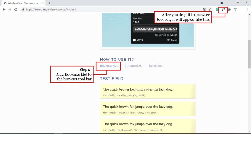
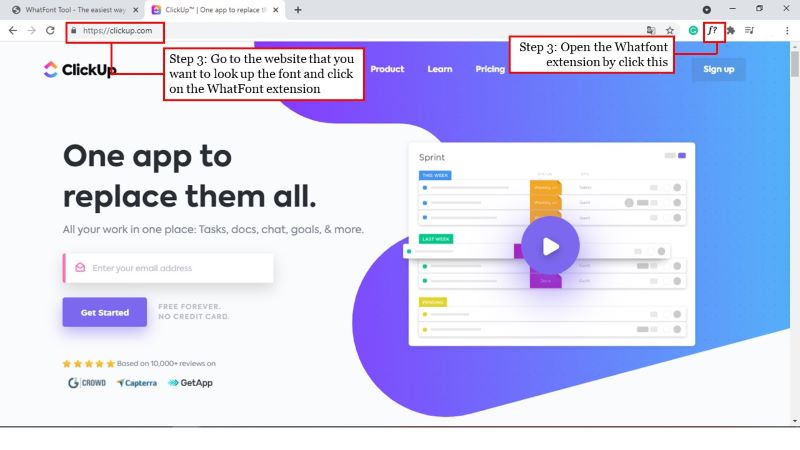
Use WhatFont
WhatFont is one of the most popular tools people have used to identify fonts on the web. WhatFont is very user-friendly.
Step-by-step how-to use WhatFont:
- Go to this website: https://www.chengyinliu.com/whatfont.html
- Bookmark it, then add the Google chrome extension or the Safari extension
- Go to the website where you want to look up the font and click on the WhatFont extension.
- Hover over the webpage and start to find out the font’s name!
Use FFFFALLBACK
FFFFALLBACK is another option to find out what font is used on a website.
Step-by-step how-to use FFFFALLBACK:
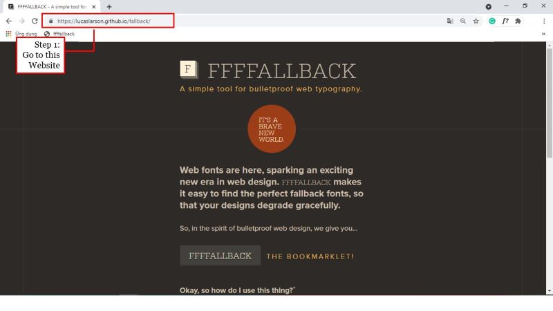
- Go to the website: https://lucaslarson.github.io/fallback/
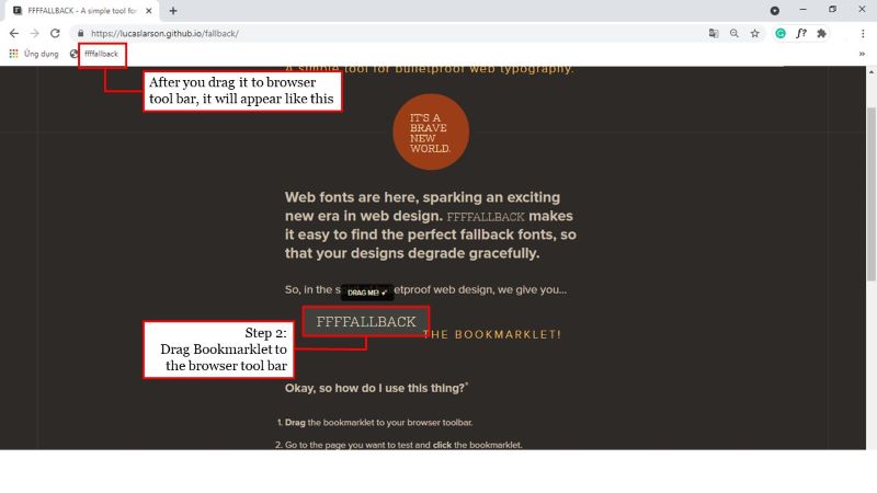
- Drag the bookmark to the browser toolbar
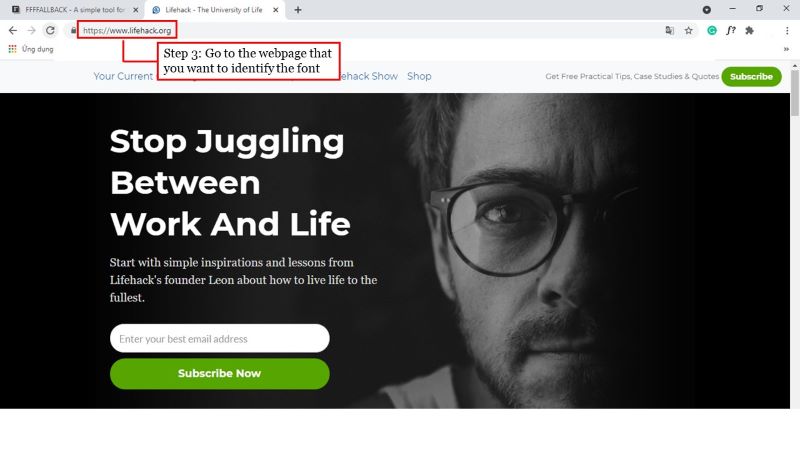
- Go to the webpage where you want to identify the font.
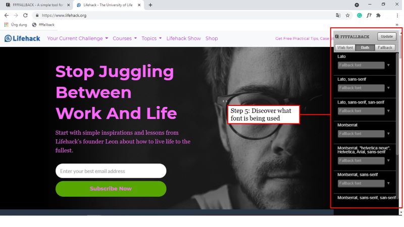
- Click on the FFFFALLBACK bookmark

- Discover what font is being used!
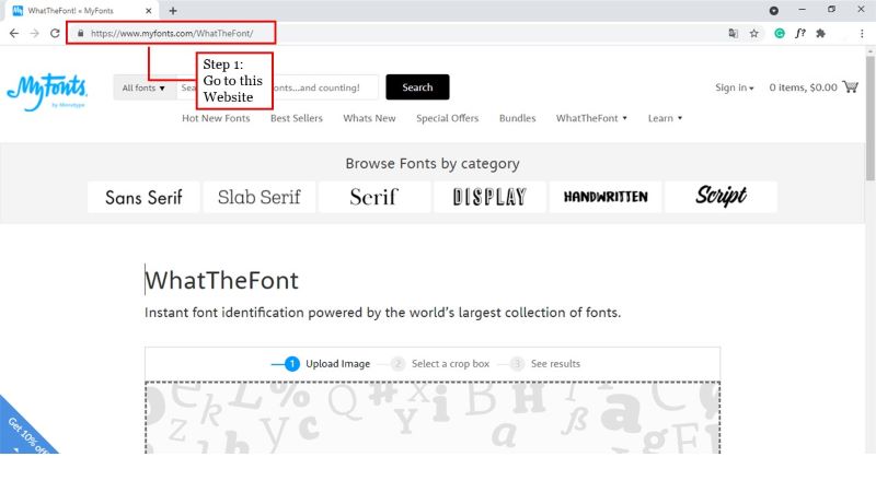
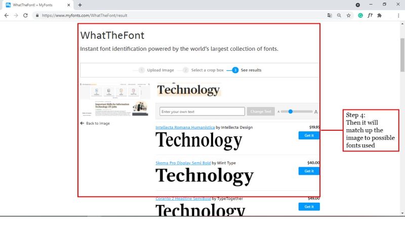
Use WhatTheFont
Step-by-step to use WhatTheFont:
- Go to the website: https://www.myfonts.com/WhatTheFont/.

- Click to upload the image of the font you want to find
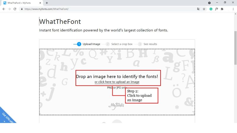
- WhatTheFont will try to select characters on the photos and make any adjustments as needed.
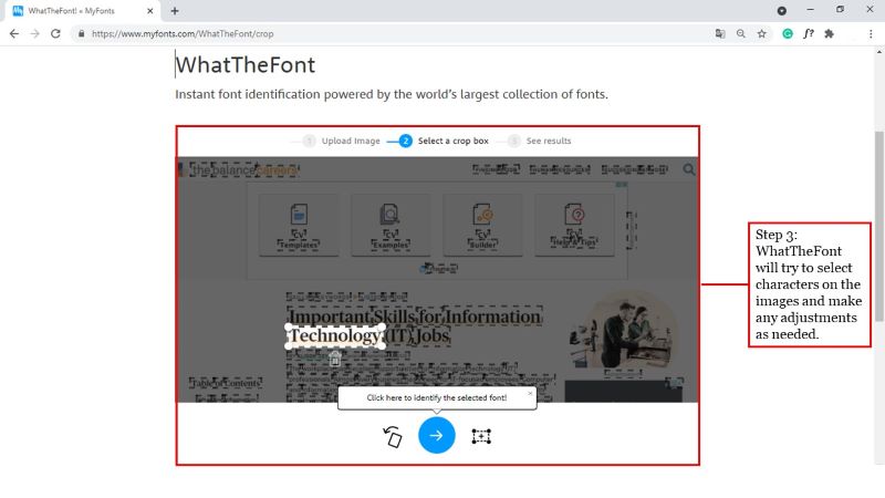
- Then it will match up the image to possible fonts used!
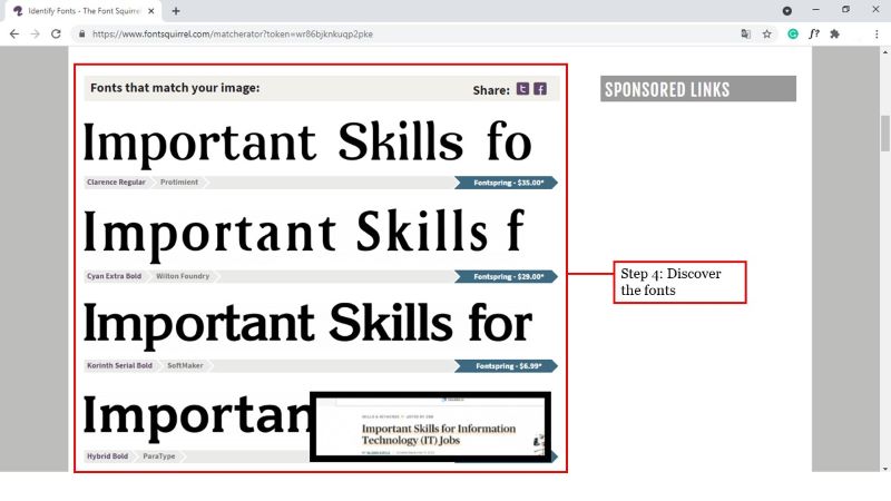
Use Font Squirrel Matcherator
Font Squirrel Matcherator can identify fonts used in an image.
Step-by-step to use Font Squirrel Matcherator:
- Go to the website: https://www.fontsquirrel.com/matcherator.
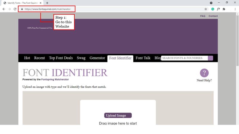
- Download the image, then upload it onto the Matcherator interface.
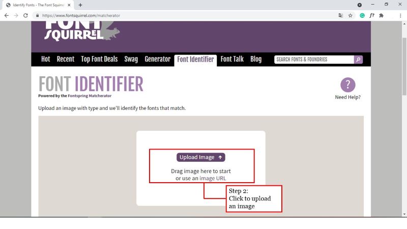
- Select the blue color and select the part of the image you wish to inspect from the toolbar.
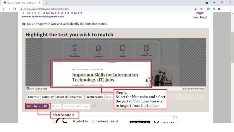
- When you have chosen your desired section, click on “Matcherate it”.
Where to Find Free Typography for Website
There are many websites where you can download a great-looking typo-free. Below, we listed the top 5 websites for finding free fonts. So let’s take a look.
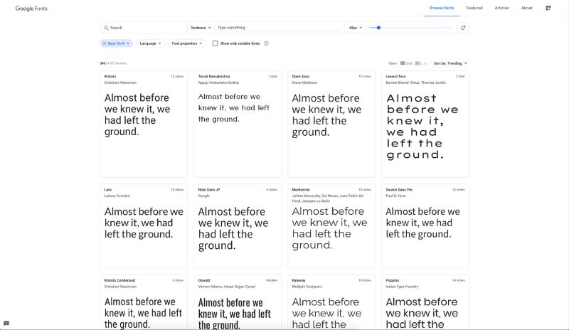
01. Google Fonts
Google Fonts is one of the first sites when looking for free fonts. This vast library has over 800 font families, ranging from sans serif to handwriting fonts, monospaced fonts, and more.
For quicker and more secure font hosting, web designers rely on Google Fonts. Most programmers, however, are unaware they can download the fonts in Google Fonts.
02. Font Squirrel
Font Squirrel is another reputable site for downloading high-quality free fonts. Most fonts in Font Squirrel are also available with commercial licenses. To prevent problems, the site makes it simple for users to search the licensing for each font before installing it.
Font Squirrel also includes several helpful resources, such as a Webfont Generator to gene, rate custom web fonts, and a cool Font Identifier for detecting and locating fonts based on photos.
03. FontSpace
About 32,000 free fonts by over 2,100 artists are available on this website. In addition, there are over 746,000 users who enjoy installing free fonts on the site.
FontSpace has many free fonts you can use for your designs. While searching, hovering the mouse over a font will reveal the font’s license details.
As a registered user, you can create a personal favorites collection to make it easier to choose the right fonts, email the designers, and donate a few bucks.
04. DaFont
Another famous site for downloading free fonts is DaFont. Most web fonts are for personal use, but a few have business licenses.
One feature which makes DaFont stand out is its category system. It allows you to search through its font range by styles, such as horror fonts, video game fonts, valentine fonts, and more. This makes it easy for designers to find fonts for a variety of designs.
05. Abstract Fonts
Abstract Fonts is a website with a carefully selected set of high-quality fonts. The majority of the fonts in the series are free to use in personal and professional ventures. Only make sure you read the license before you download it. For faster navigation, the website has a fun tier structure. Using these visualized categories, you will quickly find fonts for various themes.
Conclusion
Despite the abundance of beautiful-looking graphic design features such as motion graphics, animation, and photography on the internet, text still makes up most online content. In reality, typography accounts for roughly 90% of all website content. As a result, the importance of fonts can not be underestimated, as they can significantly impact the user interface and, as a result, can make or break your website. Often monitor your fonts on various screens and screen sizes to ensure your website is legible enough for your users’ maximum reading comfort.
Consider your design intent when deciding which font design would fit better. If you’ve decided on a general course, decide on the number of typefaces you’ll like, and then start looking for potential font variations on the internet. There are several options online, so you can find one that fits your needs.
Try FREE Magezon Page Builder demo today
Easily style every aspect of Magento website the way you want without relying on developers or designers. Just by drag & drop.


