 Magezon Blog Help Merchants Build Comprehensive eCommerce Websites

An optimized checkout page design can improve the conversion rate by up to 35.26%. Some most effective practices include eliminating major mistakes like hiding extra costs from customers or making account creation compulsory. In this article, we’ll explore the 40 best examples of checkout page design and dive deeper into how they are optimized. Let’s take a look.
Table of contents
40 Best Checkout Page Design Examples
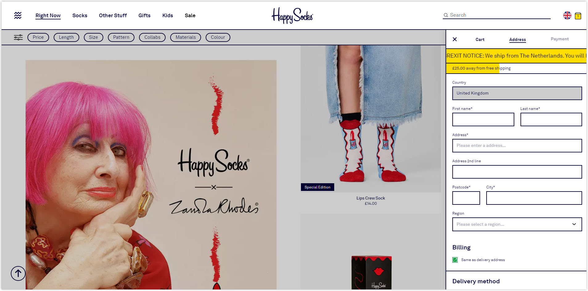
1. Happy Socks
The checkout page is as cheerful as the brand itself and is designed to be fully functional and concise. The format is what stands out the most. Unlike typical checkout pages, it opens as a tab on the product page, allowing customers to quickly finalize their purchase while still being able to see their desired products.
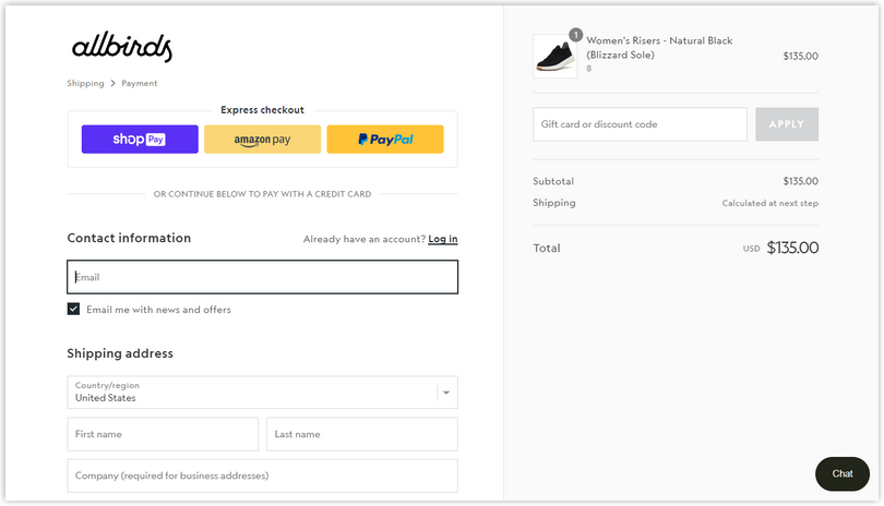
2. Allbirds
Allbird’s checkout page is thoughtfully tailored for user convenience. They’ve incorporated features like guest checkout, order preview, progress bars, and terms and conditions to make it easy for customers to complete their purchases. But what stands out is their express checkout option. It’s a game-changer for increasing conversions, allowing customers to finish their purchases quickly without hassle or second-guessing.
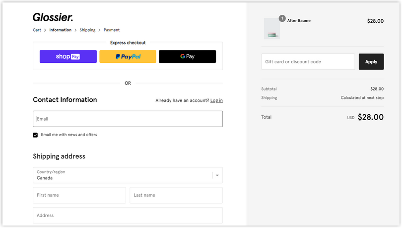
3. Glossier
Glossier has successfully designed a simple checkout page to help users check out faster. One standout feature of Glossier’s checkout page is its express checkout option. Like Allbirds, this feature allows users to breeze through the checkout process with minimal clicks. Glossier understands that time is precious, and they’ve ensured their checkout page reflects that.
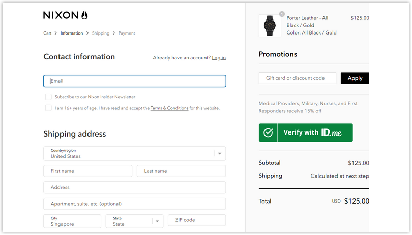
4. Nixon
Nixon, a stylish watches and accessories brand, has put a lot of thought into creating a checkout page that’s both functional and visually appealing. Their checkout page has a sleek and modern look, reflecting their brand aesthetic and providing a seamless shopping experience.
One standout feature of Nixon’s checkout page is its intuitive layout. It provides a progress bar demonstrating clear and concise steps to guide customers through purchasing. This helps users know how many steps are left for them to complete their order.
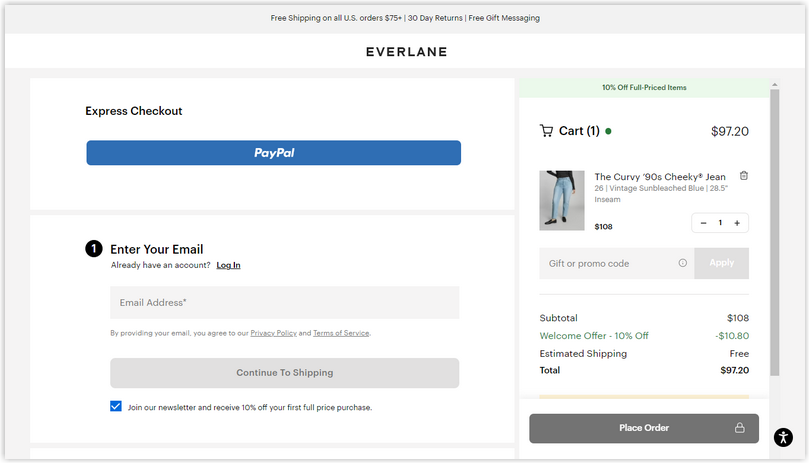
5. Everlane
Everlane’s checkout page offers a step-driven format. One feature you should keep your eyes on is the expandable menu for each step. This will allow customers to fill out the necessary information at their own pace without feeling overwhelmed by too much information all at once. And at the end, there’s a convenient order review step, followed by a prominently placed ‘Place Order’ tab.
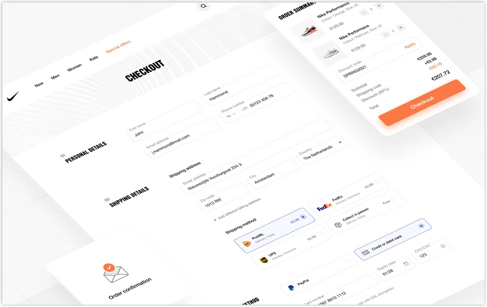
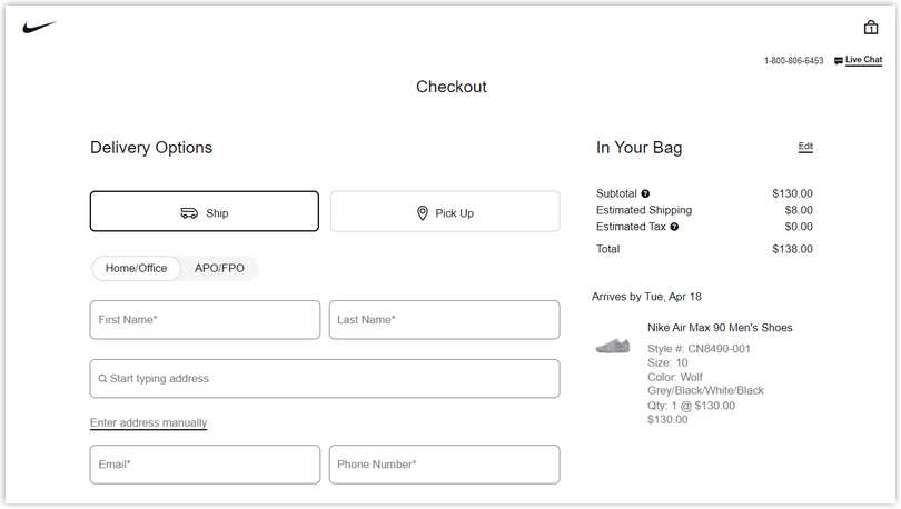
6. Nike
Nike’s checkout page incorporates many best practices for an optimal shopping experience. One of the first things you’ll notice is that it is simple and sleek. This allows users to focus on completing their purchases without clutter.
As customers input their data into the fields, they are notified with a green tick if they’ve entered the information correctly. Conversely, if they’ve made an error, they are alerted with a notification to correct their input.
Another great feature of Nike’s checkout page is multiple payment methods that ensure everyone can pay quickly and easily.
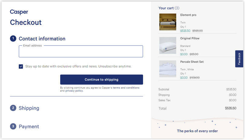
7. Casper
Casper’s checkout page’s layout is aesthetically pleasing and fulfills its main goal: helping customers quickly complete their purchases. One of the standout features of Casper’s checkout page is the neat order summary section. It’s conveniently displayed to the side, providing a clear breakdown of the costs and a guarantee for a free refund.
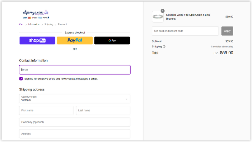
8. At Perry’s
At Perry’s checkout page is designed with the affluent audience in mind. They offer a sleek, straightforward layout with all the essential elements front and center without any distractions or clutter. A prominently displayed section for terms and policies ensures transparency and trust in the purchase process.
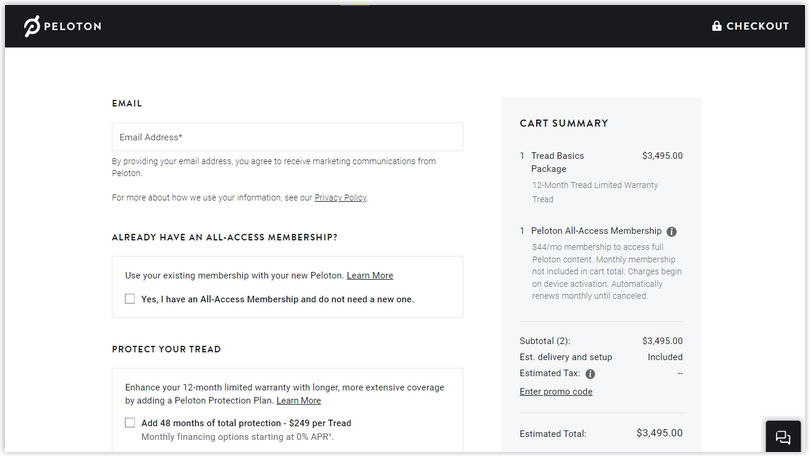
9. Peloton
The versatility in accommodating both one-time payments and subscription models is one thing that sets it apart. Peloton has made it easy for customers to choose from various cards and even offers the option to pay with Affirm for added flexibility.
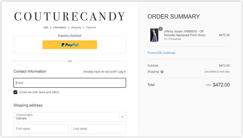
10. Couture Candy
Like Everlane, Couture Candy employs a step-by-step format for their checkout page, making it easy and intuitive for customers to complete their purchases. They also offer a guest checkout option and accept PayPal right from the very first step.
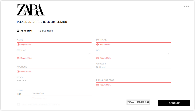
11. Zara
Zara, known for its chic and minimalist style, also extends its simplicity to the checkout page. With a streamlined design and a limited number of form fields, Zara’s checkout process is as fast as the brand itself. One notable feature is the GMaps drop-down option for location selection, which makes it convenient for customers to input their addresses and helps delivery partners quickly locate the destination.
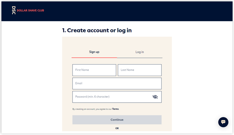
12. Dollar Shave Club
Dollar Shave Club, a renowned subscription-based grooming brand, offers a seamless checkout experience that prioritizes customer comfort at every step. Filling out the form is a breeze, with options for logging in and payments, a transparent order summary, and autofill capabilities.
One standout feature is the social log-in option, which allows customers to quickly and easily log in through their social media accounts, streamlining the process and letting them focus on the payment details. Additionally, Dollar Shave Club displays trust seals at the bottom of the page, instilling confidence in its customers.

Try FREE Magezon Page Builder!
Easily create your engaging Magento pages in any style whenever you want without relying on developers or designers. Just by drag & drop.
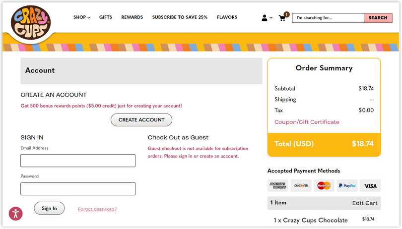
13. Crazy Cups
Crazy Cups’ checkout page is designed with a classic aesthetic that sets it apart. Still, it’s also highly functional and makes it easy to go through all the important steps to complete the purchase. They take a no-frills, no-nonsense approach to their checkout page, keeping things simple for a seamless experience.
One thing that stands out is the order summary, highlighted in a cheerful yellow color that contrasts nicely against the clean white background. It adds a pop of color and makes it easy to review order details at a glance.
→ You might like 20 Best Red Websites With Beautiful Color Schemes (2023)
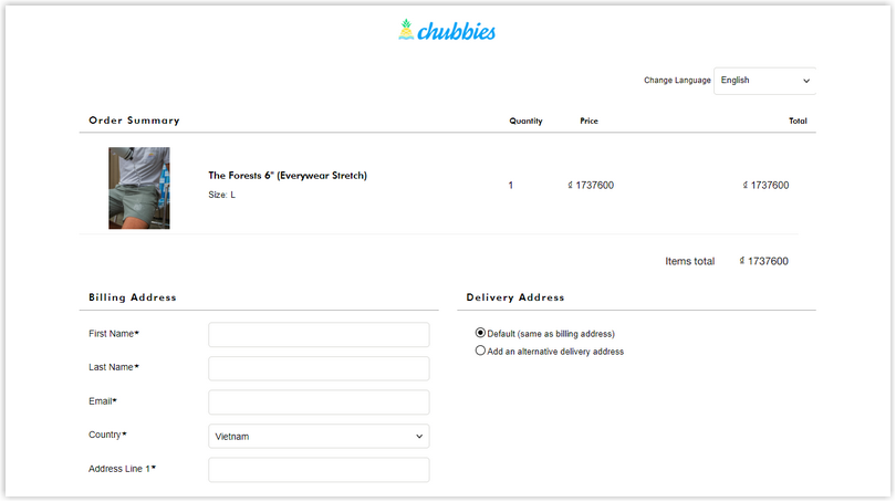
14. Chubbies Shorts
This checkout page from Chubbies Shorts is a shining example for fashion industry professionals.
The page has a unique layout with three distinct sections. The first section focuses on the order summary horizontally arranged for easy visibility of the number of items purchased. This design element allows customers to review their purchase details at a glance quickly. The second and third sections collect the billing address and payment information, ensuring a seamless and efficient checkout process.
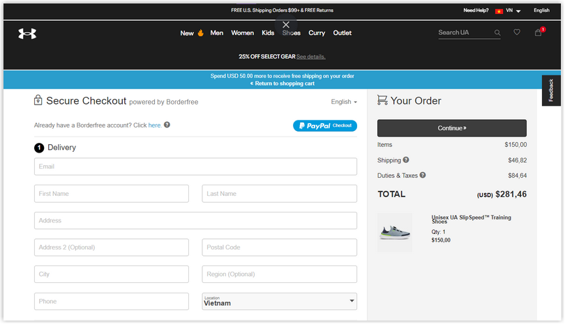
15. Under Armour
Under Armour is a powerhouse in the fitness and sports apparel market. As one of the biggest eCommerce retailers, they are known for their wide range of options and customer-friendly checkout process.
The Under Armour checkout page is a prime example of its commitment to customer satisfaction. It offers various payment options and alternative financing, ensuring that customers have flexibility in completing their purchases.
The checkout page also features an editable cart that allows customers to change their order easily, a guest checkout option, and nudges for wishlist items like free shipping or returns to ensure a seamless and enjoyable shopping experience.
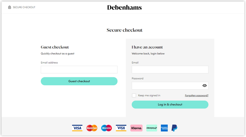
16. Debenhams
This checkout page offers customers the choice between guest checkout and log-in, allowing them to choose the option that best fits their needs. Trust badges and payment options are prominently displayed, providing customers with security and trust. The ‘Secure Checkout’ nudge and Privacy and Terms & Conditions information further assure customers of the safety of their transaction.
Regarding layout, the Debenhams checkout page is designed to be user-friendly and easy to navigate. It presents information in a clear and organized manner, helping customers quickly review and input their information.
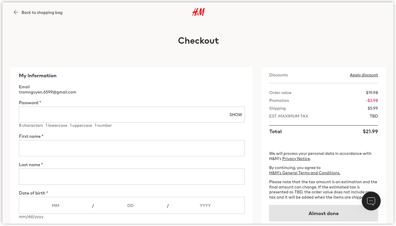
17. H&M
H&M is a pro at finding the perfect balance between convenience and value for its customers. The H&M checkout page is designed with a clean and minimalistic layout, making it easy for customers to review and input their information. For new shoppers, H&M offers a guest checkout option, which helps to prevent customers from feeling discouraged and promotes a smooth and efficient purchase experience.
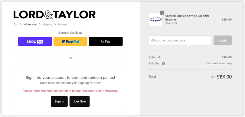
18. Lord & Taylor
The Lord & Taylor checkout page goes the extra mile to ensure a seamless and enjoyable process with features like express checkout, guest checkout, a transparent order summary, breadcrumbs for easy navigation, gift card nudges, and transparent pricing.
In addition to their comprehensive approach to the checkout process, Lord & Taylor also highlights the benefits of creating an account. By reminding customers of the loyalty points they can earn and the advantages of having an account, they encourage customers to sign in and create a personalized experience.
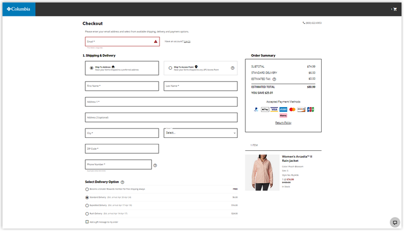
19. Columbia
The checkout page of Columbia stands out with its transparent price breakdown, providing customers with a clear view of their total costs, including taxes, discounts, and shipping fees. It is designed to be efficient and user-friendly, guiding customers through the process with clear and intuitive steps. The contrasting checkout button makes it easy for customers to identify and proceed to the next step.
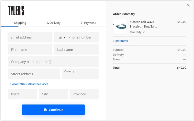
20. TYLER’S
TYLER’S has incorporated a three-step checkout process, including a clear order summary, an option to add discounts, and a transparent price breakdown. It includes a transparent price breakdown, allowing customers to see the detailed costs of their order and incorporates a lock icon to denote a secure process, demonstrating TYLER’S commitment to protecting customer data and ensuring a safe transaction.
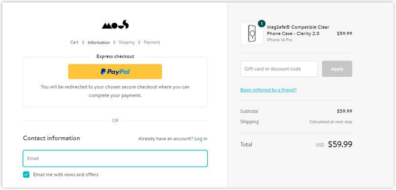
21. Mous
Mous, a customer-focused brand, takes the Shopify checkout page to the next level with its customized approach. In addition to the standard features, they have added PayPal express checkout for a seamless payment option, a clear price breakdown for transparency, and a referral nudge to enhance the shopping experience.
One standout feature of Mous’ checkout page design example is the prompt that asks customers if they have been referred by a friend. This draws attention to their referral marketing program, encouraging customers to refer their friends and earn points for their participation.
Try FREE Magezon Page Builder!
Easily create your engaging Magento pages in any style whenever you want without relying on developers or designers. Just by drag & drop.
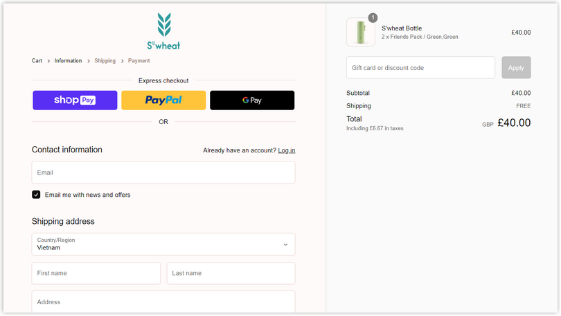
22. S’Wheat Bottle
The S’Wheat checkout page, similar to Glossier, presents a clean and minimalistic look that only shows the essential fields and information required to complete the purchase. In addition to collecting email information for order processing, S’Wheat has cleverly included an “email me with news and offers” checkbox below it.
This strategic placement of the checkbox allows customers to easily opt in to receive news and offers from S’Wheat with a simple checkmark, without additional steps or fields. By doing this, S’Wheat can leverage the customer’s interest in completing their purchase and also capture their consent for future communications.
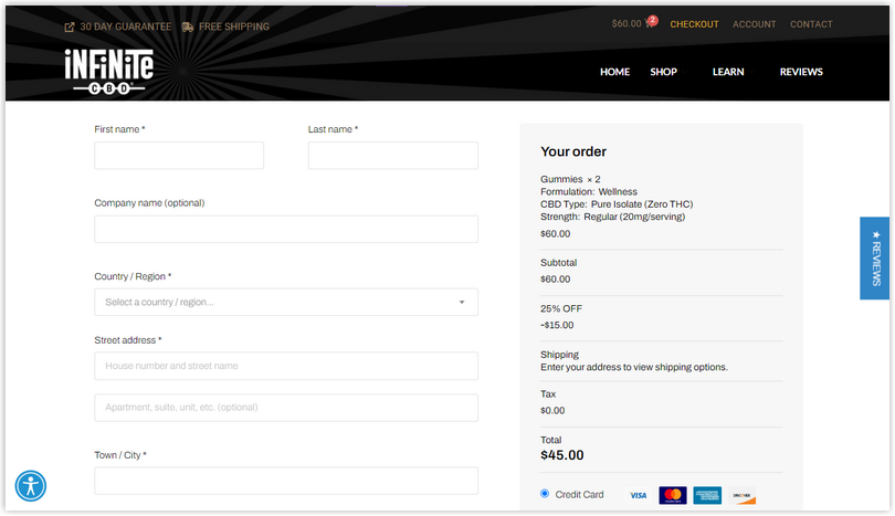
23. Infinite CBD
At Infinite CBD, they’ve designed the checkout page with a clean, straightforward two-column layout that looks great on mobile devices. It is a minimalist design focusing on essentials. The cart’s contents are easily accessible without overwhelming the page, and the checkout form asks for just the right amount of information to keep the process quick and efficient.
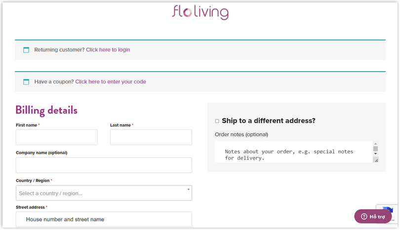
24. Flo Living
The checkout page of Flo Living boasts a sleek and minimalistic aesthetic, with careful attention to detail in its design. This includes a convenient feature that allows returning customers to skip redundant data entry and proceed directly to payment verification.
Despite its simplicity, Flo Living maintains brand consistency by incorporating its distinctive brand colors and user-friendly elements, such as drop-down menus and autofill boxes, to create a seamless and effortless checkout experience for customers.
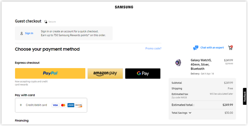
25. Samsung
Unlike checkout pages that bombard customers with all the fields, Samsung only shows you what you need at each process step. For example, you will see billing address fields once you select a payment method, and if you choose an express checkout option, you won’t see any fields.
Samsung’s checkout design offers an option to checkout as a guest, along with the option to sign in. Guest checkout capabilities are a great way to expedite the process and make it as hassle-free as possible.
26. Louis Vuitton
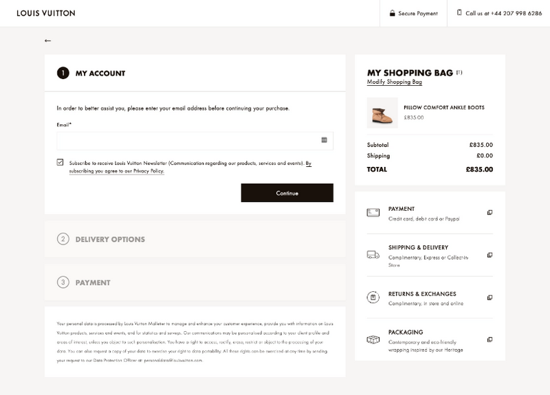
The layout of LV’s checkout page is clean and minimalist, with a clear and intuitive flow that guides the user through the purchasing process effortlessly. The use of ample white space and concise text keep the design uncluttered and easy to navigate.
Payment options are prominently displayed, and the user is guided through the input fields for shipping and billing information in a straightforward manner.
Another noteworthy aspect of the Louis Vuitton checkout page design is the strategic placement of the email form at the beginning of the checkout process. Customers must enter their email addresses before proceeding with the payment, which is a smart way to collect valuable customer information for future marketing efforts.
27. Boots
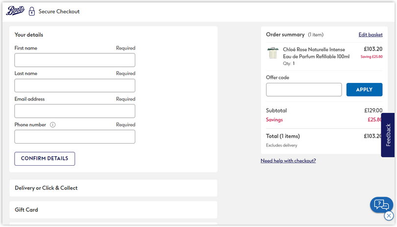
Boots has an excellent single-page checkout example that can help users fill out their information in one go without any distractions.
Having all the information on a single page may seem lengthy. But don’t worry. Boots has implemented a strategy of dividing the checkout process into smaller sections to prevent customers from feeling overwhelmed with too many fields to fill out all at once. This approach can really help minimize the chances of customers abandoning their purchase.
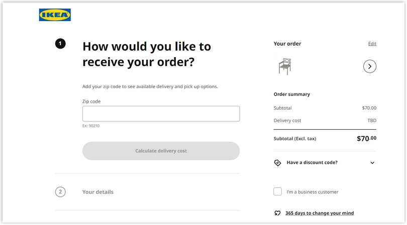
28. IKEA
IKEA is renowned for its intelligent and efficient design, and their checkout process also shows that. From start to finish, it’s a joy to use.
Instead of listing all the delivery and pickup options long and confusingly, IKEA simply asks users to enter their addresses and choose between pickup and delivery. Then, the checkout page displays the specific available options based on the user’s input and asks them to choose their preferred option.
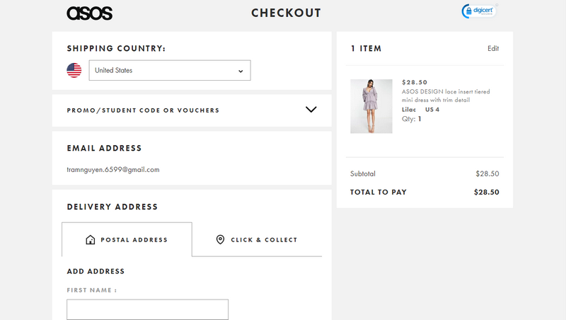
29. ASOS
ASOS uses an accordion-style checkout that keeps the second and third steps (delivery address and payment information) inactive until the user completes the first step. It has added an excellent “Click and collect” tab that aids in locating the most accurate delivery location and simplifies the process by hiding each step until the previous step is completed.
For instance, in the payment details section, ASOS offers multiple payment methods, and the customer is only presented with the specific requirements for the selected option, ensuring a clean and simple page design.
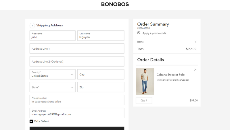
30. Bonobos
What’s great about Bonobos’ checkout page is its simple and functional design. It keeps things efficient with minimal form fields to help users quickly and… and easy to complete their purchase. Plus, the Review section has all the essential elements like order details, shipping options, promo codes, and the total cost so that buyers can review and confirm their order.
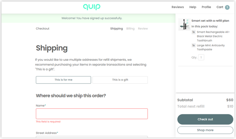
31. Quip
Quip’s checkout page is designed with convenience in mind. It’s a multi-page checkout flow optimized for subscriptions and one-time payments. What’s remarkable is the gifting capabilities that allow buyers to send products to different addresses easily. Plus, they provide various delivery options to help customers easily choose which fits them the best.
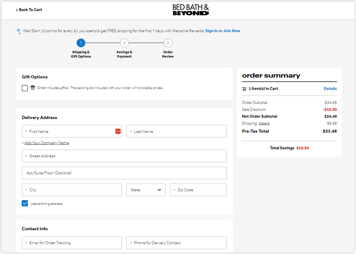
32. Bed, Bath & Beyond
With a wealth of experience spanning over 50 years, Bed Bath & Beyond boasts a unique checkout process. The inclusion of a message at the top entices customers with the prospect of earning rewards. It also serves as a persuasive incentive for them to create an account, unlocking additional benefits.
The visual design is impeccable, with each section thoughtfully color-coded for easy navigation and feels less overwhelming. The progress indicator is sleek and straightforward, while the uncluttered header and footer ensure that the checkout process remains the main focus, free from distractions.
33. Brandless
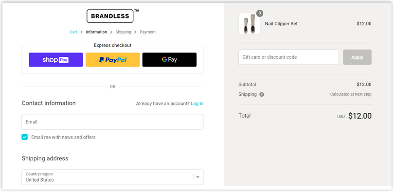
The checkout page from Brandless is reminiscent of a classic design, much like that of Allbirds. Interestingly, including an option to receive news and offers via email is a strategic move by the brand. This capability enables Brandless to collect email addresses for their newsletters, providing an opportunity to engage with customers and drive additional value.
Try FREE Magezon Page Builder!
Easily create your engaging Magento pages in any style whenever you want without relying on developers or designers. Just by drag & drop.
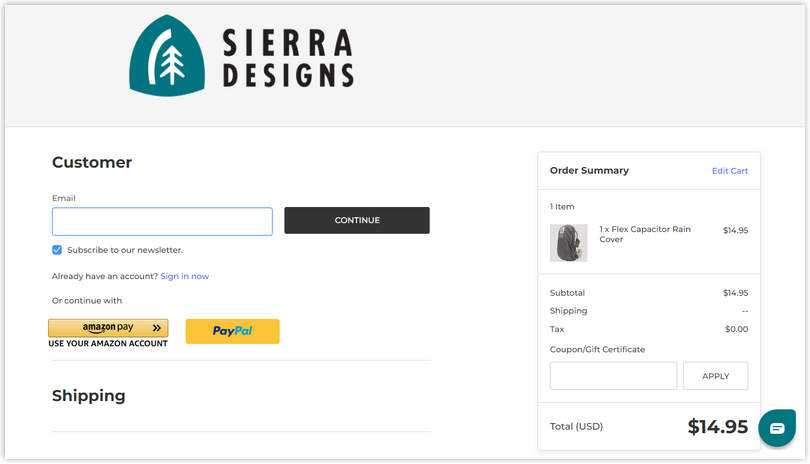
34. Sierra Designs
Sierra optimized checkout page design is a breeze to use. It quickly captures all the necessary information, making it easy to move on to the next step: payment. There’s a helpful overview of customer orders and provides shipping costs for delivery.
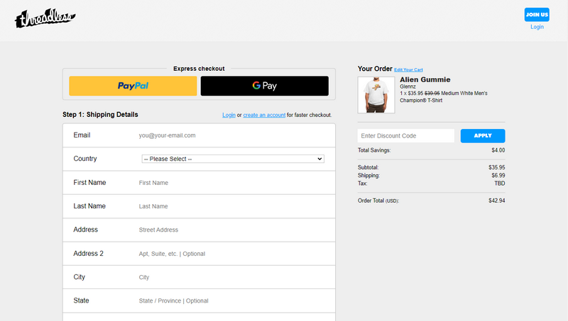
35. Threadless
In terms of designing the checkout page, Threadless has executed it brilliantly. It’s well-designed, easy to use, and has all the necessary information. The calls-to-action (CTAs) are even highlighted differently to catch your eye. And the visual hierarchy is clean and organized, and they keep buyers updated with a step-wise system.
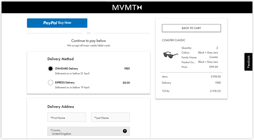
36. MVMT
When you reach the MVMT checkout page, you’ll notice it’s a four-step process. Yes, it may take a bit longer, but it’s designed with the high-intent audience in mind to ensure a smooth experience overall.
What stands out on MVMT’s checkout page design is the progress bar. It’s a handy feature that keeps you informed about how far along you are in the process, helping to ease any anxiety. Plus, it lets you know when you’re almost finished and when you need to provide your details.
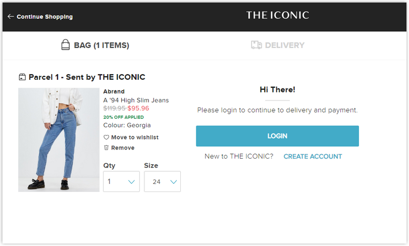
37. THE ICONIC
THE ICONIC is a another great checkout page example to learn from. It is minimal yet covers everything necessary: login nudge, delivery information, and a secure payment gateway exist.
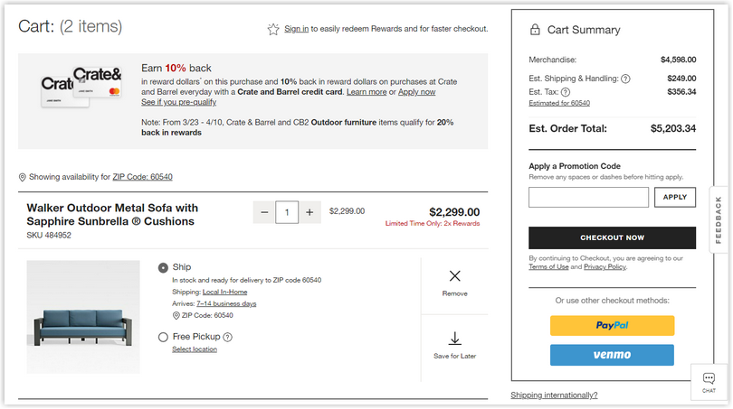
38. Crate & Barrel
The checkout page prioritizes security, transparent pricing, and minimal form fields. They’ve also added drop-down menus to reduce and a progress bar to help buyers stay aware of the purchase status.
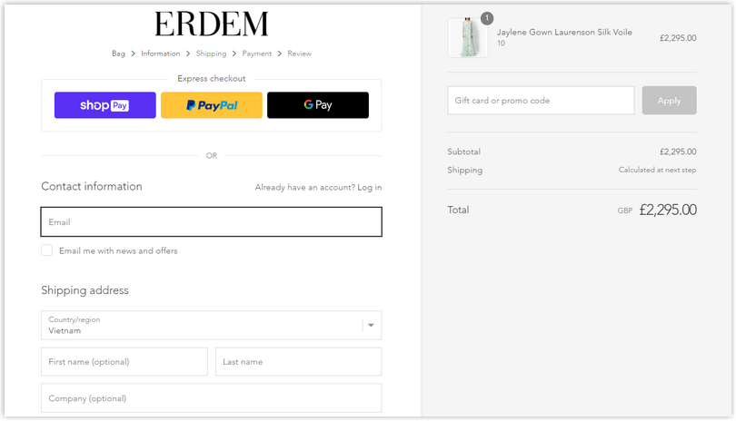
39. ERDEM
ERDEM’s checkout page design is a prominent example of a customer-centric design. They offer quick checkout options with ShopPay, PayPal, and GPay. The order summary is clear and easy to understand, so customers can review their purchase details. And to keep buyers on track, they’ve included breadcrumbs that outline the steps of the checkout process, so they always know where they are.
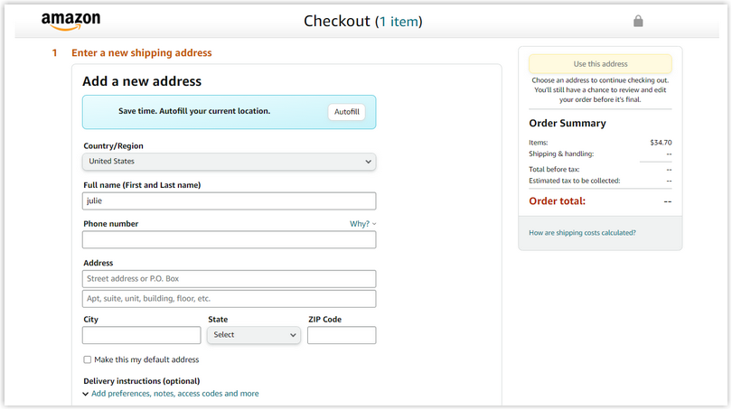
40. Amazon
You might have noticed that Amazon has a consistent look and feel across its pages, and there’s a good reason for that – it works. When you look at an Amazon checkout page, you can instantly recognize the brand by its prominent colors and design. It’s all about creating an immediate connection with customers, making it easy to navigate and find what you’re looking for.
→You might also like: 33 Unique Website Footer Examples and Why They Work
Conclusion
Looking at the best checkout page design examples in 2023, it’s clear that user-friendly, visually appealing, and efficient checkout pages are crucial. From prioritizing security and transparent pricing to offering quick checkout options, clear order summaries, and easy navigation, these examples demonstrate how thoughtful design can enhance the overall customer journey.
Now, if you are a Magento merchant and don’t know which extension to easily build your checkout page, consider Page Builder from Magezon. As a trusted Adobe partner, we have satisfied thousands of customers with a vast collection of drag-and-drop extensions, helping you create a high-converting and unique store in minutes.
Don’t take my words for granted, see how your website can be with Magezon Page Builder and what others say about us:


