User experience isn’t just about pretty sites and buttons that are fun to press. It’s also about creating sites and apps that users can easily navigate without getting frustrated or confused. A great user experience requires attention to detail and planning upfront. The more thought you put into your site from the beginning, the easier it is to adapt as your business grows and changes.
A great user experience is also a key to converting visitors into customers, keeping them coming back again and again. It can increase conversation rates by up to 400% and helps drive word of mouth and bring in new visitors through referrals.
Without further ado, let’s begin our article today.
Table of contents
- 1. Start With a Stellar UX Research
- 2. Ensure the Site Is Fast and Responsive
- 3. Ensure Your Website Is Trustworthy and Safe
- 4. Choose the Fonts That Enhance Readability
- 5. Ensure to Leave White Space on Your Website
- 6. Ask the User for the Action You Want (i.e., Data Collection)
- 7. Provide Value With Strong Content
- 8. Have a Simple, Clear, and Consistent Navigational Structure
- 9. Optimize Your Video Content for a Better User Experience
- 10. Validate Your User’s Action to Confirm Their Action
- Create a Website That Converts
1. Start With a Stellar UX Research
Before you even begin sketching out your site’s layout, it’s crucial to find out who your users are and their needs and expectations. The best way to do this is through user research, which you can conduct in various ways, depending on your budget and project scope.
One of the best ways to conduct user research is card sorting. This technique takes you inside your potential user’s minds and helps you know how they think. Excited to know more about this incredible technique? Refer to Maze’s guide to card sorting in UX research.
Besides card sorting, you can observe customers interacting with your product in person or online. You can even use a usability testing tool to observe people trying to complete tasks on your site.
By doing this, you’ll be able to see the following:
- Where people get stuck
- What confuses them, and
- What keeps them coming back for more
2. Ensure the Site Is Fast and Responsive
With the rise of mobile technology, fast and responsive websites are crucial for a good user experience. A responsive site automatically adjusts its layout and content to fit whatever device the user is viewing it on. 45% of users anticipate that content will appear accurately across different devices.
If they can’t easily view your site or it takes forever to load, they will likely leave and go elsewhere. So, make sure your site is built to run smoothly on all devices.
Do this by optimizing your site’s images, choosing the right hosting company, and using the right tools and plugins. You can also use a service like Google’s PageSpeed Insights to analyze your site and provide recommendations on improving it. A responsive site also helps you with SEO. Google likes to reward sites that are easy to navigate and accessible to all users.
3. Ensure Your Website Is Trustworthy and Safe
If your website deals in high-ticket items or anything that requires sensitive personal information, such as credit card numbers, you must reassure visitors that their data is safe and they can trust you.
This means having a secure site that adheres to all the latest security protocols, like HTTPS. Another thing you can do to make your site feel trustworthy is to include a privacy policy. This policy should include your policy for collecting and using people’s information and link to your terms and conditions. Having a privacy policy on your site also helps you avoid legal problems in the future.
You must also use actual photos of your team and office, including contact information and an address, and offer guarantees on your products or services.

Try FREE Magezon Page Builder!
Easily create your engaging Magento pages in any style whenever you want without relying on developers or designers, just by drag & drop.
4. Choose the Fonts That Enhance Readability
Bad font choices ruin your user’s experience on your site. They might not even be able to finish reading your page if they can’t stand the font. The fonts you choose for your site also reveal your brand. They affect how people read your content, which is especially important if you’re creating a lot of content, like blog posts.
There are a variety of factors to consider when choosing fonts for your site, including:
- Legibility refers to how easy it is to read a font. A font that’s too fancy or cluttered will make it difficult for people to read your content. Ensure your readers can finish reading your post without getting frustrated by the font.
- Appropriateness to your brand is more of a subjective choice. You need to choose a font that reflects your brand, as well as one that is readable.
- Lastly, readability is all about how jarring the font is to the eye.
→ Enhance your website’s typography: Typography in Web Design: the Golden Rules You Should Follow
5. Ensure to Leave White Space on Your Website
White spacing is just as important as the content on your site. Up to 20% more text can be understood when white space is used well. It refers to areas of your site that aren’t filled with text or images.
It’s often overlooked, but it’s crucial to creating a clean, easy-to-navigate site.
White space makes your site less cluttered, making it easier for readers to find what they’re looking for. It also makes your site easier to navigate, which makes repeat visitors happy. After all, no one likes to click around on a site that’s hard to figure out.
When designing your site, keep an eye out for cluttered areas. Cut out unnecessary elements, like stock photos, and simplify your site’s layout. This helps you leave white space, making your site easier to navigate and more visually appealing.
→ Optimize your website’s grid: 3 Things to Remember Before Creating Website Grids
6. Ask the User for the Action You Want (i.e., Data Collection)
One of the most important things you must do when designing a site is to make it easy for your customers to provide the information you need. To do so, ask them for the actions you want them to take. For example, if you want customers to sign up for your newsletter, you can ask a question like, “Would you like to sign up for our newsletter?” with a big “Yes” or “No” button right against/under it.
Similarly, if you want them to give you their personal data such as name, address, or contact number, explain why you need it and take their consent. Beware of asking your website visitors for too much personal information, though. 65% of them would abandon a form where they’re required to fill in too much personal information.
7. Provide Value With Strong Content
People are more likely to use and return to sites that provide value. This means creating content that solves users’ problems or offers information they can’t find elsewhere. This content can be in the form of blog posts, podcasts, or videos. It can also be written content, like how-to guides or product descriptions.
Whatever you choose, make sure it’s high quality and value.
If you create content your audience loves, they will want to return for more. They will also tell their friends about your site and help you gain new customers.
To create precious content, you need to know your audience. You need to know what they want and what they struggle with. You also need to know which topics are trending and have high search engine potential. If you create content that solves people’s problems, provides helpful advice, or is something they can’t find elsewhere, you gain a loyal following. You’ll also be able to find people’s motivations for visiting or not visiting your site.
8. Have a Simple, Clear, and Consistent Navigational Structure
When people visit your site, they must know the following:
- Where they are
- Where they can go, and
- How to get there quickly and easily
This is especially important on eCommerce sites, where users will likely look for a particular product.
Lousy navigation can cause frustrations, lead to a drop in sales, and even cause users to leave your site altogether.
So, start by mapping out your site’s primary sections and navigation. It comprises various elements, like drop-down menus, tabs, links to other pages, and search bars. The structure you choose should be simple and easy to follow. For example, if you’re using drop-down menus, it should be evident to users where those menus are and what they do.
Then, go one step further and create a sitemap. It is a diagram showing your site’s pages, including the interconnecting pages under each section. Make sure to do this if you have a lot of pages on your site or if a team of people is designing your site.
9. Optimize Your Video Content for a Better User Experience
Videos help you increase conversions and build trust with potential customers. You may decide to do a product video, offer how-to tips, or even host a video podcast. Whatever you decide to do, ensure it’s optimized for a better user experience. To do so, ensure your videos have good audio and quality.
Most importantly, make your video content accessible to larger audiences. Those who are deaf or hard of hearing should also be able to utilize your video content. Adding video subtitles or captions helps you a great deal here. Not only do they help with your videos’ accessibility, but they also ensure 80% of the viewers won’t leave without watching it till the end.
10. Validate Your User’s Action to Confirm Their Action
Users who interact with your website are taking action—clicking on a link, adding an item to their cart, watching a video, etc. You must validate these actions, whether they be clicks or subscriptions. You do this by adding pop-ups and confirmation boxes.
As a subscription ends, you can also add exit pop-ups and countdown timers that encourage users to take action before something happens.
Create a Website That Converts
Undoubtedly, UX design is essential. A great user experience attracts and keeps customers, turning them into repeat buyers and brand advocates. A stellar UX design is essential to nailing your marketing strategy and driving more sales through your website.
To create a great UX, you need to start with stellar UX research, ensure the site is fast and responsive, ensure it is trustworthy and safe, and do much more that’s explained throughout this article. However, it’s important to note that having a great UX isn’t all about having a beautiful design. It’s also about having a functional, straightforward design for site visitors.
If you are a Magento merchant and don’t know which extension to build your website, consider Page Builder from Magezon. As a trusted Adobe partner, we have satisfied thousands of customers with a vast collection of drag-and-drop extensions, helping you create a high-converting and unique store in minutes.
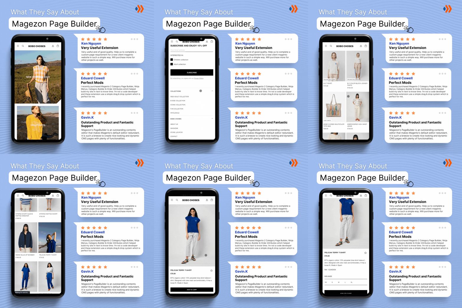
Don’t take my words for granted; see how your website can be with Magezon Page Builder and what others say about us:

About the author: Saifullah Napar is a content writer who has worked in this field for the past three years. He has been writing on business technology, blockchain, fintech, and digital marketing topics. (LinkedIn)
 Magezon Blog Help Merchants Build Comprehensive eCommerce Websites


