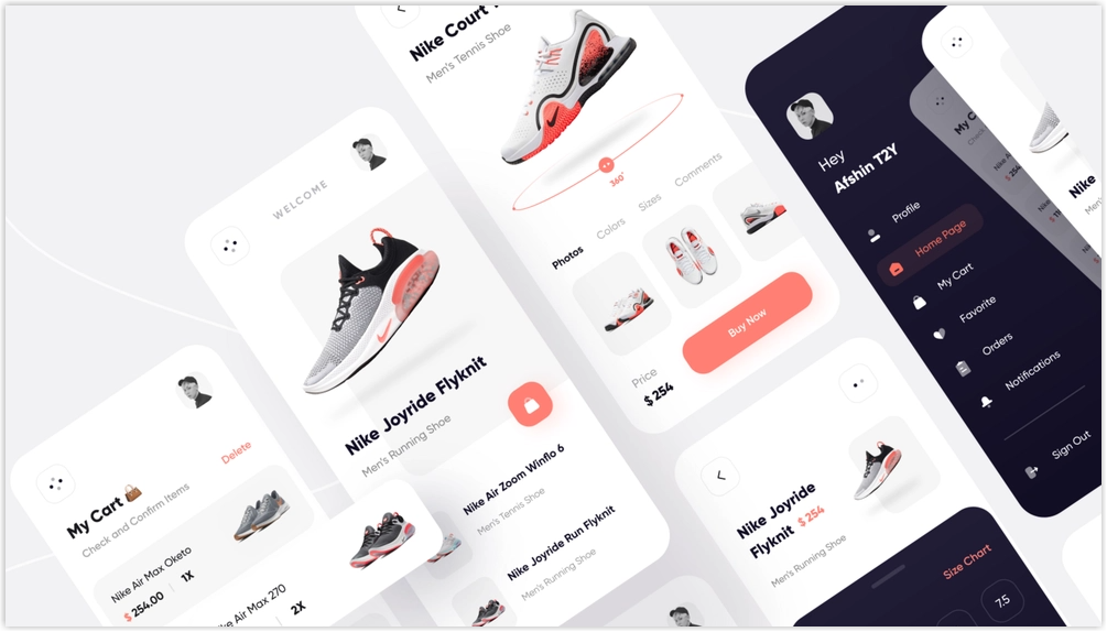
Product detail pages are critical in an eCommerce business as they determine the fate of potential sales. With them, customers can get a clear picture of a product and decide whether to purchase it. A poorly designed, ineffective product page fails to convince customers that your product is not worth their money. That’s why it’s crucial to put time and effort into creating high-converting eCommerce product detail pages.
If you are a new merchant looking for a comprehensive guide to the PDP eCommerce product detail page, you have come to the right place. If, on the other hand, you’ve been an eCommerce merchant for a while and want to learn how to optimize your PDP product page, read this article once. Indeed, you’ll be able to scare up valuable something for yours.
The guide will cover everything you need to know about an eCommerce product detail page:
- What exactly is a product page?
- Benefits this website page offer
- Ecommerce product page best practices
- How should elements be arranged to create a high-converting product page layout?
All of these questions and others will be answered below.
Table of contents
- What is a Product Detail Page (PDP)?
- Why Is a Product Detail Page so Important?
- What Makes a Good Product Page?
- How to Layout Your Website Product Page – 3 Common eCommerce Product Detail Page Layouts
- Magento 2 Single Product Page Builder- A Powerful Tool to Create eCommerce Product Detail Pages in the Magento Store
- That’s a Wrap
What is a Product Detail Page (PDP)?
A product page, also known as a product detail page or PDP, is a page on an eCommerce website that provides product information. Customers can thus know the product well before making a purchase. A typical eCommerce product detail page includes the following information: product name, price, description, product specifications (size, color, material, and so on), reviews, shipping information, and more. In addition, of course, product images, mainly photos of the actual product, are indispensable on an eCommerce product detail page.
Some product detail pages go above and beyond by including a FAQ section. Customers can easily find answers to their product-related questions here. Also, they can conveniently leave their questions in the box.
Additionally, product detail pages offer similar products or recommended items based on their shopping, increasing the chance of customers purchasing more other products from your website and boosting your revenue.
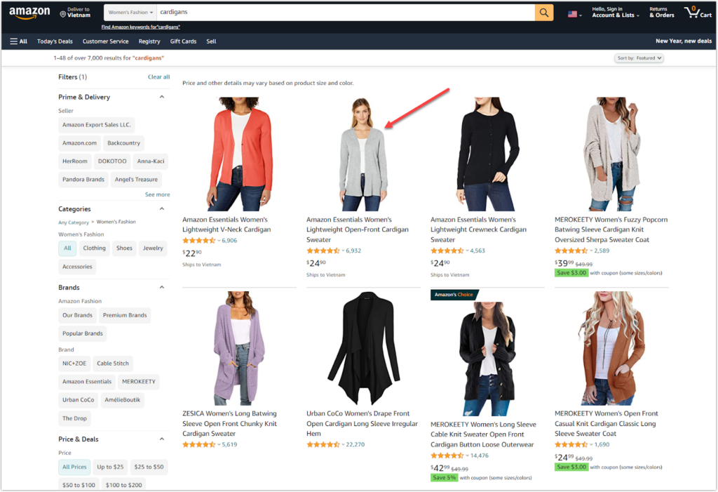
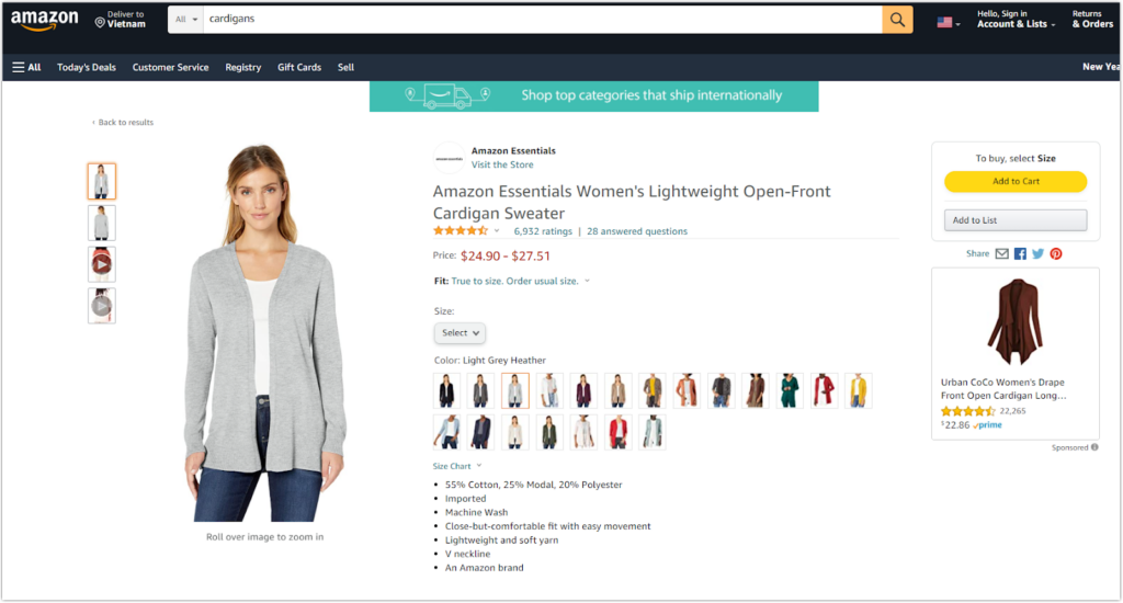
I’ll show you an example of a product detail page from the retail e-commerce giant Amazon to help you understand it better. When you go to the Amazon website, you will see a product listing page (See Image 1). For instance, when looking for a cardigan sweater, you often look for every detail, including the price, size, color, product images, manufacturer, customer reviews, FAQ, and so on (Image 2).
| Learn how to build an online store: Pt.1: A Beginner’s Guide to Website Landing Page 25+ Best Product Pages and Lessons to Take Away 7 Things Customers Consider When Buying Something Online (And How to Put Them in Place) |
Why Is a Product Detail Page so Important?
Ecommerce websites are created to sell goods and services. Product detail pages are the lifeblood of an eCommerce website because they are the pages that generate sales. Consider this for a moment. How can online shoppers buy a product if they don’t know anything about it? This is where the product detail page comes in.
Also, an informative and unique eCommerce product detail page aids in creating a positive impression on potential customers, particularly those who have never heard of your brand. Even if they do not purchase it immediately, they are more likely to return it.
Another reason an eCommerce product detail page matters are that it helps improve your website’s online presence. Suppose you optimize every SEO aspect of an eCommerce product detail page, including keywords, title, slug, meta description, and alt-text for product images. In that case, your page will be found by people purposely searching for the product. Chances are, your website is more likely to receive high traffic and be known by many people.
After understanding the importance of the eCommerce product detail page, you may be wondering what makes a good eCommerce product detail page that sells. Here is my answer: To optimize these elements, you need to understand what elements a product detail page comprises. The following part will do the job. So, keep going!

Demo FREE Single Product Page Builder today
Create any Magento product page layout you can think of. Easy to use with intuitive drag & drop and user-friendly backend.
What Makes a Good Product Page?
In this part, I will walk you through best practices for creating high-converting product pages that sell. In fact, 99 Medialab, a well-known web design, and development agency, lists 49 elements of a product detail page. However, rather than letting you be overwhelmed with information, I want you to focus on the most critical factors and follow best practices for the eCommerce product detail page.
General components
- Product Title
- Product Description
- Images
- Variations
- Price
- Call-to-action
Conversion components
- Social proof
- Product suggestions
- Trust badges and trust seals
Administrative components
- Return policy
- Shipping information
- FAQs
1. Product Name or Title
a. Keep your title brief yet descriptive
A descriptive product title should adequately describe the item. Only by looking over its name, which comprises product attributes, can shoppers determine whether the item is what they are searching for.
Each product has its own set of attributes. For example, when buying a shirt, shoppers typically consider product attributes such as neckline, sleeve length, and material. Meanwhile, those looking for a smartphone are more likely to be interested in features such as brand, memory storage capacity, screen, and battery.
Let’s analyze this product named “Amazon Essentials Women’s 2-Pack V neck Classic-fit Short-Sleeve Tee Shirt ” from Amazon and see what it comprises.
- Manufacturer/Supplier/Brand: Amazon Essential
- Gender: For Women
- Neckline: V-neck
- Sleeve Length: Short sleeve
- Shirt style: Tee Shirt
An informative product title is a need. However, don’t get me wrong that you can include as many attributes as possible. Show the most important attributes customers want to know about the product and keep the title length to no more than 55 characters.
b. Make sure your product can be found on search engines
In many cases, merchants create a compelling title to attract shoppers’ attention from the beginning; however, the words you use aren’t what customers use to search for the item. As a result, your product fails to reach many in-demand online searchers, and you will have missed out on many opportunities to sell that item. That is why you must put yourself in the shoes of a buyer. “What keywords do buyers use to search for my product?”.
Then, spend time doing keyword research to find out the best ones. Choose the relevant keywords that have high enough search volume yet low competition. Of course, those keywords must correspond to the user’s intent. To determine the exact intent, conduct research by typing those keywords into the search engine’s search bar. Then, examine the top results to see if they aim to sell products or provide information. If the keywords are intended for transactions, include those keywords in your list for the product title. However, do not stuff all of the keywords you’ve discovered. It may be temporarily SEO-friendly, but it can harm the clarity of your titles, resulting in poor SEO performance in the long run.
Looking to improve your SEO rankings? Take a tour of our series of articles on this topic here.
c. Incorporate words your customers would use
Creating a good product name is not enough to provide adequate product information. Make your product titles more human-friendly as if they were speaking directly to your target customers. Write in such a way that they write and talk. First, ask yourself the following questions: What words do your ideal customers use? Or what kind of word in your product title makes it conversational? Try to incorporate their language into the title of your product. Customers will feel more familiar and aligned with your product and brand.
d. Use the “brand-model-item type” format
After you’ve listed the necessary product attributes and the most potential keyword for your product category, you may wonder how to arrange these attributes to form a good product title. The format, however, varies depending on the product category. As a result, we will not mention any specific formula.
Instead, you should know the product category you offer, then put yourself in the customer’s shoes to understand what characteristics of product customers are interested in. Don’t try to be perfect from the start. Instead, keep testing and improving to determine what works best for the product title.
Here are some examples:
| Product category | Product Title Format | Example |
| Laptops and Desktops | Brand + Model Number + PC Type + (Processor speed + MB of RAM + Hard Drive Size+ Optical Drive) | Sony VAIO PCG-FRV25 Notebook (2.66-GHz Pentium 4, 512 MB RAM, 40 GB Hard Drive, DVD/CD-RW Drive) |
| Small Appliances, Home Environment | Brand + Model Number + Model Name + Product Type, Color | KitchenAid KSM150PSER Artisan 5-Quart Mixer, Empire Red Vornado 510W Compact Air Circulator |
| TVs | Brand + Model Number + Product Type + (Color/Pack Size) | Sharp LC-20E1UB 20-Inch LCD Flat-Panel TV (Black) |
e. Follow formatting rules
Amazon provides the following specific guidelines for writing product titles. You can use it as a reference:
- Capitalize the first letter of every word, except for the word “and.”
- Don’t use the ampersand “&” unless it is a component of the product brand name (Dolce & Gabbana). Write “and” instead.
- Make sure all numbers are written in numerals (E.g., Write 30 instead of thirty).
- Spell out the units of measurement. Say no to their abbreviations (E.g., Use Ounce instead of oz).
- Don’t add the color or size in the product name if the product comes with one color or size.
2. Product Descriptions
A product description on the product detail page, or eCommerce PDP, provides a clear idea of a product. It helps customers understand what the product is used for, what features and benefits they receive, etc. Customers will thus have enough information to decide whether or not to purchase this product. A good description is a considerable advantage when too many merchants offer the same product. So, how do you write a compelling eCommerce product description that entices shoppers through your conversion funnel?
You may also like: 10 mind-blowing, creative product descriptions that make you go wow
Here are eCommerce product description best practices you can follow:
a. Keep the product description adequate
- Make sure product descriptions are concise. Show all the most critical information that helps customers understand your product quickly. Make sure every single line of text is valuable to online shoppers. Don’t use flowery and meaningless adjectives or sweeping claims. It won’t do any good but distract the users.
.
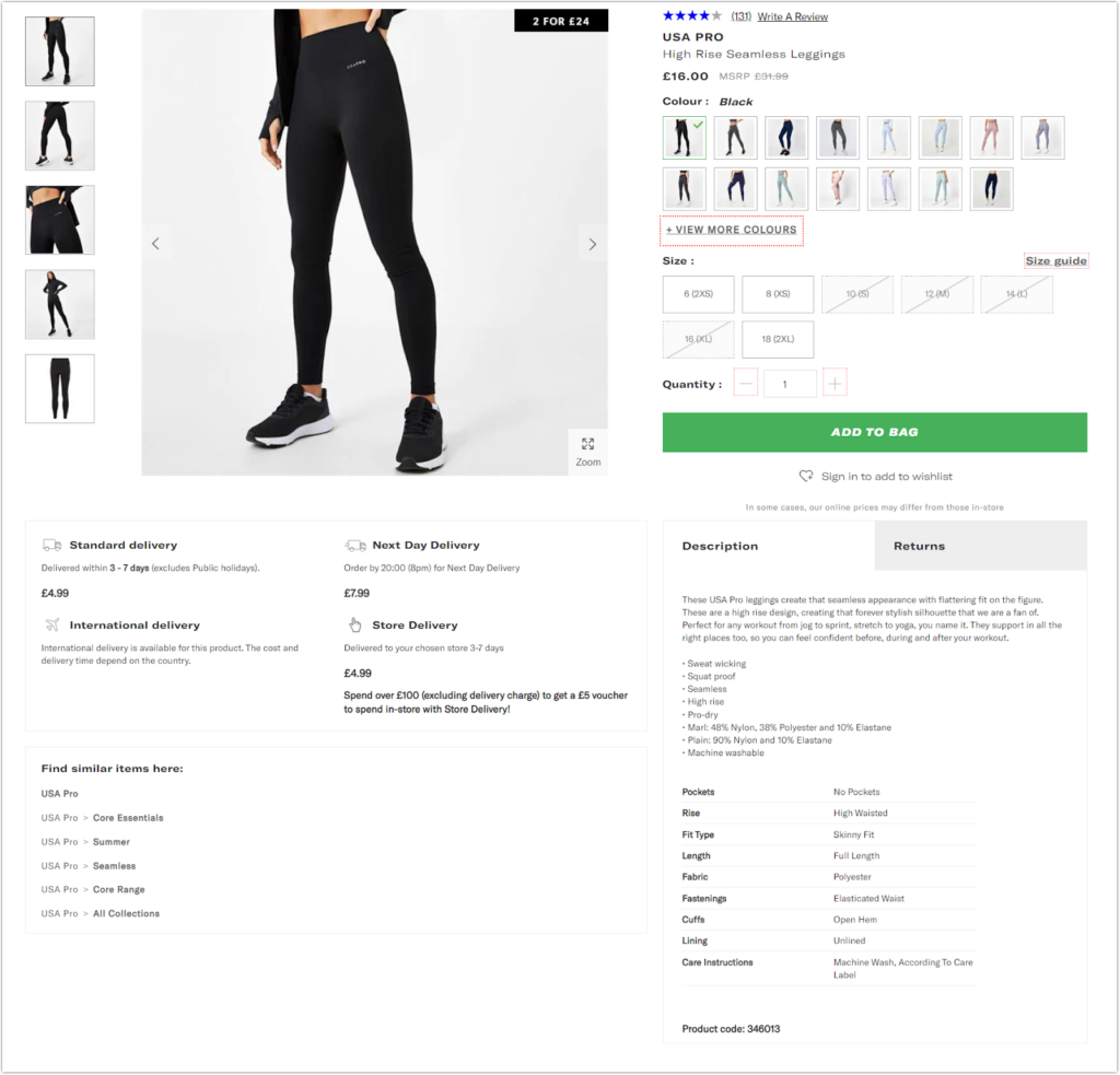
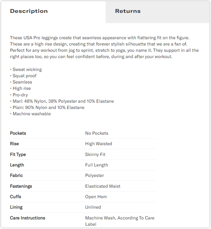
The description does its job well of describing the necessary information concisely (Create that seamless appearance with the flattering fit on the figure, high rise design), workout activities (Jog to sprint, stretch to yoga), high applicability (They support in all the right places too, so you can feel confident before, during and after your workout).
NOTE: Many websites only provide basic product information. This may cause online shoppers to leave these sites to search for another site with more information on the same product. During his search, he discovers that some websites offer the same product with all the necessary information at a lower price. If you were a buyer, which option would you select? The answer is obvious, right?
Sometimes, you may think there are some unimportant features and benefits, so you don’t include them in the product description. However, customers are interested in those features and benefits. This is a real-life example that I encountered. A customer comments that they purchased the product simply because of the low price. They didn’t expect the product to have so many extra features because the eCommerce product detail page doesn’t showcase them. For that reason, consider carefully what features should be included.
b. Highlight the product benefits
Many online merchants often make the big mistake of showing their product’s many features. They believe that the more features they list, the more likely the target customers will buy their product. In fact, customers aren’t as interested in the products’ features as that. What they really want to know is what benefits those features bring. However, it means the features don’t matter. You still need to present the features and benefits together but focus more on benefits. Love Hair provides an excellent example of a product description.
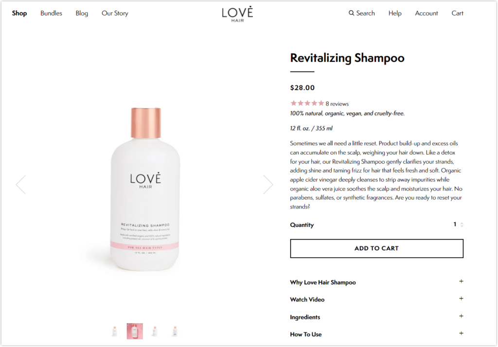
As you can see, this brand is brilliant when they indicate a list of hair issues that its product can resolve, and soon after, they emphasize how its product can benefit those experiencing these issues. Benefits include:
- Gentle clarifying strands
- Adding shine and taming frizz for hair, helping the customers’ hair become soft and fresh
- Deeply cleanses to strip away impurities
- Soothes the scalp and moisturizes your hair
Furthermore, rather than focusing solely on the ingredients or “features,” such as apple cider vinegar or organic aloe vera juice, this clever description discusses the benefits that come with them. As a result, customers quickly fall in love with this shampoo because of its sensory and customer-oriented benefits.
c. Use natural language and tone
Using natural language and tone–as you would in a real conversation–will aid in connecting with your brand.
- Use “you” to make the conversation more casual and friendly.
- Read your description aloud and ask, “Does it sound like a real conversation you’d have with a friend?”
A big plus is incorporating your target customers’ languages or words. For example, assume you are a millennial store owner who sells products to Generation Z. I’m sure there are thousands of words or expressions used by Gen Z you’ve never heard before. Therefore, it’s necessary to do more research about this generation’s language, behaviors, and characteristics. Then, include that language in your description. Then, Gen Z will feel like chatting with a friend who shares their viewpoints and understands them.
- Don’t be too stressed about learning loads of extraordinary things. Also, don’t be too concerned about not being able to use that language naturally. Start out with some cool phrases that you really understand and enjoy.
Ask for help from your acquaintances of Gen Z. “Is it cool enough? How should it be to attract Gen Z”.
- Joining the Gen Z group is a great way to learn more about these target customers.
- Try to learn about your target customers in many ways with an open mind. You can create product descriptions that entice them to buy your product.
d. Make it scannable
Instead of reading everything, online users tend to grab just the main points. Therefore, a product description highlighting the most important features and benefits is essential. Here are some helpful hints for making the product description more readable.
- Use bullet points
- Write short paragraphs with a few sentences for each. Don’t use long sentences and say no with big words.
- Bold headings
- Highlight the keywords if necessary (By using bold, capitalizing, increasing the font size, or using other font variables)
- Increase the amount of white space (Increasing the height line between lines in the paragraph, adding a margin to the left and right sides, adding more white space between different content blocks)
- Choose a legible font with a well-contrasted color if possible. Some websites make the mistake of using gray on a white background; however, it is illegible.
A specific eCommerce PDP comes from Amazon:
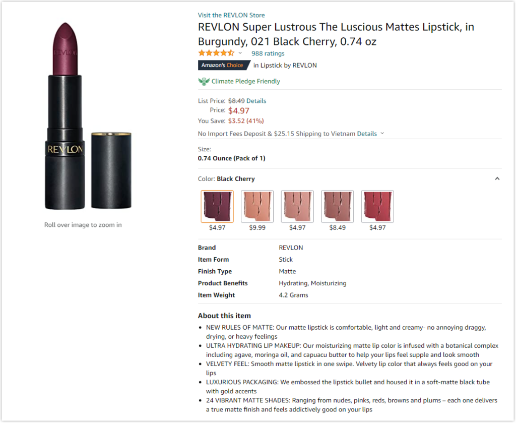
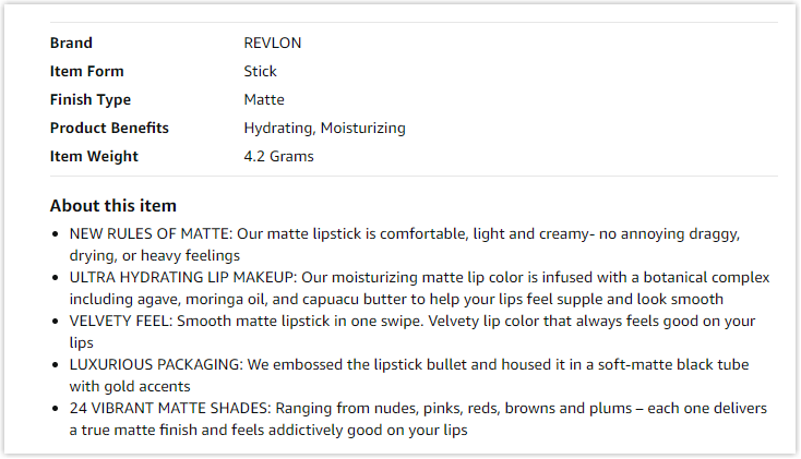
The supplier does an excellent job of making the product description easy to scan:
- Make the title bold (About this item).
- Use bullet points to highlight the most important information.
- Capitalize the text in each featured title to draw attention to it.
e. Use persuasive language that makes you money
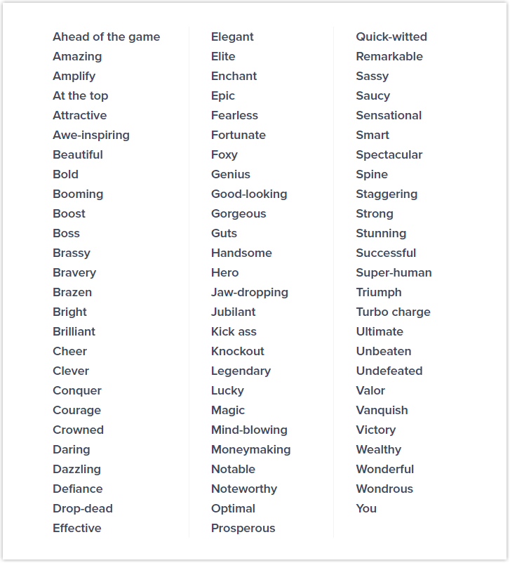
One of the most important factors that make a good product description is using persuasive words, also known as power words. Descriptions using these words can arouse our emotions and the feelings of shoppers, which has a big influence on their buying decision.
Suppose you’re selling high-end watches for women. Using words like “elegant, “elite,” “sleek,” or “signature” gives your description more power for sure. Also, they are representative of your target customers. If you replaced “elegant” with “attractive” and “sleek” with “smooth & shiny,” do you think this customer group would choose to buy watches from you? Certainly not because those words do not persuade customers that the product is in the high-end segment.
Here is a list of power words known as “vanity words” that can sell. Learn more about these words from this Optinmonster article.
f. Make product descriptions SEO-friendly
After creating a persuasive product description that sells, you may believe you don’t need to do anything with it. You are wrong. Potential customers must know your product’s existence before reading its description and then purchasing it. An SEO-friendly product description is a fantastic way to do the job. Including keywords in the product description increases the chances of interested customers finding the product.

Demo FREE Single Product Page Builder today
Create any Magento product page layout you can think of. Easy to use with intuitive drag & drop and user-friendly backend.
3. Images of Products
To persuade buyers to purchase your product, it’s not enough to simply provide a compelling product description. But, with only a thorough description, how can shoppers visualize how the item looks? This is where the product images come in.
A good product image gives customers an accurate visual look of a product, allowing them to make an informed purchasing decision. So, what should we do with the image to ensure it accomplishes its ultimate goal? The answers can be found below.
- Choose product images that are large and high-quality. Ensure your images are big enough to show all product details while remaining small enough to avoid slow page load speed.
Furthermore, use high-resolution images to ensure that your customers can zoom in on any details of your product images. An image with 800 × 800 and 1000 x 1000 is ideal for zooming.
- Use photos of real-life products, which enables customers to visualize how they would look using this product. Hence, they don’t need to worry about whether this product is as natural as described, minimizing the disappointment of receiving it.
Aside from that, you can create a separate gallery of product images taken by your customers who actually use it. As a result, customers may better understand how it is used by other people, but it also acts as social proof that encourages them to buy.
NOTE: To have such a product image gallery, you need the help of a specialized tool. If you own a Magento store and want to add an image gallery on the eCommerce product detail page, the Magento 2 Image Gallery extension is highly recommended. Explore more out-of-the-box features of the Image Gallery extension here.

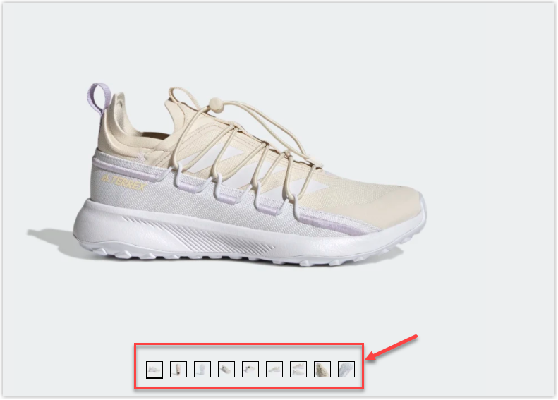
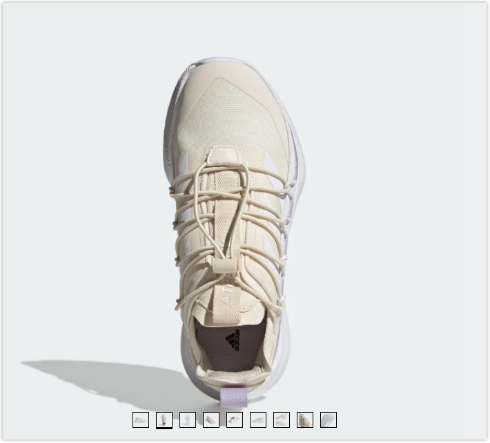
- Display product images from different angles. Adidas, a well-known shoe brand, displays multiple views of their products, allowing online shoppers to see every angle of the shoes (Tread, sole, the underside of the shoe, etc.).
- Choose a neutral background for the product, such as gray or pure white, to help your customers focus on the product. Furthermore, these colors contribute to the eCommerce product detail pages having a crisp and clean look.
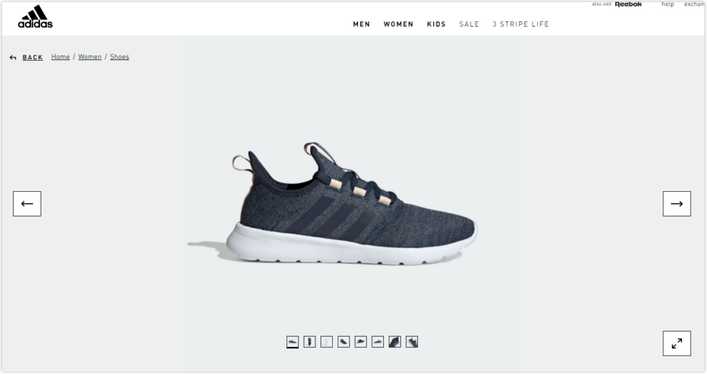
- Place the products in appropriate contexts so customers can easily visualize a product’s appearance in a realistic context. In addition, such product images can be a source of inspiration for them.
- If you include a video on your product details page, that is a huge plus. Videos provide greater clarity than images for online shoppers who cannot touch or feel the product. For example, look at a creative product video from outdoorvoices.com. To demonstrate how their versatile leggings can help hikers who bring the snack, this retailer created a video in which the girl’s leggings are packed with items such as a chocolate bar, a smartphone, and a water bottle.
- Ensure that product images across your site are consistent (Color backdrop, dimension, lighting, etc).
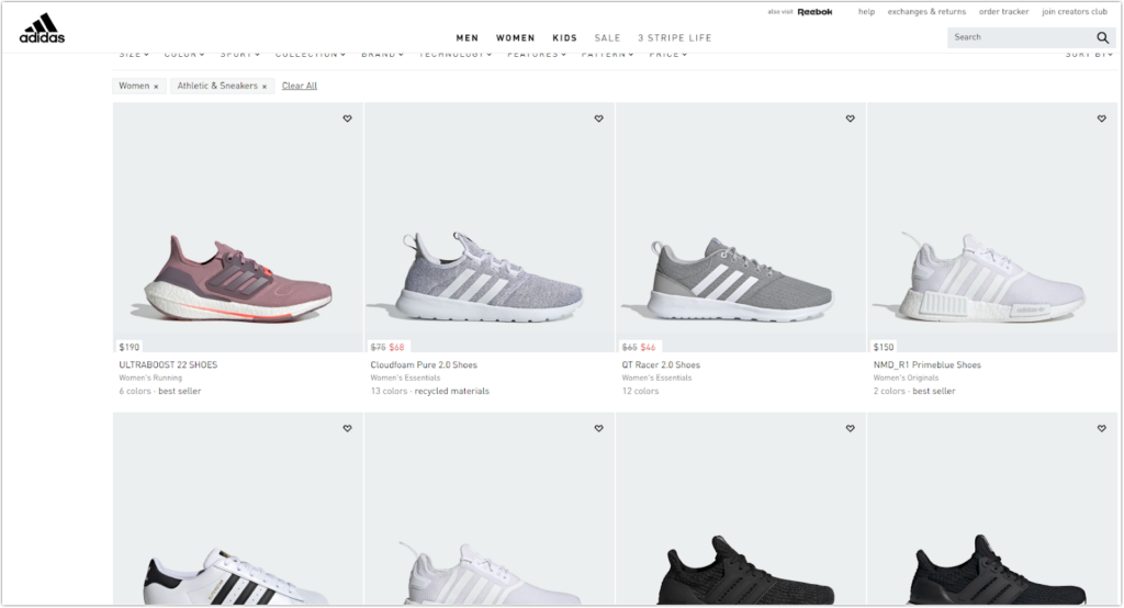
I took a screenshot of a product listings page where you can view multiple products at once. As you can see:
- All product images have a light grey backdrop.
- All product images on the product detail page are the same size (840×840). You can find it here.
- The products are in the same position as the main object in the images.
- Optimize product images for search by:
- Give it a descriptive name instead of using the complex name that your camera will set by default. For example, the image’s initial name, “2021-03-24_16-34-40,” should be replaced with a name that describes the product, like “Cloudfoam_Pure_2.0_Shoes_Blue_H00947_01_standard”
- Add your keywords to the alt tag of the product image to increase the likelihood of this image ranking high in Google image results. Even if your eCommerce product detail page is not among the first search results pages, you still have a chance to stand out among the big names in image search. Besides, it’s a description of your image for online visitors, which is especially useful when the image hasn’t been loaded for some reason.
- Optimize the sizes of your product images so that they don’t slow down your eCommerce product detail page.
- Ensure that product images look good on different devices.
Depending on the different platforms or websites, product image guidelines vary. The difference in image size guidelines between two well-known brands exemplifies what I mean.
| Image size guidelines | Shopify | Amazon |
| Maximum image size | 4472 x 4472 pixels | The image’s longest side is 10,000 pixels at maximum |
| Minimum image size | 800 x 800 pixels | The image’s longest side is at a minimum of 500 pixels |
| Recommended image size | 2048 x 2048 pixels | 1:1 square image with the dimensions 2000 x 2000 |
| Maximum file size | 20MB | 10MB |
4. Variations
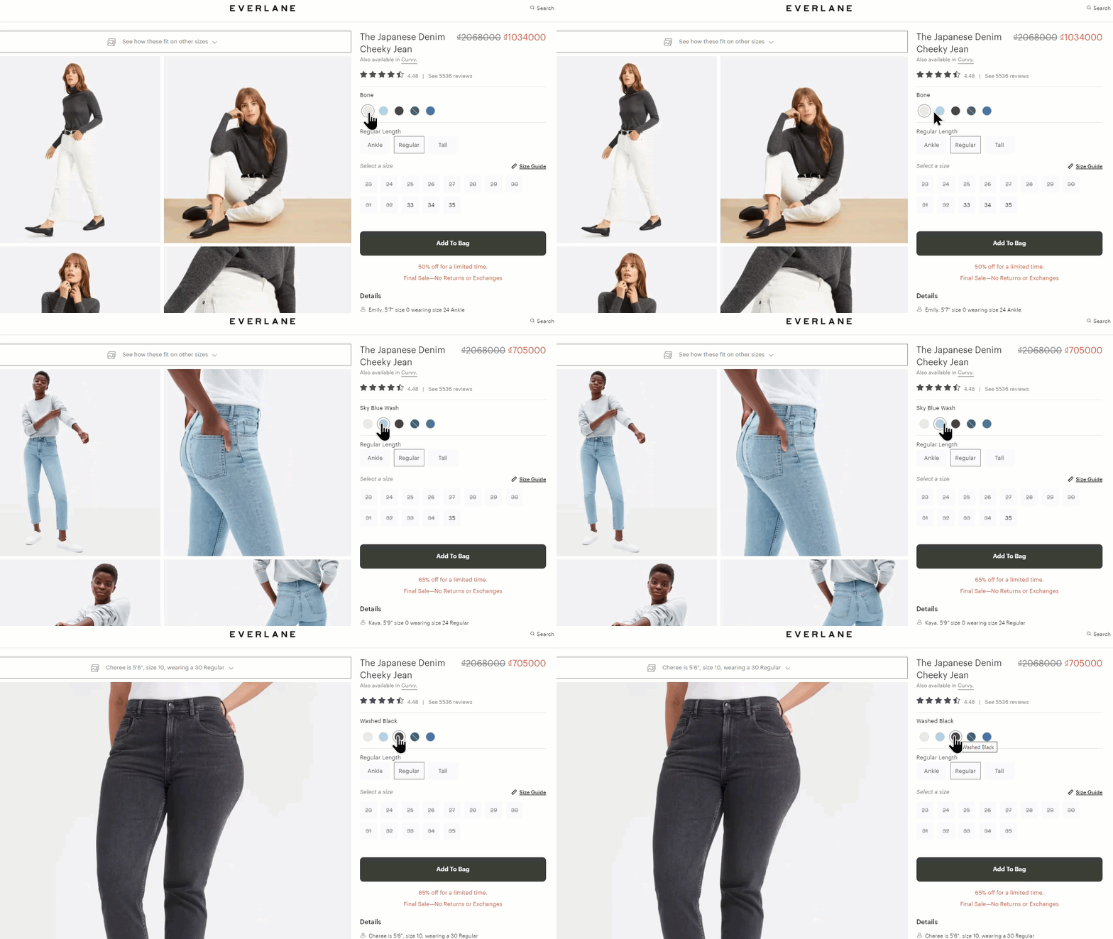
Color and text swatches help online buyers to choose between available colors and sizes of the same product if you’re selling products in several sizes and colors. In a nutshell, swatches provide excellent visual information about the product. The following are some ideal practices to follow:
- Enable customers to learn more about swatches by hovering their mouse over them.
- Make sure the swatches are large and well-spaced, so mobile users can easily tap the one they choose. As Baymart says, the minimum impact area on mobile phones should be at least 7mm x 7mm, with at least 2 mm spacing between them.
- Ensure the main product image changes when you click on a different swatch. As a result, customers may easily have a closer look at their favorite.
- Let customers know the out-of-stock variations. This lets customers know whether or not their favorites are available from the beginning, rather than going through dozens of checkout steps and finding out later that they are out of stock.
Customers may find it elsewhere if the item is restocked in your store. So, how are you gonna deal with it? Magento 2 Out of Stock Notification is highly recommended if you own a Magento 2 store. Customers no longer need to visit your website frequently because they will be notified via email when their favorite item is restocked. In addition, customers will receive notifications about other product updates, such as price changes and out-of-stock.
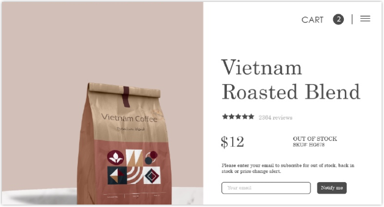
- Make sure that the color swatch you offer is accurate. Customers are less likely to return a product if it matches the color. To do so, select color values from a photo of the actual product using an eyedropper. You can also upload helpful photos for pattern-based products, such as striped T-shirts.
Everlane is an excellent example of all of the above practices:
If you are a merchant running your websites on the Magento platform, you can learn more about Magento 2 Color Swatch here.
5. Price
Customers are probably more concerned about price than others on the product detail page.
- Display the prices clearly and prominently.
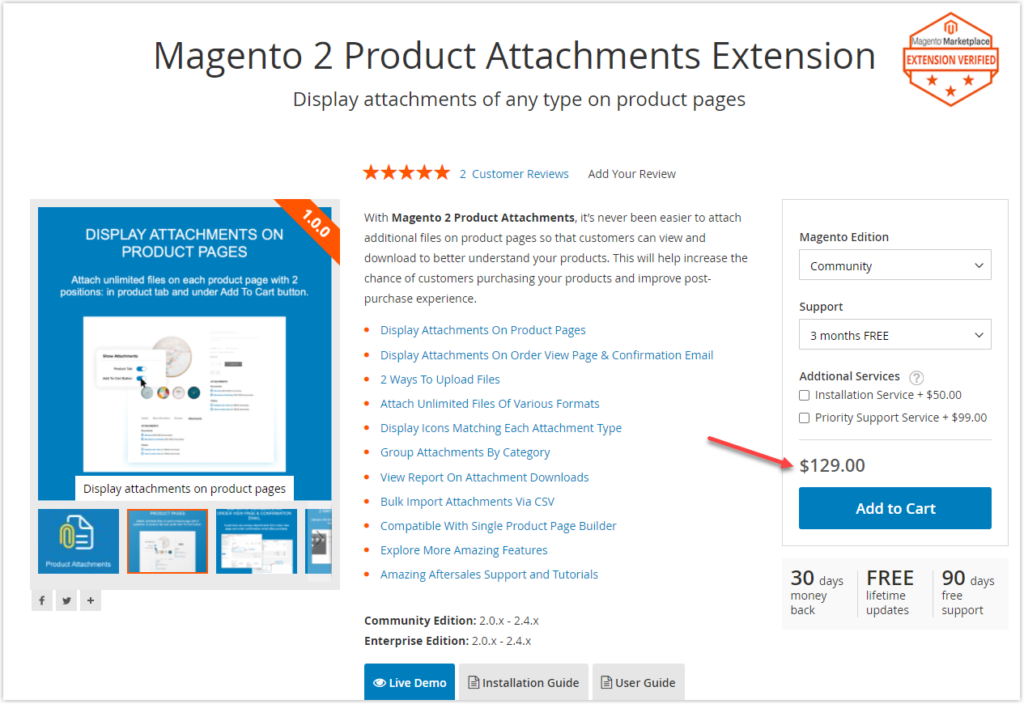
- Show the product’s discount to increase conversions. Online merchants use a popular sales tactic is ending a price in .99 ($9.99 instead of $10, for example). We are more affected by the first digit of the price because we read from left to right, says Lee E. Hibbett, an associate professor of marketing at Freed-Hardeman University in Henderson.
Although there is a slight difference between these two prices, shoppers prefer $129 over $130 for the Magento 2 Product Attachments extension.
6. Call to Action
As online shoppers, you must get familiar with the “Add to cart” or “Buy now” CTA buttons. Customers are prompted to take the ultimate action – purchasing the product with these buttons on the product page. Merchants optimize every part of a product detail page in the hopes that customers will click the CTA button. So, how do we make a CTA button that works?
CTA copy:
- A CTA copy should be short, sweet, and persuasive. “Add to cart” or “Buy now” frequently persuade clients to take action.
Every country may prefer distinct CTA copies that convey the same purchase message. For example, on Amazon.com, the “Add to cart” button on the eCommerce product detail page is favored, whereas on Amazon.co.uk, “Add to basket” is preferred.
Read more: 100 Last-minute Call-to-action Phrases To Double Your Conversion
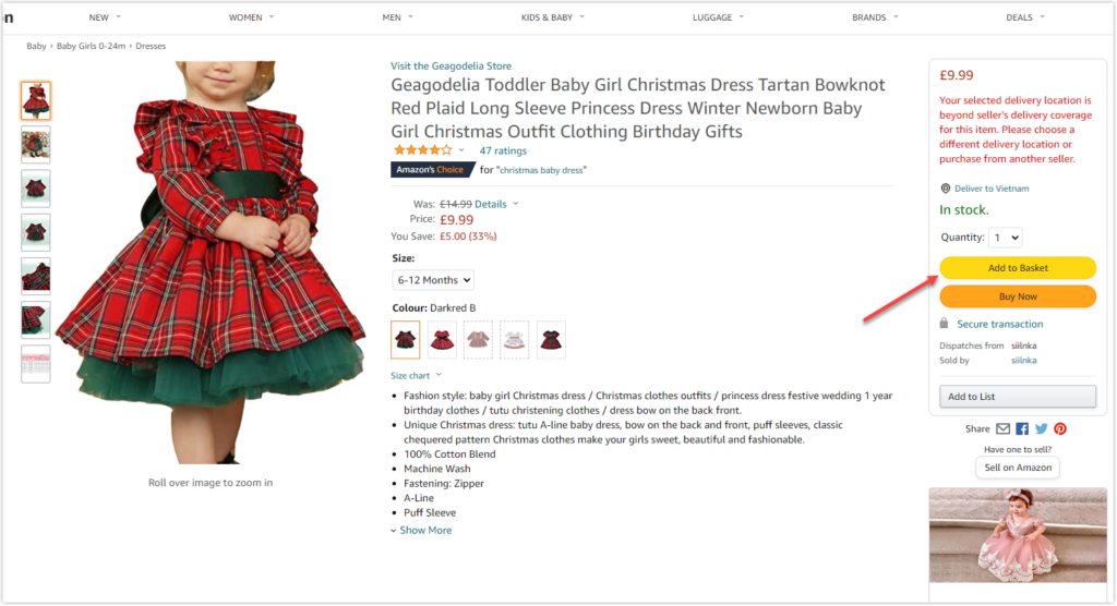

CTA button:
- Ensure the CTA button is the same color as the logo and header. This ensures that the eCommerce product detail page and the rest of the website are consistent, thereby improving customer recognition of your brand.
- To draw clients’ attention, use contrasting colors for the button about the rest of the page. Also, remember that every color has a different meaning in different cultures. Therefore, you should think about the color of the button carefully when making your selection.
Eg. Apart from being a symbol of trust, security, and authority, blue in Western cultures is connected with masculinity, whilst in Chinese traditions, it is associated with femininity, according to HuffPost.
- Place the button in the top half of the eCommerce product detail page, often called “above the fold.” As a result, customers don’t have to scroll down to the eCommerce product detail page before taking action.
- If your visitors don’t take action straight away because they want to check its quality or worth the price, add a secondary CTA button. This reduces the chances of shoppers leaving your site to look for other vendors. For instance, you can add “Request for demo” next to the “Add to cart” button.
Use a complementary color or a simple outline for the secondary CTA button. A great example comes from the Amazon:
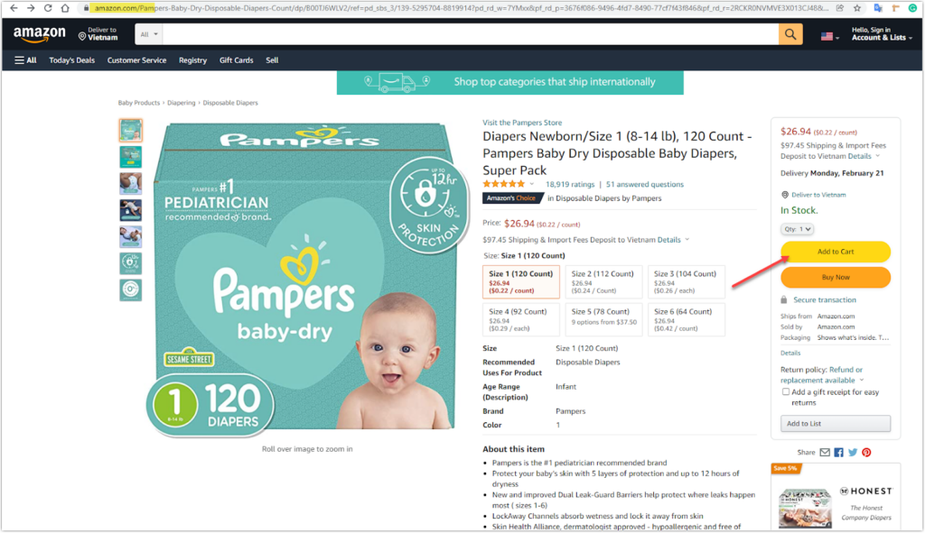
As you can see above, the primary CTA is Buy Now, which has an orange button. Meanwhile, the Add to Cart CTA, which features a yellow button, is the secondary CTA.
Take your inspiration from 25 proven CTA examples across all platforms

Demo FREE Single Product Page Builder today
Create any Magento product page layout you can think of. Easy to use with intuitive drag & drop and user-friendly backend.
7. Social Proof
Before purchasing something online, online shoppers frequently read customer reviews. If the product has a few negative reviews, they even decide not to buy it. As you can see, reviews on the product detail page significantly impact the buyer’s decision. The following are some social proof best practices to follow:
- Make the star ratings visible at the top of the page. Without having to scroll down to the review area, customers can obtain an overview of the overall rating and the total number of reviews for the product. Furthermore, a clickable rating is a need so that buyers can go straight to the review details with a single click
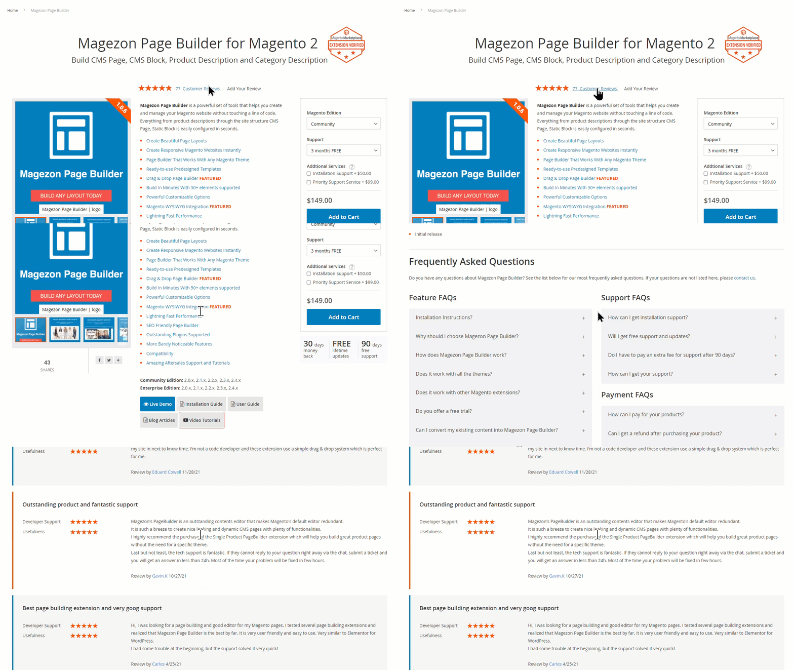
You may also like: 50+ Stunning Testimonial Page Examples
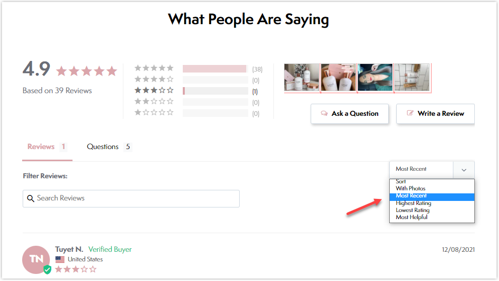
- Provide a quick overview of product reviews, including the average rating, the total number of reviews received, and the number of reviews received for each level.
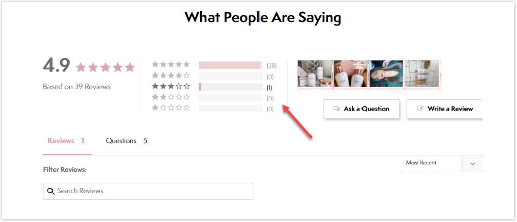
- Encourage customers to post product reviews. To enhance visibility and make it easier for customers to post a review, place a “Write a Review” CTA button near the review section or within the review summary.
If possible, persuade clients to leave as detailed as possible reviews. In addition, encourage customers to upload product photographs or videos as a reputable source of information for future customers.
- Display the essential customer information, such as their names, countries, date of purchase, etc. The reviews posted by real people with their personal information can strongly persuade potential clients.
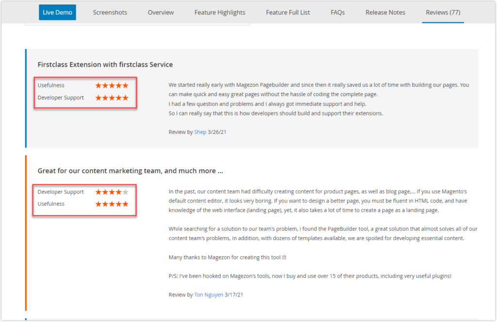
- A great idea for customers to score your product is to offer multiple criteria to score each separately. Those who have already purchased the product may find it easier to rate it accurately.
Magezon customers, for example, score our extension on a scale of 1 to 5 based on two criteria: usefulness and developer support. They can choose how useful the product and developer are to them.
- Allow visitors to sort through reviews based on their star rating. Some websites provide additional filtering options, such as With Photo, Most Recent, Highest Rating, Lowest Rating, and Most Helpful. As a result, customers can find relevant reviews quickly.
- Show the number of people that bought the product, especially if that product is popular among your past customers. A large number of customers purchasing the product will undoubtedly increase its reliability of the product.
- Don’t fake the reviews. Authentic and transparent reviews help them make the right purchasing decision. It’s also a great way to build long-term client trust. If they have discovered your reviews are fake or copied from others, you won’t get a second chance to service them.
- Don’t remove the negative reviews. If an eCommerce product detail page is full of positive reviews, it may appear unnatural and untrustworthy, potentially harming your business. On the other hand, customers who post negative reviews may believe you don’t value their opinions. The chance of fixing a broken relationship can be less than zero.
- Set up pre-moderation to avoid spam, photos that aren’t related to the product, or insults from appearing on your product detail page.
Read more: Customer Review Section on Product Pages: 9 UX Tips to Accelerate Buying Decisions
8. Product Suggestions
As retailers, you typically want customers to spend more money on your products, such as purchasing more items in addition to the ones they’re looking at. Product suggestions were born to satisfy the demand. There are a few product recommendation ideas you can use on your eCommerce product detail pages:
- Best-Sellers Recommendation: highlights the most popular items sold the most.
- Other Customers Also Viewed: provides the most accurate suggestions based on data from other users, such as preferences, interests, and behaviors.
- You Might Also Like: recommends a group of items very similar to the one viewed by the customer.
You may also like: Magento 2 Related Products, Cross-Sell and Upsell Products
9. Return and Shipping Policies
- Return Policies
A return policy tells customers what items can be returned, why, and how long merchants will accept returns.
A clear and transparent return policy gives buyers a sense of security because what they’re about to buy is guaranteed in back and white. Customers don’t have to worry about being unable to return a product if it has a flaw; for example, the color doesn’t match the description. Depending on the policies, they can request a refund or a similar replacement at no cost.
Disclaimers and return policies, on the other hand, may help merchants avoid legal trouble if an item is dispatched to the wrong address or returned products are due to the fault of customers.
Here are some of the best practices for disclaimers and return policies.
- You must strike a balance between cost and customer delight. If you’re an online retailer, you’ve probably experienced significant revenue losses due to product returns. Many individuals believe that the loss only includes delivery costs. It’s a big understanding. In fact, there are many other costs they don’t know, such as warehousing, refunding, restocking, labor, etc.
- List all of the specifics of product returns. And explain them as transparently and clearly as possible.
- Maintain a friendly tone in your return policy while delivering all necessary information.
- Make your return policies visible to customers so that they are aware of them. If they need assistance returning a product, they will know where to look for solutions without asking for merchants’ help.
- Create a customer-centric, no-hassle return policy to increase client loyalty. If they had a great return experience, 73% of internet customers in Mexico said that they would buy from the same seller again, whereas 78% would tell a friend about the vendor, according to a survey conducted by Comscore. Rather than spending a lot of money to get new consumers, businesses should focus on providing a positive return experience to keep the ones they already have.
If you’re interested in learning more about return policies, we’ll produce a comprehensive post that covers all you need to know. Stay tuned.
- Shipping Policy
Merchants do not have the same control over delivery costs as product prices. This is because shipping costs vary depending on various factors, such as customers’ location, the type of postal service they use, the shipping fee level offered by different shipping companies, and so on.
In fact, many online shoppers abandon their shopping carts because of unexpected shipping expenses. That’s why it’s critical to provide clients with clear yet concise shipping policies that explain everything about shipping, including shipping charges, methods, and delivery time. Then, customers can use it as a complete reference before purchasing.
10. Trust Badges and Trust Seals
The first-time visitors come to your site and have never heard of your company, they may be hesitant to make a purchase. That is simple to understand. But unfortunately, online shoppers can face far too many risks when purchasing from a business they don’t know much about. Therefore, a trust badge on your eCommerce product detail page is important to gain the trust of your potential buyers.
This seal ensures that your page or website is legitimate and verified by trusted, secure third-party service partners. Website security (e.g.an, SSL certificate), approved payment security (E.g., Visa, MasterCard, PayPal), anti-virus (E.g., McAfee Secure), third-party endorsement badges (E.g., Google Customer Reviews, Trustpilot), and guarantee badges (e.g., Free shipping, Money-back guarantee) are all examples of trust badges.
Have a look at our Magezon Page Builder page to better understand. First, you’ll notice a trust seal from Magento Marketplace. It signifies that a reputable and trustworthy third party in the Magento community has tested and verified our extension. So you’ll have much more confidence buying our Magezon Page Builder, right?
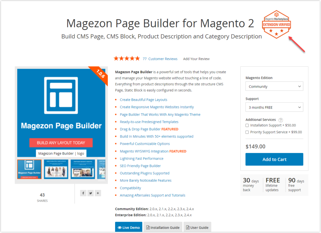
Best practices for trust badges are listed below:
- Don’t use trust badges on your eCommerce product detail page without permission. If you can’t afford a premium trust badge, look for free but reliable trust badges.
- Before purchasing a badge, ensure you understand the requirements for displaying trust badges.
- Use trust badges from well-known service providers. If you’re unsure whether trust badges are recognizable, conduct a survey among your clients.
- To win customers’ trust, link your trust badge back to its provider. Customers might wonder whether you’re utilizing the badge without permission if you don’t tell them.
We use a trust badge on our Magento 2 Mega Menu Extension page. When your customers click directly on the trust badge, a modal explains what the badge represents and why it is trustworthy. This clear explanation also helps prevent shoppers from navigating away from your site.
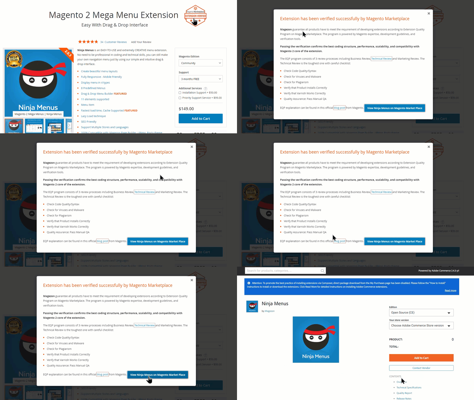
- Show an easy-to-understand trust badge. Include a link that takes customers to a modal or a page which clarifies what the badge is for.
- Use high-resolution and responsive images of trust badges so that buyers find them easier to read on smaller screens.
- Make sure your trust badges are updated to the most recent version.
- Don’t show too many badges in one location because it can make your eCommerce product detail page look spammy.

Demo FREE Single Product Page Builder today
Create any Magento product page layout you can think of. Easy to use with intuitive drag & drop and user-friendly backend.
11. Product FAQs
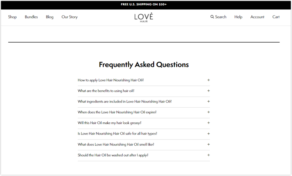
The FAQ section on the eCommerce product detail pages answers a series of frequently asked questions about the products. FAQs can cover various topics, including product benefits and features, pricing, services, and other policies. Rather than contacting the service team, customers can go straight to the FAQs, which contain frequent questions and answers. You can use the following practical techniques to create excellent product FAQs:
- Keep your response short and sweet.
- Update the FAQs regularly to ensure the information provided is accurate.
- Sort the questions into relevant categories so customers can quickly discover the answers.
Read more: 50+ most common FAQ questions for all websites
For example, all product-related queries are grouped together, whereas questions about product services will be kept close at hand.
- Maintain a basic layout for your FAQs section. Customers who land on the FAQs are looking for information, not amusement, so don’t distract them with a complex format.
- Use accordions to display the questions and answers. Customers might opt to expand on any question that piques their curiosity. This also reduces the amount of text shown on the page, which may overwhelm your shoppers.
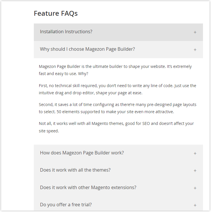
Read more: Accordions – An element in Magezon Page Builder
12. Brand Identity
Make sure that all design elements (color, typography, shape, layout, etc.) and tones of voice are consistent across your website and reflect your brand. Customers will become distracted if you have dozens of eCommerce product detail pages, each with its unique design or different tones of voice. Regardless of how well-designed and content-rich every eCommerce product detail page is, it fails to make customers recognize you. Remember, customers are more inclined to choose the brand they are more familiar with. So, don’t overlook the brand identity.
| Improve the look and feel of your website 20+ best heading fonts and how to use them effectively Most common font names for websites of all time |
How to Layout Your Website Product Page – 3 Common eCommerce Product Detail Page Layouts
Once you have all the basics of a product detail page, you may wonder how to organize the elements to create high-converting product pages that make money.
This part will introduce 3 common templates for eCommerce product pages. Read carefully and choose which layout suits your business best.
Template 1: The Universal Product Page
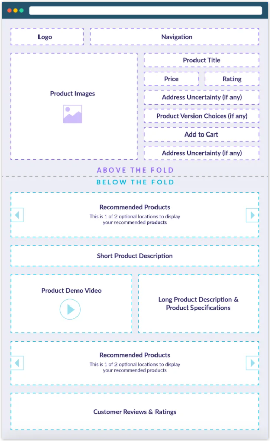
You must be familiar with this eCommerce product detail page layout because this layout is the most widely used.
- Used for which types of products?: You can use this layout for any highly recommended product type.
- What makes it so effective? In reality, people read from left to right. Furthermore, visuals are an efficient tool for capturing your audience’s attention. This website product page layout does a great job of placing the product image on the upper-left corner of the product detail page. When people see the image and if they like it, they tend to stay on the page longer and learn more about the product.
This product layout features the product title, price, star rating, and Add to cart CTA button above the fold on the top of the eCommerce product detail page. In my experience, many websites also place product descriptions in this area.
Template 2: The Image-Focused Product Page
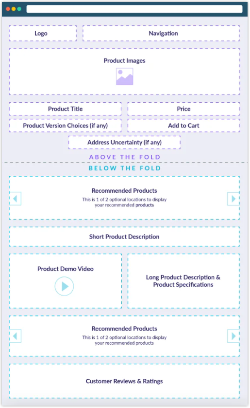
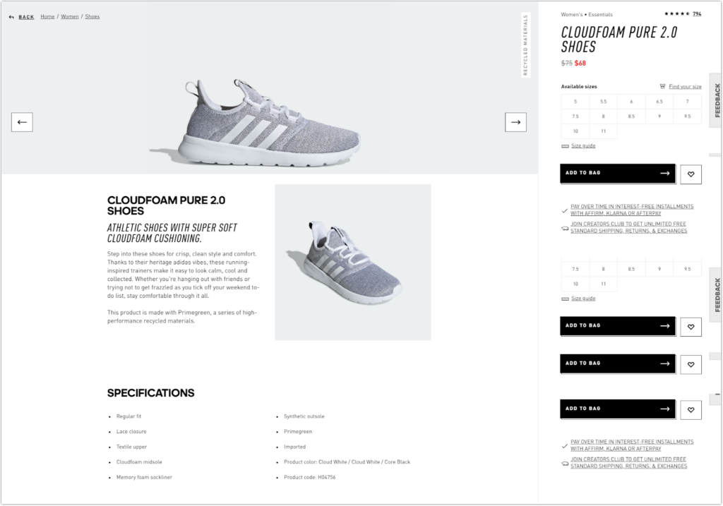
- Used for which types of products?: This product page layout is appropriate for artistic and aesthetically beautiful products like furniture, jewelry, and art.
- What makes it effective? Merchants sell these types of products on their looks. Therefore, product images are the focal point of these product detail page layouts. This image-focused eCommerce product detail page layout takes up the whole container width, whereas product images in the universal product page occupy about half of the container width. Of course, the images and the most important elements are above the fold.
- Tips: Ensure the product images are large and high-resolution so online shoppers can thoroughly view the item. Furthermore, the high-quality product images make the item worth its price.
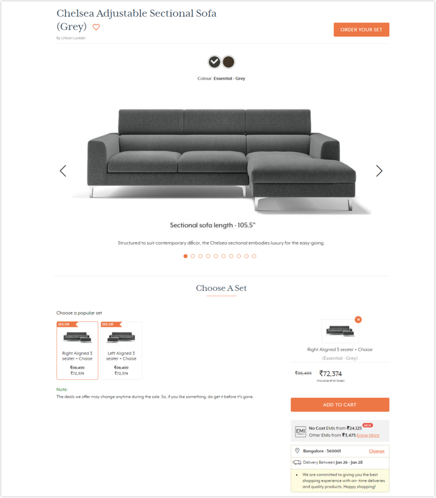
Note: I looked into several product sites to get an illustration. However, there aren’t many examples of eCommerce product detail pages like this. Most of them are applied to the former layout – the universal product page layout.
Template 3: The Feature-Focused Product Page
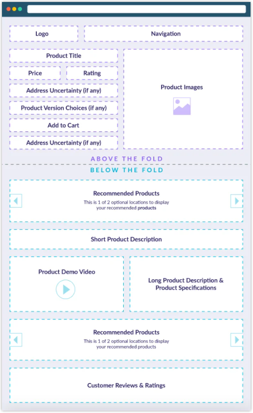
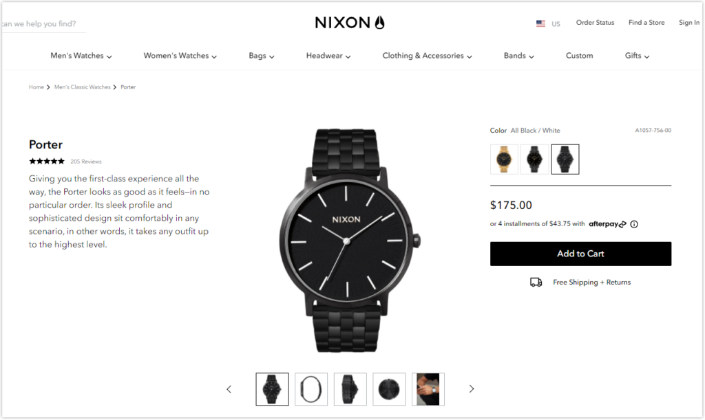
As its name suggests, the featured-focused product page layout focuses on features rather than visuals.
- Used for which types of products?: This layout is helpful for merchants who sell digital appliances, mechanical tools, or tech products.
- What makes it effective? The product page layout is designed to provide product information about features and specifications, which are the selling point. That’s why the text column with content is placed on the left.
- Tips: Pay close attention to what you write. Make sure it is clear, accurate, scannable, and not too long.
Magento 2 Single Product Page Builder- A Powerful Tool to Create eCommerce Product Detail Pages in the Magento Store
Once you have decided on the layout for your product page, it’s time to bring all elements together on the product detail page. However, you do not want your sites to look the same as other websites.
In fact, it’s not easy to design product pages with a unique appearance if you’re running a Magento website because the standard Magento 2 only has one layout for a single eCommerce product detail page. The solution is to equip your e-store with a powerful tool to accomplish the task.
You’ll learn about Magento 2 Single Product Page Builder, one of Magezon’s flagship products. With the help of an intuitive drag-and-drop editor, even non-technical merchants can quickly build beautiful and unique layouts for your eCommerce product detail pages. Interested in this Magezon extension? So, let’s see what features this Magento 2 Product Page Builder offers.
1. Create any Product Page Layout
Magento 2 Single Product Page Builder lets you control your eCommerce product detail page layouts. So if you have many categories and each has its own product page layout, this is a great option.
- Instead of using the default layout, you can build any eCommerce product detail page layout you want.
- There are no limits to how many layouts you can create.
- You can apply a specific layout to any product page.
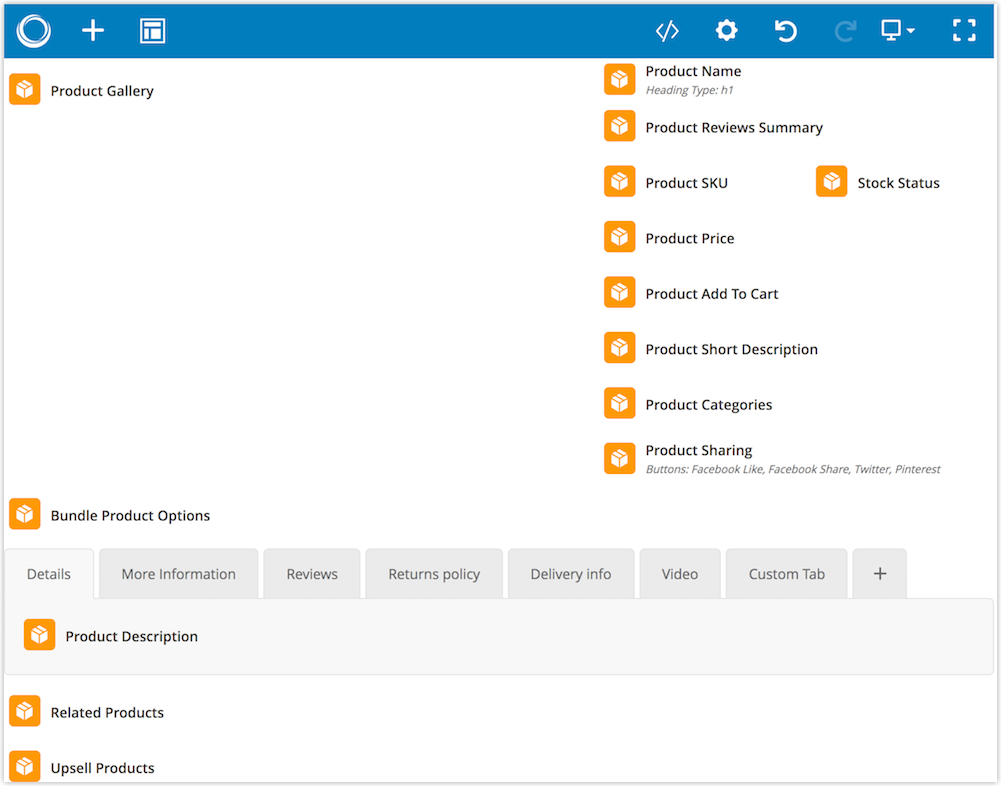
2. Come With an Intuitive Visual Drag-and-Drop Builder
Magento 2 Single Product Page Builder is a life-saver for individuals who don’t know much about coding. With a user-friendly visual drag-and-drop editor, this module makes it simple and quick for non-tech savvy users to create eCommerce product detail page layouts.
3. Save Time With Pre-Designed Layout Templates
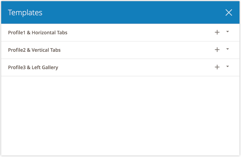
To help merchants save time and effort, Magento 2 Single Product Page Builder offers 3 premade layout templates you can use and customize the way you want.
4. 30+ Elements
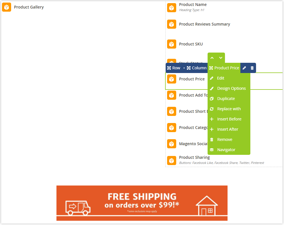
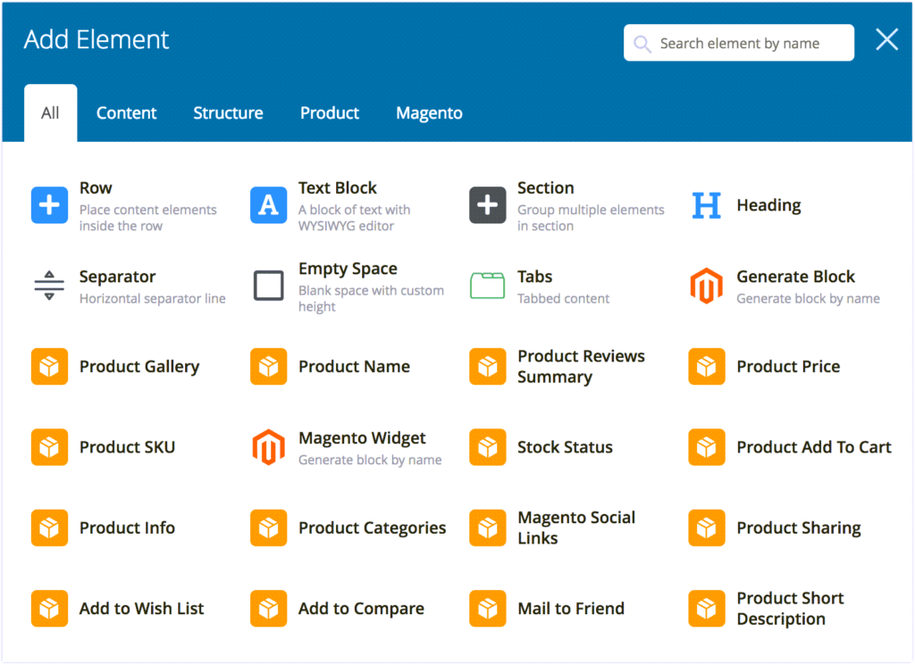
This Magezon module gives merchants access to more than 30 elements, including product name, product gallery, product review summary, product short description, product add to cart, etc. Each represents every function on the Magento product detail page, as their names suggest. You can add any element to the builder area with a single click. Simply drag and drop the items into the desired position if you want to change the layout of the product detail page. Furthermore, you can find it easy to customize, duplicate, replace or remove these elements.
5. Apply Product Variables
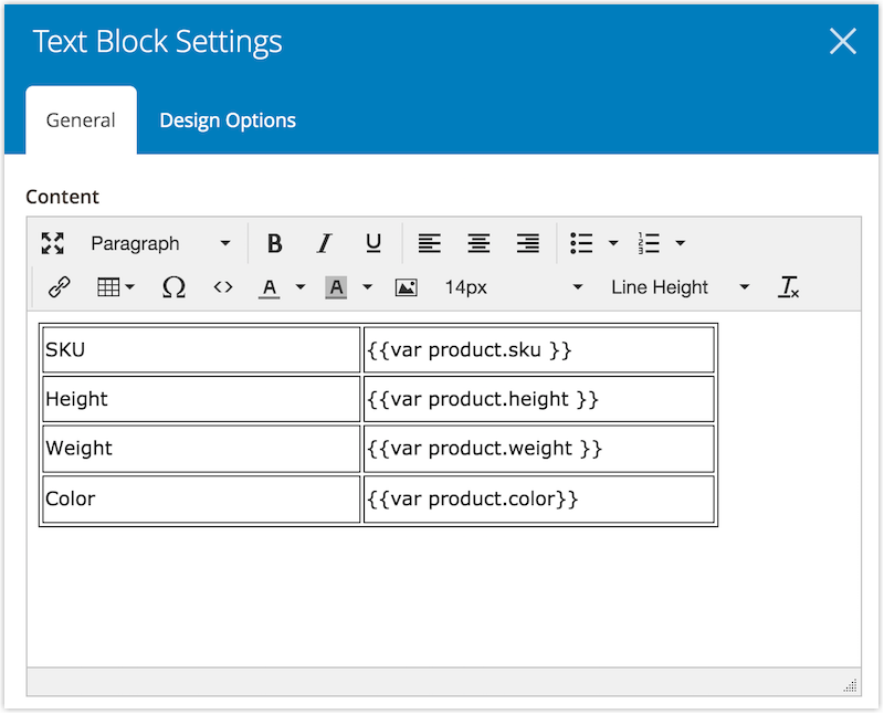
Like the Product Attribute element, the feature allows you to insert product attributes. The difference is that you can use this feature to insert product attributes where the Product Attribute element isn’t allowed. For example, you want to make a table of product attributes using the Text Block element. On the other hand, the Product Attribute element cannot be added to the table. Instead, you should utilize product variables in this scenario.
6. Easy to Customize Product Tabs
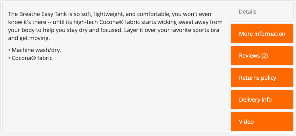
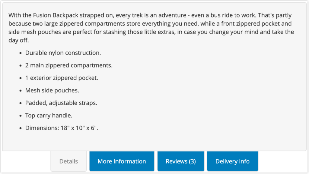
The default Magento 2 product tabs can be dull and unappealing; therefore, Magento merchants wish to replace them with visually appealing ones. Using our Single Product Page Builder for Magento 2, you are empowered to add as many tabs as wanted. More importantly, it’s easy for you to customize these tabs as desired with +30 elements and dozens of design options. Besides, you can choose whether to display the tab bar vertically or horizontally, which is a significant advantage of this builder.
7. Fully Responsive Design
You won’t have to worry about your eCommerce product detail pages being responsive when using Magento 2 Single Product Page Builder because they will automatically adapt to the screen size no matter what device your customers use.
Moreover, you can freely customize the responsive design for the layout.
- Customize the column width on every screen
- Hide or show the element on different devices
- Preview the product page from the backend builder on different devices
8. Support All Magento 2 Product Types
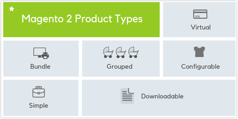
Magento 2 Single Product Page Builder supports all Magento 2 product types: simple, configurable, bundle, grouped, downloadable and virtual products. More specifically, you have complete freedom to customize and design the page layouts of all product types.
9. Fully Compatible With All Magento 2 Themes
Like Magezon 2 Page Builder, this extension is 100% compatible with all Magento 2 themes. Therefore, your current content will not be affected whether you are using Porto, Ultimo, or any other theme.
10. 100% Compatible With Magezon Extensions
Magento 2 Single Product Page Builder extension is fully compatible with the following Magezon extensions.
- Magezon Page Builder
- Image Gallery
- Product Attachments
- Magento 2 FAQ
- Size Chart
- Product Page PDF Builder
- Magento 2 Blog
- Shop By Brand
- Countdown Timer
That’s a Wrap
With this comprehensive article, you’ve got a firm grasp of eCommerce product detail pages, right? So, it’s time to implement some of the above-mentioned product page best practices for each factor. Keep testing and improving your product page every month or periodically to ensure your PDP product pages work well. If you have any ideas or questions to share with us, leave your comments right below. We’re so glad to hear from you.

Demo FREE Single Product Page Builder today
Create any Magento product page layout you can think of. Easy to use with intuitive drag & drop and user-friendly backend.
Being an official Adobe Innovate Exchange Partner, Magezon is one of Vietnam’s leading Magento 2 extension providers. We have developed efficient and affordable Magento 2 extensions to help you build robust web stores. Furthermore, they are all affordable and user-friendly for website owners and developers. So give it a shot and see how it boosts your sales. Visit Magezon extension store!
 Magezon Blog Help Merchants Build Comprehensive eCommerce Websites

