 Magezon Blog Help Merchants Build Comprehensive eCommerce Websites

Customers usually look for the review section on the product page to see if they can find any information they need before clicking on the Buy button. However, some sellers don’t pay enough attention to this element, thus losing their potential clients.
The blooming of e-commerce makes the competition between merchants more fierce than ever. If you just focus on the design and optimization of the checkout page but don’t take care of the review section on the product page, you are at a disadvantage.
After reviewing several e-commerce sites, I’ve compiled 9 UX tips for creating customer reviews on the product page for better customer shopping experiences and thus their quick buying decisions.
Without further ado, let’s dive right in.
Table of contents
- 9 UX Tips for Your Reviews Section Design on Product Pages
- 1. Make the Star Ratings Easily Visible to Customers
- 2. Offer a Quick View of the Star Ratings
- 3. Show a Review Summary Based on the Key Information
- 4. Apply Search, Sort, or Filter Features
- 5. Allow Sorting by Star Ratings
- 6. Implement Search Filters
- 7. Encourage Customers’ Reviews and Visual References
- 8. Give More Details for Each Review
- 9. Let Buyers Vote and Sellers Reply to the Comments
- The Bottom Lines
9 UX Tips for Your Reviews Section Design on Product Pages
1. Make the Star Ratings Easily Visible to Customers
The review section on the website should stay in an easy-to-see place (next to the price, for example). If your clients already hear about your products, then besides the price, the second thing they’re interested in is the experience of previous buyers.
This trick sounds simple, but many merchants seem not to understand. It’s not rare to see some websites hide the product review section somewhere. You may not want your page to look unprofessional like that.
You can place the ratings near the price at the top of the product page. Somewhere between the product’s name and the price is ideal. When seeing the highlighted stars, customers will feel encouraged to know more about the products. It’s also one of the factors giving buyers first impressions about what they’re going to buy.
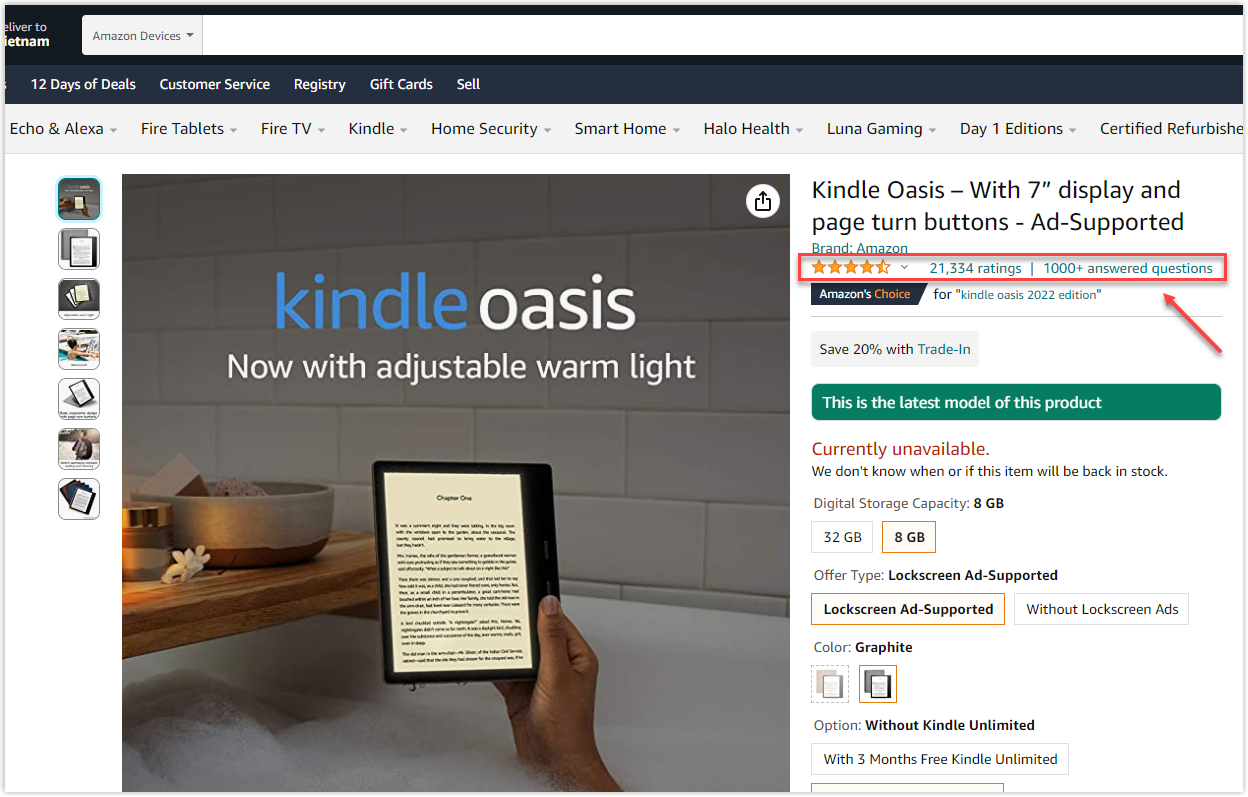
One more tip here is to pair the average rating with the total number of review counts. It provides users with an overview of the product. It’s even more helpful in the case of two similar goods with the same star ratings.
For example, you have two potential candidates, rated 4.5 stars, but one has a higher total number of ratings. Then, you’ll know which one is more popular.
Another situation is the product you’re looking for has different variations, such as colors, flavors, etc. By seeing the number of reviews, you can determine what people choose more, thus affecting your final decision.
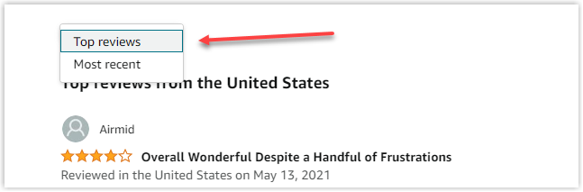
Hiding the review section on the product page is not intelligent since it can prevent viewers from exploring more about the commodity or service. Besides putting the star ratings at the top of your page, adding an element to navigate users to detailed reviews is advisable.
Instead of scrolling down and getting lost in a jungle of information, clients are brought directly to the comments. Usually, the total number of ratings is underlined, indicating it’s a shortcut link that anchors the web surfer to a more detailed section.
There are two common UX patterns for navigation. One will open a side panel and lead the users to the section down the page. Both ways create convenience and a better experience for your clients. If you are a Magento merchant, you can also use Magezon Scroll To Top Extension for your website to improve buyers’ experience.
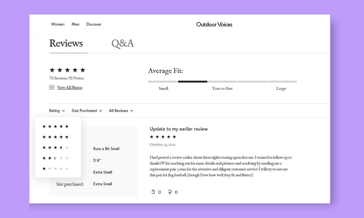
2. Offer a Quick View of the Star Ratings
Navigating users to the review section shows that your site is well-organized. Yet, you can do it better by providing your clients with a quick view of star ratings.
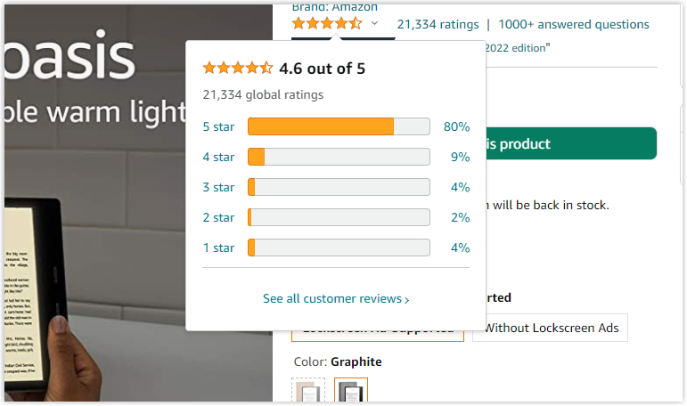
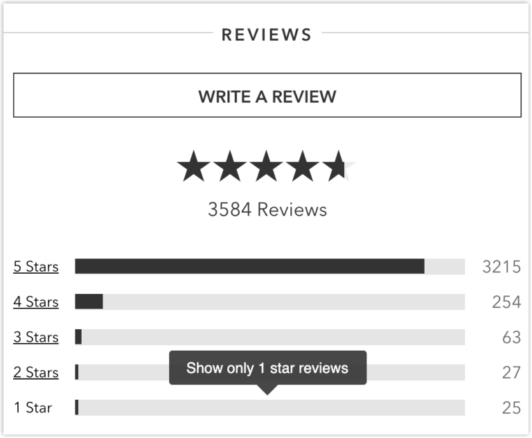
A dropdown on your product page is an excellent tooltip to apply. Implementing it allows customers to click on the star rating and have a breakdown of reviews with each tier. A small window will show how much each star rating takes up.
There will be a CTA or link in the dropdown that takes the users to the customer reviews on the website. It can be displayed as underlined “Show more reviews” with a total number of comments to attract clicks.
Following the steps of providing a quick view, then anchoring to the comments, a data hierarchy is offered, which is suitable for the ability to absorb information brain. Customers will understand the actual product experience from the overview to the details.
The best review section doesn’t mean there should always be positive ones with 5 stars. Otherwise, buyers will think that all of them are fake. Accept the negative comments to reduce the return rate and improve your products to satisfy the clients.

Try FREE Magezon Page Builder!
Easily create your engaging Magento pages in any style whenever you want without relying on developers or designers, just by drag & drop.
3. Show a Review Summary Based on the Key Information
A summary of all reviews above the review section on the website gives buyers a general understanding of the products. This collected comment snapshot aggregates information based on some vital elements as follows:
- Standard features of the products include sizes, colors, durability, quality, value for money, etc.
- Overall recommendation.
- Most helpful or popular comments.
- Star rating breakdown.
The popular format for this snapshot is progress bars, percentages, scales, horizontal bar charts, etc., letting users be engaged but at the same time easy to scroll through. This section has different versions on different websites. For example, Walmart’s desktop review section is doing this exceptionally well.
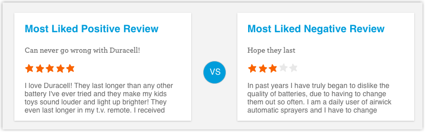
The brand lets its customers see the most helpful positive and negative reviews. Therefore, clients can quickly get a brief idea of the product without reaching for individual comments.
Meanwhile, some sites include the summary ineffectively. They may show the distributions to the ratings as separate labels. However, you can’t click on it, so the filter, in this case, is useless.
4. Apply Search, Sort, or Filter Features
One of the product reviews section’s best practices is implementing sort features. The function assists users in searching for the relevant information that they need. They can know if the good meets their needs without going through all the comments.
Many web surfers find this tool very helpful in saving time. Especially when the product has many relevant features and aspects, not all of which concern customers.
The best place to put this function is by the star scoring in the review section on the product page, where it is visible and easy to access. You can label the feature “Sort by” to make it recognizable. Make the buyers’ finding process more accessible by using familiar language for each filter.
You can write keywords in the filter options, such as most helpful, recent, lowest rate, etc. Ensure that the comment is sorted by each filter displayed naturally by mixing both positive and negative ones.
5. Allow Sorting by Star Ratings
Sometimes when there are too many reviews in the review section on a website, sorting by star ratings may solve the customers’ concerns. It also can be interesting for them to explore.
Have the breakdown of tiers in the summary part and ensure it’s clickable so the users can view only comments of one specific rating. Make sure you display the total number of reviews for each star rating.
Plus, you should create a simple way to close this filter, such as the X button. The function should act like quick access but doesn’t create a complicated interface so your clients can enjoy the shopping moments.
6. Implement Search Filters
The search filters are similar to the sort options above but are designed more in detail for specific users. They can filter by:
- Weight, height, and sizes
- Reviews including images
- Verified deals
- Common keywords
Again, one thing to remember is to let the feature stay in a recognizable and findable place. No matter if you use the text links or dropdowns, the language should be familiar so customers will have no language barrier.
Some websites do a great job with this type of filter. For example, when you select a keyword relevant to your need, a list of customer reviews on the website will appear.
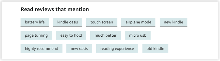
For some popular sites with thousands of products, each product has a long list of comments. Like Amazon, the best method to help users is to provide them with the “Read reviews that mention” option.
Customers can quickly get what they want by choosing specific keywords relevant to their concerns and pressing the purchase button.
7. Encourage Customers’ Reviews and Visual References
Attracting your clients to add reviews to the website is as important as encouraging them to rate a star. Place the “Write a Review” CTA close to the review section, the summary, or the star ratings.
You can include the CTA in any or all of these positions to bring users to the review form without the scrolling-down action. Ensure the button is identifiable to attract past purchasers to share their thoughts.
In addition, visual references such as photos and videos are highly recommended. Perfect studio-designed images can be attractive but can’t show how the goods are in real life, making them incomparable with those taken by real users.
As we all know, it’s an e-commerce environment, and we cannot touch anything. Getting a submitted photo or video from the previous buyers will be very appreciated.
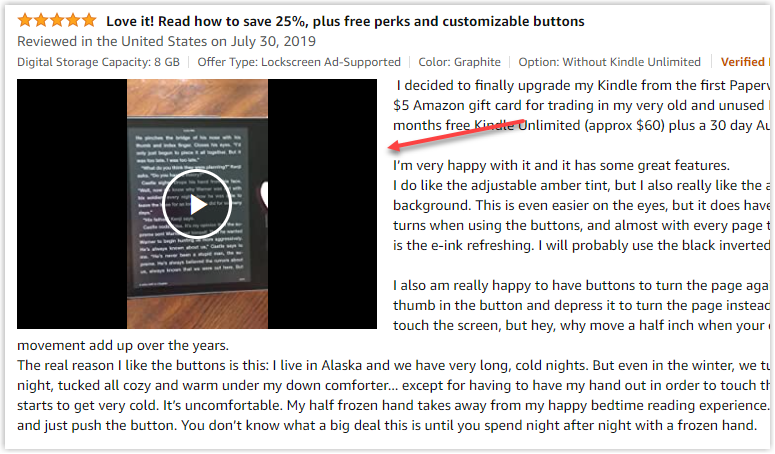
Social proof in eCommerce plays a vital role in maximizing the impact on a prospective purchase. Photos and videos help increase potential orders and build the brand.
Especially in clothing or cosmetic fields, the model showcase can only represent some types of body structures or skin tones, etc. So, the more media files you have, the better your review section on the website will be.
Not only do the fashion fields need more visual reviews, but also other fields. Consumers of some commodities, such as bedding, furniture, home decor, etc., also expect to see how their desired product looks in a typical setting.
Let’s take Ikea as an example. Since the money the customers need to spend for their furniture is not tiny, they may want to refer to as many genuine reviews as possible. The site may need more improvement as it doesn’t allow media content in its customer reviews.
8. Give More Details for Each Review
It’s good when buyers add reviews to the website. It’s even better if you can provide relevant information about them.
When there are various aspects and features of the product, shoppers can get disoriented. Providing the data of purchasing time and location, reviewing date, verified purchase, etc., may be helpful.
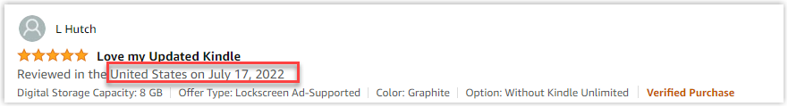
While your clients are confused since there are both good and bad reviews about one aspect, looking at the reviewing date is a good reference. Customers can determine if the products get improved according to the latest comments in the review section.
For some international sites, the locations of the buyers and sellers affect the purchase action. For example, if the client sees the products usually come with defects due to distance, it can be a reason for them to hesitate.
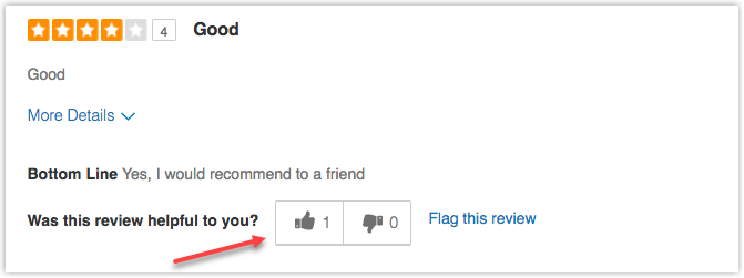
9. Let Buyers Vote and Sellers Reply to the Comments
Make your best review section by allowing people to interact with the helpful comments. It guarantees the subsequent buyers a trustworthy review, thus, motivating the buying action.
Social proof on the website shows the real buying cases and their experience. Letting others vote for its helpfulness indicates honest feedback, gaining credibility for your brand.
On the other hand, one of the ways to deal with negative customer reviews on the website is to offer sellers a place to comment under the given feedback. You need a better strategy if your page only displays not-so-good reviews without any section to reply to.
As mentioned above, customers trust the social proof in eCommerce as much as they hear it from a natural person. By choosing not to answer those feedback, you’re throwing away your chance of rectifying any potential confusion. Moreover, customers may think you’re careless about their opinion by leaving the issue unsolved.
There might be a loophole in your product. However, by integrating the reply function into the review section on the website, you may gain clients’ trust with how you are engaged and take responsibility for a solution.
The Bottom Lines
We are sure you’ve already got the ideas to create a great customer review section on the product page in a way that both looks good and does well. As a result, buyers find it easier to understand the products in real life. Thus, they can make more informed decisions.
Apply the review section UX tips above smartly and carefully, and learn other tips from 25+ Best Product Pages With Takeaways to increase your web’s efficiency and bring your products to the top in your field.
If you are a Magento merchant and don’t know which extension to build your website, consider Page Builder from Magezon. As a trusted Adobe partner, we have satisfied thousands of customers with a vast collection of drag-and-drop extensions, helping you create a high-converting and unique store in minutes.
Don’t take my words for granted; see how your website can be with Magezon Page Builder and what others say about us:


