 Magezon Blog Help Merchants Build Comprehensive eCommerce Websites


Have you ever clicked on any ads, signed up for a subscription account, and made a purchase soon? If your answer is yes, do you know what makes you do it in such a short time? That is because you have come across effective, persuasive CTAs to entice you to sign up and read their blogs.
To generate leads, having a compelling CTA is indispensable. This blog will show you the most engaging and powerful call-to-action examples you can learn from.
Table of contents
| People also read: Best selling items on Facebook marketplace 2021 100 Last-minute Call-to-action Phrases To Double Your Conversion How to hire a web developer |
20 Best Call-to-Action Examples
Call to action (CTA) is a phrase that lets potential clients and customers know what exactly they should do next if they are interested in what you offer. However, you cannot put the words “Click here” on a red button and arbitrarily place it everywhere on your website or ads. Instead, using multiple types of call-to-action phrases to bring different audiences to your marketing funnel is necessary.
CTAs are used in many different ways. However, the goal is generally to direct users to a specific conversion action. Therefore, every website or app will have various types of call-to-action templates. Are you ready to explode call-to-action ideas for your content on different platforms?
Website/Landing Page Call-to-Action Examples
- Dropbox
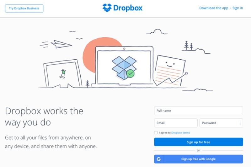
Dropbox always impresses users with its simple design and plenty of free space. Thus, it makes the blue benefit-based call-to-action buttons stand out. Besides, due to the understanding of customer psychology, Dropbox adds the word “Free” to its CTA, which makes customers feel that they have nothing to lose. This CTA is simple, but it works well.
- Forever New
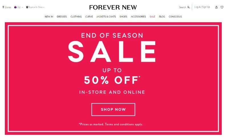
Forever New uses the feminine, standout pink background color, and white text to emphasize its core message: SALE online and in-store up to 50%. With quite a few words written on the main webpage, the CTA button “Shop Now” right below is framed so customers can immediately realize where they should click on it.
- Officevibe
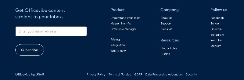
Besides several CTAs that encourage customers to make a purchase, Officevibe – a development platform team- focuses more on bringing information to customers while trying to make sales. Therefore, they utilize many “Learn More” or “Subscribe” CTAs on their website’s homepage.
- Netflix

Customers often fear not using a service effectively once they have signed up. Understanding this, Netflix has offered a promotion and added the CTA sentence “Join to get one month for free,” which goes along with Watch Anywhere – Cancel Anytime. Besides, the red color of the primary and secondary CTAs also coincides with the Netflix logo.
- Prezi

About Prezi, instead of forcing customers to click on just one button, they display three different CTAs buttons on their homepage. whatever they want, either sign up for an account or try the demo before getting started.

Try FREE Magezon Page Builder demo today
Easily style every aspect of Magento website the way you want without relying on developers or designers. Just by drag & drop.
Facebook Call-to-action Examples
- Quickbooks
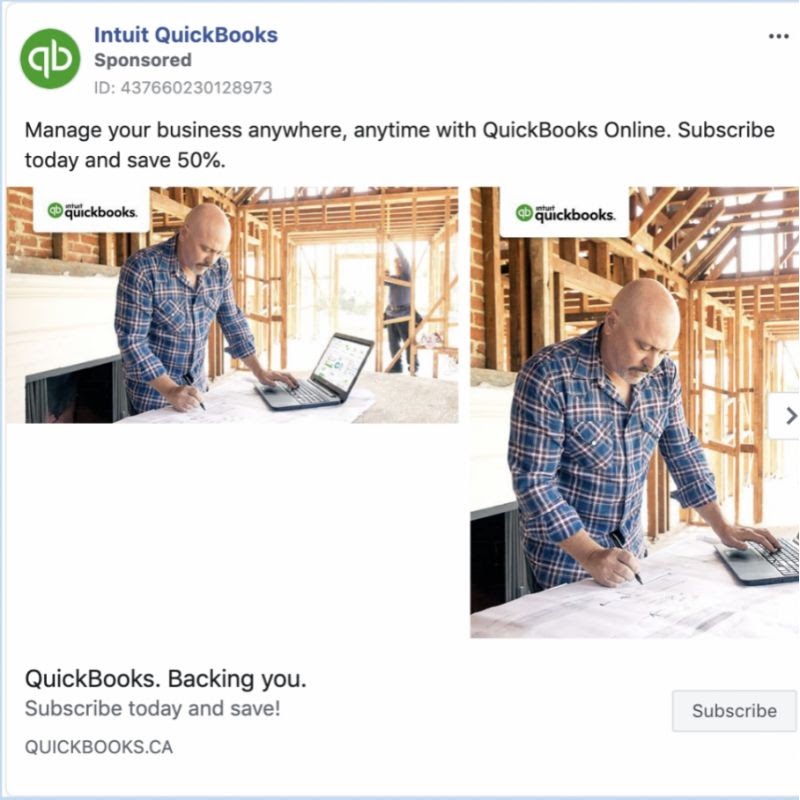
Quickbooks – Accounting software for small businesses and individuals – is the first example. Their ad emphasizes the benefits of using their software to manage enterprises anywhere and at any time.
The highlight of this offer is 50% off when you sign up. It is a considerable discount, and anyone who wants to join Quickbooks wants to grab it. Plus, a small image next to a large one is a curious way of placing the structure, a unique combination that makes users pause for a few seconds. For what? I just want to see why these images are arranged like that.
- Nike
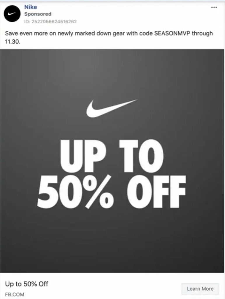
The main goal of this example is to share up to 50% of the offer messages with potential customers. The Nike logo is central, helping people perceive the brand without overthinking.
This is a pretty clear and appealing call-to-action phrase. With up to 50% discount, you will feel curious, and you must click “Learn more.” This call to action entices users to dig deeper into the product features and offers before purchasing.
- MVMT
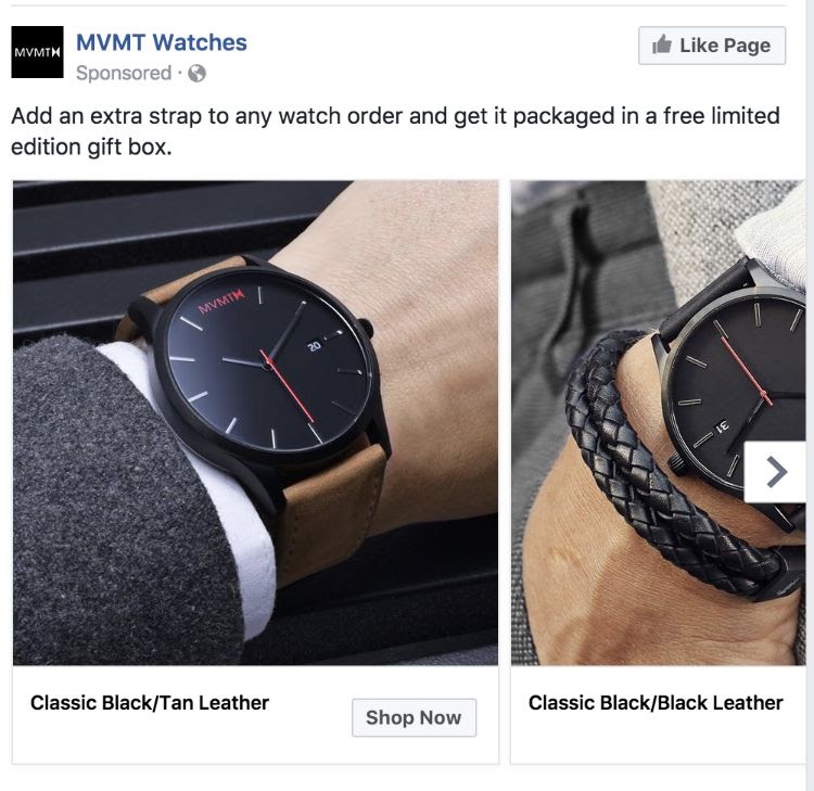
MVMT is a watch company with strong media growth. It always shows fantastic product images with powerful call-to-action phrases in its ads. “Shop Now” is a compelling call to action so customers can view the potential product immediately to get them ready to buy.
- Fashion Nova
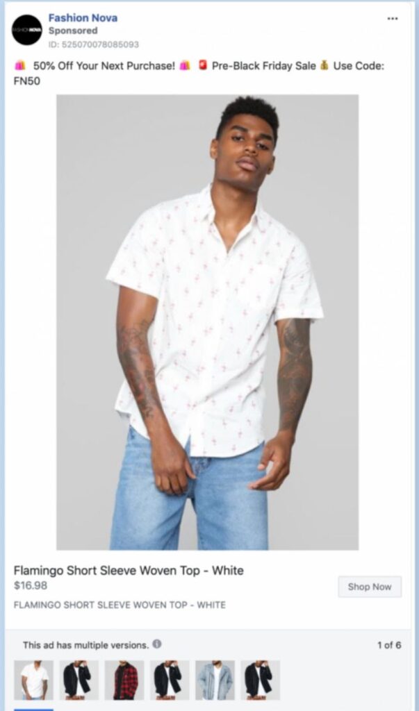
Fashion Nova is an American women’s fashion company specializing in plus-size clothing. They also entered the menswear market with typical ads. The “Shop now” button in their ad is clearly displayed so customers can directly shop for this new product line.
- Porsche

Porsche is one of the most luxurious car brands in the world, with outstanding advertising. They always present images with pops of color and relevant call-to-action buttons.
In the example above, the Call-to-Action button is evident with “subscribe,” which does not force the viewer to immediately commit to purchasing the product. It is mainly for users to have more updates about the company’s products as they know their products are not “cheap enough” for customers to buy online instantly.
Instagram Call-to-Action Examples
- Juicetruck
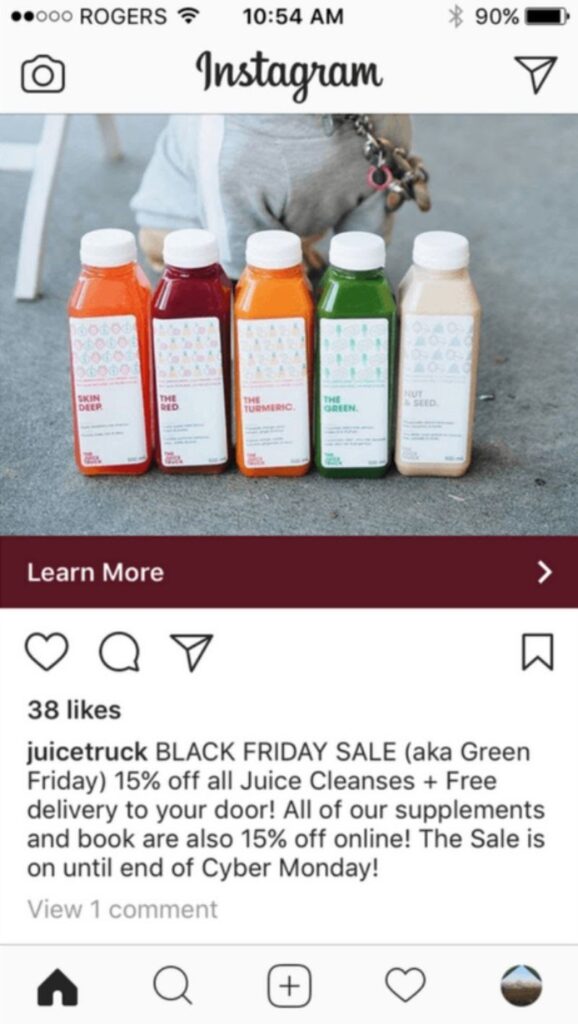
The fruit juice lines of the Juice Truck always make Instagram users feel excited and curious, especially when the company runs the advertising program “GREEN DAY.” While showcasing the products, the “Learn More” text is becoming more dominant thanks to the dark red CTA button.
- Sole society
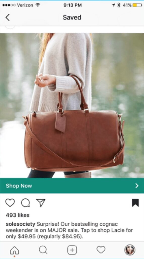
For sole society, they use “What a surprise!” and describe the product briefly to attract customers. Then the “shop now” call to action is a straightforward way to encourage users to purchase. Sole Society simplifies the buying process with a beautiful image and concise product information below.
- 8fit_app

The health app 8fit_app is truly impressive, with a promotional video about a change in a man’s body. The main message that the video conveys is that the appropriate diet this application proposes will help you lose weight. After viewing, do you want to install this app immediately?
- Thebouqso
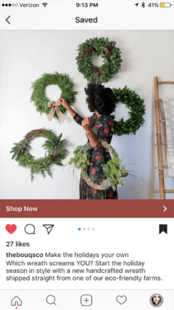
You must balance a beautiful image and a compelling Instagram call-to-action phrase to get better results from your ads. The advert featuring a Christmas wreath on a beautiful white wall makes customers immediately want to “Shop Now.”
- Peel
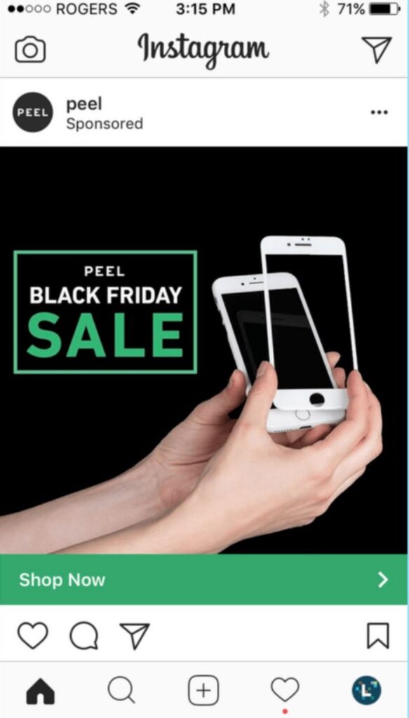
A straightforward ad with an eye-catching image can disrupt any Instagram feeds. The Peel’s “BLACK FRIDAY SALE” ad will make customers stop immediately. Moreover, the “Shop Now” button, with its distinctive blue color, also urges customers to take further action. This type of ad is simple but effective, which can surprise you.
Email Call-to-Action Examples
- Lyft
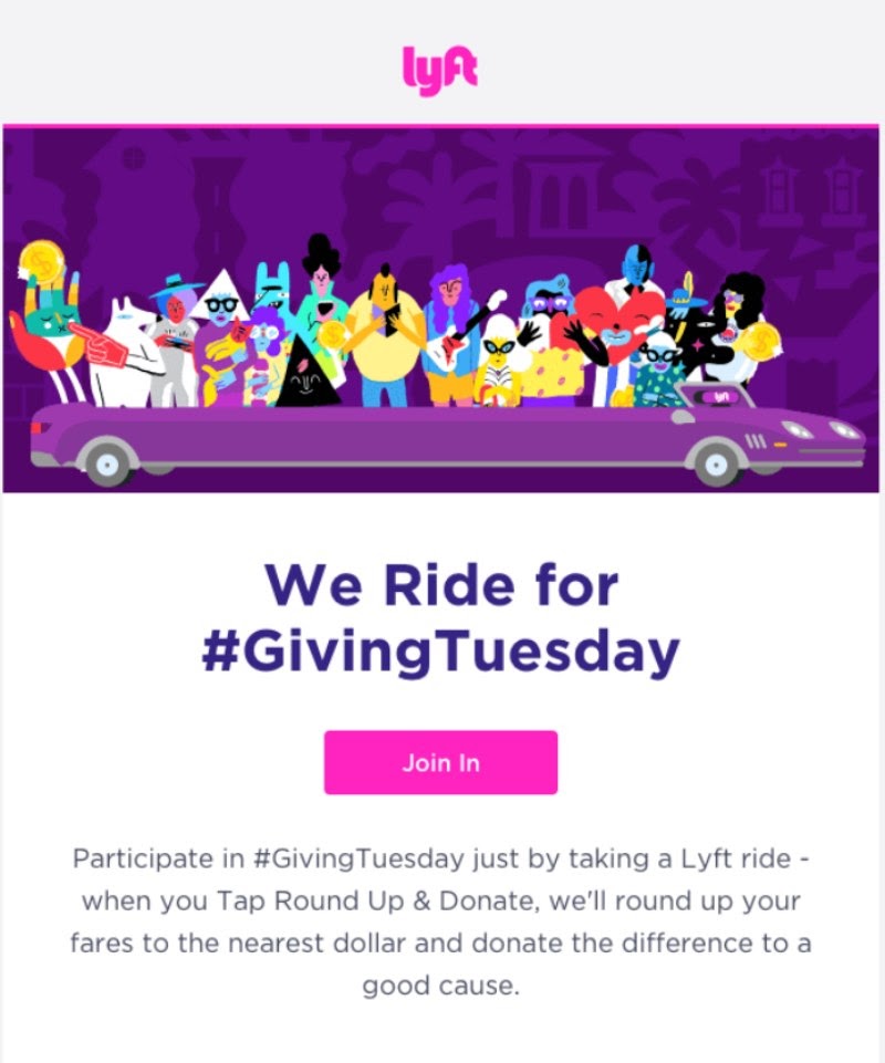
The striking purple email call-to-action from Lyft will definitely capture readers’ eyes. The bright pink “Join in” CTA button matches the business’s signature branding, which is right in the email’s center. If customers want some initial background information, it is not difficult to learn it right below. Yet, if a customer does not read the entire email, the CTA button still stands out, letting him/her opt.
- Whistle
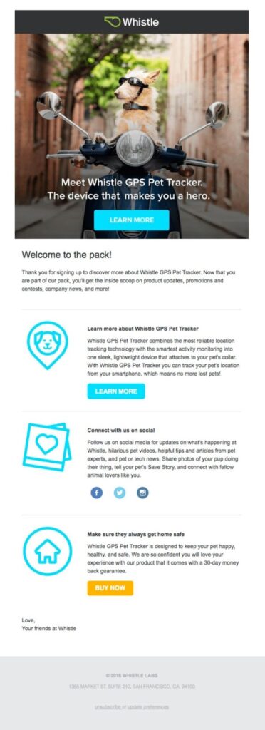
This email from Whistle is aimed to provide more information about its service to those who have signed up. The “Learn More” button in bright blue stimulates further inquiries. If a registered user researches and wants to buy any product, the orange “Buy Now” CTA button will be prominent at the bottom of the email. That is all because Whistle has assumed that it takes time for readers to learn before buying.
- Laughing Constable
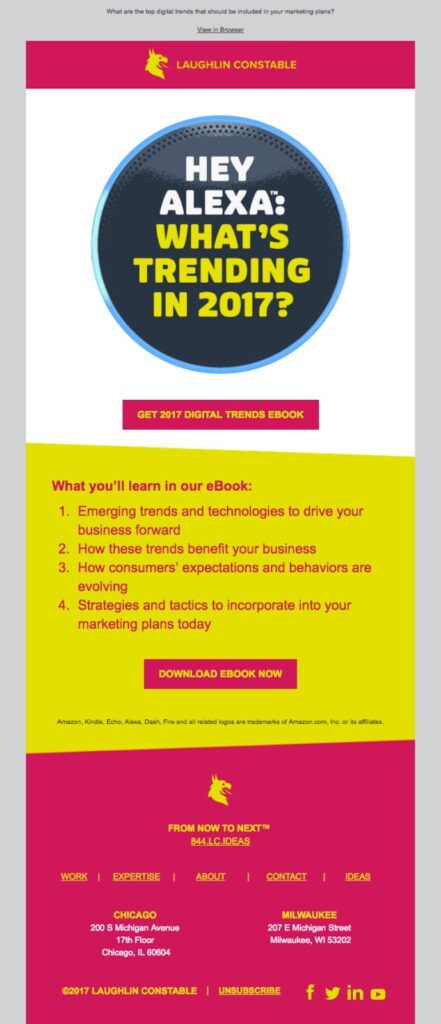
The colors from this email are undoubtedly eye-catching. However, CTA always stands out with contrasting colors to grab your audience’s attention. Although this email has two different CTAs in the email, both are saying the same thing to stimulate users to learn more.
- Krrb
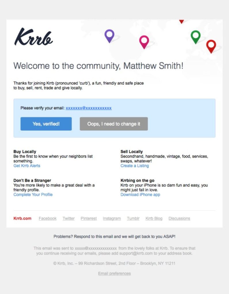
The email above has two creative call-to-action phrases simultaneously, so customers can choose either. The blue CTA button conveys the message “Yes, verified!” which catches users’ eye and stands out from a gray CTA. The more prominent color that attracts customers (psychology proved) makes customers more likely to click on that noticeable CTA to confirm.
- Casper
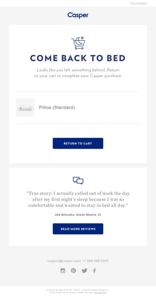
In this CTA example, Casper uses the phrase “ Return to Cart” instead of “Buy now,” “Shop now,” etc.” It keeps the customer not feeling obligated to buy the item. Additionally, if customers are still feeling confused or wondering, they have provided a “Read more reviews” button, helping customers make up their minds.
Wrapping Up
In a nutshell, crafting CTAs is not that hard. A compelling text comes with an effective Call to-action phrase that will help convey your message more precisely.
Moreover, do not neglect A/B testing and constant content creation. Besides, consider the posting platforms to incorporate the right elements of excitement. This helps potential customers click the CTA button and has a higher conversion rate. Hopefully, these call-to-action examples have given you some inspiration for your business CTA buttons.
Try FREE Magezon Page Builder demo today
Easily style every aspect of Magento website the way you want without relying on developers or designers. Just by drag & drop.


