UI/UX is one of the most critical aspects of creating a website or app. If your user interface (UI) and user experience (UX) are not up to par, you will lose potential customers. This article will discuss the eight most common UI/UX mistakes and how to avoid them. By following these tips, you can create a smooth and efficient user experience that will keep your customers returning for more!
Table of contents
Why Is UI/UX Essential for the Website?
Your website is the first impression of your business for many people. It must communicate what you do, why, and how well you do it. Your website’s design is a vital part of that communication.
User experience (UX) design is all about how easy and enjoyable your website is to use. It will ensure that users positively interact with your site, increasing traffic and conversions and reducing bounce rate. User interface (UI) design is about how your website looks and functions. Both are essential for a successful website.
Common UI/UX Mistakes You Should Avoid
There are a few common mistakes that UI/UX engineers can make. You should understand the whole process, so it will be better to create a plan and stick to it. A good design should have a clear purpose, and all elements should work together toward achieving that goal. Without a plan, getting lost and creating a confusing and cluttered design will be easy.
Also, it would help if you were consistent in your actions. Consistency is essential in any design, as it helps create a cohesive and unified look. Make sure to use similar colors, fonts, and layouts throughout your design to maintain a sense of cohesion.
I’m Peter Rossi, an expert, and founder of ByRossi. When I started my website, I didn’t consider all the UI/UX principles about the benefits of using and maintaining hot tubs, pools, and saunas. That’s why I almost lost my business. But fortunately, I change the situation for the best. Now I want to share my experience with others.
Here is a list of the eight most common UI/UX mistakes and how to avoid them.
1. Unresponsive Page Design
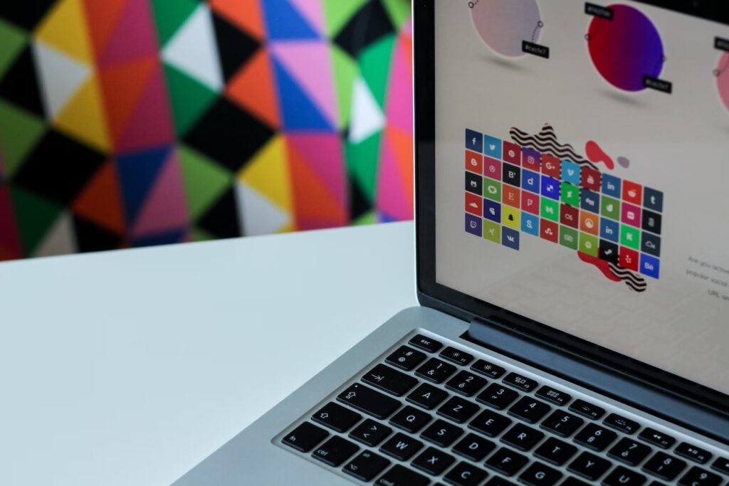
The first and most common mistake is an unresponsive page design. Many designers make the mistake of creating only one screen size, leading to many problems when users view the web page on another screen size. In other words, you must create a project that will look great and function correctly on a phone, tablet, or computer. The solution to this problem is to use responsive design techniques that adjust the UI/UX based on the screen size.
Besides, recently become popular to add different inclusive features to your design. It can be something like the following:
- An audio text reader;
- Magnifier;
- Custom color choice;
- Changing of font size;
- Virtual keyboard.
If you use these features, you’ll make the website more comfortable for customers with all physical abilities. Also, it will increase your ranking in ASRP.
2. Bad Navigation
Another mistake on the list is poor navigation. It can be a huge problem if your website or app has much content because it can make it difficult for users to find what they want. There are a few ways to avoid this mistake:
- Use clear and concise labels for each section.
- Make sure the hierarchy of your content is easy to understand.
- Use breadcrumbs to help users track where they are on your site.
- Include a search bar so users can quickly find what they need.
- Optimize your navigation bar with valuable tips.
- Don’t forget about the readability of your labels and headings. They should stand out enough but not spoil the site’s overall look.
3. Boring Infographic and Visuality
Lackluster visuals are one of the most common UI/UX mistakes. Many designers think if their app or website looks clean and organized, that’s all that matters. However, users will quickly get bored with an interface that lacks personality and creativity.
To avoid this mistake, add some flair to your designs.
- Use bright colors, attractive fonts, and engaging visuals.
- Discover some interactive websites and try using animation and micro-interactions to add a touch of fun and playfulness to your interface.
- Add videos, clips, virtual reality, and other special features to engage and entertain your visitors.
When used correctly, visuals can be a powerful tool for enhancing the user experience.
4. Mistake in a Discrepancy Between Buttons and Links
One of the UI/UX mistakes is a discrepancy between buttons and links. A button exists to act, whereas a link helps navigate another page. If you use a button to navigate to another page, it can confuse users and cause them to take unexpected actions.
To avoid this mistake:
- Ensure that your buttons are clearly labeled and that a user only uses them for actions.
- Don’t forget to put the buttons in convenient locations for users to understand where to click for action.
- Links should also be clearly labeled and permanently open in a new window or tab so that users know they are leaving the current page.
- Use the difference in size and fonts to distinguish whether it is a button or a link. But not overdo it to avoid cluttering.

Try FREE Magezon Page Builder!
Easily create your engaging Magento pages in any style whenever you want without relying on developers or designers, just by drag & drop.
5. Overloaded Page Design
The most common mistake in website optimization is when designers overload their designs and use tools incorrectly, which overwhelms the view.
Here are the most popular mistakes that lead to overloading:
Using too much or too little whitespace in the design. Whitespace is essential in on-page optimization because it helps to create a visual hierarchy and makes the content easier to read and navigate. However, too much whitespace can make the design appear empty and uninviting, while too little whitespace can make it appear cluttered and difficult to navigate.
Using too many different fonts in the design. It can help create a visual hierarchy, but it can also make the design appear cluttered and difficult to read.
Using too much text in your design. It makes your design look cluttered and makes it difficult for users to find the information they seek. When using text in your design, make sure to:
- Use concise sentences;
- Use bullet points or numbers to list information;
- Use headlines and subheadings to break up text;
- Include images or graphics to break up text and add visual interest.
→ Perfect fonts for your headings: 20+ Best Heading Fonts and How to Use Them Effectively 2022
6. Ignoring the Audience’s Needs
The first thing you should do when starting a design project is think about who will use the product. It would help to make every design decision with the user in mind. But often, designers forget about the people they’re designed for and instead focus on their aesthetic preferences. It can lead to designs that may look good but are unusable.
To avoid this UI/UX mistake, do the following:
- Always keep your target audience in mind and design with their needs in front of yours.
- Try to put yourself in their shoes and think about what would make the experience better for them.
- Regularly gather feedback from your visitors to understand what you should improve or change.
- Follow a modern UI/UX approach and regularly update your website with popular features and details.
Only by understanding your users can you create a genuinely user-centered design.
7. Disbalance of Functionality and Aesthetics
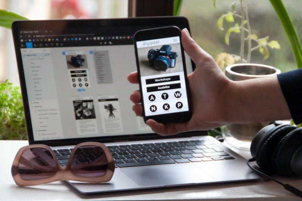
One of the most common mistakes is to create a design that is too heavily focused on one aspect, functionality, or aesthetics. It leads to several problems, such as an interface that is difficult to use or too plain and boring.
Aesthetics draw users in, but they’ll quickly lose interest if the product is difficult to navigate and understand. Likewise, a product that looks great but is difficult to use will also fail to engage customers. The key is to balance the two so that your design is user-friendly and visually appealing.
8. Missing Testing Trials of New Page Design
Design is never complete without testing. Getting feedback from actual users to see how they interact is essential. It will help improve the visual design and user experience. Without testing, it is impossible to know if the design works well.
You can do this through beta testing or by conducting user research studies. By testing your design, you can avoid making costly mistakes that could negatively impact your business.
| Optimize your website with relevant articles: 20 Best Wireframe Tools to Sketch Your Website (+ How to Choose) 15+ Best CSS Frameworks 2022 (Extremely Detail) 25+ Ecommerce Homepage Best Practices With Examples |
Conclusion
Designing a great page is hard work. It’s a constant balancing act between form and function, with the added pressure of meeting your users’ needs and expectations. However, by avoiding these common UI/UX mistakes, you’ll be well on creating a practical and appealing design.
If you are a Magento merchant and don’t know which extension to build your website, consider Page Builder from Magezon. As a trusted Adobe partner, we have satisfied thousands of customers with a vast collection of drag-and-drop extensions, helping you create a high-converting and unique store in minutes.
Don’t take my words for granted; see how your website can be with Magezon Page Builder and what others say about us:
| About writer: Peter Emmanuel Rossi – a professional hot tub designer, expert, and founder of ByRossi. Facebook: https://www.facebook.com/tubsbyrossi/ |
 Magezon Blog Help Merchants Build Comprehensive eCommerce Websites

