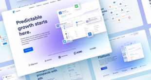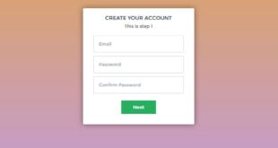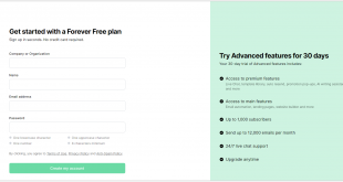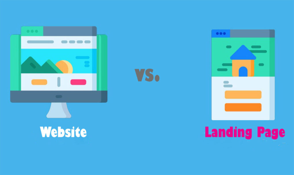
The differences between the landing page vs website can vary. Your website creates the overall impression of your business, while your landing page provides a little of it. One would be more efficient than the other in specific cases.
Many small businesses are undecided about whether to create a landing page or a complete website to promote their online presence. So which one should you use? Or how do you even use them? This article will explain the differences between a landing page vs a website and which is best for your company through several practical scenarios.
Table of contents
Landing Page vs Website: What Are They?
Landing Page
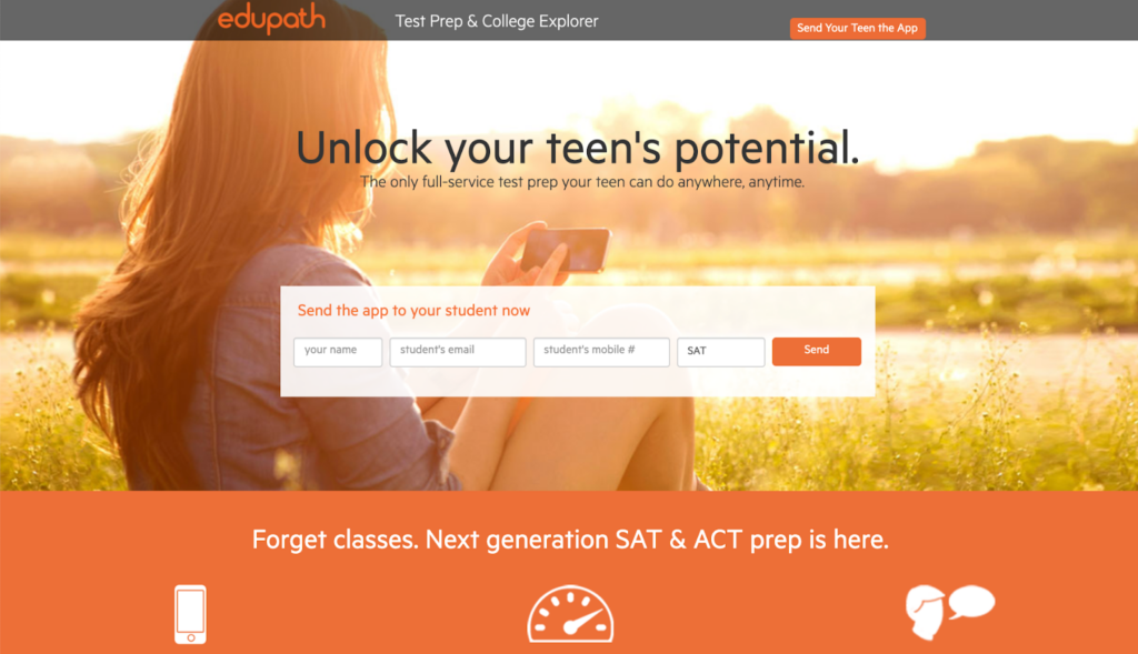
A landing page is a single, isolated web page meant to fully entice users to use an offer. This might be anything from trial periods or demos to ebooks or discount vouchers.
The foundation of successful internet marketing is an efficient landing page. Your offer may be fantastic, and your advertisements may be flawless, but your business will suffer if you don’t have a good landing page.
Rather than describing your whole company, the purpose of a landing page is to contain targeted page elements that showcase a single offer. It won’t fully describe your business and will only display what you feel is most attractive to potential customers. This is accomplished using attention-getting language, eye-catching graphics, removing sidebars, call-to-action icons (CTA buttons), and other page elements.
As a response, it draws visitors’ interest to your offer and encourages them to sign up as new subscribers or become purchasers. Overall, a landing page aims to eliminate distractions that can lead users away from taking action and present them with all of the information they need.
A landing page can also function as a standalone website, with many sections leading to a single clear call to action.
Website
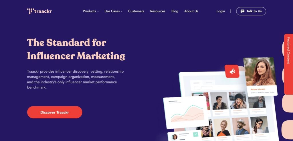
On the other hand, a website is a collection of linked web pages containing information about your company. A website for a business is often to educate prospects about what you are doing and the goods and services you provide.
Your website can also include a blog page, a WordPress admin page, discussion boards, and other specialty sites may be included on your website. Additionally, a navigation bar with hyperlinks to each page allows you to visit all of these sites.
A website’s primary purpose for business is to explain your business to potential customers and, in many circumstances, to sell the product or service. Numerous websites provide different sets of pages with different purposes.

Try FREE Magezon Page Builder demo today
Easily craft your engaging, responsive Magento landing page in any style whenever you want without relying on developers or designers. Just by drag & drop.
Landing Page vs Website: How to Distinguish?
General Differences
As you can see, the landing page vs website is two entirely different things with different aims.
Here’s a table that summarizes to help you distinguish:
| Website | Landing Page | |
| Purpose | To describe and present the company | To generate or sell leads |
| Navigation | All pages are available for viewing. | Navigation is restricted. |
| Pages | 5+ | 1 |
| Information | Everything a reader should be aware of | Information on the offer |
| Audience | Users who have a broad interest in your company | Users who are most engaged in the offer |
It’s also evident from the table above that a critical difference between a landing page and a website is the target audience. People interested in your type of business and the items and services you provide are your website audience. For example, People interested in fashion might visit your website to know more about the latest models or shop in your online store.
Another major difference between websites and landing pages is that a website can have many ways of engaging with its customers by including various pages with different purposes.
Furthermore, including multiple landing pages can benefit a website’s marketing initiatives. For example, a membership website can consist of a landing page for its subscription service, or an eCommerce site can add a pre-launch landing page for its upcoming product.
Your landing page, however, should strive to reach a more specific audience who knows precisely their need for a particular solution. These prospects are more likely to convert after visiting your landing page.
Landing Page vs Website: How to Use?
When To Use a Landing Page?
After considering the general differences between the two things, let’s choose the best moment to use a landing page. You may also want to look at the beginner’s guide to a landing page.
1. Advertising
When establishing an advertisement-based marketing campaign for your company, linking your ad to a landing page is a great idea (also called a social media landing page). When consumers click on your ad, it’ll take them to a landing page that contains all the information they need to convert.
Keep your style and branding similar to your ad to guarantee a consistent user experience on your landing page.
Take this Denise Duffield-Thomas Facebook Ad as an example:
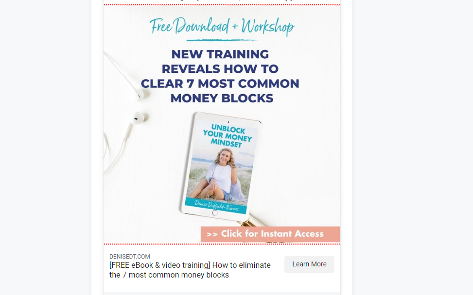
Visitors can register for a free workshop by clicking the “Learn More” button on their social media home page.
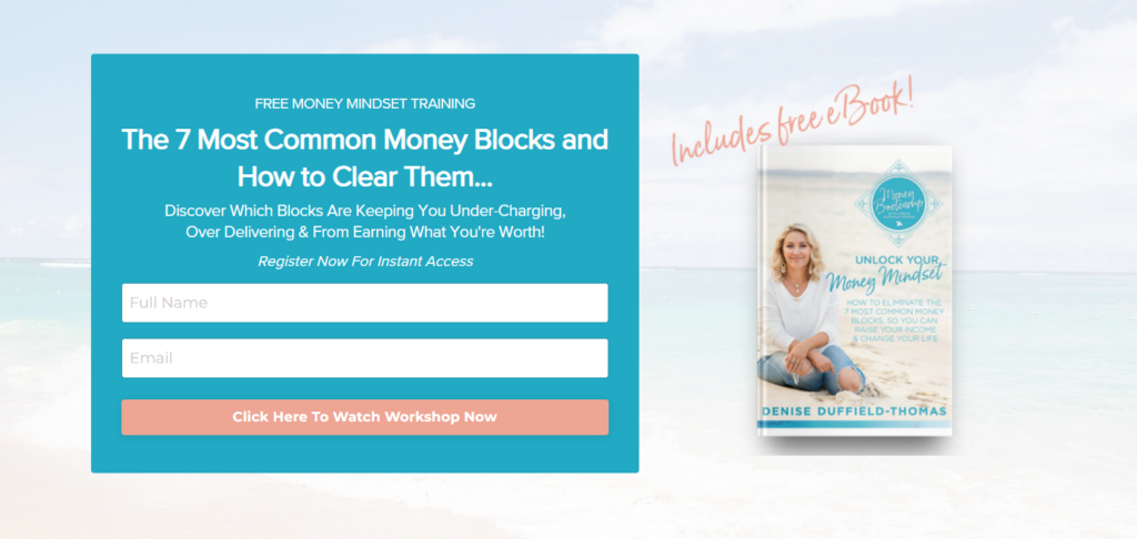
Here are some examples of different ad campaigns where landing pages are used:
- Pay-per-click (PPC) Advertisements — PPC ads can be used to display an ad in search engine results that leads to your landing page. Search engines usually favor paid search advertising, making it easier for landing pages to provide people with the necessary information.
- Build landing pages on Facebook, Instagram, and Twitter to attract potential customers on those channels.
- Banner Ads – Place pictures on other websites that, when clicked, take users to the landing page.
2. Lead magnets
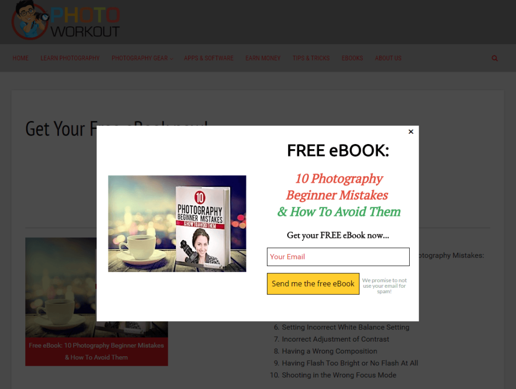
Lead magnets are enticing pieces of the content presented to website visitors and a great technique to convert visitors into qualified leads. They will get free content after filling out their email address and name in an opt-in box. The title, content, form, and call-to-action are the important components of high-converting lead magnet landing pages.
Landing pages are much more focused than websites, and you may customize them for different purposes. This implies that you won’t have to revise your entire website for each promotion.
Here are some lead magnets that you can sell:
- Ebook – Create a free ebook to share your knowledge on a specific topic.
- Webinar – Discuss crucial issues and answer questions in a public pre-recorded webinar.
- Free Trial – Use a free trial to entice hesitant users and turn them into paying subscribers.
3. Show a user-friendly landing page
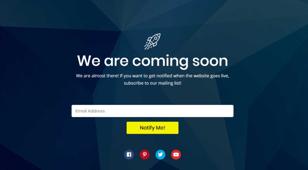
Landing pages aren’t simply for sales anymore. You may require a user-friendly page to inform customers about anything significant, such as that your website is under development or that you are temporarily unavailable for maintenance. You can generate leads and engage with your audience more naturally.
You can make one of the following:
- Inform customers that a new website is coming very soon and that they should sign up for more information on the Coming Soon page.
- Maintenance mode page – Use a repair mode page to explain that your site is currently offline. You can also ask for users’ email addresses so they can be alerted when the site reopens.
- Broken link 404 page – Display a 404 page for redirects and refer users to other parts of your site that may interest them.
- Create a customized login page for users and use it for advertising your other goods, services, or social media accounts.
4. Putting New Concepts to the Test
A landing page is considerably simpler than a whole website because it has one single purpose. As a result, you can quickly test different sites to see the highest conversion rates and outcomes.
It will help if you keep testing your pages to ensure they’re as appealing and user-friendly as possible.
Here are some things you may do with the landing page to see what works best:
- Copy — Experiment with different headings, writing styles, and lengths. Long, wordy copies may not be as effective as you want. Concise and action-oriented copies are way more effective.
- Experiment with photographs, videos, and testimonials in your media. For example, video testimonials are more interesting than text.
- Try removing some page elements such as phone numbers or menu options to reduce distractions and point attention to your offer.
When To Use a Website
Given the above information about the differences between a landing page vs a website, your website is the most effective means of informing people about your company or brand. You can also use your site to increase brand awareness, enhance search engine results, etc.
Let’s take a closer look at the purpose of a website for business in various use cases.
1. Tell the Story of Your Company

With an about page on your website, you can tell your brand’s story; this is the biggest purpose of a website for business. It is an excellent way to share your brand’s aims and goals. You can also explain why you sell specific items or services with an about page. It’s also the best place to respond to consumer questions about your company.
Telling your company’s story is far easier on a website than on landing pages. The information would be pushed onto a single page with a landing page, and many viewers would not browse down.
You may use the following to communicate your brand’s story on a website:
- About Page — In your own words, describe your goal, values, and reasons.
- Answer frequently asked questions about your brand on your FAQ page.
- Allow visitors to contact you via the contact page if they have further questions.
| See contact page examples for inspiration: Simple Contact Us Page: 10+ Examples That Work Like a Charm |
2. Describe the products or services you offer.
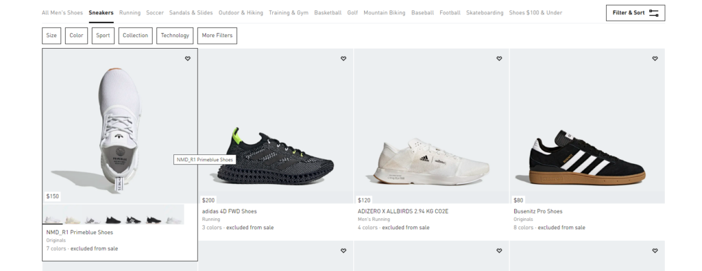
A website can be used to promote your products and services.
When visitors look up terms like “interior design,” “red shoes,” or “dentist” on the internet, they are likely looking for more information before making a purchase. They may not understand precisely what they want and wish to explore as many possibilities as possible.
At this point, your website is an excellent place to show what you have to offer while also encouraging customers to dig a little deeper for the information they need. Remember that the role of your landing page is to deliver content, not to sell, so make sure your data is as helpful as possible.
You can describe the products or services you offer using a:
- Online store– Sort your products by kind, brand, and category, then define the key features.
- Service pages — Explain each service you provide so that users may quickly find it.
- With a location page, you can list all locations where you operate so customers can save time looking for a place near them or where they live.
3. Provide User-Friendly Functions
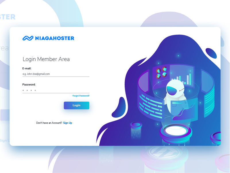
People need different pages on your website to place orders, download files, or schedule appointments. Staff members or customers can only access these pages, so people need to log in to view them. This is where a members-only area on your website will be helpful for your website.
Below are some functions your website could offer:
- Members area — Provide content that is only accessible to those who have subscribed to your website.
- Allow people to start discussions, send messages, and leave comments on your website using forums.
- Appointment scheduling — Allow users to schedule online appointments and direct services.
4. Boost Your Search Engine Ranks
Search engine optimization (SEO) is crucial for every website. It improves the visibility of your website in search engine results by boosting your web pages and blogs with keywords and phrases that users are looking for.
Boost SEO is a major advantage of websites over landing pages. Without SEO, landing pages can only reach a certain number of people. But SEO optimization can make your website reach more people than you can imagine!
Keywords to optimize for the best visibility:
- Local keywords — For physical store businesses, improve your local SEO by using location-specific keywords.
- Keywords for your product or service – These are the terms that consumers use to find your products and services.
- Question keywords – Find out what questions people have about your company and answer them on the website.
Can a Landing Page Be Used as a Website?
“Can you use a landing page as a website?” is a common question when deciding between a landing page vs a website. If landing pages are so targeted, isn’t it safe to assume that using them as a website will create positive results?
It’s an excellent question with a straightforward answer.
A landing page CAN be used as a simple website. However, you may not receive the results you want. Remember that websites and landing pages have different purposes, serving different functions, goals, and audiences.
Having a good website detailing your brand’s goals is superior to having landing pages. So, the answer is no.

Try FREE Magezon Page Builder demo today
Easily craft your engaging, responsive Magento landing page in any style whenever you want without relying on developers or designers. Just by drag & drop.
What Should Be Done To Make an Effective Landing Page and Website?
Website
1. A Good Aesthetic
If your website looks like it hasn’t been redesigned since 1998, customers will question the legitimacy of your business. Applying the latest design trends, making good use of images and colors, and another critical principle to an appealing website is ensuring that the feel and look of the website go with what you and your company are all about.
2. A Clean and Simple Look
Another critical factor is that your website must be clean, organized, and straightforward. The website must be easy to look at for your customers. Use short-form paragraphs, bullet points, and call-outs for easier scanning. Don’t overwhelm your customers with too many animations, photos, text, and icons.
3. Making It Noticeable
As we discussed earlier, SEO is a crucial asset to an effective website. A good, SEO-friendly website starts with some simple SEO elements that every website should have.
4. The Tremendous Help of a Call to Action Button
An effective call to action will clarify what you want them to do to the customers. A CTA button is also an excellent way to generate leads for your business. A good CTA gives customers clarity about what they can do next: subscribe to an email listing, buy a product, or download content.
5. Getting Social Validation
Social validation on a website is based on the idea that if other people are doing it, it must be good. Good social proofing techniques include making logos of companies that hired you visible on your website. Or you can take screenshots of photos from customers who have mentioned you or even show how people share and talk about your business on different platforms.
Landing Page
1. Be a Minimalist
A good landing page provides all the information needed to encourage visitors to convert, but nothing extra. You must keep a fresh page with clear, easy-to-follow navigations and no distractions. Too much information can bore your visitors; you should keep it concise and provide only the most important information.
2. Create a Clean and Organized Design
A good design for a landing page takes good advantage of eye-catching images and colors. The aim of your landing page should be to help your customers convert easily. Colors like red and green have been shown to enhance landing page conversions, but the most important thing is to make sure that the color of your button contrasts strongly with the backdrop color. To find the most successful layout for your landing page, you should experiment with various button variables, such as color, positioning, and size. You can sample many templates and attributes to make sure your design is effective enough for visitors to convert.
Check out our top landing page examples collection to get a sense of what a simple and orderly design looks like.
3. Use Trust Signals
Effective landing pages also take advantage of trust signals; this gives visitors the impression that the brand and offer they see are trustworthy. Trust signals can be in various forms – users’ reviews, “Like” counters, and trust badges are all effective tools for effective landing pages.
Even the unofficial buttons from some stock graphic sites can make your offer and website look more trustworthy.
3. Be Mobile Friendliness
Having a mobile-friendly landing page can double your conversions. Your landing page should look functional, especially on mobile devices, since 30% of all web activity comes from mobile. A mobile-friendly website should be: Easy to navigate, load fast, and ultra clickable.
| Create an effective navbar with tips: A Complete Guide to Creating Effective Website Navigation Bar |
4. Keep Your Forms Optimized
As we have discussed, less is more when making the perfect landing page for your website. The same principle also applies to your forms. Keeping them at an optimum level for your visitors to fill is essential. Because the more fields you ask your visitors to fill, the less chance you have of them staying on your website and converting.
What form should you include with the least information? If you ask for a user’s phone number or date of birth, their willingness to provide their phone number and email address drop by half or more. Form fields can be dangerous if you aren’t careful when to use them.
5. Customize Your Landing Pages to Succeed in Different Markets
There may be customers from several sources if you have an excellent offer and have been diligent in your promotion efforts. You’ll surely want to tailor your landing pages for targeted audiences. Social media users are very different from those who arrive at your landing page via PPC ads or links in your monthly newsletter, for example.
6. Match PPC Ads to Landing Page Copy
PPC advertising and landing pages must match each other for a landing page to be effective. Assuring visitors, they’re on the right track using the same terminology and keywords is reassuring and consistent.
Getting consumers the information they need is a priority. Ensure that if someone clicks on a PPC ad for sleeping bags, you don’t place them in the camping section. The best way to get people to buy from you is to correctly meet their needs!
7. Test Your Design
Testing is the final criterion for a good landing page. It is impossible to develop a successful landing page without extensive testing. Testing and tracking your landing page’s performance is critical to determining what works and isn’t. Perform tests ad nauseum, and then some more tests!
Conclusion
That’s all there is to it! We hope that this post clarifies the differences between landing pages and websites. We hope you’ve had a firm grasp of the fundamentals of landing pages and websites and how to apply each for your eCommerce business effectively.

Try FREE Magezon Page Builder demo today
Easily craft your engaging, responsive Magento landing page in any style whenever you want without relying on developers or designers. Just by drag & drop.
 Magezon Blog Help Merchants Build Comprehensive eCommerce Websites

