 Magezon Blog Help Merchants Build Comprehensive eCommerce Websites

Halloween is right around the corner. For e-commerce store owners, this holiday season is the perfect time to adopt marketing strategies to boost sales. Among those efforts is using a festive Halloween landing page for promotion campaigns.
However, I am pretty sure those of you who are non-designers make common design mistakes yet are not aware of them. That’s why we’ve come up with the idea of evaluating one Halloween landing page example. Simply put, we’ll explain what needs to be improved and give suggestions for how to make it more effective. Hopefully, it’ll help a lot.
In this article, we break down into the following design aspects:
- Color
- Typography
- Imagery
- CTA Design
- Others (White space, Alignment, Consistency)
So let’s begin.
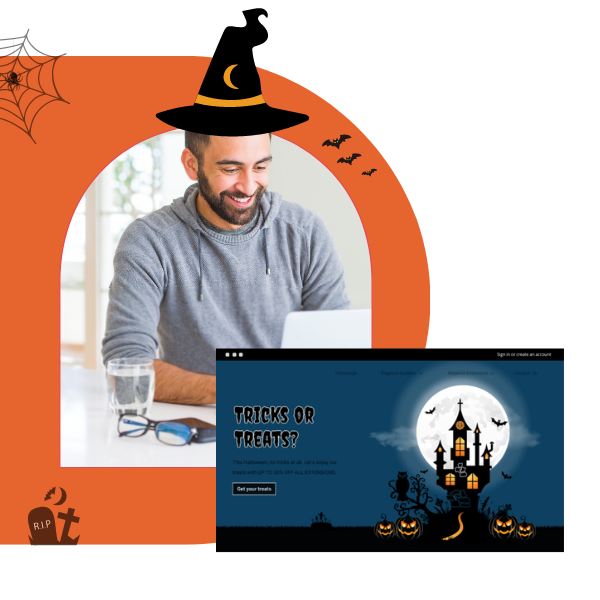
Note: This Magento Halloween landing page was created with Magezon Page Builder, a friendly-user drag-and-drop creator for Magento merchants. Anyone with even a little coding knowledge can quickly build visually aesthetic, responsive web pages.
Table of contents
Let’s First Determine the Design Purpose
Before rushing head-first into creating any design, it’s crucial to identify its purpose. By understanding what the design is used for, you’ll be able to determine the right concepts and convey what you want through design. Regarding our Magento landing page, it informs visitors about Magezon sales on Halloween.
Evaluate the Design Concepts
What is the design concept? Let’s return to the landing page design: “Inform about Sales for Halloween.”
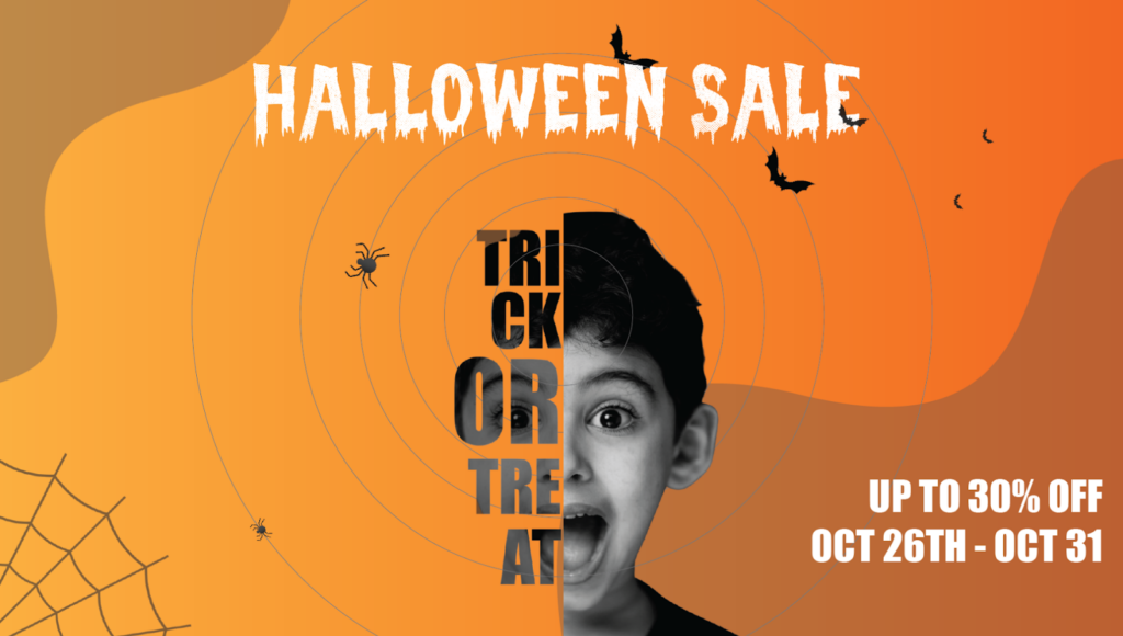
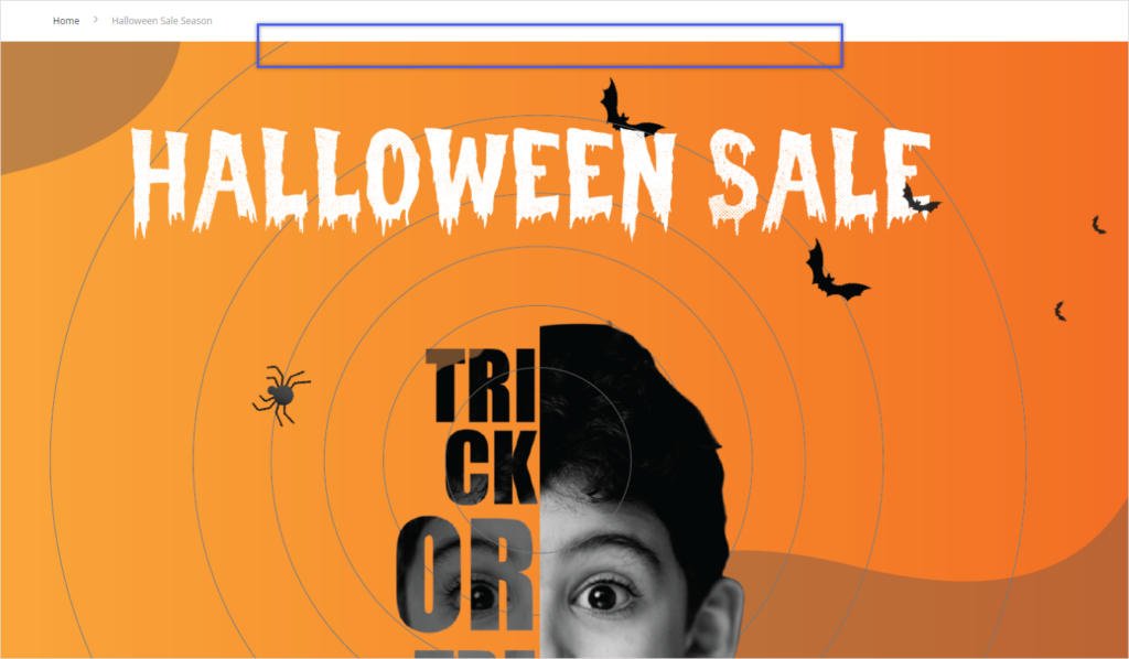
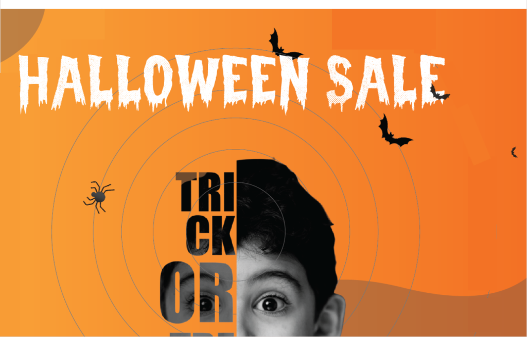
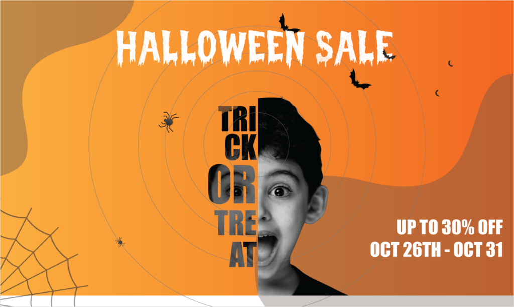
We have two keywords that need to be clarified: Halloween and Sales. Think for a moment. What makes you believe that a design is for Halloween? Ghost pumpkins, skeletons, owls, candy bags, Halloween costumes, dripping texts, etc. As for the Magezon Halloween landing page, I think it captures the Halloween mood and spirit because of its Halloween-evoking details. They are spiders and their nets, bats, dripping text, children dressed in costume, a screaming boy, and the traditional Halloween color schemes (Black and orange).
| 100+ high-quality and carefully chosen icons and illustration for this Halloween: FREE DOWNLOAD |
Another concept based on the design purpose is the sales concept. This means the design must incorporate elements that call up a sales atmosphere. In my opinion, this page partly communicates the concept because of having discount text and a countdown timer. I recommend adding more details that evoke a sales vibe (especially on Halloween), such as BOO!, light rays.
Remember, you can only decide on the concept after understanding the design purpose. Once you’ve grasped what concepts are used in your design, you’ll be able to choose suitable components that convey them exactly. Some components include typography, color, imagery, etc.
Okay so next part, we’ll overview each section on this Magento Halloween landing page. So let’s move on.
Introduce Sections of the Halloween Landing Page
Let’s look at each section and see what’s inside it.
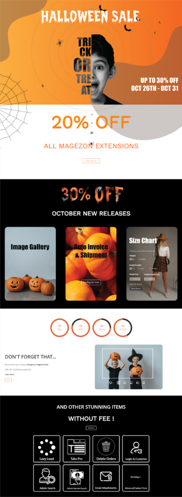
Section 1 gives you a quick overview of Halloween sales, including:
- A headline (Halloween Sales)
- A subheading (Up to 30% off Oct 26th – Oct 31st)
- A hero image (A screaming boy and other Halloween details)
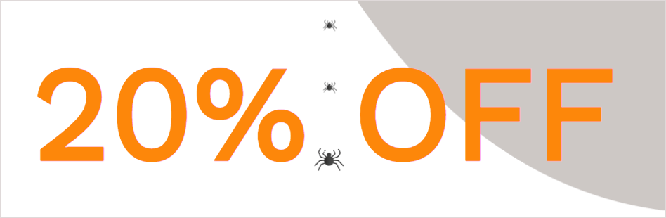
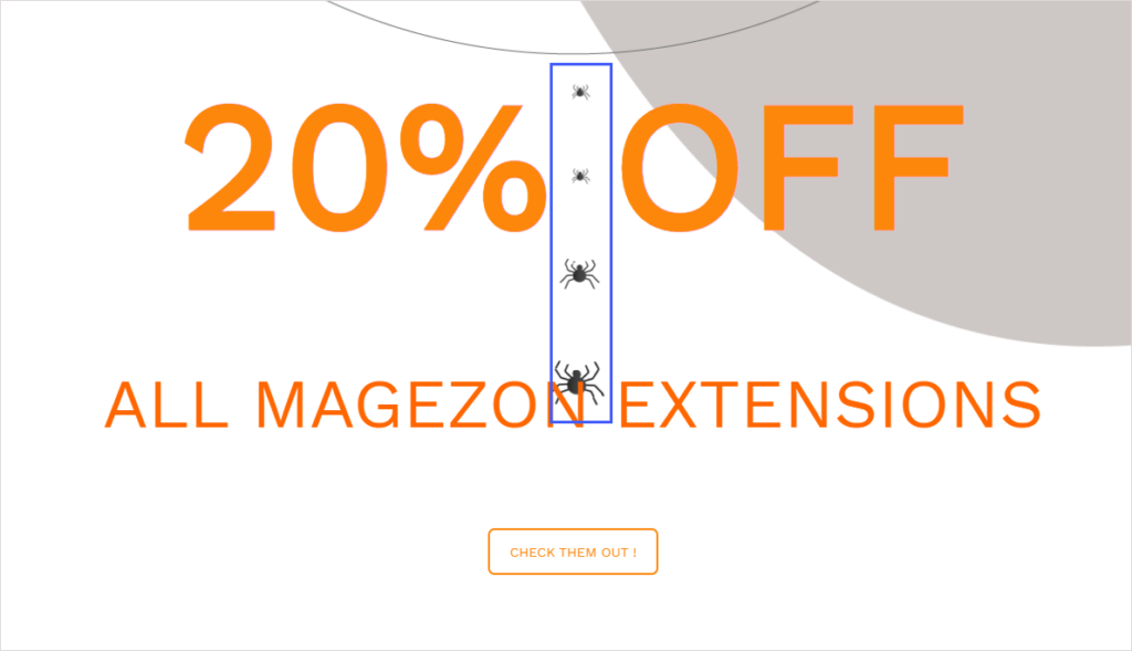
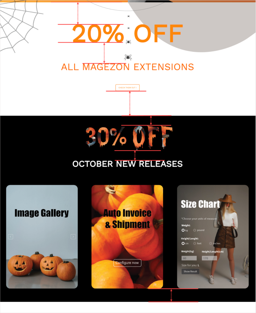
Section 2 provides the details of the 20% discount on Magezon extensions, including:
- Text “20% off all Magezon extensions”
- A CTA button
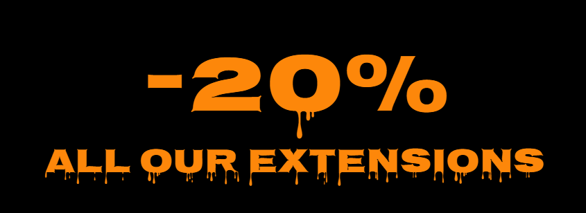
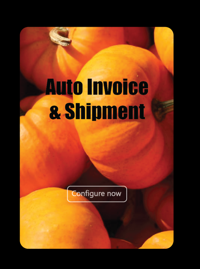
Section 3 presents a 30% discount on October new releases, which includes:
- Dripping text “30%”
- Text “October New Releases”
- Three images represent 3 of our extensions
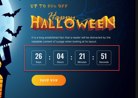
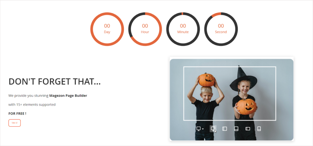
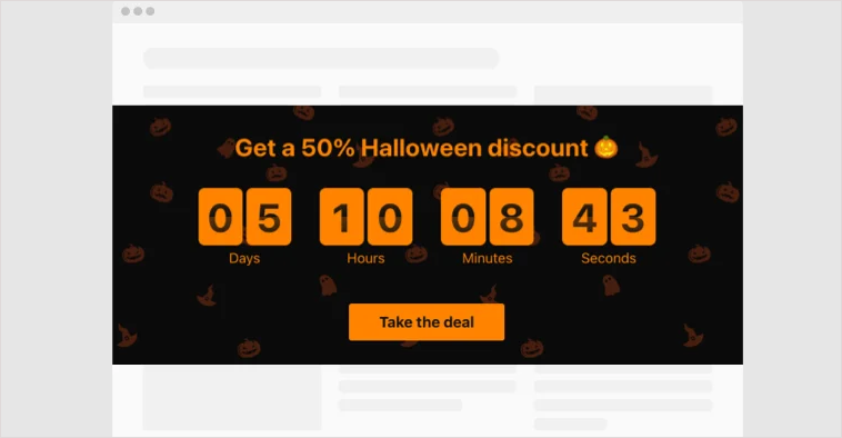
Section 4 includes a countdown timer that creates a sense of urgency to convince visitors to convert.
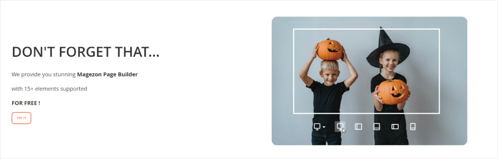
Section 5 introduces the free version of Magezon Page Builder to new visitors.
- Heading text
- Body text
- CTA button
- Image
Section 6 shows all free Magezon extensions to encourage potential customers to try our products. If they find it helpful after using it, they’re more likely to revisit our website and buy paid extensions.
Okay, so now, we’ll go into details about
- Typography
- Color palettes
- Imagery
- Other design elements like white space, alignment, and consistency
Try Magezon Page Builder demo FREE today
Easily create your festive Magento websites in any style whenever you want without relying on developers or designers. Just by drag & drop.
Evaluate Typography
1. A typography mistake on this landing page is, using many fonts, specifically 5. This makes the overall design look visually cluttered and unorganized.
Here’re the fonts used on the Magento Halloween landing page:
- Text “Halloween Sales”: It’s a dripping spooky Halloween font.
- Text “UP TO 30% OFF 26TH-31TH”: This tall font has a heavy stroke. The letter spacing is pretty narrow. The counter inside the characters is relatively small.
- Text “20% OFF ALL MAGEZON EXTENSION”: This short font has rounded corners. The letter spacing is large, and the counter inside the characters is ample.
- Text “OCTOBER NEW RELEASES” (Section 3) & “WITHOUT FEE” (in the last section) is applied in Work Sans.
- Text “Don’t Forget That..” (Section 5) & “AND OTHER STUNNING ITEMS” are applied in Open Sans.
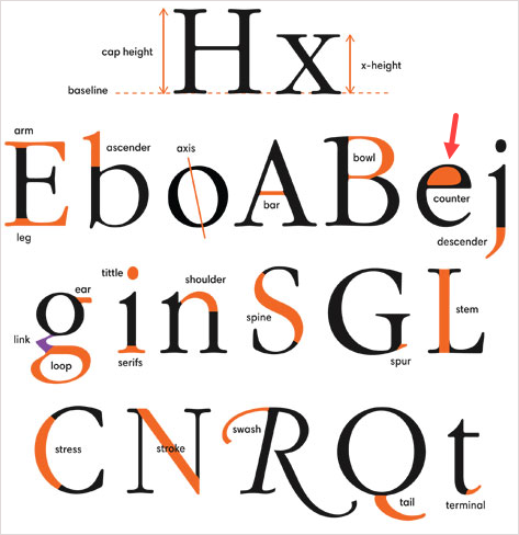
Note: Don’t know the counter? Check the image below out.
Solution:
- Go for 2-3 fonts. Using more than 3 fonts is not advisable.
- Make sure these fonts fit your brand personality and go well together.
- To make the text stand out and grab attention, use one of the following:
– Combine a serif font with a sans-serif font or Halloween font (in this case). Because of its readability, sans-serif is recommended for body text (long text). Meanwhile, Halloween or serif should be used for titles and headings (short pieces of text). This combination will create a visual hierarchy between the heading and body text, then increase the readability.
– You can use 2 sans-serif fonts; however, ensure their styles are distinct from one another.
– Change the font size and weight, or use colors and effects to stand the text out.
| Pick a spooky font to decorate your site this Halloween: 50+ Scary Halloween Fonts to Boo Your Website Visitors |
Section 2
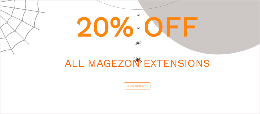
- There is a lack of connection due to the excess spacing between letters within a word in “OFF ALL MAGEZON EXTENSIONS.” More than that, the spacing between words and letters in a word looks relatively equal. At first glance, this can confuse customers and slow their reading speed.
Solution:
- Reduce the letter spacing. Also, ensure the spacing between words is clearly bigger than the spacing between letters in a word.
- Even though “20%” is the key that requires more prominence, “OFF” is larger than “20%.”
Solution:
- Make “OFF” smaller than “20%”. It would also be better to make the “%” size smaller. Users will therefore pay more attention to “20”.
- The text “20% OFF” is striking to my eyes because it is so large (190pt). It would look fine on a large screen, but with laptops in the standard screen size or other smaller devices (mobile phones, tablets, etc.), this would be hard to read.
Solution:
- Decrease the font size of the text “20% OFF”. Make sure the text looks good on different screen sizes.
- The Typeit effect is applied to the text “20% OFF” to grab customers’ attention, but the fast typing effect, especially on a cluttered background, causes some people annoyed.
Solution:
- Make the Typeit effect smoother by reducing its speed. To my preference, I won’t use the Typeit effect for the text. Simple, legible, but outstanding are what I am seeking. Also, the text must be Halloween-y, like the Google free spooky Halloween font.
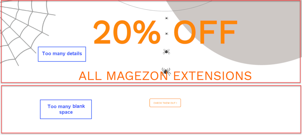
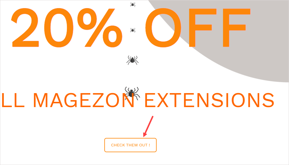
- Look at the background behind the text “20% OFF ALL MAGEZON EXTENSIONS”. How do you feel? Correct! The background has too many details that distract us from the main message (a spider net in the top left corner, a “line” of spiders in the middle, and a gray blob in the upper right corner). As a result, the main message is hard to stand out.

Solution:
- Reduce the number of details to make more room for the text.
- As you all know, a strong, prominent CTA phrase is among the most important factors influencing customers to convert. However, the text “CHECK THEM OUT” on the button is so thin that it hardly stands out.
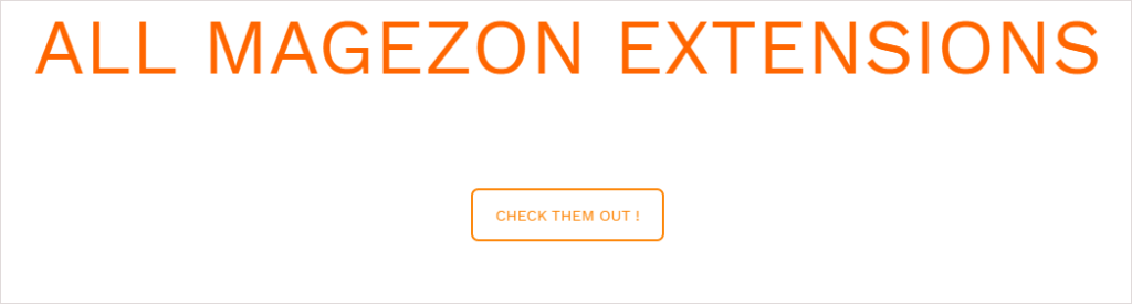
Solution:
- The CTA copy should be bigger and bolder.
8. Using all-caps on CTA copies makes people find it harder to recognize and scan text because of the lack of shape contrast between each word. There is another reason not to use full capitals in text. This all-uppercase style communicates a loud and even forceful tone. People may think you are shouting at them to click the button right away. This may make a negative impression on potential customers.
Solution:
- Apply title-style (or sentence-style) capitalization to keep the text easy to scan and convey a friendly tone to your customers. So what about using the all-lowercase style? These questions will be resolved in the section CTA Design Mistakes.
Section 3

- Look at the text “30% OFF” first. Admittedly, filling the dripping text with a pumpkin image is a great idea ‘cause it creates a Halloween-themed design. However, there are a few things to note:
- The text “30% OFF” is not legible because the inserted image contains dark-colored pieces that blend in with the black background. Also, the dripping effect doesn’t do an excellent job of making the text seem melting.
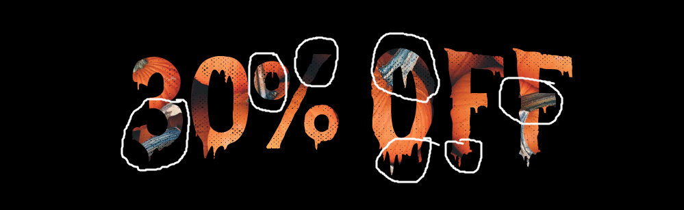
Solution:
- Avoid images with dark areas and many details. Aside from using inserted images, consider a Halloween-themed color for text, such as orange.
- Remember, this Halloween sales landing page is for marketing purposes, not art. Therefore, legibility is the top priority.
9. The key text in section 3 is “30%”, seemingly smaller than “OFF.” As a result, customers may put more focus on the critical message.
Solution:
- Change the font size of “30%” or “OFF” so that “30%” is noticeably larger than “OFF”(Refer to section 2).
- The line spacing is pretty big. This causes a lack of connection between the pieces of information in the same group.
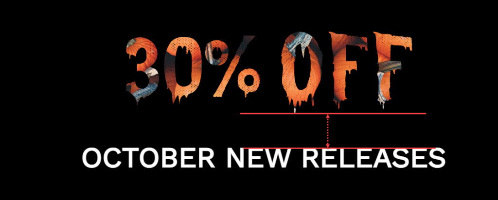
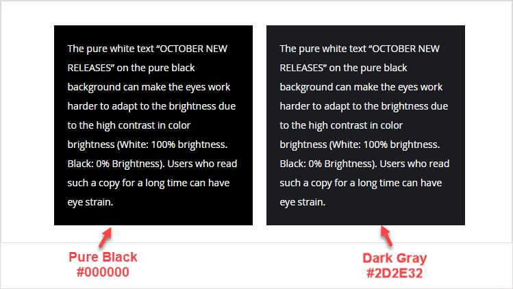
- Because of the high contrast in color brightness (White: 100% brightness, Black: 0% brightness), the pure white text “OCTOBER NEW RELEASES” on the pure black background may make the eyes work harder to adapt to the brightness. Users who read such a copy for a long time may experience eye strain.
Solution:
- Pick a dark gray instead of pure black.
Note: The text in the images will be discussed in the Imagery Evaluation section.
Section 4
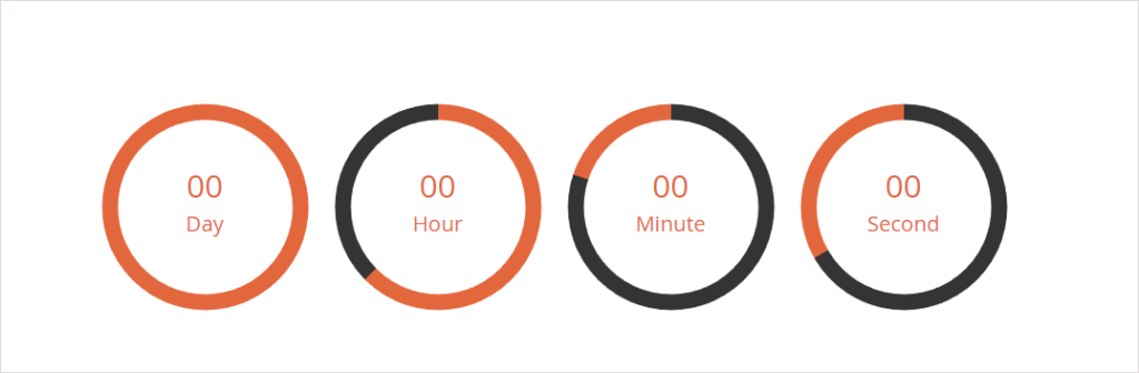
12. A countdown timer creates the FOMO phenomenon, encouraging customers to convert immediately. For that reason, its text should be distinguishable.
However, the text here is too thin, while the circle surrounding it is noticeably thicker. Hence, customers are more likely to pay more attention to the circle than countdowns.
Solution:
- Stand the text out by making it bigger, bolding, or using a noticeable color. Reducing the thickness of the circle is also a way to highlight the text. (See the image below)
Section 5
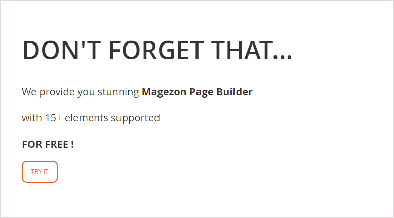
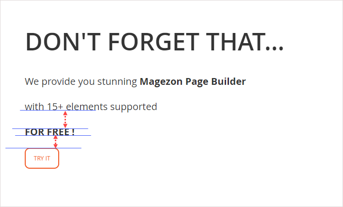
- What strikes me first is that the body text has a lot of line spacing. The wide spacing makes lines disconnected and even look like they belong to different paragraphs.
Although the paragraph and the button are two separate blocks, the spacing between them is smaller than between the lines in the paragraph.
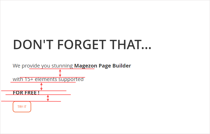
Solution:
- Reduce the line height to make the body text look connected.
- So, what’s the best line height? There’s no fixed value for the ideal line height because it varies depending on the font and size. For example, the body text font on the Magezon website is Open San at 14px. From my experience, the best line height for our copy is 26pt. However, when I use the font size of 15px, I notice that 28pt for line spacing is good.
12. The body text also contains a grammatical error: “provide you our stunning Magezon Page Builder.” The correct structure is “provide sb WITH something.” Even if it is a minor error, it can make customers think your brand is unprofessional.
Solution:
- Double-check the copy before publishing the page. I highly recommend using Grammarly. Ideally, seek help from a colleague who is good at English and detail-oriented. They’ll help you correct grammar and spelling errors that you may not have noticed and make suggestions for better improvements.
13. The CTA copy “TRY IT” has the same mistakes I mentioned earlier in section 2.
| Pick the right fonts for your website: The Golden Rules of Typography in Web Design 20+ Best Heading Fonts and How to Use Them Effectively Most Common Font Names for Websites of All Time |
Section 6

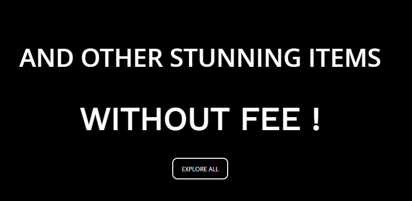
14. This section purposefully emphasizes “WITHOUT FEE”. However, it’s slightly larger than “AND OTHER STUNNING ITEMS”.
There are also 2 sans-serif fonts in these pieces of text. These two fonts look so similar that they don’t have any “chemistry” when standing next to each other.
Solution:
- Make the key message visible outstanding.
- Don’t use similar fonts of the same type. Though there are cases where people use 2 sans-serif fonts in one section, they must be different in style or boldness.
15. The same mistake as section 3 – The white text against a pure black background.
16. The same mistake as section 5 – A call-to-action button without a prominent look.
Note: The product name’s text in the images will be evaluated in Evaluate Imagery.
Try Magezon Page Builder demo FREE today
Easily create your festive Magento websites in any style whenever you want without relying on developers or designers. Just by drag & drop.
Evaluate Imagery
Section 1

- This section includes too many details that distract customers from the Halloween sales information. It may look quite impressive at first glance. However, it fails to draw customers’ attention to your message.
Solutions:
- Before including any element in your design, ask yourself what roles it will play. Remove any details that you think are unnecessary.
- If the details are too prominent, reduce their transparency (The spider net in the lower left corner is an example).

- The top of the boy’s head has been cropped, which doesn’t look good.

Solution:
- Choose another image in which the essential parts are not cut off. Check them carefully because there may be details that you’re missing.
- It’s illogical that the middle ones circle to the back of his head while the inmost and two outmost circles loop around the boy’s face. Furthermore, the circles over his face appear to be “cutting” him.
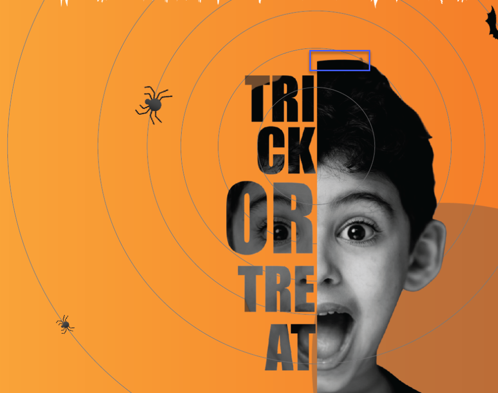
Solution:
- Don’t let the circles override the boy’s face. They should be placed behind his head instead.
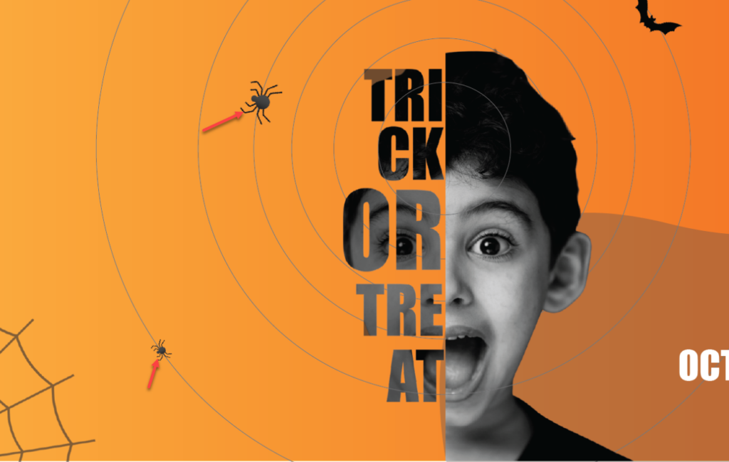
- It would make sense if the spiders crawl inward rather than outward. There are two reasons why I think so.
- The direction of spider crawling will guide the customers’ eyes to your message, “Trick or Treat.”
- The spiders moving toward the boy could be why he was screaming.
- The upper part of the largest circle is cut off, making the space appear “restricted” and narrow.
Solution:
- Don’t show the cut-off circle to give the impression that the space is larger.
Section 2
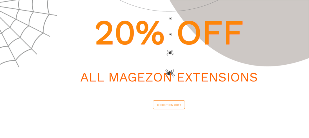
- As previously mentioned, this section includes many details, such as spiders, nets, and gray blobs that can distract visitors.
Solution:
- Remove unnecessary details to make the section cleaner and better-organized.
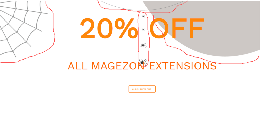
- Notice the swarm of spiders between “20%” and “OFF”? The eyes follow the path that the spiders are crawling but they don’t move toward the important information (20% OFF or CTA).
Solution:
- The “spiders” should help guide the visual direction of viewers to “20% OFF” and the call-to-action button.
- Moreover, these Halloweeny details all congregate in the upper section, leaving the lower section with too much blank space. As a result, the design is imbalanced and visually unappealing.
Solution:
- Make sure to distribute elements properly for a well-balanced design.
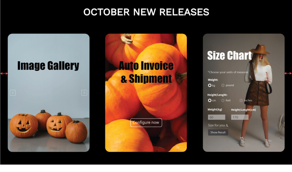
Section 3
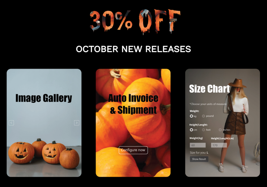
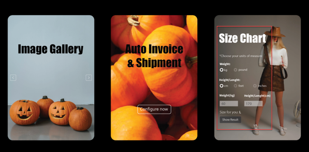
- Three images are not consistent in concept and style. The first image is related to Halloween because it includes “ghost pumpkins.” The second depicts pumpkins in a harvest rather than pumpkins on Halloween. And the last one is even more distinct from the first two. It shows a modern girl in a fashion concept.

Solution:
- Choose images with the same style and concept. Preferably, opt for Halloween-themed ones. For instance, replace the third image with one in which the human model is dressed up for Halloween.
2. The product’s functionality is shown in the third image but not in the first and second. As a result, there is inconsistency in the content demonstration. In terms of visuality, the first image has too much negative space, whereas the last image has too much text. That’s a design imbalance.
Solution:
- Ensure consistency in content demonstration among these images.
- Images 1 and 2 are used just to “fill the space.” Aside from that, the images would be near to no use. Remember, every design component must play a particular role in that design, not be anything you want to let in.

Solution:
- Create images that briefly demonstrate the product’s features or benefits to help people understand them. Remove any components that serve no purpose.
5. The text becomes less readable because of the busy background in the second image.
Solution:
- Use an image background with a lot of white space. Create a transparent overlay to make the text easier to read while the image remains visible.
- In contrast to the other images, the third image’s heading text is white. Additionally, it is placed differently in the first two images and the third one. This makes section 3 appear to be inconsistent.
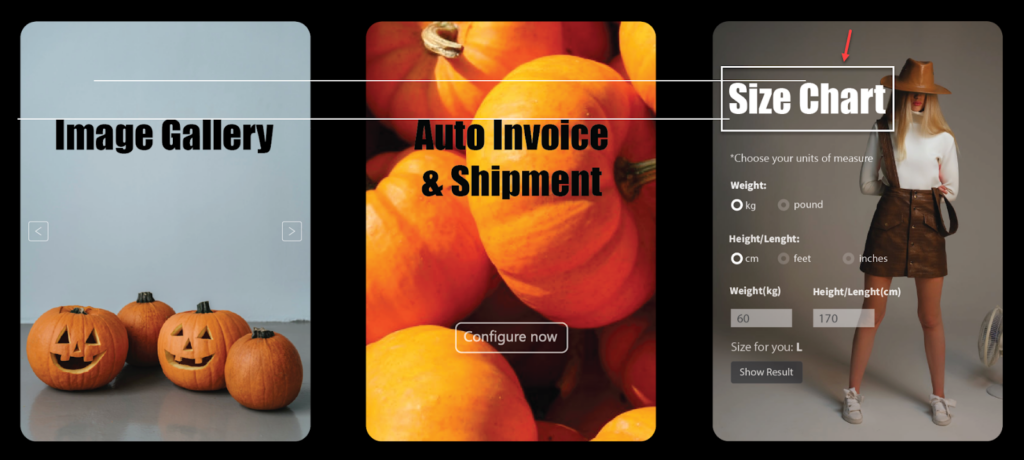
Solution:
- Always be aware of unity in design.
- It’s unreasonable that the image title (Image Gallery, for example) is greater than the title of the entire section (OCTOBER NEW RELEASES). Other than that, the thickness of Image Gallery is even more than that of “OCTOBER NEW RELEASES.”
Remember that the typeface hierarchy makes it simple for customers to decide which content to focus on. The bigger a piece of text is, the more important it is. The bolder the typeface, the more focus to put in.
Getting back to our example, “OCTOBER NEW RELEASES” is part of the main message in this section, while “Image Gallery” or “Size Chart ” is only a supplement. The former should therefore be larger and bolder. But the design seemingly does the opposite.
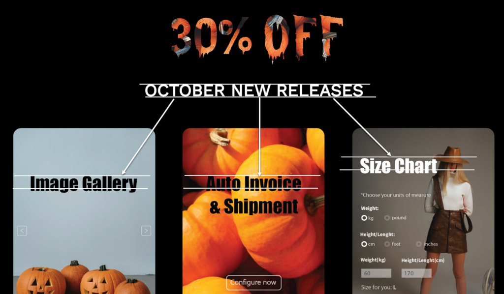
Solution:
- To establish a recognizable hierarchy, make “OCTOBER NEW RELEASE” visibly larger and bolder than “Image Gallery,” “Auto Invoice & Shipment,” and “Size Chart.”
Noting that section 4 is image-free, I’ll skip it.
Try Magezon Page Builder demo FREE today
Easily create your festive Magento websites in any style whenever you want without relying on developers or designers. Just by drag & drop.
Section 5

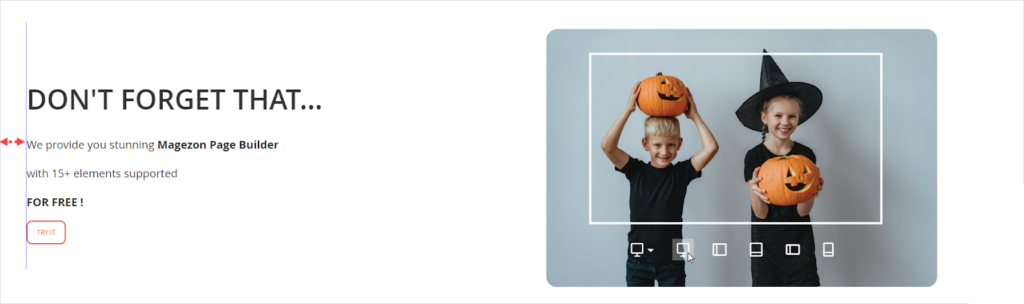
7. Let’s look at the text on the left. The critical message is introducing the free Magezon Page Builder with 15 elements. The image on the right, however, demonstrates the responsive feature, which doesn’t match the exact message.
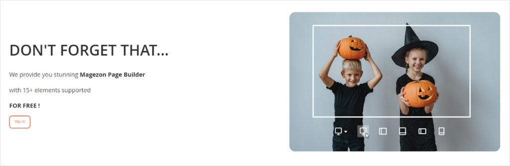
Solution:
- Use the image that depicts a builder with some elements on it.
8. The right and left halves of the white frame are not visually symmetrical. The same thing happens with the top and bottom halves.
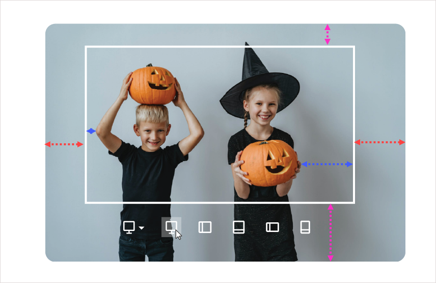
Solution:
- Put the white frame in which the left and right (and the top and bottom) halves are equal.
9. There is a white area on the upper part of the image when you hover over it. This mistake may give a brand an unprofessional look.
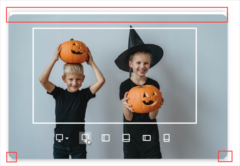
Solution:
- The easy way to fix the error is to remove the hover effect from the image. Also, this effect is often used for clickable images. However, there is no link attached to the image. So there is no need to use the hover effect in this case.
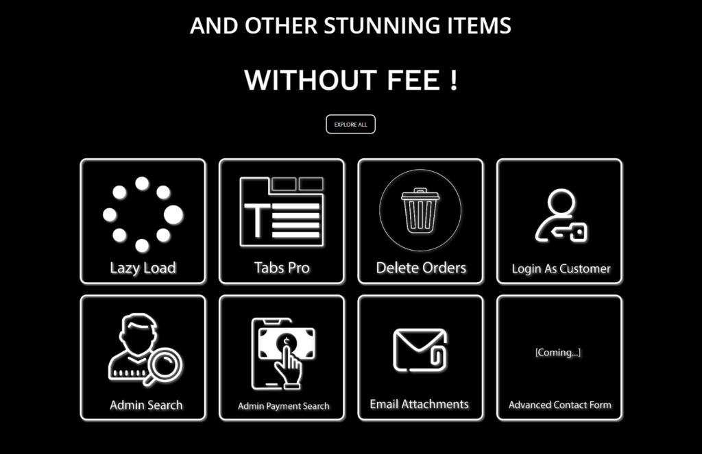
Section 6
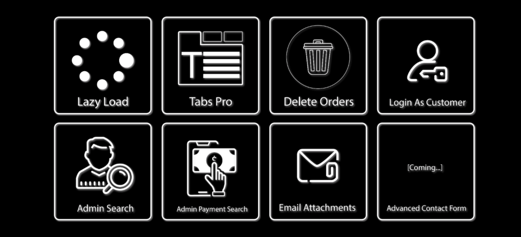
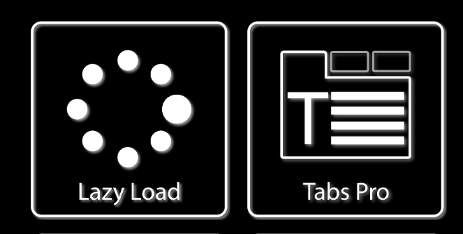
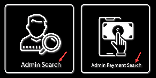
11. The style and boldness of the icons are not consistent and coherent. Some are outlined (Login As Customer, Admin Search, Email Attachments). Some are solid (Lazy Load). Some even combine these two types (Admin Payment Search, Tabs Pro).
Note: If you don’t know how solid and outlined icons look, then the image below will help.
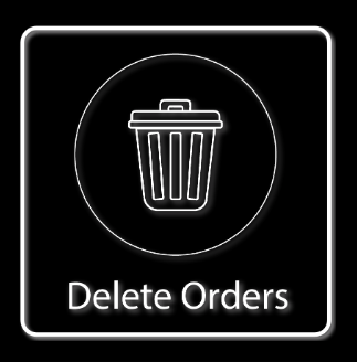
Regarding the outlined icons alone, inconsistency still appears. The icons for Admin Search, Email Attachments, or Login Customer all have thicker strokes than the ones for Delete Orders. Meanwhile, the icon for Tabs Pro, in particular, has both thick and thin strokes.
Solution:
- Design or opt for the icon in the same style, size, boldness, etc.
12. Behind the strokes, the blurred shadow effect creates a sense of illusion and dazzle.
Solution:
- Don’t use the shadow effect in this case. Keep it as simple as possible.
13. The focal point of every image is the logo inside the square frame. However, these frames have thicker strokes than some logos (Tabs Orders, Delete Order). This makes people focus more on the frames than the main point.
Solution:
- Make the frame strokes thinner so that it’s less prominent than the focal point (product logo).
14. This section makes the same mistake as section 3, which uses white images and text against a pure black background.
15. Text in every single image doesn’t have the same size and thickness. This looks visually unpleasant and amateurish.
Solution:
- Some extensions have a short name, while others do not. Therefore, it’s not that easy to ensure typography consistency in size and boldness. To resolve it, I recommend using your page builder to add text rather than including text in images initially. (In this case, we use the Text Block element of Magezon Page Builder).
Evaluate Color Palettes
To evaluate whether the color palette used on this landing page is AT LEAST okay, I’ll go through the 3 criteria listed below:
- Do colors make text easy to read?
- Do colors match the design concept?
- Do colors work well together?
In reality, there is still another factor for evaluation. Do the colors used on this landing page help people recognize your brand? However, I won’t mention this.
1. Do Colors Make Text Easy to Read?
Colors used need to make text legible. And this landing page almost satisfies this requirement. However, the pairing of white and pure black (in sections 3 and 6) can be hard to read. As previously mentioned, use dark gray instead.
2. Do Colors Match the Design Concept?
The color palette used on this landing page evokes the Halloween concept. Looking at the pairing of black and orange, how can we not immediately think of Halloween?
3. Do Colors Work Well Together?
Orange, black and white are the colors used on the Halloween sales landing page. This landing did a great job when not using too many colors that can distract users. Moreover, three primary colors help create a well-balanced color combination for the page design.
| Choose a stunning color palette for your e-store with: 10 Useful Tips to Choose a Color Palette for Website 40+ Amazing Color Schemes for Websites That Engage Users 15+ Best Color Palette Generators for Website 2022 (+FAQs) |
Evaluate CTA Button Design
This Halloween sales landing page has 3 CTA buttons, and all of them share the same mistakes:
- They’re small and overshadowed by the large headings.
- Their text is pretty small and thin. Also, all letters in words are in caps, so it may be challenging for readers to recognize them.
- “Check IT OUT,” “TRY IT,” and “EXPLORE MORE” are relatively common and boring, right?
- The effects used among CTA buttons are inconsistent, making the website unprofessional and even “cheap.
– CTA button in section 2: applies BounceIn effect.
– CTA button in section 5: applies BounceInRight effect.
– CTA button in section 6: doesn’t apply any effect.
Solution:
- Make these buttons larger while decreasing the title font size.
- Use solid buttons instead of outlined ones since this style makes buttons outshine.
- Choose the effect that makes your button look “expensive.” Alternatively, don’t use the effect on CTA buttons; keep them simple but stand out (by using a distinctive color).
- Use engaging, Halloween-y CTA copies, like “Earn your treats” or “Get your treats now.” Customers will get excited about it.
- Avoid all caps and lowercase for CTA copies. Using a title-capitalization style, even, is not advisable. Here is my explanation:
– Text in all caps (EARN YOUR TREATS): As mentioned above, this style conveys a loud or aggressive tone.
– Text in lowercase (earn your treats) conveys an idle and casual tone. It seems like people don’t care much about their customers.
– Title-capitalization style (Earn Your Treats) conveys a formal, less friendly manner. This may result in the button being less inviting to click.
– Sentence-capitalization style (Earn your treats) is the best choice for CTA copies. It conveys a friendly and personal tone that makes users perform the desired action more quickly.
| Create CTA buttons that convert: 8 Must-Have Characteristics of the High-Converting CTA Buttons How to Create Call to Action Section in Magezon Page Builder |
Try Magezon Page Builder demo FREE today
Easily create your festive Magento websites in any style whenever you want without relying on developers or designers. Just by drag & drop.
Section 1
In the first section, there isn’t any CTA button. However, I’ve noticed that every landing page I’ve ever seen has a CTA button in this section. Here may be the reasons:
- First, placing CTAs above the fold (the top half of the page) can help draw the visitors’ attention when they land on your page. Chances are, they are more likely to convert.
- Second, after reading the information in section 1, old customers tend to click quickly to take your offerings.
Solution:
- Add 1-2 CTAs to the first section.
Section 3
- Section 3 informs that customers will receive an attractive 30% discount when buying one of October’s new releases. Therefore, a CTA button should be in this section to encourage them to purchase. However, there isn’t any button in section 3.
Besides, none of the images representing each new product has a CTA button. Instead, each image was attached with an invisible link that takes people to the relevant product page when clicked. It’s not a wise choice, as it’s highly possible that customers won’t know and would click. Consequently, you’d pass up a large number of potential customers.

Solution:
- If you’re using Magezon Page Builder, select the Button or Call-to-Action element to add the button. You can create a button that stands out with the diverse styling options.
If you think about solely attaching a link to an image without adding a button, don’t do it. For instance, those who accidentally click on the image rather than a button might believe you’re tricking them into taking your desired actions. This brings a negative experience for your site visitors. Additionally, people prefer “real” buttons which change color on hover. They will more likely to click on these buttons.
Evaluate White Space, Alignment, and Consistency
- Let’s check out sections 4 and 5. There is slight padding between these two blocks, as you can see.
Solution:
- Add more paddings between these two different blocks. It would be much better to switch the background color to another, like gray, to better distinguish.
- The different-sized spaces between the same-level items create an imbalanced and messy look. For instance, there is a 50px space between the title “20% OFF” and the section above. However, the space is less than 50px between the title “30% OFF” and the section above.
- In section 5, the paragraph and the button below are separate blocks. It means the line height should be smaller than the spacing between the paragraph and the button.
The reality, however, goes the opposite. There’s less space between the button and the last line of the paragraph. As a result, they appear to be in the same block.
The same thing happens in section 3. Three images are in a block set; however, the space among them is greater than the blank space on the left and right.

Solution:
- The space between items helps users know which content goes with what block. For instance, there is less space between items A and B than between B and C. So, we can say A and B are in the same logical block. So, keep that in mind.
- There isn’t much room on the left and/or right sides in sections 3 and 5. This gives them a cramped appearance.
- The distance between two columns in section 5 is large, giving the impression that they are disconnected.
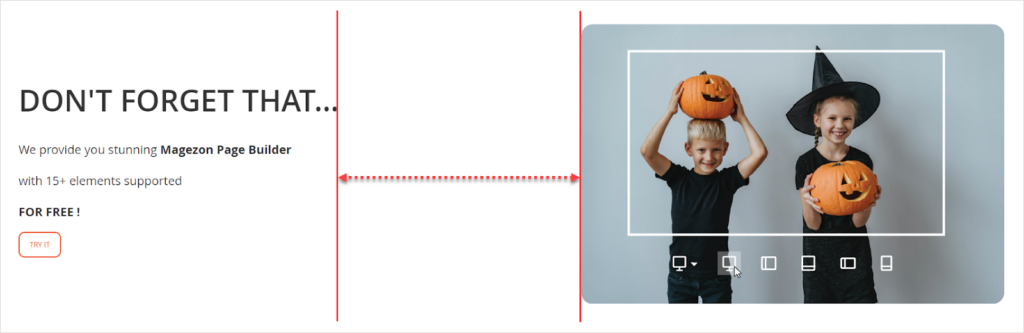
Solution:
- Make these columns closer by reducing padding.
- In section 4, there’s not any CTA button below countdowns. However, it’s wiser to include one in this section ‘cause a sense of scarcity and urgency encourages people to convert quickly.
Solution:
- Include a CTA button in the countdown timer section. Here’s an example.
That’s All for Now
After a couple of weeks, this article is now finished, and I feel ready to share it with you guys. Hopefully, you can grasp and avoid common page design mistakes in the future.
I’m pretty sure you understand all I’ve written here. This does not, however, mean you’ll be able to fix all the errors with just one reading. You may still forget what you’ve learned today and make the same mistakes the next time. Because of that, it’s crucial to reread this article after every time you build a page. By doing this, the knowledge for sure will become yours.
Finally, I have to say I’ve researched diverse reliable sources to ensure knowledge accuracy. Mistakes are, however, inevitable. If you have any suggestions, questions, or ideas, reach us via [email protected]. We’re open to listening to you. Comment below to let us know if you find this article helpful.
Try Magezon Page Builder demo FREE today
Easily create your festive Magento websites in any style whenever you want without relying on developers or designers. Just by drag & drop.


