It’s Halloween today. We’re gonna show you how to create a Halloween landing page using Magento Page Builder. Perhaps it’s too late to share with you guys; however, I believe this article has its certain values.
Unlike usual, in today’s article, I’ll walk you through the whole process of making an effective landing page from A to Z. Instead of wasting time chasing a trail that leads nowhere, you’ll understand how to do it methodically. As a result, you can fully enjoy the page creation process while finishing your work quickly.
| Note: I highly recommend reading this in-depth article to avoid common design mistakes that non-designers often make. Trust me, you’ll learn a lot from the article. |
7 Steps to Create a Landing Page
- Step 1: Understand the Basics of a Landing Page
- Step 2: Determine the Design Purpose and Concepts.
- Step 3: Search for Ideas and Inspiration
- Step 4: Outline Your Landing Page
- Step 5: Pick Design Elements That Convey Specific Concepts
- Step 6: Create Halloween Landing Page With Magento Page Builder
- Magezon Page Builder Can Ease Your Work, Trust Me!
- Boo!…Happy Halloween!
Step 1: Understand the Basics of a Landing Page
This step is better suited for those who don’t (actually) understand what a landing page is, what elements it should have, or how to arrange them. Read this article where you can learn the basics.
Step 2: Determine the Design Purpose and Concepts.
You must understand its purpose before putting any task into action. The same goes for this landing page design. The page lets customers know about our Halloween sales deal. So what concepts are used here based on this goal? Yep, they’re sales and Halloween concepts. Once these concepts have been established, choosing the appropriate fonts, color palettes, imagery, etc., is no longer challenging.
| 100+ carefully chosen icons and illustration for this Halloween: FREE DOWNLOAD |
Step 3: Search for Ideas and Inspiration
Once your mind is clear about purpose and concepts, the next step is to seek inspiration. You can “steal” ideas for how every element is arranged, how colors work together, or Halloween details to decorate your website. TemplateMonster, ThemeForest, Pinterest, Dribbble, and Behance are great places to get inspired when you’re stuck for ideas.
- Save ideas in Excel or Word documents for easy access.
- Don’t waste too much time looking for ideas. Once you’ve had 2-3 samples that you fall in love, start to outline your page.
- Say no to “copy and paste”. Instead, make your landing page in your own way.
- Develop your aesthetic sense by looking up for designs that inspire you every day.

Try FREE Magezon Page Builder demo today
Easily create beautiful, engaging Magento website in any style whenever you want without relying on developers or designers. Just by drag & drop.
Step 4: Outline Your Landing Page
You must decide what sections to include in your page. If you have a firm grasp of the basics and view many landing pages, it’s no longer a difficult task, I bet. Keep in mind that you don’t necessarily add every component a landing page should have. A video, for example, is a highly recommended element on a landing page; however, it is better suited for a product landing page rather than a sales campaign one.
As for our landing page, there are six different sections:
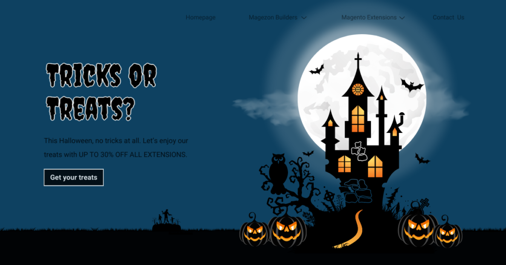
Section 1 gives a brief introduction to the Magezon sales program.
- Headline: Trick or treat?
- Body text
- CTA button
- The hero image on the right
Section 2 informs visitors of the 20% discount on any Magezon extension.
- Heading: “- 20% all of our extensions”
- CTA button
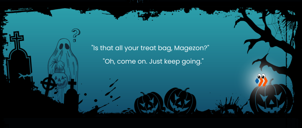
Section 3 may seem unnecessary to some of you because it doesn’t provide any information. In fact, this section is designed as a showstopper of this landing page. It also acts as a break before moving on to the next sales discount.
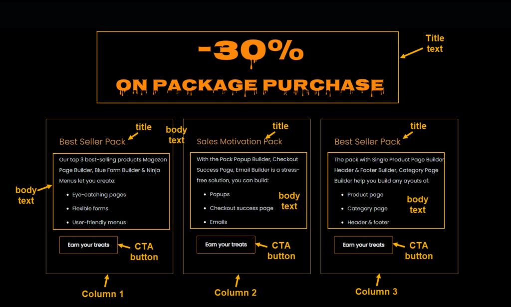
Section 4 details the 30% discount for October new releases.
- Heading: “-30% all of our extensions”
- 3 columns, each of which includes a title, body text and CTA button
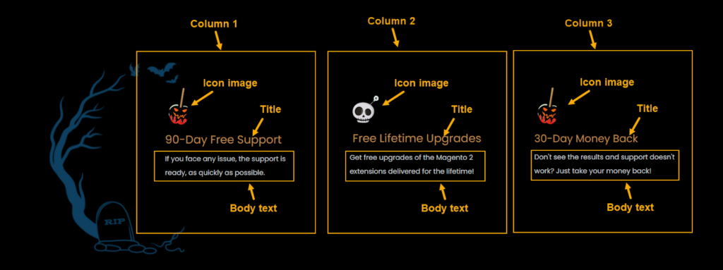
Section 5 highlights the benefits that customers will obtain from Magezon extensions. This helps drive customers to make a quick purchasing decision.
After visitors scroll down the long landing page, we need to remind them of our treats. This is where section 6 comes in. The section includes:
- A sensational hook “Don’t slip your treat away”
- Time duration
- CTA button
Step 5: Pick Design Elements That Convey Specific Concepts
Let me illustrate this point with an example of typography. As mentioned before, the concept used here is Halloween so we chose a dripping font that evokes the Halloween-y atmosphere. (Of course, because of its illegibility, this font is best suited for headlines, subheading and heading rather than body text). I’m almost sure you got the idea. Do the same with color palettes, imagery, icons, details, etc.
As for the sales concept, include elements that call up a joyful sales atmosphere. They are highlighted discount numbers, light rays, sale badge, boo! or even a dancing skeleton, etc. to name a few.
| Level up your website this Halloween: Halloween Website Ideas: 8 Tricks to Boost Your Sales (+ Marketing Tips) 50+ Scary Halloween Fonts to Boo Your Website Visitors |
Step 6: Create Halloween Landing Page With Magento Page Builder
Okay, so it’s time to create a Halloween landing page with Magento Page Builder. Let’s start with section 1.
Section 1
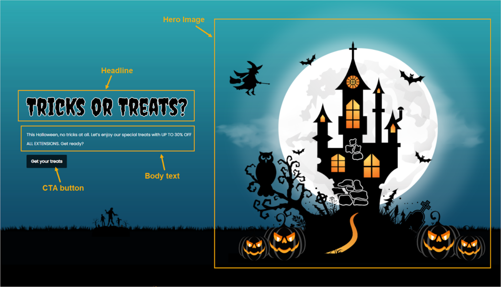
What’s unique in this section?
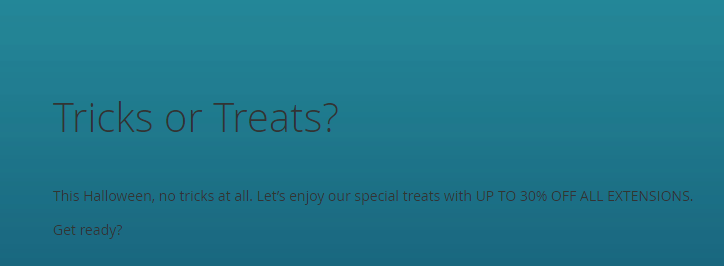
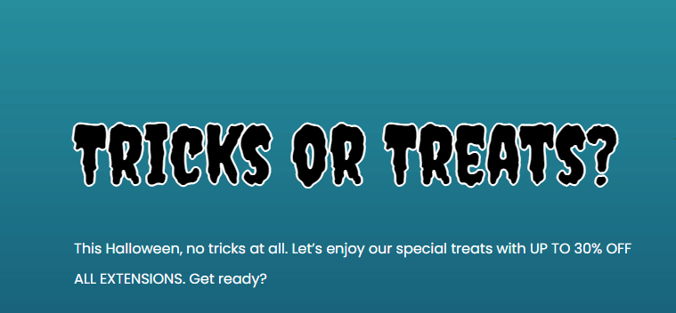
- To give visitors a scary vibe when they land on the landing page, we used a spooky Halloween font in the headline. We also added a white border to the text to make it look more prominent and spooky.
Before:
After:
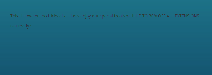
- Poppins, a legible and approachable sans-serif font, was used to replace the body text’s default font. To do it, we used CSS. This also means, all of the body text on the page, not just the one in this section, is Poppins. Hence, we don’t need to apply CSS to every single body text in other sections.
Before:
After:
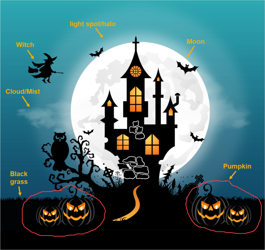
- The big hero image on the left was created with Canva. Yeap, you hear it right. Because of its ease of use and diverse resources, Canva is a life-saver especially for non-designers, in my opinion. Why struggle with a complicated tool like Adobe Illustrator while Canva can help create beautiful designs?
Note: Here’re the keywords we’ve used to search for our design elements:
- Halloween moon
- Cloud, mist
- Flying witch
- Ghost pumpkins
- Black grass
- I used CSS to give the button a new look that is consistent with the overall design.
Before:

After:

The background image is the interesting part, including black grass and the walking dead at the bottom.

Which settings applied to this section?
| Row |
| Full bleed |
| Vertical Alignment: Bottom |
| Upload the background color |
| > Read more: How to add a row in Magento Page Builder |
| Column 1 (5/12) |
| Headline |
| Heading Type: H1 |
| Heading Text: Tricks or Treats? |
| > Learn more: How to add a heading in Magento |
| Body text |
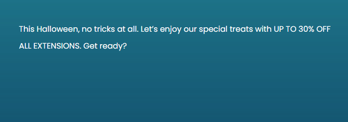
| Text: This Halloween, no tricks at all. Let’s enjoy our special treats with UP TO 30% OFF ALL EXTENSIONS. Get ready?Font size: 16pxLine Height: 28pxText color: WhiteCenter the text |
| Right Padding: 50px |
| Bottom Padding: 15px |
| CTA button |
| Button Text: Get your treats |
| Button Type: Primary |
| Button Link: URL – https://www.magezon.com/magento-2-extensions.html |
| Tick the Open in new tab checkbox. |
| Column 2 (7/12) |
| Bottom Aligned |
| Verticle Alignment: Bottom |
| Image |
| Upload the image |
| Apply CSS to the headline, body text, button using HTML Code content type. |
| <link href=”https://fonts.googleapis.com/css2?family=Poppins:wght@400&family=Creepster&family=Nosifer&display=swap” rel=”stylesheet”><style> h1 { font-size: 90px; color: black; text-shadow: 2px 0 #fff, -2px 0 #fff, 0 2px #fff, 0 -2px #fff,1px 1px #fff, -1px -1px #fff, 1px -1px #fff, -1px 1px #fff; font-family: ‘Creepster’, cursive; } body { background-color: none !important; font-size: 16px !important; color: white !important; font-family: ‘Poppins’, cursive; } .pagebuilder-button-primary { background-color: #061B24 !important; font-size: 16px !important; border: none !important; font-family: ‘Poppins’, cursive !important; } </style> |
Section 2
What’s unique in this section?
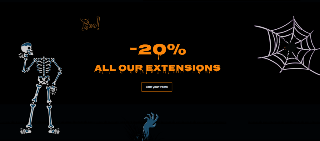
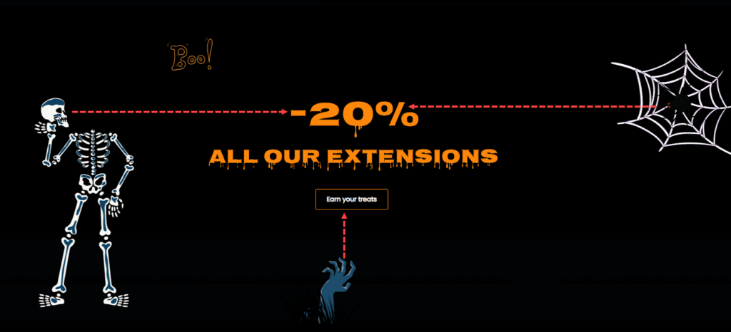
- For the heading “-20% All Our Extensions”, I changed it into another Halloween font that meet the following:
– Legible
– Pleasant to look at
– Halloween-y
- I used CSS to restyle the button into the outlined version. The button border shouldn’t be excessively thick since the typeface is also rather thick in order to avoid giving the design a “rough” appearance. Make sure the button looks visually outstanding.
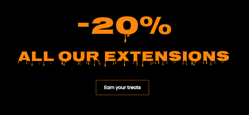
- I added Halloween details such as a skeleton, a spider on its nets and a dead hand coming out from the soil. These details not only make the section look more interesting but also help guide the eyes to the main message and CTA button. Let’s take a look at the image below to see what I mean.
Which settings applied to this section?
| Row |
| Full-Width |
| Verticle Alignment: Center |
| Background Image: Upload the image. |
| Bottom Padding: 70px |
| Heading 2 (Text “20%”) |
| Heading Type: H2 |
| Heading Text: -20% |
| Alignment: Center |
| Insert these CSS codes of this heading into HTML Code editor: h2 { font-size: 90px; color: #FD870A; font-family: ‘Nosifer’, cursive; } |
| Heading 2 (Text “All Our Extensions”) |
| Heading Type: H2 |
| Heading Text: -ALL OUR EXTENSIONS |
| Alignment: Center |
| Bottom Padding: 30px |
| CSS Classes: subheading |
| Insert these CSS codes of this heading into HTML Code editor: .subheading { font-size: 50px; color: #FD870A; font-family: ‘Nosifer’, cursive; } |
| Button Text: Earn your treats |
| Button Type: Primary |
| Button Link: URL – https://www.magezon.com/magento-2-extensions.html |
| Tick the “Open in new tab” checkbox |
| Alignment: Center |
| Insert these CSS codes of this button into HTML Code editor: .button-in-section .pagebuilder-button-primary { border: 1px solid #FD870A !important; background-color: transparent !important; font-size: 16px !important; } |

Try FREE Magezon Page Builder demo today
Easily create beautiful, engaging Magento website in any style whenever you want without relying on developers or designers. Just by drag & drop.
Section 3
What’s unique in this section?
- The section’s settings have almost nothing to say. What makes this section interesting is the small conversation between the dead and “angel” Magezon . As previously mentioned, the purpose of this section is to make the landing page look engaging. So, I decided to make up a story. It’s about a ghost who comes to get the treats; however, he believes there aren’t as many as Magezon advertised. So, he asks Magezon to clarify. Fascinating, huh? This keeps visitors staying on your landing page longer; chances are, they will more likely convert.
Note: Here’re keywords in Canva to create this section.
- Halloween frame
- Ghost
- Black grass
- Light circle behind “angle” Magezon
Which settings applied to this section?
| Row |
| Full-Width |
| Minimum Height: 800px |
| Vertical Alignment: Center |
| Background Image: Upload the image |
| Background Position: Center |
| Bottom Padding: 50px |
| Text in the row |
| Text: “Is that all your treat bag, Magezon?””Oh, come on. Just keep going.” Font size: 36px Line Height: 56px Text Color: White Center the text |
Section 4
What’s unique in this section?
- The heading text has the same style as section 2. Therefore, simply duplicate it and change its text.
- Right beneath are three equal columns with text and a styled button.
Which settings applied to this section?
| Row |
| Full-Width |
| Minimum Height: 800px |
| Verticle Alignment: Center |
| Background Color: #000000 |
| Bottom Padding: 100px |
| Heading (“-30% ON PACKAGE PURCHASE”) |
| Duplicate the heading of section 2. Then change the text. |
| Add 50px to the bottom padding of the heading “ON PACKAGE PURCHASE” |
| Column 1 |
| Minimum Height: 470px |
| Vertical Alignment: Center |
| Border: Solid |
| Border Color: #be8b56 |
| Border Width: 1 |
| Left Margin: 20px |
| Left Margin: 10px |
| Right Padding: 40px |
| Left Padding: 15px |
| Title text “Best Seller Pack” |
| Font size: 26px |
| Font color: #be8b56 |
| Body text “Our top 3 best-selling products Magezon Page Builder, Blue Form Builder & Ninja Menus let you create: Eye-catching pages Flexible forms User-friendly menus” |
| Font size: 16px |
| Font Color: #C1D4CB |
| Top Margin: 10px |
| CTA button |
| Duplicate the button in section 2. Then change the text settings as follow: |
| Button Text: Earn your treats |
| Button Type: Primary |
| URL Link: URL – https://www.magezon.com/magezon-page-builder-for-magento-2.html |
| Tick the checkbox “Open in new tab” |
| Columns 2 and 3 |
| Duplicate column 1 into two more versions. Then change the content inside. |
Section 5
What’s unique in this section?
- There are three columns. Each column depicts one benefit that customers can receive after purchasing Magezon extensions. Inside each column are a Halloween “icon”, a title, and body text.
- The scrawny tree in the black background acts as a separator against the above section and adds to the Halloween atmosphere.
Here’re the settings:
| Row |
| Full-Width |
| Minimum Height: 400px |
| Vertical Alignment: Center |
| Upload the background image. |
| Bottom Padding: 100px |
| Column 1 (4/12) |
| Minimum Height: 400px |
| Vertical Alignment: Center |
| Left Margin: 20px |
| Right Margin: 30px |
| Left Padding: 50px |
| Image |
| Upload the image. The image has a dimension of 100×100 px. |
| Title Text “90-Day Free Support” |
| Font Size: 26px |
| Font Color: #be8b56 |
| Body Text |
| Font Size: 16px |
| Font Color: #d1dbe4 |
| Line Height: 32px |
| Bottom Padding: 10px |
| Column 2 & 3 |
| Duplicate the first column into 2 more versions and change the content inside. |
Section 6
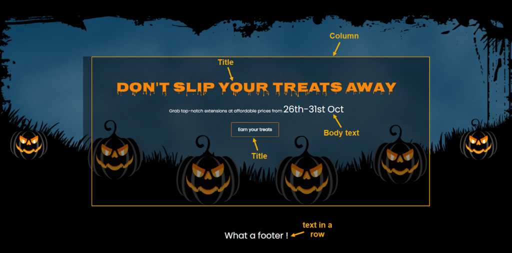
The last section includes:
- A Halloween-themed background with ghost pumpkins
- A dripping title as a hook to encourage leads to actions
- Short subheadings
- A styled CTA button
- “What a footer” like angry words spoken by pumpkins.
Here’re the settings in this section:
| Row |
| Full-Width |
| Minimum Height: 800px |
| Vertical Alignment: Center |
| Upload the background image |
| Background Position: Center |
| Column |
| Minimum Height: 600px |
| Top Padding: 100px |
| Heading text “DON’T SLIP YOUR TREATS AWAY” |
| Duplicate the text “ON PACKAGE PURCHASE” and change the text. |
| Subheading “Grab top-notch extensions at affordable prices from 26th-31st Oct” |
| Font Size: 14px. For the text “26th-31st Oct”, increase the font size to 34px. |
| Font Color: #be8b56 |
| Center the text |
| Button |
| Duplicate the button of section 3. Then drag and drop it under the subheading. |
| Row for the text “What a footer!” |
| Full-Width |
| Minimum Height: 150px |
| Vertical Alignment: Top |
| Background Color: #000000 |
| Text “What a footer!” |
| Font Size: 36px |
| Font Color: #be8b56 |
| Center the text |
The Halloween landing page is now finished. Isn’t that fantastic? Check one more time to make sure everything is perfect. So what’s next? We’re going to introduce Magezon Page Builder, one of the best-favored products in our e-store. Don’t pass up this builder because you never know what it can do for you.
Magezon Page Builder Can Ease Your Work, Trust Me!
I’ll come straight to the point. The truth is, you’ll need a couple of days to finish this Halloween landing page; some of you might even struggle with a bunch of codes. I knew it because I’d been there. Why look for another way to save you time and effort? Like Magezon Page Builder.
Let me tell you. Our page builder has a very user-friendly drag-and-drop interface and high performance. With more than 50 powerful elements, you can effortlessly create beautiful and functional web pages in a short period. If you don’t know where to start or have much time, our pre-made templates are the way to go.
Still wondering whether this page builder is right for you? So try out the demo here. Until then, it’s not too late to make your choice. Moreover, the Magezon team provides quick and efficient support whenever you need it.
This 2022, we expect to roll out a completely new version of Magezon Page Builder, promising to offer the best experiences for our customers. You can look forward to significant features and enhancements in the new version here: Magezon Page Builder 3.0 Sneak Peek.
Boo!…Happy Halloween!
After this article, I do hope you’ve had a thorough understanding of how to create a landing page (or even a web page) in Magento. This spooky yet funny landing page can also be an inspiration for your Halloween 2023. Can it? Haha. Finally, for our readers and customers of Magezon all around the world, we wish you a memorable Halloween. Happy Halloween!

Try FREE Magezon Page Builder demo today
Easily create beautiful, engaging Magento website in any style whenever you want without relying on developers or designers. Just by drag & drop.
 Magezon Blog Help Merchants Build Comprehensive eCommerce Websites

