You may have heard about the Block content type when learning the Magento Page Builder and known that it is used to add an existing, active block. This block can contain fixed information such as text, images, embedded video, etc. and dynamic information as well. On the other hand, it helps you easily manage various elements on your web pages. The Block content type is not complicated, so if you’re a Magento store owner and want to learn more about it, this article is for you.
Table of contents
Where Is the Magento Page Builder Block Content Type Located?
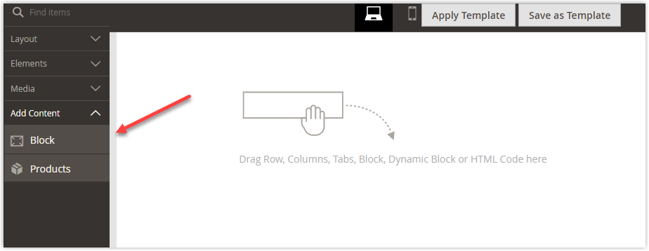
In the Magento Page Builder workspace, you can find the Block content type in the Page Builder panel, under the Add Content section.
Introduce the Block Toolbox
When you hover over the block container, you’ll see a toolbox appear as below:

| Tool | Icon | Description |
| Move | Changes the position of the block container within the stage. | |
| Settings | Accesses the Edit Block page to select the block and modify its container. | |
| Hide | Makes the current block container temporarily invisible. | |
| Show | Makes the hidden block container visible. | |
| Duplicate | Duplicates the block container and its content. | |
| Remove | Deletes the block container. |

Try FREE Magezon Page Builder demo today
Easily create beautiful, engaging Magento website in any style whenever you want without relying on developers or designers. Just by drag & drop.
How to Add a Block in Magento Page Builder?
After expanding the Add Content section, drag the Block placeholder to the stage and drop it. You can watch the video below to better understand.
You may also like: Magento Page Builder: All About the Products Content Type
Do you recognize anything? That’s right, with other content types, I first added the Row, Column, or Tabs to the stage but in this case, I didn’t do it.
Now, look at the image below.
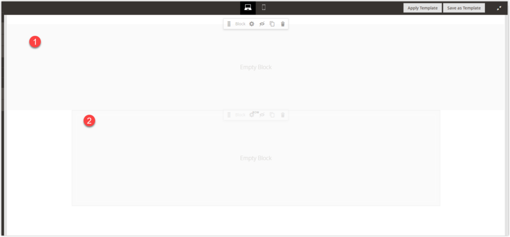
Number one is the block container itself, and number two is the block in a contained row. Do you notice the difference? If there isn’t a row, the block will only appear in full-bleed. If there is, you can change how the block container appears according to how you set the row.
In short, with the Block content type, adding a row, column or tab beforehand isn’t compulsory.
How to Change Block Settings?
Hover over the block container to display the Settings (![]() ) icon and choose it.
) icon and choose it.
Select Block
- After accessing the settings page, pay attention to the first section. This is where you select a block to display on the block container.
- Click Select Block.

- The Select Block page will appear for you to choose from. Find the block you need and click Select.
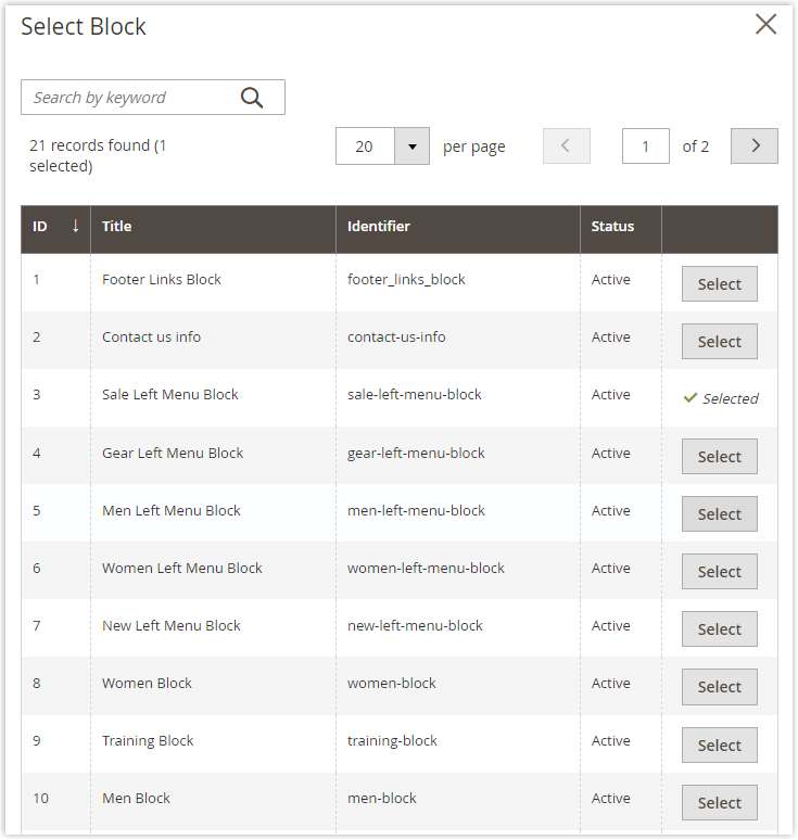
- The button after that will turn into text Selected to show that you have successfully chosen a block.
- Click the exit icon (
 ) to close the select page and return to the edit page.
 - The name of the chosen block will appear.
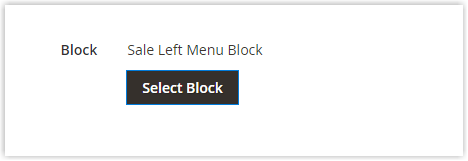
- If you want to change the block, click Select Block again and choose another block, then click Select.
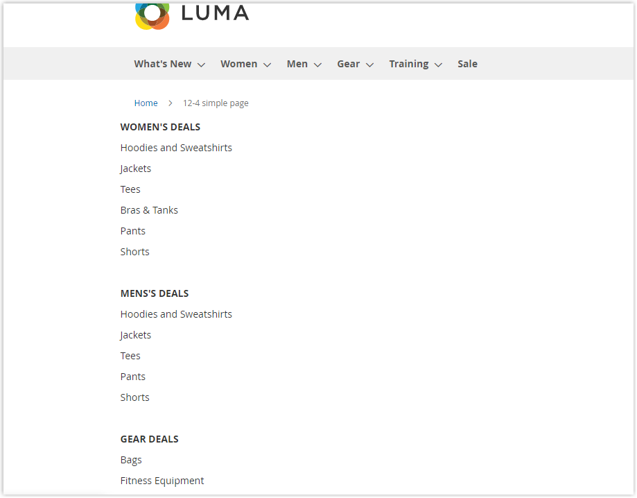
As I have chosen the Sale Left Menu Block, below is how the block appears:
Advanced Settings
Similar to the previous content types, the Block’s advanced settings section also includes
- Alignment settings:
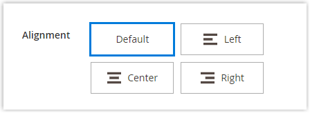
| Default | Applies the alignment default setting which is given in the current theme’s style sheet. |
| Left | Places the content along the block container’s left border, allowing for any padding that is provided. |
| Center | Places the content in the center of the block container, allowing for any padding that is provided. |
| Right | Places the content along the block container’s right border, allowing for any padding that is provided. |
- Border settings:
- Border style:
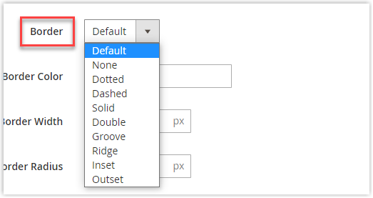
As you can see, there are nine different styles for the borderline for you to choose from, which are:
| Default | Applies the associated style sheet’s default border style, as defined. |
| None | Hides the borderline. |
| Dotted | Displays the borderline as a dotted line. |
| Dashed | Displays the borderline as a dashed line. |
| Solid | Displays the borderline as a solid line. |
| Double | Displays the borderline as a double line. |
| Groove | Displays the borderline as a groove line. |
| Ridge | Displays the borderline as a ridge line. |
| Inset | Displays the borderline as an inset line. |
| Outset | Displays the borderline as an outset line. |
If you don’t choose None for the border style then you can change the border’s color and width. The border’s radius is changeable no matter what style you chose.
- Border color:
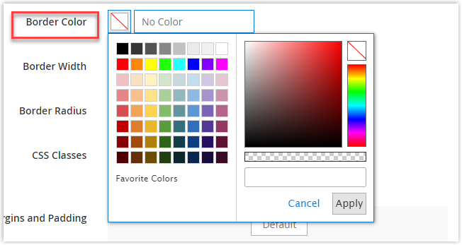
You can change the border color by
- Choosing a swatch.
- Clicking the color picker.
- Putting a valid color name or equivalent hexadecimal value in the value text box.
You can also adjust the opacity of the borderline as in the video below.
- Border width: Enter the number of pixels to define the borderline width.

- Border Radius: Enter the number of pixels for the size of the border’s radius.

- CSS Classes:

Enter the names of the CSS classes from the current style sheet to define the container.
Notice to use a space to separate multiple class names.
- Margins and Padding:
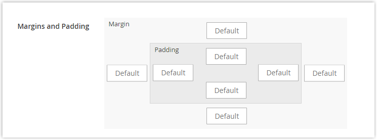
- Margins: the blank space of the container’s outside edges on all four sides. Options: Top/ Right/ Bottom/ Left.
- Padding: the blank space of the container’s inside edges on all four sides. Options: Top/ Right/ Bottom/ Left.
To adjust the margins and padding, put the corresponding values in pixels in the diagram.
Finish
After completing all the settings, click the Save button at the top right corner of the edit page and return to the page builder stage.

More Options for Your Website With Magezon Page Builder
Generally, the Block content type in Magento Page Builder offers you all the basic features. However, if you want to have more advanced and interesting settings for a block‘s appearance then let’s discover the Block element in the Magezon Page Builder.
There are two types of block elements that are Static Block and Generate Block. The thing that makes them different from the Block content type of Magento Page Builder is the CSS animation included.
In Magento, it only includes default settings for the block container’s borderline. If you want to make it more special, then you need to have little skills in coding to fill in the CSS classes text box. However, in Magezon Page Builder you don’t have to figure it out by yourself anymore, your blocks still look more exciting to look at.
We’ve designed these elements to help even users with no coding skills can have an amazing website of their own.
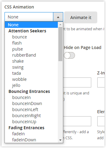
You can see the video below for better imagination.
Not only can you identify the animation effect, but you can also adjust more detailed settings such as animation duration, delay, or infinite.

Final Words
Finally, you have finished learning about the Block content type in Magento Page Builder with all the necessary information. You also got an extra option to have more interesting blocks for your website with little to zero coding skills, the block elements of Magezon Page Builder.
If you want to have a user-friendly interface to work with then I highly recommend Magezon Page Builder. Not only the block elements, but it also has more than 50 elements with various options to build any page layout you want.

Try FREE Magezon Page Builder demo today
Easily create beautiful, engaging Magento website in any style whenever you want without relying on developers or designers. Just by drag & drop.
 Magezon Blog Help Merchants Build Comprehensive eCommerce Websites

