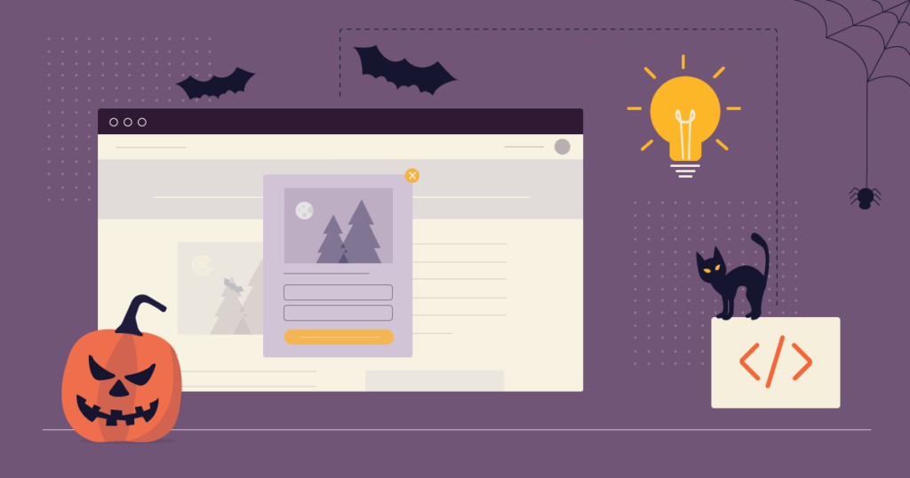
Halloween is around the corner; have you had any Halloween website ideas to impress your visitors and increase sales? If not, you’re at the right place. Today’s article will provide 8 valuable tips to redecorate your website for this Holliday season. Of course, only design won’t help; you’ll need some marketing tricks to encourage your visitors to turn into customers. No worries, we’ve got your back. At the end of the article, you’ll be informed with the most useful knowledge about how to make the most of your website marketing strategy.
Without further ado, let’s dive right in.
Table of contents
Halloween Website Design Ideas to Impress Your Customers
1. Take Advantage of Pre-Made Themes
Your theme is the first Halloween website idea you should consider when changing anything. Many pre-made themes are available on the Internet, with every possible element in the loud-colored package waiting for you.
Finding an exciting and impressive theme is easier if you use Shopify or WordPress. You can take these below themes into consideration.
For WordPress Users
- Hallo
- Samhain
- Party Maker
For Shopify Users
- Halloween Costumes
- Bogey Shop
- Monster Mash
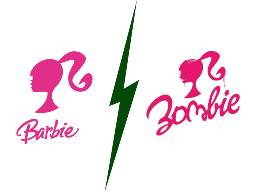
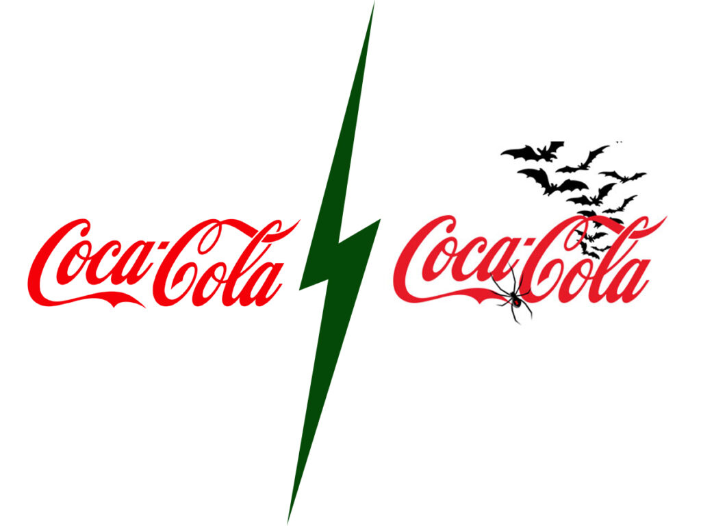
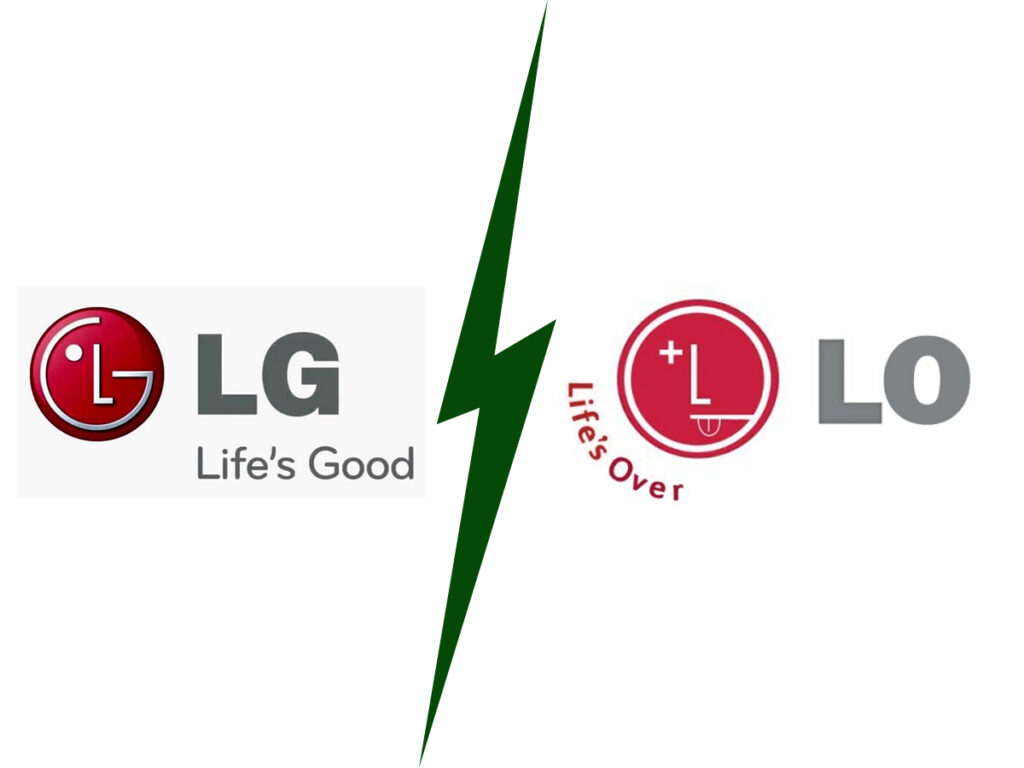
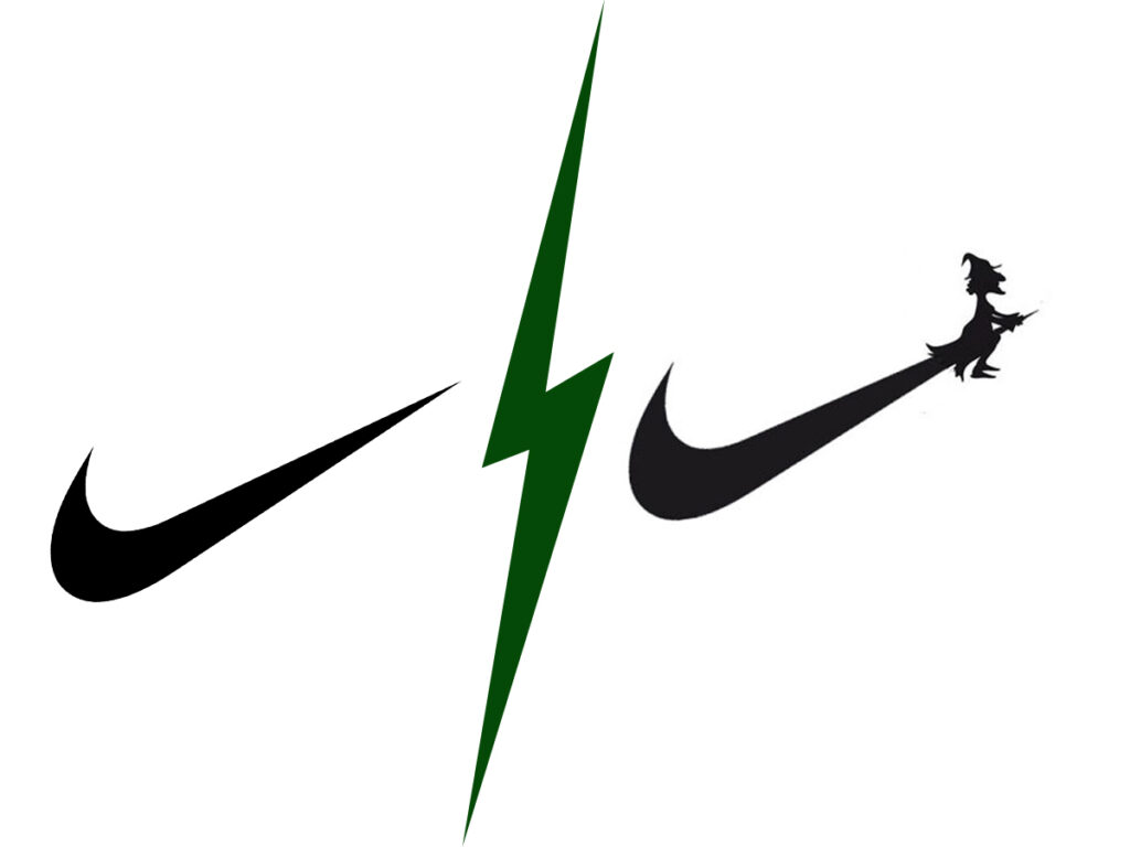
2. Make Your Logo and Name Halloween-y
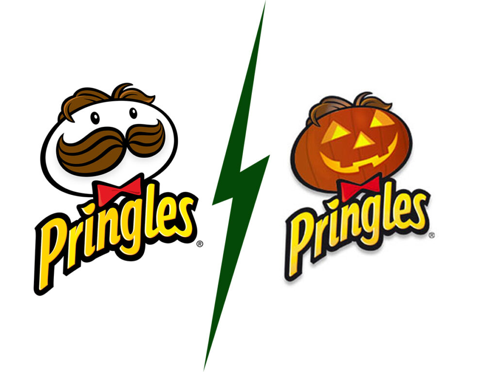
A logo helps your customers to recognize you among many different brands; you can spice it up a little bit this Halloween by adding spider webs, witch hats, or a creepy pumpkin. Depending on your budget, you can hire a professional designer, have an in-house one, or design independently. If you make it yourself, visit some logo maker websites or use freemium design tools like Canva or Adobe Spark.
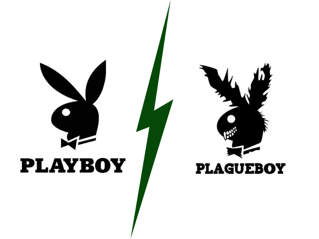
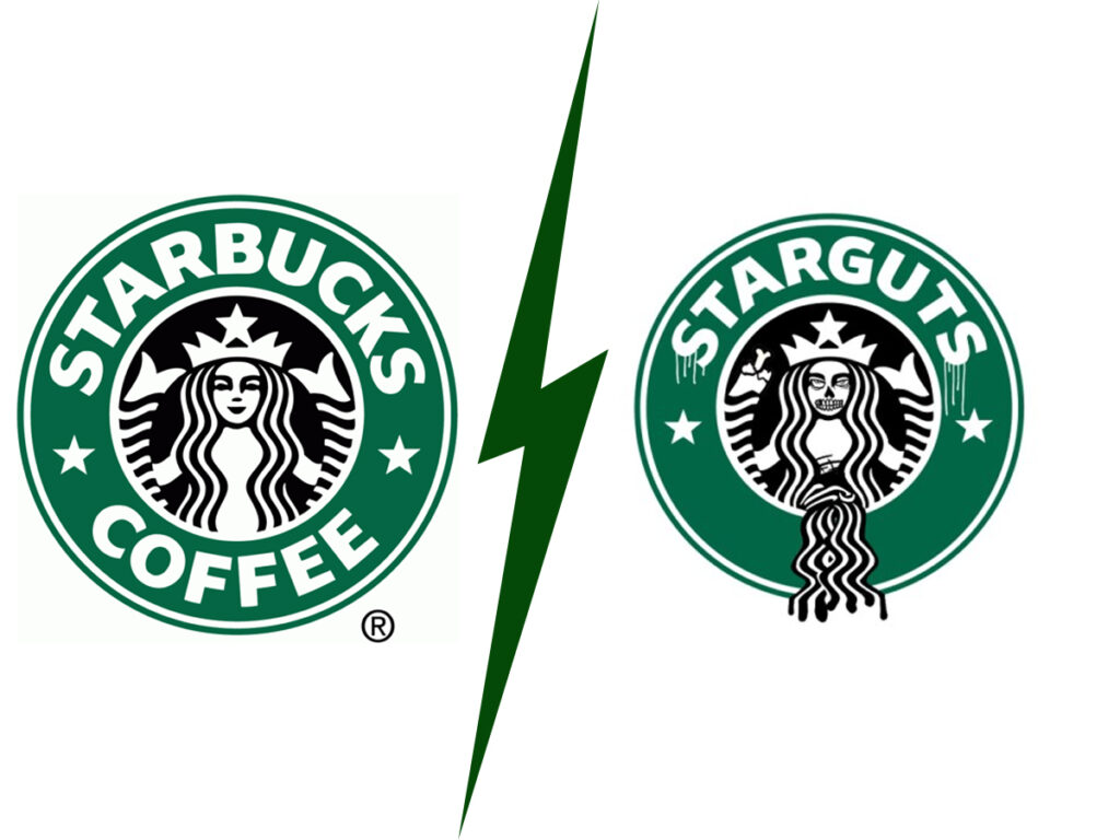
On the other hand, you must also create a matching name. You don’t want your logo to look scary, but the name sounds so cute, right? While brainstorming your new name, a good rule is to make one that rhymes with the original, has overlapping sounds, or makes sense thematically. In terms of design, remember to use scary fonts for Halloween to convey a comprehensive message.
You can refer to some examples below to get inspiration:
3. Mix Your Website With Halloween Colors
Halloween is the season of pumpkins, the dark atmosphere, and mysterious creatures. Therefore, the best Halloween colors for websites are orange, yellow, black, and grey. You can use those colors for decoration this holiday season, but remember not to let them get into your brand color scheme.
→ Let the color generators help you: 15+ Best Color Palette Generators for Website 2022 (+FAQs)
4. Add Halloween Details
Bats, witches, brooms, cobwebs, skulls, and ghosts are some comment elements you will encounter in Halloween graphic design. If you’re going to add those to your website, remember to go minimal. You don’t want to “choke” your visitors with many different details that will eventually hamper their navigation process.
Try FREE Magezon Page Builder!
Easily decorate your Magento websites in any style without relying on developers or designers just by drag & drop.
5. Change Your Website Background
How can we not talk about the background while discussing Halloween website ideas? If you’re using WordPress, go to your dashboard, choose Themes from Appearance, and choose or upload your wished background. Most WordPress themes allow you to update your color scheme by choosing Customize from Appearance.
If you’re not a WordPress user, don’t worry. Simply go to Google and find whatever background image that you like based on some website design tips here:
- Pick high-resolution images (minimum 1024 x768px)
- Go for landscape images rather than portrait ones. Crop out unnecessary parts to make them look more professional and appear neatly on your website.
- Prioritize JPG or PNG format. You can use GIFs, but be careful as they may cause distraction.
- Choose one that’s not too bright to overpower your content.
→ Spice up your website with parallax effects: What Is Website Parallax Effect? (Pros & Cons + Best Plugins)
Below are some background image examples for better understanding.
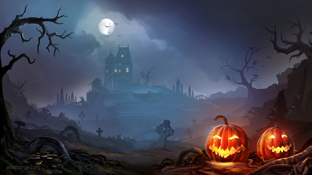
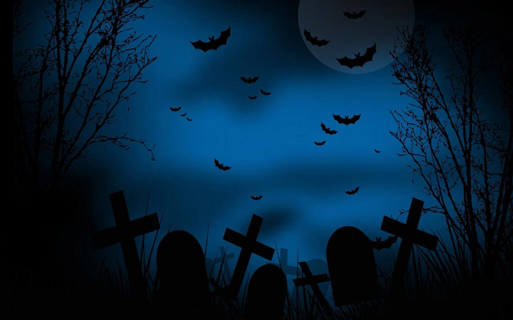
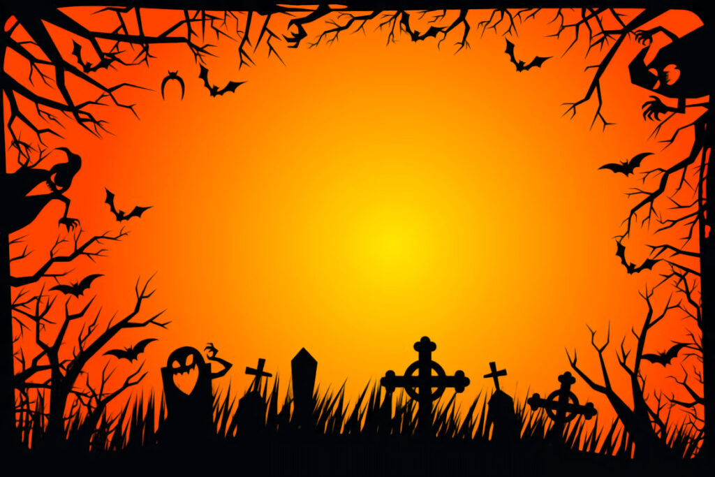
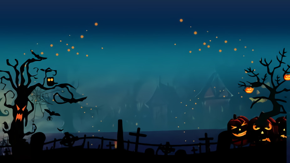
6. Use Spooky Fonts
The font is another decisive factor when talking about Halloween website tips. If you want to make a change, do it with the heading or any elements that are not the main body text. By doing this, your website won’t be complicated, and most of the text is still easy to read. There’re many different scary fonts on the internet, but if you don’t have time to research, don’t worry; we’ve carefully compiled them here in various styles.
7. Create Catchy CTA Buttons
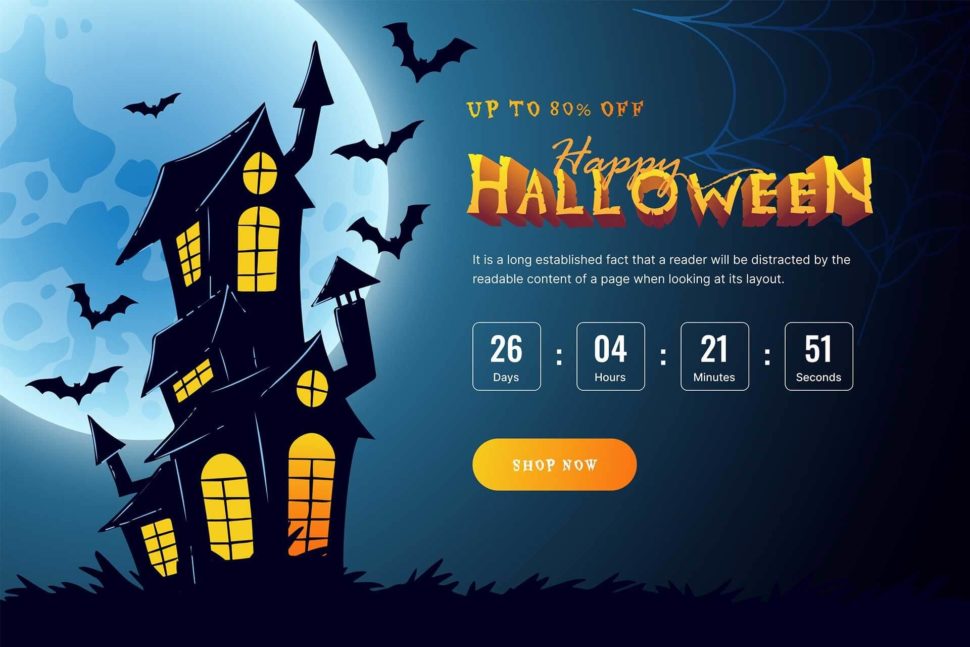
No time can be better than selling during the Holiday season, and Halloween is no exception. This is also an excellent move to boost ROI and brings in more customers to your “haunted house” or your online store. So how can you do it? One of the best Halloween website ideas is to create catchy CTA buttons to draw your visitors’ attention.
Remember to take advantage of the time factor; in other words, use the FOMO (Fear of Missing out) phenomenon. You can look at the example below to understand better.
8. Include Horrific Exit-Intent Popups
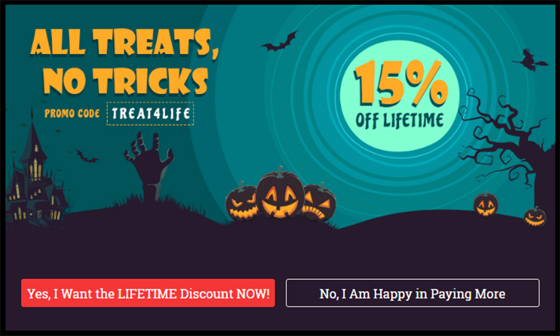
If you have an exit-intent popup box, spice it up with a creepy touch. Use popular Halloween quotes to change for the tedious ones. Also, be creative in creating promo codes. Instead of “30SALEOFF,” try “TREAT4LIFE.” See the image below for a better understanding.
→ Gain more sales with popup tips: 7+ efficient tips to create high-converting popup
Halloween Marketing Tips to Get More Sales
1. Email
Halloween email marketing is one of the most effective tools to boost your ROI massively as users proactively choose to receive your content. In fact, you’ll receive $42 in return for every dollar you spend on email marketing. However, it’s not as easy as it seems; you must do it smartly or risk an “unsubscribe” or “ mark it as spam.”
→ Use tools to help you with your email campaign: Top 12 Free Email Marketing Tools for Ecommerce Store
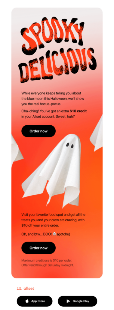
State clearly and directly what you’re promoting (event, discount, or new Halloween product) at the top. Take note that every second your customers spend reading your email is specious; try to make them reach the CTA button. If you’re creating an email, remember to design it as Halloween-y as possible. In other words, include witch hat, ghost, or devil in JPG, PNG, or GIF. Don’t worry if your customers find them annoying; they’ll love something to spice up their reading experience. Try Giphy with millions of funny and interesting GIFs to create an impression.
If you’re not confident designing a Halloween email, don’t hesitate to use premade templates. They can be customized easily and include attractive elements to help your email campaigns stand out. On the other hand, don’t forget to use this time of Halloween to showcase your holiday-specific products and services; creating particular collections to make the buying process easy and quick is a great way to do it.
You can look at the example below to better understand.
Subject line: Scary big deal (use at your own risk)
2. Blog
No one can deny that blogs, long-form, and multimedia content, are the best way to communicate with your visitors. During this Halloween season, your blogs will be influenced by your product. If you’re working in the fashion industry, you can create a blog teaching customers how to match their clothes with a creepy and spooky vibe. Or let’s say you are a cosmetic provider; you can write about using your products to create a scary appearance for Halloween parties. I mean, can anyone refuse to look unique at parties?
3. Social Media
To bring more traffic to your website, social media marketing is essential. If you pay close attention, you can see that most brands will try to create as much dedicated content as possible to delight and attract customers at this time of the year. Many ways can be used to do this, and adding Halloween hashtags or prompting readers to share user-generated content are considered the most effective. Here are some popular tags you can use:
#Halloween2022, #Spooktacular, #TrickOrTreat, #PleaseForgiveMe, #spooky, #scary, #ghost, #haunted, #costume, #scared, etc.
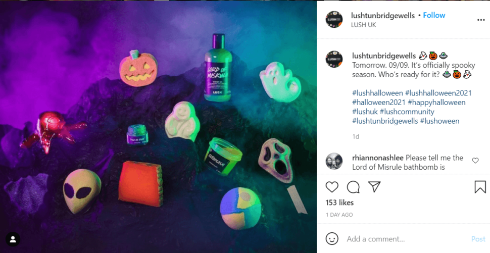
However, to use social media effectively, you always need to have the niche cultural differences of each platform in mind. For example, Twitter prefers simple, not-too-ambitious ideas, while Instagram and Facebook are videos and short-form content-heavy. Knowing the difference between different platforms can help you make the most of each one, attract more customers, and increase your conversion rate.
→ Discover CTAs examples for different platforms: 25 Proven CTA Examples Across all Platforms
4. Landing Page
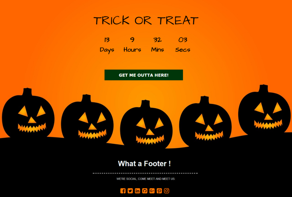
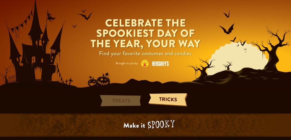
The holiday season is the best time to run discounts; you need landing pages to announce that to your customers. A landing page will help you direct traffic to a single source and evaluate your marketing campaigns. Below are some Halloween-themed examples you can see.
→ Keep visitors filling your landing page with form tips: 20+ High-Converting Landing Page Forms Best Practices

5. Run Themed Ads
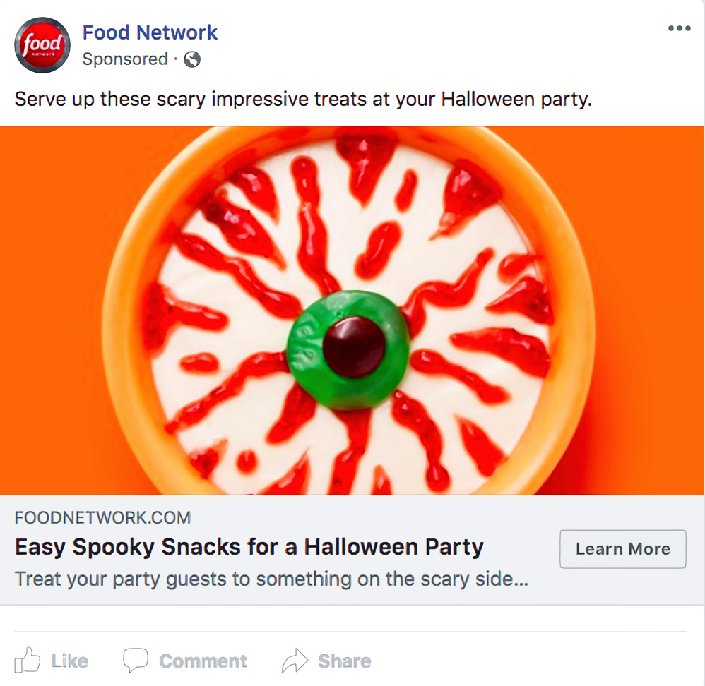
Halloween is the best time of the year to capture new customers and help them gain knowledge about your brand before the official launch of the holiday shopping season. You can use Facebook or Google ads to increase brand awareness during fall specials and spooky discounts. Your themed ads are where you can showcase that your merchandise can be used as Halloween gifts, parties, costumes, etc.
Remember to create ads for different target audiences. If your business has specific audiences, try making your Halloween ads that match their need and features.
→ Earn more with your PPC landing page’s tips: 25+ PPC Landing Page Best Practices to Boost Conversions 2022
Ready to Create the Most Impressive Halloween Website?
That’s all for today; I hope you can refurbish your site and boost your sale with all the Halloween website ideas above. It may seem challenging initially, but we have broken everything down, so you won’t find it hard anymore. If you have any questions, don’t hesitate to leave a comment below to let us know.
If you are a Magento merchant and don’t know which extension to build your Halloween website, consider Page Builder from Magezon. As a trusted Adobe partner, we have satisfied thousands of customers with a vast collection of drag-and-drop extensions, helping you create a high-converting and unique store in minutes.
Don’t take my words for granted; see how your website can be with Magezon Page Builder and what others say about us:
 Magezon Blog Help Merchants Build Comprehensive eCommerce Websites

