Magezon Blog Help Merchants Build Comprehensive eCommerce Websites

Creating a website header that genuinely captures the essence of your brand is a challenging journey. When visitors arrive at your website, your header will be their first introduction to your brand. That’s why it’s essential to pour heart and soul into designing a page header that looks beautiful and accurately represents who you are and what you stand for.
In this ultimate guide, you’ll discover everything you need to know about creating a website header that stands out. You’ll learn about the key components that should be included and best practices to optimize for more conversion.
Let’s jump in!
Table of contents
What Is a Website Header?
Think of your website’s header as the warm and welcoming front door to your digital space. Located at the top of almost every page, it’s the first thing that greets your visitors and gives them a glimpse into what they can expect from your site, including the site title, logo, navigation bar, etc.
A header also sets the tone and creates the mood for the website experience. That’s why many designers put extra care into making headers visually appealing and reflective of their brand.
Fundamental Elements of a Great Website Header
1. Business Name
Put your business name to let visitors know they’ve reached the right place. If you’re creating a personal blog or an online portfolio, don’t forget to get creative and add your name or initials to the header to make a solid first impression and promote your unique brand. And if you don’t have a business name yet, don’t worry! Many resources available on the Internet, like Wix, Namelix, and GoDaddy, can help you find the perfect fit.
2. Logo
Your logo serves as the visual representation of your brand. No matter what industry you’re in, a well-designed logo can help you differentiate yourself from the competition and make it easier for users to recognize your brand.
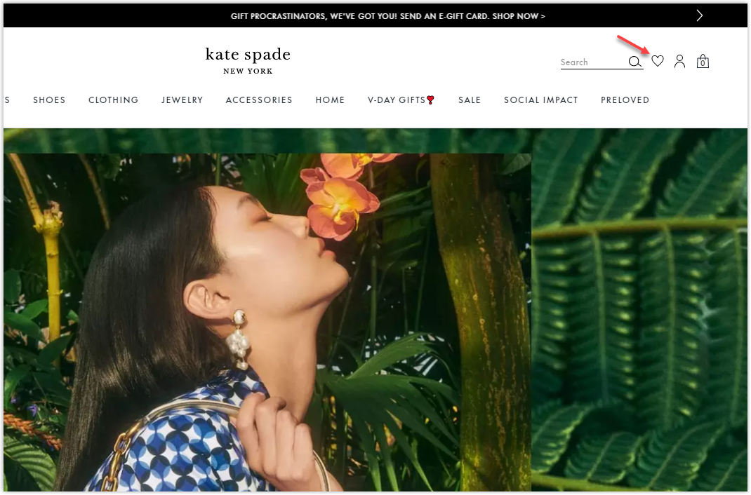
There isn’t a set rule for where to place your logo. Some designers prefer to center it, while others opt for a more off-center approach. But, according to a study by Nielsen Norman Group, users are more likely to notice the logo on the left-hand side of a website’s header. However, it’s totally okay to choose a placement that you personally love.
3. Navigation Menu
The navigation menu is a crucial part of any website and is traditionally located in the header. It serves as a roadmap for your visitors, guiding them to all the essential parts of your site with just a few clicks. Creating a website header with a clear and concise navigation menu front and center will help you ensure a seamless user experience that creates a lasting impression.
4. Search Bar
Adding and optimizing a search bar to your header is a great way to help visitors find what they need quickly and easily. This is especially useful for blogs, as it allows users to find posts related to their interests.
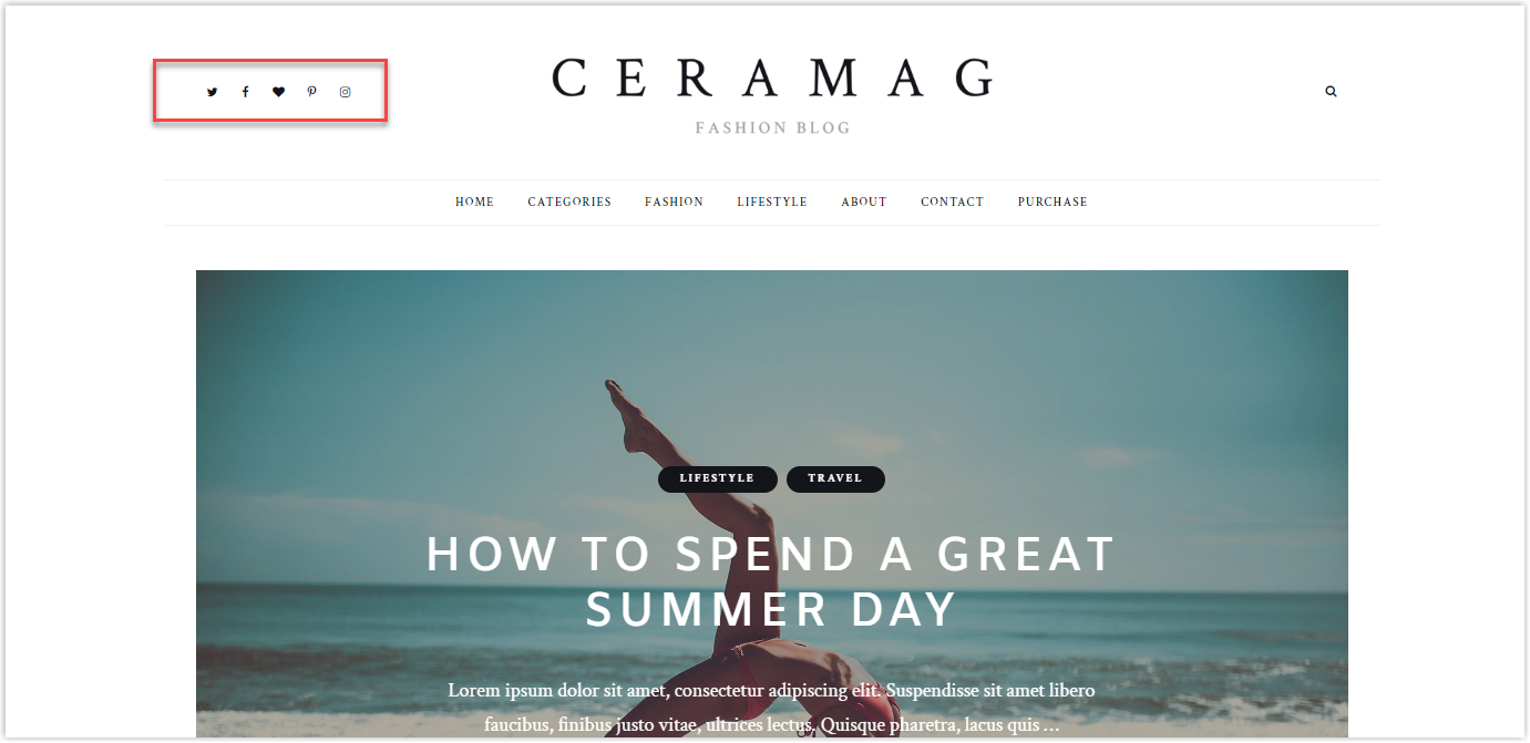
5. Social Media Links
If you want to expand your reach and grow on social media, make it easy for visitors to connect with you by adding social icons. They can transform from visitors to avid followers and fans with a simple click.
6. Languages
Your website offers multiple languages? That’s amazing! We know that embarking on a multilingual website is no easy task, but it can open many new doors to a broader audience.
After the hard work of translating and uploading your content, it’s time to make it easy for your international visitors to find their language. Adding a language toggle menu to your page header design is an excellent option to immediately let them know that multiple language options are available on your website.
7. CTA
Almost every element in your website’s header will guide visitors toward a call to action button, such as “Try a free tool,” “Join your community,” “Contact us,” or “Start a free trial. This is also the most crucial element of a website, and optimizing it to drive your business goals is essential.

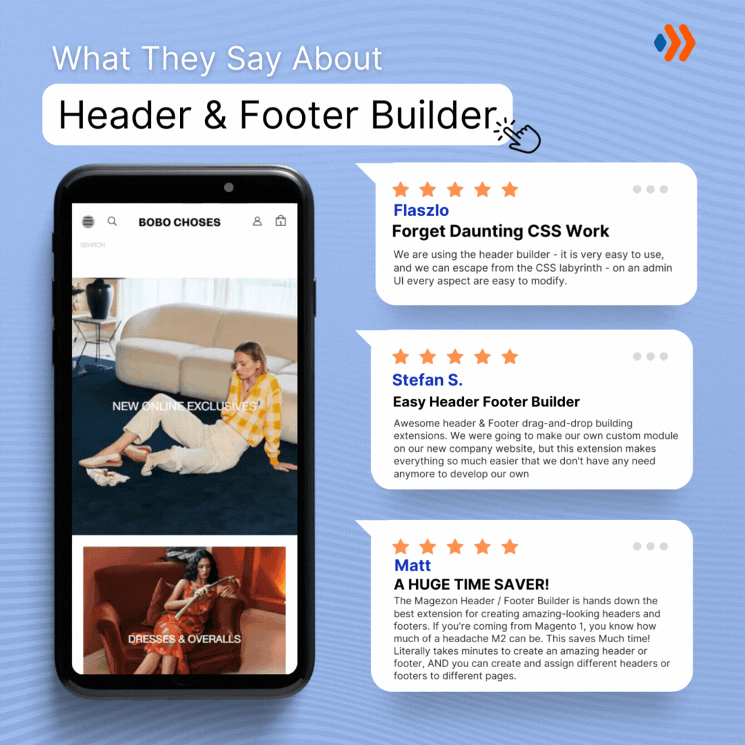
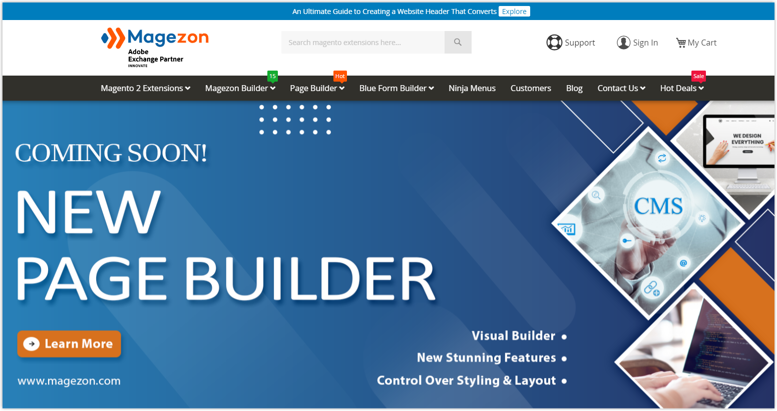
Try FREE Header and Footer Builder!
Easily create an engaging header and footer for your Magento store in any style without relying on developers or designers. Just by drag & drop.
E-commerce
8. Login Field
If you create a membership website, your users need a login field to easily access the exclusive information. And the best way to make sure your members don’t miss it? Creating a website header combined with a login button front on the right of your homepage header, where it’s impossible to miss.
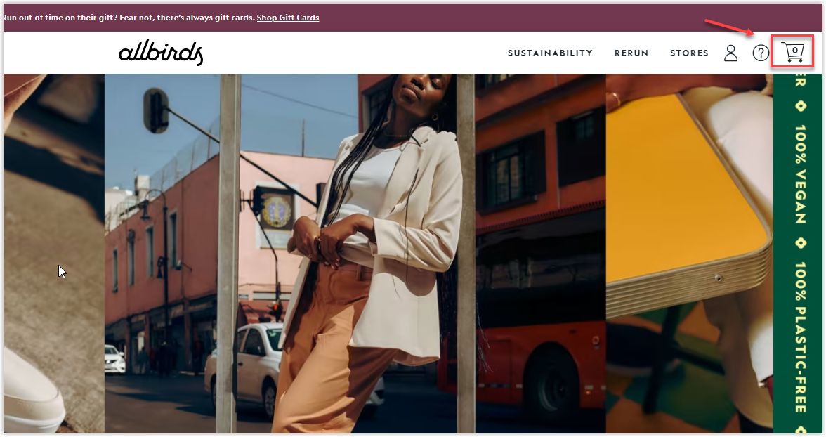
9. Shopping Cart
A well-designed header anticipates what users need and guides them to their destination before they even start searching. Just think about how easy it would be for users to check out if a giant shopping cart icon is prominently displayed in the header. This basket symbol is a beacon, guiding shoppers toward their final destination as they browse and add items to their carts.
If you combine it with a clear path to checkout, your customers will never lose sight of the ultimate goal – seamless order fulfillment and effortless payment.
10. Wishlist
Creating a website header with a “Wishlist” can be valuable for online shoppers. It allows them to easily select a list of products they are interested in, whether for personal use or as a gift. In other words, this feature is a convenient way for visitors to save their favorite items for future reference.
Incorporating a Wishlist into your website header also provides valuable insight into customer preferences and interests, which benefits product development, marketing strategies, and shopping experience personalization.
Most Common Types of Website Headers to Consider
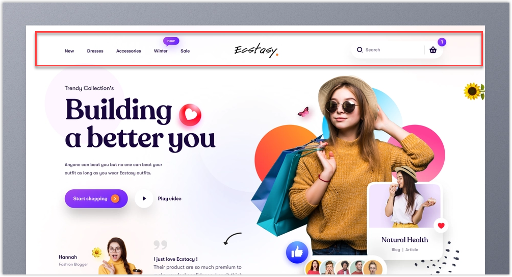
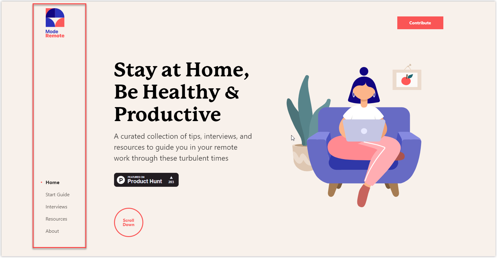
1. Single-Line Header With Left-Aligned Logo
Meet the single-line header, a minimalist masterpiece. Marketing Sumo proves that simplicity can be powerful with its left-aligned logo and only four essential navigation elements, plus a handy contact bar. The left alignment accentuates the logo, allowing it to shine and capture your attention.
Scroll a bit further, and you’ll discover a video infused with humor, conveying that Marketing Sumo is a happy and joyful company ready to work with you.
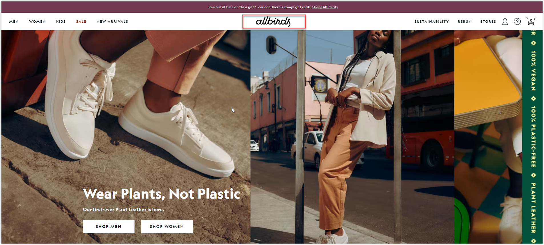
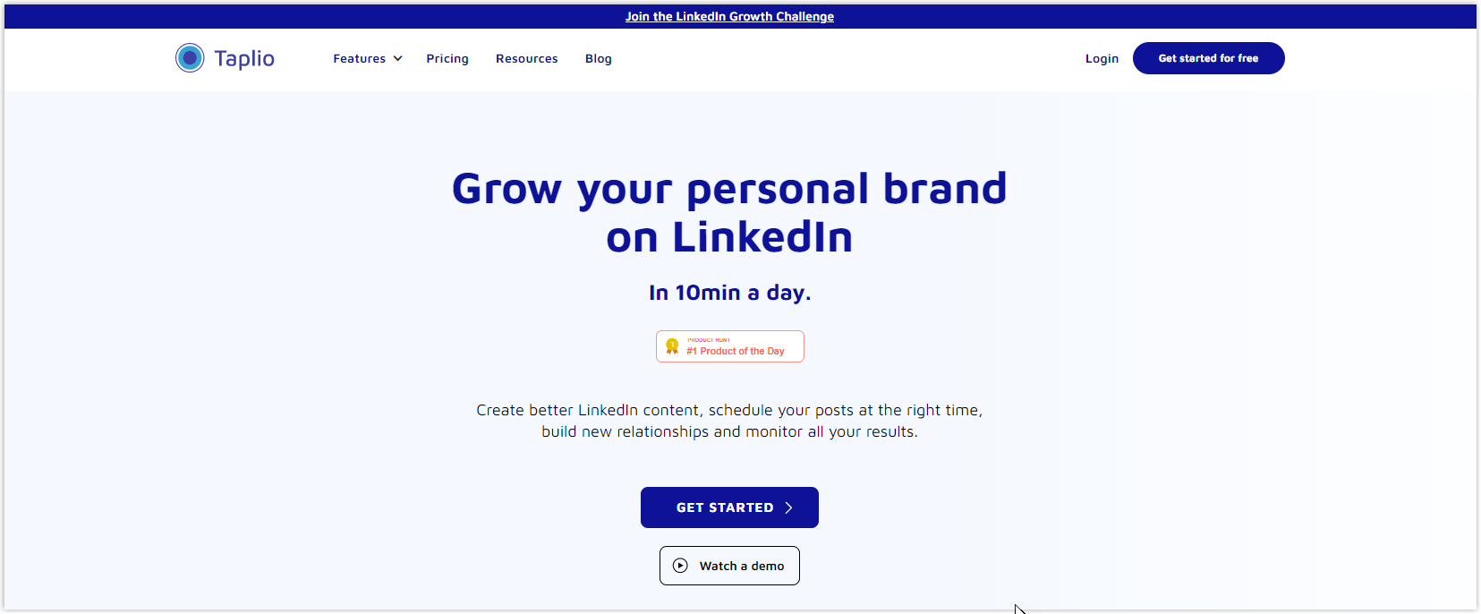
2. Single-Line Header With a Notification Bar
If the header is simple, adding a banner will create excitement. The spotlight draws visitors’ attention to something new, vital, and thrilling.
Recently, Taplio used it to promote its latest growth challenge and motivate customers to join their group on LinkedIn.
On the other hand, One Commerce uses its notification bar to encourage customers to discover their 15 expert advice to speed up stores and get a free e-book.
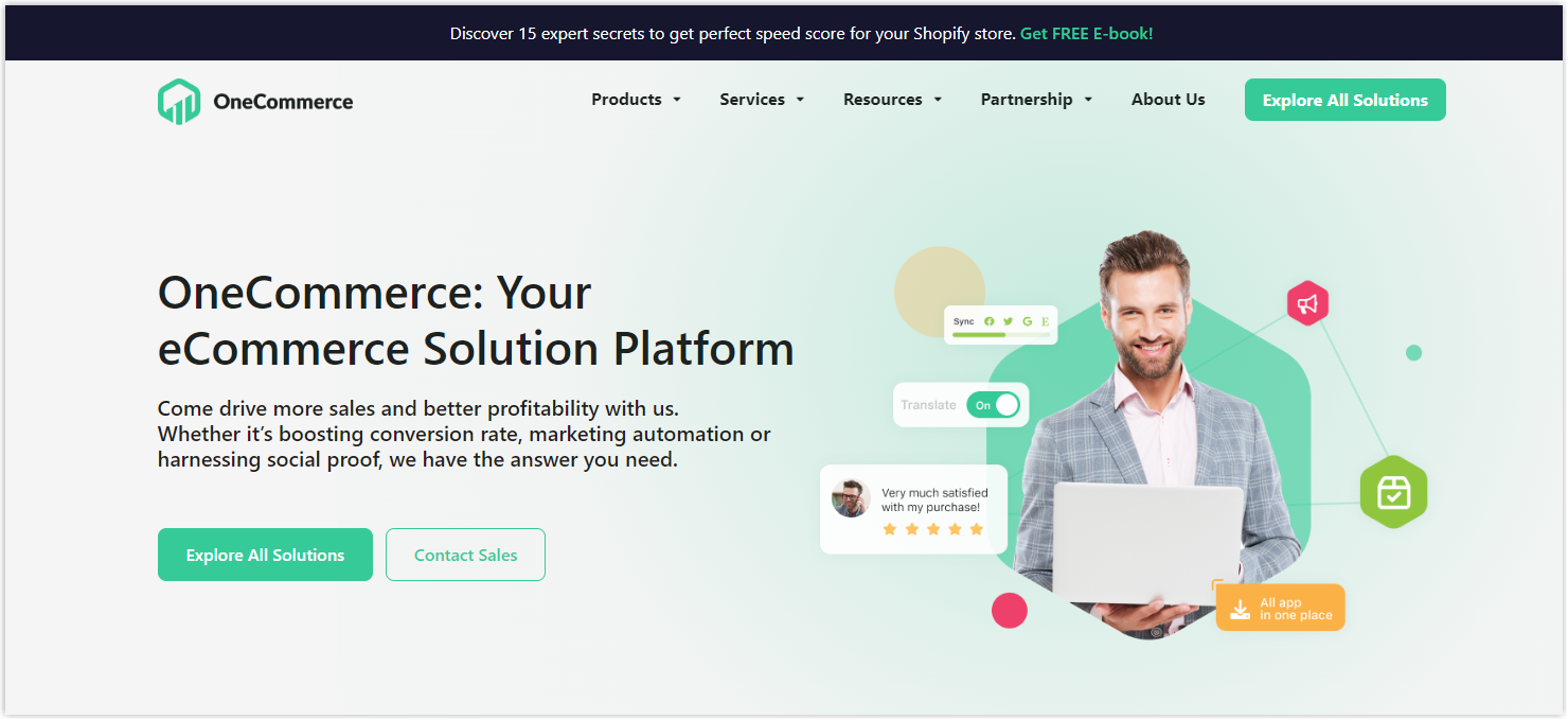
These banners are not just eye-catching; they have a purpose. A clear call to action awaits and invites you to take the next step. And with just a single click, you’ll be transported to a landing page that includes what’s on the banner.
3. Two-Tiered Header
Imagine having access to more than one navigation option you need without feeling overwhelmed. The two-tiered header design elegantly divides the options, making it easier to find what visitors are looking for and allowing them to move smoothly through the website. Say goodbye to cluttered headers and hello to a more organized and seamless browsing experience!
4. Two-Tiered Header With Notification Bar
Step into the world of seamless website design with Amplitude’s innovative solution. They’ve added a bold notification bar above the double-tiered header, creating a buzz about their upcoming conference. It is a perfect match in length to the header, blending seamlessly into the overall design while still standing out.

5. Left-Aligned Vertical Header
If you’re looking forward to creating a website header that breaks away from the traditional design, a vertical navigation menu on the left side of your site is a unique option worth considering.
Instead of having your menu items horizontally aligned, this design puts them vertically, providing a fresh approach. By changing this, you can add a touch of creativity and modernity to your site that will undoubtedly impact your visitors.
6. Right-Aligned Vertical Header
The concept remains the same as above, but the navigation menu has moved to the right, and each item stands vertically. The designers have pushed the boundaries to deliver users a unique and engaging browsing experience.
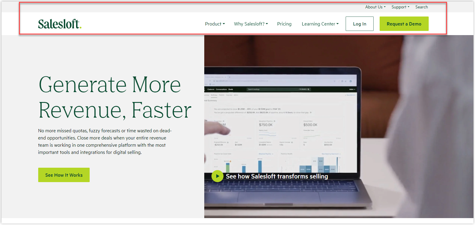
7. Header With a Utility Bar (Sticky Bar)
The header is a trusty companion as users journey through your website. You can firmly anchor it to the top of the page to ensure it stays by their side as they scroll while scrolling. The idea is to allow visitors to access any part of the site quickly, at any moment, without getting lost.
8. Floating Header
As you scroll through Mixpanel’s homepage, the header gracefully follows, creating a stunning floating effect that allows you to see both the top and below of the page. Unlike a traditional sticky bar, the floating header adds a touch of elegance to your browsing experience.
If you ask me which is the best website header to consider, I will say “floating header”; just look at our example, and you will know why:
Try FREE Header and Footer Builder!
Easily create an engaging header and footer for your Magento store in any style without relying on developers or designers. Just by drag & drop.
Best Practices to Design the Best Website Header
1. Keep a Consistent Design
Creating a website header that strikes the perfect balance between prominence and cohesiveness can be challenging. But, with the right approach, it can be a work of art! Your header should grab attention and serve as both a functional navigation tool and a design element that enhances the overall design of your site.
We know that finding the right balance may be subjective, but there are some website header best practice guidelines you can follow: You must ensure that your header’s size doesn’t interfere with the user’s experience with your content. Also, keep the color scheme, fonts, and other visual elements consistent with the rest of your website’s design.
2. Use Clear, Readable Fonts
Your header sits at the top of your page and is home to crucial information and elements. This makes readability absolutely essential. With that being said, your job is to choose a font that not only represents your brand identity but also ensures effortless reading for your audience.
After all, the purpose of your text is to guide and direct your visitors, but it’s useless if they struggle to understand it. Make sure your header font is bold, clear, and easy on the eyes so your message gets across easily.
3. Design a Clear CTA Button
Maximize the impact of your header by including a powerful call-to-action button that leaves a lasting impression on your visitors. This is your chance to capture their attention and drive them to take action.
For example, if you’re running a restaurant website, make it easy for customers to indulge with a bold “Order Here” button. And if you’re a nonprofit, inspire generosity with a clear and compelling “Donate Now” button. Ensure your message is direct, impactful, and speaks to your audience’s emotions. A few well-chosen words can go a long way in guiding your visitors toward the desired outcome.
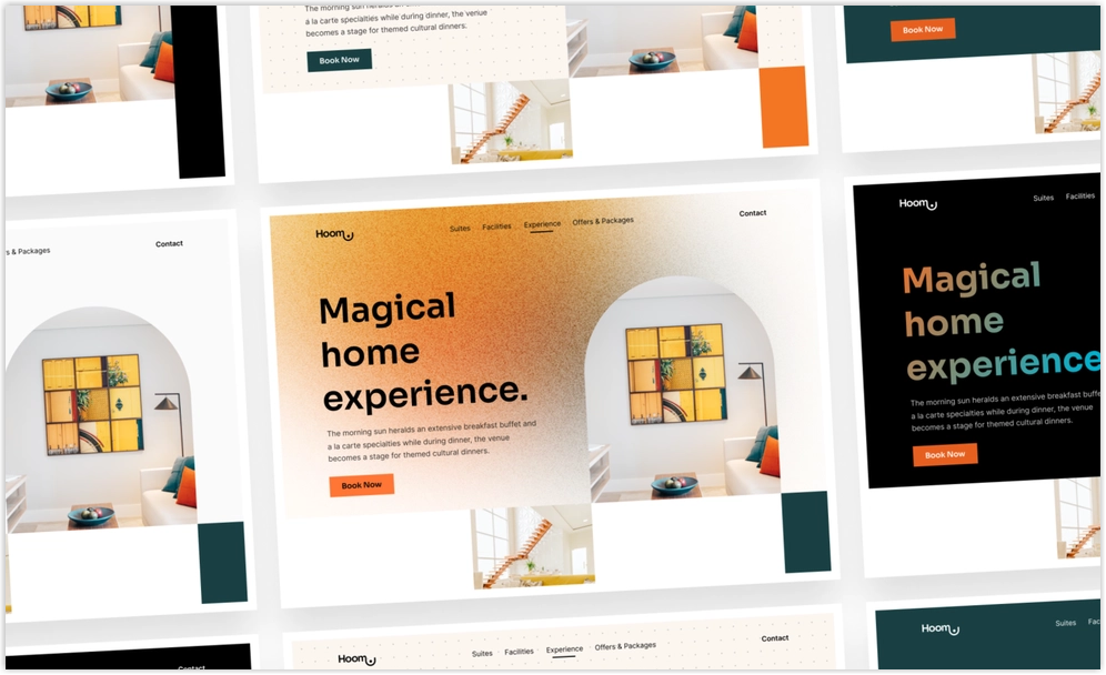
4. Add Illustration or Animation
Your website’s header is a prime opportunity to make an impression on visitors, so why not add some extra creativity to make it stand out? With the power of vector art, it’s possible to add beautiful and eye-catching graphics, illustrations, or even animations to your header design.
These dynamic elements can be any size and will help you surprise and engage visitors with a playful and unexpected touch. So if you have the space to work with, consider using illustrations or animations in your header design to elevate your brand and leave a lasting impact on visitors.
5. Use White Space
The use of white space to improve the layout and design of the page has been in the spotlight for quite some time. You can use it to put a distance between the logo and the rest of the website, creating more emphasis on the logo and making it eye-catching. Eventually, you can see how much white space you can incorporate into the design.
6. Use Color Contrast
When designing your website’s header, there’s one thing to remember: color contrast. The background color of your header should have a minimum contrast ratio of 4.5:1 with the font you’ve chosen. This applies not only to the header but also to any accompanying information displayed in the area. Additionally, consider darkening the page’s background when the header menu is displayed to bring extra focus to the header.
7. Make It Intuitive
Regarding website navigation, it’s best to follow tried and true standards that work well in your industry. Look at what your competitors and top players in your niche are doing. You should stick to what’s familiar and practical instead of trying to be too unique or risky with your design.
8. Make It Sticky
Every website wants to achieve conversions, and you only have 15 seconds to engage visitors and offer them value before they move on. To make the most of this limited time, creating a website header that’s visually stunning and easy to navigate is essential. Keep your visitors engaged by keeping the most important pages within reach and making your call-to-action (CTA) prominently visible.
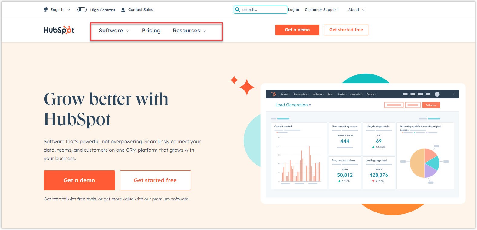
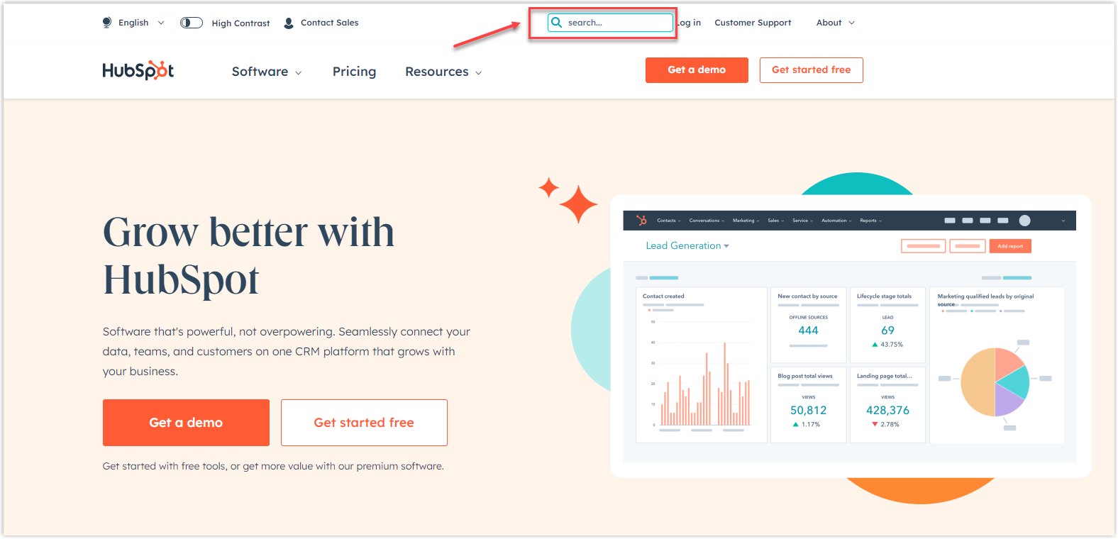
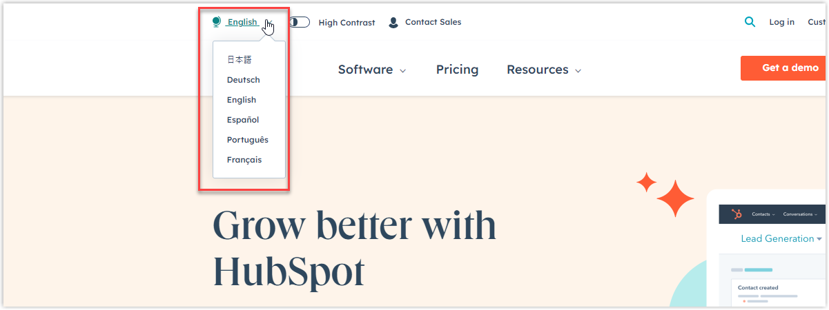
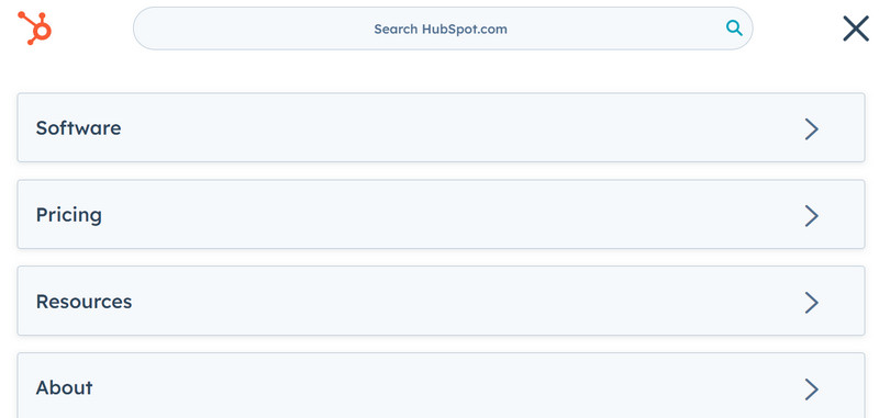
9. Optimize for Mobile
To ensure an optimal viewing experience for your visitors, consider switching to a hamburger menu for navigation. No need to sacrifice essential elements like the search bar or call-to-action button either.
Just take a cue from Hubspot and keep these key features intact:
An Innovative Way to Builder Your Header on Magento
A website header plays a critical role in determining the success of your website. From promoting your brand identity to guiding visitors to the right page, a well-designed header can increase conversions, engagement, and user experience.
If you’re a Magento store owner planning to build an impressive and high-converting header, consider Magento 2 Header and Footer Builder from Magezon, an Adobe trusted partner. With a user-friendly drag-and-drop interface and diverse powerful features, you can easily design or redesign any style whenever you want without relying on developers or designers.
More Magento extensions are also available to create all necessary pages and elements for your website. Don’t worry if you’re not that good with coding because these extensions are the solution.