A landing page for a website is one of the most effective digital marketing tools to convert visitors into leads – potential customers, then open the door to nurturing them into the sales funnels. In this article, I will explain to you:
- What a landing page for a website is
- The differences between a site landing page and a homepage
- What benefits a landing page for a website brings to store owners
- What essentials a good landing page has
After getting all the basics in this article, we’re gonna roll up our sleeves and set to work at once with the tutorial Pt.2: How to Create a Magento 2 Landing Page Using Magento 2 Page Builder
Table of contents
What is a Landing Page on a Website?
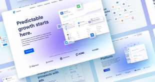
So, what is a landing page? A landing page is a standalone web page designed to convert visitors into leads. This page is attached to different sources, such as other pages on your website, search engines, Google ads, Facebook ads, email marketing, affiliate accounts, etc. After clicking through from these sources, online users will be directed to the landing page for the website and encouraged to perform the desired action, such as signing up, trying the demo, or purchasing a product. Once they have done as expected, the landing page will do the job – getting users to convert. Marketers or store owners then use the information users leave to nurture and guide them through the sales funnel.
Landing pages should be designed to convince visitors to take a single action. In other words, there should not be too many CTAs or navigation links that lead visitors to other corners of your website. If visitors are given many options, they would be overwhelmed to make decisions and perform undesired actions. Even a landing page for a website can have several CTAs, but they often have the same goal. This helps keep visitors focused on the action; then, there is a high possibility that they will convert.
Landing Pages vs Home Page: What Are Their Differences?
If you think landing pages are like other pages on your site, you’re wrong. The differences are all about the purpose. In this part, to help you better understand site landing pages and how they differ from other pages, I will compare them with the home pages.
You may also like: What Are the Key Differences Between Landing Page and Website?
- Fewer or even one single link: A landing page for the website has very few links, sometimes only one link, so users will be more likely directed to your primary objective rather than wandering from one place to another across your site. Meanwhile, once users land on the homepage, they can find many links in its different sections, like the navigation menu, footers, and primary content blocks. The home page serves as a hub that gives us an entire collection of information on your business; therefore, users can click through to other site pages where they can find the information they are concerned with.
- More potent and more specific CTAs: The CTAs on a landing page for a website tend to be more focused and specific (e.g. “Download a free e-book,” “Subscribe to our blog,” “Free 14-day trial”). This makes users know clearly what they are doing next and focus on that action. Meanwhile, homepages wear a lot of hats; it covers general information about a company, such as business fields, products, services, values, partners and customers, etc., so that every audience can learn not only about the company overall but dive deeper into other sections of the website.
- Target audience: Once users end up on a landing page for a website, they have actually been interested in what you offer. Simply put, they have a specific goal in mind – what they really desire and the chance of getting them to convert is undoubtedly high. Homepage, most of the visitors landing on this page are the ones who are not sure about what they really desire; they are just learning about the store as a whole. In short, they are not on the journey to convert right away.

Try FREE Magezon Page Builder demo today
Easily craft your engaging, responsive Magento landing page in any style whenever you want without relying on developers or designers. Just by drag & drop.
Critical Benefits of Landing Page
Still doubtful about the effectiveness that a website landing page can do for your marketing and lead generation efforts? I’ll show how a landing page can benefit you.
1. Leave a Good First Impression on Visitors and Increase Brand Recognition
The first experiences of your potential customers may be on popular pages of your site like the homepage, product page, or catalog listings page. However, in some cases, the first place they set foot on your e-store is your landing pages for a website. So, it’s safe to say that the landing page can be considered the front door to your business. A well-crafted landing page that explains the value of what you are offering and presents a single straightforward action will create a positive impression on your leads. Even if a user doesn’t convert immediately, a well-designed landing page can help raise brand recognition and nurture leads for future sales.
2. Improve Your Lead Generation Efforts
Many store owners and marketers often make the big mistake of directing online users from their Google ads, Facebook ads, or other digital marketing campaigns to their site homepage. Home pages, as mentioned earlier, are home to various business information sections linked to other detailed web pages. This is the distraction or the leading cause that drives potential customers away. A landing page for the website instead of a homepage will keep them on the right track – complete a single explicit conversion action, thereby improving your lead generation efforts.
3. Gain Insights Into Your Target Customers
The site landing page is a great way to give valuable insights into your target customers, such as what group of users or buyer personas are converting, which channels they are engaged with, or what topics your leads prefer. Assume you have a landing page for a website linked to diverse digital locations. Based on the data obtained from your landing page, you discover that most of the users click through to the site landing page from your Youtube ads. And among all website landing pages of diverse topics, the page “Download a free ebook on topic ABC” is the most preferred. Once they end up on the landing page, they often spend more time on some elements like design and imagery. And I bet you know what you should perform next.
4. Boost Website SEO
When you have created a site landing page, you have one more chance to expand your online presence and drive traffic to your website. If all SEO factors, such as the title, headline, URL, and other parts of the page, are well-optimized, your landing page with offers will be ranked high by Google. As a result, those actively looking for information that your site landing page covers tend to convert better. This way, traffic to your website via organic search grows steadily, thereby saving big on advertising while reaching a broad audience. Even better, the website landing page will witness higher traffic and conversion when cooperating evergreen content into your offerings.
If you are interested in SEO or looking to improve your SEO rankings, please refer to our series of articles on this topic here.
5. Use Website Landing Pages as an Efficient Test Tool
You can use landing pages to test whether pieces of content, imagery, design, or other elements are generating a high conversion rate. If you make an overall change to the whole blog or website, it costs much time and effort, not to mention the risk if it fails – which doesn’t fit their target audience’s interest. Rather than that, a single standalone landing page can be the ideal way of testing. It helps bring new ways to boost your lead generation for your business.
Different Types of Landing Pages
Typically, there are 2 main types of landing pages based on their functions: Lead generation landing pages and click-through landing pages.
Get to know other types of landing pages: 19 Types of Landing Pages (+ How to Choose the Right One)
Lead Generation Landing Pages
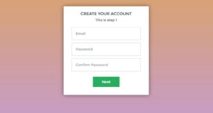
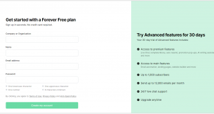
Lead generation landing pages, also called lead gen or lead capture page, is mainly used to collect information about potential customers, such as names, phone numbers, email addresses, or even job title and company. These website landing pages feature a form for visitors to leave their information in exchange for your offerings, like ebooks. Marketers and store owners can use the data to reach out to leads and nurture their interest until they are ready to buy.
Moreover, by leveraging the data collected, you can improve marketing strategies. The marketing efforts will be wisely designed to focus on the target customers more likely to convert. If your plan is to build and strengthen relationships with potential customers or simply get to know your leads better, a lead generation landing page is worth having.
Click Through the Landing Page
Unlike the lead generation pages to collect the lead information, a click-through landing page is designed to encourage visitors to click through another page where the actual conversion occurs. These click-through landing pages are often found on e-commerce websites or sites that are often used for generating sales rather than getting lead information.
Let me take an example of a click-through landing page. We have a landing page for the website with the CTA button “Join to download.” This page describes product details like features and benefits and includes persuasive customer testimonials. When interested customers click on the button, they will be sent to the page offering different pricing packages (Package 1: $99 for yearly access, package 2: $249 for lifetime access). The ultimate goal here is to make them purchase the product or service.
A lead generation page needs to have the essentials of a good site landing page, such as product details or customer testimonials, to engage potential customers and perform the action. I will introduce these essential elements in the “Key factors, an effective landing page should have” part.
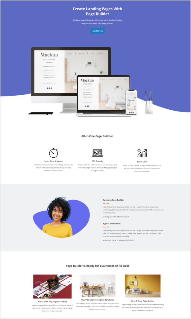
Types of Landing Page Offers
The sole aim of a site landing page is to convert visitors into leads for your business. To this end, you need to offer specific content to them right on the page. There are different types of content offers you can provide on the landing page for a website. Take a closer look at the following.
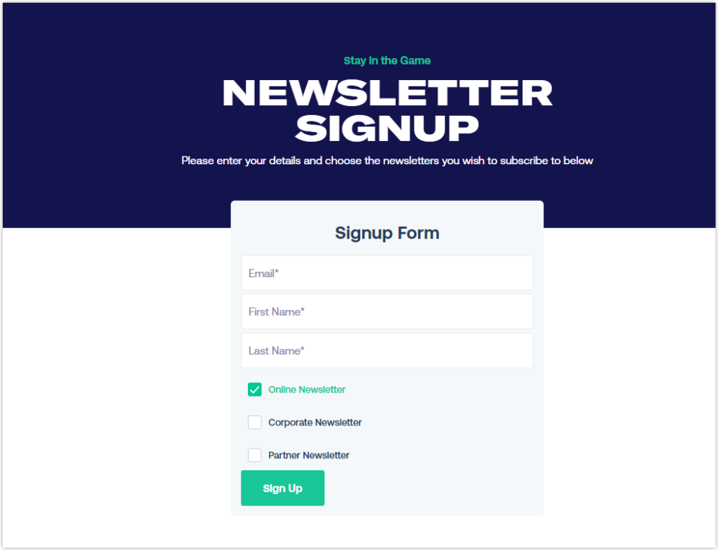
1. Email Newsletter Subscription
Usually, every blog post has a newsletter section where customers can sign up for emails to get the latest news from your business. After leaving their emails and clicking the CTA button on this section, they are done! However, you can also attach the link of a landing page for the website to this button so that customers will be headed to this page for a subscription instead. Here, users can learn more details about what values they can receive, increasing the chances of them taking action – by subscribing to your blog.
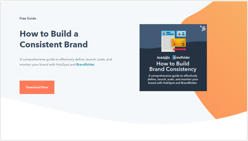
2. Ebooks and Whitepapers
E-books and whitepapers are popular website landing page offer that you’ve definitely come across frequently when you act as an online user. If your materials provide heaps of helpful information and, more importantly, are what users are interested in, Chances are they are willing to fill out the form and leave their personal details to access the content.
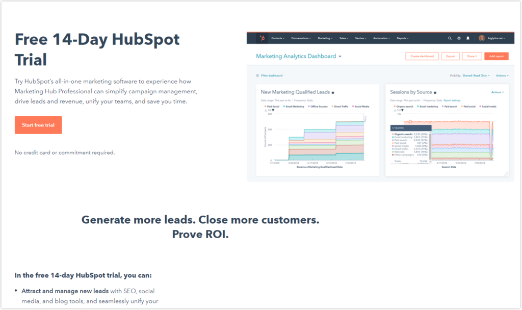
3. Free Demo Trial
If you have planned strategies to market your new product or service, providing a free demo trial is definitely a must thing on the checklist. In this way, users must leave their personal information in exchange for your landing page for the website offers. Those who have provided their details for the demo really care about what you are selling. These leads are reaching very close to the purchase journey. So, don’t miss out on the opportunity to follow up with these potential customers, paving the way for the sales team to seal the deal.
4. Online Course Enrollment
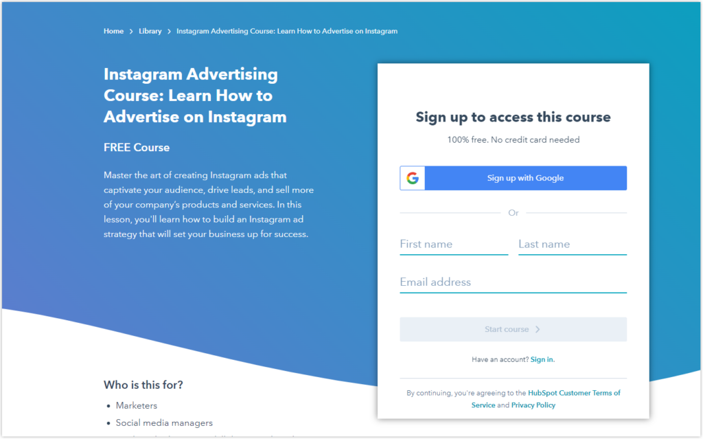
Are you offering an online course and want to capture more leads to know the course and sign up for it? So a well-crafted landing page is an effective strategy you should consider. An informative landing page doesn’t just provide potential learners with a comprehensive course overview. But it is also another avenue to captivate and nurture leads. In addition, users, after enlisting in the course, can find it more convenient to approach you through the website landing page as a private channel to ask for help or feedback on their performance.
5. App Download
If your business is developing a mobile app for a product to enhance customer experiences, this offer should have its own site landing page. This is also where you can capture leads by encouraging visitors to download your app. Using Google Analytics, you can get the picture of who is dropping into your landing page and downloading your software. Then, get the best out of the data to optimize the page and have the experiments under your belt for future marketing campaigns.
6. Community Membership
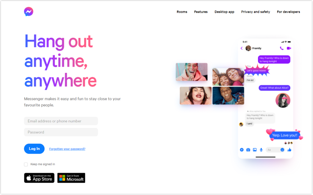
Fostering a relationship with customers is the key to your success. A dedicated avenue like a site landing page to interact with users is worth trying. By creating a landing page, you can invite users to sign up to be a member of your business. If they give the nod, there is nothing more to say. But if they don’t, come on, it’s just an invitation. So try your hand at building community among customers. Good things will come for sure.
7. Event Registration
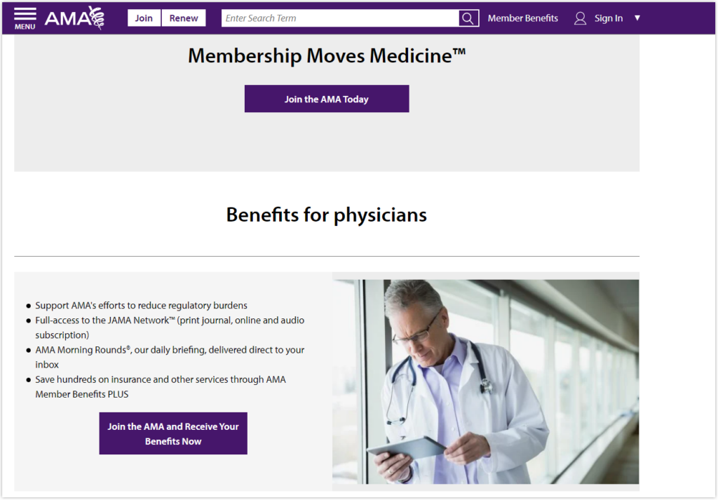
If your business thrives on events – perhaps you should build a landing page for each event. This approach helps attract the audience’s attention, and keep them updated with the sessions and keynotes leading up to the event. Like most landing page offers mentioned earlier, event registration helps compile information on your audience. Thereafter, you can use this data to convert into your event attendees.

Before You Build a Landing Page, Determine the Following:
Before creating a landing page, you must define what you want to achieve from this standalone page – Maybe promote an online course, invite the audience to join your event, or expand your subscriber list. Make sure you know from scratch what purpose this landing page serves.
Once you have the goal, the next step is to clearly explain the value of what you are offering; in other words, you need to answer the question, “What benefits do they receive from your offerings?”.
Then you can do keyword research for your landing page. To make things easier, ask yourself, “So, what keywords do people use for their problems that your offering can address?” As you have dealt with this question, your future landing page will be found by online searchers intrigued by your offerings.
Lastly, it’s time to put your landing page together. You need to know and understand the main components of creating a specific landing page.

Try FREE Magezon Page Builder demo today
Easily craft your engaging, responsive Magento landing page in any style whenever you want without relying on developers or designers. Just by drag & drop.
What Makes a Good Landing Page?
1. A Clear, Concise, and Benefit-oriented Headline
A headline is the first thing users see when they visit your landing page for a website. If the headline is not clear and compelling enough to capture their attention, they will likely navigate away. According to a study by Time, online users spend no more than 15 seconds on a webpage. For that reason, you need to make sure the first thing on your landing page – the headline should be clear and concise. It should indicate clearly the end benefit of your offering in one short sentence.
For instance, you are offering a free e-book of your product. Rather than saying “Ultimate Guide,” the headline would be way better with the more exact copy “Instagram Influencer Marketing Strategy Guide.” One thing to note is that if your headline is creative and funny but doesn’t convey the message or adequately causes confusion among users, it’s no good to use it. A straightforward and benefit-oriented headline is more likely to convert.
Below are examples to illustrate what a clear and concise headline looks like.
- Free Ebook: 15 Emails Everyone Should Send
- Instagram Influencer Marketing Strategy Guide
- Subscribe to Magezon Blog
- Instagram Influencer Marketing Strategy Guide
- 30-day Free Trial for all accounts
- Build a Fast, Highly-Converting Landing Page for the Website
Read more: How to Write Great Landing Page Headlines (That Get Clicks)
2. Short, Persuasive Subheadings
If the headline on a landing page helps draw users’ attention, the subheadlines right under it, often with a smaller font, help you draw them deeper into your page. These supporting headlines give users a more specific idea of the offer they are trying to get: What are you offering? For whom? And why is it valuable? All these things that could not be fitted into a commonly concise headline can be put together in the subheadlines.
Although it should be deemed more detailed than the predecessor, it doesn’t mean you have to explain everything in the subheadline. Just enough is the best. A good subheadline ranges from 10 to 30 words. A small note is that the headlines sometimes come after the supporting headlines. However, headlines are still headlines. You need to design it with a larger font or distinctive font color.
Here are some specific examples of headlines with their subheadings:
- Get a fast, free web browser: One browser for your computer, phone, and tablet.
- Free Landing Page Builder: Create and test beautiful website landing pages that generate leads and look great on any device – no designers or IT help required.
- Magento 2 Scroll To Top: Make browsing long pages a pleasant experience with a highly customizable scroll-to-top button.
- Learn the science behind the art of winemaking: Fill out this form, and we’ll enroll you in free sample lessons on sparkling wine.
3. Reinforcing Statements (Optional)
Reinforcing statements are one of the landing page elements that tell users what makes your offerings unique and different, along with headlines and subheadings. These statements are a way to remind them of your unique selling proposition as visitors are scrolling down on a long page.
Thy are considered a second chance to convert the leads if they are distracted by a long page. For that reason, it makes sense when reinforcing statements tend to be placed in the middle of the page.
4. Relevant Images
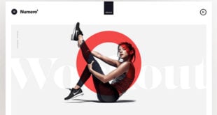
If a landing page is all about the content in text, even super clear and compelling copies, it is a real shortcoming. Instead, you can have compelling images that can stick with people longer than any copies. Because a picture says a thousand words, as they say.
You can start your landing page with a large, eye-catching (hero) image. Also, you can use images for the cover of downloadable ebooks, screenshots of videos or webinars, or discount announcements of products and services.
- The chosen images should be relevant, provide something visual that matches the text, and enhance the look and feel of the page as a whole.
- Make sure it’s also high quality, so potential customers have a good impression of your professionalism.
- The images should reflect your brand to increase brand recognition among potential customers.
- There is a fact that when you include authentic images that show that people are using or enjoying your products or services, it must be a plus for higher conversions. Because that is a great way to tell users, they can trust you and your product. So, use compelling design graphics and photos of real people (if possible) to optimize your lead generation efforts.
- Visualize what users can get. Not everyone spends time reading the copy you write, especially lazy folk. Hence, images or custom illustrations are life saviors that tell stories about the landing page for the website in a visual way. So, try to be creative with images to bring every user the best experience.
5. Relevant Videos
For the most part, videos are among the components to get a lot of attention and engage visitors with your offerings. Studies conducted by Eye View Digital show that videos on a website’s landing page can boost conversions by up to 86%.
In fact, through a video, you can explain all about your offering in the most visual way which you can’t do with texts or images. Similar to a good copy, a good video should help users understand your offerings first.
Don’t challenge their patience with a long video. Cut off all unnecessary stuff and show the most important things only. Make the video eye-catching with graphic designs, catchy music, and emotional voice-over so that customers can’t take their eyes off it.
6. Summary of Benefits
As mentioned before, the main headings provide users an overall idea of what you are offering and why it’s useful. Those alone could not be enough to persuade users to perform the desired action. For that reason, the website landing page needs to include content that describes benefits and features.
A feature is functionality or characteristic that a product or service has, while a benefit is what customers can obtain with this feature. For example, Our Magezon Page Builder comes with an intuitive drag-and-drop interface, a feature. This box feature helps users create a visually stunning website without touching any line of code, which is super convenient for those who have the slightest idea about coding. This is a benefit.
Perhaps you may have heard that there is no need to mention features but benefits. However, to increase conversions, you should showcase features and benefits together – but start with the benefits.
Instead of introducing the benefits in a paragraph, list them in bullet points to quickly scan. Besides, don’t just list dozens of features. Try to think from your ideal visitors’ perspective to show off the good features.
7. Social Proof
No matter how hard you try to convince users that your offerings are the best, users still have more and less doubt about it. This doubt will faint until they have heard someone else respond something positive to your products or services. The truth is, the decisions we have made so far have been, to some extent, influenced by people around us. Hence, to encourage users to fill out the form, or download a free trial demo as expected, adding social proof is an excellent way to go.
Social proof can be demonstrated in the following forms:
- Customer Testimonials: Quotes from satisfied customers that show how your product or service helped them address their problem
- Case studies or a link that directs users to the case studies
- Embedded posts from social networks like Facebook, Instagram, Twitter, etc.
- Video interviews
- Logos of companies & partners as your customers
- Review scores from your website or other prestigious websites
- Several users, downloads, events, attendees, etc.
Once you understand social proof’s necessity, keep some best practices in mind. First off, what you have shown as social proof on the landing page is truthfully what past customers (or users) have thought and spoken about you and your offerings. If you fake it and people later discover it, it’s tough to win their hearts back.
Second, make sure social proof is as specific as possible. If the landing page is about the product, you need to indicate who bought it (Buyer’s name, age, job, and actual photographs), when they purchased it, what problems they were facing, and how your product resolved their problem. A compelling testimonial, in general, is one that users can check and verify who has given.
8. A Conversion Goal (Your Call to Action)
You may be interested in 25 proven CTA examples across all platforms
Call to action is undoubtedly the most critical factor of a website landing page. Every other factor on the page appears to ensure visitors will end up on the CTA button and then convert – which is the ultimate goal you want the website landing page to accomplish. This button is often placed on a form on the landing page or a click-through page.
Here are the best practices for creating compelling CTAs:
- Say no with non-specific button texts like “Submit” or “Click here.” People tend to prefer receiving to submitting for psychological reasons, so you should avoid those texts. Instead, try to be more specific by showing visitors precisely what they will receive after some clicks. The text “Get a 30-day trial demo” may work better than the one “Download demo,” right? Plus, make sure the button text is short and sweet.
- Make the CTA button large enough. Use a unique text color relative to the button color. Utilize an eye-catching button color that stands out from the rest.
- Don’t forget that every landing page serves only one goal. Also, a visitor lands on your page for one reason – get your offerings. Keep them on the right track by avoiding unnecessary CTAs and keeping navigation links on the page to a minimum. Hence, users will quickly receive what they are trying to get; you can also capture the leads without hindrance.
- Ensure nothing will come between your visitors and the conversion (Popup, for instance). If possible, let your visitors convert in a single click.
- Keep the form short with a few necessary fields, such as names and email. The more fields visitors have to fill out, the higher the chance of them navigating away. However, if your priority is to capture fewer but higher quality leads, you should consider a long form.
9. Privacy Policy
Whenever you want visitors to leave their personal information, you need to clarify what you’re going to use their information for. To this end, you can include a link to your privacy policy or a statement that your company won’t sell its information to others. Due to that, they are more willing to fill out the form. Of course, you have to stick to what you have promised; otherwise, you will lose visitors to the competitors they can trust.
| Choose an institutive landing page builder for yours: 10+ Best Free Landing Page Builder to Capture Leads 2022 |
Wrap It up
Alright, now you must understand the fundamentals of an ideal landing page for a website. So, it’s time to start out on your own.
If you are an online merchant, especially those with a Magento-based store, you can refer to this tutorial, “P.2: How to Create a Magento 2 Landing Page Using Magento 2 Page Builder” you can reflect on what you have learned from today’s article.

Try FREE Magezon Page Builder demo today
Easily craft your high-converting Magento landing page in any style whenever you want without relying on developers or designers. Just by drag & drop.
 Magezon Blog Help Merchants Build Comprehensive eCommerce Websites

