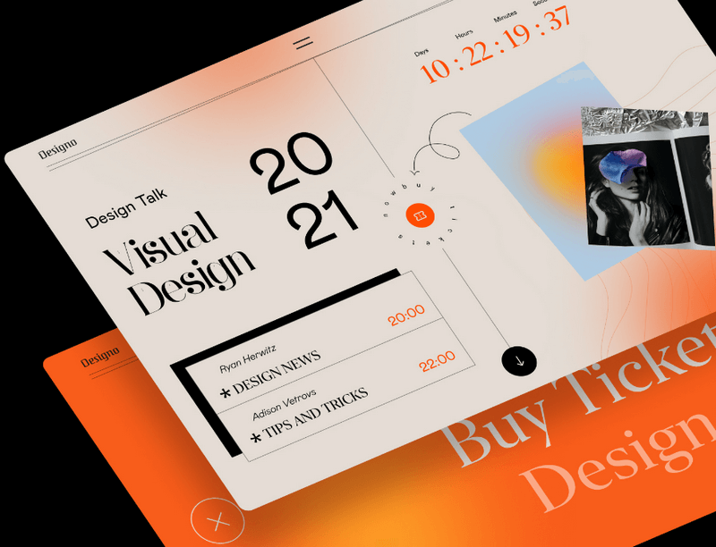
In web design, orange stands out as a vibrant and energetic color. It adds warmth and enthusiasm to any website, making it visually appealing and memorable. So why not infuse your website with the power of orange to captivate visitors and boost your brand?
If you’re unsure where to start with an orange website design, don’t worry. We’re here to spark your creativity with 25+ hand-picked selections of unique orange websites from different industries! Whether you’re creating your first website and shaping your brand’s identity, or simply looking to freshen things up and increase conversions, we’ve got you covered. So, no further ado, let’s discover chosen design ideas below to create your very own website.
Table of contents
I. Basics of the orange color
1. The meaning & how to use orange
Orange is a lively and energetic color that brings enthusiasm and a youthful feeling. It’s a favorite among companies trying to reach younger people, but that doesn’t mean orange isn’t just for the young crowd. If a business wants to convey strength and vitality, they can include orange in their branding, along with other colors that go well with it. Some popular examples of businesses that use orange in their branding include food & beverage, sports, and fashion.
Also, orange symbolizes the warmth of autumn and the last of the harvest season. Every Halloween, the store owner adds some orange color (along with their brand’s colors) to make their website look festive and fun for the holiday season.
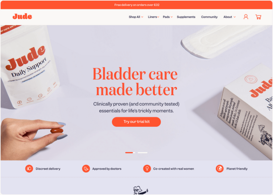
However, because orange is such a bright color, it’s better to use it sparingly as an accent color rather than in large amounts.
If possible, you should learn how to combine orange with other colors for your website. For example, blending orange with lively colors like yellow and green can give your website an exciting and dynamic appearance. On the other hand, if you want a more professional look, tone down the vibrancy by adding shades of gray or black. If the bright shades of oranges are too intense for your taste, consider its lighter or darker ones.
Throughout the process, you can get a sense of how different colors work together. Next part, we’ll go into greater detail to further your understanding.
2. Colors that go well with orange
Each color has its own unique personality that can either go well together or clash. It’s like inviting people to a party – you want to invite those who get along to avoid any conflicts. Similarly, when it comes to colors, you should combine them with other colors that complement each other to avoid straining your eyes. Here are common orange color palettes we’ve compiled:
2.1. Analogous (The warm colors)
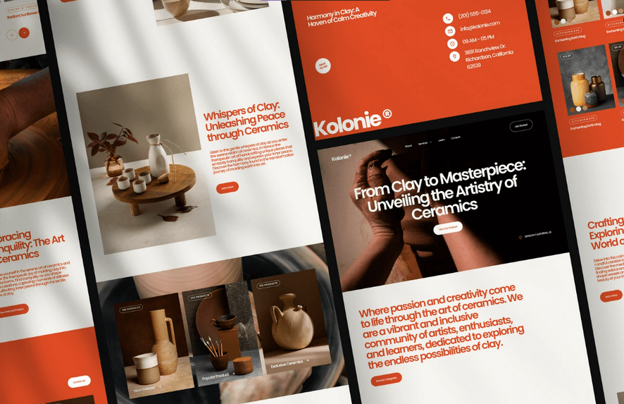
Red-Orange-Yellow
Warm colors evoke images of the sun, heat, and fire. When orange is put together with other warm colors like red and yellow, they convey a sense of passion and energy in your visitors.

Source: Chirpley
Red-Red Orange-Orange-Yellow Orange
Warm colors catch people’s eyes due to their liveliness. When you combine orange with red, they create a sense of urgency and motion. They inspire action and motivate your visitors to get things done.
2.2. Monochromatic
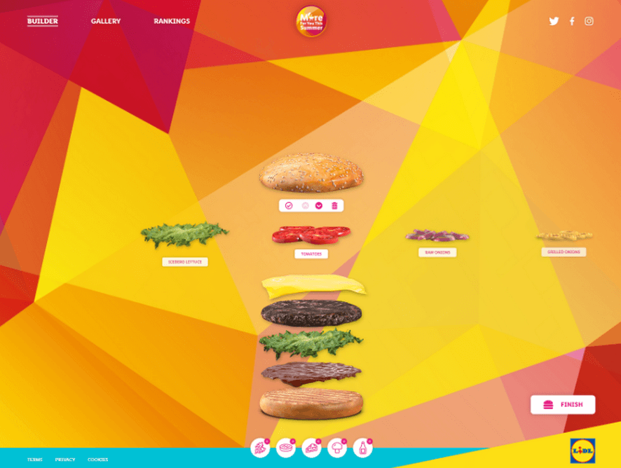
Light Orange-Orange-Brown-Dark Brown
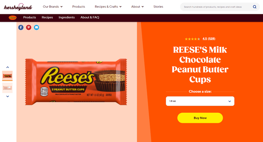
Orange can sometimes be intense. Therefore, you should consider using different shades of orange or mixing orange with earthy tones for your site’s harmonious look. As a result, this will make your content shine more.
Source: Hersheyland
2.3. Opposite warm colors (Complementary)
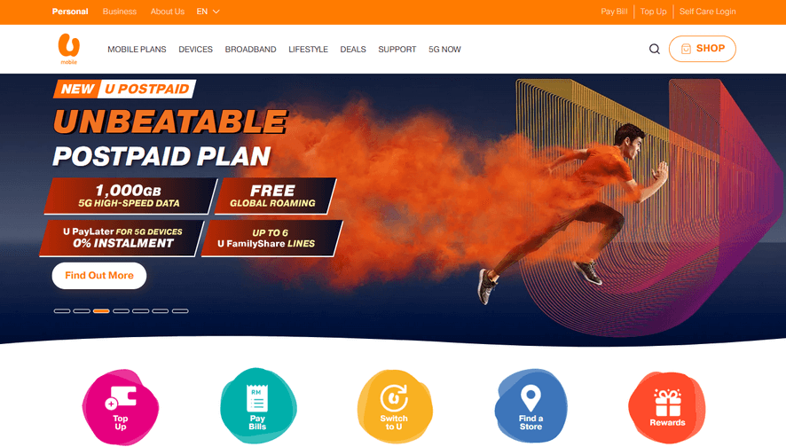
Orange-Blue
Complementary colors are pairs that are opposite each other on the color wheel. In the picture below, blue is the main color, and orange is its complementary partner. When you combine these two colors, it creates a strong contrast that looks really nice to the eyes.
Source: U Mobile
2.4. Split complementary
Orange-Blue Green-Blue Violet
The split complementary combination involves using three colors instead of just two. You can use the color wheel to help you with this. Now, begin with your main color, which in this case is orange, and then combine it with the two colors right next to its complementary color instead of using the complementary color itself.
However, when utilizing this type of color combination, if not careful, your website can become cluttered and unpleasant to look at. So, it is best to use additional colors sparingly to create a clean look while highlighting important elements in your website design.

Source: Dajemyslowo
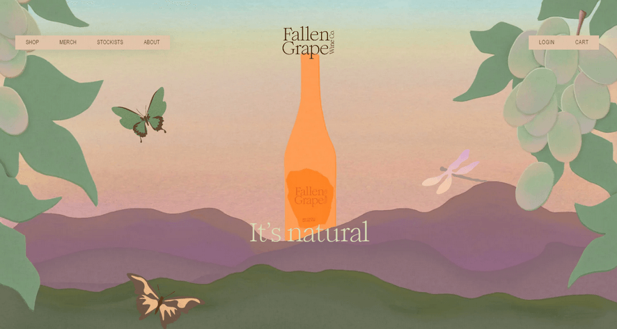
2.5. Triadic
Orange-Green-Violet
A balanced triadic color scheme consists of three evenly spaced colors on the color wheel. In this case, we also have orange as the main color, the two other colors as accents are green and violet. Using these additional colors adds vibrancy and playful touch to their website.
Source: Fallen Grape
→ You might like: 11 Most Common Website Layout Ideas (+ How to Choose)
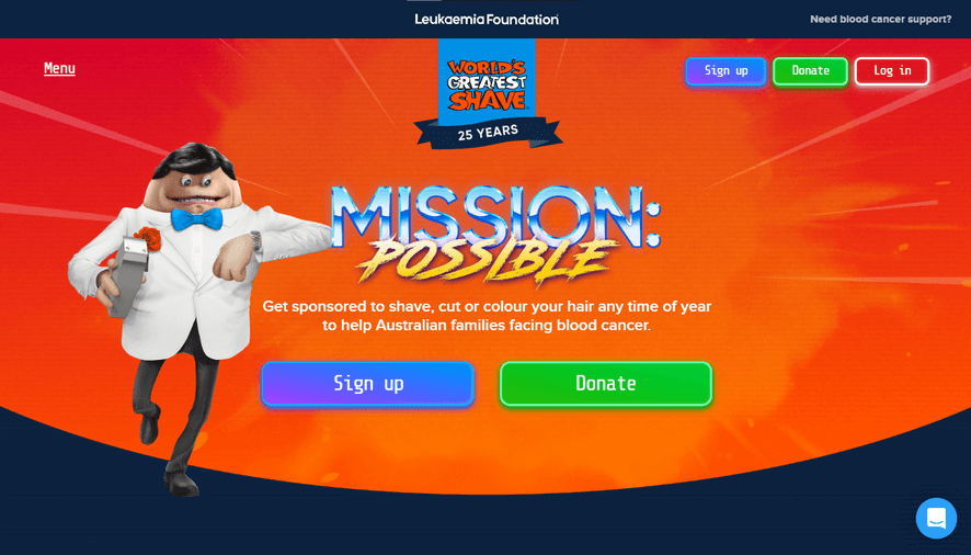
2.6. Tetradic
Red-Orange-Green-Blue
The tetradic color scheme is all about using four colors. It’s the brightest and most vibrant color scheme because it includes two pairs of complementary colors. You can use this scheme to add style and appeal to your design. And we have red, orange, green, and blue in this example.
Source: World’s greatest shave
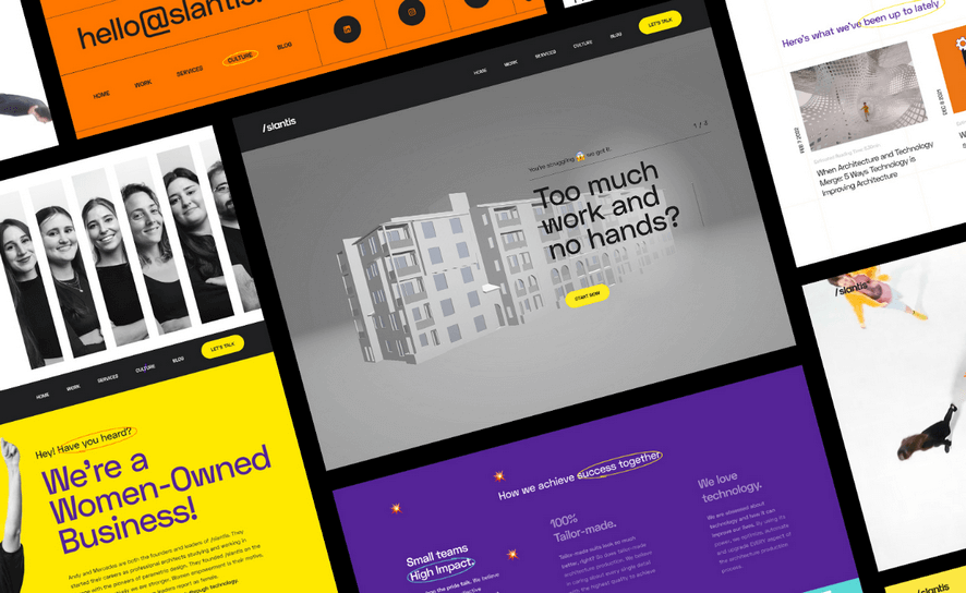
Orange-Yellow-Blue-Violet
Another example of a tetradic color scheme is orange, yellow, blue, and violet. Putting them all together creates a sense of optimism, openness, and diversity. It gives your website a lively and uplifting appearance.
Source: Slantis
To sum up, selecting the right orange color palette for your website is crucial as it impacts the overall impression, message conveyance, and mood it sets. Whether you choose warm analogous hues, harmonious monochromatic tints, contrasting complementary colors, or vibrant tetradic schemes, each option can create a unique and captivating visual experience for your visitors.
Now, let’s dive into the next part, where we’ll explore 25 of the best orange-themed website examples that will inspire you.

Try FREE Magezon Page Builder demo today
Easily create your engaging, functional Magento website in any style whenever you want without relying on developers or designers. Just by drag & drop.
II. 25 best orange website examples to inspire you
1. Cubicle Ninjas
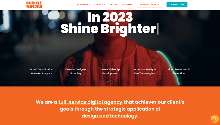
You should definitely check out the amazing orange-themed website by Cubicle Ninjas! What makes it so captivating is their strategic use of orange to reflect the essence of their services. Despite the abundance of details on the page, they skillfully guide users toward the most crucial information. From their logo to the navigation menu and backgrounds for important messages, orange is used to represent their services. Specifically, the logo prominently features a vibrant orange color, making the brand easily recognizable. The text on the navigation menu is orange, and when you hover over any category, its background also turns this color, bringing a consistent and interactive experience.
This agency strategically uses orange to highlight the background of “Results as Exceptional as Our Clients,” which helps attract and build trust among potential customers.
2. Armadillo
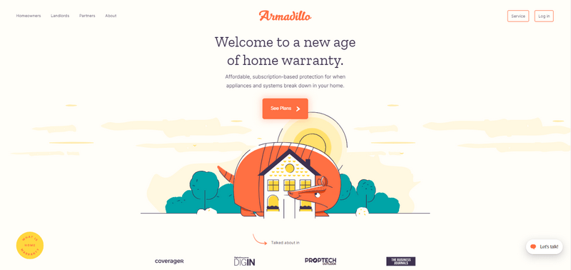
A vibrant orange color scheme is perfect for a fun and playful website. Armadillo’s homepage is an excellent example of that. This page includes orange that goes well with other vibrant colors such as yellow, green, and dark purple creating a bold and enjoyable website.
Yellow represents success and happiness, while orange evokes strong emotions like passion and strength. Although both colors are bright and intense, they complement each other well. And when green is added to the mix, it contributes to a harmonious overall look without becoming too overpowered by the orange and yellow.
3. Hubspot
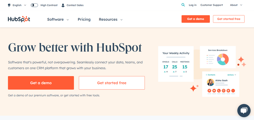
Previously, Hubspot’s website design predominantly used orange and white for the main buttons. However, they recently made some changes to improve the user experience. They introduced a lighter shade of orange for the background and dark blue for the headline and subheadline, which made the website’s overall appearance brighter and more visually appealing.
With its distinctive orange color, Hubspot cleverly utilized this color to draw users’ attention to the essential buttons and encourage people to click. Lighter shades of orange in the background help both create a positive vibe and partly reflect the brand.
4. Air Inuit
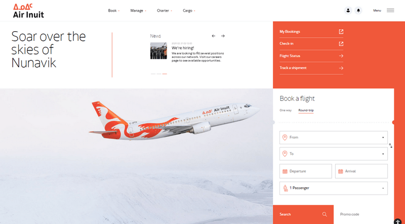
Air Inuit is another great example of how to use the orange combination well. They create a nice contrast by using orange elements against a white background.
What’s more, Air Inuit sometimes adds an orange alert bar at the top to draw user attention to important information, so that users can avoid any potential issues. To draw visitors’ attention to their programs and offers, they use bright orange backdrops on their cards. These backdrops help highlight the content and encourage people to explore their programs and offers.
5. TrackOlap

Opposite each other on the color wheel, orange and blue are complementary colors. That’s why when used together in design, they create a striking visual contrast.
TrackOplap leverages this color contrast to make their website pop. The orange is used in call-to-action buttons, which ensures that visitors are drawn to these CTAs, even on a predominantly blue website.
Look down a little bit. The main title, “TrackOlap Will Walk You Through Every Step,” stands out with a bright orange background, catching people’s eye. They also use lighter shades of orange for some icons, headings, and text which adds warmth and nicely contrasts with the overall white background.
6. Pineapple

Although Pineapple isn’t overall orange, the website cleverly incorporates the orange to highlight important elements such as their brand message of “enriching human lives” and fostering “business growth.” Furthermore, the perfect combination of orange and black creates an impressive, modern overall look. People may be hesitant to mix black with color, but when paired with orange, black makes the orange elements stand out in a captivating and powerful way.
→ You may also be interested in: 45+ Awe-Inspiring Parallax Effect Website Example
7. Oh La La Macarons
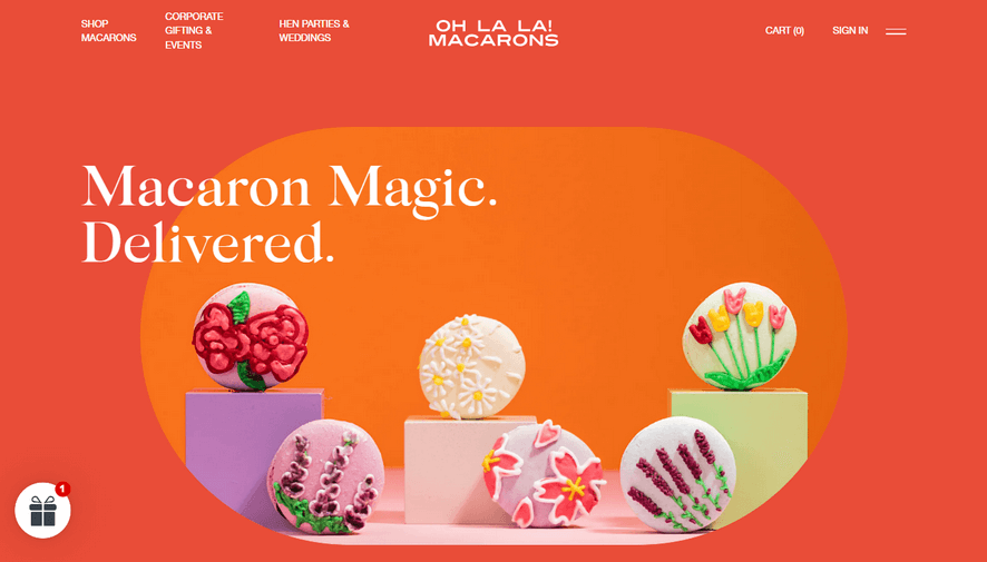
This is the very first website where you can join and explore a unique orange-themed experience. The website smartly uses orange and other warm, bright colors such as yellow, and pink to make their sweet macarons look even more colorful and vivid. It also features complementary colors like yellow and white, which go well together. And the product images on the website are awe-inspiring too!
8. SoundCloud

When you choose a vibrant color, it’s important to balance it with the other elements. That’s exactly what the team at SoundCloud did. They achieved a well-balanced web design by harmonizing orange, black, white, and gradient images. They also added skillfully playful line art in the right place. The end result is visually pleasing and easy on the eyes.
9. Cornerstone
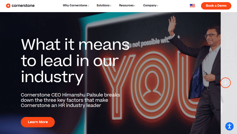
Cornerstone’s website uses orange as an accent color to enhance the appeal of a predominantly white website. Orange is an intense and prominent color, which is a great choice for important elements like logos and CTA buttons.
The website achieves a minimalistic look by using orange for highlighting key elements of the design that neutral colors such as white, black, and gray dominate. With the limited color scheme, the website is more likely to get more conversions.

Try FREE Magezon Page Builder demo today
Easily create your engaging, functional Magento website in any style whenever you want without relying on developers or designers. Just by drag & drop.
10. Gusto

Gusto’s website primarily features orange accents for the logo, CTAs, and light orange in the background. By incorporating orange into a simple design like this, it effortlessly grabs visitors’ attention.
Gusto places a small green testimonial as an interesting touch on the right side, ensuring it doesn’t go unnoticed. It’s an effective way to decorate the website while consistently maintaining the theme and color scheme.
→ Related blog: Top 70 Awe-Inspiring Green Websites (+ Color Schemes)
11. Boost
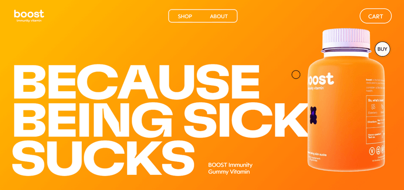
When you think of vitamins, what color comes to your mind? That’s right, it’s orange! The orange is strongly linked to health and immunity, mostly because of its association with Vitamin C. So it’s understandable that Boost Immunity Vitamins choose the orange color scheme for their website. Besides, the vibrant purple color, which complements orange, adds a nice pop and makes everything on the product label really stand out.
12. OH! Media

The Oh Media website also follows the same path as most websites we mentioned earlier. It mainly uses black and white colors for regular things but adds touches of orange to make interactive elements, like buttons and transformations, more colorful and engaging for users. Doesn’t their website look like an aesthetically minimalist magazine?
13. IdeaScale
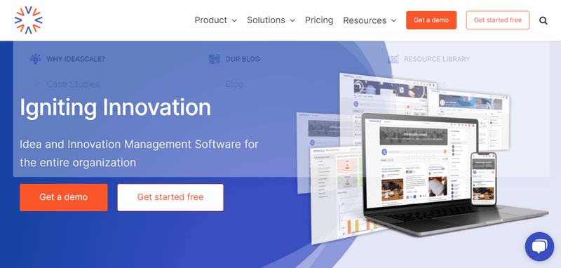
This website reminds me of TrackOlap because they both use colors in a similar way. They feature a captivating color scheme that has CTA buttons in a bold orange color against a blue background. This smart use of color draws users’ attention to the CTAs throughout the site.
Notably, when clicked, the navigation bar’s CTAs change to a light orange shade, providing visual feedback to users. The focal point of the page revolves around two main CTA buttons, each serving distinct purposes.
The first button adopts a bold orange hue with white text to emphasize the more important action. In contrast, the second button has a white background with prominent orange copies. This thoughtful approach to CTA design creates an engaging user experience that motivates visitors to take the desired actions on the website.
14. Vecteezy
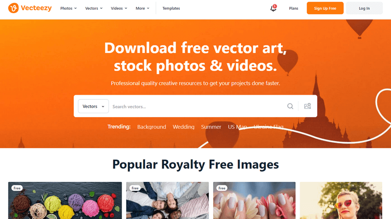
If you’re a designer, you’ve probably heard of Vecteezy, a website where you can find free vectors, stock photos, and videos. Among all their choices, they decided to use a lively orange color for their homepage background, logo, and sign-up CTA, along with some simple darker orange graphics.
As we all know, orange is associated with creativity. This could be one of the reasons why a creative brand like Vecteezy picked this color.
15. Magestore

With orange dominating the Magestore logo, it’s not that hard to guess this color is used throughout the website of this leading POS company. The website color scheme revolves around different shades of orange. The website maintains a clean appearance using a limited color palette. Additionally, the contrast between orange and neutral backgrounds ensures that critical information is easily noticeable.
For Magestore, incorporating shades of orange reinforces consistent branding. The company also integrates images featuring orange and earthy tones, aligning with the website’s color palette.
16. Fanta

Many of you probably are all too familiar with Fanta, a world’s well-known beverage brand. The way they use the color orange is quite similar to Boost: using natural orange color of the product they provide. In the case of Fanta, orange is used to symbolize their orange juice.
Moreover, the company cleverly uses a slightly darker shade of orange to make the juicy drops of orange stand out. Speaking of Fanta, we can’t forget about their logo and the blue healing sus-lines that add a nice touch to the orange background. Everything looks interactive and well-coordinated.
Unlike other websites that use orange as an accent, Fanta uses orange for many large areas. This creates a fun and exciting vibe, easily grabbing the attention of their target audiences while showcasing the brand’s unique identity.
17. Cision
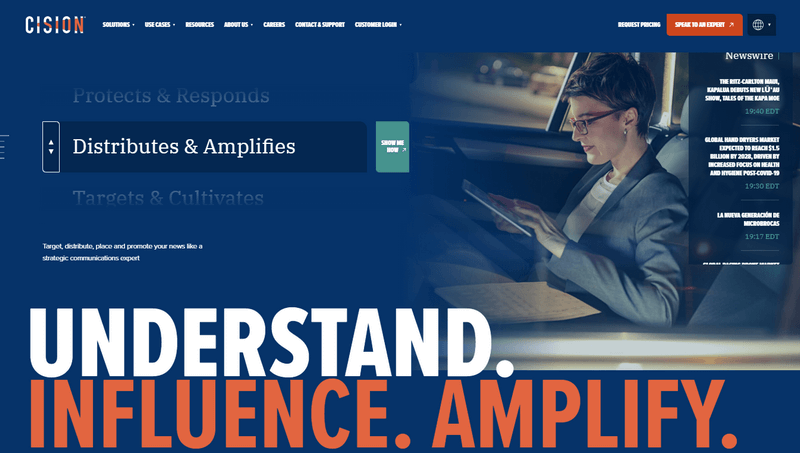
Are you looking at a movie poster? Actually, this is a company that focuses on Communication Technology. Using a combination of orange and blue, they create a visually appealing look for their site. It’s designed to be memorable and overshadow the other colors used in the image gallery. The blue color seems to be intentionally used to make the orange more prominent on the website. And just like in other parts of the website, the text color is white, highlighting some critical with orange words, which works really well with a blue background.
→ Seeking a bolder hue than orange? Check out 20+ Best Red Websites for 2023, showcasing beautiful color schemes.
18. Gulf
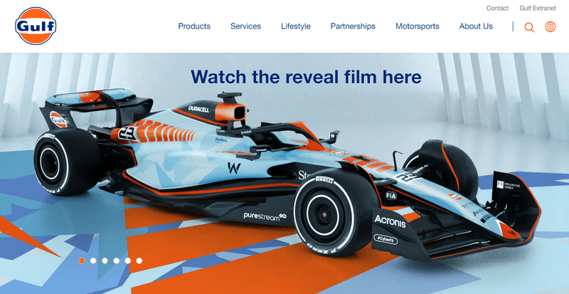
The Gulf website showcases a visually appealing color scheme with blue, and orange shades. On the homepage, a racing car takes center stage against a light blue background, accompanied by blue elements and highlighted with vibrant orange accents.
The clever use of different orange shades in the background adds depth and creates a three-dimensional effect, enhancing the overall design.
19. Zypsy
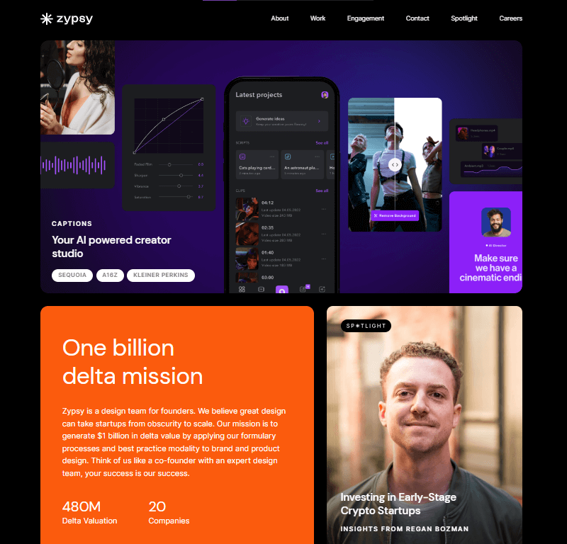
Zypsy has a black, violet, and orange theme, with most of the website using black and white colors and just a touch of orange. The mix of black, white, and orange creates a modern, dramatic look for the website. It’s a popular trend for websites to use 1/3 amounts of orange to draw attention to specific elements, and this website doesn’t stay out of the trend.
→ Looking for something beyond orange? Explore our 40+ Best Blue Color Websites with captivating color schemes.
20. Judy
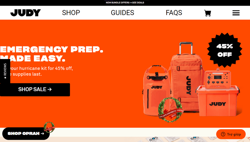
When you choose a bright orange color for your brand, be cautious about combining it with other bold colors. Specifically, on Judy’s website, the contrast between intense orange and pure black overwhelms the overall design, distracting users from important information such as headlines and subheadings (especially when the text font is relatively difficult to read). Such a bright and intense color can also cause eyestrain, negatively impacting the user experience.
On the other hand, the choice of bright, bold orange in this case effectively communicates energy and optimism, and when paired with black and white, it creates a striking effect for the web design.
More importantly, this combination is perfectly suited for a brand that offers emergency preparedness equipment, similar to the use of orange in protective gears you often see in real life.
21. Aardvark
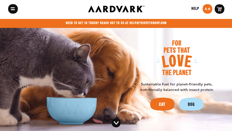
The website for Aardvark, a dry cat & dog food company, showcases a skillful and delightful three-color combination that enhances its visual appeal. The primary color scheme revolves around coral orange, white, and light blue-green, cleverly blended to create a harmonious design.
As you can see, the way they use white as the dominant color allows the vibrant orange and refreshing blue-green elements to stand out prominently on the website. Notably, the use of contrasting colors effectively highlights important elements, such as the CTAs for “cat” and “dog.”
Furthermore, beyond CTAs, the headline “Need help in touch…” is highlighted in this attention-grabbing orange hue, indicating users can easily contact the company via email for assistance. Additionally, the website uses an impressive orange health section to emphasize its commitment to being eco-friendly, dedicated to pet owners who care about the environment.
22. Milkshake
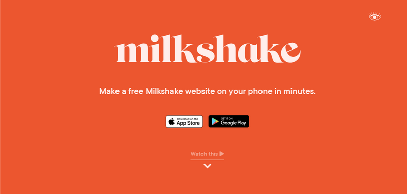
The Milkshake website has a simple yet striking design. It predominantly uses orange color for the first section, making the white Milkshake brand name pop. Below, you’ll find two distinct buttons in white and black for the IOS and Android versions, ensuring clarity for users. Thanks to the bold orange color as the background the white and black buttons become noticeable.
In addition, the website cleverly utilizes the bold orange color for important text such as large headings. This approach not only adds to the overall aesthetic appeal but also sets an energetic tone for the overall page design, effectively engaging visitors.
Notably, the sticky navigation bar and navigational links in the footer also feature shades of orange. This establishes a cohesive and harmonious visual experience for users as they navigate through the website.
23. Claspo
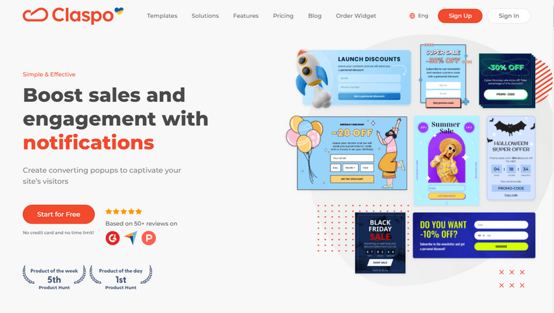
The homepage of Claspo predominantly utilizes a restrained color palette comprising orange, black, gray, and white, which all work together perfectly. To highlight important words about product features, they cleverly switch to an impressive orange color, even for buttons on clean white background
24. GreatMates
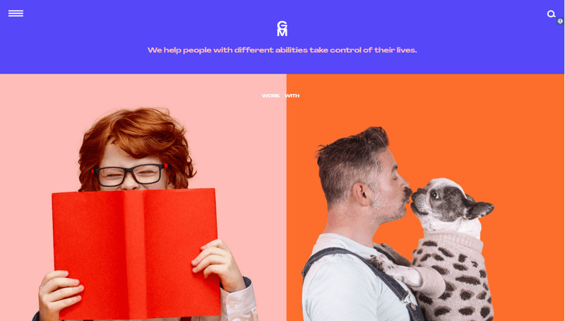
If you’re seeking distinctive and prominent orange website color schemes, look at GreatMates’s portfolio website. Their color palette features orange, blue, and pink. The website’s designer fearlessly combines these contrasting colors, creating a lively and enjoyable website. It reflects the cheerful and supportive nature of their work in disability support.
25. UI Booster
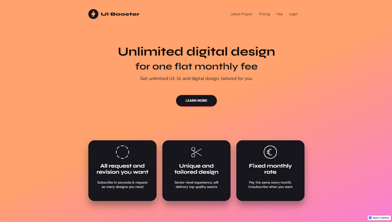
This website’s blend of orange and pink colors is a wonderful example of a color gradient. By mixing and blending various shades, gradients produce new and modern color combinations, infusing designs with a truly unique and dynamic feel.
What makes these color progressions so visually appealing is their ability to instantly catch the eye and demand attention. The vibrant and energetic transitions between colors set this web design apart from the rest.
→ Others also like: 15 Stunning Pink Websites and Color Schemes to Inspire You
Best Magento 2 Page Builder: Create a beautiful orange website for your business
In love with orange and looking for an easy way to create a stunning orange website for your Magento store? Magento 2 Page Builder extension by Magezon – a trusted Adobe exchange partner, is worthy of your consideration.
This powerful and flexible solution allows you to design and customize every CMS page on your Magento website with simplicity and convenience. Whether it’s your homepage, about us pages, contact forms, or landing pages, Magezon Page Builder has got you covered.
With its ease of use and diverse useful features, this outstanding drag-and-drop page builder has gained the trust of numerous store owners and experienced developers, making it a top choice in the Magento page builder market.
What our customers say about Magezon Page Builder
A feedback on Magezon Page Builder from our beloved customer
Let’s explore top-notch key features of Magezon Page Builder, all available with one-time payment:
- Benefit from 50+ content elements that open up numerous creative opportunities for engaging users.
- 100% compatible with extensions from Magezon and other third-parties, popular themes such as Ultimo, Porto, Pearl.
- Take full control of responsive design with the Magezon Page Builder extension, automatically adapting your web pages to any device, from desktop to mobile.
- See immediate changes with the live preview feature, saving you time switching back and forth between the backend and frontend.
- Experience a user-friendly interface designed for easy navigation.
- And more
With Magezon’s drag-and-drop page editor, creating a beautiful orange website for your business has never been easier. Give Magezon Page Builder a try and enjoy the convenience of a powerful web page-building tool that saves you time and money.
If you have any questions or need assistance, feel free to contact the friendly support team via [email protected].
Get your orange website looking stunning today
So, we have explored the 25 best orange websites that showcase the power of vibrant color. From bold and energetic designs to elegant and sophisticated ones, these websites beautifully exemplify how orange can be used to create entirely bespoke and visually appealing looks.
Hopefully, this article has provided valuable insights and inspiration for creating your own orange website. And along with the help of a powerful Magento Page Builder, those who’re running a Magento store can now design and customize your website from the ground up without relying on developers or designers.
If you have any questions or need assistance, don’t hesitate to leave your comments below. We are here to help you design your orange website with ease and pleasure.
Stay tuned for our upcoming articles on web design that will further take your eCommerce store to the next level.
 Magezon Blog Help Merchants Build Comprehensive eCommerce Websites

