As one of the popular forms of advertising on the Internet today, Popup is chosen by many e-commerce stores as an effective way to collect customers’ information and increase conversion rates. But sometimes, you don’t have any idea or wonder how to build an attractive & effective pop-up? With 30+ website pop-up examples, this article will help you to deal with this problem!
Table of contents
| People also read: 10 Useful Tips to Choose a Color Palette for a Website 8 Must-Have Characteristics of the High-Converting CTA Buttons and Examples The Golden Rules for an Effective Typography in Web Design |
What Is Popup?
Popup is widely known, but are you really understanding about it? It is a window that often automatically appears on the screen when the users access the website and stops visitors from interacting with the site until they complete a certain action.
Popup usually sends customers short ad content, attractive promotions, important announcements, or sometimes navigation information connecting customers to the other website.
Main Types of Popup
Pop-ups can be divided into 4 types below:
1. Time-Based
This popup will display when users spend a certain time on the website. The certain time will be determined by the store owners.
For example, the popup will appear after about 60 seconds since the user comes to your website. Or, when the user is inactive for about 2 minutes, the popup will appear. It all depends on the settings that the store owners set.
2. Behavior-Based
The popup will display when a visitor performs a certain behavior on the website. For example, after the user scrolls the site about 30%, the popup will appear. Or, when the user hovers or clicks on the element decided by the site store owners, the popup will appear.
3. Exit-Intent
Exit-intent popup usually appears when the user intends to leave your website. By determining the cursor’s movement, the popup will help you identify who is about to leave the website and immediately send the customer an exit-intent popup with an attractive message, such as offering discounts.
It is considered a final effort to help keep customers on your website and stimulate the conversion of action or information from customers.
4. Pop-out
Instead of appearing in the screen’s middle, top, or bottom and preventing the users from continuing to experience the website, Pop-out is displayed from one side of the screen and allows customers to continue seeing the information.

Try FREE Magento 2 Popup Builder demo today
Easily create beautiful and highly-targeted popups for your websites. With this tool, you can deliver the right content to the right customers at the right time, thereby increasing conversion rates
Benefits of Pop-up
If the popup is applied properly in the marketing strategy, it can bring many benefits to your e-commerce store. Let’s find out some advantages of popup!
1. Grow an Email List
There is no doubt that a popup is an extremely effective tool to collect customers’ information. According to the statistics tested by Sumo: “Even with 100 visitors a day, using a newsletter subscription pop-up would give you between 92 and 274 subscribers every month”. Another study from Entrepreneur found that “pop-ups helped entrepreneur.com increase subscriptions by 86% and sales by 162%”.
However, it’s not natural that customers will leave you an email. To do this, popups must have interesting conditions to attract customers. For example, you can offer some discounts, coupon codes, or download free.
2. Increase Conversion Rate
Increasing conversion rate is another benefit that popup brings to your e-commerce store. Conversion rate refers to how many people saw a pop-up and took action. The action can be that the user subscribes to email, continues to buy products, or stays on the page.
According to the research from the iPaper: “The average conversion rate of top-performing popups is 28%”. Sumo also implemented a study and saw that “the average conversion rate for all pop-ups is about 3.09%”.
30+ Clever Website Popup Examples
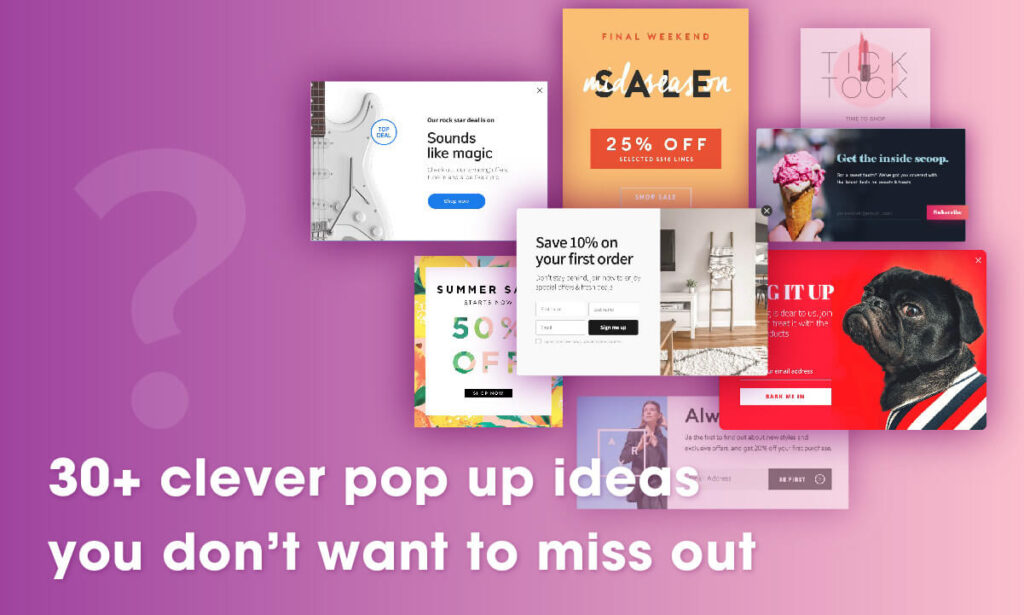
We’ve researched the 30+ best website pop-up examples, so you can scroll through these and get your desired one to build an attractive and effective popup for your Magento online store!
Email Subscription Popups
These pop-ups are often displayed when nonlogin customers arrive at your store. Use them to collect customers’ data.
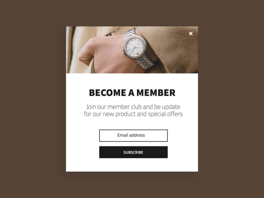
The first popup is a welcome popup; it calls users to become members to receive special offers.
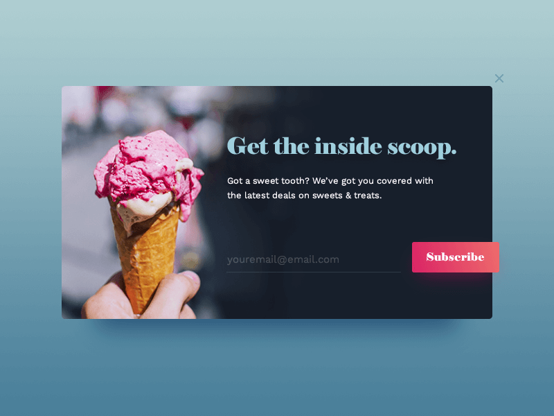
The next popup is a newsletter form popup. If you are running an ice cream store, you can use the color like the popup example below to make customers feel cool in the summer.
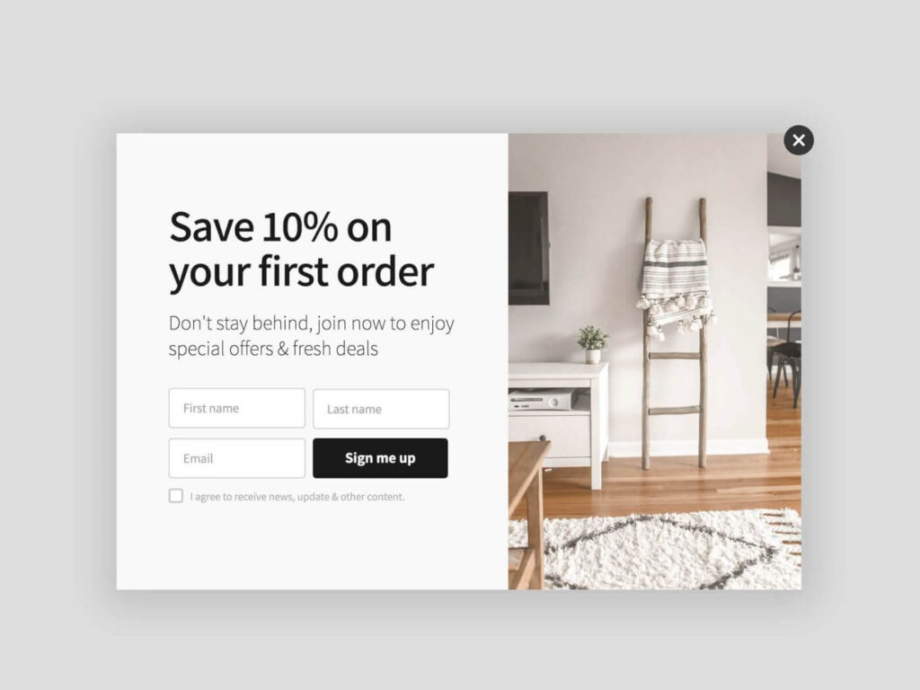
Next is the popup that is designed for furniture stores. It mainly uses a white and beige color that brings a delicate feeling. Especially, it gains customers’ attention by giving a first-time buyer a 10% discount. It also asks the customers to give their First name and Last name.
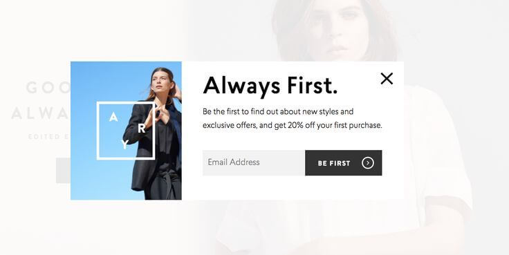
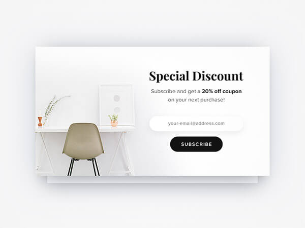
If you sell products with a simple and modern design, this popup design is a good idea for you to create a popup. You can add bright and aesthetically pleasing images to the popup.
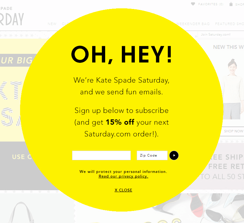
Let’s look at this popup. It has a unique style with a circle shape. It is also one of the ideas you can use to build your popup to make it more attractive and special.
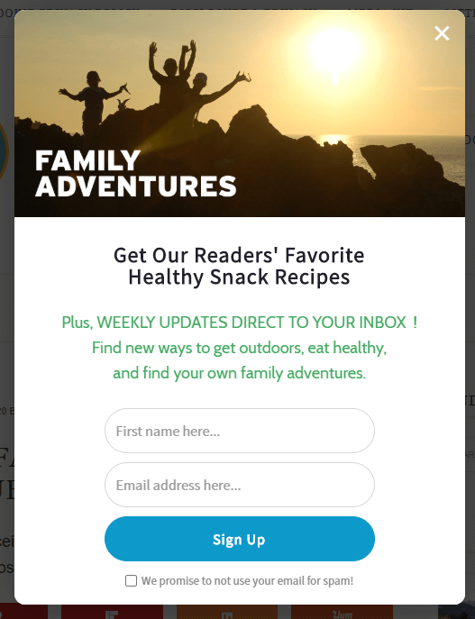
Next is a great example of offering your visitors something they want in return for the email addresses, such as a new recipe, healthy food, and outdoor activity.

Try FREE Magento 2 Popup Builder demo today
Easily create beautiful and highly-targeted popups for your websites. With this tool, you can deliver the right content to the right customers at the right time, thereby increasing conversion rates
Zooshoo
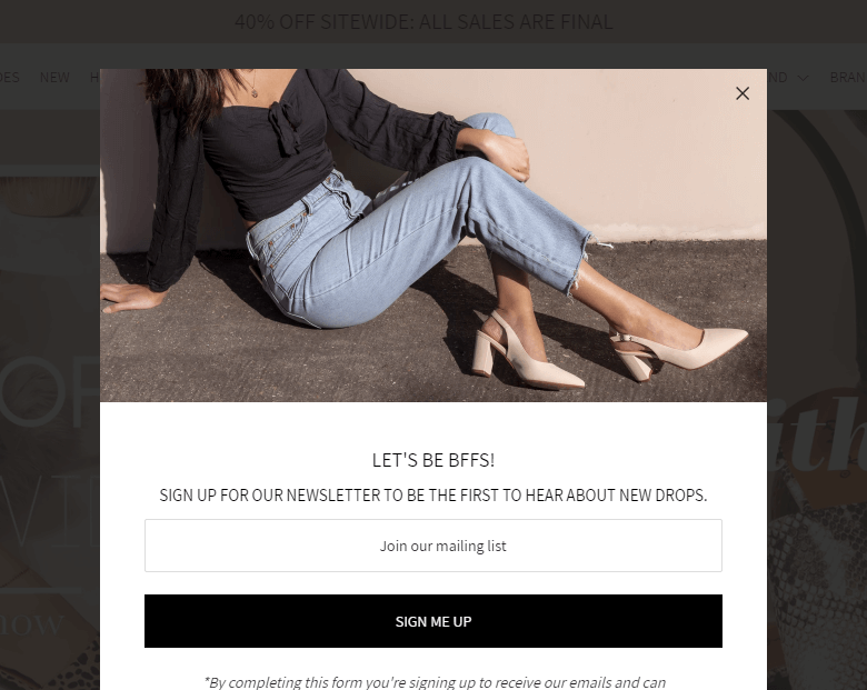
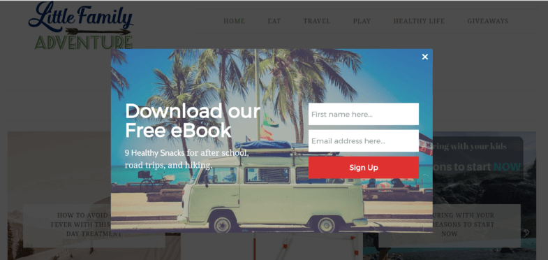
Besides offering discounts, you can encourage customers to subscribe by giving them a chance to Download the book free. Besides, adding an image to the popup can draw their attention to the popup more easily.
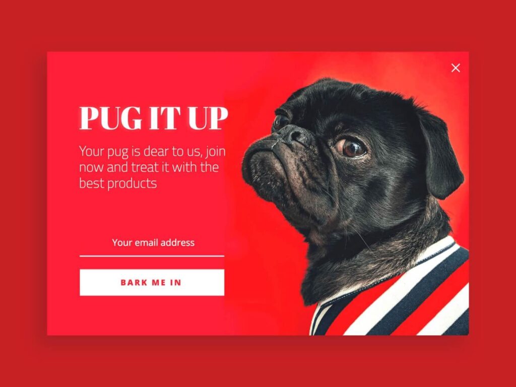
Bright and eye-catching colors like red are always the top priority for pop-up image designs.
Discount Popups
Use the discount pop-ups to increase the conversion rate. Everyone loves discounts, so it is the easiest way to boost sales and keep customers on the website.
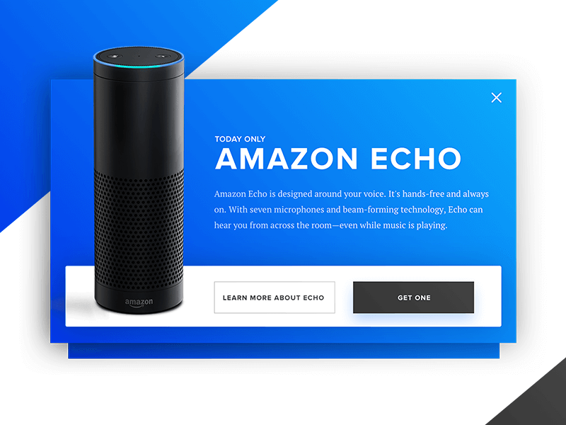
Almost discount popup uses Call to action buttons such as “SHOP NOW”, ‘“DOWNLOAD NOW”, and “GET ONE” to stimulate customers to buy products.
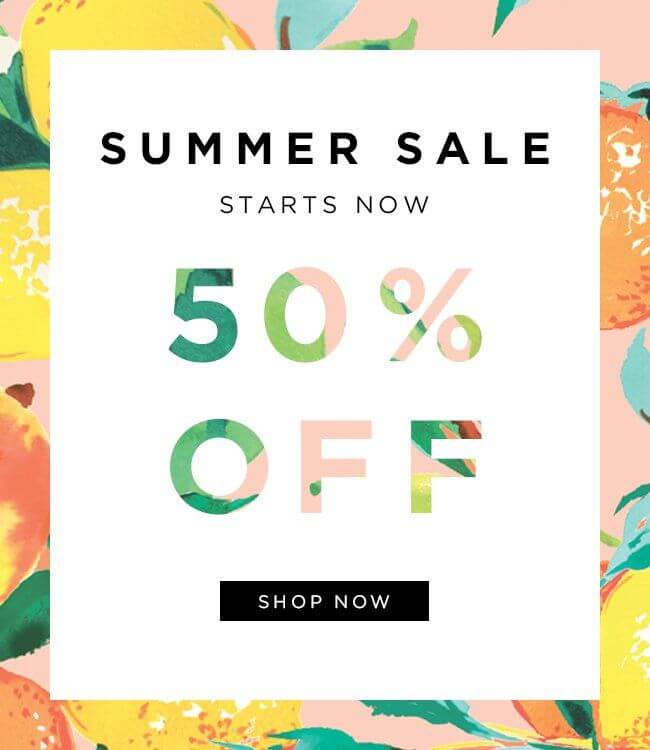
The colorful popup, like the example below, is a way to get customers’ attention! It makes users feel the lively atmosphere of the summer. Especially, no one can refuse when seeing the 50% off discount.
Next is the popup of the cosmetic store. You could use the gif image to make your popup more attractive and special.
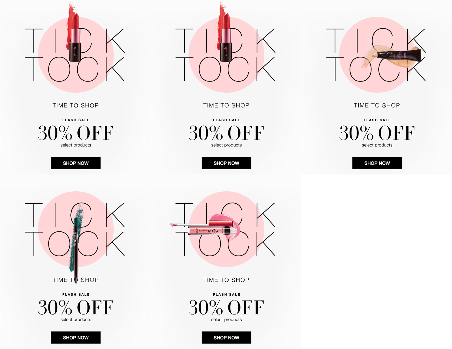
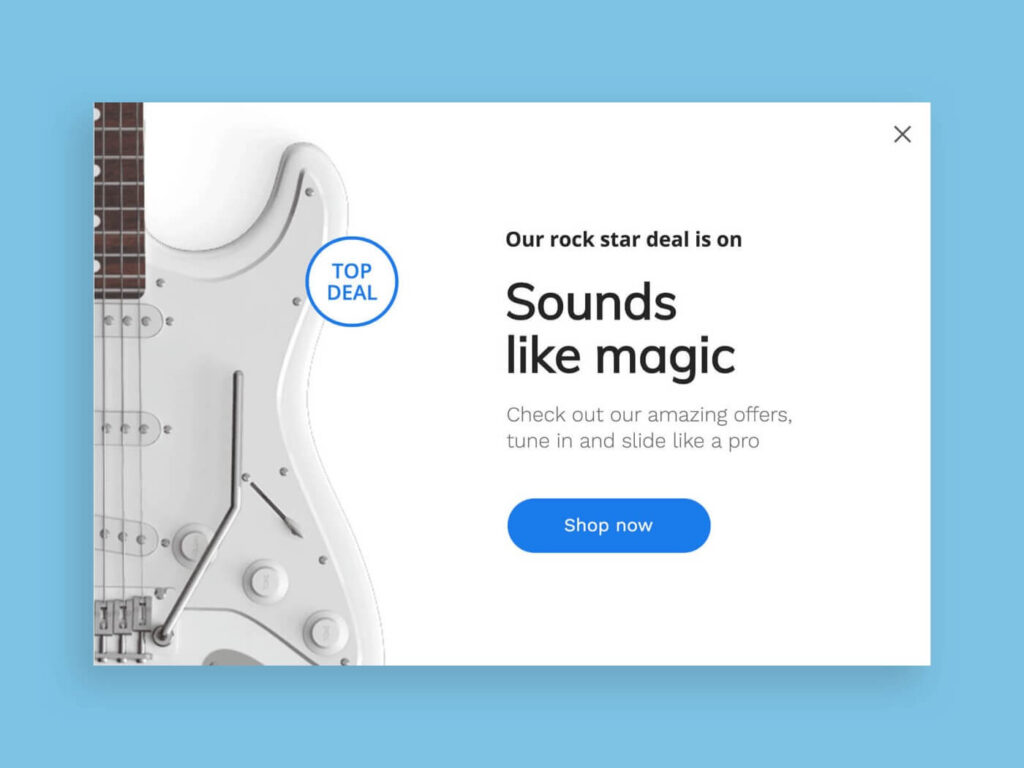
It is not only images or colors but also beautiful fonts that can help attract customers’ attention.
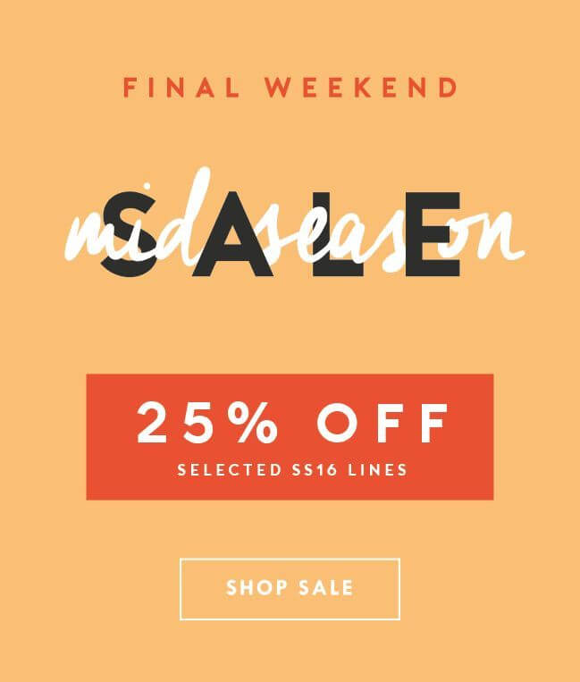
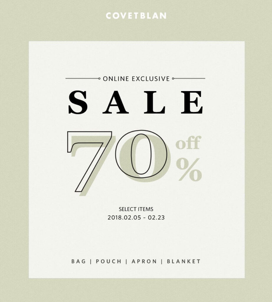
Next, Covetblan gives an informative popup for customers to help them know what items are on sale.
Using 3D images will help customers have a clear view of the product and easily attract them when using colorful colors.
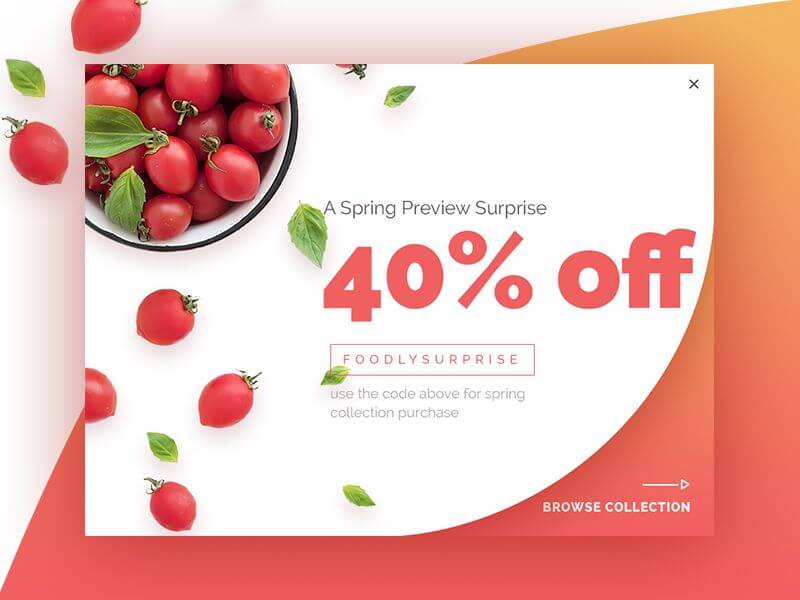
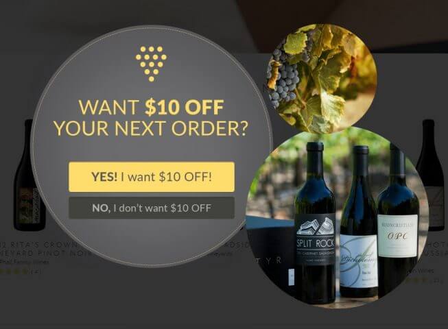
A simple and effective discount for new visitors arriving.
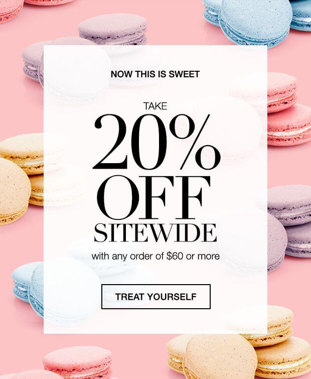
You can use this example if you are running a cake store!
Amazon Echo
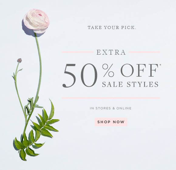
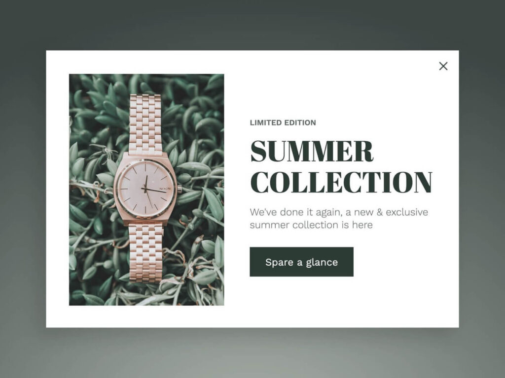
This kind of popup is usually suitable for flower or fashion stores.
Using the word “Limited” to make urgency, visitors will quickly make an order to buy limited products.
Countdown Popups
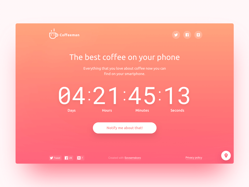
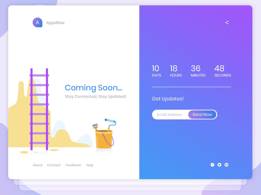
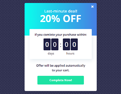
This popup will give the visitor a sense of urgency and boost immediate sales.
These two popups give a specific time to notify customers of the day they launch the product. So the customers will know the specific time, and maybe they will return that day.
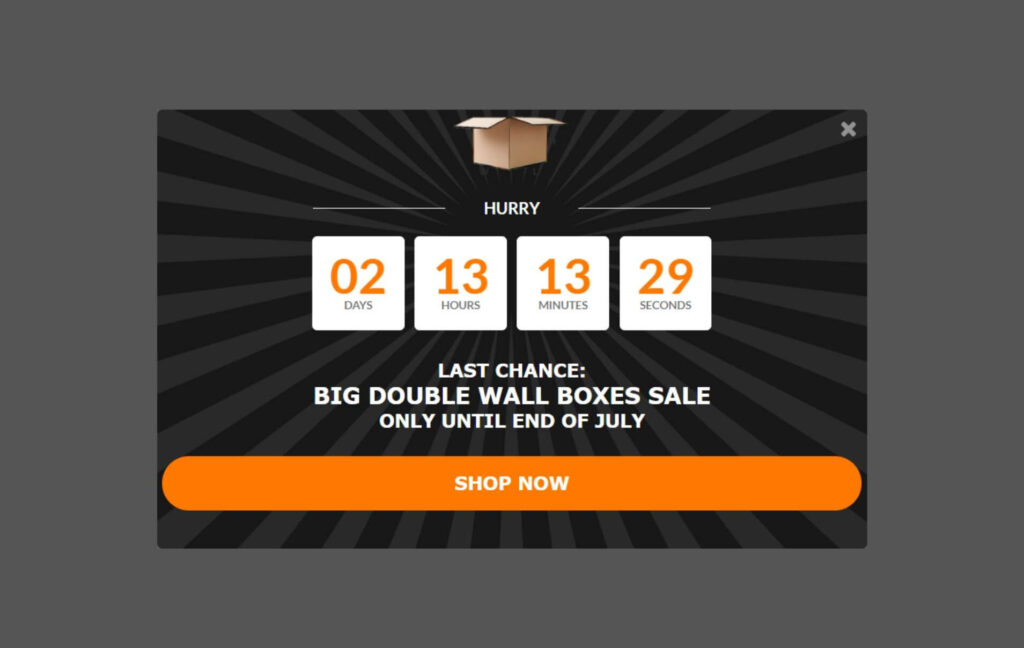
When you use the word “Hurry” and “Last chance,” that will stimulate customers quickly buy products because they see that they will not have another chance.
Many things are great about this popup. First, offering the visitor $20 off. Second, it’s only available at “last minutes,” meaning there’s urgency, and the visitor is more likely to go through with the order.
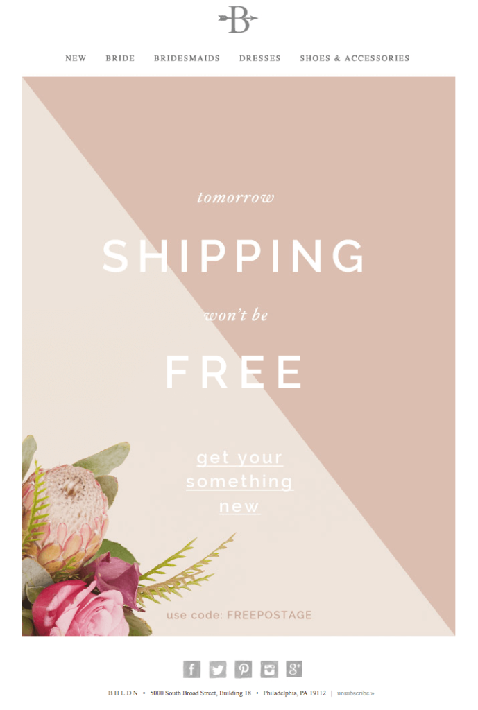
Telling customers free shipping is only available “today.” This is the #1 boosting way to stimulate a customer to make a purchase.
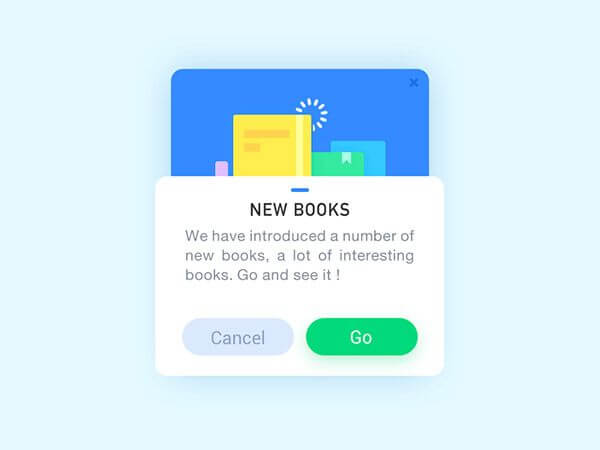
Announcement Popup
Notify customers of new books to make them know and check new products.
Exit-Intent Popups
Exit-intent popup usually appears when the user intends to leave your website. It is the way to reduce abandonment carts and boost sales.
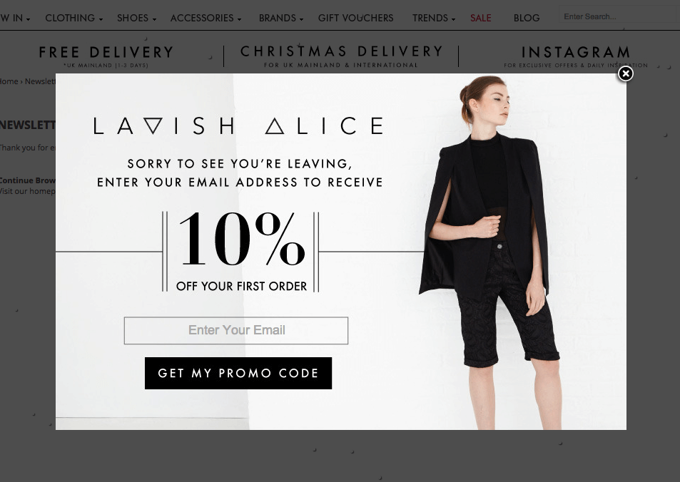
When the visitor intends to leave, the exit intent popup will appear to give them a reason to return.
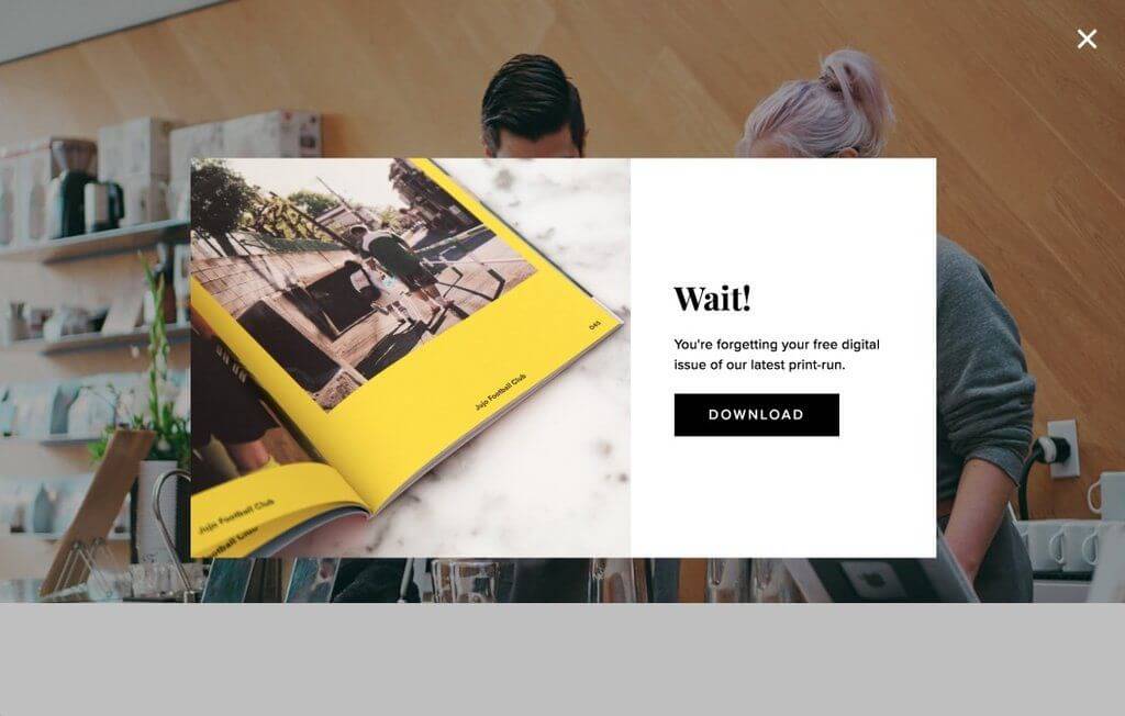
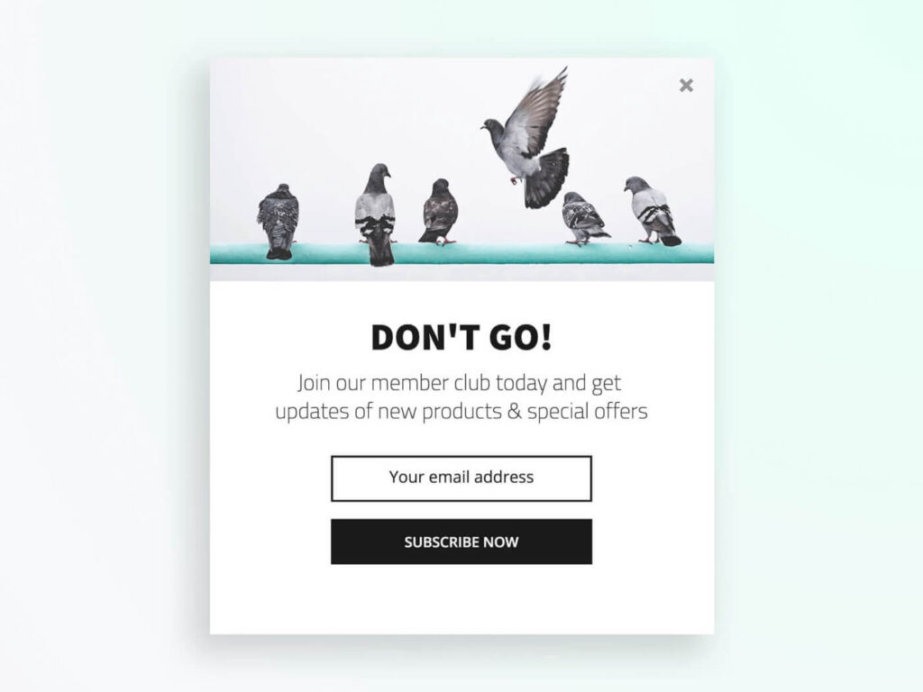
Offering the best offer for those visitors who are about to leave.
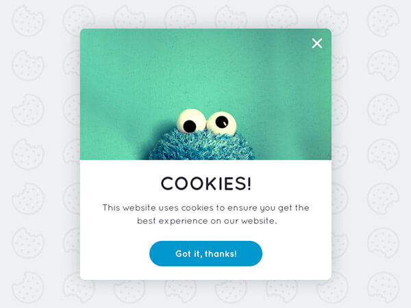
Cookies policy popup
Conclusion
We’ve already suggested 30+ clever website pop-up examples to help you have an idea to build a popup for your Magento online store. Hope you can create an attractive and effective popup to increase the conversion rate and boost sales. If you have any questions, contact us via email or leave a comment below.

Try FREE Magento 2 Popup Builder demo today
Easily create beautiful and highly-targeted popups for your websites. With this tool, you can deliver the right content to the right customers at the right time, thereby increasing conversion rates
 Magezon Blog Help Merchants Build Comprehensive eCommerce Websites

